#what was the thought process behind this art
Explore tagged Tumblr posts
Visit Tumblr Blog
Explore Tumblr blogs with no restrictions, modern design and the best experience.
Last Seen Tumblr Blogs


Fun Fact
Tumblr is available in 18 languages.
Note
Do you think being aware of the different elements in art or just ordinary objects can make the process of actually making art difficult? I get that it's about balance and unity of it all, but being introduced to so many concepts early on feels like too much. Almost feels like learning to make art digitally for the first time -> introduced to all these neat gadgets but no idea how to use them or where

This is a crazy good point anon & very important. YES I think it makes it exponentially harder
It’s just like everything else though where learning to pick your battles is pertinent - knowledge is a foundational aspect of your beliefs and your art is based on your beliefs regardless of how you frame it. Accruing relevant (and irrelevant tbh) info is always going to help you navigate more complex & unique themes. Obviously not everyone is going to get anywhere with it but I think the whole thing is pretty rewarding it motivates everything I do in my entire life so I think it’s worth it. Definitely doesn’t even just apply in theme as well it sounds like you’re talking here about practical technique too which you’re 100% right about again. I think things that I find helpful to remember are
1 - Identifying a comprehensive goal in my action helps me to slow my roll & stop trying to pull from too many sources at once
2 - On the contrary it’s also good to remember that difficult, arduous & thought provoking task is important to art. It doesn’t have to be important to you but don’t be afraid of it
But the good thing about knowing things is knowing things helps you to know more things and knowing more things helps you to make better decisions. These kinds of worries about art are just smaller picture effigies of bigger problems about growing up, it is hard & it’s exceedingly normal to feel lost especially if you’re young. If art is at its core a representation of the life behind the creator then it’s just that. All things are present even incidentally through every single thing you create, which is also why being informed is important ! If you have something to say about something then then your art will. Your art exclusively exists through the people who view it & their tastes. “What kind of people would you want to discuss your work? Whose admiration would flatter you? What figures do you admire? What occupies most of your thoughts?” Are what I’d consider pretty big standard starting points they might give you on a sheet if you were to ask someone about beginning a series of focused work.
Also the thing about purposeful art compared to direct description (e.g. in this context art discussion) is that visual art exceeds writing in a lot of areas including ease of ambiguity. It really is hard to talk about the place obscurity has in art especially factoring in where people might differ on it. But it’s easy to let its importance bypass you, especially as a figurative artist. It’s also easy to make ambiguity sound like an area of study, when really it is like the antilabel of artistic components, ambiguity is black ! It defines itself as a lack of presence & not as its own entity, which in my opinion makes it a lot easier to approach lol. It finds itself comfortably where you apply nothing else
There are one million things that could be / have been said on this subject. I’m sure you would probably get more solid ideas on how to approach an issue like this from someone who has taken a different approach to art themselves, I’ve never read any book approaching art performing from a seminary perspective just as I’ve never been taught or schooled. I’m still going through the throes of asking myself these same things & I think I will be for my entire life. It’s easy to believe that consensus is a trophy gained for putting enough time into something when the truth is that there is no guaranteed finality to art. Be afraid of stagnancy, not ephemerality. There is a lot to be said even for oblivion in character & impulse, so really just make art regardless. Even if it never gets good at least you were doing something
I think you’re already on the right track if this is something you’re thinking about though if you ask me or at least you’re doing something similar to me lol. The amount of “things there are” is genuinely intimidating & especially as such an uninformed, sheltered person as I am making any real decisions for something as longterm as an artistic identity without any real connections to a qualified community seems impossible. Keep thinking like this & hunting yourself down I like to do everything I can that makes something happen about this. It’s not easy ! I don’t think it needs to be
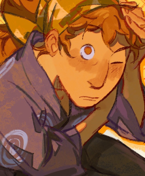
#Image is random drawing I didn’t really want to post it but posting without images is scary lol#Don’t tell me if I’ve posted it before I don’t know if I have and I don’t want to#PS You probably shouldn’t take any advice from me about this specific thing ever if you value your health#Value your wellbeing please it’s all you have lol. I do not take this advice and it makes me very stupid#Always prefacing my posts with none of this might apply in like a week who cares#no one here even has a clue what my actual ideas about art subject are outside of fanart. They could be terrible you wouldn’t know#Also also if it helps shifting my reading focus to postwar illustrators really helped me stop panicking about meaning#But I know that might not apply to everyone. Illustratory art & fine art discussions are something the internet has kind of lost#when it used to be a very pivotal to the art scene for a long time & still is to an extent in reality#anyways it means something different to everyone I won’t get into it but just in case anyone wants my ubersubjective cents#I just think you’re very very good anon you’re asking me good questions. That’s a very good thing to think about#ask
135 notes
·
View notes
Text

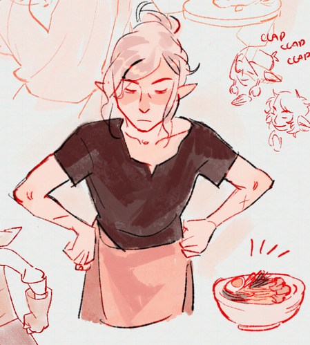
sympathy for cain
#my art#jujutsu kaisen#jjk#jjk fanart#jujutsu kaisen fanart#jjk art#yuji itadori#ryomen sukuna#fushiguro megumi#nobara kugisaki#sukuna#jjk spoilers#jjk manga spoilers#and here i thought i had finally drawn smth that didnt need the spoiler tag but unfortunately nobara has her eyepatch smh#crazy tht i end up drawing sukuna of all people when im in this mood#havent drawn the guy in a while fr starters#also Not the character i would have thought to choose to process my emotions for me but it fits very well#dont read into it :)#i dont like this piece too much tbh like its fine its cool im just in a headspace n this has all of it in it#this is why i dont typically like to draw to vent bc then i cant look at the finished product without seeing all the feelsbad behind it#but whatever . maybe todays chapter will fix me#oh yeah 2 fv captions in a row bc thats what u get when im emo. shame/rotten goes hard fr sukuna/yuuji
6K notes
·
View notes
Text
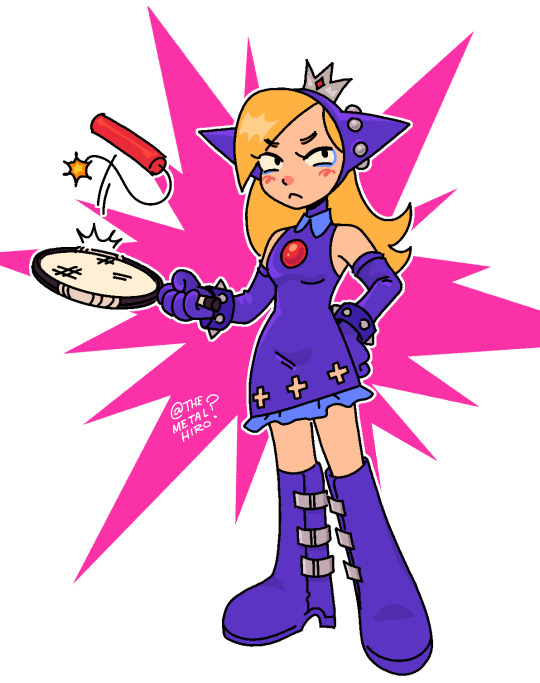
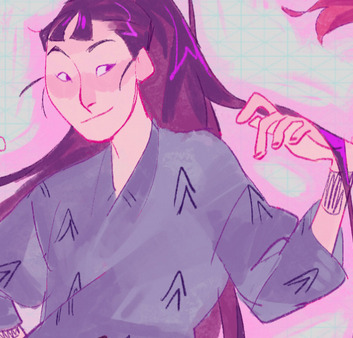
Wapeach?.. Wach? ….Weach???
#im so interested in what the thought process behind her design is#shes like a cute little imp#metalhiro arts#wapeach#mario bros#nintendo#mario tennis#nintendo fanart#super mario
2K notes
·
View notes
Text


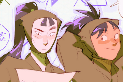
teru compilation from before i remade + some stuff i never posted…. Happy to say that I’m still obsessed with him
#mob psycho 100#mp100#teruki hanazawa#mp100 teru#mp100 teruki#mp100 ritsu#ritsu kageyama#I CANTTT remember what the thought process behind the streamer one was idk maybe teru and ritsus early 20s crisis overlap or smthn#he shouldn’t even play anything . he’d get so sick. :( my poor son who gets a fever when he loses…..#my art
273 notes
·
View notes
Text
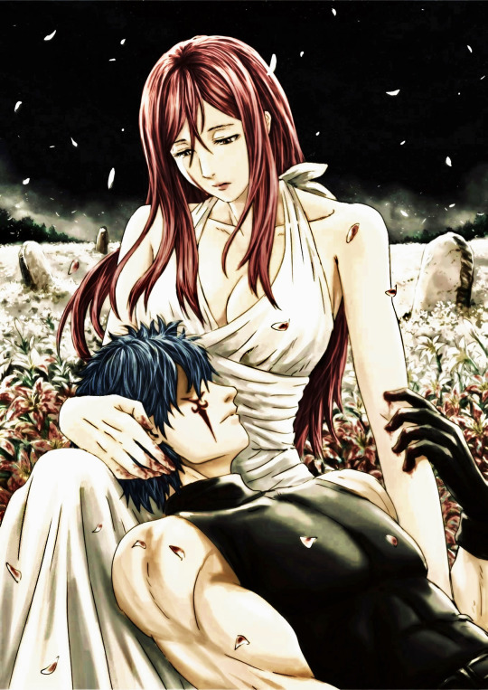
Jellal & Erza : Lilium / Death Of Innocence
Pure white lilies once untouched by scare and sin
Now bathe in blood and are soaked from within
Their fragile petals have become bruised and worn
Marking the place where innocence has been trampled and torn
Sweet laughter no longer lingers here
Just the looming shadows that speak of fear
The scarlet stains, an unmoving mark
Forever reminding of the chains that kept them bound in the dark
The lilies scream their silent cries
Of dreams undone beneath lightless skies
Each drop of red, a memory slain
And haunting reminders of a past that never lets them break from their chains
Once soft as dawn, their beauty has bled
But neither are they allowed to rest amongst those forgotten or dead
Yet the blood stained lilies continue to bow in grief
Whilst watching the promise of innocence being swept away like a falling leaf
Darkness still surrounds yet they stand, though bent and torn
Eternally mourning the life that could have once been born
With each scarlet stained petal, and through every lamenting sigh
The death of our innocence only continues to pass on by..
#for jerza day#jerza day#jerza day 2024#jerza week#fairy tail#jerza#commissioned art#jellal fernandes#jellal fernandez#erza scarlet#jellal x erza#jerza angst#fairy tail jellal#jellal#ft jellal#erza#ft erza#fairy tail erza#fairy tail jerza#tower of heaven inspired#symbolic art#poetry#yami writes#this is giving strong elden ring dlc vibes to me for some reason#literally listening to the gravesite plain ost and this hits different looking at the pic#tried to write poetry to kind of convey the whole thought process behind this commission I got#i would say happy jerza day but with the nature of my submission I just think it feels kind of...off? So let's just leave it at that-#it's still jerza related and that's what counts#i should like learn to not just indulge in dark angsty themes and motifs so much#but that's a motive for another day
74 notes
·
View notes
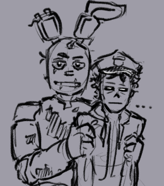
Note
CRAB IS YOUR MOON OKAY WITH HUGS?
PLEASE THIS GUYS NEED SOME AFFECTION
LET ME JUST-
GHHHHHH-/pos
#fnaf moon#Moon New Do Same You AU#fnaf dca#dca fandom#mutual shenanigans#other people's art#crab art#traditional art#Moon likes hugs#but he's very particular about them#he prefers hugs around his shoulders or his waist#he does not like being hugged from behind#he does not like being hugged by surprise#he's a bit skittish#like a cat#you have to learn his habits#and sometimes just wait for him to come to you#you know i am up to No GoodTM when i draw extreme close ups of Moon and his back#i also don't know what possessed me to do this in watercolours#but... i'm okay with the final look#i'm just very rusty#and i remembered why the last time i painted in watercolour i went into an artblock#it really do be a “trust the process” kinda deal#also for people who saw the wip#haHA you thought this was about moon ass but it was actually MOON ANGST#MOON ANGST FRIDAY#i always post my moon angst on friday it seems
284 notes
·
View notes
Text
I drew this instead of sleeping like a normal person
#i dont need sleep i need to draw#fnaf#william afton#purple guy#my art#michael afton#springtrap#five nights at freddy's#idek what the thought process was behind this#i had the need to draw a stinky rabbit
605 notes
·
View notes
Text

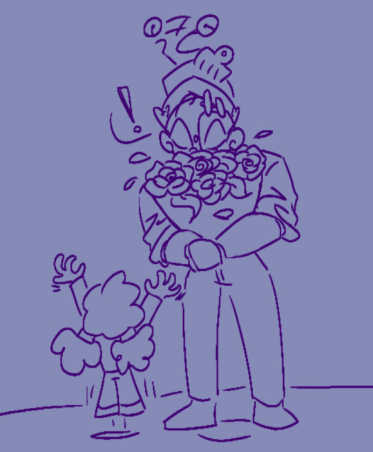
MISSION: DATA TRANSFER
#inanimate insanity#ii mephone5#my art#he's so rez area 2 to me<3#my thought process behind this was What if he could turn his hand into a USB that'd be cool
121 notes
·
View notes
Text
me being nb and feeling bad that I think Taash’s whole story is a mess. I want to like them. I do like them as long as I’m ignoring The Family Friendly pirates, the irl modern words for sexuality right down to a codex entry, ‘anyone can leave the qun’ despite you complaining about it and your mother who is clearly a victim of it enough to smuggle you out, the forced binary choice to choose either embrace Rivaini culture or the Qun like ?? The cringe growling….. What is happening? Did they really need to be written in the whitest queer person way possible?
#this isn’t even me hating Taash bc overall I love their personality and friendship and interactions#they have the sort of story that is so bizarre from Weekes#like I’m not going to bother them but I’d love to know their thought process and reasons behind all these choices#like surely EA didn’t hold a knife to them to do this so what happened#and ngl I’m also like ‘eh. ok’ about them and Harding it’s just so Nothing feeling despite me bringing them around together#saw concept art Taash and what do u mean they could’ve been a cool rogue :(#instead we got….qunari warrior. again#prawn posts
23 notes
·
View notes
Note
Err just letting you know someone posted you art in Twitter without credit:
Name: Gabsnow191010
https://x.com/Gabsnow191010/status/1840527176090714205?t=tzL_raHloMiIlXdC7N9azg&s=19
I think you are also not the only one they've been taking from.
yepp thanks so much! my friend told me about it as well :,,)
i owe big thanks to tooter for asking them to take it down,, from what i could tell they didn't have malicious intent but i hope they.learn more about online art sharing etiquette fjskdsj
#asks#i gotta admit tho i just have trouble understanding the thought process behind reposting..#what goes through peoples minds that makes them think 'wow i love this post im going to put it here instead and not say where its from'#its great when ppl share stuff they like and tell friends or whatever but like.bestie tell me where u found it its not that hard#maybe its bc its just such an ingrained concept to me to always care about sources esp for art but like#urhfhfgh
22 notes
·
View notes
Text

I asked myself, "How do I make the red Among Us crewmate as colorful, zesty, and shapes as possible while still being just red and keeping the core essence of a biblically accurate crewmate? It's design is simple and I'd like to keep it that way, so turning it 'rainbow' might bring up some challenges." (It didn't. Rainbow neuron activation.)
#me with translating most things into my style can be described as this#i'm gonna pretend like I had a complex thought process while making this#I just like throwing vibrant colors at the canvas#it was only after I finished when I articulated what was going on in my head#Shapes and colors are pleasing and fun to draw for me. There really is no other reason behind it.#among us#among us crewmate#art#digital art#shitpost#pointy doodle
7 notes
·
View notes
Text
I was looking through some stuff and apparently Silver is called Tsubaki in some side manga? And as I've been playing FE14 recently, I can't help but find it extremely amusing, the idea that these two share their names:


It's honestly made even funnier by the fact that these two are the de facto shipping partners for the two of them.


... You know what, this would make some absolutely adorable cosplay art for both couples now when I'm thinking of it
#personal thoughts#pokemon#pokemon gsc#pokemon hgss#pokemon johto#fire emblem#fire emblem fates#fe14#rival silver#trainer silver#trainer lyra#fe subaki#fe severa#fe selena#today in things that just popped into my mind & refused to leave once it happened#i've made fun of wally looking (& aging) like a manakete for a while now - might as well make the joke a little broader#tbh silver would look pretty good with subaki's hairstyle not gonna lie#don't ask what was the thought process behind this. i don't know how it happened#it just did. it's at least amusing & has some cute fan art potential#these boys have a thing for pigtails so it seems
21 notes
·
View notes
Text
Well, I didn't get any writing done, but I did watch the Wiggles documentary.
#look it was a compromise!#i was babysitting#these children were cranky and driving me nuts#this gives them music and me a documentary to learn things from#bad news: songs in my head forever#good news: actually pretty interesting#i'm always fascinated by the fact that no matter how strange or niche a type of art is#there's always people behind it#with ordinary lives and thought processes that go into what they make#and it was fun to see the very sensible and human ideas that go into creating something so wild#this wouldn't have been quite so shameful except that i kept watching after the kids were gone#instead of writing anything
23 notes
·
View notes
Text
i hate the 'i could have made that painting too' crowd. no u couldnt have
#all u bitches needed to pay attention in art class#what rlly makes a painting is the thought process behind it its the idea that it conveys not the way it is made
16 notes
·
View notes
Note
how do you get your colors to look so nice and your lineart so red and vibrant? i love it
omg anon thank you!! 😭 im going 2 be honest I am Not Great with color theory... but i like having my sketch pages look cohesive to me...
BUCKLE UP this is going to need a readmore bc i like talking.
I always sketch in neon colors it's a habit i picked up from an old teacher but I'll think of a color usually on a whim and draw with that. and then if i want to draw something else ill pick another color that i think goes well with the page. usually most of my color schemes r analogous (colors right next to each other on the wheel)

yanked this from recent dunmesh post; i kept most of my colors within the pink/red/orange range.
i wouldn't recommend doing everything in monochrome or analogous palettes though because it's sort of a guilty crutch of mine XD.
sometimes when im coloring ill change the layer mode of the sketch. color burn gets you either very very bright or very very deep colors depending on the color of the flats underneath. multiply and linear burn do the same thing but they're a lot tamer and generally always return darker colors. im sure there's some technical bits behind this though. ill either color my lineart afterward to compliment the color of the flats, leave it as is, or mess with layer modes if i feel like it. my favorite trick is color burn + linear burn + some combination of two lineart layers and just fiddling until i get a nice burn effect.
mithrun was done with crimson red on color burn.
coloring... like 999% of this is relative color which is like. kind of the idea that colors look different when placed next to each other. if you eyeball it a bit it's pretty noticeable.

what i used to do a bit ago was i would fill in the area i wanted to color with one big mask of color, make a new layer that has a clipping mask down to the flat layer of color, and then draw my actual flat colors. the color of the mask helped me pick my flat colors bc if I picked a color i think stood out too much next to the mask i could kind of just adjust it until it looked a little more cohesive.

old ish drawing next 2 a canon reference. i ignore local color a lot...mea culpa....but my overall color palette here was a light pink, so the shirt here is actually a desaturated pink? or violet i believe. if you shift sort of that purple color far enough into the gray area of your color wheel it can take on a blueish or even greenish hue. it being next to a lot of warm pinks/fuschias helps.
a neat thing that kind of helps is that if you desaturate or saturate certain colors they can kind of take on a certain hue? not sure if this makes sense. sort of how orange here turns tealish blue the grayer it gets. so if im drawing something that's predominantly orange and i have a blue color i can just take an orange color and desaturate it until i get a color that sort of looks like blue. and that way it kind of looks more harmonious? at least to me XD
shading. i don't apply serious lighting to a lot of my drawings, but a helpful bit is that the shadows tend to be the opposite of whatever color the lighting is? i try to think first about the "mood" or the main color i want to go for in the drawing and then i pick a shadow color opposite of that. so for here, i wanted the lighting to be a coolish magenta so the shadows r lime green. if there's anything off i fiddle around until i get something i like. the shadows on the skin here were too green initially so i shifted them a little more orange.
there's a "band" of color going on between the transition of the shadows to the light. generally this could be for a lot of reasons and i tend to use it differently (core shadow? overexposure? etc etc). but this is a color post so ill try not to go too off track.
but generally digital doesn't "mix" colors the same way traditional colors do if you use RGB (cmyk is a bit better with this but is kind of a pain to get used to), so to make blending a little less muddy, i sometimes add an intermediate color to smooth things out a little. for example, mixing digitally blue n yellow tends to get you gray, but generally, blue + yellow makes green, so if im making a blue->yellow transition ill slap some green color in the middle so it flows a little better.
I do a lot more cel shading nowadays. if you've been on here for a while earlier this year i have another style of coloring but it's not really accurate to how shadows really work so i wouldn't recommend looking at it. it's mostly to add zest and texture to the underlying flat colors.
coloring your lineart does a TON to helping your colors look vibrant, though its like the garnish on a dish to me (same with shadows). i think it's good to try and play with your flat colors and try to make sure those look in order first before adding flourishes. usually ill leave it a dark, saturated color that again matches my overall palette but sometimes i go in and color them by alpha locking my lineart layer and picking a color that matches the flat colors underneath? not sure how to explain it properly.

i used a darkish purple for shuro's ponytail to match the dull red of the flat colors (more relative color! trying to simulate a black/brown while keeping the pink palette there) but a lighter crimson for laios's blond. the light was this super intense like blush pink so i thought it might be cool to add this neon salmon red in the areas of that light to really give off that vibe of a very bright intense rim light.
sometimes you could also tweak with gradient maps or color balance, which adjusts hue based on how light or dark a color is. these r fun to mess with as a final touch but i need to watch using them because they can become crutches real fast XD but those are also just tools to help you. in the end just developing a good sense of how color works and how you want to use it is the best place to start.
LONGASS ramble but yeah. tldr just kind of train ur eye for color and look at what you like best. which is unhelpful and a little sucky but it really is just observation and practice and maybe some personal zest.
happy drawing!
#SORRY THIS IS THE SIZE OF CANADA I YAP A LOT#i like being thorough when explaining myself a lot XD but i think the easiest way to get good with this is just repeat practice n observing#and figuring out how stuff behaves in certain situations and what you like to do and blahblahblah#if you have artists u like that do this well looking at how they use color might be cool#...i feel this entire post is just putting my entire thought process on blast LOLLL.#“eyeball it out” -> study some actual fundamental stuff and or intake new info or art -> apply it back to just eyeballing it out#i dont think i have a natural sense for some basics#but i dont think im naturally one of those people who grind out studies all the time and breakdowns either#i guess i just kind of like knowing the mechanations behind why to do a certain thing or how stuff works and then figuring out#how that translates into what i know nerd emoji#james gurney has a good book on color and light#if you like reading. but its very informative!#quirinahscreams#ask#anon#this is mostly just me talking about how i draw i dont think this is meant to be educational or informative XD um
13 notes
·
View notes
Text
wait hold on i'm just at the beginning of ASR but i flipped through to AC just to see and it looks like the translation uses he pronouns for ART though??? girl what 😭
#i mean... i could maybe see the thought process behind using he pronouns in the third person#since the word transport is gendered male in polish... but that's still a stretch#but no ART appears to use he in first person as well.#like. what???? it can't be because it pronouns used for people/in first person would be too 'weird/unusual'#which would be the main reason i would've guessed under other circumstances (as shitty as it is)#but... you're already using those for murderbot like every sentence#so... why can't you do the same for ART???#i'm. baffled#murderbot#.txt#books
22 notes
·
View notes