#well this was meant to have a transparent bg
Explore tagged Tumblr posts
Text
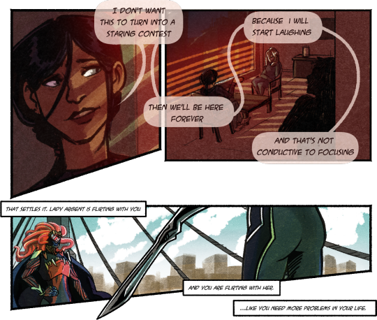
Things I didn’t expect from Aura’s playthrough; for her to sit up and go “Oh hey there-“ @ Argent
Ramblings under the cut
These were all meant to be longer but I’m still figuring out a lot and - comics aren’t a thing I can really do. I’m learning.
THINGS I LIKE before I start to muse on the nature of Aura’s bisexuality
-Aura’s speed bubbles cut her off from Argent and Ortega. This is ! Intentional. I felt clever about it.
-Light through blinds like cage/prison bars on Aura and Argent, but not Ortega.
- Argents sword at opposite angles to the bridge cables! It’s satisfying. The arm + sword should probably have like a 5° clockwise angle shift though. Argents taking up very little space in the panel but the hand/sword breaks through, she’s so imposing, suddenly, she’s breaking the border, and the bridge cables are sort of like a net around Maneater. The sword + cables behind her also box her in.
Bonus doodle for sticking with me so far
Aura and Argent are both SHORT.
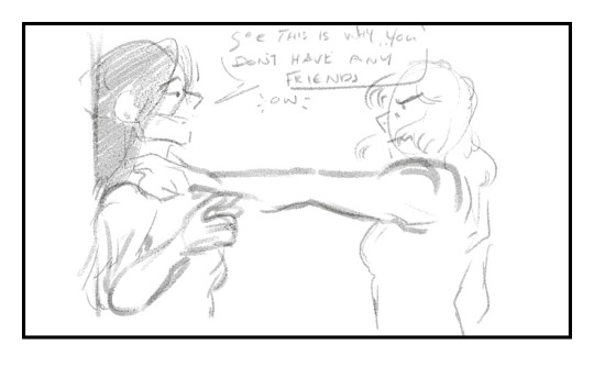
Also argent gets fluffy angry ghibli hair. I think it would be funny if the hair floofed up when angry tho that’s. A bit of a dead giveaway with the nanovores- anyway———
Aura’s having fun.
She’s! A weird character to play. Mel’s a fallen hero original, Matty isn’t but he fits the world well (he’s sort of a refugee from his original setting and likes to pretend he belongs elsewhere. Aura is too (she’s. She’s his mum in basically every other au) but she plays it off better!
So the whole run is a bit more “let’s! Have fun!” Than actually. Honestly building the character thoroughly. It’s an Au of my oldest oc! My favourite girl! Hell yeah!
Plus in superhero universes she’s usually a bit of a superwoman-sort-of-a-vibe so it’s nice to see her with the gloves off being horrible. Because it does come fairly naturally to her.
But yeah! The “Maneater” moniker lends itself to ‘oooo femme fatale’ but she’s equal opportunities on the eating, she’s bi. Generally in a sort of “lmao doesn’t everybody have crushes on other girls though???” Way, she’s sorta clueless. She’s also got a heavy streak of “I’m here for a good time not a long time so I’m gonna take everything going please and thank you veeery much!” By which I mean I think Chen’s the only person she isn’t making a pass at.
She leans more to attraction towards men, but it’d be like 60/40 if I had to put numbers on it. There are universes where she has like two and a half wives, she’s out here vibing.
#fhr#fallen hero rebirth#fallen hero retribution#lady argent#fhr argent#fhr sidestep#sidestep fhr#Ricardo is there in silhouette if you squint#sadbh art#aura cross#wow I’m so sorry I talked. so much.#this isn’t even like good this is my experimental noodly shit#well this was meant to have a transparent bg#and now I feel like a fool#smh
89 notes
·
View notes
Note
Hi! The sisters are heading to la and they might get papped with B and F and spend there several weeks pretending to be one big happy family. How not to feel anxious about their circus? I know they are not my monkeys but still I feel uneasy when it comes to bg
Well. For starters last I checked we don’t know FOR SURE where they are going but yes. Clearly they are painting this story that they are going to the USA for that big family trip they’ve talked about.
As for how I don’t feel anxious? Simple. They’re telling us it’s happening. And in this fandom if we’re being told something private life about Harry or Louis is happening it means…. It’s not their private life. It’s FOR US.
Like. Louis has shown a lot of the last couple of years he can go and do stuff and not advertise it and no one knows he’s there. Just think back to all of the adventures we saw his band/crew go on with him over tour. We didn’t know those things were happening when they did. We found out eventually but no one was posting “hey what’s a good thing to do in Iceland?” Or “where can we go ride ATVs?”
I’ve talked before about analyzing sources when it comes to the boys (and other things) and one of the biggest things is what is trying to be sold.
We didn’t NEED to be told they were doing a family vacation. Phoebe doesn’t NEED to ask IG for tips on long haul flights with a 9 month old. She has an older sister with a baby of her own. We were told about the big family vacation and Phoebe ASKED IG because the stage is being prepped for “look at our big happy family” and “look at our big happy family” is inherently going to mean Freddie should be there. So. Either we get Freddie content (and maybe that means he won’t show up for Christmas, who knows) and in that case - oh look we were prepped for it! - or we don’t 🤷🏼♀️
Either way. This trip is meant to be seen. Whether you like the Tomlinson twins or not (gonna go out on a limb and assume more people in fandom DONT) they are influencers and they TELL STORIES with their social media to sell people shit. And part of what they are selling is this idea that they are being transparent about their private lives (plot twist they definitely aren’t)
So basically… I don’t get anxious cause this is just something being sold to us. If this was an actual private vacation we wouldn’t know about it. So if Freddie shows up - lol kay… you should be in school buddy cause the USA doesn’t have breaks like that - but it’s just…. It’s just the story.
#also this is why Louis posted himself in LA#now people will be like OH HES BEEN IN LA THIS WHOLE TIME WITH HIS SON!! (no he hasn’t)#but that’s the story being told through social media#and that story is just that…. a story#the husband has compared this type of thing to kayfabe in wrestling#and that’s a good comparison tbh
33 notes
·
View notes
Note
I meant like, making the background transparent 😭

OHH , well normally i use ezgif for no bgs whatsoever !! ^_^ , just make sure your photos have those transparent backgrounds . okay , so once you've uploaded your files , you should make the " delay time " to 50-80 whatever is alright with you ! make sure the " don't stack frames " is enabled , since it'll look very odd T-T If you want to know how to do the fading one , enable " crossfade frames " i made it delay around 10-12 always !!
this is normally what kio puts in " delay time " ++ " crossfade frames " ^_^

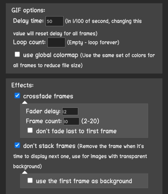

after that you should be able to export your gif and it'll look somewhat like this !!


hope this helped ! ^_^


123 notes
·
View notes
Text

do you even straight fly bro (headcanons + no bg ref below as usual) + A CLEARER REFERENCE FOR THE LOWER BODY UNDER KEEPREADING BECAUSE APPARENTLY I MADE THE POSE TOO CONFUSING,, at least 2 ppl have been confused atp so

besties/rivals with cataclysm. they/them
when they went from extreme to insane, they couldn't handle the community's torn reactions and all that so they took fleeing into the woods away from society literally (without warning too - this caused cata to become super duper depressed for a while) for a few years before suddenly deciding to return for absolutely no reason other than boredom.
they've never been interested in forming any kind of relationship with anyone, and the only reason why cata is their best and only friend is due to the time they spent together being the center of top play attention. they previously felt bad about it due to feeling "abnormal" and "selfish" for not wanting to interact with anyone, but after the self-exile they've fully embraced their reclusive personality. bro is the type to silently leave the room when there are 3 or more people in the same enclosed space as them
on the topic of that, they actually think of relationships as something that'll only end in pain (separation/conflict) and it's a huge part of why they don't make friends
they don't remember the time when there were more ice carbon levels because they've been blocking out the memories since the mass deletion of roadbose lvls; but i imagine them as family who lived in something of a mansion prior to everything that happened
their attitude towards level difficulty and stuff is very different from cata's. cataclysm felt that he fell from grace when he went from top 1 to entry over the years, but icdx became known to the world at a time when people were still figuring things out - plus the fact that they were hack-verified meant that they didn't get to spend time with their creator to learn the basics of the world and was forced to jump right in. this forced them to become desensitized to most criticism as well as learn social customs by trial and error, but in the end they were still just a confused kid. when they were downrated, they gave absolutely zero craps about going from former top 1 to insane demon (they didn't enjoy being lowkey worshipped anyway) but it was the community going crazy over it that drove them to isolate themselves
uses all lowercase and italics in text, writes in cursive as default, on tumblr i also apply cursive text to them
they are capable of floating (and ignoring wind while doing so) effortlessly, so they almost never touch the ground.
in reference to the use of player colors in the level, they can change the colors of their hair, eyes, and clothing at will.
they can also go translucent or even fully invisible - they use this to escape social situations a lot of times. they can also make sudden flashes of very bright light (reference to That one Cube Section)
cata calls them "dia" as a nickname. they do not allow anyone else other than him to call them that. (in lore, "dia" is a nickname used by the rest of the ice carbon family for them - and they have a bit of trauma with this matter whoopsie daisy)
they very rarely smile, but they're just not used to smiling being the default "relaxed expression". they're chill most of the time
uses "xd" (strictly lowercase) when being sarcastic and does the peace hand sign (✌️) a LOT (and they still think referencing the disappearing meme while going transparent is funny)
their humor is the same brand as cata's (dry ironic stupid memes) but with a lot more confusing logic (or the lack of it) - they like to do unnecessary and absurd mental gymnastics to throw people off, but i like to think their logical thinking is still very much intact. probably
voiceclaim is remainings for now
they smoke sometimes . probably also a vaper good thing that levels cant really get long term consequences from those haha
their first language is korean :3
will update post if i think of more hcs

9 notes
·
View notes
Text
The gems’ economic system
yet another analysis no one asked for, but you know me at this point
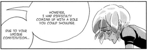
so, the lunarians seem to live under some sort of capitalistic system, the admirabilis seem to have a feudal/subsistence one or something like that, what about the lustrous?
these rocks dont produce food and there is no state, which makes everything trickier. so here’s my best attempt at classifying something that was probably never meant to be classified
disclaimer: despite studying some of these things and having a good bg in sociology, i’m not a political science or economics major. take this post with a grain of salt and correct me where im wrong. this is just for fun.

i’ve already touched on the gems’ social and political systems. the simplest, roughest scheme i can write for an economic system is this one:
what is produced and in what quantities?
how is it produced? by whom?
who benefits from what is produced? how are produces distributed?
in the gems’ case:
tangible goods (tables, chairs, paper, clothes, swords...) and services (provided by doctors, teachers, scholars, statisticians/strategists, fighters, librarians...)
by all of the gems, sensei included, through natural resources, labor and human (well, gem) capital (im oversimplifying here, bear with me)
produces are distributed equally to all of the gems and sensei according to need, with great emphasis on not wasting goods (both tangible and intangible). goods are primarily produced according to need (tables and chairs, paper, swords), more rarely for leisure (books, hibernation clothes).
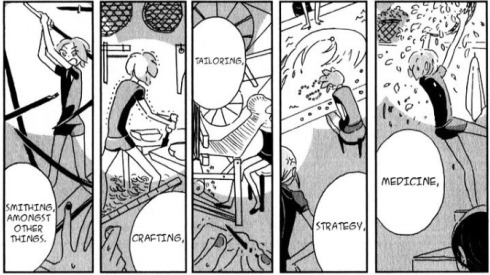
additionally, an economic system also has:
Methods of control over the means of production: the gems do not seem to know private property and, except for sensei’s leadership, there is no actual state. we can assume all goods are held in common
A decision-making system and coordination mechanisms: these are not economically specific in the gems’ case. sensei decides who does what and, after that, the laborers plan and decide over their craft (ie peridot decides who can and cannot have spare paper), always supervised by Sensei and/or Euclase (or Jade)
An incentive system: it’s usually moral persuasion (the social prestige that comes from being a fighter, praise from sensei for a job well done etc.)
Actors (all of the gems since they all produce goods and services) and regulators (the single gems responsible for a task, authority figures like sensei, Euc/Jade)
A distribution system: hard to tell cause the gems do not use money, there is no form of income for their work and no taxes because there is no state.
A mechanism for establishing rules, norms and standards: once again, this is left to the single gems and to Sensei, sometimes to Euc and Jade because they are authority figures

Economic systems are classified according to the property of the means of production and by the main mechanisms of resource allocation.
since the gems do not have a concept of private property and goods are usually held in common, the means are socially owned. so capitalism et similia are a huge no-no.
i tried looking at economic systems with socially-owned property according to resource allocation, but the fact that the gems do not produce food and do not possess a state (they’re only 28!) complicates the picture.
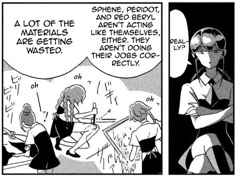
is theirs an economy of subsistence? they have no money, no trade, lack of surplus, they have bronze-age technology, there’s a huge pressure not to waste resources and energies.
but how do you define what counts as subsistence when you have a society that’s made up of 28 individuals and one leader, doesnt produce or need food and doesnt have other societies to interact with and create a market? these rocks dont produce just the bare essentials they need to live because, well, they’re barely alive. they feed on daylight.
still, you could argue that the lunarians showed the moon gems new and cooler ways to feed on daylight, as if the earth gems were barely scratching the surface of what they could be able to do, produce and consume with better technology or by trading with other cultures. as a result, the moon gems adapted themselves to a new (capitalistic) economic system.
a lot of elements fit and you could make a case that it’s an economy of subsistence, but since i’m pedantic, i’m gonna go over a few other systems just in case.
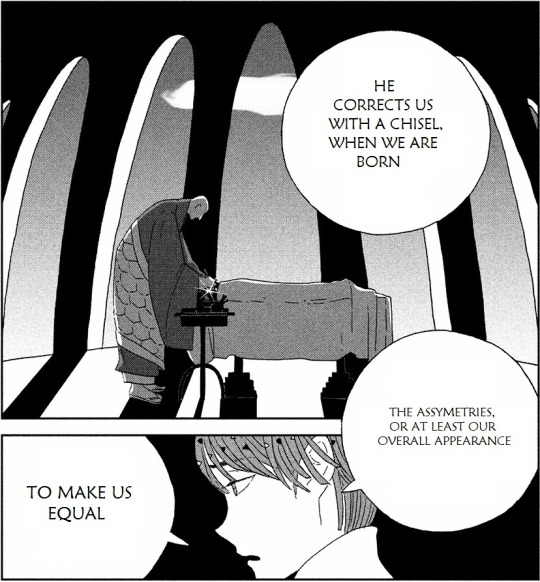
for example, an economy of subsistence doesnt really do justice to how much these gems are culturally and socially expected to conform and be all the same. communism and socialism on the other hand are, at least in theory, built on the utopia of equality.
goods belong to the working class, everyone works toward the same goal (ie fighting the lunarians), all people are equal, which results in a few issues about (among other things) individuality, independence and self-fulfillment.
yet both systems contemplate the existence of money and private property (especially socialism). also, socialism and communism seek to abolish social classes, while gem society has them (ie the fighters and the diamonds are elite classes).
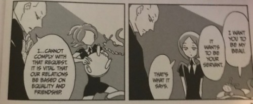
since they lack a proper state, money and a market, it seems to me that the gems’ socioeconomic system can also be compared to a participatory economy or some form of anarchist economy, like anarcho-communism or inclusive democracy.
here’s a brief overview, i did my best to sum it up but if i made some mistakes dont hesitate to tell me:
participatory economy: people come together for all decisions, they determine which goods to produce and which goods go to whom. it’s like self-management but your say in a certain matter is proportionate to how affected you’ll be by the decision. focus is on transparency and little hierarchy to encourage cooperation.
anarcho-communism: no state and no private property, money is abolished, guiding principle is “From each according to his ability, to each according to his needs.” Goods are used, not owned, and each person works whatever job they find most fulfilling (which is similar to how Sensei assigns gems a job according to their temperament)
inclusive democracy: this i included cause it can only be actualized in a small, self-sufficient community, like that of the gems. once again, no state, no money, no market, so no privileges and no accumulation of wealth. however there is a form of currency, labour vouchers, and it gets complicated. The idea of micro, self-sufficient community (domos) is v close to how the lustrous work tho, especially when private and public life kind of become the same thing.

it seems to me that the gems’ system is a mixture of a bunch of different systems. it looks like subsistence economy (social classes, lack of surplus, primitive tech) with a hint of socialism and communism (sameness, no property etc) and the stress on equality and lack of structure that comes with anarchism.
one major thing is that, even if there is no currency, personal value is still assigned (or at least perceived) according to how much you can contribute to society through work.
to wrap this all up: is it legit to speak of economic systems when the gems dont have private property, currency, food, or a market? ehhhh. they still produce and use stuff so why not. still, classifying their system is pretty tricky. let me know what you think and how many things i got wrong
#houseki no kuni#land of the lustrous#hnk#meta#hello welcome to economics 101#aka i should have taken micro and macro ecs when i had a chance now i look like a fool
102 notes
·
View notes
Photo


READ EVERYTHING BEFORE COMMISSIONING ME PLEASE!!! It will help move things along, and wont cause a misunderstanding later.
When you send a message to commission me, you will receive one of these letters first, depending on what you'd like to commission me for:
Regular art or YCH:
"Hi, I am very glad you want to commission me. But before you do, if you do commission me, you are agreeing to my rules of not being allowed to repost the art you have commissioned me for, nor the previews you receive of the art progress on your profile, nor any other website. You can put it in your favorites, and if you wish it to be on another website that I have an account on, let me know and I can post it there myself. Do you accept these terms?"
Icon, Header, Blog Doll:
"Hi, I am very glad you want to commission me. But before you do, if you do commission me, you are agreeing to my rules of being allowed to repost the Icon/Header/Blog Doll, but ONLY with visible credit somewhere people can see it. Do you accept these terms?"
Please know, this is not meant to be rude or hurtful, this is just for safety reasons. Just because you have paid for the art, and it's your character(s), does not mean you have the rights to repost it. These are my rules, and if you can not respect/accept that, please do not commission me.
You want the art you commissioned me for on another website?
These are the websites I have accounts on:
• Tumblr: lottafandoms
• Twitter: lottafandoms
• Instagram: kawaii5eva
• Furaffinity: kawaii4eva
• Pillowfort: lottafandoms
• Weasyl: lottafandoms
♥BUY ME A KO-FI?♥
COMMISSION QUEUE
!!FOR PEOPLE WHO COULDN'T READ THE TEXT IN THE IMAGES CLICK THE READ MORE!!
Terms of Service:
Please note that when you're commissioning me, you are agreeing to the statements below. If any are violated, I WILL come after you, and you will no longer be allowed to commission me.
When commissioning me for regular art, you are paying to see something be made, you are NOT paying to use it in any possible way. You're NOT allowed to repost it ANYWHERE. If there's a website you'd like the art to be on, check my social media to see if I have an account there, if I do- ask kindly and I'll post it there for you. If I don't, then oh well.
As for art related to icons, blog dolls, n' such. You're only allowed to use them for their intended use, and there must be visible with proper credit to me somewhere while using it.
As for art related to NSFW, yes, I draw it. But ask me about the fetish first, to make sure if I will draw it or not. Any NSFW of characters MUST BE 18+ YEARS OLD. I draw Anthros, Feral, Human, MLP, OC's, and so on. Any gender, and only slight gore. What I won't do, are Politics, Nazis, Anything Racist, Sexist, Homophobic or Transphobic, no very detailed characters or BG's. And no Smoking,Vaping, or any kind of drugs. Thank you.
RULES:
• I accept USD with PayPal.
• All payments will be made though an invoice or Ko-Fi.
• You will be given 3 days to reply after wanting a commission, and 3 days to
pay for the commission.
• If you're interested in a commission from me, write me a private message/note.
• Tell me which kind of commission you would like, and provide me with a picture of reference for the character(s) along with details on things such as the expression.
• Once the price, and details of your requested commission is settled, I'll ask for your PayPal E-Mail Address, in order to send you a PayPal Invoice. Once you receive it, you can easily pay for it in your mail inbox.
• When I receive the Payment, I will start with the commission. I'll provide you with previews of the commission, such as: (Sketch - Lined Flat Colors - Full Shade), depending on the commission type.
• I will notify you if something comes up, meaning- there might be a delay on your commission. Please understand I have other things in my life to deal with, and so does everyone else. I will always try to complete your commission as soon as possible, and I thank you for you patience.
• YOU ARE NOT ALLOWED TO REPOST THE ART YOU'VE COMMISSIONED ME FOR. The characters may be yours, and you paid for it, but the art is mine. Please understand, I've dealt with too much art theft to let people repost my art anywhere. The only things I WILL allow though are: Icons, Corner Blog dolls, and Headers. All I request for those are visible credit somewhere on your page of the website you use it on.
COMMISSION PRICES AND LABELS
1 Ko-Fi = 3$ USD
HEAD SHOTS:
• Sketch: 1 Ko-fi
• Sketch+Line Art: 2 Ko-fi
• Sketch+Line Art+Flat Color: 3 Ko-fi
• +1 More Character: 1 Ko-fi
(Please know that if
you want a head shot,
inform and talk to me
first before sending the
money through Ko-Fi.)
BUST:
• Sketch – 11$
• Lineart - 16$
• Line+Flat colors - 24$
• Line+Flat color+Shading/Lighting - 27$
• +1 more character – 4$
TORSO:
• Sketch - 16$
• Lineart - 24$
• Line+Flat colors - 30$
• Line+Flat color+Shading/Lighting - 37$
• +1 more character – 6$
FULL BODY:
• Sketch - 23$
• Lineart - 29$
• Line+Flat colors - 39$
• Line+Flat color+Shading/Lighting - 44$
• +1 more character – 9$
CHIBI:
• Sketch - 15$
• Lineart - 19$
• Line+Flat colors - 26$
• Line+Flat color+Shading/Lighting - 31$
• +1 more character – 6$
ICONS:
You will get 2 sizes: 400x400 and 100x100
• Line+Flat colors+Simple BG - 11$
• Line+Flat color+Cel shading+Simple BG - 15$
• +1 more character – 3$
WITH BACKGROUNDS:
• Sketched - 21$
• Colored+Sketched - 36$
• Colored+Sketched+Shading/Lighting - 41$
• Lineart+Colored - 46$
• Line+Flat color+Shading/Lighting - 56$
• Simple BG – 3$
• Transparent,Plain White, or just one solid color - FREE
I'd like to state that I can't really do backgrounds too well, but it's up to you if you really want one.
52 notes
·
View notes
Text
Costello Albums: Refining Research (Better Quotes!)
Intro (500 wds)
What is Post-Punk?
Reynolds (2005): a merging of “working-class kids and arty, middle-class bohemians” – no longer a divide. Brought about after Punk was absorbed into mainstream culture (“became a parody of itself”)
Sommer (2016): “The Post-Punk era was a time when a new generation of bands informed by punk actually lived up to the potential for creativity and artistic intimacy “promised” by punk.”
What classes something as “Punk”? (critics opinions)
Rombes (2009): a feeling of disconnection from wider society. (A desire to “shake things up”?)
Sabin (1999): “’punk’ is a notoriously amorphous concept…a subculture best characterised as being part youth rebellion part artistic statement… It had its primary manifestation in music… Philosophically, it has no ‘set agenda’ like the hippy movement that preceded it, but nevertheless stood for identifiable attitudes, among them: an emphasis on negationism (rather that nihilism); a consciousness of class-based politics (with a stress on ‘working class credibility’); and a belief in spontaneity and ‘doing it yourself’.”
Does Costello fit this description? (arguments for/against)
Gorman (2008): Stiff Records – formed “at the heart of punk and new wave scene” (Mahamdallie, 2016) – wanted to portray Costello as a “twisted outsider” to reflect the angry nature of his music. (Riviera: “Buddy Holly on acid.”)
Mahamdallie (2016): Lowe: “as hardcore as the punks, but in different ways”.
LeMay (2002): Costello could write “political” and “personal” songs with “wit and talent”.
Borack (2014): “Elvis Costello has made a career out of refusing to be pigeonholed and also constantly reinventing himself. From angry, young, new waver to country crooner, R&B shouter to sophisticated singer-songwriter – to name just a few stops on his musical journey – Costello’s body of work is nothing, if not diverse.”
Smith (2007): “For an era obsessed with authenticity, Elvis Costello was about as fabricated as they came. A made-up name…and those Clark Kent glasses, he always looked like a ringer in rock’s perpetual race to find the real deal.”
McCombe (2009): “Although Costello is often mistakenly discussed in the context of the punk movement, he had very few affinities with it, outside of a sensibility shaped by Britain’s dire economic fortunes in the 1970s.”
Bresnick (2001): “Like his fellow Englishmen the Sex Pistols and the Damned, Elvis Costello was very good at the bravado gesture early in his career. Yet underneath his punky pose lurked a staggeringly gifted songwriter who had made it his business to devour the history of American popular music, from Hoagy Carmichael to Burt Bacharach, from Hank Williams to Gram Parsons, from Louis Jordan to Smokey Robinson.”
Brief Costello background
This essay will discuss the impact of Punk on Costello’s first 2 albums, both the artwork and music
My Aim Is True (graphics) (750 wds)
Brief bg (artist, date released)
Inspiration – a reflection of Punk graphics? (critics’ opinions)
Gorman (2008): Bubbles loved Elvis Presley – inspired Costello’s pose. In response to Stiff’s desire to show Costello as a “twisted outsider”, created a “visually confusing” (Lynam, 2015) cover. This also done because: Riviera: “We wanted to appeal to the hip people, the pacemakers, those who wanted something different. Our credo was that people are more intelligent than politicians or big business gives them credit for.”
Gorman (2008): Riviera: “The brief to Barney was that we conveyed the minimum of information. No credits, just the song titles. We wanted to intrigue people, get them asking, “Where’s this guy from?””
Message conveyed through text/image – a reflection of Punk ideology/style? (critics’ opinions)
Willman (2007): “Yet Elvis Costello’s dweeby My Aim Is True stance portended menace, too, as if the 22-year-old dead ringer for Buddy Holly might just bite your head off while he’s buckling.”
O’Grady (2001): “Geek rock has always been a money-spinner. Ever since Elvis Costello appeared on the cover of My Aim Is True wearing the largest pair of horn-rimmed glasses the world had ever witnessed, the punk nerds of the world have taken on a demographic identity of their own.”
Walters (2008): “stylistically quite different”
The Stiff Records Story (2016): “A picture of awkwardness…Costello was a geek years before it was chic. A vibrant yellow screen was placed over him for the initial run of 10, 000, ensuring it would stand out in the racks and window displays of record shops. Then, when the album begun to catch fire, Stiff made a discovery that would result in a collector’s dream. Riviera had gone with Bubbles to oversee the first run and found out that using different coloured inks wouldn’t cost more. He then demanded that every run of 5, 000 copies be printed in a different colour.”
Not cool: “Costello has his Fender Jazzmaster…strapped way too high on his chest, a thrift-store jacket two sizes too small, oversized Buddy Holly specs, and a contortion of his legs that interviewer Terry Gross describes as a “knock-kneed duck-walk”. In a 1989 interview…Costello admits that the album artwork was connected to his overall project of a new masculine idiom.”
Analysis – Punk or not?
My Aim Is True (music) (750 wds)
Is a Punk attitude visible – lyrics, topics discussed, musical inspiration? (critics’ opinions)
LeMay (2002): “Perpetually wronged and rarely laid men were capable of being intelligent about their bitterness, focusing their anger not on the whole of womankind, but on particular woman…and attacking these women with a potent blend of wit and bile. Rather than self-aggrandisement, self-deprecation reigned supreme. More importantly, subtlety won out over blatant self-pity or obnoxiousness. Yeah, the gentlemen were angry, but they were smart enough to know what they were angry at – and geeky enough to include themselves in that category.”
“Costello exploded onto the punk/new-wave scene like a mutant hybrid of Buddy Holly and Johnny Rotten. He had the seething contempt of a punk, but a transparent intelligence, sensitivity, and melodic sense that made him much more interesting than many of his contemporaries. Punks didn’t give a fuck; Elvis was sensitive enough to not only give a fuck, but smart enough to be pissed off and disturbed by that fuck.”
McCombe (2009): Costello: “The only two things that matter to me, the only motivation points for me writing these songs…are revenge and guilt. Those are the only emotions I know about, that I know I can feel. Love? I dunno what it means, really, and it doesn’t exist in my songs. (qtd. In Kent, “Horn-Rims” 190, 1977)
“Rejecting the dominant pose of “cock-rock”, as well as that od=f the “soft male” (articulated in the more psychedelic stylings of bands such as Pink Floyd), Costello offered a new image of masculinity that has been much misunderstood since he first emerged in the wave of Queen Elizabeth’s Silver Jubilee and punk (1976-1977).” *
*also rejected “the aggressive and assertive “warrior” male found in many hard rock and punk songs, with its “violence aimed at a suffocating (s)mothering culture” (Reynolds and Press 40).”
“Ever since Costello was labelled an “avenging dork” by Frank Rose in a 1979 Village Voice article, critics have been quick to view Costello’s representation of masculinity in the terms he himself outlined: his songs espouse some guilt, but far more revenge as a result of his “betrayal” at the hands of various femme fatales.”
“Costello identifies an aesthetic that is truly “punk” in spirit, if not in its musical presentation” in “I’m Not Angry” and “Miracle Man” – C: “admitting absolute defeat – taking all this sexual abuse, say” “without” the need for “self-pity” or “coming on all macho with the whole revenge bit”.
Whole album: “there is no mask to conceal pain”.
Marcus: Not a misogynist? - “as much his own target as anyone else was.”
“As Reynolds and Press suggest very early in The Sex Revolts, “Rock’s great paradox is that it has successfully revolted against established notions of manliness while remaining misogynistic” (18). Such a criticism has been levelled at many iconic artists of the punk movement (The Clash, The Sex Pistols, etc.), and Elvis Costello is no exception. But is such a simple description deserved in Costello’s case?”
Analysis – Punk or not?
Conclusion of entire album
This Year’s Model (graphics) (750 wds)
Brief bg (artist, date released)
Inspiration – a reflection of Punk graphics? (critics’ opinions)
Gorman (2008): Abstract? The back cover, of which there are several alternatives (Jsayers, 2015), and also shot by Gabrin, have the band reacting to an “ectoplasmic incident” in a nicely-kept living room.
Commercially-themed, up-to-date (a reflection of the title)? The inner sleeves show two “abstract interpretations” of the title: one features a mechanical hand holding an up-to-date “micro-TV”; the other shows four clothing shop chests wearing garments in different colours.
Desire to confound the audience? In terms of shock and confusion, This Year’s Model has a very defiant “Punk” attitude – as with My Aim Is True, this is visible in the advertising campaign and cover design. According to Riviera, he refused to let Radar’s supplier Warner Music change any aspect of the record’s design; he wanted:
“to make them wary of us. We didn’t want them dictating whether we couldn’t use metallic inks or what-have-you, so we were out to show them we meant business”
In response, Bubbles came up with “one of his finest commercial interventions”, which also highlights the manufacturing procedure – the front cover deliberately crops the album title and reveals the CMYK colour bar. Confoundment was certainly created overseas – the American record company who stocked the album believed the printing “error” was real, and corrected it (Morgan and Wardle, 2010).
Snap Galleries (2019): To fit with the title, Bubbles said Costello “should be behind the camera rather than in front”. Gabrin has remarked that Costello wanted to look angry in the photograph – to achieve this, he listened to “Hotel California” by The Eagles, a song he allegedly hated. He also mimicked Gabrin’s actions throughout the shoot.
Message conveyed through text/image – a reflection of Punk ideology/style? (critics’ opinions)
McCombe (2009): Costello relates to the opposite sex? Feels objectified by mainstream culture/the music industry? “Costello is the woman objectified – he is “this year’s girl”. Of course, “This Year’s Girl” would be an awkward title for a record that bears Costello’s own image on the cover, so “girl” becomes “model”, but the album artwork nevertheless confirms the connection between the singer and the model before the camera.”
“In the words of Graeme Thomson, Costello is “both observed and observing” - both gazing behind the camera and the subject of the camera’s gaze (92).”
“Perhaps it occurred to Costello as he was writing songs for Model that his “anti-style” adopted on the album jacket of My Aim is True was nevertheless its own distinct style. It may be true that his polka-dot shirt on the cover of Model is a bit more “rock star” than what we see in the images on his debut...but we also clearly see a wedding band on his left hand, and there is still the matter of the “computer geek” prescription eyewear (Thomson 73). Although the glasses provided many a commentator with the opportunity to connect Costello to a certain memmber of the rock ‘n’ roll royalty...as Franklin Bruno writes, the specs “were more socialized medicine than Buddy Holly to English audiences” (13).”
“By choosing This Year’s Model as his title, Costello reinforced the record’s overwhelming fascination with beauty, image, and objectification.”
Analysis – Punk or not?
Morgan and Wardle (2010): “Punk-era designer Barney Bubbles...was an ex-hippy, very much like the era’s other big stylist, Jamie Reid. Yet his designs are very much contrary to the brash, bold aesthetic of the day – he was into subtlety and wit.”
N.A. (2009): “(Barney Bubbles’) fans consider his design work to be Pop Art anyway: “Taking from contemporary visual culture – he did that all the time. It wasn’t stealing, he was moving things forward,” says Garrett.”
This Year’s Model (music) (750 wds)
Is a Punk attitude visible – lyrics, topics discussed, musical inspiration? (critics’ opinions)
Gordinier (2002): Rap? “You don’t tend to think of Elvis Costello as a rap pioneer (especially where he’s schmoozing with string quartets and Burt Bacharach), but listen to the wordplay on the reissue of this 1978 classic. With all those corkscrew rhymes and spitfire verbal grenades, he could be Eminem’s long-lost uncle.”
Sheffield (2008): “The pain in these songs is as clearly visible as the wedding ring Costello wears on the album cover...these are are the plaints of a kid who fell too hard too fast, who took romantic promises way too seriously and believed more fiercely as he kept getting burned. The music is surprisingly lush and pretty... Yet it’s all punk rage, thanks to Pete Thomas’ drums and Steve Nieve’s cranky organ.”
McCombe (2009): Mankind “disappearing under late capitalism”? - “Lipstick Vogue”.
“the speakers in Costello’s songs are obsessed with betrayl and infidelity in personal relationships and how, in Thurschwell’s words, “our personal relationships are invaded by, indeed inextricable from, institutions of power” (290).”
Costello relates to the opposite sex? Feels objectified by mainstream culture/the music industry? “When Thurschwell contends that Costello desires “to objectify women before they objectify [him],” she misses the crucial ways in which Costello’s speakers also identify with these beautiful and treacherous women, in the sense that he has already been objectified as the music’s “next big thing”.”
Rejection of the music industry? Costello (NME, Kent, 1978): “People in this fuckin’ business just don’t understand that I don’t want to join their little club... From the very beginning there was never any air-brush stuff.”
A “possession” of the music industry/the audience? - “You Belong to Me”.
Analysis – Punk or not?
Bray (2018): “While it’s difficult to call the record “punk” in the classic sense, it’s undeniably informed by the genre’s angry, rebellious spirit.”
Conclusion of entire album
Conc (500 wds)
Does Costello fulfil the role of a Post-Punk artist?
Does artwork for Costello’s albums reflect Punk graphics?
Does Costello’s music reflect Punk ideology?
Effective summing-up sentence
0 notes