#was going for a linocut style and i think it really worked!!
Explore tagged Tumblr posts
Text
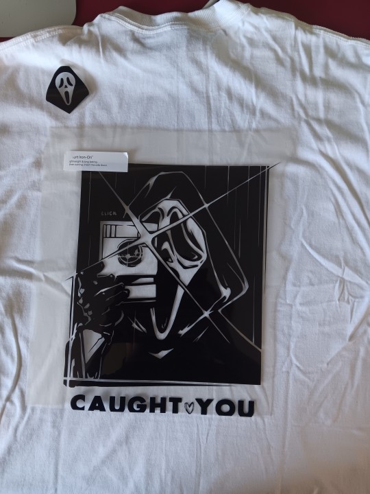
IM SO PROUD OF THIS!! IVE MADE MISTAKES!! IM TAKING IT AS A LEARNING OPPORTUNITY!! AND WHEN I PERFECT THIS ITS GONNA FUCK SO HARD!!!
#the idea is that its on the back of the shirt. so if someone looking at you whild your walking away 'caught <3 you'is what theyll see#the little ghosty guy will go on the front left chest#im so excited. even if these shirts dont sell at the con im going to ill still love them#my art#wip#ghostface#scream#was going for a linocut style and i think it really worked!!
28 notes
·
View notes
Text
waterborne poetry reactions (belated) (long post)
XINGQIU GOT FUCKING SMASHED IN THIS EVENT. BULLYING XINGQIU HOURS I LOVE TO SEE IT (affectionate)
bro got roasted for his handwriting, is Baffled by the mondstadters, then spends an entire day missing out on [whatever that was] and STILL DOESNT HAVE A CLUE WHAT HAPPENED HAHAHA im sorry i love bullying him
please never tell xingqiu whats going on it's payback <3
CHONGYUN DIONA AND MIKA. i need to hold them omg,,,, i was using freminet to wander around so in my heart they r just 4 cryo kids in a terrarium what will they do!! that combo was quite cute
CHONGYUN YANG MODE?!?!?!?!?! ON SCREEN??????? WAAAAHHHHHHHHH
he was adorable ;;;;;___;;;;; his little eye sparkles and the jumping T_T also the near-rap speed that his lines were delivered in was hilarious (thank you kinsen for ur service)
my son.... please never feed him chilis again
CHONGYUN IMPACT. that's all
now full of unfounded hope that chongyun will someday get an event about his pure yang spirit since they mentioned it a fair few times here
give him the deep lore he deserves
also XIAOYUN?!?!?!?! (only seeing what i want to see) THEY TALKED!!!! IN PERSON ON SCREEN THEY TALKED AND XIAO WASNT DISPARAGING!!!! im sorry this is what a rarepair with no food does to a mf
xiaolumi so strong (or xiaother if u prefer)
oughguhguhg the rhyming couplets part was SOOOO CUTE!! idk they did good with the pacing of the banter i think 🥺
adding onto that the camera angles and cuts this event were actually really nice and creative i think. they made it more engaging (the quick pan from chongyun to xingqiu at the end of the 3rd act, hu tao popping out from behind venti's shoulders during the couplet exchange, etc) it was REALLY good really funny. added to the experience a lot <3
Also venti zhongli are truly the most archon old friends ever
that cutscene was actually so pretty. It's drawn in the same style as Lyney's: very textured lines, slightly reminscent of linocuts, quite a few handdrawn parts, especially where there's water/liquid movement present, etc. Maybe this is a Fontaine style animated cutscene, since the oceanids and lyney are both from there? anyways. i'm intrigued—I wanna see if there are regional cutscene styles or something (that'd be very impressive)
the "close ur eyes paimon/diona" line was so fucking funny. traveler's been the third wheel a bunch of times but never this explicitly
also ! for people icked out by the morality of kid finch's crush on the oceanid: it is Fiction with a capital F
on the one hand I agree with the above sentiment, but it's also just funny to think about. first canon monsterfucker ? /JJJJJJJJJJJJJ don't kill me for that joke
Real thoughts: I think it was actually really sweet how he fell in love with a fairytale. Someone said the oceanid could've been aromantic coded to make their love story more morally palatable; I agree, it would've been cool if she was aro, but I don't think their romantic relationship is like somehow terrible and gross either
overall ending was really mid tbh, I appreciate the character growth of everyone who was on screen but literally all the other characters just disappeared. It was really unsatisfying lol especially for an event that was supposed to be hte gathering/unison of mond and liyue
would've been better if the second day's rhyming couplets ended the event I think; you'd have to tweak it to fit the mood of the oceanid/finch reveal but literally anything works, the ending was so anticlimactic
overall event: 10/10 for giving me the character interactions I wanted, and those that I never knew I needed, 5/10 because the minigames are. not the best, I get the intentions but the execution could've been better. And then 5/10 for story arc (heavily influenced by how mid the ending was LMAO)
I want to go through all the poems and their english translations because I Know somethings gonna get screwed up and I'm also just curious as to how they translated it
#oh also. chongyun diona something i never knew i needed#very disappointed that hu tao disappeared though!! like come on even how they wrote her out was so lazy#same can be said for xq and noelle though like thats foul 'oh theyre just busy' LIKE ???? WHY WERENT THEY BUSY YESTERDAY#ramblings!#liveblog insanity#waterborne poetry#4.1 spoilers#genshin spoilers#event spoilers#waterborne poetry spoilers#genshin impact#xiaoyun
45 notes
·
View notes
Text
Over the last 6 weeks I have been working on a book for a LARP here in the UK, the holy book of one factions god of the hunt, Kubeth. Leant into a woodcut style that I think came out well. The title page came in mostly to make a nice symetry in the binding, bringing the total to 36 pages, also made the font and a lil moose for a makers mark.

The writing was done by the player of Ardentia, she wanted something simple and rustic, Kubeth is one of the most feral gods of a faction with a lot of gods that lean towards people and civilisation. I wanted a nice rough look to the images, looking at actual woodcuts is impressive, I honetly feel like my facimilie is a bit of a disservice to how wonderful they can be. I have two @3eyedog linocut prints above my desk and I'd often look at them for inspiration on texture and technique.


The hare here is the second image I did and when i really felt confidence that the style would work, angular, defined prints with some soft watercolours is just nice, and quite striking. the occasional bits of ink running throughout. The pup in spoils was a lot of fun, and while the subject is grim I don't think the gore of it is initially striking, with the indistinct shape of the kill in the background, a little "it gets worse the longer you look".


The "Eyes of the Hunted" 'chapter' was the first section I fully finished, the "To Survive" and "Too Slow" are majority black ink, I wanted the hunted to feel a bit opressed, minimal colour. "Too Slow" was the style test concept image, to make sure the writer was happy, it turned out a bit more stylised than the rest of the book imo. "Defend yourself" is one of my favourite pages, the page turn for it is great. After the darker pages it is quite barren, with a little running ink. There isn't much triumph to the page, for the hunted the victory is only temporary. Finally the "Prey Medley" (and therefore all of the medleys) are very inspired by @mothsprout, I was constantly looking in their blog for vibes, and when I saw "Canis Lupus + Flora" I knew that this was how I'd want to end each chapter to end.


Probably my favourite section, every one of this images fights for my favourite, the bear intentionally pushes up on all the margins for the power, the swooping eagle for the speed, the utterly desolate hungry wolf, it's also where the colour pallet shined, I used a pallete someone kindly put on the CSP asset store featuring historical pigments so i could stick with a little fantasy, even the black ink is "bone charcoal ink" rather than just pure digital black. The "Hunters" medley took a couple goes, the first one was mostly neutral, writer wanted snarls, I had put a wolf head on in the center, then again Moth Sprout as an inspiration with the swooping owl, looks so much better. There's more than a few hidden layers of different animals on that file.


Ok cutest image in the book, writer insisted that not all this section would be human, and i struggled to think, until she suggested just a cuddle relaxed pile of wolves which I felt like, of course, I had been wanting to make some hunters not on the hunt. This whole section was very guided by her, and I feel that it comes off well. The "Gifts Medley" is my least favourite, I think it was the one place where I found the style to lack, I also had issue coming up with enough items to feel I'd fleshed out the medley, and then also depicting them in such a style, I think the message is conveyed, but at the cost of some of my self imposed style rules.

And here we go, the final image, I like this one, the final medley as a probably the most colourful page. This was a really fun project, different from OCTs I had a more intricate brief with a longer time frame, so I took my time, grabbed refs overall I'm happy with the project. Though I do now have a goal of trying to do some linocut prints of some of the pages.

Ardentia did the bookbinding, and a pretty good job of it too!
My greatest regret? I didn't take any good photos of the finished product, I did a rambly video but it was finished day of the event it was due for, and has now left my hands and is loose in the system. Below are the links to the CSP pen, watercolour brush, and historical pallete I used to complete this.
#art#self reflection#retrospective#illustration#long post#very long post#for real noone cares this is too long
9 notes
·
View notes
Note
Hey, I just found your work-- awesome stuff. I'm a linocut printmaker and a big fan of Transformers, but I've never paired the two and you bring such a cool style to the franchise.
Your Megatron etching-- how did you add the color? Is that a monotype underneath, of painted afterward, maybe?
Hi and thanks!
Underneath is an intaglio printing and colors is watercolor.
I wanted to use linocut for coloring becouse I thought lynolium should be cheaper then metal (which was a wrong thinking, copper at least really does not cost more then good lynolium or rubber, plus could be two sided but I'm moving, and I'm not sure how it's going to be in the future) and I didn't know how to do aquatint for that before. Back than I even thought to buy small metal melting furnace for easily fusible metals to cheaper all of that but metals have different alloys, i'm not really dig into that and manufacturers rarely write what kind of alloy metal has, and that's all affects the final result.
Plus, I live in a flat and going to live in a flat.
In a short may be not in this life :").
Besides letterpress printing has different texture then etching does, there needs to be very careful thinking in composition and a lot of experience in both to bind the two properly.
But watercolor looks good with etching I guess markers would look great with linocut, I'm not sure what a community of local traditionalists will say, watercolor in etching is a classic markers is not, lol, though I've seen these grandpas only from afar.
Sorry for adding this reply, I just thought it won't be superfluous if I answer: YEEEES.
It's always fun to experiment even on the stage of covering the paint and erasing it, the result always differ in a way that only printmaking does and that's cool.

38 notes
·
View notes
Text
Going to the art market this weekend was genuinely such a major inspiration for my art block
Everyone there had such a unique art style and sold a combination of not just original and fan art, but had a huge variety of media such as regular prints, riso prints, linocut prints, hooographic trading cards, handmade ceramics, papier mache sculptures, then a lot of typical merch like stickers and charms and phone case stuff
My only exposure to art markets for the longest time was comic con artist alley and although I have found some fun art there, it’s not inspirational to me and a lot of the art feels more like it’s designed for what’s popular (versus the unique art that was designed for the artist first like I saw over the weekend)
It restored a lot of my faith in fanart, especially knowing that there is a huge demand for original art that I haven’t seen online or at comic con. I think what I really just need to focus on is finding my artistic voice, which is already hard enough. I just need to also let my interests guide me to the art I want to make, I’m not really interested in making things like ship art and selling that… but what I am really interested in is exploring the horror elements of media im interested in. Also aliens.
Getting into things like dandadan and dorohedoro around the time of my major art block has been a huge relief, they’ve been fueling my passion both art/style wise and story wise.
How much art I post online will still be pretty limited, most fanart I do nowadays are for zines (other than the odd study or two like my fashion studies using Zelda as a model). I’ll be taking art classes but I want to not make any fanart in those classes and work on my own creativity.
So the art online won’t be as frequent, but at least for fanart my art will be much more refined pieces just from the nature of participating in zines. It’s also nice to type this out for myself to breakdown how this market made me feel, I can’t wait for classes to begin so I can bother my professors every week with a million questions lol
5 notes
·
View notes
Note
I really like your comic. Out of curiosity, what are your art inspirations?
that's a really good question with a slightly difficult answer because i tend to absorb bits and pieces of any media i like into my art style lol
(this got a little long, so answer under the cut)
if i go far back enough, i think my first real taste of comics as a medium was Cassandra Jean's graphic novel adaptations of Miss Peregrine
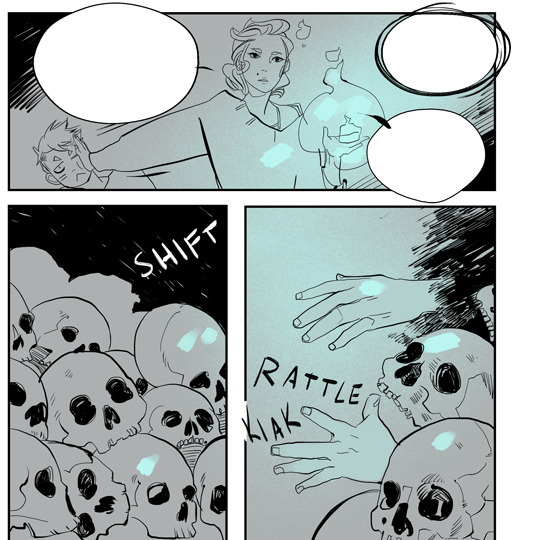

(images copied from her announcement of the second book)
looking back on it now, the overall style is loose and sketchy, but still readable (which are not necessarily words i'd use for my own style lmao) but there's the use of value and solid black that i still strive for. the style is also very manga-esque, but i definitely picked up a few things on drawing faces and action from these books
(her more recent style is a lot cleaner and a lot more graphically complex, but there's still an emphasis on interesting, readable shapes)
there's also Peter Nevins, who did the original cover for the Hadestown concept album (and the cover for the NYTW recording? correct me if i'm wrong). he also did a few covers for Anaïs Mitchell's other works
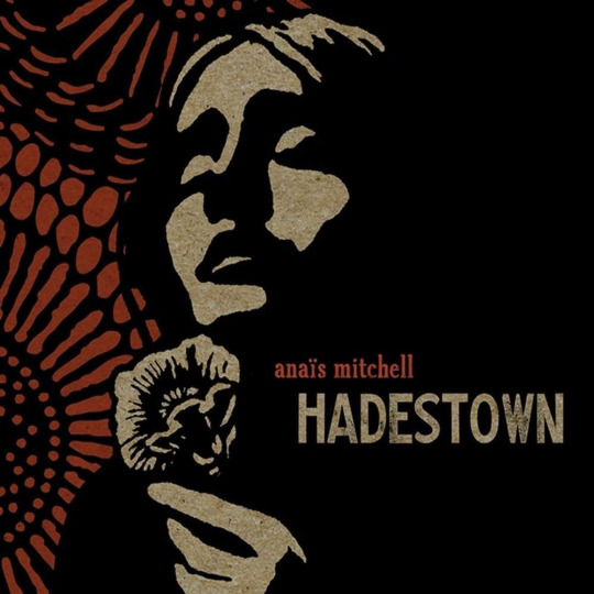
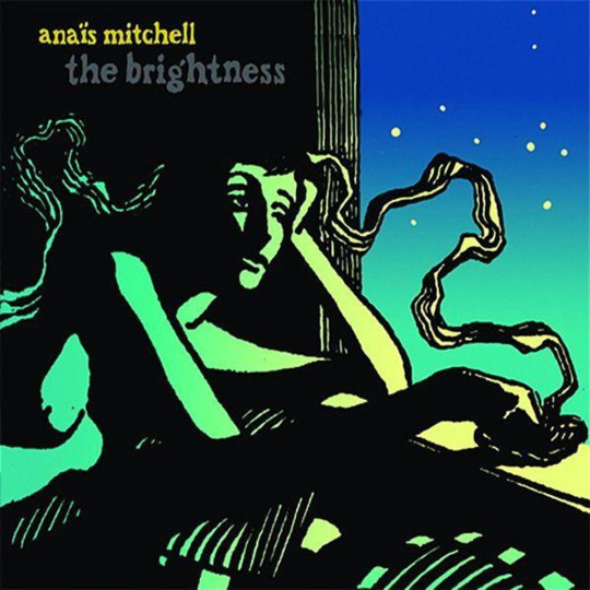
(i actually drew a piece based on that second cover a few years ago)
he primarily works in linocut prints, which is a medium that kinda forces you to think in terms of value. while i mostly use the stuff he's done for Anaïs Mitchell as an example, i'm also fond of the original work on his shop
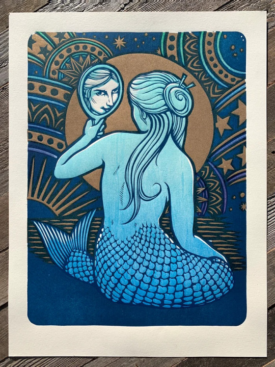
over the years though, Drawfee has probably been the most consistent source of inspiration? it feels a little weird to call them that, especially considering the fact most people know them as a comedy show, but i've been using their speed draw videos as background noise for ages now

i'm really fond of the atmosphere that they've created with their channel, and it's been so fun watching and growing in art skill alongside them (and sometimes having my vocab for the week be utterly destroyed by one of their bits)
there's definitely way more people i could name (CanisAlbus and asmeesh here on tumblr) and a huge pile of webcomic artists (Tracy Butler, Meg Syverud, Sarah Webb, Petra Nordlund—there's so many) but this post is already unreadable so i'll stop there lol
thank you for the ask, and thanks for reading Outsiders :D!!
#piano sounds#searching my mind palace for a good answer to this question lmao#i've taken little bits and pieces from the styles of a lot of artists over the years#(not even mentioning my friends. which. hi. i'm eating your art always <3)#but i always think it's good to learn from artists you look up to#see how their process works and what parts of their style you think work for you#even just to test yourself a little bit and try something new
7 notes
·
View notes
Text
tuesdaypost
marginally less depressed this week
listening: I made a playlist called "indiana mentioned" that is just. songs that mention indiana. found some of them organically, some through genius lyrics. once it's more complete I will post a link.
pale green things - the mountain goats
applesauce - sam.sts
still on relistening to the dear hunter acts.
reading: reread panting like a dog at the edge of your bed by bloodletter now that it's finished, as well as some of their newer works that I'd missed. really really fucking good.
watching: bernadette banner's "using 18th century corsetry to drape a flowy gown"
youtube
playing: I should really retire this section for a bit. I haven't been doing dnd lately because of aforementioned depression but I will be running it again this Saturday.
making: forgot to go to the studio before Thanksgiving week so I won't be able to see any of my kiln output til the weekend :-( I did go back to life drawing yesterday though!

here is the switch dustcover (see mentioned sad playing section lol)…it's fine. kinda boring. might dismantle and do more pieces do it for variation.

also started some holiday card linocut sketches. will be starting that soon.
am continuing to hang up paintings. so close. finally put up The Big One (my favorite, a clown my mom did as a child), I have a few miscellaneous ones that I have to command strip up because parts of my apartment are drywall directly over brick and I am out of command strips so that's in my miscellaneous home goods purchase for the week. I also want to hang the expensive quilt I impulse bought from a temple fundraiser last year but I am still figuring out the logistics of it (I have a curtain rod but the width of it isn't fix-able so if I try to hang it by a rope it scrunches up…)

eating: there was a thanksgiving potluck for my department last week and we got supplied rotisserie chickens! I brought one home to shred and made deli style cranberry chicken salad with the leftover meat and used the bits and bones to make 10 cups of chicken broth !!!!! let that bad boy simmer for like six hours lol, I tossed it in with some frozen veg that I've had waiting for stock purposes (mostly celery and beet/radish greens), as well as some fresh ginger, peppercorns, bay leaves, a whole onion, and some baby carrots! so I'm going to slowly freeze that in one cup cubes (I love my souper cubes…) to have in reserve in my freezer.
I also made my favorite banana bread recipe which I think is originally from here but I have made modifications (cut the sugar in half!!! and I added choccy chips and slivered almonds and shredded coconut, and replaced the oil with half butter half oil, I also didn't do it in a ziplock I find that annoying I just do dishes lol).
the soup pre-straining:

misc: I won a bottle of wine and a pizza gift card at a temple fundraiser via raffle tickets so at least I have that going for me
4 notes
·
View notes
Note
7, 8, 16, and 25 for the art ask meme!
7. A medium of art you dont work in but appreciate
Linocut/Block prints are absolutely gorgeous and I admire people who do it. I've never worked in it but I love the style and I know a lot of patience and effort goes into making them.
8. What's an old project you've lost interest in?
Sooooo many oh man. I won't share all of them tho bc that'll be way long. Just the big one. One that I abandoned was going to be about a group of dragons and other mythical creatures, specifically one young dragon named Maia who was adopted by an older dangerous dragon who used to work as hired muscle for the mafia. He gave it up for Maia and they basically were going to go on an adventure to figure out her past and somehow find a way to unite all the creatures, all the while having to deal with the three main powers that ruled their world: An Girlboss-ish Mob Boss, a Corrupt Emperor, and the Bitter Leader of an army of robots. There was a bunch of characters who help along the way with their own stuff to deal with and yeah.
It was kinda out there and weird but it kept me inspired for a long time and I wanted to lean into the weird and over the top-ness of it. I decided to not go through with it tho. But some elements from it have definitely inspired elements of my current projects that I'm chipping away at.
16. Something you are good at but don't really have fun doing.
As an artist people may be surprised by my answer. Other artists might understand tho but drawing realistic portraits of people or pets. This is often drawn based off a picture. People often ask me to do them IRL and while I appreciate that they like what I can do, it's really not what I enjoy doing. There's people who specialize in and love doing this type of commission. And despite me being p good at them, what I can do will never be as good or have as much love put into it as someone who loves doing it.
25. Something your art has been compared to that you were NOT inspired by
My brain has forgotten some of them but Probably Game of Thrones and... I think Tim Burton once? I once drew a dragon based on the turrets from Portal and someone said it was the Stay Puffed Marshmallow man as a dragon and proceeded to buy a print of it. ¯\_(ツ)_/¯
Also any black dragon is immediately called Toothless and any purple dragons is immediately called Spyro. I love both pieces of media but not all dragons are toothless or Spyro. 😂
2 notes
·
View notes
Text
Visual language - artist research
RACHEL LOUISE HIBBS:

Rachael Louise Hibbs is a relief printmaker who is inspired by the natural world. Her prints depict plants and animals in her own visual language; monochromatic and are full of texture. Rachael: “I use mostly photographs that I have taken at Kew Gardens or on my travels. I try to be as scientifically accurate as I can with botanical elements but within my own style. If I cannot find a first hand reference to study then I might use images from the biodiversity heritage library for inspiration.”

…“My go to will always be black because I just think it looks classic and clean however I love playing with colour. I try to use mostly natural or slightly muted colours to reflect the organic nature of my work.”.

I really love the way Rachel takes inspiration from the natural world and simplifies them to create here own prints. I would like to take inspiration from ere techniques.
0 notes
Note
🌵🎨🦴🦋 !!!!!!
🌵 ⇢ share the link to a playlist you love
I mostly only listen to the playlists spotify throws at me, so I'll bump my own sleepytime playlist (it usually knocks me out a few songs in 💕)
🎨 ⇢ link your favourite piece of fanart and explain why you like it
I'm assuming this is talking about my own, so it'll probably be this one of tesla. i don't normally like looking at my work when i'm done with it, but i still like this one! i'm actually working on turning it into a linocut
🦴 ⇢ is there a piece of media that inspires your writing?
i'm going to just limit this to books that influenced my writing style and uh
the normal answer: anything by shirley jackson but especially haunting of hill house
the unhinged but true answer: there was an mcr fanfic i read when i was 15 and it wormed its way into my brain forever. i don't even know if it's still up anymore.
🦋 ⇢ share something that has been on your heart and mind lately
a lot has been on my heart and mind and i don't really want to talk much about it. i'll just say that i've been thinking a lot about the future and my place in it.
1 note
·
View note
Text
RPP self evaluation
My work
Where has it come from?
During second year, I did painting, printmaking and illustration. At the beginning of the year, I explored a story that I had been working on the previous year. I filled a concertina sketchbook to create a long illustration of that story. The illustration then turned into an animation as I learned that new technique. I also focused on improving my digital drawing and painting skills and produced multiple digital paintings. Even if the painting module isn’t necessarily about telling stories, that is what I was naturally drawn to, which led me to illustration. I really enjoyed this module because I was able to explore narratives through visual media. I also learned new techniques and improved my drawing abilities. Throughout the whole year, I also did printmaking, and I learned a range of new techniques. Screen printing is the one that really impacted the way my work looked because it forced me to use a lot of colours. I also discovered wood engraving and lead type. I would like to keep exploring those techniques as well as linocuts. Some of my favourite work from last year was mixed media, which is something I would like to incorporate in this year’s projects as well.
I developed a particular colour palette that I used in my prints and that I am still using in current projects. I think that colour scheme is one of my strength as it creates an artistic identity that I can carry from one project to another.
Through those different methods, I have started developing a style. I know I enjoy a mix of expressive and delicate lines as well as bright colours. While I aim to respect things like perspective and light and shadows, I do not try to depict realistic scenes. I also like to mix tones, as in showing serious subject like coal mines in a naïve manner.
Some of my life drawings have an intimate feeling to them which I am proud of. I enjoy picking details from my personal life to include them in my artworks. I think this gives a narrative aspect to my work that is very important to me. Whether it be a study outside or an original drawing, I put a lot if importance in storytelling and letting the viewer think that there might be more to the drawing than meets the eye.
I am influenced by art movements such as fauvism, post-impressionism (Bonnard, Vuillard…) and postmodernism, as well as pop culture and everyday life. One of the artist I look up to the most is Catherine Meurisse. She is a French comic artist. She has a way of using ink and watercolour that create very delicate illustrations, and she mixes those with quirky characters and funny dialogues in her stories. That style makes for very honest and touching stories about herself or her characters. Her style is similar to Quentin Blake’s, who is another influence of mine.
What is it about
Things I want to improve this semester:
Draughtmanship
Work methodology
Have my personal style
+ include writing with my artworks, which is something I wanted to do for a long time, but I wasn’t feeling confident enough.
I think that my current work shows that I worked on my drawing abilities. I am trying to explore unusual poses and angles to make my work more interesting. I also use loose and expressive lines, which is something that I started exploring in year one with Miranda’s module, drawing and walking. Blind drawing is a technique I often use to get a more expressive approach to an ordinary subject. I use this technique to create a balance between figuration and abstraction.
I think my work is about growing up. It mixes childhood memories and influences (cartoons for example) with current experiences.
The retro aesthetic that I use for my project also comes from a need of reassurance, to think back with nostalgia about idealised days where things seemed to be less stressful. Looking back is easier than looking towards the future because it generates so much anxiety, on a personal and global level.
Where it is going
This semester, I will produce two books with different styles.
Art(ish) is a magazine dedicated to art, for art lovers. It is colorful and doesn’t take itself too seriously. Most of the art in it will be comics, influenced by Catherine Meurisse. The techniques used will be watercolour, ink pen and digital painting. The magazine should be around 20 pages. This is my 30 credits illustration project.
Pocket Poetry is small a poetry book featuring text taken from my notes app from my phone. It retraces my steps through university by using excerpts that I wrote as I went about my day when I needed to remember things or write about my frustration. Each poem is written using lead type and accompanied by a linocut. There is both French and English writing, but no translation. The book should be around 20 pages. This is my 10 credits illustration project.
The two projects have different tones and styles. The variety is something I need in order to keep me going when focusing on things that take a lot of work and time like these projects.
Influences
Catherine Meurisse
As mentioned previously, that artist’s work really resonates with me because of her style, tone, and also the fact that she uses personal stories for political reasons, like talking about her childhood in the countryside and how industrialisation and climate change impacted it.
Pierre Bonnard
He is an artist that I look up to in terms of subjects (intimates moments of his life) and colour palette.
Muntean/Rosenblum
This duo influences my practice because of the subjects they depict. They show young adults in their daily lives and include writing that doesn’t always seem related. It creates the impression that there is a whole story behind the painting and brings up philosophical questions.
0 notes
Photo
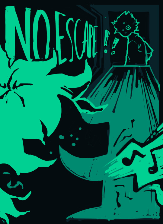
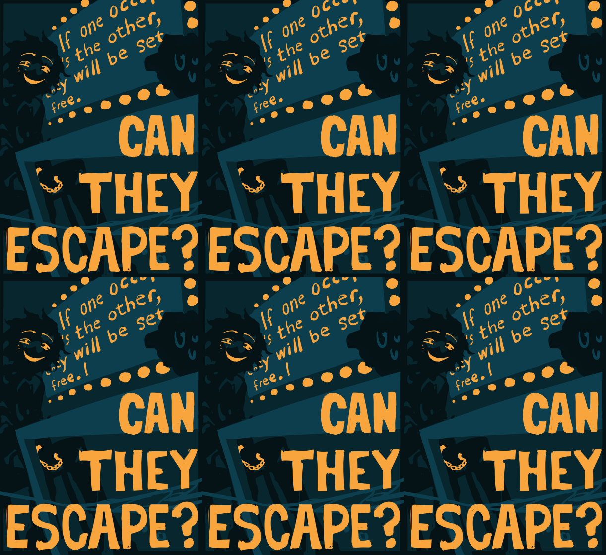
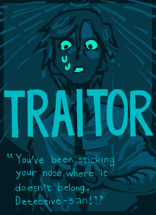
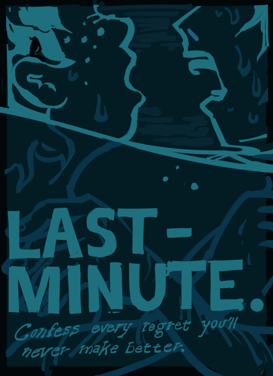
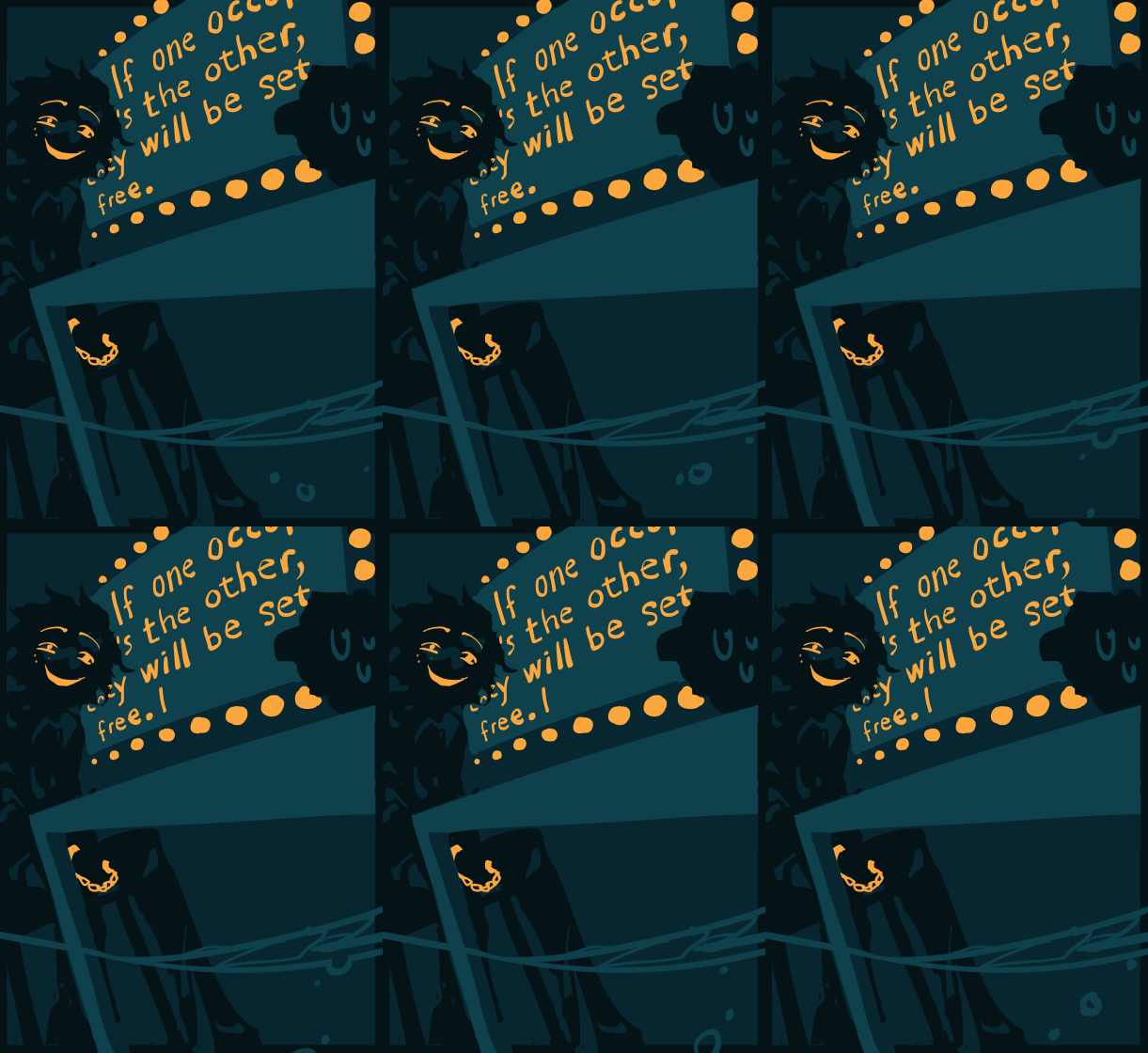
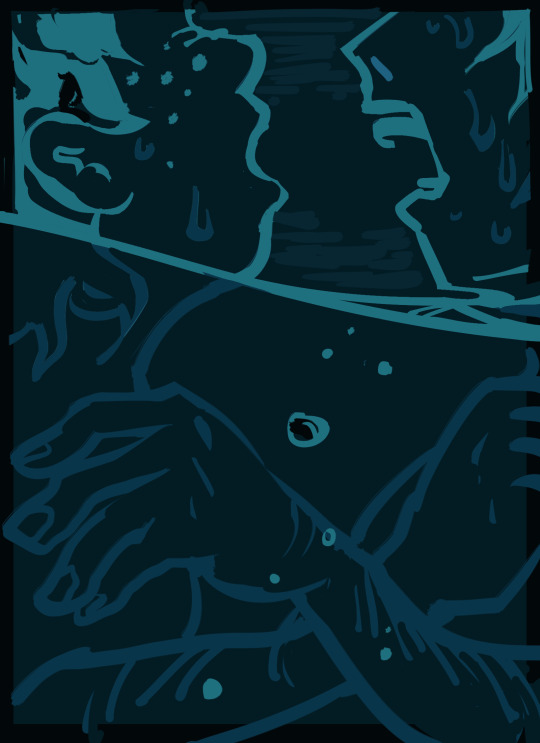
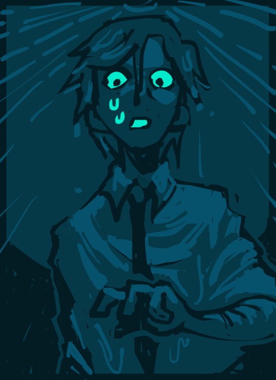
wanted to make poster-style drawings for just the two of us (we can make it if we try) by ijustwanttodestroy, @i-just-want-to-destroy on tumblr
image ids + images without text + extra stuff i wanted to say
[image id:
a series of illustrations with limited palletes in hues of teal, mint, and orange in a style attempting to resemble linocut printmaking.
image 1: in various shades of dark teal with mint. in the foreground, deku laughs, lilting and musical, as shinsou looks on, petrified, with his hand on the doorknob. a monitor on the side of the room reads NO ESCAPE ! !
image 2: in various shades of dark teal with bright orange. at one end of a table is someone's sweaty, clenched hand, and at the other is deku, his eyes creased and his grin a crescent moon. beside them, a monitor reads, "If one [occupant kills] the other, [they] will be set free." some text is blocked. superimposed above the table and the rising water, garish block text reading "CAN THEY ESCAPE?" in bright orange takes up the lower half of the image.
image 3: in various shades of teal. shinsou, his hair drenched, looks with a pallid, dear-in-headlights expression down at something indescipherable. one arm is defensively poised in front of him. there is seawater drizzling down from above, and large block text reading "TRAITOR" is superimposed on the middle of the image, with smaller, handwritten sans serif below it reading, "You've been sticking your nose where it doesn't belong, Detective-san!"
image 4: in various shades of teal. shinsou and deku's heads are barely above the rising water, gasping for breath. shinsou's hands are loosely holding onto deku's shoulders and deku's hands are desperately clenched on his. large block text imposed near the bottom of the page reads, "LAST-MINUTE" and below that, in cursive serif font wobbling slightly like a wave, "Confess every regret you'll never make better.”
image id end.]
things i wanted to say:
sorry for being so cringe i felt like the little philosophers in the cave making this because i couldnt actually find any refs for the style of printmade movie poster i want so i went from what id scrapped together in my head so im sure this looks kind of like . derivative? and boring i tried to kind of satirize (?) it but i dont think it worked.
i really liked the fic. the words were swag and the plot was yolo, etc. its my favorite worldbuilding ive ever seen in bnha fic which is maybe a weird thing to look for in bnha fanfic given that i dont think the worldbuilding of bnha, the manga is very good but i liked it a loooot & the reveals were so well done & the characters so well written . . . & just the vibes of an ocean locked room mystery type deal with a larger , darker plot . . . ! please read it if you havent
let me know if the image descriptions can be written in a less clunky/better way. like actually send me your image descs i want to get better at this
now that im done with this im going to stop thinking about bnha, hopefully.
here are some no-text versions:
thank you
#bnha#midoriya izuku#shinsou hitoshi#i promise i am done thinking about bnha. [literally about to read more bnha fanfic]#my art
356 notes
·
View notes
Text
Connecting With The Past + Grappling With History, With Painter Mia Boe
Connecting With The Past + Grappling With History, With Painter Mia Boe
Studio Visit
by Sasha Gattermayr
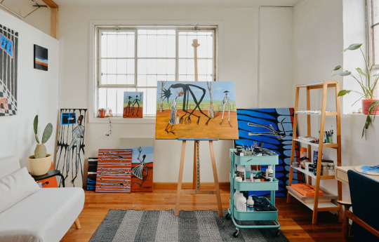
Mia’s new Brunswick studio is filled with light, and is the perfect space to continue on her growing portfolio of work. Photo – Amelia Stanwix for The Design Files.

A painting from her recent catalogue sits on the mantle. Photo – Amelia Stanwix for The Design Files.
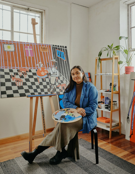
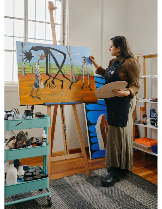
Butchalla-Burmese artist Mia Boe in her light-filled studio. Photo – Amelia Stanwix for The Design Files.
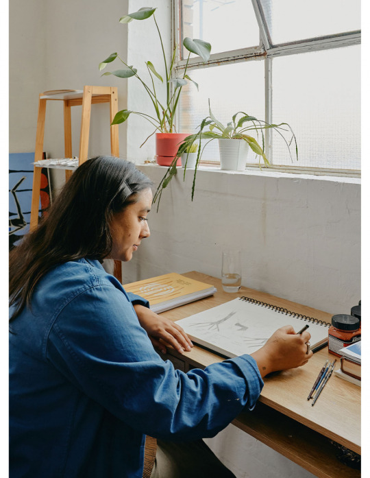
Mia paints full time and volunteers for The Torch in her spare time. Photo – Amelia Stanwix for The Design Files.
One of Mia’s works in progress.

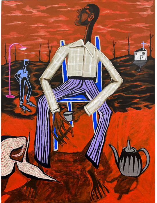
Mia’s paintings are vibrant and narrative-driven, which means she does a lot of her own historical research. Photo – Amelia Stanwix for The Design Files.

Left: Mia is inspired by figures in art history like Albert Namatjira, Sidney Nolan and Russell Drysdale; and figures from history such as Eliza Fraser, Ned Kelly and the Queensland Native Police. Photo – Amelia Stanwix for The Design Files. Right: ‘Stripes 3’ by Mia Boe.
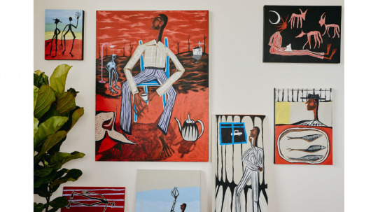
A selection of work Mia recently sold in her latest catalogue and has prepared for prize entries. Photo – Amelia Stanwix for The Design Files.
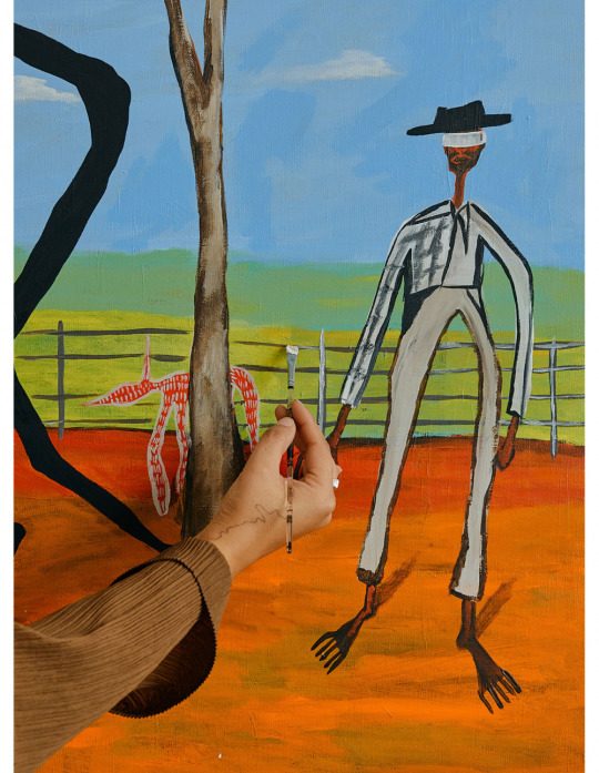
Her elongated, distended figures are always in the landscape and often accompanied by food, animals or spirits. Photo – Amelia Stanwix for The Design Files.
You can see the Sidney Nolan influence in this composition! Photo – Amelia Stanwix for The Design Files.

The historical and contemporaneous imprisonment of First Nations people is a continuous theme in Mia’s work. Patterns and vibrant colour create tension between the political context and the composition.
Watching Mia Boe’s rise to cult status is almost giving me whiplash. The Brisbane-raised, Melbourne-based artist has grown a dedicated following in the 18 months since she’s really begun concentrating on her painting – and it’s only going up. To give you an indication of just how devoted her audience are, her recent catalogue of nine paintings sold out in under two minutes.
Mia studied art history before last year, when Melbourne’s sweeping lockdowns gave her the time (and a good excuse!) to focus on her art. But it’s not just Instagram fans who are hot on her tail. With a residency at the Museum of Brisbane, commissions for Craft Victoria and Brisbane’s Institute of Modern Art, two group shows and a solo exhibition (titled Black Devil) at Open Space Collective under her belt since the beginning of 2020, it’s evident that Mia has well and truly caught the attention of the nation’s arts community.
But the institutions aren’t everything. When she’s not painting, Mia volunteers at The Torch – an organisation that aids First Nations prisoners and ex-prisoners with their art practices.
Art is the past, present and future for Mia – storytelling is her mode of being. Hear it in her own words.
How did you arrive at your current painting style? Has it evolved slowly over time or always been somewhat similar?
One clear continuity in my style has been that I tend to populate my landscapes with strangely elongated figures, whose bodies are also sometimes bloated and distended. I guess also that female figures in my work are representations, approximately, of myself, so a lot of my works could also function as self-portraits. But when I start a painting, I’m not always conscious of who the figure is, though if I’m painting black figures, they’re probably members of my family.
Also, I sometimes add larger figures with little detail, or floating in the landscape — these figures are representations of spirits. They represent family members that have died, and are a marker of the family that I will never get to know because of the repercussions of colonisation. I also try and experiment with colour: inspired by the ubiquitous blues of Robert Owen’s recent exhibition at Heide, I’ve recently been trying to control and limit my palette.
Do you use your art to connect with history or grapple with it?
Probably a bit of both. I’m especially interested in the histories of my family’s cultural heritages. My mum is a descendent of the Butchulla people, but she was only told by my grandmother that she was Aboriginal when she was in her teens (my grandmother was worried she’d have her children taken away from her if she was open about it). My Dad moved to Australia as a refugee from Burma when he was a young child.
My art practice has allowed me to research these twin histories, and to track the consequences of British colonisation in both Australia and Burma. (Burmese historian Thant Myint-U’s recent The Hidden History of Burma is an amazing book for people interested in learning more about Burma.) I hope soon to be able to spend some time looking at concrete connections between the colonial occupations of Australia and Burma. Empire, after all, makes the world smaller — it’s big project, I think, is to remake the margins in the image of the centre — so I’m sure there are some connections to be found (white officers, for instance, might have trained in Burma before coming to Australia, or vice versa).
Anyway, I definitely use my art to think through history: sometimes head-on, sometimes obliquely.
How do you involve historical references in your pieces?
I make sure that I’ve done proper research into a subject before making work about historical events. At the start of the year I showed my first exhibition in Brisbane. It was called Black Devil, and the works responded, from multiple angles, to the history of the Queensland Native Police: an exterminationist outfit which consisted of Aboriginal troopers led by white officers, and which aimed to wipe out resistance to colonisation.
The Native Police was active from 1848 to c. 1905 and were estimated to have killed over 44,000 Murris in those 50+ years. The fact that many of the massacres of Aboriginal people were carried out by Aboriginal troopers, who were themselves often kidnapped as boys, and barracked hundreds of kilometres from their kin and ancestral lands, pointed up for me the ongoing violence and infernal strategies of division which colonialism employs.
During research for this exhibition I found out that my ancestor, my great-great-grand uncle Wonamutta, a Butchulla man from K’gari (Fraser Island), was a trooper in the police force. Apart from his postings around the state, he was also seconded to the Victorian Police, where he helped to track down Ned Kelly (that’s where the exhibition’s title comes from — Kelly called the black trackers on his trail ‘black devils’).
Out of this discovery I got interested in Sidney Nolan. Two of Nolan’s most famous preoccupations were [Fraser Island’s namesake] Eliza Fraser and Ned Kelly. Nolan didn’t see these figures as related, and yet in an eerie way I think they were: Wonamutta, whose country was re-named by Europeans after Eliza Fraser, was also the man who caught Ned Kelly. So through thinking about this personal history, and the random but weird connections it disclosed, I came to envision my exhibition as also responding to Nolan’s own practice. It was a art show about history, but also about the history of art.
Do you have any key references or inspirations?
Some abiding influences for me have been Albert Namatjira and Russell Drysdale. Namatjira looms especially large: because of his tragic life story, his amazing colours. The William Dargie portrait of him which hangs in the Queensland Art Gallery, and the Noel Counihan linocut, which shows Namatjira crucified, are some really important images for me.
Drysdale matters for me because of the colours of his burnt-out backgrounds and those extraordinary gaunt figures idling about in them. His representations of Aboriginal people are very respectful and moving.
Other artists who are key points of departure for me are the contemporary South African artist Marlene Dumas, and Bill Traylor who was a self-taught artist born into slavery.
What does art-making mean to you?
On an individual level, my art allows me to recover and remake the cultural heritages which were stolen from me. And I hope in this process that I remind people (even as I learn myself) about the forgotten pasts which shape everyday life in the present.
Mia is represented by Sunday Salon. Learn more about her practice here. Mia’s next exhibition will be at Milani Gallery from 4th – 25th September.
2 notes
·
View notes
Text
Who am I as an Artist? Moving Forward
There are so many different methods of printmaking, each with their own character and charms. Linocut prints producing patchy and carefree prints, etching specialising in tone and monoprints creating one-of-a-kind pieces each time. I am personally most inspired by screen printing, also known as silkscreen printing. Screen printing is a form of printing using a screen made of stretched fabric and a frame1. The artist creates a stencil by applying glue, film/paper or photoresist to the areas of the screen that they don’t want printed, then smears ink through the untouched parts of the screen to create a print. This method is primarily used on paper and fabric; however, it is possible to print on other materials such as wood and metal if using specific inks. Screen printing is wildly popular due to its ability to print bright and even colours regardless of the surface2. Screen printing works similarly to a reduction print, creating multidimensional art using layers rather than tone and shading. It is also praised for its ability to produce identical prints in little to no time, making it a key method in the mass production for the likes of posters. Screen printing started being used in the 1920’s for advertisements, even though the method dates all the way back to 221 AD China3, and was being used by artists only 10 years later. By the 1950’s, screen printing had become a widely appreciated media amongst artists. During the 1960’s, screen printing boomed in popularity after pop artists such as Andy Warhol and Keith Harring used it for their designs4. Screen printing was the prime medium for the pop art movement because of the ease at which you could create colourful block shapes and patterns, as well its ability to mass produce designs. Screen printing has a long and diverse history, but not one that is going to end anytime soon. The method is still wildly popular today amongst printmakers, with its charming characteristic and accessibility maintaining its popularity as strong as ever.
Ben Rider
Ben Rider is an illustrator and prink maker based in London. Rider is known for his messy neon prints with punk undertones. His work is created using a screen print to bring his illustrations alive, usually in a psychedelic pop art style. One of my favourite pieces of his would be ‘Pleasure Thyself.
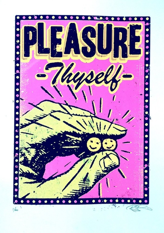
5Print Club London. (n.d.). Pleasure Thyself by Ben Rider. [online] Available at: https://printclublondon.com/shop/pleasure-thyself/ [Accessed 13 Mar. 2021].
This print includes a hand holding to smiley faces, as well as the name of the piece, ‘Pleasure Thyself’. This print is fairly simple; however, I feel as though there's a lot of depth to it. At first glance, it simply seems to be a print about looking after yourself and your mental health. The description of the piece states, ‘In these strange days it's good to be reminded to just be kind to ourselves too!’. I feel as though there could also be a comparison drawn between this piece and drug culture. The hand seems to be holding two smiley faces, which at first reminded me of pills. The slogan of, ‘Pleasure Thyself’ could also relate to the act of getting high or taking an upper. I feel as though the colour pallet helps strengthen this analysis. The piece includes bright pink and yellow, creating a psychedelic feeling. There are also a bunch of lines coming out of the faces, making them the main focus point of the piece. I feel that this also adds emphasis to the pill like shapes. However, some may say that these lines were included to replicate a sun. It could also be argued that this print was inspired by addiction. Many people fall into a dark hole and use drugs as a form of escapism, using the euphoric feeling of being under the influence as a stimulant during hard times. Over all, I feel that this piece was created with this double entendre in mind. It could simply be enjoyed as a print about looking after yourself and staying positive, but on the other hand, could also be viewed as a piece inspired by drug culture. With many of Rider’s pieces having a sense of social commentary to them, I don’t doubt that this was his intentions.
Steven Wilson
Steven Wilson is an artist, designer and animator based in Brighton. Born in London, Wilson currently works for his own self-titled business alongside Pedro Cardoso. The company works in both analogue and digital methods to create unique and colourful pieces of art. Steven Wilson has found a great deal of success since launching his company in 2001, creating work for big names such as: Nike, The Oscars, Virgin and the New York Times, amongst many others.6
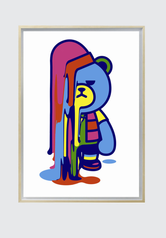
7 STEVENWILSONSTUDIO. (n.d.). Krunk Melt. [online] Available at: https://www.stevenwilsonstudio.com/prints/krunk-melt [Accessed 13 Mar. 2021].
‘Krunk Melts’ is a screen print, made using 3 layers, by Steven Wilson. It includes a bear, with a rather unpleased look on its face, melting away. I really liked this print because of the bright colours and unusual subject matter. Many of Steven Wilson’s work has a huge pop art style to it, and you can definitely see the correlation in this piece. The print uses a lot of bright colours, creating a cartoon style. The bear is outlined with a dark blue rather than a black, softening the piece all together. I feel that this makes the print feel a lot more comforting, compared to creating a stark contrast between the bright colours and a solid black outline. However, this carefree style is contradicted with the expression on the bear’s face. It has a very disapproving look on its face, as opposed to the stereotypical cheery smile cartoons are often given. This changed the feeling of the piece completely. The look on the bear’s face, along with the fact that it is melting, created a more sombre feeling to the print. This is strengthened with the fact that the bear itself is blue, a colour often used to convey sadness. I really liked the contrast this created. The use of bright colours in a piece that feels rather negative confuses the viewer. The art that, at first, seemed so cherry and carefree now has a sense of melancholy that was not initially obvious. I feel that this depth, mixed with the simplicity of the design, created a really interesting and effective print. After closely inspecting the piece, you are almost left not knowing how to feel about it, highlighting how powerful an image it is.
Andy Warhol
Andy Warhol was an American artist who explored a huge selection of media such as: painting, printing and sculpture as well as photography and film. Warhol was best known for his screen prints that explored the relationship between advertisement and celebrity culture. His art boosted him to fame during the 60’s, leading to him being considered a leading artist of the pop art movement with pieces such as, ‘Campbell’s Soup Cans’ and ‘Shot Mrilyns’. 8
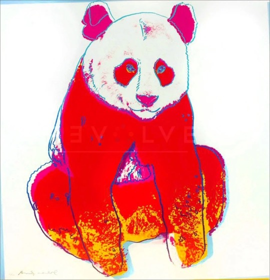
9Revolver Gallery. (n.d.). Giant Panda 295 by Andy Warhol. [online] Available at: https://revolverwarholgallery.com/portfolio/warhol-giant-panda/ [Accessed 13 Mar. 2021].
Giant Panda 295 is a screen print done by Andy Warhol in 1983. The piece was done as a commission by Ron and Freyda Feldman, and was one of ten pieces created inspired by endangered animals. The print included a red panda with a thin blue outline and pink and yellow details. I really liked this piece as I felt it was instantly obvious why it was created. The red and yellow together somewhat mimics a fire, creating a sense of danger and anxiety. The use of a blue outline really helps the piece stand out more, especially against the red. This choice was especially effective in the eyes of the panda. There isn't really much detail, however I feel that this colour choice makes them look a lot more unnatural. The blue against the red really helps the eyes stand out. I feel that this was done to make the view feel like the panda is looking right at them, almost as if the panda is shaming you for not helping. This small detail, along with the intense colour pallet creates a sense of urgency, almost pushing you to help the cause. I think that this was a highly successful piece, managing to capture so much emotion in such a simple print. Even without looking into the background of the piece, you can hazard a good guess as to why it was created. Proving just how powerful a print this is, highlighting Warhol’s talent as a whole.
Screen printing inspires me for many reasons, and I feel that the more artists I research that explore the medium, the more passionate I feel about it. I really love that every artist that uses screen printing does it in their own way, with every artist’s work looking wildly different from each other's. Yet, the use of bright colours and layers ties them all together. I think throughout my journey as a printmaker, I want to experiment with screen printing more, taking into consideration how I can use both colour and layering to enhance my work.
Word count- 1.487
1 Tate (2017). Screenprint – Art Term | Tate. [online] Tate. Available at: https://www.tate.org.uk/art/art-terms/s/screenprint [Accessed 13 Mar. 2021].
2Customplanet.co.uk. (2020). What is Screen Printing? A Step-by-Step Guide to Silk Screen Printing. [online] Available at: https://www.customplanet.co.uk/what-is-screen-printing-step-by-step-i50 [Accessed 13 Mar. 2021].
3www.leicesterprintworkshop.com. (n.d.). A brief history of screenprinting - Leicester Print Workshop. [online] Available at: http://www.leicesterprintworkshop.com/printmaking/screenprinting/a_brief_history_of_screenprinting/#:~:text=A%20brief%20history%20of%20screenprinting.%20Screenprinting%20originated%20in [Accessed 13 Mar. 2021].
4My Modern Met. (2018). 8 Print Artists That Will Inspire You to Try Silk Screen Printing at Home. [online] Available at: https://mymodernmet.com/silk-screen-printing-artists/ [Accessed 13 Mar. 2021].
6STEVENWILSONSTUDIO. (n.d.). About. [online] Available at: https://www.stevenwilsonstudio.com/about [Accessed 13 Mar. 2021].
8Tate (2019). Andy Warhol 1928-1987 | Tate. [online] Tate. Available at: https://www.tate.org.uk/art/artists/andy-warhol-2121 [Accessed 13 Mar. 2021].
2 notes
·
View notes
Note
Levi, ur work inspires me! I want to start printmaking because of you. Do you have any pointers, like supplies to start out with or learning resources? Anyone whose work inspires your own?
this is so cool and sweet! printmaking is rad because there are so many ways to do it
my favorite types of printmaking are screen printing and letterpress printing, but both of these require some means/access to supplies...screen printing is 1000% something you can do at home but if you’re just starting out, it can be a little expensive.
(though once it’s actually safe to be back in the world I’d definitely encourage you reach out to someone about screen printing if you want to learn! you can teach yourself but i feel like it’s useful to have someone to guide you a bit because getting started can be daunting)
(same with letterpress. that’s definitely worth giving a shot, even if just to learn a bit more about the process and history)
(but it’s just like anything else where once ya learn it, it’s easy) (same with letter press but you actually need a press for that, lol)
ANYWHO, I think a great place to start out would be doing linocuts! linocuts are a type of relief printmaking. they’re very cool because there’s a LOT you can do with them. getting started with linocuts is pretty cheap and there are lots of instructions online (you’ll need carving tools and blocks, ink, and a brayer but it’s pretty versatyle. you can even use fabric ink to print on shirts, bags, tea towels, etc) There are also a ton of tutorials on youtube
If that’s not your style, there’s still a ton of other stuff you can do. check out kitchen lithography, for example
as for artists, i love makoto chi, noelle longhaul, justseeds (the collective, lot of great work), nat andrewson. i also really love medieval art/woodcuts. plenty of other artists, too, that i’m sure i’m forgetting!
whatever you go for, i’m sure you’ll do a great job! <3
20 notes
·
View notes
Text
Mixed Media
In various books throughout time, you can read about the vulgar arts; it is mostly a term for any mass production and in art that means printmaking. From an art history perspective, the patron and the artist was a system that was more or less redundant in the 20th century. It was at this time that printmaking came into fashion because if an artist didn’t have one major sponsor, they would need many smaller incomes from the public.
The history of printmaking and the taboo also follows publishing technology. After 1800 the wood-engraving was considered to be un-artisan and best left to newspaper printing and advertising. When wood-engraving was embraced by artists as a reaction to various exhibitions of Japanese woodcuts, the artists who used colour printing aped the Japanese styles of carving with British scenery. Sylvan Boxsius is a good example printing in a traditionally Japanese way.

Sylvan G. Boxsius - A Devon Village, 1930s. From My Collection
With more traditional styles of English wood-engraving colour wasn’t welcome. Linocut had a vogue with Cyril Powers works but for printmaking it would be the 50s when colour came in for most artists; much like how colour photography wasn’t considered artisan until the 1980s.
It is important to add this is only in Britain. In France artists had worked in colour. Many of the big artists even worked in advertising making large lithographic posters. Pissarro made colour woodcuts in a medieval style. The French also had the fantastic Atelier 17 - a studio founded in 1927 by Stanley William Hayter. He was a British artist and working mostly in intaglio prints, but he developed new printing methods for colour etchings. Towards the end of the 40s the studio had encouraged mixed media printing methods that crossed over the sea to Britain.

Stanley William Hayter - Cinq Personnages, 1946
But the biggest taboo to some would be to mix medias, pen and ink with wood-engraving or an etching with a lino-cut. It was the 20th century when nothing was classed as holy. For me I should also add there is a thrill when you see something new. When was the last time you saw something new?
The images below are a series of John O’Connor wood-engravings with pen and ink continuations of the illustrations surrounding it. It might look to be obvious, but it is something new to me and I can’t recall seeing it before or after. The book is E. L. Grant Watson’s Departures from 1948.

John O’Connor - Illustration from Departures, 1948
On the face of it John O’Connor doesn’t look to be a rebel. A student of Eric Ravilious and Edward Bawden at the Royal College of Art his wood engravings always have an old-world charm to them. But I think adding the ink drawings really worked with these illustrations. Below, I love the way the woodcut ends at the child ankles and the ink drawing takes over to show the feet submerged in water.

John O’Connor - Illustration from Departures, 1948
John O’Connor would go on to surprise me with printmaking by making colour wood-engravings. After spending a great deal of time carving the main black inked block, rather than waste time with wood to make the colour layers he would instead use Lino to make his abstract shapes that are loosely thrown over the engraving. Below I have over-saturated the colour layer to make the point, and it might look lazy but I think it’s fantastic and gives a lovely quality to the prints. So many artists fail in printmaking by trying to be too technically accurate, I think of Stephen Whittle for example.

John O’Connor - Illustration from A Pattern of People, 1959

Michael Rothenstein - Horse and Sunrise, From my collection, 1974.
The other artist that thrills me somewhat is Michael Rothenstein. He is an artist that doesn’t get the credit he deserves and different people who represent his collection push the agenda that suit them.
Having a diverse career in art he started making accurate and twee illustrations of the countryside. As part of the Record Britain project he was sent out to document areas of Britain as artworks before the start of the Second World War. But after the war is where his life and work is far more interesting. He became one of the real innovators of printing and an early British Pop Artist, before the term was coined.
His first print was made in 1947 and after that he went to study at Atelier 17 with Hayter. There he developed skills with lithography and etching but abandoned them for their time consuming preparation processes and influenced by Edward Bawden he moved into Linocut.
Michael Rothenstein, for instance, has applied boundless energy to extending the range of the relief process of wood and lino, sometimes combining them with screenprint and photo-screen. ‡

Michael Rothenstein - Marilyn I, From my collection, 1978
This Rothenstein print is made up of two screen prints of a photograph of Marilyn Monroe with a pink frame over printed impressions of a burnished planks of wood in green. I think it may need repeating; printed planks of wood.
When I was at art school at the end of the previous century I thought my printing of pavements and blocks of wood were new ideas, however Rothenstein had already penned a book on the topic called Frontiers of Printmaking - New Aspects of Relief Printing in 1966. In the book he shows printed Tree-trunks, metal cans, chicken fencing, the board at the back of an old Pye radio, electronic motors... anything flat you could get an impression off of.
Any materials that were fairly thin were printed on the platen press. In proofing surfaces of rough texture, however, a soft, flexible packing was placed above the paper as already described ... Before use, metal from the scrap-head needs cleaning. It is clamped to the bench and brushed down with a wire brush or wire circumference brush used in a power-tool. An industrial mask should be worn for this process. Very dirty metal taken from the scrapheap or city dump should be first put in the sink and scrubbed down with disinfectant. †

Example page from Frontiers of Printmaking, 1966
Rothenstein later claimed that Hayter had prompted him to take pictorial risks and avoid predictable effects.
What Hayter did in France to stimulate etching and engraving'. wrote James Burn lately, 'Michael Rothenstein has done in England for relief printing'. ♠
Rothenstein found and collected things to make really wonderful works and I think he should be celebrated more than he is.

Michael Rothenstein - Red Gothic, 1962
† Michael Rothenstein - Frontiers of Printmaking, 1966 ‡ Richard T. Godfrey - Printmaking in Britain, 1978 ♠ The Penrose Annual: Review of the Graphic, 1964
2 notes
·
View notes