#wanted to animate the text but photoshop bit me :(
Explore tagged Tumblr posts
Note
How do you make your stamps? :0
Disclaimer: this is an obscenely long explanation, with pictures. Efficiency is stupid
So, for the static ones, I make a 99x56 px file on ibis paint x. Other programs are probably available online but I don't use them.
After that, I either upload an image I want to make into a stamp, or I draw one.
Then, I find a frame I want to use. Ill upload them here but let it be known I stole all of these right from deviantart


Most of them are from Lil-Devil-Melii on deviantart. The rest i have no idea. They're not all 99x56px but you can crop the canvas it's fine
Make sure to erase the edges of the picture , so they're transparent. It's not as cute otherwise
Upload those frames over your image in whatever art program you're using and viola, stamp.
For moving ones, it's a lot harder. Mostly because I refuse to download Photoshop.
There are a couple ways to do this. Some are simple animations, like with flashing text and whatnot. For these, you download the individual animation frames from your art program. Make sure it's transparent.
Then, upload each frame to ezgif.com under the option "GIF maker." You can play around with how fast each frame goes and whatnot but in the end, it'll be a stamp with some rad text that moves. This is easy, and doesn't make me want to shit my pants and cry. If you're new, do this. This is fun. This is good. This does not kill me inside
I made that↓ stamp with this method :)

this next one is how we turn gifs into stamps. This one makes me sad. It involves math and sucks. But we gotta do it. For the vibe
First, grab your gif. I'm using this cow gif because it's awesome

Then, I resize it using ezgif. Literally everything for this will be using ezgif. I am a simple man
At this point you should decide what frame to use. I'm using this one because its the first one I clicked

Figured out what size the inside of the frame is. That's what I resize the gif to, so the edges can be transparent. The inside of this one is 93x50 px, so those are the dimensions I'm making the gif.
Figure it out by putting the frame into ibis paint and realizing the canvas to fit just the inside of the frame, then seeing what the dimensions are. But there could be easier ways

Woah it's so small now
Then, still on ezgif, I go to the "crop" option.
Make sureeee to upload the smaller gif
press the button that says "extend canvas size", and then put the "width" and "height" as the dimensions for your FRAME. This'll put a bit of a transparent border around the gif. For this frame, I did 99px and 56px.
The "left" and "top" boxes show how many pixels the cropping happens from the edges of the canvas. The formula for finding that is
(width of gif / 2) - (difference between gif width and frame width / 2) = left box
For me it's (93 / 2) - (6 / 2) = 43.5
Then you do the same.for the height, which for me ends up being 22 from the top
This is reallyyy touchy and annoying though
Here's my result , with no visible difference

Okay so THEN you go to the "overlay" option, under "effects." And upload your frame. If the cropping was done right, you shouldn't have to move the frame at all and can just download it
Here's my result:

if you don't care about transparency, you can resize your gif to be the same size as the frame, and then put the frame over it. But I'm a slut for transparency
Anyways. I'm sorry if anything was unclear, it's two am. And I hope this was helpful :) these really are fun to make once you get it down
also if anyone has an easier way to make stamps from gifs, please god tell me
#web graphics#old web#neocities#custom#custom blinkies#stamps#page decor#web resources#da stamps#deviantart stamps#blinking gif#How to#tutorial#How to make stamps#Spacehey#deviantart#rentry graphics#old internet#early internet#stamp collecting#ezgif#stamp making#stamp template#Stamp frames#blinkies
5K notes
·
View notes
Note
Hi, me again!
Ty for the reply, I would love an in depth tutorial if you don't mind as i really wanna get this effect to work and I kinda work best when it's spelt out for me when learning new techniques lol :)
hey anon, no worries! here's how i used this amazing template by @danesdehaan and added a rolling effect like this (from this gifset):
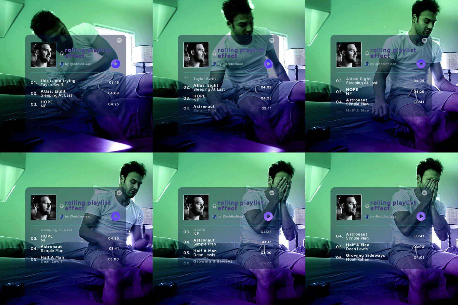
this effect uses photoshop's timeline. i use cs5, for reference.
detailed tutorial under the cut :)
I. PREPARING THE TEXT
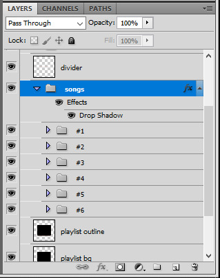
when you open the template, you should have a group called "songs" with 3 groups for each song. what you wanna do is duplicate these numbered groups until you have the amount of songs you want. for each group, use the move tool or your keyboard's arrows to move the duplicated song text layers/groups on your canvas so they're under the first three that are already there. make sure these new duplicated layers are in the "songs" group.
then type the numbers, song titles, artists, song durations, etc. it should look like that:
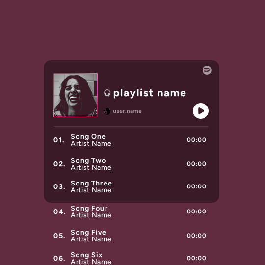
i wanted mine to have a smaller gap in between each song, so i used the arrows to move each song group closer together, and it looks like that before the animation:

II. ANIMATED EFFECT
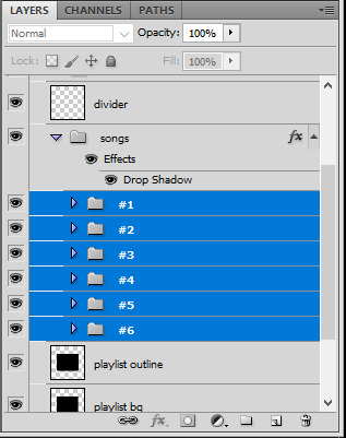
once you have typed everything, make sure there are no mistakes and that you won't need to edit anything about the songs or durations or anything like that, because you won't be able to go back. when that's done, select all of the numbered song groups and right click > Merge Layers.
that will give you one layer with all of the songs together. i've renamed mine "SIX SONGS". make sure this new merged layer is still in the "songs" group.
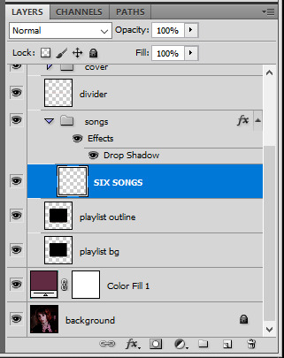
once that's done, you're ready for the animation. and it's pretty easy, because you only need two keyframes: one at the start of the gif, and one at the end.
go to the start of your gif on the timeline, and toggle the position keyframe animation by clicking on the little stopwatch icon. a little yellow keyframe should appear where the cursor is, at the start of the gif:

then go to the end of the gif with the cursor. with the "SIX SONGS" layer selected, use the move tool or keyboard arrows (my preference) to move up the text until all the songs are inside the darker rectangle. once you move this layer's position, a keyframe will appear on the timeline and the animation will be created.
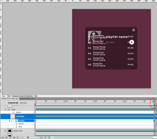
the animation now looks like this:
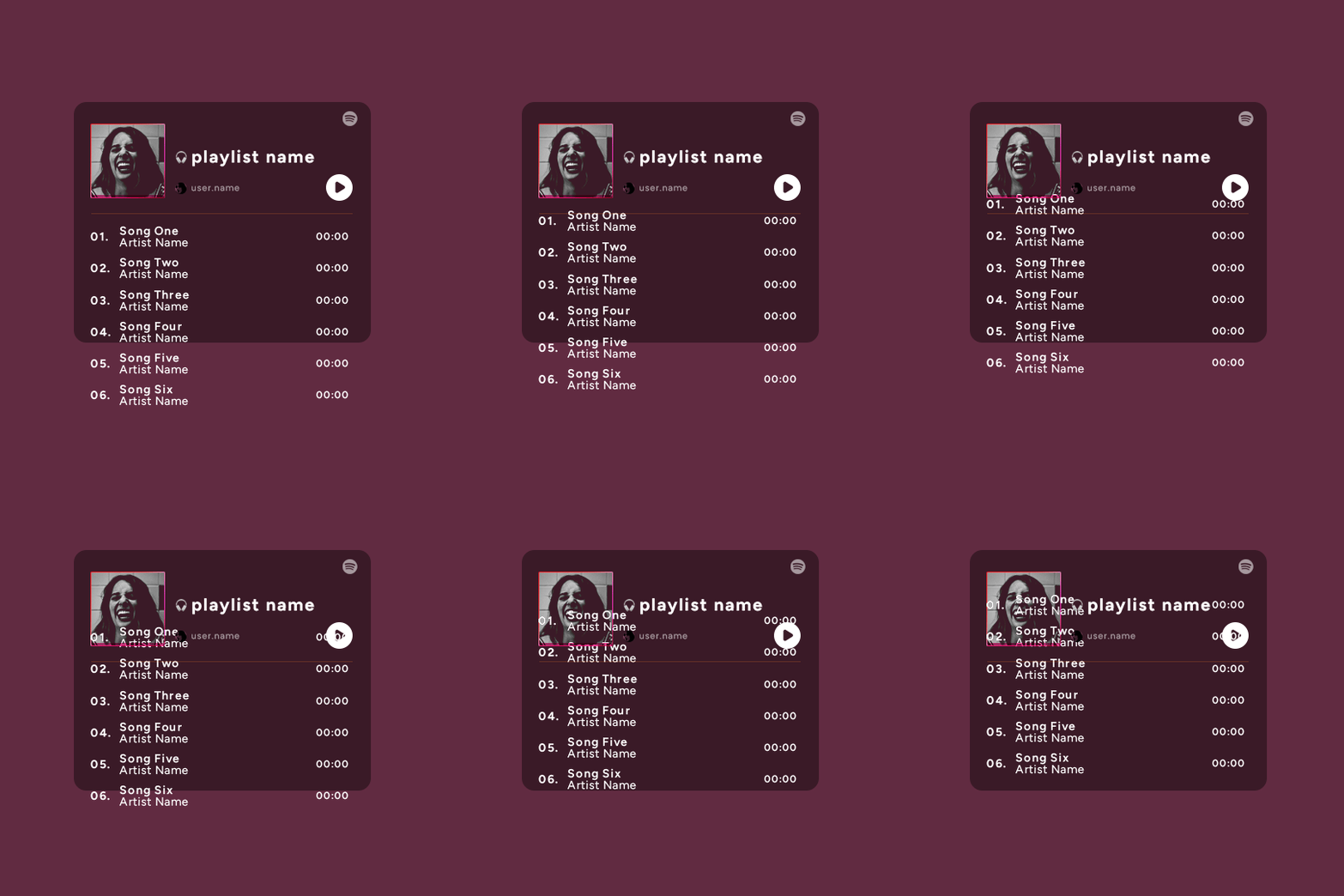
if you want, you can now edit the speed of the animation by moving the keyframes. the closer the two keyframes are, the faster the animation will be; the further apart the keyframes are, the slower the animation will be.
III. LAYER MASK
since we want the songs to be contained in the dark rectangle and below the line, we need to add a layer mask. i started by creating a shape of where i want the songs to be contained with the rectangular marquee tool:
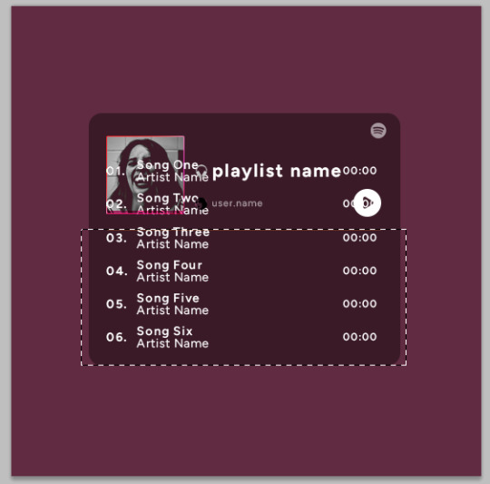
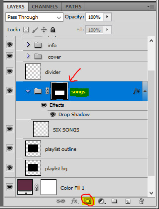
then, on the layers panel, select the "songs" group and click on the layer mask icon to create a mask with that rectangular selection.
if you play the animation after making that layer mask, it should now look like this:
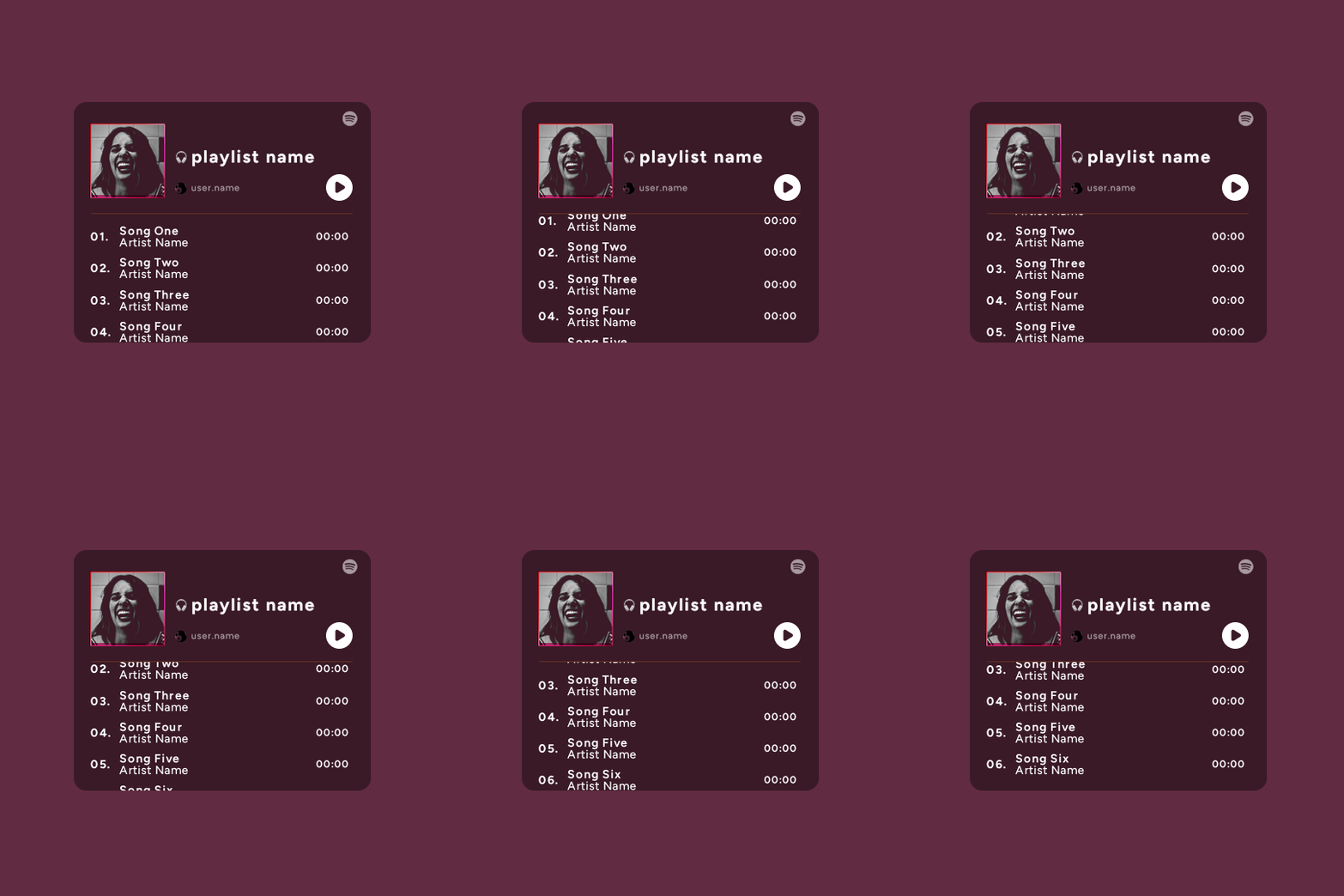
if you like it that way then you are done, yay!
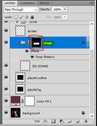
but if you'd like softer edges, like i have done for mine, click on the layer mask's black and white thumbnail. use the brush tool with a 0% hardness and the black color to make the edges of the mask softer. make sure you are making your brush strokes with the layer mask's thumbnail selected.

once you have brushed a bit of black with a soft rounded brush on the top and bottom of the mask, the animation should look like this:
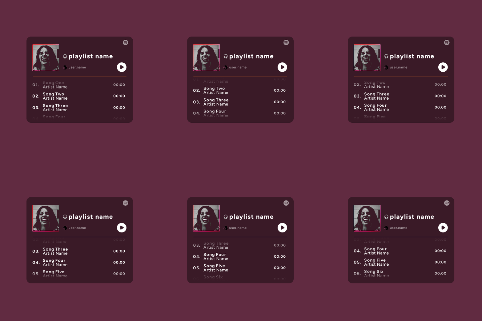
and that's it! i hope this was clear enough :)
#alie replies#Anonymous#*ps help#photoshop#tutorial#resource#completeresources#allresources#resourcemarket#usertj#usertina#usercats#useraish#userdean#userabs#userraffa#userbuckleys#uservivaldi#userisaiah#usernorah
484 notes
·
View notes
Text
Texting it out down here cause in video would go by to fast. Also the video for the sketch layer didn't save so it picks up at me starting on Cross's face. Not too much missed, I only rough out some shapes and copy/paste them where I want them from frame to frame.
It takes me about 2 hours or so to make one of these. I'm using a mouse rather than a tablet so you'll notice my style is more like carving with lines rather than drawing.
I fill my background and put down a very rough sketch. I keep it rough mostly do to impatience. The line work does turn out better if I do a more detailed sketch but that doesn't matter. None of this matters.
Things I always do that I know to correct in my line work as I go: "That head too big! Always too big! Eyes too! Shrink erything."
I do the line art in a free program called ProMotion. It's for animation but I don't care, I'm looking for clean sharp lines and tools that let me copy/paste and instantly make brushes of pieces that I highlight. Its a pixel based program and I would normally use it to make sprites for my RPG maker games.
IMPORTANT STEP: ZOOM IN AND OUT OVER AND OVER AND OVER TILL YOU DONT CARE IF IT LOOKS RIGHT ANYMORE.
Then we take that line art and shove it into Photopea for coloring. This is another free program that's a clone of Adobe because I like photoshop tools but hate Adobe as a company with a fiery passion.
Yes I just kind of choose whatever color. I could make a reference sheet with saved colors but TRUST ME. I wont use it. I almost never use references, i forget, okay. Mostly drawing from memory.
Each color gets a layer essentially and then I "paint" them with the burn tool. (Midtones 20%) Cross's armor gets highlights on the ridges with the dodge tool. (Also Midtones 20%)
Add Blush to the skin! Thin points like face, shoulders, finger tips. Blur Blur Blur till it looks right.
Also, remember how I said I was looking for clean clean lines with no blur? That's cause I just clean up the "paint" by selecting with the magic wand and deleting it.
I make my backgrounds out of stock textures mostly. Though this usually takes a little bit more collage work this strip is simple so I just used the gritty/tech wall texture. Blur that bitch. (Gaussian Blur under the filter tab, whatever looks right but the default 7 pixels is usually good for the BG)
To add motion I copy the bits I want to seem like they're moving and use the "Motion Blur" filter, then I put that copied color over the background line art.
Add shadows! Under the coloring layers, that handy gaussian blur again.
Add Lighting! I usually have the overlayer set to "Soft Light" and then I use the gradient tool to filter everything to look cohesive. (You might notice I keep their skin tone pretty dark but it might look different when I change the lighting.)
Warp the action words... just...whatever feels appropriate at the time and set that layer to "Color Burn"
I just use the Oval select tool with the feather set between 3-5 pixels to make word bubbles. Paint it in voila. Add Text. All done!
Cross x Tahny: +A Summary+

My philosophy : Style matters more than skill and you should cheat and cut corners as much as possible. Peace and Love.
-++-++-++-++-++-++-++-++-++-++-++-++-++-++-++-++-++-++-++-
Tags:
@feral-ferrule @eobe @ghostymarni
#Time lapse#drawing time lapse#art time lapse#the bad batch#sw oc: tah'nyem ra#sw oc#tbb#crosshair x f!oc#drawing comics
34 notes
·
View notes
Text
Krita tutorial the way I know it.
Basics: What is where.
Gimmicks.
Specific advice on specific tools.
Basics: What is where.

Upon opening the program this is what you're met with. First of all, must comment: The layout is HEAVILY editable so you can just drag menus anywhere you want, even leave them floating amidst the sheet you're drawing on.
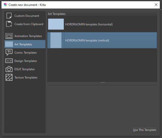
You can create custom art templates, I have two o'mine here as both have my signature background color.
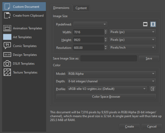
As well, you can edit the custom document settings, as in what size you want it, what resolution, even the initial content of the image. As well you can create from clipboard: Just copy some image from your browser and Krita will recognize it (useful for making meme edits lol).

Now, once you have your file, I will show you what is where.
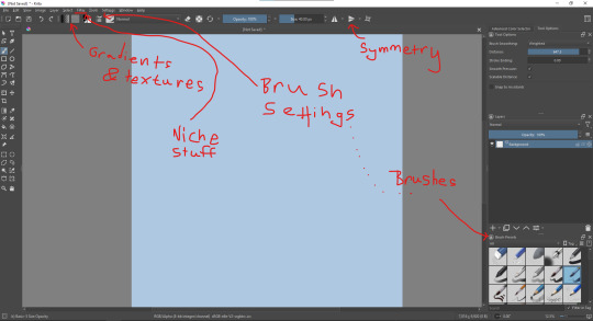
Brushes:
Brushes are easy to edit and there are tons of free bundles to download online. I myself only got one bundle, Jackpack (bit hard to find now due to original source being lost, it is still available but bit tricky to come by).
There. Are. Tons.

Some of these are my custom brushes for calligraphy in neography, you might even guess which ones. You can edit existing brushes, make new ones from the ones you've edited without changing the original, and all sorts of stuff (more below in the third chapter).
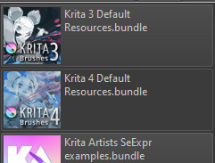
There are numerous packages of brushes once you enter Krita, but only one/two are available when you first open it. To unlock them all, click here:
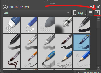
And make sure all bundles are dark gray in color (example of both dark and light below).
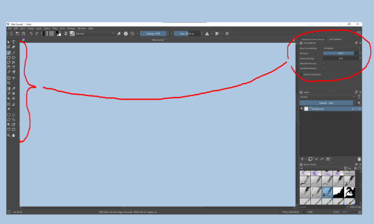
Now Tools Options: those will pop up depending on what tool you're using.
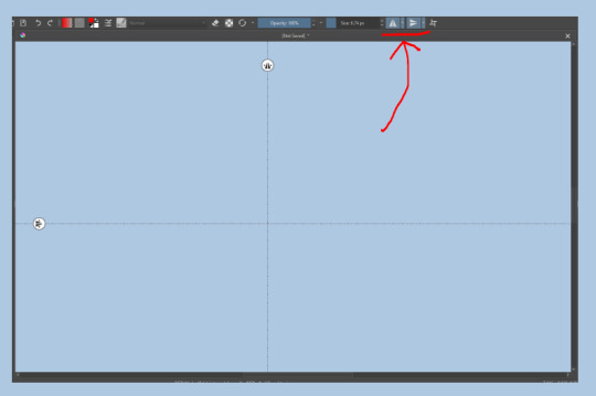
Symmetry: Fun stuff. You can drag the lines depending on how you need them and then center them back to the center of the screen if needed.
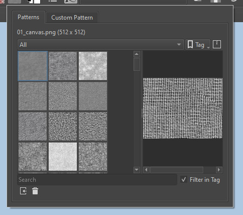
Gradients and Textures also have their tools options, you can play with those to get the feeling what they can do (more in third chapter).

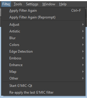
The Filters tab is useful too. Blurring, motion blurring, color mapping, artistic filters and all that: Quite fun.
Gimmicks.
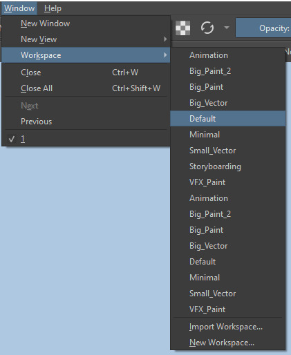
Krita allows you to customize your workspace freely. Floating menus, tabs, anything you want. It has quite many drivers at that-
To access the workspace templates, go to Window and choose Workspace.
Krita allows for copy-pasting any image onto the sheet. Though, for me it sometimes crashes if I accidentally copy-paste text into it without choosing the Text tool first.
The software allows for both raster and vector work. It is basically Photoshop sharpened to be used by artists primarily.
There are some interesting mechanics regarding the Eraser (default bind E).

You can use it with any brush, allowing for textured erasure/quick work. Good for sketching.
You can use it on gradients (given there's a transparent point on the gradient preset).
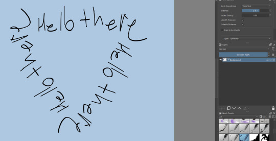
There's a Multibrush tool:

People say Krita is good for animation but my brain can't wrap around it yet honestly @~@.
The keybinds:
B - Brush tool.
E - Erase tool option.
M - Mirror (useful for checking accuracy from a new angle).
Ctrl - Color pick (when used with brush or other color-using tools).
Shift+L.Mouse+drag - Changes the size of the brush by dragging left and right.
Ctrl+E - Merge layer with the one below.
Ctrl+G - Group selected layers.
Ctrl+A - Select whole sheet.
Ctrl+Shift+A - Deselect everything.
F - Bucket tool.
G - Gradient tool.
Ctrl+S - Save document.
Ctrl+Shift+S - Save As document.
Ctrl+N - New document.
Ctrl+O - Open document (will be seen in a new tab on top of the sheet).
Ctrl+C - Copy selected layer or selection.
Ctrl+X - Cut selected layer or selection.
Ctrl+V - Paste copied/cut layer or selection.
Q - Multibrush tool.
R.Mouse - Interesting thing: Opens up a quick selector for brushes and colors you've already used in the piece.
1 - Zoom 100%.
2 - Zoom to fit the piece vertically.
3 - Zoom to fit the piece horizontally.
4, 5, 6 - Turn 15 degrees (4 and 6) or undo the turning whatsoever (5).
Ctrl+I - Negative filter applied to layer.
Ctrl+U - Color editing on the layer.
Ctrl+Y - Soft proofing mode (for color mistakes and stuff like that, mostly annoying for me tbh).
Ctrl+T - Transform selection/layer.
Ctrl+R - Square select tool.
Ctrl+J - Lasso select tool.
Honestly you can just hover your mouse over tools and see their shortcut binds, as well. Or edit them in Settings.
Specific advice on specific tools.
Brush:
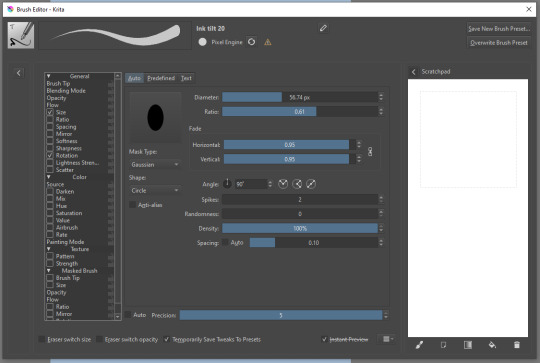
Brush editor is a great tool for making custom brushes, and it even has a sratchpad to test them out. Lots of settings, but no need to be afraid; Most of them you might never use on purpose.
Use Brush Smoothing for great and pretty lines in lining pieces or making calligraphy.
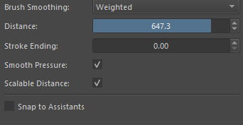
Gradient:
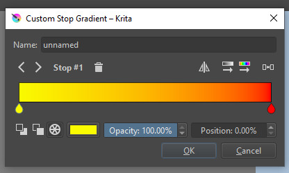
The four icons to the right top are:
Mirror gradient.
Arrange by lightness value.
Arrange by color value.
Space the stops evenly.
Click the gradient to add a new stop. The three things to the left are:
Make the stop use Primary Color.
Make the stop use Secondary Color.
Make the stop use a fixed color.
307 notes
·
View notes
Text
How to Kidnap Bruce Wayne in 6 Easy Steps
The Batfam decided to have a nice evening together. They had it all planned out. The Joker was JUST put into Arkam, Harley and Poison Ivy were having a date night, and they sent the Riddler a 5k puzzle piece, so they should have a few hours. Hopefully.
But then entered...the comedian. Not a knockoff Joker, mind, an actual comedian serving as the entertainment for the night. The kids were running a bet on the odds of Bruce laughing. Not actual laughter, naturally, but how many fake laughs Bruce would decide to manufacture. Dick maintained it would be 8 times at most, despite what the others thought.
And then a PowerPoint presentation started, with the words Bruce Wayne emblazoned behind the comedian. "Brucie Brucie Wayne. Local philanthropist, runner of jobs and charities and orphanages. Gotham's number one eligible bachelor if and only if you like kids. But Ladies and Gentlemen and Folks, I'm here to tell you otherwise. Because this right here? It's alllll a mask. I know the real Bruce Wayne, and I have the proof to reveal his secret identity."
Bruce was very carefully keeping his eyes on the performer, refusing to acknowledge the eyes latching onto him, or the occasional covert elbows.
The comedian dramatically flourished the remote and changed the slide. A stock photo of a man littering had Bruce's face crudely photoshopped over it popped up. "See! A menace to society! And I have an extremely reliable witness who swears that the recycling bin was three feet away. Tsk. Some people just want to watch the world burn. Which maybe I'd be okay with since we Matched on Tinder, and yet not a single spark despite how much chemistry we'd have!" A wall of unanswered Tinder messages of bad pick-up lines and far, far too many winky faces filled the screen, all sent to a profile claiming to be 'Bruce Waine'. "This MONSTER left me on read! Can you believe it? Ghosted. And that definitely isn't on me, because my Mom says I can make anyone swoon. Who do you trust between the two? Wayne? Some millionaire who could never relate to your everyday experience?" The slide flipped between Bruce suavely dealing with paparazzi and a sweet older woman. "Or Mom, who can make wonderful potlucks, whereas we all know the Wayne Manor has nearly burned down on three separate occasions thanks to Brucie trying to use a toaster!" Technically all villain attacks, but the public needn't know that.
The Wikipedia page's list of philanthropic acts and charities sponsored by Bruce Wayne scrawled across the screen, the comedian gesticulating wildly. "All this?? PROPAGANDA! This is what he WANTS you to think! When in reality, he's a two-faced, duplicitous, littering, puppy-kicking monster who REFUSES to answER MY TEXTS, IT'S NOT HARD! I'M FUNNY AND HOT AND--!" The comedian paused in frothing at the mouth, as if suddenly realizing the audience was there. They straightened, pointedly adjusting their collar. "We all know the true darkness that lies behind his friendly, ditzy, sexy façade. And so our goal is simple: we are going to kidnap this menace for the wellbeing of Gotham (and my love life)."
Step 1: Become an orphan.
"Alright, the first step of Plan 1 is simple. Now that you're an orphan..." the slide changed with a silly transition animation.
Step 2: Irreversible and extensive surgery.
"Now this step is a bit expensive but-" they feigned a surprised face at the protests in the audience. Planted, no doubt. "I'm sorry, what's the hold-up? We don't have all night! This is literally the first step and you already have questions?" The comedian gestured wildly in the direction of the Batfam. Bruce narrowly avoided recognition thanks to his fondness for sitting menacingly in the shadowy corner of the room. "Seriously! There're KIDS in the audience! They're far too young to know how easy it is to get tragically orphaned at a young age and left with no stability and an empty hole in your life to be filled with grief, rage, and fear!
"Sheesh. Some people have no consideration for the faint of heart. Think of the children! Literally, think of the children you will be infiltrating." A flick of the remote and Step 3: Infiltrate an orphanage popped up. "We all know the easiest way into the Wayne household is adoption. Now that you've gotten extensive surgery to appear like a child, the hard part begins.
"Little is known about the entity known as children. I have put together research to aid in your mission. You need to know how to walk, how to dress, how to speak. Do you know what rizz is? Can you dab on command? One mistake and you're dead. You can fool the hearts of men, but children will rip a poor performance to shreds. I should know, I was bullied severely on the playground every time I tried to bring up the question of what the deal with airplane food is..."
The comedian went on, detailing the absurd plan to trick Bruce Wayne into adopting them. It hinged entirely on the fact he was a well-known moron. The Batkids found great glee in piling on the jabs as the comedy bit went on. Step 4: Marketability analyzed the various personalities and attributes of the Batkids to extrapolate how to lure Bruce into adopting the infiltrator, highlighting key traits like 'small' 'looks like a drowned cat' and 'a glare that is really terrifying for a baby to have'. Bruce found that portion almost tolerable, given some of the kids turned upon one another in something akin to a feeding frenzy. But it wasn't long before the full brunt of their teasing returned upon him as Plan 1 concluded with Step 5: Buying rope and duck tape while not looking suspicious and Step 6: Using flower language to apologize (for the abduction).
"...Alright. So, maybe you don't have the funds to shorten the length of your leg bones. Or maybe you don't have black hair and blue eyes. I get it, re-dyeing is messy. If Plan 1 is infeasible for your budget or lifestyle, then I've kindly considered a second revenue of attack."
A massive picture of Batman filled the screen. The crowd descended into mayhem. "Oh don't tell me the entire audience believes the butts match! We're conspiracy theorists here, but I thought you had STANDARDS!" It was possible Bruce's face was going to freeze in that perpetual rictus. Dick waved a hand in front of him, not sure when he last blinked. "Come on people! They're clearly different people. Which is why I'm going to recruit Killer Moth to do a little crime. All the funds that would've gone to child surgery can now be injected directly into the criminal underworld. It's basically the same thing our taxes do but faster! I've thought this through. Killer Moth will do anything for a price and you won't like actually be in danger. I mean, can you imagine dying to some D-tier villain? Cringe. Anyway, this is your 'in' with Batman. He saves you and it's all very heroic. And then you start chatting, maybe get his number; it's going great. It's been a few months of him rescuing you over and over again, and hopefully you haven't died or whatever. At that point you bring up Bruce Wayne. I mean he's getting kidnapped all the time! It has to be incredibly inconvenient for Batman, and he deserves a break for all his hard work. So the next step of this plan is to convince Batman to kidnap Bruce Wayne..."
.....................................................
The comedian paced backstage during intermission, rehearsing the next segment. It seemed to be going well, a good-sized audience. There was one group in the back that was particularly uproarious, save for one adult in the center. But then, the comedian was suddenly surrounded by children who seemingly melted out of the shadows. "I don't think you are supposed to be back here. Are you lost? Do you need help finding your parents? ....wait, shouldn't there have been guards...?"
"Didn't see any," Tim shrugged. Hard to, when they were strung thirty feet up in the rafters of the auditorium. "Anyway, we've just been adoring your act. Our Dad? Not so much, though."
"Eh, can't please them all. Some people just put celebrities on the craziest of pedestals."
"More like he's listening to someone ramble about trying to kidnap him." Beneath a mask a mile thick, Dad was writhing in mortification.
The way the stages of grief so clearly filtered through the comedian's face was fascinating to watch. "..........Bruce Wayne is in the audience?" they asked weakly. "Like. Right now? Watching? Waiting to ambush me with lawyers?"
"Dad's in the bathroom." Batman was desperately out on patrol to avoid his family's heckling.
"Actually, I don't think he's caught on that you're talking about him yet." Jason grinned evilly.
"Man, I heard he was a bimbo but I didn't know it was that severe. My condolences, truly. Thank god the second half of the interview is about trying to plan a dinner date that doesn't get ruined by supervillains. I do NOT need him coming after me for slander. Uh. You aren't offended, right...?" They could not afford any type of lawsuit. Or controversy. The comedian stuck to petty Twitter bait, not actual problems.
The hoard of children beamed. Suddenly, the comedian realized the exits were cut off. A teen's arm looped around theirs, another surprisingly firm grip across their shoulders. "Nah. Actually, we had some suggestions. How'd you like to do a live interview...?"
.....................................................
"Alright folks, you're never going to believe this, but during the intermission I was cornered by children. It was terrible, I was having flashbacks to second grade..." an artistic shudder. "But thankfully, these ones just wanted to harass me after listening to me ramble about trying to seduce and/or kidnap their dad for the last half hour. Can we get a big welcome for the Wayne kids! I'd introduce them but they all look identical to me!" A fantastic roar of applause at the sudden special guest segment. "Luckily, these kids have graciously elected to let me interview them so that I have better data to act on when trying to kidnap their dad. And is he in the audience still...?"
"Nope! Still in the bathroom. Has been for thirty one minutes."
"Either he needs to see a doctor or he's locked himself in again. How often does that happen?"
"At least twice a month," Jason grinned. It wasn't an infrequent excuse to explain disappearances.
"One wonders how he survives. I like that in a man. Now, quick question. Which of you is the cutest?"
"Damian!" the hoard chorused. The youngest one snarled at once, rounding upon the others. The comedian scrambled away in what was unfortunately not a particularly exaggerated fashion. There was pure murder in the twerp's eyes.
Luckily, three brothers restraining him appeared to be enough. "Don't worry he has his rabies shot yearly," one smirked.
With cautious steps, the comedian approached where Damian was being dangled like a baby kitten. A few moments of examination, and they delivered the verdict that Damian was, in fact, a precious baby boy. The child hissed nastily. "Look at his beautiful eyes! Adorable. You could just get lost in them. Which is why I plan to print out approximately 30k pictures of this child and plaster Bruce's entire room with them. He'd never be able to leave, absorbed in his adorable adoptee."
"I'm his only biological offspring!" Damian snapped, literally. Dick had to jerk out of the way to avoid losing his fingers to the chomping child. "And that would never work!"
"Really? Doesn't he keep little picture rolls of you and corner near strangers into cooing over them?" The comedian is passed Bruce's wallet by Stephanie. "Wait, how'd you get this?"
"I took it from Dick, who stole it from Jason who stole it from Tim, who took it to reprimand Damian for stealing it from Dad."
"Wow, he is not observant in the slightest! I feel even better about my odds now. Oh, would you look at that, countless pictures..." They pulled out a roll. And then kept pulling, and kept pulling, the camera roll beginning to puddle at their feet. It was almost like a clown's handkerchief, save the fact the string of photos was sturdy enough to be used as a rope if needed. More than one of Gotham's rogues had been captured under the guise of Bruce rambling about his children.
"How much can he fit in one wallet?!" Something metallic clanged to the floor of the stage, and the comedian held up a pair of expanding handcuffs for the audience to gawk at. "Well well well, looks like I have excellent taste in men. Wait, there's also some pepper spray. When in Gotham, I suppose. Wow that's a concerning number of pocket knives...and approximately 2k in 100 dollar bills-- well isn't this scarily similar to the list of supplies I recommended in step 5! What, did he just hold someone ransom? Wait. Oh my god, that's how he made all his money. It's guilt that makes him a philanthropist! And all this time we thought he was perpetually haunted by his dead parents! WAIT." The comedian let the crowd howl, periodically interjecting as they paced the stage with grandiose graveness. "I have had an epiphany!" The laughter finally petered out, the comedian allowing the silence to linger. "Guys," they said, deadly serious. "If he made his millions kidnapping people, and I kidnap him....does that make ME Bruce Wayne???"
Batman had to dodge jokes from his kids for weeks afterward.
#disclaimer i only know the batfam from memes and cursory research (and pestering my comic fan brother)#i just had a SUPER funny dream last night and had to write it down#batfam#batman#dc fanfic#batfam shenanigans#batfamily#batfam fanfic#batfam fic#batfam funny#bruce wayne#do the butts match#dc#something to nom on
137 notes
·
View notes
Note
Hey Rontra, I'm properly digging through the archives, but I will forever love this animatic you did for Offal Hunt: https://www.tumblr.com/actualbampot/190639258301/rontra-cinder-voice-im-so-stressed-that?source=share
I really want to try making an animatic, but I have no idea what the workflow for this is. Was it a million still images fed into video editing software, or is there anything I'm missing/do you have any helpful tips?
Thanks so much.
ah, thank you, i'm glad you like it!
now i dont Usually really make animatics specifically, i just "make videos", so most of my experience is in PMVs (and adjacent fields) and that shows. but the act of Assembling them can be similar so the experience is relevant :p
there's lots of ways to do it and ultimately depends on what you find easiest for your idea. drawing images in your art software and then assembling them in a video editor is probably the simplest way, especially if it's a longer video (more numerous (or elaborate) "shots" = probably easier to organize in a video editing timeline)
if your preferred drawing software doesn't have audio import, you're probably better off arranging them in a video editor as well... especially if you have parts with animation in them! clip studio paint for example didn't always have audio importing, so before then you had to just kinda guess at the timing and keep tweaking your animation until it worked--or, more conveniently (though it doesn't feel like it), save each frame individually and time them in a separate program
and if youre using a non-linear video editor you can easily add/replace placeholders too which is convenient. i often put text placeholders that describe what i need to draw for the missing part, so i don't forget xD
religion of loneliness was made this way because it's elaborate and long and has a lot of parts and effects i wanted to do. a video editing software is usually more comfortable for that kind of thing (depending on which softwares are available to you ofc)... even the small bits of animation it has are individual pngs i assembled in the video editor
but for no particular reason, so was therefore you and me -- this video's super simple! i just felt like taking it into the video editor because i'm more comfortable there. the characters were drawn in clip studio and the text/bg/whatever was done in the video editor, even though it could've easily all just been baked into the same pngs bdfhjgfdjk
in this workflow you can also use finished animation cuts as separate gifs/mp4s/whatever where needed ofc, depending. i sometimes mix and match
on the other hand, your link in particular ("what's gonna happen") was made entirely in one clip studio paint file, after csp added the ability to import audio into its animation timeline. this video is a very simple mix of animation and tweening, which are both doable from inside clip studio now, so i said fuck it and crammed everything into one file
it looks like this in clip studio paint*
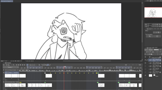
that kind of thing works for me because im a little messy and i like being able to redraw or adjust stuff inside the same software instead of switching back and forth. but for more elaborate project it will probably start wearing on your sanity to have everything crammed into one file (not to mention the file size might become unwieldy depending on what you're working with)
not all drawing programs will have animation features or audio import as part of their kit, which can make things troublesome. but if you're using animation software or an art software with animation features, it's possible to just do it all inside that program with relative ease like that (though some of them can be quirky to Learn)
as an aside, the original black eyes was made entirely in photoshop of all things because csp didn't have as many tools back then, and you can tell because . that is not a brush ive ever used and the pans/crossfades are Occasionally Very Weird JHBHSJK i could've just used a video editor but noooo. photoshop timeline tools ONLY No Assists
and that video is All still images so it could've easily been handled either way. important part is it worked out and i had fun messing around in there
i'm sure there's some other workflows out there someone finds super useful but i think the Main Branches are definitely
drawing software + video software (tag team)
drawing/animation software with audio import capability (solo job)
the first one tends to be more accessible i think? not only like Generally Speaking because there are more free drawing programs and more free video editors than there are free programs with drawing + animating + timeline editing all together (which . is true) BUT ALSO because even when we already have our programs ready the learning curve is usually sharper for the all-in-one and can be challenging to figure out, depending
but for me when im just playing around in there i find working all in the same program gives me a lot of flexibility. since i don't have to keep taking an image back and forth between the drawing room and the video editing room if i have to change something. yknow
it depends on the project. just try stuff out idk :)
my advice is definitely to start smaller and don't jump into making like a 3-minute video right away until you're more comfortable with your developing workflow. but that's about it. i think beyond that its Fuck Around And Find Out HAHAH i dunno
if theres anything specific i missed im sorryyy but you can ask and i can try 😂 good luuuuck!!
*to compare i guess, RoL looks like this -- behold the filenames of a genius

17 notes
·
View notes
Text
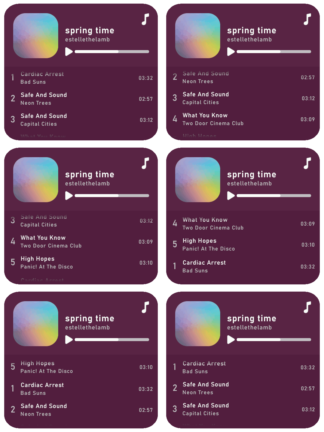
Rolling playlist gif for GIMP: a tutorial ▬ by Joy from @creativexspirit
Credit where credit is due, I fell in love with this gif tutorial but EH I don't use Photoshop anymore so I made it my mission to recreate the effect in GIMP.
This tutorial uses AnimStack, a Script-Fu script for GIMP to give you tools for the creation of animated GIFs. As it's super useful, even if you don't follow this tutorial I highly recommend to download. How to install AnimStack to GIMP in tumblr's FAQ: https://animstack.tumblr.com/faq
This tutorial uses my playlist template.
Tutorial with screenshots is under the cut.
Like or reblog if you download. Please don’t request as your own, respect my work. Don’t hesitate to tag me if you follow the tutorial! I would love to see your edits.
STEP 01.
Change the titles, the colors, the icons. Tip if you want to change the song title that are not visible: move the layers group "Song list", so you can see the text you modify.
Add songs by copy/pasting the "Song 5" layers group. Keep this layers group inside the "Song list" group.
Try to move the layers group so that it is aligned with above songs.
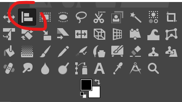
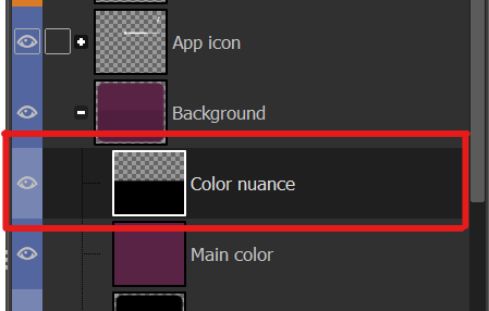
To place back correctly the "Song list", here's a tip: use the align tool and click on the "Song list" group. In the tool's options, in the "relative to" drop down menu, choose "Selection". Back to the layers window: in the "Background" group, right click on the "Color nuance" layer and choose "Alpha to selection". Now you are free to align your "Song list" layer group to the top and center of that selection, and it should be alright!
STEP 02.
Now the tutorial actually begins. Flatten all layer groups using Image > Flatten Layer Groups. (Don't mind my GIMP language, it is in French but the AnimStacks tools are in English, you should have the same menu.)

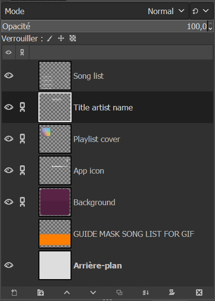
And now your layers window should look like mine, minus the links on the layers.
Now, see the linked layers? Merge them all together. You should end up with only 4 layers: "Song list", "Background", "GUIDE MASK SONG LIST FOR GIF", "Arrière-plan".
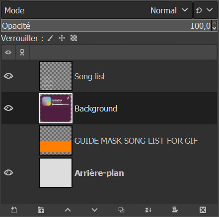
Note: you don't really need the "Arrière-plan" layer, so if you want to, you can delete it or you can merge it with the background layer. In my case, I will delete it.
STEP 03.
Reorder your layers. This is very important as AnimStacks will process the layers from top to bottom, so the layers order counts.
Put your "Background" layer on top, your "Song list" layer under it. As for the guide mask, we don't really care as we will delete it later.
STEP 04.
We are now going to add AnimStacks tags to our layer names. Here you'll have to do a bit of maths because you can choose the number of frames your gif will ultimately contain and adjust the tags parameters accordingly. This might seem complicated but it really isn't. I'll start by showing the tags to add, and explain how this will be processed. I will then give you the maths to choose your parameters accordingly.
Below, the tags I have added to my layers. You will have to write the same things as I do but what you might change is:
the number of "30" in Background.
the y parameter of the offset tag "-12".
YOU ARE NOT ALLOWED TO REMOVE THE [copy:0] and change it.
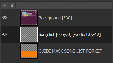
OK but what does each tag do? Remember, AnimStacks process is from top layer to bottom. Here the first layer is our Background layer: [*30] means it will duplicate the "Background" layer 30 times.
Now, onto "Song list" layer: [copy:0] will check all layers above the "Song list" layer that has no tag (at this point, all of our 30 "Background" layers have no tag), create a group for each found layer and place the "Song list" layer at position 0. Ok this explanation is wacky, for better explanation, please check the documentation.
The offset tag is necessary for the rolling effect: at each addition of the "Song list" layer, it won't just be a simple duplicate of the "Song list" layer, but the layer will have moved a little by (x,y) = (0,-12), allowing us to get that "rolling" effect in our gif. (And now you get why I said "y parameter".)
OK now, but how did I choose my parameters? So for reference, I only have 5 songs - I didn't add any song to the song list. For my maths, you need the height of the "Song list" layer. Check it with the scaling tool.
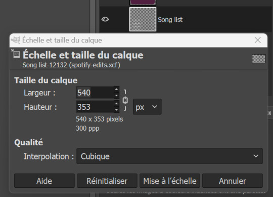
The height of my layer is 353 pixels (awful number meh). I choose to have 30 frames. So the move of the layers will have to be of 353/30 = 11.77 pixels. I choose 12 pixels because you can't have floats for the number of pixels, can you?
DO NOT FORGET the minus in front of the y parameter. My y parameter is "-12". Otherwise, the playlist will roll towards the bottom.
STEP 05.
We are now going to add a mask to the "Song list" layer to avoid seeing the title songs where we shouldn't see them. See that obnoxious orange layer "GUIDE MASK SONG LIST FOR GIF"? Yes, it is its time to shine.
Right click on the "GUIDE MASK SONG LIST FOR GIF" layer and choose "Alpha to Selection". (Well in French it's Alpha vers Sélection.)
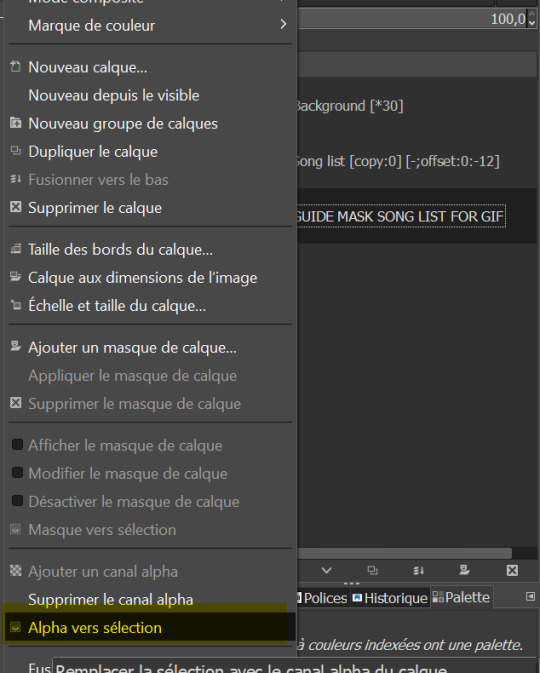
Now, we are going to use that selection to create a layer mask on the "Song list" layer.
Right click on "Song list" and choose "Add a layer mask". /!\ Your selection must still be active. (Well in French it's "Ajouter un masque de calque" but you can see the icon right? By the way, you can also add a layer mask by clicking on the icon in the layer window, see circled icon in red.)
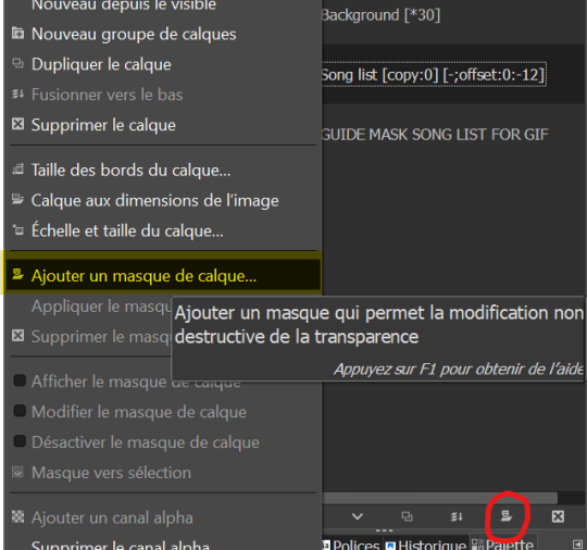
Now, choose Selection for the creation of the layer mask.
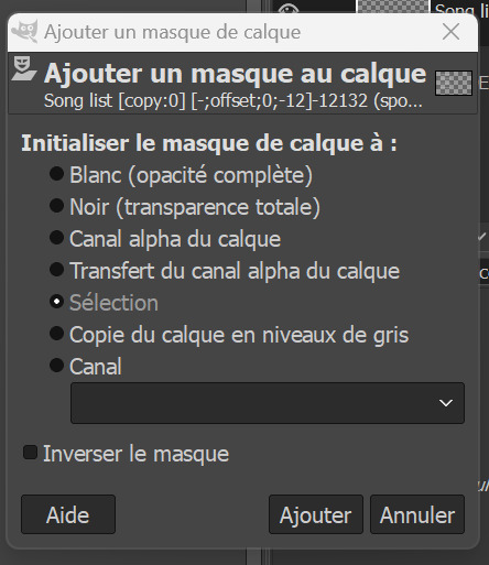
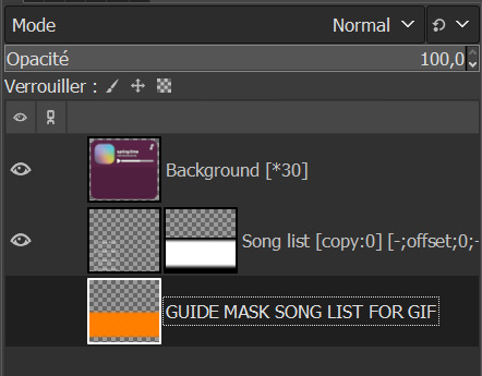
If you don't have the above results for the mask, it might be that you foreground and background colors are not the same as mine, meaning black and white respectively.
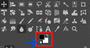
If you don't have the same colors as me above, click on the small pair of squares the blue arrow I draw is pointing to. It will default your foreground and background colors to black and white. Keyboard shortcut is D. (I don't think I changed it.)
And now, we don't need the orange guide mask layer anymore, so you can delete it.
STEP 06.
Last check before process: make sure you have no area selected (or you will get a weird result). Cancel all selection with Selection > None.
STEP 07.
We now begin the AnimStacks tags process.
In Filters > Animation, find "Process Animation Tags" and click on it.
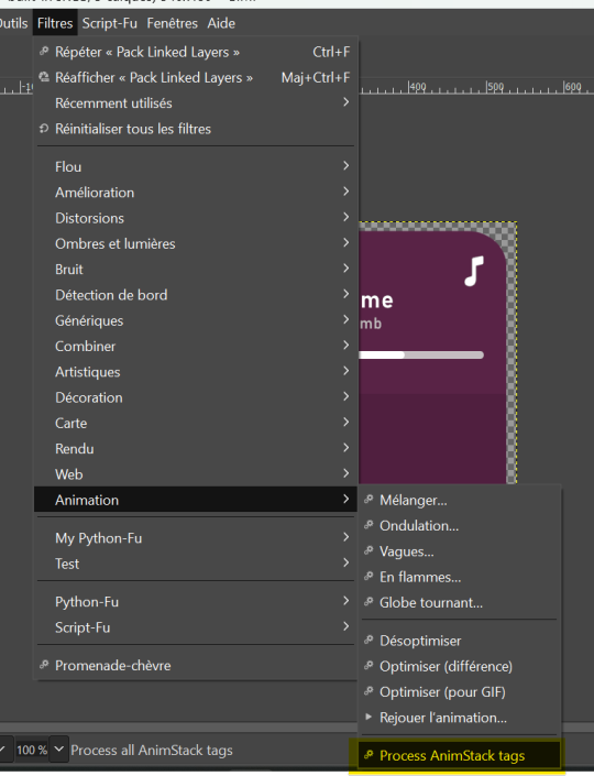
The process might take a while depending on the number of frames you have.
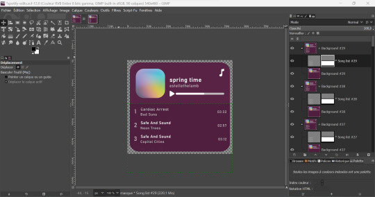
If everything is correct, you should have something similar to that. Now, we can check if the gif is correct and if we liked the number of frames and y parameter by previewing the animation in Filters > Animation > Playback...
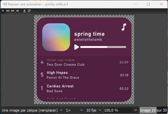
STEP 07.
This step is optional but you might want to change the time of our first frame to be longer so people have time to read the beginning. Do so by changing the layer group name by adding (800ms) to it. This means the frame corresponding to that layer group will be 800ms.
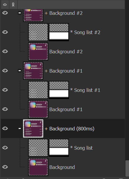
You can check if it's long enough by doing the playback again.
STEP 08.
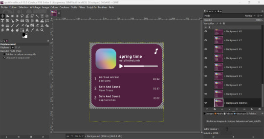
Now, we have to flatten all layer groups if we want to export to a GIF. In order to do so, we will just use the same trick as the beginning: Image > Flatten Layer Groups.
STEP 09.
Optional, but good to do: to make our gif lighter, we are also going to optimize the gif. In order to do so, do Filters > Animation > Optimize (for GIF) I don't know personally the difference with the other optimization method. Choose either you'll have similar results it's a difference in the implied algorithm I guess.
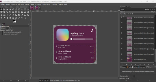
This step might take a while, but it's ok. When it's done processing you should have a new image created with the same results as me above. You can playback to check if everything is correct but here our job is done! We will now export the GIF.
STEP 10.
You can now export to GIF! Go to File > Export as..., choose the name of your file and end it with the .gif extension.
If you get an error message because some layers are not cropped, no worries: just choose the "crop" option (but you should not with the optimization).
Now, don't forget to check "as animation" when saving the GIF, if you haven't done the optimization, choose the delay between frames (the first frame will still be of 800ms), and choose "replace".
WITHOUT OPTIMIZATION:
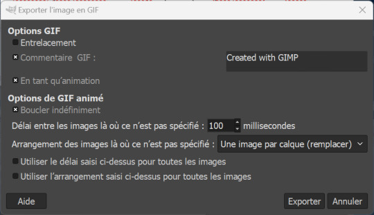
(With the optimization process, all layers already have delay and animation replacement type thingy specified.)
AND VOILA, YOU HAVE YOUR GIF! If you mess around more with AnimStacks, you can do cool stuffs with it!
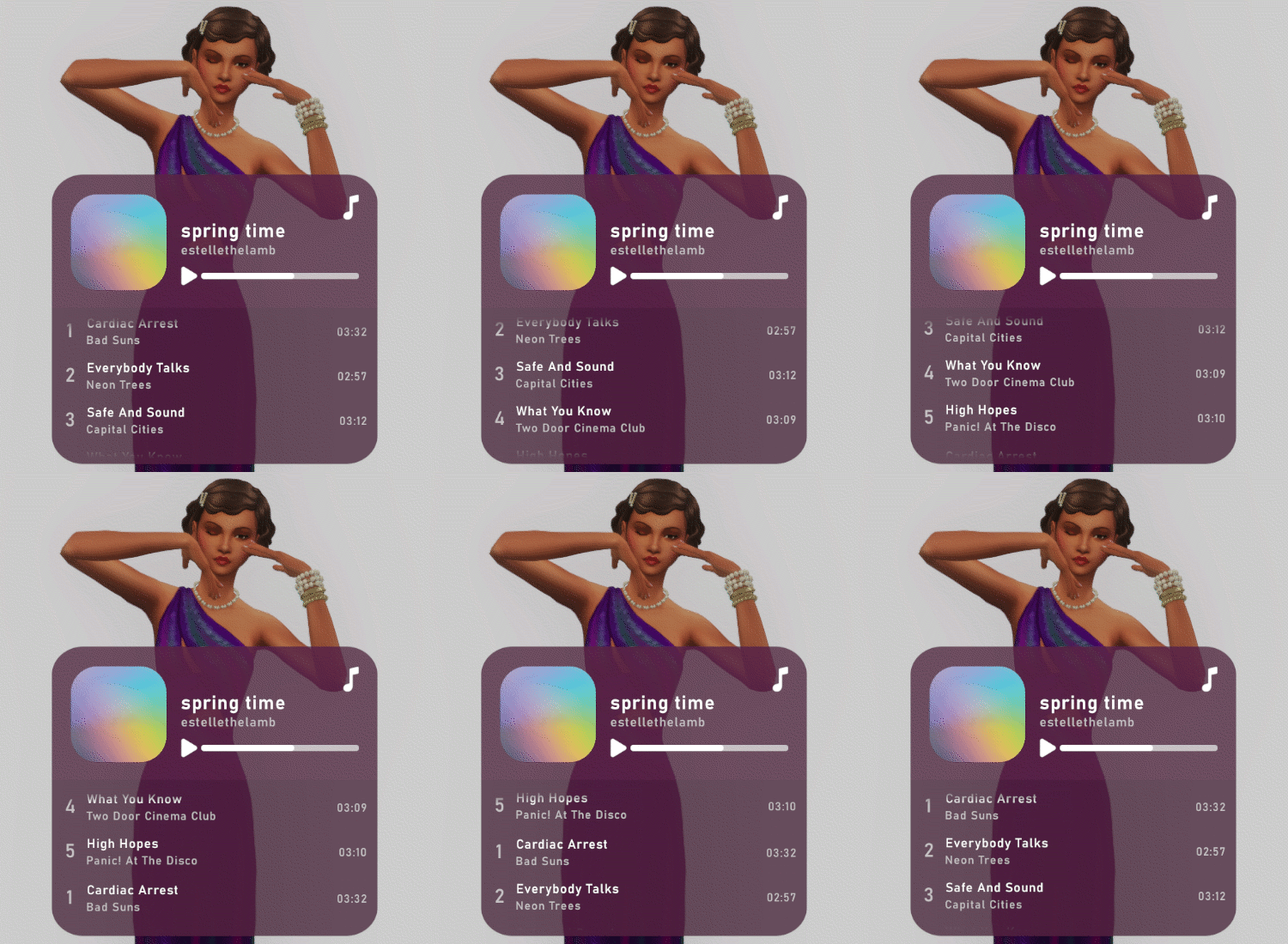
Now, how do you pronounce the G in gif? Also shh, don't say you saw the mistake I made when changing the title's songs in the tutorial, I wanted to write Everybody Talks by Neon Trees.
21 notes
·
View notes
Note
Hey, Mugi! I saw you reblogging the artist ask game, so I'm ready to fire away 😁 How about 9 and 30? And if it's okay, I'd like to add number 12 and hear (read lol) about your process 🥰
Hey there, Zahra! Thanks for sending me another ask, and of course I'm more than happy to answer😃 However, my Dory-brained friend/aff, you already asked me 12 here. But, fear not! I'm still gonna answer it and focus on something different this time.
Let's-a go!
9. How much time do you spend drawing on an average day?
This is a bit of a tough one. My drawing, painting and animating is very irregular depending on the day and my list of tasks or projects to do. It can be anything from 10-15 minutes spent on just doodling in my sketchbook to essentially all day. And then there are even some days when I don't get to actually draw anything at all. Not sure how to even count the average time taking all of that into account... maybe 2 hours a day, at least for the artsy things? I mean, there's also the design but not art related stuff I have to do, and sometimes the line between the two is a little blurry, but yeah, let's go with that for the art. I hope it makes at least some sense lol😂
30. What inspires you to not just make art, but also be a better artist?
I suppose it's the mixture of all of the artists and animators I admire being a huge source of inspiration, my natural ambition and love for the craft, and a little dream that I wanted to give a chance after failing to fully give up on it. The dream is to become a professional animator, though the problem is, between the time that dream first formed in my head (when I was like 6) and now a lot has changed, for example the types of animation in demand - I've always liked hand drawn animation the most and it has never really changed. But it's become a little niche now. Not to mention the possible dangers of gen AI. But I still keep trying to improve and maybe someday finally get to the professional level I'm aiming at.
And finally, an extra answer to 12:
12. Is it okay for people to ask you about your process?
This time, I'll tell you a bit about my process of drawing comics. I'm a complete amateur at this and have never even watched a single tutorial on how to do it, so I don't know if I'm doing this "correctly"... but I've developed a method that has been working for me just fine so far, and that's what matters in a non-professional setting! I create comics in Photoshop. Let me walk you through my process step by step:
Step one: rough sketch; when I figure out the entire layout of my panels, speech bubbles etc., as well as create the base for my drawings in each panel
Step two: panel frames; I typically use a rectangle tool because so far I've been very basic about the shapes of my panels
Step three: adding text
Step four: making the panel bases; what I mean is, I select my frames and create a mask in order to color inside the frame in a neutral shade of gray that I like to work on top of; then as I work on each panel, I create clipping masks for every layer, makes it easy for me
Step five: draw a speech bubble cleanish sketch/lineart; I do it separately for each panel
Step six: draw everything else's cleanish sketch/lineart; I also do it separately for each panel
Step seven: color panel by panel; I start with filling the speech bubbles with white on one layer per panel; then I like to color an entire panel on just one separate layer so I don't have to juggle between too many of them
Step eight: color the background; sometimes I do this step earlier, but usually once I have everything else colored, I still adjust it a bit; I often keep it very simple, like a gradient (fun fact about my I Was-a Too Late - The Comic: the first few pages all had a gradient that gradually became less saturated, starting with the same color the previous page ended with; to signify the shift in the mood from normal and bright to something much more grim; the saturation in the panels themselves also gradually changed for the same purpose^^); but sometimes the background or part of it can be a frameless panel, too, which spices things up a bit
That's it, that's been my comic drawing process so far!😃 Hope you found it interesting.
Thank you so much for the ask, my beloved friend!😊 Always happy to find you in my inbox.
The asks are all based on this game.
6 notes
·
View notes
Note
can you please make a tutorial for your santa gift graphics? i'm not totally new to photoshop but i could use some help <3
Ohh okay, this will be a bit long, so bear with me, dear Anon.
I'm going to use this one as an example:
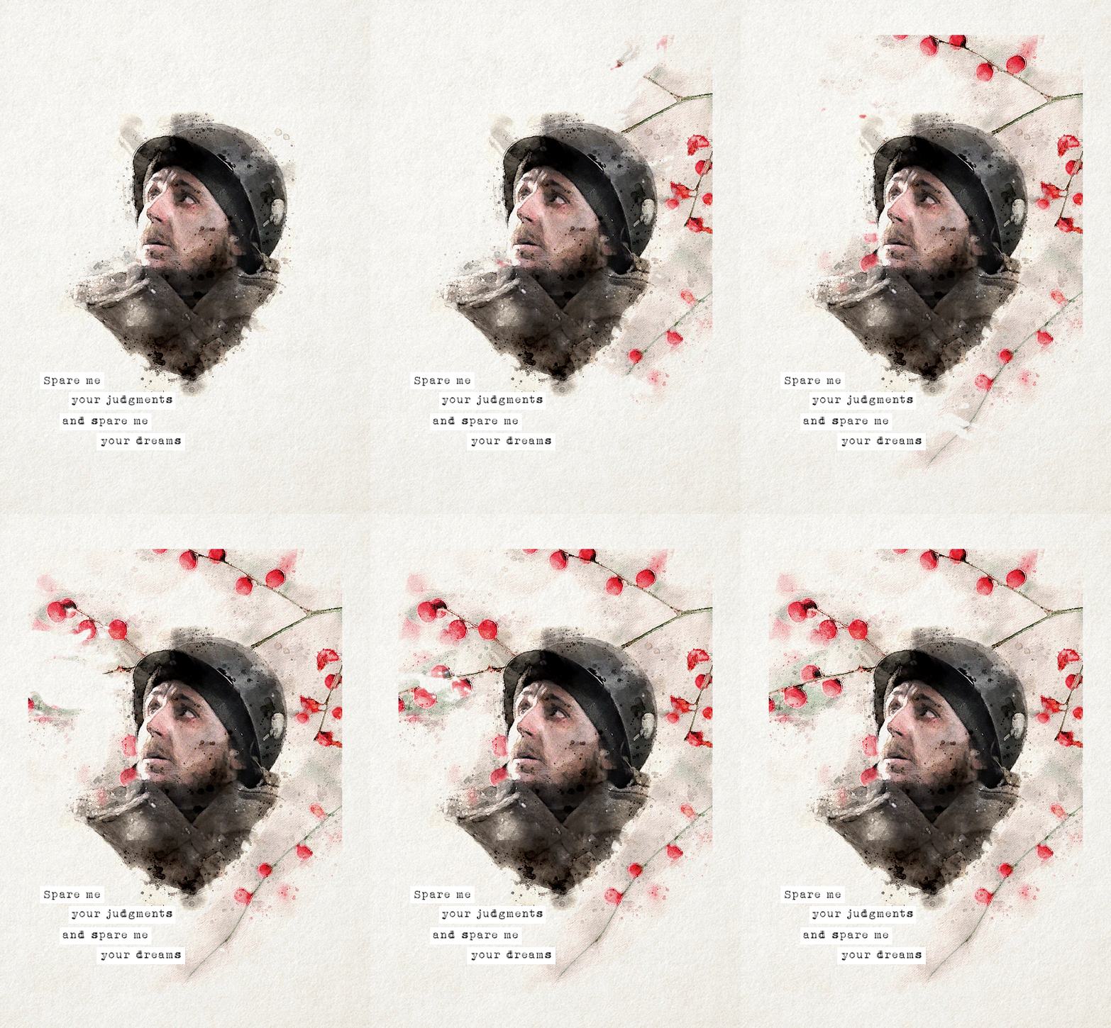
You'll need three new documents: one for creating the watercolour portrait, one for the watercolour elements in the background, and a third one for the final edit.

Let's start with the portrait. I'm using a free photoshop action for the watercolour effect, which you can download here with a complete tutorial. After using the action, you'll need to make some adjustments, but it's still faster this way. Change the blend mode of the "watercolor artist" group to screen and slightly turn down the opacity if needed to make the details more visible

In the second document, use the watercolour action the same way again to create the red elements in the background. You can download the photo I used here. I highly recommend using Unsplash, they offer plenty of free high-resolution stock photos, and unlike on Pinterest, the photographers are actually credited.
Create the third document; mine is 540x750. I used an ivory paper as a background, but it should work with a canvas texture or even a simple white/light layer. Pick whatever you like.
After you're done with the watercolour actions, paste the portrait into your third document. Adjust the size and position, then change the blend mode to multiply. Name the layer "portrait."
Next, paste the background elements too, and also change the blend mode to multiply. I changed the saturation and vibrance to make the red pop more, but it's optional. Name the layer "background elements." Now that you see everything together, you can play around with different adjustment layers, contrast, colouring, etc.
Now, open the video you'd like to use for the animation, in a separate document. I used this one, but there are other similar free videos on this website, pick what you like the most. If you want to make the process quicker, pick one that's already a high-contrast black and white.
After you've opened it, you can use the timeline to cut out the part you'd like to use, adjust the speed, etc. In this case, I just doubled the speed which you can do by clicking on that little triangle, and used the full video.

Create a video timeline in the third document. Go to Window -> Timeline -> Create Video Timeline. It's an important step, don't forget about it. Once it's done, copy and paste the video layer into the third document, and name the layer "video." Make sure the "video" layer is right above the "background elements" layer because you're going to need to create a clipping mask. You can do that by right-clicking on the "video" layer and choosing create clipping mask, or you can hold down the alt key and left-click between the two layers. When it's done, you can adjust the size of the "video" layer, rotate it, flip it, etc., depending on how you want your animation to look
After that, set the blend mode of the video layer to screen. If you've done everything correctly, you should have your animation now.
It's time to add the text. I used this font, size 16. I divided the text into 4 lines for easier adjustment of the position.
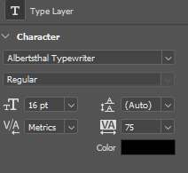
Once you're happy with the layout, create the white stripes, each on a different layer. This way, you can move them around separately if you'd like to change the position of the text. I like to make the text and stripe layers into a group so the layers are less chaotic, but you can skip this step.
The only thing left in the editing part is the invisible frame. Click on the "background elements" layer and add a layer mask. Select the brush tool, 50px, 100% hardness, and set the foreground color to black. Now, draw a line from corner to corner. Holding down the Shift key, click on one corner using the brush, then click on the next one, and repeat until you're done with all four sides. Your layers should look something like this now.

Before saving, make sure that all the layers on the timeline are the same length and start/finish at the same time.

If you're done, go to File -> Export -> Save for Web (Legacy). These are the settings I used for this particular edit, but feel free to experiment and use what you like the best.

I tried not to complicate it too much, but it's difficult to explain everything in writing, so if you have any questions, I'm always available :)
17 notes
·
View notes
Note
Hey fren! I have a ton of questions. Lmk if I’m being too intrusive or nosey lol.
I love your story, I always have to give you your flowers when I write you!! All hail the Queen 🙌🏾🙌🏾💐💐💐
Ok my questions:
For starting out posting and editing, do you keep a schedule for yourself to stay organized? Rn I’m finally posting on my simblr after 3 years but I find myself just constantly taking screenies instead of posting and organizing the story. It feels chaotic lol the only organizing I’ve done just for game play in general is shopping for CC every other day (it’s an addiction)
A question I wanted to ask for a while is, if you are commissioning someone for poses what are the average prices you pay (or better yet, what do you think a good price is to pay for pose commission)? Sometimes I have these perfect poses in my head and when I’ve searched for hours I normally just end up giving up.
Lastly, I noticed your post from yesterday said you had 25 photos loaded in photoshop. Do you have all the art board (or images) side by side to edit them consistently and simultaneously?
Thank you if you answer!!
Good morning bestie!! Let me just go on ahead and adjust this crown right quick lol THANK YOU and I got you!
I'm chaotic and impulsive but I have a little bit of a routine. Follow me under the cut!
Okay, SO!! For the first question about posting and editing.... I usually have an idea for the next scene while working on the previous one. So when I go in-game for story updates, the idea is already there and I'm just setting up shots and making the scenes look good. I don't have a schedule other than my posting schedule, so when you mention last night, I was editing pics that I had taken earlier in the day or the day before. So my schedule is usually sitting in photoshop all night the day before I post.
For pose commissions, I've only done that twice. I've had real good luck over the years finding poses or animations for anything I've needed. I would say make an offer to donate to them if you know their shit is dope and move anywhere between $5 to $10 USD. For the poses I commissioned, they weren't released publically so that's extra special (tip them more!). Also keep in mind if you're asking for accessories to be used, how many sims are in the pose, etc. For pose searching, try to be as vague as you can. "ts4 cleaning poses" and then see what comes up is one example and don't shy away from animations! They work with pose player, most without WW and can make for some great screenshots.
I load up all the pictures in Photoshop plus whatever templates I'm using (like the texting one or the dust overlays), and edit in order of sequence. This is where all the dialogue happens so sometimes I edit out of order if I know the dialogue for one scene already and maybe not the others. I hope i'm making sense lol. I spend a lot of time on this part because the words might change given which picture I've decided on (some scenes I take multiple screenshots of and multiple angles and then decide later which one to use). I go pic by pic, doing editing and adding dialogue individually then saving them, closing them and moving on to the next one. Once I'm completely done then I flip through them a few times as if I were the reader to try and catch any typos, etc.
This got really long but let me know if that helps or if I can elaborate more!!
18 notes
·
View notes
Note
hey, i'm sorry if this is a weird question, but i'm wondering how you personally make gifsets? i wanted to make some basic ones for a post and i love the ones you make. thank you!!
yeah sure! here's my method:
First things first, I use Photoshop CC (a tooooootally legal version of course. so legal. so not pirated), and idk how to make gifs in other programs so uhhhh find a copy of Photoshop, if you don't have it already. Also I'm assuming you already have the video you want to gif somewhere (also gotten through entirely legal means, of course).
Also it's entirely possible there are better ways to gif, this is just how I do it! Lots of people use actions to streamline their process for instance, but I don't. So. There's that.
Anyway:
Clip the part of the video you want to gif
I personally use Microsoft's in-built program Clipchamp, because it's there and it can handle mkv files and output as mp4, but you can obviously use whatever program you like.
2. Import the video in Photoshop
Use File > Import > Video frames to layers

Select your clip. You now get this screen:

Select the part of the clip you want to turn into a gif. Keep in mind Tumblr's 10mb limit, so don't make the selection too long. If you do want a longer clip, and don't mind the gif looking a little less smooth, you can tick "Limit to every 2 frames" to cut down on the number of frames.
Click OK, and PS will convert the clip into layers. Make sure to have the timeline on (Window > Timeline)
Your workplace should now look like this:

3. Adjust the frame delay
Adjust the time between the frames by selecting all the frames in the timeline and clicking the little arrow in the bottom right of one of the frames.
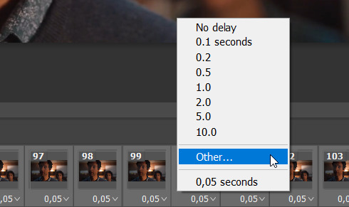
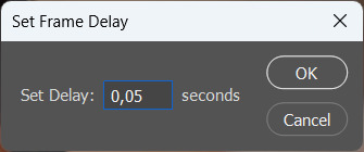
I tend to set my frame delay to 0,05 seconds, but do whatever you like most!
4. Convert to video timeline
Convert the frame animation to a video timeline by clicking on the hamburger menu in the top right of the timeline and clicking "Convert to video timeline"

5. Convert the layers to a smart object
Select all the layers, right-click and select "Convert to smart object"
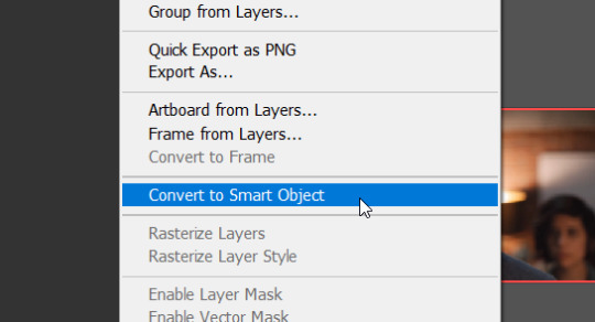
Cool, all your layers have now been converted into one video layer. Easier to work with.

6. Cropping
Crop the video to whatever size you want it to be (keeping in mind that 540px is the widest the tumblr dashboard goes). I'll crop this one to 540x350px.
7. Apply adjustment layers
Now apply adjustment layers to colour the gif to your liking (Layer > New Adjustment Layer). You can do this any way you like, but the adjustment layers I tend to use most are Levels, Curves and Vibrance
Here's a before and after.
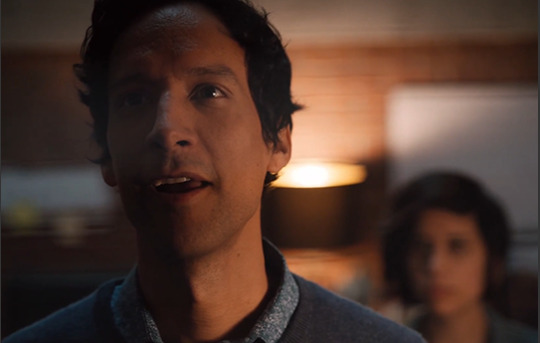

But again, you can just go ham on this in whatever way you like. Just fuck around with the layers until it looks good to you!
8. Sharpening
Now it's time to sharpen the gif, to make it look extra crisp. Select the video layer and go to Filter > Smart sharpen and just fiddle with the settings until you're happy with it.
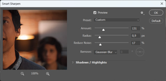
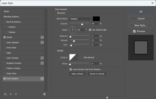
9. Text
I'm just gonna assume you know how to add text lmao. But to make that text stand out, go to the layer style by double clicking the layer and selecting Stroke and Drop shadow.
10. Saving
To save your gif, go to File > Export > Save for web (legacy)
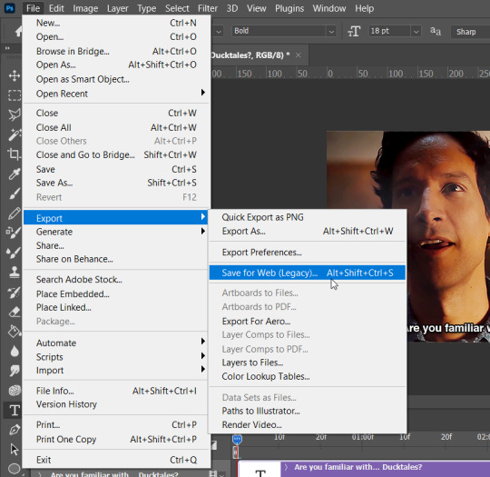
Select gif and set the looping options to Forever.

Now, make sure to check whether your gif falls under tumblr's image limit of 10mb. This one is 9mb, so I probably should've cut it down a bit, but I like big gifs, sue me. If you don't want to cut the length of your gif (which you can very easily do with the timeline), you can also cut down on the amount of colours. I wouldn't go below 128 though, that just makes it look ugly lmao. But hey, the option is there.
Anyway, save the gif and you're done! You have made a gif!!
Hope this helps!!
9 notes
·
View notes
Note
hi lovely!! do you have any tips on making cool fun and sexy typography?
hey joanna!! this made me giggle haha, i'm not quiiiite sure how to answer that, but here are some tips i keep in my when i do typography, and some examples:
FONTS
don't be afraid to "shop" for fonts and try funky fonts you've never used/seen. i often try so many before settling. i almost always use at least 2 different font for gifsets, even 3 sometimes. i think a good font pairing can do a lot for a gif. it's usually something like:
serif + cursive/funky fonts (example)
sans serif + cursive/funky fonts (example)
serif + sans serif fonts (example)
two different cursive/funky fonts (example)
or even simply the same font but all caps + all lowercase (example)
in case you're unsure where too start or want inspiration, here's a great resource: usergif's font pairing guide and its fonts page
BLEND MODES & LAYER STYLES
i think playing around with different blend modes and layer styles will always elevate your typography game, in my opinion. it's usually a bit more dynamic than just an opaque color. tho this minimalist typography can also be really good.
when you double click on a text layer, you get all the layer style options, as well as the blend modes. a very popular layer style is setting the layer's blending option to difference, paired with a color and/or gradient overlay (often set to multiply/color dodge). a drop shadow is also important so the text is more easily readable. we often see a black soft drop shadow, but don't hesitate to be creative with it, for example a thick, hard line, colorful drop shadow.
i feel like this step often takes the most time for me because the possibilities are endless. definitely play around with layer styles, especially drop shadow, color overlay, gradient overlay, stroke. and also try different blending modes for these settings.
as for the layer's blend mode, also definitely play around with them. and keep in mind that the text's color will also give a different result, it doesn't have to be white + blend mode set to difference, even tho this is a classic that works well.
TEXT WRAPING & POSITION
a great feature on photoshop is definitely the text warping tool. to access it, right click on a text layer and go "warp text". from there you'll get a few different styles and setting sliders. my favorites are flag and wave (example). you can always go back to edit these settings once they're done by right clicking again. and you can even keyframe/animate these settings!
typography doesn't always have to be centered and straight, i often prefer it on a side and rotated a little. you can easily rotate typography by selecting the layer(s) and hitting ctrl + T. you can also play with the skew and pespective after hitting ctrl + T by right clicking the canvas and clicking on either. these will give different ways to move your text.
SIZING
i love playing around with different font sizes, it makes the typography more interesting in my opinion, and it's a way to emphasize some words.
so for that reason i usually put each word on a different layer so i can edit each word separately. sometimes i will also put each letter on a different layer, because it can be interesting to offset/rotate some letters sometimes (example) (another example).
i often pair a quite small serif or sans serif font with a much bigger funky font (example). and often that bigger font will also have different sized words (example). i play around a lot with this!
ADDED EFFECTS
there are some things than can be done to enhance typography:
adding a colorful rectangle block behind the text (example)
using text symbols such as quotation marks or backets (example)
using lines around the text (example) (another example)
these can definitely bring typography to a different level
MORE RESOURCES
great font website
usergif's typography tag
my fonts tag
this is all i can think of right now, i hope it helps :D if you have any question on a specific text effect let me know, i can definitely make a tutorial!
#alie replies#silversmists#typography#photoshop#*ps help#resource#completeresources#allresources#resourcemarket#usercats#userabs#userpjo
214 notes
·
View notes
Text
Anon has got me thinking abt Gundam again -_- apologies. Specifically Gwitch, which iirc had a preproduction w a ton of market research vs First which has more auteurism imo. They have opposite pitfalls in a way.
Gwitch is undoubtedly made with the international market in mind. For example, the UI at the school, on characters phones etc is exclusively in English, and not even basic phrases or wasei-ego a Japanese audience could easily infer or read. (Granted, the font makes it tricky for anyone to, lol) Someone's job was to write it grammatically accurately and meaningful, as opposed to just plunking in filler text about operating photoshop or whatever like someone at the studio did for Wing. It's a notable choice, but also a poor one for narrative flow, because it necessitates fumbling at the edge of the 4th wall a bit (and for anglophones, redundancy) when characters talk abt the text they just sent/read. (It happens multiple times too lol) It's a very good choice however, if part of your metric for success is getting foreign eyes on your show AND having nerds pour over the phrasing as easter eggs to analyze. It's free marketing!
Using English can absolutely be an artistic choice, esp when only a Japanese audience is going to be watching the show (there has been tape-sharing from pretty much the start, but that's not what finances a production) Early UC used English/Anglophonisms all the time for an international and narrative intent, such as calling female federation cadets "Waves" a la WW2 USA, having western name orders ("Amuro Ray" even though "Ray" is his family name) and saying that the canon name spellings are in katakana, even with Japanese names like 'kobayashi' and 'deikun'. Part of that is futuristic world building, but it's a very political choice, even before getting into 0079s obvious themes. I'm no expert on race/ethnicity in anime, but to put in context how new the 'racelessness' design approach was in 1979 as opposed to today, Yasuhiko Yoshikazu semi jokingly told coworkers a possible kanji spelling for "Ray" if any higher ups audit their choices. A non (Yamato) Japanese lead was something artists had to defend! (Another example off the top of my head is Jotaro from JJBA having a Japanese father....who is never even pictured lol. It's a compromise with editors for "daring" to show a minority lead)
In that sense, having characters of color, having women characters who aren't pigeonholed into "women's roles" etc are choices that today are taken for granted. It's fun to point out the silliest Tomino names for example, but it's far better than ethnic homogeneity. And make no mistake, representation is a good thing! I just hold a higher bar for productions that have the benefit of less scrutiny. If my understanding is correct, absolutely no toy sponsors or TV execs back in the day would've pushed for more POC in Gundam but the studio did anyways! Whereas I assume such a thing was a given at sunrise today, not out of anti-racism goodness nessessarily (Shaddiq was done SO dirty) but because it's generally profitable to avoid ruffling too many feathers, as well as to target as wide a demographic as possible. And in this day and age with high-speed internet, quick translation, vast supply chains for producing and and disseminating merch, etc, "wide audience" means an international one. "Representation" is incentivized, not nessessary a choice made against a status quo.
This is all obvious and fun to parse if you're aware of the socioeconomic context in which media is made, questions like "who is the audience? Who is the producer? How is this being made and why?" show a more objective picture of it all. I'm not here to beef w other fans who feel less alone when there's someone like them on the screen, I want people to think About media more is all. If you find Sulemio meaningful, I'm not going to take that from you, as WLW are in fact good. I'm just painfully aware that someone somewhere was calculating, financially, if an onscreen lesbian marriage would be profitable or not (Gundam and other big anime IP are federally subsidized by the 'Cool Japan Initiative' iirc) and the choice to be less gay than possible (and promised, imo) was made, maliciously or not, to bow to the wishes of a conservative, misogynistic nation-state.
#sorry for the lack of sources this got massive quick#i was intending to talk abt gender politics in gwitch vs zeta but thats an even bigger topic lol#abs blabs
13 notes
·
View notes
Text
Graphic Design 4
Hello you loquacious lollipops!
On Friday we spent some time on the computers designing a little book to convey what our project is all about.
I missed most of Thursday's workshop but i know they mostly folded paper, introduced the concept we did today and that I should research an artist who deals with paper. I'll try and catch up on this in the next post or the post after.
Anyhow, we went on Illustrator and divided our A3 (420mm x 297mm) page using guides. I also added a 10mm border around each page and numbered them in a way that when folded the book was in order. Lydia helped me with this as it was more explained in yesterday's class.
I realised I needed to design a cover and back cover page that were cohesive and matched my project so I immediately thought of one of my earlier designs. I added text and aligned both pages so that they would match up.

I used a Cooper Black Font because I thought it matched the rounder parts of the design but was still bold but I might change this. I might also rearrange the bottom text but I quite like the way it looks right now. I want to know what my tutors think first as I don't feel too confident with typography.

This is the back cover where the design matches the cover's as a continuation of it from the back. from my initial design where the box was in the middle, Sharon felt there would be more balance if it was at the end of the page, but with this I can still get that effect and meaning of the first design without throwing off the balance on the singular pages.
I realised I want a better picture of my girl on the swing to put in this but I didn't like any of the later ones I took so I went to photoshop. I was using the magic wand tediously to select every part until Lydia saved me with introducing me to masking. This sped up the progress of selecting things for me and although I was aware of it I didn't properly understand it until then. This made the whole cut-out process much easier.

Here is a picture of the book template layout and some of these assembled pieces in it. You can see how the pages are numbered and how some have to be upside down before the paper folds so it lines up. You can also see the guide on the first one to see how I divided up the page.


You can see I've also put in a bit of my character design work from animation where I also plan to put another bit of my Animation work into page 2. The next two would be Graphic Design and then the last two being Painting. I also added a line of text on each page or the ones I have done to tell that story of what my project's about.
I was also thinking of doing another one of these but with illustrations of my animation work and a designed book cover of my animation's story. It depends if I have the time because I still want to get more of my animation done.
3 notes
·
View notes
Note
12, 14, 16 ❤️
Hi there! Thank you for these questions - any excuse to ramble about editing.
12. What gifset made you feel the happiest to work on? (link)
There's perhaps some irony in this, but this edit of Crozier and Fitzjames. I was knee-deep in a Terror fixation at the time, and finally feeling inspired to make and edit after a few months of nothing. The idea I had for the edit is almost exactly what I ended up posting, which is unusual for me. I was able to locate good quality screencaps and cut out and colour what I needed to cut out and colour. I was happy because I was editing again, happy because the editing was going smoothly. The point of that edit is to make as many people cry as possible, but I had fun making it, and that's the main thing.
14. What gifset was the most difficult to make? (link)
This edit of Fourteen and Donna turned into a bit of a nightmare, actually, and not in a way that I expected. Two specials deep into the 60th Anniversary, I was very much in the mood to make a Doctor Who edit. I didn't really have an idea, but I coloured that promo photo of Donna and Fourteen and then fiddled around in Photoshop until I came up with the rotating galaxy idea. I did not know, however, that rotating a layer in Photoshop reduces its quality. I was animating the background by duplicating it and rotating the layer by one degree as I went along, leaving me with a stack of slightly different layers. By layer 40 the starry background was a blurry mess. I just didn't understand it. I had to delete all of my rotated layers, and I found another starry background, this time with light trails, but by layer 50 it was also a mess. I still don't know why that happened, but I realised that I could get away with rotating the light trailed stars by about 30 degrees and they looked like they were moving more than they actually are. The finished edit is only three frames or so.
16. Do you have a favourite gifset you made this year? (link)
I'm still very proud of this edit of Silver and Flint. The screencaps of the scene I wanted to use didn't lend themselves to being cut out and coloured very easily, so I decided to just use them as they were. I like the balance I managed to achieve between the two parts. I remember the struggle I had with the second half especially, trying to get that text to look right. When I finally came up with the idea of using the Gaussian blur and flickering animation on both Silver's "shadow" and the text I was over the moon. I think it looks great and also tells a story. I always try to shove as much symbolism into my edits as possible.
gifmakers (and editors) asks | send me an ask
#ask#blakbonnet#thanks again! i hope you were able to understand what i was trying to say#it's really hard to describe photoshop sometimes i just click and hope a lot of the time
2 notes
·
View notes
Text
Title Screen Part 2
After some time I made my Text Shrink and grow. I did it every 0.25 seconds. It would shrink to 0.2x its size then it took another 0.25 seconds to grow back making the whole loop.

Now I want to make it go invisible so click the + and click Colour and Opacity

First I tired having the Opacity every 0.75 seconds. This was to make it more interesting than just being big and visible then turning small and invisible. However because the Opacity changes overtime which made it hard to see for about 0.3 seconds. I wanted it to be visible than almost instantly turn invisible.

So I decided to change it so the Opacity was 1.0 between 0.00 to 0.65 then at 0.70 it would go to 0.0 Opacity and would stay at that for 0.1 seconds until 0.8 then at 0.85 it would be visible again. This would create the idea of it being Visible then Invisible

You can see this with the 2 graphs the First one has a Yellow that is constantly changing into the checkers white and black making it almost a constant mix. But the Second has very defined Yellow and Checked sections with only a very small blurry bit.

However now it was a bit to flashy which might be disorienting so I changed the numbers slightly. So I changed the distance between the 1.0 Opacities and the 0.0 Opacities from 0.05 to 0.15, The first Opacity 1.0 now being at 0.55 and the Second now at 0.95.
Now all I needed to do was make this an actual Title Screen.
First thing I tried was goin into the BP_FirstPerson and in the Event Graph and out of Add Controller Pitch Input search up Create Widget

Then Under Class selected the Title Screen Widget.

Out of Create Widget's Return Value select Promote to Variable


Now out of Set's Nodes search up Add to Viewport

Then connected it to Play Animation

Now out of Target search up Get New Var 1

However this is all for a HUD that stays on the player at all times meaning it doesn't do what I want it to do.
Repeat this was all useless for Title Screens
But then I realised I made a project with Title Screen my 2D project so I went back to that project and found these lines of code to make the Title Screen Work here we go.
Now in the Title Screen Level

Open it up and then go to the Blueprint List

Then select Open Level Blueprint.
Then off of Event BeginPlay then drag off and search up Create Widget.

It will have no Widget go to Class and select the Widget that is your title screen.

Then to the Create Widget's Main and Return Value search up and connect it to Add to Viewport.

Now in the Title Screen Widget

Go to its Event Graph

Right Click the Blueprint and search up Any Key


Now Drag off Any Key's Pressed and search up Open Level (by Object Reference)

Then Under Level Select your main world (for me this is FirstPersonMap)


(IT ISN'T ANIMATED PUT HOW TO FIX, FINISH THIS POST)
(The date is 3.2.25) I saw mu original title screen which has now changed into my background because the plain White Border was boring, and I don't have enough time to make another background in Photoshop. You may have seen that almost everything is checkered this is because I felt it looked to plain when it was normal, and I wanted to see what it would look like Checkered. This symbolises though how difficult this game is and how you are going to have to be very smart to beat this game (aka Left Wing). Because Chess the most Strategical game also is played on a checkered board and it requires a lot of intelligence.

0 notes