#viscomstudents
Explore tagged Tumblr posts
Visit Tumblr Blog
Explore Tumblr blogs with no restrictions, modern design and the best experience.
Last Seen Tumblr Blogs


Fun Fact
If you dial 1-866-584-6757, you can leave an audio post for your followers.
Photo

Reposted from @canonindia_official Register now (Link in Bio) to join us for the virtual product launch event on 9th July at 5:30 PM IST. #Canon #ProductLaunch #RegisterNow #Photography #StayTuned #digithots #IndianPhotographers #indianphotographyhub #visualcommunication #viscomstudents #photographyindia #weddingphotographers #virtualevent #lockdownindia https://www.instagram.com/p/CCQsd_Anwtn/?igshid=14tcysbq5rg4u
#canon#productlaunch#registernow#photography#staytuned#digithots#indianphotographers#indianphotographyhub#visualcommunication#viscomstudents#photographyindia#weddingphotographers#virtualevent#lockdownindia
0 notes
Video
tumblr
'Save Young Hearts' - A month-long campaign by Prashanth Hospitals in collaboration with Loyola College. To raise Cardiac Awareness among the young population, the campaign was initiated on 10th September leading up to World Heart Day. The Heart Film Festival, as part of the initiative, was inaugurated by the renowned Music Director and Youth Icon, Mr. Yuvan Shankar Raja! The celebrity expressed his excitement towards watching the work of aspiring filmmakers and appreciated the innovative campaign. Yuvan Shankar Raja Loyola College, Chennai
#yuvan#SaveYoungHearts#heartawareness#yuvanshankarraja#HeartFilmFestival#shortfilmcompetition#PrashanthHospitals#LoyolaCollege#viscomstudent#SaveYoungHeart#loyolacollegestudents#yuvanshankarrajamusical#yuvansongs
0 notes
Text
Specialist Practice
Proposal outcome Mock-ups


Instagram and poster mockup:
For my final mock-ups I wanted to present my idea-outcomes clearly. I wanted to show my poster in a way that the viewer could imagine seeing it walking around campus for example, the instagram posts are clear and easily to see in this style of mockup too so that the actual design of the posts wasn’t overtaken by the mockup choice I wanted the mockup to be clear aswell as showing my out comes in ‘action’.
Bill board mockup:
The bill board mockup was originally a design for the side of a bus however I preferred the idea of a billboard instead, I was to do this again in the future I might take inspiration form the aub and bu buses where the whole vehicle is wrapped in a pattern/colour with logos in different spots sd a way of marketing this too, it would’ve been a successful way to promote something to gen-z expcisllt as most 16-25 year olds most likely use a bus to or from school/college/uni. Do I’m keeping this in mind for future.
Laptop mockup:
The laptop mockup I think isn’t my best choice of mockup, it is kind of small on the image and makes it difficult to really see the website design, in this case it isn’t too bad because I didn’t fully design the website or like how ny design come out, however In future I think I’ll do something similar to the instagram posts where it’s the design with subtle assets to show it’s a mockup of what it’s supposed to be on, like the dock bar of a laptop for example.
Merchandise mock-ups:
For the merchandise mockup’s I wanted to make things i know as a person who’s in the age range of my target audience would enjoy and actually want to own. For example a tote bag a pen a mug and some pins and stickers are all things I know 16-25 year olds would be interested in rather then something like a jumper or a t shirt.
Overall self reflection:
Aside from my laptop mockup I believe all my mock-ups came out exactly how I imagined and show my designs perfectly and I’m happy with the outcome overall.
#viscomaub#aub#viscomstudent#visual communication#aubviscom#graphic design#researchprocess#adobeillustrator#research#viscom
0 notes
Text
Specialist Practice
1:1 Presentation draft with rich and feedback


Self-Reflection and understanding:
This were my mid-point slides that i showed to rich in a 1;1 tutorials, the aim of this tutorial was to get feedback on if i had a good layout for my boards and insuring they was conveying my idea clearly and simply to the reader as if i was pitching my idea proposal to someone whom would be funding the idea concept, and someone who's never seen my idea before or been briefed on the aim of the idea.
However, I always tend to struggle with being able to clearly communicate my design intentions or laying out my slides clearly, i often ad a large amount of text making the slides boring and less enjoyable ton engage.
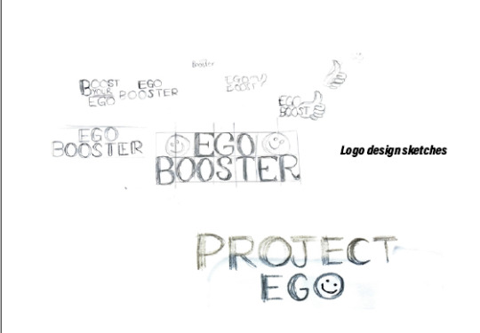
Constructive Feedback:
Feedback: The name 'Project Ego' might convey the wrong idea in the sense the word 'ego' is used more often to negatively describe someone who has high confidence in a way they act better than other people, so the name may be taken as a negative 'project'.
Solution: created a new name that still evolves the work ego but in a different tone of voice to convey the correct message through the concepts name, Ego Boosters connotes the brand is the one boosting the go of others and its more of a positive tone of voice.
Feedback: The slides contain a lot of writing, this isn't convincing the viewer that your idea is good enough for them to possible invest in it. A lot of explanation does not give the idea confidence.
Response: Create a visually motivated presentation that concentrates on my proposal with small explanation sections but mainly visual self explanatory designs and outcomes with physical realistic mock-ups in context or life like settings.


New Presentation Boards:


#viscomaub#aub#viscomstudent#aubviscom#visual communication#researchprocess#viscom#graphic design#research
0 notes
Text
Specialist Practice
website design


For the website design i made sure to have a cohesive colour pallet through out all my brand elements and that includes the website. i wanted my website to intrigue my young audience and be interesting and relatable, playful and still informative and easy to navigate. i used Adobe XD to create my designs for each page of what i would want it to look like or similar to, and then i exported each page separately to then use photoshop to showcase the designs onto a mock-up of a laptop to see it in action and i done this a few times to figure out the correct, readability side, if the font was good for being eligible, different colour layout as sometimes the writing would clash, if it was easy to navigate and if the user would find it easy to access many information i was providing, as well as being able to easy post themselves on the public blog i wanted it to have.
What works well:
-Colour theme and typeface, good combo and is eligible
What doesn't work well and i could change in future:
There is unfortunately a lot i am unhappy with when it comes to the website=, i think this idea would possible work better in a mobile app form or on a phone in general, i am not happy with the layout or the design elements placement, i wanted to only touch on what the website would look like to get a base for my idea so there could be a lot of improvement if i was to continue development for this whole concept.
Where do i think i went wrong:
my concentration for this project was poster design and Instagram posts and story design, i didn't focus directly on a website design and so this ultimately lacks the possibility's it could have had.
not enough research into similar websites design and layout and i wasn't 100% happiest with the original sketches and instead of refining i moved to fast into designing, lacking more design elements and layout skills.

#viscomaub#aubviscom#aub#visual communication#viscomstudent#viscom#researchprocess#graphic design#research#adobeillustrator
0 notes
Text
Specialist Practice
Posters design and design change process
Design inspiration:
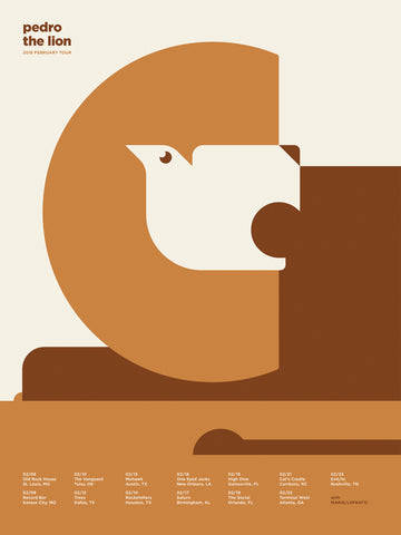
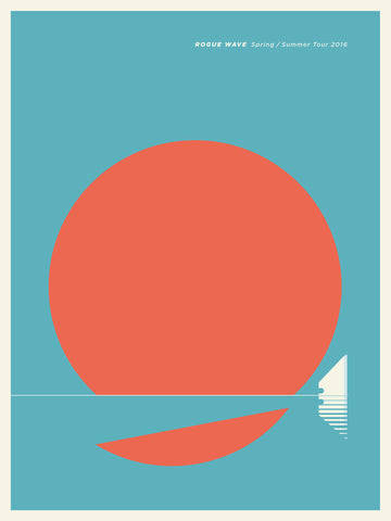
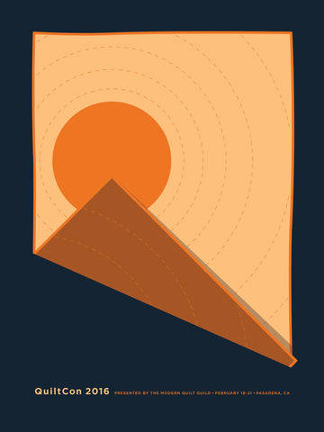
Looking at flat image and interestingly illustrated posters on behance to get ideas and inspiration for creating posters.


Poster sketches and brain storming:


Poster designs 1:


My original poster design, used the same colour scheme and was alternate for a different version to create variety.
What worked:
- the colour theme worked really well and i did use this colour palette for my final outcomes.
-The design element of this first design worked well and are eye catching.
What didn't work: -Writing amount was too much and wasn't informative in the short amount of time a poster has a readers attention, this is something i needed to improve and have less information and let the poster do the talking.
-Font size on some sections of writing were too small and in a realistic scenario of it being and A3 sized poster it would be a eligibility issue.
-some of the colours on top of each other also cause an eligibility issue from a far, this is also because of the typeface, its a particularly condensed, skinny and close together making from a distance more difficult to read.
What i needed to change:
typeface; something less harsh, better eligibility in all sizes and colour would work a lot better for the brand design overall and the poster designs.
Writing amount; Lower the amount of written explanation and have less information that makes the poster more interesting and engaging to direct the viewer to visit the social presence like the Instagram account on the website to find out more information of the posters purpose.
font size; I needed to decide a successful pyramid of font size for the header, sub heading and additional information to create a layout that was level and showed information successfully in its level of importance.
This project has helped me strengthen my skills in creating posters as i do struggle with this, i think iv learned more about how a successful poster is created and what i can use in future.
Different poster variations:


(these are not the correct colours i exported incorrectly, in future i need to check colour settings)
what didn't work:
Poster 1:
The typeface was the same as before, except i rounded the corners to make it less harsh for me this still didn't work and wasn't giving off the vibe i was looking for. The writing on the bottom of the poster was still too small for a good level of readability, although ti think i found a good layouts plan for the rest of the writing, it was still missing some small amount of information.
Poster 2:
The typeface here was better but now i think was to thin for it to stand out and was still failing with a good readability and lacking information still.
Poster 3:
This poster was on track to being exactly what in was looking for and had a good overall layout and readability but was still missing some information and a possible 'call for action'
Final design:

I added the time of the event i was promoting to the poster and a short list of what was included but avoiding too much writing to stop overcrowding the poster and make it overwhelming to viewers, i moved some things down and added the logo at the top i had a hierarchy of importance for the writing and had the title that clearly communicated exactly what the poster was for, the date was clear and large for viewers to see from a far to engage them in viewing it closer up to see what it was for, i added a QR code as my call for action which is an easy way to engage my target audience being that QR codes are the easiest most effortless way to be redirected to something online. (colours not accurate exported incorrectly in cmyk format)
0 notes
Text
Specialist Practice
Logo, name and assets design change process, Marketing to Gen-z Research
Colour psychology:
Amongst other research i wanted to look at how using colours for marketing towards certain age groups specifically gen-z.
How to Understand Gen Z: A Design Guide - Open Influence Inc.
'The older end of Gen-Z tends to follow millennial trends closely. This includes the muted colors and pastels like “spearmint,” green, and blush pink. Also, like millennial colors, Gen-Zers rely heavily on the 80s and 90s trends; bright and bold colors are typical (including neon).'
'On the other hand, younger members of Gen-Z are taking almost the opposite approach as millennial 80s/90s nostalgia: retro-classic palettes from the 50s and 60s are coming back alongside fashions from that time. This includes colours like olive greens, magentas, maroon, orange, and various purples. Gen-Z yellow (a bright and sunny color) is already being labelled as the next trend that will rival millennial pink.'
Using information like this helped me decide on three of my colours (magenta, yellow and green) and then i added the deep blue that i thought matched well.
The vape industry and marketing to gen-z:
I also looked into the vape industry as they tend to market towards gen-z and all vape products are brightly coloured.
In this article it talks about the change of e-cigarette appearance considering the change in its target audience. before elf bars, lost marys and crystal bars were around, it was jull that was the popular e-cigarette.
source
'By the time Ms. Addison, 19, started college at the University of North Carolina Wilmington last year, the vape du jour had shifted. She saw many of her classmates brandishing Elf Bars, brightly coloured e-cigarettes that looked like ombré AirPods cases, with gently sloped chimneys for inhalation.
She bought flavours like piña colada and strawberry-kiwi, and took pictures when the candy-colored gradients of the devices coordinated with her outfits.'
“If it looks glamorous and it looks appealing, that’s going to be the first driver that will bring a horse to water,” said Brian King, the chief of the Food and Drug Administration’s tobacco centre. “The flavours then get them to drink. And the nicotine keeps them coming back for more.”

Research supporting my logo and brand Assets design process:
'Gen Zers appreciate brands and messaging that stand for something and tackle social issues such as race, diversity, and gender equality. They have influenced how brands incorporate mental well-being, self-care, and inclusivity. Gen Zers tend to prefer brands that feature an array of body and sexuality types, influencing the fashion industry to promote body positivity and feature models on the periphery of previously held beauty standards.'
What intrigues gen-z when marketing
To successfully market my brand to my target audience (16-25 year olds, Gen-z) i needed to research into the key factors of things that will intrigue them, being part of gen-z myself i have an advantage or knowing somethings but understanding the deeper meanings for some interests or marketing techniques for gen-z helped me choose the correct colours, layout patterns etc.
'Gen Zers are empathic and know they can make a difference in the world. They connect with brand values and messaging that prioritizes the bigger picture. They stand for interconnectedness, broader perspectives, promoting tolerance, and celebrating differences.'


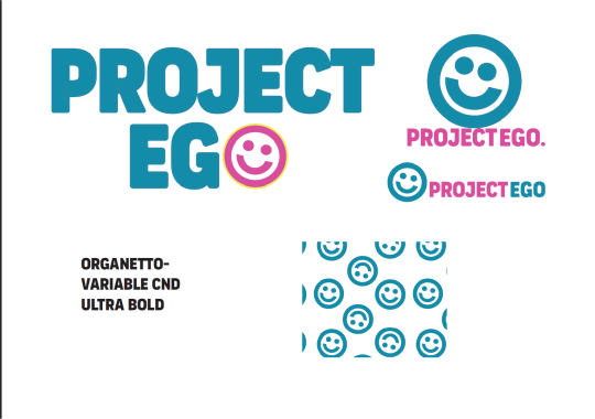
Typeface:
Logo 1- Organetto variable, regular and Bold
Logo 2-Gimlet Sans
Found on Adobe Font Gallery
Colour Palette:
Magenta - D74D9C
Green- 55BE8A
Blue- 048BA8
Yellow- EFEA5B
Logo Design:
For the original logo designs as previously mentioned in other posts, i began to think the typeface i originally chose was too harsh and bold and was giving off the wrong idea and aesthetic i wanted to give off with the brand, for example my brand aims are:
- friendly
-Bubbly
-aimed at gen-z
-welcoming
The new font fits my vision more as I was able to manipulate it so it was semi customised and make it rounder but the slight personality it already had makes the logo more interesting.
I stuck to the same colour theme, change the pattern to something more versatile and not repetitive that had lots of ways to be used (as seen in mock-ups) the new sub mark logo represents growth in self love as it’s an abstract flower illustration and it also replaces the letter ‘o’ in the primary logo. It looks good in all colours and is versatile for stickers, pins, phone cases laptop covers bags and more as well as the new pattern design.
0 notes
Text
Specialist Practice
1:1, feedback, major project and idea changes, New problem, insight and solution.
I had a 1:1 with Emily on Wednesday (8th Nov), i was worrying ab9out the compatibility of my idea and if i could successfully achieve what i wanted to without the wrong impression as well as what time i have left to complete it.
I started my 1:1 with Emily explaining my original idea and telling her where I think it wouldn't work and what i was thinking of changing.
Problems with idea 1:
Creating a skin care brand for this brief might give a different message to consumers than i want to give. Skincare is paired with improving skin and or to cover up imperfections or improve them.
A skin care brand wont delivery the educational aspects i want to correctly as the website may be disregarded.
New Problem, Insight, Soltuion
Problem:
Many young children suffer from poor self esteem and lack of confidence in their skin. This is usually caused from negative comparisons to social media images that are edited and perceive unrealistic beauty standards and expectations. Along with peer bullying and not enough support from adults around them like parents and teachers.
Insight:
"30-50% of teens and young adults suffer from low self-esteem due to skin related issues like acne". Researching into the main reasons of young people's unhappiness within their bodys/skin. looking into the negative effects of social media, comparison culture to models and edited photos on social media, peer pressure and bullying from peers, lack of encouragement and confidence boosting from adults like teachers and parents.
Solution:
To create a campaign/ Pop up workshop to support young people in school, college and university’s to improve their self confidence and self-esteem. The pop-up ‘workshop’ will include group activities, activity’s to educate young people on the use of editing in images on social media that portray unrealistic beauty standards, tips and tricks on how to improve self confidence with daily positive affirmations. This will include a social media presence, a website with more things on offer to support young people and posters that can go up around university’s, schools and colleges to make people aware of the workshops or re-direct them to the website for more information.
Using personal experience for my solution:
Another reason for this solution response is due to personal experience, as a teenager i struggled terribly and still do with mental health and having self confidence because of having acne prone skin, from the ages of 11 to 17 i was teased and bullied for my skin, i wasn't encourages by others often about my skin being okay as it was and to love it, so i would try anything and everything to improve my skin and it started to affect my mental health more and more. i wish i could've had something similar to this where i was encouraged to love my skin and what i looked like at a young age as i feel it definitely would've helped me mentally and helped my confidence.
Next steps:
Design brand assets (logo, brand name, type face colour palette etc)
decide on what illustrative elects i want o add to social media, posters and website.
look at inspiring for poster design and website design/layout
Designs social media posts to promote workshop/ pop-up shop
What will the pop up shops offer and include design things for that, banners, goodie bags and contents.
further research to support choices


#aubviscom#aub#viscomaub#visual communication#viscomstudent#viscom#graphic design#researchprocess#research
0 notes
Text
Specialist Practice
Competetor research- Anatomicals
What is Anatomicals?- A skin care brand marketed towards young adults and teenagers


My thoughts on anatomicals?
playful marketing strategies; friendly, Comedic, and relatable
An unserious-serious approach to website and other social media presence.
packaging is simple and playful, range of colourways throughout as well as comedic value on each product. its eye catching and youthful.
What can I take from them?
The playful marketing Anatomicals use could help me aim for the correct target audience. Using a similar approach might make grabbing young people attention achievable.
What do they do well?
They're successfully relatable to young adults/teens with their playful illustrations, colour's, wording on website, products and social media post's, wide range of product choices eg. hair and skin and extremely inclusive.
Packaging Elements that work well?
Simplicity, layout and typeface choice.
comedic elements throughout (front and back of product}
subtle compliments to the consumer
Bright colour's makes it stand out from other products and its not common for skincare brands to use lots of/bright colours.
Simplicity, layout and typeface choice.
comedic elements throughout {front and back of product}
Images I took of product's by Anatomicals that I already personally owned:


Screenshots
Screen record
Images of product- taken by Maddison Pointer
1 note
·
View note
Text
Specialist Practice
General Research, idea outline, problem insight solution
Problem;
Amongst a lot of young people lacking skin confidence is common and results in extreme depression, mental health struggles like social anxiety or unhealthy relationships with appearance and social media.
Insight:
"30-50% of teens and young adults suffer from low self-esteem due to skin related issues like acne". Researching into the main reasons of young people's unhappiness within their bodys/skin. looking into the negative effects of social media, comparison culture to models and edited photos on social media, peer pressure and bullying from peers, lack of encouragement and confidence boosting from adults like teachers and parents.
Solution
My solution is to successfully create a fully inclusive skincare brand that isn't just a skincare brand, i want to be able to use the skin care products to educate the consumers, the website and social media presence will educate its consumers/viewers through daily videos, guest talks , live online seminars and pop up events/workshops in schools and universities. Positive affirmations on social media and products to boost self-confidence, education on avoiding comparison culture and having a negative relationship with social media, aswell as spotting edited or fake images that are often mistaken as 'perfect' looking people creating the unhealthy, unrealistic expectations young people set themselves based off of these posts creating the lack in confidence. the brand is going to make people use skincare to care for themselves rather than to 'perfect' themselves.
What research did i do to come to this solution?
I started by asking myself lots of questions and answering them or finding answers for them.
What is are the key factors for low skin confidence and self esteem in young adults and teenagers?
lack of support from adults like teachers or parents
childhood trauma (lack of attention can create low self-esteem which can spiral)
negative comparison to social media models (edited images in advertisment or modelling)
comparison culture
What can be done to improve the skin confidence of young people? - source
By developing educational programmes to help young people understand skin conditions to help with being kinder to one and other.
helpful advice provided to teachers and parents on how to help teens with self love struggles
educating careful actions
educating on media literacy and fake images
'Individual actions. Everyone has a right to feel comfortable and confident in their skin, and we can take small actions in our daily lives to help foster a more accepting environment. For example, it may be helpful to be mindful of how we speak about our bodies in casual conversations with friends and family.'
Community actions:
'To maximize outcomes and reduce stigma risk , public health campaigns should focus on messages of healthy eating
A common response to research that links body dissatisfaction with exposure to idealised bodies in the media to add 'disclaimer' or 'warning' indicators on images that have been edited to change the appearance of the models to get rid of the risk of comparison culture and unrealistic expectations'
Supporting body image in young people:
'At home; research shows the most effective way to support healthy body image and eating habits is to display/model positive behavior around body image (avoid criticizing their appearance or others to them)'
0 notes
Text
Specialist practice
Brief Breakdown
When it come to choosing a brief i wanting to pick a brief where i could add a personal touch to it. i know i really enjoy branding and packaging design i wanted to continue improving these interests and skill going into my final year as it's definitely something i want to specialise in for my future.
The Brief i have chosen is the RSA brief 'in your skin' , iv struggled with self confidence from a young age and even now due to suffering with acne-proned skin and it got me thinking about what would have helped me through my most vulnerable teenage years and going into adulthood.
The brief is broad and has a vast majority if possible outcomes its all about having a large imagination and what personal reason pushes us to the designs well go for.
Key elements picked from the brief:
target audience of 16-25 year olds
all research is true and scientific factors to backup the proposal.
understanding the benefits and how the product created will be better than existing ones.
does it have a positive impact on the natural environment like sustainability.
make sure to combine first hand personal research as well as research already done on the matter.
Next steps?
Mind mapping and idea generation using 'problem insight and solution' which i'm gonna use miro board for, i'm gonna start researching into the reasons into the lack of skin confidence, things that are being done already what more can be done, common reasons, popular brands , competing products and packaging, and what schools are doing to improve this problem.
0 notes
Text
Poster research
To research how to approach m,y poster creation i looked into successful flat colour design poster's
Jason Munn
Tom Eckersley
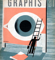
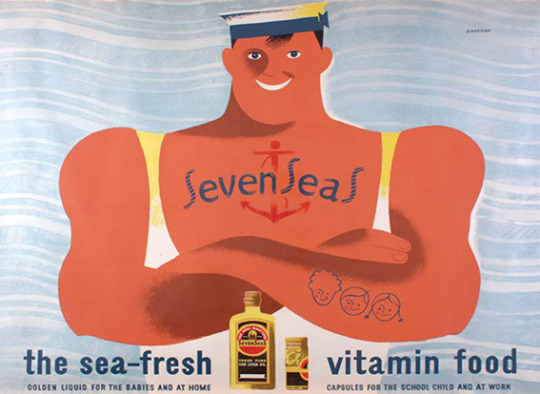
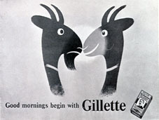
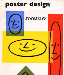
2 notes
·
View notes
Text
D&AD Brief analysis
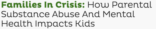
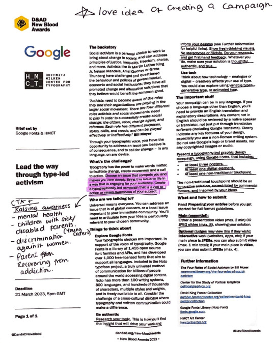
Looking into this brief iv decided to choose this brief as i really liked the idea of being able to research and make something (passionate to me) a reality an for people to be more aware of this subject.
The subject i feel quite strongly and passionately about is 'Mental health and addiction in parents'
i want to make suffering or recovering parents feel heard as being an addict is an illness not a choice, As well as children and adults who are suffering or suffered this kind of home life growing up or at current. It's not talked about enough and i want the reality, and damage of it to be noticed.
To start this project, I have began researching in more detail the effects addiction can have on children. Iv read some of the long lasting effects of addicts on the 'american addiction centers' s website, iv take notes while reading and then moved on to look at an article by Dr . Todd Thatcher, published on the 12th February 2020. in this article they talk about long lasting effects of substance abuse in parents, effects on family friends and children through their lifespan and the things that are more likely to happen to children in these situations compared to children with a "normal" homelife.
‘In 2014 1 out of 10 Americans ages 12 and older use and illicit drug in the past 30 days’
‘one in five children in the U.S live in a home with a parent suffering from addiction to drugs and/or alcohol.’
‘Children in this kind of homelife environment are also 3 times more likely to experience physical, emotional and sexual abuse, whether this I at the hands of the parents who is an addict or exposure to others who abuse them’
2 notes
·
View notes
Photo
creative thought process
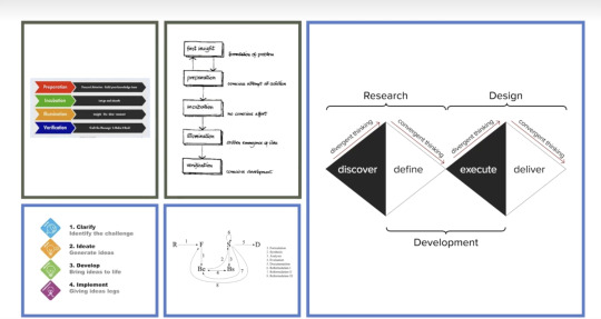
this is a screenshot from out transition lecture today called: where do ideas come from?
in this lecture we had a talk from Dr Karl Jefferys’ who is. a creative researcher and he spoke to us about how we think and create ideas and how a creative mind works. he spoke to us about brain scans and how some peoples creative thought process can be different to someone else’s and most thought process always in with doubt and the the question of yes but, he spoke to us about how we can change and improve our creative thought process by say yes but....i can fix this by. so that all and every idea we have can always help with our success instead o pulling us back.
#viscomstudent#viscomaub#visual communication#identity#thought process#creative thinking#createive process
2 notes
·
View notes
Text

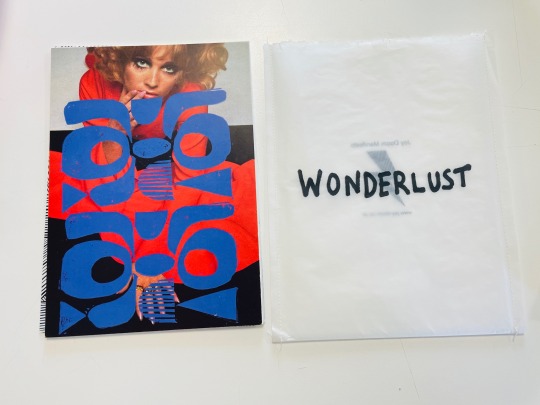
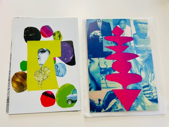
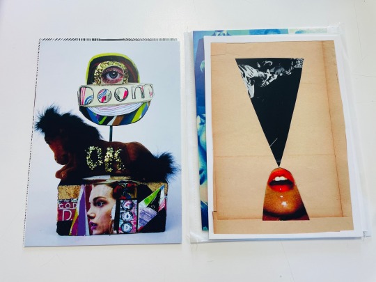


Imtroduction to viscom: Art book workshop
Different types of ‘Art books’ and what can be called a ‘book’
One of my favourites
#viscomstudent#visual communication#art#artbook#3d#3d printing#graphic design#digital art#digital illustration#photoshop
2 notes
·
View notes
Photo
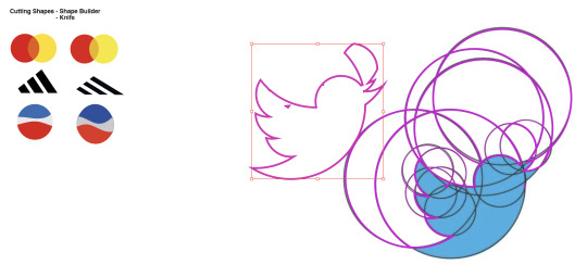
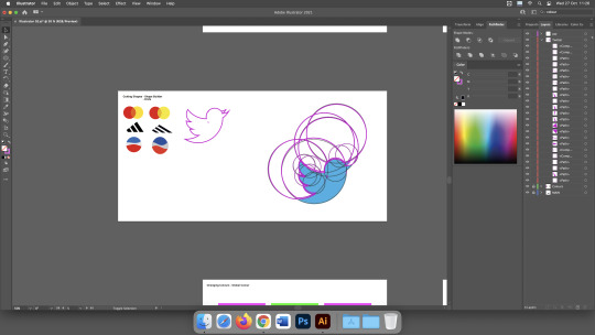
Learning how recreating logo or creating our own logo works on illustrator today, the twitter logo was difficult to fuigure out and recreate but got there in the end. really enjoyed this task.
1 note
·
View note