#victoria gotica
Explore tagged Tumblr posts
Visit Tumblr Blog
Explore Tumblr blogs with no restrictions, modern design and the best experience.
Last Seen Tumblr Blogs


Fun Fact
In Q3 of 2020, 31% of US users access the Tumblr app daily.
Text

#masquerade#lace#gown#satin and lace#gothic#gothic victorian#gothic vibes#gothic romance#gotico#gothcore#vampire#vampire vibes#misterious#misterioso#vampiresa#victoria gotica#romance gotico#antifaz#mask
36 notes
·
View notes
Text
Oi, pode me chamar de Luna. Eu tenho 17 anos e fiz essa conta pq meu psiquiatra mandou eu ter um diário, então me inspirei na Tori Spring ja que eu sou literalmente ela. Então caso vc fique aqui, oq eu não recomendo (ja que tudo aqui é deprimente ao extremo), boa leitura (provavelmente tem muitos erros de gramática).

#depressao#tristeza#bpd vent#desabafo#borderline things#transtornos psicológicos#transtorno bipolar#transtorno borderline#transtorno mental#tdah#mente deprimida#pensamentos#lana del slay#tori spring#victoria spring#alice oseman#literatura#gotica#edgar alan poe#ansiedade
6 notes
·
View notes
Text


#gotico#goticstyle#gotica#brilhante victoria#jade west#elizabeth gillies#e girl#egirl style#black swan#black and white
66 notes
·
View notes
Photo

Ela não segue padrões, segue apenas seu coração e as vezes a intuição!
#girl#estilo#beautiful#gotica#blessed#blue eyes#victoria's secret#black#lifestyle#foradopadrão#foradocomum#diferente#vida#coraçãovalente
6 notes
·
View notes
Text
Typographical development up to and beyond Nicolas Jenson’s roman typeface
Introduction
While reading about the history and early development of typography, I grew interested in the point at which typographic design became, for the first time, abstract; moving away from letterforms that mimicked handwritten script towards new styles that were driven by a growing awareness and appreciation of the formal possibilities allowed by the nascent technique of letterform printing. This technical and conceptual shift is generally attributed to the French typographer, Nicolas Jenson, who designed one of the earliest and finest Roman style typefaces in 1470s Venice: a typeface now referred to as Jenson.
Background/history of writing
Typography, of course, derives from writing, which can be traced back to the 3rd millennia BC, an era in which cultural interactions between the societies of ancient Egypt and Mesopotamia, saw the Sumerian cuneiform script of the latter influence the development of hieroglyphics in the former, both written forms establishing themselves as powerful communicative aids before developing into new forms which influenced the creation of subsequent abjadic and alphabetic stems of writing.
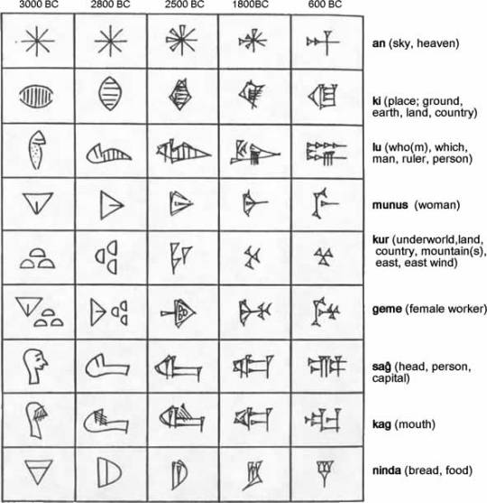
Sumerian cuneiform
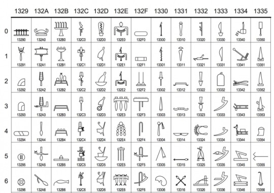
Egyptian hieroglyphics
The Phoenicians simplified the act of writing by drastically reducing the number of letterforms, creating what is now recognised as the first abjadic alphabet, consisting entirely of consonantal sounds. The Greek alphabet derived from the Phoenician, but included letters for vowel sounds, making it the first of a new form of alphabet. This, in turn, informed the development of written Latin - a system that, according to Eric Gill, ‘reached a permanent type about the first century AD.’
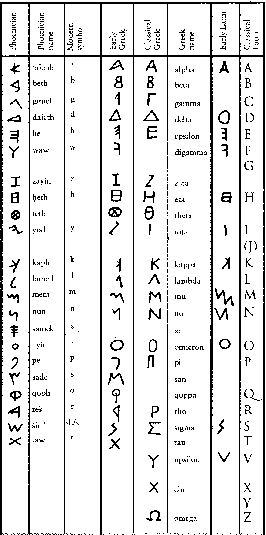
Development of the Phoenician, Greek and Latin alphabets
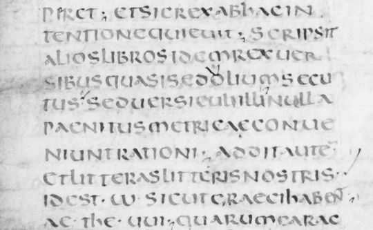
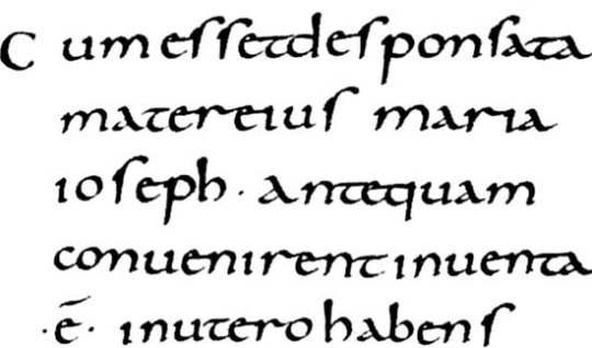
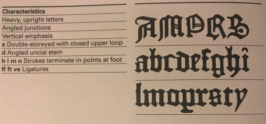
During the next fifteen-hundred years, a period in which the Latin alphabet itself remained for the most part fixed, the forms of lettering written in the languages derived from Latin developed in manifold ways: from the square capitals that were a characteristic of Roman lapidary inscriptions, through later and less formal cursive, insular and uncial scripts that eventually found a level of standardisation from the ninth to the early thirteenth centuries in the form now referred to as Corolignian miniscule. In turn this form of script developed into blackletter, or Gothic script, that was used from the 1150s through to the invention of printing and beyond.
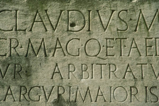
Roman lapidary inscription
An example of uncial script
Carolignan miniscule
Gothic blackletter
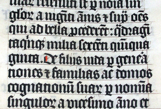
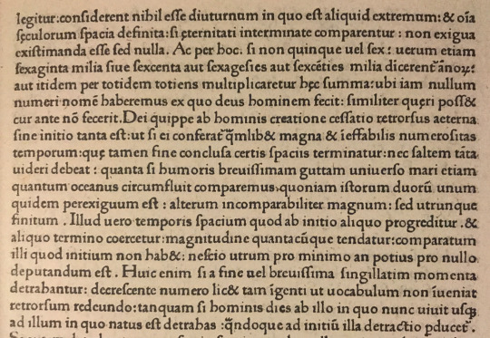
At the time Johannes Gutenberg introduced printing with moveable type in 1439, the new technology was conceived as a means by which texts - specifically indulgences - that had previously been produced, painstakingly, by hand could be mass produced and the process of manufacture and dissemination made more efficient. The focus was on the speed and convenience that the mechanical process allowed, rather than clarification or any improvement in the aesthetic quality of handwritten script. This meant that the initial conceptual scope of mechanical printing was to produce scripts in the style in which they would, previously, have been handwritten. The standard method of writing in the germanic world used Gothic letterforms and, since printing was invented in Germany, the early typefaces mimicked Gothic script.
A page from Gutenberg’s bible of 1454
However, as Italy was the most culturally developed country in Europe at the time, German printers moved south to cities like Venice and began creating typefaces that took account of humanistic handwriting that was developing in Italy - a form that took as its inspiration the clarity of Roman lettering, marrying this with minuscule forms that had developed during later eras.
In his Essay on Typography, Eric Gill explains that the process of using current technology to repeat received forms of lettering was not new and that, in an earlier era when lapidary inscriptions were the norm, texts written using a very different technology, the pen, mimicked the then culturally dominant form:
Pen writing, even as late as the fourth century, shows very clearly that the scribe had no idea of inventing ‘pen’ forms of letters, but was simply making as well as he could with a pen what he conceived to be ordinary lettering. Whether he held the pen one way or the other (so that the thick strokes came vertically or horizontally) makes no difference to the primary intention of the scribe. He was not inventing letters; he was writing forms already invented.
…whatever tools or materials or economic circumstance (that is hurry & expense), the artist, the letter-maker, has always thought of him self as making existing forms, & not inventing new ones. Thus, the Lombards of the fourteenth century did not sit down and invent Lombardic lettering. The Siennese inscription in the Victoria and Albert Museum, dated 1309, is simply a stone version of the pen letters with which the letter-cutter was familiar. The letter-cutters of the fifteenth century did not invent ‘gothic’. They had the job of cutting stone inscriptions, and they did it in the ordinary letters of their time. The forms of their letters were what we call ‘pen’ forms. But they cared nothing about that. To them they were simply letters. And just as we saw that in Roman times the Roman scribe imitated the stone inscription forms because, for him, nothing else was letters; so, in the fifteenth century, when the written was the most common and influential form of lettering, the position is reversed, & the letter-cutter copies the scribe — the stone inscription is imitation pen-writing (with such inevitable small modifications as, in stone, cannot be avoided), whereas in the fourth century the written book w as an imitation of the stone inscription (with such small modifications as the pen makes inevitable).
Gill goes on to say that,
…the first printers were no more the inventors of new letter forms than any other craftsmen had been. The first printed books were simply typographic imitations of pen writing, just as were fifteenth century inscriptions in stone.
So there was a sense in which the originators of typography, like the practitioners of earlier techniques, were tied by custom to past practice - in their case the organic, humanistic (in the sense of being physically formed by humans) physicality of scribal penmanship, which was deep rooted, and linked to a seemingly intrinsic need to make marks.
However, while early typographical practitioners referred to earlier calligraphic forms, increased usage and improved technology had significant implications as the categorical difference between handwritten and printed letters became apparent: as Elaine Lupton says in her book Thinking With Type, ‘Words originated as gestures of the body. The first typefaces were directly modelled on the forms of calligraphy.Typefaces, however, are not bodily gestures — they are manufactured images designed for infinite repetition.’ As people worked with type, there was an emerging realisation of the new formal possibilities inherent within the new medium.
The move away from traditional forms took place quickly, during the space of fifteen years, from Guttenberg’s Blackletter type in the mid-1450s, through Gothic Roman to the emergence of humanistic Roman types that emerged in 1470, and was inextricably linked with the movement of German practitioners to Italy and the influence Roman capitals combined with contemporary Italian handwritten forms on typographical development.
Characteristics and sample of Gutenberg’s Textura blackletter

Characteristics and sample of the Gothic Roman Subiaco Type
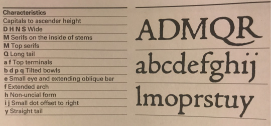
Characteristics and sample of Jenson’s roman type
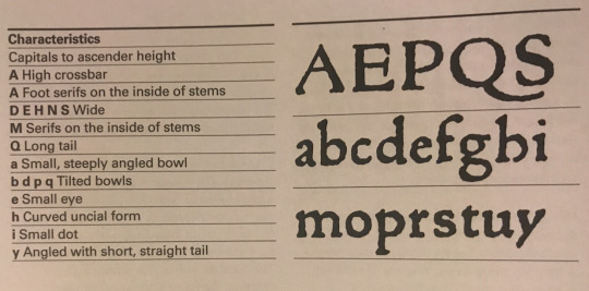
Characteristics and sample of the Von Speyers’ roman type
Images above taken from Paul McNeils The Visual History of Type
The earliest instance of this is, what’s now known as the Subiaco Type, was created by two German monks, Sweyynheym and Pannartz, who established the first printing press in Italy and developed a hybrid, Gothic Roman type that combined elements of medieval lettering with renaissance forms, to appeal to local audiences. The typographer, Stanley Morison, thought that Sweyynheym and Pannartz’s invention is entitled to rank as the first humanistic or roman type’, because it established a principle, of movement away from Germanic towards humanistic letterforms, that influenced the emergence of new typographical forms and new ways of thinking about the possibilities of the medium. For this reason, Paul McNeil, in The Visual History of Type, says that, ‘The Subiaco typeface represents a milestone in the history of printing and typography.’
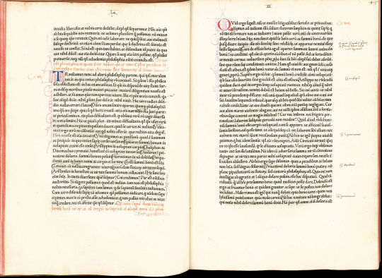
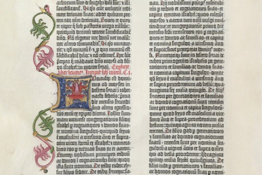
De divinis institutionibus by Lactantius; printed by Pannartz and Sweynheim in 1465
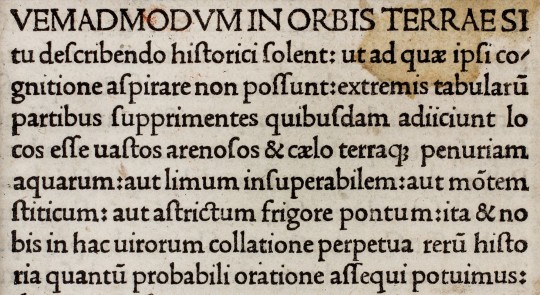
So the typographical style now known as Gotica Antiqua, invented by Sweyynheym and Pannartz and developed by practitioners such as Gunter Zainer, represents a significant movement away from a earlier purely germanic forms and a broadening of awareness of the formal possibilities of the still nascent technology. However, it was the development in 1470 of a purely Roman typeface that constituted a complete shift away from medieval lettering and Blackletter type towards printed lettering that seems familiar to us today. There is some dispute as to who should be given credit for this - the Von Speyer brothers (also known as da Spira brothers) or Nicolas Jenson, who seem to have made similar breakthroughs simultaneously. Of the Von Speyers’ roman type, printer and historian of typography D.B. Updike wrote in the 1930s, ‘Many roman types of varying degrees of purity and attractiveness were used by Italian printers of this period. It was reserved for John and Wendelin de Spire to show a roman type which today appears roman to us.’
An example of the Von Speyers’ roman type
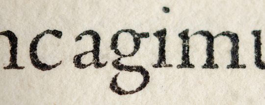
However, it is Jenson’s roman that is the more famous today, considered the progenitor or all subsequent roman typefaces. Paul McNeil states that, Jenson’s type, ‘marks a turning point in the history of printing. A blueprint for all that followed, it continues to influence type design today.’ He goes on to say that, ‘Nicolas Jenson’s work elevated the nascent craft of printing to a fine art. The balanced proportions of the letters, the evenness of their spacing and the restrained overall tone of his pages demonstrate why he was acclaimed above other printers working in fifteenth-century Italy and why his work has remained a cornerstone in the history of typography.’
Jenson’s roman type
In his, An Essay on Typography, Eric Gill in summarising the impact of Jenson’s roman, says that it represents, ‘the emancipation achieved from the gothic of northern Europe and from handwriting generally. Henceforth, the designing of type was primarily the work of punch-cutters, that is of engravers. Letters were still reminiscent but no longer an imitation of handwriting.’ So while Italian printers, advanced the art of typography by moving from a type that was an imitation of Germanic handwritten forms to one that took Roman capitals and contemporary Italian minuscule for inspiration, the revolutionary insight was that mechanical typography - a new technology that allowed standardisation of letterform, technical refinement and reproducibility - made possible a formal abstraction, away from handwritten letterforms to a distinct system of lettering, occupying a different conceptual space to handwriting, that could improve efficiency and readability, while constituting an artform in its own right.
This relationship between the written and the printed letterform is one of the defining characteristics of typography. As Ellen Lupton says, in her book Thinking With Type, ‘The history of typography reflects a continual tension between the hand and the machine, the organic and the geometric, the human body and the abstract system.’
This excerpt from an article on Jenson’s roman by Paul Finn of Fitzroy & Finn studio, goes someway towards explaining what makes Jenson’s roman typeface special:
Gutenburg's invention was realised by Jensons first True Roman typeface. A convergence of all that had gone before. The alphabet now became in focus, sharpened through sacred geometry, asymmetric logic and the golden section. A monastic devotion of meditation brought forth a revelation. Jenson's inspired amalgamation of Roman capitals with the humanistic handwritten miniscule of the day imposed a structural unity upon the miniscule through remodelling the serif structures bringing form and clarity, unifying an essence of perfectly proportioned form.
The Renaissance. Rebirth. The revival of Ancient Rome. Classical antiquity; mathematics, geometry, architecture, art and science infuse Jenson's typeface. Jenson sought a suitable vehicle to disseminate the knowledge of humanities new epoch. He created the typeface which became the foundation stone of all future typographical endeavours. Constructed with architectural precision he attained a unified cohesive whole. Practising the Renaissance ideal of balance between Form and Space, when white space is as important as the blackness of form. Presence v's Absence. This is illustrated in his 1470 edition of Eusebius, De Evangelics Praeparatione the counters, wordspacing, linespacing are suspended in perfect equilibrium with the letterform, whose relationship with the extender lengths add elegance to the balanced body of type. These decompressed forms are reaction to the dense blocks of Blackletter type of Gutenburgs printed matter. Instead spacious circular rhythmic forms grace the paper enticing the reader.
Jenson’s roman has has a fundamental impact on subsequent typographical development. The principles behind his work formed the basis for later well-known roman faces, such as Griffo’s Roman (or Bembo), which was cut for the Venetian printer Albert Manutius by the punch cutter Francesco Griffo. In his book The Visual History of Type, Paul McNeil states that Griffo’s roman, ‘became the progenitor of all old-style typefaces, setting a new standard for typographic excellence.’
Griffo’s Roman or Bembo
In turn Griffo’s roman influenced later generations of type cutters, such as Claude Garamond, whose roman type has become one of the most popular Old Style typefaces in the world
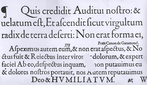
A sample of Garamond’s roman typeface
More recently, from the end of the nineteenth century to the present day, direct revivals of Jenson’s roman have been either cut or - in the digital era - computer designed.
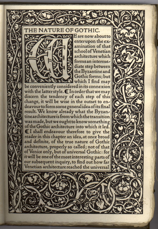
These include William Morris’ 1890 Gold Type on Jenson' type in 1890.
Cobden-Sanderson modelled his typeface for Doves Press on Jenson's alphabets in 1900.

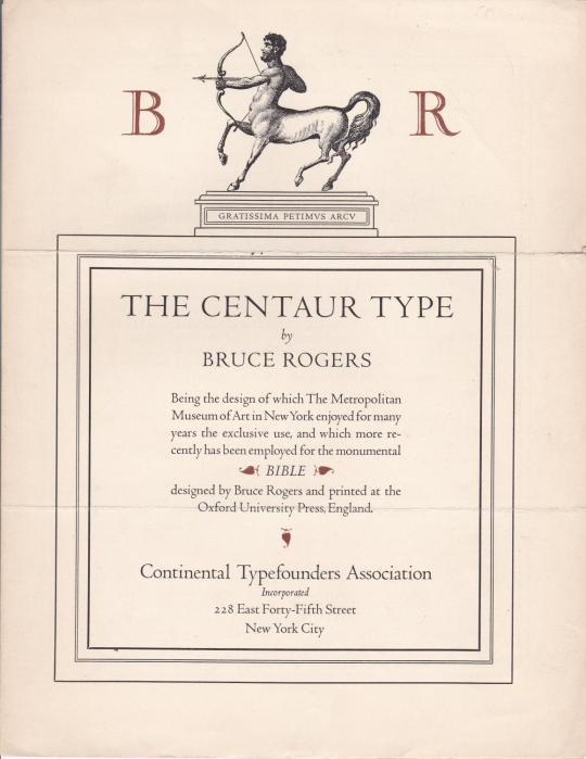
Bruce Rogers’ Centaur of 1914
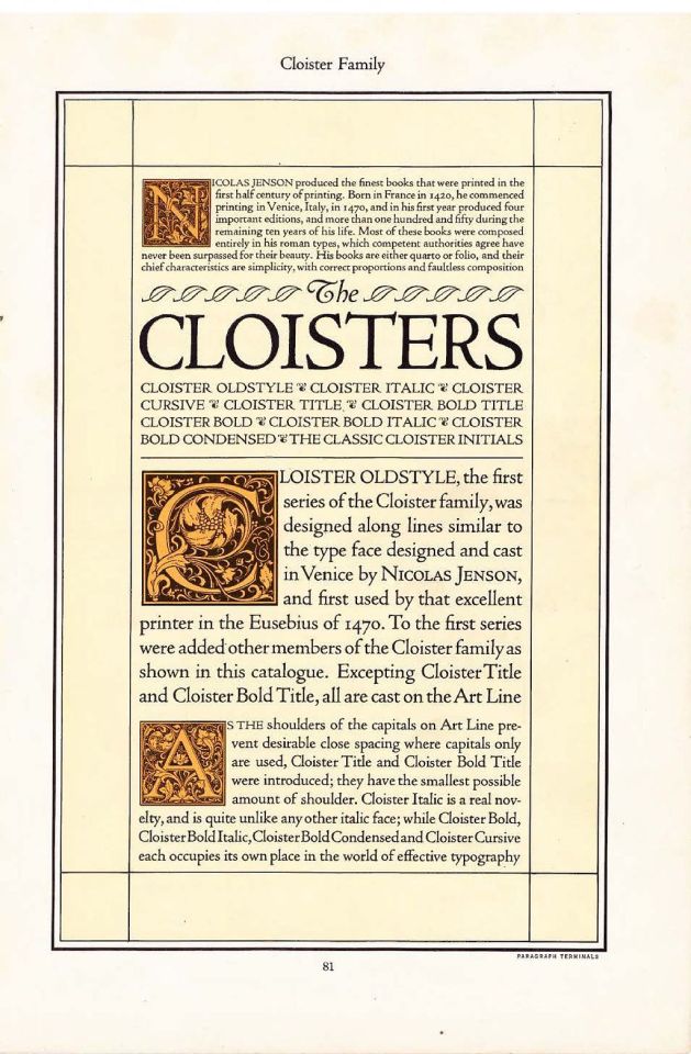
Morris Fuller Benton’s Cloister Old Style from 1926
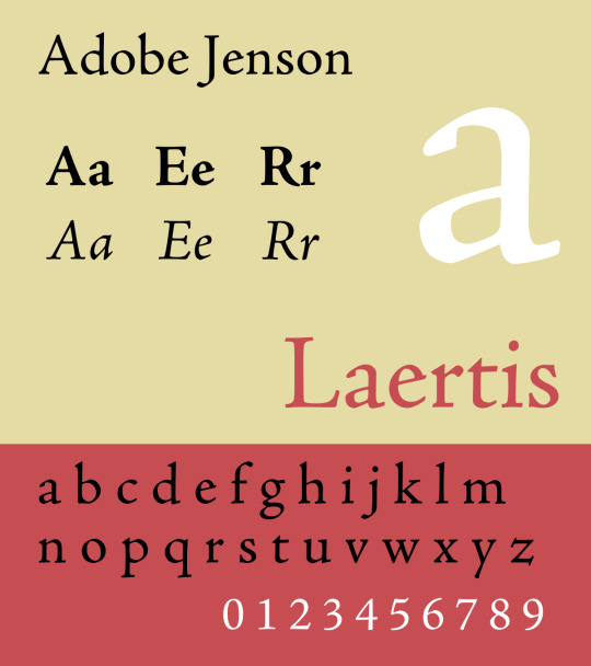
Robert Slimbach's digital Adobe Jenson from 1996
3 notes
·
View notes