#velvetdesign
Explore tagged Tumblr posts
Text
The Allure of Velvet in Commercial Interior Design
Velvet isn’t just a fabric – it’s a statement. Known for its rich, luxurious feel, velvet has become a go-to material in commercial interior design, transforming everyday spaces into works of art. Whether you're designing a hotel lobby, an office lounge, or a stylish restaurant, velvet can elevate the mood and add sophistication to any setting. Let's explore why velvet is such a popular choice for designers and how you can use it to create stunning, functional spaces.
Why Velvet?
1. Instant Luxury: Velvet brings an unmistakable sense of elegance. Its soft, smooth texture and shiny finish make it perfect for high-end environments. When used in commercial design, velvet gives the impression of luxury, creating spaces that feel exclusive and refined.
2. Rich in Color: One of velvet’s greatest strengths is its wide range of colors. From deep jewel tones like emerald and sapphire to soft pastels, velvet has a shade for every style. Whether you want a bold, dramatic look or something more subtle, velvet’s color versatility ensures it will fit right in.
3. Comfort & Sound Control: Beyond its visual appeal, velvet offers comfort. Velvet-covered chairs or couches add a cozy touch to any space, inviting guests or employees to relax. Its dense fabric also helps absorb sound, which is especially helpful in busy environments like offices, cafes, or conference rooms, creating a quieter and more comfortable atmosphere.
Velvet in Commercial Spaces
1. Hotels & Resorts: In hospitality, velvet is often used for furniture, curtains, and accent pieces. Think velvet sofas in hotel lobbies or velvet drapes framing windows in a cozy restaurant. The material helps create an inviting, luxurious vibe, making guests feel pampered and special.
2. Restaurants & Cafes: For restaurants and cafes, velvet adds a rich, inviting atmosphere. Velvet-covered chairs and cushions give dining spaces an elegant yet comfortable feel, encouraging guests to stay longer. It’s the perfect fabric for creating an environment where people can relax and enjoy their meals in style.
3. Corporate Offices: Velvet isn’t just for fancy spaces—it works wonders in corporate offices too. Velvet accent chairs or throw pillows can bring warmth and style to an otherwise sterile environment. For meeting rooms, velvet-backed chairs offer a touch of elegance, ensuring the space feels both professional and comfortable.
4. Retail Spaces & Showrooms: Velvet is a popular choice in retail design because it can make a space feel exclusive and high-end. Velvet upholstery on seating or displays draws attention and makes customers feel like they’re stepping into something special. It enhances the shopping experience by creating a visually appealing and luxurious atmosphere.
Tips for Using Velvet in Design
1. Combine with Other Materials: While velvet shines on its own, it pairs beautifully with other materials like wood, glass, and leather. Combining velvet with sleek metals or natural textures helps keep the design balanced and prevents it from feeling too heavy or overdone.
2. Durability Matters: Velvet is delicate, so choosing the right fabric for high-traffic areas is essential. Many velvet fabrics are now designed for commercial use, with blends that are more durable and easier to clean. If you're using velvet in a busy office or restaurant, look for options that can stand up to everyday wear.
3. Focus on Statement Pieces: Velvet doesn’t have to cover every surface to make an impact. Use it for statement pieces, like an oversized velvet sofa or a dramatic velvet accent wall. By focusing on key areas, you can create a luxurious atmosphere without overwhelming the space.
4. Layer Textures: For an even richer feel, layer velvet with other materials. Pair it with silk, linen, or leather for a design that feels textured and multidimensional. This approach makes velvet stand out while still complementing the overall look of the room.
Conclusion
Velvet is more than just a material—it’s an experience. From its luxurious texture to its wide range of colors, velvet can transform commercial interior in pune into inviting, stylish spaces. Whether used in a hotel lobby, office lounge, or restaurant, velvet creates a sense of comfort and elegance that’s hard to match. For designers, velvet is an exciting tool that adds depth, sophistication, and comfort to any commercial design project.
By incorporating velvet thoughtfully, you can design spaces that feel both exclusive and welcoming, ensuring a lasting impression on anyone who steps inside. Velvet is timeless and versatile, making it an excellent choice for any commercial interior looking to stand out.
#VelvetDesign#InteriorDesign#CommercialInterior#LuxuryDesign#HotelDesign#OfficeInterior#RestaurantDesign#VelvetFabric#InteriorTrends#DesignInspiration#VelvetUpholstery#ModernDesign#SpaceDesign#CommercialSpaces#InteriorStyling#DesignerSpace#LuxuryInteriors#CozySpaces#InteriorIdeas
1 note
·
View note
Photo
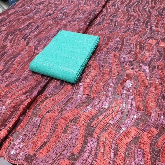
Slay on budget 💯👌 . . Suitable for all occasions Send DM for order /enquiries WhatsApp 08055861726 #honeylace_bridalplace #slayers #luxurylace #fabrics #velvetsequence #fabricstore #fashionister #owanbe #velvetdesign #fashion #inspiration #fashionnova #ibadanfashion #laceseller #vintage #newdesign #samplelace #brocade #materials #sequence #weddingdress https://www.instagram.com/p/CNDzpTklU0Y/?igshid=13rrtvrc629uk
#honeylace_bridalplace#slayers#luxurylace#fabrics#velvetsequence#fabricstore#fashionister#owanbe#velvetdesign#fashion#inspiration#fashionnova#ibadanfashion#laceseller#vintage#newdesign#samplelace#brocade#materials#sequence#weddingdress
1 note
·
View note
Photo
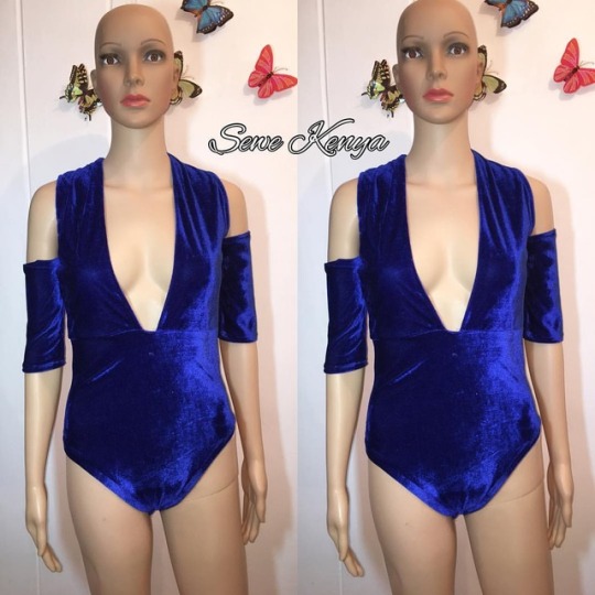
VELVET LOVE.... designer @sewe_kenya #bodysuits #velvetdesign #sewekenya #sewestyle #sewfinest #sewinglife #fashiondesigner #fashionmagazine #fashionbloggers #mystyle #detailbrand #magazine #madeinkenya #designerslife
#detailbrand#madeinkenya#velvetdesign#sewestyle#fashionmagazine#sewekenya#sewinglife#fashiondesigner#fashionbloggers#mystyle#designerslife#sewfinest#magazine#bodysuits
0 notes
Photo
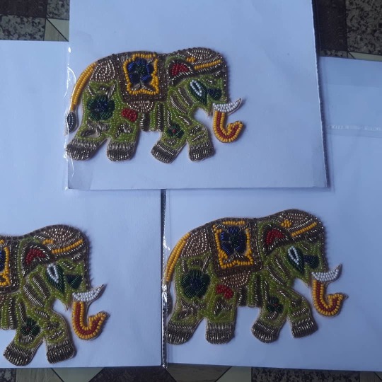
#cutingelephanthead We are provide you Zari hand work. we are manufacturers all kind of zari hand work on fabric. ( Make your own design) Now you can do online customize order Bridal or Partywere Dresses direct Factory........... Shaikh Naimuddin WhatsApp - +919929509156 #handworkkarigar #handworkkarigarpanchla #handworkkarigardhulagarh #handworkkarigarhowrah #handworkkarigarkolkata #kolkatahandwork #indianhandwork #handworkdesign #fashionhandwork #newfashion #designerdress #bestdesigns #sharee #blouse #butawork #indianwedding #designerdress #trosers #customizedressdesign #bridalcouture #customization #bridalfashionweek #bridaldressdesigns #latestbridallook #gotaworksuit #latestbridaldresses #dardoziwork #ariwork #velvetdesign #velvethandwork https://www.facebook.com/providentshandwork/ https://www.instagram.com/p/CKqVsomlgD2/?igshid=1q6m21otlstlw
#cutingelephanthead#handworkkarigar#handworkkarigarpanchla#handworkkarigardhulagarh#handworkkarigarhowrah#handworkkarigarkolkata#kolkatahandwork#indianhandwork#handworkdesign#fashionhandwork#newfashion#designerdress#bestdesigns#sharee#blouse#butawork#indianwedding#trosers#customizedressdesign#bridalcouture#customization#bridalfashionweek#bridaldressdesigns#latestbridallook#gotaworksuit#latestbridaldresses#dardoziwork#ariwork#velvetdesign#velvethandwork
0 notes
Photo
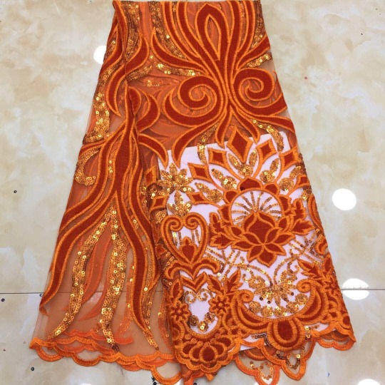
💋VELVETDESIGN 💋TULLE LACE 💋AVAILABLE IN DIFFERENT COLOURS _______________________________⭐#20,000/5yards ⭐#16,000 /4yards ⭐#12,000 /3yards ⭐#8,000/2yards ⭐#4,000 /1yard ________________________________ WHATSAPP/CALL: 08028542859 FOR ASOEBI AND WHOLESALES. ________________________________ #basbonlinefabrics #basbonline #fabricstore #weddings #brides #owambe #asoebibella #bridesmaids #asoebiafrica #awoofsales #sales #weruntheerrand #asoebieventplanner #asoebicollections https://www.instagram.com/p/B7QRn55FW-o/?igshid=1sc86tn7c37jv
#20#16#12#8#4#basbonlinefabrics#basbonline#fabricstore#weddings#brides#owambe#asoebibella#bridesmaids#asoebiafrica#awoofsales#sales#weruntheerrand#asoebieventplanner#asoebicollections
0 notes
Photo
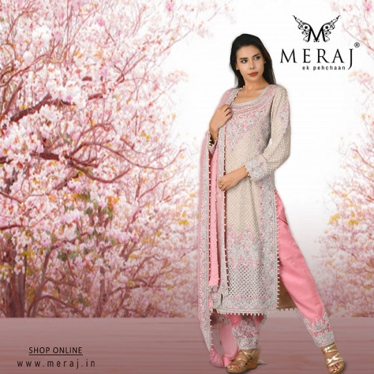
Crafted in alluring palate this classic silk & velvet kurta set embellished with silver zardozi, french knots, zircon stones, pearls, and sequences. It adds the right amount of style statement to every pretty woman who makes an appearance in it. High sensed style and luxury specially made for you!
#merajekpehchaan #traditional #kurtaset #fashion #onlineshopping #indianwear #salwarsuit #dress #style #designerkurti #ethnic #partywear #indiandress #velvetdesign #velvetchuridardesigns #kurtilover #salwar #suit #salwarsuit #weddingsuit #dupatta #designerkurtis #dresses #wedding #color #pink #pearlstonework #trending #clothing #embroidery #womenoutfits #salwarkameez #ethnicwear #indianfashion Know More: https://bit.ly/2D77FpO Contact Us: https://bit.ly/2QTRuSg
0 notes
Text
Top stationery design tips that will make you stand out from the stack
While the world has transitioned steadily into the digital realm, there’s been a renewed interest in the power of printed materials. Things like beautiful packaging, business cards and of course, stationery.
When you think of stationery, the stodgy designs of our parents’ annual newsletters or the stern typefaces of a lawyer’s letterhead might come to mind. But stationery comes in many forms, from bold and fun to classy and elegant and everything in between. And the best part is, it’s a part of your brand you can hold in your hand. An email dashed off can always get your basic message across, but there’s no denying the weight of a real letter, whether you choose to type or write it out.
By Prozmajevski
Since stationery can be used for important communiqués, designers need to make sure their designs are professional, on trend, impactful—all without overwhelming the actual message that will be written on the page. With that in mind, we’ve rounded up some tips and inspiration to make sure your stationery is relaying the clearest message possible in the most stylish way possible.
How to organize the information —
The first step is to take stock of the physical dimensions of the stationery you are designing for. A suite of products might feature standard A4 size for letters, as well as a A5 (half letter), envelopes, and business cards. The copy and brand assets will further limit the amount of space to work with. While a logo, street address, web address, phone number, and email might fit on the full sheet, the half sheet and business card might have to be trimmed back to just the website, depending on the design.
by velvetdesign
Next, give some thought as to what the stationery needs to communicate and how it will be used. If a client will use the stationery for writing lengthy letters, they would require more whitespace. If they simply want to scrawl out a personal note by hand, they would probably need less.
The design to the right organizes its information with ample white space and a dramatic logo. The oversized logo feels weighty but the pillow of whitespace around it makes sure it doesn’t feel like it’s dragging down the page.
It’s a given that a letterhead will have a good amount of white space for written words—but even the white space needs to be well thought out. A solid grid is an essential starting point. Use the Rule of Thirds (which tells us to break a page up into thirds for the greatest visual appeal) to plan your layout, using no more that one third of your available space for logo and contact information. The remaining two thirds should be blank. You could have the information frame the white space on the top and bottom. Or instead list the pertinent details down the side in a column.
Branding and logos
—
by Mila Jones Cann
Once you’ve figured out the best way to organize the information, it’s time to move on to the fun stuff: the design! If you’re working with a preexisting logo, think about the different ways you can use it throughout the branding. The suite above uses the simple four leaf clover logo at different sizes and inverted colors to effortlessly tie the products together. The largest logo is only half on the page, bringing interest to the background, as well.
by undrthespellofmars
This design keeps the letterhead very simple, with ample white space. The envelope contrasts beautifully in a slate color that echoes the logo. This is a great reminder of how less can absolutely be more when it comes to branding.
To color or not to color
—
While conventional wisdom says muted colors are more professional, keep in mind a good design breaks all the rules. Take for example, 2+2’s super fun design for a consulting firm. It demands attention with its colorful palate, while still being professional and polished.
Is it right for every brand? No, especially considering that color will impact the cost to print. But it will definitely help the client stand out in a crowded marketplace of boring consulting firms! On the other hand, look at how the stark black and white design above brings a minimalist heft to a suite for a hair salon.
Typographic vs graphic
—
Other brands have gone in the direction of clean, uncluttered and modern. Designs like the ones above eschew heavy graphic elements for simple, refined text across each element of the brand identity. This is particularly effective for clients like architects, lawyers, and luxury brands who want their branding to feel expensive, effortless and uncluttered.
Finishing touches and printing techniques —
Now you have a well-organized, great looking design, it’s time to think about production. If you want your design to truly stand out, this is the time to consider high-end printing options. Letterpress, hot foil stamping, and reverse side printing bring a luxuriousness that your recipients will be able to experience in a tactile way when they open your envelopes. While these options will cost more to print, if your intent is to stand out, they are well worth the expense. Even a local print shop might not be able to handle all the bells and whistles like foil and embossing, so be prepared to use a commercial printer.
Along those lines: it’s important to ascertain where the final products will be printed before you settle on important design elements. Will they be in black and white, printed on an office printer? Or printed in batches by a high quality offset printer? Maybe even downloaded as a PDF and sent electronically? The complexity of the design needs to match what you or the client want to spend on production. Make sure your files are the appropriate quality and in the correct color space for how they will eventually be used.
by Jecakp
It’s also important to make sure you have the right files in hand at the end of the process. You can use a range of programs to design stationery and related ephemera but make sure the resulting files aren’t too complex (or too simple) for the clients’ intended use.
For example: say a nonprofit wants a simple logo letterhead and matching envelope template to send letters to their donors. In that case, a complex Photoshop or Illustrator file might overwhelm them and it would be best to create a template file they can easily set up in their program of choice.
Stationery stands out
—
We all want to make a great first impression. Often your stationery, whether used for personal or professional ends, introduces you to someone far before you meet in person. Follow these tips and designs to make sure your stationery is truly something to write home about.
Looking for a standout stationery design?
Find the perfect designer to create it for you.
Let's go!
The post Top stationery design tips that will make you stand out from the stack appeared first on 99designs.
via 99designs https://99designs.co.uk/blog/creative-inspiration-en-gb/stationery-design-ideas/
0 notes
Text
Top stationery design tips that will make you stand out from the stack
While the world has transitioned steadily into the digital realm, there’s been a renewed interest in the power of printed materials. Things like beautiful packaging, business cards and of course, stationery.
When you think of stationery, the stodgy designs of our parents’ annual newsletters or the stern typefaces of a lawyer’s letterhead might come to mind. But stationery comes in many forms, from bold and fun to classy and elegant and everything in between. And the best part is, it’s a part of your brand you can hold in your hand. An email dashed off can always get your basic message across, but there’s no denying the weight of a real letter, whether you choose to type or write it out.
By Prozmajevski
Since stationery can be used for important communiqués, designers need to make sure their designs are professional, on trend, impactful—all without overwhelming the actual message that will be written on the page. With that in mind, we’ve rounded up some tips and inspiration to make sure your stationery is relaying the clearest message possible in the most stylish way possible.
How to organize the information —
The first step is to take stock of the physical dimensions of the stationery you are designing for. A suite of products might feature standard A4 size for letters, as well as a A5 (half letter), envelopes, and business cards. The copy and brand assets will further limit the amount of space to work with. While a logo, street address, web address, phone number, and email might fit on the full sheet, the half sheet and business card might have to be trimmed back to just the website, depending on the design.
by velvetdesign
Next, give some thought as to what the stationery needs to communicate and how it will be used. If a client will use the stationery for writing lengthy letters, they would require more whitespace. If they simply want to scrawl out a personal note by hand, they would probably need less.
The design to the right organizes its information with ample white space and a dramatic logo. The oversized logo feels weighty but the pillow of whitespace around it makes sure it doesn’t feel like it’s dragging down the page.
It’s a given that a letterhead will have a good amount of white space for written words—but even the white space needs to be well thought out. A solid grid is an essential starting point. Use the Rule of Thirds (which tells us to break a page up into thirds for the greatest visual appeal) to plan your layout, using no more that one third of your available space for logo and contact information. The remaining two thirds should be blank. You could have the information frame the white space on the top and bottom. Or instead list the pertinent details down the side in a column.
Branding and logos
—
by Mila Jones Cann
Once you’ve figured out the best way to organize the information, it’s time to move on to the fun stuff: the design! If you’re working with a preexisting logo, think about the different ways you can use it throughout the branding. The suite above uses the simple four leaf clover logo at different sizes and inverted colors to effortlessly tie the products together. The largest logo is only half on the page, bringing interest to the background, as well.
by undrthespellofmars
This design keeps the letterhead very simple, with ample white space. The envelope contrasts beautifully in a slate color that echoes the logo. This is a great reminder of how less can absolutely be more when it comes to branding.
To color or not to color
—
While conventional wisdom says muted colors are more professional, keep in mind a good design breaks all the rules. Take for example, 2+2’s super fun design for a consulting firm. It demands attention with its colorful palate, while still being professional and polished.
Is it right for every brand? No, especially considering that color will impact the cost to print. But it will definitely help the client stand out in a crowded marketplace of boring consulting firms! On the other hand, look at how the stark black and white design above brings a minimalist heft to a suite for a hair salon.
Typographic vs graphic
—
Other brands have gone in the direction of clean, uncluttered and modern. Designs like the ones above eschew heavy graphic elements for simple, refined text across each element of the brand identity. This is particularly effective for clients like architects, lawyers, and luxury brands who want their branding to feel expensive, effortless and uncluttered.
Finishing touches and printing techniques —
Now you have a well-organized, great looking design, it’s time to think about production. If you want your design to truly stand out, this is the time to consider high-end printing options. Letterpress, hot foil stamping, and reverse side printing bring a luxuriousness that your recipients will be able to experience in a tactile way when they open your envelopes. While these options will cost more to print, if your intent is to stand out, they are well worth the expense. Even a local print shop might not be able to handle all the bells and whistles like foil and embossing, so be prepared to use a commercial printer.
Along those lines: it’s important to ascertain where the final products will be printed before you settle on important design elements. Will they be in black and white, printed on an office printer? Or printed in batches by a high quality offset printer? Maybe even downloaded as a PDF and sent electronically? The complexity of the design needs to match what you or the client want to spend on production. Make sure your files are the appropriate quality and in the correct color space for how they will eventually be used.
by Jecakp
It’s also important to make sure you have the right files in hand at the end of the process. You can use a range of programs to design stationery and related ephemera but make sure the resulting files aren’t too complex (or too simple) for the clients’ intended use.
For example: say a nonprofit wants a simple logo letterhead and matching envelope template to send letters to their donors. In that case, a complex Photoshop or Illustrator file might overwhelm them and it would be best to create a template file they can easily set up in their program of choice.
Stationery stands out
—
We all want to make a great first impression. Often your stationery, whether used for personal or professional ends, introduces you to someone far before you meet in person. Follow these tips and designs to make sure your stationery is truly something to write home about.
Looking for a standout stationery design?
Find the perfect designer to create it for you.
Let’s go!
The post Top stationery design tips that will make you stand out from the stack appeared first on 99designs.
Top stationery design tips that will make you stand out from the stack published first on https://www.lilpackaging.com/
0 notes
Text
Top stationery design tips that will make you stand out from the stack
While the world has transitioned steadily into the digital realm, there’s been a renewed interest in the power of printed materials. Things like beautiful packaging, business cards and of course, stationery.
When you think of stationery, the stodgy designs of our parents’ annual newsletters or the stern typefaces of a lawyer’s letterhead might come to mind. But stationery comes in many forms, from bold and fun to classy and elegant and everything in between. And the best part is, it’s a part of your brand you can hold in your hand. An email dashed off can always get your basic message across, but there’s no denying the weight of a real letter, whether you choose to type or write it out.
By Prozmajevski
Since stationery can be used for important communiqués, designers need to make sure their designs are professional, on trend, impactful—all without overwhelming the actual message that will be written on the page. With that in mind, we’ve rounded up some tips and inspiration to make sure your stationery is relaying the clearest message possible in the most stylish way possible.
How to organize the information —
The first step is to take stock of the physical dimensions of the stationery you are designing for. A suite of products might feature standard A4 size for letters, as well as a A5 (half letter), envelopes, and business cards. The copy and brand assets will further limit the amount of space to work with. While a logo, street address, web address, phone number, and email might fit on the full sheet, the half sheet and business card might have to be trimmed back to just the website, depending on the design.
by velvetdesign
Next, give some thought as to what the stationery needs to communicate and how it will be used. If a client will use the stationery for writing lengthy letters, they would require more whitespace. If they simply want to scrawl out a personal note by hand, they would probably need less.
The design to the right organizes its information with ample white space and a dramatic logo. The oversized logo feels weighty but the pillow of whitespace around it makes sure it doesn’t feel like it’s dragging down the page.
It’s a given that a letterhead will have a good amount of white space for written words—but even the white space needs to be well thought out. A solid grid is an essential starting point. Use the Rule of Thirds (which tells us to break a page up into thirds for the greatest visual appeal) to plan your layout, using no more that one third of your available space for logo and contact information. The remaining two thirds should be blank. You could have the information frame the white space on the top and bottom. Or instead list the pertinent details down the side in a column.
Branding and logos
—
by Mila Jones Cann
Once you’ve figured out the best way to organize the information, it’s time to move on to the fun stuff: the design! If you’re working with a preexisting logo, think about the different ways you can use it throughout the branding. The suite above uses the simple four leaf clover logo at different sizes and inverted colors to effortlessly tie the products together. The largest logo is only half on the page, bringing interest to the background, as well.
by undrthespellofmars
This design keeps the letterhead very simple, with ample white space. The envelope contrasts beautifully in a slate color that echoes the logo. This is a great reminder of how less can absolutely be more when it comes to branding.
To color or not to color
—
While conventional wisdom says muted colors are more professional, keep in mind a good design breaks all the rules. Take for example, 2+2’s super fun design for a consulting firm. It demands attention with its colorful palate, while still being professional and polished.
Is it right for every brand? No, especially considering that color will impact the cost to print. But it will definitely help the client stand out in a crowded marketplace of boring consulting firms! On the other hand, look at how the stark black and white design above brings a minimalist heft to a suite for a hair salon.
Typographic vs graphic
—
Other brands have gone in the direction of clean, uncluttered and modern. Designs like the ones above eschew heavy graphic elements for simple, refined text across each element of the brand identity. This is particularly effective for clients like architects, lawyers, and luxury brands who want their branding to feel expensive, effortless and uncluttered.
Finishing touches and printing techniques —
Now you have a well-organized, great looking design, it’s time to think about production. If you want your design to truly stand out, this is the time to consider high-end printing options. Letterpress, hot foil stamping, and reverse side printing bring a luxuriousness that your recipients will be able to experience in a tactile way when they open your envelopes. While these options will cost more to print, if your intent is to stand out, they are well worth the expense. Even a local print shop might not be able to handle all the bells and whistles like foil and embossing, so be prepared to use a commercial printer.
Along those lines: it’s important to ascertain where the final products will be printed before you settle on important design elements. Will they be in black and white, printed on an office printer? Or printed in batches by a high quality offset printer? Maybe even downloaded as a PDF and sent electronically? The complexity of the design needs to match what you or the client want to spend on production. Make sure your files are the appropriate quality and in the correct color space for how they will eventually be used.
by Jecakp
It’s also important to make sure you have the right files in hand at the end of the process. You can use a range of programs to design stationery and related ephemera but make sure the resulting files aren’t too complex (or too simple) for the clients’ intended use.
For example: say a nonprofit wants a simple logo letterhead and matching envelope template to send letters to their donors. In that case, a complex Photoshop or Illustrator file might overwhelm them and it would be best to create a template file they can easily set up in their program of choice.
Stationery stands out
—
We all want to make a great first impression. Often your stationery, whether used for personal or professional ends, introduces you to someone far before you meet in person. Follow these tips and designs to make sure your stationery is truly something to write home about.
Looking for a standout stationery design?
Find the perfect designer to create it for you.
Let's go!
The post Top stationery design tips that will make you stand out from the stack appeared first on 99designs.
0 notes
Photo
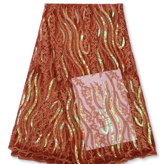
Swipe 👉👉👉👉👉 . . Suitable for all occasions Send DM for order /enquiries WhatsApp 08055861726 #honeylace_bridalplace #slayers #luxurylace #fabrics #velvetsequence #fabricstore #fashionister #owanbe #velvetdesign #fashion #inspiration #fashionnova #ibadanfashion #laceseller #vintage #newdesign #samplelace #brocade #materials #sequence #weddingdress https://www.instagram.com/p/CRG1QJTF2GO/?utm_medium=tumblr
#honeylace_bridalplace#slayers#luxurylace#fabrics#velvetsequence#fabricstore#fashionister#owanbe#velvetdesign#fashion#inspiration#fashionnova#ibadanfashion#laceseller#vintage#newdesign#samplelace#brocade#materials#sequence#weddingdress
0 notes
Photo
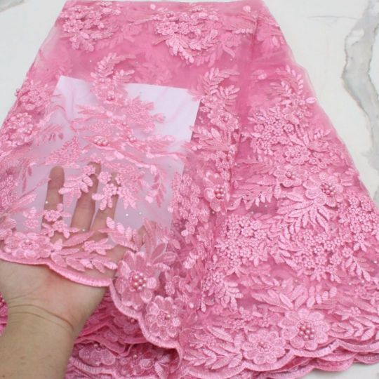
Slay on budget 💯👌 . . Suitable for all occasions Send DM for order /enquiries WhatsApp 08055861726 #honeylace_bridalplace #slayers #luxurylace #fabrics #velvetsequence #fabricstore #fashionister #owanbe #velvetdesign #fashion #inspiration #fashionnova #ibadanfashion #laceseller #vintage #newdesign #samplelace #brocade #materials #sequence #weddingdress https://www.instagram.com/p/CRG1GOvlAky/?utm_medium=tumblr
#honeylace_bridalplace#slayers#luxurylace#fabrics#velvetsequence#fabricstore#fashionister#owanbe#velvetdesign#fashion#inspiration#fashionnova#ibadanfashion#laceseller#vintage#newdesign#samplelace#brocade#materials#sequence#weddingdress
0 notes
Photo
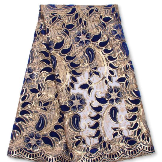
Slay on budget 💯👌 . . Suitable for all occasions Send DM for order /enquiries WhatsApp 08055861726 #honeylace_bridalplace #slayers #luxurylace #fabrics #velvetsequence #fabricstore #fashionister #owanbe #velvetdesign #fashion #inspiration #fashionnova #ibadanfashion #laceseller #vintage #newdesign #samplelace #brocade #materials #sequence #weddingdress https://www.instagram.com/p/CRG04Cel-CU/?utm_medium=tumblr
#honeylace_bridalplace#slayers#luxurylace#fabrics#velvetsequence#fabricstore#fashionister#owanbe#velvetdesign#fashion#inspiration#fashionnova#ibadanfashion#laceseller#vintage#newdesign#samplelace#brocade#materials#sequence#weddingdress
0 notes
Photo
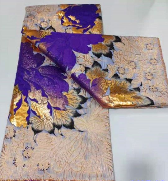
Brocade❤️🌶 . . Suitable for all occasions Send DM for order /enquiries WhatsApp 08055861726 #honeylace_bridalplace #slayers #luxurylace #brocade #fabrics #velvetsequence #fabricstore #fashionister #owanbe #velvetdesign #fashion #inspiration #fashionnova #ibadanfashion #laceseller #vintage #newdesign #samplelace #brocade #materials #sequence #weddingdress https://www.instagram.com/p/CRG0zZPFltK/?utm_medium=tumblr
#honeylace_bridalplace#slayers#luxurylace#brocade#fabrics#velvetsequence#fabricstore#fashionister#owanbe#velvetdesign#fashion#inspiration#fashionnova#ibadanfashion#laceseller#vintage#newdesign#samplelace#materials#sequence#weddingdress
0 notes
Photo
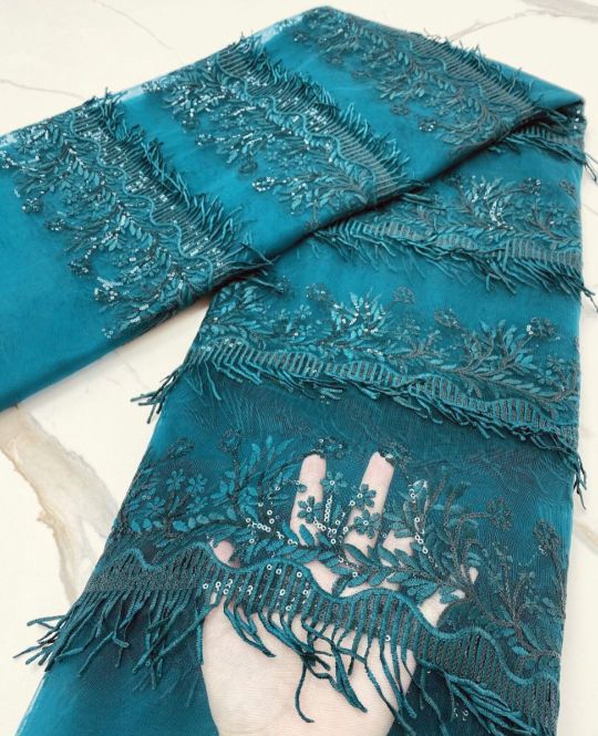
Slay on budget 💯👌 . . Suitable for all occasions Send DM for order /enquiries WhatsApp 08055861726 #honeylace_bridalplace #slayers #luxurylace #fabrics #velvetsequence #fabricstore #fashionister #owanbe #velvetdesign #fashion #inspiration #fashionnova #ibadanfashion #laceseller #vintage #newdesign #samplelace #brocade #materials #sequence #weddingdress https://www.instagram.com/p/CRG0iuMFaI_/?utm_medium=tumblr
#honeylace_bridalplace#slayers#luxurylace#fabrics#velvetsequence#fabricstore#fashionister#owanbe#velvetdesign#fashion#inspiration#fashionnova#ibadanfashion#laceseller#vintage#newdesign#samplelace#brocade#materials#sequence#weddingdress
0 notes
Photo
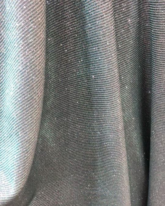
Shimmer lurex fabric🔥 . . . Suitable for all occasions Send DM for order /enquiries WhatsApp 08055861726 #shimmer #shimmerfabric #lurexfabric #honeylace_bridalplace #slayers #luxurylace #samplelace #fabrics #velvetsequence #fabricstore #fashionister #owanbe #velvetdesign #fashion #inspiration #fashionnova #ibadanfashion #laceseller #vintage #newdesign #samplelace #brocade #materials #sequence #weddingdress https://www.instagram.com/p/CQvqg1oFPz2/?utm_medium=tumblr
#shimmer#shimmerfabric#lurexfabric#honeylace_bridalplace#slayers#luxurylace#samplelace#fabrics#velvetsequence#fabricstore#fashionister#owanbe#velvetdesign#fashion#inspiration#fashionnova#ibadanfashion#laceseller#vintage#newdesign#brocade#materials#sequence#weddingdress
0 notes
Photo
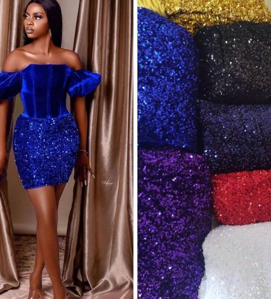
Style inspiration 🌶🔥👌 Pictures not ours . . . Suitable for all occasions Send DM for order /enquiries WhatsApp 08055861726 #honeylace_bridalplace #slayers #luxurylace #samplelace #fabrics #velvetsequence #fabricstore #fashionister #owanbe #velvetdesign #fashion #inspiration #fashionnova #ibadanfashion #laceseller #vintage #newdesign #samplelace #brocade #materials #sequence #weddingdress https://www.instagram.com/p/COyXi-inDAY/?igshid=11sjjahfn7hp5
#honeylace_bridalplace#slayers#luxurylace#samplelace#fabrics#velvetsequence#fabricstore#fashionister#owanbe#velvetdesign#fashion#inspiration#fashionnova#ibadanfashion#laceseller#vintage#newdesign#brocade#materials#sequence#weddingdress
0 notes