#typophiles
Explore tagged Tumblr posts
Visit Tumblr Blog
Explore Tumblr blogs with no restrictions, modern design and the best experience.
Last Seen Tumblr Blogs


Fun Fact
Post activity is at the highest at 4:00 pm EDT; notes peak at 10:00 pm EDT.
Text


Merry Christmas!
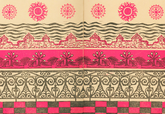
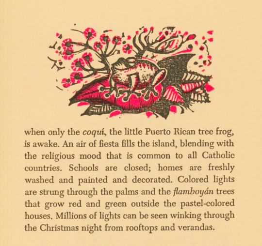
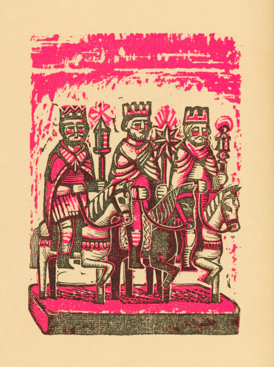
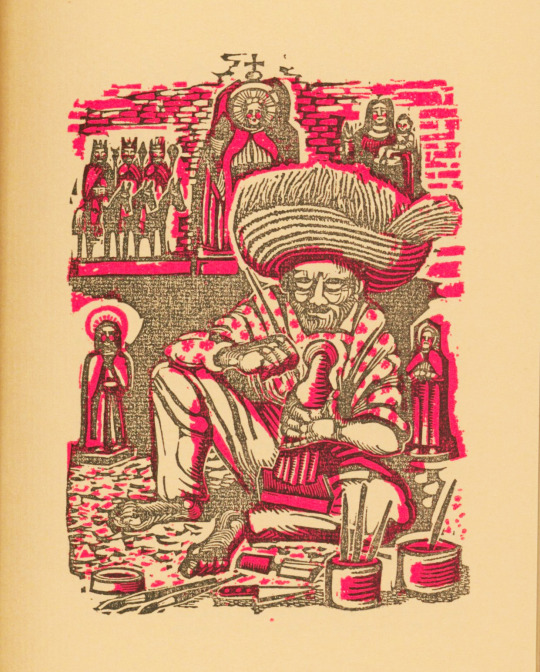
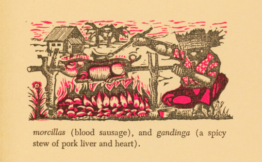
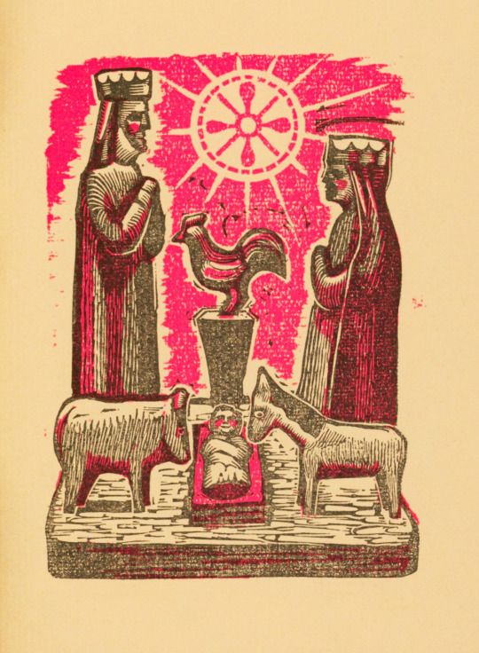
Or as they say in Spanish, Feliz Navidad! Today we celebrate the Christmas holiday with a festive book, Land of Two Christmases, which was published by Oxford University Press in 1965 with 360 copies held for distribution to the Typophiles. The text was written by Harriett Philmus Pitt and discusses the various Christmas traditions celebrated in Puerto Rico, where the books says it is celebrated in both the American and Spanish styles—though I would argue that Puerto Rico has a style all it's own! You can learn all about Christmas and related celebrations in Puerto Rico on the Discover Puerto Rico website.
The illustrations are by Erwin Schachner and were printed using photo-engravings of original linoleum prints. The text was set in Caledonia and letterpress printed on tan laid paper by Marbridge Printing Company, Inc. The book is printed in black and bright pink, making it quite festive though not what most would normally consider to be Christmas colors.
Merry Christmas to all and to all a good night!
View Christmas posts past.
-- Alice, Special Collections Department Manager
#Christmas#Land of Two Christmases#Oxford University Press#Typophiles#Harriett Philmus Pitt#Puerto Rico#Erwin Schachner#linocuts#Marbridge Printing Company#holidays
56 notes
·
View notes
Text

oh yeah? cool list alright, lets see what you suggest-

*VINE BOOM*
#nnstuff#rambling#unwell about this its so funny#eric gill STRIKES AGAIN#art college#a little typography joke for all you typophiles out there
23 notes
·
View notes
Text
Free Natural Sans Serif Font from Design Cuts
Design Cuts is giving this font away for free until March 31st. This is a beautiful, clean sans serif font with an organic feel that's extremely legible even at small sizes.
Get it here before it's gone.

Earth & Tone font
#sans serif font#free font#free fonts#best fonts#typography#graphic design#graphic designers#typographers#typophile#typografie
15 notes
·
View notes
Photo

Arazatí font is inspired by Edward Johnston's typefaces, with 48 variants and 422 glyphs each, including two monospaced options, paying homage to Johnston's birthplace in San José, Uruguay.
Link: https://l.dailyfont.com/KdNw0
#aff#typography#design#fonts#socialmedia#creativity#inspiration#art#style#graphics#illustrations#layout#composition#textdesign#fontlover#typophile#creativeprocess
0 notes

Text
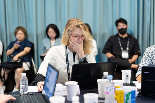
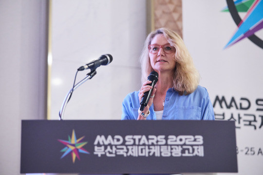
[MAD STARS through Female Eyes] Becky McOwen-Banks, Director, Creative X Global, Meta
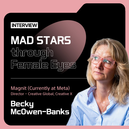
[MAD STARS through Female Eyes]
: Becky McOwen-Banks, Director, Creative X Global, Meta
It was the first MAD STARS event Becky McOwen-Banks, director, creative X global, Meta. She also brought their female perspective to the final juries.
Becky has been a creative director, on staff and freelance, at agencies such as M&C Saatchi London, VaynerMedia UK & EMEA, New Republique and FCB Inferno as well as an active member of the SheSays committee.
Becky McOwen-Banks certainly threw herself into MAD STARS. She was a member of the Final Jury and New Stars Jury, as well as a speaker discussing Searching for Innovation? Then Shut Up and Get Out of the Way! A.K.A. Creative Entrepreneurship in Action. Here is her MAD STARS view:
What motivated you to be so involved? What was your impression of MAD STARS 2023?
Becky McOwen-Banks: I have been on many global awards juries, but none that ran from Asia. I was keen to join MAD STARS, see the approach, meet more amazing talent and see for myself how it has been growing as an awards to be noticed. The combination of creative showcase and marketing business focus provides a balanced view of the industry, so I was excited and honoured when invited to get involved. I believe in the power of learning and curiosity have driven me throughout my career. The opportunity to visit a city I hadn't travelled to before, spend some time with leaders and creative talent was too good to miss. It is so important that we in the West don't become myopically focussed inwards and forget that there is so much more to discover and uncover.
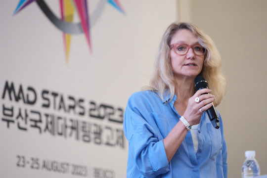
You were on the final jury. What stood out for you in the jury room (and did any work stand out for you in particular)? What were you looking for in the winners?
Becky McOwen-Banks: We had a great mix of talent and skills in the Final jury for my categories which meant lots of good discussion about the work. Identifying what is the right work for this specific awards show, at this time and within the specific category makes judging different every time. This year lots of conversations focussed around work that made a difference to the world (like Knock Knock) but also rewarded paying clients for pursuing brave thinking.
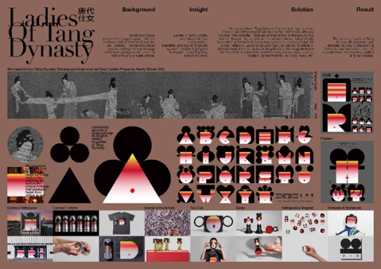
A piece of work I loved and have shared since being home is the Ladies of Tang Dynasty for Daning Palace. I'm a typophile - I adore typography - so this was just delicious. The attention to the heart of the concept and then allowing their design minds to fly was brilliant.
You were also on the New Stars jury. What did you think of the standard of work and the New Stars themselves as well as the judging experience? What were you looking for in New Stars winners?
Becky McOwen-Banks: The NEW STARS jury was tough. There was a lot of great work and so little time. The awards facilitators were very strict with us to get through all of the entries with time for good conversation. It was really interesting seeing the variation in the approaches, and also seeing how some teams seemed to really get under the skin of the issue. The ideas that linked the heart and head were the standout winners, taking such a sensitive topic out of expected channels, to reach audiences wherever they may be - and all with empathy. You won't change behaviour on any topic by shouting at people and trying to shame them. The ideas required an understanding of the educational job that was needed in order to bring people with you and allow the message to be heard as well as the empathetic tone required. The three points I had as advice for all teams was:
1: Really question your own thinking. Be your own biggest critic. Would the audience REALLY respond how I am suggesting? Would it really work? What is the simple message they would actually take out and remember? If you’re not strict in your own thinking then CDs or awards juries will be and will dismiss your thinking. Learn to stress test your own ideas. Try them from every angle and always be honest with how effective the idea may be in the actual world. It's only this way you get to water-tight thinking.
2: Keep pushing ideas. Some ideas simply weren't evolved far enough, despite having a good insight and idea. Creatives (particularly at the early stages in their career) need to keep pushing to deliver full campaign thinking. It's also a way to test the validity of the idea itself. You can get two executions out of most ideas but then run dry - so push for 3, 4, 5 and show this idea can go anywhere.
3: Crafting should always be secondary to the idea - in service of the idea, not instead of it. Great design and entry boards can never hide an average idea. Some entries were beautifully crafted, when I'd advise for this time-limited exercise that they should have been focussed 90% on idea and 10% on the board.
Please tell me about your session. Why did you choose the topic and what were its main insights?
Becky McOwen-Banks: Searching for Innovation? Then Shut Up and Get Out of the Way comes from my MBA thesis subject. I am a creative leader committed to innovation and teams. My thesis enabled me to explore the effects that leaders have on their teams, not through their direct actions but through the team design and process they create - and subsequently if these different team designs then have a different impact on the ability to innovate. This felt like a topic that would bring together the MAD STARS audience of leaders and innovation. We are all after ways to learn and enable our teams and businesses to be better, so I thought this was a good way to share some of my findings. I've had a few enquiries for my presentation so I'm hoping that means it landed with some. The main insight is that the traits of leaders (or founders) do affect the shape of teams they create, and this does ultimately impact the ability to innovate. So, we all need to be more aware of the systems we are creating, that we are the ones inhibiting our own success. It also reveals that innovative leaders are those with interactive and interpersonal traits, and that these leaders create more fluid teams.
Or to distill that into some simple guidance from my results: 1: Leaders who identify themselves as interactive/interpersonal create more autonomous team shapes 2: A more autonomous team shape results in more identifiable and measurable innovation with the added benefit of team positivity and confidence.
#festival#advertising#busan#marketing#creative#digital#madstars2023#madstars#awards#award#conferences#speaker#speakers#judging#jury#newstars2023
3 notes
·
View notes
Text
Page Wood Type Bookmark Stocking Stuffer
The Fifth of Ten Posts in Ten Days for the Upcoming Christkindlmarkt Holiday greeting cards are a big part of what The Norlu Press is offering at this weekend’s Hofbräuhaus Buffalo Christkindlmarkt, but we also will have several other interesting letterpress printing items for sale. One of them is a handsome bookmark that will appeal to the typophiles and bibliophiles among us and make a…
0 notes
Text
Handwritten Calligraphy Fonts: Upgrade Your Scripts!
Immerse yourself in the personal touch of Handwritten Calligraphy Fonts that hold the power to transform your written communication. Imagine your words wrapped in the effortless elegance of Elegant Script Fonts, each stroke telling a story beyond the ink. In an era where digitization reigns, you still have the opportunity to infuse warmth into your scripts with Personalized Calligraphy Fonts that reflect your unique voice.Whether you're designing a heartfelt invitation or branding for your business, Digital Handwriting Fonts offer a vast ocean of creativity to explore. Cater to your audience with styles that range from the classic charm of traditional calligraphy to contemporary Hand lettering fonts. Upgrade your scripts and embrace the visual storytelling that awaits you with each meticulously crafted font.Key Takeaways - Discover how Handwritten Calligraphy Fonts can enhance the narrative of your text. - Explore the impact of Elegant Script Fonts in adding sophistication to your designs. - Personalize your digital interface with Personalized Calligraphy Fonts that reflect your unique style. - Leverage the beauty of Digital Handwriting Fonts to create compelling and memorable scripts. - Find out why Hand lettering fonts continue to be a trending choice in design.
Discover the Aesthetic Beauty of Handwritten Calligraphy Fonts

The world of typography offers an escape into the realm of Aesthetic Beauty, where the art of Handwritten Calligraphy Fonts reigns supreme. These font styles are not merely a method of communication but a statement of elegance and character. Font Design Inspiration is drawn from the harmonious fluidity found in cursive handwriting fonts, turning each word into a masterpiece.As you explore various calligraphy fonts, you are greeted by the expressive strokes and thoughtful swashes that define this art form. Fonts such as Edwardian Script and Great Vibes highlight how cursive handwriting fonts can add a personal touch to invitations, logos, and branding.“Typography is the craft of endowing human language with a durable visual form.” – Robert BringhurstBelow is a showcase of handwritten calligraphy fonts that embody Font Design Inspiration, beckoning you to explore their individual stories: Font Name Style Usage Lavender Script Elegant and Refined Wedding Invitations, Business Cards Amber Taste Artistic and Bold Book Covers, Advertising Silver South Delicate and Modern Logos, Packaging Balqis Classic and Traditional Restaurant Menus, Signage Quickhill Casual and Dynamic Merchandise, Casual Wear The aesthetic allure of Handwritten Calligraphy Fonts is more than their visual appeal—it's the feeling they evoke in the reader. Whether it's the nostalgia stirred by the traditional loops of Balqis or the cutting-edge excitement induced by Quickhill, there is an emotional resonance embedded in the design of each font. - Transform the mundane into the extraordinary with a font that speaks to your aesthetic sensibilities. - Invoke different moods and atmospheres with fonts that embody the essence of your message. - Let the natural grace of cursive handwriting fonts add sophistication to your creative endeavors. In your quest for the perfect typeface, consider how these handwritten styles can serve as a form of Font Design Inspiration, elevating your work from the ordinary to the extraordinary. So go ahead, let your creative spirit soar with the aesthetic enchantment of calligraphy fonts—your next visual story awaits its distinct voice.
Exploring the Top Handwritten Calligraphy Fonts of the Year

The allure of calligraphy has always been its inherent ability to convey emotions and personality through written words. This year’s standout Handwritten Calligraphy Fonts are proving to be no exception, with several typefaces capturing the hearts of designers and typophiles alike. From the delicate finesse of the Airila Calligraphy Font to the bespoke charm of Personalized Calligraphy Fonts like Amorfatti, these fonts combine the best of traditional artistry and modern design sensibilities.The Elegance of Airila: A Modern Calligraphy ClassicIf your design calls for a touch of modern sophistication, look no further than Airila Calligraphy Font. This contemporary gem bridges the gap between historical calligraphic practices and current Modern Calligraphy Typefaces, rendering it a versatile choice suited to a wide array of applications. The elegance and fluidity encapsulated in Airila's characters are ideal for invitations, branding, and advertising where a refined touch is desired.Captivating Curves: The Charm of Aromatisse FontFor those of you seeking a typeface with Captivating Curves and timeless beauty, the Aromatisse Calligraphy Font might just be your typographic soulmate. Renowned for its graceful presence, Aromatisse imbues each design with a sense of classical charm. Envision your next project adorned in the enchanting sweeps of this Charming Calligraphy Typeface, and watch as it draws in your audience with its lyricism and finesse.Signature Styles: Personalized Fonts like AmorfattiThe unique allure of a signature can now be yours with fonts like the Amorfatti Font. Personalization reaches new heights with this Signature Style Font, offering the distinctiveness of individual handwriting coupled with the clarity of digital text. Tailor your messages to hold the personal resonance of a handwritten note, building a connection with your audience that serenely echoes the iconic strokes of a signature. - Airila Calligraphy Font sets a new standard for modern classics. - With Aromatisse Calligraphy Font, captivating elegance graces every word. - Amorfatti Font encapsulates authenticity in its personalized signature style. As you explore these Top Handwritten Calligraphy Fonts, consider the emotional impact and visual storytelling potential they can bring to your projects. This year, allow the mastery of calligraphy to infuse a dose of character and sophistication into your work, and redefine what it means to communicate through design.“A typeface is an alphabet in a straitjacket.” – Alan Fletcher Font Name Attributes Ideal Use Airila Calligraphy Font Elegance with Modern Edge Wedding Invitations, Luxury Branding Aromatisse Calligraphy Font Classic Charm, Graceful Curves Event Design, Formal Correspondence Amorfatti Font Personalized Signature Style Business Cards, Autograph-like Logos The beauty of these fonts lies not just in their aesthetic appeal, but also in their ability to tell your story with conviction and style. Embrace the Personalized Calligraphy Fonts that resonate with your vision and let your next project be an illustration of unmatched elegance.
Free Handwritten Calligraphy Fonts: Where to Find Them

The search for Free Handwritten Fonts with the charm of calligraphy has never been easier. Today's online landscape is brimming with resources offering Calligraphy Font Downloads at no cost, ensuring that your digital designs carry a touch of personal flair without breaking the bank. Whether for personal projects or commercial endeavors, the availability of diverse and capable Digital Handwriting Fonts is vast.As a designer or hobbyist, you're no longer restricted to the default fonts pre-installed on your computer. Handwriting Font Generators and Font Design Workshops provide unique avenues for creating your own fonts or discovering existing ones that embody the spirit of handwritten text.Below are some trusted platforms where you can find a plethora of Free Handwritten Calligraphy Fonts: Platform Font Type Availability Language Support Commercial Use Google Fonts Extensive Selection Multi-language Yes DaFont Indie Fonts Primarily English Limited Adobe Fonts Premium and Free Extensive Yes with Subscription Font Squirrel Handpicked Freebies Multi-language Yes MyFonts Free and Paid Options Extensive Varies Behance Designer Portfolios Varies Limited While some of these fonts are available for both personal and commercial use, it's crucial to review the licensing agreement for each font before use in a commercial capacity. Some creators may allow their work to be used freely, while others might require a one-time payment or subscription. Ensure you're respecting the intellectual property of these talented font designers by adhering to their usage policies.Keep in mind that the aesthetic of your project should guide your font choice. A Gentle Script might be ideal for something like wedding invitations, while a Bolder Handwritten Style could elevate the branding for a startup. Don't hesitate to test multiple fonts to find the perfect fit for your vision. - Browse through platforms like Google Fonts for a wide array of free and open-source options. - Use Handwriting Font Generators to create a custom font that is unique to your brand or message. - Visit Font Design Workshops online to enhance your typography skills and learn to make your own handwritten fonts. Pro Tip: Always have a secondary font option in case your primary choice doesn't pan out. Flexibility is key in design.With the resources at your disposal, the perfect Free Handwritten Font for your next project is just a few clicks away. Explore, experiment, and let the distinctive qualities of calligraphy uplift your design!
Integrating Handwritten Fonts Into Your Branding
When it comes to creating a memorable and distinctive brand, the visual component of your logo is paramount. Incorporating Calligraphy in Logo Fonts not only adds a touch of sophistication, but also personalizes your brand's aesthetic. This artistic approach enhances Branding with Calligraphy, ensuring that first impressions resonate profoundly with your audience.Calligraphy Fonts in Logo Design: A Touch of SophisticationEmploying Sophisticated Script Fonts in logo design is not merely about aesthetics; it's a strategic choice that can speak volumes about your brand's ethos. A well-chosen calligraphic font weaves a story of tradition, craftsmanship, or bold creativity, all while maintaining the sleek professionalism necessary in today's market. Consider the renowned logos of luxury brands which often utilize these types of fonts to signify elegance and exclusivity.A logo imbued with calligraphic elements can set you apart from competitors and imprint your brand identity in the minds of consumers. Whether on a storefront or the header of a website, Typography in Calligraphy is a detail that attracts the discerning eye.Matching Font and Company Identity: Font Pairing for Maximum ImpactThe process of Font Pairing for Branding should be a thoughtful and focused effort to align your visual presentation with the core values and character of your company. The harmony between Calligraphy Font Pairing and other visual elements can significantly enhance brand recognition and consumer trust."Your brand is a story unfolding across all customer touch points." – Jonah SachsIncorporating a calligraphy font doesn't mean sacrificing readability for style. It’s about finding the right balance that reflects your Company Identity without overwhelming the audience. Here’s a helpful framework for Font Pairing for Calligraphy to achieve an impactful brand presence: Font Style Brand Character Industry Elegant Scripts Luxury, Sophistication Fashion, Jewelry Bold Calligraphy Confidence, Strength Sports, Fitness Modern Calligraphy Creative, Artistic Design, Advertising Minimalist Script Clean, Straightforward Technology, Startups Consider each table entry as a guide—mixing and matching until you find the perfect Calligraphy Font Pairing that speaks to your brand’s unique story and market position. The right combination can empower your branding materials to communicate more effectively, making every letter count. - Choose a calligraphy font that echoes your brand's personality and complements its narrative. - Strike a balance between ornate calligraphy and more subdued fonts for a pairing that is both beautiful and functional. - Let the individuality of your brand shine through with a unique script that is not commonly used by others in your space. Your logo is more than just a symbol—it's the cornerstone of your brand identity. As you embark on the journey of Branding with Calligraphy, remember to allow the typefaces to serve as ambassadors to your company's story, adding that indispensable human touch to your visual identity. Explore the endless possibilities and craft a brand image that stands the test of time!
Tips for Choosing the Right Calligraphy Font for Your Project
https://www.youtube.com/watch?v=oKBpF8sdhZcEmbarking on the journey of Selecting Calligraphy Fonts for your latest project entails a confluence of aesthetics, functionality, and thematic considerations. The perfect choice of typeface can amplify your message, emotionally resonate with your audience, and give your work an undeniable flair. Here are some savory Typography Tips to aid you in navigating the world of Calligraphy Font Aesthetics.Before you dive into the font selection process, it's crucial to understand the context and purpose of your project. Whether you’re creating an elegant wedding invitation or conceptualizing a branding proposal, the font you choose should align with the project's overall vibe and intentions. Let's explore some practical advice to aid your Project-specific Font Selection.“Typography is what language looks like.” – Ellen Lupton - Reflect on the tone and message you wish to convey. A playful event might call for a whimsical script, while a gala may require something more regal and refined. - Consider your target audience. What are their preferences and expectations? A font that appeals to a younger demographic may differ vastly from one that resonates with a more mature crowd. - Analyze the usage context. Will your text be displayed on a massive billboard or be thumbnailed on a smartphone screen? Size and legibility from a distance can be a deciding factor. - Don't ignore color and texture. While these might not be direct attributes of the font, they play a significant role in Calligraphy Font Aesthetics. A careful examination of these elements will offer clarity and narrow down your choices to those most fitting for your project. And yet, balancing these factors is not the end-all. Let us delve into a bit more detail with a comparative analysis designed to facilitate your decision-making process: Font Traits Ideal for Considerations Heavy Strokes, Bold Weight Impactful Headlines, Posters May overpower delicate designs, use sparingly Fine Strokes, Light Weight Elegant Invitations, Art Galleries Ensure legibility in all sizes and mediums High Contrast, Varying Thickness Fashion Branding, Editorial Works best on plain backgrounds for maximum readability Minimum Contrast, Uniform Lines Corporate Documentation, Formal Letters Offers clarity and formality, but may lack emotional connection Above all, remember that Selecting Calligraphy Fonts is an intimate process that should be thoroughly enjoyable. This is your chance to imbue a piece of your creative spirit into your projects. Trial and exploration are your best resources; don't shy away from experimenting with different typefaces until you find the one that not only meets your criteria but sings to your aesthetic sensibilities.By marrying these Typography Tips with your innate style, the Calligraphy Font Aesthetics you select will seamlessly become an extension of your project's identity, ensuring your audience is not only reached but touched.
Understanding Font Licensing: Free vs. Commercial Fonts
When it comes to using fonts in your designs, it's essential to grasp the concept of Font Licensing for Calligraphy. This license acts as a legally binding agreement that stipulates how a font can be used by the purchaser. There's a world of difference between Free vs Commercial Script Fonts that can impact not only your wallet but also the Typography Legal Considerations involved in your projects.Why Font Licensing Matters for Your DesignsRespecting Font Licensing for Calligraphy is crucial. It safeguards the intellectual property of type designers who have put hours of craft into their work. More importantly, disregarding font licensing can lead to legal repercussions that could harm your personal or company's reputation and finances. Below, you will find a table detailing the contrasts between free and commercial font licenses: Font Type Usage Rights Common Restrictions License Cost Free Fonts Usually limited to personal projects Some exclude commercial use or require attribution $0 Commercial Fonts Permits use in commercial products and services May limit the number of devices or users Varies by font and foundry As seen in the table above, Free Fonts can be a cost-effective option for personal projects, but make sure to read the fine print. While some free fonts permit commercial use, others might require a fee or stipulate certain conditions, such as crediting the designer or restricting the use to non-commercial projects. Read the full article
0 notes
Photo
Typography and ornament composition made with EFCO Songster. Now available on ephemerafonta.com #ephemerafonts #logotype #lettering #vintagelettering #victoriantype #distressedunrest #typewip #goodtype #typophile #handlettering #procreate #logo #customlettering #letteringlove #letteringdaily #graphicdesign #typography #handlettered #letteringtattoo #handmadefont #letteringbrasil #tutorial #font #typedesign #typefacedesign #typespire https://www.instagram.com/p/Ca2KTnjP1WT/?utm_medium=tumblr
#ephemerafonts#logotype#lettering#vintagelettering#victoriantype#distressedunrest#typewip#goodtype#typophile#handlettering#procreate#logo#customlettering#letteringlove#letteringdaily#graphicdesign#typography#handlettered#letteringtattoo#handmadefont#letteringbrasil#tutorial#font#typedesign#typefacedesign#typespire
2 notes
·
View notes
Photo

©No Talent Studio
#Typography#typografie#typo#typophile#graphic design#typeface#customfont#customtype#fashion#Streetwear#madeinportugal#notalentstudio#no talent#nts#logo#logodesign
8 notes
·
View notes
Text
I spend 85% of my life looking at things & thinking: what a nice font. I like that font. that is a lovely font.
3 notes
·
View notes
Text
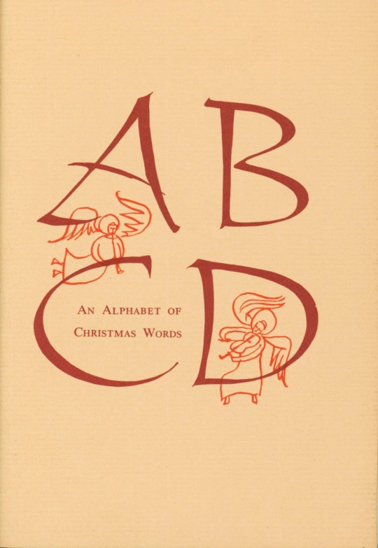
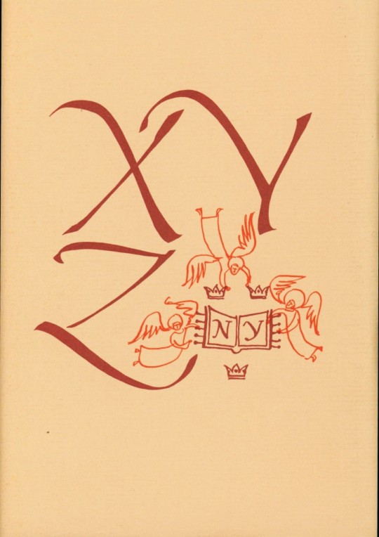

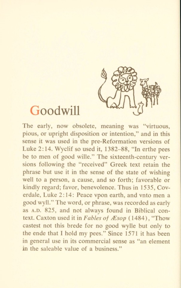


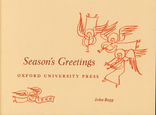
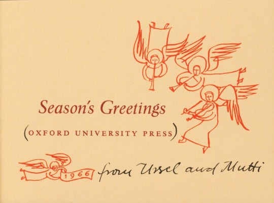
It’s Fine Press Friday!
In the spirit of Christmas’s arrival in three days, we present a small Christmas-themed book entitled An Alphabet of Christmas Words, published in 1966. The book is a dictionary of holiday terms, with corresponding illustrations. Entries were selected and edited from the Oxford English Dictionary by American writer Helen McKelvey Oakley (1906-2003), who explains that her “interest [in this project] lies in seeing how The Dictionary treats [each term].” The accompanying illustrations are by Ursula Suess (b. 1924), a graphic designer, calligrapher, and artist. Most recently, her art was shown in a 2022 solo exhibition at the Tubac Center of the Arts in Tubac, Arizona.
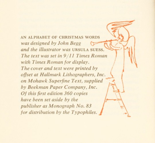
An Alphabet of Christmas Words was offset printed in Times Roman on Mohawk Superfine Text paper by Hallmark Lithographers Inc. in an edition of 360 copies, published by the Oxford University Press and designed by Ursula Suess and the press's art director and vice president John Begg (1903-1974). Also included with this book are two small season’s greetings cards from the press; one has Begg’s name printed on it and the other has “from Ursel and Mutti” inscribed in black ink.
View more Fine Press Friday Posts.
– Sarah S., Special Collections Graduate Intern
#Fine Press Friday#fine press fridays#fine press printing#fine press books#An Alphabet of Christmas Words#Christmas#oxford dictionary#oxford english dictionary#helen mckelvey oakley#ursula suess#John Begg#Times Roman#Mohawk superfine paper#offset printing#Hallmark Lithographers#typophiles#alphabet#Sarah S.
59 notes
·
View notes
Photo

Deutschland typografisch. Font: Frutiger 65 bold #typographytravel #post #ostfriesland #iloveyou #typohype #schriftarten #typotravel #citypography #typography #typo #typografie #typophile #ilovetypo #typedesign #goodtype #typematters #thedailytype #typoart #fontoftheday #typoworld #streetphotography #streetart #strassenfotografie #photooftheday #bestoftheday #pictureoftheday #artefakt (hier: Bunde, Germany) https://www.instagram.com/p/B4VdCdvCJxe/?igshid=hccrfwbpidew
#typographytravel#post#ostfriesland#iloveyou#typohype#schriftarten#typotravel#citypography#typography#typo#typografie#typophile#ilovetypo#typedesign#goodtype#typematters#thedailytype#typoart#fontoftheday#typoworld#streetphotography#streetart#strassenfotografie#photooftheday#bestoftheday#pictureoftheday#artefakt
1 note
·
View note
Photo

Here's to all the people who create, in whatever medium you choose. . This limited edition print sold out a long time ago, but every order of an 11" x 14" screenprint comes with a small leaflet giving framing advice, I use this design for the reverse. ��� . Also, a big thank you for the wonderful response to yesterdays 'favourite female author' question! After looking at all the different responses I might have to design this print to be finished by hand, so you can all choose your own favourites to be featured! . . #chattynora #lettering #creative #Handlettering #handlettered #lettering #goodtype #typography #typographic #typophile #typographyinspired #typematters #musicmakers #mycreativelife #abmlifeishappy #abmlifeiscolorful #artistoninstagram #artofinstagram #etsyuksellers #etsysellerofinstagram #makersgonnamake #quoteprint https://www.instagram.com/p/ButLLgpFjRS/?utm_source=ig_tumblr_share&igshid=1agjjinptthjh
#chattynora#lettering#creative#handlettering#handlettered#goodtype#typography#typographic#typophile#typographyinspired#typematters#musicmakers#mycreativelife#abmlifeishappy#abmlifeiscolorful#artistoninstagram#artofinstagram#etsyuksellers#etsysellerofinstagram#makersgonnamake#quoteprint
2 notes
·
View notes
Photo

Sláinte, Skål and Santé too! 🥂✨ Best wishes for health, laughter and fulfilling adventures this 2023.🤞🏻 These cards are my last 2022 and first 2023 print projects! 😍😊 I reprinted one of my favorites first, the: Pop Fizz Clink Repeat And added the Cheers card as the perfect companion.💌 I would have loved to make some variations in sayings but I’m limited by the type I have…no special characters and only 2 Cs…I’m making it weeerk with what I’ve got.😉 #letterpress #letterpresscard #letterpressprinting #vintageprinting #typophile #vintagetypography #granbyshadow #kisskisspaper #happy2023 #happynewyears #snailmaillove #snailmailing https://www.instagram.com/p/Cm4uTO_Stc9/?igshid=NGJjMDIxMWI=
#letterpress#letterpresscard#letterpressprinting#vintageprinting#typophile#vintagetypography#granbyshadow#kisskisspaper#happy2023#happynewyears#snailmaillove#snailmailing
0 notes
Text
Helvetica is a great movie and also a great example of why male graphic designers need to be oppressed
#did you know typophiles were a thing? I didn't#but now i do and so do you#imagine a sans serif smooth enough to get you sprung bc i sure as hell can't
1 note
·
View note