#two versions: shaded n then shaded + overlay layers
Explore tagged Tumblr posts
Text


hot and bothered werewolf men in my area. please. please. five miles away please. please.
#art.png#artists on tumblr#two versions: shaded n then shaded + overlay layers#oc:Duke#oc:Dock#they're more implied but whatever#the two of them are sort of exes they were never an official Thing#but they did fool around a bit#suggestive#just in case
6 notes
·
View notes
Photo
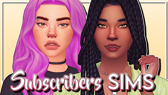
⭐️ N E W V I D E O ⭐️ The Sims 4 | MAKING OVER MY SUBSCRIBERS SIMS #5! | CAS & Lookbook + CC Links
Hey there! Today I'm making two beautiful sims created by my subscribers! I also finally created a discord server for us all to join and talk about not just the sims but also a bunch of other things! Use this link if you want to join: https://discord.gg/UQUDAFV
▶️https://youtu.be/6XYNkTY4cFo
CC Links
SIM 1 (ARIELLE)
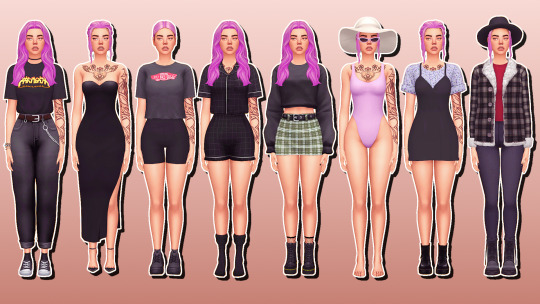
GENERAL Skinblend: https://www.patreon.com/posts/38472438 Face Overlay: https://heihu.tumblr.com/post/168522486651/i-did-a-little-spring-cleaning-of-my-blog-and Eyes: https://baieyu.tumblr.com/post/179216040640/still-feel-eyes-previews-heavily-insp-by Catchlight: https://simulationcowboy.tumblr.com/post/183759640852/inspired-by-okyio-and-the-eyes-in-her-edits Eyebags: https://ratboysims.tumblr.com/post/188237560445/kiwi-eyebags-updated-1110-2019-by-ratboysims Nose Shader: https://simfileshare.net/download/977930/ Freckles: https://joviean.tumblr.com/post/186573920181/maple-freckles Blush: https://squeamishsims.tumblr.com/post/185846308452/booboo-blush-by-squeamishsims-so-ive-tried-so Hair 1: https://grimcookies.com/post/614903696818683904/deliliah-hair-your-sims-inner-icon-is-gonna Hair 2: https://dogsill.tumblr.com/post/621917028322803712/margot-buns-i-love-margot-robbie-this-hair-is Hair 3: https://grimcookies.com/post/167010061675/aubrey-a-remake-of-my-kimberly-bun-with Edges: https://setsuki.tumblr.com/post/178307334864/full-scalp-with-edges-skin-detail-version-1-6
MAKE UP Eyebrows: https://adiec.tumblr.com/post/185708180915/eyebrow-set-1-some-cute-lil-eyebrows-i-made-in Lashes: http://kijiko-catfood.com/3d-lashes-version2/ Eyeshadow: https://crypticsim.tumblr.com/post/613974349191561216/the-blossom-collection-this-collection-is-a-collab Eyeliner: https://crypticsim.tumblr.com/post/190594545470/the-lotus-collection-inspired-by-the-lotus-flower Eyeliner: https://caelhinn.tumblr.com/post/190809835077/heart-shaped-wing-an-eyeliner-by-caelhinn Liner: https://crypticsim.tumblr.com/post/180694444347/passionfruit-liner-the-passionfruit-liner-is-a Blush: https://www.thesimsresource.com/downloads/details/category/sims4-makeup-female-blush/title/biscuit-blush/id/1453076/ Lipstick: https://sagittariahx.tumblr.com/post/178538243045/50-shades-of-nude-lipstick-download-sfs-buy-me Nails: https://simlaughlove.tumblr.com/post/163327412088/sll-rainbownails
EVERYDAY Top: https://www.thesimsresource.com/downloads/details/category/sims4-clothing-female-teenadultelder-everyday/title/trillyke--paper-plane-t-shirt-%28part-1%29/id/1471674/ Bottom: https://clumsyalienn.tumblr.com/post/189104784520/gerda-winter-cc-pack-base-game-compatible-female Shoes: https://sssvitlans.tumblr.com/post/159295739339/heypixels-low-top-all-star-conversion-by Piercing: https://pickypikachu.tumblr.com/post/130419022043/celebrating-10000-followers-here-is-part-2-of-my Choker: https://grimcookies.com/post/186093894930/its-here-this-cc-set-is-the-conclusion-of-months Bracelet: https://www.thesimsresource.com/downloads/details/category/sims4-accessories-female-bracelets/title/s-club-ll-ts4-hand-catenary-n01%28f%29/id/1307432/
FORMAL Dress: https://grimcookies.com/post/612432610906554368/grimcookies-x-deligracy-2-deli-i-have-once-again Shoes: https://www.patreon.com/posts/35228475 Earrings: https://nach0sims.tumblr.com/post/187201760442/sutton-earrings-basically-the-earrings-that-my-mom Bracelet: https://veranka-s4cc.tumblr.com/post/142800259050/claire-necklace-bracelets-i-did-some-simple
ACTIVE Top: https://mousysims.tumblr.com/post/182712684887/bgc-custom-thumbnail-disabled-for-random-18 Bottom: https://grimcookies.com/post/186093894930/its-here-this-cc-set-is-the-conclusion-of-months Shoes: https://tunayegit.tumblr.com/post/616484713367060480/chonk-sneakers-so-i-didnt-like-how-the-sneakers
SLEEP Top: https://www.thesimsresource.com/downloads/details/category/sims4-clothing-female-teenadultelder-sleepwear/title/trillyke--dreams-come-true-pajama-shirt/id/1485054/ Bottom: https://www.thesimsresource.com/downloads/details/category/sims4-clothing-female-teenadultelder-sleepwear/title/trillyke--dreams-come-true-pajama-shorts/id/1485056/ Socks: https://www.thesimsresource.com/downloads/details/category/sims4-clothing-female-teenadultelder-everyday/title/trillyke-run-away-socks/id/1469854/
PARTY Top: https://savvysweet.tumblr.com/post/187251375353/clothes-dump-hey-yall-i-decided-to-make-some Bottom: https://captainmrbored.tumblr.com/post/188628810356/classic-edge-skirt-simblreen-gift-call Shoes: https://tunayegit.tumblr.com/post/187577862556/better-than-mosc-boots-hoi-guyss-welcome-to-my Socks: https://love4sims4.tumblr.com/post/161466199623/ceiuu-fishnet-socks-please-forgive-the-bad
SWIM Swimsuit: https://gvbesims.tumblr.com/post/185126083949/inakhs-80s-swimsuit-recolors-i-absolutely Sunglasses: https://casteru.tumblr.com/post/181406722897/cat-eye-sunglasses-tou
HOT WEATHER Dress: https://moontrait.tumblr.com/post/189960301998/10k-followers-gift-moontrait-layered-dress Shoes: https://www.patreon.com/posts/mmsims-dr-molly-25334773 Earrings: https://www.thesimsresource.com/downloads/details/category/sims4-accessories-female-earrings/title/venus-earrings/id/1444335/
COLD WEATHER Top: https://www.patreon.com/posts/female-autumn-cc-29988371 Bottom: https://tajsiwel.tumblr.com/post/168013107850/erin-28-swatches-custom-thumbnail-disallowed-for Shoes: https://madlensims.tumblr.com/post/182216831210/madlen-roberto-boots-high-quality-leather-boots Hat: https://down-in-simsland.tumblr.com/post/141566884905/leave-your-hat-on-casual-hat-hi-its-been-a
SIM 2 (JADA)
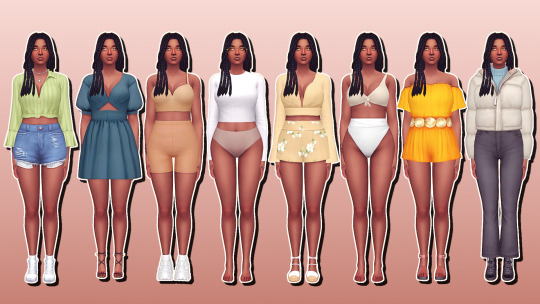
GENERAL Skin Overlay: https://nesurii.tumblr.com/post/190606984166/lunaria-a-default-non-default-skin-this-was Hair: https://sleepingsims.tumblr.com/post/621543129293750272/bria-braids-i-wanted-some-braids-that-werent Edges: https://setsuki.tumblr.com/post/178360831744/full-scalp-with-edges-100-followers-gift-7-8 Eyes: https://baieyu.tumblr.com/post/179216040640/still-feel-eyes-previews-heavily-insp-by Catchlight: https://simulationcowboy.tumblr.com/post/183759640852/inspired-by-okyio-and-the-eyes-in-her-edits Eyebags: https://ratboysims.tumblr.com/post/188237560445/kiwi-eyebags-updated-1110-2019-by-ratboysims Nosemask: https://simfileshare.net/download/977930/ Face Shine: https://nesurii.tumblr.com/post/182508085171/amaryllis
MAKE UP Eyebrows: https://adiec.tumblr.com/post/185708180915/eyebrow-set-1-some-cute-lil-eyebrows-i-made-in Lashes: http://kijiko-catfood.com/3d-lashes-version2/ Eyeliner: https://caelhinn.tumblr.com/post/190809835077/heart-shaped-wing-an-eyeliner-by-caelhinn Eyeshadow: https://crypticsim.tumblr.com/post/613974349191561216/the-blossom-collection-this-collection-is-a-collab Lipstick: https://stretchskeleton.tumblr.com/post/188423483268/finally-back-with-some-cc-download-under-the-cut Blush: https://simandy.tumblr.com/post/613202637416988672/its-not-a-hiatus-come-back-if-i-dont-make-a-new Nails: https://simlaughlove.tumblr.com/post/163327412088/sll-rainbownails
EVERYDAY Top: https://aharris00britney.tumblr.com/post/620123767733141504/eco-lifestyle-add-ons Bottom: https://emmibouquet.tumblr.com/post/186212027867/summer-time-shorts-i-have-seen-many-versions-of Shoes: https://majorpanicgamer.tumblr.com/post/159625104726/pxelbox-converse-by-pxelbox-some-simple Necklace: https://enriques4.tumblr.com/post/618844358245023744/egirl-collection-by-enriques4-isjao-so-were
FORMAL Dress: https://sulsulhun.tumblr.com/post/614473277807689728/sulsulhuns-dana-dress-hi-everyone-simfileshare Shoes: https://www.thesimsresource.com/downloads/details/category/sims4-shoes-female-teenadultelder/title/madlen-jasmine-shoes/id/1376912/
ACTIVE Top: https://dear-solar.tumblr.com/post/187076819275/the-chuuuuu-collab-this-is-a-korean-beauty-and Bottom: https://grimcookies.com/post/186093894930/its-here-this-cc-set-is-the-conclusion-of-months Shoes: https://mmsims.tumblr.com/post/611005735890993152/s4cc-mmsims-cb-thunder-sneakers-download
SLEEP Top: https://kimoanasims.tumblr.com/post/179496231902/simblreen-treat-3-reggie-top-srry-for-being-so Bottom: https://grimcookies.com/post/621067688626864128/softe-a-collection-of-intimates-ive-been Glasses: https://www.patreon.com/posts/remove-makeup-29396235
PARTY Top & Bottom: https://ilkup.tumblr.com/post/174829580382/magnolia-magnolia-shirt-16-patterned-swatches-16 Shoes: https://sims4nexus.tumblr.com/post/184857327879/caroline-sandals-for-ladies-of-all-ages-go-to
SWIM Top: https://kumikya.tumblr.com/post/187408460326/heatwave-bikini-this-is-my-third-and-final-bikini Bottom: https://www.renorasims.com/product-page/sulani-swimwear-collection
HOT WEATHER Jumpsuit: https://sentate.tumblr.com/springsummer2019 Shoes: https://www.thesimsresource.com/downloads/details/category/sims4-shoes-female-teenadultelder/title/madlen-marius-shoes/id/1407602/ Rings: https://christopher067.tumblr.com/post/617650784711098368/g-l-i-m-m-e-r-r-i-n-g-s-hello-today-i-have
COLD WEATHER Top: https://clumsyalienn.tumblr.com/post/189104784520/gerda-winter-cc-pack-base-game-compatible-female Bottom: https://www.patreon.com/posts/wide-leg-jeans-29395817 Shoes: https://simtone.tumblr.com/post/179065116035/buckle-boots-10-swatches-more-cas-pictures
#sims#the sims#sims 4#the sims 4#sims 4 cc#sims cc#sims 4 custom content#sims custom content#sims 4 mm cc#mm cc#maxis match#maxis match cc#sims 4 maxis match#sims 4 maxis match cc#sims 4 cc finds#sims 4 cc links#sims 4 lookbook#sims 4 cas cc#sims 4 cc lookbook#sims 4 mm hair#sims 4 mm clothes#simpanions#simblr#sims 4 simblr#sims 4 makeover#sims 4 cc makeover
60 notes
·
View notes
Note
what is your process for coloring? Just asking cuz it’s beautiful and amazes me.
Thank you! I have two colouring styles right now but I’m gonna explain the complicated one because the easy one is just that minus the fancy steps.
so before I begin let me also note that until I enter my finalization stage my line art is entirely black. ok now!! I always start with flat colours each on separate layers and I name the layers so I know what's what, I also make sure I have a colour palette layer so I can colour pick when I do fancy shading. so after I have all my colours ready I fiddle with them to make sure I like the saturation and brightness and hue and all that.
after flat colours, I do that sweet sweet fancy shading! which is hell to explain but ill try my best, heh, essentially I use a watercolour brush and I put down SUPER DUPER saturated reds blues and yellows, sometimes I also use cyan. so I mostly just colour map where I want to look blushy and where I want to look darker and its mostly just knowing faces and stuff. after that, I go in with the OG colour and b l e n d. it takes so long it hurtssssss, when I use this colouring style I end up spending like 4 hours on a drawing. now the fabric is way easier i use the same colouring style but I can use a way bigger brush and it's just knowing what colours make things look like they have depth. eyes are fun cuz other than the usual blending thing I use a particle brush with a really saturated version of the eye colour with a layer set on add, it makes the eyes look glowy
then I do a multiply layer with blue on like mid opacity, DUPLICATE IT, blend that duplicated baby out and fiddle with both the blended and unblended layers opacities (I always have the blended layer more opaque than the non-blended one). then I use like yellow or something on an added layer (not a lot of it) and turn down that opacity. over ALL THAT I put an overlay layer of some saturated colour to make sure everything looks good together. then I change the lineart colour with clipping and add eye lights.
I need to do an actual tutorial because it’s hard to explain with just words but I'm in class rn haha. I hope that helped explain stuff! for my easy colour style I just don't do any of the watercolour saturated blending and just sure the flat colours + the multiply stuff (and maybe some light airbrushing)
Hope this made sense <3
2 notes
·
View notes
Text
Art Process
Someone asked me for my process and how I do things. I thought I’d used the latest painting I made as an example, since I was compulsively saving each step of the way and thus have neat snapshots on how things go.
I use Photoshop CC. I used to use Corel Painter, but there are tools in Photoshop that I use all the time for correcting mistakes, which don't exist in Painter (at least the 2012 version.) My brushset can be found here. I spend 90% of my time using the square brush. To have it display properly, you’ll need to grab the little bottom right corner triangle and expand the little brush-window until things look like this:

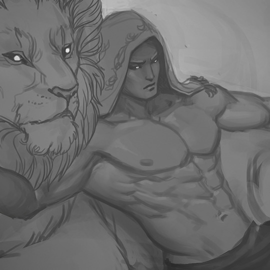
I typically start off by blocking in big blobby, noodly shapes in greyscale and start sketching/rendering that up with more and more detail. This is all done with the plan that I will add color later via blending modes. By working in greyscale first, I can roughly figure out my values/shading without also having to worry about color at the same time. The old masters used to do something similar with oil painting by creating a grisaille first and adding washes of color later.
Rest of process is under the cut as it is a long post!
To add color my usual choices for blending modes are Multiply layer first right over the greyscale with an Overlay layer on top of that to stop things from getting too dark. I also use Overlay to do a bit of lighting adjustment too if I feel things would look better a bit brighter or darker. I try to also keep warm vs cool colors in mind at this point as well. You’ll notice that Tiergan’s pectorals, face, and the shoulder closest to the light are a bit brighter and warmer - while things get subtly darker and cooler as you get lower down his torso. Things look really funky and weird in this stage, but you just have to trust in the process and know it will gradually get less fugly.

Speaking of blending modes - I love the fuck out of them and I feel like they are an extremely powerful tool in your toolkit. Other blending modes I tend to use sometimes are Saturation (to knock things back if I made the colors too over-saturated using Overlay), Color (for color adjustment like the name suggests), Lighten (to affect only lighter values while leaving darker ones alone), Darken (tweak only darker values while leaving the lighter ones alone, Screen (great for glows), Linear Dodge (extremely situational, but can be neat for rim-lights, magic effects, and LIGHT SABERS if you put the blending mode on your brush).
Once I am satisfied with the color, I flatten everything and resume painting from there in full color, continuing to render and polish everything up, adding in all the details. I tend to do this by making new layers and painting on top instead of directly on my flattened layer. Sometimes I’ll have two or more extra layers set to Normal to paint different things. The reason I do this is so if I don’t like how I’ve rendered things, I can erase parts of it or just nuke it all back to a clean slate - without destroying the base foundation I’ve created. I use a mix of Normal layers and layers with blending modes to render depending on what I need. Sometimes further along in the painting, I’ll realise I want to make things even brighter/darker and push the values more - so I’ll do something like add n Overlay or Multiply layer to do that, then add a Normal layer on top of all of that to keep painting in color. (And then flatten everything again when I start getting antsy about there being too many layers.)

You’ll notice above I realised that I forgot Tiergan’s hair and that he was looking super bald the more I rendered, so I just added it in on its own separate ‘hair’ layer. At the same time, I probably had another layer right beneath it that was just for rendering out all the skin details.
I always try to work as non-destructively as possible. This is also why I have so many versions of the same file and can show you past snapshots of what I was doing - every time I’m about to make a major decision, I save the file as a whole new copy of itself before continuing. Other ways I try to work non-destructively is to use Layer Masks instead of actually erasing things unless I am POSITIVE I want something gone and never want to bring it back.
If my character is on a separate layer from my background (which usually is the case, but not what I did this time around) - I abuse the shit out of Clipping Mask layers to paint only on my character. In fact, I used clipping masks on the ‘Hair’ layer I mentioned earlier to paint only on the hair when I wanted to add lights and shadows to it without risking fucking up the surrounding areas. The shadow cast by the hair onto the skin I did on a different layer just beneath the Hair layer.
Note: If you’re reading this and your first question is “What the heck is a Layer Mask/Clipping mask?” - then HOLY SHIT NUGGETS MY FREN, READ THIS AND FEEL YOUR MIND BEING BLOWN.
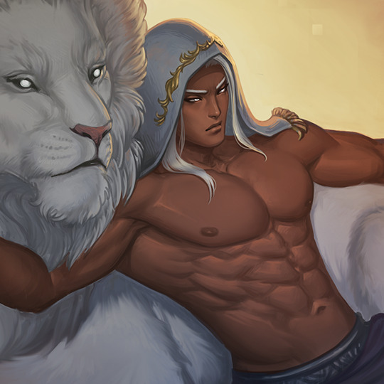
When I feel like I'm finished, I more often than not do a final pass of lighting/color adjustments and some finishing touches that would be tougher to do earlier in the process (like scars!) either with blending modes (to push or dial back lights/shadows, adjust colors/saturation) or slap a gradient map on top of everything as an adjustment layer set to low opacity to kinda help harmonize all the colors. It’s a little easier for me to try and bring everything together once all the information is there on the canvas and I just need to tie stuff together.
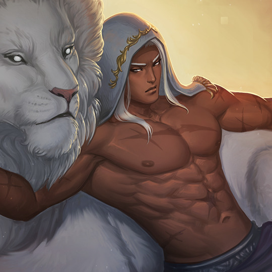
As for how I blend - almost all my brushes are set to change opacity depending on pen-pressure. Thus when blending values/colors, I just use the eyedropper tool to choose a color/value I want and use light brush-strokes to blend. When I REALLY want something to be soft, I use a big ole fuzzy airbrush-type brush and very, very lightly put down a stroke or two - but I do this very sparingly and try to avoid relying on fuzzy-brushes to blend as it can very quickly lead to your paintings looking like mashed potatoes. Making sure you have a nice mix of hard crisp edges and soft ones will make your work feel nicer.
And that’s it! I hope it was helpful!
131 notes
·
View notes
Text
Portfolio Breakdown:
Deforestation: This ended up being our main sector in the game, with our first level being set in a forest. I had to create enemy characters which were aiming to ruin the forest. I will go through each character I have created and show their alternative versions and references, if any. I should note that despite these characters being in the first set here, most of these were among the last designs I created, as we were not sure which level would go first, and so the designs have improved here since the other sets. Match:
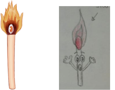
When thinking about which characters could destroy a forest, we thought of a match which could cause wildfires as it fits the deforestation theme to a degree, just from a different angle than some of the machinery characters below.
In the early stages, our roles were not clearly defined. The top left coloured design is mine, and the sketched one on the right was one made early on by Anna in our group.
It fell into my hands to redesign it as I wished, and I felt it was too cartoon-like and I did not like the eyes and random arms.

(Trigga, 2013) I decided to instead base my design similar to that of a cyclops, which to me made more sense, as I wanted to incorporate elements of an actual match rather than add ones in. As seen in the above image of a match, I used the red tip to make it into a cyclops eye. I felt that the movements of the match could be minimalised also and it could just hop forward, rather than having any useless arms. I am happy with the cyclops design, but if the modellers had not already gone and modelled from this prototype design so quickly (it is very small to create), I would have experimented more with the type of eye and adding other details. After that stage, it was not really needed for me to do so, although I could have cleaned up the design. However, this was one of my early designs and so the quality is rougher as my skills were.
Progress:
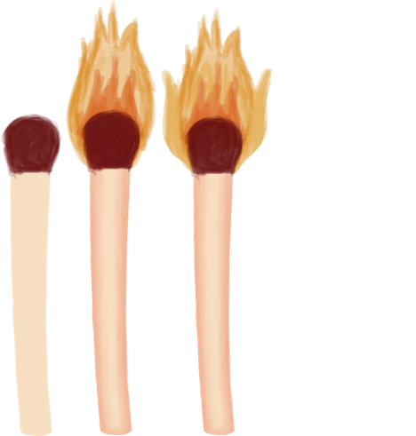

As seen, I started off with a basic match shape, then shaded the wood in another layer with layer constraints, added the flames in layers and later the cyclops eye. I added in an outline, as we decided that they would have outlines within the game to make them stand out more. Most of my designs, therefore, do have outlines, but later on, this became a little obsolete as the outlines were guaranteed and the modellers knew where to place them.
Axe:
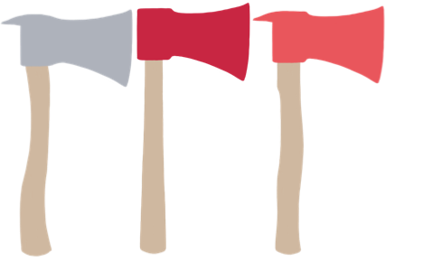
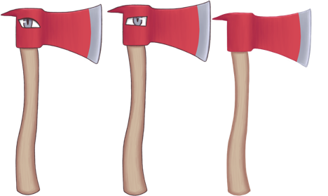
When creating the axe, I had to first figure out which type of axe would be used on trees and quickly found it was a cutting axe. Then, I had to choose the colour and shape. I experimented with a few different shapes, particularly for the handle, as seen in the top row, and then for the head of the axe. We felt an axe would be a fairly obvious character choice for deforestation and could be a low-level enemy, as an axe by itself could not do much damage to an entire forest realistically by itself. My progress was basically as above, I started with flat block colours with a hard brush, with the axe head and handle in two layers, then used layer constraints to add shading in new layers, adding in design variations in further layers. I am the most satisfied with how this design turned out and am very happy with it. I felt it turned out looking very clean and that my skills had upgraded from the beginning designs. If I were to change things, I could add scuffs to the metal and swirl designs in the wood, but I feel it looks good as it is.
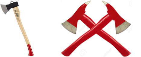
(Amazon, N/A) (Kamngoen, N/A)
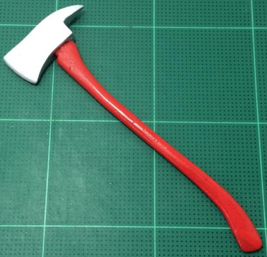
(JKKToys, 2019) I used references such as the above to decide on the shape of the handle, the head, and where to place the colours. I presented the different variations to the 3D modellers, where the head could be all silver or all red, but my finished design became the wooden handled, redheaded one with a silver tip as I felt this looked both striking and the most recognisable. I also felt that the spike at the back of the head looked a little like hair and gave a nice human touch. I then gave them a couple of eye variations to choose from.
Bulldozer:

The idea of having a bulldozer was another very early on idea which we had, back before I had been certified as the concept artist. Just like with the design of the match, others tried to create a version of it also. Maria’s first design:
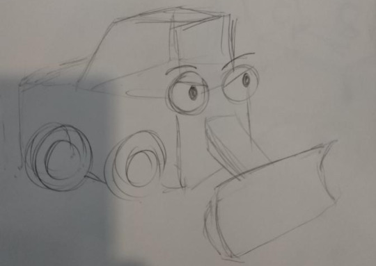
Carolina’s design:
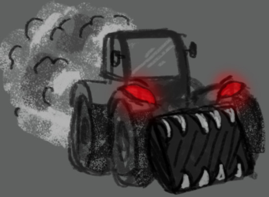
With Maria’s first sketchy design, Carolina took it and tried to amplify it into a full design, but it ended up being quite scary for a kid’s game. Anna then took it and simplified it back down into something kid friendly. Anna’s design:
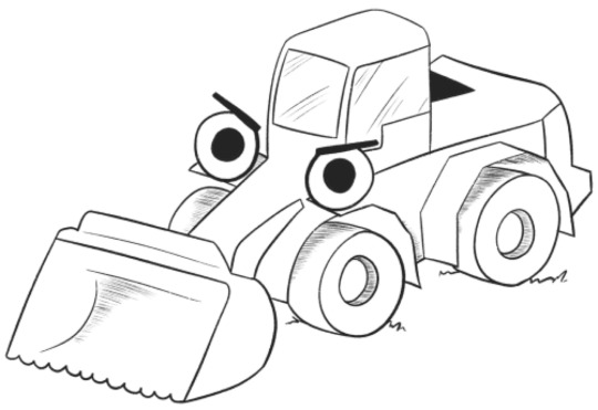
It was this last design that I used as a big reference when creating my own and so they are fairly similar. I sorted out the wheel covers properly and set the colours in my design, but kept the ‘nose’ of the bulldozer similar to that of an elephant trunk as I liked the design. I changed the eyes in mine a little to look more ‘mean’ and to sit a little more like car mirrors, rather than randomly placed. Progress:
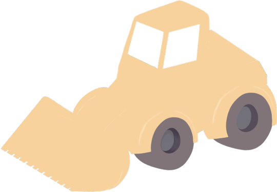
Using Anna’s design as a shape reference, I first shaped out the angle of the bulldozer, but changed the perspective of a couple things, in particular the ‘nose’ as it did not point correctly. I blocked the whole thing out in flat colours to begin, setting each part of the bulldozer out onto its own layer.
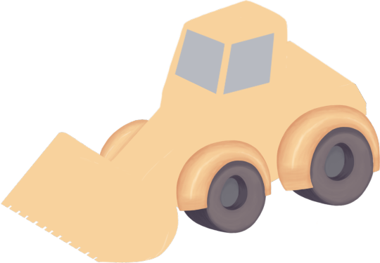
When creating the wheels, I had created one and then pasted it over to create the second one, just changing its size.
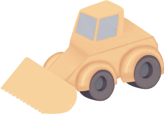
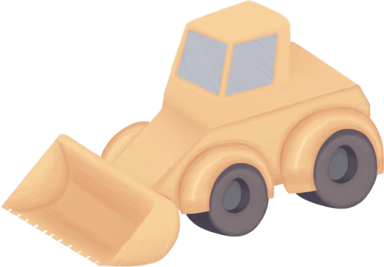
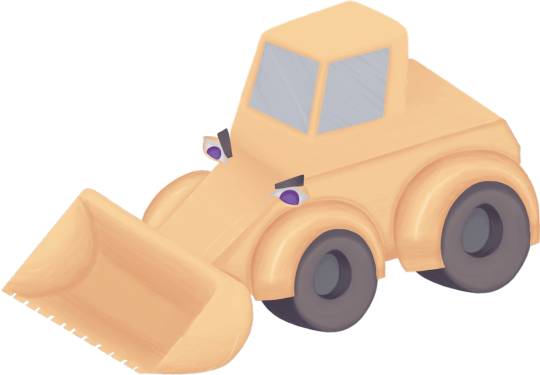
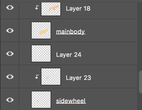
I shaded each section of the bulldozer separately, within its own layer, using layer constraints, as seen above, to do this. If I were to redo this, I would amplify the wheels to look less soft. I could have added spikes onto the side, such as the 3D modellers ended up doing, or simply added a rougher texture. I would also add an outline, but with the way I had sectioned out the bulldozer, it was clear enough for the modellers where to place the lines in the model. I also would have thought about how to design the eyes harder. I wanted them to sit as if they were side mirrors, but this is not entirely clear and I should have used a reference for this.
Excavator:

The excavator is an advanced version of the bulldozer. We were undecided on which version we wanted in the game and felt that two heavy duty monster machines would be a bit overkill, so we settled on the idea that the bulldozer would transform into the excavator as the final boss of the level when then bulldozer drops a certain amount of HP.
Since excavators often do have the front part like the bulldozer, we felt it would work well to have it either have a fold-down excavator ‘arm’ at the back, or straight up transform into this.
I made them differ a little by changing the eyes to red using an Overlay layer and the addition of the arm. I designed the ‘claw’ of the arm after a scorpion stinger, this works especially well as I had to decide where to place the ‘arm,’ as other excavators often have them at the side of the windows or even at the front.
I figured this way the arm could also attack like a scorpion and spring forward, offering this as a tip on how to animate it.
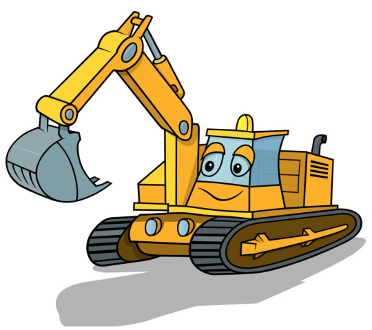
(Derocz, N/A) The above was the main reference I used for the excavator arm, and as seen, the arm here is next to the window. If I were to change things, I would have used a slightly different reference for the stinger arm, or shaded the arm differently, as it was pointed out to me that the shading is incorrect for the angle but works on the reference image. I would also have made the bulldozer and excavator differ further, such as beefing up the wheels in the excavator, changing their size. I also wish I had thought to add ‘teeth’ to the front handle. Progress:
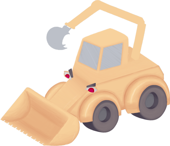

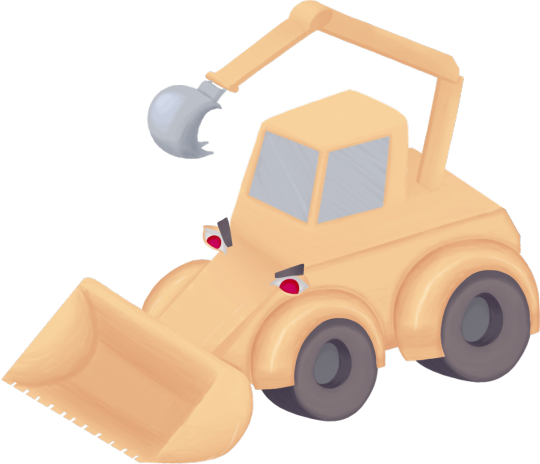
Here is the progress of the excavator arm. I started off with the bulldozer and made a new duplicate document. I first laid down flat colours for the arm and then used layer constraints to add shade and light to the separated layers of the arm and stinger/claw tip.
Hand Saw: We had to think of further characters for the forest level and figured a saw might be a good idea, as it could be a low-level character like the axe.
There were several different versions of this which I offered to the modellers, and I shall sum them up by combining them.
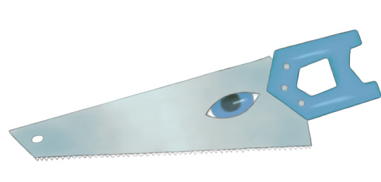
Blue coloured, dark pupils, little saw teeth.
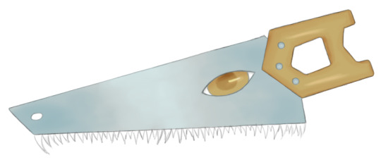
Gold coloured, medium shade pupils, dragon-like saw teeth.
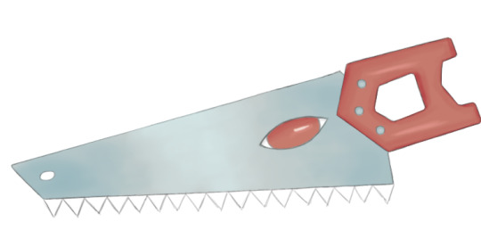
Red coloured, no pupil, large chunky teeth. These were the main three final variations which I presented to the modellers, however, I created other versions as well, particularly for the teeth.
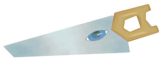
This was one of the first versions which I presented to them, without any teeth, screws or the hole at the end. The addition of the hole helped to look a little bit like a nostril and especially worked with the ‘dragon’ teeth and all over gold colours. The added screws helped to add a little more detail.
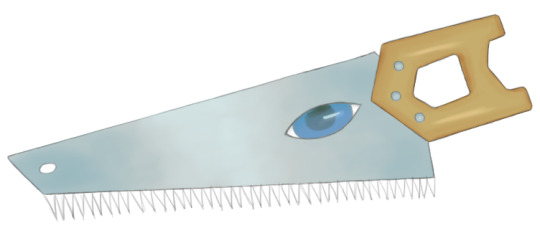
These needle-like teeth were also one suggestion early on before I knew how to design them a little bit better. With all of the above colour variations, it was implied to the modellers that they could keep the handle and eyes the same colour or mix and match them with the variants I presented them, such as with the blue and gold mix. This design was admittedly a little rushed. If I were to redo things, I would take more time with the shading as it lacks depth and colour value. I would also experiment with more actual eye shapes.
Progress:
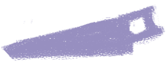
The hand saw started off as a very rough silhouette sketch.
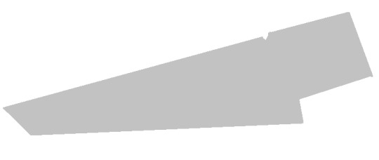
I then blocked out the silhouette by using shapes in Photoshop.
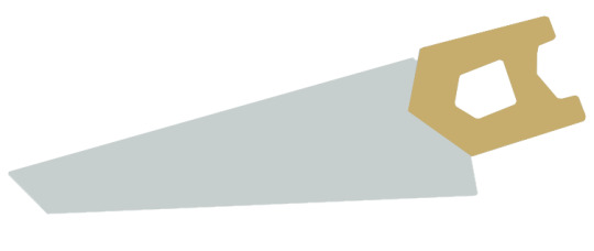
I then sorted the handle and the blade into separate layers and added flat colours.
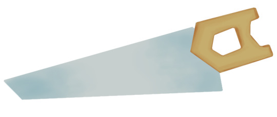
I used layer constraints and added shade to the blade and handle in more separate layers.

I then added some shine.
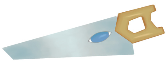
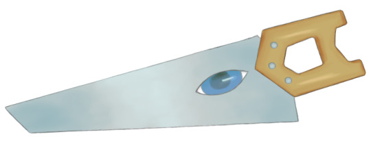
The eye was added, its pupil and shine, and then I outlined everything. I later created the ‘nose hole’ by duplicating the blade, erasing a hole, and drawing an outline around it.
References:
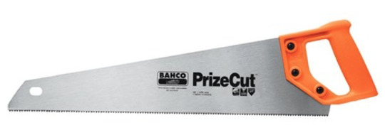
(TradeTools, N/A) I used references such as the above to get the basic gist of the shape of a hand saw. They tend to have similar appearances across the lot. I had first decided against the ‘nose hole’ at the end and screws for the sake of simplicity but added them in later where they generally would be. The only thing really differing my hand saw from a regular one is the shape of the handle. They tend to follow the shape of the one above, but I made mine a little different in that the handle is more ‘A’ shaped from the side view, so more symmetrical from that angle. This was to make it a little easier to model and to give it a touch of uniqueness.
Other Angles:
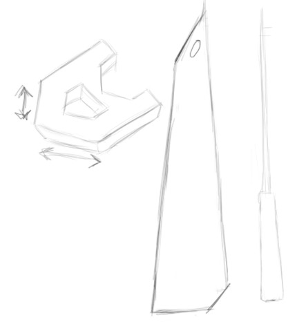
On the above left, I sketched out the handle so that it could be seen that it is symmetrical and in an ‘A’ shape and its thickness. I also sketched out how the blade should be shaped beneath it, as it has a couple of angles beneath the handle. I then sketched the top view so they could see how thick the handle compares to the blade.
Animation Suggestions:

This was one sketched suggestion for how the saw could move within the game, a very jaggedy up and down movement, where it could move from tip to handle as it goes forward, although this was an exaggerated example.

This was a second suggestion, where the blade could ‘wobble’ from side to side as the saw glides forward.
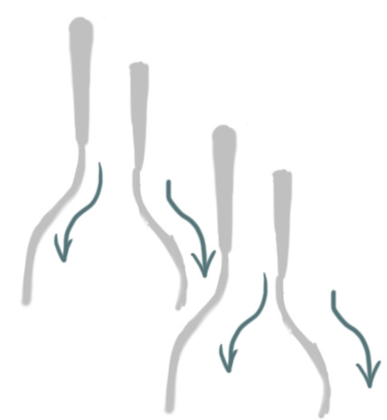
This was another very rough version of the example above, to show that the blade would turn one way and then the other as it moves forward.
Chainsaw: We felt that both a handsaw and a chainsaw would be good additions, and a chainsaw could be a good medium-level deforestation enemy, not too heavy duty but more likely to be used in reality than a normal saw. Like with the handsaw, I made a few different variations.
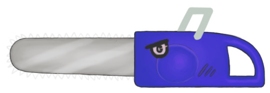
Blue, square-shaped handle, uniform chainsaw teeth.
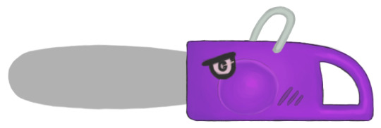
Purple, rounded handle, large fat blade.
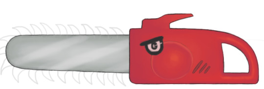
Red, large spiky blade, spike top handle.

Of course, they could also choose to have no teeth on the blade at all, as was the original version I made. The first colour and handle version was actually this red one, which, with the eye I chose, I felt actually looked a little too much like Red from Angry Birds, even if it was completely unintentional. However, it is actually the version I like the most. If I were to change things, I would take more time designing the eye, as it was thrown on there rather last minute and not fully thought through. I would make a few different eye variations. I would also offer less saturated colour versions for the alternative sets, as they were chosen quickly and are not super appealing to me.
Progress:

Like the hand saw, the chainsaw started out as a rough silhouette.

I then used flat grey with a hard brush to smooth out the silhouette so that I could work with it.

I separated the handle and the blade into separate layers and used layer constraints with another layer to add shade to the blade.

I used more layer constraints to add light shine onto the blade. I then did the same to shade the handle in another layer. I then painted a circle with a hard brush onto another layer on the handle with the old flat red colour.

With more layer constraints, I shaded and added lighting onto the circle to make it look like a side panel. I liked how it turned out looking like a chubby cheek. I also added a spiky handle to the top and some details on the side.

I next decided where to position the eye.

I went around the outline with a black brush.
References:
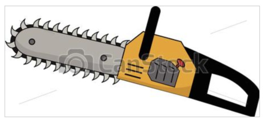
(Scrapitsideways, 2016) This was one chainsaw I used as a reference image. In particular, I used it as a reference for the type of shape I wanted, as I wanted something simple, and the type of teeth on the blade.
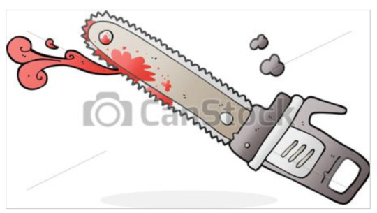
(Lineartestpilot, 2016) This was also a good reference for the type of handle on top I could use. The side details were also a reference for how I did mine.
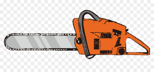
(Yinwafb, N/A) This one was a good reference for how to shade the blade and how to colour things in general. I decided that keeping the blade and handle in two colours was a good idea.
Angles:
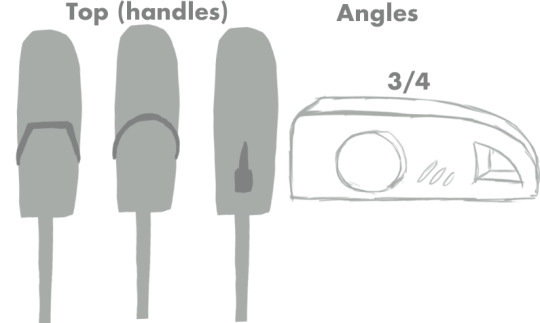
I decided to do some sketches to make it clear to the 3D modellers how to position the handles and how thick the body of the chainsaw and handles should be. I also did a 3/4 view sketch to show how the round panel on the side would stand out a little from the body, although this could be achieved just with texturing.
Animation Suggestions:
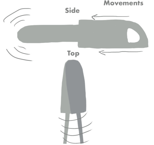
I decided to draw a demonstration for how the chainsaw should move, showing that the blade should ‘vibrate’ side to side, while the body itself slide forward.
Circular Chainsaw:
Since the modellers had decided they instead wanted to create a circular chainsaw, I set about designing this version as well. It too has several different versions to it. I used Hue/Saturation layers to offer different colour versions to the modellers. This is the technique I have used throughout for all of the different colour sets.
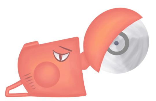
Red, full blade cover, the body has a circular panel with grills to the left. The blade has one dark circle within the centre.
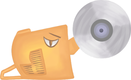
Yellow, no blade cover. The body panel is reverse ‘L’ shaped and has more grills. The blade has more inner circles.
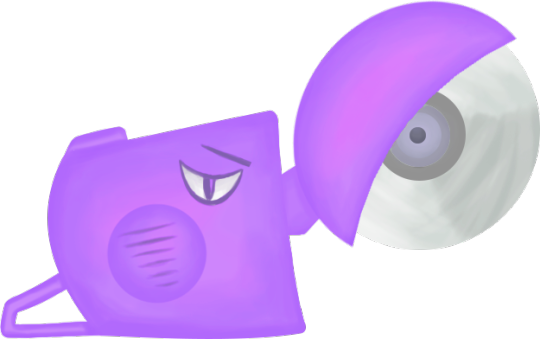
Purple, body panel has grills on it rather than to the side.
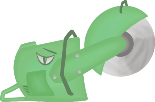
Green, body panel is a curved version of the reverse ‘L’ of the above version, the tail end of the panel is smaller, as are the grills. This version has a big handle with screws attaching to the blade and another two thin handles in the middle of the body and on top of the blade. This last version was the first version I created, but I was told it was too complex with all of the handles, so I removed those and offered an alternative ‘nose’ as well. Instead of the long handle in the middle, they could have a shorter one as shown in the other versions above. I am fairly happy with this design and again prefer the red version. I feel the design has a certain quirkiness to it with the type of eye it has. I wouldn’t change much in a redo other than perhaps adding a quick outline and more carefully designing the grills on the side.
Progress:
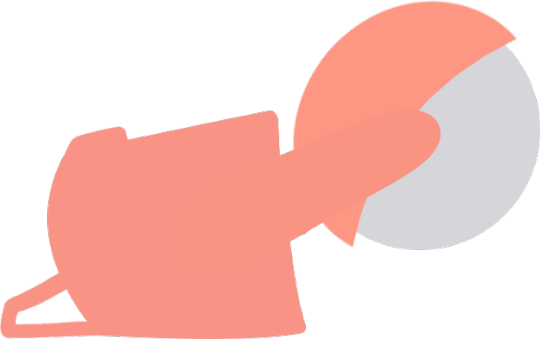
I was a bit lazier with creating the initial shape of this saw and used a square and warped it to the left so that I achieved the curvy shape of the main body above. The blade shape was created by getting a hard brush in a large size and stamping it once. The blade cover was made by duplicating that, enlarging it, then warping the edges so that they pointed outward a little. I set the body, handle, blade and blade cover on separate layers.
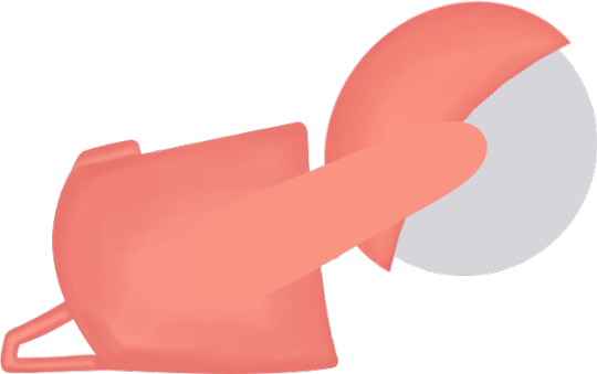
I used layer constraints in new layers to add shade to the body and blade cover.
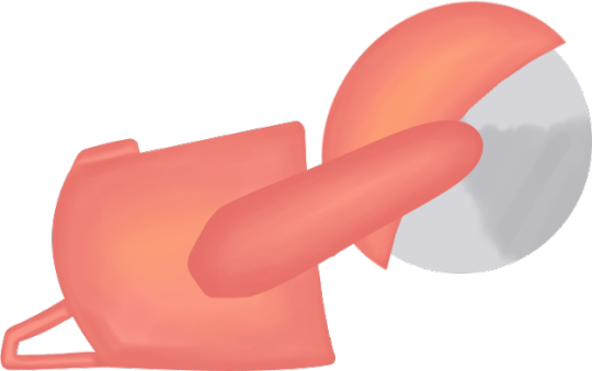
I added touches of orange here to give more dimension to the colour and started to shade the blade and handle.

I added circles to the blade by stamping a hard brush again and duplicating it in layers, then changing the size and colour. I added a panel on the left in a flat colour. I used the warp tool here to create the shape.
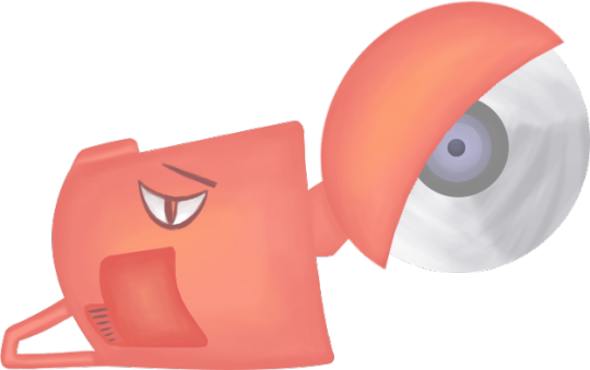
For the alternative handle version, I turned off the long handle layer and added in the shorter one in its own layer. I added an eye and had to move it around, as you can see above its position is more to the left when there is supposed to be a long handle. For the finished concepts, I move it to the right. I also added grills to the panel.
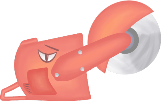
I added in some screw details for the long handle.
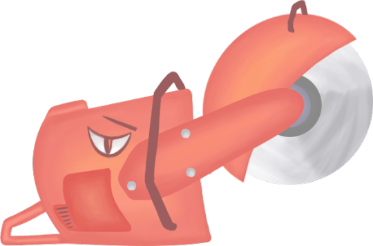
Originally, this was how it turned out, with the mini handles included.
References:
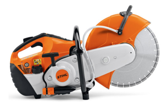
(Atlas Machinery, N/A) This was the initial reference which Maria showed me for what she had in mind for a circular saw. It was my main reference for the handle and blade cover.
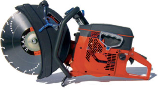
(UnifireUSA, N/A) This reference was how I ended up with so many handles initially. It, too, has the middle and top of the blade handle. It was also a reference on a shorter blade holder and how to draw the grills.
Angles:
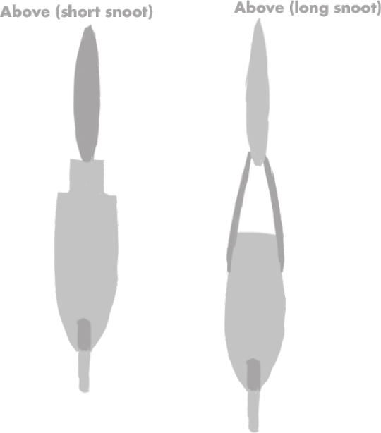
I drew a couple of silhouettes for the 3D modellers to show how the different handles would hold the blade from the top view.
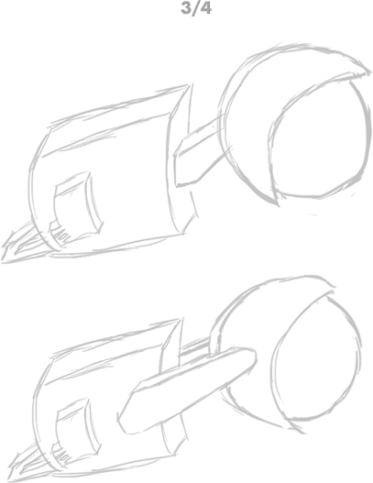
These were some rough 3/4 view sketches for how to the body panels stand out at the side and how there are two of the long handles and one of the short.
Animation Suggestions:
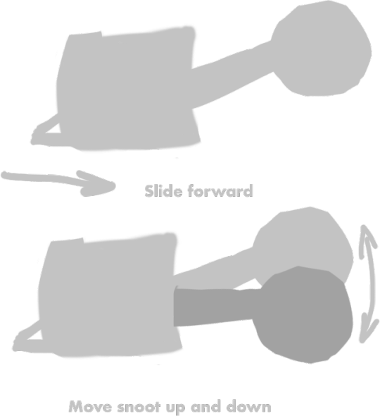
I also drew some silhouettes as an example of how the circular saw should move in the game. I demonstrated how the body should slide forward and the handle of the blade would move up and down as it went.
Works Cited:
Amazon, N/A. Amazon. [Online] Available at: https://www.amazon.co.uk/Idealspaten-75201000-Cutting-Protection-Grey/dp/B07BBWW96K [Accessed 19 April 2019]. Atlas Machinery, N/A. Atlas Machinery. [Online] Available at: https://www.atlas-machinery.com/stihl/stl-ts800 [Accessed 5 May 2019]. Derocz, N/A. Vector Stock. [Online] Available at: https://www.vectorstock.com/royalty-free-vector/smiling-excavator-vector-4744080 [Accessed 4 May 2019]. JKKToys, 2019. [Online] Available at: https://www.etsy.com/uk/listing/530553036/16-scale-custom-made-fireman-axe-red [Accessed 19 April 2019]. Kamngoen, P., N/A. 123rf. [Online] Available at: https://www.123rf.com/photo_23555536_axe-red-wooden-handle-on-white-background.html [Accessed 19 APRIL 2019]. Lineartestpilot, 2016. [Online] Available at: https://www.canstockphoto.co.uk/cartoon-bloody-chainsaw-34850812.html [Accessed 5 May 2019]. Scrapitsideways, 2016. CanStockPhoto. [Online] Available at: https://www.canstockphoto.ie/yellow-chainsaw-with-big-teeth-36236289.html [Accessed 5 May 2019]. TradeTools, N/A. TradeTools. [Online] Available at: https://www.tradetools.com/product-range/hand-tools/sawing-tools/bahco-19-prizecut-hand-saw [Accessed 5 May 2019]. Trigga, 2013. IStockPhoto. [Online] Available at: https://www.istockphoto.com/gb/photo/single-match-gm172224626-3267912 [Accessed 19 April 2019]. UnifireUSA, N/A. UnifireUSA. [Online] Available at: http://www.unifireusa.com/cos.php [Accessed 5 May 2019]. Yinwafb, N/A. KissPng. [Online] Available at: https://www.kisspng.com/png-chainsaw-drawing-cartoon-painted-orange-chainsaw-98933/ [Accessed 5 May 2019].
0 notes
Photo
⭐️ N E W V I D E O ⭐️ The Sims 4 | OUR LITTLE PRINCESS 👸🏽 | CAS & Lookbook + CC Links
▶️https://youtu.be/_iFx3b2ZQz4
CC Links
GLEN: Eyes: https://baieyu.tumblr.com/post/179216040640/still-feel-eyes-previews-heavily-insp-by Face Overlay: https://heihu.tumblr.com/post/168522486651/a-collection-of-all-my-face-overlays-xigua Skinblend: https://kumikya.tumblr.com/post/168380449781/toffee-skinblend-ive-actually-been-wanting-to Beard: https://www.thesimsresource.com/downloads/details/category/sims4-hair-facial/title/beard-n6/id/1410891/ Moles: https://cruisinfdr.tumblr.com/post/180623186108/holy-mole-y-hi-finally-worked-up-the-courage-to Nosemask: https://slythersim.tumblr.com/post/172389355988 Nosemask: https://obscurus-sims.tumblr.com/post/174533730818/obscurusxmelancholic-collaboration-dl-video Noseshader: https://simfileshare.net/download/977930/ Eyebags: https://www.thesimsresource.com/downloads/details/category/sims4-makeup-female-skindetails/title/eyebags-n09/id/1335431/ Eyebrows: https://adiec.tumblr.com/post/186028112159/eyebrow-set-2-1000-followers-gift-33-thank-you Tattoos: https://www.thesimsresource.com/downloads/details/category/sims4-accessories-female-tattoos/title/asiatattoov5--lounacutex/id/1449430/ Piercing: https://www.thesimsresource.com/downloads/details/category/sims4-accessories-female-earrings/title/bad-dream-nose-ring-piercing-set/id/1444328/ Hair: https://okruee.tumblr.com/post/184698036176/jonas-hair-v2-just-a-closer-cropped-version-of
EVERYDAY: Shirt: https://simsontherope.tumblr.com/post/178255996966/escale-shirt-for-the-sims-4-yay-patterns-to-be Jeans: https://aharris00britney.tumblr.com/post/187194346870/axa-2019-official-release Shoes: https://sssvitlans.tumblr.com/post/176615309759/remiiry-vans-sk8-hi-retextured Bracelet: https://luumiasims.com/post/143659727344/forever-summer-an-hm-inspired-mini-collection-i
FORMAL: Suit: https://plumbobteasociety.tumblr.com/post/170874771645/rustic-romance-stuff-for-sims-4-the-love-child Shoes: https://kedluu.tumblr.com/post/131967017923/kedluu-simple-sneakers-monochrome-running-shoes
ACTIVE: Shirt: https://aharris00britney.tumblr.com/post/187194346870/axa-2019-official-release Shorts: https://www.patreon.com/posts/boxing-shorts-30180581
SLEEP: Briefs: https://pleyita.tumblr.com/day/2019/11/15/
PARTY: Shirt: https://okruee.tumblr.com/post/188658622396/followers-gift-set-i-passed-a-milestone-and
Pants: https://marvinsims.tumblr.com/post/160730374168/three-piece-suits-i-couldnt-believe-we-didnt
SWIM:
Shorts: https://aharris00britney.tumblr.com/post/187194346870/axa-2019-official-release
HOT WEATHER: Shirt: https://sixam-hearts.tumblr.com/post/186542263410/hello-ive-been-working-on-these-tanks-all-week Jeans: https://dyoreos.tumblr.com/post/183412740317/dyoreos-2k-followers-gift-i-reached-2000
COLD WEATHER: Jacket: https://darte77.blogspot.com/2019/05/leather-jacket-hoodie.html Jeans: https://okruee.tumblr.com/post/188658622396/followers-gift-set-i-passed-a-milestone-and
Shoes: https://mmsims.tumblr.com/post/183417028551/s4cc-mmsims-dr-martens-molly-enjoy-male
KARLEY:
GENERAL: Eyes: https://baieyu.tumblr.com/post/179216040640/still-feel-eyes-previews-heavily-insp-by Hair: https://aharris00britney.tumblr.com/post/189456863120/karley-hair Lashes: http://kijiko-catfood.com/3d-lashes-version2-for-skin-detail-experimental/ Lip Preset: https://stretchskeleton.tumblr.com/post/187172222703/some-mouth-presets-that-i-havent-posted-yet Nosemask: https://brntwaffles.tumblr.com/post/157021939147/found-in-the-skin-details-thumbnails-for-each-nose Eyebags: https://www.thesimsresource.com/downloads/details/category/sims4-makeup-female-skindetails/title/eyebags-n09/id/1335431/ Skinblend: https://viiavi.tumblr.com/post/183382856408/papillon-default-nondefault-skin-blend-for-all Skindetail Highlighter: https://nesurii.tumblr.com/post/182508085171/amaryllis Eyebrows: https://adiec.tumblr.com/post/185708180915/eyebrow-set-1-some-cute-lil-eyebrows-i-made-in Freckles: https://joviean.tumblr.com/post/186573920181/maple-freckles Tattoos: https://fernpots.tumblr.com/post/171598292642/moth-boy-tats-2-semi-mm-full-body-tats-one Earrings: https://wildlyminiaturesandwich.tumblr.com/post/149258915734/a-second-version-of-these-earrings-that-i-edited Nails: https://simlaughlove.tumblr.com/post/163327412088/sll-rainbownails Lipstick: https://love4sims4.tumblr.com/post/165931634543/aprisims-kylie-lip-kits-fall-shades-sims-4 Lipgloss: https://raiichuu.tumblr.com/post/189556737324/advent-calendar-day-8-fruitcake-lipgloss-just-a Lipstick: https://alhajero.tumblr.com/post/184959100825/a-little-hi-how-have-you-been-hopefully Eyeshadow: https://dear-solar.tumblr.com/post/187076819275/the-chuuuuu-collab-this-is-a-korean-beauty-and Eyeliner: https://simandy.tumblr.com/post/171605780781/made-an-eyeliner-actually-4-but-yea
EVERYDAY: Shirt: https://kimoanasims.tumblr.com/post/183201014697/5000-followers-gift-whateva-collection-thank Jeans: https://tajsiwel.tumblr.com/post/167928709375/tajsiwel-chrissy-23-swatches-custom Shoes: https://madlensims.tumblr.com/post/182216831210/madlen-roberto-boots-high-quality-leather-boots Necklace: https://kumikya.tumblr.com/post/188336354646/moon-shard-jewellery-set-simblreen-pt-1-hi-i
FORMAL: Hair: https://www.saurussims.com/post/185953051413/prom-2019-collection-by-joliebean Dress: https://www.patreon.com/posts/30351413 Shoes: https://www.thesimsresource.com/downloads/details/category/sims4-shoes-female-teenadultelder/title/madlen-attila-shoes/id/1325644/ Necklace: https://bethsims4love.tumblr.com/post/160823033598/so-i-have-been-messing-around-in-blender-and Bracelet: https://veranka-s4cc.tumblr.com/post/142800259050/claire-necklace-bracelets-i-did-some-simple Earrings: https://www.thesimsresource.com/downloads/details/category/sims4-accessories-female-earrings/title/fan-earrings-revamped/id/1457307/
ACTIVE: Shirt: https://moontrait.tumblr.com/post/175148225998/moontrait-long-sleeve-layered-top-ea-mesh-bgc-21 Pants: https://pleyita.tumblr.com/day/2019/07/16/ Shoes: https://kedluu.tumblr.com/post/131967017923/kedluu-simple-sneakers-monochrome-running-shoes
SLEEP: Nightgown: https://kumikya.tumblr.com/post/185442507651/poppy-jasmine-sleepwear-i-made-these-a-little
PARTY: Outfit: https://honey-moth.tumblr.com/post/189513363916 Shoes: https://madlensims.tumblr.com/post/182216831210/madlen-roberto-boots-high-quality-leather-boots
SWIM: Swimsuit: https://gvbesims.tumblr.com/post/185126083949/inakhs-80s-swimsuit-recolors-i-absolutely
HOT WEATHER: Top & Shorts: https://kumikya.tumblr.com/post/189401305261/kumikyas-summer-basics-collection-its-suuuuper Shoes: https://gloomfish.tumblr.com/post/187789866948/birkenstocks-for-all-your-sksksksks-and-i-oop
COLD WEATHER: Sweater: https://www.thesimsresource.com/downloads/details/category/sims4-clothing-female-teenadultelder-everyday/title/trillyke--winter-heat-sweater-dress/id/1435983/ Socks: https://www.thesimsresource.com/downloads/details/category/sims4-clothing-female-teenadultelder-everyday/title/trillyke--run-away-socks/id/1469854/ Beret: https://casteru.tumblr.com/post/187221101262/cc-dump-tou-i-fixed-18-of-my-old-cc
NORA: GENERAL: Eyes: https://baieyu.tumblr.com/post/179216040640/still-feel-eyes-previews-heavily-insp-by Hair: https://naevys-sims.tumblr.com/post/181974167109/greenllamas-winter-hair-okruee-lizzie-hair Bangs: https://atashi77.tumblr.com/post/184987287173/nayla-accessory-bangs-a-couple-of-people-asked Lashes: http://kijiko-catfood.com/3d-lashes-version2-for-kids/ Skinblend: https://oasisgoth.tumblr.com/post/175646311686/new-dna-skin-revamped-by-oasisgoth-i-got Skinblend: https://sammmi-xox.tumblr.com/post/173100202612/hello-my-lovelys-its-been-awhile-but-i-come-with Skindetail Highlighter: https://nesurii.tumblr.com/post/182508085171/amaryllis Moles: https://cakenoodles.tumblr.com/post/169814596326/so-this-was-requested-by-an-anon-they-just-wanted
EVERYDAY: Shirt: http://onyxsims.blogspot.com/2019/02/mya-blouse.html Jeans: http://onyxsims.blogspot.com/2019/09/back-2-school-collection.html Shoes: https://simblob.tumblr.com/post/138158191799/happy-2016-deeetron-i-got-matched-up-with Patched Knee: https://ratboysims.tumblr.com/post/168471097775/download-pls-dont-reupload-or-claim-as-ur-own
FORMAL: Dress: https://plumbobteasociety.tumblr.com/post/166361358489/cottage-garden-stuff-for-sims-4-a-collaboration
ACTIVE: Hoodie: https://jinskookie.tumblr.com/post/188009516846/the-parenthoodie-for-children-version-5-i-am Pants: http://onyxsims.blogspot.com/2018/08/abena-athletic-set.html Shoes: https://pleyita.tumblr.com/post/184432141250/the-basic-sneaker-these-are-two-perfectly-good
SLEEP: couldn't find
PARTY: Shirt: https://margosims.tumblr.com/post/186092730799/kiseki-top-recolor-theweebsimmer-mesh-is-needed Jeans: https://theweebsimmer.tumblr.com/post/182026814581/mini-kids-pack-made-two-more-things-for-kids
HOT WEATHER: Shirt: https://theweebsimmer.tumblr.com/post/181929709471/4k-followers-gift-first-of-all-let-me-thank Skirt: https://clumsyalienn.tumblr.com/post/181245667075/christmas-pack-by-amelylina-and-clumsyalienn-you
COLD WEATHER: Shirt: https://sisselin.tumblr.com/post/182255980829/my-part-of-the-playtime-stuffpack-me-and Jeans: http://onyxsims.blogspot.com/2018/12/holiday-gift-2.html
#sims#the sims#sims 4#the sims 4#sims 4 cc#sims 4 custom content#sims 4 mm cc#mm cc#sims 4 lookbook#sims 4 kids cc#sism 4 children cc#sims 4 male cc#sims 4 cc showcase#sims 4 custom content links#sims 4 cc links#sims 4 cas cc#sims 4 cas custom content#sims 4 maxis match cc#sims 4 maxis match#sims 4 maxis match custom content#sims 4 family#sims 4 family cas#thesimpanions#simblr#sims 4 simblr
50 notes
·
View notes