#tunts tunts
Explore tagged Tumblr posts
Visit Tumblr Blog
Explore Tumblr blogs with no restrictions, modern design and the best experience.
Last Seen Tumblr Blogs


Fun Fact
Tumblr has been banned in Indonesia for providing people with access to pornographic content.
Text
i love you all 5 people in tumblrs archer fandom
#archer#archer fx#sterling archer#malory archer#pam poovey#cheryl tunt#ray gillette#algernop krieger#lana kane
158 notes
·
View notes
Text


some sillies to celebrate the final season :D
#HI ARCHER NATION. runs around the walls#i found like one funny post that applied to one of them and i sorta blacked out after that#also i feel like u can soooo tell who my fave is from this LMAOOO#but umm yeah hopefully none of these have been done before- if they have then im super sorry! not trying to steal anyones ideas i prommy#archer#archer fx#archer fxx#lana kane#pam poovey#cheryl tunt#cyril figgis#sterling archer#algernop krieger#dutch dylan#daaamn i didnt make one for ray... sad#mine
609 notes
·
View notes
Text


124 notes
·
View notes
Text

are they lesbian or something
50 notes
·
View notes
Text


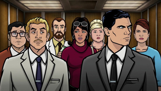
Season 11 - Episode 4, "Robot Factory"
#archer fx#barry dylan#sterling archer#cyril figgis#malory archer#lana kane#pam poovey#algernop krieger#cheryl tunt#season 11#episode 4
45 notes
·
View notes
Text
I may or may not have figured out how to animate in an (approximation) of the Archer style. I am using this skill for evil
#archer fx#archer fxx#sterling archer#lana kane#trinette mcgoon#cheryl tunt#carol tunt#archer dreamland#Barry Dylan#Dutch Dylan#toonsquid#animation#my art
28 notes
·
View notes
Text


the Archer brainrot is bad atm
#archer#archer fxx#archer fx#sterling archer#lana kane#cyril figgis#malory archer#ray gillette#pam poovey#dr krieger#algernop krieger#dr algernop krieger#cheryl tunt#carol tunt#fan merch#acrylic charms#plush charms#stickers
78 notes
·
View notes
Text


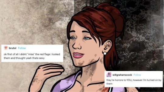
he's so cute, she's so cute, she's also so cute, so is she. they're all so cute <3
27 notes
·
View notes
Text
Archer is gay as shit and its a tragedy that the faggot website doesnt have a thriving community talking about it
I mean the gender shit Pam is up to in the coma seasons ALONE should be enough
#archer fx#archer fxx#sterling archer#malory archer#cheryl tunt#pam poovey#Im literally cheryl shes my bestie and im her
38 notes
·
View notes
Text
#had a totally random tangent of thinking which reminded me of a couple I had come up with and inspired me to make a few new ones#another contender was Tessica Tunt#you know what ima add that in too
25 notes
·
View notes


Text
#archer fx#archer#tumblr polls#sterling archer#Lana Kane#Aj Kane-archer#Pam poovey#rag gillette#Cyril figgis#Cheryl tunt#Mallory archer#algernop krieger#barry dylan#katya kazanova
44 notes
·
View notes
Text
talking about the art style for this show because I am lowkey (high key) obsessed with it and how unique and genius it is.
Warning: this is sort of a long-ish post. Everything here stated is purely subjective lol
S1’s style has a certain charm to it but personally doesn’t actually give me that wave of “nostalgia” (I started watching the show in 2023 summer) but it does have a certain aura to it. I personally love experimental styles and for the time this came out I still consider it to be very unique. Noting the experimental phase of it where things look less polished and the line weight isn’t as well executed as it is in the later seasons.
Using rigging for the time this series came out was certainly a bold choice with the realism and complex designs that this show used while also having a perfect balance with well done cartoony style. Archer is one of the most well known cartoons when you look into rigged animation! Floyd County’s process of using Illustrator and After effects together at the time was certainly bold as well. The team for this show was not as big as most people might think, as it states in the Art of Archer book that there were around 70 artists, illustrators, etc.. that worked on production. Compared to the average Hollywood animated movie, it’s surely a small crew. Using multiple levels for character movement, as the usual storyboarding that’s essential for any animated project (you cannot have a quality animated series without story boarding!), having to design an entire new model when the state of any character changes (scars, scrapes, torn clothes, etc..) which becomes a lot of extra strain, along with the actual design process in illustrator and using skeletal positioning as well. It’s truly impressive imo!

The backgrounds and settings throughout the show were also very cleverly executed. Using 3d modeling and royalty free assets to paint textures and the amount of detail was insane. Apparently Adam had a good eye for everything.

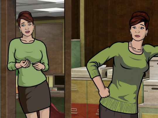
I really admire the effort that goes into all of the details in the show’s settings, along with the painted scenery. Which only improves over time. As you can see the quality difference between the earlier seasons and the latest.


S1 Malory’s office and S2 Tunt Manor
Vs


S6 Office and Tunt Manor. Notice the different in light fixtures and textures, the marble walls moving away from more of a tile texture, and the lighting in Malory’s office is much more smooth, the texture of the chairs, etc.. I love the improvement.
The more obvious and interesting part about all of this is the actual character design changing over time. I will always wonder what those first season 1 and 2 storyboards looked like. (If anyone ever finds any info on that please feel free to let me know! Ik there’s a few artists portfolios out there that are more easy to find and I’ve seen S12/11/etc..)
As with S1, it had a certain charm to it in which I love. The funny looking experimental angles, I wish we got to see more of, just for the silliness alone. Im glad they tried their best with dynamic poses. </3


I’d say there’s definitely even just a difference between the line weight in S1 vs S2, it’s slightly more smooth in S2 depending on the pose. Depending on the show you’re watching, I noticed line weight is sort of an underrated and mostly overlooked technique upon other people I’ve seen talk about art styles. It adds a lot of depth. Dynamic poses are not easy.
Not all line weight is used for dynamic posing though

I love this shot in particular. From what I remember and notice the most is that this is the first shot in the show where there’s much detail like the card reflection of the characters, they’re flipped like proper mirroring (obviously the modelling is not perfect for Ray, he still looks a little janky which isn’t a huge shock since we only saw him a handful of times in previous season) But the line weight for Malory’s thumb is something I appreciate very much and just thought this was a cool shot and shows a huge step up. The text boldness and format is also well done.
I guess the last elephant in the room surely is the actual style for the characters changing over time. There are about 3 different changes throughout the series, based on looks, clothing and movement. I wont get into specifics but it is always going to be entertaining to me how stiff and wonky certain shots looked. Not everything looked super goofy though.
I will never hate you scoliosis Lana </3

It’s very entertaining to see the changes through out the show.


(Malory’s hair was a tragic mess. Bless her cold heart <3)
First two seasons are where its flip flopped the most. Models were more stiff, tho on the brighter side the movements were still up to par with the action scenes. It’s still perfection. Some of the one-offs had funny designs (Krimenski, Uta, Mannfred, etc..)
Fast forwarding to S3 is when the improvements finally come in,


Noticeably mostly with Archer, Malory and Cyril (though he still has his old glasses. I much prefer his post S5 ones)
Lana and Ray still look a little off but certainly different in face shapes and Lana is much less- “S” shaped lol. Pam has improved looks as well.

The side profiles have had an improvement as well up to this point. But it doesn’t change much going down the line. The side profiles are very rarely shown. Krieger’s head finally looks less stiff as well. Cheryl looks completely different, with her hair being much more consistently styled. Also, notice the clothing saturation specifically, it’s much more toned down. The colours tend to match better more than they did before in S1 nd 2.
Completely new character…. Hah.
Moving on past S3, since the character models stay pretty much the same, everyone at this point has their new looks leveled out, notably Ray and Lana

This style pretty much remains the same through out the next few couple seasons. The models and settings have a new flair, the lighting improved immensely, especially with Vice. I dont wanna drag this on for too long but the modeling stays the same until the coma seasons.
One of the biggest reasons I love the coma seasons is that it brings a lot more to the table for the show as I played around with 3 different completely new environments. It mostly likely brought a lot of new people to the production crew as it cover a lot of architectural different and themes (jungle islands, temples, spacecrafts, etc.. )
Going forward past the coma seasons straight to S11 is where the style gets a little harder to explain the huge differences. Backgrounds and shots look very polished and none of the characters look stiff in any way anymore.

We’ve also gained more soft lighting on the characters compared to mostly pre S6, dynamic lighting was improved immensely. In the Art of Archer book the majority of the animation process that is presented is mostly BTS for S6 and so on, though it does go into the works of Vice, its mostly with the musical production though they do delve a bit into the music video, which is a whole other level of its own. The environmental feel excels greatly with the lighting changes and also background ambience. Much of which was actually visible in the Danger Phone mobile game (RIP </3) I’ve always thought the sound design in this show was clever enough but it got significantly better over time.. Atmosphere makes a big difference. I’d love to add more specific examples but tumblr DOES have a limit on media that can be in one single post. But I can recommend going back and rewatching the show wearing headphones/earbuds and you will notice the difference.
Just a few extra things I wanted to point out is that as much as the animation has improved there are little quirks I do miss about the older seasons, for example the clothing colour changes. It really added more depth and realism to the show and I think despite it being subtle it was something that the majority of us fans enjoyed. But assuming they needed a different model for every colour worn, I could see why it was weeded out. Maybe it helped with the polish! That’s just personal bias.
The difference is subtle, but it’s there! The faces shapes and body proportions have been “improved” slightly. But I genuinely think thats due to setting changes and having higher quality animation tools. But lighting makes a huge difference.
I don’t have a lot of cons for the art style improvement besides really that “nostalgia” feeling a lot of ppl have for this show. I personally believe pre- S11 is when the artstyle was the best, of course with having a few sacrifices
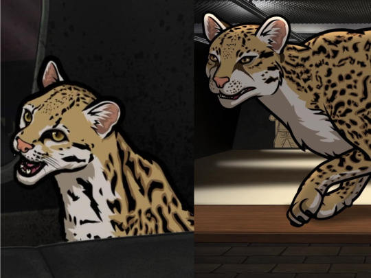
Not sure how I feel about this one. He looks less like an ocelot in the right panel. The colours do look better but Babou’s eyes are eyes extremely different, not a fan of it. Some things just look better than before!
I would also like to take a moment to appreciate this gal’s glow up.. Not to drive too far from the point of this post but Im glad they kept Trinette relevant.
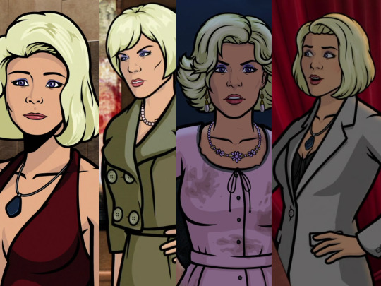
Not 3, but 4 different improvements. Even though she has 3 completely different hairstyles there’s still the difference in quality..
Anyhow, I’ve run out of gas for this post and I’ve pretty much covered mostly everything I wanted to go over. I definitely would like to cover more on this topic but unfortunately tumblr has different plans.
Anyways I love this show so much and everything a bit and probably has one of the most compelling art styles out there with a very passionate studio. I think Floyd County is unique on its own and even just outside the art style there’s a lot more to be said about this show’s greatness. If you read this far and actually enjoyed reading my word vomit… well- thanks! Hoping to write more someday if I get any more literate than LOL
If i missed any details or got anything wrong then plz let me know! Most of everything here is subjective and I may perhaps be a bit biased with some things, but thats just me
#archer fx#long post#this is a lot and i tried my best to have it organized#unfortunately i have adhd#sterling archer#lana kane#malory archer#pam poovey#Cyril figgis#Cheryl tunt#archer
22 notes
·
View notes
Text

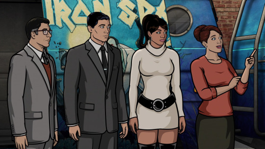
ARCHER S14 E06, "Face Off"
#archer#archer fx#archer season 14#face off#sterling archer#pam poovey#cyril figgis#cheryl tunt#ray gillette#zara khan#algernop krieger
219 notes
·
View notes
Text

cheryl tunt❤️ im sorry she looks too normal i think she should look unhinged
48 notes
·
View notes
Text


Season 6 - Episode 6, "Sitting"
#archer fx#cyril figgis#pam poovey#cheryl tunt#algernop krieger#ray gillette#sterling archer#abbiejean kane-archer#aj kane-archer#season 6#episode 6
40 notes
·
View notes