#trying to get better with squash and stretch and silly expressive shapes also
Explore tagged Tumblr posts
Text


[ID: A sketchy digital comic featuring Samama Khalid and Alice Dyer in university. Sam is a fat South Asian man with curly black hair and stubble, and he is wearing a red Oxford University hoodie, a backpack, sweatpants, and socks and slides. Alice is a tall, thin trans woman with fluffy hair in a short ponytail, glasses, and she is wearing a t-shirt, shorts, a flannel around her waist, sneakers, and a messenger bag. The background is gray and the only color is the red hoodie.
They are walking together.
Alice: Hey, Sam Sam: Mm? Alice: I've been meaning to ask... (she points at him) Why do you always wear an Oxford hoodie? We're at Nottingham.
Sam doesn't respond, looking away grimly.
Alice: .... Sam?
Sam is drawn small and a bit squashed, still looking grim before perking up and looking normal again, smiling.
Sam: I'm wearing it ironically. (There are sparkles around "ironically".) Alice, amused: Yeah? No other reason? No rejection letters in your past?
Sam looks grim again while Alice gives him a knowing look before he leans into her side sadly.
Sam: Yeah.... Alice, patting him: AWWWW, poor boy. Don't you worry your pretty head about all pointless stuff.
end ID]
~~~~
i think it'd be funny if he wore an oxford hoodie in uni
#fg's art#the magnus protocol#tmagp#samama khalid#alice dyer#samalice#dyerama#comic#we're gonna ignore the missing word dw about it#trying to get better with squash and stretch and silly expressive shapes also#we tryin
344 notes
·
View notes
Note
Two questions, how do you do lineless art, and how do you draw faces/expressions? They are always so cute!!
ermm I am not good at tutorials but I did my best here! First lineless art. My methods kinda messy and theres probably better methods out there.
First I start with a sketch like normal, and line it like normal.
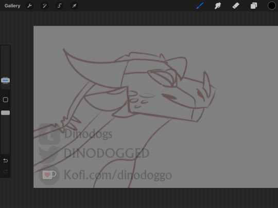

2. then I color it like I usually would. Nothing fancy.

3. Then I use a clipping mask to create the lineless look. A few rules I have for myself are to do the very outside of the lines first, then go in and do the inner bits. ONLY do darker lines if necessary, I try and keep darker lines reserved for jaw lines. In the end, the lineart looks smthn like this!

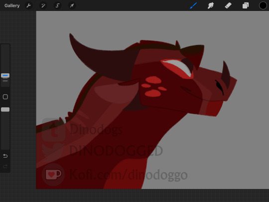
For expressions and faces uhmm. Thats a lil tricky but I'll try my best to explain.
For faces I imagine them sorta like masks on a circle, and I change the shape of those masks for different characters. Sometimes I'll even make it a mask on a square. Ruby has a long, thicker snout, Weiss has a long thinner snout that sorta leans in, and the rando dragon has a shorter one then both of them.
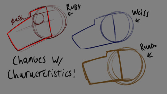
For expressions, subtlety is key. I did my best to draw Ruby and Weiss with virtually the same expressions, but I made very slight changes to Ruby like having her look at the viewer and adding that little triangle to the corner of her mouth. So instead of just a neutral smile like Weiss's, she looks smug.

Heres another example with Weiss, where I made her neutral face look like an annoyed one just by scrunching her snout a little and slightly turning her lip down more.

But I do like to exaggerate more sometimes! Such as to make really happy faces, or really angry ones. I'm still kinda practicing when it comes to super exaggerated expressions, but I've been following the squash stretch rule and acting kinda like a characters face is putty. I can squish, stretch, elongate, and smoosh their faces as much as I want! I'm not aiming to be realistic.
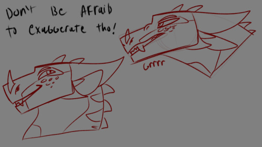
Also, eyes add a lot to the expression! I also like to get super silly with eyes, and change the size of the pupils depending on expression. I also treat them like putty.

Thats kinda all I have?? I'm not sure if this helps in anyway but here it is lol.
2 notes
·
View notes
Note
Hey do you have any tips for drawing gnolls? I want to make one of my own but I'm struggling with how to start ;v;
I think the best way to answer this is to go over my thought process for constructing gnolls, versus (for example) giving a step-by-step tutorial of the drawing process itself.
Hyenas are so expressive and that’s deffo my favorite thing about gnolls/hyena-based characters, you can push their expressions super far and get a lot of fun squash/stretch going on! From a character design perspective, there’s a ton of potential.
In my personal opinion, the biggest mistake you can make when designing a gnoll is thinking of them as a canine! I see them referred to as ‘dog-people’ in shorthand but hyenas are much more closely related to meerkats, mongooses and fossa than they are to dogs. There’s nothing wrong with this shorthand, of course – 'dog-person’ conjures a clearer image than 'feline-like-carnivore-person’ – but I wanted to clear that up in case of confusion. I mention this because it’s very easy to make a gnoll/hyena look like a chunky wolf if you’re constructing them the way you would a canine character. If you’re having trouble drawing gnolls/hyenas and getting them to look hyena-ish enough, this might be your problem.
Research, research, research! Look at lots of photos and videos of hyenas to get a sense of how they’re put together, as well as the particular features/shapes you like. I’m using spotted hyenas for my examples because they’re what inspired the design of my gnoll character, but striped hyenas and brown hyenas have unique and interesting features to consider as well (you can even take inspiration from aardwolves… I won’t tell anyone… our little secret…)
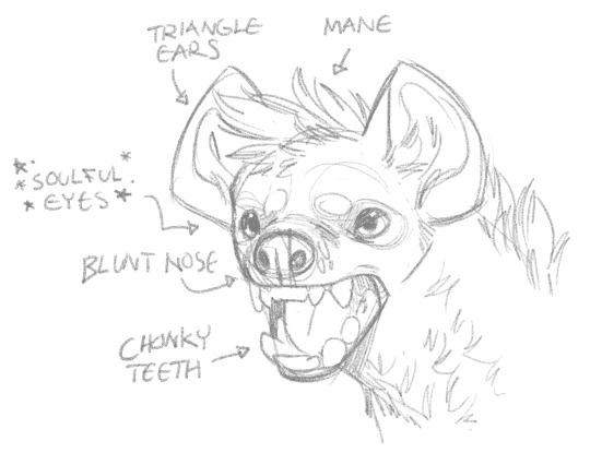
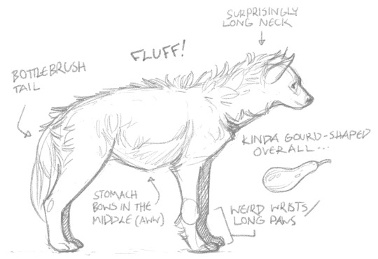
The most successful caricatures usually come from exaggerating the features of a creature that are already prominent. For example: the hyenas in The Lion King had exaggerated hunched postures and wide grinning mouths filled with huge fangs to make them look more villainous. What features appeal to you most? Caricature the hell out of them, mold them to your will!
Think about what you want your character’s personality to be like and their background (and their class if you’re using the character for a tabletop RPG!) and consider how these could all inform your design choices. For example: my D&D gnoll Ozzie is a fire sorcerer cursed with wild magic. Sorcerers in D&D don’t tend to be very strong, so I made her scrawny and wirey looking, and due to her wild magic background being a little on the tragic side I wanted her to have an “~edgy~ Hot Topic teen” sort of aesthetic, so I gave her a punkish mohawk mane, pierced ears, and face markings that mimicked heavy goth makeup.
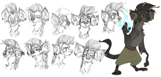
Your gnoll might be less silly than this if your campaign is intended to be more serious, but in my opinion there’s something a bit inherently humorous about a race of hyena people with their big goofy feline-like-carnivore faces and little triangle ears, and it’s most fun to lean into that. Your mileage may vary.
It’s also worth noting, I think, that it took me months to get Ozzie from her original design to her more or less current one (and it’s changed a bit since then even!) so as with any character design repetition and experimentation are key. I must have drawn her stupid face a hundred times before I landed on a design I liked.
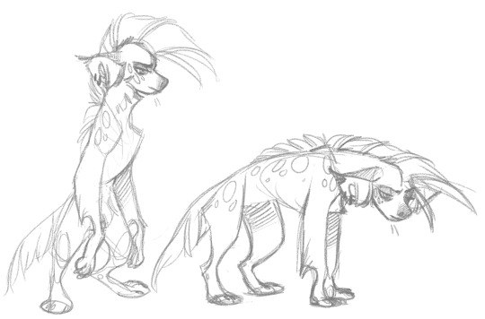
The instinct for some may be to give a gnoll standard “furry” anatomy, i.e. human proportions but with fur and a hyena face. Personally, though, I find more animalistic proportions work better for gnolls. Basically, I think of them more like monster characters than furries. Ozzie, for example, has longer arms and shorter digitigrade legs, and is just as comfortable on all fours as upright. The giraffe neck helps, too.
Of course this is all my personal preference and I am in no way trying to claim that there is a right way and a wrong way to make a gnoll, or that if your preferences are different from mine then they are wrong. I’m by no means a gnoll expert or authority! That said, I hope this advice helps you and best of luck in creating your gnoll.
550 notes
·
View notes
Note
Why have I not discovered you sooner, seriously I love the art style with the bionicles? Any suggestions for a fan trying to draw bionicle?
It’s been a while since I’ve poked my head into the fandom like I used to, but I do have a few art tips that worked well for me. This is somewhat of a rough/vague/basic guide starting from when I was the greenest beginner.
Under a read more because it’s kinda long.
Practice drawing straight lines, curves, circles, and ovals because there will be A LOT of that going on. For circles and ovals, try to make the ends touch (as you can see it takes a few tries lmao but it’s a good warm-up). I usually do these whenever I don’t have time to draw, like on a scrap piece of paper.��
Use one single stroke rather than a bunch of small ones. Not only is it a good habit to make your lines nice and clean, but it also makes the drawing process so much faster in the long run.

Use geometrical shapes like cylinders and cubes to block in poses and armor and to visualize proportions and how they interact in space. It’s also a good opportunity to practice some perspective and foreshortening. (this is where those art mannequins come in handy if you want, I personally never used them but I probably should’ve lmao). There’s quite a lot of art books and online tutorials out there that go into much further detail, so I highly recommend reading through some.

USE REFERENCE (such as the actual sets, screenshots, concept art, etc.) This one here is very important for drawing anything in general.
Breaking things down into shapes makes it so much easier to mentally visualize how things would look at a different angle. You can even trace the pics for study purposes to see how things fit together and to get the shapes and proportions down.

Search up pictures and videos of how different mechanisms work, like different types of joints and pistons and hinges (there’s quite a lot of ball joints in particular).
Although what I like the most about the movie designs is that quite a few areas are filled with organics like muscle sinews for the Toa Metru or that brain-looking stuff for the Toa Nuva.

I kinda jumped into drawing biomechs straight away instead of learning to get a grasp on human anatomy first (which in hindsight was a mistake because even now I struggle with humans lmao) but it would be incredibly useful to learn because there’s quite a lot of connections between the structures of biomechs and the human body. Bonkles are just a lot more skewed, and this goes for more than just the movie version I’m using as an example. Posing will also be a lot more easier to deal with.

When it comes to posing, nothing’s better than stick figures amirite guys

Personally I’ve found Kanohi and non-Kanohi faces to be especially difficult to draw because it’s so easy to make them look wonky. Tracing references to study them helps a lot to get the proportions down, and then you can break them down into blocks. Try out different angles, the shapes change drastically sometimes.


But once you’ve gotten Kanohi/faces down, the fun part comes where you can squash and stretch them! Play around a bit and learn how the facial features interact with each other. Making silly expressions in a mirror helps a lot (even without the mirror you’ll probably end up involuntarily making faces anyway). Watching any of the Bionicle movies will give you plenty of examples since you get to see animated expression changes. I use the Piraka as an example here because of their giant teeth. \o/
If squash-and-stretch masks aren’t your thing, then body language and eye expressions will help compensate.


All this stuff may sound daunting, but all it really takes is practice! The earlier you start, the better you will be later, and you’ll save a lot of time and work in the long run. Take inspiration from the works of other Bionicle fanartists and note what you particularly like, such as lineart or color choice or armor design.
Of course, the most important thing is to have fun!

Being able to draw whatever you want is the most empowering thing.
66 notes
·
View notes
Photo

a a a a a a a i’m not the best with making tutorials but i’ll give it a shot??
i’m going to go a little in depth and mainly talk about my own set up which is honestly a lot more complex than the average rig! if you’re more just looking for an introduction, there’s a three part video series here that’ll get you up to speed and running real fast!! it’s what i used to learn!!
that aside a a a a a a i’ll try my best sdhgfksdfjhglhk HERE WE GO
a a a a first and foremost you’re going to want to start with the base?? which is going to be your transparent drawing sans most of the face (though keep the nose in there because you won’t be animating it). so for instance with my donut hole cover, that looked a little something like this:

(i mean sort of but a a a a a a i won’t get into too much detail about all the loops i went through to make the donut hole rig so i could move the face/head/and hair individually sdjghksdfjhg)
from there you have your basic facial groups: eyes, brows, and mouths, as you probably already know w. how they work is they’re drawn on a transparent layer that’s lined up exactly with the base (the canvas size has to be exactly the same! if you crop your facials and leave your base as is, your facials won’t line up with your drawing!!). the amount of facials you want to draw for each all depends on how expressive/versatile you want your rig to be or how much animation you’re willing to trudge through later on (more facials means more expressive animation, but it also means a longer facial list and more digging around to get at the frame you want w).
example:

the total facial list for a basic set up (in this case the default miku model)

and about 1/3rd of the face list i used for donut hole skjdghslfgkjsf
the most basic set up is a closed mouth, shapes for A, I, U, E, O, N, an open set of eyes, a closed set of eyes, and a transition between the two (or half closed, if you want to think of it that way). if you just want to get a functional rig, that’s all you need to make. from there, though, you can either build your rig for a specific song and only make the extra facials you know you’ll need (like i usually do) or you can draw a wider variety of facials and make a more generalized rig that can be used more than once (which is the typical norm).
in my case, my usual set up is :
MOUTH > closed mouth (default) > wider closed mouth > small versions of all the vowels (a i u e o) > basic versions of all the vowels (A I U E O) > wider versions of all the vowels (A I U E O) > yelling versions of the more dramatic vowels (A E O) > wider versions of the more dramatic yelling vowels (A E) if you want to be fancy w > basic consonants (n f sh ts m) > wider versions of some of the consonants (N SH M) EYES > open (default) > half (transition between open and closed) > closed (blinking) > wide (slightly more open) > relaxed (slightly more closed) > tired (in between open and half) BROW > default > up > down > furrowed > sad/worried > arched/happy > angry
which honestly adds up to a lot of drawings w
(donut hole in particular had a whole ton because i had to make full set of eyes for every direction i wanted the eyes to look. so for the eyes looking down, for instance, i had to have open, half, closed, wide, relaxed, and tired versions sjhgksjfdh)

(that’s not even half of them it was a lot of facials sfgdjlksdfgj)
as for the jaw, i typically make 4 or 5 jaw edits?? one for each of the vowel sets, so small/default/wide/yell/extra yell??? and for each one you want to try to visualize how the lower jaw moves downward in response to the movement of the mouth ? ? ? so for a small A, for example, the mouth’s only opening slightly, which means that the jaw’s only going to drop a little bit. it definitely helps if you draw out a rough of your teeth first and use the spacing between the bottom teeth and the chin as a guide (which is what i did for the gomen’ne pv ye).
as for the actual facial, how the jaw edit works is that you make a copy of your jaw line art (or redraw it if you want), move/stretch/warp it so the chin is slightly further down down, and then color underneath it with the same color as your base, so that way when you turn the facial on, it masks the base line art and replaces it with the edit.
how far down you want the jaw to go depends on how dramatic you want the finished effect to be, though it’s best not to move it too much otherwise it gets to be a little jarring w
i’m not ?? ? sure if i’m explaining it correctly??? it might just help if i show my A set kdhfgj

(though note that the skin color underneath the mouth isn’t actually necessary—all you need is enough to cover up the original jaw line art. i only put color under mine because i used a greenscreen to transfer my animation onto the base in AviUtl and i needed a buffer—though that plan didn’t actually work at all because i was silly and forgot to actually make sure the color surrounded each mouth so if you watch the pv you can see the greenscreen getting fussy with some of the wider mouths sjkghklfdjg)
a a a a other than that ANIMATION A A A
the main reason i make ten million variations on the same vowels is so i can do some makeshift interpolation/easing in LipSync (the other reason being so if i have two of the same vowel in a row i don’t have to suffer ww). the way i break it down so that i get a nice easing effect is:

[default vowel][wider vowel][default vowel][small vowel]
and then for the more dramatic vowels i’d do it as [yell vowel][wider yell vowel][yell vowel][default vowel][small vowel]
what all that means is that your mouth is going to transition from closed to open very quickly (between the closed and default vowel frames there’s a dramatic difference in size), but appear to “ease” into the rest of the expression (because there’s a much smaller difference between the default and wider frames). i ‘m not sure how to properly explain it further/put into words jdfskhgl but it’s one of the basics of animation?? about frame spacing and the differences between keyframes??? a a a a a a forgive me i have no idea how write it out fjghklsdjfglk
learning the fundamentals of animation definitely helps you work your way around the program better!! easing, squash-and-stretch, anticipation, so on and so forth!! i used to do a lot of animation in flash back in the day so i learned a lot of it through trial and error and picking apart my favorite animations, but that in turn means i don’t really know a lot of the technical terms sdfjghlkfd ; ; ;
a a a a A A A A i hope that answers some questions ! ! ! i’m not sure how well i explained everything but hopefully it helps ! ! ! !
i uh also just realized this is probably all even more overwhelming SFJFHKJHFKS FORGIVE ME ;
52 notes
·
View notes