#trying clip studio paint for the first time
Explore tagged Tumblr posts
wheniwatchtheworldburn · 15 days ago
Text
Tumblr media
9 notes · View notes
dunkalfredo · 4 months ago
Text
Tumblr media Tumblr media Tumblr media Tumblr media Tumblr media
hi here's more isat stuff, including a character turnaround bc I'm trying to learn how to animate properly instead of just shitposting (there will be more shitposts tho)
last one is doodles of stuff from chapter 2 of human after all. i love my silly cryptid sif too much what can i say
445 notes · View notes
full-time-femboy · 2 months ago
Text
Tumblr media Tumblr media
I finally got my digital pen back!
And I'm making it into a keychain!
Tumblr media
It is $15 and is available for pre-order here on my Ko-fi
Please note that this is a PREORDER! Production and shipping can take up to 2 months. These are expected to be shipped out in late October or early November
Commissions are also open again!
Reblogs and boosts are very appreciated 💜
53 notes · View notes
daipeanutsaiban · 7 months ago
Text
Tumblr media
the little miss baskerville at around 14 years old- a young lady with a mischievous streak 😺. her father makes her wear white as a way to know when she's sneaked out against his orders, because her clothes will be visibly dirty. sometimes she'll disguise herself and klint (and occasionally barok) as east end kids and they'll blend in the crowd for a day. her color scheme is meant to be reminiscent of a candle, both in reference to the headstrong, fiery personality i write her with and to her short-lived existence.
101 notes · View notes
sliverspeaks · 3 months ago
Text
oops my hand slipped + (Flash Warning) Speedpaint below cut
Tumblr media
33 notes · View notes
autistic-blazamy · 6 months ago
Text
Tumblr media Tumblr media
twig the otter or whatever her name is
27 notes · View notes
blandspaghetti14 · 1 month ago
Text
Tumblr media
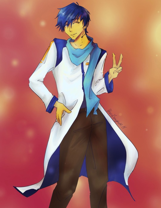
Kaitober day 1
V1
13 notes · View notes
theelusivelotus · 2 months ago
Text
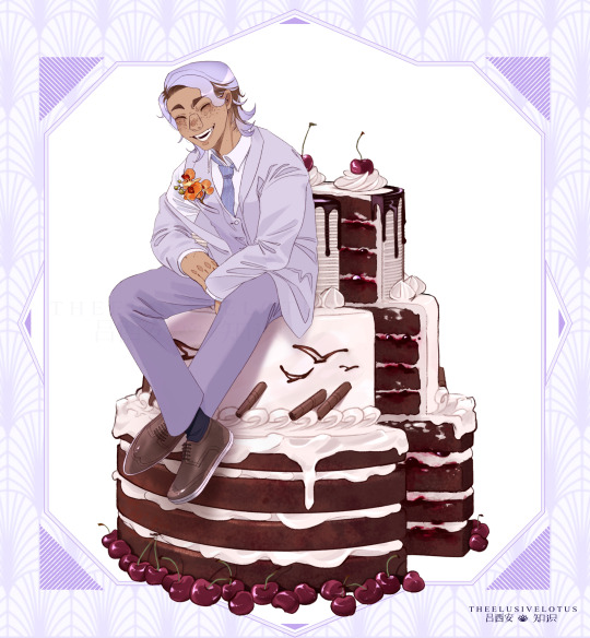
HAPPY BIRTHDAY YUUMA OYAMA - 16th September
Tumblr media
15 notes · View notes
ahiijny · 7 months ago
Text
Tumblr media
tee
14 notes · View notes
howtodigatrench · 5 months ago
Text
post-credits wanderer design (implied? ending spoilers) :
Tumblr media
+bonus hydrae sketch
Tumblr media
4 notes · View notes
circus-ten · 1 year ago
Text
Behold a rough animation that actually looks decent. This is an exercise I wanted to do with animating dialogue and I chose a clip from Powerpuff Girls to sync to the animation because Mitty canonically sounds like Him and its like the most fitting voice for her I stg
9 notes · View notes
ticktockteapot · 1 year ago
Text
Tumblr media Tumblr media
I was unsatisfied with the original so I spent a few minutes tweaking this, or is it called rendering?? Idk my dude but I like how she turned out now
7 notes · View notes
zaynes-ocs · 3 months ago
Text
I’ve been kinda dead over here so here! Have a little snippet of Xadian chillin on a rock!
1 note · View note
wizardweevil · 11 months ago
Text
Tumblr media
sketch as i figure out new software
0 notes
foervraengd · 1 year ago
Text
Mirre’s “How i render gemstones” tutorial!
Tumblr media
(note: image above is not what is shown in the walkthrough. It is an example piece)
Ingredients:
Art program that has layers and selection tools
Patience (hubris or stubbornness is fine too)
(recommended) photo references of gemstones and/or prisms
(Optional but very helpful) Knowledge on how to use Reference layers and anti-overflow in Clip studio Paint
For this tutorial i am going to use clip studio’s “anti-overflow” feature. This post is not going to explain how to use that specific setting but you should be able to find guides on how to use it on clip studio’s official website or on youtube.
Please Note: The result of this technique will not 100% represent real life gemstones. These are more simplified but should still make an impression of the brilliance and appeal of gems, crystals and diamonds.
If you don’t work in CSP: the best workaround is to use the polygonal lasso selection tool for the same purpose.
This ended up being a long post so I am putting it under the readmore:
First off; Basic idea on how the light refracts inside a solid transparent object:
Tumblr media
Wether it is acrylic, glass, water or crystal, the way light pass through more or less should behave the same as long as it is solid and not hollow inside. Pay attention to how the darkest parts of the stone goes along the inner edges, leaving a ”mid tone” sort of in the center. However, this might vary depending on the light setting. But it is a generally good rule-of-thumb to follow if you’re drawing something not based on a photo. Another thing to pay attention to here is how the placement of the highlight will lit up the inside of the gem in a parallel line. It also shows through on the cast shadow.
Light refraction on a cube:
I have already made two posts on this, so definitely go through them:
CUBE BREAKDOWN POST HERE
But a rough summary from those two links would be: Every side/facet of a gem or a cube etc refracts the light individually and not as one entity (that would make it look hollow and not solid). Think of it like how each piece in a broken mirror individually reflect your face back to you. Like a weird patchwork!
Putting this into practice:
For this tutorial I’m going to be nice to myself and not try to draw perfectly accurate gemstones. Instead I’m gonna draw them with a more ”natural” looking set of facets. Which actually isnt as common in real world as video games makes us think. Some crystals have geometric shapes naturally, but a lot of other stones are not as fancy. Anyway, im taking artistic liberty on these example stones because the technique I’m going to use will work for these just fine.
Tumblr media
So, in clip studio paint, I first draw the stones on a vector layer. I give them facets for the front side. Then I duplicate the layer, remove the front facets and replace them with the facets on the back of the stone. The third image here shows both layers visible on top of each other. I now put these into a layer folder and mark the folder as ”reference”.
Tumblr media
Now, on a layer below the lineart folder, fill with your base tone. Then make a layer on top (if you can clip it to the base tone, do that), this layer is where you decide where the highlight will be placed. In some cases the highlight is only lighting up one single facet - it really depends on the design of the stone. You can also blend and soften the highlight here if it looks good for you, just make sure not every facet is highlighted. The highlight layer should be on top of all the other layers clipped to the base tone layer.
Tumblr media Tumblr media
Now it is time for the juicy juicy stuff! Turn on both lineart layers so they’re both visible. I hid the hilight layer here because it was in the way, but might not be needed in your case. Make a layer clipped to the base tone and paint in the darkest tone. This is where anti-overflow helps me out, because when i run my brush over all these crossed lines it will make the stroke pop in and out for each facet. If you dont use CSP, this is where you can use the lasso tool and select every second facet. It will take a bit more time but it should work similarly.
After the darkest tones I then make a layer for the inside light that the highlight has lit up. Here i keep it inside the darkest tone but this might vary depending on the light setting. If it looks good to me, then that’s what i stick to.
The way I approach rendering the facets here is like the grid in the example images above, every shade and tone appear more or less in each facet but the amount is relative to their position. So a gradient wouldnt have a smooth transition; it would be slightly scewed in each square on this example grid. Essentially like how some bathroom window glass panes look like.
Tumblr media
Now it’s time to hide the lineart layer folder and check if the gemstones look decent to you. If not, then you can look up some reference photos and analyze where the values group together the most; be careful not to focus too much on the photos 500 million sparkles. Squint your eyes or blur the reference and try to see how the overall values behae.
I, personally, am satisfied with these rocks so I slap on a gradient map (you can manually color in them too if that’s your thing) and call it a day. The lit up inside of a gemstone tend to have a brighter and more saturated color than the mid tone.
Other Examples with this technique:
Tumblr media Tumblr media
If you look up ”gemstone types” you can often find images displaying various facet types from more than just front view. These can serve as useful base templates for practicing this rendering technique. The backside of a gemstone is called the “pavillion” and is really useful to have at hand when it comes to painting the inner refractions. You can probably also use 3D models and convert the wireframe into lineart. But that is slightly out of my pool of knowledge.
Tumblr media
Applying this knowledge without using a base lineart layer is of course possible. In this painting I followed a simplified summary of how the facets sparkle: Keep the highlight shape to match the front facet design, and all the inner refractions should be more scattered and split up but face a direction towards the center of the gem. Now don’t you think this sort of makes the gems look like eyes? That’s right! You can, and absolutely should, apply this on eyes to create the most sparkly anime eyes ever.
Now, refracted light that lands on the surface surrounding gemstones varies depending on the material - and if the gem is inside a metal frame it usually doesnt create this much refraction around it. But I want to have fun so i decided to break this rule in the name of pretty sparkles. :)
3K notes · View notes
dunmeshistash · 19 days ago
Text
Interview to celebrate the opening of the Ryoko Kui Exhibition
About Delicious in Dungeon: Story making
Q1. Your first long-running series has lasted for about 9 and a half years. Has it been different from your previous experience drawing short stories?
A1. Compared to short stories, the series has been easier because the same characters appear each time. But I was surprised to find that I got tired of drawing the same characters too many times.
Q2. You have said before that the overall structure of the story was decided before serialization began, but how much of that had you communicated to your editor? Also, what kind of communication did you have during the series production?
A2. The goal was something we discussed and had decided on from the beginning. The goal itself was simple, but the path to get there was more difficult and took longer than imagined.
Q3. Regarding the overall story concept and development, did you write out or put anything down in writing (such as the plot)?
A3. I did, but it was simple.
Q4. Did you come up with the dishes based on the monsters you wanted in the story? Or did you come up with the monsters based on the dishes?
A4. It depended on the story, but usually the story came first followed by the monsters or food. I feel like that was most often the order.
Q5. As you progressed in drawing the series, what elements of the characters, story, or world expanded or grew in the most unexpected way?
A5. Nothing particularly unexpected perhaps. When I used to draw web manga, I tended to think up inconsequential settings. So, from the beginning I tried to restrain myself as much as possible and not expand too much. I was surprised when my editor said "Let's expand it more," in the second half of the series.
Q6. "Delicious in Dungeon" starts with a relatively simple setting, but as the series and the labyrinth exploration continues, the map slowly expands little by little in the readers' minds. It becomes more three-dimensional, revealing the secrets of the world, and taking on a multilayered structure. Are there any sources that you used as a reference, or which influenced you in creating this multilayered structure?
A6. A long time ago, when I was working on my personal web manga (fantasy), I drew it however I wanted, thinking that "Only people who can read this will read it," but I regularly received feedback that it was "unreadable", so I tried to make it as easily. accessible as possible.
Q7. The series combines many elements, including "fantasy", "gourmet", "battles", and "puzzle solving", but I think it's also important that it is a "comedy" which makes people laugh. Could you let us know if you have a creative commitment towards depicting humor?
A7. My hopes are that I can make it fun for people to read.
[page 5]
About Delicious in Dungeon: Drawing manga
Q1. Please tell us about the drawing tools you currently use, both digital and analogue.
A1. In terms of analogue tools, I use a light box, a G pen, a round pen, and a brush pen. And for digital, I use CLIP STUDIO PAINT and a Wacom LCD tablet. Screentone pasting is always done on the computer, so ultimately it all ends up as a digital manuscript.
Q2. Do you have any rules or reasons for using digital and analog separately?
A2. I'm always looking for ways to draw better and save time, so the exact approach is probably different for almost every chapter. Personally, I feel that analogue methods create more appealing lines, but I feel like digital saves time, so maybe I'll do a digital rough sketch and do the inking by hand… I might have been using a G pen, and maybe I'll try out a turnip pen, or this time I'm short on time so I'll draw it entirely digitally, but with digital I can redo it over and over, so maybe analogue is still faster, and so on and so forth. I'm indecisive in this way and so haven't developed a consistent process.
Q3. I understand that you prepare 3D data for your assistants to draw the backgrounds. What kind of data did you make for "Delicious in Dungeon" ?
A3. You could call it 3D, but it's not a proper model, just something to help with the rough sketching. I line up cubes to share the perspective and sense of scale, and they use it as a reference.
Q4. At the beginning of the series, the characters and backgrounds were somewhat simply drawn, and it seems like they became richly detailed over the progression of the story. What was your intention behind using these different styles?
A4. It's simply that my technique isn't stable. I thought I'd put a lot of effort in at the start. I remember being confused when my editor asked me to add more in to the drawing, and I wondered "Where…?"
Q5. Thinking about the food, were there any menu illustrations that you were particularly satisfied with, or which you struggled with?
A5. I've never liked my own food illustrations. But the times when I read other people's manga and thought "That looks delicious," I think it's been more an influence of the movement, the staging, and the situation than the drawings.
Q6. For the world maps and the terrain of each continent, did you refer to any maps of the real world? I feel like the shape of the 'island' is similar to the shape of Fukuoka Prefecture or Kyushu.
A6. I didn't reference any specific geography, but I did try to put thought into things like whether a developed city would be near a river or the sea, and what the coastline would look like. I'm pleased if it feels similar to a real place, because it means my interpretation was pretty accurate.
About Delicious in Dungeon: Other
Q1. Which is your favorite monster?
A1. Nightmare.
Q2. I'm sure you have received a lot of feedback from readers in countries and regions outside of Japan. Please tell us if there was anything from them that made you happy, was unexpected, or which made a lasting impression on you.
A2. When you play foreign games, there are times when you think "Why did they translate it into Japanese like that?" But having been on the side of having something translated, I've realized some things are unavoidable, or endless, and there are many things that don't matter either way from the author's perspective, so it was interesting.
About Ryoko Kui's short story collections and herself
Q1. Dragons are a consistent and important motif in your work. Was there any particular work or experience which inspired this? Also, are there points about drawing dragons which you find interesting or have had to work hard on?
A1. It's less about liking dragons, and more that I'm interested in the worlds in which dragons exist. When I draw dragons, the depiction in itself has a sweet feeling to it. I have never had a pet reptile, so I don't have a very good understanding of them.
Q2. Unomiya University in your story "The dragon's school is on top of the mountain" has a Faculty of Dragons, Department of Environmental Studies, and Department of Technology Studies, and a Faculty of Veterinary Medicine. If you were to enroll in the university, which department or faculty would you like to enter?
A2. I probably wouldn't be accepted….
Q3. The collection includes a short story staged as an essay manga. Are you a fan of essay manga? Please tell us about any genres of essay manga that you like.
A3. I love all kinds of essay manga. I read them often.
Q4. If you were to make your own game, what kind of game would you like to make?
A4. I prefer being a player when it comes to games.
Q5. When did you first start drawing illustrations (doodles)?
A5. I don't exactly remember when I first drew a picture, but I think I started drawing manga around the fourth or fifth grade of elementary school. in my notebooks and had my friends read them.
Q6. What is the most fun part about drawing manga?
A6. Every part is fun and hard in its own way.
Q7. Please tell us if there is anything you "just can't stop no matter what".
A7. My procrastination habit.
Q8. Could you please tell us if there's something you want to draw now?
A8. I've been working continuously since the serialization, so I'd like to take about 2 to 3 months to just draw whatever I want.
272 notes · View notes