#those weird pixels aren't supposed to be there
Explore tagged Tumblr posts
Text
So apparently a LOT of self shippers are antis
Hm, it's getting a little boring only being able to gush to my friends about Hypno. Maybe I should look for some good self shipping communities, I'm sure they'll be acceptin-
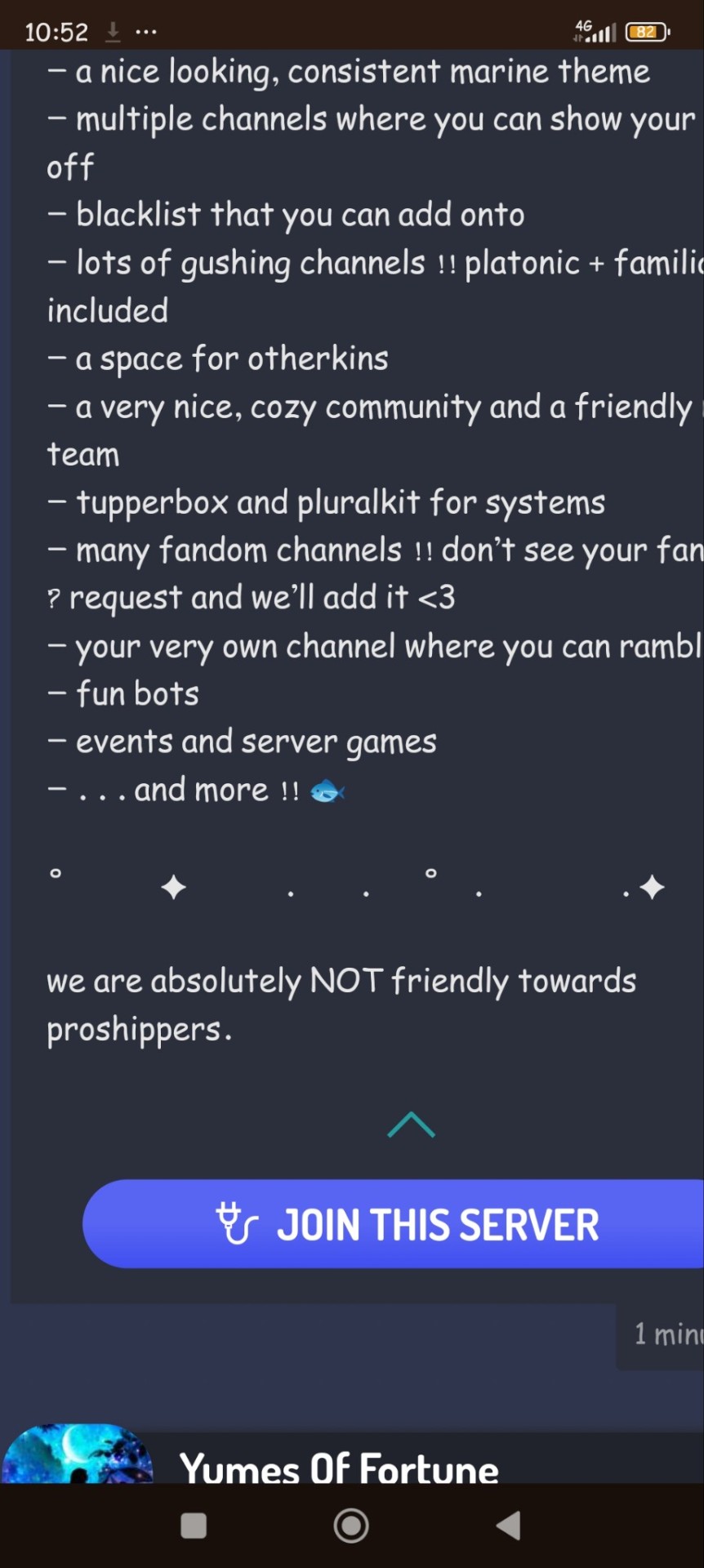
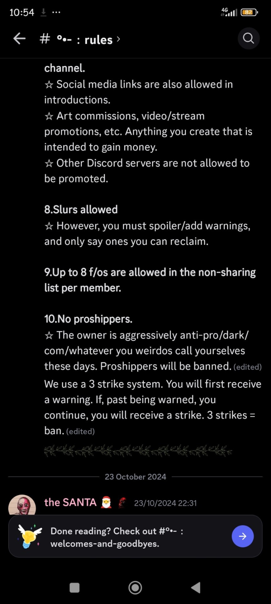
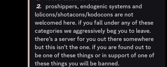
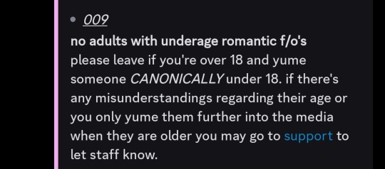
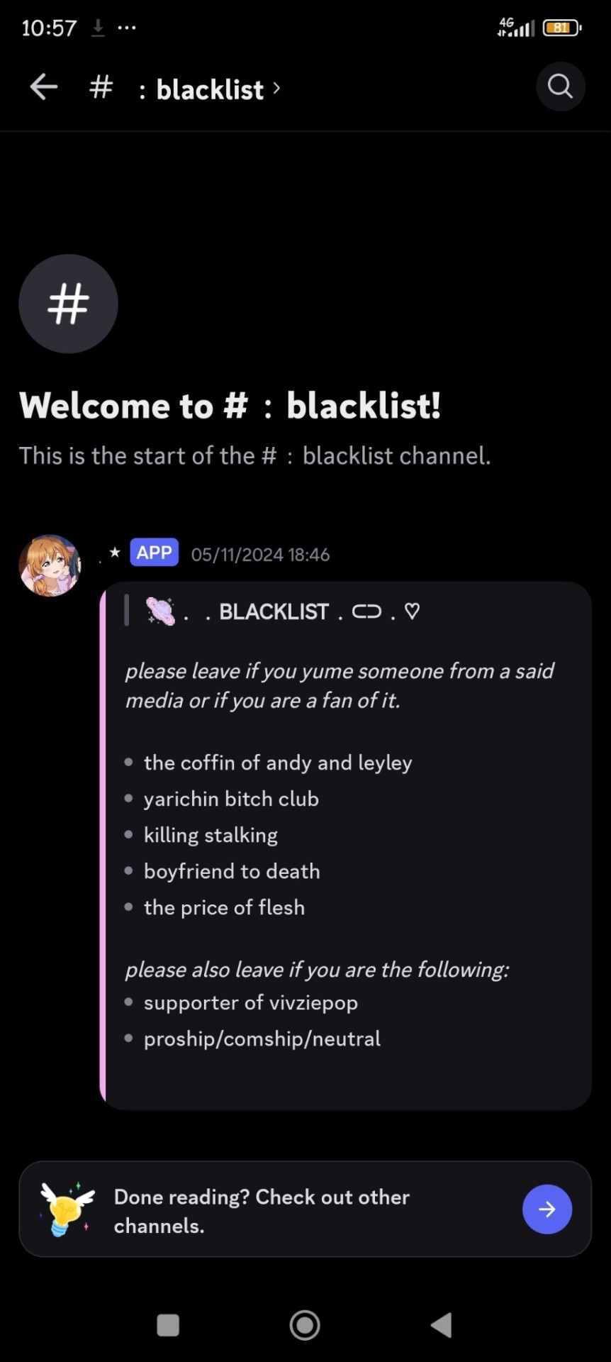

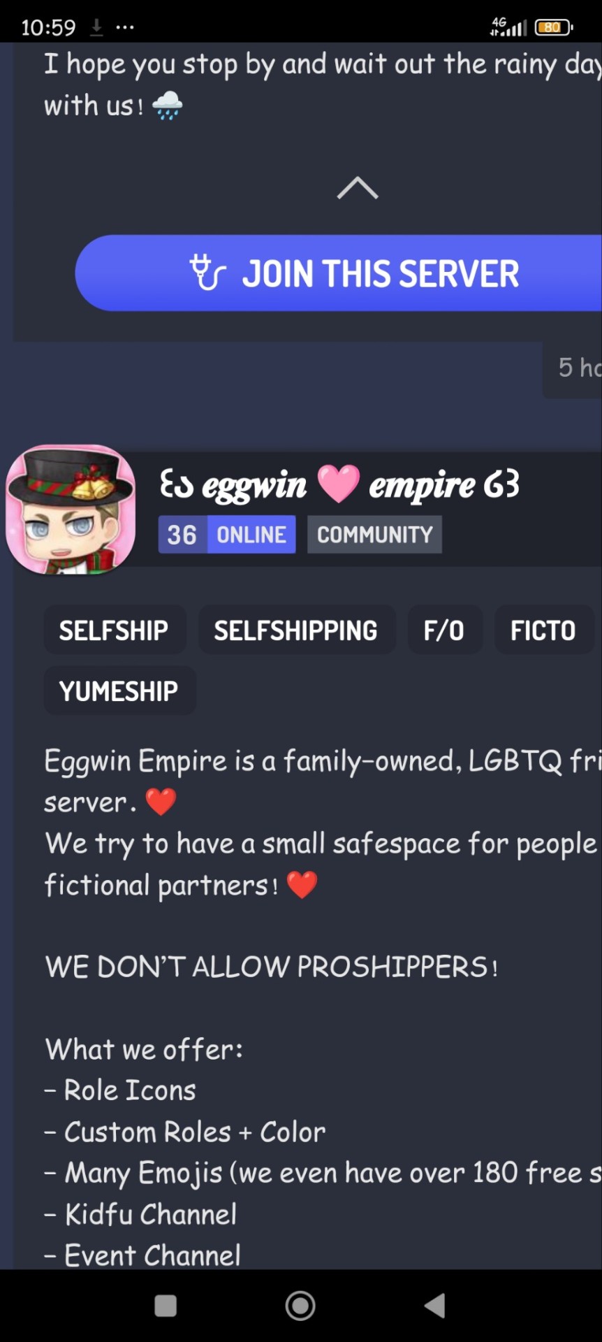
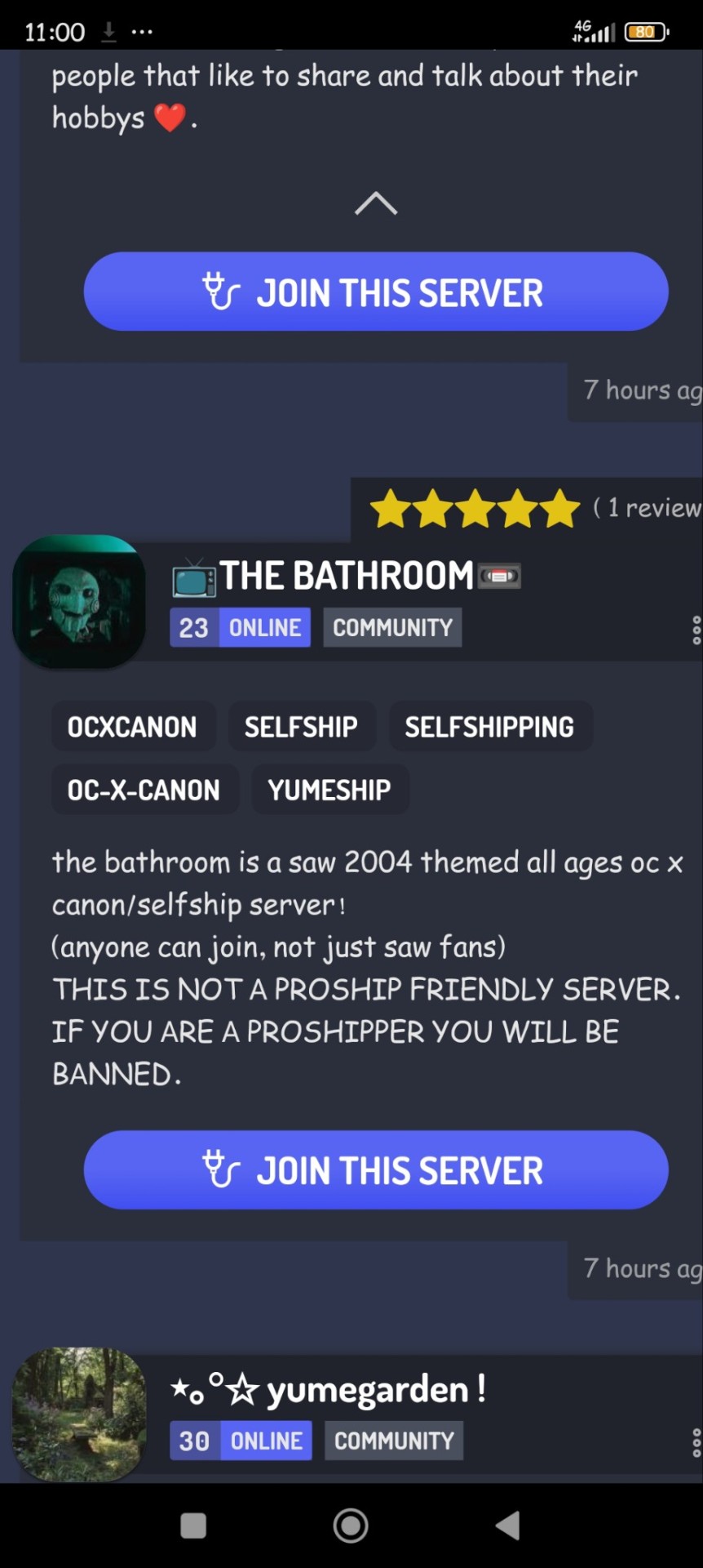
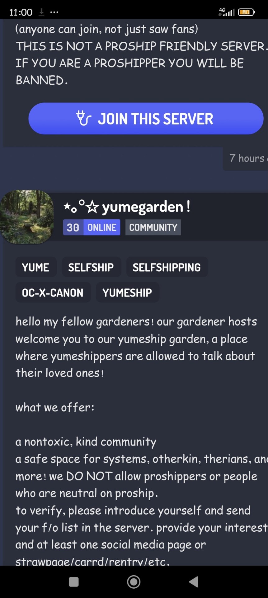
...okay
Why is this? I thought self shippers would be way, WAY less biased about com/darkships considering selfshipping and com/darkshipping are basically cousins.
"Oh, you ship yourself with this FICTIONAL character who isn't real and has 0 consciousness? That's ok! ^^ BUT NO ILLEGAL F/OS!1!1!1". I thought they'd be more aware than that, but I guess not. Heck I've seen people post about 18+ self ship communities being like that. I thought adults were supposed to be mature and understanding...? But I guess it's bold to assume everyone in those are actually over 18
The fictional characters aren't gonna thank you for your weird pixel activism guys, snap back to reality and talk to people
hey guys btw if you know any good communities please recommend them to me, thank you <3
#proship#proshipper safe#profic#profiction#proshippers please interact#complaining#rant#rant post#proshipping#proshippers are valid#proshippers are welcome#proship positivity#op is a proshipper#proud proshitter#personal rant#proship please interact#self ship#self ship community#selfshipping community
321 notes
·
View notes
Note
I dont need to feel sexually atracted to crash, but if i saw crash and I thought "man that bandicoot looks ugly as shit" then no way I'm gonna stare at that for 4 hours
same with the sonic movie original design, you dont need to find it attractive but AT LEAST you need to not consider it ugly or unappealling
its not a hard concept to grasp
A few problems...
What you are describing is character design. And I suppose there are cases where poor design might be distracting enough to feel unenthused about a game. But I grew up on Mario Bros. and there were so few pixels the character design was near meaningless. All that mattered was fun. If the game was fun, we were happy.
But we aren't talking about character design. We are talking about people disregarding a game because they don't find the protagonist fuckable enough. And that is just weird and immature. I'm playing a video game, not trying to rub one out. I literally don't have enough hands to even make that work.
But I think your argument is silly mainly because all most people really care about is having a good experience. A good story. A fun adventure. I didn't play Tetris because I found random blocks attractive. I played it because it was fun. And if you are going to be that aesthetically judgmental about what you play or watch, you are going to miss out on a bunch of fun experiences.
I mean, by your standards, no one would watch Lord of the Rings because Gollum was "unappealing."
When I play a narrative-centric game, the only thing I care about is the story and characters being compelling. Being attracted to them is usually of little concern to me. I will take funny, interesting, mysterious, badass, and about 50 other adjectives before I even consider what they look like. Because those things contribute to making an interesting story much more so than the character's level of attractiveness.
I like when games and movies incorporate a diverse group of people. Not because of any woke agenda. I am just so bored of seeing the same thing over and over again. I am a curious person and I like learning about people with different perspectives and cultures I am unfamiliar with.
59 notes
·
View notes
Text

cole—spirit or human?
this, like all my meta, is just my personal feelings or interpretation: I am not trying to claim any kind of objective correctness, or to dismiss those who feel otherwise. I remember conversations about cole being somewhat strained so I'm hoping ppl aren't going to be super weird on this post.
so—cole. I've played both routes and I actually enjoy both of them, but I'm strongly inclined towards making him more of a spirit, and my reasoning comes down to three primary aspects: 1) respecting cole’s autonomy and his choices up to this point, 2) acceptance of an “other” way of being as equally valid to a “human” way of being, and 3) making him more human feels weirdly to me like asking him to replace the real cole in full rather than be himself
1—respecting his autonomy.
cole states early on that he became more of who he was and less human, and that it lets him help. that's a choice he made. on a personal level, even though he's just pixels, I find it deeply uncomfortable to unmake the choice he made about his nature. I understand that he's shown as happy and fulfilled regardless of which path you choose, which is part of why I like both, but this is why I prefer the spirit path: making him more human feels, to me, like the inky is making him more… palatable. or like the game is giving a “comfortable to the player” option. I felt this way when I first played dai when it was new, and I continue to feel this way now
he is happy in both and that's nice, and i like that there's no strong delineation of a right v. wrong choice. at the same time, i've always gotten the sense that cole wants to be more spirit—maybe not because it brings him joy or satisfies him, it could well be that he just believes he will be more useful/functional as a spirit, but even making "bad" decisions (which i don't think this one is, but for the sake of argument) is an individual's right and part of their autonomy
2—acceptance of an “other” way of being as equally valid to a “human” one
in a watsonian, in-text view (which does tend to be my approach), I think it's very important to accept the personhood of spirits, even when they're so fundamentally different. spirit!cole forgets things, can erase negative experiences, etc.—there's a lack of what we'd see as typical growth and maturity going on there, but I'd argue that we can't really effectively apply human (or “mortal” ig, bc elves, dwarves, qunari…) norms to a spirit.
cole as a spirit of compassion is the way a spirit is supposed to be. the way a spirit is supposed to be is not the way a mortal is supposed to be. and to me, it does feel like his preference throughout the game is to act as a spirit. he stays "pure" and "clean," and that allows him to help without becoming corrupted or changed. it's tempting—and not wrong—to view this through a human lens and to find it unhealthy for him, but i tend to defer to solas' explanations of how spirits are in this case. they can easily be corrupted because they are a Single Thing. that is their nature. wisdom is wisdom; changed by perception, expectation, memory, or pain, it becomes something fundamentally different. spirits are malleable in a way mortals are not
3—replacing the “real” cole
tbf, this one isn't really supported by anything in game, just a personal discomfort. but he “became” cole after the young man's death. honestly, I find that a little uncomfortable, but I can understand it: the textual “simplicity”/purity of spirits makes sense of that kind of reaction to compassion’s “failure,” its inability to help the real cole (according to its own standards where help=fix: it did help the real cole by being there)
so, to me, it reads a little like you're confirming that direction when you have cole become more human. ik it's not presented that way, but yeah, personally just makes me uncomfortable bc it feels like I'm encouraging cole to view himself as a replacement of the real cole
spirits can come back, but they are the sentiment that gave rise to it in the first place, not the individual being itself. compassion taking on cole's name in the first place feels like that to me, but becoming more human feels like it's taking it a step too far. bc then cole becomes a young man who's taken on the face and name of a dead man and it's… it's a lot. for him to grapple with down the line, for the people around him, for everyone. but as a spirit, that kind of behavior feels more like a way of recognizing and respecting the being that came before
and of course, cole isn't 100% either—he's more human or more spirit. so it's fair to say that it'd still be a sign of respect and acknowledgement of the real cole even if he becomes more human, it doesn't turn automatically into a Bad Thing, and the complexity can honestly be fascinating to explore, bc i imagine as more-human he will develop some complex feelings about all of it
#broodmeta#cole#also i know the pov of autism acceptance/“cure” and i get it#i just don't really feel it#so i didn't include it here
35 notes
·
View notes
Text
POLL! since i haven’t made one in awhile and instead of actually posting stuff i wanna know what you want more
examples of option 7:
the aesthetic of my best friend
uhhh idk
random stamp dump and another stamp dump
this one is kind of an aesthetic but it wasn't supposed to be a specific one
i love this one
i thought I was so funny for this and also this
literally chose these exactly as the title says
examples of some graphics that aren't stamps, pixels, or blinkies:
fanlisting icons
gifs and more gifs
buttons and more buttons
dividers
web badges or whatever these are called
i don’t have any purely png posts but those are on the table as well.
#blinkies#neocities#web graphics#old web#web resources#stamps#carrd graphics#blog resources#old internet#animated gif#graphics#webcore#poll#poll time#feedback
23 notes
·
View notes
Text
I recently reblogged a really helpful post about identifying ai-generated art, but it was a long read that might feel daunting to folks, and it's quite specific to a particular fandom/genre of art, so I thought I'd share something concise and a bit more general. If you, like me, want to avoid spreading ai art, here are some things I've noticed. This is somewhat specific to the kinds of ai art I see in fandom spaces/on tumblr and social media in general. There are incredibly informative articles online about other kinds of art and imagery created by ai and how to identify it, so by all means do some googling.
I've noticed that backgrounds are often a good indicator, not just in weird blurry architecture or nature that doesn't make sense, but sometimes it features nonsense text as well (think signs and posters).
You may notice that something that otherwise seems like it was produced with a great level of skill has some major things off about it (why does that foot seem to disappear? why is this side of the desk perfect but the other side has six legs?).
Parts of it, especially backgrounds but also clothing or random patches of color, may look painted or pixelated or sketched while other parts look hyper realistic. (This may be a purposeful stylistic choice by an actual artist and not a program, so be careful about this and pay attention to context. Like why do some body parts seem so perfectly rendered but others are blurry/sketchy/anatomically incorrect?)
Things seem stilted or awkwardly placed in some parts, but fluid and lively in others.
Light or shadows that don't make any sense. Anatomy that doesn't make any sense. Structures that don't make any sense. Designs and patterns that aren't anything.
You might be looking at a piece of art that at first seems really good and for the most part is quite beautiful, but you notice something off about it, some random chunk of color or fabric or an item that doesn't seem to be anything placed in a weird spot, and you're looking at it closely and you still can't identify what the hell you're looking at. Yeah. Probably ai.
Remember that sometimes artists make mistakes. Art isn't automatically ai-generated just because something doesn't seem perfect to you. It's the number of mistakes, the nature of them, the way that art that seems really skillfully made contains these bizarre mistakes that would've otherwise been caught by the artist.
Why is ai art bad? To paraphrase the post I linked to above, it is built on theft and supports dystopia. And it devalues the role of artists.
Sometimes it's very easy to tell. Sometimes you look at an image and roll your eyes at what a poor job the program did and you move on. But sometimes it's nearly impossible to tell, so this post may not necessarily be helpful in those instances. AI is getting scary good, and it sucks. So just be careful, I suppose. And spread art that you know was made by artists.
18 notes
·
View notes
Text
*sight*
Now I understand better why ラファリュ grew in popularity and all and why I am ridiculosly obsessed with it, but still that's such a shame IS didn't manage to make these level of chemistry for more character with Alear and that's really disappointing knowing that not only is it a ship doomed to be underated, but that because it's our traditional "ouups, we did a scamcest" some fans are definitely going to be judged for just liking their dynamic rather then being uncomfortable cause I totally respect not liking it or thinking it has a weird narrative because... it is no matter how you look at it, no one will argue that dating the son of you dad from an universe where your dad isn't your dad isn't weird, but I really think that making a crusade over proving either point is useless and not just because we are talking about pixels and that I personally don't play a video game to ask myself philosophico/moral question, and I personally don't want to have a horse in this discussion even if I am trash forラファリュ cause I don't want to spend my time arguing about a ship just cause I like it and happen to have legitimate reasons to do so especialy when it comes to character entirely fictional so trying to prove that 2 PNG are related is so... silly. IMO the only reason why they are the kids of Xenobron is because the devs didn't had a better idea to make them Fell dragon in a way that is interesting and since they had Nel in love with the other Alear, they also made her a romance for our Avatar (other then the necessity to have the player being able to romance everyone but since they could have mad her platonic like Veyle I guess that's why) and IS seems to be favoring リュエル like they are also infering アルリュ, and i think they made Rafal a romance as well since they already did it for Nel, even if Nel is much more explicit. It's kinda sad that two solid candidate ends up being dragged into that weird wank that exploded 2 month ago, I still remember it, I was here for it and even then people still talk about it. See the Nintendo life interview ? People complaining about losecest commented on the page dedicated to this article even though the devs didn't even mentionned the pact ring with the DLC character nor were asked whether or not Alear is sibling with the twin, they just had to vent under it because this interview was about the DLC, much like how people are so desesperate to prove that it's losecest they have to use Veyle/Nel's support to try to make a point that they are right to be uncomfortable for a ship and you should be ashamed of thinking it's a cute couple. Which make no sense. Granted 2 mont ago I also asked myself the question, but now having cleared a new run, i think it answer itself : the proper game explain that they simply aren't Alear 's sibling because they come from a world where they aren't Alear's sibling. That's literally just it, even if you think it doesn't make logical sense, and you would be right it doesn't make logical sense, but paradox aren't really suppose to make sense!! That's literaly what I ended up understanding when I finally got the time to play a new proper run and unlocked all of the twins's event !! Anyway, I don't see why people pretend to care about their relationship or lack off when we all know it won't stop the shippers nor people who dislike those ships, but I think it's a shame that 2 interesing character with solid ships with Alear have nothing more to talk about then this for some fans *sight* : 3 even more so when there is actual legitimate reason to root for them other then the classical "self insert biais" cause S supporting a character is different then shipping them with the Avatar character.
All the more so when the rest of the cast don't have much chemistry with Alear compared to the one they have with others character and we don't even have paired endings for them
Edit : also, if you are curious, no i have no intention of sharing any ラファリュ ship fanart, at least on this plateform because I don't want people to feel unconfortable and I know that Tumblr's tags can sometimes recomment it unless you block/mute the ship tags
#fire emblem engage#fe engage#usually people never read under the cut so it should do right ?#i guess i just hate seeing people fighting that much
7 notes
·
View notes
Text
diary394
10/20-21/24
sunday - monday
finished a strange drawing, today:

there was a mistake with the pattern fill, it's in some of the black zones... but it looks kinda good actually. maybe i should experiment with that some more. super thin lines in a little area with some extra color on them, just to make stuff look a little more textured, i like how it makes it look like she has pinkeye or something.
the idea for this one is maybe strange, i just though about some lolita girl having this thing erupt from her (in all honesty, for some reason it came to me as prolapse, which is gross but i suppose that is the point), and overtaking her, and her sort of candy affectations inflicting a kind of suffering, the matted hair w/ candy all in it, finger wrapped in hair, kind of like, inescapable as an image of something, forced into submission i suppose, swallowing an idea of being something, and then defensively using it until it spirals out.
here's a good song:
youtube
very hypnotic riffing, very weird stuff here. italian screamo's always strange. creative people, lots of the time.
i continue to struggle to get back to fear and hunger termina to try and do ending b... i get too sad thinking about killing everyone, last time i tried, i just started saying 'i can't' out loud to myself over and over and then closing the game. i at least got moonscorched marcoh... very sad that happened to him. it's not just his guilt, it also feels like he went mad in an effort to protect tanaka from that fate, which would come to him if he were alone, i'm pretty sure. those apartments are so crazy. i really love them, that's where i knew the game was truly truly special, which is crazy. i love the game so much... it makes me want to do a favorites of all time thing, but it's not like... well idk, they're just very obvious. honestly.
humm, what else. i've been watching a playthrough of sh2, it's been pretty strange to see how not awful awful it is, but it's definitely not great. the way the areas are designed, it seem aggravating, on top of that, there's too much combat that plays like, it seems honestly like the original plays better in that you aren't really paying attention to combat ever, you're like, seeing these odd and unpleasant things show up, and you wander past them, sometimes you fuck up, and they make things a little harder, sometimes you hit them with a pipe for a couple seconds, sometimes you run past and then get into an empty room, and then have to leave and run past again. in most ways, fear and hunger takes this in an actual constructive direction because making horror games turn based is really really good i think. but, either way, the original flow was fine, you were more immersed in a place, and the camera let you absorb that place better. fixed cameras really help so much. i dunno why people only use them in a retro way, when they're actually like, almost like, the most profoundly useful thing you can do to highlight an area / make it feel like something i think. that and pixel art... idk,,, those lately have felt more capable than much else.
the voice acting isn't so bad though, it's okay the direction they took, sad it's not so lynchian but really most of the game is not, now.
i need to sleep, i'm gonna see my friend tuesday, so i need to be normal again,
so,
byebye!!!!!!!!!!!!!!!!!!!!!!!!!!!!!!!!!!!!!!!!!!!!!!!!!!!!!!!!!!!!!!!!!!!!!!!!!!!!!!!!!!!!!!!!!!!!!!!!!
1 note
·
View note
Text
am i the only one who feels like the ever-present glitch effects in today's media aren't reaching their full potential?? i feel like people always over-emphasize "ah yes, glitch, multicolored rectangles now must appear" but in my experience with computers, i have seen such more weird and creepy looking glitches
feels like one of those things where a bunch of people are just looking at each other instead of at the pot of Things That Happen In Real Life causing it to be a little bit stale
for example, i have this glitch in my art program sometimes where the entire thing goes white, and when i hover my mouse, it draws with it (which is not how its supposed to work) and everywhere i draw there is this sort of radius with a pixelated edge of the white being erased (it is very creepy)
i also get this glitch on youtube / twitch sometimes where half of a person's face is frozen while the other half keeps moving, which is very creepy, especially if the colors failed and the person is also entirely green
my friend got this error with one of their images once where the top part of it was totally normal, and then the bottom part was terrifyingly stretched out, like every pixel was just a column of the the color from the edge pixel
i also get this small bit of distortion on images sometimes where there's a line of white and then three pixels of pure green, blue, and red
some of this is debatable whether it's a network error or a proper glitch, but regardless
any artist can make glitches whatever way they want, but i'm more talking about games that play the whole "is it real or is it fake??OOOO" thing on you with in-game glitches and it's like.....static sound effect and the multicolored rectangles. please do something a bit more neat!! come on make overlapping ui elements make the sounds all Weird YOU CAN DO IT!!
0 notes
Text
The store I work at does this thing, on occasion, where they give people coupons that take effect at weird times. The circulars go out on Sunday, but the deals don't count until Wednesday. I hate these, because it always leads to the same confrontation. Somebody looks up at the price, angrily wants to know why the discount didn't come off, hands me the coupon. Then I'm forced to show them the circular, to point to the place where they got the coupon. I'm supposed to point out the big red sale sign where, in big bold letters, they blatantly spell out that the coupon doesn't take effect until Wednesday.
I feel like I have to treat people like they're dumb. I have some flavor of this conversation a dozen times a day, where some person either misses the fine print or fails to understand the mechanics of a coupon scheme we've been running for years or grabs the wrong bag of shrimp from the seafood thing and no, Ma'am, it's not the bag of shrimp that's on the coupon. Do you see the front of the package on the coupon? Do you see how yours is a completely different color?
And to make matters worse, there's the nagging thought in the back of my head. "Oh, these people are being rude about it. They're combative, and acting all entitled. I wouldn't be surprised if it turns out they're just pretending to be incompetent, so that I'll take pity on them and just punch the coupon in, manually." And that's... a nasty thought pattern to fall into. Even if it turned out to be true, for some people, is that how I want to interact with people? Do I really want to foment a conspiracy in my own mind that customers are willing to feign colorblindness, just so they can save a few bucks on overpriced shrimp?
People don't pay attention. Coupons hide information in the fine print. That big red block above the coupons? That's ad copy. People just don't look at ad copy. They only care about what the product is, and what the price difference is. They get the circular on a Sunday, they're used to the coupons being useful on Sunday because that's how it is most other weeks. People aren't stupid. They just don't fully parse all the information that my awful store expects them to deal with, every time they want to get two bucks a pound off of pork chops.
Companies deal in confusion. Attention, like willpower, is a finite resource. Some people have more of it than others. Exploiting those who can't painstakingly scrutinize every pixel of every circular of every grocery store in easy driving distance, is one of the only morally grey ways capitalism can exploit people. The optimal shopping trip would require spreadsheets and painstaking recordkeeping, and even then you'd probably lose money on gas by the time you went to the third store. They count on the fact that you won't think too hard about it, that you'll accept the deal offered to you with nothing more than a vague grumble to the cashier about how everything's getting expensive.
So, I dunno where this ramble is going. I want to assume people are people, and not agents of spite trying to wheedle me for petty advantages. It seems like the latter is a very silly thing to think. But also literally why do they always pick out the most expensive bag of shrimp, when they do this thing? Why is it always the high tier shit they pull, when it's always the cheapest bag that's on sale? Is there such a thing as purple/blue colorblindness, or no?
0 notes
Photo


the cutest ♡♡
#exid#seo hyerin#ggnetwork#kgirlsquad#femaleidol#hyelin#mcountdown#music show#mine#my gifs#ughh tumblr#those weird pixels aren't supposed to be there#why you do this to me#ok i edited them it's fine now#*hyerin#*exid
336 notes
·
View notes
Note
how do you like,,color schemes, or like color pallets? i have ideas for colors but when i put them down it all looks muddled or disjointed or just weird, even when i plan it out, so do you have any advice?
(ik you get a lot of asks so no pressure to answer 😭 also thank you for the advice on dynampic panels! it was rlly helpful and im getting the book you and the commenter reccomended soon.)
That's a tough one. I know a lot of artists really play around with color schemes and color theory, but I never went in for that stuff. All my color palettes were generated initially by drawing the character, coloring them in different ways until I found one I liked (lots of playing with HSB sliders) then saving those colors to the palette for future consistent use.
I think this is a fine way to handle things - some of the pallets have even shifted a little over time as I swap out individual colors for ones I like more. For instance, my pallet for Falst still has a dark brown saved in it from when my design for him had darker hair, before I decided I liked the aesthetic of the lighter, more golden hair.
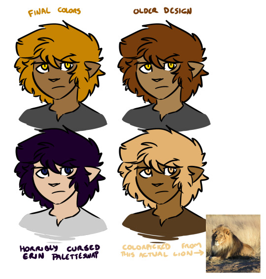
There's no right or wrong answer here (except the cursed paletteswap) and a lot of alt color schemes would look good, but the trick here is that as far as I'm concerned this matters a whole lot less than your shading and lighting.
If the colors look disjointed and weird, it's entirely possible that this is because the figures aren't matching their environment. If we were doing physical art, this would be a huge pain in the ass to fix. Fortunately, because I do digital art, I don't need to worry about all the complexities of paint mixing and underpainting and all that jazz - I can just use layer combine modes.
Suppose we want to put a character into this lovely unity asset.

If we just slap our figure on top, this isn't going to look good.

He looks like a desktop icon. We can do better. The light source in this shot is high and centralized in the frame, and it appears to be a dusty blue-white. The shadows it's casting are quite dark and stark. For now let's not worry about the color of the shadow layer - let's just draw in how we would shade this figure given this directional light. I'll use a nice light purple to start with, but we can play with this later. Benefits of digital art! Other benefit: when set on a Multiply layer, a light purple shadow immediately makes our figure look like this.
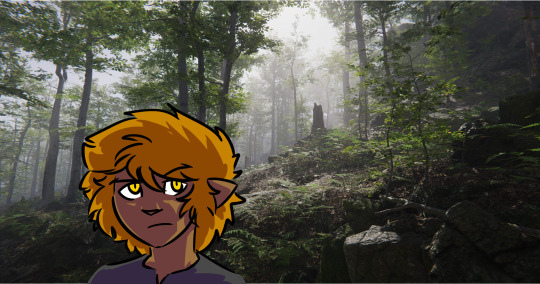
That already looks a lot better! But part of what's making this figure stand out against the environment is that the darkest points on his design are a lot darker than the background he's standing in front of, and at the same time the shadows on him are much lighter than all the shaded areas we see in the background. This is also one of the telltale visual indicators of bad VFX compositing - the light levels and black levels need to match between the different parts of the image. (there's a late episode of columbo where they use this to catch the killer!)

So, for the easiest first step, let's see what happens if we shade the figure with a dark green colorpicked from the image instead.

Immediate improvement! We've got the shadows lined up and the figure looks like he belongs in the environment. And while we could leave it as-is, I find it also helps to address the highlights as well, especially in dark environments. So I take a mid-tone gray from the light part of the image, I select the negative space of our shading layer, I fill that space on a new layer set to the Add (Glow) combine mode, I use a soft eraser to mellow out the really harsh glow that's farthest from the edges of the figure, and I blend the whole thing by 200 pixels.
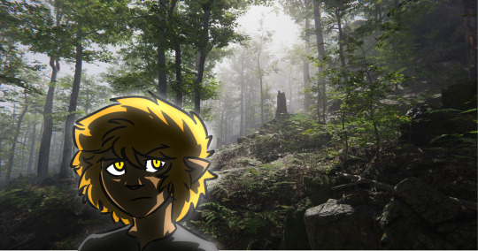
We could keep playing with this, but at this point we have a character who, regardless of underlying palette, looks like he fits in with his environment. Heck, we can even hit him with our cursed paletteswap and he still looks like he fits in the space.
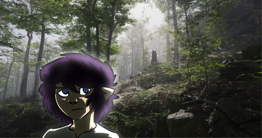
It'll work even if he's a uniform neutral gray.

So while precisely playing with color palettes is very important for certain styles of art, one huge benefit of digital art is you can just use your own freeform aesthetic sense to lock in a very basic starting palette that defines how your characters look under theoretically perfectly neutral conditions, and then you can do all the other hard work of coloring them and matching them to the space by way of shading and highlighting without ever worrying about the underlying base colors. And if you decide some part of the figure is too saturated or dim or weird or whatever, you can play with that one part until it looks good and then just update your palette with the new shade.
173 notes
·
View notes
Note
THY ✨ANON IS BACK FRON THE DEAD JAHAHAHA!
Greetings once again :D!
May I request separated Romantic headcannons with Ena and Mizuki with a Reader that's very much have learned all ways of proper etiquette and have become somehow elegant as such. Bonus if Reader is a noble and which is the reason why Reader bothered to learn etiquette anyway. Another bonus if Reader wears a royal suit or something in one of their dates 👀
I just have been reading a lot of manhwa these days, im so sorry ( ._.)
{Ena/Mizuki with a proper, noble Reader!} [R]
Heya there, ✨! Congrats on becoming the first names anon here! I don't know much about manhwa, but I hope this was enough to fit your likes!
Ena Shinonome

Let's be fair, Ena hates people with big egos. As someone who has had to work extremely hard and put a lot of effort into what she does to not receive any recognition, she does tend to resent those who believe they deserve it without the same sacrifices...
So when she hears about your noble status, it gives her a bad impression. Since she hasn't actually met any people like you before, she's fallen for a few stereotypes herself, as much as she tried to refuse it.
She was... Stunned when she first saw you. Your look wasn't standoffish, or too overbearing. However, your appearance alone established a regal atmosphere without it feeling suffocating. She was stunned...
She would take a few secret photos of you for her to have fun editing. This was a pretty rare chance, after all! She never used the regal themes much before in her edits, so this could be an interesting change of pace. She wouldn't post them without your permission, and would always block your face though!
Honestly, she was at a loss. What was she supposed to do? Was she supposed to act natural? No, that would be too offensive! Should she act formal as well? She has never been too good at it!
Before long though, she learns that you don't mind her normal attitude, as long as she keeps the condescending part to a minimum, and she sighs in relief.
She will definitely ask about how your place looks! The colors, aesthetics, textures, she wants to know it all! If you're able to show her photos, she'll spend hours staring at them to take in every single pixel! Also...
"How did you just keep your cool talking with that cashier?? She was just so rude! She didn't need to pry into our personal life with those questions! God, it's so frustrating what some people do! But... You didn't bat an eye, nor raise your tone! How...?? You're so amazing!"
You shrug it off as something you have to deal with often, and get used to, and Ena seriously questions the implications that you and others of the group may not be so different...
Offer her lessons in proper manners, it could go a long way! Ena isn't the type to mince her words, so this could help her a lot to stay out of trouble...
All in all, meeting you and spending time with you would be an enlightening experience for her, to learn and to explore a side of the world she knew little about! And with you by her side, she could work on some positive attitudes for a change!
Mizuki Akiyama

Mizuki knows that acting the way they do isn't the most pleasing for any stranger, so they have learnt about how to act respectfully and properly, even think it may not seem like it!
That's why they were a bit stiff when first meeting you, making sure you didn't mind their normal attitude, before relaxing once you tell them that it's fine, that they didn't need to force it too much.
They will still treat you a bit special, teasing you less and being generally more respectful altogether! It's... Weird. Their usual energy still shines through, and it's evident that they aren't acting as before.
If any of your clothes need a small touch up, they will jump at the opportunity and help you! They will be a bit nervous working with such precious materials, but their talent is unmatched!
They will also host small dress up sessions in your house with all of the clothes you don't use much. They look like they're having so much fun... These clothes are so rare after all!
However, they're taken by surprise when you tell them to try some out. It's... A shock! Mizuki, wearing regal clothes! Well, don't mind them as the session doubles in length and noise with them squealing and getting excited!
Since then, they've fully loosened up and now treat you like anyone else! Teasing you, trying to crack your respectful demeanor, taking cover behind you when someone else (Ena, usually) starts to criticize their behavior...
It becomes a test of sorts, as you try to endure either the urge to shut them up or to laugh at their behavior, although you will laugh more when out of the public's eye. It's such a weird experience, unique of such a person like them!
"Waaaah, why is Ena so meaaaan?? The only thing I wanted was to ridicule her by showing how much editing her selfies went through before being posted! I mean, three hours?? SERIOUSLY?? And she says that I'm the unreasonable one! Waaaahhh... You're on my side, riiiight??"
They do know when to tone it down though, and when they notice that you're tired or simply not having any of it, they return to a more passive attitude, even showing a respectful front instead of you at times!
All in all, they will flip your life upside down, so long as you stay by their side! Everything becomes lighter and brighter next to them, letting you lower your guard with no fear of needing it on, thanks to the casual environments! Just make sure to remain by their side... You're a pillar of strength, even if you don't realize it.
#project sekai#project sekai headcanons#project sekai imagines#project sekai x reader#prsk#prsk x reader#pjsekai#pjsekai x reader#pjsk#pjsk x reader#ena shinonome#ena shinonome x reader#shinonome ena#shinonome ena x reader#mizuki akiyama#mizuki akiyama x reader#akiyama mizuki#akiyama mizuki x reader#/cawcanons#/✨anon!
46 notes
·
View notes
Text
And I've now watched all 8 available episodes of Sonic Prime! I'll probably make a fuller opinions post once it's properly over, but feelings so far are leaning towards generally positive but with a good amount of eh.
It's really nice to look at and has a very good and constant sense of fun, but I'm finding that they've kind of intentionally regressed Sonic as a character in order to justify the "development" he's getting. I still feel like they channel his core appeal well a lot of the time but the more under-the-surface aspects of his character are definitely neutered.
The early episodes also playing out rather achronologically and just inserting flashbacks onto the initial setting is weird, makes it kinda hard to take in the core version of the setting we're supposed to be saving. Ideally they'd all play out in proper order before getting into the shatterverse stuff, would just make the beginning flow a little better.
I don't think I love any of the three shatterverses we've dealt in so far. New animated Sonic series dealing in a premise as generic as "alternate universe but they're all X" is just kinda tame, and the jungle area in particular was pretty boring lol. I do enjoy New Yoke though, and I think it works well as kind of the primary setting. The alternate versions of our core cast aren't exactly great most of the time but I find those from New Yoke and especially Nine to be actually pretty compelling.
It's very weird that SEGA are doing their whole unifying the canon thing and all the showrunners are calling Prime canon and yet even despite that it's got like, just weird inconsistencies? Knuckles' and Sonic's first meeting flashback for example (the pixel art in those scenes is really bad btw lol) just like, isn't it lol. And the whole Green Hill being the entire setting thing. This is a very weird element of the show.
I quite enjoy the voice cast! Knuckles having a New Yorker accent is weird and it's pretty impossible to beat Mike Pollock Eggman, but everyone otherwise sounds great! I'd lowkey honestly take this Shadow over Kirk Thornton lol.
I think from the way the early episodes played out I kind of expected the show to follow a very rigid structure of X episodes in every shatterverse doing the usual so it's nice that even this early in the total runtime we're subverting that and mixing shatterverses and all that stuff. Gives the narrative stronger weight.
I don't know if I have any other particular thoughts at this present moment. Certainly glad it's releasing in batches lol, way less of a grind to keep up. Yeah uh, gamer.
4 notes
·
View notes
Text
my deductions for the current case (file. 1094-1096): the writer is the original bomber who bombed those two other hotels, but the bellboy is the one who sent out the current cipher.

it's suspicious that the writer immediately assumes the cipher left in his room is someone "pretending to be that serial bomber". firstly, civilians aren't supposed to have access to the ciphers; sera got her hands on the first one by hacking into the phone of the hotel staff who had leaked it online. so how would this writer guy even connect this random weird note with the serial bomber's ciphers? but, say that this guy saw the leak before it was removed. then, it's even stranger that he immediately assumes that this is a copycat or a prank rather than the real thing. the explanation may be that he is, in fact, the original bomber, and therefore immediately dismisses the cipher as a fake without even thinking about it.

the phone call from the "bomber" could definitely have been prerecorded. as we see, the bellboy's interjection is the only one that the caller responded to, while conan's question gets completely ignored. while it can just be the caller not wanting to answer questions, this may well be a ploy by the bellboy to give himself an alibi. if he just pretends to be imploring the bomber to stop and includes a "response" in the recording with corresponding timing, then it'll seem like the caller is someone else, calling from within the hotel.
the fact that with the two previous bombings, the hotels were both told to send their answer to the ciphers to an email address, while this time it is a phone call, is also a sign that these could be two different culprits.

when eri asks the bellboy if the layouts of sera's and the writer's rooms are the same (right panel), he responds that yes, everything is the same, even the location of the humidifier (left panel). however, the humidifier had only been moved into the room after the writer demanded it at check-in. if the bellboy truly hasn't entered the writer's room at all like he claims, them he should not be able to know that the humidifier is in the same location as in sera's room, because the humidifier is placed at an angle that's fully unable to be seen from the doorway. rookie mistake there, mr. bellboy

the writer's panic when conan nearly pressed the enter key on his keyboard might indicate something about his previous method of detonation, or it might just be a writer's panic at someone possibly messing up his draft lol (moves one image two pixels left in word doc, two dead fifteen injured seven new pages created) or, maybe the draft pulled up on his computer is a fake, and he's a fraud of an author as well as a serial bomber lol who knows
but everyone's "!" reaction mean that they probably got a clue to solving the cipher from that. something about keyboards? i've never been one for ciphers, so i'll just leave that one alone and wait for the reveal next chapter lol

these three being so cavalier and cheery about it makes me think that the bomb threat is fully fake this time, and there's no bomb at all. i can't figure out what the bellboy's motive might be though.
also...eri feels weirdly out of character this chapter, especially the beginning scenes. at this point, i can't tell if it's just the way gosho's writing has been going nowadays (sacrificing character personalities in favor of cheap comedy), or if it's actually indicative of something. also, she's not wearing her wedding ring…and one of the possible rooms they keep mentioning is room 1412…

i'm a bit [eye emoji]
#file 1094#file 1095#detective conan spoilers#conan reread#i don't want to be that person who's like 'tHis ChARaCtEr is AcTuaLLy VerMoUtH' but...#hmmmmmm#detective conan#detective conan theories#kisaki eri#but if she's finally truly divorcing kogorou i am all for it#even though we know that's never gonna happen lol
9 notes
·
View notes
Note
Please teach me the ways of visually appealing linart, that literally looks so good! ToT
DISCLAIMER: I HAVE NO EDUCATION ON THIS SUBJECT WHATSOEVER AND HAVE NO IDEA WHAT I'M DOING. ♥ I'm sorry this is so long! OTL
I put a lot of focus on just getting the bare, thin lines down first so I know where everything goes and can fix up any little tangents* as I go. After that, I go over certain spots thickening those lines up to give stuff a bit more clarity.
It's pretty obvious looking at my lined doodles that I really like the "slap a thicker border on it" look, but that's actually the part I do last. First I look for specific places to change the line width and go nuts until I'm happy with it. Here are some tips that you should probably disregard because I have no idea what I'm doing. I'm assuming you're working raster (pixels) rather than vector (math), because vector is a whole other monster.
Don't get crowded. If you need to zoom in to pixel-perfect your lines, you're too close. If you need to zoom in to see the gaps between any of your lines, they're too close. Fine lines are all well and good, but with fine lines comes busy eyestrain if you aren't hyper-aware of leaving enough space between them.
No, really. Zoom out. If you can, try to keep a cloned window open off to the side with your work zoomed out to fit, or just zoom out frequently. It'll help you spot problem areas, such as when lines intersect at a weird angle (see next point) and make eye-drawing dark spots, or when a line is too thin to be seen at all.
*Avoid tangents as you go. Schweizercomics has a post about tangents here. It's focused on panel composition, but very much applies to lines too! Tweaking your lines ever so slightly as you work to minimize the impact of those problem areas is really helpful with making your lines look less cluttered and (IMO) more appealing.
Thick part, thick line (and vice-versa). If something is thin and fine or hit by a lot of light, I leave the lines thin. In contrast I often put thicker lines on the bottoms or thickest/heaviest parts of shapes or where shadows would fall. No hard and fast rule to this one, sometimes it just looks nicer and I have no idea why.
Front and back. When objects pass over others (foreground vs background, arm over face, etc) I usually make the lines a bit thicker where they cross over each other to make the separation more distinct. Usually on the front object, but sometimes if it's a smaller object I'll thicken the back instead. It helps me to differentiate object depth a bit since I have trouble visualizing anything even remotely involving depth or 3D.
Every detail doesn't need its own set of lines, especially if you're coloring afterwards. Hatching in a shadowed area? Go solid so it's less busy. Markings or vitiligo? Don't be afraid to put light lines down to get your bearings and erase them once you've got everything set up! If something looks busy, try getting rid of the finicky bits or allude to them elsewhere. And remember: The area surrounding a shape shows its form just as much as the outline itself!!
A stupid little thing and an extension of the previous point: Specifically when objects are sitting on a hard surface, I thin out the line a little bit towards the middle of the line to simulate the point of contact (without compromising the line itself by drawing little bumps or squishes).
Oh god, this is getting so long and I'm supposed to be in D&D.
OTL
6 notes
·
View notes
Text
Yep
Honestly I enjoy pixelated stuff and things with cartoon graphics way more.
Like there's some games I love that have a realistic style like darksouls and mordhau, but those aren't trying to be photo realistic but to match their setting and style. Mordhau is a game where you see your enemies face for a few seconds in a fight at best so the face animations and looks are kinda crap, but the mechanics and look of the weapons and armors are great!
Darksouls and even the newer Titels aren't photo realistic or anything but put emphasis on the things you're supposed to see! Some areas might be a bit blurier but only because they're next to something that's supposed to stand out, or because it's in the distance and if you go out of bound and Onl then realize it was just a cardboard cutout then that's your fault.
Dunno if this made any sense, I'm not a game developer but it's what I personally feel.
And then there's the games that don't have any sort of realistic graphics. Hollowknight and cupgead being hand drawn in unique cartoon styles that feel genuine and fit their tone perfectly. Sundered astroneer and many others are flashy and colour full. And subnautica and satisfactory with their 3D rendered semi realism that gives you just the right amount of real to put you in that situation and enough unreal to make the weird and quirky things feel at home.
So yeah, realism isn't always bad nor always good, you should just know when you need it and when you don't and how to use it. I don't need fish reacting and swimming a way from me in calm of duty, or Grass that moves in the perfectly simulated wind, I need a gokf game play feeling and a surrounding that supports the mechanics of the game.
what is your most controversial video game hot take? 🎮🎮🎮
334K notes
·
View notes