#those little color by number apps help too if you want to add number values in
Explore tagged Tumblr posts
Text
... i... i need to contribute my fucked up system for shaking off writer's block but i feel like people are gonna hate it...
under a read more for feral adhd wrangling that looks one hell of a lot like OCD
STEP ONE: assign letter value to your project. slap that letter on the front of whatever folder you're keeping it in.
STEP TWO: that thing you got distracted by? book/ebook/video game/tv show/movie? figure out how to extract letter values from it. a line of dialogue starts with a letter that matches a project? whoop, stop right there, can't progress until you write a character/word/sentence/whole scene/you can slap that fucker up for reading, however little you need to keep moving, however much you need if you get on a roll. first letter of a page, first letter of a title or subtitle or episode title, first letter of a name of a character in that one phone RPG you keep playing who you just got the drops to upgrade, whatever works
STEP THREE: record overflow of whatever you're doing, all the letter values that didn't slot in. this is when you start making release valve projects with THOSE letters
no, hear me out--sometimes you are trying to write something tense, or dark, or violent... but in your heart, you had a tense and shitty day and while you can jot down words for how that feels as a form of keeping that feeling fresh, what you actually want to experience right that second is the warmest and fuzziest fluff you can think of, stuff that would NEVER fly in that first project. that is your release valve, and you need it because that writer's block is actually sometimes a feral idea that is blocking your mental pipes and will not leave until it can clamp down on your brain. do not listen to the cringe, the shame, the quality control in your brain. write the thing and do what you will with it after
shit, this whole blog is a release valve for me for when i want to be going over amazing ideas with close friends but no actually what i want is diving into random reblog threads and conversations and drop my masking so as to prevent severe fuckin burnout
anyway
STEP FOUR: binge that thing you've been meaning to catch up on. go on. do it. fill that overflow file
harvest the letters
feed them to the feral word beasts
they only bite when you love them
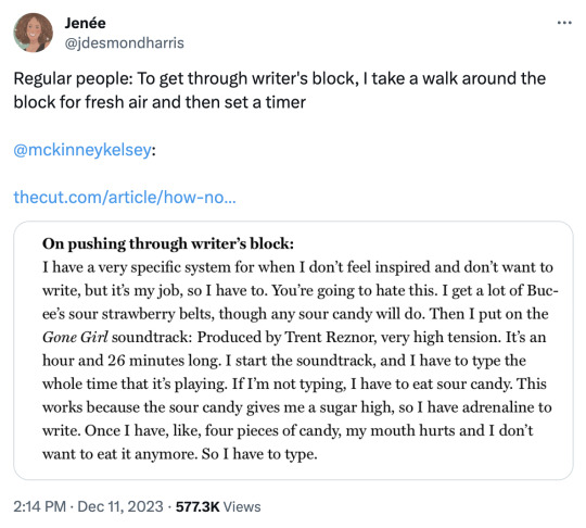

(tweet 1) (tweet 2) (article)
#i am entirely aware of how this sounds#but this is how i get to play video games and read new shit without Capitalist Guilt gnawing at me about not being productive#those little color by number apps help too if you want to add number values in
70K notes
·
View notes
Text
Top 10 Must Have Android Apps which I use daily.
Productivity Apps
1. Solid Explorer File Manager. [Free & Paid] 🔐http://neatbytes.com/solidexplorer/
Playstore – https://play.google.com/store/apps/details?id=pl.solidexplorer2
PlayStore Rating 4.4 / 5
Best Features
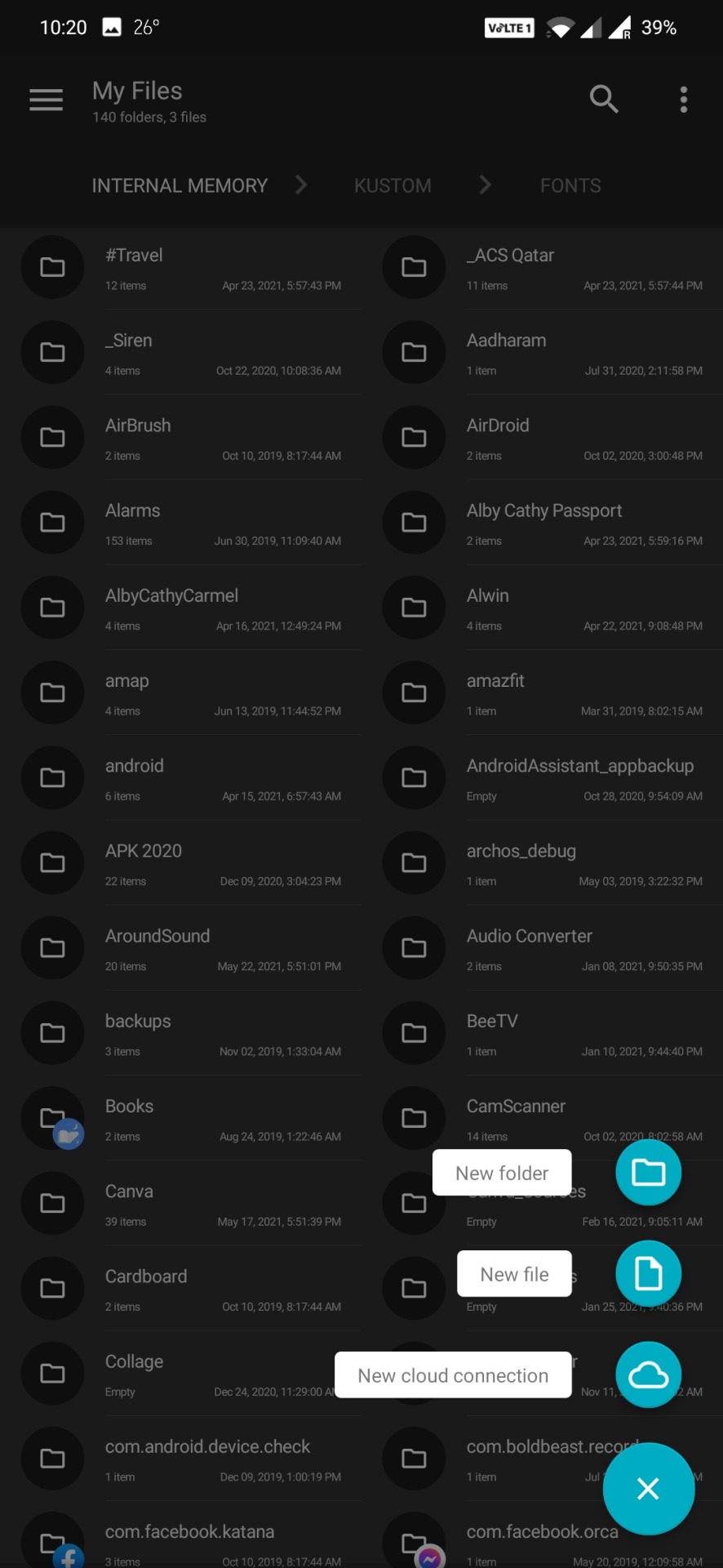
Best Features
Solid Explorer covers almost all of the beats you’d expect from a file manager nearly flawlessly. Collections allow you to view all of your photos, music, and videos in one place. You can connect your cloud storage accounts like Dropbox to manage your files remotely. It also has support for remote access protocols like FTP and you can even use it as a root file manager. Even for advanced users, it packs a punch.
On top of all this, it’s also gorgeous. While most file managers have a design stuck somewhere between 2009 and the stone age, Solid Explorer makes it a priority to adhere to Google’s Material Design spec. You can also customize your themes and colors and even choose between light and dark themes, because there’s really no reason a file manager should blind you.
Improvements required areas
While we prefer to choose a free app when we can, Solid Explorer doesn’t fall into that camp. You can try it for free for two weeks, but after that, you’ll have to shell out $2 to keep using it. On top of that, the company also charges for some plugins like Mega, and even offers additional icon packs for more money. This is annoying, but most of the add-ons are either free or optional. The upside is that you at least know where Solid Explorer is getting its money from. Since our last pick was pulled for adding sketchy adware, we’ll call this a mixed blessing, rather than an outright negative.
The Competition.
The free version of ES File Explorer may have lost our recommendation, but if you don’t want to say goodbye, you should at least check out ES File Explorer Pro. For a small amount, all of the embedded app “suggestions” and junkware are removed, and there are no ads. It still has all the bells and whistles we used to like, including remote file access, ZIP support, and an app manager. Of course, most of those same features are in Solid Explorer for a dollar less.
2. Safe In Cloud Pro [Password Manager] [Free & Paid] 🏅
https://safe-in-cloud.com/en/
Playstore – https://play.google.com/store/apps/details?id=com.safeincloud.free
PlayStore Rating 4.8 / 5
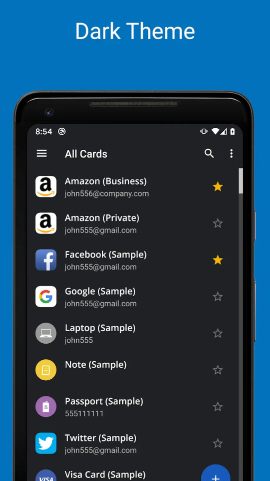
Features and utilities
Despite being free for desktops and very competitively-priced for mobile devices, SafeInCloud still offers a great selection of extra features. For starters, it can be used to store passwords, but also to remember credit card numbers, ID details, and pretty much any other sensitive information. These can be added fast and efficiently with one of the built-in templates.
SafeInCloud also features a powerful password generator and strength analysis tool. In short, this assesses the strength and estimated crack time for each password, flagging those that are too weak.
The program is also compatible with Apple Watch and Android Wear smartwatches. Browser extensions are available to streamline web use and provide autofill functionality, and you can even import existing data from other programs to the desktop app.
Interface and performance
SafeInCloud works with a Windows 10 laptop and the Google Chrome browser extension. The desktop interface is somewhat outdated, but it remains simple and intuitive. Important options are available across the top of the window, passwords and accounts are listed in the center, and different password/information categories can be accessed via the panel on the left of screen.
When it comes to performance, SafeInCloud is great, and adding a new password is extremely easy. Simply type the website, username/email address, and password into the app and hit enter. Login details for saved websites can then be filled with a single click on the browser extension.
3. Soul Browser [Free & Paid] – A little gem you’ve probably never heard of .. 🥇Playstore – https://play.google.com/store/apps/details?id=com.mycompany.app.soulbrowser&hl=en_IN&gl=US
PlayStore Rating 4.5 / 5
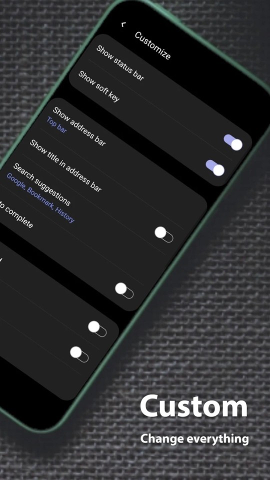
The most important thing in the browser is pleasant content viewing. To achieve this goal, Soul Browser offers a variety of features. All features are fast and powerful. Intuitively designed for ease of use. Every effort has been made to provide the unique value of the Soul Browser.Soul Browser wants to be a valuable app that has been loved for a long time. Clean Mode, Fast and Clean. Built in cleaner is optimized for the browser. The filter is updated automatically periodically. Using this browser Videos can be Downloaded, no additional software needed.
In addition to general features like pause, Powerful features such as limiting concurrent downloads and reserved downloads.
Video Player, A web player and a local file player are provided. Gesture control is possible. Various functions such as repeat play and PIP mode are provided. Powerful Incognito Mode. which help to easily protect your privacy. You can protect your personal information, such as your visit history and download history. Various locking methods are supported.
You can choose to your liking. Supports Dark Theme, Protect your eyesight. Full dark theme support. Both app UI and website are fully supported. Text To Speech Listen comfortably by voice. When you click the text displayed in the browser, it is read by voice.
You can view images on the web like a book. If you use it like a comic site, you can feel like you are reading a real book. You will have a new experience. Save all images. You can save images from the web at once. Album creation is also provided. Manage your images efficiently. If you download multiple images, you may have difficulty managing images. Using the album feature solves the problem.
TV Cast This app is TV cast-enabled. Soul Browser is a TV cast-enabled app which lets you stream your favorite entertainment from your mobile device to your TV.
Both local files and web streaming are supported. Change Font .You can change the font of web pages. You can change the font with TTF files in internal storage or SD card.
Gestures suppport, You can move pages and tabs with gestures.
4. TickTick : ToDo List Planner, Reminder & Calendar [Free & Paid] – Best Todo So Far
Playstore – https://play.google.com/store/apps/details?id=com.ticktick.task&hl=en_IN&gl=US
PlayStore Rating 4.6 / 5

Finding a to-do app that’s right for you is as much about finding an app you like as one that has the right features for the way you work. TickTick is a cross-platform and collaborative to-do app that has a few neat features suited to the Getting Things Done method of working. You can create custom task views, for example, and there’s an inbox for jotting down anything that pops into your head. Overall, TickTick is a good app, but its free version has too many restrictions to be worth using long term. There’s more room for improvement beyond beefing up the free app, as some features didn’t work as expected or were hard to find. If TickTick doesn’t quite meet your needs, try one of our two Editors’ Choices: Todoist Premium or Asana.
TickTick offers a free account, as well as a paid Premium plan that costs $2.79 per month or $27.99 per year. The Mac app lists the price as $2.99 per month, but I can confirm I was billed $2.79 via the web app.
To read the full article please visit here https://binoyanto.net
Please visit our Tech Facebook Page https://fb.com/geektalk.me/
2 notes
·
View notes
Text
The 62 2020 Movies Releases I Watched During 2020 Ranked

Like the awkward title says, I’m going to rank (and talk about) all the 2020 movies I watched in 2020. This is not meant as any empirical list of what was best, it’s ranked by what I liked the least to the most, and my main criteria is what kind of impact it had on me and/or how much I enjoyed the experience of watching it.
Little bit about myself, I went to art school for animation, then after art school I went to a community college where I studied screenwriting. Never ended up pursuing either thing professionally, but I still write screenplays in my free time and read screenwriting books and listen to screenwriting podcasts. I'm the type of person that loves special features, seeks out behind the scenes information and director interviews, and watch youtube videos analyzing films. I love film, and thinking about film and talking about film and sharing the films I like, and maybe one day making films of my own, who knows.
Ranking and reviewing 62 movies was a more ambitious and challenging task than I anticipated, I rearranged this list swapping titles back and forth so many times, and then I’d remember a movie I forgot I watched and have to add that and figure out where it ranks. I started this on January 1st and am just now ready to post it on the 17th, I was still switching rankings right up until posting this. Even looking at it now there are some kinda want to switch but I’ve accepted that this is more or less arbitrary, lol.
The more I learn about film and what goes into creating a movie the more lenient I am about them. It’s not like I’m never critical of films, but I try to consider both the good and the bad of a movie instead of thinking in a binary of films are either amazing or trash. Some of these films aren’t great, but I typically still enjoyed them to some degree. Except Mulan, lol. I’m sorry Mulan. Speaking of Mulan...

62. Mulan
I'm going to try to say something nice about all these movies even if I didn't like them at all. So... I like the cast, and there are some nice visual moments. I actually was looking forward to this movie before reviews started coming out, it has 2 of the martial arts G.O.A.T.s in it, Donnie Yen and Jet Li, and also Jason Lee as the bad guy, so I figured it might at the very least have some decent action, but they were all underutilized. There’s not a single moment in the film where I felt anything at all. I think all these Disney live-action remakes are doing is making a case for how effective animation is for storytelling.
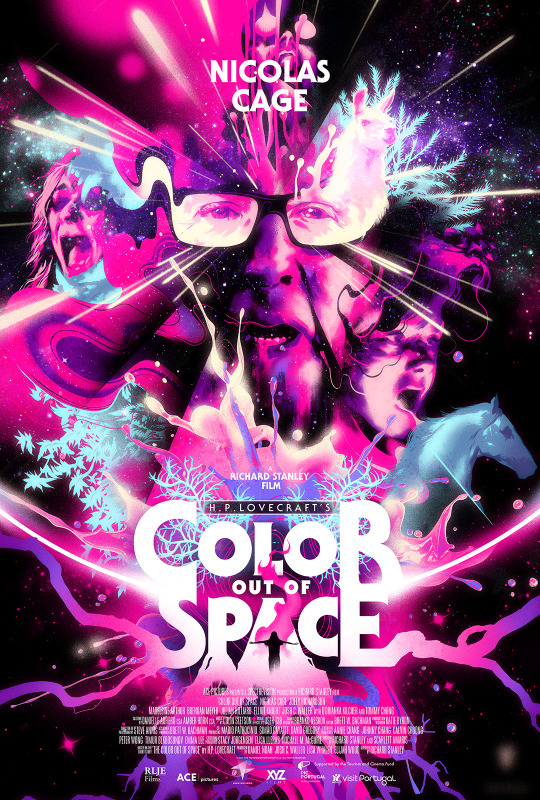
61. Color Out of Space
I heard a lot of good things about this movie, and it’s really cool visually, and I love Nicolas Cage always, but I really couldn’t get into it. I guess my main issue is that it starts off already too campy for any of to the Lovecraftian horror to really hit. It felt like a B-movie with great production value, and maybe that’s what they were going for? I really wanted to like this but I really just did not feel invested in anything going on, did not relate to anyone in the family, so I don’t think I got much out of it besides the cool visuals.
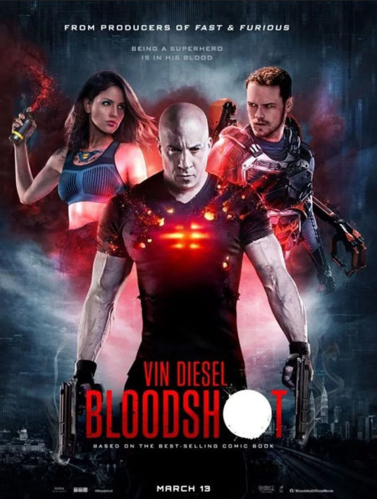
60. Bloodshot
I think the main flaw of this movie is that is that Vin Diesel was a producer on it, and Vin Diesel should be kept away from making creative decisions on movies. How Did This Get Made did a great podcast episode on this movie. It’s absolute nonsense, it has a couple of cool sequences and special effects in it, and Lamorne with a British accent is great, he’s the main redeeming value of this movie.
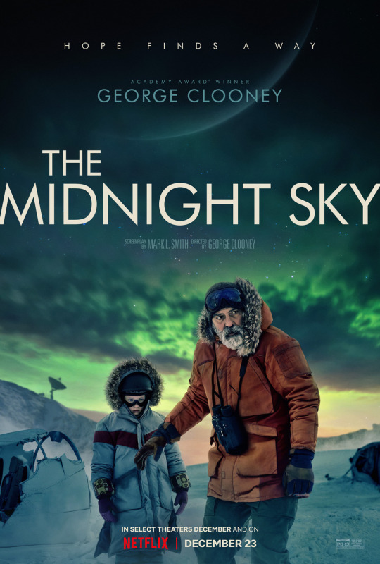
59. The Midnight Sky
It seems like this movie wants to be Interstellar, it’s structured in a very similar way, but it just didn’t quite have that same emotional punch. It looks very good, it’s well-acted, it has it’s moments.

58. The New Mutants
It's not as much of a trainwreck as people make it out to be in my opinion, I think the cast is good and it has some good character interactions, but it mostly suffers from the fact that it's way too predictable, from the beginning you're way ahead of the characters, and it doesn't help that they're in this confined setting so there's not a lot for them to actually do. But I appreciate the attempt at using mutants to do a horror breakfast club thing, good concept.
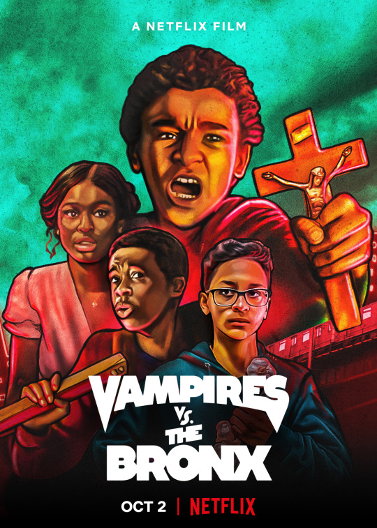
57. Vampires vs The Bronx
Vampires as a gentrifiers taking over the hood, great idea. Mero is in it, the brand is brolic. It was a fun set up, but it was neither funny enough or scary enough in my opinion. The vampires die so easily it's like okay whatever. It's like a really long Goosebumps episode.
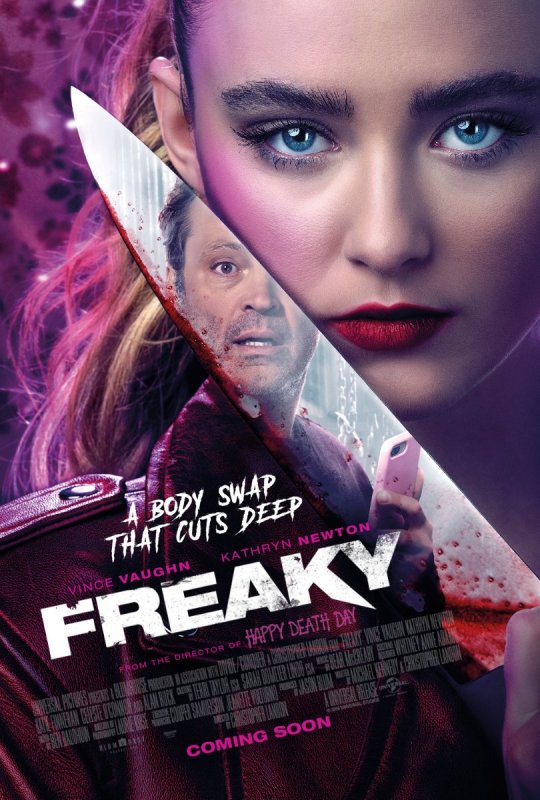
56. Freaky
I don't think the execution lived up to the great concept, but Vince Vaughan was really great in those sincere moments playing a teenage girl. Horror fans will appreciate the gory kills. I'm not going to spoil anything but I do think there are some narrative issues that keep this from being stronger than it could've been. If you made the killer a creepy janitor at the school or even one of the teachers, then I think that would've created more interesting situations.
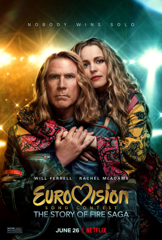
55. Eurovision
I love Will Ferrell, I even love some of his flops like Casa De Mi Padre and Kicking and Screaming, and even the House I think had a lot of really funny moments. This was definitely one of the least funny movies he's done to me. I think the director David Dobkin couldn't commit to being silly the way Adam McKay can cause there's a lot of this movie that just has no jokes, and the movie is over 2 hours long which isn't normal for comedies so you spend a lot of time watching unfunny scenes and extended musical numbers.
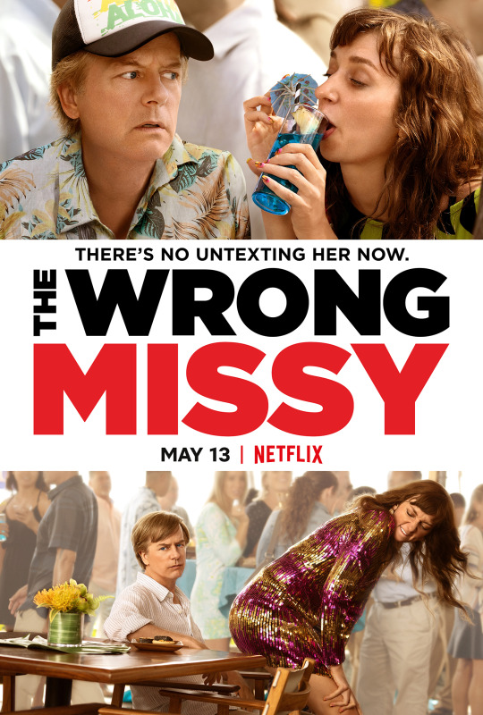
54. The Wrong Missy
I'm not a big fan of most Happy Madison movies, the jokes are very hit or miss for me. I'm a big fan of Lauren Lapkus though so I watched it to support her, and she plays an absolute psycho in this. It's so over the top it's like this character is not a human being, but I have to admit there are a few moments where she made me laugh pretty loud. I'd never watch this movie again, but maybe I'd look up certain parts on youtube.
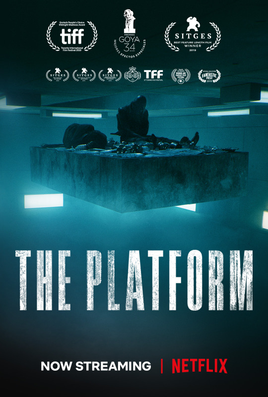
53. The Platform
High concept dystopian sci-fi horror. Reminds me of the Cube. It's one of those things that makes you think about what you'd do in the same situation. It's a very on the nose allegory, so by the end of it my only takeaway was "Yeah, it really be like that."
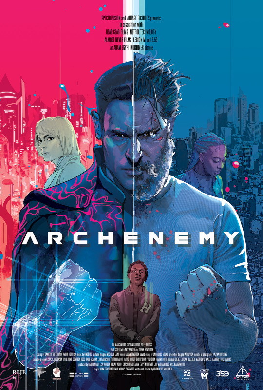
52. Archenemy
Another high concept movie. Joe Mangienello is good in it, but Glenn Howerton and Paul Scheer are my favorite parts of the movie, it's fun to see comedy actors play bad guys. My main problem with the movie was that I did not find the teen character to be interesting or relatable at all, in fact he can be kind of obnoxious. In his introductory scene he's REALLY bothering this random guy minding his own business, not respecting his boundaries at all. Then the rest of the movie is about him exploiting a homeless man and being really pushy for likes on some app, and he doesn't really have a character arc. Also wasn't a big fan of the animated sequences but I forgive that knowing this was a low budget movie and those sequences were done by a team of just 3 people.
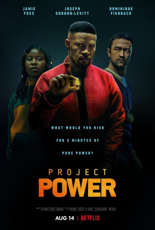
51. Power
Jamie Foxx is great. I think he makes almost anything he's in watchable to some degree. The idea of this movie is fun but I think the action sequences are kinda underwhelming, but Jamie makes it worth watching in my opinion.
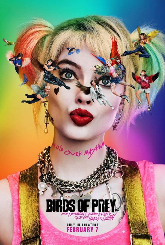
50. Birds of Prey
This movie was all style and absolutely no substance. When your main character doesn't have a solid purpose or goal you're really just watching shit happen, and that can be okay if the shit that's happening is occassionally fun or funny, but it doesn't really make for a memorable story in my opinion.

49. Wonder Woman 84
The most panned movie of 2020 maybe? It's got flaws for sure and some narrative choices I just can't understand why they made. It has some fun performances though and I ultimately appreciated that our superhero wins not by using her fists but by appealing to goodness. I feel like you rarely see that kind of idealism any more. It may not be realistic but I think that's one of the things fantasy is good for, showing us a way things could be better to strive for. But yeah, the Steve Trevor things was fucking weird, why'd they do that? And neither Steve or Diana seem concerned with about this random guy's fate. I'd probably rate this film higher if they had Steve simply appear out of thin air, I mean why not? It's magic. But I loved Kristen Wig and Pedro Pascal in this. Pedro is performing with his whole body, did he film this after season 1 of the Mandolorian? Maybe being under that helmet for a season made him want to be really expressive. The films overall kinda campy but I didn't necessarily mind that.
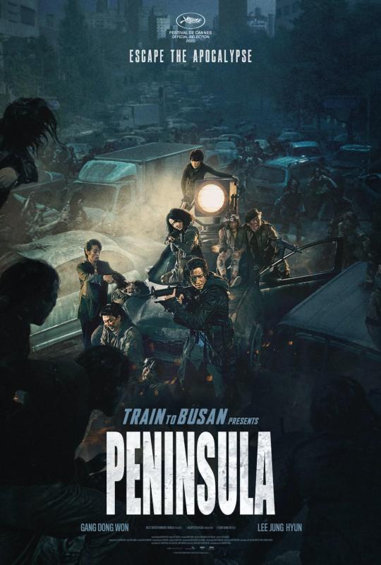
48. Peninsula
Sequel to the already classic Train to Busan, this film decides the up the scale, which is what sequels often do, but I think it was a mistake in this instance. This is more of an over the top action movie than a character-driven horror film like the first. There's a climactic Mad Max-esque car chase scene that is almost entirely CGI. I don't think it was a bad movie, it's an okay popcorn flick, but it definitely doesn't live up to the original.
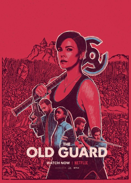
47. The Old Guard
In terms of action I don't think it did anything interesting, but I like how they explored how horrific and heartbreaking it would be to be immortal. Coming to terms with your own mortality is a tough thing to do, but we often don't consider the idea that death is a blessing we take for granted.

46. Sputnik
A Russian sci-fi thriller about a young doctor being tasked with trying to figure out how to separate an alien parasite from a Cosmonaut that's returned from earth. Good performances, creepy vibe, and lots of interesting questions about ethics. It has a sort of epilogue ending with a reveal I didn't quite understand the significance to the story, but didn't take away from either. Solid.
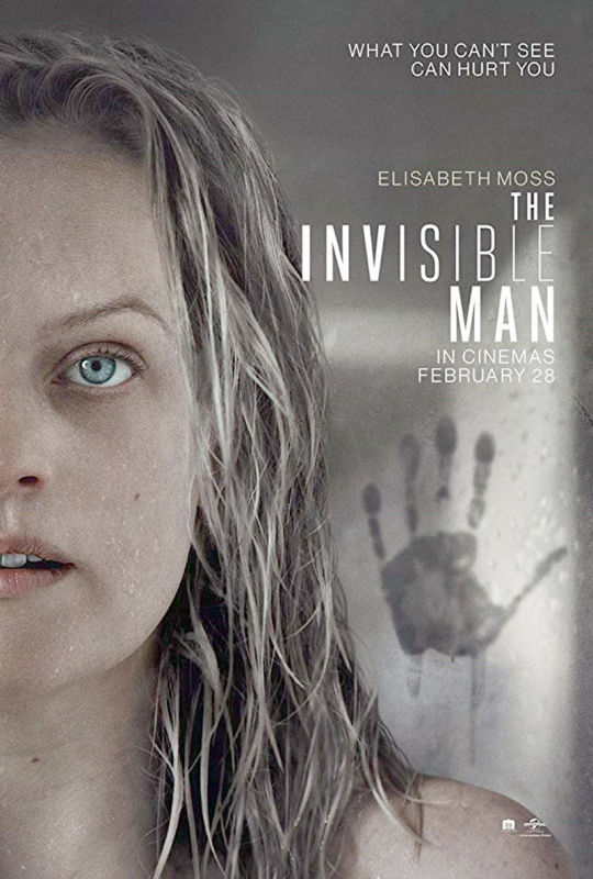
45. The Invisible Man
Fun sci-fi thriller about toxic abusive relationships and gaslighting. Elizabeth Moss is great in it and my favorite sequences are before her character actually catches on and you have moments where the camera is just focusing on a random place, very creepy and effective.
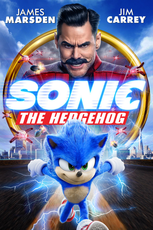
44. Sonic the Hedgehog
Personally I would've preferred a fully animated film taking place in Sonic's world. I don't know why they always feel like they need to make these movies about human characters and then spend a lot of time having to hide your CG character and having people do comical reactions to them. It feels very played out to me. BUT Jim Carrey is great in this, of course. Jim Carrey is the reason to watch this movie. He makes the movie. And it goes without saying thank God they changed that character design.
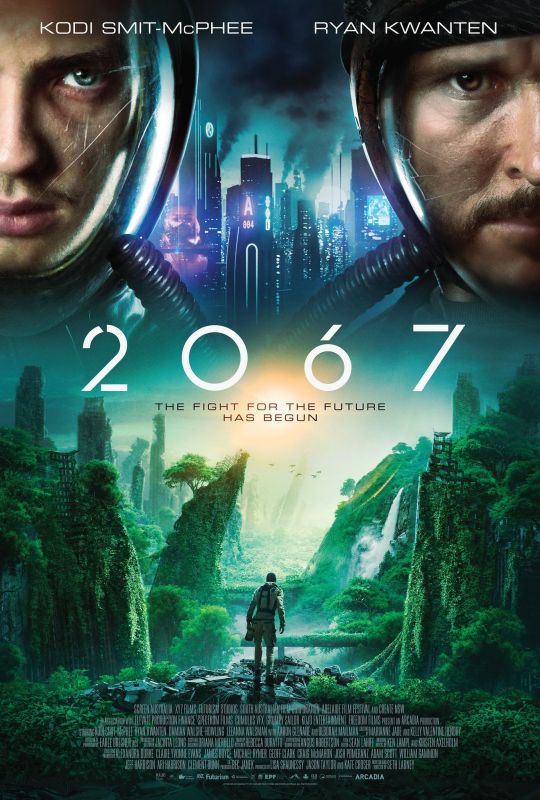
43. 2067
What I liked about this dystopian future is that the cause was basically everything. War, famine, ruining the environment, pandemics, just all our collective fuckery has resulted in a world where the human race is on the verge of extinction, plants are extinct, and oxygen is synthetic. Enter time travel, a young man is tasked with traveling into the future to bring back the solution to saving the human race. Very timely obviously. I liked it.
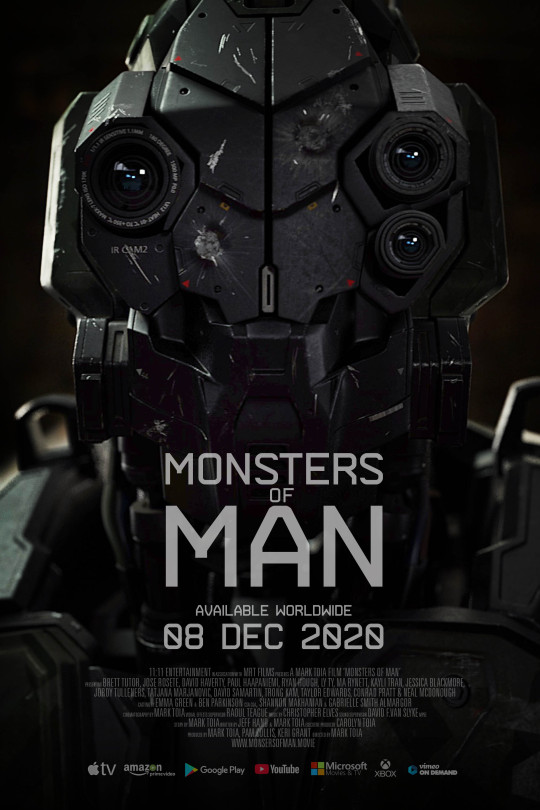
42. Monsters of Man
Some asshole tech bros let some killer robots loose on a remote southeast asian village as a trial run. It has lots of flaws but I give it some leeway because this is the first film of a guy who wrote, directed and was the cinematographer by himself, he didn't have a huge budget or much experience, so it's hard to expect perfection. My biggest criticism is that the film centers a white guy living in this village and some westerner medics, not the actual Asian people of the village. Could've been so much more of interesting commentary about racism and eurocentrism dropping these robots in a village of brown people no one will miss just for practice. That aside though I think it was a solid enough thriller and the robots looked pretty good.

41. Family Romance LLC
An interesting movie about a Japanese entrepreneur who has a business where he'll play whatever role in your life you need. Father, husband, coworker, etc there's a scene where someone even pays him to be scolded in his place by his boss. The main thrust of the film though is him playing the role of a girl's absentee father, pretends to reconnect with her and take her out on the town for activities. It's shot very documentary style, and there are a mixture of first time actors and non-actors. Sometimes there are long awkward conversations that feel just as awkward as real life. I really liked the premise, and the only thing that keeps it from being higher on my list is it doesn't have a strong enough conflict nor does it really have a satisfying conclusion.
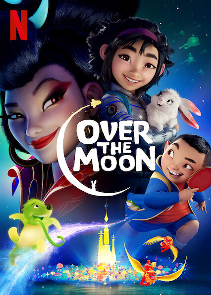
40. Over the Moon
Directorial debut of animation legend Glen Keane, I really liked this visually. It was sufficiently enjoyable, but it doesn't have that emotional gut punch that Pixar or Disney films tend to have. But I guess cartoons don't NEED to make you bawl your eyes out to be good. I think there were some missed opportunities narratively, like I guess this is spoilery so just scroll ahead if you don't want to know, but she gains a step brother that she doesn't like and doesn't want to spend time with, once the adventure starts on the Moon they get separated very early on, and don't ge reunited until towards the end, but she somehow now cares about him and considers him her brother. I didn't feel like that was really earned, they should've been together throughout the adventure getting to know each other. But I otherwise liked the story aside from that nitpick. Loved the colors of this movie, almost everything in the moon world is luminescent which provides some nice visuals. Hope to see Glen direct more in the future.
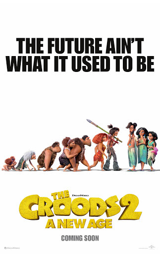
39. The Croods 2
Nothing revolutionary but it has some solid physical comedy and great voice acting. All of Nicolas Cage's overacting is perfect for animation, and I liked Peter Dinklage as Mr. Betterman as well. There's a lot going on thematically but it all works pretty cohesively.

38. #ALIVE
Another Korean zombie thriller. I really liked this because I felt like as far as zombie outbreaks go this is the most realistic scenario. Once you realize what's going on you will just stay in your house rather than risk going outside and fighting zombies. But that poses the problem of a limited supply of food and water. The main thrust of the movie is not how this character survives though it's about him trying to retain his will to live. It's the perfect pandemic isolation allegory.
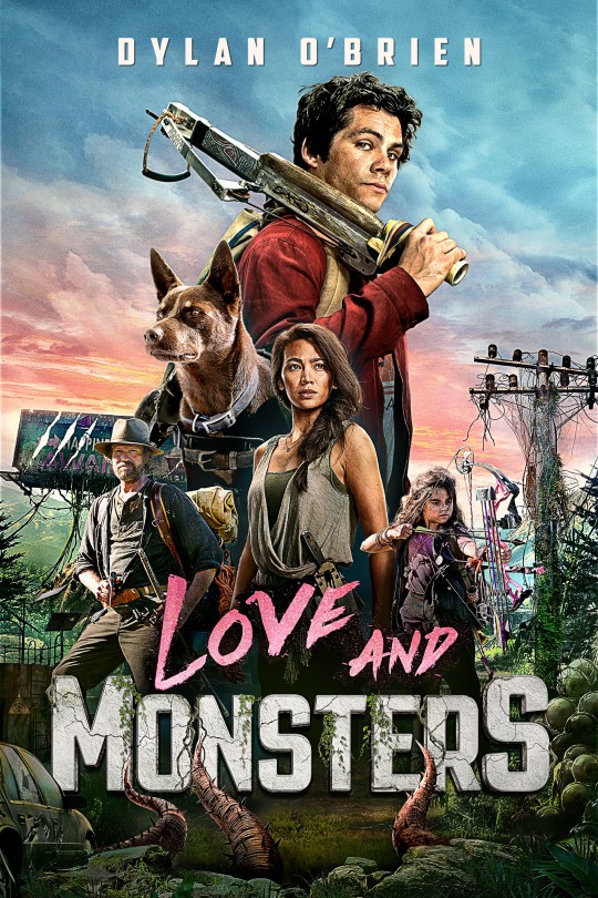
37. Love and Monsters
It looked kinda corny but I actually enjoyed this more than I thought I would. I like Dylan O'Brien, I love Tom Holland as Peter Parker but I've always felt like Dylan O'Brien would've been a great choice too, he has a good everyman relatable quality. There's also a dog in the movie that I loved. Put a dog in peril in a movie and I will be on the edge of my seat guaranteed. It's a fun movie with some interesting creatures in it and a solid character arc for our main protagonist.
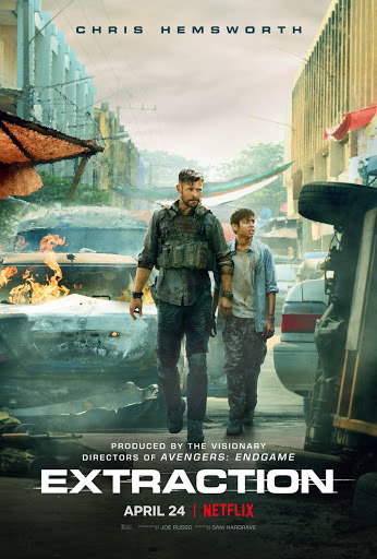
36. Extraction
I love the trend of stunt coordinators directing films. That's the main reason why the John Wick series is so good, and the reason why this also has some very solid action. Nothing crazy here in terms of story or themes, everything is an excuse for Chris Hemsworth to fuck people up and it delivers on that. There's one scene where he slaps around some kids attacking him that I found hilarious as well. Fully welcoming an Extraction 2.
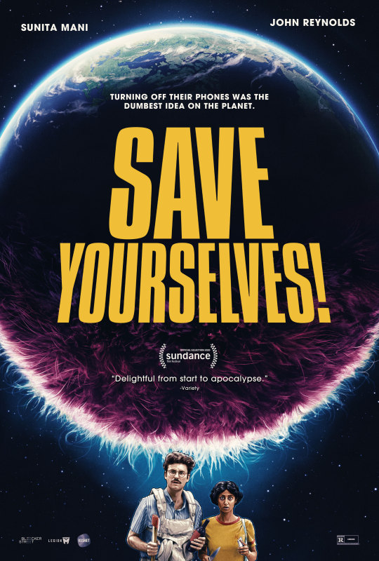
35. Save Yourselves
A couple decides to take a break from social media and get away to a cabin outside the city. While they're disconnected from the world an alien invasion occurs, furry little basketball sized poofs. This movie was pretty funny. I'm a little ambivalent about the ending but I enjoyed these hipsters arguing about what to do about aliens.
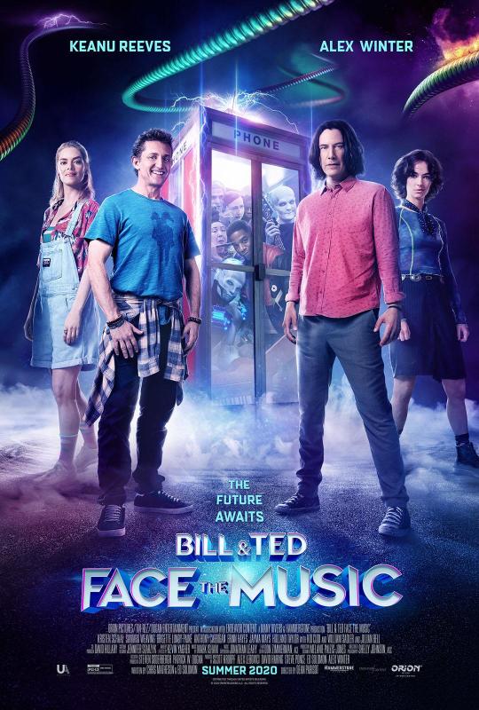
34. Bill and Ted Face the Music
A most bodacious movie. Fun gags and a robot that steals the show. It's not as good as the first 2 but I don't think that's any surprise. I think it borrows a little bit too much from the previous films, like the collecting legendary musicians thing, could've done without that. It was a fun movie though, and the daughters really worked.
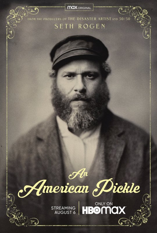
33. An American Pickle
Seth Rogen playing an orthodox Jew who's been preserved in pickle juice for 100 years and his modern day app developer grandson. I think this may be Seth Rogen's best acting role, as silly as this movie is he's kind of endearing as this character from 100 years aro, and as the grandson he's a lot more understated than he usually is in movies.

32. Tenet
Tenet! Is it controversial that this is not higher up on the list? I really like Nolan's films, actually been a fan since watching his first film Following in a film class. Nolan likes playing with time in his movies so it was inevitable that he'd do something that addresses it very directly eventually. I love the time travel genre and I think this is one of the most ambitious and unique approaches to it to ever done. I actually braved theaters to see this because I did not want to miss the opportunity to see it on the big screen. I did it as safely as possible and booked a reserved seating theater where I knew I wouldn't be sitting by anyone, had a mask, gloves, antibacterial gell on deck, sanitized my seat with wipes, etc, there only 2 other people in the theater all of us sitting way for from each other. Weirdest moviegoing experience I've ever had but glad I saw it on the big screen because the visual spectacle of this is excellent. The reason it's not higher on the list is because as conceptually cool as it is as I did not feel invested. Just on a story level having a character we know very little about pursuing a goal he knows very little about for no clearly defined reason makes it feel like... we're just watching events unfold as opposed to watching a character-driven story. There's a moment at the end that you can tell was meant to be an emotional moment, but I felt nothing. They try to introduce some emotional stakes with the female character, but idk, since it wasn't tied to the inciting incident it felt more like a b-plot than fundamental to the story. So it was a really fun cool looking puzzle, more like watching a cool Rube Goldberg machine, but not something I really thought much about after it was over.

31. Guns Akimbo
I really have been enjoying Daniel Radcliffe's post-Harry Potter career, he'll do some solid dramas he seems to prefer doing fun weird shit like Swiss Army Man, Horns, his role on Unbreakable Kimmy Schmidt, etc. This is in that vein of fun weird shit, a guy who gets guns bolted to his hands and is running around the city in a robe trying to survive essentially a real life video game. A lot of the movies lower on this list had fun concepts but were lacking in execution, but this is one that is just as fun as the idea sounds, even more fun actually, it's funny, the action is good, and there are some great visuals. I found it all around enjoyable.
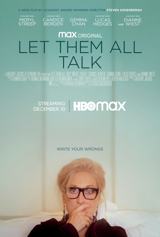
30. Let Them All Talk
Glen Close as a celebrated author who invites her nephew and 2 estranged best friends on a cruise with her. It's a very light-hearted movie with some underlying conflicts that the characters are afraid to address head on. Glen Close is great, obviously, she plays this pretentious self-important woman with affectations but is still likable and warm. It's a fairly pleasant almost slice-of-life until the 3rd act where everything comes together. To me it was a movie about communication, saying what you mean, saying what you feel, and those unspoken assumptions of what those around you are thinking or feeling about you. I know I can relate to the idea of wanting an apology from someone who might not even be cognizant of the fact that you feel slighted by them, or vice versa finding out someone's had a long standing problem with you when you thought you were cool. One sided grudges do no one any good.
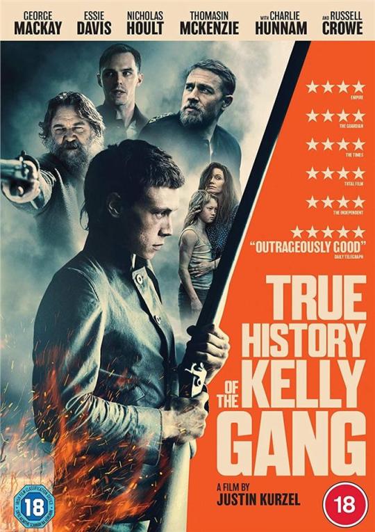
29. True History of the Kelly Gang
I've heard of Ned Kelly, but I've never seen the Heath Ledge or Mick Jagger movies about him and I don't know much about him other than he's a famous Australian outlaw and something of a folk hero to some. The performances and cinematography if this are great. George MacKay from 1917 is the lead and he's amazing, sometimes vulnerable and soft, other times a madman. It spends a lot of time in his childhood and the child actor who plays Ned is great as well. It's gritty and sometimes surreal in it's imagery. From what I can gather previous films seemed to focus more on what happened with him and his gang, while this movie seems to focuses more on everything in his life that led up to him becoming who he is and forming that gang. Like a 3rd of the movie is spent in his childhood, and once the gang is actually formed things move at a pretty brisk pace, seemingly skimming over the exploits of the gang to the conclusion. The film feels very raw and gritty and very fuck the police which I always appreciate.

28. Lucky Grandma
A stubborn grandma in New York's chinatown gets her fortunte read and is told that she's going to be very lucky and come into a fortune, she then comes into possession of a bunch of money that belongs to a gang and she decides to try to keep it feeling it's owed to her by the universe. A funny crime drama with the unlikeliest of protagonists.

27. Da 5 Bloods
Spike Lee is an icon but he can honestly be a little hit or miss for me. I don't always enjoy every choice he makes, for instance he uses real footage of war attrocities in this, and it's really upsetting to see REAL people, including children, be killed, when you're not expecting that. I understand it's meant to be upsetting, but it does make the movie something I'll probably never rewatch. Spike Lee's films to me can also feel at times heightened to the point that it feels a little cheesy (Miracle At St Anna), and there moments in this that kinda took me out of it to be honest, but overall I enjoyed it. The performances were great, Delroy Lindo in my opinion is one of the most underrated actors of all time, he's just always good no matter what he's in, everyone else in it is good too, but of course I have to mention Chadwick Boseman who was great. At the end of the day it gave me a lot to think about in terms or race, war, America, forgiveness, trauma and so many other things.

26. The Devil All The Time
There's a LOT going on in this movie, maybe a little too much, it's like 2 or 3 movies smashed into one, but... I really liked it, and that's probably because Tom Holland is so good in it. Really liked Robert Pattinson in it too. I can’t really think of more to say about it say I won’t. Next movie.
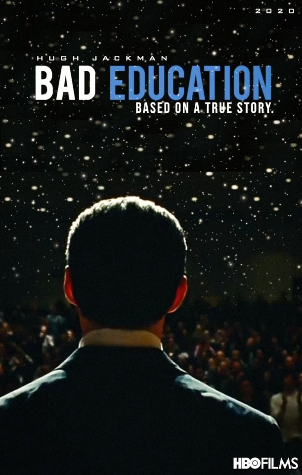
25. Bad Education
A true crime movie about school district officiala who stole from the budget of a highschool. Hugh Jackman is great in this. I loved Jackman as Wolverine, but now that he's done with that I'm excited to see him other stuff cause he's always interesting to watch; The Fountain, Prisoners, The Prestige, he's always solid. I enjoyed this, it was done with nuance, it doesn't let them off the hook for what they did but it doesn't paint them as absolute monsters either. I really have to ask myself, if I could get away with stealing money that no one would miss... I don't know, I think I'd not do it out of fear not altruism, lol.

24. My Octopus Teacher
This is a documentary on Netflix about a diver who immerses himself in the world of underwater life and documents the life of an octopus. It's really beautiful, both in terms of visuals and in content. There's not a lot to talk about because it's fairly straightforward, but it was really fascinating to learn about this octopus and see the bond they mutually formed, and again I can't talk about how great this movie looks, it's like you're in a different world. This is something I could put in and mute while I draw just for the ambiance.
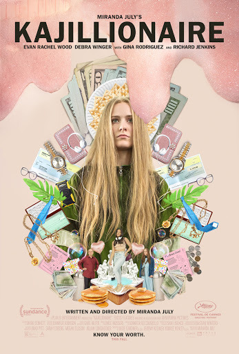
23. Kajillionaire
A quirky dramedy about a family of really obtuse poor scam artists. As absurd as their behaviour is I can totally imagine a trio of weirdos like this living in Los Angeles ( I can say that cause it's my hometown and where I lived most of my life. It's Evan Rachel Wood's best role, I never would've imagined her doing something like this but she's great as "Old Dolio". It's funny, at time sad but not in a hammy melodramatic way, and I feel it had the perfect ending.
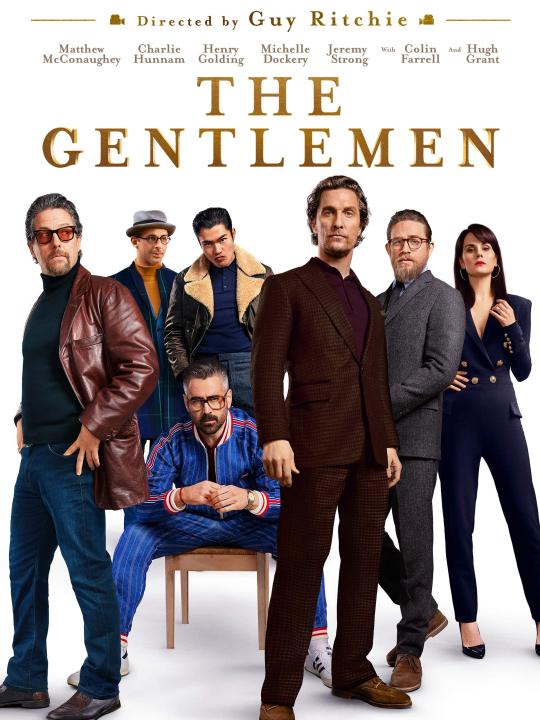
22. The Gentleman
Guy Ritchie doing what he does best. It's fun, stylish, witty, has layers and twists and reveals. Everybody's good in it. It doesn't have anything poignant to say, but it's fun to watch the entire time
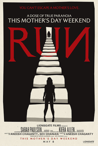
21. Run
A thriller about a wheelchair bound teen who suspects her mother is drugging her and tries to get to the bottom of it. You can tell this director is a Hitchcock fan because it definitely has that Rear Window vibe but takes it a step further, and in many ways it's even shot and paced like Hitchcock. The lead actress is actually wheelchair bound herself so it really adds to the realism of all the things she does in this film. Oh, and Sarah Paulson is the mom, when is Sarah Paulson ever not good?
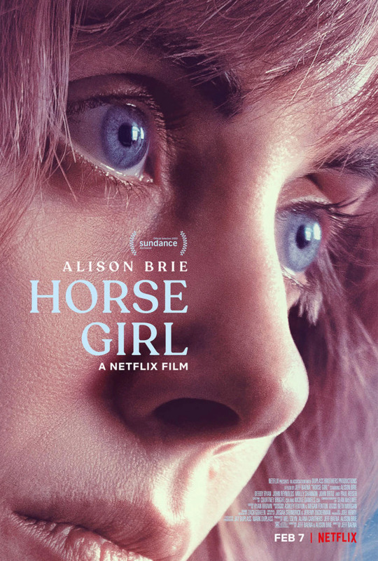
20. Horse Girl
Alison Brie is an awkward neurotic woman getting over recent grief and a history of mental illness in her family, she starts to have weird dreams and then notices people from her dreams in real life, starts blacking out and having gaps in time, and starts to believe it's due to alien abduction conspiracy. Is she losing her mind or is it really happening? Alison Brie is really really good in this, and she co-wrote it too, it has a lot of moments where you really feel sorry for her or scared for her and you start to question what's real yourself.

19. Swallow
I found this movie really fascinating, it's like what if you turned one of those My Strange Addiction episodes on TLC into a movie. It's about this woman who ostensibly, at least from appearances, has the perfect life (at least by societal standards), she came from nothing and is now housewife to a rich successful man, and behaves almost like a Stepford wife. Then develops a compulsion to swallow inedible things, like marbles and batteries and thumbtacks, which is a real condition called pica. Its the kind of movie that gives you a lot to think about but no easy answers.

18. Time to Hunt
A Korean heist thriller set in the near future. A bunch of childhood friends rob the wrong person and have an Anton Chigurh-esque killer sent after them to retrieve the money and kill them. It's a really tense cat and mouse thriller with good performances. The ending seemed to turn a lot of people off based on a lot of youtube comments I read, but I didn't mind it. My only real gripe is that they set this in the near future but aside from some imagery in the beginning it doesn't seem to come into play that much, this all could've taken place in modern day or even the past with no alteration of the story. I think the future setting was more just for some social commentary that maybe went over my head a little bit because I'm not from Korea, but I think if they were going to do near future they could've added some futuristic weapons or something. But that's just nitpicking, while the future setting didn't add to the story much it didn't take away from it either.

17. Tigertail
As I get older one of my worse fears is making decisions that I will regret for the rest of my life, so this movie really hit home as a cautionary tale. It's a kind of quietly devastating movie. There's no huge tragic horrific even, just a huge miscalculation. Decades of your life of work and unhappiness go by and all you can do is wonder what things could've been. I also especially appreciated the cinematography and music of this film.
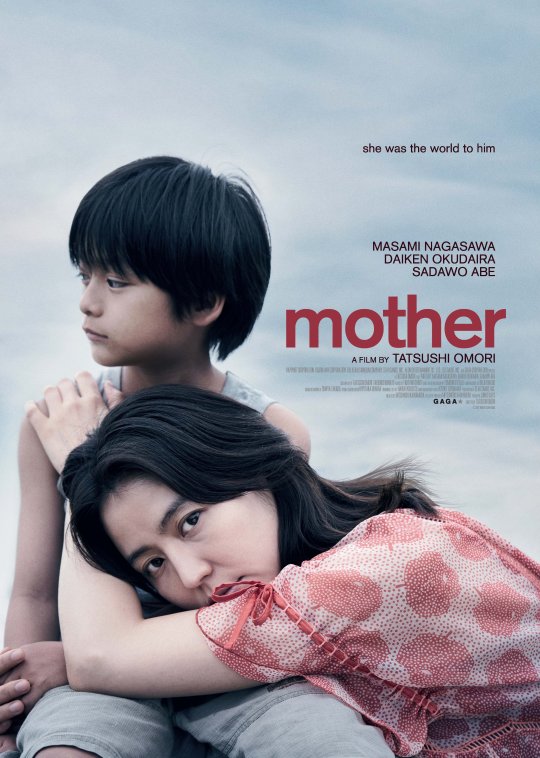
16. Mother
It's been a while since I hated a character this much, but this titular mother really pissed me off. She's a neglectful mother who only sees her son as a tool, but he sticks by her cause he loves her. It's definitely not a fun movie to watch, but it made me feel a lot and meditate on the idea of love and whether it in itself has innate value.

15. Call
I went into this movie cold, having no idea what it was really about other than that it was a thriller that revolved around a woman getting mysterious calls. I'm glad I had seen no trailers and did not know the gist of the plot becuase it went places I really was not expecting. One of the most fun thrillers I've seen in a while. So, I'm not going to talk about the movie but what I will say is that Jeon Jong-seo, who played the woman in Burning is in this, she was great in Burning and she's great in this. After watching it I googled her to see what else she's been in that I can watch and this is only her 2nd film. Apparently Burning was her first audition EVER and she BOOKED IT! Like, one a million success story right? But she deserves it cause she's great and I look forward to seeing what else she does.
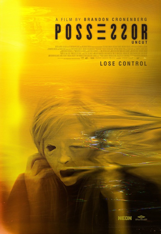
14. Possessor
This was directed by Brandon Cronenberg, the son of David Cronenberg, big shoes to fill, and I think he's going to fill them fine cause this is already a cult classic in my opinion. The visuals in this, which look like they were mainly created with practical and in camera effects. There is some very graphic very realistic violence in this. The movie is about an assassin who works for an organization and uses some type of scientific process to "possess" people to carry out hits. When she's in a body for too long who's in control starts to blur. It's really fucking trippy, like a fucked up Black Mirror episode.
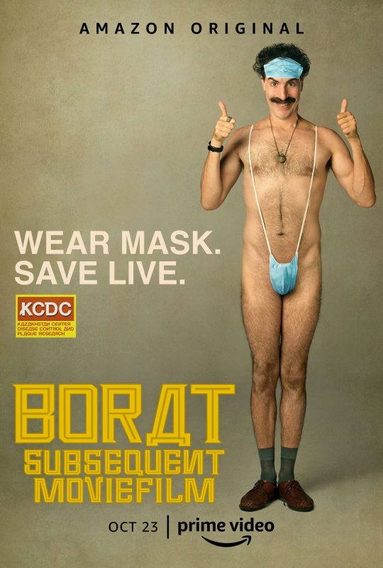
13. Borat 2
Been a fan of Sacha since the old Da Ali G Show days when Borat was just a side character. I'm amazed with out Sacha can stay in character the way he does, especially when later on in the movie he shelters in place with some Qanon conservatives with who knows how long staying in character. Maybe they'll reveal they were paid actors who knows, but whatever I fucking laughed a lot at this movie. There's a black woman in this movie that I hope to god was not an actress cause I loved her and her reactions so much. It was a breath of fresh air to watch something that's just goofy in 2020 because it wasn't a good year for comedy. As much as I love film sometimes I got a little fatigue from watching so many things with very heavy themes, this also had heavy themes it was satirizing, but also chimp pornstar jokes, so.. a fun time.

12. A Sun
A drama about a family's eldest son going to juvenile detention for his involvement in a violent crime. We see how his father, his mother, his brother and his pregnant girlfriend all deal with this. I found it very engaging. My only gripe is that there are some moments of levity where they use this really generic comedy music score it and it really takes you out of the film. No music at all is better than bad generic music. Other than that I really loved it and the ending is great. I really thought this would end up in my top 10 but the following films just had more personal relevance or were more fun to watch.
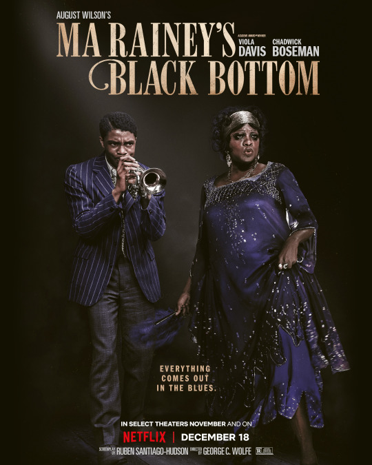
11. Ma Rainey's Black Bottom
R.I.P. Chadwick Boseman, this movie is like an acting showcase for him, he has so many great monologues here, the ending really took the wind out of me. It's also packed with really still relevant commentary on race.
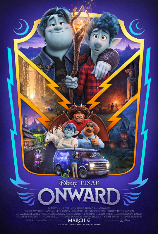
10. Onward
You already expect a Pixar movie to make you cry, but this came from angle I was NOT expecting and I bawled hard at this. This movie was so applicable to my life experience it's like they specifically engineered it to make me personally cry. Honestly there are better movies lower on this list, but movies are just like any other art, when a song touches you on a personal level it doesn't need to have complex instrumentation cause it's how it made you feel that matters.
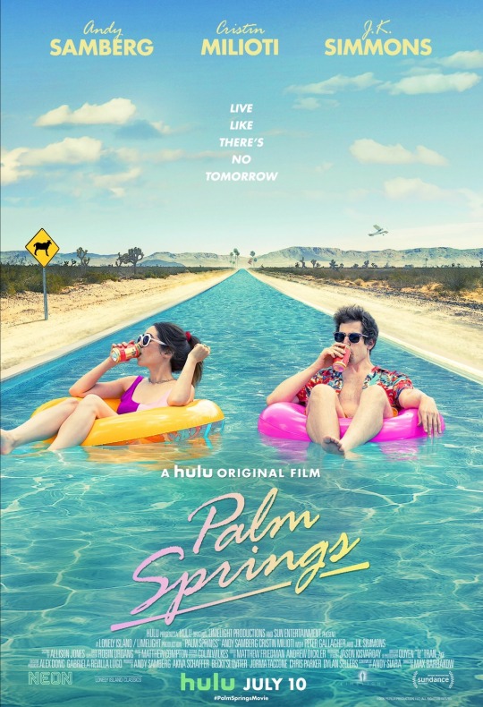
09. Palm Springs
A comedy released during a pandemic about trying to find stimulation and meaning when every day is the same thing? Ya don't say! Another take on Groundhog Day, which at this point I feel like it's its on genre with the amount of times the concept has been done, but I'm not complaining, I typically enjoy a good time loop movie (or show; Russian Doll). I don't know what else to say besides that it's really funny and Andy Samberg and Cristin Milioti are both charming and great in it.

08. Scare Me
This movie was funny, creepy, the performances were great, and it's just really unique and clever. Written, directed, produced, and starring Josh Ruben, who I know primarily does really idiosyncratic "impressions" on instagram. It's 2 people alone in a cabin telling each other scary stories, they don't cut away to the stories you just watch them act it out. 4 people in the cast, one location, and it still manages to be a fun ride of a movie and manages to touch on some good themes in the overall story. I really hope to see Josh Ruben direct more films because I think he's really creative.

07. Ride Your Wave
A romantic comedy about a woman trying to find joy and purpose in her life. I often go into movies very cold, so I didn't know much about what this movie was about, just knew that it was from an animation studio and director that I really respected. It's very beautiful, very grounded, until it's not. Kind of movie that breaks your heart so it can uplift you later.
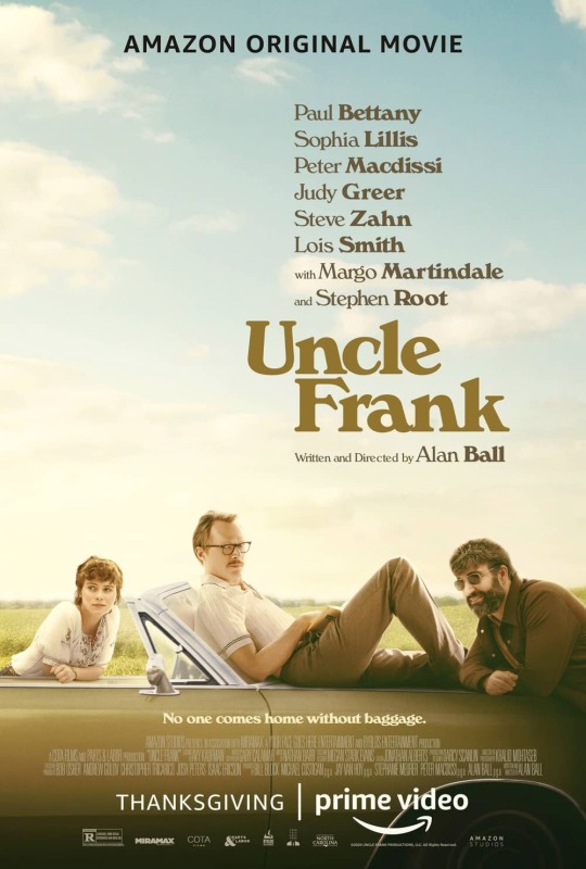
06. Uncle Frank
I really did not expect a lot from movie, not that I thought it would be bad, I just thought it be your middle of the road movie. It's about a teenage girl who really looks up to her uncle who she learns is a closeted gay man, in an era where that was potentially dangerous to be. They go on a road trip home when his father dies and learn about each other and themselves, it sounds kinda cookie cutter, but it really surprised me. Paul Bettany is so very good in this, and it made me cry. Easy way to get on high on this list is to make me cry lol.
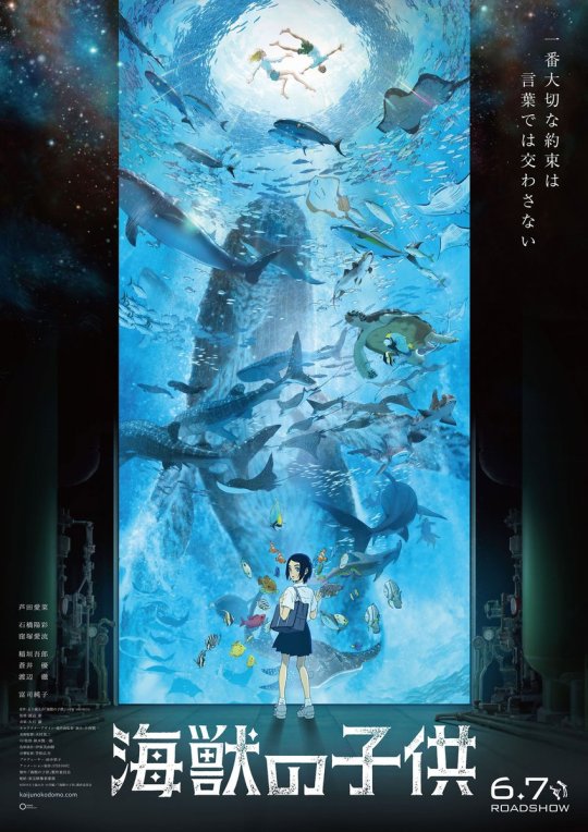
05. Children of the Sea
This film had to be in my top 5 because I'm an animation nerd and this is one of the most beautiful animated films ever. Ever. It's right up there with Akira and the Ghibli catalogue, and the works of Satoshi Kon, and all the Disney movies and everything else. It focuses on details and nuances in a really gorgeous way. The story is VERY ambiguous and gets very metaphysical towards the end, the climax is like watching an acid trip. It's about a girl who meet 2 young boys who have adapted to living underwater, and they form a bond, and then... uh... there's no way I can concisely explain it. The creator has said it's not supposed to be understood logical, instead it's supposed to be felt. There's a lot of symbolism and metaphor, it's very philosophical and explores themes of connection and the cycle of life. It's produced by Studio 4°C, which is my favorite animation studio because they really push the envelope, they're responsible for Mind Game, Tekkonkinkreet, and the recent Mutafukaz, and other, if you've never heard of any of those definitely look them up, they're unlike any anime you've ever watched before. Anyway, beautiful movie and the cryptic plot allows for you to rewatch it multiple times and take different things away from it. I can't wait to own it on blu-ray.
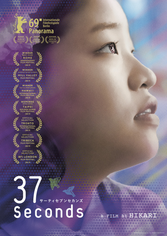
04. 37 Seconds
I saw this very early in the year and love it. It's about a young woman with cerebal palsy who is also an aspiring hentai artist trying to get laid. Her mother who takes care of her like a child smothers her, so it's not only about trying to get laid but trying to have some independence. Firstly the performance of this woman who actually does have cerebral palsy and is a first time actor is so natural and endearing, secondly there are things they portray with an uncomfortable amount of realism and awkwardness that it really draws you in to the nitty gritty of her reality and what it can be like for someone who is wheelchair bound to try to have sexual experiences. I like that there were 2 films this year about characters in wheelchairs that used unknown actresses that face the same things their characters do, it adds to the authenticity of either film. Films like this are why I think diversity in film is not just about doing something for the demographic you're depicting but also giving everyone else not of that demographic new unique stories and perspectives.
03. Soul
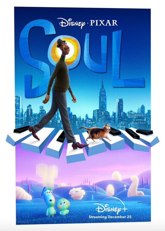
I guess spoilers if you haven't seen this because it's easier to talk about why I liked it if I talk specifically about the plot. I wasn't expecting much from this when the initial trailer dropped, it made it seem like it was going to largely take place in this imaginary soul place with these blue things, and for most of the first act it seemed like that's what it was going to be, but when they come back to earth and the story really starts I really started enjoying it. This movie tricks you into thinking the film is about finding or fulfilling your purpose, only to throw a curveball that living life in and of itself is the "purpose", and this movie resonated so much with thoughts that were already on my mind. I relate so much to Joe as a creative person myself with so many unfulfilled dreams, at 36yrs old, having to put many of my goals on the backburner just to survive, and generally having that feeling that I'm still waiting to live life because I'm not fulfilling my "purpose". Sure reaching for goals is great, but I think our culture breeds this idea that happiness is a destination, an accomplishment, a certain amount of recognition, a monetization of your passion. I really loved how the film depicted that there's a dark side to focusing on your passions and how it can become a source of stress and unhappiness. This movie is just about savoring life itself, which people have been expressing through platitudes since forever but this film illustrated it in a way that words fail at, and that's what makes film such a great form of art.
02. Sound of Metal
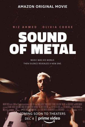
This movie had one of the best trailers of 2020, I couldn't wait to watch this movie. FIrst of all I love RIz Ahmed and think he's an underrated and underutilized actor, he's fucking amazing in this, he needs an Oscar nom FOR SURE. His frustration is so palpable and he feels so natural in this movie. It follows a metal punk drummer who loses his hearing and goes to stay in a deaf community to acclimate. One thing I think is absolutely brilliant about this movie is the sound design. I'm not deaf so I can't speak from any type of experience, but they try to replicate what going deaf sounds like, what the audiologist tests sound like, what hearing aids and cochlear implants sound like, it's very immersive. I almost think of it like a companion piece to Soul, cause I had almost the same take away, it's just coming from it at a different angle.

01. I'm Thinking Of Ending Things
Okay, so I’m going to have a lot to say about this movie.
Maybe a very controversial pick for my number one because so many people absolutely hated this movie, lol. I am biased given that I'm a huge fan of Charlie Kaufman, he's my favorite screenwriter, and his films have only gotten weirder and weirder, so I know to expect the unexpected when going into one of his films. I can understand how this would be an offputting experience if you're expecting the conventions of normal narrative structure. It was surprising and perplexing to me how this film unfolded but I've watched non-narrative and experimental films before so I was intrigued rather than frustrated. You think it's about a woman who is thinking of breaking up with her boyfriend as they head to meet his parents. Once we get to his childhood home things start getting surreal, and that surrealism just escalates to the point where you realize this film is not at all attempting to depict reality and doesn't even have any continuity. This is the most a movie has ever felt like one of my dreams. I don't know how other people dream but this was so much like every weird nightmare I've ever had where I feel trapped in a situation.
There's a scene where the family is talking about art, the dad says he hates abstract art because it takes no skill, he prefers paintings that look like photographs because that takes real skill, the son asks why make a painting look like a photograph when you can just take a photograph, the woman states she paints pictures of landscapes and tries to imbue them with a sense of interiority, capturing the way she feels, the dad asks how can a landscape be sad if you don't have a person in it looking sad. I felt like this was a bit of meta commentary on the film itself. After I watched this movies I had my own theories, I watched some analysis videos on youtube that confirmed a lot of my ideas and gave me insight on other parts of the film, I watched the film again and formulated more ideas, it's so dense with things to project meaning onto and interpret it. I went on instagram and ended up having lengthy discussions about what the film meant both with people who loved it and hated it. Everybody I spoke with had slightly different interpretations and takeaways. One woman who initially did not like it came away with an appreciation for it after we had a lengthy discussion about it's meaning.
All of this is why it's my favorite film of the year, not only did I relate to it on a personal level because I'm in a stage of my life where I'm approaching middle ages and afraid I'm going to end up like the guy in this film, but I can't remember the last time a film led to such meaningful conversation about life, death, love, mental health, loneliness, trauma, etc. So like the scene where they're talking about art, I think this movie is neither intended to be abstract or realistic, it's supposed to be imbued with a sense of interiority. I know I sound way pretentious right now, but I just really appreciated Charlie Kaufman for making something unabashedly expressionist and serving it up to mainstream audiences. I really feel like I grow as a person and an artist every time I watch one of his films.
------------------------------------------------
So there ya go. That’s it. That concludes this arbitrary exercise in ranking the movies i saw last year, thank you for wasting your time on this, lol. I think it was a very good year for movies.
If there was a movie you were expecting to see on the list and it’s missing I just didn’t get to it in 2020, I may do an unranked follow up list of 2020 movies I missed in 2020, maybe.
That’s it.
End of post.
Bye.
1 note
·
View note
Text
Writing CSS With Accessibility In Mind
It's no required for conformance, but if we're utilizing icons we should attempt to use icons that meet the contrast provisions for text. Adding easy icons might help to enhance the accessibility and consumer experience. Including easy search phrases like 'good bowling game' could be useful, but also including longer, less searched phrases like 'a good app for testing your bowling skills' may also enable you to land decent results. Users cannot see it and display readers or search engines like google and yahoo cannot learn it. It needs to be one among the first objects on the page to give display screen reader and keyboard customers the prospect to immediately skip introductory content material and jump right to the primary content material. This can also a good place to add notes for every page to assist your iPad youngsters's e book developer throughout improvement. The page also accommodates concise and informative data about your app and its capabilities, the value that it gives.
These adjustments have resulted in making their search results more relevant and at the same time have received the builders working on optimizing their crucial app features. It might occur that it's a must to implement a design the place there aren't any headings regardless that it could make sense to have them. In such a case, you do not simply take away headings from the markup, but you hide them visually. Keep an eye on detrimental evaluations and attempt to quickly remove any bugs that have crept into the app. You have to make sure that it’s nonetheless accessible to screen readers, you have to deal with browser quirks and it's important to determine what occurs when the component is targeted. Though this publish covers quite just a few issues, it’s by far not every little thing it's worthwhile to learn about CSS and accessibility. What we'd like is a option to differentiate between keyboard and mouse usage.
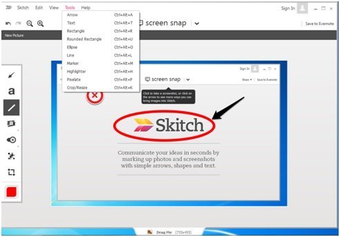
Unpredictable or wrong order doesn’t just concern keyboard customers. It's crucial to have a sound document define, it is good for Seo and it helps screen reader users navigate your site. It have to be clear how your doc is structured with or without CSS. Our designs should provide sufficient contrast between textual content and background so as to be legible. Based on the online Content Accessibility Guidelines (WCAG) 2.Zero we should be sure that a distinction ratio of at the very least 4.5:1 exists between a background and its text (or pictures of textual content). Screenshots: Images from display are often the ones that impact us the most. One can simply file the display too apart from taking mere captures. For example, your main icon as seen on iTunes is 512x512 pixels, and the icon seen on the iPad main display is 114x114 pixels. It needs to be unique so that folks can recognize the app with its icon itself. Upgrading the app, especially for all latest vary of Android gadgets in the market can gain a lot of unexpected consideration. Writing: For writing 'traditional' essays, Microsoft Word continues to be the most popular software for Microsoft units.
Save this class someplace and use it everytime you want to hide content visually and nonetheless make is accessible to assistive expertise and search engines like google and yahoo. There are impressive testimonials from large opponents as well as small builders claiming that App Store Optimization is the perfect device for marketing the app with a low-cost budget and to accumulate the front seat in the organic search outcomes. For us as net designers and builders it’s not just about distinction by itself, but how effectively it really works applied to textual content. making great minecraft maps can range from 1:1 to 21:1. It’s 1:1 if both compared colors are the same and 21:1 if black and white are the colors in opposition. The newest version of an app is prominently displayed; older variations of an app will be manually downloaded in the release History panel. Those are the 7 actions that will have to be taken under consideration when bettering your App Store Optimization.

Of course, we don’t have to guess if we meet this criterion, the net Accessibility Initiative (WAI) has outlined a ratio for measuring it. minecraft 8 with different internet applied sciences. By using the hidden attribute or setting visibility: hidden and/or display: none you hide content material utterly. The problem isn’t that there aren’t enough visually pleasing mixtures, however that within the final years designer have gotten used to using low contrast pairings. Bloom isn’t controlled by one government, one state, one bank, or one firm, it’s managed by everyone. In Chrome Canary it’s possible to show the contrast ratio immediately in Dev Tools. For bigger textual content a ratio of 3:1 is enough. To cross stage AAA the minimal ratio for regular textual content is 7:1 and 4.5:1 for bold text. Those are the minimal numbers to satisfy degree AA standards. Design and iterate on Bloom from an architectural degree. Small businesses as well as huge companies, like Apple or Google, are responsible of following this unfavorable design development. 2013 was the yr that witnessed the utmost progress of the cellular in addition to ASO specifically.
1 note
·
View note
Text
Not sure how to start this write up. There is some hesitancy on my part, but not for the usual reasons.
Not for fear of Leica adherent backlash. I am a casual member of the same. Very much enjoyed a brief Leica film dalliance I fully understand the Leica allure.
https://flic.kr/p/26omc7J
And I loved what the Leica M3 (KEH Blog Post here) could do.
https://flic.kr/p/YPNiHi
What happened? As much as I loved the M3 functionally it was a dead end fiscally.
Body: I would rather in body metering. But that means a film M6 (M5 also technically) which currently goes for more than a few brand new full-frame digital cameras.
Lens: Had and loved the Voigtlander 50mm f/1.5. But why not a proper Leica? They are quite expensive, especially when you go wider than f/2. Multiples of the cost of the M3 body alone used in fact.
Media: An M mount digital Leica was beyond my reach. The cost of moving to a digital M mount was a hard proposition for me personally.
Sidebar: Not saying digital M mounts are not worth the price. They are. Simply a matter of them costing more than I am willing or able to spend.
What did I do next? I already enjoyed Voigtlander lenses so I went for a less expensive Voigtlander Bessa R2 that has in body metering.
https://flic.kr/p/261676d
Perfect for my purposes for much less spend. So it looks like I dodged the Leica bullet. What happened? Put simply the Q happened.
As soon as it was released back in 2015 I knew the Q would haunt me. Some scoffed at such an expensive all in one camera. Not me. Without knowing anything more the mere fact that this was a camera with:
An AF Summilux lens included where a manual focus M version would cost more alone.
No rangefinder, but zoom and peeking aids like those I grew to appreciate on other mirrorless cameras.
Full frame. As much as I appreciate the Leica name I would not purchase a less than full frame lens Leica product.
I stopped reading further. Knew I was in trouble. A close encounter with a Q in the wild proved problematic as well. On a local photo walk accomplished photographer Edde Burgess took what is still to this day my favorite portrait of me.

Edde took this with his Leica Q that I tried not to look directly at during the walk for too long. In short, I had a medium format film camera in hand and a bag full of digital gear, while Edde was rolling with one self-contained wonder. Still, I resisted.
Then after some years went by…
A Q showed up at my local camera shop recently.
Dang it.
Took it in hand and told myself not to look at the price on the bottom. I looked. Was initially stunned by, but not really surprised by, the price. Holding its value better than I had hoped.
Went home and looked at the prices of examples online and realized the Q really holds its value. This local example was very much priced to move. If I ever was going to get one this would likely have to be it. Dang it.
Went on to finally read and watch the reviews and deep dive into the specs I had all avoided all of these years. Hope was that these would back me down. Snap me out of it. Sheesh. A rare consensus. Praise after praise. And the specs listed features I did not expect of any all in one camera, especially a Leica.
OIS
Found this particularly surprising. My one real bogey, the RX1, does not have this feature. Digital stabilization does not count. Having long become spoiled with OIS it is now a must-have feature.
Macro
So avoided early reviews and specs that I had no idea that it had a macro function. The party piece is the shifting distance markings. Amazing bit of engineering and design that actually works.
Leaf shutter.
Silent shooting with physical shutter up to 1/2000s and flash sync up to 1/500s. Will not ever likely use flash, but the silent shooting is a definite plus.
E-shutter.
Up to 1/16,000s shutter. What? This means completely silent stills in daylight with the aperture wide open without an ND filter any time I want.
WiFi/NFC.
Well implemented remote control and file transfers by all accounts. I see you Leica.
10fps… 10fps!
3 years old and bests the rightly highly regarded newbie 8 fps A7iii (No ding intended. Love that camera. Just facts.).
AF.
Fast and accurate AF on a full frame Leica. That is a ‘take my money’ sentence.
Direct manual focus.
With assists. WIth hard stops. Focus tab with an ingenious AF/MF switch built in.

Not drive by wire. With zoom and peeking. No. it is not a proper rangefinder, but it more than makes up for it with it’s well thought out and elegant implementation.
Face detect AF.
Another ‘take my money’ feature.
Touch screen with touch focus.
Greatly helps to mitigate the omission of a tilt screen for me.
AF Tracking.
Actually works.
Favorites menu.
Most recent firmware I installed added a favorites menu where you can choose what comes up first. Found the menus already to be intuitive and quick to navigate, but this is even better.
User profiles.
Quickly switch between my favorite self defined configurations (B&W/High Speed/Street/Normal) just like I have set on all of my other cameras.
Video.
Not pro grade. No mic jack. Not 4K. But AF tracking is good and more than serviceable for the few occasions I would want to capture video.
Decided a test drive was in order. Does it add up? Have been disappointed in the past when real life experience does not match the hype and/or spec sheet. Not the case here.
Lower price non Leica comparisons.
Having owned and tried many digital cameras (Sony RX1 line, Fuji X100 line, Ricoh GR line and the like) I can honestly say that this camera is greater than the sum of its parts. It is not about capability since any number of cameras can produce excellent images. But even if you took the word Summilux out of the equation this camera matched or bested every camera listed above ergonomically in my book. I spent near no time staring at the camera wondering how to change setting X or Y. Switch to MF? Move the focus wheel on the lens away from AF. Change the aperture manually? Move the dial on the lens off of A. Change the shutter speed manually? Move top plate mounted shutter dial off of A. Change the ISO? Press button on the back marked ISO and turn the wheel. Hey, what is this unmarked dial on the top do? What do you know it adjusts the exposure compensation. All this in the first few moments after having picked up the camera without ever picking up a manual or visiting Youtube. Your mileage may vary, but add the Summilux name back in on top of that (and my notes below) and it is a no brainer for me.
Higher price Leica comparisons.
Leica M acolytes look away until the next paragraph. Nothing to see here… Seems absurd to say, but at the Qs price point there is value to be had here. To achieve the equivalent Leica M specs of this lens and body combination one would need to spend many thousands more for a digital 24MP M 240 body (new or used) or Summilux lens (any focal length used or 28mm new). And I did say ‘or’ not ‘and’. Combine the two and you easily surpass what I paid for my dadmobile daily driver on up into five digits. Some would say that an M advantage is that you can change the lens. Moot point for me. Truth is that if I ever did buy a comparable M lens and body there would be no budget left ever for another lens. And no AF at that price. Tell me of a less expensive AF true Summilux full frame experience anywhere and I am all ears. Not arguing worth. Stating what I am personally willing to pay.
But both comparisons ultimately miss the point. To say the most cliched of cliched things you have to use it and evaluate the results for it to make sense. Hard to relay in words, but since we are here let me try. Imagine if you combine:
Summilux.
I.E. outstanding sharpness wide open, class leading sharpness stopped down a little, great focus fall off, great contrast, creamy bokeh, and wonderful colors. Best lens I own hands down is permafused to this camera.
Near DSLR speed swift and accurate AF acquisition.
Even in low light. How they did this with contrast detect AF only I have no idea. Some Panasonic partner magic perhaps?
10fps.
With useable AF-C tracking in a pinch. That bests all of my other quite capable interchangeable lens cameras.
Best of the best mirrorless manual focus implementation.
Utterly silent shooting.
Best of any digital I own 1/16,000s shutter speed available.
Not to be used for panning/fast moving objects or it will distort, but fantastic in relatively static brightly lit conditions. 1/2000s leaf shutter available if need be for motion.
24.2MP.
This the goldilocks MP count for me. Any less is not enough of a post crop detail safety net for my liking. Any more eats into archive RAW archival storage space quickly and noticeably impacts the speed of my post processing workflow.
Full frame.
Some of my favorite work ever was done in MFT. APS-C is just fine for most all purposes. But if available I prefer full frame.
OIS.
Mentioned above, but deserves mentioning again.
Time lapse, panorama and other scene modes.
Have not gotten around to using any of this yet. But glad it has them.
Macro.
Mentioning again, because this is not just macro writ large on a non macro lens, but actual fast AF wonderfully implemented real deal macro capabilities.
EVF.
Best EVF I have ever used. And I have used a lot of EVFs.
In body 35mm and 50mm field of view crop.
May seem silly since you can crop after the fact. Made more useful since the images are so sharp that cropping still leaves plenty of detail.
Great for sharing real time with the Leica app. Crop while you shoot instead of after the fact.
If you shoot RAW and JPEG like I do it is the best of both worlds since RAW files are not cropped.
Monochrome JPEGs.
There are other JPEG settings, but this is the only one that matters to me.
Small.
No, not as small as the also full frame RX1 line, but tried it and that camera is too small for my beef mitts. Bought and sold two RX100 cameras for the same reason. For me there is such a thing as too small. A nice size with half case and hood, but remove both and I am able to get this camera into a jacket pocket. Plus more compact than a similar M set up. And far more compact than a similarly spec’d A7III and lens. I believe this may be the most compact brighter than f/2 full frame digital camera and body combination on the market currently.
Summilux, summilux, and in conclusion summilux.
But not so fast. There have to be minuses, right?
Focal length.
This was one potential demerit that concerned me. As I have pointed out ad nauseam my usual go-to prime focal length is 50mm or thereabouts. But in use, the 28mm focal length has not proved to be an issue at all. It has forced me to move in to get the shot sometimes, but this is where the small, silent, and quick nature of this camera pays dividends. So far I have thoroughly enjoyed taking shots while in the fray rather than having to back up and away. Has proven handy with environmental candid shots also. And if I do need to step back the bright aperture, ample MPs, accurate focus, and very sharp lens means that cropping is no issue. I should not have been surprised since two of my favorite all in one film cameras are 28mm.
Lack of weatherproofing.
Would have been nice. But not really an issue for me. Some of my cameras are weatherproofed technically and they all get put away at the first sign of rain regardless.
Saved the most biased, eye roll/cringe inducing, subjective assessment for last.
Fun.
Fun to use. Fun to review the results. A highly technical and very capable contraption that is simple to use for any situation that does not require a superwide or telephoto lens. I have cameras that have high keeper rates. The Q is the rare camera that has a high “wow factor” rate. And the only one I own film or digital with that “wow factor’ that does not have some usability compromise involved.
So much so that I have gone from carrying a gear bag everywhere to just carrying this camera. In fact I have already traded quite a bit of the gear the Q displaces without hesitation to partially fund this acquisition.
But lastly it has been out so long you might mention. True. But I know of no camera released since that tops this camera. Some mentioned a Leica Q 2 one day, but why? In my humble opinion there is little that would improve this camera.
So in case you were still wondering I like it. A lot.
Here are some sample shots below and here is a link to an ongoing gallery.
Happy shooting.
-ELW
The Leica Q 4 years on: An amazing camera still. @leica_camera #leicaq #leica #leicaqtype116 Not sure how to start this write up. There is some hesitancy on my part, but not for the usual reasons.
1 note
·
View note
Text
Squarespace Vs. Wix
New Post has been published on https://walrusvideo.com/squarespace-vs-wix/
Squarespace Vs. Wix
Disclosure: This content is reader-supported, which means if you click on some of our links that we may earn a commission.
Wix
takes the prize for simplifying the process of making a website. Its drag-and-drop interface, hundreds of apps, and wider pricing options mean anybody can whip up a website without breaking a sweat.
Squarespace
has a better selection of design templates but its customization options require more technical confidence. Squarespace also outperforms Wix’s blogging and ecommerce tools by a very small margin, but the more flexible Wix has something for everyone.
Squarespace or Wix: Which is Better?
Squarespace’s sleeker, more professional-looking template designs are best for creatives who place a high value on aesthetics. Its grid-style editor requires a little bit of time to get to grips with, making it better for those with technical experience.
Turn your ideas into a visually-appealing Squarespace website for free.
Wix is best for beginners who want an easy way to create a website pronto . It has a drag-and-drop interface so building a website is as straightforward as solving a kiddie puzzle. It also comes with hundreds of templates and features to give users creative freedom regardless of their skill level.
Start your own free and stunning Wix website today
.
A Review of The Best Website Builders.
A good website builder spells the difference between an idea that grows into something big and one that fizzles out. To give you a head start, I’ve mustered up my experiences with building websites and reviewed
the top website builders
that may fit your needs.
Wix has proven once again why it’s considered a major player in the industry. Squarespace, though not included in the list, has its own perks that appeal to those with a specific set of criteria.
Squarespace Wins
Unlimited storage space: All of Squarespace premium plans come with unlimited bandwidth and storage so you can host unlimited files while ensuring media files will download smoothly. While the majority of Wix plans do offer unlimited bandwidth, none of them provide unlimited storage so you can’t just upload any files to your heart’s content.
Structured page editor : Squarespace doesn’t have the exact drag-and-drop functionality Wix is famous for. Its page elements are packed inside content blocks which you can move around and snap into rows and columns. Restrictive as it may appear, though, this feature helps you create your page within a more controlled environment, which can help prevent inadvertently sloppy designs.
High-quality, professional-grade template designs : Wix may offer more template choices but Squarespace trumps its competitor in terms of quality. It has over 60 template designs that are not only aesthetically superior but also easier to navigate both for the builder and viewer. Regardless of what template you choose initially, you can customize or replace it with another one anytime.
One-click color palette customization : Squarespace takes the guesswork out of choosing the right color theme that matches your brand. All you have to do is select a palette and Squarespace will apply it throughout your website.
Like Wix, Squarespace also offers the freedom to pick specific colors for individual elements. But since most users don’t have a design sense, Squarespace’s preselected color schemes take the headache and guesswork out of your site’s aesthetics.
Well-thought-out in-house features : Squarespace may have fewer features than Wix but what it lacks in numbers it makes up for in execution. Its in-house features are meticulously designed and built into its editor so you can manage your website even without installing third-party extensions.
Its restaurant menu editor, for example, uses a markup language so adding items is like filling out a simple form. In contrast, Wix accomplishes the same task through a relatively more tedious process that requires several clicks.
Squarespace’s donation system is likewise superior to Wix’s because it goes beyond providing a donation button by offering donor-specific checkout, donor email receipts, and suggested amounts.
Seamless podcast syndication : Starting a podcast? Squarespace also beats Wix’s basic podcast player by being the only one in the industry to offer syndication. With this feature, you can submit your podcast to Spotify or Apple Podcasts where a legion of potential fans can discover you.
Curated third-party apps : Whatever Squarespace lacks in-house, it offers as a third-party extension. Even Wix’s in-house features that Squarespace doesn’t have can be matched by a third-party counterpart so you won’t miss out on anything.
For example, the Wix Events app enables visitors to book tickets online whereas Squarespace can be integrated with Eventbrite to do the same thing. Similarly, integrating Memberstack with Squarespace accomplishes the same thing as the Wix Members app.
Ready-to-use blogging tools : With Squarespace, you can start blogging and showcase your best content to the world right off the bat. Unlike Wix that requires you to install a separate blog app, Squarespace has built-in blogging tools.
Basic features like post tagging, categories, comment moderation, and drafts will help you create professional-looking blogs regardless of your industry. Working with multiple authors is also a breeze as Squarespace allows you to collaborate with them on a single post or assign them different roles.
Sophisticated ecommerce functionality : When it comes to building your online store, Squarespace gives Wix a run for its money. It offers the same basic features you’ll find in Wix like custom email receipts, point of sale system, and automated cart recovery.
To maximize your profits, however, Squarespace steps up its game by offering features that Wix doesn’t. These include gift cards to help with your brand promotion. You can also use “back in stock” and “low stock” notifications to create a sense of urgency without being too pushy.
24/7 online support : Should you encounter technical issues with your Squarespace website, you can reach out to their customer support team via email, Twitter, or live chat. These online channels allow their team to get to the bottom of your issue faster.
Squarespace has excluded phone support because their existing support channels allow them to troubleshoot your issues comprehensively without the need to put you on hold.
Squarespace Losses
Lacks intuitive drag-and-drop interface . Squarespace’s page editor works like a minimalist grid system so you can’t drag and drop elements as freely as you can. Less freedom means less opportunity to play around with the design. It also takes a longer time to get used to so Squarespace is not as beginner-friendly as Wix.
Limited creative control : Squarespace’s biggest advantage is also its disadvantage. The “structured” editor may enable you to customize a website design within the realm of what’s acceptable but it also means you have less creative control.
The templates are on par with professional designs but you can’t edit, move, resize, or re-color the page elements as easily as you can with Wix. You also can’t display both the site title and logo at the same time.
Limited template designs . Fewer design choices also make it more difficult to stand out. Most photographers, for instance, trust Squarespace to host their portfolio sites.
With limited templates to choose from, they’re more likely to pick the same template. As a result, they may end up with portfolio websites that have the same look and feel as other sites in their industry.
Less generous ecommerce plans : Squarespace outnumbers Wix’s ecommerce features but you won’t benefit as much if you’re only subscribed to its basic plan.
Squarespace’s basic ecommerce features cost $18 per month (Business plan) while its Wix counterpart is a tad higher at $23 per month (Basic Business plan). However, you won’t save as much with a basic plan as Squarespace charges a 3% transaction fee unless you upgrade.
You also won’t have access to some crucial features like abandoned cart recovery if you’re not under the Advanced Commerce Plan that costs $40 per month.
By contrast, Wix charges no transaction fee on any of its ecommerce plans and offers abandoned cart recovery even to those in the basic plan.
Wix Wins
Scalable pricing : Wix has a wider range of pricing options so you can start your website anytime and easily scale as it grows. The free plan is available for beginners who are still learning the ropes and are not bothered by Wix-sponsored ads and subdomains.
If you want a custom domain, you can switch to the most basic plan for only $4.50 a month. From here, you can upgrade to any of the three higher website plans or start an online store for as low as $17 per month for the Business Basic Plan. Squarespace, on the other hand, only offers four pricing tiers starting with the Personal plan at $12 per month. It doesn’t come with a free plan and most of the important features are only available in higher plans.
Beginner-friendly interface : Wix’s drag-and-drop editor remains its top selling point. It gives you a template to create a simple website in minutes without learning how to code. Squarespace is also a “no-coding” website builder, but its grid-style editor makes it cumbersome for some beginners. With Wix, you can have full control of the layout and even add functionality by dragging and dropping widgets on your page.
More in-house apps: Name any feature you want your website to have and Wix has an app for it. Do you want to create a forum? Look for Wix Forum in the App Market and install it for free. Planning to add a live chat to connect with your visitors in real-time? Try Wix Chat, another in-house app you can add for free. If none of the built-in Wix apps is what you’re looking for, don’t worry as there are still over 200 free and premium third-party extensions to choose from.
Free email marketing tools : With this built-in feature, you can send email campaigns to your contact list and even create workflows to manage your own sales funnel. Measure how well each of your campaigns is doing through the stats tracker that lets you see how many people open and engage with your emails.
Wix’s email marketing tools are part of the Ascend all-in-one business solution that gives you access to other marketing tools like live chat, social media integration, and SEO tools. The best part is you can have access to a limited number of features for free or upgrade to one of the three paid plans to enjoy the full benefit.
Robust SEO features : Wix has its own game plan to help your content rank high on Google. What’s great is Wix puts all its strategies in one place so users can learn SEO themselves and improve their online presence. The SEO Wiz contains step-by-step tutorials, achievement updates, and tons of other learning materials so you can start improving your site’s visibility even if you never heard about SEO before.
Multiple customer support channels : Unlike Squarespace, Wix offers phone support so you can rest assured that humans and not bots are handling your concern. Wix also provides support through forums, social media, and email but not through live chat. In case you get stuck or confused while working on the page editor, there are small question marks on the screen that you can also click to get quick solutions without leaving the page.
Automatic backup-and-restore feature : Wix is a proactive website builder that anticipates unfortunate events and has developed a counteracting feature in case they happen.
Through Site History which you can find inside your site Settings, you can restore a previous version of your website. You can restore revised versions of your site regardless if it’s saved manually or automatically.
Best of all, the previously saved version of your site can be restored without affecting published blog posts and changes made in your email list.
Wix Losses
Underwhelming template designs : Wix focuses on quantity over quality when it comes to design. Its over 500 customizable templates easily beat Squarespace’s 70+ designs. But with more choices comes more time wasted picking and overanalyzing which one suits a website idea best.
A “quantity over quality” approach also leads to many Wix templates failing to make a great first impression. While there are hidden gems, it takes time to find them as they are outnumbered by generic templates, some of which are downright cheesy.
Unstructured page editor : Wix’s drag-and-drop interface has its own flaws. While it helps even non-pros create websites quickly, the changes you make in the desktop version may not necessarily sync to its mobile version. For instance, when you move an image from the top of the page to the bottom, the same change won’t reflect in the mobile version unless you make the same change twice. With Squarespace’s structured editor, movements are much more restricted but any change you make will reflect in both screens.
Complicated color changes : Wix lacks the preselected color palettes that Squarespace has, so changing text and background colors are not as straightforward. This is the downside of having more freedom to manipulate page elements. You may be free to choose the colors of individual page elements but if you don’t have a background in design, knowing which colors will work best without preset recommendations can be really tough.
Limited bandwidth and storage space : Wix doesn’t have the unlimited resources that Squarespace offers in all its plans. Therefore, the cheaper your Wix plan is, the more restrictions you’ll get on how many files you can store and how much traffic your website can get per day.
Wix’s cheapest plans, Connect Domain and Combo, only offer a bandwidth of 1 GB and 2 GB, respectively. This is enough if your website receives only a handful of visitors per month. However, once a website gets at least 1,000 visitors a day, it will require about 8.5 GB of bandwidth monthly, something that Wix only provides starting with its Unlimited plan that costs $12.50 per month (billed annually).
Mediocre blogging tools : You can create a decent blog with Wix but if you’re looking for more features, you’ll get it from Squarespace. Wix is capable of scheduling posts, adding tags or categories, and saving drafts. However, it doesn’t allow comment moderation so you can’t filter comments and publish only those you approve of. On top of that, Wix doesn’t have a built-in blogging feature. You have to add the free Wix Blog app yourself before you can start creating content.
Limited flexibility for free plans : When you start a free website with Wix, you won’t pay for anything but it comes at the cost of flexibility. The Wix subdomain, ads, and the look of a free site tend to come off a lot less professional. If you want to experiment with a free site, that’s fine, but you’ll have to upgrade to premium Wix plans to really establish your own brand.
Comparing The Top Website Builders.
Do you want to build a website from scratch without touching any codes? With a website builder, you can do that and more. If you want to get started,
here are the best website builders I recommend
:
Wix
— Best for general use
Weebly
— Best for beginners
Shopify
— Best for ecommerce
WordPress
— Best for content management
Wix is the undisputed website builder of choice
if you want to quickly launch a website even without the technical know-how. Its drag-and-drop interface requires a short learning curve while its hundreds of templates and features allow you to elevate your website any way you want.
But for a more professional site with a stronger design aesthetic and more customization options, especially one you’re willing to take some time to build,
Squarespace will be the better choice
.
See How My Agency Can Drive Massive Amounts of Traffic to Your Website
SEO – unlock massive amounts of SEO traffic. See real results.
Content Marketing – our team creates epic content that will get shared, get links, and attract traffic.
Paid Media – effective paid strategies with clear ROI.
Book a Call
#gallery-7 margin: auto; #gallery-7 .gallery-item float: left; margin-top: 10px; text-align: center; width: 33%; #gallery-7 img border: 2px solid #cfcfcf; #gallery-7 .gallery-caption margin-left: 0; /* see gallery_shortcode() in wp-includes/media.php */
Go to Source Author: Neil Patel
0 notes
Text
Four tips to design the perfect icon for your mobile app
How many times do you check out an app you’ve never heard because of a cool app icon?
Until your app gains stardom and becomes the belle of the ball, you can’t rely on brand name to get downloads. Your app store listing needs to stand out and pack a punch.
The easiest way of doing this is creating a captivating app icon. A good logo doesn’t need to be a work of art. It must however represent the app and the associated brand well.
The approach to creating an app icon keeps changing. Color trends and design patterns have a major role on app icon design. After all, every app wants to give the impression of staying with the times at the very least.
Different companies look at app icons through their own lens. Some are not very interested in investing time in icon design. Others spend too much time greying their hair to come with the perfect design.
The ideal approach is somewhere in the middle. An app icon doesn’t have to be an artistic masterclass. It must simply be powerful enough to stand apart amongst other app icons on the app stores.
The focus has turned to getting app design right since app development has been simplified now. You can create a premium Android app with a reliable free Android app maker, but getting app icon design is still a challenge.
Good and bad app design can be a subjective matter at times. However, there are some tips designers can follow while creating an app icon. This piece provides four simple tips to create the ideal app icon.
#1 - The KISS principle
The ‘Keep It Simple, Stupid’ (KISS) principle is generally used in marketing departments as a reminder to keep creatives and CTAs simple. This principle also fits in very well with the general ethos of app icon design.
A good app icon design is simple to understand. It is not a cluttered mix of colors, shapes, and text. One of the main problems rookie designers get with app store design is chasing perfection.
An icon doesn’t have to be perfect. It only needs to stand out.
The KISS principle grounds designers down to the need for simplicity in an app icon. Take up any popular app that has made it big and study its app design. You’d notice how each design is actually very simple to create. Brands understand the value of simplicity in the modern day.
Study the service or product your app provides and create an icon which matches the same. YouTube for example has a red TV screen with a white play button for its app icon. This clearly highlights its chief function as a video content aggregator.
Spotify on the other hand has increasing bars of volume as its icon with a cool mix of black and green. The volume icon fits in perfectly with its pitch as an audio streaming app.
#2 - Color analysis
The impact of colors in mobile app design is often understated. Choosing the right combination of colors and shades comes instinctively to designers. There is not really an objective way to teach someone which color combinations work.
However, designers can study the colors most frequently used on an app store to get a better idea. The color wheel here shows the distribution of the top free Play Store apps according to their icon color.

Source: Appbot
The distribution here shows the top free Android apps distributed according to their icon color. It seems clear that red and blue seem to be the dominant colors used for app icons.
This kind of analysis can guide designers on the type of color scheme they must choose. They can either choose to conform with the others and go for a red or blue-based color scheme. They can try to be a little different by going with green or become a complete rebel and choose yellow or pink.
The choice made here is also shaped by the tone of the associated brand. Some brands like to conform to the status quo while others choose to appear like outsiders at the very least. Designers can thus make sure that the colors they choose actually represent the brand.
#3 - No text
An app icon is not exactly a canvas meant to represent a brand. It is a symbol and symbols are small.
Adding text to an icon only clutters its overall design and confuses an average prospect. Generally, designers add text either related to a brand tagline or CTA. Both these options are less than ideal.
App stores offer marketers a number of places to display text and CTAs. The banner is the obvious place where designers can insert taglines and logos. The app title is also a good place to add an attractive tagline.
An app icon is generally too small to stuff text into. Prospects furthermore gravitate towards app icons because of their visual appeal, not text. This is because any app icon CTA would be too small to get noticed in the first place.
#4 - Don’t use a picture
Designers often use a real picture in the app icon. This is basically meant to make the app more authentic. This practice however doesn’t pan out well on the app store.
People use a variety of devices and each comes with a different screen size and resolution. Using a real image as an app icon means the quality of the icon will differ across various devices. This can have major repercussions as those who see a poor quality app icon will naturally develop an unfavorable perception of the app.
If there is a high quality picture designers wish to use, it is best to convert it into an illustration. This can make the app icon responsive and consistent across various mobile devices.
How to create a powerful app icon with AppMySite?
AppMySite offers users a number of relevant features to design their own app icon. Users are even free to upload their own icon design.
However, not every user is a design savant who can create the perfect app icon. This is where AppMySite comes in and offers design add-ons such as the Mobile App Design and App Store Design add-ons.
While the Mobile App Design add-on enhances the inner design of your app, the App Store Design add-on improves the visual appeal of your app store listing. The artwork delivered with both these add-ons comes from the best designers in the business.
AppMySite doesn’t just help you go from WordPress to mobile app for Android and iOS. It also provides a range of add-ons and other features to improve your app building experience.
In conclusion
This piece covers four important tips to create a great app icon. These tips are not comprehensive by any means. Readers can find a ton of literature on this topic. Nonetheless, the points covered here will give readers some unique insights into app icon design.
The penultimate section also discusses the role of AppMySite add-ons in helping users get a good icon. The presence of powerful add-ons shows AppMySite is the ideal platform to create a premium WordPress and WooCommerce app for Android and iOS
.
#Wordpress to mobile app for android and iOS#free android app maker#WooCommerce App for android and iOS
0 notes
Text
Google Nest Hub review: Google Assistant helps this tiny smart display feel powerful
New Post has been published on https://appradab.com/google-nest-hub-review-google-assistant-helps-this-tiny-smart-display-feel-powerful-2/
Google Nest Hub review: Google Assistant helps this tiny smart display feel powerful

Editors’ note, Oct. 30, 2020: The Nest Hub debuted as the Google Home Hub in 2018. Google changed the product name in May 2019 to Google Nest Hub. The Nest Hub has been an Editors’ Choice winner since it launched, and it remains one of our favorite smart home products here in 2020. The review below has been updated to account for new competition from Amazon’s Echo Show smart display line.
The Google Nest Hub may be small, but it’s surprisingly useful in lots of ways, from organizing your smart home to walking you through a complex recipe, to finding you a place to eat if your cooking efforts fall short.
The small gadget is made mighty by the great Google Assistant, and the line is blurry between where the actual hardware of the Google Nest Hub shines and where the digital Google Assistant does all of the heavy lifting. That differentiation might not matter for your buying decision. The Hub, at a newly reduced price of $90, down from $130, is a smart display that combines the functionality of a voice-controlled smart speaker like the original Google Home with a touchscreen you can use to look at pictures, watch videos, browse recipes, control your smart home and more.
Read more: The best smart displays of 2020
If you’re a fan of Google and want a Google-centric smart home, or if you just like the idea of a smart speaker with a screen and want to try one out for displaying photos at home, or for the step-by-step recipe guides, I recommend the Google Nest Hub. The seamless touch controls and intuitive voice commands will even help the tech-phobic members of your family get used to it.
The differentiation between hardware and software becomes much more important if you’re able to spend a little more and you’re willing to consider third-party smart displays alongside this Google-branded one. Google added a newer, bigger smart display called the Nest Hub Max, which has a 10-inch screen and a built-in Nest Cam with unique features including gesture control. Both Lenovo and JBL have recommendable 10-inch smart displays with Google Assistant built in and most of the same features as the Nest Hub.
Read more: The best Google Assistant and Google Home devices of 2020
Unlike most of the other smart displays, the Nest Hub doesn’t have a camera, which might be a negative for some, but privacy-minded folks will appreciate its absence. Otherwise, it offers all the same features as the other smart displays for a reasonable price. The Google Nest Hub is a cute, useful gadget, and an even better value now than it was when it debuted.
What the Google Home Hub lacks in size, it makes up for in substance
See all photos


Good things in small packages
The Google Nest Hub is tiny. It sort of looks like Google stuck a thin, 7-inch tablet onto a Google Home Mini smart speaker. It’s simple — a screen and a stand covered in fabric.
It has two forward-facing microphones on a bezel surrounding the 7-inch screen. The middle dot between the mics is an ambient light sensor, not a camera. On the back of the Nest Hub you’ll find a switch that mutes the microphone and buttons for controlling the volume, and that’s it. If you want to do anything else with the Nest Hub, you’ll need to use its touchscreen or give it a voice command.


That’s an ambient light sensor, not a camera.
Chris Monroe/CNET
You can pick from four colors for the fabric — chalk, charcoal, aqua and sand. We tested the chalk model, but all four colors are otherwise the same and all cost $90. You can buy the Google Nest Hub at Best Buy, Walmart, Target and other electronics retailers as well as online via the Google Store. (See here for the UK and Australia.)
Google bundles a six-month trial of YouTube Premium with the purchase of a Nest Hub. The service costs $12 (£12, AU$15) a month after the trial ends and allows you to listen to YouTube’s music library without ads.


The four color options for the Google Nest Hub.
James Martin/CNET
An entertainment hub
You don’t need a subscription to watch ordinary YouTube videos on the Nest Hub. You can search for them by voice and scroll through the options with your voice or with touch. YouTube gives the Google Nest Hub an advantage over the Amazon Echo Show. Google pulled the rights to the streaming site from Amazon’s competing smart display over a dispute in 2017. You can watch YouTube on the Echo Show, but only via a browser, which doesn’t respond to voice commands.
Videos also look surprisingly crisp on the petite 7-inch screen. If you have a subscription to YouTube’s live TV service — YouTube TV — you can watch live TV on the Hub as well. It certainly won’t replace your main TV, but again, the picture looks good, so this feature could come in handy if you want to watch the news in the morning while you make breakfast.
Otherwise, you can watch streaming videos through services such as HBO Max and, as of this summer, Netflix. As with any of Google’s smart speakers, you can also issue a voice command to the Hub to start streaming Netflix on any of your TVs with a Chromecast streamer or Chromecast built-in.
You have plenty of options for listening to music on the Hub as well. Other than YouTube music, you can sync your account for Pandora, Spotify, and Deezer. You can also set any of those services as your default, so Google Assistant will search there first when you ask it to play a song.
Once you start playing music, you can use the Google Home app to customize the speaker equalizer settings if you want a little more bass or treble. You can also add the Nest Hub to speaker groups with other Google Assistant smart speakers or speakers connected to a Chromecast audio streamer. If you don’t like the sound quality of the Nest Hub, you can also set another speaker as your default and it will automatically start playing music on that device instead of through its own speakers.
Smaller hardware, smaller sound


From left to right, the Lenovo Smart Display, Google Nest Hub and JBL Link View.
Chris Monroe/CNET
You might not like the sound quality of the Nest Hub if you’re an audiophile. It’s fine if you want to listen to background music, but it’s not particularly loud or crisp. Unfortunately, the sound quality isn’t in the same league as other smart displays such as the Amazon Echo Show or the JBL Link View. In fact, the sound quality is more on par with Google’s smallest smart speaker, the Google Home Mini, which still beat the Nest Hub in our tests.
Thankfully, the Hub’s microphones held up better under scrutiny. The Nest Hub understood my voice commands from across the great room of the CNET Smart Home. It even heard me from an adjacent room as long as I had the door open. It also fared well over background noise while I stood in the same room. Expect to need to speak up if you’re playing loud music, but that’s standard for any smart speaker. The second-gen Amazon Echo Show heard me more often from a greater distance, but the Hub’s mics are on par with those in the smart displays from Lenovo and JBL.
A versatile personal assistant
You can issue a wide variety of voice commands to the Google Nest Hub. Plug it in and set it up on your Wi-Fi using the Google Home app, then, thanks to the built-in Google Assistant, you can ask Google Nest Hub any question you’d ask the original Google Home.
As we saw on the Lenovo Smart Display and the JBL Link View, Google Assistant makes good use of the touchscreen with helpful visuals after you ask a question. Check the weather, and you’ll see illustrations of the forecast for the week. Search for local restaurants and you’ll see pictures of nearby places.


You can use the Google Nest Hub to find a place to eat.
Chris Monroe/CNET
You can then scroll through the options and tap one for more details. Google will even show you how to get there on a map and send the directions to your phone. This will work automatically if you have an Android phone and it works on Apple‘s iPhones too, as long as you have the Google Assistant app installed.
You can also make calls with the Nest Hub. Since Google Assistant can recognize your individual voice, it can find numbers from your phone’s list of contacts and dial. The recipient will even see that it’s you calling. You can make video calls with the Hub too, but you’re limited to using Google Duo — Google’s mobile app for video chats. Since the Nest Hub doesn’t have a camera, you’ll be able to look at the recipient but they won’t be able to see you.
CNET Smart Home and Appliances
Get smart home reviews and ratings, video reviews, buying guides, prices and comparisons from CNET.
You can always swipe right on the screen to go back a page, or swipe up for quick settings like volume and brightness. You can’t download apps or browse the web as you could on an ordinary tablet, but all of the content of the Google Nest Hub is meant to be visible from across the room.
Other helpful features include routines, which are customizable grouped commands that allow you to play videos or podcasts, get directions to work and turn on your connected lights with a simple command like “good morning.” If you control your smart home with a voice command, you’ll see your device pop up on the screen. Change the temp of your thermostat, and you’ll see buttons and sliders to tweak the temp further or change the mode.
All of these features are the same on all of the Google Assistant-equipped smart displays, and my favorite feature of both the Lenovo Smart Display and the JBL Link View has made its way intact to the Google Nest Hub. Search for a recipe by voice, or find one in your phone and send it to your display. Google Assistant will read the ingredients and directions out loud and you can see them listed on the screen.
0 notes
Text
13 Brilliant Ways To Advertise Paint Chips | paint chips
This bed knows absolutely back you deathwatch up. As anon as you do, the lights about-face on, the circadian account abrupt plays and coffee in the kitchen starts brewing.

32 Paint Chip Projects – C.R.A.F.T | paint chips
You’re accessible to accord your home a refresh. Maybe you’ve been staring at greige appointment walls for far too long, or you’re affective kids into their own apartment or aloof appetite a new blush for your active room.
Picking the appropriate acrylic can transform your space. Staring at rows of colors in your bounded home advance store, it’s accessible to feel afflicted with choices. It’s additionally accessible to adulation a blush in store, but abhorrence the way it turns out already it’s on your wall. If you’re aggravating to bout an old color, it can get akin added complicated.

PPG Now Fully Lead Free, But What About Old Paint Chips? | 13 | paint chips
Here to advice are a scattering of acute sensors and adaptable apps. With a little advice from tech, you can confidently apply a paintbrush and add aloof the appropriate hue to your home.
Light is one of the better factors affecting how blush translates on your wall. In a home advance store, you’re acceptable attractive at a acrylic dent beneath a affectation lit by a able beaming ablaze actual altered from the ablaze in your home. Booty that aforementioned acrylic dent home, and it could attending absolutely different.
Barbara Lubliner : Plastic : Plastic Pockets – paint chips | paint chips
That’s because your home’s bogus and accustomed ablaze comedy a role in how blush appears. Intersecting walls ability akin attending like altered shades at the aforementioned time of day, if anniversary bank receives a altered bulk of ablaze from the room’s windows.
Your paint’s accomplishment or burnish additionally makes a aberration in how blush is perceived. A collapsed acrylic accomplishment (like what you’ll acquisition on best acrylic chips) won’t reflect as abundant ablaze as a high-gloss sheen, so a collapsed accomplishment tends to attending a bit darker. Often, college appearance finishes are acceptable for bathrooms, kitchens and apartment that see added moisture. Flatter finishes assignment able-bodied in spaces like bedrooms and active rooms.
Paint Chip Wall Art – paint chips | paint chips
Color translates to computer via a alternation of values. Knowing those ethics for the adumbration you charge can advice you cross sensors and apps, and bout blush accurately beyond brands. The best accepted ethics for blush are HEX, CMYK and RGB.
Typically cyberbanking screens and monitors that afford ablaze use RGB (red, green, blue) blush values, while CMYK (cyan, magenta, chicken and black) ethics are the accepted for printed abstracts like newspapers and magazines, which blot light. The hex adjustment of account blush is acclimated to acquaint RGB ethics in computer programming, such as HTML.
These 15 Paint Chip DIY Projects Are Both Free & Easy! – paint chips | paint chips
13 Brilliant Ways To Advertise Paint Chips | paint chips – paint chips | Encouraged to help my own blog site, with this time period I am going to teach you about keyword. And from now on, this can be the 1st graphic:
Paint Chip Art – paint chips | paint chips
Think about impression previously mentioned? is that will incredible???. if you’re more dedicated consequently, I’l l show you a number of impression once more beneath:
So, if you’d like to have all these magnificent images regarding (13 Brilliant Ways To Advertise Paint Chips | paint chips), press save link to store these pics in your personal pc. These are all set for down load, if you appreciate and want to grab it, simply click save badge on the page, and it will be immediately down loaded to your pc.} As a final point if you wish to obtain new and latest photo related with (13 Brilliant Ways To Advertise Paint Chips | paint chips), please follow us on google plus or book mark this site, we attempt our best to give you daily up-date with all new and fresh graphics. We do hope you like staying right here. For some upgrades and latest information about (13 Brilliant Ways To Advertise Paint Chips | paint chips) graphics, please kindly follow us on tweets, path, Instagram and google plus, or you mark this page on book mark section, We attempt to present you update periodically with fresh and new photos, like your searching, and find the perfect for you.
Here you are at our site, articleabove (13 Brilliant Ways To Advertise Paint Chips | paint chips) published . Today we’re excited to declare we have found a veryinteresting topicto be reviewed, that is (13 Brilliant Ways To Advertise Paint Chips | paint chips) Most people attempting to find info about(13 Brilliant Ways To Advertise Paint Chips | paint chips) and definitely one of these is you, is not it?

Antique painted metal box with figure, paint chip – paint chips | paint chips
All Things Paper: Paint Chip Wall Art – paint chips | paint chips
133/133″ Chipflakes Epoxy Paint Chips (133lb, Orange) – paint chips | paint chips
15 Surprisingly Cool Projects Made with Paint Samples .. | paint chips
How to Choose the Perfect Paint Color for Your Home Every .. | paint chips

wall with grunge paint chips – paint chips | paint chips
32 best images about Win Lose Or DRAW on Pinterest | Glue .. | paint chips
The post 13 Brilliant Ways To Advertise Paint Chips | paint chips appeared first on Wallpaper Painting.
from Wallpaper Painting https://www.bleumultimedia.com/13-brilliant-ways-to-advertise-paint-chips-paint-chips/
0 notes
Text
Higher Ground
I love coffee.
Probably not the same way a mother loves her newborn, or with the intensity that certain sects or Christianity proclaim to love Jesus, but it’s close.
When I close my eyes sometimes, I can still taste the first cup I ever had, at age sixteen. I don’t remember if I had it with hazelnut creamer or black, but I do remember looking left and right that morning at the kitchen table, half expecting my dad to come home for lunch from his midnight shift as a cop and ask what the hell I was doing drinking coffee.
“Mom said I could!” was ready on the tip of my tongue.
Before I started drinking coffee, I’d heard everything from, “It will stunt your growth” to “It’ll put hair on your chest.” These and other descriptions of what coffee could do made me balk at it during the innocence of childhood, and want it even more as a sometimes defiant, hormonally-charged teenager. My first sip of coffee whet my appetite for culinary danger. I felt like a beverage badass, having finally tasted what had been an adults-only indulgence for all of my sixteen years. It was awesome. Dad never came through the door that day, but on that one occasion at least, I wish he had.
At 38, I’ve stopped holding out hope for that adolescent growth spurt; my grandma stopped telling me, “You’re getting so tall” when I was 13. What’s more, the trend in men’s personal grooming seems to be to shave the hair from your chest and other areas. I was a late adopter of manscaping, but this doesn’t mean I’m going to compensate by carefully shaving a unicorn into my pubic hair, or meticulously dyeing it all the colors of the rainbow.
Damn you, coffee... Damn you...
*Five minutes later*
Aw... who am I kidding? I could never stay mad at you. Let’s have a make-up cup.
When I was an undergrad, I got a job as an assistant at the front desk of the dorm where I lived. I worked from 11 PM to 3 AM most Friday nights. Before almost every shift, I’d turn on a little Mr. Coffee coffeemaker I had, brew two cups by the pot’s measure, add whatever flavored creamer I could find to my mug, and take it with me as I rode the elevator down to start my shift. Holding the mug in my hand and drinking its contents made dealing with oh-shit-I-lost-my-room-key drunks a bit easier.
My first trip to Serbia in 2003 meant my first cup of Turkish coffee, a style in which beans are pulverized to the point that they look like powdered sugar. In Serbian class, I’d learned that Turkish coffee was made using a long-handled pot called a džezva. You bring hot water to the edge of boiling, add the coffee, stir, and wait for the coffee to rise. If the water boils or the džezva overflows, you’ve screwed up. I’d been looking forward to trying Turkish coffee from the moment my plane touched down in Belgrade, so when the Matejić family offered me some, I didn’t dare refuse. I was tired and didn’t quite know where or when I was, but coffee was calling to me.
There was just one problem. For all the praise heaped upon it in the classroom, in tales of tassology, and in the Matejić family living room as St. George watched dutifully overhead from his portrait on the wall, nobody warned me about the sediment that rests at the bottom of every properly made cup of Turkish coffee. I’ll go to my grave believing that the Matejić family knew the whole time that I didn’t know about the sediment lurking at the bottom of my tiny cup, and they placed bets before I even arrived about how long it would take me to notice. If tassology is the practice of fortunetelling by reading coffee grounds, tea leaves, or wine sediment, my fortune that day was clear. The Matejić family chose not to intervene.
I spit the sediment back into my cup almost as soon as it touched my lips. Zoran, Ljilja, Aca, and Miloš bent over with laughter. Knowing what I know now, I can’t blame them.
Years later in Novi Sad, Massimo almost killed me with his powerful Italian espresso. My heart nearly lept from my chest as I raced home from our English lesson trying to figure out what was happening to me. I couldn’t help thinking of what seems to be a natural human attraction to things that challenge or could kill us, such as skydiving or doing the tango with a beautiful woman. I hadn’t gotten a tassology reading from the 2003 Turkish coffee sediment, but as my heart continued to thump, I wondered if I’d tempted fate one too many times, and would as least die having done something I loved as one of my final acts on Earth.
As the years passed my comfort in coffee increased. Though I once gave a friend a džezva as a birthday gift, I rarely drank Turkish coffee and steered clear of Italian espresso.
I experimented with pods and French-presses before finally settling on some kind of a Black + Decker brew station that has three of four more features than I really need. Its filter is reusable, but I’ll often curse myself if I forget to clean it out, thereby leaving it for a zombielike version of myself the next morning. More than once, I’ve asked myself who would do such a stupid thing, but then I remember that I have only myself to blame. If a practitioner of tassology could read my fortune in those used, wet, and clumpy grounds, it would probably say something like: You will be unnecessarily angry today. Your lucky numbers are 7, 19, and 23.
If my palate for coffee weakened over time, so too did my care of the coffee and its containers. To save space of the kitchen counter, I moved a canister of coffee from this most logical place to the shelving above my washer and dryer. One morning, shortly after 6 AM, I scooped out some coffee, put it in the filter, and went to return half-full canister to its illogical place on the shelf above my washer and dryer.
There was just one problem. I forgot to secure the lid on the canister. As I reached up to place it on the shelf, I lost control. It went flying out of my hand, somersaulting like Simone Biles, sending precious coffee grounds all over, beside and behind the washer and dryer. I wanted to yell obscenities, but I quickly realized this wouldn’t do any good by myself in my apartment at 6:30 AM on a Thursday.
I vacuumed up the grounds I could see as best I could, but the lid to the canister was no where to be found. Not knowing where the lid was bothered me more than having spilled the coffee. Out of respect for its fallen bean brethren, I wanted to preserve the remaining coffee in its original canister. I couldn’t effectively do this of course, without the lid designed to fit said canister. To add insult to injury, the coffee serving scoop had fallen into the no-man’s land between the dryer and the wall. I knew I didn’t need that scoop to get a satisfying serving size of coffee, but it was part of a set that belonged to my grandparents; as odd as it sounds, that little scoop had sentimental value to me.
When I got home that afternoon, I resolved to find the lid any way I could. I knew what happened was an accident, but I felt dumb for allowing it to happen by deciding to store that canister above the washer and dryer in the first place. I downloaded a flashlight app on my phone, located the coffee serving scoop, and fished it out of apartment purgatory with a tool that allows me to extend my reach to high shelves and tight spaces I wouldn’t naturally be able to.
Damn you, coffee... Damn you...
In search of the prodigal lid, I climbed on top of the dryer and shined the flashlight all around. Nothing. My knees hadn’t hurt that bad since the Prayers at the Foot of the Altar when I served the Tridentine Latin Mass at Holy Family Church half a lifetime ago. Back then, I wore skateboarders’ kneepads underneath my pants to cope with the pain. There, atop the dryer, my lapsed Catholic ass thought of something I hadn’t for years:
“If Jesus hung dying on the cross for three hours, you can get through this.”
Introíbo ad altáre Dei.
I can’t explain why that thought occurred to me just then. Perhaps, in moments of discomfort, we revert back to what we know. These days, I don’t elevate Christ (or my coffee) to such lofty places. I try my best to remain grounded in facts, evidence, and reason while recognizing that not everyone will share my beliefs, or love of coffee.
No matter how you grind the beans, we all should remain grounded in something. But, it does bring me peace of mind if you come to service my washer and dryer and you have a vacuum with a really long hose among your tools of the trade. I’d recruit you to find most of the remaining grounds about a month after the incident, and for years to come, until they’ve all been collected. Like a shepherd tending to the lost sheep of his flock, still I can’t let go. You belong to me. I belong to you.
The lid ended up in the laundry basket among a breakaway sect of coffee grounds, a group of granular renegades that had separated themselves from the whole in a great schism. Tired of the House of Maxwell, they had broken free like Protestants in search of a new method, or a perfect latte. Instead of putting these ground rebels back with the masses, I momentarily admired their conviction before dumping them out, and leaving them to their own brew. Turkish, French Press, percolator, pour-over, drip, etc... that’s how it should be.
0 notes
Photo

In the first part of this post, we discussed a few reasons why your Facebook Ads aren’t generating leads and business. In part two, we will be sharing strategies that will help you create killer Facebook Ad campaigns.
Why are Facebook ads perfect for generating leads? (buyer or seller)
To put it simply: TARGETING. Have you ever found yourself in a situation where you were thinking of purchasing say, a blender, and all of a sudden you see ads for blenders everywhere you go online, despite never even searching online for one?
While it is fun (and some might say pretty creepy) to speculate on those conspiracies that Google and Facebook are spying on you, the truth of the matter is actually more straightforward and logical. Facebook and other social media platforms have the means to collect immense amounts of data that relate to your online behavior. All this data is calculated using sophisticated algorithms that therefore aim to predict what you will do next. So if you love home appliances and nutrition they may equate that you would eventually want a blender and show you ads before you even start searching
If you apply this logic to possible hone buyers and sellers, then boom, you now have the best way to zoom in and target people who are looking to buy and sell their homes!
6 Strategies to Creating Winning Facebook Ads:
1. Be Consistent with your Branding. Social media, especially Facebook in particular is very vision centric. Therefore you want to make sure that there is brand consistency across your visual materials and all online channels. You want to have a color scheme, a logo and other elements that are consistent throughout all your online (and even offline) platforms and websites. Have a nice headshot to use as profile pictures etc. All of these are important to establish before you even.
2. Map-Out Strategies and objectives for your Ads. What is your Ad objective? Who is your target Market? WHERE is your target market? What is your budget?
First, figure out what your ideal goal is for your ads. How many leads would make them worth it? Is it two a day? Twenty a week?
Second, decide on how much you are willing to pay for each lead. An example of a way to calculate this is to take how much you make for each deal you close, and divide that amongst the number of cold leads that usually get turned to warm leads, and the closing ratio for those warm leads.
For example, let’s say you generally sell homes worth $500,000 and have a standard split. That means you gross around $7500 per deal. Now, let’s say you convert 5% of the leads you talk to into clients, and close 20% of them. So out of two hundred cold leads, that leaves you with 10 clients, and you generally close two of out of 10 clients you work with. That means if you spend $37 per lead, you’ll just breakeven. If you spend $20 per lead on the other hand, you’re looking at a profit of $3500.
Third, determine your campaign objectives. Facebook offers several options for your campaign objectives like Engagement, App Installs, Video Views, Lead Generation and, Traffic. Take note that Facebook has recently changed their anti-discrimination rules, real estate agents can only select one campaign called a “Special Ad Category.” For now, set the campaign objective under awareness to “Reach,” and then choose “Traffic” as your objective. This means Facebook will send as much traffic as possible to your ad within the criteria you set next.
3. Set the Right Targets. As we mentioned earlier, targeting is KEY in Facebook ads, so this is a crucial strategy in order to ensure that your ads are successful. With more than 2.4 billion users, your targeting needs to be precise.
Here’s how to create your audience on Facebook:
Location Facebook previously allowed ad creators to pick locations via zip code, however, this feature is (unfortunately) no longer possible, currently you can pin a specific location and advertise to up to a fifteen mile radius from there. So make sure that your pin is located somewhere that can effectively target your specific farm area.
Language Select a common language that your audience speaks, you can select more than one option. This is extremely effective if you have specific communities you would like to reach out to and adds a personal touch.
Demographics and Interests This is where things get tricky. In previous years, you could get extremely detailed in this section of ad creation up to a point where “likely to move” was an option. However, due to their changes in policy related to fair housing regulations, you can now only target by interests. Not to worry though with a little bit of creativity, you can still find interests that will target people who are looking to move soon. Here are some interests that could get your creativity flowing:
• Zillow • Trulia • Real estate investing • First time buyer • For sale by owner • Holiday cottage • Home equity loan • Refinancing house • House hunting • Housing.com • Land and houses • Luxury real estate • First time homebuyer grant • Mortgage loans • Property finder
Think of other cues you could use to find people who may be thinking of moving. Think like interest in infant supplies and toys, home loans, bridal registries, weddings, best school districts or more. Just remember that the more options you choose, the smaller your audience becomes so play around with a few ideas and test them.
Connections Connections include people who like your page, responded to an event, or visited your website. Your ads can be targeted toward these connections as well.
4. Choose your Ad style. As you create your ad you need to choose an ad format. Here are your options:
Lead or offer Ads- this is where you can offer your lead something in return for their contact information. Make sure it is something that adds value to their lives and will entice them to share their info.
To create a lead ad, select “Lead Generation” instead of “traffic” as your campaign objective. You will then be given the option to create an ad that includes a Call To Action (CTA) button.
Traffic Ads- this is where you simply encourage your leads to visit your website. Your CTA can be there when they click on your link.
Personal Pitch Ads- This is where you can pitch personal records, awards or deliver your service promise. Simply tell people why their best bet is to work with you. Sometimes, a straightforward pitch ad is all someone needs. If this is on-brand for you, you should try it out.
5. Make it pretty. Now that all of the logistics are done, it’s time to talk about images and copy. Make sure that you have eye-catching images and short but concise copy. Remember to keep a balance between the aesthetic and the purpose. Be creative and don’t be too formal. Feel free to use emojis and relatable vernacular. Images of homes are good but don’t be afraid to think out of the box, remember your goal is to catch your audience’s attention.
6. Get some help. Setting-up a good Facebook ad campaign in itself is a lot of work and that’s only one piece of your marketing pie. Finding a dedicated team member to handle your marketing may be your best bet in order to ensure that you are always at the top of your marketing game. Marketing is important but your time is too, finding a qualified person to take care of your Facebook ads and other marketing responsibilities full time can be a big game changer for your business.
Do you have any winning Facebook Ad tips you would like to share? Have you tried any of these strategies and how have they worked for you? Sound off in the comments below!
Marketing takes a lot of time, stay on top of your marketing with a MyOutDesk Real Estate Virtual Assistant and learn how our virtual assistant services can help you!
0 notes
Text
An Extrovert’s Lament
I love people. Genuinely. They’re all fascinating- such a wide range of potential exists for each person’s path, yet there are so many formulas of probable outcomes guiding and overlapping them all. Their capacity for creativity, even if unintentional, is equally delightful and terrifying. I have always loved watching and trying to “solve” people, with varying and hopefully increasing degrees of success over the years. Becoming a sociology major was one of the best decisions I’ve made, as it was like applying an outline to colors I had already laid down in my mental picture of human nature and function.
This affinity has been endlessly helpful in my own quest for self-acceptance and belonging. The more generosity I can give to another person as they perform their character, the more freedom I can imagine for myself. Even if a person is downright disagreeable, placing the source of their behavior within a scientific framework helps me remove the immediate reaction my anxious brain otherwise snaps to, which is to blame myself for the other person’s ill humor. It gives me a way to organize otherwise incomprehensible hatred and selfishness. In my daily interactions, allowing room for random and insistently pleasant conversations has helped me build local connections and establish a sense of home post-college. I see it as “encouraging serendipity,” and though it’s still not a perfectly oiled machine, I’m glad to have figured out ways to make others feel welcome and engaged while also satiating my own social needs. Stories and friends are available everywhere.
So please explain to me why, despite having a seemingly endless amount of social energy available at all times for new friends and acquaintances, the second a romantic prospect initiates communication with me, every fiber of my being wants to screech and cringe like shrink wrap being scorched with the fires of Hell?
I can look at the man next to me in this coffee shop where I’m writing, and see that although his sweater smells like my grandma’s old living room couch, he is clearly earnest about his work and sensible in his lifestyle choices. We could have a lovely conversation about books. I could ask him to kindly watch my things while I run to the restroom, and upon my return he might make a joke or ask me what I’m drinking. We might both smile and have a nice little adrenaline rush that comes with a mutually successful social interaction.
Yet a boy from a dating app, likely much more suited to my interests due to the curation those apps enable, will start a conversation that has to cover the same initial ground of pleasantries, and each reception of a message will make my stomach wrench. What kind of drink did I order at this coffee shop? Why the hell does he care? How is any of this anything but pointless and irrelevant? Why am I so irrationally annoyed by his question? Yet now that I’ve reasoned myself back to calmness, there he goes addressing me with unearned endearments, despite not knowing anything about me or how “dear” or “darling” I am. So am I the problem or is he?
The root of my irritation is the knowledge that any version of me a person is flirting with is their own imagined projection of who I am, and I suppose I dislike not being able to have more control over managing their impressions of me. This is especially true in a potential dating situation where one is testing bounds of vulnerability, not just compatibility. My identity feels imposed upon, and each comment or joke feels invasively presumptuous. My choices in these situations are either to play into their simplified and pedestal-perched vision of me for the sake of keeping them strung along until a real date is suggested, or else to painstakingly toe the line between disillusioning their misinterpretation of my personality and being unnecessarily rude. None of it feels authentic, but even worse, none of it is challenging. We all know exactly what to say to be likeable while also having no real chance of being understood enough to really be liked. I feel like I’m completing a level one sudoku puzzle- the solution is assured as soon as the first few numbers are written in place. No actual deduction is necessary, just mechanical chain reactions of filling in the boxes until the puzzle finishes itself.
This sense of frustration with the predictability of dating conversations leads to another problem. The people I start to engage with more, especially in these weird textual app interactions, are the people who most surprise or amuse me. Occasionally this leads me to someone who is genuinely funny and intelligent, but more often I find myself following a string of conversation where I’m entertaining myself with my own ability to build repartee off of their ridiculous comments. Inevitably I’m suddenly way too caught up with someone I know will annoy or be wrong for me, yet because of my inability to intentionally ghost or be rude to anyone without being crushed by my own guilt, I exhaust myself appeasing their growing infatuation.
Whereas greeting a stranger or building a new friendship will enhance both participants’ lives, talking to a romantic prospect is assured from the beginning to disappoint one or both parties, a nightmare for those whose energy and self-worth are generated from their social successes. Add in the need to be accommodating which Western patriarchy cultivates in femininity, and it becomes apparent that the dating world is set up to punish extroverted women for the very qualities of social availability that all other social situations have taught them to rely on. It makes us betray ourselves no matter our course of action, whether by being unkind, ingenuine, or insecure.
This helps explain why both I and others have been so quick to place blame for my perpetually single status as well as any hurt caused to my suitors squarely upon my shoulders. I am sociable, I am smart, I am creative, so the only reason for my being alone must be that I have allowed my attitude in this department to calcify into one of cynicism and disaffection. Yet why shouldn’t I, and why shouldn’t I be able to forgive myself for it? Why shouldn’t I prioritize self-preservation over potentially disappointing a stranger? If they actually care about me or are trying to, they should be able to understand. I cannot be the only one to be deferential to others’ feelings while also enforcing boundaries of realism.
I have no idea what the solution is for making more men understand this or filtering out those who don’t, but I do know that it’s not to continue carrying all of this guilt. So here, at the end of my extrovert’s lament/rambling bitch-session is my Extrovert’s Resolution, aspirational though it may be: I will not allow qualities I value in myself to be used against me. I will not be caged in as equal parts martyr and self-saboteur. Reserving energy is not selfish, but rather allows me to distribute it more meaningfully. I will be better able to deliver the kindness and engagement I wish to give to others if I am first and foremost kind to myself.
And thank you for asking, I got a honey lavender latte.
0 notes
Photo

20 Ecommerce Advantages and Disadvantages You Need to Know http://bit.ly/2Ipt8wW
Are you thinking about starting an ecommerce business? The good news is that worldwide online sales are expected to grow to $4 trillion by 2020. In 2018, in the US alone, ecommerce retailers made $504.58 billion in sales revenue. There are many more benefits of ecommerce. In this article, you’ll discover the advantages and disadvantages of online stores so that you can decide for yourself if this is the right business type for you. These advantages of online business will help you stay excited and motivated throughout your entrepreneurial journey.
What Are the Advantages of Ecommerce?
You came to learn what are the advantages of having an online business. Top of the list of advantages of ecommerce is low financial cost but other pros include selling internationally, retargeting customers, personalization of the buying experience, etc. These benefits of ecommerce will help you determine if starting an online store is right for you.
Ecommerce Advantage #1: Low Financial Cost
One of the ecommerce benefits is that it has a lower startup cost. Physical retail stores have to pay up to thousands of dollars to rent one of their store locations. They also have several upfront costs such as store signs, store design, buying inventory, sales equipment, and more. Physical retail stores also have to pay staff to work and run each location. They may also need to hire security staff depending on the product value in the store.
However, for a dropshipping store startup costs are estimated at $418 in 2019 and ecommerce stores only pay $3192 a year on Shopify at most for virtual ‘rent’. Shopify also includes an easy to use platform, hosting, free Shopify themes, great apps like Oberlo, and lots of other great perks. Depending on what type of ecommerce business you run, you may only need to hire employees when you grow to a certain level. As your online store is online these employees can work remotely, making it easier to find staff that will suit your company.
If you choose to dropship online, you won’t need to buy bulk inventory saving you a lot of money. Your store logo is often more affordable than a store sign. Your business expenses are generally much lower in ecommerce. This is one of the most attractive benefits for new entrepreneurs looking to keep their costs low.
Ecommerce Advantage #2: 24/7 Potential Income
Another advantage of ecommerce is that online stores are always open for business. With your Facebook ads, you can attract someone at 11 p.m. or 4 a.m. in any part of the world. Most physical location stores are open between 9 a.m. to 9 p.m. By being available at all hours, you can attract people who would normally pick up a product in stores, if the store were open.
Think about your audience who don’t work normal hours or who are too busy to pop into a shop to buy something. An ecommerce store allows you to attract those who may have odd work schedules or who don’t have time to shop in-person. For a customer to order at night, you don’t need to have employees working the night shift to ensure all orders get processed. You’ll never need to hire a security guard! All you need to do is automate your ordering systems so that customers receive a confirmation email when they place their order to give them peace of mind.
Ecommerce Advantage #3: Sell Internationally
Next on the list of ecommerce benefits is that a new brand can sell to customers around the world easily. You have the ability to discover your audience whether they’re in the U.K., South America, or neighboring countries. If you choose to dropship from AliExpress, many products offer affordable ePacket shipping or free shipping. This allows you to price and ship your products competitively to a worldwide audience.
Selling worldwide is a great feat as it helps you build your brand a lot faster, broadens your marketplace exponentially, and allows you to see profit long before your local competitors.
Ecommerce Advantage #4: Easy to Showcase Bestsellers
Ecommerce benefits like being able to easily display best-sellers makes it easier to show off products to customers. While you can design a brick and mortar store to sway people to buy certain products, it’s easier for a customer to find the best-sellers in an online store.
The reason why you want customers to buy your best-sellers is because they’re proven. Other customers have already bought them and are happy with their purchase. If you want to showcase new products to customers you can include them in your upsell, email marketing or retargeting ads. With an ecommerce store, you can include great product photography and product descriptions to sway the customer’s choice.
Ecommerce Advantage #5: Personalized Online Experience
Website personalization, one of the online business advantages, can enhance the online shopping experience. Creating personalized landing pages for different audiences can entice them to buy from you without much extra work on your side. It is not like customers coming into a physical store who you need to nurture from the first minute. You can do all the hard work before you launch a campaign and then relax once you release the campaign to your customer base.
Try segmenting your email lists based on purchases made, location or even how much money a customer spent. You can also retarget a customer who visited your online store showing them an ad for a product they added to their cart and forgot about. If your online business has a login feature, you can have a welcome message appear such as ‘Welcome back (name).’
Product bundles can help the customer buy more for a better price increasing average order value. You can also personalize upsells based on what the customer has looked at or what you think they might like based on their purchase behavior.
Ecommerce Advantage #6: Affordable Employees
One of the benefits of ecommerce is that hiring employees is affordable and, as mentioned before, you can hire from anywhere in the world. You can choose to outsource work to virtual assistants in countries where the cost of living is much lower. You’ll need fewer employees in an online business than a retail location. A huge advantage of online businesses is you don’t need to hire employees at launch. You can start and run an ecommerce business all by yourself. Only when you start to grow or when you have the capital should you start to hire employees.
Ecommerce Advantage #7: Easier to Encourage Impulse Buy
Another ecommerce benefit is that you can capitalize on impulse buying as online shoppers are more inclined to partake in this. If you have attractive product photography, with vibrant color or human emotion, you can create ads that drive impulse buys. You can also execute a range of scarcity tactics such as countdown timers or showcasing limited quantities.
Ecommerce Advantage #8: Easy to Retarget or Remarket to Customer
It’s easy to create retargeting ads to reach out to customers in your area when running an online business making it one of the most profitable ecommerce benefits. You can create a Facebook pixel. You can use the Shoelace Shopify app to retarget the browsers who visit your store but don’t buy.
With ecommerce stores, you can retarget people who add products to cart but don’t abandon and don’t buy or who visit a blog post and never buy. You can collect email addresses easily with an effective pop-up or lead magnet and continue marketing to your customers after you’ve made the sale.
Ecommerce Advantage #9: Customers Get a Less Invasive Experience
Some people dread walking into a brick and mortar store as they’re forced to interact with the store’s employees. Whether learning about a sales promotion or being asked questions throughout the shopping experience, some may prefer online shopping as it can be a little less invasive making it one of the best benefits of ecommerce. If a customer wants to contact the store owner, they can click on a live chat feature, email or send a Facebook message.
Ecommerce Advantage #10: Gain Access to Customer Data Easily
One of the best ecommerce advantages is that you can easily gain access to data for analysis on your customer. Most people feel uncomfortable giving away email addresses or postal codes to physical retailers. In ecommerce, you can get your customer’s name, mailing address, e-mail address, and phone number. That means you have at least three different ways to communicate and build a relationship with them. You can even have them fill out marketing surveys, share their birth date with you, and more. If you ask them to create an account, you can obtain even more information from them to better serve them. If your customers are based within Europe be careful of GDPR regulations when contact customers.
Ecommerce Advantage #11: Able to Process a High Number of Orders
If you choose to dropship, you can process a high number of orders with ease. As your business continues to grow, you might choose to hire employees to help with order processing. Also with dropshipping you don’t need to physically have the product in order to sell it to a customer, therefore you do not have to worry about stock control like physical stores have to
In retail stores, long queues can deter people from shopping. With ecommerce, there’s no waiting time. A customer can place orders on his or her own schedule with no delays allowing you to accept a high number of orders.
Ecommerce Advantage #12: Can Scale Business Quickly
One of the benefits of ecommerce is that it’s easy to scale the business quickly. You can increase your ad budget when ads are performing well without having to worry too much about keeping up with the demand, especially if you dropship.
With brick and mortar stores, it can be hard to grow product lines or add more cashiers due to finite space. You’ll need to find a bigger space, renovate or wait for your lease to end in order to scale your business. If you create informational products, you run into a challenge again as it takes time to write ebooks, courses, and more.
With dropshipping, you can add new products to your store without having to worry about shipping products or holding inventory allowing you to grow quickly.
Ecommerce Advantage # 13: Grow Your Business Organically with Content
With ecommerce, you can grow organic traffic and sales with ecommerce blogging. From making videos to writing blog content, you’ll be able to optimize your store to drive traffic and sales without having to spend more money. With ecommerce, you’ll be able to not only get traffic organically through content creation, but you’ll also be able to monetize those customers with retargeting ads.
A brick and mortar retailer would need to market to their customers to encourage visits or ensure they’re located in a high traffic area to get more shoppers.
What Are the Disadvantages of Ecommerce?
As with every pro, there is a con. When starting an online store it is important to be realistic so below are a few ecommerce disadvantages that our merchants have run into, that do not apply to a physical store.
Ecommerce Disadvantage #1: No One Can Buy During a Site Crash
The worst of the ecommerce disadvantages is when no one can buy from your store if your site crashes. That’s why it’s important to ensure your website is hosted on the right platform. For example, if you’re paying the minimum hosting fee and get a surge in traffic from a high converting ad or a television shout-out like Shark Tank, your site will likely crash.
Fortunately, Shopify offers free hosting in their monthly fee allowing you to have one of the best servers on the market. In recent memory, there was only one time where sites were down. However, ecommerce stores weren’t the only sites affected. Twitter, Spotify, Soundcloud, and more were affected by this crash. The issue was resolved the same day. Yet, site crashes on Shopify are so rare that it’s likely not to cause problems in your business.
Ecommerce Disadvantages #2: Customers Can’t Try Before They Buy
While this is currently a problem for many retailers, this won’t be a long-term problem. With augmented reality, more stores are starting to add AR elements to their store to allow customers to try products on. Augmented reality ecommerce companies offer solutions for businesses to create a more interactive experience with your customers. If you own a cosmetics store, you can check out Sephora’s Virtual Artist app for an example of a beauty retailer with an augmented reality experience.
Ecommerce Disadvantage #3: Ecommerce Is Highly Competitive
Finding the right niche is another one of the worst ecommerce disadvantages. The reality is the best niches are often the most competitive that’s why people are drawn to them. The more competitive a niche is, the more expensive ads for that niche are. There are a couple of ways around this. First, you can go after a different audience than your competitors. If all your customers are being targeted by competitors through Facebook ads, you might try ranking organically with SEO optimization. If all your competitors are using Pinterest, you might try Instagram marketing if your audience are very visual beings.
Second, if your ads are expensive, you can send traffic to blog posts and retarget your customers who visit them to create lower cost ads. Working on CRO campaigns can help you be much more successful than your customers.
Ecommerce Disadvantages #4: Customers Can Be Impatient
If a customer has a question in store a salesperson is on the floor ready to answer them. However, an ecommerce disadvantage is that most businesses experience a delay responding to customer inquiries. The reality is most customers expect a response from a business within the hour on social media. If you delay in responding to their message, they can become angry and shop somewhere else instead. You need to be online 24/7.
You can hire customer service representatives who are trained to make your customers happy via Upwork. Or you can work with a chatbot to help customers find their answer any time of the day or night. But all of this still doesn’t equate to a person who is able to look after each person, in person.
Ecommerce Disadvantage #5: You Need to Ship Your Products
Customers consider shipping times to be one of the worst ecommerce disadvantages. When a customer shops in person she can take the product home right away. But, with online shopping, most customers receive their products in a week or more. While Amazon offers same day shipping, it wasn’t a profitable model until they created Amazon Prime. It only became profitable because they have tens of millions of Prime members. The solution is to be transparent with your customer. Let them know when they can expect packages when they place an order.
Ecommerce Disadvantages #6: Physical Retail Is Still More Popular Despite Decline
Even though one of the benefits of ecommerce is that it’s growing, physical retail still owns most of the market share. In 2014, the retail industry had accumulated over $22 trillion. Yet, online commerce had only made $1.3 trillion worldwide. Having an online business in the early stages allows you to become a leader in your niche. Yet, most money made is in physical retail stores making it an ecommerce disadvantage. Hence, why Amazon, despite being the biggest online store, is now creating in-person stores. But, keep in mind that $1.3 trillion in sales isn’t a small number. There’s still a lot of potential that online retailers can cash in on. And this number keeps growing.
Want to Learn More?
How I launched my eCommerce store in less than 30 minutes (with products)
10 Online Stores to Use as Inspiration for Your First Store
50 Ecommerce Tips for New Entrepreneurs
What is Entrepreneurship? Entrepreneur Definition and Meaning
These are a few of the ecommerce advantages and disadvantages you need to consider while running an online store. Do you have any other questions about running an online business? Let us know in the comments section!
The post 20 Ecommerce Advantages and Disadvantages You Need to Know appeared first on Oberlo.
from Oberlo
Are you thinking about starting an ecommerce business? The good news is that worldwide online sales are expected to grow to $4 trillion by 2020. In 2018, in the US alone, ecommerce retailers made $504.58 billion in sales revenue. There are many more benefits of ecommerce. In this article, you’ll discover the advantages and disadvantages of online stores so that you can decide for yourself if this is the right business type for you. These advantages of online business will help you stay excited and motivated throughout your entrepreneurial journey.
What Are the Advantages of Ecommerce?
You came to learn what are the advantages of having an online business. Top of the list of advantages of ecommerce is low financial cost but other pros include selling internationally, retargeting customers, personalization of the buying experience, etc. These benefits of ecommerce will help you determine if starting an online store is right for you.
Ecommerce Advantage #1: Low Financial Cost
One of the ecommerce benefits is that it has a lower startup cost. Physical retail stores have to pay up to thousands of dollars to rent one of their store locations. They also have several upfront costs such as store signs, store design, buying inventory, sales equipment, and more. Physical retail stores also have to pay staff to work and run each location. They may also need to hire security staff depending on the product value in the store.
However, for a dropshipping store startup costs are estimated at $418 in 2019 and ecommerce stores only pay $3192 a year on Shopify at most for virtual ‘rent’. Shopify also includes an easy to use platform, hosting, free Shopify themes, great apps like Oberlo, and lots of other great perks. Depending on what type of ecommerce business you run, you may only need to hire employees when you grow to a certain level. As your online store is online these employees can work remotely, making it easier to find staff that will suit your company.
If you choose to dropship online, you won’t need to buy bulk inventory saving you a lot of money. Your store logo is often more affordable than a store sign. Your business expenses are generally much lower in ecommerce. This is one of the most attractive benefits for new entrepreneurs looking to keep their costs low.
Ecommerce Advantage #2: 24/7 Potential Income
Another advantage of ecommerce is that online stores are always open for business. With your Facebook ads, you can attract someone at 11 p.m. or 4 a.m. in any part of the world. Most physical location stores are open between 9 a.m. to 9 p.m. By being available at all hours, you can attract people who would normally pick up a product in stores, if the store were open.
Think about your audience who don’t work normal hours or who are too busy to pop into a shop to buy something. An ecommerce store allows you to attract those who may have odd work schedules or who don’t have time to shop in-person. For a customer to order at night, you don’t need to have employees working the night shift to ensure all orders get processed. You’ll never need to hire a security guard! All you need to do is automate your ordering systems so that customers receive a confirmation email when they place their order to give them peace of mind.
Ecommerce Advantage #3: Sell Internationally
Next on the list of ecommerce benefits is that a new brand can sell to customers around the world easily. You have the ability to discover your audience whether they’re in the U.K., South America, or neighboring countries. If you choose to dropship from AliExpress, many products offer affordable ePacket shipping or free shipping. This allows you to price and ship your products competitively to a worldwide audience.
Selling worldwide is a great feat as it helps you build your brand a lot faster, broadens your marketplace exponentially, and allows you to see profit long before your local competitors.
Ecommerce Advantage #4: Easy to Showcase Bestsellers
Ecommerce benefits like being able to easily display best-sellers makes it easier to show off products to customers. While you can design a brick and mortar store to sway people to buy certain products, it’s easier for a customer to find the best-sellers in an online store.
The reason why you want customers to buy your best-sellers is because they’re proven. Other customers have already bought them and are happy with their purchase. If you want to showcase new products to customers you can include them in your upsell, email marketing or retargeting ads. With an ecommerce store, you can include great product photography and product descriptions to sway the customer’s choice.
Ecommerce Advantage #5: Personalized Online Experience
Website personalization, one of the online business advantages, can enhance the online shopping experience. Creating personalized landing pages for different audiences can entice them to buy from you without much extra work on your side. It is not like customers coming into a physical store who you need to nurture from the first minute. You can do all the hard work before you launch a campaign and then relax once you release the campaign to your customer base.
Try segmenting your email lists based on purchases made, location or even how much money a customer spent. You can also retarget a customer who visited your online store showing them an ad for a product they added to their cart and forgot about. If your online business has a login feature, you can have a welcome message appear such as ‘Welcome back (name).’
Product bundles can help the customer buy more for a better price increasing average order value. You can also personalize upsells based on what the customer has looked at or what you think they might like based on their purchase behavior.
Ecommerce Advantage #6: Affordable Employees
One of the benefits of ecommerce is that hiring employees is affordable and, as mentioned before, you can hire from anywhere in the world. You can choose to outsource work to virtual assistants in countries where the cost of living is much lower. You’ll need fewer employees in an online business than a retail location. A huge advantage of online businesses is you don’t need to hire employees at launch. You can start and run an ecommerce business all by yourself. Only when you start to grow or when you have the capital should you start to hire employees.
Ecommerce Advantage #7: Easier to Encourage Impulse Buy
Another ecommerce benefit is that you can capitalize on impulse buying as online shoppers are more inclined to partake in this. If you have attractive product photography, with vibrant color or human emotion, you can create ads that drive impulse buys. You can also execute a range of scarcity tactics such as countdown timers or showcasing limited quantities.
Ecommerce Advantage #8: Easy to Retarget or Remarket to Customer
It’s easy to create retargeting ads to reach out to customers in your area when running an online business making it one of the most profitable ecommerce benefits. You can create a Facebook pixel. You can use the Shoelace Shopify app to retarget the browsers who visit your store but don’t buy.
With ecommerce stores, you can retarget people who add products to cart but don’t abandon and don’t buy or who visit a blog post and never buy. You can collect email addresses easily with an effective pop-up or lead magnet and continue marketing to your customers after you’ve made the sale.
Ecommerce Advantage #9: Customers Get a Less Invasive Experience
Some people dread walking into a brick and mortar store as they’re forced to interact with the store’s employees. Whether learning about a sales promotion or being asked questions throughout the shopping experience, some may prefer online shopping as it can be a little less invasive making it one of the best benefits of ecommerce. If a customer wants to contact the store owner, they can click on a live chat feature, email or send a Facebook message.
Ecommerce Advantage #10: Gain Access to Customer Data Easily
One of the best ecommerce advantages is that you can easily gain access to data for analysis on your customer. Most people feel uncomfortable giving away email addresses or postal codes to physical retailers. In ecommerce, you can get your customer’s name, mailing address, e-mail address, and phone number. That means you have at least three different ways to communicate and build a relationship with them. You can even have them fill out marketing surveys, share their birth date with you, and more. If you ask them to create an account, you can obtain even more information from them to better serve them. If your customers are based within Europe be careful of GDPR regulations when contact customers.
Ecommerce Advantage #11: Able to Process a High Number of Orders
If you choose to dropship, you can process a high number of orders with ease. As your business continues to grow, you might choose to hire employees to help with order processing. Also with dropshipping you don’t need to physically have the product in order to sell it to a customer, therefore you do not have to worry about stock control like physical stores have to
In retail stores, long queues can deter people from shopping. With ecommerce, there’s no waiting time. A customer can place orders on his or her own schedule with no delays allowing you to accept a high number of orders.
Ecommerce Advantage #12: Can Scale Business Quickly
One of the benefits of ecommerce is that it’s easy to scale the business quickly. You can increase your ad budget when ads are performing well without having to worry too much about keeping up with the demand, especially if you dropship.
With brick and mortar stores, it can be hard to grow product lines or add more cashiers due to finite space. You’ll need to find a bigger space, renovate or wait for your lease to end in order to scale your business. If you create informational products, you run into a challenge again as it takes time to write ebooks, courses, and more.
With dropshipping, you can add new products to your store without having to worry about shipping products or holding inventory allowing you to grow quickly.
Ecommerce Advantage # 13: Grow Your Business Organically with Content
With ecommerce, you can grow organic traffic and sales with ecommerce blogging. From making videos to writing blog content, you’ll be able to optimize your store to drive traffic and sales without having to spend more money. With ecommerce, you’ll be able to not only get traffic organically through content creation, but you’ll also be able to monetize those customers with retargeting ads.
A brick and mortar retailer would need to market to their customers to encourage visits or ensure they’re located in a high traffic area to get more shoppers.
What Are the Disadvantages of Ecommerce?
As with every pro, there is a con. When starting an online store it is important to be realistic so below are a few ecommerce disadvantages that our merchants have run into, that do not apply to a physical store.
Ecommerce Disadvantage #1: No One Can Buy During a Site Crash
The worst of the ecommerce disadvantages is when no one can buy from your store if your site crashes. That’s why it’s important to ensure your website is hosted on the right platform. For example, if you’re paying the minimum hosting fee and get a surge in traffic from a high converting ad or a television shout-out like Shark Tank, your site will likely crash.
Fortunately, Shopify offers free hosting in their monthly fee allowing you to have one of the best servers on the market. In recent memory, there was only one time where sites were down. However, ecommerce stores weren’t the only sites affected. Twitter, Spotify, Soundcloud, and more were affected by this crash. The issue was resolved the same day. Yet, site crashes on Shopify are so rare that it’s likely not to cause problems in your business.
Ecommerce Disadvantages #2: Customers Can’t Try Before They Buy
While this is currently a problem for many retailers, this won’t be a long-term problem. With augmented reality, more stores are starting to add AR elements to their store to allow customers to try products on. Augmented reality ecommerce companies offer solutions for businesses to create a more interactive experience with your customers. If you own a cosmetics store, you can check out Sephora’s Virtual Artist app for an example of a beauty retailer with an augmented reality experience.
Ecommerce Disadvantage #3: Ecommerce Is Highly Competitive
Finding the right niche is another one of the worst ecommerce disadvantages. The reality is the best niches are often the most competitive that’s why people are drawn to them. The more competitive a niche is, the more expensive ads for that niche are. There are a couple of ways around this. First, you can go after a different audience than your competitors. If all your customers are being targeted by competitors through Facebook ads, you might try ranking organically with SEO optimization. If all your competitors are using Pinterest, you might try Instagram marketing if your audience are very visual beings.
Second, if your ads are expensive, you can send traffic to blog posts and retarget your customers who visit them to create lower cost ads. Working on CRO campaigns can help you be much more successful than your customers.
Ecommerce Disadvantages #4: Customers Can Be Impatient
If a customer has a question in store a salesperson is on the floor ready to answer them. However, an ecommerce disadvantage is that most businesses experience a delay responding to customer inquiries. The reality is most customers expect a response from a business within the hour on social media. If you delay in responding to their message, they can become angry and shop somewhere else instead. You need to be online 24/7.
You can hire customer service representatives who are trained to make your customers happy via Upwork. Or you can work with a chatbot to help customers find their answer any time of the day or night. But all of this still doesn’t equate to a person who is able to look after each person, in person.
Ecommerce Disadvantage #5: You Need to Ship Your Products
Customers consider shipping times to be one of the worst ecommerce disadvantages. When a customer shops in person she can take the product home right away. But, with online shopping, most customers receive their products in a week or more. While Amazon offers same day shipping, it wasn’t a profitable model until they created Amazon Prime. It only became profitable because they have tens of millions of Prime members. The solution is to be transparent with your customer. Let them know when they can expect packages when they place an order.
Ecommerce Disadvantages #6: Physical Retail Is Still More Popular Despite Decline
Even though one of the benefits of ecommerce is that it’s growing, physical retail still owns most of the market share. In 2014, the retail industry had accumulated over $22 trillion. Yet, online commerce had only made $1.3 trillion worldwide. Having an online business in the early stages allows you to become a leader in your niche. Yet, most money made is in physical retail stores making it an ecommerce disadvantage. Hence, why Amazon, despite being the biggest online store, is now creating in-person stores. But, keep in mind that $1.3 trillion in sales isn’t a small number. There’s still a lot of potential that online retailers can cash in on. And this number keeps growing.
Want to Learn More?
How I launched my eCommerce store in less than 30 minutes (with products)
10 Online Stores to Use as Inspiration for Your First Store
50 Ecommerce Tips for New Entrepreneurs
What is Entrepreneurship? Entrepreneur Definition and Meaning
These are a few of the ecommerce advantages and disadvantages you need to consider while running an online store. Do you have any other questions about running an online business? Let us know in the comments section!
The post 20 Ecommerce Advantages and Disadvantages You Need to Know appeared first on Oberlo.
http://bit.ly/2WsnxzH June 06, 2019 at 02:11PM http://bit.ly/2WzMREd
0 notes
Link
Best Photo Editing Apps
In the world where we live today, it is usual for people to click pictures and add a dash of the filter to the same. The filter makes the picture look far more appealing and interesting than before only if the filter is applied properly. So, as the photo editing apps become important, let us check out some of the amazing photo-editing applications.
Top 15 Photo Editing Apps:
Snapseed
When we talk about enhancing the quality of shots or about a vast collection of filters and accurate control tools prove to be really important editing elements and thus, much to the delight of thousands of users, Snapseed comes loaded with a rich collection of many such features, that’s why Snapseed is in top of our photo editing apps list. But all in all what truly sets this image editing app apart for others is its well thought of integration of various customized control variables in every filter and tool. This lets the user achieve the desired and apt outcome finally resulting in that perfect image which is worthy of posting on Instagram.
If you see the sheer diversity of editing tools and effects it can get a little confusing in the beginning, but once you settle into the feel of the application with time, you will feel like certified photo editing machine. The application edits pictures beautifully without any loss in the picture quality.
Snapseed (Free, Google Play) →
Snapseed (Free, App Store) →
Adobe Photoshop Lightroom CC
Android counterpart of the Adobe Photoshop- Photoshop Lightroom CC certainly inherits the same DNA in totality. The first and foremost thing that makes it stand out is its clean user interface and clutter, a hassle-free organization of tools. This doesn’t mean that it doesn’t give you variety. The app is fully loaded with many editing tools and filters that surely won’t leave you longing for more. The app has a noteworthy auto preset feature which allows the users to capture RAW images in Pro/HDR and other modes coupled with five different camera effects, facilitating seeing the outcome before the photo is actually clicked. It is a perfect on-the-go picture editing app.
Adobe Photoshop Lightroom CC (Free+, Google Play) →
Adobe Lightroom CC (Free+, App Store) →
PhotoDirector
PhotoDirector is indeed a good image editing app which brings to the table some lovely enhancement and editing tools such as various filters, some light effects, and various other add-ons to infuse new life into the images clicked by its users. It flaunts a wide array of picture editing features, and the most eye-catchy one is the object removal trick. This feature helps in erasing undesirable objects from an image in a spur of the moment and in a much smoother manner.
PhotoDirector Photo Editor App (Free+, Google Play) →
PhotoDirector - Photo Editor (Free+, App Store) →
Cymera
This editing app is one of those which can be comfortably regarded as a jack of all trades.It not only presents to its users an impressive collection of lovely image editing tools, but it also goes on to boast of a very useful camera function which is further divided into two amazing modes: a beauty mode which can be used for clicking selfies added with a lot of filters and a normal mode for flexing muscles of the rear snapper.
Cymera - Face Filter, Selfie Editor, Beauty Camera (Free+, Google Play) →
Cymera (Free+, App Store) →
Photo Editor by Aviary
This application is definitely one of the best photo editing apps around. Thank the brilliant range of editing options to choose from and the hassle-free manner in which they are located right on the homepage of the app which makes it highly convenient for users to find the desired filters and tools when needed. The app is loaded with a lot of image retouching tools which aptly serve our basic photo editing needs. But a few of them are totally worth mentioning due to their amazing functionality and brilliant execution.
Photo Editor by Aviary (Free+, Google Play) →
Photo Editor by Aviary (Free+, App Store) →
Camly
This app can comfortably be called one of the simplest and highly productive photo editing app. Its simple user interface is its major plus point. Unlike the various other image editing applications, Camly’s home screen only consists of seven enhancement options. This makes it distinctly easy for users to choose whatever tool they want to use and then go ahead to select the specific variable of the tool that they want to tweak. The app doesn’t confuse the users with a plethora of options.
Camly photo editor & collages (Free+, Google Play) →
Photo Editor & Collage Maker by Camly Pro ($2.99, App Store) →
VSCO
This is one application that I personally love to us. Indeed, it is a highly acclaimed and rated photo editing app which is a blend of a very smooth user interface and an extensively impressive range of image editing tools and camera presets that are genuinely striking in enhancing a shot and final outcome. The app lists the editing tools in an extremely well laid-out manner and displays only four of them on the home screen so as to keep it simple, wherein each further contain a vast catalog of filters
VSCO (Free+, Google Play) →
VSCO (Free+, App Store) →
PicsArt
If you want the best of both filters coupled with amazing editing features, head on to download PicsArt, and you’ll happily amazed. It is a perfect combination of an immersive, clean user interface and an equally capable camera app, which offers more enhancement tools like various scene modes, a variety of filters, and catchy stickers than any other app. One can also make use of the images uploaded by the PicsArt community members as backgrounds absolutely free of cost.
PicsArt Photo Studio: Collage Maker & Pic Editor (Free+, Google Play) →
PicsArt Photo Editor & Collage (Free+, App Store) →
Pixlr
The primary thing that will gather your attention when you start using this app is how systematically well the enhancements tools are clubbed into merely five categories on the home page. This complete arrangement is what makes this application an absolute delight to use and edit the images with a wide range and variety of effects and styling elements. The app supports an amazing feature that users to save their chosen combination of filters and combination for future use too.
Pixlr – Free Photo Editor (Free, Google Play) →
Pixlr - Photo Collages, Effect (Free+, App Store) →
Toolwiz Photos – Pro Editor
Toolwiz Photos – Pro Editor is a photo editing app that facilitates you with the complete range of retouching elements and tools that you’ll ever want or expect on your smartphone. From detailed portrait retouching tools, various text addition options available or the pro-level light and color adjustment tool option this app provides it all. Everything is clearly organized into a sorted and interestingly engaging interface. The app goes on to offer a huge selection and variety of stickers and layouts.
Toolwiz Photos - Pro Editor (Free+, Google Play) →
ToolWiz Photos (Free+, App Store) →
Photo Editor
This is an app that provides a person a totally pro-level photo editing controls and experience right on your smartphone. If you know how to play around with colors and the various other in-depth variables of a shot to create a final image that has been tweaked well to absolute perfection in all the aspects. If we set aside the superficial photo editing tools and effects, one can comfortably adjust the RGB values, and accordingly go-ahead to assign the number of points around which you would adjust the curves to go on and obtain the apt color balance and output.
Photo Editor (Free+, Google Play) →
Facetune
If you are the one who has ever wanted a totally no-frills app that can do just one job well and nothing else but. make your selfies look flawlessly magazine-worthy, and do all of this without editing it a lot, then Facetune is the app you’d love. The app’s tag is totally justified by the vast collection of really beautiful editing tools it brings to the users. It comes loaded with loads of retouching features such as skin tone smoother, the amazing detail enhancer, a reshaping tool and a plethora of others too that help a user in creating the perfect self-portrait.
Facetune - Ad Free ($5.99, Google Play) →
Facetune ($3.99, App Store) →
Afterlight
If the idea of a complete image editing app that does not confuse your head you with zillion kinds of tools and filters, but on the other hand just provides the aptly balanced options of fundamental editing features to beautify images in a jiffy, then this app is surely for you. It brings to a user an interesting blend of filters from both its expert team of developers as well as some iconic Instagram users. It also features an impressively enticing collection of textures, layouts which feature some mind-blowing natural lighting effects that will give your images a distinct look.
Afterlight (Free+, Google Play) →
Afterlight 2 ($2.99, App Store) →
Prisma
This app has grown to be one of the most popular and widely used photo editing application out there, and definitely for all the good reasons, as the wide range of beautiful filters that come in the app are definitely a kind of their own and are really hard to find on any other similar app. The various interesting filters available on the app exhibit the signature style of art of various iconic personalities. The collection keeps getting latest updates by additions made of the newer ones so as to keep the user community gripped well.
Prisma Photo Editor (Free+, Google Play) →
Prisma Photo Editor (Free+, App Store) →
Vignette
In case a user wants to enjoy something different without majorly missing on the specific core image enhancements tools then, in that case, Vignette can be your perfect pick to relish the experience.There is absolutely no dearth of editing tools and filters in this app, but the only thing is that the manner in which they are arranged and presented makes the app so special. Even though this app does not support a very varied set of filters or effects but just the availability of very basic editing tools will enable you to tweak your photos in a matter of few minutes to come up with really nice shots.
Vignette • Photo effects ($2.49, Google Play) →
Vignette Camera Pro ($2.99, App Store) →
I hope the list gives you various options to pick and choose from as to what application would you want to download and edit pictures in.
The post 15 Best Photo Editing Applications (Android and iOS) appeared first on Waftr.com.
0 notes
Text
High Ticket eCom Secrets Review
High Ticket eCom Secrets Review (Earnest Epps Course)
If you’re here, you’ve probably stumbled across Earnest Epps’ High Ticket eCom Secrets course and are wondering whether it’s a good investment for your money.
Today, we’re going to go through the course and its contents. I’ll give you an overview and let you know if it’s worth your while.
It’s priced at $997, which is about average for eCommerce courses from online gurus, but author notwithstanding, is it any good?
Who’s the author?
Earnest Epps is a business and eCommerce consultant who has his own online blog filled with content on those subjects. He’s known to value knowledge as “the new currency”, so that’s a good sign if he’s offering a course.
Unlike most eCommerce gurus, he keeps his social media clear of any unnecessary wealth and luxuries demonstration. Besides his personal coaching, he’s also appeared (as featured guest) in live eCommerce events.
While that’s good to know, it doesn’t really mean his course is worth the asking price, or even if high ticket dropshipping is a worthwhile investment.
High ticket requires care
Now, don’t think that high ticket requires any special knowledge that regular dropshipping doesn’t offer. There aren’t significant differences between selling high ticket or low ticket products, and any course that’s good for one is as good for the other.
If you’ve already found success with low-price items, then you can feel free to skip the course. You can apply the same knowledge and approach you used with low ticket.
The difference lies in the risk; this is something most gurus won’t tell you. It might sound easier to sell a $4,000 product instead of selling 40 smaller items for $10. However, people are more likely to spend $10 than $4,000 just because it appeared on their social media feed.
Selling an item for more than $500 is already quite the task.
Many people take a look at the figures and figure out that with selling a couple of items are already making good money. The problem is that your marketing budget will likely increase with your products, and then there’s the profit margin you can keep.
If your supplier’s price is already $10,000 per product, there isn’t much you can add to make a profit yourself and keep it looking nice to buy. That’s without considering taxes, hosting, and any expenses related to your website: frauds, refunds, returns, etc.
Imagine someone buys with a credit card on your store. After they receive their product, some people might call their credit card company and just say that someone else used it. That’s a double hit for your store: payment and your product.
Other customers might change their minds after delivery, or the product might be defective or damaged from the trip. Some suppliers don’t cover that expense, and if they don’t do it, you have to.
Sure, if you’re a large company with a large enough safety net, you can withstand and overcome those issues without too much problem. However, new dropshippers (like the ones finishing this course) can get ruined with their business just from these types of problems.
You can find horrible stories on the internet from dropshippers choosing high ticket as their introduction to dropshipping before exiting with thousands USD on debts over their cashflow. Yes, high risk tends to translate into high rewards, but that’s not the case for people without the ability to offset these scenarios.
Reviewing High Ticket eCom Secrets
This course gives you the same claims as all others like how it’ll help you quit your day job, but high ticket definitely requires you to have at least another job to make up for your first months before establishing your business’ profits.
It’s hosted on Teachable, which is great for its responsiveness on all devices, but you can’t download the videos. They’re still HD, though.
The modules cover the standard topics from all dropshipping courses. That’s your first clue telling you that there isn’t something like a “high ticket specialized class”.
Selection
Your first module on this course is quite short. It offers 5 brief videos with insight regarding what you need to start out. You have a video explaining how to choose products, setting your prices, selecting a market to target, targeting interests, and how to decide on your first product.
While short, there’s some good insight here and there.
Market definition
This section has 2 more videos than the last one. I’ll take a moment here to point how that the names in these videos are actually quite odd; it feels like Earnest wanted to make his course feel like a masterclass but only matched the names and not the content.
The topics included in this section cover researching your market, creating brand loyalty, searching volumes, and competitors and how to gain an edge over them.
Formation
This is the first section where you realize that you just paid too much for a lot of content you probably won’t be able to apply to your business. Many videos in this module are aimed towards American students, and they cover setting up an EIN and certifying as a reseller, plus some DBA registration.
Non-US students will have a significant handicap if they decide to establish their business there. If you don’t have your reselling ID or a social security number, then you can forget about using US suppliers to dropship towards US customers, especially as a sole trader.
It’s possible, of course, but the process is quite tricky. The best advice I can give you is to get an accountant to guide you through all the processes and taxes inherent to reselling in the US. Yes, that means you have to pay someone for advice, but it’s the best way; it’s not a good selling point for this course, though.
The more general videos include how to set up your domain, linking it to a store on Shopify, and how to get your business email, address, and phone number.
Creating your website
There are 11 different videos in this section, and they mostly cover your standard module on how to create a store on Shopify. There’s nothing special here, and you get the standard template selection and recommended apps.
There’s also how to add your logos and changing the color and layout of your theme. Overall, it’s nothing out of the ordinary. It’s not a bad module by any means, yet you can find the same content for free on YouTube.
Approving suppliers
The 5th module goes back to being exclusive to the US market, so don’t expect to be able to replicate the lessons included in these videos to the letter. There are a few things you can pick up regardless.
You have videos on what to do to get accepted by your supplier, the types of suppliers you can find, making the first contact (with some scripts included for you to use), and some advanced tactics to find suppliers.
Optimization
This is a nice module if you want to optimize your website to get the highest amount of conversions. However, it’s still a fairly basic section, and there are many themes available that already include the features Earnest recommends here.
The videos here include how to add timers to your store as well as bonus offers, using upsells, social media proof and signals, how to use reviews in your favor, and tracking visitors with the Lucky Orange plugin.
I’ll make a brief parenthesis here to explain something important. If you feel this course didn’t work and want a refund, you must follow these videos closely and set up your store exactly as explained here.
Traffic
This section is named “unlimited traffic”, but believe me: it’s better this way. There isn’t really unlimited traffic that applies to the internet, and you’ll always find limits regarding what you really get and the investment you can make to get it.
Despite the promising title, the module is just your standard web traffic module explaining Google Adwords and Shopping, banners, and social media influencers. It’s also nothing out of the ordinary, and it sits at the lower end of the spectrum with just 9 videos.
This is quite disappointing seeing the price of the course and how traffic is the lifeblood of your commerce. You won’t make any money if you can’t drive traffic to your store, so for almost $1,000 I’d expect a thorough explanation of all the techniques there are.
It sometimes feels like this course is more of an introduction to high ticket selling for people who already know how to run a business, yet that target audience already knows everything necessary to run a high ticket business. They just apply the same knowledge they used for their first stores.
Earnest does try to make up for it in the bonuses section, but you’ll soon find out it’s not really optimal when you have courses like eCom Elites out there.
Automating your store
There isn’t much here, to be honest. It’s just 4 videos with a focus on outsourcing your work and hiring virtual assistants. It also skips the plugins you can use for the same task.
Bonus modules
The course started off with 2 extra modules as bonuses. The first one focused on how you can combat fraud, which is quite useful. The second one offers a bit more insight on how to update your store.
However, there are 5 more modules, which were added just recently into the course, and they cover some of the basics on different marketing methods.
It includes a bit of extra Google content regarding Adwords, product ads, and dynamic retargeting. You also learn a bit about SEO, which is skipped in many courses. It also offers additional information on optimizing your website, and live masterclasses every week.
There’s also one feature I need to congratulate: Bing Advertising. You won’t find that in most courses, and its popularity grew a little during 2019, so it’s a nice addition.
Refunds
As I said, you need to have your store looking exactly like shown on the store optimization section. Besides that, you also have to finish the entire course in a month (a lot easier than you think), have your first 100 products listed (a bit more difficult) and prove you’re running traffic to your store.
Basically, you have to apply everything he taught before asking for a refund. Just make sure you finish the course quickly in case you feel unsatisfied since you’ll need quite some time to meet the last two requirements.
Final Verdict
Is It Worth It? Final Verdict
If you’re now to the whole dropshipping business model, then you don’t want to start out with high ticket products. If you already have experience and want to move towards high ticket, the you don’t really need a course.
Overall, it’s not worth your money. Beginners who know they can apply the same knowledge here to low ticket dropshipping are still better off buying a good course for less than $300 and a theme for less than $100 and spend the rest on ads.
Once you save enough, you can simply research and list high ticket products.
If you’re looking for one of the best dropshipping course which is affordable and contains a ton of information? Check out eCom Elites, I did a review on it that you can read.
I hope you found this review useful and if you have any questions, please comment down below. I’ll be more than happy to assist you.
Once again, thanks for reading my High Ticket eCom Secrets Review and I wish you the best of luck.
The post High Ticket eCom Secrets Review appeared first on Only Genuine Reviews.
source https://www.onlygenuinereviews.com/high-ticket-ecom-secrets-review/ source https://onlygenuinereviews.tumblr.com/post/190168533852
0 notes