#this was made in fucking medibang and i hate it
Explore tagged Tumblr posts
Text

because ibis paint x is still pretty fucked right now, I felt like revisiting medibang paint, a program I used to use for a while until ditching it in 2020 because of how much of a laggy piece of shit it was. and I must say, it turned out better than expected, not once did it crash and while it was a bit perplexing to remember where everything was after a long time of not using it,i overall got along well with it.
i felt like drawing the black spy to as like a test piece, idk why I made him look pissed, probably because he is as upset as I am about the fact that I actually enjoyed myself drawing on medibang paint for the first time in years because I used to have a massive hate boner for the fucking thing..
#this is meant to be a simple test doodle for fun so I didn't obsess over making it look fancy or anything#I do want to make a more polished svs drawing sometime. I want to make more fanart of these silly little spies#spy vs spy#black spy#dreaming doodles#artists on tumblr
68 notes
·
View notes
Note
your art is so nice looking! im wondering what program do you use? sorry if this has been asked before haha
thank you! Right now I use Clip Studio Paint. If you're asking bc you're in the market for an art program though I would personally recommend Medibang Paint Pro instead, it's free and I like it basically the same as CSP if not better. Only reason I switched was because my current computer throws out an error every time I try to download Medibang and I don't have the energy to troubleshoot that
This comic was made in Medibang and I still really like my workflow from this general era so much. I miss this brush (medibang paint default mapping brush)

This other one was done in CSP. It's a really nice program with a robust community putting out a lot of helpful resources to work with it but the company's recent business practices have been :( . Also I hate how it handles text why the fuck does it work the way it does

ざらつきペン改 my beloved but still inferior to medibang paint mapping brush
38 notes
·
View notes
Text
Used to use GIMP it was a fucking nightmare that made me hate digital art
I use an inbrowser photoshop rip now for editing and Medibang to draw digitally now
guys i don't care what adobe corporate is doing, there is literally nothing they can do that would make recommending Gimp as a Photoshop alternative anything other than a sick joke at the expense of people who don't know better. Adobe could announce that every picture you draw in Photoshop is now being harvested to power their baby-boiling machine, and the correct response would still be continuing to pirate a cracked version of Photoshop from before they made those changes (or just blocking the relevant port with a firewall rule). friends don't let friends use Gimp
17K notes
·
View notes
Note
Do you use Photoshop for art?
I piss people off (namely other professionals, and my professors) when I tell them just how much I hate Photoshop- and the legal bull that Adobe is pulling right now is at the very bottom of the list of reasons I hate it. I tried it like... A few times over the years and it made me wanna take a flying fucking swan dive into the Grand Canyon.
Firstly, I do not recommend Adobe products for your personal art... Unless you're chill with paying like eight different third parties for extra plugins to make it work like a painting program... And that Adobe can steal your work, or delete it remotely because they didn't like your content, at any time. Especially if you're an adult, you can't safely draw NSFW using the CC suite anymore.
Don't support programs that actively police and stifle creativity because they personally think the content of your art is "icky." I won't even pirate the program, I think it's that trash. But no harm done (except to Adobe, which tbh I WANT to hurt them) if you pirate it! You might like it as it is!
My recs, that I've personally used; Paint Tool SAI, MediBang! Paint, Clip Studio Paint.
...I've also heard good things about Krita, Ibis paint, and a few others... But Idk anything abt them lmao. Try out Procreate if you're on mobile as well! ...I think MediBang! is also on mobile.
Please send me recommendations for other programs too, y'all. I ALWAYS like learning new shit!!!!!
1 note
·
View note
Text
this is why i shouldnt have access to art programs at 11 pm

#expanding report data#paintshit#this was made in fucking medibang and i hate it#also if you wanna use this as an emoji for some reason go ahead idfc
6 notes
·
View notes
Text
PaintTool Sai has always struck me as a notoriously user-unfriendly art program and i deeply struggle to try using it but for years i was convinced that it was the only program that could help me do “professional” art. this is simply NOT TRUE.
i use Medibang Paint Pro instead! the interface is in a grey-black so it doesn’t hurt my eyes, and all of the tooltips are very easy to see and customise! when you open the program, you can have a mini menu that shows all the latest user-made tutorials (i really recommend them!) for medibang and you can save your art to the cloud if you have an account, the program even lets you know when there’s an update available!
you can download hundreds of new brushes with the add new brush menu and browse for a very long time! there’s a brush called Gingko and it has leaf-patterns which is very good for foliage! the layout is simple and very comprehensive, there is a lack of “mysterious buttons” and most are labelled with a hover prompt. you can easily access filters like gaussian blur via the tooltips above, and you can choose to hide certain parts of the screen that you don’t like. despite the name “pro”, you don’t need to pay anything for it! it’s genuinely one of the nicest user programs i’ve ever used and it’s very community based too!
#viktor.txt#i HIGHLY recommend medibang like i cant stress that enough#i know it seems more like a ‘low grade’ or whatever poncy art snobs think of it#but any program can make very professional work no matter what#many people use programs like Kri... Kirita? Krita? but i absolutely hated it#it had terrible interface and in pursuit of ‘customisability’ it made the thing completely unnavigatable#i would’ve had an easier time creating a fucking rocket ship than even making a basic shape with Krita#seriously fuck that program just because something looks fancier does not mean its easier
8 notes
·
View notes
Text
dear god
1: medibang, krita, ibispaint
2: i can only draw most things facing right except for the fucking v models from ultrakill i have to draw them at least facing somewhat forward i don’t know
3: i can’t really understand what this question means at the moment my reading comprehension is fucked sorry
4: gabriel ultrakill .. 💔💔💔 cant draw him good for the life of me
5: i show like everything i draw to a very small discord server of very close friends but i hardly post any of my art anywhere else so
6: there’s way too much here for me to list
7: painting. like on a real canvas i love it so much but i just can not do it
8: i was gonna make a thing with my current sona and my old sona ghat j could redraw like every month or something but like i kind of just Didn’t
9: i name my files mostly just the thing i drew. like if i draw my oc v0 i’ll name it like ‘v0 doodle.png’ or something however @cikdik would have a very good answer for this question
10: i hate drawing all clothes i don’t know how to do it
11: music very loudly always my v0 playlist mostly
12: probably arms but when it comes to anything animalistic the face and the legs
13: i don’t really have one of these as far as i can remember
14: body horror, gore, horror in general things like that i also like religious themes a lot but that’s just cause i really really like ultrakill
15: anywhere i have access to my phone or my tablet i guess
16: reference images which is funny cause that’s all i fucking draw half the time it’s either that or whatever character i’m drawing just standing there side profile and it’s kind of frustrating
17: i don’t eat when i draw but i will drink. mostly flavored water, tea or juice
18: not much i draw digitally most of the time for the past like four years
19: uhhhi have no idea unless robots count and i don’t think they do
20: not really any specific thing but i make my sketches very fast apparently like for mostly anything i’ll take at most like maybe 20 minutes for a sketch or doodle i think
21: that kind of like. scraggly roundish art style i have no idea how to describe it better but i love it i just try to draw more angularly you know
22: absolutely none unless you count constantly cracking my knuckles as a habit
23: no i don’t know how they work i’m trying to figure them out though
24: no i hardly ever remember to use references and i think that’s not good for me but hey
25: j can’t remember anything named specifically but it happens often
26: i don’t really have many actuall like. pieces and if i do i haven’t posted them so
27: no my dumbass always goes straight in and then i’m like shit hold on and then doodle a million other things while i’m halfway through and forget what i’m doing
28: artfight if that counts this year will be my third on artfight
29: like uh. mostly everythjng j think the only media that really influences my art has been wings of fire and ultrakill i guess
30: i don’t post most of my finished art like at all i don’t have many pieces to go unappreciated but like. that one time i made that shitpost of gabriel and me and @cikdik ‘s ultrakill angel ocs on the ‘save the turtles. that’s a fucking frog’ video i think that’s my magnum opus /j
@cikdik (i tagged you like twice already in this sorry) @athiav2 @adriaue
Weirdly Specific Artist Ask Game
Didn't see a lot of artist ask games, wanted to make a silly one.
(I wrote this while sick out of my mind last year and it's been collecting dust in my drafts, I might as well let it run free) 1. Art programs you have but don't use
2. Is it easier to draw someone facing left or right (or forward even)
3. What ideas come from when you were little
4. Fav character/subject that's a bitch to draw
5. Estimate of how much of your art you post online vs. the art you keep for yourself
6. Anything that might inspire you subconsciously (i.e. this horse wasn't supposed to look like the Last Unicorn but I see it)
7. A medium of art you don't work in but appreciate
8. What's an old project idea that you've lost interest in
9. What are your file name conventions
10. Favorite piece of clothing to draw
11. Do you listen to anything while drawing? If so, what
12. Easiest part of body to draw
13. A creator who you admire but whose work isn't your thing
14. Any favorite motifs
15. *Where* do you draw (don't drop your ip address this just means do you doodle at a park or smth)
16. Something you are good at but don't really have fun doing
17. Do you eat/drink when drawing? if so, what
18. An estimate of how much art supplies you've broken
19. Favorite inanimate objects to draw (food, nature, etc.)
20. Something everyone else finds hard to draw but you enjoy
21. Art styles nothing like your own but you like anyways
22. What physical exercises do you do before drawing, if any
23. Do you use different layer modes
24. Do your references include stock images
25. Something your art has been compared to that you were NOT inspired by
26. What's a piece that got a wildly different interpretation from what you intended
27. Do you warm up before getting to the good stuff? If so, what is it you draw to warm up with
28. Any art events you have participated in the past (like zines)
29. Media you love, but doesn't inspire you artistically
30. What piece of yours do you think is underrated
34K notes
·
View notes
Text
In regards to this excellent post, I’d also like to make a post on how I designed my own logo. Zenith’s post gives an excellent breakdown of what elements go into a VTuber logo and things to keep in mind, but not so much how one gets from an idea to a finished logo. So I wanted to share my process, which goes through most of the basic process I learned while studying graphic design in community college.
Before doing anything else, I had to do research. I knew the general style I was going for; I wanted to evoke the y2k aesthetic, or at least somewhere in the late 90s/early 2000s. In particular I wanted to evoke the bright, optimistic aesthetic of certain games I played as a kid (DDR, late 90s to early 2000s Sonic games, Kirby Air Ride, etc.), as well as the Eurobeat music genre, which I’m a big fan of and is part of my overall “theme”.
(Granted, I mostly find myself streaming gothic horror-esque games, but... A bitch can contain multitudes)
So with these ideas in mind, I spent a lot of time looking at y2k graphic design, researching different logos (for example, I looked at some racing logos as well), and eventually I put together an inspiration sheet with logos I wanted to evoke. Not all of these are from the same period, but they have a lot of similar vibes
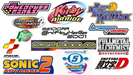
Do you see some of the common elements? Text in dense blocks, lots of bold outlines, often a sense of motion, blobby geometric shapes, sans-serif fonts, bright colors. These were some of the things I wanted to keep in mind for my logo.
With my research done, it was time to design the emblem. I really like motorcycles, and they’re... technically supposed to be part of my theme even though I always forget to post about them... So I wanted my emblem to be a motorcycle helmet. (This also fits in with the eurobeat theme, since racing and driving fast is a common theme of eurobeat lyrics, albeit usually about cars and not motorcycles lol.) I sketched out a few variations on what I had in mind.
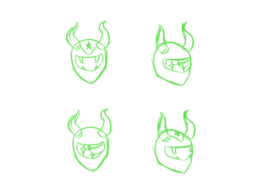
I incorporated my horns into the design, since they’re a big part of yknow, me. I also tried a few different decorative elements; The shooting stars are a motif sometimes seen in y2k graphic design, and the fangs are meant to emphasize the demon thing. As for the triangle stripe with the star, it’s meant to evoke the flag of Puerto Rico, but also has a classic racing flair.
After examining the various options and getting input from my friends and family, I settled on the design on the lower right. Next step was doing the black and white lineart.
This is a really important step. A good logo should, ideally, work in plain black and white. Even if you’re limited to just one color, your logo should be readable; This can be useful for things such as printing, stickers and T-shirts, things like that. Ideally you should be able to slap your logo on anything regardless of technical limitations. Am I, or you, necessarily going to do these things? No, but it’s good to be prepared anyway. You never know! So it’s always good to have a black and white variant of your logo.

This is the design I ended up with. In keeping with the y2k/late 90s/early 2000s style, I used bold lines with heavy weight variation, rounded corners, and a double outline. Now if I were really trying to be professional about it, I would have done it in a vector program rather than Medibang Paint, but I fucking hate vector programs and the only person who needs the files here is me, so I can afford to be sloppy. There’s programs out there that’ll let you vectorize black and white images anyway, so eh.
Next, it was time to add color to the emblem. Again, I had a bunch of different options, so I made several variations and asked for input from my friends and family. (I also put the BW version in the corner for reference.)
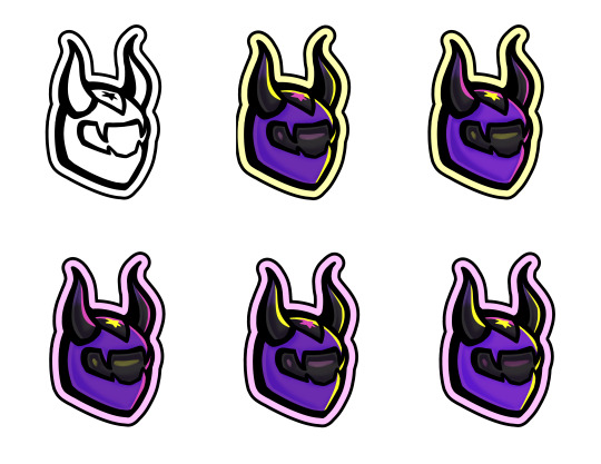
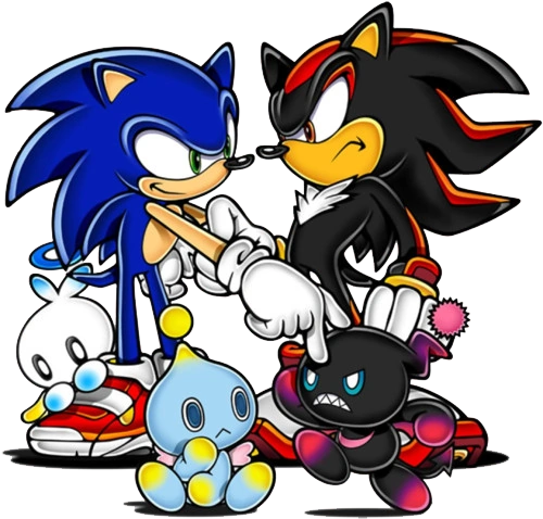
I already had some standard colors I use in my model and my graphics, so it was really just a matter of deciding how to arrange them. By the way, you can really see in the shading just how much inspiration I took from 2000s Sonic the Hedgehog art! Don’t be afraid to take inspiration from things that mean a lot to you, or... Well, inspire you, lol.
Once again, I ended up choosing the last variation as my winning design. With the emblem done, the next step was choosing a font. Zenith’s post already has some great notes on choosing fonts, so I won’t go into too much detail there, but once again I chose several options and asked for input. Getting feedback from others is a really important part of the graphic design process. It helps you to learn what works and what doesn’t, especially when other people may have different backgrounds than you (Is one of your friends colorblind? Does your art effectively convey its message to someone who doesn’t have the same knowledge of design history? Etc).
I actually chose 15 different font options, but for the sake of brevity I’ll just show four of them.
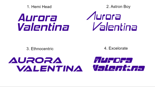
In general it’s good practice to do variants in regular caps, no caps, and all caps, but I didn’t do that because uh... I don’t remember why. Anyway, I largely looked for y2k or racing fonts. Admittedly Excelorate is super cute, but I ended up going with Hemi Head, because it’s nice and readable. I believe it’s a popular font in the Eurobeat world as well? I know Odyssey uses it in her graphics sometimes, at least. In any case, it looks nice, it’s not too generic, and it’s really easy to read.
After choosing both an emblem and a typeface, it was time to combine them both into a logo. Again, I started with black and white, both because it’s useful to have and it’s also just easiest to add color later on.

I spent quite a lot of time fiddling with spacing and such to get it to look neat and tidy. I added a line at the bottom to add balance to an empty space, as well as a sense of motion. To tie it all together, I encapsulated it all in that big chunky outline we’ve seen so much of.
Finally, color. Since I already had a colored version of the emblem, it was pretty easy to build the rest of the logo’s colors from there. I incorporated the purple and pink gradient I’ve used for header text in a lot of my existing graphics, and again I added a fun outline, and... That was it! The logo was finally finished!

Now, I’m not claiming it’s the most perfect logo in the world. I’m sure there’s things to criticize about it, and plenty of people who just won’t find it appealing. But I think it looks alright, and above all else, I hope this breakdown of how I went from square one to a finished logo is helpful to those of you who may be looking to design your own. I encourage you to do other research as well, and again, to check out Zenith’s excellent post on VTuber logos. (It’s worth noting as well that VTuber logos often have a particular look to them that I personally chose not to go for, but Zenith’s tutorial does a good job of explaining how to achieve that look.)
As a bonus, here’s this thing I made while messing around and trying out different techniques that ended up looking hilariously like the iCarly logo, lmao.
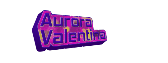
#VTuber#ENVTuber#Graphic design#I hope this is helpful idk if it is but I tried anyway#Good luck everyone!!!
2 notes
·
View notes
Note
What art are you most proud of? And please show us a pic if you can! <3
Not gonna lie, this was actually p hard to answer. I’m honestly proud of any piece I get done, especially any full body, full color, full background pieces, and I refuse to let myself out-right hate anything that I draw in general now-a-days, unfinished or no. I draw for fun, always have, so I try not to put too much worry on how good something looks so long as it gets my idea across in a way that I like, or that I tried?? (And ik being proud of a piece doesnt have to tie into what the end result looks like, im just covering that base) I looked through all of my recent digital art on my ipad(that i’ve had what, 3-4 years at this point?) and found myself about just as happy with each finished piece-
-Except one. There is one piece that I forget about constantly but I’m honestly super proud of the amount of effort it had put in to reach the end result. It probably sees a number of glances infrequently(due to my sporatic activity on said blog) but isnt posted to this blog’s art tag.
It’s the blog banner I drew for my @thelostguardianau fic, of the(at the time) whole cast in the au. You can find the post to reblog it from here but i’m also adding it below for reference. (* and honestly I’ll mention every other art piece in this au posted to it’s blog stands at having this same proudness, as each individual characters complicated design fed into this big banner, each one having a giant set of uniquely drawn wings, complex body markings, and unique clothing and features. And I would not have been able to complete this banner without having those singular character chart pieces finished first, except for Thomas’s design, who has yet to be posted for ✨reasons✨)
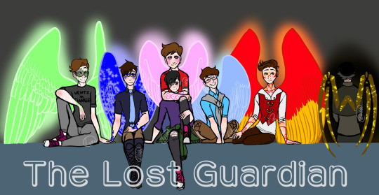
This fricking Banner was and still is(for now, *wink*) the most ambitious piece I’ve managed to finish. It took me so long, my wrist hated me, my ipad hated me, my ipencil hated me, medibang hated me, this piece pushed the limits of the poor app. Every time I try and open this piece up on the app it takes a solid couple seconds to open, save, and close.
From sketching to lining every single character, to having to uniquely match up Their Wing Sizes and Heights, because Guardians are fucking Tall, so Wing size and Height size was hell to calculate and portray. Why, you might ask?
Because I was limited to the proportions that would actually fit into a tumblr mobile banner. Which, funfact, is much smaller than you’d think!
I had to make sure they’d all fit, wings and all. And they didnt fcking want to. But I made it fit, because I wanted a full body + wings cast banner and goddamn it that was going to happen. And I did. And I lost a fuck-off amount of detail-space for it.
Coloring it wasn’t exactly difficult, but I will once again point back to this app hating this piece and it draining my battery because of it. I work in layers. My lineart will have 5-6 different layers in color before I combine them and set the hue to black, but I still keep my lineart seperate in that each character has their own lineart, and the background lineart is seperate.
I had their lineart, and probably still do, seperated into Seven different layers, one per character, each one w/ an extra masking layer for their wing glow. Each character got their own folder for colors, and had multiple layers for each colored section: clothing, skin, skin blush + eye whites, hair, wings, body markings, marking glow. And then there was the background layers, and the glowing affects, ect. The whole piece stands at having about 80 total layers having been used over the course of making it.
So yeah, Medibang does not like this piece when I try to open it. xD
But really, setting aside fighting and babying technology thats being pushed close to its limit, the real pride comes from the fact that this piece has Seven fully colored, near-full body characters drawn, all touching and interacting and accurate to the scale that I made. It is the most amount of characters in one piece that I’ve ever drawn, colored, and finished, and I’m pretty fricken proud of it.
Which makes it all the more daunting that said banner is going to get an upgrade, because it’s a Character Cast Banner after all, and its going to have four more fully designed and full winged characters added into it.
And by upgrade, I mean I get to redraw the whole dang thing. Because I gotta rearrange ✨everyone’s✨ positions. And at this point, the only way thats possible is by starting over.
wish me luck on that. o_o;
128 notes
·
View notes
Note
i used ibispaint years back right when i first started digital art and i absolutely agree That it feels me with inexplicable rage. literally i always have to do such huge takes when i see my favorite artists say they use ibispaint it makes me so angry
literally the only problem is that it lags Like nothing else is that bad but using it for the first time today made me actually pissed they put something in that damn app to make you hate it. Fuck this im going back to medibang which wiped my art folder without warning Better than ibis paint
2 notes
·
View notes
Text
I do a lot of the above currently, and I've done the rest (and more) previously.
I do traditional all the time, and that was the one I started with. Probably my favorite medium to work in.
I use all kinds of mediums in that too. I started with just an HB pencil, of course. But then that turned into all kinds of graphite, and that progressed into a brief charcoal phase (which I dropped and baven't touched because got damn that's a messy medium to work in), then I did Prismacolor colored pencils, then Copic Markers, then I tried watercolors, then acrylics, and now oils. I've done all kinds of other smaller things in other mediums, and not all of my previous phases have been fully dropped. I experiment and mix mediums a LOT. Copics are still my medium of choice when looking to draw something and color it, and I'll usually start with a pencil sketch, use a Gellyroll to line it, then use Copics to color, and then sometimes use Prismacolors for added depth and throw on some highlights with a Uniball. It's ridiculously fun to throw shit around and just... have fun with it.
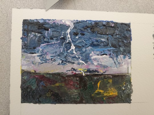
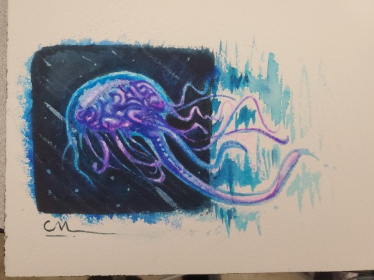
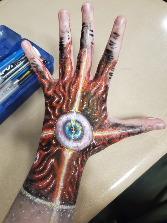
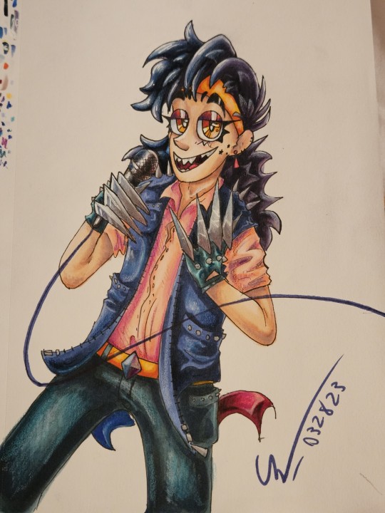
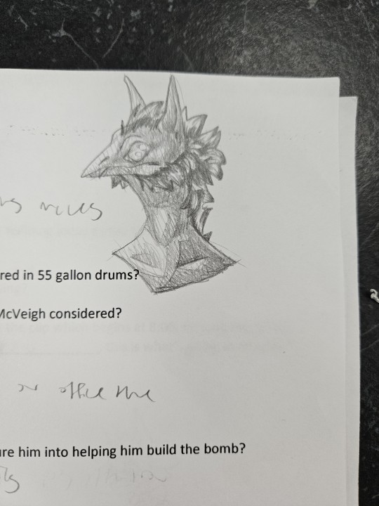
Acrylic photo study | watercolor 'brellyfish' | pens and markers on my hand | Copics, Prismacolors, and pens | pencil doodle on an assignment
I have a nice screen tablet currently (and also use screen tablets in my animation class). My old tracking tablet broke.
I'm still really sad about that tracking tablet. That thing held strong for seven years!
When I draw with a finger on my phone, I usually do a sketch traditionally, then take a picture of it and bring it in as a base. Sometimes I'll do lineart traditionally and use the 'convert to lineart' feature on the apps I use. I'm actually getting a lot better at working on a phone!

Lineart scanned in from a traditional doodle, the rest done in MediBang on my phone. This actually isn't done yet.
And yes, when I was first starting out digitally, I used a mouse/trackpad. I actually made a full animation back then. In MSpaint.

Tumblr wouldn't let me upload videos, and the only way I could get this here was by making it a gif... which is extremely limited. But it's whatever. Enjoy the animation I made for an old Scratch project.
I used MSpaint until a year or two after getting my tracking tablet. Then I found FireAlpaca, and used that for a LONG time. Then that progressed to Clip Studio Paint, which I started using about a year or two ago.


Modern MSpaint drawing juxtaposed with a modern CSP drawing. Both WIPs that I need to finish.
In class, I use Photoshop, Adobe Animate (fucking hate Adobe though. Piece of shit company with unnecessarily complex toolbars/mechanics), and Toon Boom (Harmony and Storyboard). We were supposed to use Maya this year too, but we unfortunately didn't have enough time to get to it.

Toon Boom Harmony animation... that I also still need to finish lmao
On my phone, I started with IbisPaint, and now use MediBang.
This has become an art dump of a post, and honestly I so love it lmao. Y'all get to see some more of my art! Plus some really old shit! I'd share more if Tumblr didn't limit images to 10. Maybe another art dump will come in the future 👁
#art dump#traditional doodle#traditional art#copic markers#prismacolor pencils#skin art#pencil doodles#mixed media#phone art#medibang#ms paint#animation#scratch.mit.edu#mspaint animation#csp#clip studio paint#toon boom harmony#toon boom animation#my art
2K notes
·
View notes
Text
Edit 1:
so .... as i said
medibang it's not friend anymore...
but i think everyone also gonna hate medibang for good fucking reasons.
medibang
1: don't made us delete some art to make another ones for future updates...
2:LIKE YOU TOLD US EVERYTIME YOU WERE UPDATING THINGS
you could just told us about this, while making another page to say "ah so medibang was making updates no bad :)"
3:some say it worth it, but many already saying it's bad update.
and gonna be honest by just reading the update... it just gonna let you add more layers if you buy their premium...it's shit to be honest.
so it's fine if you still like it, but you broke my heart medibang.
youtube
0 notes
Text
I hate shiny shaymin groudon and dialga with a passion burning deep in my soul so i made them, in my opinion, way fucking better
yeah the edits kinds shitty but to be fair im using the free version of medibang paint in mobile with no pen


#ranger rambles#pokemon posting#pokemon#shaymin#dialga#groudon#shiny pokemon#pokemon diamond and pearl#pokemon ruby and sapphire
1 note
·
View note
Note
I have a questiooooon!! >A
AAHh TthHaaANK YOoOU!!! ♡
I use an ipad! I lineart in medibang and color in procreate (i also do all my sketching and doodles in procreate) I own a wacom tablet and ive tried Photoshop and paint tool sai(i think thats it?) once or twice but i needed something portable because i work a lot. And those art apps are too advanced for me o_o like wtf is a magic wand??? OKAY SO as far as brushes go I don’t really use another fancy just whatever comes with the application. I have a folder with my go to brushes in it. i totally recommend going in and fucking with all your brushes settings until you get it just how you like. Almost all art applications allow you to change the brushes settings and i really gottah say if you get it just like you like it it’ll really help you go faster and smoother while drawing. OKAY AND LAST THING– i make a lot of my own brushes. (Anything you see in my art like stars or clouds or hair tuffs, etc are brushes i made) i can not recommend making your own brushes enough. most applications allow you to do this! there are lots of tutorials out there that can help with that (i use youtube tutorials for this but theres a lot online in different places)! I have two brushes named “sexy boi” and “best friend” and they are my favorite!!! i spent a lot of time making them to be my dynamic duo. BUT YEAH I love making custom brushes there’s no end to what you can create! (sorry if the image below is blurry tumblr hates me)
I HOPE THIS ANSWERS YOUR QUESTIONS ♡♡♡

66 notes
·
View notes
Text


And we are done :D
These are the last few images in the PMV (although I will go back and render some of my favorite images with the text on them because wowie I popped off with the caption decisions I made and my handwriting and so on)
Director's cut commentary:
the perspective shots I did for a lot of the ones with Ken and Shinji were really complicated but I genuinely feel proud when I look at them. The program I use (Medibang Paint) has a bunch of line snap tools and one of them is actually a vanishing point perspective tool so...yknow...country girls make do and I don't mind cheating (using resources I have on hand). Made some of this easier frfr.
the decision to only have blood as the color in the last few frames is because I'm Mean (: (No but it's more about like...the trauma and like how Ken is Not Doing Okay and how all he can focus on is the blood and Shinji dying and is this what revenge should feel like?)
Takaya's tattoos are the bane of my existence. Also I had to darken his hair because if I left it white like I had it originally (and like how Aki is) then it'd blend in really badly. Thankfully his hair is a little darker than Aki's so I could get away with it.
drawing hands gently grabbing someone's face from behind their head is hard and difficult and I couldn't find fucking references and I couldn't do them myself so I had to IMAGINE it and boy that was...bad. I did it, but it was bad.
not to belabor the point about me being a huge fucking whump/angst gremlin, but I LOVED drawing Ken wailing in agony. 10/10 sorry buddy but you had a whole revenge plan that ended in you committing suicide and you are TEN YEARS OLD so like...yeah, this is a better alternative. Sorrynotsorry.
Shinji's color (his menu icon color) being the burgundy/maroon of his coat is so much to me. Ominous fucker (said with love).
the revolver was the easiest part of the Takaya shot, no lie. Turns out I hate drawing the Jesus part of Revolver Jesus the most lmaooo. Fuck this guy.
I added the ribbons to the vases to break up the colors and it worked really well.
youtube
Happy October 4th. I fucking love Persona 3 so so much (as one does).
(This was like a month of work and I think I won't be doing art again for a week minimum but I did the damn thing, fucked up a single frame, had to RE-RENDER THE VIDEO and then had to RE-UPLOAD IT so I'm feeling some kind of way.)
#the sheepy does art#persona 3#p3#ken amada#persona 3 ken#next day rebagel#image description in alt#long post#persona 3 spoilers#p3 spoilers#director's cut#cw guns#cw blood#hey so i do deeply love this pmv#and im so fucking proud of me#anyway look upon my work boy
12 notes
·
View notes
Text
AMA Transcript: In The Silence I Hear You
Recently, @skadventuretime, @eerna (JoKay on Discord) and @amberlehcar stopped by to chat about their 2016 Resbang, In The Silence I Hear You! Here’s some of what went down:
Q: Okay, first of all thanks for single handedly getting me to finally watch YLIA lol! My question to madi is, what was the inspiration behind soul's nightmares? Because that was something I noticed was different from the source material! I mean, they were there but yours were way more nightmarish and horrifying lol! (That is absolutely a compliment by the way.) What made you go that route?
madi: ahahaha 1) You're very welcome, that anime Ruined me and one of the first things I did after watching it and Soul Eater around the same time was look for the AU, because surely it had to be a thing. When it wasn't, I was like welp, I know what I must do. As for the nightmare inspiration, it was part Soul having them in canon and part just what sort of came out of me as I wrote. It wasn't planned per se. I tended to sort of let what happened happen at those parts and just intuited nightmares there, though I did sort of intentionally have them stop as he began to open up to Maka more.
Q: I would like to know how Jo determines how many sparkles to put in an art piece for maximum heartbreak.
JoKay: Simply. I just really love sparkles and let them do whatever they want in my work.~~ BD
madi: OkAY. CAN I JUST FIRST SAY MY FAV THING ABOUT JO'S ART. Because the way she did the mirroring is incredible. Like, this is my desktop background. They go together so well:

Q: Favourite moment in the fic or about the art?
madi: I think my favorite moment was writing Soul beginning to get through his block. I ended up having a lot of fun with the over-the-top synesthetic music bits and that part was very heartfelt for me.
JoKay: Favourite moment in the fic: the hospital visiting. I wanted to illustrate it really badly and ranted to Madi like. For days. About all the ideas I've had. It was heartbreaking but colorful and vivid, and the way Madi writes the two is just.... ahhhhhIhhhHHHH
madi: And like, Jo paid attention to the little details?? ? ?? Like, his tie isnt tied there. I just threw in some little bit about how he thought his tie would be crooked since Maka wasnt there to help him and ladjglkdsfg. I forgot about it tho til I saw her art.
JoKay: You threw in so many little details that struck me and I thought "YES I WANNA MAKE THIS A PART OF THE PICTURE SOMEHOW"
Q: Care to talk a little about your process? What program do you use?
JoKay: Sure! I start off with rereading the text I want to illustrate about ten times. I die a bit and try to remember the feeling to capture it. I make a traditional pencil sketch. For the Maka picture I had to take some references of myself with a violin, which... took a long time to get right haha. Next I take a picture of the sketch and do lineart in an app called MediBang Paint on my Samsung. I choose a color palette, pick the bg color, and put down basic colors. I shade, then add multiply and overlay layers to add lighting, and this is where the final palette and overall feeling gets formed. And then, best for last, the sparkles! Which usually take 3-4 layers, depending on opacity I want.
Q: This was a difficult read (in the best way); what scene/scenes did you find most difficult to write?
madi: I ended up going back and rewriting a good chunk of the beginning third of the fic around November/December because it just wasnt getting at what I wanted, tone or writing quality-wise. I have a ~12k doc of dumped/scrapped stuff from this. /cries. But specific scene wise, hm. I agonized a bit over the hospital scene with Spirit a little, because I wanted that to hit a certain kind of helpless sadness where there is nothing you can do to fix anything.
Q: This had such emotional depth to it and lots of moving pieces of grief and accurate descriptions of guilt/grief that hit me hard. Was it hard to write something so emotional and was it as much of an emotional journey writing as it was reading?
madi: I guess, well. writing for me, and I think a lot of people, can be a very intimate look at who a person is, and I think that's where the guilt/grief came from. I tend to internalize a lot of that stuff, especially with the grief/regret/wistfulness, so I think that's where all that came from. And it's funny, it wasnt hard to write in the moment, as I was listening to a bunch of ridiculous music and yelling at/with Bones about her Resbang at the same time, but looking back I can definitely see a journey and it was as much because of the friends I made during this process as much as the act of writing. [For example], around the part where maka dusts off the piano, Bones came in with some Real Piano Experience and helped me understand what actually goes into that and how long it'd take for things to actually lose tone, etc. and I was like, heck, i didnt think about that, having not played a classical piano. Moral of the story is this is why betas are gr9. It's fucking sappy as shit, but it's true. I learned sO much about not just writing, but also life and irl shit from my betababes. Part of my Process turned out to be letting Bones throw me all sorts of cognitive dissonance shit and terrorize me with very emotional music, and then I'd mix a drink and get to it. I stg it felt like I was tripping balls when I wrote most of the music scenes, tipsy and listening to BT. (https://www.youtube.com/watch?v=HyGf2mTP2_Y).
Q: That golden swoop in her dress on the right side is what really kills me. That exiting feeling.
madi: So fun story: Jo sent me her second piece a few days before posting and I legit teared up.
JoKay: Handkerchiefs all over the place.
madi: All. Over. I also tried to sort of avoid the awkward love triangle in the anime bc i didnt feel like it really fit SoMa. Also, this is what me and Jo's convos looked like a lot towards the end:

Q: Adverb gate time?
madi: To explain adverbgate, basically, Bones came in and 1) made me realize I overused adverbs 2) this led to me realizing oH by not using them and applying better characterization things, all is better than the first time. I told all my betas, and part of the reason I asked who I asked, [was for them] to not hold back and if they saw something they thought was off or whatever, to tell me and not worry about hurting my feelings because i was in this to improve and learn. I'd much rather have it done like this, because now I really feel like I learned a lot and got better. Bones went from the 98 edits in chap 1 or 2, to 4 [edits] in the last one. And one of them was this: http://imgur.com/R3L4S9b
Q: I wanna know Amber, what made you decide to do a VA project? It turned out so freakin well and you guys were so good T.T
JoKay: The VA was so perfect, I teared up a bit. Beautifully done.
AmberLehcar: I was an amateur voice actor on YouTube prior to joining tumblr (good luck finding anything I was in though. /cries) And I'm a competitve asshole so I was like "I'm gonna be different."
Q: Anything in particular that made you choose that specific scene to do?
AmberLehcar: I asked Madi right away what she wanted. And it wasn't even written yet when I asked lol.
madi: Like, okay, when she sent me the first clips, I was blown away because they sounded better than over half the English dubs I've seen. Yeahhh I uh, I could have been more on top of things. But I knew that scene was gonna be in there and it sounded like the kinda emotional moment that would be good for her project, so I wrote that scene out of order.
AmberLehcar: I love it, it's so good. Madi was there while Brian was recording. She's a director now :3 She heard all the ridiculousness.
madi: You guys were soooo gooood! And your puppy, ahhhh. I still have that laugh track, too.
AmberLehcar: My pup wanted to be a star. I was so nervous [that] the piano bit was so bad people would hate it. It dragged so long. In writing it works so well. Listening, though...
madi: Man, you captured the transition well tho, of him slowly finding his sound and no longer needing to hear it through her.
AmberLehcar: Playing badly and repeating playing badly is tough, dude, so I'm glad it worked nicely.
Q: Did you make a public playlist of the stuff you listened to?
madi: OhH yes, yes i did /slinks off. Not fully included on there is the copious amounts of BT and Stuntin Like Mufasa I chainsmoked: https://www.youtube.com/playlist?list=PLhw3nWRXdsh-jPe7SXHPy-NOT4-PtY1yt. I also feel obligated to note that Bones did play a p important role not only as beta, but as general conspirator/friend and writing mentor, and being free with her music trenchcoat.
Q: Jo, do you have any art/style/artist inspirations?
JoKay: Yeah! Artists that make my inspiration wander could be found on tumblr as viria, lukrecious, loish, mormoc, also IG mizymiyajima and cyarine. IRL I live for Alphonse Mucha's work.
Q: I feel like we should put an honorable mention for amanda's and zxanthe's contribution.
madi: YES, ZXANTHMANDA'S COVER OF HALLELUJAH WOUNDED ME SO PLS LET IT WOUND YOU: http://zxanthe.tumblr.com/post/157041732943/so-in-honor-of-skadventuretimes-resbang-in-the.
Q: How often do you draw, outta curiosity jo? I remember it being A Lot, but...
JoKay: Depends? If I'm not too busy with school I can make pages worth of sketches a day.
madi: Dark Jo, your sketch books are amazing.
JoKay: Madi, if you saw them, you'd change your mind. They're a hellhole of faint traces of suffering teens and stupid decisions.
Q: Are you working on anything else now Jo? What is on the Horizon?
JoKay: SfTF is the only fic in my opus! Idk I just don't feel confident to write anything else...
madi: (It is a Noragami MMA AU type deal >:))
JoKay: As for paintings... boy does The Lunar Chronicles' fandom have some stuff in store for them once I find the time. I will save up for a proper tablet soon, so that will be a new beginning for me.
madi: Man, the world isnt ready.
madi: I would also attribute this Resbang to teaching me that I apparently can't listen to tone-appropriate music while doing a scene, so that was a learning curve. I ended up with a bunch of upbeart mashups/disney rap during the sad scenes. Like this: https://www.youtube.com/watch?v=YdSo1oY_GB4
JoKay: It was fun talking to all of you and listening to more behind-the-scenes discoveries of this great fic~
madi: I also wanna take a sec to be sappy again about everything I learned throughout this process from my partners and betas. Y'all are super swell.
Thanks to the creators for stopping by! That ends our AMA Transcripts for the Resbang season - thanks for reading and congrats to all of this year's Resbang participants :) We'll see you all in 2018!
9 notes
·
View notes