#this picture had two layers and one of them was the background color
Explore tagged Tumblr posts
Text

i think they deserve some good ole’ love making, don’t you?
older brother’s best friend eddie x fem reader
18+ ONLY MDNI
warnings: oral (fem receiving), eddie is a pussy drunk lover boy, riding, unprotected piv sex, cream pie and just some over all cuteness… they deserve it <3
it’s a recipe for disaster masterlist.
a/n: big thank you again to the loml @strangerstilinski , also i totally picture time of the season by the zombies playing on the radio during this chapter… enjoy freaks xx.

the sweltering august nights had finally faded into a more tolerable autumn, the leaves beginning to bloom in a array of yellows and reds.
after your disaster of a date at the hawk a few weeks prior, you both agreed to meet exclusively at eddie’s trailer from now on. as it was the one place that was safe from the prying eyes of your brother.
so far anyway.
the cool september breeze that filters through his cracked window offers you some reprieve from the rising temperatures in his bedroom.
his hands are everywhere, gentle and warm as they kept your hips pressed into his mattress. the radio is playing softly in the background, an oldies station that neither of you cared to change.
as the both of you far too preoccupied with the weight of his ribs between your hips.
his tongue continues to lap against your overly sensitive core, already having coaxed two orgasms from you in the last half hour alone. your fingers are buried in his hair, curls mussed from your constant tugging and damp from sweat.
your soft whine of his name has his head lifting, flushed cheek pressing into the meat of your thigh. his pupils are blown out and glassy, your juices that are smeared across his chin shine in the muted light of his bedside lamp. the colorful handkerchief draped over it casts him in a soft pink glow.
and he’s never looked so beautiful to you before.
“c’mere,” you plead.
he’s crawling up your body without another word, lips locking with yours. he kisses you deeply, hips rutting against yours with fervent need. the feeling has you gasping into his mouth, the taste of you still lingering on his tongue.
another pointed roll of his hips has your fingers sliding down his bare chest and lightly pushing against it. eddie pulls back slightly, the worry that fills his features quickly dissolves when he takes in your lustful expression.
“lay back for me, handsome.” your words come out soft, but more desperate than you intended.
and eddie, eager to please as always, just flops down on the mattress beside you. he just gazes up at you, doe-eyes filled with devotion as you place your palm on his chest and move to straddle his waist.
you can feel the flutter of his heartbeat beneath your fingertips, chest rising and falling as you seat yourself on top of him.
you’re both treading in uncharted waters, but the encouraging look in his eyes helps to keep you afloat.
an experimental drag of your hips has him groaning, rough fingers splaying over the tops of your thighs. you can feel him— hard, heavy and straining beneath the fabric of his boxers. the thin layer is the only thing separating your bodies now.
the mixture of your slick and his saliva soaks into the checkered fabric, allowing you to glide your hips more easily against his shaft. the damp material catches against your clit in just the right way, pulling a whiny moan from your throat.
“that’s it,” he mumbles, helping to guide your hips. “take what you need, baby.”
your hands that are resting on his chest suddenly dip lower, the male helping to lift your hips so you can tug his boxers down his thighs. when eddie moves to kick them off the rest of the way, the sudden motion has you tumbling forward and accidentally knocking your heads together.
“whoops,” you breathe as you lean back, cradling your forehead in the palm of your hand. “sorry… you okay?”
your lips jut out in a small pout, suddenly worried that you ruined the moment due to your inherent clumsiness.
he glances up at you before licking his lips, “it’s hard to say…” his brows then quirk up beneath his bangs, a breath blowing past his spit-slick lips.
“but y’know, now that you mention it…”
he draws it out, an over dramatic lilt beginning to bleed into his voice.
“i am starting to feel a bit woozy.” he pauses, before the corner of his mouth turns up in a cheeky grin. “not from a concussion, of course, but having a pretty thing like you on my lap is—”
and quickly shut him up with a kiss, feeling the laugh that rumbles through his chest.
“you’re such a shit head,” you giggle, nipping at his lower lip.
“oh yeah, keep talking to me like that, sweet thing.” he teases, “you know how that gets me going.”
feeling suddenly emboldened you reach between your bodies, grasping his hardened length in your palm. his answering groan only encourages you to grip it fully as you sit back up.
you nudge the reddened tip through your drenched folds, mewling softly when you slowly start to sink down onto his thick length.
“that’s it, slide it in— oh fuuuuck,” he all but whines.
you’re panting by the time you’re fully seated, palms resting on the flat of his stomach. his cock is nestled at your deepest point and you swear you’ve never felt so full in your entire life.
eddie regards you with the utmost tenderness as you raise your hips, nearly letting him slip out of you before you’re guiding them back down with a small gasp. your pace is slow but steady, gradually taking him even deeper with each subtle rock of your hips.
your head falls back, eyes fluttering shut as the tip of his cock nudges against your sweet spot. his hands that were resting on your hips begin to trail up your sides, underneath your shirt to kneed your breasts in his warm palms.
“look at you,” he groans, encapturing you in the warmth of his gaze. “… like a goddamn dream, baby.”
you’re far too engulfed in your own pleasure to register anything he’s saying. besides the lewd whimpers that continue to spill past his lips with each rise and fall of your hips. the sensation soon becomes overwhelming in the most intimate way possible.
“god, i love you…”
those three little words slips past his lips before he can stop them. so drunk off the feeling of you wrapped around him that he doesn��t realize he’d actually uttered them aloud.
despite the lustful haze that continues to dull your senses, you suddenly hear him loud and clear.
when your hips gradually increase their pace, your fingers wrap around the chain that has fallen into the hollow of his throat. you grip the guitar pick in your fist, coaxing him up until your clothed chest is pressed against his own and his forehead touches yours.
“say it again,” you plead.
his eyes widen as the realization of what he’d just said finally sinks in. but there’s no trace of fear in them when he cups your cheek in his palm.
“i love you, sweetheart.”
your mouths meet in a sudden clash of tongue and teeth, and he swallows each breathy cry that leaves your swollen lips as you meet your end. he allows you to bury your face in the crook of his neck, panting as he chases his own release.
his thighs tremble and he fists the back of your shirt— keeping you pressed against him as he fills you to the brim. only then does he let the exhaustion take over, both of you falling back into the mattress in a heap of entangled limbs.
you both lay like that for a while, letting your breathing slow as the radio continues to fill the comfortable silence.
when you dare a quick glance up at him, your heart thumps even louder in your chest. his eyes are shut, his wild curls fanning out over the pillowcase. he looks so content you would’ve thought he was sleeping, but the subtle quirk of his lips tells you he’s wide awake.
eddie carefully peeks one eye open and you quickly hide your face back into his shoulder. a deep chuckle rumbles in his throat when he catches you staring, but it still makes his heart flutter beneath his ribs.
when you finally muster the courage to speak, your words are muffled, lips pressed into the sweaty skin of his clavicle.
“i love you too.”

series taglist: @nailbatanddungeon @angel-eyes-and-devil-hearts @mugloversonly @eddiemunsonfuxks @munsonhoneybaby @alagalaska @creative1writings @missmarch-99 @stolen-in-moonlight @xxbimbobunnyxx @calumfmu @bastardstevie @prestinalove
let me know if you want to join the taglist for this series!
#the freak writes 🫧#eddie munson smut#eddie munson blurb#eddie munson x fem!reader smut#eddie munson x fem!reader#eddie munson x y/n#eddie munson x you#eddie munson x reader#eddie munson x female reader#brothers best friend!eddie munson#brothersbf!eddie munson#[ the munson files ]#[ series: it’s a recipe for disaster ]
770 notes
·
View notes
Text
F1 DRIVERS AND CHRISTMAS ACTIVITIES
special xmas edition
inclunding mclaren, ferrari, mercedes + verstappen, ricciardo & gasly
warning : none
note : i rushed it and i just think it's super messy and bad written lol
!! english not my first language !!
ᦈ OSCAR PIASTRI 81
you love christmas because of course it means christmas cookies and pastries. you like baking, so when oscar offered to join you to bake some cookies, you obviously had to say yes. he would try to do his best, learning from you. he looks carefully how you manage to draw perfect shapes, and he tries to recreate it even though it ends up in a mess. his cookies are not the best, but he doesn't care since he spend time with you, the most precious person in his world.
ᦈ LANDO NORRIS 4
your tradition is to decorate christmas tree. this year, you came up with the idea of mixing red and gold colors, but your boyfriend does not agree with that. he asks for orange, since he wants to show how proud he is of being a mclaren driver. you argue with him, saying orange will look bad. but he's stubborn, so after a agreement you two ended up by putting orange and gold colors in the tree. it's not really pretty. but lando likes it anyway, and he'll thanks his favorite girl for letting him put his favorite color.
ᦈ CHARLES LECLERC 16
this man doesn't even know how to cook pasta, so no need to ask him to wrap the christmas presents. he'll make a pure mess. instead you made him responsible for buying the presents, and you'll wrap them. seeing you wrapping them, he would propose his help. you say yes because how could you refuse some precious help. but you knew it was a bad idea cause as soon as he grabs the wrapping paper, he rips it. you sigh and he would peck your face and lips in order to apologize. and it worked, since he finished by helping you, well more kissing you but that's a secret.
ᦈ CARLOS SAINZ 55
you literally love christmas market, so does carlos. you are so excited to see the different decorations and dishes, and carlos couldn't help but get excited too. he would bring you there, and seeing those little sparks in your eyes warms his heart. he'll buy you anything you ask, and even feed you some hot food. a big christmas tree is in the center of the place, and of course you have to take a picture with it. carlos will take it, and then probably post it on his instagram story, saying how good the day was and how cute his lover is.
ᦈ LEWIS HAMILTON 44
christmas also means movies marathon. well at least for you and lewis. it is one of your favorite activity of the year. you two would slip under the warm blankets, cuddling so close. lewis starts the first christmas movie, and the night passes extremely fast. laughing and talking about christmas stories, and of course kissing session is open. but soon you start feeling tired, and when lewis sees you falling asleep he would join you. pressing soft lazy kisses on your forehead, the movie still playing in the background.
ᦈ GEORGE RUSSEL 63
snowman. how cute it is. when you saw the first snow, you literally screamed and called george, getting way too much excited. and when the snow would stop falling, letting a large white layer on the floor, you'll run outside with george. you start building the snowman's head, and george build the body. of course you would throw at each other some snowball but it's just too funny. you finish by placing a carrot and some rocks, and ta da ! the snowman is just as beautiful as you and george. and he'll proud of it, but most of you.
ᦈ MAX VERSTAPPEN 33
karaoke night. max wants to spend his christmas holidays only with you, well actually all of his winter break with you. and he loves karaoke and you loves christmas songs, so obviously you had to mix these two things together. so here you are, on a night, playing christmas songs out loud in the house. he'll sing loudly over them, and you'll join him, screaming lyrics like you felt the music deep inside your bones. maybe the neighbors will complain about it later, but you don't care, because the moment was just so romantic and sweet.
ᦈ DANIEL RICCIARDO 3
ice skating is such a fun activity. and daniel wants to do it with you. so putting on your skates and going on the ice. surprisingly, daniel would be the one who fall literally every seconds. he firmly grab your hand, maybe a bit too much since you don't even feel your fingers, but even like that he somehow manage to slip and fall on the ground. taking in you with. but you don't really care, because after all it's just so funny. your laughs filled the air and daniel feels so happy about his idea. about ice skating together. and he knows for sure it will remains as a great memory.
ᦈ PIERRE GASLY 10
you literally hate gingerbread, so when pierre asked you to build a gingerbread house you refused the offer. but you know how much he wants to spend time with you and how much he wants to build that house, so you finally gave up. he would be so happy and after baking everything, you thought about contend for who will build the best gingerbread house. you would put all your efforts in it, so concentrate. pierre doesn't want to lose, and neither do you. so after building them, he'll ask on his instagram story who built the best one. and when he'll see you being the winner, he won't hide how disappointed but proud of you he'll be. because after all if it's you the winner, then that's all okay.
#f1 imagine#f1 x reader#f1 fanfic#f1 x you#lando norris x reader#oscar piastri x reader#charles leclerc x reader#carlos sainz x reader#lewis hamilton x reader#george russel x reader#max verstappen x reader#daniel riccardo x reader#pierre gasly x reader
404 notes
·
View notes
Note
i rlly like ur composition, i wanna know about your process :D
thank uuu !! yeah so like. composing a scene for me generally begins with a vague idea that i want to get down as quickly as possible- and for me that usually starts with finding a setting. I knew that i wanted to draw a) a group of roomates gossiping in a crowded kitchen and i wanted there to be b) one figure in the extreme foreground and c) lots of plants. i do use some tools to figure out perspective, mainly the csp perspective ruler. Usually i start by finding a picture i like similar to the vibe im going for- but instead of referencing anything else- im purely interested in perspective. sorry to anyone who is shocked i dont generate all of my perspective purely by myself- i can draw in perspective fairly well but i struggle to make straight lines and this is easier to make grids with than the line tool lol ^_^ i try to use it kinda more like spellcheck on typos than like something to fully rely on. this is the video i learned this trick from:
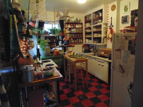
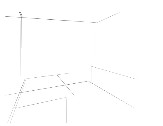
i saw the left photo and realllly loved how the cabinets alligned with the wall- so i used my ruler tool to draw out my inital plotted points from the image- basically the linear movements i was most interested in and then i turned off the image layer and worked with those lines and the ruler tool to move on. eventually i had this:

which was enough for me to put my characters in for the inital round. if you notice- i made a looot of further adjustments as i go on. this sketch is not a final layout, its so my characters have somewhere to be! i cannot draw someone standing on a floor if theres no floor, nor leaning on a table that doesnt exist. i can’t draw my characters without a background, but i also cant finish my background without accounting for how my characters can comfortably exist in it!!

this was the like.. very basic start. i knew the positions of two characters- but i needed to change a lot not only to fit them better but to allow for the other two figures i had planned.
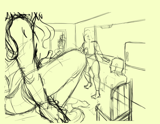
okay.. a little better. i widened the kitchen, closed the fridge door.. added a chair and fit in all the figures.. but this is waaay too dramatic. only two figures are actually interacting- and they are at wildly different energy levels!

this is where things started to make a little more sense characterwiss, so i was ready to refine backgrounds and figures and unite the two.
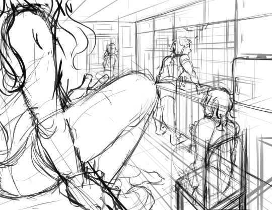
inital base sketch. much better layout.
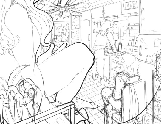
okay- this is where im getting my footing but things seem.. really really off. You can see me working on my framing here- theres some good linear movement from left to right here- but not vertically. It’s hard to notice the figure in the far back, so i need to redirect the viewers eye to move upwards as well!
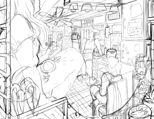
this is where i decided to zoom out, add an interesting vertical element to the left of the image and make it clearer whats happening in the foreground. i had to account for some stuff by adjusting the cropping, but i paid attention to that as well.
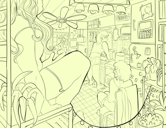
annnd- thats what a clean sketch looks for me! i have all the elements of my scene accounted for, and things are clean enough to read.
the next step for me would be transfer! essentially- I print the image of my sketch out, resizing and taping pages together so my sketch matches the size of the paper i want to paint on, and then i use a lightboard to transfer my sketch with pencil onto my paper. Then i refine the sketch a few times on paper before stretching my watercolor paper (essentially just prepping for painting) and inking with a brush and colored ink before going in with watercolor, gouache and ink, then usually finishing with marker, colored pencil, pastel and ink. it’s a lengthy process but a lot of fun lol. but sketches for me can be like.. 15 layers of different roughs until im happy with just the sketch. there were more images but im on mobile and theres a 10 image limit 😭😭 im a bit masochistic but i believe that if i dont have a good sketch i dont have a good painting!!
117 notes
·
View notes
Note
How do you do your Final Fantasy edits?
The hard way, my friend. No AI is used here, I do it all by hand. 🥰 I assume you mean the screenshot manipulations I create? I'll try and give a simple summary... First, I boot up Remake on PC and use a "free camera" mod(you can find the links to the mods I use on my archive pages for manipulations, which is on my pinned post) to take a couple screenshots that I think will work well together. Sometimes I change my mind and choose a different one. It can be hard to match the camera angles and lighting, so sometimes I have to mess with that later, as well. But it's easier if they fit together from the beginning. We'll take my current WIP as an example. I started with these two screenshots:


I open them in the free program GIMP (GNU Image Manipulation Program), which anyone can download at gimp.org. Then the first thing I do is choose the base image. In this case, they're both facing the same way, so I choose to flip Sephiroth(you can't really do that with Cloud easily because of his earring, and his hair is less symmetrical). Since the camera was closer up on Cloud, and he's the smaller one, I usually choose Sephiroth's to be the base image. With that decided, I roughly cut Cloud from his background and paste him onto Sephiroth's image as a new layer. Then I position him, resize him, rotate him, whatever I need to do until he seems to be in the desired place, which ends up looking like this: (I ended up adding snow for this preview, so it would look more complete than it is when I showed it to my server, haha)

If you look at Cloud, you can still see a thick outline of his old background around his head. Once he's positioned properly, it's time to remove the rest of his background(I use a size 10 eraser with 100% hardness and zoom in about 5 times). Then I need to think about where they're connected, and how to make them look like they're touching, as well as layering to make them seem intertwined, as if they're truly occupying the same space together.

I cut away some of Cloud's shirt, and the rest of that effect will come with shading later. If I wanted Cloud even closer, I would make a duplicate of Sephiroth and erase his background, so that his lock of hair would appear to go over Cloud's face. I could also make it semi-transparent, so you could see the outline of Cloud's face through his hair. You can see I have some small game defects to fix, such as Cloud's hair clipping through his ear. I leave those tiny details for later, typically. Sometimes, because of their height differences, I have to "rebuild" missing parts of them from scratch, such as I did for this other manipulation:


It's a delicate process that's mostly the clone tool(to keep the textures) and some freehand drawing, but I don't have an art tablet, so I use my mouse for everything, which can be quite challenging. I've had a lot of practice from translating doujinshi, where I'd erase the words, rebuild the missing part of the image, and then place the translated words over that spot.
In any case, I decided I wanted more out of this manipulation than just leaning against each other. I wanted Cloud to be reaching up towards Sephiroth, and perhaps for Sephiroth to be pulling him closer. To do that, I needed pictures of their hands/arms like so:


I've taken hundreds of shots, so I looked through what I had first, but it wasn't the right angle, or was the wrong outfit for Cloud, so...then you open up those images and cut out the parts you want. After that, you work on positioning and things like that again. I haven't finished with that part yet, so it looks a little awkward. (And when you're doing these kinds of things, color matching is very important, but that's a bit advanced.)

I'm not fully satisfied yet, so I'll probably remove the rest of the background from the arms and then mess with the placement. As for Sephiroth's hand, I intend to thread it in Cloud's hair, so Cloud will need to be duplicated in order to create that layering effect, as mentioned previously. Which should end up looking similar to this one:

(I had to draw in most of Cloud's hand because I didn't have the camera mod back then, and the Sephiroth shot was provided to me by Coeurlwhiskers.) After that, it's a matter of shadows and highlights, remaining details, and finishing up the colors, etc. It's a long and difficult process, and can take many hours to complete, depending on how ambitious I get with it. Most of that stuff would be a much longer tutorial, and I did used to do some actual artwork a long time ago, so I...kind of know what I'm doing?? I probably do a lot of stuff the hard way(like not using layer masks) because I just don't have the time to teach myself more than the basics. 😅I know it may seem daunting, but it's really fun! I hope I managed to answer your question properly. Feel free to ask follow ups~
20 notes
·
View notes
Text
"Not a devil, I'm not a devil!" "Oh no, I'm dead, I'm gone... aaahhhh, aahhh"
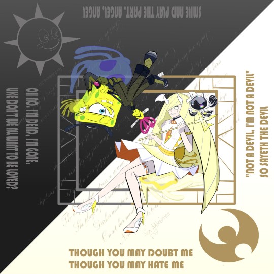
H I
Rambling is below as per usual!
Click at the bottom for a bonus art, the stand alone art for each of the characters in this piece and two poems. Yes, TWO whole poems! Pretty shitty ones at that. I quickly typed them into the file for the background to capture the vibes from the OG MV. That's how elaborate this one was.
Hey! It's me again. Sorry for going silent for so long, life and stuff got in the way. I got a job, but I didn't last long in it because I didn't pass the trial period. So here I am popping back in with an elaborate art piece loosely related to the paracosm with the main duo, the Jellyfish Duo.
Here's the music video this is inspired from by the way
There's a reason why I picked out which Miku the two would cosplay as for the Bit.
SpongeBob ended up with the slutty Deco27 Miku because it reminds me of how he sees himself as well as the fallen imagery. He plays the good guy in his show and even everyone sees him as a good person (Angel), but he sees himself as a bad person and actor because he thinks that it's his fault that acting out some bad/not so great episodes lead to forsaking the Nation into being raided by Weblings who took their reaction too far. It's also because he was at his peak during his golden age before "taking the fall" (being a black angel instead of white). Hence the fallen angel
Lusamine gets PinocchioP's Miku for obvious reasons. She plays the villain who happens to wear white, and hides a dirty secret behind the clean reputation. The less obvious reason is that the lyrics for White Devil Miku fit her paracosm counterpart, especially the "I'm not a devil!" bits (they'd sound like it's her insisting she's not "Her"/The Persona and pleading people to not see her That Way™). She doesn't want to be seen as a devil, she doesn't even WANT to be the devil. But she has to play the part in order for the game to move forward. "So sayeth the devil," even sounds like the rolcists stamping the label on her without taking another look at the actress and giving her another chance.
"Smile and play the part," just reminds of the paracosm in general, everyone has to play a part of their story just to exist. It could also fit SpongeBob because he has to play the part of an angel.
Bonus art

A chart :>

A jokey version of the chart (people said SpongeBob is the hot one as a joke because of this art work)
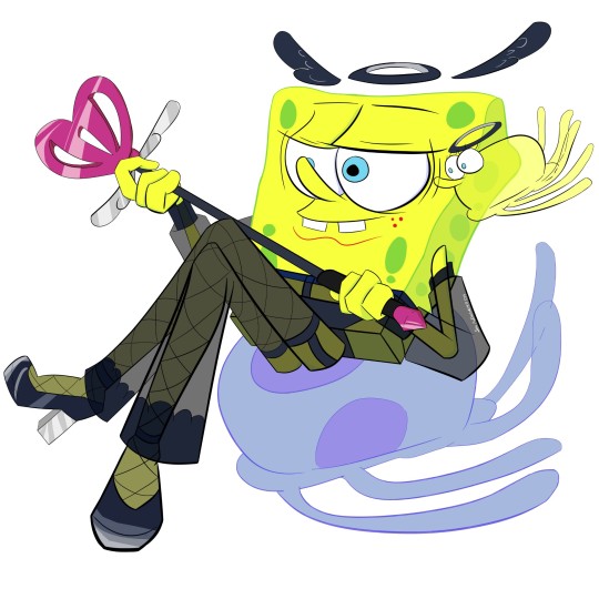
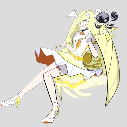
The stand alone art works of the characters in the "Not a devil" piece
Some additional notes:
• SpongeBob's wand is a spatula in the heart shape
• I really could have drawn SpongeBob in a, ahem, more modest outfit, but I thought it was funny to put him in a suggestive one. Plus, I somehow made his legs look really good, so now I HAD to play for the bit.
• Lusamine's outfit is based on Kartana, the origami Ultra Beast. I think it became a running gag or bit where she'd cosplay an ultra beast even if she didn't mean to. A friend even imagined that she has a wardrobe full of UB-themed outfits
• I could not for the life of me add in the wings on their back. So what I did to make up for it is them sitting on their respective jellyfishes. They're both shinies too, both to go well with their colour schemes and just to match in general.
• Their "mini me"s floating by them are based on their jellyfish forms
• I know that this piece would fit a different pairing better if it were to be a smaller crossover (like Squidward being the devil to SpongeBob's angel or Cynthia being the angel to Lusa's devil), but crack platonic ship duo who are obsessed with jellyfishes...
• SpongeBob's sun is based on Mr. Sun from the Best day ever episode
• Lusamine's moon is basically the moon logo from Pokémon Moon. What I did to achieve that look is pretty much cheating. I basically looked for the og picture, copy and pasted it onto the file, cropped out the unnecessary bits, and then colored over the logo in another layer. I got lazy, okay.
Ah! Before I forget, the poems!! Some of their bits are hidden behind the characters, so I'll just copy and paste them here.
For Lusamine's side:
The unfortunate actress, so young yet so unlucky
Ignorant to the core, glad to be born
She plays a part with a heart so murky
And pays the price for the flesh she worn
Darker and dark have her days gone by
As she bid her rights good bye
On set, her mouth left her with a scorn
Off stage, hell awaits her in full
Now she regrets being born
For her script played her like a fool
For SpongeBob's side:
The fallen actor, how sleek, how serious.
Once youthful, once a prodigy.
Sad to say his episodes became nefarious.
Now his nation and his life turn into a tragedy.
One by one, his comrades die.
As they look at death in the eye.
One neighbor taken, another hung twice over.
Of course it left him wailing.
He directed his final act with a game over.
But he can't, for everyone wants him to keep sailing.
#immersive daydreaming#screen universe#art#daydreaming#digital art#screen universe rambling#spongebob fanart#spongebob#pokemon villains#pokemon#lusamine#Not a devil#devil janai mon#jellyfish duo
14 notes
·
View notes
Text


i got a little distracted with making these little gems and backstories that go with them 😭 I'm back on the comic! I promise!
I kept the circus/clown theme i felt our Spinel had, so Yellow is a Sword Swallower, Blue is a Juggler and White is a Pierrot. All of these Spinels are part of troupes - having at least 10-20 of their same gems alongside them while our Pink Spinel is a one-of-a-kind.
Yellow Spinel snaps just like in canon. Except she attacks the colony where her Olivine resides and destroys stuff. Blue Spinel runs away and lets herself corrupt and disappears in the wilderness of a planet near a colony. And White Spinel gets shattered the instant that the fun moment is over. She gets harvested and recycled into remaking new White Spinels
ETA Image Description
[Image Description: Three pictures, each depicting a different circus themed character in the style of Steven Universe.
Image 1 is of a Yellow Spinel proudly holding a sword. She has twin vertical pigtails tied at the end, a yellow court jester themed outfit and a large white Ruff collar that leads to pants that poof out with diamonds on her thigh and solid color to her shoes. Surrounding her is different depictions of herself in various poses, bowing, a size comparison to her diamond, Yellow, and on of her in a state of anger, large black drops overtake much of her outfit and her collar is tattered and stained. Instead of her usual outfit, her goofy pants were replaced with a too-tall alternative that rose past her stomach and only ended at the start of her shirt. Her hair is messed up and her gem is upside down.
Image 2 is of a cat themed Blue Spinel, she acts as a juggler and is noticeably taller than a regular Spinel. Her two-pointed hat moves to her emotions like it were actually a cat's ears. Her arms are made of bicolor streams of ribbon, blue and white alternating and look like baggy sleeves but can be used outside of being as an arm. She has a black upper lip and white lower lip with white upside down drops on her eyelid acting as face makeup. The collar of her outfit and the decoration around her hip is sharper looking than Yellow Spinel's, jutting out and up in multiple points. Also surrounding her is other depictions of her, one holding her juggling pins, one of her crying due to Blue Diamond's oppressive power and three of her corrupted form as a Panther-like creature. It's blue with dark blue teeth, white under the eyes and like a tiger- has two fake eyes imaged on the fur of the back of its ears- it has two sets of ears and two extra limbs on it's shoulders that act similar to the destructive claws of the Mantis Shrimp and is aggressively solitary.
Image 3 is of a White Spinel , much smaller than the other two, both in gem size and in body size and almost completely white in front of a slightly-lit black background. Her gem is the size of a pupil and lacks pigmentation - being almost solid white itself. Her gem is in place of her pupil on her eyeball and she would be only half of Steven's height if lined up next to him with her hat making up the difference. She is an old-fashioned mime themed with a tall cap with black pompoms, a soft two-layered Ruff draping around her neck and a baggy jumper with a simple cord tying the loose fabric close to her form. There are triangles on top and bottom lid that fit together to make black diamonds on her face and each have a small black dot at the outer point of it. ]
I've never written an image description for my art before, I hope it's understandable haha😄
#digital art#fallen petal au#fallen petal su au#suau#fpau#behind the comic#steven universe au#spinel su#spinel#other spinels#gem oc#gem
51 notes
·
View notes
Note
do you have any tips on how you color? your coloring style is similar to what i’m trying to achieve but i have no idea how you actually pull it off
Hi!
I'm gonna separate this question into rendering vs. coloring. I'm not sure which you mean so hopefully tackling both covers your question, although I'm not really the best at explaining things.
For rendering, I usually paint using some square/textured brush (kind of like the one pictured below and a low opacity circle brush (the standard in photoshop, and most painting software). Lately I like using brushsets from the digitalbrushes account here on tumblr.
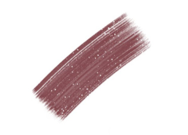
I sketch, and then paint underneath the sketch. after i paint for long enough I either delete the sketch layer or I merge the two. I like to add texture where the midtones are. I think a lot of my "rendering style" is probably owed to that.
I like adding texture around midtones. I also like adding limited random variation of color and value to large areas. Like below, you can see that I added a slightly different shade of red to the lit part of the apple in step 3. If you add variation or slight gradation to the large light shapes or shadow shapes you can create the impression of depth. At the very least it looks more fun.
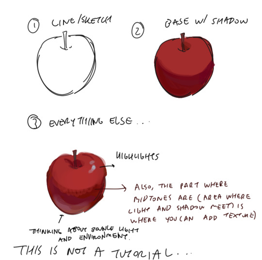
Also a disclaimer, but for the last two drawings I did I've kind of went off kilter. The process is the same but I used some oil paint brushes I downloaded and I pretty much added as much variation to every shape possible, which I would not recommend unless you're sure of what you're doing. But you can see here that even though I added variation (in color, brush stroke, etc) that the shapes are pretty readable and the light is very clearly separated from the shadow.


In terms of choosing color, I had a long stretch of time where nothing would look right to me. Things were colored really literally, with no regard for lighting or ambient color (background/environment surrounding characters). I would often fix things up using a gradient map and using color burn or multiply on 14%. Honestly, this is still a great way to make things look coherent, I really like these gradient maps on the CSP asset store if you want to look into them.
My colors improved a lot after I developed an eye for color/figured out what colors I like to put next to each other. I did this by saving and making a folder of any piece I saw that I liked specifically for color. By doing this I got a clearer sense of what kind of color schemes I tend to like. I suggest doing this as well so that you can figure out what kinds of color schemes and pairings you tend to enjoy most.
Hopefully this answers your question <: ] Apologies if this doesn't make sense, it's a bit of a long post.
#ask#I wish I could help out more anon ... I often feel like I have no style consistency so seeing this ask surprised me#i think unfortunately i do work partially intuitively so its a little hard putting this into words
106 notes
·
View notes
Text
[Translated from Spanish]
Louis Tomlinson at the Autódromo Hermanos Rodríguez: Night of euphoria and spirit of direction
COVERAGE. The former member of the iconic band One Direction conquered the country's capital with his solo stage as part of his Faith in the Future tour

Louis Tomlinson at the Autódromo Hermanos Rodríguez. Photo: Humberto Sauri
DANIESKA ESPINOSA | 06/02/2024 18:31
The former member of the popular British boy band One Direction, Louis Tomlinson, caused a furor on his return to Mexico. Since the great reception he had in his hotel that, unfortunately, had an impact on certain inconveniences, there was no doubt that the native of Doncaster was ready to offer his greatest solo show on Saturday night at the Auotódromo Hermanos Rodriguez.
The concert that is part of the Faith in the Future tour, was held in front of more than 70,000 people, marking a milestone for both the performer and a male singer who, in addition, broadcast and recorded this great presentation that will remain in his memory. And it is that from hours before the doors opened, thousands of fans gathered in the surroundings of the enclosure, creating an atmosphere of anticipation and enthusiasm singing their repertoire of songs in chorus.
But before the "Louies", a term used by the singer's fans, went crazy with the presence of their artist, the Australian band DMA'S opened the show by working the hard work of opening up, taking the opportunity to sing their hits such as "The Glow" and "Fading Like a Picture". Their energetic performance managed to rouse the attendees and warm the atmosphere for the arrival of the main act. The songs resonated loudly, and the applause was not long in coming, being well received by the attendees.
The stage was equipped with numerous high-definition screens, ensuring that each of the attendees could see and hear the concert from any angle, even from the general area. This impressive visual display was complemented by an online broadcast, although the latter did not meet expectations due to sound problems and background noise, which in some moments overshadowed the quality of the concert for virtual viewers.

Despite this, Louis Tomlinson would be at a good time to start his presentation with "The Greatest", followed by "Kill My Mind", songs that were accompanied by a dazzling game of lights and fireworks that illuminated the sky, creating a visual experience that left everyone speechless. The screens showed visual arts in black and white, adding an artistic and nostalgic layer to the atmosphere of the concert.
After performing "Bigger Than Me", Tomlinson addressed the audience with a moving sincerity: "I never thought I would tour this size again. I spent the first three songs trying to calm my nerves. This is incredible. See what we have achieved, I love you. I'm very emotional and nervous." These words resonated deeply with his followers, many of whom have followed him since his time in One Direction.
Louis' show continued with "Holding On To Heartache", a ballad that made the entire stadium sing in unison, creating a moment of collective nostalgia. Tomlinson offered a mix of songs from his two albums, Walls and Faith In The Future, demonstrating his growth and evolution as an artist.
One of the most emotional moments was when he performed "Night Changes" by One Direction. This song not only celebrated his career with the iconic band, but it was also a tribute to the fans who have accompanied him since those days. The audience, many of them crying with emotion, sang next to him, remembering old times and appreciating his trajectory.

During the concert, the stage was illuminated with colored lights that accompanied each song, creating an atmosphere according to the message that their songs convey. In the middle of the show, Tomlinson took a moment to breathe, affected by a throat condition. In a sincere voice, he expressed his gratitude: "To have the luxury of being who I want to be, to sing what I want to sing. Not all singers can do that. So thank you very much." This moment of vulnerability and gratitude was received with ovations of support and affection from the public.
The night continued with "Copy of a Copy of a Copy" and "Walls", two singles from his previous album, and "Written All Over Your Face". Tomlinson also surprised the audience with covers such as "505" by Arctic Monkeys, where his guitarist performed an impressive guitar solo, demonstrating his versatility and musical skill.
Something outstanding about the young British singer is that he always took the time to thank his followers, especially those who have accompanied him since his time in One Direction. That caused the powerful song of "Louis, brother, you are already Mexican" to resonate in the Autodrome Curve, a sign of the affection and special connection he has with his fans. Tomlinson, visibly excited, mentioned: "Those who are here and in the stream, it doesn't matter if you're not present today, if you haven't been to a show, the only thing that matters is that you support me. So if you do, thank you!" he said.
After a brief break, Tomlinson returned to the stage with "Saturdays" and "Silver Tongues", two of the public's favorites. And so, the evening of the eternal lovers of the British singer culminated with a spectacular closure full of rockets and fireworks, leaving a lasting impression on everyone present. The night was a testimony to the growth and evolution of Louis Tomlinson as an artist, consolidating his place in the hearts of thousands of fans around the world.
This concert not only marked a milestone in Louis Tomlinson's career, but it also made it clear that his connection with his followers is stronger than ever, and that his music continues to inspire and excite crowds around the world.
24 notes
·
View notes
Text
The Talk of the Town
I finally finished my art project!
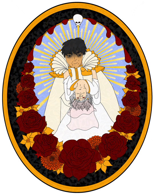
Gift and process under the cut
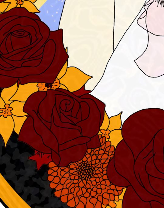
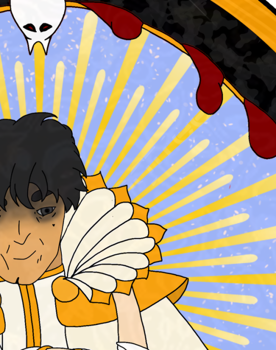
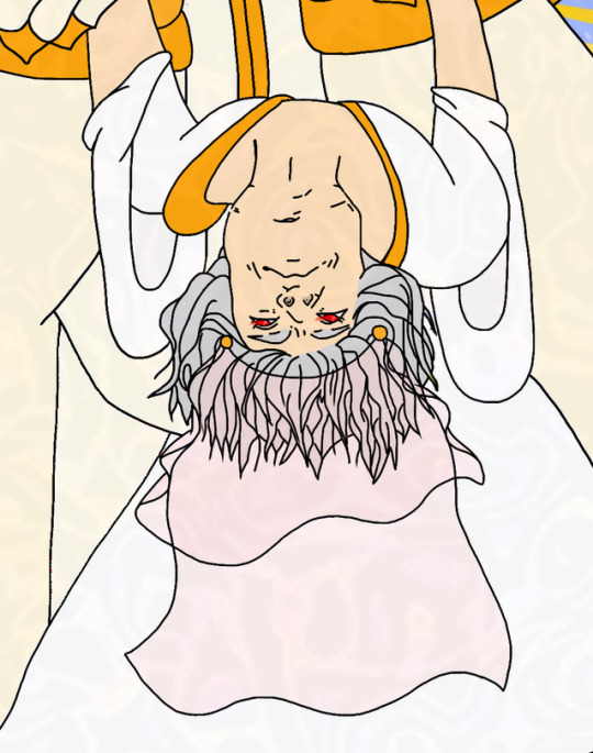
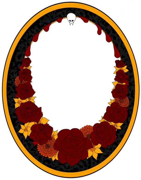
As a treat, I saved the frame separately, so other people can use it for their toxic ships 👀 please tag me; I want to see them 👀
Now, I want to walk y’all through the process for this, because I think it’s hilariously odd
I can’t picture things. At all. I get the impression, like the brains reaction to having seen something, but no actual visuals, so…
There were at least two different version I tried to work through first; I really wanted to draw AAstarion with his corset visible, but I just couldn’t make it work
I started this one by turning these two into 3D models with Hero Forge, and posing them
With some paper on top of my laptop, I roughly traced their outline, and then drew a grid on top of it 👀
So…do you remember those pages in coloring books where you’re supposed to use a grid to redraw a picture? I always hated those, but that’s how I got the outline into my sketchbook 🙃
This is what I took Forever (months) fleshing out, and then, well…the border 🙃 each individual rose was its own grid, and the others I had to break down first. I wanted there to be another layer of flowers as the background, all Wolfsbane. I just couldn’t figure out how to do that one well enough 😅
I took the picture of the finished sketch, and traced over it in art studio
I only had three layers to work with, which was a pain in the ass, even though I was barely doing more than dumping colors
Astarion’s dainty face and pain in the ass hair were too delicate for my pencil, so they were done entirely digitally…by precisely pasting game and hair references I could use as guide lines to trace over. I don’t love tracing, but I could not figure out how else to do this; his face is impossibly pretty
Gortash’s mug, in sharp and obvious contrast, was not as involved of a process. I think he’s ugly cute. The only specific detail I made sure to include is the mole I saw someone mention getting obsessed with. I turned it into a little heart 🖤
Anyway, a whole bunch of cleaning up, selecting and cutting, a diy glaze, and here we are, just in time for the chapter it goes with 💪😭✨
@nyda-the-tav thank you again again for helping me figure out how to get the formatting functional; I hope my process didn’t give you an aneurism
15 notes
·
View notes
Text


Basically a big Hoyo wallpaper dump. XD I just felt artistic when I got home today. I honestly wasn't intending on making so many Sunday ones, but honestly people made a bunch of pngs of him that were awesome art so there was just more available for inspiration. Like I would really love to make another Aventurine one, but I didn't have an idea of other motifs to do with the other renders I have. I'm actually even pushing it on creativity with the last Sunday one.
But anyway, new Zhongli one that I think is finally better than the other two I made and like a better motif and scheme than the other two. I mixed a texture in with like his profile plate thing. I used the traditional characters for his name because my Japanese computer doesn't seem to like simplified.
Aventurine's is pretty straightforward, but I played with the colors a bit to try to get both his yellow-gold color along with his green together in a nice blend. The roulette there is a screenshot from his trailer too.
Sunday's one's the first two are basically playing with lights for the most part. I go a generic render of a piano for the 2nd one to try to like emphasize some mad playing skills, and honestly sometimes I forget that he's very musically inclined. He kind of reminds me a little bit of how much I liked Nodame Cantabile back in the day because his boss motif is as a conductor (Chiaki), but like his trailer is all the piano (Nodame). The web event was violin though, which doesn't really fit that reminder other than it being a classical instrument. I guess also a bit of Eternal Sonata because that game is all Chopin. The background of both of the first two does actually have game screenshots though. The first one has the Penacony Grand Theater, but mostly darkened out as I lit it so that it seemed like he had sudden divine inspiration or something. The 2nd one is a screenshot from his trailer where one of himself is playing in the theater. Underneath the big piano him is a tiny version of him also playing the piano on a different layer. The light beam is from that background image so I placed it in such a way so that it'd light the bigger image of him and played around with the lighting to hide most of the rest of the background.
The third Sunday one I think I was getting tired and I don't think I got the lighting exactly right. I'll probably get around to another one like I came back around for this Zhongli one in the future. The background is an actual cathedral picture and I just played with the lighting and colors to try to get something cohesive. Placement and such though I was trying to like make him seem like really holy and like rising up like an actual angel. He's like so biblical motif and very seraph-y. I kind of wish there were renders of him with the six wings, but I think this is okay.
I honestly don't really know why I wanted to do so many Sunday ones, but I just did. Like I said the art was pretty and he's out right now and also escaping my pulls. ;o; I really don't want to spend that much money on him, but also I'm trying to make a secondary team for my Dan Heng Imbibitor Lunae because my main team is a break team with Aventurine and Acheron, and I just want a team of my favorite boys. Also, for real all these boys from the walls I've made recently are yellow. Like Dan Heng's the other day because he's Imaginary and had some gold on his outfit, but Zhongli has yellow gold from being Geo and both Aventurine and Sunday are also Imaginary, but have a lot of gold in general in their motifs too. I was actively trying to change the text color in the Sunday wallpapers so that not all of them would be yellow.
Sunday makes me think of a bunch of things though because I didn't really like him so much at first because he was kind of a dick to Aventurine. But then like after his fall and events with his sister, it seemed like he probably was actually okay and just misled by his adoptive parent, but is also very genuine in wanting to help people. Just misled on the how and the helicopter parenting kind of POV. But like he seems like he genuinely wants to learn and does seem to have regret for his mistakes. Like he genuinely seems like a very sweet boy that really just wanted to try his best and got it wrong. I hope he learns a lot on his travels. But like also, I was raised by a Catholic mother who took me to church sometimes. My English name is a biblical name too, and I don't really care so much and I don't really believe in organized religion because I feel like a lot of churches are corrupt or like really hypocritical in how they interpret scripture or even like...just dumb. Like I don't really think they follow the spirit of things and like hold on so tightly to words that were written, chosen, and translated by fallible human men who had their own agendas they were pushing. Like Sunday's story route is like a child who was raised in the church only to meet the outside world and realize that the religion he was taught was full of hypocrisies and hate that he wasn't aware of, which is how I felt growing up where there was what scripture and churches "said", but then I also didn't want to be a mean jerk to other people? So yeah, Sunday kind of just hits a spot for me.
8 notes
·
View notes
Text

Holy shit I was working on this since late October, and I'm the most proud I've ever been of a picture I've drawn?
Details and graffiti transcriptions below the cut! 'Cause I worked on that shit for like three entire days, and I'll be damned if I don't show off some environmental storytelling word crimes.


So, first we have a couple closer looks of Sasha! Their outfit was pretty fun. I haven't done modern outfits in... probably ever, and it was nice having a lot more references to work off of.
Their sefirot necklace was fun to draw because I have one almost exactly like it. The flannel was the first time trying to do plaid by hand with a new little technique (Base colors+Multiply layer for dark stripes+Overlay layer for light stripes) but it went way faster than the god damn quilt?
All in all, my favorite detail was doing cosmetics, because I got to do little chips missing in the nail polish, and that's probably the first time I've drawn eyeshadow and willingly shown the result! : D


Next we have the little rat family in the background, with the wall-dwelling Rat King peeking through the wall, which is where I did dipped into tracing a couple photos instead of just looking at references.
Generally my process has been doing anatomy lines over a reference, then working off of those for about... three to four layers for body->clothes->hair->Full sketch, then another with whatever brush I wanna do the lineart with (usually a watercolor detail brush from one of two sets on Krita), but I'll note where I skipped that process and committed some art crimes.
The two background rats (Pestis and Mortar) are from a pair of stock photos from Getty, while the one in the foreground (Yersinia) is a mix of a pic that pops up in meme dumps from time to time of a smoking rat and a few bits that weren't in the original image. (Jewelry, the legs that were covered by an ash tray in the original pics, the "Buns and Roses" lighter she clearly stole from Sasha.)
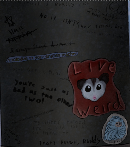
Time for some graffiti transcriptions! Most of the variation in the graffiti came from switching the size of my brush and trying to mix up my handwriting, but there's a few segments where I use a font, then outlined the font with a 2px across brush to make it fit more into the art. Mostly, this was through screenshotting google docs, but some of the fancier fonts are from cooltext.com.
Top:
This is really high
No it's not?
Top Right:
A drawing of a clown that clearly used to be titties
"What's wrong with Bipo's eyes?" (Referring to the tape over the nipples)
"Their titties, bro"
"What about them?"
Top Left going down:
"Hail Satin" written next to a six pointed star
"Rong star, dumass"
A sticker reading "Apologize to your English teacher"
"Yeah, get a brian, morans!"
"You're just as bad as the other two!"
<The URL for the Wikipedia page on sarcasm>
Bottom Left:
Gazebos ate my ass
Bottom center:
"My sister turned into a bird but no one believes me."
"That's rough, buddy."
Bottom right:
A sticker of a possum with "Live Weird" written on it.
A sticker of a more poorly drawn character wrapped in blankets with "Seep eeps" written on it.

...So I made up a fake BDSM club for this one and named the majority of the bands dirty jokes, but I will die on the hill that there should be an all-trans metal band called "The Book of Dead Names."
CHOKE POINT
PRESENTS
LIVE MUSIC
THIS SUNDAY
CUNT MUNCHIES
THE BOOK OF DEAD NAMES
SOME GUY NAMED STEVE
FIST FUCK DUMP TRUCK
WOLFGANGBANG
THE PENIS MIGHTIER

A sticker with a set of vampire fangs that says "Got Blood?"
"Parasitic fucks"
"U got beef w/ Count Chocula?"
"Bro, vamps suck."
"Duh"
"So does your mum.
A sticker of a cross made out of a bunch of interlocking parts with some mirrored Hebrew in the middle. (I'm really proud of making this shape up on the spot. I had an idea for a religious monster hunter group named after the Watchers from Enoch, but I've got no idea if this story will ever happen.)
"Your Hebrew is backwards, you twatwaffle"
A sticker reading "Deus Vult"
"I fucking love Powerwolf"
"VULT DEUS NUTS, GOTTEM!
A cut off poster telling people to vote for, I presume, their favorite chainsmoking rat, clearly.

A sticker of the Autism Creature
"Rizz 'em w' the Tism" with the last S being the one everyone draws in school, but also backwards.
"It's like if Kirby was a centaur"
"I will never unsee that."
"It looks nothing like my vaccuum"
A paper with "Missing Printer" and a cut off phone number written in sharpie.
A meme of a bear in a suit (Partially a trace of the actual meme template) with "You have seasonal affective disorder because you need Vitamin D. I have seasonal affective disorder because one of my ancestors fucked a bear. We are not the same"
"Is that how it happens?"
"Oh, sure, this dude's ancestor fucks a bear, he gets a meme, BUT WHEN I-"
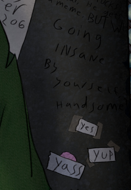
"Going insane by yourself, handsome?"
Three pieces of paper with "Yes" "Yup" and "Yass" written on them, two stuck on with tape, while the third is stuck to a wad of chewing gum.

"You guys seriously pay to print out memes just to vandalize shit?"
"No, I stole the printer, too."
"YOU"

"Paulie never died"
A sticker of the Mothman
"TAX FRAUD"

A large printout with a dramatic portrait of Mitch McConnell with "ARE YA BREEDING YET?" written below it. Several tear off strips are missing, but the remainder all say different variations of "Yes"
A cut off sticker of a smiley face
A sticker of a machete
"BURGLE TURTS"

A sticker of a crying laughing emoji.
A sticker of a pot leaf
A sticker with a picture of bigfoot with pasties on her boobs walking up to a stripper pole with "I want to believe" written in the X-Files font
"Whoever gave Bigfoot tits will never enter the Kingdom of God"
Three notes pointing to the previous message with "Noticed the tits first" "Weirdo" and "Your preoccupation with cryptid mammaries betrays your discomfort with your own sexuality. Consider meditation, therapy, or possibly fucking yourself!"
"Weirdo" pointing to the previous paragraph before being crossed out and replaced with "BASED"
"K, but y tho?"
"No one insults the Bigfoot big naturals on my watch"
(She has them in the Patterson-Gimli footage, too)
"BIGFOOT BIG NATURALS" "NOW LORE ACCURATE"
A swastika being covered up by a peace sign
"Degenerates should be purged" "AMEN" "U FIRST."
A drawing of a penis that's been turned into a weasel in a familiar pose with "Dick weasel" and "Had to do it to 'em" written next to it
A sticker of a stalk of corn labeled "CORN"
"See? Iowa is with us!"
And, finally, "Does reading this hurt your back, too?" which was the last thing I added because I literally spent two days just doing graffiti for this shit.


So, the map behind Sasha is made up on the spot, with some inspiration from a map of the Seattle Bay. Kinda proud of just how dirty this fucking place is, but the final, and greatest achievment in making this picture look grimy...
THE RUST


I didn't exactly nail the perspective on some of these (The sketchy layer for the floor grating was done once, then dragged into place and warped with the perspective... and then completely fucked that up) but god DAMN do I love texturing the fuck out of things!
There's like six Multiply layers scattered about because it turned out it's a phenomenal way to make the shading of multiple textures make sense without losing that texture, and I feel so god damn powerful!

Oh, right, the posters.
Not much to say about them. The righthand one was 95% traced from a mafia stock photo, while the hands in the left came from another stock photo.
Honestly, I drew the frames, then had no idea what to put in them. There was briefly gonna be a pic referencing a cosplay photo I have of myself, but eh...
The rats and the guy in the wall were originally referencing a Vampire the Masquerade character I had named Pretty Paulie, who was a mafioso turned nosferatu who dubbed his crew the Rat Pack. I figured if there was some kind of dramatic, Scarface-esque movie about him, he'd definitely find a way to keep the poster nearby, and I wanted to slap in one of those "Give blood!" posters from the Red Cross except... not from the red cross.
I don't really feel like I put in much effort into these (compared to the Graffiti-a-thon with several subplots), but hey... they covered the tile, which before shading was boring and very flat, so they did their job.


I'll leave you with some zoomed in textures, because I do feel proud about those! I make them via a combo of oil paint and watercolor brushes, usually with a whole lot of different coats of varying opacity until it looks like the thing it's supposed to be. :)
I've only just started drawing again this year (I've been editing a looooot longer) so there's a lot of spaces where I have hiccups, but I'm figuring out the areas I do well in.
...Also sweet Jesus this started as me trying to figure out what a character looked like. It says 3 full days worth of editing was done in Krita on this file, and I don't think it's counting the idle time.
#character art#original character#digital art#digital drawing#oc art#nonbinary character#trans artist
10 notes
·
View notes
Text
Pretty much last minute, but, I made some new pics of the costumes of my muses! (Almost no new costumes - only Starlight has something new, and of course I made new things for the one char that hasn't been here last year and her twin bc I had to)
A bunch of pics incoming - and thus a long-to-scroll-post below the cut. Starting with the opposite order, because Star gets enough spotlight already.
Two pics as "appetizer" or whatever before the cut!

Using some existing scene here and simply having adjusted a few things. My initial plan was to bring all my chars onto this scene (bc halloween background, and a good amount of space too), but then I decided against it.
And because I love what I managed to create for him, here's also one pic already of the one char that isn't even a muse here (so far) - Akira, Akari's twin!

I should have moved him further "up" (as in, to the left if you look at the pic as it is here) in the thing I think, but, I only realized that way too late so this is the pic I'll keep.


Akira totally climbed up some church or something when the moon was out and the scenery was just perfect. Whoever he was out with absolutely insisted, multiple times, for him to come down, that it's dangerous and that he can barely stand up there (and on the decoration thingie at that, not even on the roof itself) much less pose, but he didn't relent, managed to find a hold (probably after being close to slipping or falling a few times) and actually pose up there smoothly.
Bonus:

Of course he has the teeth to match, too.
Would have loved to make his group too, but I barely had the time to finish this, so getting 4 more ideas and making them a reality would have taken way too long. Perhaps I'll find more time next year.
Tidbits I want to mention or noticed too late when taking the screenshots: - The ruffle neck thingie, the lower part of the ruffles glitched into his body. It isn't just one ruffle there, it's wider than the above layer. - I did search for a free-to-use background of the night sky with the moon, somewhere on one of these "free backgrounds" websites I found this one, and it did say free for personal use. Slapped it onto here because I of course didn't take screenshots within KK with the skybox visible (I need to actually check that in the settings somewhere when I want it which sucks)
---
Next, of course, Akari! She decided on a costume together with @merveiilles Aoi who is going as Raven, so of course she's Starfire!


Tidbits I want to mention or noticed too late when taking the screenshots: - This is her Idol/Mermaid-Hair, that's why it's so insanely long. It should be a lot wavier than this, because it'll be nigh impossible to get it this straight after it's in her huge curls almost all the time, but I did what I could within the limits of KK - Probably obvious, but, those are contact lenses. Her eyes are red otherwise, after all.
---
Continuing my reverse of going through the characters, next up Pyrrha!

I like to think that whatever Halloween-esque party she went to had a broom hanging like a swing to match the aesthetic of the party. Of course with a witch-costume, she had to use it and get a picture.
---

I would have liked to have a model for Mimi ready for use to combine with Sheshe for this year, but while I downloaded a model before I have not yet found the time to check it out and adjust, so I didn't use it yet. Thus, another time her alone. Oh well.
---

Mar'i again as Mar'i'o, too.
---


I still love my spunky cheerful pirate Lightning. Her white top is still supposed to go down longer than the corset is and "pop out" again below the corset, and not basically leave her with a free belly, but it's the limits of (my skills in) KK.
---

Me-ow~
---


Sheriff Mia is back again too! The colors of the right side feel more like the colors I want, the brown is kinda so pale on the left pic. Idk why, I probably forgot to adjust some settings before taking the screen.
Tidbits I want to mention or noticed too late when taking the screenshots: - Just... ignore how in the second/right pic she has her guns out and has them in her holsters too. I forgot to take off the guns in the holsters. Just imagine those wouldn't be there.
---

---

No new pic for Moonshot because the whole thing for him is that he doesn't get the appeal, joined because Starfire asked him to, and then proceeds to just stand in a corner somewhere growing more unhappy over time.
---
Actually a new outfit! I had that ready for her already, actually, last year, and now decided that Starlight would very much go as a fairy this time instead of the rainbow she went as last time.

---

---

Tidbits I want to mention or noticed too late when taking the screenshots: - It's such a struggle to draw those laced-straps there everytime I do something with this outfit. But adding them onto the model in KK doesn't look good, ever, so I have to take the effort.
---

I still very much adore this outfit, though of course there's glitchy stuff at the top of the belt.
---
And that's all! I still love all my chars and their costumes a lot. I wish I could actually have done some things for halloween - I'd still be open if anyone's interesting in starting something even now that it's almost already over - but alas. I'll find the time to be here again properly eventually.
#✫ Out of Characters ✫ | OOC#✫ Lights KKamera Action! ✫ | Char Studio Things#✫ General Tag (Starfire(Canon)) ✫#✫ General Tag (Blackfire(Canon)) ✫#✫ General Tag (Wildfire(Semi)) ✫#✫ General Tag (Starlight(OC)) ✫#✫ General Tag (Moonshot(OC)) ✫#✫ General Tag (Cat(OC)) ✫#✫ General Tag (Mia(OC)) ✫#✫ General Tag (Kage(OC)) ✫#✫ General Tag (Lightning(OC)) ✫#✫ General Tag (Mar'i(Semi)) ✫#✫ General Tag (Sheshe(Canon)) ✫#✫ General Tag (Pyrrha(Canon)) ✫#✫ General Tag (Akari(OC)) ✫#it's out now so i can finally post this!#will probably reblog this for a day or two still even though it usually feels to me like halloween is over after today
7 notes
·
View notes
Text
Dev Post - Workshop
From concept to end, this is a breakdown of how I did this plot post.
Concepting
This is when I put my thoughts onto paper. Each line in [brackets] is a drawing, followed by text.


Rough Rough Drafts


Dialogue is revised, with each line as its own bubble. Descriptive text in the brackets is cleaned up a little. The thumbnails become sketches, with references getting added to each drawing to make life easier for me later


The order of pictures also got revised. This is where I noticed that I wanted a certain "beat" or "rhythm" to my drawings. This is where two more thumbnails are added and the images are swapped
Sketch/Lining


This is where it gets time consuming--getting the right angles I want. This is where references photos get stretched or warped. This is also when I bust out sketchfab to find 3d models so I can find decent angles.

The "items in motion" was so difficult to me because I simply didn't get it. It took a lot of studying Hajime no Ippo and with some help by the mods of askdeoxys and light-of-unova (I don't feel like tagging them I don't think they'd be interested in this long write up lol). The end process involved duplicating the line layer, saving one in case I fuck up, and erasing/hatching the line layer in the direction of the movement.
A lot of the choreography advice was taken from here, which is a FANTASTIC write up of how to show someone getting punched. This entire page was re-done after reading and interpreting the timing.

This part was a challenge because I wanted to tackle two things I struggle with--fights and backgrounds. Eventually, I had to settle on a style, so i started with the outside shot to get a feel for what kind of colors I wanted to use for this post

Originally, I wanted to go with a yellow/black color contrast, but I couldn't get it to look right. So, I settled on a dark blue / dark blue background combo that matches the overall vibe I've had so far in the rest of my blog

Stuff like distant lights was a little challenging, but I found a brush and altered/stretched/cut items where it looked fine and moved on. I really liked the pinkish light spilling out from the ground, and it set the tone for the rest of the post.


God, even an angle like this was difficult, especially since perspective never feels right until you reach the "ah hah!" moment that's at the end of the process. There's a lot of little things like the direction of the steps and how it would look going down and make sure it didn't look like you were looking up.
ONE THING that I really liked to use throughout this process was a "stamp" brush so I can keep my character proportional, because I didn't want to have him look too tall or too short so I used a stamp brush.

It's hilarious.
After the backgrounds, the order of drawings that got finished next were in order of difficulty. This was when I decided on a lighting vibe.

These colors are striking on their own, but I thought it was a bit too stark of a contrast and it made my lines disappear, so I duplicated my lighting layer and Gaussian blurred the hell out of it and turned it into an "add" layer

Colors
I have this thing: I try to find a way to make it easier to do a monochrome post, but end up doubling/tripling my work process where it'd be easier if I used regular flats... I can't say that I don't like the end result. If anything, I love it. But man, was it time consuming.

Since the pink layer was duplicated, it was both my coloring and shadow layer, which was too time consuming. I think I'm going to be doing stuff like this sparingly, even though I really enjoy the lighting.
This took the longest amount of time, so long that I forgot to take meaningful screenshots throughout the process! Oops.
Final Touches

Small items like "wait, there's supposed to be a small crowd" were added last minute!


I decided to bump the light up to a harsh degree. Arguably, the one on the left is easier on the eyes, but I didn't want that. I wanted this to be up in your face. I wanted this to hurt.
Other edits include some sparks/electricity in the closeup with Aila's dad. I thought about extending his leg past the frame, especially it'd symbolically make sense because Aila's dad is literally pushing him down, but it looked awkward. I settled for a spark going over the border, instead.

For my favorite page, I added a background shot of some moving lights were added afterwards. I thought it'd be too jarring to move from locker room straight to the apartment.


It's also a fun throwback! I thought it'd be fitting to have him symbolically lower, yet again. This time, he really knows that he's staring at rock bottom. He's actively looking down, watching the shadow he casts gets swallowed up by what awaits him below.
This was a LOT OF FUN! But man, if I work on something for too long, I think to myself: "Is this too much? Am I pushing my characters too far down the misery hole?" And I'd start second guessing the entire post as I'm making it. I had to learn to take that voice and shove it in a locker.
I decided upon the "self harm" content warning because... well, it is. The imagery doesn't match what's typically shown in media, and a part of me thinks that the content warnings are overkill, especially since it's not explicit. I thought I'd play it safe.
However, it's also a meta way for me, the author, to tell you that this is Jack actively hurting himself. The act of purposely losing a fighting match is an act of self loathing and self destructive behavior.
I hope you found this interesting!
Time Spent from start to finish: 2 weeks Time spent working those 2 weeks: ~ 5 sessions, each varying from 2 to 5 hours
10 notes
·
View notes
Text

art by em year in review 2023!
for the fourth time, i present to you a selection of the art i did this year! this definitely was the Year of Understanding Procreate, and i think it paid off. as usual, reflections under the cut.
january: i saw @malcolm-f-tucker tag a picture of abigail thaw with a comment about a theresa faceclaim and it left no survivors, i.e. i decided that theresa should have greying hair and did not look back. this was from when i was still trying to figure out what brush to use for lineart in procreate. luckily i had learned my lesson from the sketchbook learning curve and realized that what i liked for lineart would most likely be in the pencil section. however i wasn’t a huge fan of the brush i used in this one, so i didn’t use it again. instead, for later pieces, i decided to customize the 6b pencil brush to my liking, and…
february: …this came out of it! this is still one of my favorite things i have ever drawn, and it’s my favorite thing i’ve drawn yet for herc and linda. this piece really convinced me to use overlay layers more in my art, and the amount of detail i managed to capture in this one still amazes me now. and before anyone asks, yes, they are doing specific things in the startup procedure for an airbus a320-family aircraft, except linda is doing things off the CM1 checklist and herc is doing something off the CM2 checklist, which i learned later is not really something that is done. let’s just say herc is not the tightest stickler to convention.
march: one half of an intended two pieces centered around the f1 au (which, regrettably, i have yet to continue… i just reread what little of the second part is on ao3 and god, it slaps actually, i really need to continue it so bad) depicting a pivotal scene from around the outside, where theresa and linda decide to put aside a childhood feud at the top of the banked curve at monza. at sunset. on theresa’s birthday. i know, very meaningful, incredibly homoerotic. read the fic to see how well that turns out!
april: i always knew i wanted to redraw the first filipino!hercolyn thing i did back in 2020, the one that completely solidified in my mind the notion that These Characters Are Filipino, Actually, and when i got comfortable in procreate i quickly jumped on that. (if you notice, a lot of the stuff i did this year were redraws of old pieces i really liked but wasn’t fully satisfied with.) of course i wanted to draw them in the traditional clothes in my parents’ and grandparents’ wedding pictures. the implication of this being, of course, that this is the soft shoe shuffle wedding. i have a fic planned centered around that, from douglas’ perspective. now that grad school apps are basically done, if my honors thesis doesn’t kick me too hard, i’d love to get on that as soon as i can.
may: YOU JUST GOT COLINED! SEND THIS TO A FRIEND TO TOTALLY COLIN THEM! ah, colin fairbairn: the figure whose presence haunts all of newcastle but is never actually. named. (much to the chagrin of a lot of people who genuinely thought linda’s dad was named colin bc i Wouldn’t Shut Up About It) i just love him so much and i love this piece, i wanted to depict the wistfulness of an older colin whose airline is on the verge of collapse, who has been secure in his job as chief pilot of air cal, who looks out over glasgow airport (that’s glasgow’s runway in the background) and wonders if it’s time to put himself out to pasture. wondering what he could have done differently. it’s okay bby. there’s no way that you could have prevented this. but he’d never believe it. he’s too duty bound. he lives in my head rent free.
june: another redraw, this time of a piece from 2021. i was so happy with this one, and i am very happy with it still! everything about the older piece i loved was improved massively by this redraw: the poses, the proportions, the line work, the coloring. honestly, just thinking about the two of them just existing in the airport, overlooked by bustling passengers, just part of the landscape, but having such a rich history and relationship between them… it’s something i think about a lot and i love it.
july: this comprises the third part of an unofficial trilogy of drawings i did centered around douglas/martin/theresa. in each one, i centered a different member of the ot3: i did one centering martin last year, one centering douglas in the spring, and this one centers theresa between douglas and martin. i really enjoy how i did the expressions in this one: martin, looking out toward the planes; theresa, following his gaze, eager to share in the passion they both have; and douglas, looking down at both of them (yeah i think they’re both shorter than him. i think it’s cute). i feel like when i draw these three, where they look and how they look is very important to me.
august: can you believe before this point i had never drawn herc and douglas together? yeah, me too. anyway, them 🤍 i’ve literally only ever drawn them as older men so trying to draw them younger was. lowkey kind of hard. i’m hoping to revisit air england herc and douglas in the future, especially since i didn’t intend for this to be anything more than a quick bit due to those bisexual divorcee brackets (which i don’t know what became of them in the end except that douglas got through and herc didn’t, lmao)
september: unposted self-portrait done as a part of my aerospace fellowship application i wound up getting rejected from because they required me to do a creative component. not much to say here. anyways.
october: yet another redraw, this time of a portrait of herc, carolyn, linda, and arthur i did a year prior, in october of 2022. i like to think that lfeu!herc carries pictures of linda, arthur, and carolyn in his wallet: he had never wanted to be the family man for most of his life, but in his new life, this new form, he can play it well. something about the coloring seems a little off to me: i think i may have to go in and adjust arthur’s skin tone because i think it doesn’t look 100% right. but i love this one too. i hemmed and hawed for ages over what they should be wearing but in the end i put them in what they’d wear for work bc i couldn’t think anymore. but it turned out super cute and i think it emphasizes what brought the four of them together in the first place: aviation.
november: a cute little doodle of young!colin with baby linda, from a bigger piece. something i generally feel like i’ve gotten stronger with this year has been drawing a larger variety of poses. i discovered that procreate allows you to import reference images in a smaller window that can be very easily dragged around and resized, which was a massive improvement over my previous strategy with sketchbook, which had been to import reference images as their own layers. often, moving it around or resizing reference images resulted in some loss of quality. anyways there’s something just so tender about colin and linda and i love to revisit them.
december: last but not least, we finish off the way we started, with theresa (and an added douglas lol). and boy, how different does december look from january? granted, it’s a different angle, but i personally think there is so much more dimension at the end of the year compared to the beginning. i was less afraid of using overlays to enhance the coloring. and the brush i wound up settling on for lineart really ended up serving me well this whole year, culminating in this piece. not much to say on this one, i like it a lot :)
overall thoughts: i didn’t think i drew as much as i wanted to this year, but looking back i still think i made really good progress and improved a lot from last year, so i’m still happy. definitely want to draw more next year, explore new subjects, and maybe work on redrawing more pieces from previous years because those projects have been very fun to undertake.
once again i want to say a big thank you to everyone who’s ever shared or commented or left a like on anything i’ve drawn: it will have been 10 years next year since the end of the show i primarily create fanwork for, and to still have people out there who like what i do is such a gift. yes i create for myself, but i do also like receiving feedback from others and sharing it with others, so thank you thank you thank you. and happiest of new years to all :)
14 notes
·
View notes
Text
Review: 71456 Mrs.Castillo's Turtle Van

Welcome to Dream Crafting Van, the place where you can craft your own dreams and ride your way through the world of endless imagination.

Ever since the official reveal of the LEGO DreamZzz line, this set was the one that caught my eye, and I fell in love with. There's something about this retro-looking van itself, its pastel colors and Mrs.Castillo's minifigure that makes it so nice and different.
Building was fun. The book with instructions is colorful, features art illustrations and tells a story that leads you through the building.
The set can be built in 3 different ways: just the van, build it as a turtle with a fun party mode on, with a cat-cactus, palm tree and a chest, or make it into a flying turtle submarine with a periscope and “fire” in the back.

Tortuga's Dream Craft shop is a very fun place where Mrs.Castillo mixes different items and ingredients. There are two chalkboards that show the Dream Craft items and builds. They add something extraordinary to the set. But there's no printed tiles, it's all stickers.
The minifigures are very colorful and detailed, they are: Mrs. Castillo, Mateo and Zoey. There are also 2 new figures: Z-Blob and a Grimspawn. All of them are very fun to photograph and play with. Especially if you have watched the DreamZzz episodes.

Mrs. Castillo's minifigure may look odd, but she is perfect as it is. The white hair, the print on her dress, the look of her face, they all match up perfectly and show us her personality as she is a wise and a warm hearted woman.
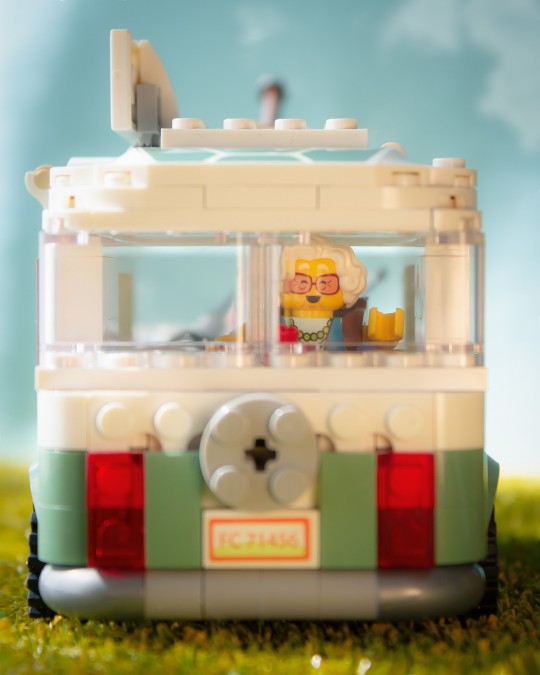
The hourglass is the main tool in the Dream World. It is used for Dream Crafting, but you have to be careful– the sand inside isn’t endless. You can see it even on the front of the van as an emblem.

It's a really fun set, which is both great for display and play. It has a lot of characters involved.
I would give this set a score of 9/10.
It has been released on August 1st and it's price is $47.99 and 47.99€
LEGO sent the set, but all the opinions here are my own.
Here's how I came up with the idea of the pictures:
I wanted to represent the colorful part of the Dream World, so I decided to use hard morning sunlight.
I put a piece of cardboard next to my window. On top of it, there’s a layer of artificial grass. Next, there’s a blue cardboard as a background and some props. I used barbeque skewers, wire, and Uhu Patafix to attach the objects to the wooden sticks. These sticks are pretty good to make things stable.


For one of the pictures I used a little tripod to place the turtle van on top to make it look like it’s flying. Then some editing, I had to remove the props and make the magic look real.
Find out more on the blog
Hope you enjoyed reading the review 🙂
@toy-story-yana , Community Engagement Mod
29 notes
·
View notes
Note
Hey there!
I love how you draw backgrounds, and I was wondering what your process for that is?
ahh i'm almost not sure how to answer, i feel like i haven't done a proper background in a while!
i think the most important part is to go into drawing a background with its purpose already in mind. even if you're not drawing a dedicated background, and it's just a backdrop for your characters, there should still be a reason why it's there. like, maybe the character(s) are interacting with it (leaning against a door frame, sitting in a chair, having their hair swept by the wind), maybe it provides a certain dramatic lighting that you want the character(s) to be cast in, maybe it adds a physical barrier between two characters who really need to talk something out, etc.
i feel like this is much easier in a comic because 9 times out of 10, the background is already woven into the setting and movement of the scene so you already know what you need from it, but you can also do the same for a single illustration. if i know i want a character to be shelving a book in a bookstore, and to have a ray of morning sunlight come in from the right that just catches the edge of her face and her neck, then I know that I need to draw a bookshelf near an implied window, and then maybe a few more books that she hasn't shelved yet, another bookshelf or two to imply there's an abundance of them, and then a few things i think a bookstore would need to have: a checkout counter, the counter is by the entrance/exit, the entrance/exit has large glass windows, additional light is coming in by the counter.
after i decide what elements i need in the environment, i sort out how i'm going to separate those elements out into layers--foreground, midground, background--and then i start working on composition. i value composition right after context because even if you can draw an environment with technically correct perspective, if it lacks a pleasing composition that completes the piece, it just feels dissatisfying. of course it's nice to have both a pleasing composition and correct perspective, but if i had to sacrifice one i would always sacrifice perspective. composition is hard to give tips on, because all i can really say is rule of thirds, feel it out, trust your gut, do your best, and remember that color and lighting affects composition too so try to plan with those in mind as well. at this point i usually try to start a color sketch and add in all the lighting effects i had in my head in order to get a full picture of the environment so far, so that i can judge if the composition & the colors work well together or not.
for coloring, i start by coloring everything its base color, which means the background starts out looking very flat. you can add depth into this base--and i sometimes do by just adding a few washes of darker color using normal mode layers--but for my comic backgrounds i actually prefer to add depth by relying on the lighting that i apply through layer modes, to keep my layer count down. for lighting, i like to stick with one main source of light that i can use to justify glowy highlights, and then i'll use a soft brush to airbrush some ambient light in the background. i'll mess around with my favorite layer modes, like multiply, linear light, and add glow, and i'll also try to have different gradients of light going in the foreground, midground, and background to maintain some contrast and depth between them. sometimes, if you're pushing something further into the background, and you're tempted to add more shadow and make it darker because you think that'll push it back, the right move is actually to focus on reducing contrast. like, if you look at a landscape, the hills in the far distance almost just blend into the sky; it's objects that are close to you that have the most distinct shadows and high contrast.
as for perspective, you can always fudge perspective, and should feel free to mush and squish it around if it benefits other aspects of the piece (composition, eliminating tangents, symbolism, whatever). messing around with it too much can break the illusion (unless your style completely supports that), but a little bit is healthy. everyone has an innate sense of perspective, and as long as that sense says "yeah feels good to me," then you don't necessarily need to pull out the formal perspective tools for every single background. a huge part of faking perspective without many tools is just to get so familiar with different angles that you can just toss them out on demand, and for that you can study a bunch of photo refs of different angles from real life, or you can do what i did and get a freecam mod for your favorite game and fly around taking screenshots of environments of interest from different angles.
23 notes
·
View notes