#this is such a good way of combining the charm of his original sprites and his hatless ones
Explore tagged Tumblr posts
Text
Design Talk- London & Reyes

Character Design
In the first draft of the short story, London and Reyes were named Good Cop and Bad Cop. They’ve come a long way since then, but they’re still partners, and that aspect was emphasized throughout the entire character design process.

Silhouettes are important in character design, and so when you have two characters that are going to be spending a lot of time together on screen, right next to one another, you want to make sure that they “fit” well. This was already taken into consideration subconsciously in the original concept art with their framing and posture, and so we made sure to keep that through-line. In their final sprites, their color palettes also compliment one another as inverses, with London’s irises and backdrop matching Reyes’ jacket, and her cyber-eye and neon shadow matching the warmer hues of London’s wardrobe.

We started on Reyes- designed her as athletic and wild, energetic and proud. We gave her clothing and hair brightly colored highlights but left notes of militarism and rigidity in her dress- an Army-green jacket and a fully buttoned, tucked-in shirt, and her right hand never far from her sidearm. As the member in the duo who wears her heart on her sleeve (loudly) we also made sure that her badge and gun were in full view. Reyes isn’t afraid of who she and what she does- but declaring all that so loudly in such a settled world makes it clear how badly she needs to prove herself.

Throughout the story she'll come face-to-face with the new breeds of good and evil that 2086 has spawned- and she'll have to grapple with how her society's balanced the scales of justice versus peace.

London, on the other hand, keeps his claws tucked away. His gun and badge are hidden by the calculated lay of his clothes, and his hands remain in his pockets throughout all his emotes. His slightly bowed head hides his true height and gives him a friendly, humble appearance- but his air of easy confidence combined with Reyes' occasional deference (plus the coat) gives player a hint of exactly what kind of character he is.
Throughout the design process he’s kept the swagger and oily charm of a seasoned gambler, though he was mostly playing the mediator throughout the prologue. He’ll soon have all too many opportunities to show how cool he can keep under the unique pressures of late 21st century law enforcement.
Synthesis
The two detectives were always meant to be clashing personalities- every iteration of Reyes was young, idealistic, sporty and short-tempered. London was always written as apathetic, practical, compromising and experienced. The (only) young blood in the homicide office, Reyes’ adoption of new technology and “punk” styling would contrast strongly against London’s passivity and conservative dress.

But as their designs evolved to better express the wide range of emotions and character beats we knew they needed to hit, the two characters grew closer in age. In early drafts, Farah stood on London’s right instead of his left- this put her closer to the protagonist and made her look more like she was initiating and leading the conversation. We later preferred how her silhouette looked on London’s left side, which had the side effect of giving him the lead. To match this new dynamic, dialogue and jokes were re-written to show more of her respect for her much more experienced partner, and Reyes’ strict adherence to rules and laws began to bleed into a generalized respect for authority and seniority which changed how the two partners got along.
Reyes still gets the urge to slap him out of his apathy, but it’s now out of frustration at wasted talent, and not just because of how his face looks.

Download of the Devil for Free Here
8 notes
·
View notes
Text
Ok, so I think I have finished ghost designs for my clones after they pop up in the zone after their destabilisation •^•
I also have color for them now - roughly at least. I may change hues or values at some point because I just mostly used this one pack of markers with nice saturation, and so if I ever decide to draw them digitally things will definitely change at least a bit.
But yeah, here they are, my bois but ghost addition:
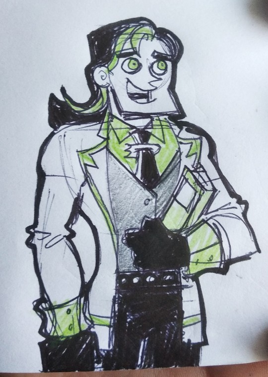

I drew this man once on a sticky note and once on notebook paper, I added them both because I think both sketches have their charm. Dorian is no longer naked, so I had to incorporate his original design in more subtle ways like the belt. And his colours are generally the black and white of his original appearance.
I gave him a new hairstyle because I was already going for a glow up vibe, and I thought it'd look nice. I gave him some green in the hair because I wanted more green accents near his face just in case the detail on the suit ended up distracting away from it. Also hair streaks are cool.
Lastly, I was so proud of myself when I realised I could make the DP symbol into a tie accessory, the joy I felt when I randomly happened to sketch it like that was just... A lot.
Gotta love feeling smart for doing small details right OwO

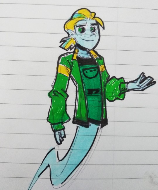

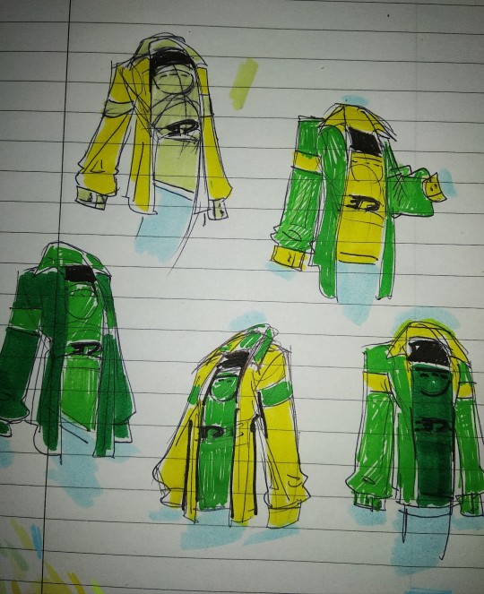
This man. This man gave me a lot of trouble in the colour department. I already knew I wanted Dante in a comfortable/ casual outfit because he's the art guy of the squad, but after I figured out what it's generally going to look like, I realized that the whole green/yellow/blue triad looks great on paper... But it actually looks awkward in paper.
The markers I picked were giving me very few options because the green was dark, so I brought in another lighter one that didn't have a brush tip ( hence the roughness in some sketches ) and began to play around with the different combinations and with the way they'd look near the blue ( hence the swatches around the clothing )
In the end I settled for darker on the inside, lighter on the outside. After that I decided my man had way too little blue and thought it'd be cool to also give him blue in the hair to help tie the color together a bit more. It worked, but I like my sketch without the streaks more than the one I did with them, so I'm showing both.
Other than looking like a sunflower, the man's dark and green on the inside is also kinda his original colour scheme. His eyes were red as a Skelly, but I ditched that because I like my yellow/blue/green scheme and I wanted to keep it consistent.
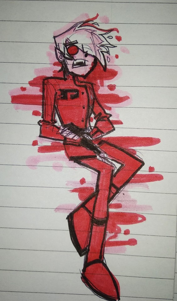

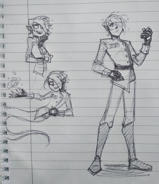
This guy was the simplest to figure out because I already knew I wanted him to look the most superhero/ready for action one out of all of them. I gave him a uniform looking suit because I thought it'd probably be better for flying around and being tiny but also stylish.
I have multiple sketches of this lil man ( one in my own ) because of how simple and quick it is to actually pose and draw this man out of all of them.
I think this works because he's also quite expressive and mischievous so if he's easier to draw I can maybe push the outline and expressions more to show his emotions.
Also elf ears and fangs because that way he looks like a tiny fairy or sprite and that's very chaotic. You see him and you know he's a mischievous boi.
His hair is fire because why not, fire hair is cool. That's probably why they gave Dan fire hair too, it just looks nice.
Though for Dominic it's more of a general ' this guy is a free spirit ' vibe rather than a ' I am intimidating and very scary ' vibe.
He's red because I just thought it fit and it would help him stand out against the green of his brothers ( and also his own green from when he was a clone ) OwO
I think this is everything I wanted to show for now so yeah, I hope you guys like them (ㆁωㆁ) Have a good day/night!
52 notes
·
View notes
Text
15 Best SNES RPGs Ever Made
https://ift.tt/3gFkLz0
SNES games might not be much to look at now, but in many ways, they were a massive improvement over any console games that came before. SNES developers could create massive worlds with detailed sprites that actually looked like what they were intended to represent. New advances in technology also meant that games could take their first real steps toward becoming the kinds of cinematic experiences we arguably take for granted today. And while 4 MB wasn’t even a ton of storage even space back then, it was still more than enough to fit an impressive script for a 40-hour story.
In short, the SNES was almost perfectly set up to be the home for RPGs. While the console RPG scene was still finding its footing at the time of the Super Nintendo’s release, many developers were more than willing to dip their toes into the genre to see what kind of experiences they could craft. That combination of experimentation and all-time great creative voices eventually resulted in some of the most beloved role-playing games ever made.
As we celebrate the 30th anniversary of the SNES in North America, now feels like a great time to look back at 15 of the best RPGs on the SNES.
15. Shadowrun
In the early 1990s, console RPGs were synonymous with turn-based combat and medieval settings full of knights, sorcerers, and dragons. So, no one really knew what to make of a cyberpunk game with real-time combat set in a dystopian Seattle. However, those who stuck with Shadowrun found one of the best and grittiest stories of the 16-bit era, as well as some surprisingly innovative conversation and hacking systems.
Shadowrun was truly ahead of its time in almost every way. While it didn’t get that much attention when it was released, games like Cyberpunk 2077 and The Ascent proudly carry on its legacy to this day. Even the Shadowrun franchise itself finally got its due with a trilogy of successful PC RPGs released over the last decade.
14. Soul Blazer
Even today, Soul Blazer is a title that not many gamers have heard of. Admittedly, it’s a little rough around the edges. Arriving early in the lifecycle of the SNES, the graphics and music aren’t quite up to par with the best games of its era, but the gameplay makes it a worthy addition to this list. Taking some inspiration from Actraiser, another beloved Quintet game, your goal in this action RPG is to clear out various lairs, rescue various souls (that could take the form of plants, animals, or other humans), and free the land from the evil Deathtoll.
Quintet would go on to hone Soul Blazer‘s best ideas in several other games (including Terranigma, another fantastic action RPG that sadly never made its way to North America). Unfortunately, Quintet shut down in the mid-2000s, and it’s unclear who exactly owns the rights to these games at this point. That sadly makes any official re-releases of these often-overlooked gems unlikely.
13. The 7th Saga
The 7th Saga is an excellent example of a game that had a lot of great ideas that never quite came together. Probably the best thing about the game is the playable characters. You have seven to choose from at the start (including a robot and an alien), and you eventually meet six other characters that you can either fight or recruit. It was also one of the first RPGs that didn’t include completely random combat. Enemies could actually be avoided through an innovative “radar” system.
Unfortunately, The 7th Saga is also unforgivingly difficult, with some enemies always surpassing your stats no matter how much you level up. So, while it may not have aged as gracefully as other games on this list, it’s an utterly fascinating project with incredible ideas that have since been incorporated into numerous genre classics.
12. Breath of Fire II
To be honest, Breath of Fire II doesn’t have a particularly memorable stand-out feature. Sure, there’s a town-building feature that lets you fill a town with various NPCs you meet throughout the game, but it’s easily ignored. Having a giant talking armadillo in your party is also pretty cool, but it’s obviously hard to recommend the game based on that alone.
So why should you play Breath of Fire II? Well, it’s just a very solidly told fantasy story with a lengthy quest and strong turn-based combat. It’s nothing flashy, but it’s a strong overall entry into the Super Nintendo’s RPG library.
11. Lufia II: Rise of the Sinistrals
The release of Lufia II was overshadowed by the release of the next-gen systems and a SNES library already bursting with classic RPGs. It took a while for a lot of gamers to dig up this hidden gem, and some gamers simply never found it at all. To be fair, the story (which features a typical fantasy hero who has to save the world from the four evil Sinistrals) is a little mechanical, but Lufia II features some of the best graphics and music of any game on the console. Plus, there are tons of puzzles to solve and a 99-level randomized dungeon to eventually tackle. Honestly, Lufia II might feature more “gameplay” than any other Super Nintendo RPG.
While it’s billed as a sequel, Rise of the Sinistrals is actually a prequel to the first game, so you can feel free to dive right into it without playing through the first (though Lufia and the Fortress of Doom is well worth checking out as well).
10. Harvest Moon
Arriving at the tail end of the SNES’ lifespan, Harvest Moon made a lot of gamers re-examine what an RPG could actually be. There’s no combat and no great quest to save the world. You’re just a simple farmer growing crops and raising livestock on the land you inherited from your grandfather. It sounds boring, but the gameplay loop is remarkably addictive. There’s a reason why the Harvest Moon series continues to this day and has inspired dozens of imitators, spin-offs, and sequels (most notably Stardew Valley).
Admittedly, some of the recent Harvest Moon games haven’t lived up to the series’ standards, but thanks to charming characters, witty writing, and its simple yet deep gameplay, there’s a very good argument that this first Harvest Moon game remains the best in the franchise.
9. Illusion of Gaia
The spiritual sequel to Soul Blazer exchanged the town-building mechanics of its predecessor for more involved combat, which honestly made it a better game overall. Illusion of Gaia also forgoes the traditional leveling of most RPGs for a roguelike system where protagonist Will can choose to increase his attack, defense, or health stats after clearing each room of enemies. As such, how you choose to proceed can make the final bosses of each dungeon significantly easier or much more difficult.
While it’s not technically set in the real world, Illusion of Gaia does incorporate several real-life locations, such as Egyptian pyramids, Incan ruins, and the Great Wall of China, leading to some of the most unique locales in any SNES RPG. It’s also a much better-looking game than Soul Blazer, fixing one of its predecessor’s biggest flaws.
8. Secret of Evermore
Square Enix (then Squaresoft) is primarily a Japanese developer, but after the massive success of multiple titles in the ‘90s, they decided to give an American studio a crack at the Square formula. While the basic gameplay of Secret of Evermore is obviously inspired by the superior Secret of Mana, Evermore mixes things up by restricting combat to just you and your trusty dog. There’s also a new alchemy mechanic that allows you to create potions when battling the game’s many tough bosses.
For better or worse, Evermore is also graphically a much darker game than other Square titles of the era. It all mostly works here, but Square was ultimately not interested in pursuing Americanized versions of its games and Evermore is now more of a curiosity than anything else.
Read more
Games
25 Best SNES Games of All Time
By Chris Freiberg
Games
25 Best RPGs Ever Made
By Matthew Byrd
7. Ogre Battle: The March of the Black Queen
More of a military strategy sim than a typical RPG, The March of the Black Queen might be the most demanding game on the SNES. You will spend a lot of time managing units, some of which include ninjas, griffins, and witches. But when you pick just the right strategy, it’s oh so rewarding to watch them take back the continent of Zetegenia from the evil Empress Endora. It also features one of the denser stories of any 16-bit game. Many of the best plot beats may even remind you more of Game of Thrones than Lord of the Rings.
This is actually considered the fifth episode of the Ogre Battle saga, and while several sequels were produced over the years, the first four games that would have presumably featured the rise of Endora were never made. Sadly, though, Square Enix now owns the property, it doesn’t look like the Ogre Battle saga will ever be completed either.
6. Final Fantasy IV
Plenty of RPGs were released before Final Fantasy IV (also known as Final Fantasy II in North America at the time of its release), but this was the true turning point for the JRPG genre. Of course, the graphics and sound were better with the move to more powerful hardware, but what really set it apart was the distinction of being one of the first RPGs to actually feature a fully fleshed-out plot complete with a complicated love triangle and a sympathetic villain in Golbez. It was also the first Square game to include the Active Time Battle system, which showed that JRPGs didn’t have to just be plodding turn-based affairs.
Honestly, the only downside of playing Final Fantasy IV on the SNES is that the original English translation is a little iffy. That’s been fixed in later ports and remakes, so while it might not be worth checking out on the SNES anymore over other options, it’s still worth playing in some form.
5. Super Mario RPG
Both Nintendo and Square were arguably at the height of their abilities in the mid-90s, so it shouldn’t come as a surprise that when they finally teamed up, the result was an absolute masterpiece. Super Mario RPG expertly combined the beloved Mushroom Kingdom setting and Mario platforming with Square’s top-tier storytelling abilities and advanced RPG combat systems for a truly epic game.
Those who have played through Super Mario RPG still yearn for a true sequel developed by Square or, at the very least, the addition of Geno to Super Smash Bros. Given how beloved the game is, it’s surprising that Square and Nintendo still haven’t teamed up for another RPG. The Paper Mario and Mario and Luigi games are good, but none have surpassed this classic.
4. Secret of Mana
Closer to The Legend of Zelda than Final Fantasy in gameplay, Secret of Mana was perhaps the most innovative RPG of the ‘90s. It introduced many gamers to faster, varied combat, three-player multiplayer, and an absolutely massive game world. Even better, it’s all wrapped up with some of the best music and graphics of the generation. While still confined to the 2D limitations of the SNES, Secret of Mana’s systems are closer to what we see today in modern RPGs and action games than anything that came before.
While this game has been ported and remade perhaps more than any other game on this list, none of those versions quite match the first release. The original version of Secret of Mana still looks and feels timeless.
3. Earthbound
RPGs were generally considered more niche games in the ‘90s. They rarely sold well, but at least did well critically. Earthbound is even more unusual because the initial reviews were rather tepid, yet it’s now considered one of the greatest games of all time. Most gamers just weren’t ready for an RPG set in the modern world that alternated between the cheery enthusiasm of childhood and the ominous alienation of growing up. In that way, Earthbound could be considered a PG-rated South Park that debuted two years before South Park even premiered.
Surreal, satirical, and sometimes just plain weird, Earthbound remains one of the more unique and innovative RPGs ever made. It’s a triumph of the genre that dozens of other games have attempted to emulate, but none have yet surpassed. Now, if Nintendo would just get around to finally putting out an official English localization of the sequel…
2. Final Fantasy VI
Two decades and nine sequels later, there are still some RPG fans who consider Final Fantasy VI to be the pinnacle of the series. That’s debatable, but it’s easily the best of the 2D entries as well as a kind of swan song to the gameplay that introduced many gamers to RPGs for the first time, with its pitch-perfect ATB battles, a huge, varied world to explore, and an epic, apocalyptic story.
But it’s the cinematic aspects that make Final Fantasy VI stand out. The rousing soundtrack pushes the SNES to its absolute limits, making moments like the famous opera scene and the final battle against Kefka feel especially epic. Square arguably came to rely on CG movies a little too much in later games, but Final Fantasy VI is proof that the developers were master storytellers long before that.
1. Chrono Trigger
Is there really anything to dislike about Chrono Trigger? The time-traveling story that sees our heroes journey across millennia to save the world is simply outstanding. The characters, from Frog to Magus, are among the most memorable in any RPG. While the combat system might be a little simpler than some of the games on this list, letting party members team up to use their “Tech” abilities in different ways is endlessly customizable and entertaining. Of course, all of that occurs before you even dig into the new game plus and dozen different endings.
It’s difficult to label any video game as truly perfect, but Chrono Trigger may be the closest thing to perfection that gaming has ever seen. More than two decades on, it remains a high point in the RPG genre that all gamers need to experience at least once, and it’s easily the very best RPG on the SNES.
cnx.cmd.push(function() { cnx({ playerId: "106e33c0-3911-473c-b599-b1426db57530", }).render("0270c398a82f44f49c23c16122516796"); });
The post 15 Best SNES RPGs Ever Made appeared first on Den of Geek.
from Den of Geek https://ift.tt/3ypVLCa
2 notes
·
View notes
Text
I Regret Buying Pokémon Shield
I told myself I wouldn’t do it. I’ve seen time and again the lack of innovation from main-series Pokémon games, and I insisted nothing would convince me to buy this latest atrocity. Yet here I am, reviewing the game I said I’d never purchase. I should have listened to myself. I KNEW BETTER! Strap in, ‘cause this one’s pretty long.
Pokémon has been around for a long time—like, a long, long time—and I’ve been around for every single new main-series game that’s been released since the franchise’s first arrival in North America back in 1996 with Red/Blue. I was not yet 10 years old, and I still remember the childlike excitement of finding rare, never-before seen creatures, the stress of trying to catch a wily Abra or elusive Pinsir, and the challenging first encounter with the Elite Four and the Champion, a 5-man gauntlet of trainers with powerful Pokémon rarely (if ever) seen in the game prior to that moment. It was exhilarating in a way that keeps me coming back for more, hoping to rekindle those same flames of wonder.
While the main gist of the games hasn’t changed much over the years, one of my favorite parts of playing a new Pokémon game is seeing the improvements each game brings to the series. Many of the initial sequels made huge leaps in progress: Gold/Silver introduced a plethora of new mechanics like held items and breeding; Ruby/Sapphire introduced passive abilities and was the first to include multi-battles in the form of double-battles; Diamond/Pearl was the first generation capable of trading and battling online and brought us the revolutionary physical/special split so elements were no longer locked into one or the other. These changes all had significant impacts on how players approached battles, formed their teams, and used each Pokémon.
Those changes, combined with the addition of new Pokémon to catch, regions to explore, and enemies to fight, were enough to keep me interested. But I know I wasn’t alone in imagining all the possibilities of taking the franchise off the handheld platforms and moving the main series games over to a more powerful home console. In the meantime, each generation that followed Gen IV highlighted a new, troubling pattern that became more and more prevalent with each addition to the series.
1. Gen V: Lack of meaningful gameplay innovation
By Generation V with Black/White, not only was Game Freak quickly running out of colors, they were quite obviously running out of ideas for significant gameplay innovation. The bulk of Black/White’s biggest changes were improvements on or adaptations to existing staples to the franchise: many new Pokémon, moves, and abilities were added, and the DS platform allowed for greater graphical quality where Pokémon could move around a bit more on-screen during battles, the camera wasn’t as rigid as it had to be in previous games due to machine limitations; perhaps most importantly, they FINALLY decided to make TMs infinite. Thank goodness. While the updates were nice, they were nowhere near as impactful on the game as previous generations’ changes were and served more as needed quality of life adjustments.
I would also argue Gen V also had the least inspired Pokémon designs (like Vanillux and Klinklang) with the worst starter choices of any Pokémon game, but that’s a discussion for another time. Excadrill and Volcarona were pretty cool, though.
2. Gen VI: Gimmicks as the main draw
Pokémon X/Y (See? They ran out of colors) continued this new downward trend in innovation. Mega-evolution—while admittedly pretty cool—wasn’t enough to carry the new generation into an era of meaningful improvement because it was equivalent to adding new Pokémon rather than developing innovative gameplay, ushering in a new era of gimmicks in lieu of substantial updates.
Though the gameplay innovation for X/Y was minimal, the graphic updates were substantial: Pokémon X/Y was the first generation to introduce the main series to a fully 3-dimensional world populated by 3D characters. However, since X/Y was on the 3DS, it was a ripe target for the 3D gimmick seen in almost all games on the console, which I personally used for all of 5 minutes before feeling nauseous and never using the function again.
Despite the fresh look of the new 3D models, the battle animations were, to be frank, incredibly disappointing. Pokémon still barely moved and never physically interacted with opponents, nor did they use moves in uniquely appropriate ways. To my point, for years now there’s been a meme about Blastoise opting to shoot water out of his face rather than his cannons. I was sad to see that they didn’t take the time to give each Pokémon’s animations a little more love. But I figured, in time, when or if the franchise ever moved to a more powerful machine, they would be better equipped to make it happen, right? I also convinced myself that the lack of refined animations were kind of charming, harkening back to the games’ original (terrible) animations.
3. Gen VII: Focus on Minigames
The main innovation (gimmick) that came with Generation VII, Sun/Moon, was the lack of HMs in lieu of riding certain Pokémon. Sun/Moon also added Ultra Beasts (essentially just new Pokémon) and Z-moves (just new moves) which only added to the number of gimmicks present in the games. These changes, which provide some mild adaptations to gameplay from previous generations, don’t fundamentally change the way players go through each game, the way that updates in the earlier generations did. I personally played through the entirety of Sun/Moon without using a single Z-move or seeing a single Ultra Beast outside the one you’re required to fight to progress the main story. Ultimately, these changes were not a significant enough experience to warrant an entirely new game that is otherwise full of more of the same stuff with slightly different creatures who have slightly different stats and occupy a slightly different world.
Though Sun/Moon was comfortably embracing the franchise’s affinity for gimmicks, it brought to the forefront yet another troubling trend: mini games. Between photography, the Festival Plaza, and Poké Pelago, the focus on and attention to detail toward mini games had grown considerably over the years. Pokémon games have always had minigames and other time-sinks—which is great! Don’t get me wrong, I appreciate having more to do than trudge through the main story. But it is apparent that, with each new generation, more time seems dedicated to development of these extras. Pokémon Contests, Secret Bases, Super Training, feeding/grooming; a lot of their larger innovations after Gen IV were centered on non-essential parts of the game, which results in diminished game and story quality overall.
Admittedly, Sun/Moon did have some of the best exploration moments of any of the Pokémon games, which I did very much appreciate. More on that later as it relates to Sword/Shield…
4. Generation VIII: You Can’t Be Serious
When Game Freak finally announced they were launching Generation VIII, Sword and Shield, on the Switch rather than a dedicated handheld console, I was beside myself with excitement.
And then I saw gameplay footage like this, and my heart sank.
What is the purpose of launching the game on a stronger console if they are going to continue copy/pasting their sprites and their animations? If they aren’t going to provide the Pokémon any unique flair or create more appropriate animations? It was disappointing enough seeing the same animations/models from X/Y for Sun/Moon, but that was sort of expected since the games were on the same console. But now that the game has moved to the Switch, this is unacceptable.
When I learned that they were significantly cutting the number of Pokémon available in the game, I thought for certain that would translate to more time dedicated to the ones that made the cut, to focus on adding animations and character to the critters to make them feel like real parts of the world, rather than avatars of a child’s imagination, unable to fully process how the world functions. Alas, what was I thinking?
I thought the Dynamax gimmick would be one of my biggest gripes because it’s so pointless, or maybe the Wild Area’s severe lack of organic belonging (all Pokémon are just wandering aimlessly, weather can change drastically after crossing an invisible line, trees look like they were cut and pasted out of Mario 64, you can’t even catch Pokémon if they’re too high a level) but honestly the most disappointing part of the game for me was the pitiful routes between towns/gyms. Previous installments of the game included routes full of trainers and puzzles you needed to defeat or solve before you could progress—in Sword/Shield, the only thing that ever prevents you from progressing are some Team Yell grunts barricading paths the game doesn’t want you to take yet, for literally no reason. It completely removes player autonomy and a sense of accomplishment earned through overcoming challenges—now instead of learning that you need to find an item that allows you to cut through certain trees to gain access to new areas, you simply follow the story beats and then, upon returning, the path will be open. It’s inorganic, it’s clunky, and it’s extremely lazy.
Speaking of lazy, the story itself was another massive disappointment for me. Pokémon games are not particularly known for having deep stories, but Sword/Shield takes it to a new low. Every NPC simply pushes you to battle in gyms, and every interesting story beat that occurs happens just outside the player-character’s reach. Any time something interesting happens, you are shooed away and told to let the grown-ups handle it while you just get your gym badges. There COULD have been some interesting story moments where your character gets more involved with helping fix the havoc occurring around the Galar Region, but instead we as the player are simply TOLD what happened, why it happened, and who fixed it (usually the champion, Leon).
I honestly think having the game focus on the story of Sonia, Bede, Marnie, or even Hop (was not a fan of this kid) would have been a much more interesting game, because those characters actually had some depth to them, some bigger reason for taking on the gym challenges than simply “I want to be the very best.” Albeit those stories would have required a tremendous amount of work to add depth and details, the potential for a better story is in those characters. There is just no story at all to the main character, who is ushered from gym to gym because…because? Because that’s what kids do? I’m not even really sure what the motivation is.
There are SO MANY exciting, interesting, innovative ways Game Freak could drive Pokémon into a new and exciting direction while still maintaining its charm and building on existing mechanics, but they instead choose to demonstrate their lack of interest in significant graphical and gameplay innovation. I imagine this is largely because the masses will eat up just about any Pokémon product produced so long as there’s a new bunny to catch, and Pikachu is still involved. I’m disappointed, and I wish the Galar region could meet the expectations of my 10-year old mind’s imagination.
When abilities were added, we suddenly had to consider whether our Earthquake could even hit the enemy Weezing and adapt to the tremendous changes the passive skills added, reconsidering how we faced each battle. When the physical/special split occurred, entirely new opportunities opened up and certain Pokémon who were banished to obscurity due to their poor typing and stat distribution, like Weavile, were suddenly viable. Some even became incredibly powerful, like Gyarados, who had been hit pretty hard by the Special attack/defense split. There were also already-powerful Pokémon (Gengar, Dragon-types) who became even more so through access to STAB moves that benefited off their strongest stats.
I want new games to include updates that feel as impactful as these changes. If you’re interested in how Game Freak can improve on the main gameplay, I have some fun ideas that will be fleshed out in another article: How to Breathe New Life into the Pokémon Franchise. That article will be dedicated to explaining what those changes are, why I want them, and how they can improve future games.
#pokemon#pokemon shield#pokemon sword/shield#game review#review#hilltop sunset#streamer#gamefreak#gen viii#gen 8
4 notes
·
View notes
Text
Reference List for amiibo Fighter Names (Set 4)
37) Pichu : Zap Nezumi - Those who have been with my channel for awhile might remember a cute and charming Mega Man style game called Nezumiman. I love that game so much and would love to see a sequel. Squeakuel?... Anyway. Most of the bosses were dubbed (Element) Nezumi, depending on their power. So Pichu gets to fill in as Zap Nezumi! Up top we have all the various stage bosses, and Pichu is dressed in all the fashion items Nezumiman gets for beating them. He’s got Perfect Fashion! Which according to Nezumiman, also involves having Dr. Gyoniku’s butt in the background.
38) Pikachu : Agent 25 - Actually a self reference, this one. Agent 25 is a “character” that has appeared in some of my silly bits I’ve done for past videos. Theoretically his real name is Conduit, my Lv. 100 Pikachu, but he serves as an agent for me, going by the codename Agent 25 (his Pokédex number), protecting me from annoying talent agents trying to zap me with a dragon prod for taking time off. We went with a full-on James Bond style for this one. A minor detail, the display of PokéBalls in the nameplate having five empty circles before it is supposed to reference the display showing how many Pokémon a trainer has in a battle, thus, he’s the only one here.
39) Pit : Icarusicus - What can I say, I grew up with Captain N as a kid. Back then, as a gamer, you took whatever media you could get. Captain N was cheesy as heck, and got a lot of source details WAY wrong, but it was still fun in its own weird way. In that cartoon, Pit was instead simply named Kid Icarus, and had a habit of inserting “-icus” at the end of everything he said. So here the more modern Pit is faced with a blast from the past, his cartoony old weapons and contact from Kevin and Princess Lana. Neo added more details, like some Mega Man sprites recolored and restyled to look like characters in Captain N. Including a Simon Belmont sprite given his look from the cartoon, blue bomber jacket and blond hair and all. The building shown is the Palace of Power, Princess Lana’s base of operations.
40) Pokémon Trainer : RedVersion - Again a self contained reference to Pokémon. The trainer he’s based on is Red as he appears in Fire Red and Leaf Green. Thus, RedVersion, in reference to the original Red Version of Pokémon. Neo and I both had the idea to try to pose the Pokemon and Red himself like how they’re posed in the original game sprites. Neo also went an extra step, using minimalist colors to mimic how the sprites looked on a Game Boy Color or Super Game Boy. While I do like the idea, I might ask to stick with full color just to mimic the amiibo itself if we do indeed redo these. The overall look of the card was designed to look somewhat like the original Pokédex.
41) Robin : ShipREKT - Again, Fire Emblem is not exactly my area of expertise. But this silly idea came to mind, knowing Robin’s game has a lot of “pairing people up to increase bonds” mechanics. Sooooo Shipping : The Game. So I just had the silly idea of drawing him in super charming anime style. Of all things, I think I was largely influenced by a scene from the Unova episodes of Pokémon where a male Minccino was using Charm. I suppose this is a good time to mention that, in cases where only one figure was released for a character, I go with that style for them, so for instance, there’s only a male Robin card, only a female Wii Fit Trainer card, no wireframe Little Mac, no Koopalings, etc.
42) ROB : Spin Cycle - I mean, ROB’s all about spinning his gyros, that’s really all there is to this one. The colored swirl in the background was supposed to mimic the red and blue colors of the gates from Gyromite that he’d help you move. However, it also kinda looks like the colors of those infamous Tide pods. Which... I mean, spin cycle IS a laundry term, so yay accidental references?...
43) Rosalina : Cosmic Mama - I love Katamari! Seriously given that was a Namco game, I would have loved it if some Katamari music got in on the Pac-Man stage. Ah well. This was one of those where I just couldn’t resist the reference and sneaking the Half Inch Prince into the picture. Neo further personalized some of the Lumas, as well as adding the famous “I feel it! I feel the cosmos!” quote.
44) Samus : Chozen One - A self contained Metroid reference, and a silly pun. Samus is the “Chosen One” in the sense that a lot of Chozo prophecies as seen in the Prime series seem to center around her actions. So just a combination of Chosen and Chozo. I had worried that Samus would be hard to draw in Visio Home, but it turned out to be really good for drawing the defined lines of her suit.
45) Sheik : HARP HERO - While I’ve never actually played any of the Guitar Hero games, the fact that Sheik generally just follows you around to teach you new songs via her harp made this idea stick with me. A shame she doesn’t use her harp for anything in Smash... Seriously feels weird that she doesn’t. Anyway, I had the track display the notation for Bolero of Fire. For some reason, the scene of her teaching you this one just stuck with me as a kid as one of the most iconic scenes with her. This was also drawn before we started putting character icons in the nameplates. In his version, Neo added the Sheikah eye symbol to the nameplate.
46) Shulk : RA1NFALL - This is a reference to Project Rainfall, a community effort to coax publishers into localizing a few select games in the US. If memory serves, Xenoblade Chronicles was the first and perhaps most prominent game to have been part of this effort, hence my putting a 1 in the name. I didn’t really have a good solid way of drawing rain in Visio Home, so Neo added that on his end. Really this one probably saw the most changes between versions, as I really had very limited info on Xenoblade. My frame as such is.... really clunky looking. Neo was able to make something far better looking on his version. The symbol on Shulk’s Monado here means “rain,” so, uh.... umbrella utility!
47) Sonic : SpeedRacer - A reference to the anime of the same name. Sonic here is posed like Speed after he jumps out of the Mach Five during the Speed Racer title sequence. Meanwhile Sonic’s car here is the one he drives in Sonic All Stars Racing Transformed, as well as being on the game’s Starlight Carnival track. Neo gave me the idea to have a Coconuts peeking out of the trunk of the car to mimic Chim-Chim, the monkey mascot of the Speed Racer team that had a habit of stowing away in Speed’s trunk while he was racing.
48) King Dedede : ThreeDeDe - A joke on 3D imagery, such as that found on the Nintendo 3DS. The first Kirby game for the 3DS, Triple Deluxe, even had a mode where you played as King Dedede on his own adventure, so hey, him celebrating this moment of glory does not seem out of character for him.
3 notes
·
View notes
Text
Good Stuff: Elements of Justice [Pt. 1]
My Little Pony, Friendship is Magic. Ace Attorney. To think around 7 years ago, a fan of both was able to combine the two to create Turnabout Storm, the multi-part youtube video series that weaved a whole tale where Phoenix defends Rainbow Dash in a murder trial in Equestria. It admittedly wasn’t a well-tight story, but I will never deny the effort that went into considerably one of my favorites fanworks in history. It wasn’t til’ 2019 where a spiritual successor has arisen by a new artist, combining the two series once again with new characters and potentially more new cases at hand. This is Phoenix Wright: Ace Attorney x My Little Pony: Friendship: Elements of Justice, and I not only adore it, I smell the good potential.
This review is gonna do things differently, since case 1 isn’t complete yet there’s plenty to talk about so part 2 onward will depend on how far this is able to go. With that said...
It starts off well. 15 minutes in, the case is introduced, Phoenix and his crew are transported to the pony world, everyone’s freaked out and are caught up to speed before getting into the investigation factor of Ace Attorney before the trial starts in part 2. Great thing about this series so far are the designs; there’s certainly a lot to juggle but the creator managed to work out so much, from the character sprites to their personalities to their voices, all of which are really fitting even when Apollo and Athena aren’t in action.
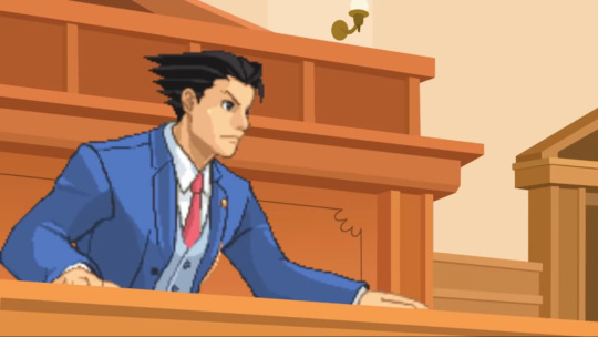
I was genuinely surprised seeing the pixel sprites of DualDestinies!Wright, especially since I've never been used to full 3D Ace Attorney
As for the story so far, it’s really solid. As the first case in this supposed series, it’s an easy murder trial involving characters from MLP where after the first part gave the characters time to put some pieces together, the remaining 2 parts will take place where the real action is in court. I say the key reason why this, and the premise, certainly works is that both were able to sell you on its drama beforehand. Ace Attorney comes off as the more mature of the two, but they’ve never been above being in more goofier situations. MLP Gen 4 on the other hand, while a young kids show, has always had this secret versatility where putting the characters in more adult scenarios, both in show and with fanworks, never feels out of place. It helps that most the characters in MLP themselves are adults with actual jobs so this probably wouldn’t have worked if they were kids. That’s why as graphic as the murder in question is, the creator went for it being a serious situation while you’re subconsciously remembering that we’re dealing with cute talking horses.
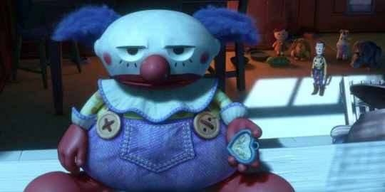
reminds me a lot of how Toy Story 3 worked so well
When I get down to it, it’s just Ace Attorney with MLP characters yet I very much appreciate the passion that’s going into this being a full on series, expanding on that original project. It doesn’t feel like a half assed attempt at making an Ace Attorney series, beyond a moment in the story where you have to suspend your disbelief a bit more, but a bonafide beginning effort to make a puzzle you can put the pieces together as you watch along. Everyone sounds like they’re invested in this, Blueblood’s rough voice aside, which makes it more investing than the simple merit of seeing these characters again. If there’s one major issue I have to point out, it’s mostly with the dialogue box. It takes up nearly a third of the screen and while that isn’t an issue with reading the text,
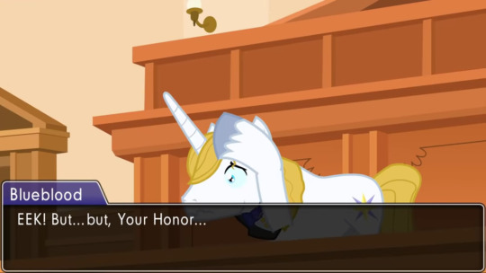
I feel like it got in the way a couple times where the box either could’ve been sized down or move the image up
Another issue I kinda had was where there were times where I thought that what the characters trying to prove were obviously flawed yet they kept going with it, but at the same time it makes sense that they’d want to fill any holes in the plot as possible so knocking out theories adds up. Again, it’s about putting the pieces together by the end.
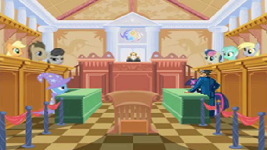
it is to say we’ve come so far
Overall, I genuinely want more and I’ll gladly wait for more to come. It’s a project where the creator knew what they wanted and have put the ankle in giving it just as much charm and care as before. It feels polished and a clear vision beyond the single big case. While nothing major has truly happened yet, I’m ecstatic seeing this in action to where I sincerely ponder how more it will do. The creator himself is looking to improve however possible so it’s pretty hyped to see what’s next.
#ace attorney#AA#phoenix wright#my little pony#mlp#mlp;fim#Friendship is magic#FIM#cartoons#video games#reviews#Good Stuff
15 notes
·
View notes
Text

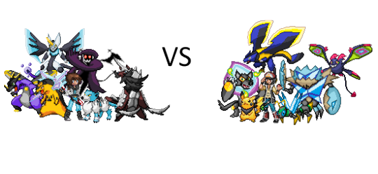
So I got REALLY bored and decided to make a sprite based on another product of my boredom where I made a “what if” design for Ash if he ever came to my fan region, Tauraro. Technically Pikachu too, since he has the region’s gimmick: Type Scarves, which simply add a type or replaces a type of the Pokemon they are attached to with the type of the corresponding scarf, and allows them to learn TM’s that come from those (but are forgotten once removed).
While I was at it, I updated Dray’s sprite and made him a better team, and this would be his “anime” team that’d rival Ash’s.
Anyway, more info under the cut, and some corrections or updates to previous info already posted. Warning, a very long read.
In this series, this is an alternate timeline where Ash won Kalos and Alola (because he was robbed in Kalos, and he won properly in Alola in this timeline in a proper league and island challenge rather than daycare for a summer) and instead of Journeys, he came to my region, Tauraro. He’s a bit older, like 19 or so (also he’s allowed to age in this alternative timeline), a bit wiser, but he’s still got that slight goofy charm he has now and then- although, Ash is a tad bummed, since he rarely loses these days and most battles tend to end pretty quickly- Hence why he wanted to start over again in a tough region like Tauraro. Sort of think of him like DP or XY Ash in terms of mannerism. He’s here on another gym challenge, and of course there’s shenanigans along the way. He’d also be sort of a rival but more of a big-brother/mentor figure to the in-game best friend rival, Dray.
So, his team:
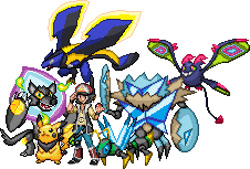
1. Pikachu (Electric/Dark) Obviously Pikachu is here. Pikachu is still pretty spry and a tad more mischievous, but obviously there’s something different here. Pikachu is wearing the item called the Dark Scarf, which has made him into an Electric/Dark type. Thanks to this, in addition to Thunderbolt, Quick Attack, and Iron Tail, Pikachu also knows Dark Pulse. He can combine Thunderbolt and Quick Attack to form Volt Tackle, Dark Pulse and Thunderbolt to make Black Bolt, and Volt Tackle and Dark Pulse to make Dark Volt. Pikachu actually likes this particular scarf more than others, but he has been known to wear an Iron Scarf, an Esper Scarf, and a Wind scarf.
2. Kyokoglare (Fire/Ghost) (Wolf looking fakemon): Ash was given this Pokemon in its first form (Sparkbark) by the regional professor, Rachel Poincienna. Throughout its evolutions, its virtually remained the same: Hyper, goofy, aggressive to cat Pokemon, likes to chase cars, barks at the slightest noise, and easily influenced by food. He’s a strong boy, and he loves Ash and everyone else he travels with- Even has a soft spot for Team Rocket. Ash himself often finds himself being aggressively licked or hugged by Kyokoglare.
3. Krushtocean (Water/Fighting) (anime crab): Krushtocean in its base form (Crabash) was released by its original trainer because she could not handle how excessive and hard to handle he was. This never left him as he evolved, and in fact got worse. He flexes, he gets into pose contests with random Pokemon, he always shows off in battle and often lets his guard down- Krushtocean is addicted to the spotlight, and its often his own undoing. Ash has to hype up Krushtocean and pose with him in order to properly use him in battle, but he’s otherwise a pretty decent Pokemon to get along with. Krushtocean is often prone to competition with Kyokoglare, but the two work very well together when they get in sync.
4. Gnateon (Bug) (The bug): Ash caught a Tauraran Eevee in the wild, and it evolved pretty quickly into Gnateon after it got ahold of his Scale Scarf. Gnateon is easily distracted by bright lights and flames, and Ash often times finds himself being tackled in the face or receiving a very tight hug from Gnateon when happy. He’s curious and stubborn, but he’s a good boy that brings gifts sometimes- sometimes these gifts belong to other people, and this gets him into trouble. He’s fast and strong, and the fastest Pokemon Ash has ever owned.
5. Globat (Flying/Psychic) (formerly Tauraran Crobat): Tauraran Zubat and its line are naturally very friendly to travelers, so imagine Ash and the gang’s shock when one snuck away under Ash’s vest. It quickly evolved to Globat because of how well Ash took care of it, and it quickly became gifted in hypnosis, mind reading, distraction, and intel gathering, not to mention its ability to shoot lasers. Its a very joyous and affectionate Pokemon that can often be found perched atop its friends or hugging Ash. There’s not a bone of hatred in its body, and it is easily fooled by lies. It loves to snack on sweets, and people are all too happy to give it treats.
6. Calistaris (Dragon) (The dragon): One of the semi legendary dragons of the region (although its more or less as powerful as a Garchomp or Dragonite). In a time of crisis, this dragon appeared before Ash to save his life from the villain of the region, someone who was chosen by this dragon’s father. Calistaris is actually just as mischievous as the rest of the crew, and chose Ash due to his adventurous spirit. He and Pikachu are practically best friends in a sense.
Anyway this is the team I’d see Ash having towards the inevitable Pokemon League matches. His direct rival would be with Dray, and yet he’d also be like a big brother/mentor figure to him.
Speaking of.
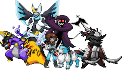
Dray, like in the game, starts off very timid and unsure of himself. But underneath all of that hid a righteous hero who wants to make something of himself, like his father: the former champion of the region and now the 8th gym leader of Tauraro. Throughout his journey, he becomes more sure of himself, learns of his strengths and how to build upon them, and his weaknesses and how to improve himself. In the game, he would go on to eventually be chosen by the other psuedo legendary dragon of the region, and also be worthy of becoming champion, and would be the player’s best friend. In the Ashnime, he’d be Ash’s rival and sort of be a newbie he’d help out now and then, and he sort of considers Ash to be like a brother to him after a bit. Still, he sees Ash as a rival to surpass, and the two would eventually meet in the final round of the Pokemon League after all of the story stuff.
Team:
1. Typhlosion (Electric/Psychic): Dray had a choice from Tauraro variants of the Johto Starters for his first Pokemon, and he chose Cyndaquil, who evolves just like Dray does from skiddish creature to proud and powerful. Dray and Typhlosion are practically inseparable, and Dray takes it very personally if Typhlosion loses- because it means Dray made a mistake. These two are so close, Typhlosion can make moves before Dray can even issue them with 100% accuracy, and Typhlosion has the power to charge up a small town AND levitate large boulders. He and Ash’s Pikachu get along really well, and have a friendly rivalry very similar to Ash and Dray.
2. Deviclaw (Dark/Ghost) (ghost thing behind him): Dray had extreme luck and yet was also UNLUCKY at the same time and caught the region’s non legendary psuedo legendary in its beginning stage as a Spirisp. Deviclaw was rather weak towards the beginning, and had a negative view towards itself, but with a kind and patient hand, it would eventually become Deviclaw and become one of the strongest members of his team. Deviclaw went from a debby downer to a proud and protective lad, and is especially protective to Dray, viewing him as his savior. Dray used to be scared of the dark and of ghosts, but Deviclaw proved to him that neither are to be feared when you have someone there to protect and to protect you.
3. Frozark (Ice) (Dog): Dray rescued a Pupote from an abusive trainer and gently nursed him back to health. When trapped in a blizzard, Pupote returned this kidness by evolving into one of its three evolutions, Frozark. Frozark is very loyal to Dray and went from skiddish to very calm, collected, and mature, but Frozark is rather prone to demanding pets and treats, or chasing cat Pokemon like Ash’s Kyokoglare. Frozark views Dray and his Pokemon like his pack, and will do everything in his power to keep them safe and make Dray happy. Like Deviclaw and so many of Dray’s other Pokemon, he is very protective of Dray and would go to any lengths to keep him safe, feeling a massive debt towards Dray for being the light in the darkness he needed.
4. Charizard (Water/Poison): Initially as a Charmander and Charmeleon, it would not listen to him and was very prone to going feral- As Dray made the mistake of thinking that Tauraro Charmander’s line was anywhere near as domesticated as the traditional Kanto breed. Dray still did his best to take care of this monster, even if he was scalded with hot water, poisoned with sulfuric breath, clawed, bitten, or slammed in response. When Dray was confronted by Team Empire’s leader and nearly killed, Charmeleon had a moment of revelation and evolved into Charizard to save Dray’s life. Charizard since then has been somewhat of a tsundere type, but he really does care about Dray and shows it in little ways, and Dray now knows exactly how to bring him out of his wild frenzy. Although not as easily tamed as Kantonian Charizard, Tauraro Charizard are naturally much stronger and more in line with a Mega Evolution in terms of strength, and Dray’s Charizard is no exception. Ash actually helped give Dray pointers in winning Charizard over.
5. Samurott (Fighting/Steel): Dray found it as an Oshawott training after it was exiled by its clan for being too weak. Dray, seeing himself in Oshawott, extended a hand to him, and Oshawott became part of Dray’s team. He was weaker than most, but with hard work, it became a very powerful Samurott that far outclasses any Samurott from his home village, and feels gratitude to Dray for helping him become a better version of himself. Samurott sees himself as Dray’s personal bodyguard, and often breaks out of his ball in order to protect Dray from perceived threats, much like a royal body guard. Although, Tauraro Samurott seems to have a fierce rivalry with traditional Samurott. In addition, it holds somewhat of a rivalry with Ash’s Krushtocean, and holds himself in a way very similar to a very honorable samurai.
6. Dracomeha (Dragon/Fairy) (the dragon in the background): Calistaris’s brother and the other legendary psuedo legendary dragon of Tauraro. When all hope was lost against Team Empire, and everyone had given up, Dray refused to back down. Even with all of his Pokemon decommissioned, even with Ash, his friends, and their Pokemon all against the wall, Dray conquered his own fears and refused to step down and allow Team Empire’s leader to have his way with the world, even if he’d have to fight him bare handed. Dracomeha, the Dragon of Hope as it was once nicknamed, saw the brilliant light of Dray’s heart and chose him to be his new master. Dracomeha can fly as fast as a comet, and it hits with tremendous power. In addition, Dracomeha’s special ability powers up any Pokemon that appears in battle after he goes down. Dracomeha is more mature than Calistaris, and is very gentle to Dray. Although, Dray makes great efforts to treat him just like any other Pokemon he owns, and Dracomeha greatly enjoys the care he gives to him.
I imagine that Ash would win most of their battles, and towards the end of the series Dray would win a few battles. As I said, the two get alone fine with a bit of admiration from Dray to Ash and a bit of a brotherly bond between the two, although Ash will be jealous that Dray is taller than he is despite Ash being two years older than Dray. When Team Empire strikes, these two would end up banding together with their dragons and their teams to take out the leader, Lord Tyrabel, who had already dethroned the previous Champion by force with his own powerful team and his own cosmic dragon- the father of Calistaris and Dracomeha. By the time the league comes up, the two would come to a draw in the final round of the league, where the two have a profound respect and admiration for one another. No hard feelings, no sadness, in fact, the two would laugh with pure excitement from the outcome. Dray would end up joining Ash’s group for one last post league arc around the region where they’d deal with the post game stories (The league of ex champions, the eclipse legendaries, and finally the world turtle).
Before Ash would eventually leave Tauraro, there would be one last battle between the two, and Dray would eventually win. Ash, having rarely lost a battle in this timeline, would feel overwhelming joy knowing that someone like Dray existed, and he feels a thrill he hasn’t felt in a long time in battling. They would part and shake hands, vowing to battle again some day, somewhere, out there in the great big world.
Yeah it’s cringe, but I mean it’s a fun story and I feel like I would accept Ash losing to someone that was built up from the bottom from the beginning.
While I’m here, I’ll also post some updates to sprites I did, and some individual sprites.


Top was originally Tauraro Crobat, which was Flying/Fairy, but I decided I could do better with it and went back to edit it. It looks similar to Crobat, but I felt confident enough to designate it as a new species called Globat (listen of Game Freak can get away with Runirigus not being Cofagrigus or Sirfetch’d not being Farfetch’d, I can get away with this). I mainly fixed the ears, added a tail, and removed the blushing cheeks. I might make the wings a bit more jagged eventually, but for now I’m pretty satisfied with it.


Here’s some individual sprites for Ash and Pikachu. Ash’s outfit was meant to make him look a bit older and more like a seasoned traveler- Although I have no excuse for the leg warmers except that Tauraro is cold and they look cool in this design (somewhat similar to AZ’s). The hat is actually based on a hat I saw him wear in a dream, which is very similar to the Indigo Plateau hat, but with a slightly more jagged yellow triangle thing. The brim was originally going to be a bit more detailed, but as a sprite its a lot harder to pull off.
Pikachu is a simple edit of the Black and White Pikachu sprite with the bandana added, the cheeks recolored, and my added shading style to make it pop a bit more.
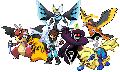

Somehow I don’t have an individual sprite of this prior version of Dray saved, but I can still kill two birds with one stone by showing it off in what was his ORIGINAL team shot. I decided to change Dray’s hair mostly to reflect more how I draw him and edited his jacket shoulder just a tad, and the team I changed up to allow more of my favorite fakemon and variants in for him. Other than that, a lot of pretty similar. Nothing too big.
In addition, Calistaris used to be part electric, but I decided to just make it pure dragon so that the electric type wouldn’t clash with Ash’s Pikachu and that, since it is technically the Player’s dragon, it would impose a “weaker against” scenario vs Dray’s or the Team Empire Leader’s dragons (Dragon Fairy and Dragon Poison). It is the baby boi afterall.
Anyway if you have any questions feel free to ask. If you wanna tell me how much you think I suck, please don’t. This post took a lot longer than I thought it would, but I like how things turned out for the most part.
#pokemon#fakemon#team shots#sprites#ash#doubled32#pikachu#typhlosion#charizard#samurott#regional variants#pokemon quasar version
4 notes
·
View notes
Text
25 Years of Sega Saturn & Virtual Boy - Flashback Special!
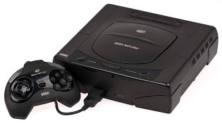
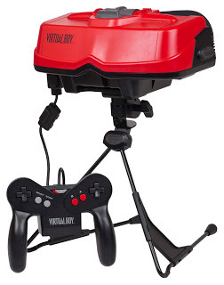
After the deluge of wrestling-themed entries for WrestleMania month this past 30 days, I have been pining to do another videogame anniversary special. Looking up which platforms have major milestone anniversaries this year, I noted six that stuck out. Four of the platforms (NES, Xbox 360, PSone, PS2) I have an extensive history with and they will get their own respective flashback treatment from me when their anniversaries draw nearer later this year. The other two platforms have all had lackluster or outright abysmal degrees of retail success and both I have only had limited histories with and never played on a consistent basis. Nevertheless, the time I did have with them I considered unique and I do have some fond memories of my experiences with each platform. So let us get on with this flashback special as I celebrate the 25th anniversaries of two consoles that each hit in 1995: Sega’s Saturn and Nintendo’s Virtual Boy.
I want to begin with the platform I have played the least of these two, the Saturn. Yes, I played my Virtual Boy and its daunting 14 game library more than the Saturn. In 1995 I was still lagging a generation behind on the latest consoles. All my family had was an NES at this point and I recently got a GameBoy for Christmas of 1993 so in 1995 I was getting a lot of mileage out of my GameBoy and my parents were still hitting up garage sales for bargain price NES game for me. By the time the Saturn and PSone hit in mid-1995, I was a year away from getting a SNES which I desired more so the Saturn and PSone were not even close to making my wish list. I read about them looming in magazines like Game Players and Electronic Gaming Monthly, but truth be told I was not all that excited for the future of disc-based platforms and the advent of polygonal graphics that were about to come into fruition with 32-bit consoles. As a naïve 12-year old, the first major 3D polygonal games that hit on SNES and Genesis in the early 90s like Star Fox and Virtua Racer looked butt-ugly to me, and from trying out demo kiosks of PSone and Saturn at stores the impatient kid I was back then was furious at this newfound ‘feature’ of the latest systems having loading times. Combine that with my family having no desire to chunk down several hundred dollars for another gaming system and I was left with no cravings for the Saturn and PSone when they both hit in 1995. I had no clue of Sega’s surprise Saturn launch announced at the first E3 in May of 1995. For the unfamiliar, it was when going into that E3 it was known that both the Saturn and PSone were slated to launch within days of each other in September of 1995, but at Sega’s press conference they said right then and there the Saturn is out right now at a handful of select retailers. In 1995 the Internet was only around for a few years and not even the slightest bit ubiquitous. Computers were still a couple years away from coming down to more reasonable family friendly prices, so at this time I got all my gaming news from my monthly subscription to Game Players.
youtube
Here is the podcast special on the Saturn I originally recorded way back in 2008. Check it out if you want to know even more about the history of the Saturn and its games. I wound up largely ignoring both the Saturn and PSone for the first few years they were out, maybe occasionally trying out an occasional store kiosk demo and that was about it. I remember the magazines at the time putting a lot of hype into Sega’s arcade ports, and console exclusives like Panzer Dragoon getting cover stories of having mind-shattering graphics, but I was not buying it at the time and stubbornly remained loyal to my 2D sprites. For the Saturn, I finally got my first real experience with it in April of 1997. I remember shortly before this time the Saturn was being pushed aggressively on TV with a special 1996 holiday bundle packaging it with Daytona USA, Virtua Fighter 2 and Virtua Cop for $199. I had no idea at the time why this ridiculous deal happened was because Sega was getting killed in sales at this point in the PSone/Saturn/N64 era and they were desperately trying to play catch-up with a hell of a value considering several months earlier in 1996 it was clinging onto its dooming launch price of $399.
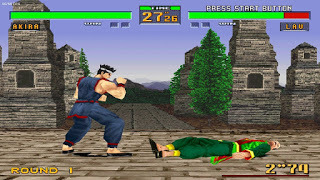
Flash forward a few months later in April of 1997 and my hometown got hit with a huge flood that forced a mandatory evacuation of the entire town for a couple weeks until the waters receded. For a couple days our family stayed at a nearby air base hangar. I believe we were planning on hunkering down there for several days until a couple days in my uncle from St. Paul surprised us and showed up and ‘volunteered’ on taking us in and refused to leave without us coming with him. My siblings and I were delighted to get out of the crowded hangar and spend time with our cousins for what ended up being a week before we were able to get back home. My cousin Royce, who was within a year of my age at the time wound up getting that Saturn three game bundle for Christmas a few months earlier and we played those three games along with the demo disc that came with the system almost every day. We must have played through Virtua Cop at least a few times, and I remember finding it a big step up from previous light gun games I was accustomed to. Daytona USA at the time did not really click with me, and while I was impressed with the graphics at the time I did not come around to checkpoint-racing games yet and was more turned off by their enforced time limits back then. On the demo disc our family got a lot of fun competing against each other in the home run derby mode available in World Series Baseball. The standout game of the pack was easily Virtua Fighter 2. It blew me away and for me it was the first game that proved not only for fighting games, but for games all together that 3D polygonal graphics and gameplay could be viable and damn fun. I knew I was a couple years late to the party by this point, but by 1997 polygonal graphics were no longer the crude, non-textured blocks and rectangles on the SNES and Genesis, but actually had some depth and style to them. I loved Street Fighter and Mortal Kombat at this point, but Virtua Fighter 2 proved to me that 3D fighters could coexist with 2D ones.
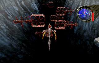
That week with my cousin was my proper introduction to the 32/64-bit era. It would be over a decade though before I got more serious hand-on time with the Saturn. Not many friends of mine had the Saturn back home, or if they did we rarely busted it out. My friend and former podcast co-host, Matt has a mammoth collection, and I only recall us turning to the system once or twice all these years to play the charming platformer SCUD. Another friend and podcast co-host of mine, Chris also has a Saturn in his equally mammoth game collection, and until 2008 I only recall us powering it on a couple of times to play the fun co-op action platformer, Three Dirty Dwarves, which had a nonsensical, grungy vibe to its destruction. In 2008, we were a couple years into doing our videogame podcast and we loved doing console retrospectives, so we decided it was time to do one on the Saturn. I just uploaded it to YouTube and integrated it into this article for your listening pleasure! Chris knew about my limited Saturn hands-on time at this point so we decided to spend literally a whole afternoon, about four to five hours of ‘research’ playing a good chunk of his Saturn collection. About 10-15 minutes for each game for a quick refresher for what each game brought to the table. There was one though we played for about two hours straight. That was the rare Panzer Dragoon Saga Chris had a copy of. I knew about it being a collectible at this point and heard the acclaim for it being an ahead of its time RPG and professed to Chris to hope to spend a little more time with it to see what the hype was all about. I remember digging its rail-shooter action the first two games established while simultaneously mixing in RPG style mechanics and exploration. I think we both got wrapped up in it, and stuck with it a bit longer than anticipated. Suffice it to say, those opening hours stood out to me all these years later and I can see why Panzer Dragoon Saga became a hot commodity.
youtube
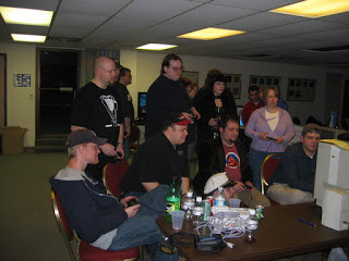
Jeremy Parish did an excellent line of videos with deep dives on every individual Virtual Boy game released, including Japanese exclusives. Here is his take on the Wario's exclusive Virtual Boy game as of yet to be re-released, Wario Land. In my TurboGrafX-16 flashback, I wrote about how I procured the system at a gaming community meet-up event. At that same event there were several gaming systems hooked up for play throughout the night, and one of them was the Saturn. One of the highlights of that night was someone bringing enough multi-taps and controllers that we were able to get plenty of rounds of eight player Saturn Bomberman in. I am a fan of classic multiplayer Bomberman, but never played more than four players before, and was surprised to see the Saturn pull off an eight player version with a micro-sized map and characters in order to fit everyone on screen. It was a Bomberman experience that nothing will likely ever stack up to. I dug up a photo from the event of all of us gathered around the TV so you call can see the tech in action!
Sadly, I never got anymore hands on time with the Saturn after this. It is one of the few major consoles that I do not own. For years I remember seeing the system for sale at our local retro games shop for around $30, but I always hesitated on it. The games I enjoyed on there Sega released better sequels on other systems, and I later got to check out some of its top ranked games like the Capcom fighting games, Guardian Heroes, Nights Into Dreams... and acclaimed shmups like Radiant Silvergun on enhanced re-releases on the Xbox 360 and PS3. There remains games exclusive to the Saturn that I always wanted to try like Die Hard Arcade, World Series Baseball ‘98, Fighters MegaMix, Burning Rangers and Shining Force III, but with retro game prices continuously going up, the time to start a Saturn collection has come and gone in my book unless I happen to stumble upon a steal of a deal. I do have one Saturn game in my collection however, and I will give props to Matt once again who gifted me his extra copy of Bug!. While Sega pulled the plug early in America on the Saturn, it comparatively fared much better than Nintendo with the Virtual Boy. It launched in America in August of 1995, and sold so poor right out of the gate that Nintendo could not have abandoned the platform any faster. Its last game, 3D Tetris, hit North America in March of 1996, only seven months after it launched and with a total of a meager 14 games officially releasing stateside. I remember seeing the hype leading up to the Virtual Boy’s launch in the magazines, and like with the initial wave of polygonal graphics, I was not sold on the concept of virtual reality. However, a couple months after that same flood hit in 1997 our local Wal-Mart had unsold Virtual Boy inventory it was desperate to get rid of by selling the system itself for $20, and games for $5 each. This was one of the first times as a kid I recall my dad abstaining from his garage sales-only videogame rule and realized the steal the system was going for. We walked out of that Wal-Mart with the system and the copy of Mario’s Tennis it came bundled with, along with copies of Golf, Mario Clash and Nester’s Funky Bowling.
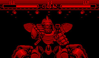
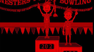
I was in the midst of spending summers on a farm at this point in my childhood for several years, and that was the summer of Virtual Boy with my siblings. I played the crap out of all four of those games. I abided by the recommended break alerts that popped up every 15-30 minutes seriously because I recall the gaming mags at the time reporting on the Virtual Boy causing eye strain after consistent use. Even with all that heavy duty play of the Virtual Boy that summer, somehow I am the only one in my family that does not have glasses. All four games we had were solid, but not mind blowing. Mario Clash I thought was a nice, fully-featured take on the classic original Mario Bros. arcade game that fleshed out that style of gameplay with about 100 stages and got so difficult early on I did not come close to finishing it. Golf was a good simulation of the sport, but it only had one course so I did not revisit it that often. I remember enjoying Mario’s Tennis a lot, but this being the debut version of that game it was more of a tennis sim with Mario characters, and had less of the wacky mini-games and power-up attacks associated with the franchise today. My siblings and I played a ton of competitive Nester’s Funky Bowling. There was not anything that funky about it other than the occasional cheerful animation from Nester and his twin sister Hester whenever you scored a strike or spare, but it was a functional enough bowling game that we had plenty of fierce rounds of over that summer. After that summer we and I got our fill of those four games and the Virtual Boy found itself in the closet for many years. Eventually I randomly dug it out and found the tripod busted, and the pack that hooked up to the back of the controller that contained the plug-in for the AC adaptor was missing. With no means of powering on the Virtual Boy, it sat in a bag forgotten in my closet for well over a decade. I will thank one Jeremy Parish for renewing my interest in Virtual Boy with his excellent line of Virtual Boy Works videos. For those that are unfamiliar with him, Parish is one of most credible members of the retro gaming press, with him hosting the renowned retro-game podcast, Retronauts since 2006 and going on to write countless books and producing chronological video series on nearly every 20th century Nintendo platform. He averages one video a week, which usually highlights one or two games and does a deep dive into its development history and then proceeds to review the game. A few years in he has already covered almost all the games released from the first years of the SNES and the first two years of NES and GameBoy.
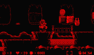
Throughout 2019 Parish took a detour from those three systems to focus on going through the entire VirtualBoy library, including its several Japanese exclusives. His surprise love for the platform shined through his thorough coverage for each game. It is a well-produced series and fantastic history lesson for this blink-and-miss-it platform that I highly recommend checking out by click or pressing here, especially now to learn about the first major attempt at a virtual reality platform with VR now having a modicum of success with the PlayStation VR and the Oculus Rift having made legit waves these past few years. Virtual Boy Works inspired me to track down a few more Virtual Boy games to my collection which were surprisingly going for not that much on eBay. I wound up getting Galactic Pinball, TeleroBoxer, Virtual League Baseball, Vertical Force and Wario Land. I also tracked down a replacement AC Adaptor hub and tripod stand which resulted in my Virtual Boy powering on once again! I tested out all these games briefly. I love me some videogame pinball, and Galactic Pinball has some nifty 3D tricks up its sleeve. TeleroBoxer is like Punch-Out meets Rock ‘em Sock ‘em Robots or Real Steel for the younger readers who need a more contemporary reference. Vertical Force is a competent shmup, and I wish I put more than a few minutes into Wario Land because it is a legit top notch platformer and went down as one of the few highly rated games on the system. I swear to one day make it through Wario Land! Thank you for joining me on this two part 25th anniversary special for the Saturn and Virtual Boy! Got a favorite Virtual Boy or Saturn memory of your own? I would like to hear how it compares to my tale so shoot me a line on Twitter over @Gruel. If you enjoyed this journal-style flashback special, than I encourage you to check out the links below to the specials I wrote for the Dreamcast, GameBoy, Genesis, TurboGrafX-16 and yes, even the 32-X. Thank you all once again for indulging me!
My Other Gaming Flashbacks Dreamcast 20th Anniversary GameBoy 30th Anniversary Genesis 30th Anniversary TurboGrafX-16 30th Anniversary and 32-X 25th Anniversary
#videogames#saturn#virtual boy#virtua fighter#panzer dragoon#nester#wario land#three dirty dwarves#teleroboxer
2 notes
·
View notes
Text
2019 Mega Drive Explorations [1]
It takes me a long time to do some things and I’ve finally gathered up a bunch of Sega Mega Drive / Genesis titles that I’ve been meaning to play, hopefully through their entirety, or replay and take as many screenshots as I can. These aren’t going to look like most other screenshots you’ll see online, though; I’ve been using an NTSC filter because I believe it’s the visual format in which these games look best. So, let’s take a stroll through the material so far.
Super Hydlide (1989)
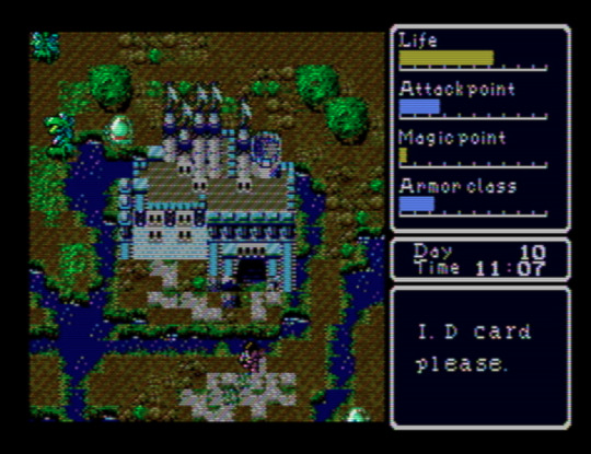
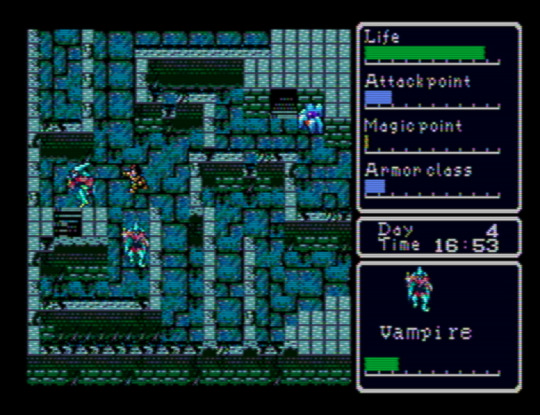
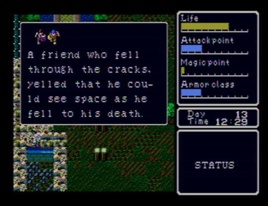
This is one of the best “old style” action-RPGs I’ve played. I’ve gone in with barely any prior knowledge, and I think that’s how to best experience it. Spoiling yourself on the extent and workings of its mechanical systems would, I think, turn it into nothing more than leveling up and finding the next place to go. The range of overworld which you’re initially able to explore is fairly restricted, and, as the action-RPG designation suggests, there are no randomized battles. Because of details like your need of food and sleep, or the encumbrance limit, though, it’s a deep relief to return to a town after some exploration in a way that reminds one why this trope of wilderness vs. domesticity caught on. You might just find yourself exhaling when your enter an inn. In another game, your character’s attack would likely be assigned a hitbox straight ahead of the sprite, but Super Hydlide locally assigns it to your right arm/hand, and it’s a welcome quirk in a game with super basic combat. There is no in-game map (or, if there is, I haven’t found it yet), and so -- as with Simon’s Quest -- I’ve been drawing my own on a sheet of gridded paper.
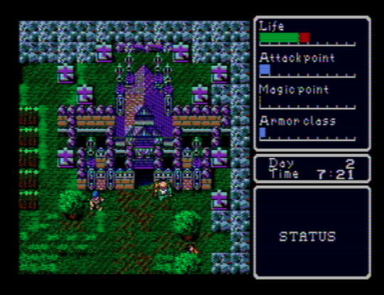
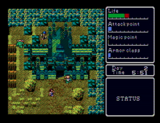
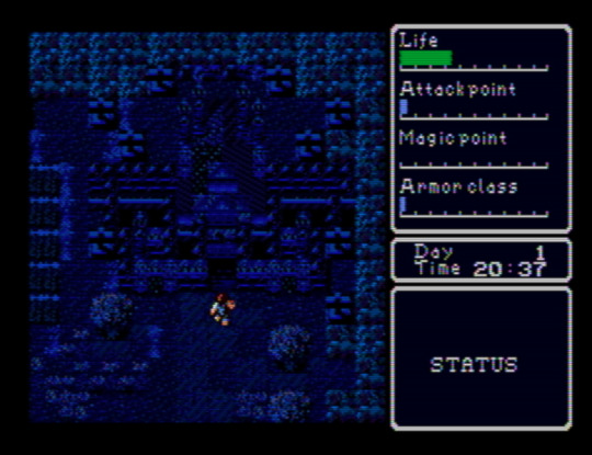
Above: the same screen at different times of day.
I hope that this blog’s emphases and its audience make the claim that I think Super Hydlide looks amazing at least appreciable. Everything has just enough detail to render the object, being, or space as categorically legible while retaining ambiguities, and there’s a variety where you might not expect it, like the grass around the building above, that gives each screen a kind of visual grain that an ornate and time-worn carpet might have. Complementing this is a soundtrack that seems unaware of the console’s audio capabilities in a way that another contemporary Mega Drive release, like Sword of Vermilion, certainly was not. That’s fine, though; the sound’s smallness, with those lite approximations of exclamatory synth brasses and the percussion’s dusty, dinky punches, enhances the cute visual aesthetics: people, monsters, and buildings you could hold in a pair of cupped hands. Especially remarkable is the overworld theme, “Chaos Separator” -- almost three minutes long, a duration that was basically unheard of at the time.
Atomic Runner Chelnov (1992)
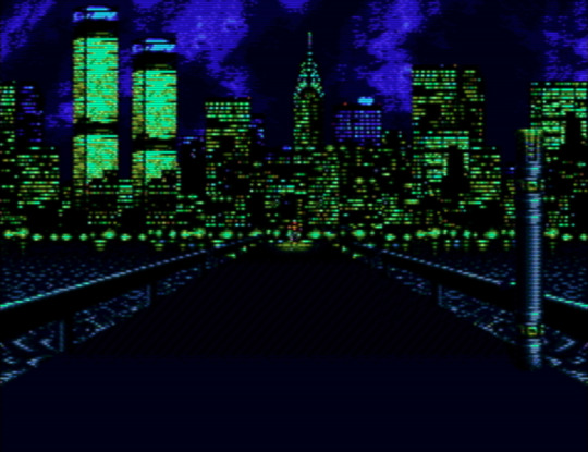
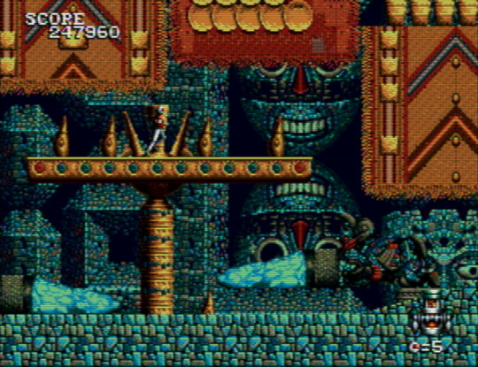
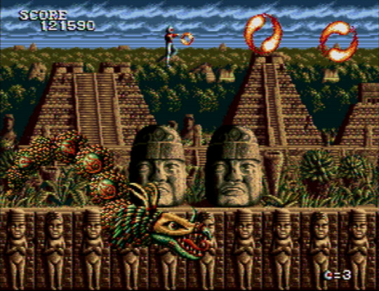
Chelnov has me torn between wanting to share either as many screenshots of it as I can or as little. It’s so stunning to behold that exposing anyone who hasn’t played it to its sights seems like a disservice. It’s in extreme contrast to the game’s original arcade version, too, which may as well be a different game. Every stage is a stream of layered ornaments, and continuing to play to see more of this is motivation alone. At first I thought the graphic theme was one of a general “exoticism”, with ziggurats settled above lava giving way to stepped Mayan pyramids, but then the penultimate stage threw architecture designed by Antoni Gaudí my way, making me wonder if the theme is more broadly “eclectic” -- choosing certain settings and motifs for their dazzling power alone. This is one of those run ‘n’ gunners where your character will keep running unless you stop them -- but you soon have to start running again anyway, since the screen keeps moving right and only stops for bosses. It took me playing through half of the game to figure out how to turn around. Please, if you want to give Chelnov a look: consult a controls FAQ.
El Viento (1991)
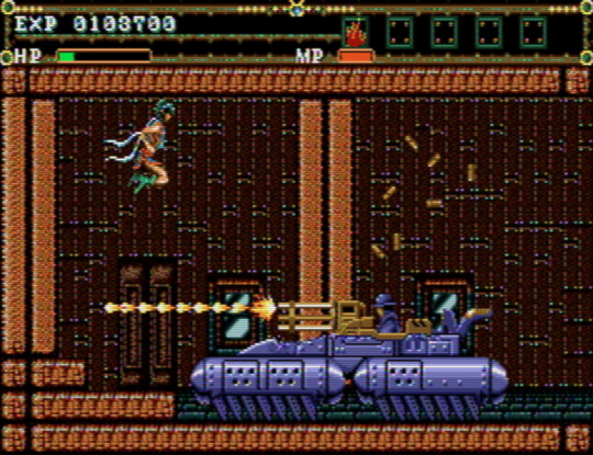
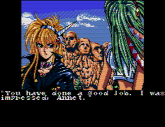
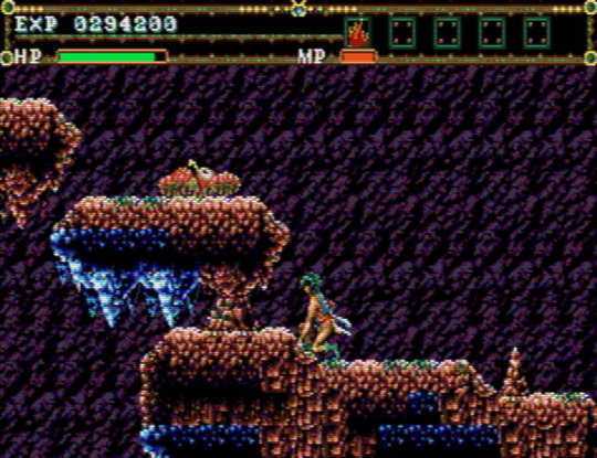
If you’re looking for level design that’s a mixture of the mundane and the out-of-control, El Viento might be for you. One moment you’re walking through an open sewer channel, exploding the occasional fish; the next, you’re navigating a bundle of platforms that feel way too closely packed together for your character’s sprite size as you attempt to outrun a never-ending flood of rats that move at speeds never before recorded. One moment you’re going through an apartment’s door into an empty interior; the next, a tank bursts through the opposite wall and just starts hammering you with missiles and bullets, giving you only five feet of space to work with. It’s the second in a trilogy of games, which includes Earnest Evans, a game perhaps most notable for all of its footage making it appear that the players are incompetent on purpose, but which in fact plays more or less the same no matter how good you are. Grave sacrifices were made so that the titular character could be a composite sprite. El Viento’s level design hews closely to Earnest Evans’, with the important difference that its protagonist, Annet Myer, is controllable.
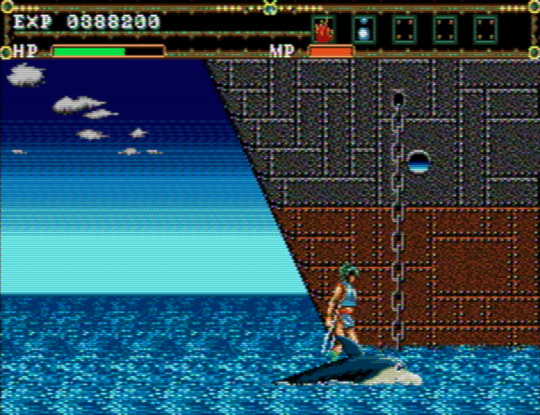
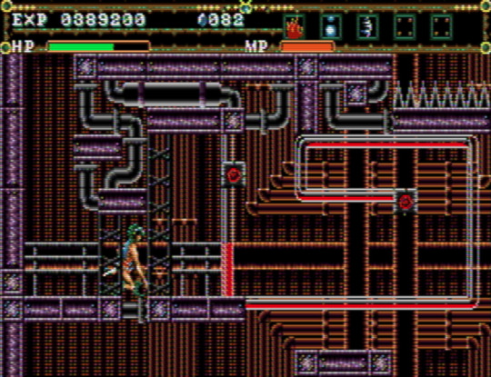
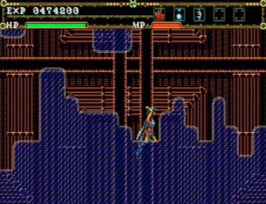
Even with its problems, El Viento is charming. It’s nice to play a videogame with a female protagonist who’s not creeped on by the artist(s) (perhaps we can, in part, thank technical limitations for this). The palettes and style of pixel art bear an uncanny resemblance to Master of Darkness, released for the Game Gear and Master System, and give each stage a distinct, almost dirty granularity. For me, El Viento gets especially interesting around the fourth stage, a ship’s engine room (or... factory?) that’s preceded by a short segment that has you crossing water on top of a cartoon-eyed dolphin. The level design transitions to looking like a network from Metroid Fusion -- a knotty maze with small destructible points that cause chain reactions, oddly small platforms, moments where you’re not sure what’s interactive and what’s not, and low ceilings underlined by spike-beds that necessitate you make use of a crouch-dash mechanic that feels like it shouldn’t work the way it does. It’s a hardly perfect yet precious occurrence of extinct, or endangered, level design, and the developers apparently had a confidence in letting it, as it were, speak for itself, because there’s not a single enemy to defeat throughout.
Jewel Master (1991)
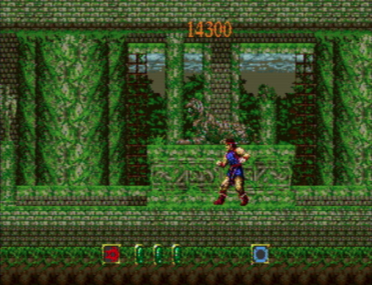
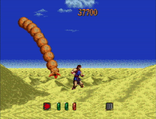
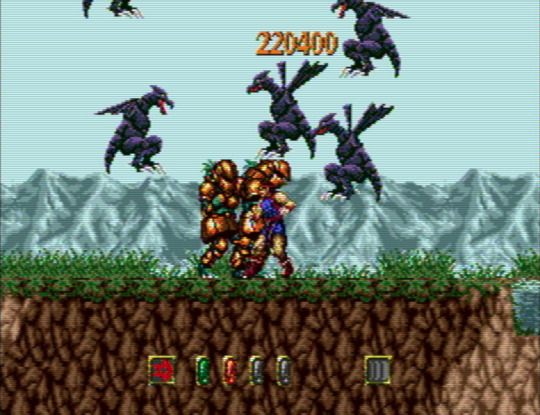
Wanting to hear Motoaki Takenouchi’s incredible score, one of the Mega Drive’s best, in its intended context was almost totally my incentive to play Jewel Master. It’s a fine, somewhat haphazardly designed action game; not bad, not memorable, but for the music. You acquire different rings, some optional, as you go from stage to stage, and can assign them to a total of four active slots on an equipment menu. Different combinations will lead to different effects -- or you might want to leave a ring on one hand on its own. It’s a neat idea in the abstract. In practice, you’ll often be better off sticking to one set-up per stage until a boss demands a switch. The level design is pretty uninspired, and it increasingly makes artificial attempts at challenging the player by burying you under swarms of suddenly-appearing monsters. When this happens, you just have to hope that you can make it out alive. There’s not a whole lot to look at, either: the stages’ environmental peculiarities and palettes are minimal to an extreme, although I do love that the protagonist’s sprite seems to take a cue from Rastan’s by only moving his legs when he walks.
Gynoug (1991)
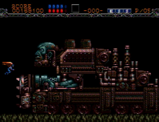
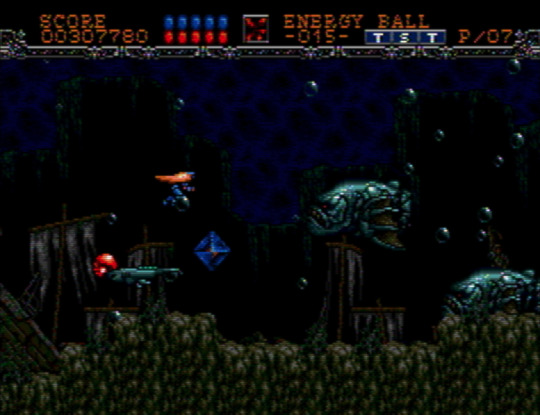
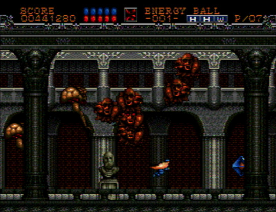
My experience with, and interest in, shumps, is next to nonexistent, so I don’t have a ton to say about Gynoug. Why’d I bother? Well, because of the weird and grotesque enemy and boss sprites, which combine the mechanical, exoskeletal, and visceral. The first miniboss is like a floating snapping turtle... except without legs, and a head that’s a toothed skull. Later, in stage two, you’re confronted by the bow and head of a ship that reveals itself to be the hat atop a colossal, wrinkled face. Maybe it was expecting too much to hope that the settings would match the bestiary’s inventiveness, but only stage three and four wowed me. If it’s not a game I’m going to be returning to any time soon, it was worth going through once.
That’s all for now. Other titles I’ve been exploring and will write about at some point include Alisia Dragoon, Cadash, Chakan: The Forever Man, Elemental Master, Light Crusader, Mazin Saga: Mutant Fighter, Mystic Defender, Shining Force 2, Splatterhouse 2 and 3, Two Crude Dudes, and Ys III.
14 notes
·
View notes
Text
10M Downloads Campaign 4-Star Sabers Breakdown
The 10M Download Campaign aired originally from September 20th 2017 to October 4th 2017. During the campaign, players receive a ticket that allows them to choose “1 4★ Servant of your choice from 42 available 4★ Servants by using the [10M Download Commemoration Ticket]“.
There are 8 classes represented on the campaign and all have valid options, so don’t make up your mind too fast unless you’re going to pick your favs. I just wanna help you pick who’s right for your team. Idk who I’m picking yet and am having the worst time picking.

4* 10M Downloads Sabers
Artoria (Alter) | QAABB - B
General Damage
Highest 4* Saber Atk; 7th highest Atk for 4* Servant. One of strongest aoe NPs in game; has two self-steroids in her kit, but one is low-rank Charisma; Intuition is always terrible, but she has decent star gather as a Saber; mediocre HP with absolutely no defense; no team support; selfish play-style; good Mana Burst; Still strong and playable with insane Atk.
No NP interlude, animation update, strengthening, or rank-up.
Salter is about to be Bond 10 for me and is still my main Saber despite having 3 5* Saber with aoe NPs. She works well for early and mid-game content but dies with a puff of wind. I still use her because she’s a selfish high-damage Saberface.
Gawain | QABBB - B
Damage (on Sun Stages)
2nd highest 4* Saber Atk; 9th highest Atk for all 4* Servants. Consistent damage with triple-buster deck; 1-turn Guts that’s attached to NP battery forcing you to choose; NP damage outclassed by Artoria Alter BUT NP has Skill Seal and Burn; can turn 1 NP with Kaliedoscope; party-wide attack buff; strong self-buff; low hit count and NP gain. Mediocre for anything outside of farming.
No NP interlude, animation update, strengthening, or rank-up.
NP3 Gawain and I only interact for farming or Sun stages, but his gorilla deck makes him hit hard at a consistent basis. His survivability skill being tied to NP battery is a nightmare, and the Guts is only 1 turn and that just ruins it.
Siegfried | QAABB - B
Tank, Damage (vs Dragons)
Highest HP of all 4* Servants; 5th lowest Atk of all 4* Servants. Among best Dragon-type slayers in the game; decent NP gain with Golden Rule and two Arts cards; Dragon Slayer available from start; great in Challenge Quests and hard story fights; only truly shines against dragons.
Animation and sprite update with Fate/Apocrypha campaign; Strengthening 1 upgrades Dragon Slayer from A to A++; Strengthening 2 upgrades Noble Phantasm from A+ to EX.
I for one quite love using him to clear Dragon waves with zero effort. And he always lives longer than I expect him to.
D’eon | QAABB - A
Tank
2nd highest HP of 4* Sabers; 3rd highest HP 4* Servant. Taunt is locked to 3rd Ascension; deals little-to-no damage; NP has hard time proc’ing; high HP and decent self-heal skill; nearly immune to debuffs; charm/taunt skill and evade skill synergy; can tank hits and care for themselves, but it’s the only thing they can do.
Animation and sprite update came with Agartha. Strengthening quest upgrades NP from C to C+.
I love D’eon as a character, but the only thing they can do is tank where there are other Servants with more versatility that do their job better. I don’t find myself using them frequently.
Suzuka | QAABB - B
Single-Target or Wave Damage, Late-Game Content
Decent stats that don’t favor too heavily either way. Combines waveclear and single-target crits; has no trouble doing burst damage, but specializes at extended battles; self-sufficient; Sure Hit built in; niche anti-male ability; slow to get going; has nonexistent defense; weaknesses can be easily compensated for; good enough to be useful in nearly any situation.
No NP interlude, animation update, strengthening, or rank-up.
Nero | QAABB - A
Soloing, Survival
4th highest HP of 4* Sabers. Super rare triple-use Guts to buy turns; survivability kit with Migraine and Imperial Privilege; slightly above-average NP gen for 4* Sabers; Migraine’s Rank Up improves Imperial Privilege’s usefulness; can’t block incoming damage, so can have trouble using skills optimally; inconsistency due to random nature of Imperial Privilege.
Battle animation and Sprite Update with Nero Fest 2016. Interlude 2 upgrades NP rank from B- to B. Interlude 3 gives third skill, Thrice-Setting Sun. Strengthening replaces Migraine B with Goblet of Wealth B, which adds a NP battery and Arts boost. Receives Olympian Bloomers Costume Dress.
Rama | QAABB - B
Single-Target Damage
3rd highest HP 4* Saber. Vanilla stat spread. Low hit count with low NP gen and Star gen per hit; has a hard time charging his own NP or generating his own stars; consistent high single-target damage; occasionally does obscene damage without warning between crits and buffs; party-wide attack buff feels good; survives difficult fights with third skill (3-turn guts that revives with 1k then heals for 1k-3k); easily-compensated weaknesses, but feels vanilla and hard-to-use.
Battle animation, sprite, and dialogue update with Lostbelt 4.
If you get the critical stars and NP charge for him, he deals absurd damage. His first skill guarantees star gather and boosts crit damage by 100% on a 4-turn cooldown. He’s time-bomb going off every few turns.
Lancelot | QAABB - A
Single-Target Damage
3rd highest 4* Saber Atk; 11th highest attack of all 4* Servants. Kit is geared to star gen, star absorb, and crit damage; frequent crits allow him to utilize NP frequently despite low NP gain; consistent damage at a rate competing against 5* Sabers; zero defense ability or durability; skills being on cooldown cause huge dip in consistency and damage--his NP gauge fills way slower and he deals significantly less damage without crits; no damage boosts outside his NP and his crits.
No NP interlude, animation update, strengthening, or rank-up. NP Rank changed from A++ to A August 2017.
General “Best Servant to pick if you don’t have” Vote: Lancelot
#novel elitist#2d trash#fgo#Fate Grand Order#f/go#saber#gawain#saber alter#artoria alter#suzuka gozen#chevalier deon#deon#Siegfried#nero claudius#nero#rama#lancelot#saberlot#fgo na
10 notes
·
View notes
Photo
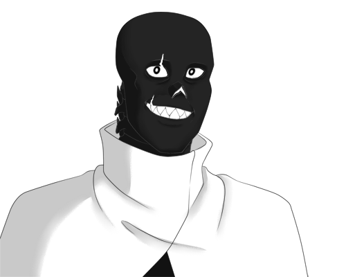
About Myst
Myst’s concept, at its most simple, is based on the ‘Mystery Man’ in the gray room whose entrance only appears in about 2% of game files created for Undertale. Traditionally speaking, the person you encounter in here is assumed to be Gaster, though there’s no actual confirmation of that given anywhere in game. The sprite’s filename is, after all, only ‘mysteryman’. Some canny observers have noticed that if you turn this sprite upside down, the black side of it also happens to look like a face, which is what I have based Myst’s design on.
(Just a brief disclaimer before the fandom jumps down my throat, lol, but I also personally assume that the mystery man IS Doctor Gaster. This was just a fun idea I had and ran with.)
[Character Information under the cut]
History: Dr. Myst was, once upon a time, a scientist in the Underground whose research focused on the theory of the universal wave function, and was often at odds with Dr. Gaster not just on the best way to free monsterkind, but for funding from the capital as well. Myst’s hope was that if the barrier in their own world could not be broken, perhaps they could simply go to an alternate one where the barrier had already been broken, or never cast in the first place. With options on realities being theoretically infinite, it was possible they might find a completely unoccupied world they could simply move into and make their own.
The Royal Scientist was unimpressed, but Asgore was intrigued enough to continue funding Myst’s work. Myst made progress by leaps and bounds, and when he finally finished his grand machine, he tested it. He tested it on rocks, then plants, then the various bugs and fish one could find around the Underground. He wasn’t sure exactly where these things went, but when they came back, they were always still alive, and so… it only made sense that he should be the first monster test subject.
‘The Gray Room’ was his masterpiece; built in waterfall, well away from anyone that might get hurt should something go awry, it presented only as a simple gray door from the outside. Within was a similarly simple, small, gray room that would react with glowing control displays only in his presence. It was minimalist, to say the least, but brilliant all the same. Rather than physically moving from location to location, the Gray Room phased from reality to reality; like an elevator between universes. It always appeared in the same physical location in Waterfall, though the world in which it manifested was completely different from the last.
When Myst used it for the very first time, it worked like a charm. Unfortunately, doing so had unforeseen consequences that not even he could have predicted.
It turned out that the universe did not much like people moving freely among its many realities. Or perhaps it was simply the Gray Room itself attempting to process too many variables and, in the end, deciding to reconcile them all into a single common denominator with which it could more ably contend.
Whatever the reason behind it, and however it happened, every version of Myst that existed across any and all realities were plucked from their timelines and combined into a single entity. He no longer remembers exactly what reality he originated from, and is now faced with the curious fact that he belongs both everywhere and...nowhere. Not only that, but the process erased all hint of him from every universe he’s traveled to. Granted, he was physically changed by the event, but even his name does not trigger any sort of recognition no matter where he goes.
His memories of life before first using the Gray Room seem to be primarily those of the version of him that created the thing. However, he gains the occasional flash of insight from the depths of the memories that linger beneath the surface, leftover from all those other versions of himself. It took him some time to figure this out, though once he realized he was unable to return from whence he came, he had all the time in the world to do so.
During his initial test of the machine, he had created a recall mechanism for the Gray Room, but now there was no one to press it. In fact, there was a good chance that because every trace of him had been removed from all realities, any evidence of his creation had vanished as well. It occurred to Myst, as time went on, that even if he were able to return to his world, the Gray Room was no longer a viable option for their escape, not without potentially causing tremendous damage to reality as a whole by tearing all of monster kind from its very fabric. Thus resigned, Myst travels from world to world, exploring and hoping to find some clue that will help him further refine his machine and allow him to transport people across realities without suffering the same fate as him.
Personality: Despite the many trials and tribulations Myst has been through since initially leaving his world, he remains a kind monster with a good sense of humor and impeccable manners. One thing he has learned is that a little patience, forethought, and flattery will get a person just about anywhere, no matter what reality they happen to find themselves in.
This does not, of course, mean his patience is infinite. When it does run out, he tends to snap pretty catastrophically and launch headfirst into a tirade of the sort to raze entire villages. It is only then, or when he is taken truly off guard by something well out of the realm of normal that he’ll actually start to swear. Otherwise, he’s far more likely to get creative with his insults when he feels a need to employ them.
Myst possesses a voracious hunger for new knowledge and is always a keen student to the willing master, no matter the subject. The sciences come easy to him, though he has resolutely pursued the arts as well out of a sheer pigheaded desire to be adept at those too. History is troublesome, however, considering how frequently he travels between universes, so he generally doesn’t bother beyond a general study of how small actions can lead to tremendous consequences on the geopolitical stage.
Diplomatic almost to a fault, unless you are close to him, it can sometimes be difficult to get an honest opinion out of Myst. He considers himself an observer, there to learn, so he’s generally unwilling to speak up overmuch or reveal his own thoughts on a matter. That said, in times of crisis, he can be prone to taking control of a situation without necessarily asking himself if he should. Myst always means well in these situations, believing he is doing what needs to be done for the good of all, but many often see it as being offensively high-handed for one who professes themselves to be an outsider. The habit likely stems from the fact that he is constantly on his own, and has long since become accustomed to solving his problems on the fly with no one else to lean on for assistance.
Trivia:
Myst’s magic is extremely powerful thanks to the fact that he’s essentially many souls combined into one, but it is completely unpredictable. Because different versions of him used different kinds of magic, they all try to come out at once, and he never knows what he’s going to get next. He could try to burn an enemy with fire and wind up healing them instead. As such, he uses it only in life or death situations where he has literally no other options.
Gravity’s grip on him seems to be erratic, though the why of this remains an unknown. If Myst becomes too distracted, he will start to float, or find himself walking up surfaces he really shouldn’t be able to. If he notices too abruptly he will fall. Years of practice, however, has allowed him to control this strange phenomenon to his advantage so long as he is in the right state of mind.
Uses duodecimal math in almost everything he does unless decimal serves better.
Has six fingers on both hands (which might be what inclined him to duodecimal math in the first place)
Statistically speaking, Myst is practically immortal. Every time he is killed, one of his souls is destroyed, as is his body. The remaining souls, however, reconstitute him over the course of about a day, which is useful, but extraordinarily painful. He also loses any memories that were linked with the soul that was destroyed.
Inventory:
Bottomless Bag - It’s not literally bottomless, but it is definitely bigger on the inside and capable of carrying a great deal of necessities and trinkets.
Leather Journal - A book that he carries everywhere with him to take notes on the new things he learns in every reality he visits. Also doubles as his personal diary. Seems to have an impossible number of pages despite looking like a normal book. He prefers using it to the many types of tech he has that could serve the same purpose since it is enchanted against damage and he doesn’t have to worry about it shorting out.
Invisibility Cloak - Not what the wizard that sold it to him called it, but Myst’s been to enough universes with Harry Potter to call a spade a spade. Only lasts for a few minutes at a time before having to recharge.
Weaponry - Because his magic is so completely unreliable, Myst has been forced to become adept in many kinds of weapon to keep himself in once piece without sticking out in whatever reality he happens to have landed.
Well that’s all I have for now! Feel free to drop an ask about or to Myst if you want to learn more about him!
83 notes
·
View notes
Text
SINoALICE - Famitsu App Interview with Jino on Character Design
An interview with SINoALICE’s character designer, Jino
Published on August 25th 2017.
The untold story of the birth of the girls from the illustrator of “SINoALICE”, Jino! As well as info on a new character…..!?
Why are the girls so gorgeous?
“SINoALICE”, a mobile RPG that is the work of a collaboration between PokeLabo and Square Enix.
One of the reasons why this title became popular is because of its charming ‘character designs’. Jino, the illustrator who gave birth to the beautiful girls from the world of “SINoALICE”, of who you wouldn’t think at first glance that they would come from a dark tale spun by Yoko Taro.
▲ One of the concept art that Jino conceived. Jino possesses a rather unique touch which resonates well with the “NieR” series and the very essence of Yoko’s own world. This is truly ‘art’.
From the previous interview, we learned that Jino, with a professional mindset in place, visited a library and even looked up the story’s own setting of its era. Just how did he bring the 9 girls to life? We’ll unravel the truth!
The 9 girls brought to life by Jino
From here on, we will go through Jino’s creative process as well as some rough sketches. We hear the players asking questions about the design, such as “Why did you go with this design?” “Where is the point of focus?” and so on. Jino shares with us his comments regarding the matter.
Alice (CV: M.A.O)
Alice, you may call her the main character of SINoALICE. The keyword is “Restriction”, not to restrict someone in the game, rather, to restrict your own self. This trait of Alice’s shows one side of her largely mysterious character.
▲ Coupled with a large pocket watch and a distinctive sword, as well as an aura of blue, filled with valiant air. Completed with a frilly maid outfit, creating a gap that received much praise from the players.
Jino’s comment
The maid outfit was a proper request (from Yoko). There are gothic motifs in the sword as well, which was created faithfully to Yoko’s orders…. That’s my intention!
“In a scenario where her original flange broke off in a fierce battle and she fled off to somewhere, what weapon would she use as a substitute?”, which was the delusion I had which lead to me to the idea that she’d use a circular-shaped weapon. So I thought, slap a pocket watch on it! And so, that was the conclusion I arrived at.
There was also the “If the apron shoulder straps come off then I’ll fool em by wrapping it around” and “The scabbard was quickly lost so in order to put back the sword, I’ll give Alice a harness”, as well as “The knee socks look like it’ll tear apart so I’ll add in something simple instead” and etc, in addition with that sort of behaviour and combat style (which I simply made up myself) I imagined and I designed it from there.
▲ Underneath the maid outfit are the harness and its belt and even a ton of pocket watches. These are details you won’t be able to notice in the game, all mixed in with my tastes.
Snow White (CV: Ueda Reina)
The keyword for the titular character of her own story, ‘Snow White’, is “Justice”. In the story, she’s easily taken as self-centered, however, she strongly enforces her own twisted form of ‘Justice’.
Jino’s comment
Actually, her hair and clothes and all give off a very general looking silhouette, as per request. There’s a contrast between a katana and a greatsword, so I designed it in a way that would have the same difference between a samurai and a knight.
If you give her some clunky armor… Well, you wouldn’t be happy with it, would you? (darkly smirks) Which was what I thought, so I gave her a great sword that’s easy to wield, coupled with a light outfit. I tried to make it so that the armor would assemble as much as possible on the front part of the design.
▲ Adorned with a pure white dress, decorated with a bouquet of blood-smeared roses leaves quite the impression. She seems to have settled in with the dirt sullying the end of her dress.
Hansel and Gretel (CV: Uchida Maaya)
Gretel, a girl with a few screws loose who has a relentless obsession with her older brother. I’ve gotten a snippet that she has already laid her hands on him…… The keyword for her is “Delusion”.
Jino’s comment
I’ve gotten a request to implement a robe but that would’ve made Gretel’s silhouette to be similar to Red Riding Hood’s. I was troubled on how to make Gretel more distinct. I felt that I made a pretty good impression with it.
In the game, Gretel is shown to be messed-up so her clothes mimic that trait of hers. Her exposure is also sort of mismatched. The mismatch is a specialty of Gretel’s, I wonder if I conveyed that correctly, even my comment became mismatched.
▲ The cage that Gretel carries is her feature. This cage has a motif of teeth and gums.
Pinocchio (CV: Sanpei Yuuko)
Due to not knowing what to do on his own, Pinocchio sets out to revive his Author. In contrast, I didn’t think much about the verbally abusive staff-Pinocchio. His keyword is “Dependency”.
Jino’s comment
The request was to make him look like he was brought up with proper manners. The head that’s attached to the weapon was originally supposed to be eerie-looking, as if it’s cursed, there’s also the setting where it’s able to talk and the result of focusing on that gave birth to a rather charming chap.
My favourite is this mysterious flapping open bag. I think it’s actually hard to use but I wonder if that’s alright…..
▲ Pinocchio’s staff is able to grow limbs and is able to move freely. With the upcoming Job designs for Pinocchio, I’d like to fully utilize that setting.
Little Mermaid (CV: Noto Mamiko)
The Little Mermaid, a girl who expresses her own story as a ‘Tragedy’. She holds a twisted ideology where “Tragedy is Beauty”. Her keyword is “Sorrow”.
Jino’s comment
It was a setting where her hair would have fish fins protruding out, but, there wasn’t any twin-tailed character so far so. “The tail end will have fins then!” was what I went with and so she has an extremely thick tail fin extending from her head.
I tried reading the setting book again, but I have a feeling I’ve made a mistake. I think there was a request to make her look like Medusa…… N-nah, I’m able to present the final design like so, so that means I did the job! Yes I did!
▲ Her weapon has ocean motifs embroidered on it. “You can break coconuts with it”, according to Jino’s comment.
Princess Kaguya (CV: Itou Shizuka)
Princess Kaguya, she has the most mature physique amongst the 9 girls. In the game, she stands out with her masochistic trait where she seeks out a companion who will torment her. Her keyword is “Suffering”.
Jino’s comment
Her outfit originally was supposed to be that of a courtesan’s, but, when I looked up the fashion in the Heian-period to see how it looks like, I decided to go against the request. (What) Or so I thought, I had to implement her twelve-layered ceremonial kimono no matter what so I was put in a really tough spot. As a result of trying to find a solution, “A person who returns to the Moon is an Alien!” and with that, I mixed in Alien-like elements into a courtesan. (What)
It all looks pretty messy to me but, I’m truly grateful to Yoko’s big heart!
▲ The skull ornaments on the weapon and her clothes give out quite the impression. Her characteristic is her bewitching aura.
Briar Rose (CV: Hondo Kaede)
“Briar Rose”, a girl who wishes for a world of everlasting slumber. One who disturbs her from her sleep will be torn apart by her cage of thorns. Her keyword is “Slumber”.
Jino’s comment
The request what that for her to be sleeping in an encasement of thorns but, in terms of the game system, how is her sprite going to be animated was a problem. So, the Art Director and I pondered about it together. In the middle of all that, somehow, a certain famed post-apocalyptic game’s “that vehicle” popped into my head.
Thanks to that, we now have a bit of a firmly established character. And also thanks to having settled on the character, I was able to make the weapon more flashy, it was like killing two birds with one stone. Wasn’t she supposed to be a much more docile character? Uhh…...
▲ The doll that Briar holds in her hands can be associated with her “childishness”. But, the thorns surrounding her give off a sinister impression.
Red Riding Hood (CV: Imamura Ayaka)
“Red Riding Hood’, a girl who holds a psychopathic line of thinking no matter how much she kills, kills, and kills, will never be enough. In accordance with her keyword; “Violence”, she holds her greatest desire of slaughter with pride.
Jino’s comment
I had torture tools as the first image in mind but at the same time, her violent personality gives me the impression of “I don’t feel any sort of attachment to the tools themselves”, with that, I shifted the outfit and weapon design into a dicey manner.
Just like Jac◯y Chan where he picks up things that are around him and use it, if he likes it, he takes it home. I feel like I’m wrong about the comparison.
▲ The huge gap between a pure and innocent smile and a ferocious-looking weapon. It truly compliments the aspect of a psychopath.
Cinderella (CV: Kitamura Eri)
“Cinderella”, a strong-willed character. Her personality is rotten to the point that it feels good, you often see her being gleeful in-game when she sees others suffer. Her keyword is “Depravity”.
Jino’s comment
Truth is, the final design is radically different from the initial request. It seems I’ve added a lot of my tastes into it…..
I had a hunch where Cinderella’s colour palate and silhouette would look similar with the other characters, so I pretty much went with a discriminative approach, Cinderella is designed in a way when someone looks at her, they’ll go “Huh?”.
Small arms aren’t my specialty, so I had a quite a tough time.
▲ The combination of a rotten facial expression and a gun as a weapon goes hand in hand. Inside her skirt is another weapon cramped inside of it.
Jino’s Untold Story of Development
After the game launched, “SINoALICE” has gained a lot of responses of the players, I would like to hear your current impression of the game.
Jino: I’ve never had a career before this, I’m just but an inexperienced illustrator, so reality hasn’t quite set inside me just yet. This was the kind of work where I kept pondering on whether “Was this right?” during the long period of time before the game launched, but no matter how much I ponder, it’s tough to answer it. Honestly speaking, I feel quite relieved to see the huge reception for the designs. Thank you very much.
In addition to be the one to supervise the designs, what was the hardest thing about it? And also, what was it that bore in mind during the process?
Jino: The question was how to shape up Yoko’s worldview, which left me exhausted. The designs I made for the characters must match up entirely with the theme of the game or else we would’ve failed our goal. Characters are often regarded as the face of the game, likewise, I kept in mind that they are one part of the game. With regards to the comment from above, isn’t it absurd……? That was the impression I had but, I’m doing a proper job! A proper…. Job…. Especially receiving a piece of advice of having a consistent coloring style. If I’m not aware of what I’m doing, then there will be messy areas so this has been quite the learning experience for me.
We’d like to hear who your favourite character is and the reason for it.
Jino: It’s a bit of an unfair response but “Everyone!” is what I’d like to say. I did have a go at the game, saw some fan art and that’s when it came to me, the aspect I never thought possible and all the pairings, that’s when my indecisiveness struck. But of course, my impression might change along the course of development…..?
Could you spare us some details about the currently-under-development character?
Jino: It’s definitely a fairytale character! Even though it’s a fairytale character, it’s an old story yet also relatively new, the next character is quite new! I’m beating around the bush but I have a feeling people will quuuuickly figure it out! Yeah?
▲ A special acquisition of the silhouette of the 10th character! Of what seems to be hair braided into three and a coat that extends down to the knees…..!?
And finally, a word you’d like to say to the players?
Jino: Thank you very much for playing SINoALICE! We’ve only just begun so I’d like to give it my all for the road ahead. I’ll also beat the producer’s butt! To the people who are interested in this article, please give the game a try. Thank you!
Source: Famitsu App
47 notes
·
View notes
Text
A Catastrophe
(Alternate title- Purr-plexed. Alternate title 2- Meow What? Alternate title 3- Pawzzling. Alter-someone stop me)
Summary: Fluffy (literally) Sanders Sides fic where the Sides suddenly have a kitten and nothing makes sense anymore. but who cares, have you seen that kitten? cute. so so cute.
At this point, they'd all heard Patten scream enough that they didn't tend to hustle to his side anymore. Spiders, hot coffee spill, jelly staining his polo, existential crisis, someone using foul language, an especially cute birb video- they just didn't drop what they were doing and show up.
So when Logan heard Patten shriek, he finished his chapter, placed his bookmark, set the book down, and then made his way to the mind palace commons. He gathered a roll of paper towels on the way- useful for both killing spiders and mopping up stains.
When he arrived, he stopped dead.
Oh.
He opened his mouth. Then he closed it. Then he opened it again, and paused.
He… he was at a loss. Well. That was new. He'd never experienced this severity of perplexity before. The situation wasn't merely improbable, it was impossible. He would’ve briefly wondered if he was dreaming- but he didn’t really do that, Roma was the dreamer. But then how…?
“That is sooooooo cute!!! What's their name?” Patten was cooing, crouched over where Virgil and the…. other thing… was.
“I was thinking Ursula. Cause she's mostly black. And she's a total baddie,” Virgil said. “It's a girl.”
“Ursula?” Patten repeated,wrinkling his nose. “Isn't that an evil squid woman? Son, you are just such a dark villainous soul, and it’s frightening yet charming. Ursula it is!”
“Octopus, not squid,” Virgil corrected absentmindedly. He was staring down at the tiny thing.
Data. Logan needed more data. He approached cautiously, observing. Mostly black with brown tortoiseshell pattern. Calico, female. Short haired. Polydactyl front paws. Probably 9-10 weeks old. Comfortable with Virgil as demonstrated by the tucked in position, eyes closed, purring loudly.
“Great Odin’s beard, is that a kitten?!?!” Roman had finally joined them, and was dramatically pointing, arm fully outstretched at the thing.
“Yeah. It's a kitten. Her name is Ursula,” Virgil said protectively, petting the small creature.
“Virgil,” Logan finally managed. The anxiety avatar hummed to indicate his attentiveness, so Logan continued. “Virgil. Where- why- how do you have a cat?!?!”
“I dunno. I just woke up and she was curled up on my bed with me,” he said carelessly. “Jealous?”
“Technically, it would be envy, not jealousy, as envy is to covet while jealously is to hoard- and no, I am not either jealous nor envious. I am… Virgil, this can't happen.”
“I'll take care of her, don't be such a party pooper,” Virgil scoffed. “I'm the embodiment of worry and over thinking and stress, as if I’m ever going to neglect her. I’m like, the ideal cat owner.”
“Ohmigod. So you're a cat mom now! Except- you’re male, so cat dad? Is that a thing? We both are dads! High five, kiddo! So I get to be the cat granddad?” Patten said excitedly.
“No, I'm not your kid, and the cat isn't my kid either. She’s not my baby. We’re bros.”
“I can't believe you named her Ursula. Don't you think she looks more like an Aurora, or Tiana?” Roman grumbled, approaching to better appreciate the kitten.
“No, she's totally going to be a mischief cat, not some princess.”
“Like- there's this adorable cat I follow on instagram, his name is Oreo, and he steals bread, like, all the time. And it's so cute and naughty, the owners are like making a sandwich and they turn around and he's in the bread bag and has a slice-”
“Ursula is going to disrupt everyone's sleep and steal their socks and act cute but just be luring you in, and bite you, because she’s ferocious and terrifying and the coolest cat ever-”
“Or what about Mulan? I think she looks like a Mulan. She's not a water creature or a witch, and I've become well versed in both identifying and killing witches, I have been known far and wide for my prowess-”
“-but Oreo is running off with a whole piece of bread, half dragging, and they get to chase him, and-”
“She's my cat, so I'm naming her and she's going to take after me-”
“If she does turn out to be a witch, I will be forced into the terrible dilemma of killing evil but also killing cuteness-”
“HOW IS THERE A CAT?!?!”
Everyone went quiet at Logan’s exclamation. They all looked surprised.
“Whoa.”
“Loud much?”
“Rude.”
“You okay, son? That was just a liiiittle aggressive.”
“This doesn't make any sense. We are all- this can't just wander in here! We're not in reality, we're in Thomas’s head! He can manipulate our environment and we can manipulate the forms we present with, but to introduce a new creature that is a) not human, b) not an aspect of his personality, and c) not consciously created, is simply not possible. I do not understand and that is not okay,” Logan said, starting to get a little breathless and alarmed at the end.
“Look, I don't know how she got here. But here she is. I have a cat now. That's a thing, you can see and feel her, she's really here,” Virgil said. “That's reality. I don't know anything about cause, history, any of that, but I know present and I can give a pretty good guess at future stuff. History is your department. So if you wanna try and figure it out, sure, but I'm happy with her.”
“This doesn’t- this doesn't make any sense!”
“But it's happened.”
“No, no, no, no,” he said, pointing at each of them to emphasize. “We are figments of Thomas’s personality, and this is a created reality of consciousness, but we still have rules!”
“We also have a cat now,” Patten said delightedly.
“My cat,” Virgil grumbled.
“Let her be the judge of who’s cat she is, and may the best side win,” Roman said impetuously.
“Doesn’t this bother you? Does this bother any of you? This. Is. Not. Possible. We can’t just magically appear a cat!”
They ignored him in favor of coddling and cooing at the kitten. He let out an irate breath and sank out.
“Thomas,” he said, dropping in on him. Thomas yelped and smacked his keyboard.
“Oh! Jeez, you spooked me. What's up, Logan?” Thomas said, frowning at his screen and backspacing all the keyboard smash he'd accidentally put in.
“Virgil has a cat.”
Thomas looked unreasonably unbothered. Why was nobody else perturbed?
“That sounds pretty cool. Can you guys like… dream up cat food? Where does your garbage go? Am I going to be dealing with imaginary cat poop-,”
“No, those are all the wrong questions. Because Virgil can't have a cat. Because you are not a cat, and you don't have a cat side of your personality-,”
“I dunno, I like having my head scratched, and I've bit people before. It's certainly not a manifestation of any gracefullnes, though-”
“Can we please be serious for a minute!?!?”
“I'm not putting a tie on.”
“Oh, for- mmmmmm. Mmmm-mmmm. Okay. I need you to try and-” he pulled his flash cards out of his pocket and flipped through them for a moment before selecting something he hoped would convey the preponderance of the situation. “Be ‘hella legit’ for a moment.”
Thomas blinked at him.
“Was- was that not good? I thought if I combined two, it would have a multiplier effect on the level of colloquialism usage. No?”
“...no.”
“Okay. Alright. I’ll just take note of that. Won’t happen again. I am a work in progress,” Logan said quickly, scribbling himself a note on the back of the cards.
“Good. Okay. But- I’ll be… serious… for a minute. Why is it important that Virgil has a cat?”
“Because this is breaking the basic rules of our existence. I know that your reality has rules, of course- gravity, conservation of mass and energy, particle resistance and friction, colloid rules, etcetera, etcetera. Your world exists in a framework of parameters that simply cannot be crossed. Our reality is the same- though there are some different rules, because we are apparitions of personality traits and exist to your consciousness, on a different plane of perceived reality than ‘reality’, for lack of better terminology. Now, our mind palace can have temporary sprites- I believe they’re similar to a video game NPC- that are usually created by Roman, as he is creativity, but they’re not properly real. And our inanimate environment is subject to change at will as well, it doesn’t have to stay the same, as your reality does. And we can change our own appearances at will. But this- a real, live, sentient creature? It can’t have come from anywhere, it can’t exist, it can’t- it’s impossible.”
“But it has to be possible. Because it’s there.”
“It- well, we should say ‘she’, it’s a female calico kitten that Virgil deigned to name ‘Ursula’, to Roman’s horror- it is there. I cannot deny that. But I also cannot deny the rules of our reality. I have two directly opposing true statements that cannot exist simultaneously, but they do. The cat cannot exist. But the cat does exist.”
“This is like that Schrodinger thing, a little. But way cooler, because there’s no death.”
“The only similarity is the species of the subject, Thomas, this isn’t an existential paradox of the same manner as that. Try and keep up,” Logan said impatiently. “What could’ve created this cat?”
“I dunno.”
“Perhaps we need a new angle.”
“Wait- you said right when you showed up- ‘those are the wrong questions’. We need to trace it back to the start. So instead of asking what created this cat, what can we ask and answer? Something that exists now, or will exist eventually.”
“Why was this cat created? Perfect, Thomas, that’s exactly where I need to start. If I can divulge the motive, perhaps I can better understand the origins. What are cats good for?”
“Memes,” Thomas said without hesitation, confidently.
“Great. No. I mean- yes, but why would a cat be good for your mind?”
“Uh… cats are… pets? And they’re something you need to be responsible for.”
“Why would your mind need additional responsibility?”
“Becoming an adult?” Thomas suggested with a shrug.
“No, no… I don’t think that’s it. I don’t think a cat would exist to create more responsibility. I suspect that the existence of the kitten isn’t to create something, but to modify. Within minutes of us discovering it, our entire relationship dynamics changed. Our usual patterns were broken and we all- or, the others did- began to focus on the cat. Why?”
“Diversion,” Thomas said excitedly.
“Diversion! Of course! The cat is distracting us from something.”
“Cats are also comforting. Usually. People go to cats when they’re sad or lonely. The stereotype of the lonely single person with a cat exists for a reason- it doesn’t represent every case, but it does represent some. Cats aren’t useful like dogs are, they’re just cozy and soft.”
“Do you require additional comfort?”
“I don’t think so. I don’t. Wait- the kitten… she appeared to Virgil?”
Logan could feel the realization starting to form, like a half forgotten song or a sense of a coming rainstorm. It was just there, just…
“Virgil got a cat. A comfort creature that is distracting and creates additional responsibility.” He rubbed his chin, thinking, alternately chasing the idea and trying to just let it come on it’s own. “Comfort, responsibility, distraction… Oh. OH! Oh, we’re- I’m an idiot, it was right in front of me, we both knew- it’s all for him. It’s all for him! Your anxiety!”
“What?”
“Thomas. You’ve been working harder with your friends to understand and manage your anxiety, through diet change, meditation, cognitive behavioral changes, and self-monitoring. You created the cat- the cat is your efforts to placate your anxiety without putting him off completely!”
“I’m not following. I made the cat?”
“You made the cat, yes! Look- people can often get a doctor’s note for a landlord or a college room assistant if they have mental health issues and need a cat. Because cats create responsibility- a person is much less likely to commit suicide if they have a cat, because they know that if they’re gone, nobody will care for the cat. Just that small responsibility is frequently enough to help people push forwards and keep living. Cats are also distracting- stressors like work, classes, homework, socialization, home maintenance, etcetera are all lessened when you have a cat. People tend to spend less time thinking about their problems and worrying, replacing those negative thoughts with thoughts about their cat. And cats are comforting, for when someone is upset or anxious.”
Thomas’s mouth had opened slightly. “Whoa. Whoa. Okay, so… so you’re saying that my anxiety management techniques manifested in the mind palace as a cat?”
“Precisely! Now, this doesn’t get rid of your anxiety, but it keeps him from bothering you. He might be distracted by the cat, or caught up in his cat-caretaking responsibilities, or be too comfortable and at ease to bother you.”
“That’s… that’s actually super cool,” Thomas said, starting to giggle.
“Your subconscious did it, obviously, or else we all would’ve known. Your subconscious recognized your attempts to placate your anxiety, and drew upon the information that cats can help with mental health, and manifested that as a cat. Fascinating. You make some very odd leaps of logic, Thomas.”
“Well, you’re me, and you’re my logic, so that’s on you,” Thomas laughed. He suddenly gasped. “Can I- can I see this kitten? Can you guys bring her out with you?”
“I’m not sure. I don’t have any precedents to draw upon. Give it a try.”
“Virgil! Ursula!” Thomas called. Then he gasped delightedly. “Ohmigod. That. Is. So. Cute.”
“It worked,” Logan concluded as Virgil looked around, holding the tiny black and brown kitten protectively.
“Oh hey. Figure out the mystery yet?” Virgil said. He nodded at Thomas. “Check it. I got a kitten. Sick, right?”
“Is the cat sick already-?!?”
“Stop. Taking. Me. So. Literally,” Virgil said with a groan. “Dude. Seriously-”
“He’s wearing a tie, he’s always serious,” Thomas said. “That is the cutest kitten ever. My subconscious is awesome.”
“Your subconscious needs to stop pulling this strange and unexpected hokum because it’s wasting my time to figure it out. I’ve got more important things to do,” Logan scoffed.
“But Logan. Look at this kitten. Just- just look at her. Tell her she wasted your time.”
He looked at the kitten. “You….” Her eyes were big and round, the fur around them appearing to be improbably soft, and her nose was so tiny…
He tried again. “You, cat, are…” Virgil was giving him a wide eyed stare that was somewhat analogous to the look the animated deer, Bambi, often wore in the Disney film about the creature and his woodland friends. Somehow, the cat was also wearing a look similar. He cleared his throat. He could do this.
“Cat. You are wasting…”
He couldn’t.
“It’stooadorableIhavetogetoutofhere,” he said in a rush, sinking out. He could hear Thomas laughing, Virgil laughing (Virgil?! Laughing? Anxiety was LAUGHING!? What kind of miracle kitten…?) and the stupid adorable impossible cat purring.
Author’s note: This was supposed to be short. I started this on my phone last night after getting home at 10 from watching IT. I don’t know where this idea came from, but there you have it. It happened. And I’m absolutely taken by the Sanders Sides, if anyone wants to send me requests or prompts, I might very well write them!
407 notes
·
View notes
Text
Link’s Awakening Switch VIDEO GAME REVIEW
3.5/5 STARS To be honest, I didn’t really like Breath of the Wild, the previous game that was on the Switch and the WiiU. That open-world game really doesn’t seem to have a narration and instead plop you at the start, making it difficult to find your way and I got bored with it after a few hours of just killing Pig monsters with sticks and stuff. Now with this remake in hand, Link’s Awakening still poised to be above average experience with its release.
Much like the original, after getting ship-wrecked on the coast of an unknown island, a girl rescues you (link) and was brought to a village. Not sure where he is, Link must collect eight instruments from dungeons to wake up the Wind Fish that is hibernating its shell. This island where link woke up, is brimming with some Nintendo monsters from other games and this flying owl who told you that these instruments will wake up and help you escape this island.
The game still falters on nostalgia, as a top-view game that was brought from the original 8-bit version. As you traverse through this island, killing any monsters on your way or finding a secret room once you bombed a part of a wall that either will get a piece of a heart or a fairy shrine that will replenish your health.The navigation seems to be more helpful than previous games, aside from you typical map and compass, there are these treehouses that have “pay phones” which the shy old man in the first village will give you kirky hints. Also there are memories located on your overview map that will regurgitate what the owl said earlier to help you unlock these dungeons where the instruments.
There is an arsenal of gear that makes the game more easier, choosing between two items like a grapple hook and a Roc’s feather on the X and Y button is the same thing from other Zelda games. It’s still nice that they kept similar mechanics from the previous games with its combination of monsters like those flying bombers that you have to shoot down with your bow to having you do a sword-spin backwards on those mimics/shy guys. Much like the original, when you find the ocarina, you can learn from specific people, songs that can warp out to various fast-travelling waypoints to waking up a walrus with Miran’s song.
One new feature with this remake is Dungeon Creator that unlocks the ability for you to create dungeons. It’s much like a mix of Super Mario Maker and that 3DS Dungeon Maker game, creating chambers in the dungeon brimmed with challenges and traps that you can play if the game is easy for you. From editing chambers, requiring the player to do some difficult puzzle in play for a small key or much like the main challenges as well as having a brutal, final boss at the end seems to be great. This new addition is nice and much like Super Mario Maker, could get a lot of playability after you have beaten the game.
From a graphical standpoint, it has some faults. The design of Link himself reminds me of those overrated Funko-Pop toys which is very disappointing. The character designs just feel like Funko-Pop meets Animal Crossing in terms of visual aesthetics. I mean, it looks like ditto from that episode in Pokemon, in terms of disappointing design. It is in any case, ugly and it really drives the charm of a Legend of Zelda game.
One other fault is the motion blur, it just feels awkward having you transverse throughout this island. It’s like staring at the sun, hoping you would get blinded or cross-eye. It doesn’t do any justice to have this “depth-of-field” effect around Link, or any motion blur for that matter because it still doesn’t focus on the center like something that a “depth of field” would do - centering something important especially if you would his picture taken. This whole transformation from the original Gameboy version to the Switch - from pixelated sprites to a cartoonish, Funko Pop look is totally overrated and annoying at spots as you kill Pig monsters with shields and such.
However, not every design is terrible, it seems like only in dungeons that they don’t have this blur-effect. One aspect in dungeons is that those side-scroller, Mario feel to it, having goombas, it just felt like Mario Maker during those segments while you use something like Roc’s feather and it looks good.
The soundtrack yet again, never ceases to be awesome, there are three options; original 8-bit track from the Gameboy to the re-orchestrated version. Having a version of the LoZ theme while you roam around the prairies killing monsters and finding sea shell collectibles is just a treat to listen to. Also having Marin, constantly singing is just adorable, that track that she’s singing is quite soothing.
Overall, the remake to Link’s Awakening is still a great remake, overshadowing it’s new take on its horrid design. To think that they wanted to make it look more like Funko-Pop just is upsetting. It’s upsetting that the game falters to this level of an overrated, big-headed design that people seem to collect. However as far as it goes, the combat is still the same with its mechanics and the fun you would get completing a dungeon and getting that 10th heart from defeating a boss.
0 notes
Text
The Good, The Bad, and The Ugly of Polygon Faces
Sometimes we just have to be honest with ourselves. There is an undeniable charm to many games from the early 3D era. While often unrefined, a style developed that now breeds nostalgia in the way blocky, squat pixel mascots did in a generation prior. Pushing polygons rather than sprites was a new art form, and not many had a clear vision as to how it should go. Many made the push toward photo realism, and in doing so, ended up drowning us in a new surreal, a limbo of concrete and abstract representation. I have a deep fondness for the 32/64 bit generation because it gave way to a new visual language for video games, but like I said before, we have to be honest with ourselves. Sometimes the language being spoken with those ground breaking graphics was unintelligible. Sometimes the results were downright unsettling.
Let’s start with this police officer from Parasite Eve II.
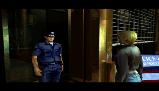
All things considered, this police officer really doesn’t look too bad. He’s got some nice shading and some real definition to his features. This being a 1999 release, it’s pretty clear that Squaresoft had made some real improvements over their earlier forays into 3D gaming:
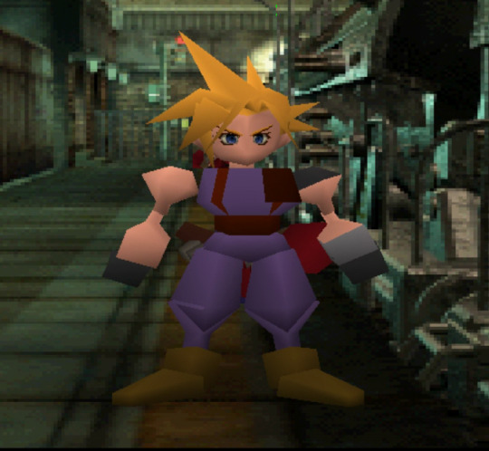
(Ahem.)
The problem with the officer isn't so much in the level of detail, but really the content of those details, specifically his eyes. With Aya approaching him, his gaze seems to be aimed at nowhere in particular. Given that this game features no voice acting, it isn’t really odd that he would have a neutral expression, but neutral is not really an appropriate description. He looks eerily absent, as unresponsive as a mannequin. Compare that to the beautiful pre-rendered cutscenes that pepper the game and you have yourself quite the disconnect.
Obviously, no Playstation game is going to be rendering characters that look as good as that on the fly, but even compared to Aya’s in game face, the officer looks odd.
This closeup reveals a hint of determination, but also a sense of calm, similar to how she was characterized in the cutscene above. The officer, on the other hand, looks as though he’s never experienced stimulus of any kind.
(There’s just nothing going on in there.)
Parasite Eve II is one of the more technically impressive Playstation games, and as such, its crimes against humanity barely even register. There are modern games that can’t get characters to emote, and their faces can actually move. By that measurement, Officer No Soul is a crowning achievement. Let’s take a look at a game in the same genre and released the same year. Capcom’s Dino Crisis featured a female protagonist, Regina, with the same kind of gun totin’ sex appeal that Aya Brea brought to Squaresoft’s character lineup. For reference, when we thought about Regina, this is what Capcom would have preferred we have in mind:
The unnaturally red hair seems geared at portraying Regina as a fiery, adventurous type. Her look is pointedly alluring, which doesn’t complement the theme of the game in any way, shape or form, but was par for the course after the debut of Lara Croft. Let’s see how well this dinosaur murdering seductress translated into the actual game.
(Oh, god!)
The “come hither” look from the cover seems to have melted like a wax figure. Similar to the officer from Parasite Eve II, Regina lacks any meaningful expression on her face. The texture mapping is slightly misaligned as well, making it so her lips appear to be sliding off to the side of her mouth. What’s most disappointing has to be the way her hair is rendered. This was long before things like cloth physics or individually animated feather blowing in the breeze. I’m empathetic to the constraints of the platform, but I can’t help but feel discontent when I’m teased with distinguished hair strands and am instead given a rust colored crescent moon with some highlights capping her skull.
By 1999, the Playstation had been on the market in Japan for five years. Dino Crisis and Parasite Eve II were games developed and published by big players in the industry. While it’s all well and good to poke fun at their badness now, they were still among the most advanced graphics that could be achieved on the platform. While looking quite dated by the dawn of Sega’s Dreamcast, in the same year as these releases, they managed to hold their own. Results from games much earlier in the system’s library tell a very different tale.
This is from King’s Field, released in North America in 1995. You may have noticed that this man here has no face. There’s an extra polygon showing for his nose, but other than that, we are just staring into the void. Bad faces are unsettling, sure, but no faces is the stuff of nightmares. This game is technically the second in the King’s Field series. The first game, confusingly also just called King’s Field in Japan, released early on in the Playstation’s life, December of 1994.
While many of the established studios were busy mixing pre-rendered backgrounds with polygonal character models in order to maximize the amount of detail they could squeeze out of each scene, From Software decided to go all in on 3D right from the beginning. Nearly everything in this game is built using polygons. Even more impressive, the game continuously streams data from the disc, meaning load times are practically nonexistent once play begins. In order to accomplish that, corners had to be cut. A lot of those corners were in the details department. Most objects are made of simple shapes with little or no texturing. Edges are sharp in a way that feels unnatural. This extends to every face in the game, and is the biggest barrier to buying into the game’s world.
There is something inherently unpleasant about holding conversations with people sans mouth. It was bad enough when characters couldn’t move their lips, but to not have a visual reference for where the speech is supposed to be produced from puts the player in a tough spot. On the one hand, there is plenty of space for the player’s imagination to take over. They can create any character they want due to the faces being literal blank slates. On the other hand, of course, the inability to visually relay more detailed information about its characters through facial expressions means King’s Field has to work harder at the language that’s used when NPCs communicate directly with the player. Overall, the trade off of having a large, fully 3D world at the expense of detail was risky. Given what we know about texture mapping in the ‘90s, I’d say From Software made the right call, even though it meant talking to no faced monstrosities.
I wanted to point out a few bad examples of polygonal faces in order to demonstrate that some games took a completely different approach to the whole 3D thing: mainly, they tried to maximize their capacity to convey information visually by only including the most vital information. In Mega Man Legends, the characters are incredibly blocky. The basic shapes and sharp edges make it so that it looks as though everything was a paper cutout. When looking straight on at a character’s face, all you see is a flat surface with everything simply drawn on top of it. It may not be the most technically impressive, but it allows for a great deal more emotion. Mega Man expresses more with his face in one scene than any of the previously mentioned character do throughout their entire adventures.
Here, Mega Man shows some clear confusion. The simple frown and solid coloring gives him a great deal of personality.
In this shot, Mega Man’s sense of fulfillment is very clear, and all it took was a different mouth texture over the same facial structure. Sure, he doesn’t have the lips and his hair looks poised to pop any balloons that might be floating by, but the anime style art design allows for visual storytelling in a way that many early 3D games just couldn’t pull off.
Another great benefit to Mega Man Legend’s art style is that it has prevented the game from appearing as old as many of its contemporaries. Dino Crisis may have looked really good when it came out in 1999, but when magnified and displayed at resolutions above those that would have been possible on TVs of the time, it’s very obvious what era of video games it was made in. Games with pre-rendered backgrounds look especially bad at higher resolutions because character models and the environments don’t scale together. A character might upres quite well, but then clash horrifically against the blurry, pixelated mess of a backdrop. For anyone playing on the original hardware hooked up to a television of the era, these issues are lessened, or even non-existent thanks to the resolutions and adaptability of CRT technology. When played by more modern means, say on a Playstation 3 via the Playstation Store connected to a nice LCD screen, you can get some very unfortunate results.
Mega Man Legends’ visuals may not hold up perfectly in the modern era, but they can be blown up significantly and still maintain most of their quality. The techniques of simplifying visuals would pay off big for Nintendo just a few years later with The Legend of Zelda: The Wind Waker for Gamecube. Basic shapes combined with newly developed cell shading techniques allowed the game’s visuals to be expressive in ways even modern games struggle to match. When played at modern resolutions, The Wind Waker hardly skips a beat.
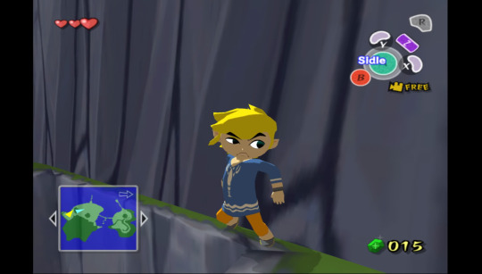
(That is a look of some serious, and easily distinguishable distaste.)
The increased processing capabilities of the Gamecube meant that visuals for its games would automatically outpace the Playstation, but visual techniques pioneered on that platform gave 3D games a way to circumvent the inherent limitations of the era and technology available to them so that they would have lasting power. It’s important for games to push the boundaries when it comes to visuals, and a cartoonish style certainly isn’t appropriate for every title, but I can’t help but wonder how many times this cycle will repeat. Games developed for the Playstation 3 are already starting to show significant visual age when compared to the newest released on PC, so much so that I almost prefer the abstract horror of bad face texture mapping to settling in the uncanny valley. Graphical fidelity never felt as important as artistic design, a reality that feels more true now probably than ever before.
1 note
·
View note
Text
ChronoTrigger Review (A+)
Posted this on another website years ago, but I thought I’d share it here.
What do you get when you include Akira Toriyama (the creator of Dragon Ball manga) with Square (famous for the Final Fantasy series)? Well quite possibly the best RPG on SNES and a contender for one of the best of all time. I will rarely give any game an A+ rating... it has to be a very special game and not just a personal favorite. To achieve the rating, the game has to be nothing short of a masterpiece. There are a lot of things that can go wrong in a game that would make it stumble down to an A and it only takes one or two. To get an A+, a game must cover all fronts including graphics, sound, and gameplay (and it's harder for RPGs as they have to include a great story). Besides the story aspect, the bar is generally set higher for RPGs than for platformers due to the time investment involved by the player. Given this, you should understand how important a game is when it's an A+. It's nothing short of being a must-play game. Chrono Trigger is just that sort of game. It doesn't matter that this game doesn't have the same graphics capability later systems had. Toriyama's excellent design work still shines - even today. When the art of a game thrives on looking like anime or cartoons, it takes on a sort of timeless charm. The only other games I can compare this quirky style with are Earthbound and Lunar. That's excellent company to be in for any game. As far as graphics goes, this is at the top of the SNES library as far as attention to detail and colorful vibrant sprites. The art direction in this game is amazing. Sometimes you pause the game just to check out all the details on the screen. When you're in a forest it's comparable to The Legend of Zelda: A Link to the Past... it's that good. Every boss has nice details and a sort of character all their own. Even the regular enemies have a sort of quirky sense of humor. When you're in a dark cave you feel like you're in a dark cave. Likewise, a castle is regal and well-lit whereas a run-down castle is spooky and lonely. From abandoned high-tech laboratories and post-apocalyptic frozen landscapes to bright happy country fairs... the game makes you feel like you're where you're supposed to be. It takes very little imagination to lose yourself in the story and background. Even the psychedelic mode-7 backgrounds on the bosses make the fights seem epic. Now about the sound... it's even better than the graphics. I don't know how that is even possible. Every track is a masterpiece. This really shows off the SNES' sound capabilities. At no time will you be wishing the music would change. The whole game lends itself to remixes and remastering that many gamers have taken on. You will find no shortage of excellent Chrono Trigger music remixes, but the original is pretty good on its own. There are even parts of the story with their own music score (like with US Final Fantasy 3) - in particular the court trial (which you'll know when you play the game). But wait... there's more. This isn't one of those games where the story and atmosphere are awesome, but the game play sucks. This is a finely polished role-playing game on mechanics as well. When you start the game you will get to pick your battle system: Active (where a clock on each character winds down between moves) or Passive (your classic turn-based system). The first time I played I picked Passive (because I'm a bit of a micro manager on my RPGs), but the second time I used Active and was amazed how much more interesting it makes the game. You have to really pay attention and plan your attacks so you can pick the menus and attacks and execute them before it's time for your enemy to attack. If that sounds too hard or complicated, then by all means pick Passive. It won't affect the enjoyability very much in the end. It's just nice that the creators offer you the choice. You can also use items to restore health, restore magic, or help with a status effect. To summarize, you can make gameplay more complicated if you wish, but in the end it's a very simple system. You will be able to pick up the system on your very first encounter with no problem. Characters have HP (health points) and MP (magic points), like with most RPGs. Unlike early Final Fantasy games (or I should say like Dragon Warrior games), you will not randomly start a battle every few steps. Instead you will see enemies and be able to maneuver around them instead of battling. You probably don't want to do this all the time - as you want to level up. But it's always nice to have options. Speaking of options, there are three sort of modes on attacks: a regular attack, a magic spell or ability, and a combo move. Spells cost magic points. Combos can be between two or three characters and each combination results in an interesting move. Like with other RPGs, each character represents a flavor of attack or magic. For example, Chrono is lightning while Lucca (his inventor friend) is fire. Their combo is Chrono spinning his sword while Lucca adds fire to it for the attack. The first thing you'll notice when playing this game is that it starts out slow. This was my major complaint on the first play-though. Why do I have to talk to Chrono's mom? Why do I have to go find Lucca? Why do I have to go to this stupid fair? That's probably what you're going to think when you start the game. Well the reason is that you need to invest your feelings into the characters... and you can't do that unless you get to know them. This only lasts a little while, and the pay-off for this little bit of annoyance is huge. You seriously want to try and go for the story with this game. You will not be disappointed. Also, after you finish the game, you'll really cherish the replay (which I'll get to later). It adds a whole other dimension to these scenes. Enemies are fun for the most part. The bosses aren't overly complex and there's usually some trick to beating them. Keep in mind the elements of the game. You'll want to hit an ice guy with fire and a fire guy with ice. Sometimes you need to attack in a certain pattern. The bosses aren't really too hard, but some aren't a walk in the park either. Sometimes the combos can be a little over-powering, but I see this as a way the game leaves the experience up to you. If you want to repeat the same cheesy moves over and over to get to the story that's fine, and if you want to make things harder on yourself during combat that's also fine. But in the end, you aren't pushed in either direction necessarily. As you may have guessed from the title, the game involves time travel. There's a main, somewhat linear plot, but along the way there are little sub-plots and there's a fair degree of back-tracking. The beauty of the time travel is that each period covers the same area but with different characters and buildings. And doing something in one time period can have consequences in other time periods. While this isn't explored quite as much as I'd have liked, it is a welcomed element to the game and well-designed. The overall story is rich if not deep (but not deep enough to be boring) and there are a ton of endings to the game. The ending, in fact, depends on what you do during the game. After you beat the game, you can play again with a New Plus mode that lets you keep your items. That might seem a little cheesy, but by this point you're going to want to go check out the parts of the game you didn't finish or didn't finish the way you would have liked before. This system actually gives the game a lot of replay. So to summarize, if you haven't played this game and are even remotely a fan of RPGs, you need to play this game. I know it's not a cheap game on the SNES, but it's available on Playstation and on the Nintendo DS. The later games even have video cut-scenes from the creator.
2 notes
·
View notes