#this is only the 2nd colour photo edit i have ever done ok
Explore tagged Tumblr posts
Text


#I LOVE THESE especially that first shot#ateez#seonghwa#park seonghwa#none of the red's match i am aware of this#this is only the 2nd colour photo edit i have ever done ok#and blame his lighting person....the shades were all over the place#i was going to black-out these but that first shot was so beautiful in red#it reminds me of a Vogue Asia editorial#and that's a compliment of the highest order#International Seonghwa Red#to go with my International Riki Blue lol
153 notes
·
View notes
Note
Because i miss your design themed rants (it is good word here) i would like you to rank Rammstein album covers from designers point of view.
Ah, I love you. This got VERY ranty.
This is kinda hard because I tend to judge the entire packagaing/notes, and when I count that into it the ranking would be ever so slightly different. I’ll mention it for each I have Opinions (TM) on, but yeah, this is solely going on cover. I’ll only do the studio albums, not made in germany or the DVDs, or this will get too big.
7th: Rosenrot.
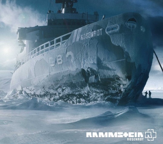
I know lots of you are gonna hate me for this. It’s not that I don’t like it, I do, it’s beautiful. Unfortunately it’s ... slightly lazy. It’s I think their most obvious cover and obvious feels like it’s good design but never truly is. It’s got that first idea feel, if that makes any sense. There is always that project where you go “uh can’t think of anything, but this works.” It’s not a bad thing, they clearly still knew what they were doing. It’s just ... that typical photoshop post apocalyptic composit that lost of metal/alternative bands did at some point. They all did it because it’s cool. No argument there. It’s just that I expect a bit ... more.
6th: Herzeleid
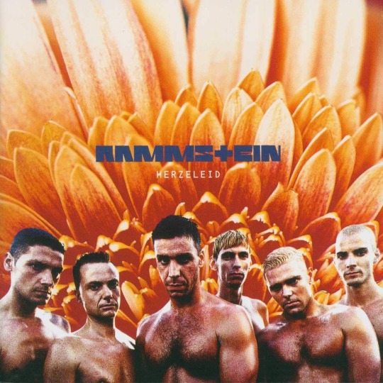
I know it’s iconic, but. The execution?! Terrible. The colours of their skin and that flower?! Too different to feel monochromatic, to same same to contrast nicely. Too much texture. What is that?! The positive bit is the placement of the typography because, neat! Most people fail at that. I like the blue-grey there aswell, how about you’d added that to their skin a little? No? Ok.
Also, this (Richard speaking):
“The bloody sleeve! What a crazy situation that was. We approved the photos in a car park without thinking what we were letting ourselves in for. When we saw what the designer had done, we freaked! We looked so… gay! All of us stripped to the waist. It was like an ad for a gay porno film. So we had to say, sort it out. Make us look straight again. Change the sleeve.”
Who in the fuck works like this?! Nevermind, I know it was a considerably younger Dirk Rudolph, but fucking hell, have some self respect, all of you. I know they didn’t know what they were doing, they probably had the management/record company comission it, and that was still the time graphic designers were seen as just pixel pushers from that time it took 3 days to layout a poster. Still. What was that brief?! Could you have sat down for 20 minutes and talk, perhaps?! Also, I hope this is how Richie learned to be the nightmare client I know he is. Don’t approve layouts in a car park, what the fuck is wrong with you.
It’s a pity because the concept? Nice. Sculpted men infront of flowers, what else do you want from life. Why crysanthemes, tho? Too textured in that macro shot. What is that photo angle?! Might try and redo that if I ever feel like it.
5th: Reise, Reise
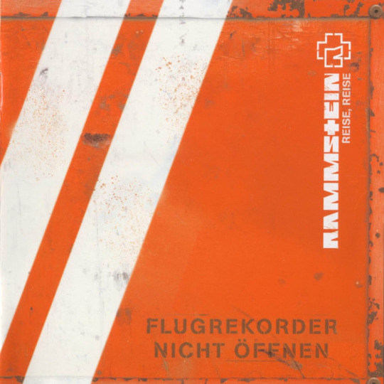
This breaks my heart a little, because it’s my lonely island album. And it isn’t bad by any stretch. Actually, their album cover game is ridiculous, can I have that established as a general benchmark? It would make for a lot less mental break downs. The thing is ... I like the idea. Make it look like the black box, cool. The problem is the type. It makes it look like “Flugrekorder Nicht Öffnen” is the album title. To be fair, Typesetting is my main thing, and album artists get it wrong (imo) 99 out of 100 times. I wish they would have comitted more and just left the titel off and solved it with a slide in, or a sticker or something like that. It’s just a bit ... weird. What works brilliantly is that it’s very memorable, stands out on the shelf, is unusual, all of that. It’s iconic. I do like it very much but I had to place something here.
4th: Liebe ist für alle da
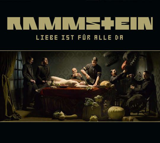
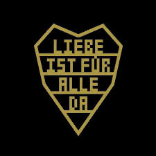
Now the thing with that album is that it has two covers. If I’d gone by the original one, I’d have to place it behind Reise, Reise. Everything RR has in impact, this is missing. It’s too dark, has too many pieces, it won’t stand out on a shelf. Especially not in the CD age when it was on 12x12 cm. Even on a Vinyl, it’s ... just not that impactful. Sure, the photograph is beautiful but meh. Luckily there is a second option. And that - is almost like a logo. It works as a symbol, and that makes it so strong. Less is more. Brilliant. You can draw it from memory. It’s so iconic, the kind of stuff that starts showing up in subways, drawn on the back of a seat and sprayed on walls. Tell me you never wanted to paint that on a flag and take it to a pride parade. I am sure some of us have.
I do want to mention the booklet in this, because it does bump it up a little too, because where the panorama image fails as a cover, the inside is done so beautifully with the fold out, the type setting, everything. It’s special, and done with love and it shows.
3rd: Mutter
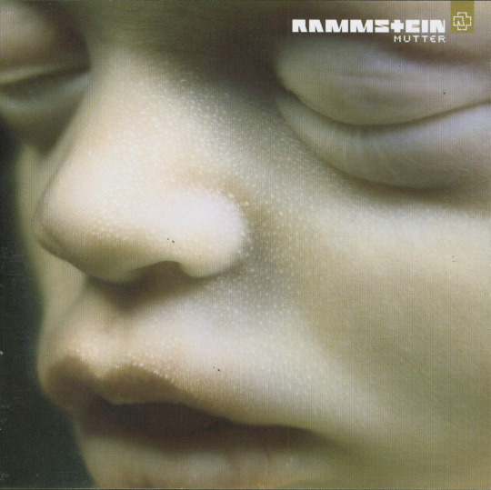
There is just something about this that is so, so, so memorable. Everyone recognises this. If you ask anyone over the age of 20 to describe Rammstein with an album cover only to someone less familiar, is anyone gonna say anything but “they’re the band with the embryo in close up”?! Maybe this is subjective because that’s how I first got exposed to them, but I don’t think so. It’s such a powerful image. It’s both beautiful and uncomfortable, the way Rammstein as a whole and that album in particular is beautiful and uncomfortable. It’s stunning. That’s it. Unfortunately, this one falls apart inside. The went too far with the whole Matrix inspired cyber elements. It’s trendy and trendy never stands the test of time, in that it has the same problem Rosenrot has, but much worse because it’s not even done that well. They could have just used the photos and kept it raw. The type setting on the cover is as good as it gets with albums tho, so I am happy.
2nd: Sehnsucht
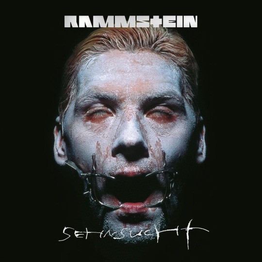
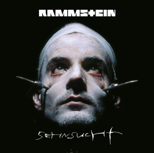
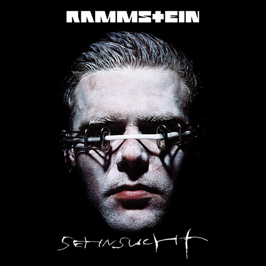
Ah, Sehnsucht. The most perfect band shoot they ever had. Helnwein just ... did it. I don’t know, it both defined and summed up who they are aesthetically for the longest time. It’s the visual statement that says “this is Rammstein”. It ... just looks like a band that sings about heartbreak and necrophilia is supposed to look like. Don’t you agree? How else would it look like? Even that omniously coloured beach. It’s as if the predicted the mood of True Detective, only less Hollywood. That darkness we don’t want to see, that can happen anywhere. And where they fell short with Mutter, where they added too much on to these powerful images, they just added the type. Granted, it was the 90s so it’s slightly experimental type. But unlike most type in the 90s it stood the test of time. Add the whole variable cover versions and chefs kiss! Beautiful work. Makes me happy and emotional and ugh.
1st: The White Album

I’m just calling it that now. The Matchstick. You know, good design is made up from three components only: Concept. Commitment. Execution. The concept of this is so streamlined and clean. It’s the entire Rammstein story narrowed down to a single little thing. It’s small and ordinary looking but it can become dangerous and big. It’s underestimated. A little piece of wood with a head of phosphor and calium chlorit and yet you can commit the most legendary arson. It’s the personification of the thing that has become synonymous with them: Fire. It says so much with so little. And then they comitted to that. No useless typography, a simple but oh so well done photoshoot, the simple text on white. They didn’t ad too much additional ideas on to it, they trusted that one to carry and it does. They could have done without the black and white match stick arrangements inside, although I’m not even sure if that’s not just a limited edition thing, it’s a bit too much almost. They got scared a little there. The execution is also well done, I have very little to critique, only that I feel it lacks a tiny bit of love. The thing is, the more minimalist you go, the more love you have to put into each element. I feel like the spacing of the type should have been fixed in a few places but honestly that is being very very picky. Or not. Because if it wasn’t for that, and the teeeeny tiny commitment issue, this should have been a candidate for the packaging grammy. I mean it should be even the way it is, but we all know how those fuckers ignore our boys.
I’m done. Can I use this as application? Do you think if I send them a run down of basically tearing them apart they will hire me?
#my version of i will be a rockstar is i will win the packaging grammy#just you watch me#it’s roughly 35 years until the end if my career and just you watch me#rammstein#album cover#graphic design#i need a ramble tag#rammstein asks
61 notes
·
View notes
Text
How to tell the difference between court dress...

And wedding attire:

After my last PSA about Consuelo Vanderbilt, I’ve had a few people message me photos and images regarding various Dollar Duchesses of her era. Some of these also contained images which were either wrongly attributed or contained other errors. So, because I am The Biggest Pedant Ever, I thought I’d branch out and make another PSA about an issue I see happening a lot in the historical fashion community.
Both dresses pictured above have been attributed to Consuelo Vanderbilt and both have been described as featuring her wedding dress (I haven't found a definitive source for the 2nd image to say whether it is her wedding dress but the sleeves are different from those pictured in the newspapers of the time which makes me suspicious). I see a lot of pictures of court dress being described as wedding dresses and vice versa.
Here’s a quick guide on how to tell whether the dress you’re looking at is intended to be worn at court or if it is a genuine wedding dress of the era (for the purposes of this post I’ll be referring to Edwardian era court dress in the United Kingdom):
1. Google Is Your Friend: I know it sounds patronising but if you’re unsure, Google It.
2. Pinterest is Not Your Friend (Pinterest Hates You): Ok, I’m being dramatic because I have a bee in my bonnet about Pinterest but the reason I say this is because both of these images (and many others) found on Pinterest contain either wrong information or no information at all. For example, after doing some digging on the internet I found that the top image is of Baroness von Linden in Court Dress (Lafayette 1898). If I had simply stopped my search at Pinterest I would have been spreading misinformation which would have been sucky.
3. Feathers: One of the main ways to know that you’re looking at court dress rather than evening or wedding attire is the plume of three ostrich feathers on the wearer’s head. From the 18th century onwards the rules regarding court dress would be published by the Lord Chamberlain’s office in an official publication called Dress Worn at Court (for those of you who may be wondering, the 1937 edition is still in force for those occasions where court dress is still required). According to these rules no hats are to be worn by ladies at court, only tiaras, and three ostrich feathers are to be worn on the head (in what is known as the Prince of Wales plume). Due to how expensive ostrich feathers could be it was practically unheard of for brides to wear them in their wedding attire, and never in the Prince of Wales plume.
4. Train-spotting: According to the official rules court trains must be a minimum of three yards long. In the above image, Baroness Linden is wearing an evening dress (again stipulated in the rules for the reign of George V - no afternoon dresses allowed!) with a detachable court train. Because a dress made to be worn at court would be ridiculously expensive, the wearer would naturally want to get the most use out of it. Therefore it made sense to create an outfit that could otherwise be used for regular dinner or evening events with the train and other accouterments removed. There also may or may not have been a matching bodice appropriate for daytime wear outside of court functions. So, taking the above into account, the second dress pictured cannot be court dress because it isn’t evening dress and it does not have a train.
5. Versatility and Complicating Factors: During the late 19th and early 20th centuries, we start to see more high society women wearing wedding dresses made specifically for their big day. This was done as a sign of wealth in contrast with lower class brides, who would often be married in their best dress (usually an afternoon or day dress in any colour, often their Sunday best). In the 1890s wealthy brides could have their wedding dress made according to the latest fashion, rather than opting for something timeless and versatile like the lower classes. British court dress, on the other hand, often seemed designed to take the wearer from coronation to coronation with few alterations in between (perhaps to take some pressure off cash-strapped peers?) while still displaying wealth. Queen Victoria famously made white a popular colour for brides in the 1840s but white was also a popular colour at court, especially for unmarried debutantes. And, to complicate things further, a young bride would sometimes wear her wedding dress to court following her marriage (after being altered to follow the rules for court dress). All of this is to say, its hella difficult to tell the two apart sometimes and it’s no wonder things can get confusing.
6. Presentation: The above photos show two different ways of presenting historical fashion. One is a studio photograph of the dress being worn by its intended wearer, while the other is an ensemble put together by a curator using their knowledge and understanding of the era. In addition, photography, while no longer a novelty in the 1890s, was expensive and time-consuming and was often reserved for special occasions and it’s important to keep this in mind when thinking about the garments intended use. Flowers are present in both pictures, although the second photo has a sprig of what appears to be artificial orange blossom on the crown of the veil which suggests it to be a wedding dress (another trend started by Queen Victoria). The top photo has gloves as part of the ensemble which was required for court dress but not for weddings in the 1890s and 1900s.
This has been a PSA.
Disclaimer: The above is compiled from my own knowledge and research, and I welcome any input or opinions to further my own learning. Also, putting this post together was super fun so if anyone has any ideas for similar posts you’d like to see then drop me a message!
Sources: Wikipedia / Dress Worn at Court / Source for Baroness Linden / Lafayette Archive of court presentation photos /
#historical fashion#court dress#consuelo vanderbilt#1890s#edwardian#wedding dress#evening dress#she speaks!#19th century#I should be studying for my driving test but who cares
24 notes
·
View notes