#this is one of my favorite quick panels from the manga and I'm so glad they did it justice!
Explore tagged Tumblr posts
Text
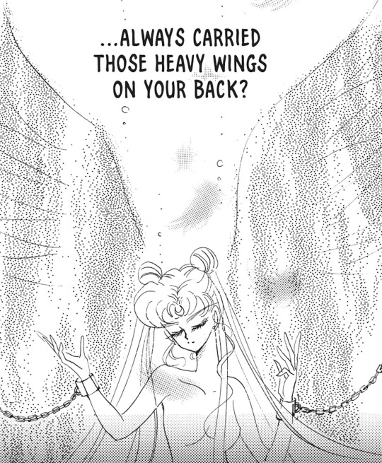
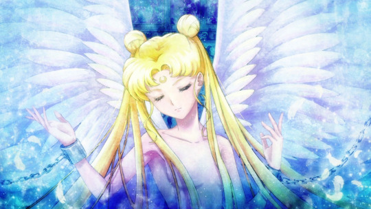
Anime vs Manga: "Have you always carried those heavy wings on your back?"
#this is one of my favorite quick panels from the manga and I'm so glad they did it justice!#sailor moon#bishoujo senshi sailor moon#usagi tsukino#sailor moon cosmos#anime vs manga#1k
1K notes
·
View notes
Note
Heyy, I’ve been reading your wonderful one piece works for a while — and I couldn’t stop wondering how are you actually doing those magnificent headers?
Like… hello? The great quality, with additional 3D-alike details I could catch by my eyes? I got only Ibis Paint X on mobile, since I’m only a young man that literally two months ago went on a life-time ‘adventure’ of living alone in a small apartment.
In short — I got no money to pay for additional graphics/drawing programs, not yet at least
Hello!
Thank you! I'm glad you enjoy my writing - I'm curious to know what's your favorite piece / part? Also I'm so happy you like my headers? Makes it feel worth it to spend time on them! :D
I have excellent news for you, I used a mix of Canva and Photopea. They're both FREE!
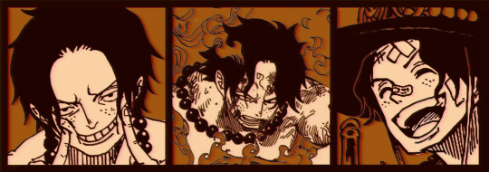
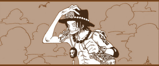
I'll be explaining the process for making these two kinda? The full tutorial is below the cut, to be courteous to the other folks, hope you don't mind?
Though I am hearing that Canva has given people some grief. But Photopea is just *chefs kiss*
If you've ever used photoshop, Photopea is essentially a free photoshop, and it even has the automation tools! An absolute lifesaver when you have multiple layers you want to export (but that's for larger projects not this)
I'm going to assume you have basic knowledge of layers in digital drawing programs for this. If anything isn't clear: ask me, I'll clarify!
//-------------------------------------------------
My General Process is:
Search for official art / images
bring it into canva / photopea
crop / arrange images to match the dimensions
select a thematic color that is associated with the character
separate the foreground from the background
mess around and test things until they work
//--------------------------------------------------
Given "Louder than Words" is the latest one I've made, I'll start with the process for it.

Dimensions: 3000 x 1055 px dpi: 96
//-------------------------------------------
Let's Get Crackin'
Alright let's grab some official art so we're not using any fanart without the artist's permission
I try to pick images that feel relevant enough to what I'm trying to make. For example: the image for the Matching banner shows the ASCE tattoo which is super important in that fic
2. Let's arrange them onto a banner where each individual image has the same/similar dimensions to the rest
That's probably part of why you like these. To a certain extent they have similar dimensions, so they have a uniformity that's pleasing to the eye! (It's not perfect because I threw perfectionism to the wind because this is tumblr not my portfolio) Tip: if you have 3 images and only 2 that have similar dimensions, and the 3rd one can't be cropped logically: but the one that's a different aspect ratio in the middle!
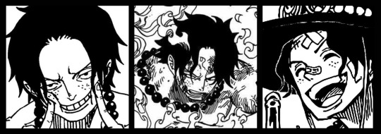
3. lets arrange them in such a way that the borders all feel like they're the same/equal width/thickness
you might find that you have to shrink some images for this, that's fine.
ALTERNATIVELY: if you're going with one image crop it so it's just the relevant info and it matches the dimensions (3000 x 1055 px)
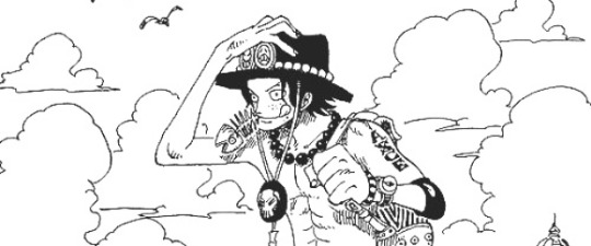
We have our base! Now let's add some color, and direct the viewer's eye together!
4. pick out a color that you think matches your character / vibe - that color is going to be your background Given I'm making an Ace banner: orange is the color I'm going with
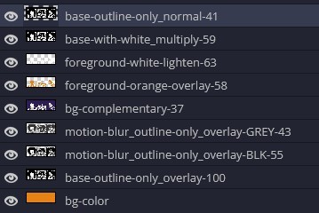
I went and named my layers for this lol. The numbers represent the opacity, and they aren't important. I just kept changing the opacity until I liked the way things looks. But here's the secret to the 3D feel:
Motionblur (+ moving it about)
Separating the foreground and background and dulling out the background.
I'm going to show you my process so you can see the effects, but first let's give you some quick skills:
//------------------------------------
SKILLS / THINGS I THINK ARE HELPFUL
//------- Select Similar
magic wand -> select something -> right-click -> select similar This works best when you have high contrast images (like manga panels that are black and white). You can select the black or the white areas. Depending on what works better for you. TIP! Invert selections with ctrl + i Say you know that you want to select everything but Ace's face in the second panel. Select his face with the magic wand then ctrl + i, and that's the only thing NOT selected

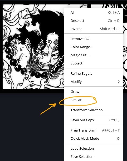


TIP!!!!!!!!!!!!!!! Please, please, please, duplicate your original image and work on the duplicate layer. This helps you SO much. !!!!!!!!!!!!!!!!! TIP! Check your selection tolerance! This could be why too little, or too much is being selected.

//------- The Move Tool
Shortcut key: v While the move tool is active, you can nudge the stuff on whatever layer with your arrow keys Shift + arrow key = 10 px move (generally)
//------- Layer Locking
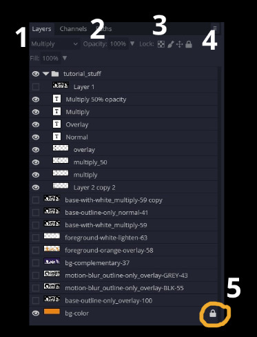
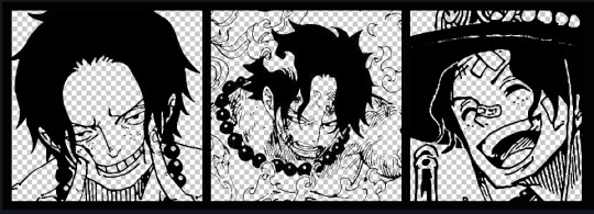
1- Layer Blending Mode (see Overlay vs Multiply vs Normal) for how this can affect results) 2- Opacity: how see through it is / isn't 3- Lock Transparency (it's the little checker board) 4- Lock Layer (looks like a lock) 5- Lock icon that appears when anything on the layer has been locked More on 3 Lock Transparency: You can only paint on / modify what's on that layer. You CANNOT add anything to any area that is already transparent Here's a demo of what you can do with this power:
Here's the original Image - notice how it's just the lineart with a transparent background.
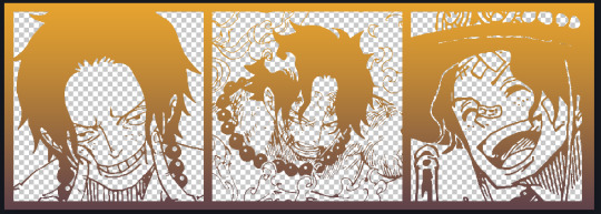
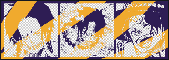
It's powerful: abuse it
//------- Overlay vs Multiply vs Normal
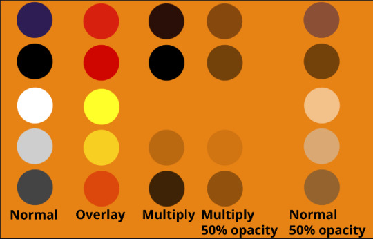
I think seeing this is the best way to visualize how different modes can affect the color.
//--------------------------------
Back to the Tutorial
!!I IMPORTANT NOTE !!
Please play around with the opacity slider to figure out what opacity works best for you on the multiple different layers we're about to make / work with. It's up to your own style to figure this out. Next: please feel free to not follow all of it. Add more layers, add less layers, take the base principles and go wild! :D
5. Separate the lineart from the background and save it as a new layer 6. Duplicate it and set it to overlay, or set it to overlay immediately
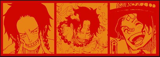
7. Duplicate that lineart layer twice and set the blending mode to overlay 8. lock transparency on the top one and change it to be a dark grey 9. Apply motion blur to both:
Main menu bar -> Filter -> Motion Blur I made it so that the grey layer was blurrier than the black layer
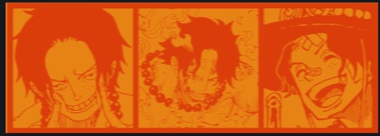
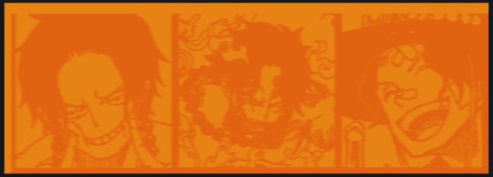
10. More them around a little to give it a "3D effect" as you called it.
It creates shadows under the lines - I was aiming for an effect similar to chromatic aberration (chromatic aberration is a valid way to add punch to your stuff too!)
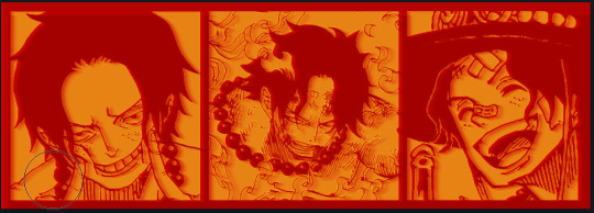
So this is what things look like now - painful, but let's keep going
11. Duplicate the ORIGINAL / BASE lineart layer, that you DID not apply motion blur to -> set the blend mode to multiply (reduce opacity for it to actually take effect)
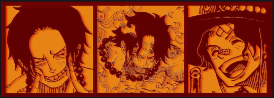
okay that's less painful here's what the layers look like right now:
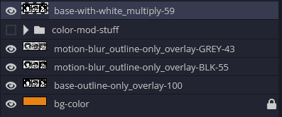
let's bring more focus to Ace's face, and push the background farther away:
12. Use the magic wand tool to quickly select large areas of the faces / focal area / foreground and the lasso tool to refine things
TIP! Hold shift + click -> add to selection Hold Alt + click -> subtract from selection
13. On a new layer with blending mode -> lighten, fill that selection to be white

If you look at it, you'll notice that it is ALREADY starting to draw our attention to his face, but the background is kinda aggressive, so let's dim that down
TIP! Right-click on the gradient tool to find the paint-bucket tool

TIP! Sample All Layers: Turning this option off makes it so that you only work with the content on THAT specific layer. Turning it on makes it so that it is working while taking all other layers into consideration.
14. ctrl + click on the "white foreground" layer to select the contents of that specific layer (pink thing is your mouse)
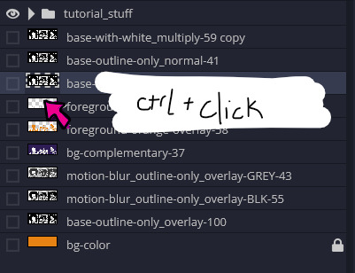
15. ctrl + i to invert selection and ON A NEW LAYER (layer mode -> multiply) fill that with a complementary color

16. I did one last thing where I took the original base (before we separated the lineart) and added it to the very top and played with the opacity to get something less in your face (layer blend mode was set to NORMAL)

And that's it!
More considerations that I take:
I want the banner to be "thin" or not square, so it doesn't take up too much screen real estate on people's devices
I don't want readers having to scroll too much to get to my writing (which is the whole point of the post, let's not waste their time making them look for things)
I want the banner content to be relevant enough?
ie: with Matching: I wanted the ASCE tattoo to be visible. With matching I wanted Ace to not look too happy in some of them.
I'm also trying to avoid spoilers, I hated getting things spoiled, so I'm trying to be careful that the images I pick don't spoil anything really.
Congrats on starting life on your own! I did that whole living by myself thing too! Tip: keep the pantry stocked with lentils, beans, pastas, baking essentials, rice. They really come in a clutch when you're hungry.
#photopea resources#photopea psd#tutorial#tutorials#tumblr banner#photoshop#photoshop tutorial#digital art#fuck adobe#adobe photoshop
29 notes
·
View notes
Text
Reading This Week
I am back home and reading like my life depends on it! I'm going to start working through articles I have saved to my computer bookmarks and such
Abandoned:
Pregnant Butch by A.K. Summers i tried! i've been meaning to try reading this for ages! but i got turned off by goodreads reviews saying theres a transphobic screed in the middle, and then just not clicking with the storytelling style.... oh well...
Finished:
The Secret to Superhuman Strength by Alison Bechdel (colored by Holly Rae Taylor) I kinda stayed up later than I technically meant to finish reading this. Bechdel really is a fantastic memoirist
Started & Finished:
As Yet Unsent by Tamsyn Muir tbh, kinda wish i'd read this before Nona so that I would have a tad more context for like the connections between the other House characters. but this was pretty great as a quick read, and really enlightening for the inner life of a character that I never really cared about before
"I wrote a story for a friend" by Julian Gough this is the personal essay by the guy that wrote the Minecraft End Poem about the trouble surrounding its creation and copyright. I find it kinda funny when he's like "the capitalism game makes me sad bc it gets in the way of the art game and the friendship game.... but there's nothing inherently wrong with the capitalism game!" he's got the spirit but ain't quite there yet yknow? anywho. one day I will actually beat Minecraft and read the story in its proper context!
What Did You Eat Yesterday? Vol. 1-5 by Fumi Yoshinaga, translated by Maya Rosewood (1-3) and Yoshito Hinton (4-5) now I did not intend for reading this manga to be a christmas season read, but somewhere in the beginning of vol 2 or 3 it was just christmas season within the manga itself!! anyway this is a pretty chill slice of life manga, half cooking/recipes, half daily life for a middle aged gay couple in 2000s Tokyo, and it's been a fun easy read
Nectar edited by Tab Kimpton & Harry-Anne Bentley most thoughts remain in my private journal for this one, but I can say that kinda like the last one only like 2 or 3 of the stories within actually like. worked for me on an artistic style level. still delighted that this exists
Ouran High School Host Club, Vol. 2-3 by Bisco Hatori, translated by Kenichiro Yagi while i'm enjoying the nostalgia of reading the manga version of a childhood anime, i find the panels of this really difficult to read? also this is the last volume available through my library so i probably won't read more for a while
Decolonizing Queer Games and Play from First Person Scholar, edited by Khee Hoon Chan:
Editorial by Khee Hoon Chan A Boy is a Gun: Weaponizing Black Gender in Video Games by Oluwatayo Adewole Unmaking and Undoing: A Trans* Reading of Katamari Damacy by Julie Fukunaga Interviw with Caro Asercion by Olivia Popp
working my way through articles that i've saved to my bookmarks bar! i absolutely want to check out more stuff like this
Masters in this Hall by K.J. Charles now THIS is a deliberate Christmas read for me, as it's the surprise un-advertised Christmas novella from one of my favorite romance authors! it was fun and funnily enough, most of took place in the days following Christmas. it was fun to see Jerry again (this time as a side character), and kinda made me want to go reread Any Old Diamonds since it's been a couple years now
Started:
Secrets Typed in Blood by Stephen Spotswood YES YES YES i am only a few chapters in at time of writing, but i am so happy to be back with my delightful butch private detective duo. i've been waiting for this inpatiently ever since i finished the second book in the series and i'm so glad to be back to get my historical mystery fix
Hen Fever by Olivia Waite
this is another surprise christmas novella from a favorite histrom author and the cover is absolutely Delightful. i'm gonna try and savor it but i make no promises
2 notes
·
View notes