#this has been in my WIP folder for so long I had to redraw it haha
Explore tagged Tumblr posts
Note
4, 8, 9, 30 :]
4. Fav character/subject that's a bitch to draw
Honestly? Humans as a whole, still. I started art a long time ago, originally mostly focusing on animals and creatures, til I started drawing humans sometime in middle school - and I never stopped drawing them since! But yet, somehow, even though by now I probably have drawn more humans and human-adjacent characters than not with all those years, beasts are still much easier and come more naturally to me. Maybe those very early years wired my brain this way hbghb
8. What's an old project idea that you've lost interest in
Oh holy fukc so many of those uuuuuuuh,, right now the one that comes to mind is this old story I had made up in middle/highschool - something about a kind of death land, a sort of limbo, and the ghost lords that 'ran' it; and the main character having to go through it to bring his love back from the dead (orpheus and eurydice inspired). And though even then I wasn't particularly optimistic about my chances of going through with it, I really wanted to make a comic of it! Obviously, never happened. I should redraw those old OCs one of these days hgbghb
Have a sneak peek of what my art (and one of my ghost lords) looked like back then. Not the full pic cuz even just sharing this lil tidbit is hurting my ego

9. What are your file name conventions
I've been meaning to change it cuz it's no longer organized enough for my taste! My file themselves don't have any fancy names, they're usually just named after their subject (like 'demoman_sketch' or 'pernelle_portrait' or 'morribel_reference' etc). Of course, no accent in the file names since that renders them unstable and makes it easier for them to get corrupted, same (to a lesser extent) with spaces, so I always use an underscore instead.
So rather than by name, my organization goes by folders: • First off I have a folder per art program (one for Photoshop, After Effects, Corel Painter, Krita, etc), each of which have two folders, 'Unfinished' and 'Finished'. The latter usually only has the PNG renders, while the Unfinished folder houses the PSD (or other) files. Sometimes I'll have a 'Done' subfolder there for the files of pieces that i've finished, but most of the time they'll hang in there in the middle of WIP files forever • And in those Un/Finished folders, I have subfolders for the subject of the art piece (one folder per fandom (like TF2, Rayman, etc), a folder for commissions, one folder per original story, etc) so I can easily find what I'm looking for.
I plan on changing my naming conventions though, keep my folders but name my files with dates at the beginning (year/month/day), then theme (fandom/story/commission, etc), and then the piece's name.
30. What piece of yours do you think is underrated
I'm... Not sure? 🤔 To be honest I post my art to share it but I don't really have expectations regarding its reception from the public... I used to! Back when I was on deviantArt. And honestly it sucked, getting legitimately upset when an art piece didn't get enough digital attention, not enough internet points. But I've grown past it years ago, so I don't really have many feelings if a piece does badly anymore. I've had OC pics get like 2 likes and nothing else and I felt fine with it ghbgh
Don't get me wrong I still want them to do well, I still want people to reblog my art, and nothing brings me more joy than comments in the tags because that's a direct reaction to my art, which always feels very personal and legitimately touches me. But not having expectations means I don't really feel disappointed as much
The last time I've had the thought 'oh i expected this to do better' was for my HLVRAI zine piece, but that's about it!
#asks#mine#art#about me#thank you for the ask!!!! i am holding squishing you#this was interesting#humans are good but tough to draw and they still always feel stiff under my pencil#working on it but it's always a uphill battle for me#one i'm willing to fight though#and god that old project. those old ocs. my good ol' ghost story#the void/limbo/death ghost land thing was basically an endless swamp#this dude's name was allen damon carnibal#his territory was a funfair#in the middle of the foggy marshes#was fun#and yeah i dont really feel disappointed by the lack of reactions to my art!#sometimes it does dawn on me and im a lil sad#mostly cuz i wish i had more feedback from people (so reblogs n tags)#but usually it's fine#ANYWAY ty again fro ask birb you are the precious
3 notes
·
View notes
Photo

So this was based on a suggestion from @ifigaveyouthemoon like, forever ago... Better late than never, right??
And yes, these shirts were definitely gifts from Benny
#boardwalk empire#charlie luciano#meyer lansky#modern au#ifigaveyouthemoon#erinart#this has been in my WIP folder for so long I had to redraw it haha#but I missed drawing these babiesssss
129 notes
·
View notes
Text
#ShowYourProcess
From planning to posting, share your process for making creative content!
To continue supporting content makers, this tag game is meant to show the entire process of making creative content: this can be for any creation.
RULES — When your work is tagged, show the process of its creation from planning to posting, then tag 5 people with a specific link to one of their creative works you’d like to see the process of. Use the tag #showyourprocess so we can find yours!
ty for the tag @sketchyscribbles ! and also ajksdh props for picking the hardest pic I could do this for lmao
tagging (if you want to but no pressure ofc!)
@tricksterkat209 with this piece
@lookforanewangle with this piece
@littlewhitetie with this piece
Process for this yanqing piece under the cut bc whoo boy we wordy
Planning:
In general, except for bigger pieces, there isn’t...a whole lot of planning....ever. This one was a break from working on a large, detailed painting and the result of talking with @apaladinagain about yanqing AU thoughts so it was pretty quick and mostly just a kind of visual note-taking for myself.
I don’t have any of the WIP files/layers because I clean out my WIP folder at the end of each year but based on memory and knowing myself, the initial sketch would’ve looked something like this (this is done with my trackpad and a sore wrist but honestly...probably not that far off. my sketches are uh rough):

Creating:
I work in Paint Tool SAI (but like. a slightly fucked up version. idk why but it’s been janky since I got it ANYWAY) with a Huion tablet. My usual process is a little weird but goes:
rough sketch — usually a very rough scribble of where heads are and other important features (in this case, the lotus and fire) on a canvas around ~1500 px on the short side
clean sketch — the actual base of the piece, where I fully draw out all elements of it (except fingernails lol) and also set the composition. On this one, the original sketch was flipped, which felt much more stagnant, so I flipped the canvas in order to have more visual interest/direction. I also wanted to be more intentional about placement of hands so that each of them should roughly correspond to the upper dantian (Wen Qing’s right hand), middle (Wen Qing’s left, with the flame), and lower dantian (Yanli’s hands with the lotus). I don’t totally remember the thought process behind this but I do remember looking at a lot of pixelated diagrams. as u do. this part’s usually on a slightly larger canvas (~2500 px short side)
lines — I use a custom brush I made a long time back but it’s basically set up to emulate like...a micron pen? might be the closest feel to it so smooth, slightly softer edgers, etc., and I always size up the canvas so that the shortest side is at least 6000 px so that I can downsize and have extra crisp lines
colors — block in colors roughly to get a sense of color composition (for bigger pieces, I often do a rough version of this before I go into lining it), then clean them up so they’re all within the lines. Once all the main color bodies (so like: skin, base color of each set of robes, etc.) are in, I always go in and add facial details first (blush, nail colors, eyes, lips, etc.) mostly out of habit and also as a treat to myself bc it’s one of the easiest ways to start seeing the piece come together
details — after that, it is clipping layer central! in this one, I think (based on squinting at it lol) each robe has at least 2 clipping layers for details such as the difference colored collars on Jiang Yanli’s and the pattern on Wen Qing’s sleeves. I tend to organize layers by color so like the dark red on Wen Qing’s robes would be one layer and the ombre pattern would be a separate one. This is also when I do any rendering, usually, which there isn’t much of here but would include the details on the lotus
shading — pretty basic multiple layer here. I p much always use desaturated blues and purples for shading unless it’s for effect.
effects — glow baby glow! this is where i had to google “How to Paint Fire” bc it’s been 8 million years and then spent forever airbrushing on luminosity and overlay layers. also added a luminosity effect to the lotus for the shigs. Also added an overlay layer for the highlights from the fire here
signature — pls don’t ask me how many times i redraw my signature for each picture. it’s embarrassing. i’ve had the same signature, with slight variation, for like 10 years and yet. orz
fussing — on very rare occasions, this translates to me actually checking for errors and making sure I haven’t forgotten anything but most generally, this involves me staring unblinking at my screen as I slide the saturation and hue bars back and forth and contemplate whether I should start exclusively drawing at 100% saturation. in this piece, the background was originally a lovely deep blue but at this stage I decided to turn it green both for the contrast with all the red and for a hint of unease/eeriness coming from a highly saturated green + the donghua’s use of green ghost fires for yllz!wwx — basically hinting at Bad Shit Comin’. I have regretted that decision every time I’ve seen this piece since then :| it was such a nice blue...
Sharing:
At this point, I spend 15 minutes staring into the middle distance trying to come up with any sort of caption and then just throw down whatever I think of and post it on tumblr. titling fics? easy peesy lemon squeezy. captioning art? terrible death suffering time.
if i think abt it, i’ll post to instagram (unless i am defeated by the cropping curse) but i didn’t with this one...presumably bc I am p meh about it (the blue!! the blue ;____;)? but also possibly bc i just forgot
#long post#tag meme#showyourprocess#ty for the tag!#also akjsdl sort of forgot this piece existed#orz#wish i had any actual process pics for it but alas#just a million words of explanation and rambling instead
6 notes
·
View notes
Text
the long awaited wip graveyard post
i thought the title was fitting for halloween :p
this post is an assorted collection of all my old thaw wips that i deemed not good enough to post, but didn't want to just rot away in my folder, so now they're here.
enjoy !
-
the Eye post
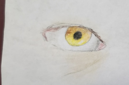

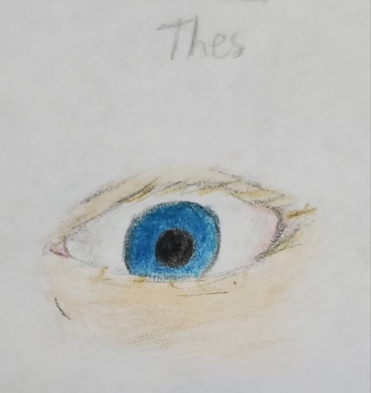
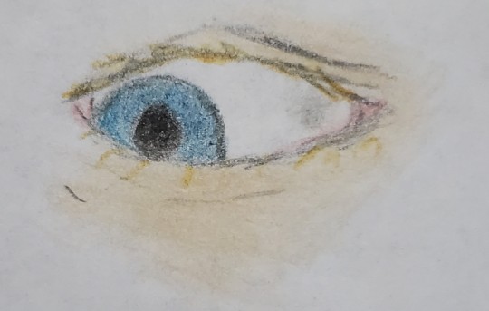
fun fact: i used the same seven colored pencils for both the thes eye and the tommy one, i just made the grayer shades more emphasized for the latter. thought that was a neat little detail.
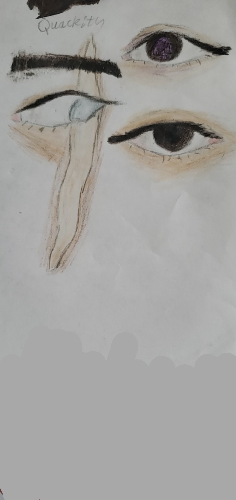
q's eye here makes his skin look a lil more purple
i impulsively gave quackity an eyebrow when i didn't sketch it before, and the way it turned out bothered me >:((
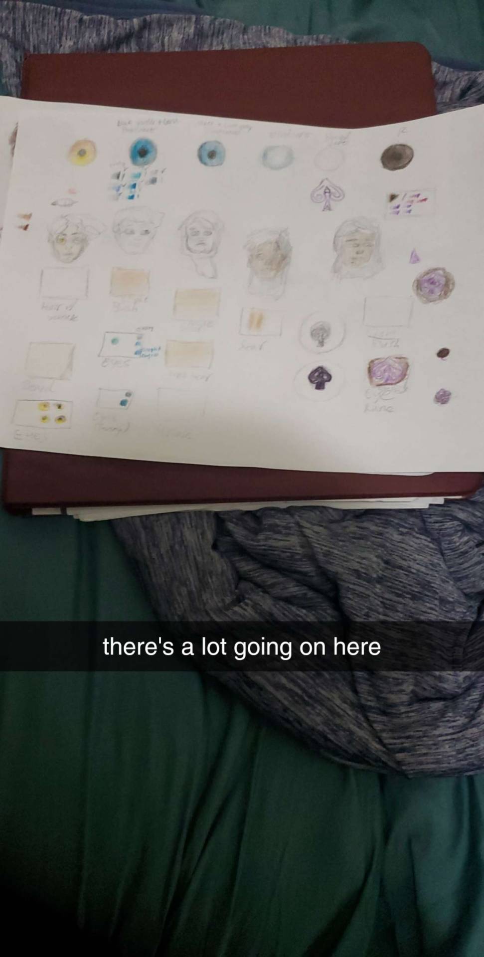
not a wip because i absolutely would never give this abomination its own post, but this is basically what my scratch paper sheet looks like when i want to test out how different colors look with each other, and also get a really, Really rough idea of what the final product will look like. this is the process i go through Every time i draw something serious. 😭
peep all 7 colors of the chaosduo's eyes under the thes eye practice
LMAO AND THE THES FACE 8 SECOND SKETCH LOOKS LIKE HE'S ON DRUGS IT'S SO SILLY
can you see me struggling to figure out how to wrap the rune around q's pupil? and also how to make the rune not just Completely disappear bc of how dark his eye is? yeah. traditional art is a pain is the ass sometimes, but i'm still wayy better at it.
also shoutout to @alexanderwesker for giving me an idea of what the rune on q's eye looks like, because i like being as accurate as i can when i draw stuff, so that was very much appreciated!
the part 2 to the hero's journey comic
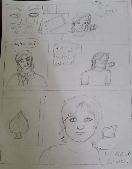
i went fucking Ham during the hero's journey assignment, so much so that i literally planned like 19 more panels than what you saw in the original post (27 panels planned in total). but then i realized that i had like Four Whole Days to do that assignment, and would definitely not be able to do that many, especially not without burning out.
so i instead settled for the very first 8 panels that i planned (though even then, i had to abridge a lot of it, and also cut slime entirely from it, bc otherwise those 8 would have been 14 whole panels, and i think i would actually die-), since that was just enough to show two different steps of the hero's journey (crossing the threshold and meeting the mentor btw. i could probably do a whole analysis on how wesker's stories fit into the hero's journey if i wanted to, but i'm lazy rn and this post is already pretty long), and that was the big grading requirement. (i got 100% on that assignment btw 💪and my english teacher still has no clue that he graded minecraft fanfiction fanart LMAO) but this one is what i would have included if i had more time on the project, and could include more of the story, but as it stands, i made this one in my own leisure, because comics are fun to do.
anyways, with that little rant aside, i tried my best to make q look younger than quackity, and really accentuate the difference between them. idk how i feel about how q turned out though.
i'm really proud of the paneling, and i'm also kinda proud of the first frame with quackity's face in particular bc i thought it looked cool, like an actual comic book or something. but i couldn't figure out the card physics or perspective and that's what ultimately made me choose to abandon it 💔 maybe i'll try attempting this page again when i'm feeling more daring (as well as the other panels that i still haven't even drawn yet), but this wip has been collecting dust for a couple of months now so i figured i'd share it here anyway.
Palido
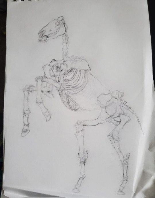
i drew palido a bit ago, but bro got somehow managed to get crinkled in my bag, even while literally being Inside of my sketchbook 🤨
it's not Too awfully noticeable though, especially bc the fold isn't On the drawing itself, so i might be able to salvage him and post a finished version someday... but i kinda halted progress on him for the time being bc of it, so here he is. </3
"Am I Still Even Me?"
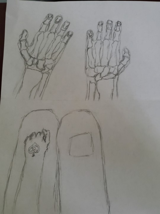
i 1000% want to redraw this someday, just because i think the idea behind it is so fucking neat.
honestly, this one wasn't too bad at all, especially since i did all of it (besides the bones bc i think my health professions teacher would be disappointed if i got them wrong, and also the rune bc i care way too much about accuracy) without any reference, which is a pretty impressive feat for me and my aphantasia. but yeahh i think it could definitely be better, and really, this drawing was ultimately something that i just drew in class to keep myself busy for a bit bc i had way too much freetime that day. it wasn't intended to be post-worthy or anything.
but i think that the idea behind it is definitely post-worthy. maybe i'll even add a thes and/or youngerbur addition once i get more information about them and just how they've changed yk.
i had no clue how to draw the bones in that position, i probably could've done more research but. yeah no i don't have an excuse, i just couldn't be bothered that day lmao.
i was also gonna bloody q's hands a bit if i ever got to the coloring stage. like a little nod to when he lost himself to Madness. is the blood actually there? who knows, we're seeing it from his eyes, so for all we know, the rune isn't even lit up either, and he's just remembering it being so. remembering the moment he acted so unlike how he used to be.
the bones are definitely there for charlie though, poor guy...
also can y'all tell that i drew the rune in like. 5 seconds. bc yeah.
i had way more wips to share but i have literally no clue where they went, and also the tumblr picture limit is getitng close so ig that's all for now </3
like for a part 2 (whenever i accumulate enough wips to warrant a post, that is)
#i reserve the right to resurrect these wips at any time#so don't be surprised if one day you see a finished/redrawn version of any of these#thaw#the house always wins#fanart for a fanfic#my art#thaw fanart#wips#the house always wins fic#thaw!charlie#thaw!quackity#thaw!q#traditional art
1 note
·
View note