#this artwork was supposed to be about hypersexuality as well
Text

Wishing you’d hold my face again
Wanting wanting wanting
.
.
.
Shitty little vent doodle
#I want to feel attractive lol#this artwork was supposed to be about hypersexuality as well#but I failed to convey that whoops#dysphoria art#vent art
0 notes
Note
Hey idk if you’re the best person to ask and I’m not trying to start anything, I don’t mean this disrespectfully but why is the new poster artist art problematic?? I’m just not very educated on the subject :)
first of all, i'd recommend looking at this post from thegrinningwheels going over the mistakes people make when drawing peter because this definitely plays into some of them. also, disclaimer that i am white, and if anyone else wants to jump in, feel free. before i start, i'd like to mention this screenshot:
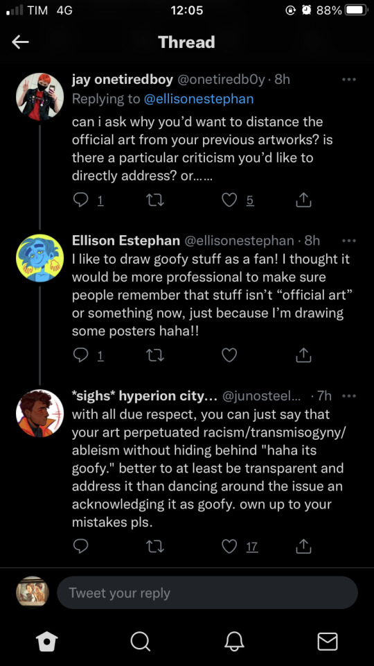
[id: a screenshotted twitter thread containing three tweets.
1. jay onetiredboy (@onetiredb0y)
can i ask why you'd want to distance the official art from your previous artworks? is there a particular criticism you'd like to directly address? or... ...
2. Ellison Estephan (@/ellisonestephan)
I like to draw goofy stuff as a fan! I thought it would be more professional to make sure people remember that stuff isn't "official art" or something now, just because I'm drawing some posters haha!!
3. *sighs* hyperion city... (@junosteel [rest is cut off])
with all due respect, you can just say that your art perpetuated racism/transmisogyny/ableism without hiding behind "haha its goofy." better to at least be transparent and address it than dancing around the issue an acknowledging it as goofy. own up to your mistakes pls. /end id]
as well as this response to harley kaner saying that people sometimes called others racist to justify bullying them (a post made about an hour or so after the artist was announced)
so they know they messed up but... yeah they're not gonna apologize
(a link to the junoverse designs for anyone who wants to follow along)
for starter’s, the way peter is drawn feels a bit like a caricature, to the point of drawing on transmisogynistic stereotypes. (stereotypes that are like, ten times more visible in their art of vespa, who is actually trans fem which i’ll get to in a second) the intersection of what it means to be a feminine gnc person and being a poc are many and varied, and there is definitely a lot to say about femininity being seen as wrong and shameful. there's a lot of history in how Asian men's femininity has been portrayed and sexualised, both in fandom & in the world at large, and sometimes white authors just aren’t capable of handling those points with care. as much as i would love to celebrate a gnc character design, i think it's safe to say that this artist's depiction of a hyper-feminine nureyev feels like a mockery rather than honest representation
also, it may not be intentional, but when you have a line-up & you're drawing the lighter characters (or at least nureyev and buddy) much more sultry & sexual than the darker ones.... that tells me something about how you view people of color. especially when the sexual way you draw those lighter characters has nothing to do with their character
a line up like this is supposed to give you an indication of character personality. this is supposed to be how you're going to present them to the world. both buddy and peter use their charisma to their advantage sometimes, but that charisma is based on their personality! though he's absolutely flirted to get what he wants, peter tries to give off the vibes of a suave gentleman. if he’s wearing a tie, it’s not going to be haphazardly put on, because he cares about his appearance. peter can be sexual, but it’s not really the way he presents himself to the world at large, and this version of him goes so far it feels like some kind of parody of ouran host club or something, which makes me feel like it’s mocking him rather than trying to honestly portray his character.
buddy meanwhile has never flirted with anyone but her wife and gets her way with confidence & force. that exaggerated body type would already be a bad look on its own because of the hypersexual way people view women of color, but with added context, it kind of feels like there's the implication that the only way these characters could be as cool & charismatic as they are is if they get their way with sex, which is just... incredibly racist
some of it is just an issue with the art style in general. a lot of cartoonish styles have exaggerated features, but there's a limit to how much you can exaggerate those features without just drawing actual stereotypes. alessandra's design makes me uncomfortable for the exact opposite reason as buddy's: cartoonishly gigantic muscles aren't really a great sight when black women are constantly seen as hypermasculine. i might be a bit too critical on this one? i feel like it was worse when i first looked at it, but there's still the fact that exaggerating an asian character's eyelids is racist. it's like. racism 101. both peter and quanyi have incredibly slitted eyes in the majority of their art & personally the way quanyi specifically is exaggerated makes her seem more…. manic, somehow? the way her eyes are lidded aren’t only racist, but make it seem like she’s constantly giving everyone bedroom eyes which is just. Oof
vespa i wanted to talk about in more detail, because there is literally not one element of this design that doesn’t scream bigotry. It reminds me so much of every terrible caricature of a trans woman i’ve seen in horror. The wild bloodshot eyes, the bloody nose, the dagger, the unkept hair & hairy armpits, the wardrobe malfunction revealing a bare chest for no other reason than shock value alone—because how else are we supposed to know what kind of woman she is? There’s already been so many films & just, media in general linking trans women to mental illness and violence. We absolutely didn’t need a vespa design that looks like she belongs in silence of the lambs. If this was just vespa holding a knife, that’d be fine! She does, canonically, have a knife that she uses. But everything about this vespa is designed to look as offputting as possible. She doesn’t look dangerous because she’s part of our cool crime family, she looks out of control. Which is exactly how vespa worries the world will see her! Taking a character who says, pretty up front that she wants to be seen as more than her violent urges & mental illness and then drawing her in a way that screams “look out! This person is dangerous and mentally ill!” is honestly unforgivable. Add that to the fact that everything about her appearance implies she’s doing womanhood “wrong” (obviously, not shaving should be considered a neutral thing, but when it’s only a trans woman character you show with hair, it’s worth considering why you feel the need to do something like that) including the fact she’s going around with her shirt slipped like that, which looks obviously oversized to fill a chest she doesn’t have. One of the first things i learned about writing trans characters is that you should never reveal a character is trans by taking a moment to emphasize how different their body looks from a cis person, be it through having someone else walk in on them in the shower or this. It’s voyeuristic and serves no purpose but to make someone’s gender seem like a dramatic twist instead of an identity that deserves respect, and if a trans artist can’t even understand that, then there’s no hope of them accurately representing literally anyone else.
according to a friend, this art had been drawn before vespa was confirmed as trans (but reposted after, so clearly they didn’t see an issue either way) but that just means they saw an angry, schizophrenic woman & decided to not just make her a harmful stereotype of a pyschotic person, but add insult to injury by making her trans as well.
This has gone on too long & i can’t type anymore, but i wanted to say the second citadel designs really aren’t any better. Every character they chose to make a poc implies something negative, such as making marc and tal the only knights of color & then placing them as nothing more than comic relief. Maybe i could believe this was part of an effort to show the white characters as part of the oppressive class if it wasn’t for didn’t seem clear that we’re supposed to see the brothers as a pair of bumbling fools. Not to mention every single other bad thing they did
EDIT: i want to emphasize that just because i’ve only talked about the junoverse designs doesn’t mean the citadel designs aren’t also worth an apology. so far, the only thing ellison has said (aside from them calling the initial line up “goofy”) is this tweet, but when they say “i wouldn’t draw those characters like that now,” that apology doesn’t acknowledge the fact that multiple people on twitter have criticized quanyi’s design for some of the reasons mentioned above. it also rings a bit more hollow when they say “i wish i could go back and design things different” because this citadel line-up was posted in late august. if you’re incline to go “well, this was in the past, and they apologized” (and i do see some proof they changed their vespa design) i’d like to remind you that some of their most recent drawings were in fact, last month, and there has been no acknowledgement they understand what was wrong with that. whoever was involved in getting a new artist for the penumbra saw these racist & homophobic designs and agreed that someone who drew that material was someone they wanted to align themselves with.
And remember, this is the second time the penumbra podcast has worked with an artist with blatantly bigoted art (the first being tumblr user disasterscenario) and i remember plenty of people explaining exactly what was wrong with that art as well. Whatever chance you think they have to learn and improve—they had it! And in response, this is what they gave us
#ask#the penumbra podcast#tpp#This definitely isn’t all i could say but hopefully it’s enough#Like i barely went into the citadel designs but a white person should definitely not be making a monkey girl brown#note: some of this has been edited for phrasing & etc#also#i didnt explain a part well & it wasnt actually super relevant so i deleted it
274 notes
·
View notes
Note
How would you fix Awakening and Fates?
Fates I don’t know, I haven’t played it so I can’t say much.
But Awakenign...well...I’d mainly change two things, the way the characters are executed and some focus of the story, let me explain.
One of the things I notice about Awakening is how contradictory it is with its characters, the famous and controversial Miss Tharja for example, she’s basically a walking Miss Fanservice but I remember seein a post in Reddit trying to defend her pointing out that in the game she’s very modest and even covers her breasts in her posts and she has no hypersexualized dialogues, which...is true...here’s the problem.
These datials are worth shit when the character is always presented in the marketing and aditional material as a sexual bomb, notice in her main artwork from AWakening and her sprite she is...yes...somewhat modest despite the outfit, but in later incarnations starting from the beach DLC, the Cipher cards and recently Heroes, she went from being modest and serious posing to showing her breasts fully and being a sexual looking character over all, which is a stark contrast to what you see in the game...and she’s not the only one with this problem, Lucina has it, Nowi has it...you can’t do that, if you want a character to be a certain way, COMMIT to it, if you want Tharja to be a modest misunderstood girl, then make her a modest misundestood girl EVERYWHERE she appears in.
Another thing is the execution, characters are designed to be walking stereotype and not people who progress, some of them do, some don’t , Cordelia for example NEVER gives up on Chrom, EVER, her ending implies she never does, her daughet says she never does, it’s really pathetic having EVERY SINGLE person who S supports her going “Yeah I know you love Chrom but...”. And this is because she’s designed to be the “poor girl who never gets her man” type, and she is not shown as anything beyond that, same can be said of EVERY SINGLE character in Awakening, they are a walking thing, Gaius is the Candy Man, Lucina is the edgy yet innocent on the inside girl, Severa is the mommy issues girl, Nah is the frustrated mature girl and they NEVER show you anything beyond this, that is not good character development, they need to have other things going on for them.
I’d say applying these changes would improve Awakening A LOT, I don’t even care that much about fanservice, I wouldn’t mind Camilla showing her tits all over the place, as long as she’s an excellent character and she doesn’t do this in moments where you’re supposed to take everything seriously.
Change the focus and execution of character, a better directing would help tremendously too.
1 note
·
View note
Last Seen Blogs

swinginturtlecopthing
제목 없음

swingjong
❝ Save me
thlasthours
🧛🏻♀️

sorrowlikefalling
sorrow :3

swinginsoulgiantfestival
Sin título