#they will look older than how I draw them in my normal artstyle
Explore tagged Tumblr posts
Visit Tumblr Blog
Explore Tumblr blogs with no restrictions, modern design and the best experience.
Last Seen Tumblr Blogs


Fun Fact
Kazakhstan’s Minister of Communications and Informatics has blocked the Tumblr site because it contained 60 sites of terrorism, extremism, and pornography in 2015.
Text
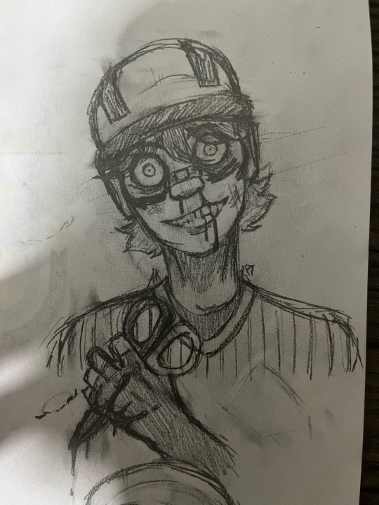
Decided to doodle someone’s Ballclone oc late night as biblically accurate as possible to Ballman’s canon appearance
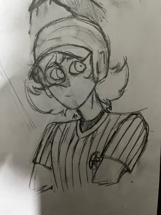
Also a bonus doodle of my Ballclone oc / OFFsona, Shortie in my normal art style to give a comparison between how I draw these two ballers
Also Nougat / 310 belongs to @dremisfreck
#AidenKnow#My Art#Aiden’s OCs#Traditional Art#Pencil Sketches#My Doodles#Doodles#For a friend#OFF#OFF Game#OFF (Game)#OFF Fangame#OFFSpinOFF#Panic In Ballville#PiB#Ballclone#NUMBERS#NUMBERS (OFF Fangame)#Short Ballman#Short Ballman (NUMBERS)#TW Scopophobia#Also been trying to see if drawing the clones as close to how Ballman looks like in canon#they will look older than how I draw them in my normal artstyle#The defining features arent that clear but at least they look like little 💩s like Ballman
15 notes
·
View notes
Note
Hi! I just have a question, how do you edit these so we’ll? I wanna start editing myself but I don’t know we’re to start or even what to use, if you have any tips that would be greatly appreciated! Thanks! ^w^
Hello! I'm not good at giving tips for this kind of stuff, but I'll try my best :D.
---
So when it comes to sprite edits, everyone has different ways on doing it, but for me overall it's just like doing a normal drawing while trying to keep the artstyle of the thing you are editing! so you are pretty much drawing extra accessories on the already existing sprite.
I use Paint Tool Sai for my edits (and for art in general);

Because it's lining tool it's very useful in edits to keep the lineart as clean as possible.
I use the line tool mostly for Kingdom sprites, but for Ovenbreak sprites free handing with the pen tool from time to time makes it flow better (especially with cookies with older sprites who have one or two lineart colors);

As for doing sprites edits that COMPLETELY changes the character (like my Jellydusa and Addie AU edits), you have to get creative.
What I did to try to maintain the art style was play Frankenstein with the sprites;

^^^^^^ That's how the rough concept looked like,,, Yeah.
Then I just sketched the armor, lined, made some touch-ups and BAM! AU JELLYDUSA.
And to clear another question; if you have/can find high quality sprites, USE THEM. don't be like me who literally recreates the whole sprites just to have it be HD... that's just more work than necessary..

P A I N...
But overall, I say just practice to see how you do. These are just the way I do edits after all, everyone edits a different way than others and who knows, you may find your own way of editing stuff.
All you have to keep in mind is keeping the art style consistent as best as you can and have fun!
Hope this was somewhat useful >.<;
12 notes
·
View notes
Note
Your art style is really cute and very fun to look at! If you don't mind me asking, how did you come up with it? Do you have any particular art inspirations or maybe references you regularly use? I also adore the way how you draw stretch marks. May I ask for some tips on that, too, please? Thank you for sharing your beautiful content with us!
Aw thank you so much! I'm so glad to hear I'm doing a good job!! My artstyle takes cues from a lot of very simple but graphic media: s/u, kir/by, meg/aman cla/ssi/c, po/kem/on, m/l/p, in/fini/ty tr/ain, and sho/vel kn/ight are all examples of things that I'll look at and try to apply to my art. If you can, I also really recommend finding individual artists to look at the work of as well, since there can be a lot of variance within shows. Don't worry if they don't "match" your style. Fa/yren is a stunning artist who's work doesn't necessarily match my style, but I study the way she draws things because there's always something to learn from others' techniques. If something about an artstyle catches your eye, observe it; figure out what about it you like and try incorporating that into your art.
It's also worth asking yourself what your goal is with your art, and working towards developing your style with that in mind. My goal with art is not necessarily to make something representational or "realistic" looking, but for the viewer to instantly be able to recognize what's going on with relatively little effort on my part, while also making an image that's pleasant to look at. Being able to shorthand certain things and whip out a shape that easily communicates an idea is a skill I've taught myself over the years, and it's what enables me to churn out art like nuts. I love the look of more naturalistic art, but I'm usually very frustrated trying to create it (I like instant gratification, which is not a compatible mindset for the amount of rendering in most representational art XD), so I'd rather make something that takes relatively little time but has a lot of spirit in it.
Something I try to keep in mind with when using my style is that nothing is set in stone; my style is fluid. If I like the way something looks, I try it out, and see how I can fit it into my art.
Drawing Sta/rscre/am's hands as rectangles with sticks attached to them in simpler drawings is an example of this; I don't normally do that, but I thought it would be cool and communicate how I think his hands look better than my usual method.
Ahaha, stretch marks! One of the things I was hoping someone would ask about!
I happen to have some pretty sizeable stretchmarks in easy-to-reach places on my body, so I have a hands-on reference for them, but if you don't happen to have any of your own, there's a few things I do to quickly communicate them.
Stretchmarks are usually in the shapes of little lightning streaks, or branches. They form where the skin stretches after a rapid change in mass. Different things cause stretch marks, so it's worth knowing that not all stretch marks will look the same; you can get stretch marks from a pubescent growth spurt, pregnancy, going on HRT, bodybuilding, and of course, an increase in weight.
Of course, they don't just lie flat on the body; they follow the curves. Here's a (very) rough drawing showing how they tend to fall with the gain of weight, and a better view of the ones on Sta/rscr/eam:
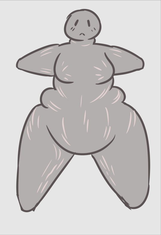
With fresh ones, they tend to be red on people, but if you're drawing, say, a giant alien from another planet, consider using the color you would use to convey blood or blush.
On older stretchmarks, they tend to be lighter than the skin around them because of the way the scar tissue forms. They have a slightly satin quality compared to the matte skin around them. This is pretty easy to replicate in digital art, because you can use a screen or lighten layer to get that effect, but if you wanna go the extra mile, you can also ad a gradient to them. The ones Sta/rscr/eam has are tinted pink and blue. If the lighting was different, I might have used different colors.
For traditional art, what I'd probably do is either use a thinned down acrylic or gouache to block them in if I were painting, or create them in the negative space while shading. They can be pretty fiddly! I'm 100% sure there are skilled traditional artists who can whip them out without struggling (If not for kink, then for the sake of creating gorgeous renders to pay homage to the classical era of art), so don't be discouraged by my lack of advice!
2 notes
·
View notes