#these two are my favourite characters and i just knew i had to redraw them to celebrate :D
Explore tagged Tumblr posts
Text

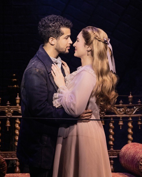
⚓️🕊️ happy sweeney todd 2023 cast recording release day!!
#I CAN’T BELIEVE IT’S HERE AAAAAAAAAAAAAAA#i listened to it on repeat while drawing this!!!!#these two are my favourite characters and i just knew i had to redraw them to celebrate :D#sweeney todd#sweeney todd broadway#sweeney todd 2023#sweeney todd musical#sweeney todd the demon barber of fleet street#sweeney todd fanart#anthony hope#johanna barker#jordan fisher#maria bilbao#nem art :)
245 notes
·
View notes
Text
Even more details about Zlatt’s design (process)

As a tailor Zlatt takes his looks quite seriously. But as a mercenary he also cares about the function of his clothes and how they can help him through the battle or any other challenging situation. There was a lot things to consider.
His first ever design when I didn’t even know what his personality would be was this:

His design was and still is inspired by D2 corvo. He used to have chains, many golden patterns that didn’t make any sense and I can say this for each peace of this design from 2021. The desing that I managed to create in the end still looks like one of Corvo’s concept artworks and I realised it only after searching for the artbook :D

Back to the process of creating it. It was awful. The clothes didn’t make sense, there was no functionality and I didn’t know how to fix it. I think I was struglling with his design for about a month of constant redrawing.

I tried to save his resemblance from earlier artworks of him where I painted him in details. But it didn’t work well for me. However, maybe I’ll use the jacket idea for the future, it’s still one of my favourite things about Zlatah’s old design. He kind of looks like a hunter, which I simply love.

I couldn’t figure out his silhouette. Sometimes it looked like Rohan or sometimes it would look like... Well
youtube
Yeah. My main goal for the design was to put an interesting mix of biker style clothing and tech wear. Here in the corner you can see the first idea for Zlatt’s design in this project:

He was supposed to have a naked shoulder where you could see an engraving tattoo of a snake. He was also supposed to have a cape and a corset. Alas, I couldn’t put it together. And I struggled further for weeks to still save this idea with the shoulder tattoo. I failed. I got stuck in this position where I didn’t know what to design for him. Until I decided to go into my old sketches folder and find this.

It’s a very old sketch of Zlatt that I forgot I had. It was a wholde different design that I’ve never used for him again. Then when I saw it I knew it was it. It felt like him, the silhouette was his, style was his. So, I got back to working on his reference sheet.
Everything was layed in front of me. I knew what to do and what I finally wanted.

I had biker tech wear and that one sketch as my final direction for the design. Then, this looks was finally born.

In game I tend to use lighter shaders and I also had these cowboy pants that I took inspro for the final design with what was above.

There are buckles and clips, two belts, shoes that could take you through many battles and you could rely on them, pretty gloves that Zlatt never changes because they’re cool and he won them on a bet, there’s funky cowboy pants. Zlatt finally has his silhoutte and style.

What just as important as the story these clothes tell = it’s all functional and the viewer can actually tell how the hell the character fits in the outfit. That was a win.
There’s another topic about his design that I’d like to address later, but for now - thank you for reading.
18 notes
·
View notes
Photo


HAPPY MOD MONDAY!
Each week we will be introducing two of our fantastic Kakairu Reverse Bang Mods!
This week will be featuring:
✨MANDA & ROCKETPUNCH✨
We asked this weeks mods Manda and Rocketpunch to share a few words about each other's favorite work!
Manda-Mandapandabug
Rocketpunch’s favorite of Manda’s work is When a Blessing Becomes a Curse
(E, 18.6k, Major Character Death)
”This has got to be one of my favourite fanfics EVER. This has it all: the pining idiots in love, the drama, the angst, the cute moments, the top quality porn, all that tied down with the funniest, most crazy story possible! Manda is a writing god and a comedy genius, I never thought I would laugh so much I cried reading an E rated fic yet HERE WE ARE. “
A fun fact about this fic from Manda: "So, that FIC! Giuseppe is based on my brother-in-law and that may be weird, but if you knew him, you’d understand. Lol! Fun fact! This is the little plot summary I made for the ending. You can see how close I got: “They eventually decide it's too much and they doink to try and break the curse. Doesn't work. But they are more and more infatuated, but trying to hide it. Eventually they confess love and the curse is broken. But it was sh*tty somehow and they awkwardly avoid one another after. Giuseppe is like ‘WTF Venus helped you and this is how you repay her?!?’ (Italian passion, Gai approves).”XD"
Rocketpunch-Rocketpunchhh
Manda's favorite work of Rocketpuch's work is... “I have two and I’m not sorry.”
Halloween Comic (CW: mentions of character death)
Flamenco Dancer Iruka
"The Halloween comic is hilarious and beautiful and just exemplifies the idiots in love trope I can’t get enough of! The second favorite (literally not in order. I cannot decide.) is this redraw from the umino hours of Iruka being absolutely stunning. The color!!! The movement!!! The EVERYTHING!!! Iruka looks so amazing I just cannot handle it.
But to be honest, I cannot decide. Every piece of art from this genius is so good I wish I could force every human (and animal really) on earth to look at them all. (Especially the perfection she captured with Giuseppe!!)"
A fun fact about this art from Rocketpunch: "Fun fact about the Halloween comic: I had the idea initially for a 90min challenge from the kakairu server but wasn’t sure if my giftee would be ok with this kind of humour, so I scrapped this for my Halloween post 🌚 Fun fact about the flamenco drawing: I sketched out so many different versions of this DTIYS (the original a lovely doll art by ShyDaredevil) but it never had the right SWOOSH to it. Drawing movement is just too hard y_y Plus never turning down an excuse to draw beauty boy Iruka B)"
Tune in next week for our next dynamic duo!
Join in the fun! Sign Ups will be live until March 26th!
#kakairu#Mod Monday#meet the mods!#mandapandabug20#rocketpunchhh#Kakairu Reverse Bang 2022#fanart#fanfic#Sign-Ups OPEN!
19 notes
·
View notes
Text
Major Character Death
Yes. I’m evil. I will make you cry. May the odds be ever in your favour.
Twist and Shout by gabriel and standbyme on AO3. (97,556 words).
Tags: AU.
My Rating: 5 stars.
Description: What begins as a transforming love between Dean Winchester and Castiel Novak in the summer of 1965 quickly derails into something far more tumultuous when Dean is drafted in the Vietnam War. Though the two both voice their relationship is one where saying goodbye is never a real truth, their story becomes fraught with the tragedy of circumstance. In an era where homosexuality was especially vulnerable, Twist and Shout is the story of the love transcending time, returning over and over in its many forms, as faithful as the sea.
Notes: First of all, this is the reason I am torturing myself and making this list. I absolutely cannot convey to you both how amazing this was and how much I cried. Seriously, I had to stop because I couldn’t physically read it at one point. Every fandom has its own Twist and Shout (I’m thinking Alone On The Water for Sherlock) and I don’t think I will ever get over this.
Kiss You When It’s Dangerous by zoemathemata on AO3. (57,593 words).
Tags: Temporary Character Death, Violence, Alternate Universe, Human Castiel, Suicide.
My Rating: 5 stars.
Description: When his partner Uriel, betrays him, Federal Agent Castiel Novak is saved from becoming a ritual sacrifice by brothers Dean and Sam Winchester. Discovering the world of the supernatural and learning about werewolves, wendigoes, vampires and things that go bump in the night also leads to learning more about Dean and the strange life he and his brother lead. The more he learns, the more Castiel finds himself drawn into Dean’s world and toward Dean himself.Until Uriel wants to complete the ritual he started.
Notes: I’m not sure if it entirely counts as Major Character Death, but it is tagged as that, so we’ll roll with it. The plot was fabulous, their relationship was as adorable as ever, and I loved it.
the inexhaustible silence of houses by Askance on AO3. (31,280 words).
Tags: Horror, Psychological Trauma, Domestic Violence.
My Rating: 5 stars.
Description: Almost two years after the world doesn't end, Castiel falls from grace—and loses his voice in the process. It is the impetus for confession and change; before long, he is settling into a loving relationship with Dean, the Winchesters are tired, and hunting for a place to land has taken precedence to hunting anything else. Dean and Castiel fall in love with the strange little house on the end of Swallowtail Drive, and for a little while life is as it should be—sweet, affectionate, and beginning afresh.But more and more Castiel sees and hears things in the house that beg the question of whether or not a place itself can be alive. The walls and rooms seem to shift and grow and breathe, and one night, Dean comes home from a hunt changed in a way that Castiel cannot explain. In the months that follow, their domestic bliss takes turns for the dark and sour, and the confusion of their circumstances will ultimately test everything Castiel knows about the man he loves, and everything he believes to be true.
Notes: Excellently written, it made me cry, and the ending was incredible.
Outrun My Gun by Misachan on AO3. (33,070 words).
Tags: Time Travel, Slash, Hurt/Comfort, Alternate Universe, Ghosts.
My Rating: 5 stars.
Description: "The two of you are so stubborn you've made Heaven blink." Finally convinced that Sam and Dean will never say yes and accept their destinies, Heaven and Hell come up with a new plan, one that will redraw the Apocalypse and make everything run much more smoothly. All they need is Dean Winchester's soul.
Notes: Very cute and slightly depressing towards the end (which is all I expect from anything tagged major character death, if I’m being honest).
Named by RC_McLachlan on AO3. (94,596 words).
Tags: Episode Related, Season 4, Alternate Canon.
My Rating: 4 stars.
Description: Jesus Christ is dead. Somehow, that isn't the worst part of Dean's week.
Notes: Weird plot, but I loved it! The plot twist was excellent, and Gabriel (plus his whole garrison) making pasta art made me laugh out loud. I only wish we could have seen Sam’s inevitable bitchfit.
A (Somewhat) Brief Biography Of Dean Winchester by smile_for_me on AO3. (3,285 words).
Tags: Character Death, Major Illness, Suicide, Suicide Notes, Hurt/Comfort, Emotional Hurt/Comfort, Hurt No Comfort, Fluff and Hurt/Comfort, Fluff, Fluff and Angst, Heaven, Sad, Sad Ending, Sad With a Happy Ending, kind of.
My Rating: 3 stars.
Description: "You shouldn't have done it," Cas whispers. Of course Cas would know what he had done, Cas always knew everything even if he didn't tell him. "I could have waited." Dean smiled, pulling back just enough to see his familiar face. "You've always been the patient one out of the two of us," he replies softly. "I couldn't wait any longer." And then Dean kisses him. And that's when Dean is finally happy.
Or, the story of how Dean met Castiel and his life became infinitely better, until it didn't.
Notes: I didn’t love it, but I didn’t hate it. It just was what it was.
The Consequences of Falling by FayJay on AO3. (37,144 words).
Tags: Dean Winchester, Sam Winchester, Ruby, Castiel, Uriel.
My Rating: 3 stars.
Description: A story in fifteen parts, in which the angel Castiel finds himself put in an untenable position, and consequentially loses his grace. In which he goes on a roadtrip with a demon, discovers the delights of tequila and french fries and pie, plays a starring role in a virgin sacrifice, is deflowered by his favourite Winchester, and then gets some very unpleasant news indeed.
Notes: I actually kind of ship Ruby and Sam in this, which is weird because I was never quite sure when watching the show (Jared and Gen are cute though).
In the Spine by Castiel_Left_His_Mark_On_Me on AO3. (5,467 words).
Tags: Castiel-centric, Original Character Death(s), Letters, Love Letters, Secrets, Angst, Post-Canon, Unrequited Love, Heartbreak, Dreams, Supportive Sam, Demons, Fallen Castiel, Human Castiel.
My Rating: 2 stars.
Description: Sam finds an old letter that Dean wrote for Castiel.
Notes: It wasn’t written particularly well so I kind of got the general gist of the work but I was mostly confused what was happening (that might just be me, though).
So, merry Christmas and a happy Halloween. I will not be held responsible for any tears shed. Also, I’m fully aware that some of these may not classify as major character death in your mind - certainly some of them didn’t for me - but the authors have tagged them all as that, and I don’t know what else to tell you. Anyway, I’m gonna go scrounge up enough money to watch season 12, so good luck, and don’t forget the ice cream.
7 notes
·
View notes
Text
Axel Scheffler
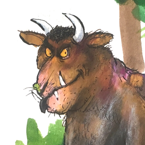
In this post, Axel takes us on a journey through his art studio and career. As well as sharing wonderful development work from some of his much-loved picturebooks, he shows us unseen sketchbook pages, early illustration commissions, etchings he made as a student, and his recent work to educate children about the coronavirus.
Visit Axel Scheffler’s website
Axel: I’m not really sure how many books I’ve illustrated in the 30+ years that I’ve been working. Over 150. I mostly work for the UK market, but occasionally I do books with German publishers. Not picturebooks though, so nothing that collides with the co-edition market.
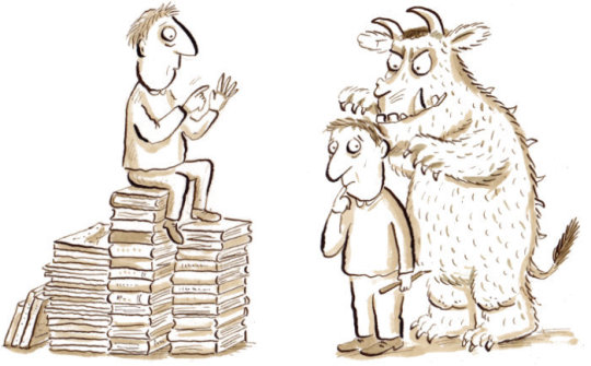
Each of the boxes you see here contains one of my books: the sketches, illustrations, dummies, alternate versions of covers, everything.
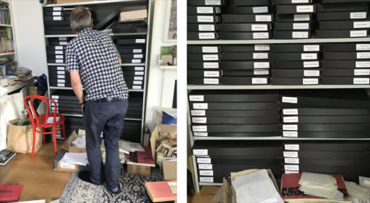
I organised these boxes with Liz, my assistant, to have all the main books there so we can find things for exhibitions. There’s still lots of drawings in these boxes which aren’t sorted yet. Liz is such a great help, but it’s very difficult for me to keep on top of everything. I think I would probably need two Lizes, or perhaps three.
So yes, I don’t really know where to begin... I’ve got endless sketchbooks and little drawings on paper. I’ve got some really old sketchbooks I could show you.
Shall we start with The Gruffalo?
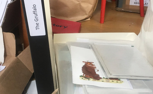
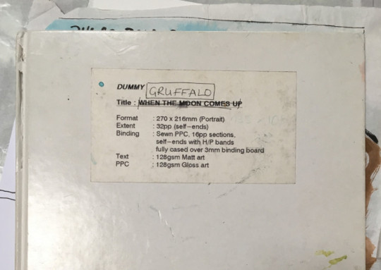
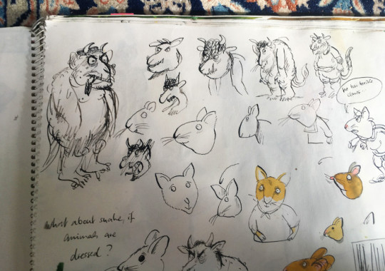
My early sketches of the Gruffalo were thought by my editor to be too scary for small children. So I had to make him a bit rounder and more ‘cuddly’. Initially, I‘d also thought that all the animals would be wearing clothes, as they often do in picturebooks. But Julia had different ideas, and to be honest I was relieved. How would I have dressed the snake?
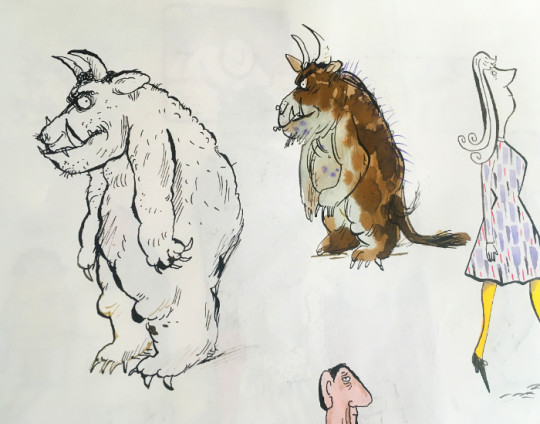
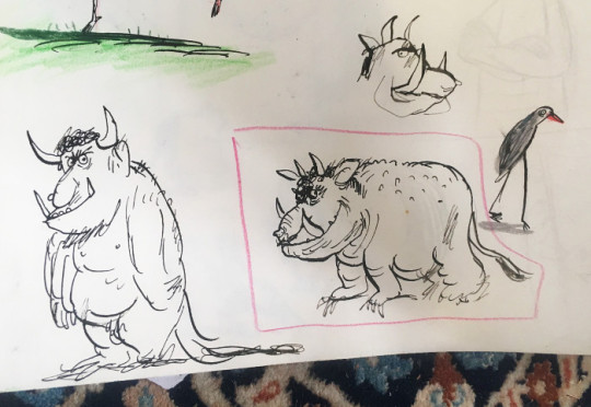
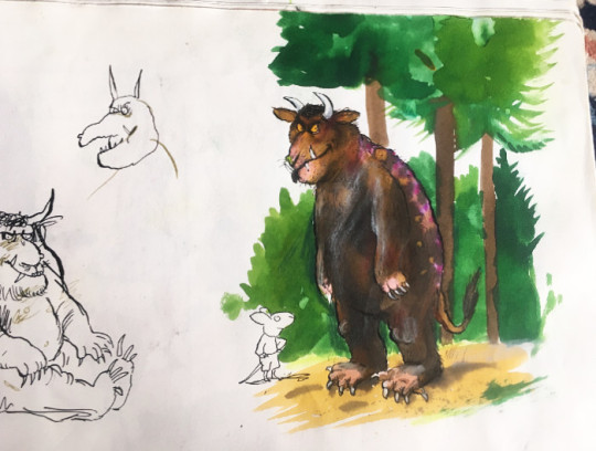
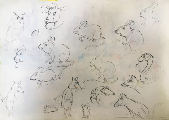
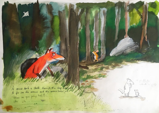
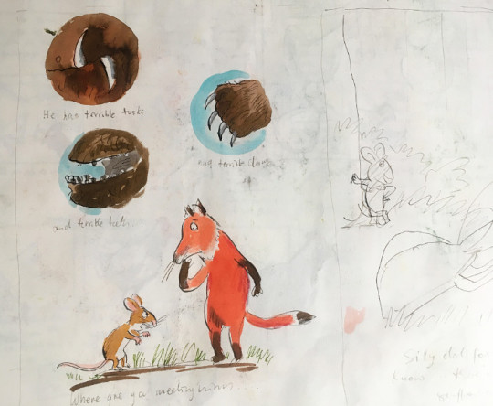
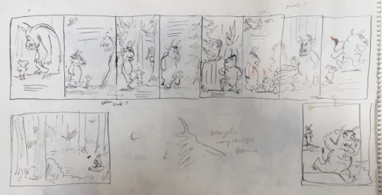
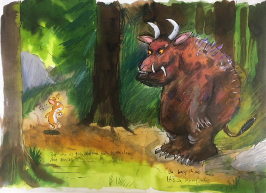
Here’s some spreads from the dummy...
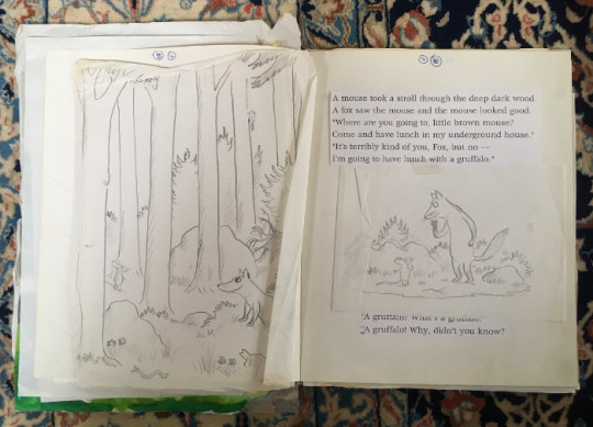
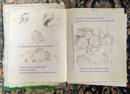
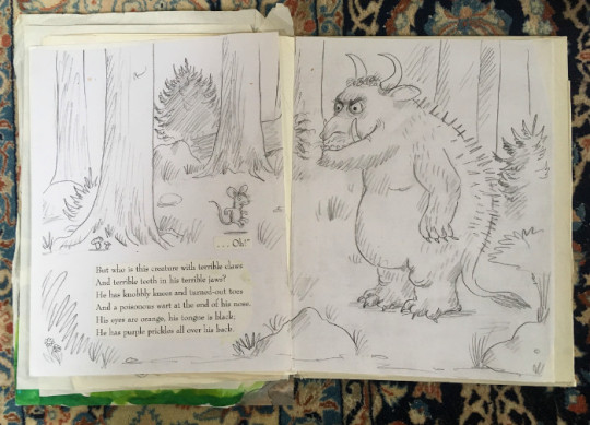
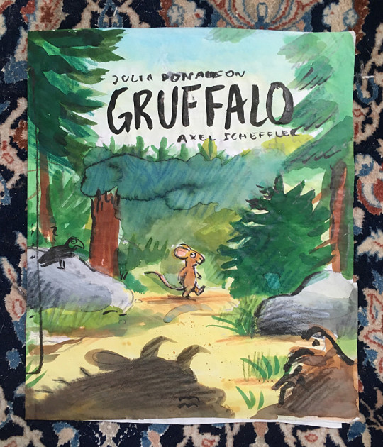
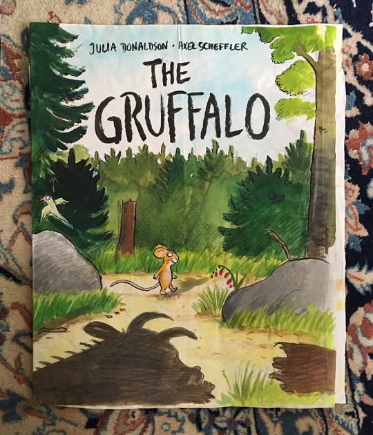
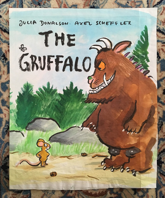
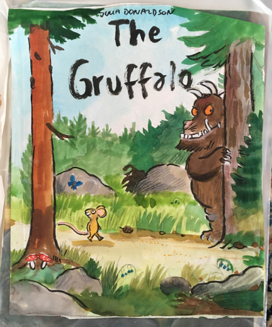
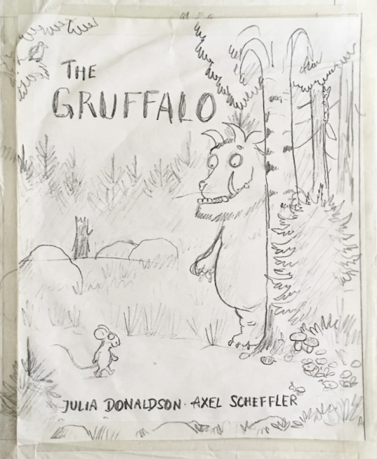
I tried a lot of alternate covers for this book; I think there were twelve in total. There’s some where the Gruffalo doesn’t even feature on the cover.
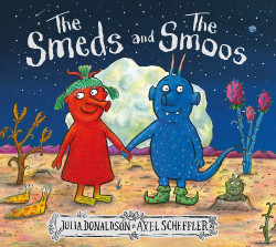
My latest book with Julia is called ‘The Smeds and The Smoos’. It was quite nice to work on because it’s so different from the other books we’ve done together. The text is a bit like a mixture between Dr Seuss and Lewis Carol; it has this nonsense element. But it’s basically Romeo and Juliet in outer space.
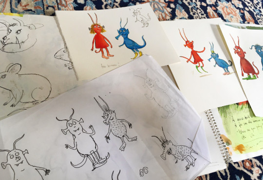
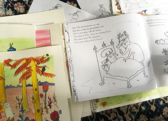
It’s an alien story, so I didn’t have to draw any rabbits or squirrels for a change, and I could invent more. I had more freedom. But like always, I got bored with drawing the same characters over and over again. But that’s picturebooks.
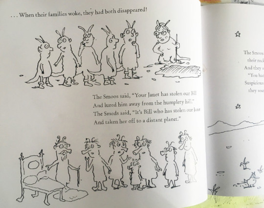
There was quite a lot of development work in the case of this book. But when it’s a story about a fox or a squirrel, I don’t do this kind of stuff. Over the years, it’s become much quicker and easier working on my books. I do far less research than I used to. Now I generally just do a quick pencil sketch then go straight to artwork.
Sometimes I have to start again because things go wrong though. This was a finished piece that was abandoned. I think I suddenly thought that the rocket was far too big or something. I do that; I work on something for ages, and then I suddenly look at it from a distance and realise that something needs redoing.
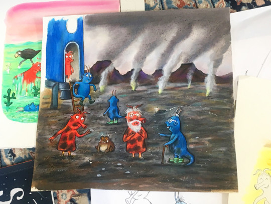
Did you spot the little Gruffalo in this picture? Since ‘The Snail and the Whale’, I’ve hidden a Gruffalo in each of my books with Julia (not ‘The Ugly Five’ though).
For almost all of the books Julia and I have done together, our editor has been Alison Green. We’re an old established team. And I’ve always worked with the publisher Kate Wilson; I followed her from Macmillan to Scholastic, and then to Nosy Crow. Julia moved from Macmillan to Scholastic, and decided to stay there. So Julia and I have some of our joint titles with Macmillan and some with Scholastic. Julia does books with other illustrators for Macmillan, and I illustrate other books for Nosy Crow.
People often ask me which of the books I’ve done with Julia is my favourite. It’s quite hard to choose, but I enjoyed working on ‘The Smartest Giant in Town’. I liked the way I could do a crazy world with animals, giants, fairytale characters, everything mixed together without anyone caring or questioning it. I’ll show you a few things from the box...
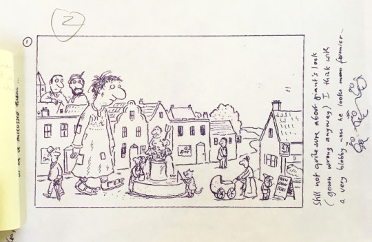
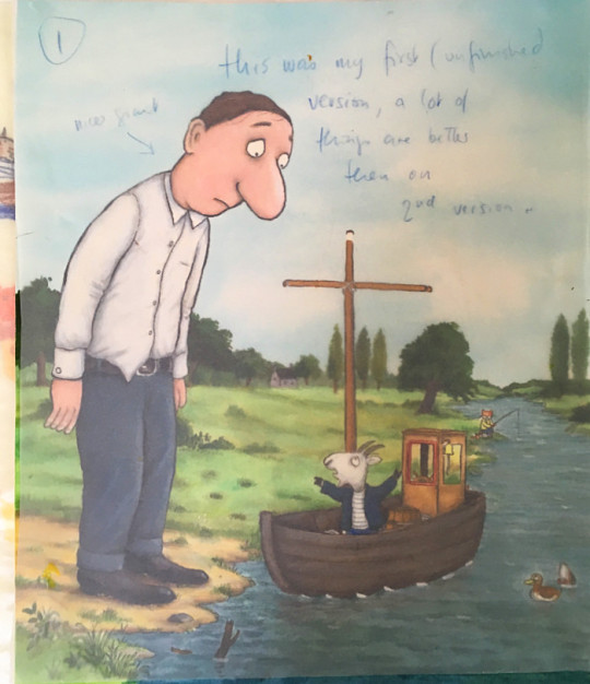
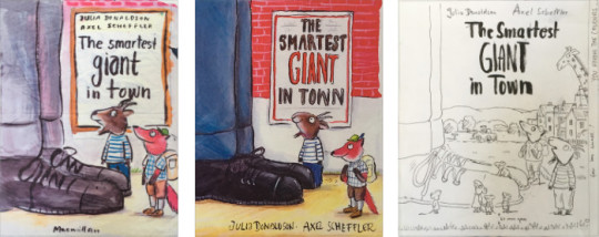
For this book, the cover was changed at the last minute. The original design had the title written on a poster stuck on a brick wall, but the sales people said they wanted a landscape, so I did another one. Years later, they used the original design for a new paperback edition, so it wasn’t completely wasted in the end.
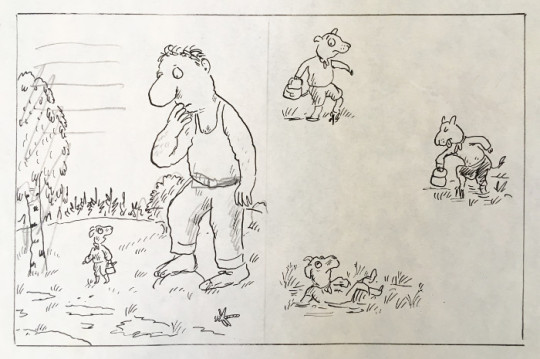
I mentioned my endless sketchbooks earlier. I’ll show you a few of them. This was mainly me playing around without thinking about what I was doing; it wasn’t a conscious thing.
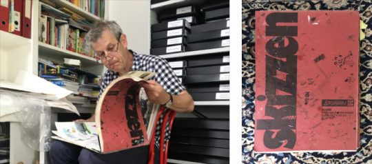
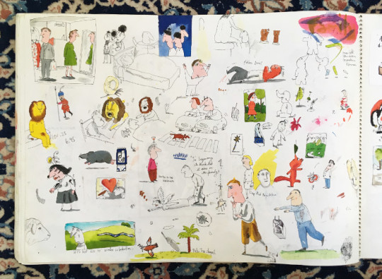
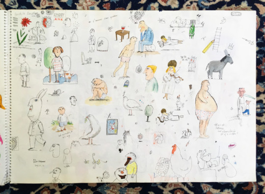
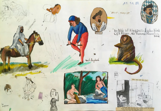
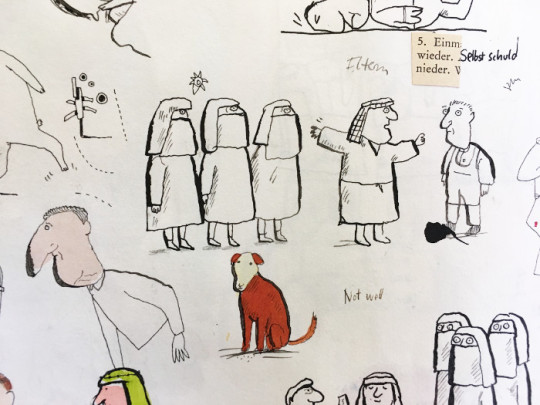
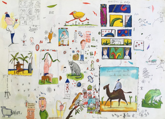
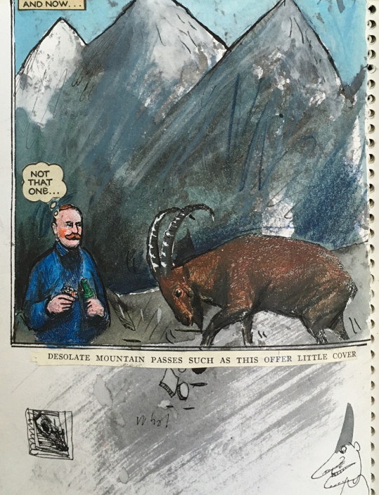
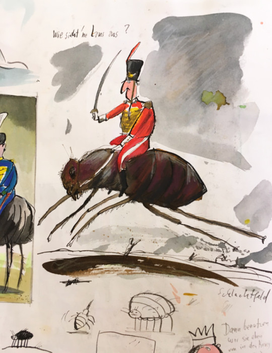
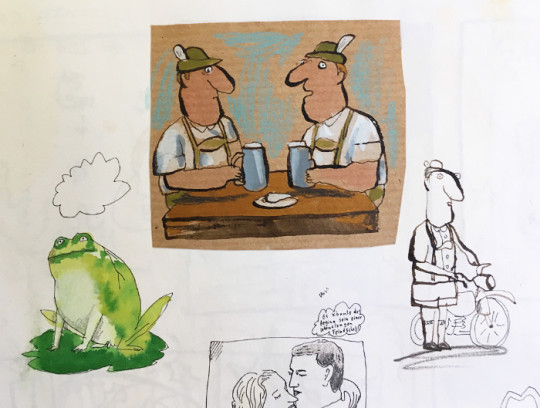
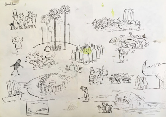
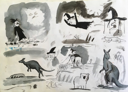
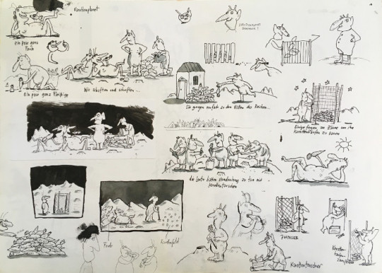
I haven’t looked at these sketchbooks for ages. It was such a long time ago. I don’t work in sketchbooks like this anymore, and I no longer doodle. But for fun, I make illustrated envelopes for friends.
I often think about doing a book with just pictures, but I’m always too busy doing other things. Posthumously, perhaps there will be time to do this. I’d also love to experiment and be more spontaneous; it’s been my dream for decades to do something completely different. But when I receive a book project, I always feel under pressure to finish it, and I’m always late with everything, so I end up doing it the way I’ve always done it.
This is my drawing table, which is and always has been too small and too messy. I think I have to accept it will always be this way.
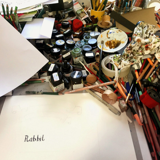
I use Saunders Waterford paper for my illustrations. It’s funny how we all have our special paper. My rough sketches are often quite small, so I have them blown up to the correct size. Then I trace the sketches on a lightbox onto my watercolour paper. After that, I draw the outlines in black ink with a dip pen. I colour everything with Ecoline inks using brushes, and then coloured pencils on top of it (I use Faber Polychromos and Prismacolour crayons). I might then need to redraw some of the black lines, or use some white gouache for highlights.
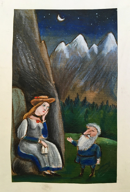
I studied History of Art in Hamburg, but left before graduating. I realised this wasn’t what I was good at; I’m not an academic.
Then I had to do my alternative service as conscientious objector. Sixteen months. There was still conscription then; that’s how old I am. I worked with mentally ill people in their homes. It was during this time that I had a friend studying ceramics at Bath Academy of Art in England. I went to visit her. I really didn’t know what else to do, so I thought maybe I could move to Bath and go to the art school. So this is what I did. The course was Visual Communications, so it was design, printmaking, photography, all that stuff. But I realised I only wanted to do illustration.
I’d gone to art college hoping to learn something. I don’t think that necessarily happened, but drawing intensively for three years was, I think, what I had needed to do. I don’t remember actually finishing any projects though.
Here’s some drawings from my student sketchbooks. I did lots of observational drawing back then, which I don’t anymore. I did it then because they told us to. I’m an obedient person!
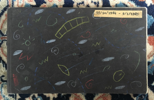
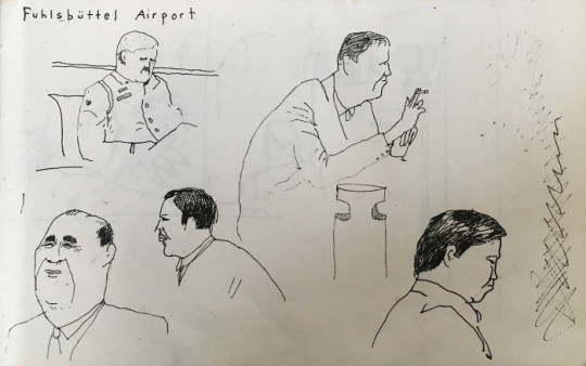
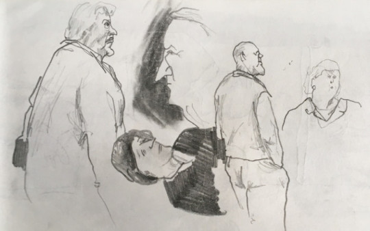
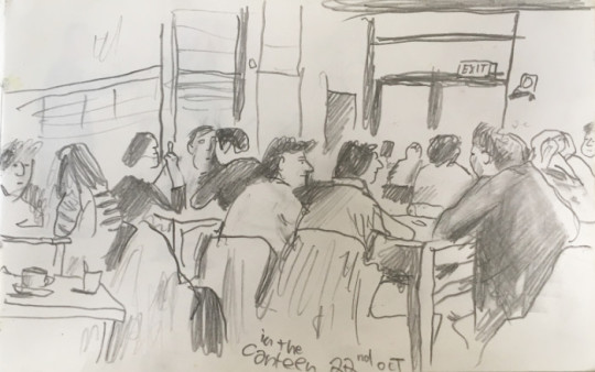
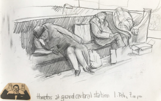
While I was a student, I did an exchange in New York: Cooper Union Art College for three months. These drawings are of Jewish immigrants, meeting for coffee. It was 1984, so many of them were still alive; refugees from Germany or Austria. I heard them speaking German, so that’s how I knew.
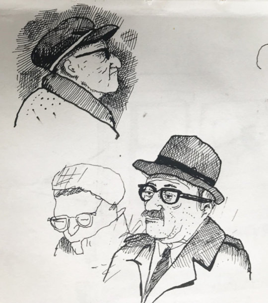
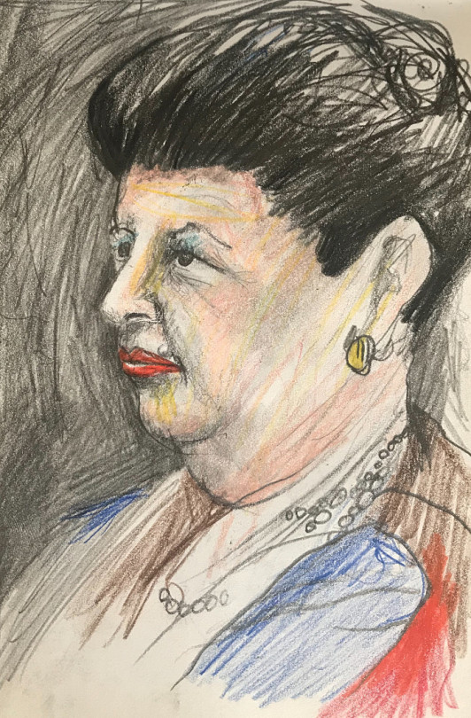
Sketchbooks are such a good way of memorising things. Nobody really knows about these sketchbooks; I used to take them to interviews, but they’ve been hidden away for years.
After I graduated, I moved to London and took my portfolio around. My art teacher had suggested I should do this to get work, so that’s what I did. In those days, you had to ring them and ask to come around. I got two commissions straight away, and it’s been busy ever since, really. I’ve always had something to do.
Here’s some of my early commissions. Starting from 1985, I guess. Very pointy noses...
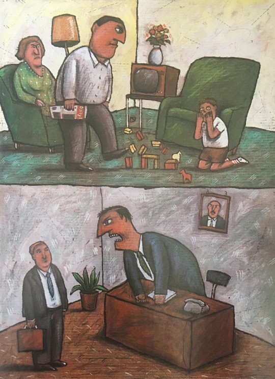
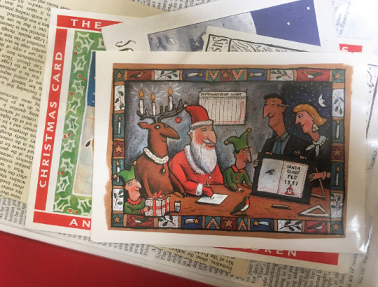
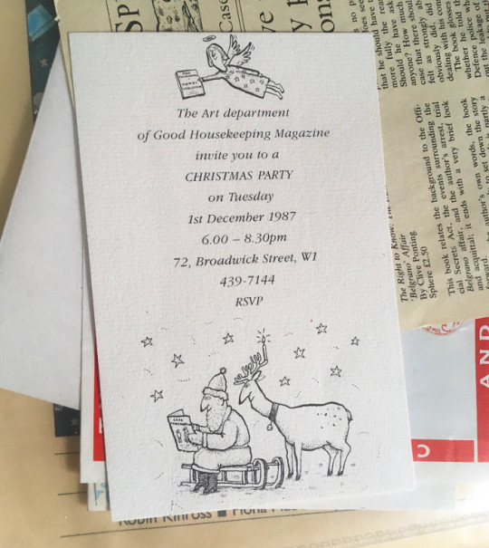
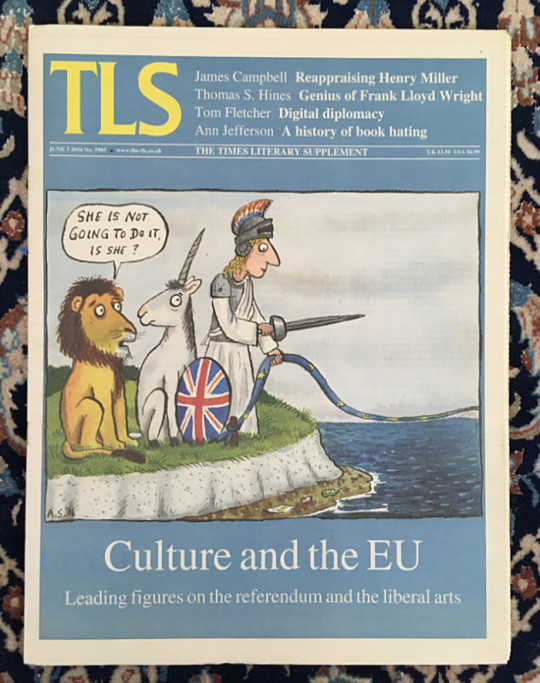
I did so much of this kind of work. It was a good way of earning money quickly. Occasionally, I still do editorial. I did some Brexit drawings for the remain campaign. Sadly, it didn’t help. Maybe I wrecked everything!
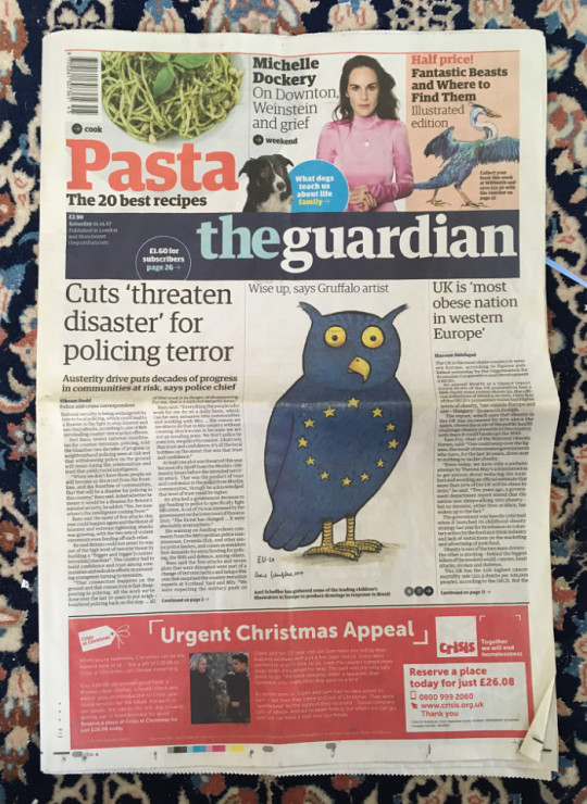
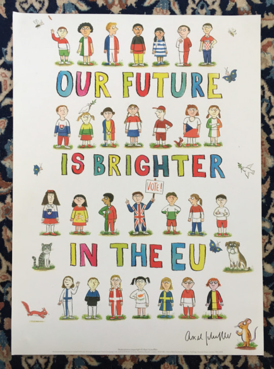
I’ll say a few words about the KIND book... 38 wonderful artists donated a picture to illustrate some of the many ways children can be kind. Such as sharing their toys or helping people from other countries to feel welcome.
One pound from each book sold goes to the Three Peas charity, which supports refugees from war-torn countries. It’s been a big success so far, and Three Peas has received a lot of money from sales in the UK and co-editions.
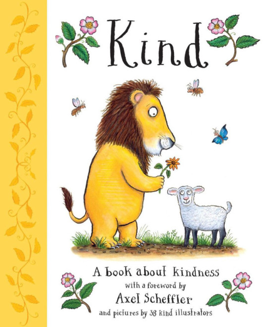
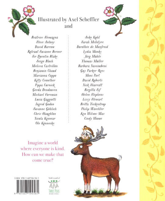
I’d quite like to do the UNKIND book next! I think illustrators would probably enjoy that, but I don’t imagine it would sell very well.
And now for something completely different! Some etchings I made when I was a student.
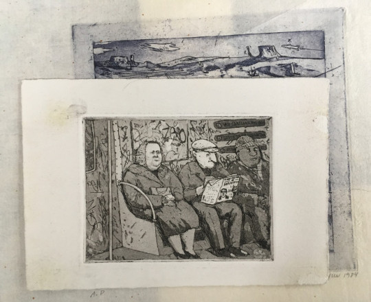
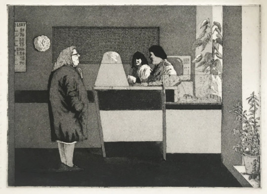
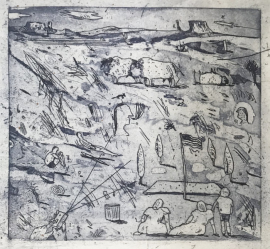
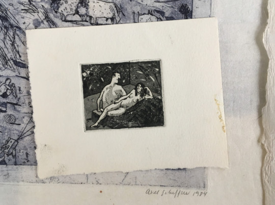
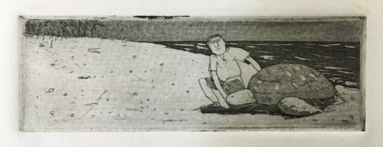

People often ask me which illustrators I’m inspired by. I don’t seek any direct influence on my work, but I’ve always said that Tomi Ungerer had the greatest influence on my approach to illustration. Although his style is quite different to mine, this humour and wackiness is something that has always appealed to me. And the details.
William Steig is someone I got into later, when I was already illustrating. And Edward Gorey of course. And Saul Steinberg. I think the Czech artist Jiří Šalamoun is wonderful. And I like Eva Lindström from Sweden a lot. She’s so great.
Okay, to finish with I’ll talk about the coronavirus work I’ve been doing...
I asked myself what I could do as a children’s illustrator to inform, as well as entertain, my readers here and abroad about the coronavirus. So I was glad when Nosy Crow asked me to illustrate a book on the subject. I think it’s extremely important for children and families to have access to reliable information in this unprecedented crisis.
You can download the free digital book in English here, and in over 60 other languages here.
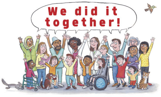
I also wanted to do something light-hearted to cheer people up, and I thought, “What if I imagine some of our characters in corona situations?” Julia liked the idea and wrote rhymes for the new scenes. This was really more about entertainment than serious information.
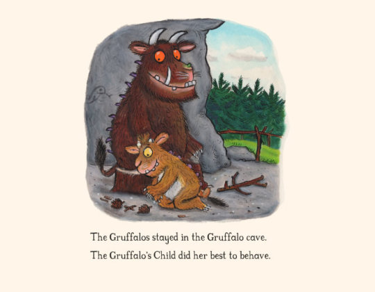
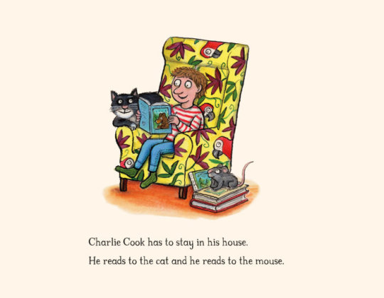
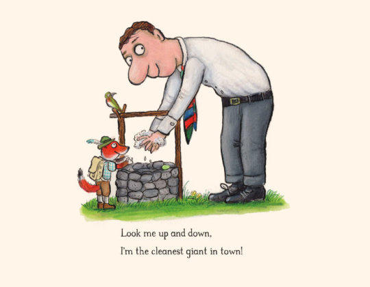
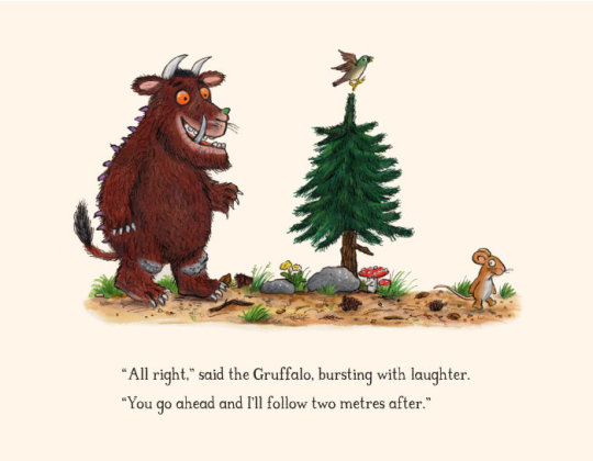
Artwork and verse © Axel Scheffler and Julia Donaldson 2020. Based on characters from ‘The Gruffalo’s Child’ (2004), ‘Charlie Cook’s Favourite Book’ (2005), ‘The Smartest Giant in Town’ (2002), and ‘The Gruffalo’ (1999) — © Macmillan Children’s Books.
And here’s one more thing: my ‘letter from lockdown’. On The Children’s Bookshow website, you’ll find lockdown letters from lots of other wonderful authors and illustrators.
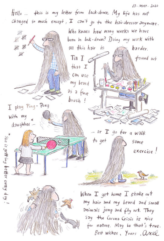
Illustrations © Axel Scheffler. Post edited by dPICTUS.
Buy this picturebook
The Gruffalo
Julia Donaldson & Axel Scheffler
Macmillan Children’s Books, UK, 1999
‘A mouse took a stroll through the deep dark wood. A fox saw the mouse and the mouse looked good.’
Walk further into the deep dark wood, and discover what happens when a quick-witted mouse comes face to face with an owl, a snake... and a hungry Gruffalo!
‘The Gruffalo’ has become a bestselling phenomenon across the world. This award-winning rhyming story of a mouse and a monster is now a modern classic, and will enchant children for years to come.
PUBLISHED IN THE FOLLOWING LANGUAGES & DIALECTS
Afrikaans
Albanian
Arabic
Australian
Azerbaijani
Basque
Belarusian
Bengali
Breton
Bulgaria
Catalan
Chinese (Simplified)
Chinese (Traditional)
Corsu
Croatian
Czech
Danish
Doric
Dundonian
Dutch
English
Esperanto
Estonian
Faroese
Farsi
Finnish
French
Frisian
Gaelic
Galician
Georgian
German
Glasgow Scots
Greek
Guernésiais
Hebrew
Hindi
Hungarian
Iceland
Indonesian
Irish
Italian
Jèrriais
Kazakh
Kölsch
Korean
Latin
Latvian
Lithuanian
Low German
Lowland Scots
Luxembourgish
Macedonian
Maltese
Manx Gaelic
Maori
Marathi
Mexican Spanish
Mongolian
Norwegian
Orcadian Scots
Polish
Portuguese
Portuguese (Brazil)
Romanian
Russian
Sami
Schwabisch
Serbian
Sesotho
Setswana
Shetland Scots
Slovakian
Slovenian
Spanish
Swedish
Swiss German
Tamil
Thai
Turkish
Ukrainian
US English
Vietnamese
Welsh
Xhosa
Zulu
Buy this picturebook
The Smeds and The Smoos
Julia Donaldson & Axel Scheffler
Alison Green Books, UK, 2019
The Smeds (who are red) never mix with the Smoos (who are blue). So when a young Smed and Smoo fall in love, their families disapprove.
But peace is restored and love conquers all in this happiest of love stories. There’s even a gorgeous purple baby to celebrate!
PUBLISHED IN THE FOLLOWING LANGUAGES
Afrikaans
Catalan
Croatian
Dutch
English
Finnish
French
German
Hebrew
Hungarian
Italian
Korean
Luxenbourghish
Polish
Russian
Slovenian
Spanish
Swedish
Turkish
Ukrainian

Buy this picturebook
Kind
Alison Green, Axel Scheffler & 38 illustrators
Alison Green Books, UK, 2019
Imagine a world where everyone is kind; how can we make that come true? With gorgeous pictures by a host of top illustrators, KIND is a timely, inspiring picturebook about the many ways children can be kind, from sharing their toys and games, to helping those from other countries feel welcome.
One pound from the sale of each printed copy will go to the Three Peas charity, which gives vital help to refugees from war-torn countries.
PUBLISHED IN THE FOLLOWING LANGUAGES
Bulgarian
Catalan
Chinese (Simplified)
Chinese (Traditional)
English
French
German
Greek
Hebrew
Italian
Korean
Netherlands
Portuguese (Brazil)
Romanian
Spanish
Swedish
Turkish
Vietnamese
2 notes
·
View notes
Text
I recently reblogged that one post where someone redrew their old oc. I thought about the same, but I don’t really have many (I mostly drew animals, pokemon and other creatures as a kid). But I did venture to the depths of my 13-year-old deviantArt gallery to see what I could find. So now it’s time for a cringe compilation on some teen’s artwork! Or so I thought, but the depressing fact is that I found a lot of stuff in my old work that I could learn a thing or two from...
Overall this post is just a place for me to get a chance to talk about older drawings nobody looks at any more so good luck to those who intend to proceed to readmore.

(2006)
There were some unkind discoveries in my tour to the past when I noticed how I had stagnated on some areas (and sometimes it even feels like regression), but it is comforting to see that there has been some development too. But seriously that is some ow the edge design right there. If you ever think about edgy deviantArt ocs you should know that I was there too.
(The angel chick looks kinda dull in comparison...)

(2007)
I did some couple dozen chibis on characters I knew (though not necessarily too well apparently, I’ve never played Disgaea). I find the poses and expressions on some of these fascinating, like nowadays I feel it’s much more common for me to draw just a generic standing pose. With this and many of the other older drawings there are some fun and expressive ideas that were beyond my ability to execute properly, but apparently I didn’t let it stop me. Now it’s more like that if something seems too difficult for me to draw I won’t even try, but back then I drew it anyway. I probably should put some effort into trying to get back to that mindset.
Part 1 & Part 2 on dA

(2009)
I have no idea how I’ve been able to create this one because the light effect. And this is drawn with Copic markers! In traditional media! So I had to get it right on the first try! And since Copics are expensive I had very limited resources!
The girls are unnamed ocs, the one on the right is the everygirl and the other one is her friend from some alternate fantasy world that changed according to the everygirl’s wishes (so it was like her imaginary world).


(2011)
This is Beta, the only oc of any substance I’ve ever had (aside from the FuwaFuwa gang I guess). She had such a grand story that it never got anywhere, but I sometimes posted drawings of her that didn’t mean anything to anyone else since her story was only in my head. I really like that winter outfit, the web is a fun design idea even if it looks like it’d get stuck on every bush branch on your way. The pic of her trying to put on a hood pisses me off because I have a feeling that if I tried to draw that today it would look worse. Maybe I should take my own advice from three paragraphs ago and try a redraw anyway
(More pics of her outfits and hair: Clothes 1, clothes 2 & hair on dA)
I also found a winter themed drawing of her which looks like an early FuwaFuwa precure.
(2012)
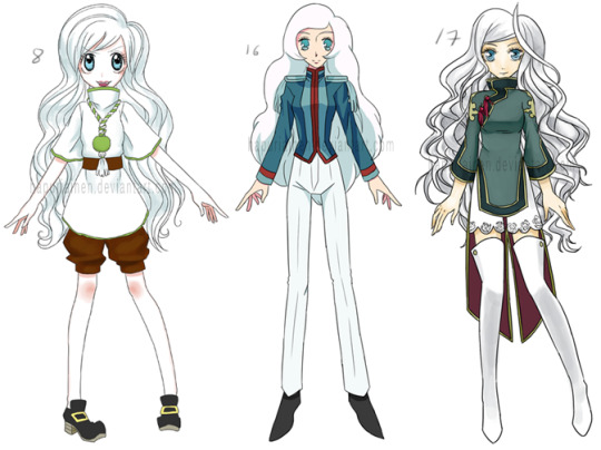
I’ve always liked style parodies and apparently I did 44 of Beta. I remember that white hair was kind of an unfortunate choice since it made colouring highlights impossible. The Precure ones looked decent enough that I think I’ll give them their own post.
(These are Sugar Sugar Rune, Utena & Trinity Blood)
all 44 on dA

(2013)
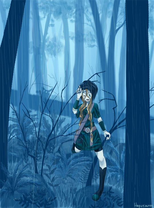
At some point I drew a lot of stuff for a Disney Princess Pokemon au, and while it has now been overthrown by Attack on Titan and magical girls I’d love to get back to it one day. Art-wise some of the best and most ambitious stuff I’ve ever done is from this au, and the first drawing on this list (that’s Merida) is one of my favourites. Granted it was done with a how-to-draw-rain tutorial so the colour palette is copied, so it’s always felt like I can’t really take proper credit of the result, but the concept and execution are still mine.
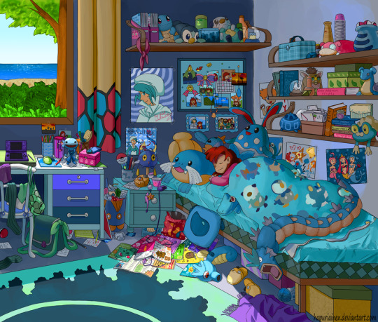
I’ve always liked ‘cluttered room’ type drawings, and I even submitted an idea for a Precure themed one for a zine. It didn’t get chosen, but I still want to draw it one day. Like, right now this instant, as if I didn’t already have enough on my to-do list.
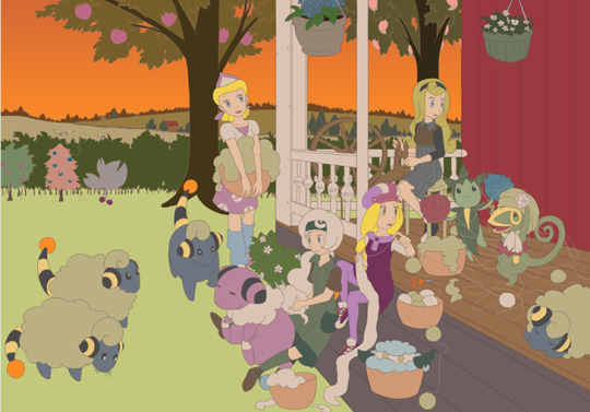
The last one was abandoned because I didn’t know how to get the colours right for a warm sunset vibe. Shame really because there’s a lot of fun stuff going on there.
full size on dA: #2 & #3
11 notes
·
View notes
Text
Fix-it Leo: Katie / KG
welcome to something im tenatively calling “fix-it leo”, where i take my really old OCs and try to make sense of them! i’ve previously done this with Shadowy, which you can read here. seeing as im redrawing & “bringing back” a few other old ocs i figured id make this a series of talking about things! unlike the Shadowy one this doesnt have pictures beyond the initial ref bc i dont want to murder my hand and im also not sure how to draw some of this
today’s subject: Katie! also known as KG.
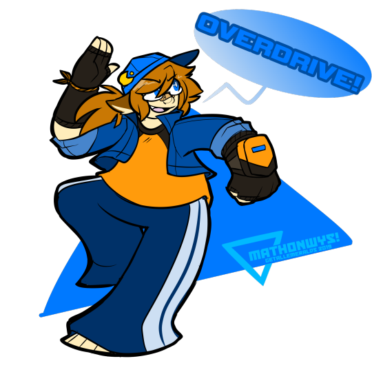
KG’s from 2010-ish, so some time after Shadowy but before the Shattered Worlds rework. to be as specific as possible, he’s from a RP setting that people that have known me closely have at least heard mentioned, if not seen snippets of it outright: KL, the massive crossover including any character and setting me & my friends wanted to RP.
as a self-insert character in crossover hell, Katie is VERY weird.
it was really hard for me to find info on Katie, because i actually had a bunch of OCs using that name that were my direct self-inserts for RP & story purposes both in and outside of KL. the unifying idea was that he was kinda just Me but in a fictional universe... and, apparently according to what info i DID find, all of the various Katies were. actually the same person, just in various conflicting situations with various conflicting backstories? so me stitching it all together got kinda weird. i did find a starting point though, so, uh... here we go!
as a general overview, Katie is pretty much just me. autistic, ADHD, likes videogames and art, bad social anxiety conflicting with desperately needing validation from everyone around him. he also has a very short temper and no volume control, which was usually a comedy thing but could also lead to him lashing out and doing/saying things he regrets, mostly hurting his friends. as a result he was kinda unpopular in his hometown... except for a small handful of friends he went to school with.
one night, he decides to go camp out with his friends to watch a meteor shower cause hes pretty fascinated by comets & shit like that. one of his friends, Elson, was acting pretty weird about it but Katie’s too excited to take much note of it up until the meteor shower “starts early” and Elson runs off into the woods. confused and startled, he gives chase. then, uh, the fucking apocalypse happens.
a lot of plot happens that im skipping over bc this is gonna be long enough as it is, but it gets revealed that Elson is actually an incognito alien named Elohim and an alien invasion is happening and wiping out civilization, and Katie is just. running out of sanity. being a main character SUCKS. he has a tragic backstory now, his friend (who he kind of had a crush on?) is an alien and is partially responsible for his tragic backstory, they join a rebellion after confirming “yeah your family’s dead as hell” and go to space, and finally find out that the leader of the aliens got a case of “jewelry makes you evil”.
they save the day obvs, with the help of some other people they ran into, and Katie has a moment of “well, fuck” bc his hometown is still extremely exploded and his family is still extremely dead and he’s like .5 miliseconds away from a mental breakdown. he then has a conversation that goes roughly like this:
person that helped them bust out of alien jail: hey, i think i know someplace you can stay katie: my house exploded person: cmon trust me
and then it turns out that that guy is actually Ninten and he’d just helped save the world with a fictional character, and before he has any opportunity to go “wait, what” he gets pulled through a portal by him and ends up somewhere totally different. more specifically, he’s now in the Earthbound universe, and his brain is going “[dial up noises]” a whole lot bc its not like his life was weird ENOUGH now he’s just... ditched his home reality??? with Ninten’s help??? and Ninten’s taking all of it in stride and ends up explaining the multiverse to him and that he’s one of the guys who ended up with the ability to worldhop and had stopped by Katie’s universe because he knew the possessed alien guy. he’s also apparently used to having to help people acclimate to massive paradigm shifts caused by multiversal fuckery.
so Katie’s just kinda trying to wrap his head around this, but takes Ninten up on his offer to go get to meet people and he goes to the Nowhere Islands! which was like, basically the hub location of KL. and then things get EXTRA surreal for Katie, because like... he used to write fanfic, and come up with story ideas that he daydreamed about a lot before everything exploded, and he bumps into Kurousu who is his OC. and there’s a lot of “UHHHH”-ing but he plays it off and befriends her, and its finally starting to sink in that yeah, he’s hanging out in this super weird crossover reality now, and he tries to make the most of it!
then some... weird things start happening. Tank, Joseph, and Vince make a jump to the Persona universe to do some plot stuff and run into Katie there, where he’s apparently joined SEES? except the last time they’d seen him, he’d been acting as a lackey to one of the arc villains because of a FMian from the Megaman universe screwing with him and taking advantage of his trauma to create a “new” Gemini Spark. and they start to write it off as “well i guess he’s like Tails where there’s some AUs of him running around” except... he recognizes them each time? but looks different and has different backstories and nothing really adds up. the next time a protagonist sees him, it’s Artemis post-getting turned into a Nobody finding Katie’s Nobody, Teixak, who apparently was very excited about getting to meet Roxas... despite, according to himself, having been living in Twilight Town for as long as he could remember. while also being very aware and very confused that that contradicts everything else about him.
teixak: eeee you mean i get to meet roxas?! he’s my favourite kingdom hearts character!! >w< rasemtix: ...you do realize you just told me youre from this universe, right? you were just explaining to me about how you lived here with leixand until the shadows attacked you two and stole your hearts. teixak: eh..? hm. ............Hm. but.... hm.
meanwhile on Katie’s end of things, he gets his heart stuffed back in his body and he reconciles with his externalized FMian-induced evil side and various other things from various other worlds, but everything feels weird and disjointed. he remembers attending school at Gekkougan, but also remembers living in Echo Ridge, but also remembers Twilight Town, but also remembers living in a boring world that got invaded by aliens where also all of this was just videogames and books and animes and OCs. and then things start getting weirder for him. he makes a joke to Artemis about “hey, remember when we got in a big fight cause i hit you with a sign?” and he doesn’t remember it. he teases Ninten about something personal and Ninten freezes up and asks him how he knows that, and Katie gets confused because he told him. he has an even more personal talk with T1, and then has the same talk later but with slightly different words. and it’s starting to look like it’s not just “various Katies”, it’s Katie also dealing with various... varieties of everyone else, and he’s pretty much spinning a wheel on “what version of events am i in today?”
he finally gets an answer after a while-- something went really weird and really wrong when Ninten first brought him into the KL multiverse. the Katie that told Gomess about the Andromeda Key is the same Katie that joined SEES is the same Katie that got his heart stolen is the same Katie that got rescued from an apocalypse, but he’s sort of... existing simultaneously in different realities with slight “adjustments” to his personal history depending on what universe he’s encountered in. he also exists “outside of canon”, so some of the weirder memories he has are from rewrites or scrapped plotlines or noncanon moments that sometimes clip into canon when theyre not supposed to. apocalypse!Katie is the “primary”/original Katie, and that’s where all his weird meta knowledge comes from.
it’s... really confusing, and nobody really “gets” it, least of all Katie himself. he just knows that he’s ended up with a bunch of cool powers, although he’s not really sure what he’s doing and has been a villain at least two universes. he also has a severe case of main character-itis (hence getting a Persona, getting his heart stolen, etc), and still isnt sure how to tell if he’s interacting with the “canon” versions of everybody or not. he’s at least unable to cause weird bizarre paradoxes by interacting with himself; trying to visit one of the universes he has an “echo” in just causes a perspective switch to the resident Katie. Katie also has access to all of his abilities as long as he’s not in a universe with a resident Katie; apocalypse!Katie has no abilities at all, starforce!Katie only has his FMian transformation, kh!Katie can only use his Keyblade, etc. this only starts being a thing after he “clicks” with his new existence.
he also has various outfits and aesthetics depending on universe, with the one i drew being his “outside canon“/default one. he gets cat ears! and Outsider eyes. Katie also has a bad habit of stealing things from universes he visits, and as a result has a collection of random things that he really shouldnt.
2 notes
·
View notes
Photo

Game Development 2 - Part Three
This post was originally published on February 12th, 2020
I don’t think character design is a particular strong point of mine, so I really wanted to take the time to assemble something I would be really proud to sculpt. When we initially began, most of the focus was on anatomy of the character - so we began looking up research and references of faces that we would want to reference.
I began looking at references of girls that were a bit younger. With the thematic of my project, I think this is an important aspect that needs to be communicated to the player - both through anatomy and through style. I collected some imagery of woman that had very “young” features like large eyes - such as Mars Argo and Frances Bean Cobain - as I thought they communicated this idea really well in their anatomy. Despite being 32, you would probably guess from her facial proportions that she’s in her early twenties.

I think that she has a really interesting face that would be nice to play around with - but at the same time, I wouldn’t want my model to fall intro the trap of feeling too animated against realism - so I’m really going to have to play to find a nice medium.
Another thing that is notable about her face is the way she sometimes applies her makeup - sometimes applying things like white to her waterlines to make her eyes appear larger. This got me thinking about the way that I will need to apply makeup to the model. While sculpting will be really important, makeup can really offset facial features, so I’m going to need to really pre-plan the way I do this long with the rest of the characters outfit.
So because of this, I began looking at different makeup looks and styles to try and compliment the themes I want to show in my game.
When I began thinking about the way I wanted to show the makeup and the outfit of the character, I knew I wanted to do something stylized and dated. The idea with the game will more be a retrospective on idolization of the past and times shifting, so I wanted the way the character looks to represent this. I began looking at makeup that felt very graphic and fun, but dated. Things that are very iconic and recognizable - I began looking at face makeup from the 60′s and 70′s.

In terms of the design of the makeup, I wanted it to feel like a nice medium between the past and the present. As someone who does their own makeup daily, I designed a few looks I wanted to try and then tested them out on myself. I thought that it would probably translate better onto a 3D model to practice the designs in 3D rather than in 2D so I had a better understanding of shape and what the makeup was doing to my features.
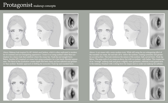
I think I liked the first look the most as it was really graphic and fun. Interestingly, the way that the eye-shadow is blocked in and the eyeliner is shaped basically creates a new lid, which creates a very large and unnatural looking eye. I thought that this would be really fun to play with. I like the softer looks as well, but I felt the more graphic look was more impactful - but most importantly, it feel the most obvious. In the other makeup looks, I was changing my anatomy with more subtly - redrawing my crease, blending and giving the look an overall more natural feel. With the graphic look it becomes heavy and unnatural, which makes the makeup easier to read in terms of knowing that is real and what isn’t when you come closer to it. Ultimately, I’ll just have to see how this translates when it comes to the final model.
At the same time, I also began looking at some of the fashion styles I wanted to replicate. I think with the ideas I had in the basis of my story - being set in California and kind of having a surf vibe to it - I thought it would be most appropriate look at a time period when this kind of culture was iconic - so I began looking for inspiration from specifically the 70′s and the 90′s - which are both iconic and unique in two separate ways.

I began looking at all kinds of things - t-shirts, bombers, shorts, skirts, patterns, rollerblades - everything I could to bring together the kind of style I wanted so that I could reference these for a board of sketches. Once I collected a good level of inspiration I really wanted to just begin sketches.
I often find when I’m doing these initial sketches I get really frustrated at the way I draw versus what I would like to accomplish. When I first began work trying to create a template for the fashion I found I was getting really frustrated, so I looked into some of the concept work in some of the video game art books I already have for inspiration.

A lot of them began with using silhouettes and colourless sketches to create a baseline aura for the character. Using these as a reference helped me create ideas on paper that were similar to what I wanted to accomplish from a character sheet and helped me feel more confident. It was really good to see how these ideas were started in industry and helps me get to a point where I wasn’t frustrated with every detail.
As I kept practicing, I finally got to a place where I created a template that I was happy to work from that didn’t feel too stiff or rigidly referenced while maintaining the seven-and-a-half-head anatomy that I needed. It helped me feel a lot more confident in the work and allowed me to create a wider range of designs and really experiment with different looks.
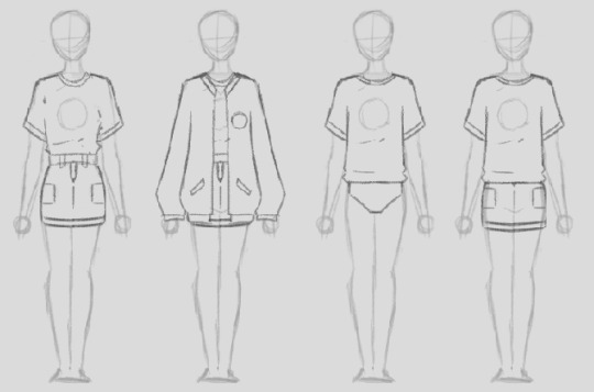
I wanted to work with a range of different styles and fits to the clothing, including in some ways that I wouldn’t consider wearing clothing. I think one thing that’s really important when considering clothing female characters is the fit of the clothes, and how you want clothes to wear and rest to meet an aesthetic. Luckily, as a woman (and an avid fan of RuPaul’s Drag Race!), I’ve had more than enough experience in this. When I did my character sketches, I really wanted to break down the look and feeling - so I went into annotation of what I was trying to accomplish with each look; why are some aspects oversized, why I specifically specify a men’s fit, why I used certain fabrics and what cultural aspects they come back to.

I felt very inspired by some of the reference imagery of the cultures of California, so I didn’t limit it to cute-skirt-and-a-totally-rad-top-I-found-on-depop. I also began looking at things like Chicana culture and other forms of fashion and expression used by minorities in California (as at this point, my character didn’t particularly have a set ethnicity or style).
Because a lot of the fashion was very graphic back then as well, I also coincided some of my designs with some graphic designs as well that I would hopefully be able to use. I referenced a lot of graphic designs, fonts, quotes and lyrics that I felt appropriate for the designs I wanted to produce:
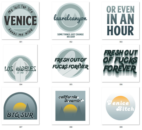
These decals were intended to be able to be used in a few different areas if I wanted to - on shirts, as patches for jackets or for jeans and skirts too.
Some of these designs were intended to be for either a front patch or a shirt design, other were things like back patches for jackets and other. I also created some designs and quotes that ran off of the backs of each other, so that I could use multiple patches with the same theme in one outfit (”some things just change in a day” / “or even in an hour”).
I referenced a lot of Californian and surf culture inspired typography. I used typefaces from different cultures as a means of getting in that “melting pot” Americana aspect that I discussed in one of my previous posts - if I don’t end up using it, I’ll definitely use it somewhere - like on environmental signage. I do really like the way it looks up against things like the surfboard so it’s definitely something to keep in mind.
In the end, I created a big large board of designs that I was considering - each with annotation and explanations to the style, fit and design choices.

I then took some of my favourites and went into more detail - did a back and a front and really tried to develop my idea and sow what I was really trying to do with the fabrics and break everything down. I was inspired by some of the concepting done in the second Alice game, where they did very specific breakdowns of everything that was relevant to the design process and referenced everything. I also think by having boards in this style, I’ll be able to communicate my design work a lot more clearly and effectively and hopefully it will look a lot cleaner in a portfolio.
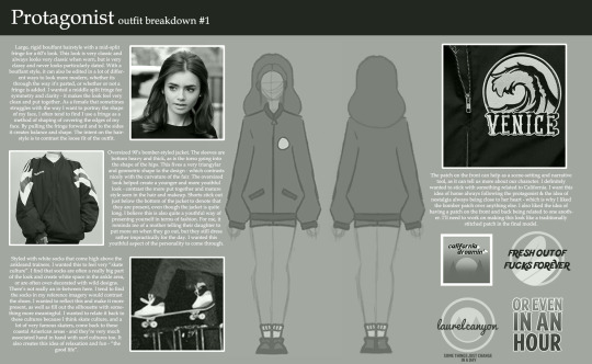
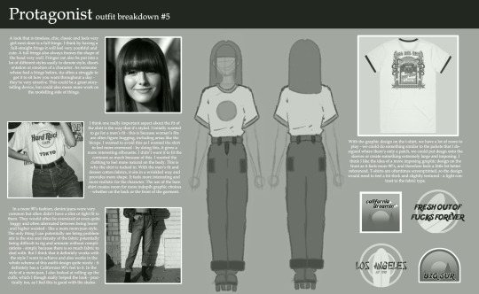
I then made a final render of the front and back of my design just for the clarity of having a definitive design.
To help me get the project on it’s feet, Danny scanned my face so that I can work from it as a base in ZBrush. I’m really excited to be able to work with the data and manipulate it. I’m not sure how it’s going to go, but I’m just going to fire through it and hopefully it’ll be an easy process.
Although, I have struggled with learning ZBrush - but I really want to push myself this time to create something I can be a lot more proud of.
0 notes