#there was no proper orange for skin and I didn't like the darker tones so do ignore how light they are
Explore tagged Tumblr posts
Text
Another picrew I found through the dash!


#✫ Out of Characters ✫ | OOC#I wasn't really that amazed by this maker but it had p decent options for galfore#and then these wonderful spikes for moonshot; that made me have to make it and share it#there was no proper orange for skin and I didn't like the darker tones so do ignore how light they are#✫ General Tag (Starfire(Canon)) ✫#✫ About (Starfire(Canon)) ✫#✫ General Tag (Blackfire(Canon)) ✫#✫ About (Blackfire(Canon)) ✫#✫ General Tag (Wildfire(Semi)) ✫#✫ About (Wildfire(Semi)) ✫#✫ General Tag (Galfore(Canon)) ✫#✫ About (Galfore(Canon)) ✫#✫ General Tag (Moonshot(OC)) ✫#✫ About (Moonshot(OC)) ✫
2 notes
·
View notes
Text
Initial thoughts on the Natlan characters now that I've had the day to simmer on them
Disclaimer: I am white. I figured I should make that clear. I just want to get my thoughts out there.
In general, I think the more modern look is very unique and something we haven't seen in Genshin Impact before, but they do feel kind of safe. They're very vibrant too, which fits all the color we've seen from the Natlan previews. Unlike a lot of the Fontaine designs initially there's few I actively dislike, but perhaps they'll grow on me, like many characters have. They just sorely need some melanin given the cultures Natlan takes inspiration from.
Ranking each character we've seen individually based on my initial impressions, from best to worst, under the cut (pictures included).
1. Xilonen
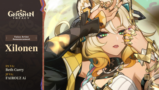
Out of everyone in the teaser she immediately caught my eye. The jaguar (or possibly other big cat) theming (as well as being a proper catgirl) and image of her lounging in a tree, bathing in sunlight gives off a sense of power. Kind of like a real big cat! But you guys probably know I tend to like the tall women a lot.
2. Mavuika
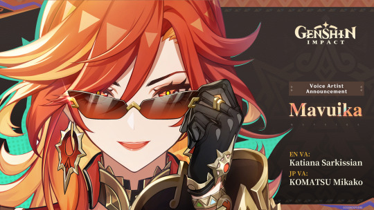
I think a lot of people, myself included, expected the Pyro Archon to be a Himeko expy and/or light-skinned. And well, she seems to be both of those. The leaks of the Pyro Archon in a conquistador outfit did have me worried given real world history, but I'm very relieved to see that isn't the case.
Seeing her in a bodysuit when I first opened YouTube did have me puzzled at first, but seeing the full outfit really brings it together. Hoyo does put a lot of research into things, so I'm interested to see any analyses on her design, too!
And the sunglasses are peak. From what I've seen it's a controversial design element, but I think it really adds to her character. She really seems like a friendly archon all around. I wonder how "war" plays into all of this.
She's also the first archon without dark or white hair--it's just straight up red. Which makes me hope she'll change up the common tropes archons tend to have (please i don't want the two archons plotline for the 4th nation in a row). is really I really liked the flame hair concepts from her leaked designs, so it's nice to see we still got that in some form here.
3. Kinich
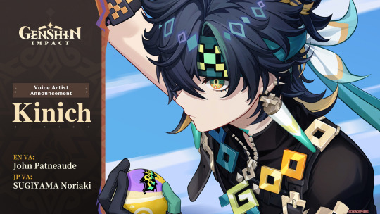
Kinich has a pretty cohesive design, and the color palette is pretty pleasing to look at, too. But I can definitely see the Xiao comparisons. I hope his personality makes him stand out from him.
The most perplexing thing about him though is how his design focuses a lot around pixels--Ajaw is a pixel dragon. The Sumeru Dendro characters do have their computer/tech themes (Alhaitham and Nahida especially, the latter of which is Irminsul's avatar), but this seems a little...much. Even when considering Natlan characters have more modern designs.
Taking the "Teyvat is a simulation" theory (and similar) in mind, I feel like Ajaw is going to play into that. Or they're just a pixel dragon because Hoyo thought it would be cool.
4. Mualani
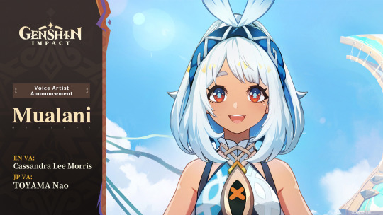
Her design makes me think she was originally designed with a darker skin tone, but late in the development process someone told the designer to make her skin lighter, so we got the tan she has today.
Honestly her and Kinich are pretty close, probably interchangeable. But the main thing that bothers me are the orange highlights on her hair. They're a little off-putting.
But overall, I think her design is cute! As a character I get the impression she's going to be chill. Like "girl next door" vibes.
5. Iansan
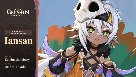
I really don't have much to say given we've seen her before, and I didn't have much to say back then either. I do hope they give her a good amount of focus given she is a Teyvat Travail character, and I think they will, given it's a pattern they haven't broken. But Hoyo does like breaking patterns... I'd rather be optimistic, though.
Iansan is, however, the first character on this list we don't know the element for. I remember thinking initially she would be Geo, but now we know of two Geo characters, surely they won't have three Geos in the Pyro Nation, right?
I think she's most likely to be Pyro, but I've seen people throw around Electro too since I heard she's named after a lightning spirit. It would make sense--she has a lot of purple in her design. But I'd like to throw out my wild guess that she's Dendro. Why? Well, her eyes are the Dendro green, and if she isn't, then it's impossible for every element to be represented by a Teyvat Travail character. And I highly doubt Pulcinella is going to be Dendro.
6. Ororon
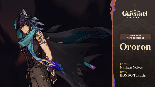
yeah that sure is a genshin character. cool cape though.
He's probably important given he's with Capitano of all people. Maybe he's a Fatuus, but I don't see any Fatui symbol on him. It would be nice to have more playable Fatui.
One thing I'm noticing just now is that he has heterochromia. Hoyo doesn't give out heterochromia willy-nilly. Definitely a mysterious character for sure.
As for element I'm pretty sure he's Anemo with how prominent teal is in his design. If that's true, he'll be our first tall Anemo man! Only took four years...
I am curious about his name, though. It every other language his name is Olorun. I wonder if the misspelling in English is intentional, or if it was just a localization error.
7. Kachina
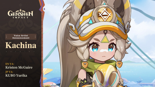
She's cute...but that's really all she has going for her. I will say, though, the big fluffy ears are unique.
but basically melanin would've saved her
8. Citlali
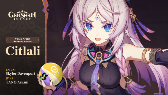
The only reason she's at this spot is because of what we've seen of her personality so far. I can't think of a particularly hot-tempered female character in Genshin, and I think she might fulfill that niche.
But her design... I think the main thing that bogs it down is the dull pink color used for her hair. With the light skin tone she has it's kind of clashing. It's nice to see another character get colored eyelashes, at least.
I...really don't know how to put my dislike of her design in words. I don't think she's the worst design in Genshin, but she's far down there.
9. Chasca
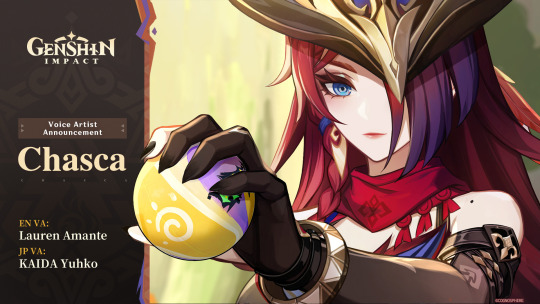
I'll be honest she just feels like Natlan Clorinde. She stands out from her as a distinct character, but they still give off the same vibe.
I like her design better than Citlali, I will give her that. She just feels kind of boring compared to everyone else.
There are a few small details that are neat--the shoulder mole, textured eyebrows, elf ears... But yeah. She'd really have to impress me to make me want to pull her.
~
So yeah, those are my thoughts. I think this will be fun to look back on later down the line, when Natlan's story is done and we've gotten to know these characters better.
I am excited to see where the story goes, but honestly I'm more excited for the exploration than anything else. It looks super fun, and I can't wait to finally get my hands on the Saurians.
2 notes
·
View notes
Text
Editing - Final Touches
Once I had added B-Roll to the sequence in the form of pictures and graphics, I showed the film to some of my peers to gain feedback. It was useful to get a fresh set of eyes on the documentary, as by this point I had been working pretty intensely on it! The general feedback was that despite having already added B-Roll to try and break it up, there was still a lot of dialogue sequences of Ros and that this caused them to lose focus. This is something that I too had picked up on, particularly regarding the middle section of the documentary, where Ros is talking about the brokerage. There was also feedback that despite Esther being a protagonist of the documentary, she did not in fact feature that heavily, and that maybe this was a problem regarding issues of representation. Again, I had been wary of this when I sent it to them and so had already begun thinking about ways to remedy it.
Regarding the Ros sequence, I took out some of the sections in which I felt the content didn't apply, or had been covered elsewhere. I aim to try and weave these clips back in to a longer cut of the doc, because they contained information that I would still like to include, but simply couldn't afford to in this case.
The issue I faced with Esther's interview was that it was made at a point in which I still believed that the doc's focus would be mental health. This, coupled with the fact that Esther responded better to more closed questions, meant that there wasn't that much to work off regarding the process of transitions. Also, Esther doesn't know about the details of her transition and so couldn't answer questions on such. However, what Esther could do was talk about the STEPs program, the next stage of her social care journey. In the STEPs program Esther will stay at Fairfield Farm College but her education will focus more on bridging the gap between college and supported living. At the time of the interview Esther had only just found out about this placement, and was very excited about it. Despite finding change stressful, this was just the right level of change to still be a 'new thing', and therefore be exciting. This provided a good ending clip of Esther talking positively about STEPs, ending the documentary on a hopeful note. It also meant that the doc was bookended by Esther, reasserting her as the central focus and one of the protagonists.
Despite saying in my presentation that I would like to make subtitles available, at this current point in time it is difficult to do on Premiere. I was able to subtitle the sequences of Esther, but to manually transcribe the whole thing would have been very time consuming. Fortunately, however, Adobe recently announced an Auto-Transcribe feature that is being trialled as a Beta on some versions of Premiere Pro 2021, with hopes to roll it out wider in the coming months. When this becomes available I will make it possible to have captions on The Inbetween, both the pilot and any future longer versions, as this issue of accessibility is very important to me. In the mean time, I will upload the video to YouTube where accurate auto-transcribed captions can be generated. On YouTube you can select whether to watch the video with or without captions, increasing the accessibility of viewing options.
After finalising the sequence, I had to go in and fine tune the colour. Both interviews were shot in different lighting conditions, and the rooms were very different colour tones. This caused issues with regulating the White Balance. The room in which Esther was interviewed was very warm toned, thus producing a picture that had a lot of reds in it. She was also positioned in front of a window and so the exposure was irregular, as in order to get her correctly exposed the background had to be overexposed. Ros, on the other hand, was in a room that was filled with blue and orange tones, and so these were strong in the picture. Also I interviewed Ros as the sun was setting, and so over the course of the hour-long interview the lighting quality decreased a lot and the shot got a lot darker. I did not have access to artificial lighting like soft-boxes or two-head lighting kits, and so had to rely on the lighting available in the room, which was also very warm.
To correct these issues I used the Lumetri plug-in on Adobe Premiere Pro. I do not have much experience with colour correction so this was a pretty steep learning curve, but with the help of some YouTube tutorials I was able to fix some of the major faults. I used the Vectroscope YUV view to work on the skin tones, as this allowed me to see the exact balance of colours, and how the alterations I was making was affecting the hue of the skin. I used the comparison view option to make sure there was continuity across the shots. The parts of Ros' interview that were shot as the sun was at its lowest were the hardest to correct exposure-wise. I attempted to correct it as best I could using an adjustment layer with an ellipse mask over her face, as this was where it was most noticeable. The tricky part was knowing where to stop, as by this point I was so immersed in the editing process and knew the clips so well that every time I watched it over I noticed a new thing that needed to be tweaked! Overall though I am happy with how the corrections turned out. Examples of some side-by-sides are below:


Esther - non-graded (left) vs graded (right)


Ros - non-graded (left) vs graded (right)
As can be seen, the grading made quite a big difference on the exposure and temperature of the shots, giving them an improved quality.
I decided to add in a music track because there were times when a graphic would be playing, without a backing audio track, and the silence felt quite jarring. I wanted music that was quite soft and upbeat, but not too noticeable. I searched several royalty free music sites and came across a track - Crowander's Who Would Have Thought - that fit perfectly. This track was free to use as long as it was not for commercial purposes (which it isn't) and that proper credit was given. I named Crowander in the credits, and provided a link to the track, which was also a condition of its use.
Again because of the difference in conditions between the rooms in which the interviews occurred, the audio levels were also affected. The room of Esther's interview was large and tall, and covered in soft furnishings, and so there was little background "fuzz", whereas the room I interviewed Ros in was a lot smaller and shorter, and had fewer soft furnishings to absorb sound, resulting in a lot of background "fuzz" and also disparities in volume levels. Using audio effects and the gain control I was able to normalise these levels against one another, and still allow the backing music to be heard. This was quite a fiddly and time consuming process but it paid off in the end.
To avoid these issues with lighting and audio in the future I'm definitely going to make sure that I have adequate lighting and sound equipment available before I start shooting!
1 note
·
View note
Text
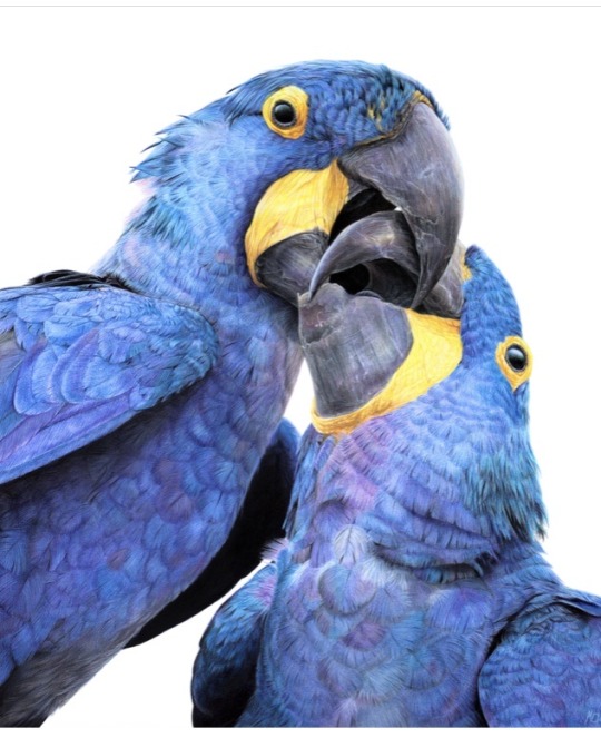
Congratulations to Monique Castellani-Kraan for winning Best in Show at the UKCPS Keswick Exhibition 2021.
Monique has kindly share some background information on her wonderful piece Kisses in Blue.
I drew my first hyacinth macaw back in 2015, and it was wonderful being able to revisit the same subject again with “Kisses in Blue”. Parrots are honestly such a delight to draw. Their colours are bright and happy, and they have so much character. I will also always jump at the chance to get out my blue coloured pencils!
I started work on this piece back in January. After a long spate of only making miniature pet commissions over the Christmas period, which was slowly sending me into a spiral of madness, I decided to overcompensate by starting my largest drawing to date, at 40 x 50cm (16 x 20 inches approx).
As someone with a background in digital painting, I like to do all of my sketches and compositions digitally nowadays to transfer to paper. That way my expensive watercolour paper stays free of eraser marks and errant sketch lines. It saves a lot of time in the long run, and if I mess up I can very easily just print out the sketch again to start over. I don't know what I'd do without my iPad!
This drawing proved to be a little intimidating because of the size I was working at. I ended up setting it aside for a few months. You know that famous "fear of the blank canvas" we've all experienced? This one hit me hard. I got a tiny section of the eye and surrounding feathers done and then proceeded to swiftly run away, back to the safety of drawing miniatures! A few months later, I finally decided to stop hiding and to give this piece a proper go. As I got into the rhythm of it I quickly felt myself being sucked into that "zone" of intense focus - where time just slips away until it's suddenly dark outside and you've skipped a meal!
Now that I had finally got my toes wet, I was gaining confidence. Art is a bit like exercise - it takes effort and routine to get into the swing of it - but once I do, I feel like I'm flying! With every new drawing I'm reminded of just how much I adore coloured pencils and how fun the process is.
Translating the reference photo’s feathers on the left macaw’s cheek was proving to be a bit of a challenge. I could only stare for so long at the complicated mess of shadows without going cross-eyed - so I decided to treat myself to tackling the beak first instead. If ever you find yourself in a rut with a painting, look for the deepest, darkest shadows in your reference, and block those in first. You will have a much easier time once they're there. Here, the darkest shadows were the inside of the macaws' mouths, so I put my much-loved Polychromos black to work, blending with paint thinner in between each layer and tinting it with Luminance Dark Indigo to get it nice and deep. Now that the darkest shadows were blocked in, I would have a much easier time in the areas surrounding it. That shadow became my reference point for judging the values for the beak, skin and feathers nearby.
I used Daler Rowney Low Odour Thinner to blend my pencils in between layers, with a flat taklon brush. I primarily used it in the first few layers of the underpainting. The yellow skin on the beak was a tricky customer with this - my blending brushes had to be impeccably clean, or else I would end up turning it green with the blues being so close by. In addition, I didn't want the very pale yellows getting contaminated by the oranges that are in the shadows. I made sure to carefully wipe my brush off thoroughly on some paper towel before blending in small areas at a time.
Beaks are so much fun to draw! They have a lot going on, from subtle colour shifts, to chips and cracks and ridges. The texture is a treat for the eyes! Here, I started by creating a gradient of soft earthy purples, greys and creams in the underpainting. At this stage I used mostly a mix of Luminance and Polychromos pencils. For underpaintings, I like to go darker than what the final result will be - though some would say I go a little TOO dark (coloured pencil is technically a light to dark workflow because they are mostly transparent).
After blending it with OMS, and making sure it's still a little damp, I go in with my pale tones from the Derwent Lightfast, Caran d'Ache Luminance and Holbein lines. These brands are soft and have more wax than oil in them, making them very creamy and more opaque than brands like Polychromos. Because the paper is still saturated with paint thinner, the pencil melts as it makes contact with the paper, making it go on super thick, even though I'm only pressing gently. This is my dirty little secret for how I work from dark to light in all of my coloured pencil pieces. The paper you're using, of course, is paramount for this technique too. If you're not using a good paper, you're going to run out of tooth extremely quickly using this technique. This piece was drawn on Saunders Waterford Hot Pressed 300gsm- and I wholeheartedly recommend it!
However, I just want to add that if you have an area or texture you want to keep REALLY light, for example a large white crack in the beak, you should draw that in first before doing anything else. That way, when you put your underpainting over it and blend with paint thinner, the white detail you added first will show through, clear as day! (This is great for whiskers on cats and dogs for example) You can also use a ceramic cutter to do this afterwards instead, though personally I have yet to use one myself.
After finishing the beaks, it was time to face the feathers on the birds’ bodies head-on. As always, I block in my darkest shadows first and then my underpainting, giving it a good blend out with plenty of OMS. This is so that I don't get lost in a sea of repeating shapes. Without doing this, I find it's very easy for your artwork to end up all the same value with not enough contrast between the highlights and shadows. I also rough in where I want each contour feather to be on the bird’s chest with a dark blue, though I only very gently line them in with my pencil so I can still move things around if needed while I build on the textures and detail.
Once the underpainting is done I am free to start pulling out those details. I went feather-by-feather, preferring to go in with my lighter coloured pencils first, gently pulling out each feather’s barbs. After that, staying mindful of how the lighting is hitting each feather, I used my mid tone and darker pencils to work in between each barb, gradually building up shadows. I also glazed in shadows over this with a very gentle hand to give the overall shape of the feather form and depth.
It can be tempting to rush through areas like this where there is lots of uniform texture, but it’s important to stay patient and take your time. Body feathers especially can become indecipherable after a certain point, because they all overlap and merge into each other. Sometimes even though the reference photo is sharp as a tack and super clear, there is just so much going on that it wouldn't 'read' well as an artwork. So I used my reference to help me with the general structure and composition, and to inform me on how the shapes and textures should look. But I didn’t stress about getting it exact.
Once you have good knowledge of a subject, after doing study sketches and looking at lots of different references, you can be a lot freer with how you approach your final artwork. A lot of the colours, textures and feather placement in ‘Kisses in Blue’ were not there in the reference. I opted to go for a much warmer, cheerful blue. The reference I was using was also fairly flat as it was taken on an overcast day, meaning the lighting was quite diffused. I made my artwork brighter than my reference material, pushing the overall contrast between the midtones and the deepest shadows. I also found myself intermingling soft lilac hues and subtle teal with my Polychromos and Luminance pencils, almost over-exaggerating the birds’ vibrancy. I tried not to stress too much about feathers either - while getting the shape and placement of feathers right on wings can be paramount to a realistic piece, the same does not apply for contour feathers and down feathers. As long as you stick to the right shapes and sizes, paying attention to the bird’s form, you don’t need to get it looking exactly like your reference.
I try my best to bring myself out of my comfort zone with each new drawing. This piece was my biggest challenge yet – quite literally. I’m glad I pushed myself to draw larger than I am used to and I can see why a lot of coloured pencil artists like working at this size – while it is more time-consuming, you have much more room to breathe and fit details in, that would normally get lost in a smaller piece. With my choice of composition and lighting, I wanted to convey a feeling of intimacy and closeness with the birds that I don’t think I would have been able to achieve were this drawing smaller.
1 note
·
View note