#there is a link to an image in the 2nd paragraph <3< /div>
Explore tagged Tumblr posts
Note
Miss, Mrs. I'm sorry I get confused if you're married or not. Ms. Evelynn. With you being a member of the KDA as one of the two singers. Alongside Ahri. What are these outfits for (Pertaining to Spirit Blossom and Coven skins)? Are they some side gigs of yours? You and Ahri.
In comes a long moment of silence, as if the woman is attempting to pick her words very carefully ( for the sake of the band, and any PR nightmares ). Eventually a hand raises as if she's going to speak, before it shifts to her temple and digits massage it gently.
" My assistant is fond of the term Miss, yet the correct term is Mrs. " Evelynn allows her hand to fall to her side, retrieving to her pocket to gather her phone. Soon she brings it back and shows her lock screen. " This is my wife, surely you know her -- she is a core member of K/DA after all. "
Away goes her phone, her expression turning more irritated. " Every member of K/DA is capable is singing, darling. In fact, it was Kai'sa who sung the lead during the chorus of POPSTARS. " Evelynn's tongue clicks for a moment, showing restraint before she continues. " I wasn't aware we had those outfits, frankly. Those must be some impressive fan edits. Perhaps I should run those ideas by Ahri, I do look hot in those. "
#» WHO DOES A GIRL HAVE TO KILL TO START ANOTHER RUNE WAR? ( ASK )#Anonymous#» HATE AND LOVE ARE JUST TWO WORDS FOR PASSION ( IC )#» V. { KDA }#there is a link to an image in the 2nd paragraph <3#as a reminder I do Spirit Blossom and Coven as seperate verses !#they are not tied into K/DA at all
7 notes
·
View notes
Text
Robin/Duela?
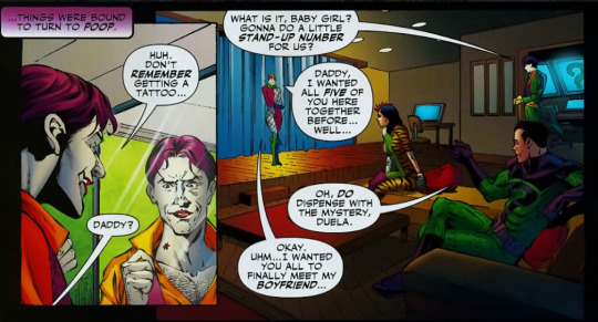
So there’s nothing in the original, 1970s text (or any of the later texts, actually) that indicates there was any romantic feeling between Robin and Duela. However, we have these. (1993 and 2021, respectively, just read the last paragraph on the 2nd image):
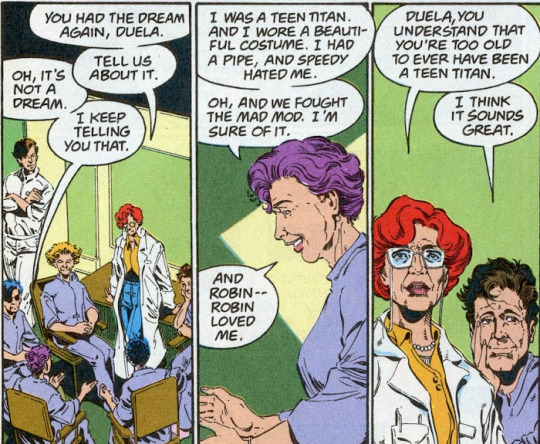

Duela and Robin - Dick - are certainly friends. They have a good rapport, they fight well together, they have nicknames for each other, they trust each other, and they seem to have a relationship outside the Titans, as civilians at the college they both attend. There is absolutely no indication that either of them feels anything beyond friendship.
If a romantic relationship had ever developed between them, I would have been totally cool with that. It could have been really cute. Enemies(ish) to friends to lovers? I’m down with it. But to come in years - decades - later - and replace an actual friendship with a romance that never existed, just for two random, throw-away lines, is a baffling choice.
It is worth noting that Duela was romantically linked, about ten years after her old lady appearance and about fifteen years before the Mal/Karen comic, with Talon.
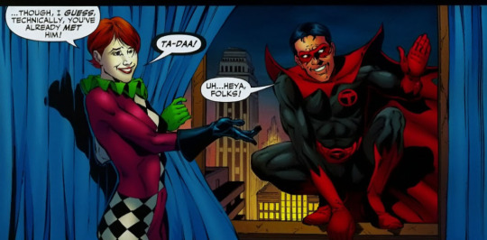
Talon is an Earth 3 character - from a world where the Justice League is evil. He’s the sidekick of Owlman, who is Earth 3′s evil Batman - basically, he’s Earth 3′s Robin-equivalent. Which means Duela may have been romantically involved with a Dick Grayson. But Talon is in a tiny handful of comics, only one of which suggests any connection between him and Dick, and it’s in a comic where Dick sees him in a drug-induced hallucination, so, like - is Talon his world’s Dick? We don’t actually know.
-
Actually! Two 70s era panels that *might* indicate romance, but they’re a little bit of a stretch:
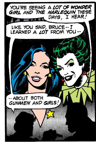
Bruce comments on the time Dick’s spending with Harlequin and Wonder Girl; Dick says he’s learned a lot about girls from Bruce.
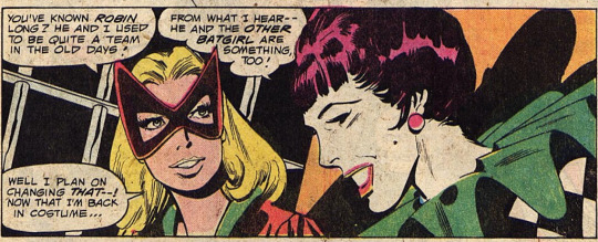
Duela calls Robin “Legs,” Bat-girl, who likes Robin, joins their group and sort of tries to stake a claim on Robin.
-
Like I said, both a stretch. I didn’t think anything of them until I reread with the context of later stories implying there was a thing.
11 notes
·
View notes
Text
on this blog, i will be writing a short book and will be posting each chapter on this page. The links to the chapters will be below this paragraph.
Chapter 1 Chapter 2
Now, onto the lore and other silly stuff
LORE:
They live in an entire community, and they all have different roles. Like the healer, the hunter, the resource manager, the writers, the poets, the enchanters, guards, and the leader- the ones that I made are all hunters, but Robin wants to be a writer or a poet, and Nyxen doesn’t know what he wants to be. And all of the creatures have the ability to shape shift into humans, so they all have human forms. I still have to make the others human forms, but the hunters usually use them the most to lure humans into a trap to then kill them and bring them back to the dens and the colony to eat. :3
CHARACTERS:


1ST IMAGE: Elyn
2ND IMAGE: Crow
3RD IMAGE: its actually Kyla, haven’t updated it
4TH IMAGE: Robin
5TH IMAGE: Nyxen
6TH IMAGE: Aspyn
7TH IMAGE: Willow.
8TH IMAGE: Nyxens human form
9TH IMAGE: Robins human form
0 notes
Text
InDesign


HOW TO CHANGE MESUREMENT MODE: InDesign -> Preferences -> Units & Increments (IMG 1) Change the Horizonal and vertical ruler units to Millimeters.
I clicked 'T' to get to the text box and then I dragged form the top left to bottom right on the screen, to change the whole screen to a text box (excluding the margins) ~ When I press Move tool (V), then I can edit in a design way. But if I don't press move tool (V), it'll think I'm trying to type on the text box.
HOW TO CHANGE COLUMN NUMBER: Select the selection tool (V), and in control panel there will be that square with lines (in image below, it says 2) Change the number in the box to change the number of columns made.
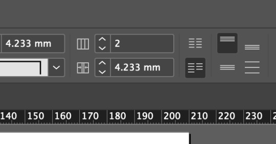
HOW TO FILL TEXT BOX WITH RANDOM LATIN TEXT: Type -> fill with placeholder text (2nd from bottom)
HOW TO USE PARAGRAPH STYLES: (IMG BELOW) Window -> style -> paragraph style Double click the [basic paragraph]
I used 'Basic character format' to make changes to the font, from a serif(curvy tails) to sans serif(blocky) I also changed the font size and leading point. Leading is the gap between the lines.
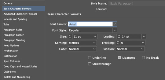
HOW TO REMOVE HYPHENATION: (IMG BELOW) Double click basic paragraph Go to hyphenate, unlick the hyphenate button
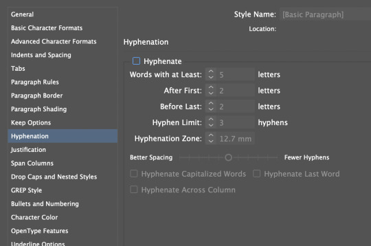
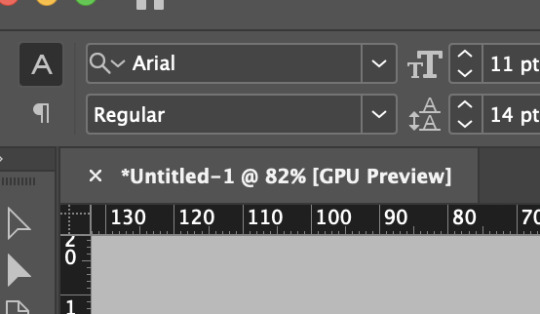
HOW TO MAKE BOLD // ITALIC TEXT ETC: (IMG BELOW) Click regular(control panel top bar) and change it.
PARAGRAPH STYLES: Highlight text Press + on paragraph styles and then double click into the new style, modify the text as i wish e.g, for a heading, enlarge and bold. Then to change other text to fit in with the new style, highlight area of text and then click the new paragraph style button, and this will connect it to have the same style as everything else selected in that layer. The effect will be applied to any text between two return buttons. MAKE SURE you pressed return after the line you wish to make a heading. By pressing return, it will treat that as a 'paragraph'. By not pressing return, it will treat everything as that paragraph. (example below is what'll happen if you don't press return - it'll effect he whole text section in that paragraph.

INDENTS AND SPACING: Space before: means the space before a paragraph Space after: means space after a PARAGRAPH, not the line.
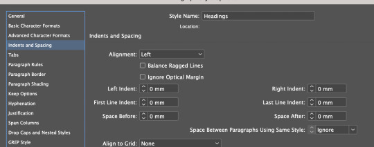
BULLET POINTS: In paragraph styles, new layer. Go to 'Bullets and Numbering' Selected list type is bullet (could be numbers) Then it showed like this: (IMG BELOW) So i fixed this by changing the indents, left indent +3 and first line indent is -3
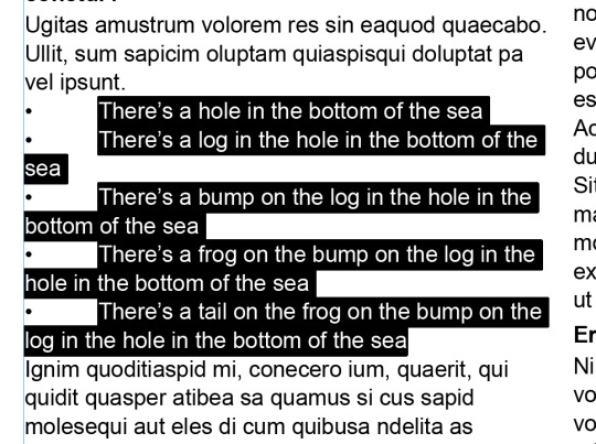

ONE LINE CHANGES: Despite this line being in a paragraph, with paragraph styles, I can still change things individually from the control panel if I highlight a specific amount of text: I added more space before for this line. (IMG BELOW)

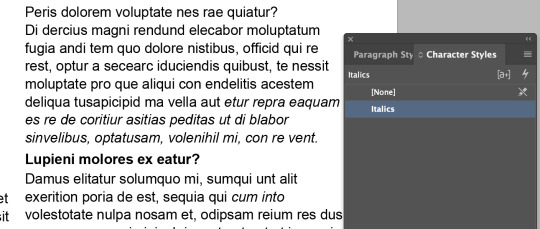
CHARACTER STYLES: Character Styles t plus button, then rename to italics,a nd then selected italics in the basic format chaacetr section. cagarcetr styles will only work on the sleected area, and not the whol prgaarph, lie aparagarph styles do.
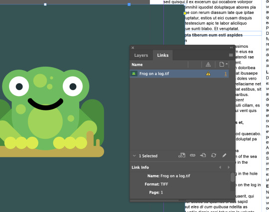
LINKED PHOTO FILES: If you have a photo in InDesign that you modified somewhere else e.g, photoshop. Then you can refresh your photo development. Window -> links. Then press the refresh button bottom right of the links panel. This will refresh the picture.
Right click the picture. Press 'reveal in finder', the image will be found in photoshop, so you know what image to work on in other applications to fix it. Only command + save, not command + save shift. NO SHIFT. Save as the same file.

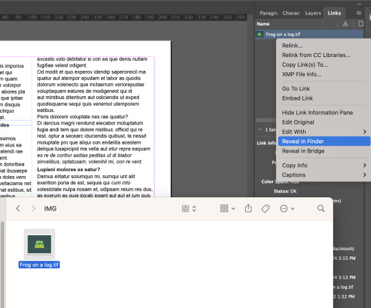
Don't drag the image by the round circle in the middle. If you do, then it will only move the image around the frame its in, which will crop it. You need to press selection tool (v) and then move the image (NOT FROM THE CIRCLE).
HOW TO RESCACLE: I + AN IMAGE within its frame
Shift + command = rescale an image Shift = crop the image, but keep the original frame shape Command = scale an image (not evenly) Option = Centers the framing Shift + Option = Centers and keep the same frame shape. Use direct selection tool (a) to adjust where image sits in the frame ~ can use to little arrow keys to so this.
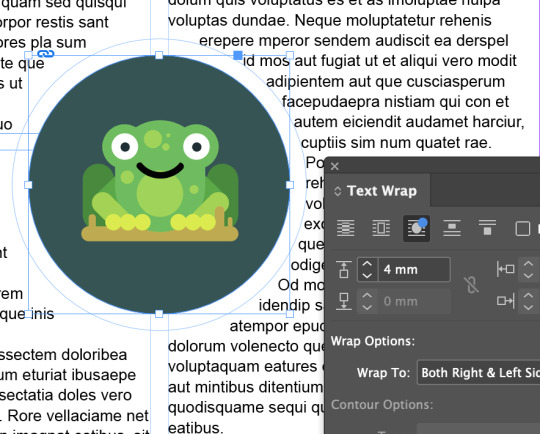
Window -> Text wrap This second icon, (shown below) will cause the text to be pushed around it, no text will be behind the image.
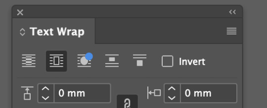
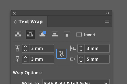
Click the chain option in the middle, (so its got a cross in it) if I want to change the distances round the image separately. (Shown below)
Make an ellipse tool (stoke only) draw a circle around the image. Click image, press command + X (this cuts out the image.) Then right click the frame of the stroke circle, then click paste into now i have an image inside a shape.
The third option, 'wrap around option shape' will wrap around the object shape. It is possible to modify the handles of the text border shape. (shown below)


REFLECTION:
I've learnt how to change measurement settings, change number of columns, change the size of the gutter gap, how to fill a text box with Latin gibberish, how to use paragraph and character styles, remove hyphenation, add spacings, indents and bullet points, and how to add in a linked image. Before this lesson I didn't know how to use InDesign. I have a small lesson on how to use it last year, but I didn't understand it so I didn't touch InDesign last year. But this lesson helped teach me the crucial basics and now I feel a lot more confident + I actually really enjoyed using InDesign as it feels very relaxing to use.
0 notes
Text
About 13.8.21
This is an ongoing update about the case from start to development. List of all related posts can be found on this blog's pinned post (link provided at bottom of each post as well).
4 December 2021 update: Added ZZH's mothers official address about the matter
9 September 2021 update: Updated major events part
22 August 2021 update: Updated 'thoughts' section
21 August 2021 update: Updated small content
16 August 2021 update: Added paragraph in purple and an important read there
Originally posted on 14 August 2021
[Disclaimer: The purpose of detailing is to let international fans know why it was a deal in China for a clearer picture, this is a cultural and political case with Internet Water Army play(link) involved, so I think having some detailed knowledge is essential.]
The huge event that broke out yesterday (13 August 2021) with him is actually a series of events related to his trip to Japan before covid-19, of which China does not condone. Yesterday was the biggest catalyst and final.
Here's a list of major events that compiled (they are all debunked and proven out of context now, this information remains here to serve as what transpired this day) - and this post link that ZZH's mother officially addressed the accusations on 3 December 2021. This is the ultimate debunk.
- Uploading a Rising Sun Flag(link) car among a spread of his Japan trip's photos on weibo in 2017
- [DEBUNKED LINK HERE] Took a photo outside Yasukuni Shrine(link) and uploaded on his 2nd instagram account in 2018. He lost this account's login details, last post update was 2018. Visiting is alright, praying (by entering) is not. This shrine is also near a tourist attraction so it's easy to think it's another attraction. The shrine angle taken in the picture, was at an unobvious angle of the Shrine.
- Attended a friend's wedding at Nogi Shrine(link) in 2019 (he is NOT a right-wing member as claimed). One of the attendees is a political figure:
- Dewi Sukarno(link), of whom ZZH took a photo with (Circulation raised only of her controversy, but note that she is a respected lady in her country)
- [DEBUNKED LINK HERE] Photo leak of ZZH sitting on Su Xiao Xiao's(link) (a famous ancient Chinese courtesan and poet) - photo seemed to be taken in his early twenties. *Note that it's an empty tomb
- [DEBUNKED link here] Posing hand gesture, with Zhe Jiang Memorial Hall of Revolutionary Martyrs(link) at the background in 2019
- Mermaid image bebunked to be photoshopped
(Please read these places and people online, Wikipedia is also fine - added the link for your quick click underlined too. Generally, the shrines' knowledge are thought by the general Chinese as basic knowledge and taboo offline, so happening consecutively every year is also seen as too coincidental that to them, ZZH did it on purpose).
Other magnified issues unless otherwise seem normal to any non-public figure:
- Took a series of photos in front of Japanese Shrines for 3 consecutive years until covid happened (it could just be a niche interest)
- Learning and speaking a bit of Japanese at his friend's wedding
- Some photos of him in Japan in 2017 uploaded on his second instagram account etc
Reception by China-Chinese:
- First of all, ZZH himself made an official apology on weibo at about 1.39pm yesterday (13 August 2021). Reception by Chinese was getting bad after the issue broke out, and at 5.35pm, he followed up with a repost by a Major Chinese Media reposting his apology, and stated his reflective attitude towards his past actions as a citizen of China. Of course, the comment section and sentiment started to become even more aggressive.
About 8 Major China's official news account reposted his apology post and they generally don't sound forgiving.
After the 6pm news, all brands withdrew their collaborations with him and by midnight today (14 August 2021), all 27 brands had cut ties with him.
- Secondly, to understand this reaction, we have to look at his fans demographics: the major age group of his fans are in the thirties to forties. This explains him topping charts for fan purchase power because this group are mostly working adults. Which also mean, closer familial ties to the after war era about 70+ years, which meant their parents or grandparents may be directly involved during the war. China was a major victim in war, thus the sentiment is very high and the hatred inbred both online and offline is extremely strict and serious. This is why the Shrines that housed the war leaders were seen as taboo. Do read up on those two Shrines, Wikipedia is okay too.
As we all know, China-Chinese place utmost importance in family, it's not limited to father & mother with siblings, it's extensions to uncles, aunt, cousins, grandparents, grandparents' siblings etc (this explains why pre-covid, Chinese people would flood the transport system to go back to their hometown for family reunion), so this war sentiment is really close. International Chinese place a somewhat lighter importance than them.
- Thirdly, (if am not wrong), he is the first celebrity to break out with such amount of political collision. Therefore, his case is deemed one of the, if not the most serious case in the industry as well. Far serious than the other shenanigans lately.
Added on 15 Aug, updated on 18 Aug post update - The Internet Water Army in China
After reading a comment and thinking through, I'm adding this because this is something I neglected to add to draw a bigger picture.
Internet Water Army is prevalent in every Entertainment industry: Phrasing, click-bait titles, twisting context, baseless assumptions, pulling down any celebrities etc.
This needs a post of its own here (link), please read and keep this in mind as well. There's nothing to beautify here, the topic itself is a cloud of negativity and played a huge role.
Maybe just a note to all that, even after this news of him broke out and there was a huge choir of Goodbyes, ZZH's followers did not dropped much at all. (Based from what I rmbed before and after the issue) His official Weibo account dropped merely from 18.9m, to 18.7m in 2 days. So if the backlash was supposed to be such a National serious Political issue, it should have at least caused more unfollows than just a mere 200,000+. Pair with 15.8.21 issue, the Internet Water Army did very well acting to their own script.
ZZH's background
Aside from the event and issue, we also have to look at ZZH's background to understand certain things before concluding.
1. Before WOH, he is a traveler. Adventurous and has many big connections internationally which not a lot of people in their thirties have to his scale. Because of his passion in basketball, he met a number of famous basketball players worldwide. In the Chinese-Korea sports show, he knew some Koreans, and his later changed interest in Golf which I believe also gained him some international golfer connections, and his connections, you can't deny is more than most people's for his age.
Those who came from an ask: 11 years in the entertainment industry
Travelled to not just Japan but Rome, Australia, Taiwan, France, Germany, Greece, Tibet (famous cycling-only trip) and a lot more in his own country etc, I'm sure for Sports purposes there are many more, everyone can tell he is a man before 29 years old, with a fulfilling travel experience, so his world, is definitely wider than the average China-Chinese.
Won't conclude to what extent, but I'm sure he is much more open-minded, and might, i stress the word 'might' be more internationalised than the average China-Chinese.
He seemed more outward that he could have neglected inwards.


2. Before he was famous, or even before WOH (which also means before meeting GJ), he is someone who shares a lot on Weibo. His opinions, his emotions and his life (eating, going out) etc. Very outdoor-sy person and open to share. But because of his looks (manly image) and certain straightforward things he said, he has a history of being cyber bullied/scolded online, by his own fans and maybe some passer-bys. During filming of WOH, his Weibo saga was just one of the many. Also, because of his straightforward captions, this issue arose.
He had represented China in the China-Korea sports show and clearly stated how he should help his teammates score back points for China (can't rmb if it was also the same for his MVP basketball period as well). His face was injured, plastered with bandages but he insisted on completing the competition for China in the sports show.
He is very passionate in both basketball and acting that he had a serious injury to his knee caused by a basketball match, then because of acting, he missed the crucial moment for recovery and went back to filming till an accident occurred again (this drama never got aired), causing permanent damage to which he can never touch his favourite basketball again (in the sense of competitive playing).
Left: Drama snippet that never got to air
Right: ZZH's dunk (not related to the injury)


In recent interviews before the whole situation, he pronounced certain chinese words wrongly, and admitted before he couldn't focus on studying much in school. So in some ways, you could tell he was more an active kid, doesn't like words.
3. After he was ZZS and got famous, and maybe also after meeting GJ, he changed. He isn't as open to sharing much online (which is normal, considering fame can increase wealth, decrease privacy) and his personality obviously internalised and became more sensitive. Much more introverted and less adventurous than last time (covid could be the reason). Reading books, concentrating on singing (mostly melancholic) and putting on a colder front (personally to hide or suppress his sensitive side) etc became much more common.
The sparks and lights of burning passion from his past isn't very visible even during February's interview or even last year (that passion is very prevalent in sports). Personally, i think he became mature, and just, quieter publicly (maybe because it's not sports and the event's nature), except when he's with GJ.
Back to topic
Bringing up his background was not to defuse what he had done. As I said from the start, knowledge is essential, even the person involved and the Media because it helps people to understand and see a bigger picture.
The fact that war's cruelty and hell hole is not fiction and happened in this one generation where there are still people alive to tell their experiences, is a magnitude of its own.
Politics between China and Japan is very strained also mainly because Japan never admitted to the war and certain memorials of their war leaders are still controversially honored which is why it is a huge thing.
The Internet Water Army is also a cause of concern because in this case, they were definitely hired.
Conclusion
You can make your own whole conclusion no matter your background on this but please do so with enough information from all sides: The political aspect, ZZH himself and the Internet Water Army (link).
Thoughts (on 14 August 2021)
For those who had moved on from the Political aspect, you may scroll below for bonus or read about Internet Water Army.
22 August 2021 update: The landscape has changed so this part onwards may be irrelevant (due to IWA). If anyone would like read on, feel free to.
We are all humans the first time, we experience every year and age for the first time. To me unless one did lowly things or killed a person, they are still forgivable. Then again, I'm just an international fan, but ZZH's career is in China.
Knowing ZZH for 5 months and will still continue to, I find he has changed. It's like seeing your son or brother or friend growing and changing after WOH happened. While he did what he did in the past, I'm sure the him now even before this situation arise, would be more cautious on these.
The line between a public figure and commoner is one step across but the difference in reception to the same actions are astronomical. He wasn't famous before, it's more forgivable, he didn't do it when he was famous, but should his past determine his future and his person now?
As an international chinese fan, his whole situation isn't a problem to me in the first place. My first reaction was barely just "Oh. So?" So painting a bigger picture got me to understand more. After learning, it became more of wanting to be there for him. Forgive, dont forget.
My own family lineage has a fair share of war stories directly in China, they are running in my blood real and utterly painful. How can it be easy for those directly involved to move on?
If anything else for me now, it just adds one thing to note about him. That's all. Move on.
Generally, he did something not right, so he will need to bear the outcome, as long as he learns from it, is there a reason not to forgive?
Having done the Fate Series before, I'm once again appalled by it. It may be negative this time, but the scale is also...and how much the whole landscape changed because of his case in a span of one week. Lie down everyone, the road before was paved by IWAs, the road foreward will be their consequences. Lie down and watch.
Bonus
Since today (14.8.21) is Chinese Valentine's Day, one of ZZH's buddy posted this:
"Although many things happened lately, I still hope everyone can spend a happy Valentine's Day on this (beautifully) great occassion.
Wishing everyone a Happy Valentine's Day~"
Related posts 🛏️:
- End -
397 notes
·
View notes
Text
Japan Girl’s Fest 3 - Hakuoki Drama “Screen Door Encounter” Translation
First post of the month, so I’ll start by asking you to please support me if you can either on ko-fi, through paypal or through patreon which gives early access to my stuff and blog translations…. also let me know if you have any hakuoki drama cds that you’d be willing to share that are on my looking for list since i either do not have audio for those cds or do not have audio that i can share...
Also, Happy Canada Day~!
Anyway, when I decided I’d try my hand at translating Hakuoki content, this was one of the very first live dramas that I really wanted to have translated (for the record the 2011 otomate party reimeiroku drama was 2nd tho i only found tl for that recently)... and while I did have translations for the drama itself, I am missing CH TL for some of the introductory dialogue that occurs before it... and the JP>ENG translations (not done by me) that I’ve included on this are from people who don’t really really Japanese (they both weren’t certain), which are for the two sets of words on pink backgrounds (first 2 images attached under the cut). If anyone can translate that text better, please send me a message since i’ll be cutting the intro off what i post to youtube otherwise [will include credit and can provide clean video +srt file if helping].
On top of that, I also didn’t have the drama’s name for the longest time (hence why i referred to this as ‘Unknown Drama’). Thankfully, the TL help I received from my friends was enough for that tho...
The format for this post has been done a bit oddly due to how i had to copy the subtitles for this line by line (it was off a video), and I never bothered to properly put the text into paragraphs and sentences due to how this was done off of community created subtitles (basically viewers contributed to the translation via the text barrage) on bilibi that showed up on the video at odd and not exactly precise timings....
As always, final edits will be done on the video... will have it done for this month.
link of the video i used for CH TL at the very bottom if interested in watching.
Enjoy~ this month is all non-game translations!
Japan Girl’s Fest 3 - Hakuoki Drama “Screen Door Encounter”
Translation by KumoriYami
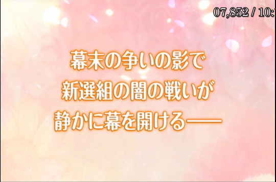
^???? one of my friends says this should be something like: “The dark battle of the Shinsengumi begins quietly in the shadows of the Shogunate's conflict" while other says “The dark Battle of the Shinsengumi opens quietly in the shadow of the Battle of the shogunate.”
Narrator: [is this a time of] A time of repelling foreigners or the opening of a country?
All kinds of sweeping change occur [during the] country's age of unrest.
Bakumatsu.
In order to look for your father who is a Western doctor,
you've left home to live with the Shinsengumi,
Experience these turbulent times with the members of the Shinsengumi
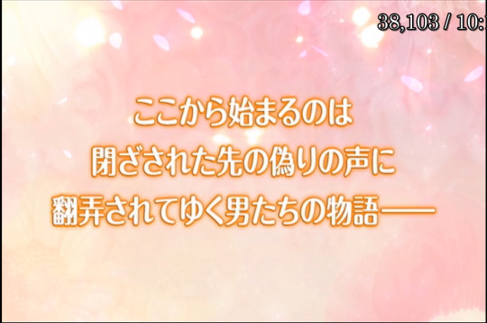
^ also have no tl for this or what is narrated here, though google mtl says the text’s pronunciation kinda matches the audio here
TL is something among the lines of: “what begins here is the determined story of men thrown around by the voices of deception.” (TLN: I don't really know how to accurately translate 閉ざ��れた先, but it essentially means a predetermined destination) or “It starts with the story of a man who is at the mercy of a closed-off, untruthful voice.” so I’d guess something is among the lines of “What begins here is the fateful story that begins with being at the mercy of a man with a cold and uncaring voice.” or something or other?

Hakuoki
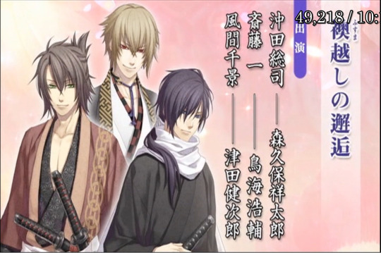
“Sliding Door (Fusuma) Encounter” [well should be anyway. i don’t have formal CH tl for this tho... also Fusumu can mean room dividers but i don’t think that sounds or looks as good.]
(Kazama enters)
Kazama: My wife, I have kept you waiting!
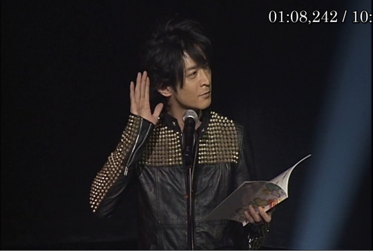
(crowd screams)
Kazama: My wife, I have kept you waiting!
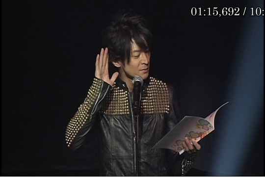
(crowd screams again)
Kazama You must be filled with a deep sense of loneliness during the time we were separated by the hateful Shogunate's dogs [either that or hateful dogs].
but since I have arrived, you don't need to worry about anything. Just close your eyes, listen to my words and entrust yourself to me. That's it.
Today, you'll become mine.

Kazama: hahahahaha!! The love letter I wrote is truly wonderful. [this laugh count may or may not be accurate lol]
My wife will surely become infatuated with me once she reads it
But I am rarely able to avoid the eyes of the Shogunate's hunting dogs.
I went straight to her room but she's not here right now.
Really, to make her husband wait.
I can't just leave my love letter here then head back.
(footsteps)
ah, footsteps! I've been waiting for you, my wi—

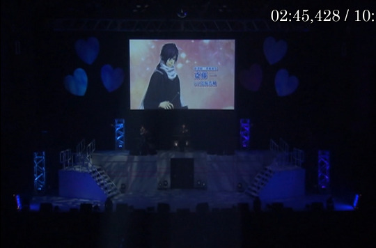
Saito: Yukimura? It's me. Saito.
Kazama: Ugh....
Saito: it looks like you're in your room. I have something to say [tell you], can i come in?
Kazama: Don't come in!
Saito: Uoh? What’s wrong, Yukimura? Did something happen?
your voice sounds so low which is very strange
ah! is it....
Kazama: che! found out already/discovered already—
Saito: Are you sick?
Kazama: Mmhm......
Saito: Mm. that being the case, I will not come in.

Souji: Areh? Hajime-kun? What are you doing here?
Saito: ah, souji.
Souji: Sorry, but can you move aside? I have something to tell that child.
Hey, is that alright? i'm coming in.
Kazama: I said that you can't come in [I didn't say that you could come in]!
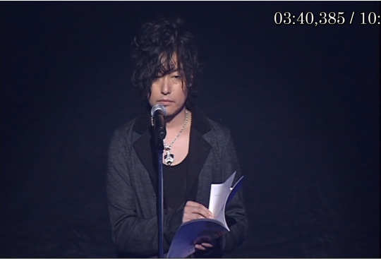
Souji: Hey, Hajime-kun, that voice just now came from behind this door.
Saito: Ah, it seems that Yukimura is sick.
Souji: Sick?
Saito: yes. I wasn't allowed in.
She's probably worried about passing it to us.
Souji: Hm...? (begins trying to open the door)
......Wah! It won't open. Is it blocked from the inside?
Saito: Souji, stop it. Don't forcefully enter a girl's room.
If something happens, how will you respond/react/take responsibility?
Souji: What happened [What do you mean]? What do you need to say [What are you trying to say]?
Saito: Ah... That's.... for example, if you went in and she was wiping her body down...
Souji: You're so embarrassed while talking that I'm feeling embarrassed.
Saito: This isn't something that can bee spoken aloud!
souji: Well, if she's not coming out of her room, that's easier for me.
Saito: What's going on [What do you mean by that]?
Souji: Just stay on the other side of the door and listen to what I have to say.
Just now one of the soldiers reported seeing Kazama near headquarters.
Saito: Kazama Chikage? In other words, his goal/target is to obviously...
Souji: That's right. That's why I came over to tell you [her] to stay inside your [her] room and not come outside.
Saito: So it's like that. I understand.
However it's Kazama again.
Souji: Indeed.
He really must be bored to be coming over here so many times.
Kazama:...mrgh....
Saito: The person herself has clearly said several times that she didn't want to go with him.
Kazama: Rgh...
Souji: How about saying "I hate you the most" to Kazama next time?
Kazama: How could that possibly be!

(silence)
Souji: Hey, Hajime-kun, where did that voice/sound come from just now?
Saito: The sound echoed everywhere, so I'm not entirely sure.
It might have come from inside headquarters
Souji: I think it sounded like it came from inside here.
(souji struggles with the door again while Saito tries stopping him and Kazama works to keep the door closed)
Souji: Sure enough, it's not opening.
Saito: What are you doing Souji. Kazama might already be inside headquarters.
We can't delay and must go and increase the watch/strengthen the guard.
Souji: mah, fortunately the First and Third Division are all here today.
They have plenty of combat power.
Saito: Then I’ll go tell the members of Third Division— (VA fumbles)

Saito: Then I'll go and tell the members of the Third Division to be on high alert [reword later. more literally it says raise vigilance].
Souji, what will you be doing?
Souji: I'll stay here.
The other person's target is on the other side of this door, it can't be left unguarded.
Saito: understood.
I'll leave protecting Yukimura to you then.
(Saito exits)
Souji: Well then, Hajime-kun's gone now.
hey, are you listening? I heard you were sick, [so] it's probably because of that.
That time when you and I went out alone together that night.
Kazama: Two people together?
Souji: Do you remember/You remember, right?
Although the wind was cold, the starts were quite beautiful that night.
You hands turned red from the cold, so I held them in mine.
"How is it, is this warm?"
I didn't hold your hand like that since it was cold, [rather] it was because your cheeks became very red.
Really, although I only did that as a prank,
seeing such a cute expression, it makes me wonder what will happen if I get serious
Or is it, that you want me to be serious?
I'm just making fun of you right now. You don't need to answer now.
So next time there's an opportunity, let's go on a walk together with just the two of us at night.
Kazama: You bastard! What did you do to my wife!
Souji: Ah? Sure enough it is Kazama. such a savage voice, [might have] deceived Hajime-kun, but not me
Kazama: Heh. I didn't intend to lie, it was you guys who misunderstood.
(sword gets drawn) Anyway, you bastard, is what you said true?
If even a fraction of what you said happened...!
Saito: Wait Kazama Chikage, stop this at once!
Souji: Hajime-kun? Could it be that you simply pretended to get tricked, and you were in fact already aware of Kazama?

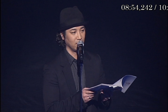
Saito: Hm? hm.....of course!
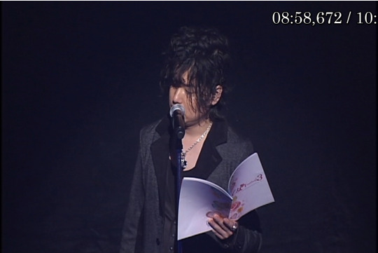
Souji: Really?

Saito: Mm.....
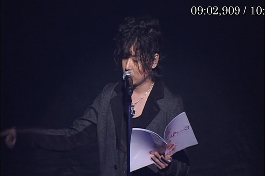
Souji: Re~(poke)~al~(poke)~ly (poke)?
Saito: To tell you the truth, I bumped into Yukimura herself while looking for the other members. After thinking about which locations were suspicious, I came back here.
Anyway/Putting that aside [?]. Kazama! Prepare yourself!
Kazama: Che, Shut up, I'll cut you down later.
I must first cut down the man who put/laid his hand on my wife!
Saito: Put his hand—? Souji, what did you do to Yukimura?
Souji: Then, let's move to somewhere with more space. I'll cut you down today, it'll give me a peace of mind.
Kazama: You talk big! I'm going to/ I'll kill you first!
Saito: Eh? ah, wait, (they exit) Souji! Kazama!

Saito: I'll have to ask Souji what he did later...

end~
------
video will be done later this month.... tho not sure when since juggling a bit too many srt files right now (you’d know if you saw my patreon’s latest post and extrapolated from that lol).
link: https://www.bilibili.com/video/BV1dx41177dj?from=search&seid=13990360835510964870
also i can’t believe that takeda is actually on one of the hakuoki shinkai drama cds. and on the sakamoto/nakoa one at that.... which makes miki the only shinkai char i know of who doesn’t appear on a drama cd.

oh and for the record, i only have translations for 2 of the 3 Japan girl’s fest hakuoki dramas (this being one of the 2).
#hakuoki#hakuouki#hakuoki drama translation#hakuoki live drama#saito hajime#Kazama Chikage#Okita Souji
23 notes
·
View notes
Text
The Legacy of Aika Village
[This will be the first of a few mini-articles I plan to post here, just about different things I’m passionate about. Please indulge me.]
This article originally was written back in early April- since then, Nintendo announced that the “Dream Suites” would be coming to the latest update of ACNH, as “Dream Islands.” As such, I thought it would be timely to finally post this.
Update: On July 2nd, the original creator of Aika Village made a tweet announcing their plans to remake Aika for Dream Islands in New Horizons! The legend lives on!
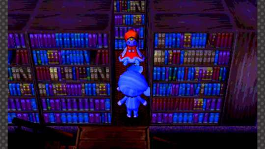
Image Credit: thumbnail from chuggaconroy’s playthrough of Aika Village on Youtube.
Animal Crossing And Horror: The Legacy of Aika Village
With a lot of the world in lockdown, Animal Crossing New Horizons has become a creative and social outlet for many, leading to a lot of people who never played Animal Crossing to engage with it for the first time. I’m sure most of you have encountered the various types of people present in the Animal Crossing community by now, but there’s a type of Animal Crossing players that a lot of people didn’t realize exist, and have existed, for a while now: The Horror Town Creators.
These players were the subject of a brief write up on Polygon by Patricia Hernandez [Hernandez, Patricia. “Animal Crossing: New Horizons is now a horror game, thanks to fans.” Polygon, 24 Mar. 2020. https://www.polygon.com/2020/3/24/21190826/animal-crossing-new-horizons-horror-game-decorations-scary-nintendo-switch-blood-spatter-pattern.], who posted an article featuring quotes and pictures of people creating horror themed towns and rooms in New Horizons, but only made a brief mention of the legacy of horror that many of these players are striving to recreate: The Nightmare Suites of Animal Crossing: New Leaf.
(These next few paragraphs are a bit of a self-indulgent aside, so feel feel to skip ahead.)
Horror gets a bad rap. Horror artists get comments like “lmao what SCP is this,” “that’s fucked up,” or get flippant remarks about it all “looking the same.” Horror writers get made fun of for only writing “three types of stories.” Even the term “creepypasta,” which has evolved into shorthand for “horror stories independently published online,” still carries the stink of derision from the typo-filled, often poorly-written shock stories the term originated from. Despite this derision, horror, as a genre, is MASSIVELY popular (and profitable as well!). There’s an undeniable appeal to it.
More importantly, horror always finds a way to adapt itself to different mediums. As one can easily see by the success of horror podcasts like the NoSleep Podcast and The Magnus Archives, it isn’t even limited to a visual format! Like fear and dread itself, the horror genre crawls on, inexhaustible, undying, and ever-present, always returning to us in ways both novel and familiar.
Horror lovers are a tight knit, but welcoming, community, and that’s one of its biggest strengths and weaknesses.The biggest drawback is that a lot of really cool stuff produced will never be experienced, let alone documented, by people outside the community. And that’s what prompted this post. I was trying to explain the Dream Suite horror movement to my cousin, and despite my best efforts, didn’t find a lot of coverage about them, beyond the fact they existed. Worse, most of those were articles written five years ago. Even so, I’ll link to a few of them at the end of this post, as they’re definitely worth reading.
For me, I wanted to share my experience of the horror town phenomena with people outside the community. The Nightmare Suites movement was really something magical, and I know that I, personally, am still trying to recreate that magic in New Horizons. And hey, maybe once you’re finished reading this, you will too.
The Dream Suite
Before we can talk about Aika Village, we need to explain the feature that made this whole movement possible. In the 2012/2013 3DS game, Animal Crossing: New Leaf, there were two areas in every town: The village, and Main Street, which laid beyond the train tracks that ran across to the north of every town. Main Street was home several important structures, including the town shop, the Happy Home Academy, and the Post Office. Later on, more structures could be unlocked and built as public works projects, one of which was the Dream Suite.[“Dream Suite.” Nookipedia, 25 Apr. 2013, nookipedia.com/wiki/Dream_Suite.]
As for how it worked, Nookipedia explains it best:
To begin a dream, the player must lie down on the bed and pay Luna 500 Bells. They may then choose to visit a random town, input the Dream Address of a specific town to visit, or search for a town. They may then choose to visit a previously visited town or a random town, or to input the dream address of a new town to visit. While dreaming, the player may walk around the town and perform actions just as they would in the real world, but their actions will have no effect on the town.
While dreaming, the bed will be on the dream town's plaza. Luna and Lloid stand near it until the player decides to wake up. Players can borrow tools like a shovel and axe from Lloid to use within the dream. If the player lies on the bed a second time, they will leave the dream and anything they have in their pockets will be lost.
The player cannot go to Main Street or enter any buildings with doors besides homes. Additionally, messages left on the bulletin board cannot be read; instead, the board displays the town's name and Dream Address…custom designs on display in the town, such as on the ground and in houses, will be visible. The player who uploaded the town can also be found walking about. When spoken to, they will say their recorded greeting.
In essence, the Dream Suite takes a snapshot of your town at the moment you ask Luna, the NPC running the Dream Suite, to share a dream- this includes your outfit, the way you decorated your home, the items laying around town, etc.
The most important aspect of this feature, and the one that I feel had the most impact on the Nightmare Suite creation movement, was the method of discovery. If you didn’t know someone’s code, you would be sent to a random dream of a random town, from anywhere in the world- and this is where I feel my personal experience of being in the community departs from the articles that have already been written about the Nightmare Suites.
The Urban Legend of Aika
In the years leading to 2013, I was going through some rough shit. I won’t go into details here, but video games had become my entire life. Coming into the summer of 2013, I didn’t have any friends I kept in touch with, and I was “starting over” in a city where I knew nobody- things were looking up, but outside of tumblr, I didn’t have anything even resembling a social life. Animal Crossing: New Leaf was a stabilizing force of my life during this time, and really helped me. I had the Shampoodle haircut guide saved to the camera roll on my phone, for pete’s sake.
It was in the beginnings of my friendship with a group of girls (whom I sadly no longer even have contact with), where a lot of our initial bonding happened because of anime and RPGmaker horror games. We were sitting together in the campus dining area, me playing on my 3DS, when I first learned about the Nightmare Suites.
“Have you heard about Aika Village?”
I hadn’t.
“It’s this really creepy town in dream suites, I heard about it from a friend online.” Later that day, she linked me to a tumblr post compiling a series of codes leading to different “creepy dream towns,” the first one being simply labeled as “Aika Village.”
That dream village became a phenomenon: people would write up their interpretations and theories about it, and even lead to a few articles and videos on gaming sites like IGN and Killscreen, which is why I’m not gonna even bother going into the content of the village itself.
And So, The Dream Begins…
This, in my opinion, was the draw of the Nightmare Suites. Without a way to directly share codes from your 3DS to your social media, the discovery and sharing of Dream Towns was like that of urban legends- like virtually passing notes in class, or sharing scary stories that “totally happened to a friend of my cousin’s sister” at a campfire. It felt like a cool discovery- something exclusive and scary and weirdly intimate. They had a mystique to them, a mystery of who their creators were and what they “really meant.” But above all that? They were cool as hell.
The Nightmare Suites used the limitations of the game to try and create an unnerving atmosphere in ways that were reminiscent to me of the RPGmaker horror game subgenre, and for me, created a lot of memories of excitedly typing in my once a day dream suite visit late at night in my dorm. I never lacked variety- there were so many people either influenced or inspired by Aika to make a horror town that there are entire lists and tumblrs dedicated to collecting those codes. (I even played around with the idea of making my own horror town, but never found the right inspiration, instead dedicating my time to making themed homes and custom outfits based on different anime characters.)
The sad fact that so many of these towns have been altered or overwritten, if they’re available or accessible at all, is in itself, a part of their urban legend-like appeal. While many of us may never get to experience these towns, the stories about them endure, in lists on long-abandoned blogs and youtube videos from people’s playthroughs.
And that mystique is the real legacy of Aika; While the Nightmare Suites may be gone, the wonder and dreamlike memories many of us hold from our chance encounter with it will never fade. You could even say we’re a bit…haunted by it.
#bluerose txt#bluerose-writing#acnh#acnl community#acnl horror#acnh community#aika village#nightmare suites#dream suites#dream islands#game essay#video game writing#video game journalism#personal essay#bluerose-essay#original writing#nonfiction writing#animal crossing#animal crossing new horizons#urban legends
18 notes
·
View notes
Note
www *DOT/* quora*DOT*com/Does-Naruto-love-Sakura HI! I love your blog! I wanted you to read this analysis, this person explains why Naruto and Sakura are just friends and it's SO GOOD. I wanted your opinion of it, it's the first answer. And it's true, Sasuke never saw Sakura as a damsel in distress, he always knew she was capable and wanted her to work on herself. This is so consistent that when Sakura shines at the war, Sasuke doesn't look impressed. He knew she had it in her.
I can tell that person put a lot of effort into their analysis, judging from how long and detailed it is, but I have to say that I’m a little disappointed. I’ll admit that I didn’t fully read the entire thing and I skimmed through much of it, just to get the basic gist of the points they were trying to get across. However, I noticed that towards the end of their analysis, they literally stole everything from one of my posts. I suppose that I should count myself as fortunate because I tend to be rather good at remembering the things that I say, because I recognised the points from my post literally word for word.
This is the link to the essay in your ask, and as you said it’s the first answer featured. Now once you get to the page and you click on the “more” button to expand the post in order to see it in its entirety, if you then use the search function (Ctrl+F) and type in “I think when” in the search bar, it’ll take you to where this person started to copy me.
From that point onward, this person took literally everything from my “Sakura’s Uniqueness” post, which can be found over here. My post was made on the 24th April 2015, and their’s was made on the 21st April 2017, almost exactly 2 years later. You’ll notice that the 2nd paragraph in my post begins with “I think when people first encountered Sakura…”, and after using the search function on their post, it’ll take you to a part where they begin with “I think when fans first encountered Sakura…”, they tried to change the wording a little bit here and there, but it’s essentially a copy and paste of my post. They removed my section about Temari and Tsunade because it wasn’t relevant to the points they were making, but then they restarted copying me word for word when they started with “I wish many of those who apparently didn’t see NaruHina or SasuSaku coming…”, which were my exact words around 2/3 through my post, and they continued copying me until the end of their analysis from there.
They even took the image that I used:

And wrote it out instead, using it as the penultimate point of their analysis.
Now, it’s obviously rather flattering that my post resonated with them so much that they wanted to use it to help construct their own analysis, and as I said it’s a very good and detailed analysis. The majority of it was their own words (I’m presuming here, because I skimmed through it as mentioned earlier), but it’s a little disappointing that I’m only finding out about this now and this analysis was posted almost 3 years ago. I just wished they had asked me, you know?
25 notes
·
View notes
Text
Free Product Review—Spier & Mackay Custom Shirt (+Giveaway Announcement)
Spier & Mackay is best known to my readers for their excellent-for-the-price Neapolitan-style jacket cut. But actually, their roots are in custom shirt making. The tailoring, the accessories, the trousers, that all came later. Founder Rikky Khanna (who goes by Rick) asked me if I wanted to give an honest review of their custom shirt program. Intrigued by their multitude of collar styles and what I’d heard was nearly infinite flexibility, I said yes (for my policy on free products and reviews, see my disclaimer page here). With that said, let me dive straight into my thoughts on the shirt and the process.

Pattern is key
I’ve got several online custom shirts from other companies, which I usually make by measuring a shirt I like the fit of and copying the measurements. Over time, I’ve tweaked the measurements here or there to dial it in, and I’ve been happy with the results. But this shirt has changed my perspective a little bit. While none of those shirts fit poorly, something about the cut of this shirt makes it feel like it fits better—using nearly identical measurements. I can only assume it has to do with how the pattern is drafted. I asked Rick about this, and he said that they have a third-generation tailor whose entire career has been in making custom shirts drafting each pattern. He is also apprenticing two younger tailors to take over for him when he retires. Considering the price of these shirts (as low as $80), that’s remarkable.

Collar designs for everyone
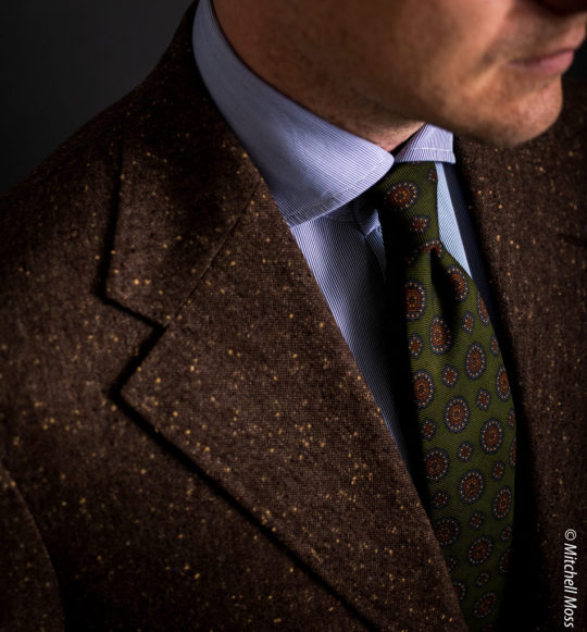
While they can make any collar you want based on specifications, their standardized collar designs cover almost all the bases. From point collars to super tall Italian wide spreads, there’s something for everyone (though someone recently did ask in their Styleforum thread for short collars for casual use—a blind spot of mine, since I never wear those). I opted for the large wide Italian spread (“C21” on the website), and then specified a slight increase in front collar band height. It is identical to my favorite dress shirt collar, the Eidos Marcus collar (which is why I chose it of course).
By default, the collars all come with a stiff, fused interlining. Instead of that, I asked about un-fused collar linings. They have four stiffness options: 1) Light (a single layer of un-fused interlining); 2) Unfused lining bonded to a fused lining (which is sewn in; there is no fusing to the shirt fabric); 3) Unfused bonded to a medium fused; 4) Unfused bonded to a stiff fusing. I opted for the second-lightest option and am happy with it. Given that the fabric I chose is a dressy, business-appropriate fabric, it does very well with a tie as well as without a tie, standing up under a jacket. I’m considering doing a super light fused on future shirts (which is how my Eidos dress shirts are made), and will likely also try the lightest unfused option. For sport shirts, such as a washed denim I intend to do at some point, I’ll go completely unlined.

Unlimited possibilities
For customization and even designs, the sky is the limit. For instance, as mentioned above, I requested a small increase in the front collar band height and about doing an un-fused collar lining. But I also talked to Rick about other details like the shirt sleeve attachment angle (a detail Ratio exposed to me as a possibility) or pleated shoulders (a detail found on Neapolitan shirtmakers’ goods, like G. Inglese), and he said it’s all posible. I even asked if I could send him a shirt to just copy all the design details on, and he said this was doable.
I am not a fan of secret menus, so this would be kind of a turn-off for me if I were new to the style game—I wouldn’t know what I don’t know, and would be afraid I wouldn’t think of some critical detail that would take my shirt to the next level. However, the options that Spier does offer by default in their step by step process are enough to make an excellent shirt for most people. And in my opinion, besides a good fit and fabric, most of what makes a shirt special is the collar shape, where they’ve got most bases covered. So, I say if you’re worried about missing out on some secret knowledge, don’t. Just design a shirt with the tools available and you’ll be able to make something special. (I’ve listed exactly what I requested below if you’re interested).
Fast turn-around
The high water mark for quick custom shirt turnaround is Proper Cloth, who has shaved it down to 2-3 weeks. However, I was glad to find out that Spier’s turnaround was only about 4 weeks from the time of my order to delivery.

Some negatives
Not that it’s all roses with the Spier & Mackay online custom shirt program. My biggest gripe is that the fabric selection and descriptions are pretty lame. Their images can sometimes make it hard to know exactly what you’re getting. Maybe I’m just spoiled by Proper Cloth—which has gratuitous fabric images, a full paragraph of copy written about each one, and consistent information like opacity, weave, origin and more—but it feels to me like somewhat of a leap of faith to select a fabric. On top of this, they do not offer the ability to order a swatch (which again, Proper Cloth does). Rick says that’s something they might do in the future, but since their fabrics are all stored overseas in their factory, it is not currently feasible.
I asked Rick what their remake policy is if the shirt fits incorrectly, or you end up hating the fabric. In the event of an issue like that, they will remake the shirt for 50% off, which he feels is fair given the already low prices they’re offering. Compared with Proper Cloth or Ratio, which do free remakes, this makes for a higher barrier to entry for those hesitant to try it out.
As for my shirt in particular, one detail came out wrong: it came to me with the collar cut with curved collar leafs, instead of straight-cut. Some of Spier’s off the rack shirts come cut this way, and other companies do them as well, but I’ve never liked it. I assumed that’s how it was designed, and told Rick I wish I had thought to request it with straight leafs. He told me actually the collar is supposed to have straight leafs, and this was a mistake by the factory. To rectify that, I sent the shirt back, he had a new collar made at their factory in the same fabric, and their in-house tailor attached the new collar to the body of the shirt. It was back to me within two weeks. So, my advice is: if you get a shirt and you don’t like something, definitely ask about it, in case it was an error on their part.

Shop the Outfit: Brown tweed Eidos jacket (similar); Spier & Mackay custom shirt (see details below for fabric and design); Spier & Mackay charcoal flannel trousers (other options from Berg & Berg; SuitSupply; Brooks Brothers; Drake’s).
A couple of things I’d change about the design of my shirt: 1) I’d make it with a one-piece yoke (I didn’t think to ask, and their design tool didn’t offer either. Can someone tell me why the split yoke even exists?). 2) A wider forearm/more pleats at the cuff. They have you measure the bicep and arm hole size, and then you specify the cuff. I copied my favorite shirt for all three measurements, but there are only two darts in the sleeve at the cuff, which means the pattern of the sleeve decreases in width more dramatically than the shirt I measured. It’s a bit tight in the elbow (I’ve never had a shirt blow out the elbow, but this could easily be the first one that will). I’d probably just request they make my shirt with four pleats at the cuff to rectify this.
Overall, however. I’m very pleased with the shirt. I give Spier & Mackay high praise for their superior pattern making, great selection of collar shapes and extreme flexibility in customization. They need a major facelift on their website, and need to make options like collar linings, cuff linings and forearm fit more accessible in the typical step-by-step design process (instead of being special requests in the comments box). But, all in all, I highly recommend giving Spier & Mackay’s custom shirts a try.
My custom shirt specs
Fabric: “BLUE PENCIL STRIPE – TESSITURA MONTI – 2 PLY 160’S”
Collar: C21 “Large Italian Full Spread Collar”, with the following special instructions specified in the comments box:
Specified with front collar band height increased to 1-7/16”
Specified with unfused lining at the 2nd level of stiffness (unfused lining bonded to a fused lining, sewn in)
Cuffs: Round, conical cuff, which tapers toward the end (a custom option requested in the comments box)
No placket
No back pleats
No front pocket
Mother of pearl buttons with crow’s foot stitching
(Help support this site by buying stuff through my links; your clicks and purchases earn me a commission from many of the retailers I feature, and it helps me sustain this site—as well as my menswear habit! Thanks!)
Giveaway
I’m pleased to announce a partnership with Spier & Mackay to give away a FREE custom shirt, plus two other bonus prizes. To enter the giveaway, see the instructions below.
To Enter:
1- Make sure you’re following @SpierMackay, and @MenswearMusings on Instagram
2- Like this post on Instagram
3- Tag at least 3 friends in separate comments on the Instagram post; more tags = more entries
4- For an extra 5 entries, share the Instagram post to your stories with tags of both @menswearmusings and @spiermackay
Here are the prizes:
GRAND PRIZE: a FREE Spier & Mackay custom shirt
SECOND PRIZE: $50USD off a custom shirt
THIRD PRIZE: $25USD off a custom shirt
The entry period for the giveaway ends Sept. 2 at 11:59 p.m. Central Daylight Time. We will announce winners, who will be chosen at random out of all the entries, within one week after the end of the entry period.
Rules and regulations
Per Instagram rules, we must mention this is in no way sponsored, administered, or associated with Instagram, Inc. By entering, entrants confirm they are 13+ years of age, release Instagram of responsibility, and agree to Instagram’s term of use.
The give-away is open to people from anywhere that DHL or FedEx will ship.
Read more at Menswear Musings
#bespoke shirt#broadcloth shirt#custom shirt#hairline stripe shirt#italian collar#italian style#product review#spier and mackay
10 notes
·
View notes
Text
There are 3 main of angelic deities beings known to the Jewish faith, as follows:
A. Malachim – מלאכים – Emissaries
The closest to the Western interpretation of angels. That said, indeed some of said ‘Angels’ do fall under this category (the ministering angels/serving angels – Gabriel, Michael, Uriel and Rafael – are a prime example), however this role is likely to be influenced by that as seen in the Aggada – the Rabbinic Literature that isn’t law – that defines them the heavenly entourage.
The Emissaries were in fact God’s messengers to the people, often either taking a human-like shape due to the great terror their encounters implanted in humans.
B. Saraf – שרף – Serap/Seraphim
“…and I had seen the Lord seated on his high and lifted chair… and Seraphim standing above Him, six wings to each: by two covering his face, by two covering his feet, by two fly” (Isaiah 6: 1-3)
“…because of the root for asp it came, and its fruit a flying saraf...” (Isaiah 14: 29)
That, and a several more passages provided in Isaiah, describe a being that led many researchers to believe had the image of a snake with wings, hands and legs. It belonged to the heavenly entourage.
The Kabala (Jewish mysticism) sees them in a constant state of burning, probably an interpretation to their name (being the same root of the Hebrew word “(to) burn”).
C. The Kruvim - כרובים - Cherubim
There are either two or three possible ways the Kruvim took shape:
1. the ‘modern’ one, as visualised by Chazal (Jewish sages of about uhhh 200 BCE to 6th century). Their concept of the Kruvim was of winged babies, which was later adopted by Christianity, who linked them to angels and gave them more of a baby-like form.
2. a winged being that took the form of a beast with human-like face and animalistic features, either a lion or an ox.
3. Lamasu, the Assyrian/Mesopotamian deity of the human-faced winged beast, which was adopted and converted by the Israelites. Note that this and the 2nd paragraph are closely linked.
Note that , in the modern concept of Kruvim (by Chazal), the Kruvim hovered the Ark of the Covenant. However, within the Bible, they were those decorating the sheets of the Tabernacle, and, wait for it... they were those guarding Eden.
Kruvim has a two meaning in Hebrew. One of them is cabbages.
In conclusion, Aziraphale is a Cabbage.
4 notes
·
View notes
Text
9 Free SEO Tips And Tricks To Increase The Ranking Of Your Website On SERP- SEO Company in California
Do you want to rank your website on the search engine result page? Are you looking for the best SEO tips and tricks for your website ranking?
Well, who doesn’t! Everybody wants that.
Everybody wants to ace in their respective fields and wants to hold the top position on search engines. The rank of your website determines your success.
This fact has been justified by the data presented by Infront Webworks, which states that 95% of the website traffic is received by the first page of Google. So, it means that you should strive hard to rank on the first page of your website in order to increase your brand’s visibility and website traffic. (SEO Company in California)
Even if you are at the top, it is not possible to maintain your position for a longer period because of the constantly changing nature of Google algorithms.
So, here I am going to share 9 tricks to boost your ranking and grow your business:
#1 of 9 SEO Tips and Tricks to Increase Rank on Search Engine
Engaging Content
Well, I am putting content at the top of my list of best SEO tips and Tricks because it is the most crucial part of your website, that’s why it is called the ‘king’. If you offer quality content then no one can stop you from grasping the higher position on SERP. Make sure that your content is unique, relevant and attractive to generate engagement. Also, if it is in a long-form then it adds an advantage to it. Websites with strong engagement get rewarded by Google in terms of its ranking.
Make your content informative and easy to read. You should lay more focus on the title or the beginning part of your content. This is the part which is responsible for attracting and driving maximum potential customers to your website. So make it captivating. Don’t use difficult words which is hard to read for both the audience and search engine. Your content should be SEO optimized and updated.
You can add other multimedia like images or videos to make it more entrancing. Always remember that your content posses the sole power to increase your ranking and generating more traffic without charging any dime. So making quality and valuable content should be your main agenda.
#2 of 9 SEO Tips and Tricks to Increase Rank on Search Engine
Keywords Targeting
As said above that your content is the crucial part, but your content is made up of certain keywords on which you want your website to be ranked. So before creating any content, do semantic keyword targeting for effective results. You can take the help of various keyword research tools available online like Keyword planner by Ad Words, KW Finder, Ubersuggest, Mondovo, Word Tracker, SEMrush, Soovle, etc.
An ideal keyword density is 1-2%. Avoid keyword stuffing as this is considered as one of the Black Hat SEO techniques. Google can de-rank or penalize you for exploiting this technique in your content.
Placement of your keywords affects your ranking majorly. So place your keywords properly in the Title of your content; in all the tags including heading tag, Meta tag, image alt tag; first para and last paragraphs of your content. Try to incorporate long-term keywords in your keyword targeting strategy. It is because due to low competition on these keywords, it becomes easy for you to rank. It brings in more traffic and results in a higher conversion rate.
Thus it is 2nd on the list of best SEO tips and tricks.
#3 of 9 SEO Tips and Tricks to Increase Rank on Search Engine
Speed
You surely don’t want to lose your visitors on premises of low site speed. People tend to abandon your website if it takes more than 5 seconds to load the web page. Google uses your site speed as one of the significant factors in SEO ranking. This is why this factor is in our list of best SEO tips and tricks.
There are many factors that affect the speed of your website. Some of them are technical for which you need to consult a professional web developer or designer. There are other factors that are controllable by you like one of the biggest factors is the images of your website. The speed of the loading time of your image contributes largely to the overall speed of your website.
You can compress your images as it enables you to cut down the page size up to 30-40% which will speed up the loading time of your website. There are many image optimization tools that can assist you in compressing your image. For example, Optimizilla, Image Recycle, CompressNow, Triage, Online Image Optimizer, Compressor.io, GiftofSpeed, Kraken.io, etc.
Some of the plug-ins also contribute to lower down the speed of your website, so deactivate or delete the unnecessary plug-in. Not just plug-in, also remove the unnecessary content of your website as more the content more it takes time to load. So don’t let superfluous contents to depress your loading time.
#4 of 9 SEO Tips and Tricks to Increase Rank on Search Engine
Fortify Your Social Media Presence
You may have noticed that sometimes when you type any brand’s or company name on search engines, then their social media profiles appear on the top. Thus, your social media profile also ranks on the search engines.
Social media can be a great source of generating leads for your website that’s why this factor is on the 4th position of our list for best SEO tips and tricks. You can embed or integrate the links of your website pages in your social media content. When you will provide unique, informative, valuable and quality content on social media platforms, then more people will share your content.
This will widen your reach, promote your brand, and increase your clicks and traffic. And most importantly, it will build your brand’s authority as it will show the search engine that your content is valuable enough to compel others to share. This will, in turn, make a search engine to give you preference in the ranking.
There are numerous social media platforms like Facebook, Twitter, Instagram, Linkedin, etc. So build your brand’s profile on these networks and strive to gain more and more likes and followers. To strengthen your social media presence to boost your business and increase the rank of your website. (SEO Company in California)
#5 of 9 SEO Tips and Tricks to Increase Rank on Search Engine
Make Quality Backlinks
Backlinks are the most important part of Offpage SEO that has a massive impact on your ranking thus you must consider it as one of the best SEO tips and tricks. The backlinks that you generate has the power to either make or break the online reputation of your website. If you have created a good backlink then it can improve your rank on the search engine result page. But if you have spammy then Google can drop your ranking or penalize your website. All credits go to Google’s update like Google Penguin which lays focus on the quality of your links. Thus, it is very important to generate a quality backlink.
First of all, make sure that you are creating the backlinks on a website that is relevant to your niche. Before creating any backlink on a website, check its domain authority and spam score. Evaluate your links today, identify the ‘bad links’ or ‘broken links’. Remove it immediately to save your website from getting penalized by Google.
There are some of the really handy tools to check broken links like Screaming Frog SEO Spider, W3C link check, Google Webmaster tool, etc. For the purpose of removing these broken links, you can use the ‘Disavow Tool’.
There are other techniques too that you can adopt like generate high-quality links and promote it to attract natural links instead of buying it. This method will save you from buying bad links.
#6 of 9 SEO Tips and Tricks to Increase Rank on Search Engine
Do Internal And External Linking Of Your Website
People tend to undermine this factor but it does impact your ranking. Do the linking of the related keywords as anchor text to the relevant pages of your website (internal linking) or to other relevant website pages (external linking). (SEO Company in California)
This will not only increase the relevancy of your website but will also lower the bounce rate thereby increasing the average time spent on your website. Internal linking is sometimes used as call-to-action. It will make easier for users and search engine bots to navigate and find other web pages of your website. Thus, it improves the visibility of your website and is on our list of best SEO tips and tricks.
External linking to the authoritative and well-reputed websites will increase the creditability of your website making it more trustworthy in the eyes of search engines. This will, in turn, improve your ranking. Make sure that the website you are linking to must be valuable, informative, relevant and highly ranked.
Poor quality external links can harm the reputation and ranking of your website. You can put no-follow links wherever it is required. External links or outbound links can be a great way to make connections. So don’t forget to do internal and external linking to boost the traffic and ranking of your site.
#7 of 9 SEO Tips and Tricks to Increase Rank on Search Engine
Do Thorough Competitor Research
It is a very popular saying, “Keep your friends close and enemies closer”, which is applicable to every field of work. Healthy competition is necessary to provide a room for one to improve. Knowing your competitors and tracking their strategies will help you in analyzing your next move.
Identify your competitors and make a list of them. Analyze their performance based on certain metrics like page authority (PA), domain authority (DA), ranking, keywords, Trust flow, and citation flow.
Monitor the SEO strategies they are utilizing and which of them are working for them or which are not. You can also analyze their social media activities and backlinks to know about the sites where you can perform link building activities too.
Moreover, you can check the content and structure of their websites and the services provided by them in order to improve yours so that you can outdo them. There are many tools that you can use to measure and learn about the tactics and marketing strategies implemented by your competitors. Some of the very useful tools are Superstat, SEMrush, SimilarWeb, Alexa, Siteliner, Buzzsumo, Monitor Backlinks, SpyFu, etc.
The most important part of the best SEO tips and trips.
#8 of 9 SEO Tips and Tricks to Increase Rank on Search Engine
Make A Mobile-Friendly Website
We are living in an era where Mobile phones have become an intrinsic part of your daily life. The population of Mobile users comprises more than half of the total world’s population. Targeting these mobile users will provide you with a wider reach and more traffic. So make your website responsive web design. According to statistics, around 50% of all Google’s search traffic is now made up of Google’s mobile traffic. (SEO Company in California)
In April 2015, Google announced one of its updates called ‘Mobilegeddon’ for mobile device users. This stated that if a website is not mobile-friendly or optimized for its mobile device users then Google will bring down their ranking. And Google did what it said as over 80% of websites suffered in their ranking due to the effect of Mobilegeddon.
To improve the mobile user experience, check the speed of your website on mobile devices and do take care of other factors too like the spacing and font size.
There are several online tools to check if your website is mobile-friendly, some of them are Google’s mobile-friendly test, W3C’s MobileOK Checker, Keynote MITE, Google’s PageSpeed Insights, RankWatch, Varvy Mobile SEO, etc. So, optimize your website and make it mobile friendly to serve large no. of audiences and boost your ranking.
#9 of 9 SEO Tips and Tricks to Increase Rank on Search Engine
Focus On Your Site Structure
Believe it or not but the structure of your website does affect your ranking. A well-built architecture and clear navigation of your website will help the users and search engine bots to find the content of your website.
A good structure helps in the better indexing and crawling of your website. Besides that, it enhances the user experience making your visitors lean on to your website for longer. Hence, it drops off the bounce rate. To increase the navigability of your site, you can also use site links. Sitelinks help in improving your brand’s reputation, user’s trust and your ranking on SERP.
Provide users with a path or ‘breadcrumbs’ for the various contents of your website for easy navigation. Divide your content into categories and subcategories. Plan the hierarchy or site structure of your website before developing it. Your URL structure should be created in a way that follows your navigation hierarchy.
Internal linking also helps in improving your site structure. To improve the architecture of your website and provide structured data and increase your ranking.
CONCLUSION
So what are you thinking? Include the above discussed 9 brilliant free tips and tricks in your SEO strategy today to outperform your competitors and to improve the ranking of your website on SERP.
Promotion By: (SEO Company in California)
https://seocompanyincaliforniablog.blogspot.com
2 notes
·
View notes
Text
RECENT NEWS, RESOURCES & STUDIES, mid July to August, 2019
Welcome to my latest summary of recent news, resources & studies including search, analytics, content marketing, social media & ecommerce! This covers articles I came across from July 14 to August 24, although some may be older than that.
Tumblr has not been saving all of my drafts correctly, which has led to me rewriting some of this post more than once. (I’m now going to be compiling it elsewhere & pasting it here when done, to avoid this issue in the future.) That, a heavy workload, and some vacation time delayed & truncated this report.
But the good news is I am now on a more consistent schedule, with more time to read and write. I expect to be getting this back to 3 times a month very soon.
Are there types of news you would like to see here? Please let me know! Leave a comment below, email me through my website, or send me a message on Twitter.
TOP NEWS & ARTICLES
The priority placement is US search for items that ship free has been around for nearly 4 weeks, and doesn’t seem as disruptive as some feared. Etsy is conscious that non-US sellers are particularly upset about this, and have therefore published a list of things they are doing to help international sellers. (note that most of those things also help US sellers that ship to other countries,
Etsy’s 2nd quarter results came out on August 1. Everything was up, but not quite as much as some experts predicted, so the stock is down quite a bit. The big announcement was that Etsy will be combining Promoted Listings & Google Shopping ads bought by sellers into Etsy Ads. They are supposed to launch in August, but I have yet to hear of any seller who thought this was a good idea.
3.5 million people worldwide use at least one social media platform. (That’s 46% of the planet’s population.) And more than half of the planet - over 4 billion people - watch videos online. “[H]alf of all internet users below the age of 35″ use voice to operate their devices, with 43% of internet users worldwide using voice at least occasionally.
SEO isn’t enough; you are going to have to spend money to be seen, if you don’t already “The last 18 years have been an anomaly. Twenty years ago, if a brand couldn't afford to pay for a newspaper or a radio ad, the media company didn't give the company time to publish a public service announcement. SEO allowed companies to go through a period where they received free listings on search engines like Google and Bing. Sending people to a brand's website is like getting a free television or radio commercial or newspaper ad or billboard at the baseball park in 1984″
Trend watch: both clothing retailers and makeup companies are seeing a drop in sales as their markets shrink. If you sell either, you will want to read both articles, as there are some parallels between the two areas in regard to what is and is not working.
ETSY NEWS
Etsy purchased musical gear website Reverb for $275 million; it will continue to run separate from Etsy. Etsy stock went up at the time. This is notable because Etsy hasn’t bought much lately; it looks like they are slowly dialing back the panic mode, single-goal approach. Their business acumen has disappointed one commentator [humour].
Etsy is “improving” Etsy shop stats. (Note that the Google Shopping category is apparently for the ads you buy yourself only, not the ones Etsy buys, so you will need to use Google Analytics to look at those hits for the moment.) This seems to be leading up to the launch of Etsy Ads (see above).
Here’s some coverage of Etsy changes in the past few years (not a lot new, with some errors).
Etsy seems to be ramping up its monitoring of seller customer service factors, as more people are receiving email notifications that their shops are falling below Etsy’s customer service expectations. I expect that any updates in this area might involve the new chat convo thingy: Convos are changing to live chat threads, which you cannot write more than one paragraph for because hitting return sends the message. It’s a mess. (Please forgive my frustration; I’ve already had to deal with over 40 separate convos from one buyer alone.)
There will be a site-wide Labour Day sale August 30-September 2, which Etsy will apparently be promoting.
Fall fashion trends as promoted by Etsy: apparently silk scarves are in, for all sorts of uses. They also released their holiday trend report (pdf file), which I will summarize next week if I can find the time. It’s worth a look, because they divulge some top search data. You can also listen to the podcast, or read the podcast transcript.
This article on tiered pricing and increasing your average order value is geared towards people using the $35 free shipping guarantee, but it is also useful for anyone wanting their customers to buy more from them.
Staff will be using the Etsy Success section of the forum to post weekly tips called “Etsy Insights”. So far, they have been posting each week’s thread in that announcement post, so it is easy to skim and see if any topics are relevant for you.
They are also asking members to sign up for more research surveys; so far, I am finding it pretty boring, and all of the content on their “hub” page is over a year old.
The expansion into India saw their domestic listings more than double last year. Free workshops have helped bring many new sellers aboard.
SEO: GOOGLE & OTHER SEARCH ENGINES
Google’s John Mu, who does SEO outreach & education, reminds us that “LSI keywords” are not actually a thing. (LSI was a computer method to figure out relationships between words back in the 1980s; no search engine today is using it, as they have real search data on how people relate words to each other, and it just doesn’t give any insight into modern search technology.)
You don’t need tons of backlinks, but you do need good ones. And linking out on your own site is a good idea in many cases [video], as long as it serves your readers.
Using images that show up on many different web pages can harm your SEO. They used stock photos that showed up on hundreds of pages for this experiment, so it is not likely that using your own image on 5 sites, for example, would be a problem.
It looks like there was a fairly significant Google update around July 18th; there’s a bit more coverage here. The last 3 large Google updates are summarized & analyzed here.
Google then released a blog post explaining their core updates and what you should do if you are negatively affected by one. They linked to several SEO websites explaining Google’s concept “E-A-T” (Expertise, Authoritativeness and Trustworthiness), which is particularly important if you produce blog posts or educational materials.
Less than half of Google searches now lead to a click on a website result, at least on desktop. Mobile Google searches overwhelmingly do not result in traffic to a website any more. (Note: as I always remind people, the data from these types of studies is always a bit suspect, because they only have a slice of the data, but the provider here probably has the biggest slice worldwide.
Do you do some simple coding on your website or blog? You will find this beginners’ guide to canonical tags and the different uses of redirects and canonical tags [video & transcript] very helpful. If you are a bit more advanced than that, here’s a good guide to meta tags.
CONTENT MARKETING & SOCIAL MEDIA (includes blogging & emails)
Hubspot puts out a lot of good digital marketing guides; check out their “Ultimate Guide to Content Distribution”. Also, they covered how to write a great (& SEO-effective) blog headline, with examples.
Some stats on current social media usage [infographic].
Verizon sold Tumblr to Wordpress owner Automattic.
Snapchat users continue to increase, as does revenue. They still aren’t profitable, but didn’t expect to be yet.
Not getting enough traffic on Facebook? Here’s how to get seen by more people there.
There are ways to optimize your LinkedIn profile to get more sales.
How to get valuable Twitter followers, that is, not bots. (They use Etsy as an example of a well-optimized Twitter profile.)
ONLINE ADVERTISING (SEARCH ENGINES, SOCIAL MEDIA, & OTHERS)
Amazon is making advertising an even bigger slice of its income.
Digital ad spending is continuing to increase in most areas.
Facebook is expanding its search ads to more businesses; it’s not really clear how it all works, though. The ads must also run as news feed ads. Here are some basic tips on how to get the most out of Facebook’s ad algorithm.
With Etsy possibly ending the free Google Shopping ads it currently buys for us (see the Etsy Ads announcement above), this might be a good time to look into buying Google Shopping ads for your website; here is your complete guide to setting them up.
More changes to regular Google ads mean less control for the business buying ads, meaning that exact match phrases are no longer even close. “Google says 15% of its daily searches are new — and advertisers will miss out on these new queries if matching is too tightly controlled. Its machine learning systems, the company says, can infer intent and spare advertisers from creating exhaustive keyword lists in order to get their ads to trigger on relevant queries.”
If you are thinking about paying for ads on Pinterest, you will want to read this starter guide.
Twitter video ads now have an option to not pay for a click unless people view at least 6 seconds of the video.
STATS, DATA, OTHER TRACKING
How to use Instagram Analytics to boost your business. (That is written for companies that are larger than most Etsy shops, but there is plenty of good material there.)
ECOMMERCE NEWS, IDEAS, TRENDS
eBay beat earnings expectations in the second quarter.
Amazon had higher than expected sales but lower than expected earnings in the second quarter. They keep thriving despite low profits margins because they have a massive cash flow.
Alibaba reported higher than expected revenue and profit for its first quarter ending June 30th.
Amazon sales on Prime Day (July 15-16, actually 2 days) were greater than last year’s Black Friday & Cyber Monday combined, and also signed up more new Prime members on each than ever before. Other websites also saw a big boost, especially for electronics.
Amazon forced to amend its seller policies worldwide following German legal action. As of August 16, they will give 30 days notice for standard account cancellations.
And they have expanded their robot deliveries (still followed by humans, though!)
BUSINESS & CONSUMER STUDIES, STATS & REPORTS; SOCIOLOGY & PSYCHOLOGY, CUSTOMER SERVICE
While buyers do love free shipping, nearly half of US consumers surveyed will choose to pay for shipping in certain circumstances, most commonly when they really want the product. Only 11% said they never buy unless shipping is free.
When you are trying to sell something, and especially if you want a repeat buyer, make sure you are pitching it to the right target market. For example, people who don’t want to spend a lot of money won’t buy things they can get for free elsewhere. Provide value for the right people. (A lot of this article is pitched at entrepreneurs selling classes and events, not tangible products, but I think there is a lot of value in the explanations.)
MISCELLANEOUS
WordPress is one of the most popular ways to set up your own website; here’s a beginner’s guide to getting started.
Google beat earnings expectations in the second quarter. Ad revenue was up a lot. Microsoft also had a better-than-expected quarter, but the growth of their search ads and of LinkedIn (which they own) has slowed.
How to choose colours that will work together well.
There is a lot of research on productivity; here are 10 things you can do to get more done.
If you use Chrome, you could really use these Chrome keyboard shortcuts.
#seo#search engine optimization#search engine marketing#etsynews#analytics#stats#social media#contentmarketing#ecommerce#smallbiz#cindylouwho2newsupdates
1 note
·
View note
Text
2019 Megaman Valentine’s Day (Humor) Contest Results!
Apologize for the delay on this once again. Didn’t expect to be posting these results nearly a month after Valentine’s Day, but the extended deadline did help make sure we got a healthy competition this year. Thank you to all for your patience!
I’m going to start out this year’s results thread with a totally appropriate callout 4-Koma that is not technically an official humor entry from SubzeroIceSkater, even though it fit the rules. But it’s worth posting, to publicly humiliate myself anyways:
I'll take my token Akane-in-an-entry bribery any way I can get it, since nobody felt inclined to draw Mrs. Stelar’s fresh, piping hot, iced cinnabuns for their talent entry this year...Did I just type that? I mean, um...
Play me off, Johnny!
I kid, I kid! After all, these contests aren’t about me, it’s about the characters you love and want to draw. And that’s what makes everyone’s entries unique and helps motivate you to create time after time. And I am grateful for it, whether you are a long-time participant, or the yearly new contestant.
I’ll be doing things a little different this year, because the post would be way too long if I kept everything in one. So this first post will just contain the Humor category, and I will have a second, separate post for the Talent category. Raffle prize winners will be contained in both posts, so keep an eye out after my commentary on your art, for some possible winners here. The rest will follow soon. I’ll be contacting all winners soon enough, so sit tight!
Here are your humor winners and full gallery of entries, after the break!
Category 2 (Humor) - Princess Sigmia Returns
A much smaller group of entries for this category, but the zany mergers were great, all the same. I thank you all for getting as creative as you could with this concept, as it was a little more than just a mere gender swap you had to consider, when designing your combined character. Whether you won or not, know I truly enjoyed seeing all of these pics.
I know imgbox gallery gave people some issues before, so as always, let me know if images or links appear broken. Crossing my fingers this works smoothly this year! XD
After each entrant’s name, there will be a link in the character description to the entry, too, just in case the inserted external images don’t load for you.
[Full humor gallery]
1.) SubzeroIceSkater - Arc Weldy Falls In Love (featuring Tundroll.EXE the Arc Weldy, plus ‘Master Albert’)
[Page 1] [2] [3] [4] [5] [6] [7] [8] [9] [10] [11] [12] [13] [14] [15] [16] [17] [18] [19] [20] [21]
Comics with length and substance always seem to steal the show, and this year was no different. Joining the ranks of fenril-huayra, wintesm and so many others in recent years, I believe SubzeroIceSkater’s wonderful tale will stick with many of you, as much as it did me. As a humor piece, sure there are great sight gags and comedic lines all around, but it also has a lot of heart. You feel really bad for Arc Weldy to start out, but also feel so many emotions of compassion, friendship and love throughout. Wonderful work, and thank you for all the effort you put into this massive entry!
Also, are 21 pages not enough for you all? Well, SubzeroIceSkater also had ANOTHER 15 pages worth of ideas, alternates, and outtakes to go with this comic. And, while I won’t upload each link or image here, because this one entry is long enough, you can see them in THIS GALLERY LINK. They are also really great.
*For coming in 1st, SubzeroIceSkater has won $100 via Paypal, or a prize of their choice up to that value.*
2.) @drewblossom - Geminette
Nearly equally deserving in length, Drew’s comic more closely followed the Bowsette-style transformation gimmick to give Snake Man his comeuppance. The classic bait-and-switch kiss, turned on it’s head with a ‘lil Search Snake rather than a gross Toad Man, was a funny end.
Design-wise, I really liked what you did to create Geminette’s look. Splitting his helmet crystals to the side as like dual hair broaches, and keeping the motif with the choker, armband, garter straps and chestplate, worked out nice. I can see why Snake was so easily charmed.
*For coming in 2nd, Drew has won $50 via Paypal, or a prize of their choice up to that value.*

3.) @wimzik - Rollbble.EXE
If dominatrix Devil Roll wasn’t enough of a pain in Rockman’s side, I shudder to think how bad a Bubble Roll would be, puku! Or, would her devotion to him be as great (or clingy) as Bubs was with Shademan-sama?
Taking Bubbleman’s yellow flipper feet motif, and turning it into a fish fin design, both on her feet, legs, and hair ribbon, turned out pretty neat. If anything, I’m sure this transformation gives her very kissable lips, though! XD I have to wonder what her plan is with that Roll Navi Data chip, now that the chocolate is all gone, and what it will do to Rockman?
*For coming in 3rd, wimzik has won $25 via Paypal, or a prize of their choice up to that value.*
And the remaining wonderful entries, in alphabetical order by alias:
@3-oclock-blues - Dr. Willis
What you talkin’ ‘bout, Wil-lis? Or Dr. WHY?!-ris, if you prefer. With that absolutely awesome wide-eyed grin, she’s hellbent on living together with Zero in a world where only Reploids exist. Being that they both have spent time piloting flying machine bodies, and have sorta possessed some form of an evil energy, it’s a rather fitting combo. Unless you are Zero, and it’s your dad and girlfriend merged into one being. Awk~waaaarrrd.
The skull motif and spikes are subtle on Iris’ design, but fit in really well. Her bangs are just wild enough on both sides now, that it gives that Wily hair vibe, without having to give her a horrible, bushy mustache. XD
*3-OClock-Blues is the winner of Raffle Prize #2 - The X OCW artbook and Zero keychain*

@bracedshark - Mettayer
This might be a terrible concept, but I’m going to type it. When a Met pops out from under it’s helmet, especially in sprite form, usually all you can see is the whites of it’s dark, beady eyes under that helmet, on it’s dark grey/black blobby round body form. With Layer, you don’t get to see her eyes under her bangs, hardly ever. So staring at Mettayer’s underboob for too long, due to her chest armor mimicking a Met helmet, all I see is a Met’s pair of closed bottom eyelids, and I’m seriously waiting for those eyes to open up and start staring back at me. Would that not be the most wrong way for Mettayer’s eyes to work?! But I can’t unsee it! Her belly button even feels like a snoring, sleeping Met’s mouth. I’ll spare everyone of me editing this art to make my point. But it’s in your head now, isn’t it?
OK, despite that awful paragraph, this is one hot Metall Mommy. Sorry, I’m starting this paragraph off pretty badly, too, I guess. ^^; Despite my interpretation of the combination, the design elements do stand out in a unique way. The fiery reddish-pink hair seems like a different choice considering the characters merged, but it plays off the red of a Met’s mouth and earpiece, and, well, fitting for Valentine’s, too! And instead, you get the Layer color scheme in the pickaxe, so it still connects visually.

@drewblossom’s 2nd entry - Roll n’ Rock
This bonus entry from Drew flips the genders of both DLN-001 and 002. I liked Roll’s hair bow converting into more of a bow tie, and Rock getting her version of Roll’s hoodie, in a Blue Bomber color scheme. The V-Day card concept, complete with crayon-ish name writing, made for a cute entry. Hearts all around!

@supernovabee - Bayer
No, there won’t be any paragraph about underboob eyes for this version of a Layer transformation, as supernovabee has merged her with Bass. Bayer loves belting out her hard and heavy siren song to woo prospective love interests during karaoke night.
Keeping Layer’s purple hair here actually kinda still keeps a Treble Boost feel, that the color scheme fits seamlessly, to go along with the more obvious Layer armor design pieces.
#Rockman#Megaman#Mega Man#Rock Miyabi's 2019 Megaman Valentine's Day Contest#Fanart Contest#Too many tags to list
7 notes
·
View notes
Text
Comments of submitted arts
.
.
.
I translated the judges ' evaluations. I am sorry that I am not good at English. But I did my best.
.
If I get a chance someday, I'll visit you in a more proficient way!
.
.
.
*********************Evaluation details************************
<<Lobotomy Corporation Unofficial Fan Art Contest Winners>> - Illustration
. . . 1st.
Wish the event will go smootley! [Leafy] https://goo.gl/m9Vg8y . ----------------------------------------- . (Gallery director) . Objectively, this seems to be the best. . ----------------------------------------- . (contest organizer) . He has just given relief to the pain of one of his employees. Did the peace given to him lead to happiness in the staff? I'm not sure. We'll just have to mourn. Until he gives us eternal rest. . (Translate plz.) 솔직히, 더 이상 무슨 말씀을 드려야 될 지 모르겠습니다. 내 관점에서는 당신이 최고입니다. . ----------------------------------------- . (Gallery sub director) . The whole body was excited and it was really cool and to my taste. I think he(or she)'s winning my appetite. The realistic paintings and unique atmosphere fascinated me.
. ----------------------------------------- (Sponsor-1) . Looking at the picture, It was worth 150,000 won invested in the competition. I am happy to find such a good quality for 150,000 won. (150,000 won -> about $ 140) . ----------------------------------------- (Sponsor-2) . It was the foreign participant that made us realize that this was an international competition.
I got the mail and looked at the pictures in advance, but I don't think I have any problem getting the first prize.
Their expressions and techniques also had the perfect technology and the right filters for the atmosphere.
I think it suits the atmosphere of the game. I will give you the highest point in both quality and original interpretation.
. ----------------------------------------- .
. .
2nd.
Artworks for awesome mood in game [ N_9] https://goo.gl/wcAqMt . ----------------------------------------- . (Gallery director) . +) The cuteness that covers the horror completely and separation. -) The dimple is so doll looking. If someone have only seen Pan Art, they don't think it's a horror game.
. ----------------------------------------- . (contest organizer) . The atmosphere of the old version of the game is fantastic. So why did you submit three? If you are a foreigner, but you are a Korean ... . ----------------------------------------- . (Gallery sub director) . Admiration, Admiration, Admiration. . ----------------------------------------- . (Sponsor-1) . The atmosphere is fantastic and the employees of the previous game version. It is an adaptation of a scene from a legacy trailer. It is an old user's picture that
shows that he has played the game since the previous version. . ----------------------------------------- . (Sponsor-2) . It looks like a professional illustrator. The atmosphere is really good. I liked the idea of perfectly implementing a game picture like a book illustration. Its structure, lighting, and old atmosphere were all perfect.
However, only two pictures can be submitted. While agonizing over it, I examined the third painting except for it, and it was sadly well drawn.
Older versions of the game staff seem to be the norm. Clearly, previous versions of the staff were even more eerie as they were round and cute, compared to game settings. Once again it has been proven.
. ----------------------------------------
.
.
.
3rd.
Slime girl and the queen of hatred [moolon] https://goo.gl/pqQty5 . ----------------------------------------- . (Gallery director) . +) A soft flowing Slime girl and a cute queen of hatred. -) But let's not meet in the game. . ----------------------------------------- . (contest organizer) . Ho Ho Ho, I love the Slimes girl. The Queen of Hatred is pretty. Ok, Hong, Hong, oh! . ----------------------------------------- . (Gallery sub director) . It is a beautiful picture of " Molten Love. " Just like a slime, I want to add a little more clarity or shine. The Queen of Hatred is brighter than the Slimes. It doesn't matter, anyway. . ----------------------------------------- . (Sponsor-1) . I'd like to tell the writer that I used 3 packs of tissue. (It's still growing.) . ----------------------------------------- . (Sponsor-2) . well implemented the glittery of the Slimes and the glitter of the Queen of Hatred. The Queen of Hatred could have become too colorful. But he painted it very cute, elaborate and without eye pain.
Slimes might have been nice to have a more shiny description. But the melting expression is very good.
The only regret is that I'm not a fan of both. So I could not give additional points. . -----------------------------------------
. . .
<<Lobotomy Corporation Unofficial Fan Art Contest Winners>> - Novel
. ***All the judges participated in the review.*** . . . 1st.
No one will be left [5boonmander] https://goo.gl/YqQsnY . The beginning the and end of a new recruit [5boonmander] https://goo.gl/FShVro . ----------------------------------------- . (contest organizer) . The subject of the fog war. Clearness as well as clarity.
. The process of family members disappearing was impressive. I did not expect to do so with only the " setting of game " of the fog war.
. ----------------------------------------- . (Gallery sub director) . Are you worried that there are no photobias, no blood, no trials, no stories? You can see Lobotomy's grim world view through any unnamed employee, sometimes perfect in writing except for a few paragraphs that have been too long for description. Personally, I like a rich description.
. ----------------------------------------- . (Sponsor-2) . A good article feels the moment you see the first sentence. This article did. It is my favorite way to end the first and last sentences in the same form. The novel was a perfect beginning and ending, especially with its combination of writing power and plot. A story without a story or story that could not be used went off the rails.
In particular, it is a story from Lobotomy Corporation " Outside. " But it wasn't awkward at all. It is a novel that mixes elements of the world view that did not appear in the game.
. It was a novel about how the staff who worked at Lobotomy worked. It was a perfect way to boost tension and finish it. The spelling is also correct. We give you the highest marks in the quality of the novel and the original interpretation.
. ----------------------------------------- . . . 2nd.
Eternal Meal [Carania] https://goo.gl/ZPyThF . ----------------------------------------- . (contest organizer) If it was in the form of " recording, " the script format was not bad. But at the end, the character himself said, " This is not a recording. " So I had to re-evaluate the assessment. It has been a long time since I took the introduction speech of the previous version of midnight.
. ----------------------------------------- . (Gallery sub director) It was an interesting story that was created by linking the text from this book. It was a great victory. It was so cool.
. ----------------------------------------- . (Sponsor-2) It is very similar to the story of " Ppodae. " Are you a prophet? So I gave him extra points. It is also ironic that the main character was chosen as a safety team. Nezach cries... overly descriptions and dialogue between overly agreeable characters were a bit annoying. But this is a good novel.
. ----------------------------------------- . . . 3rd. [*spoiler*] A person standing by [Hwatottbool] https://goo.gl/GvzYgg . . (Gallery sub director) Angela's mind was revealing well. The sight of me made me feel lonely. . ----------------------------------------- . (Sponsor-2) I remember that it was a novel that was just before the Ending Update. it was a prophecy. It has a pretty style and description. Character interpretation worked well. But this is not a novel. This is a memoir of a person. I was bored because there was no incident.
Since this contest is a novel contest, it was judged on the basis of novels. . -----------------------------------------
.
.
. ******************************** Additional Lists *********************************
<<Lobotomy Corporation Unofficial Fan Art Contest>> - Inspection details for Foreign participants
.
Hello! [bakaiju]
https://goo.gl/A7Zizy . ----------------------------------------- . (Gallery director) A work of high quality and full of hard work But I am sorry that letitia's eyes are only pretty. . ----------------------------------------- . (contest organizer) . Nice judge. Many abnomarlity. And, thank you for your participation. . ----------------------------------------- . (Gallery sub director) The image of the referee bird and the employee who died next to him was so good and great. If you had paid more attention to detail, I would have given you the high marks.
But the second picture felt strange. I find the Queen of Hatred strange. . ----------------------------------------- . (Sponsor-1) It places significance on the first foreign participation. The background and quality are unfortunate. The first picture seems to be done by hand and the second picture by computer. The Queen of Hatred and Latitia are a bit sad.
. ----------------------------------------- . (Sponsor-2) It was thought that foreigners should participate in the event, so I went around foreign sites for three days. And I was worried if no one attended. However, this arts immediately gave an impression. I was personally impressed.
So I gave him extra points. The quality is also good. Thanks to this work, I gained confidence that it is okay to put effort into promoting this contest.
However, quality did not give the highest point for some details. Thank you. . ----------------------------------------- .
. . I hope this… [7-Tek]
https://goo.gl/1PiiCm . ----------------------------------------- . (Gallery director) +) A solemn yet colorful butterfly -) Nothing. . ----------------------------------------- . (contest organizer) butterfly is the best. NA. BI. ZO. AH. . ----------------------------------------- . (Gallery sub director) GOOD! Neat light and shade, proper background, and beautiful work. . ----------------------------------------- . (Sponsor-1) It is a fairly good painting, " The funeral of dead butterflies. " It was neat and well-colored. The flying butterflies keep the background from getting bored. He worked hard at expressing the back of his coffin. But it's just a " funeral of dead butterflies. " lol
. ----------------------------------------- . (Sponsor-2) High quality is the " funeral for dead butterflies ". This is a work which really
excited me. Color selection and line description are outstanding. The dark clothing, which can become a lump in the face, is described wisely with lights and dividing lines.
It faithfully depicts butterfly men and has a serious quality. But it's simply that I don't have any additional points because I don't like the guy. Haha...
. ----------------------------------------- .
. . Good day [Mushroomliang]
https://goo.gl/9BN7Qy . . ----------------------------------------- . (Gallery director) +) Well represented the characteristics of each upper layers sepiroth. -) I saw a beer on the table, but this is not a beer place. . ----------------------------------------- . (contest organizer) Netzach's bedtime is impressive. but Yesod's clothes are preety bad. How many penalty points? . ----------------------------------------- . (Gallery sub director) A painting with a beautiful, calm, water-coloured expression and a sense of calm that is rarely seen in the Lobotomy corporaton.
I can feel another emotion from the mess of Nezach. . ----------------------------------------- . (Sponsor-1) You must love your Jacques. Me too ... It's not good, but I'd like to have a beer with him.
. ----------------------------------------- . (Sponsor-2) Looking at the picture of Nezach lying upside down, I thought I should let him in. Thank you for accepting the invitation.
I was glad to see that the picture was submitted. The eye of art has no borders. Without digital work, they painted only manually. The book gave the original interpretation the highest point in that it revealed the character's individuality through proper setting, not just by expressing characters.
However, I could not feel my preference in the characters submitted. Failure with additional points.
. ----------------------------------------- .
. . art contest [Midson Vonjungle]
https://goo.gl/t4am7B . ----------------------------------------- . (Gallery director) +) His "noting there" is good. -) His final form of evolution requires holes in the ship. I was embarrassed. . ----------------------------------------- . (contest organizer) So simple message. So simple art. I love simple. . ----------------------------------------- . (Gallery sub director) I liked the scary and wonderful " Nothing " that " Goodbye. " However, I want to feel more Gore. I think it is enough to be expressed by hand.
For " Dream of the Black swan, " I'm sorry. Honestly, I didn't like it. When I first saw it, I didn't understand what it was, so I thought it over. If you had painted each characteristic alive, I would have given a much higher score.
. ----------------------------------------- . (Sponsor-1) It is regrettable that the lines are neatly aligned and uncoloured. If you had painted the color, I would give high scored the picture .
. ----------------------------------------- . (Sponsor-2) "Nothing there", waving an ax, shouting " Goodbye. " "Black swan's dream"s brother, who looks like he is screaming at his sister, " Get some
money. " It is also a mysterious work that although it is a simple, creased painting, everything
is expressed. However, they did not get high scores in terms of quality as they did not have any painting and had no other explanation besides drawing.
If you had submitted it more carefully, it would have been at least middle class. When the artist painted this painting, it is regrettable that the painting might have been painted roughly due to his impulsivism.
. -----------------------------------------
.
.
. I like Snow White’s apple [JeeJee]
https://goo.gl/ME21Ly . ----------------------------------------- . (Gallery director) +) Painted apples like a cruel fairy tale -) It is regrettable that the wings of "White night" are not sharp but round. . ----------------------------------------- . (contest organizer)
The end of the story is that " Finally, she was happy with another prince." Stop resisting. I am cure you. Pretty art. . ----------------------------------------- . (Gallery sub director) It was nice to reinterpret the story of the apple. Let's wish her happiness. The grandeur and beauty of the white night was a little trim. It would have been even cooler if you had put in a clock unique to the white night instead of the Magic Circle behind you and instead worked more carefully on the description of the wings.
. ----------------------------------------- . (Sponsor-1) Our apples can't be that good. The paintings are neat and reveal the author's personal desires. Applelover!
. ----------------------------------------- . (Sponsor-2) Snow White's apple can be cute, and white night can be dignified with the SD ratio. I like hard work in background, excellent lighting, and SD ratio and structure. However, Deporme is so severe that the detailed description of characters is regrettable that it does not give the highest quality score.
This drawing style is similar to the Lobotomy Corporation game. With a little attention, it is likely to be able to produce an impact no less than the original.
. ----------------------------------------- . . . owo TwT [Michin]
https://goo.gl/4oyWgV . ----------------------------------------- . (Gallery director) +) It's amazing and amazing that Malkuth's right hair got longer when she broke up. -) Nothing. . ----------------------------------------- . (contest organizer) It's a pretty cool mood. . ----------------------------------------- . (Gallery sub director) I gave the highest marks in the original interpretation part. I was impressed by the neat and clear portrayal of each character's bad side. It's like a party for all the people. A picture that seems to reveal each other's character in a warm and warm manner.
I wish it had actually ended this way. . ----------------------------------------- . (Sponsor-1) The contrast between the first painting, which is quite dark, and the second painting,
which displays the characters, is impressive. But i think hod is not good. . ----------------------------------------- . (Sponsor-2) I think, most foreign fans prefer the upper layers to the middle layers, cuz they are more important the psychological description.
This fan also seems to draw a lot of upper class fan art. I was impressed by her emphasis on the double personality of ** in the upper tier factoid.
I also liked the way the upper layers were destroyed. So i give that the best score about original interpretation part. . ----------------------------------------- . . . Daily work [白華]
https://goo.gl/gKCKVy . . ----------------------------------------- . (Gallery director) +) It's like a old-Maker game. If the main character of the game was an employee, this game's style would have appeared this way.
-) What the h...er character?
. ----------------------------------------- . (contest organizer) Deep Dark Lobotomy's daily work. . ----------------------------------------- . (Gallery sub director) The highest-quality piece of dot art that has appeared on this contest. It felt like a game script with a graphic like a classic game. Just after a friend dies, he joked, " Who's going to get rid of this?" I felt another strange feeling.
. ----------------------------------------- . (Sponsor-1) Management, log-like, simulation - > Maker Game Event Personally, that sounds like a pretty good challenge. Overall, the quality is good. . ----------------------------------------- . (Sponsor-2) Pan-Art turned Lobotomy corporation into an old game atmosphere by mixing dot art and scripts properly.
She laughs at her fellow body and says she won the bet. It shows the broken minds of Lobotomy's employees.
The quality of the object expressed in dots and the detailed Easter egg implementation are very good. It gave him the highest point in the original translation.
It was a piece that showed how the mental state of employees who say they miss the smell of blood was felt by foreigners alike.
. ----------------------------------------- .
. . Fan Art Contest(Angela :x) [清川淀武]
https://goo.gl/Fg7n2M . . ----------------------------------------- . (Gallery director) +) Angela hides huge greed and tries to punish bad people. -) Grow up, my hair! . ----------------------------------------- . (contest organizer) I thought I would write it in English, but I think I'd better put it in Korean. Whose hand is Angela holding? And what does the background mean? Does that punitive bird go to punish Angela? Or did they just follow up?
I don't know the purpose, but it seems possible to interpret in many ways. Is it Angela who has just been made and hasn't gone through the TT2 protocol? . ----------------------------------------- . (Gallery sub director) Beautiful and dreamlike. Originally, the punishing bird is not matched about this atmosphere. However, I liked the unique atmosphere as a point.
. ----------------------------------------- . (Sponsor-1) The background resembles the king of greed's pattern . I hope that the king of greed will eat Engela hard. [Censored]
. ----------------------------------------- . (Sponsor-2) It depicts Angela and a punishing bird with elaborate backgrounds reminiscent of the king of greed.
Angela seems to have expressed her desire for what Ending showed her. Using an accurate but distinct description and depth, the background reflects slightly beyond Angela's clothes, creating a mysterious atmosphere.
I thought :X was just a facial expression, but now I think the main character in Angela's hand is X.
. ----------------------------------------- . . . Lobotomy corp. illustration for Contest [noyuki]
https://goo.gl/a1JY5H . . ----------------------------------------- . (Gallery director) +) Same teenagers, different feeling. -) Just inevitable beauty of Letitia's eyes. . ----------------------------------------- . (contest organizer) Letitia shot my emotion with a pretty. The magical girl is as cheerful as her profile is. Very good. But why is Letitia's eye normal?
Were you Japanese? I give up on English. I am sorry. Let's understand because we are from the same East Asian country.
(= I'll bother Sponsor-2.) . ----------------------------------------- . (Gallery sub director) Letitia's cute features, appropriate backgrounds, detailed effects and fine hades. The Queen of Hatred suits the background, which looks like an American comic book. . ----------------------------------------- . (Sponsor-1) I'd like to tell the writer that I used five tissue boxes. The picture of Queen of Hatred seemed to shake a little, so I thought it was moving at first. So i've been watching.
. ----------------------------------------- . (Sponsor-2) The detailed description and color were so harmonious that they gave the highest marks in quality.
A picture of a magic girl hurts her eyes. I like the fact that while using strong colors, the colors do not play separately and melt into one piece.
The character interpretation was also well implemented without any differences, but the original interpretation part score is not the best.
. -----------------------------------------
.
.
.
Lobotomy_corporation FAN ART [秋津]
https://goo.gl/iJL1eU . . ----------------------------------------- . (Gallery director) +) Clean style. -) But something is missing. . ----------------------------------------- . (contest organizer) Good placement and not bad background for the same department location. It seems to be a good description of the upper layers. And Angela, who suggests in the front that things will go his way. I like it. . ----------------------------------------- . (Gallery sub director) Pictures drawn about upper layers.The painting is a neat and well-relieved picture. However, although some of the paintings were omitted, this painting simply listed characters. So i failed to give a high score.
. ----------------------------------------- . (Sponsor-1) Nezach is turning back hair beside his ear. Why? It is Angela and upper layers, which is in line with the position of the upper division. . ----------------------------------------- . (Sponsor-2) The positioning of the characters is also the same as the location of the department in the game with Angela.
It was clean pastel version of description and color, but the problem was only lined, which lacked the another impact.
Perhaps the picture just submitted was more so as it was compared with the one in brilliant colors and styles. The painting itself was good, but the timing of submission was not good.
. -----------------------------------------
.
.
.
Submit arts for FanArt Contest [BleryKey]
https://goo.gl/D8XXCe . . ----------------------------------------- . (Gallery director) +) A different atmosphere about abnormalities. -) Nothing. . ----------------------------------------- . (contest organizer) Strong red hood. She will be kill wolf. Knight of dispair was drown fairy tale style. what a cool style. . ----------------------------------------- . (Gallery sub director) It was a painting that made the touch rough so that the life of a red mercenaries could be felt. But I felt somewhat awkward.
I like realistic things, but the face of the article of despair has become so realistic, So i felt awkward... a little too much.
. ----------------------------------------- . (Sponsor-1) The article of despair is of good quality, but not of mercenaries. I prefer mercenaries
to knights of despair, what does this mean? certainly a contrast between red and blue. . ----------------------------------------- . (Sponsor-2) would draw a red mercenary or marksman of magic bullet. he(or she) also sent in mercenaries. to be nice The manual drawing of a foreign artist using strong texture and penmanship was so impressive that it gave the original analysis the best point.
The painting of "knight of despair" seems to be boring as the painting is a bit lackluster in coloring after using detailed descriptions.
Therefore, it does not give the highest point in quality. . -----------------------------------------
.
.
.
Art contest submissions [K-108] https://goo.gl/o7XkdQ
.
. ----------------------------------------- . (Gallery director) +) The woodcutter was well described. -) I don't like the wings of white nights because they are not sharp, it's just round. . ----------------------------------------- . (contest organizer) Simple. Simple symbol. Cute Whitenight, And Fooooooooooooooooookin Axe guy. . ----------------------------------------- . (Gallery sub director) Only the woodcutter looked very good because the background of the hungry heart, the axe, and the rusty face caused synergy.
. ----------------------------------------- . (Sponsor-1) It looks like white night is pissed. The painting shows the color, expression, and
lumberjack's aspirations. . ----------------------------------------- . (Sponsor-2) It is a picture that is decorated like an abstract sentence.I didn't think about white night, but the lumberjack was so cool.
The expression of the rusty helmet and cross axe in his keyword, " Heart, " was very good. He also had a good brush effect.
It seems to be an example of a good result in a simple drawing style. However, the white night seems to shoot the beam from the eye. I am really sorry for not scoring well because of laughing.
lol... loool... looooooooooooool........ sorry!
. -----------------------------------------
.
.
. [FAN ART Contest] [siriu]
https://goo.gl/C8f133 . ----------------------------------------- . (Gallery director) +) A work of great detail -) But no one uses weapons as well as Geburah. . ----------------------------------------- . (contest organizer) It's the last time you'll be attending. If you had come a little later, you would have been buried. You were really lucky. They all wear suits and only carry EGO weapons. He must be a competent manager. It's gonna hurt a lot. . ----------------------------------------- . (Gallery sub director) A dynamic painting that came up just before the closing time. It has a solid background, and EGO's expression that each of them is holding, and the
fine detail of the staff is all good. For a balanced evaluation, a demerit was made from the fact that the EGO clothes were not worn. I am truly sorry.
. ----------------------------------------- . (Sponsor-1) The manager made only weapons but didn't build a defense equipment!! How did he make a weapon in full dress? . ----------------------------------------- . (Sponsor-2) I didn't expect a foreigner to turn in his work six minutes before the deadline. If I had not opened the mailbox... Everything is perfect, including situations, character locations, weapons presentations,
detailed descriptions, and the identity of the game. The color is also well matched, so that it is visible without anyone being buried. I think it would have been okay if the outline of characters was a little thicker, but this was excellent.
. ----------------------------------------- .
.
.
A Day of My Agent [Mr.Deleted]
https://goo.gl/TsdW1s
.
----------------------------------------- . (contest organizer)
Thank you for your novel. . ----------------------------------------- . (Gallery sub director) Don't sweat it. The translation went well. The sentence was of moderate length. The confusion, fear and anger of the description and character were well felt. . ----------------------------------------- . (Sponsor-2) It was crazy to translate a foreign language that I didn't even know based on Papago translation. I'm afraid things that I thought might have been double-tracked while I was translating it to make it really readable didn't go away cool afterwards. Sorry. I am happy to introduce a game novel written by foreigners. The description I saw was excellent. What a crusade!
. -----------------------------------------
.
.
.
13 notes
·
View notes
Text
How To Add Text To Photo Word For Mac

Text plus for mac computer. Standard Shipping is complimentary on all U.S. Upgrade to 2nd Day Shipping for $5.00 or Overnight Shipping for $10.00. We do our best to estimate the most accurate delivery time for your convenience. Once your order has been shipped, please refer to the tracking information in your email confirmation.
Add Text To Photo Mac
How To Add Text To A Picture In Word Mac
Add Text To Photo Free
The second key for me was to use Word’s Picture toolbar instead of the Format Picture dialog. The toolbar may already be docked. The toolbar may already be docked. If not, you can reach it by right-clicking a picture. Learn how to add words to pictures with Movavi Photo Editor. All you need to do is download Photo Editor for Windows or Mac, install the software, and follow the instructions below. To add words to a picture, open the Text panel and click the blue Add Text button. Now type whatever you want inside the broken white line frame.
If you don’t write all the time, then you probably don’t need a full-featured word processor, such as Microsoft Word () or Apple Pages (). But you still may want a flexible tool for handling text that lets you compose résumés and recipes, letters and flyers. You know what? You already have one: Apple’s TextEdit.
This text app comes as part of OS X, and can meet many of your writing needs. It doesn’t offer advanced page layout features such as columns and image wrap, but it does provide most of the fundamentals. Simplicity comes with benefits, too. TextEdit is sleek and fast. It takes a half-second to launch, and it doesn’t lag even if you have a document containing hundreds of pages. On top of that, TextEdit can save documents to Apple’s iCloud, so if you have a desktop Mac and a laptop, you can work on your documents at home and know they’ll still be at hand when you’re on the road.
Still need convincing? Here are six TextEdit tips that show off what this free, easy-to-use program can do.

1. Get better zoom

TextEdit offers a zoom feature with two sizes: tiny and huge. Not very practical when you want to write something and see other windows on your Mac. You can access it from the View menu: Actual size is the size of the page set in File > Page Setup. You can also choose to Zoom In (Command-Shift-. [period]) or Zoom out (Command-Shift-, [comma]), but unlike most word processors, you can’t pick a zoom percentage.
There’s a top-secret gesture, however, that lets you fine-tune TextEdit’s zoom. Just pinch on a trackpad, either inward or outward, to zoom in smaller increments. (Sorry, there’s no way to do this with a mouse.) With a bit of practice, you’ll find the right size, and it will be a lot easier to work with your TextEdit documents.
2. Make quick lists
If you need to make a list—a to-do list, or an outline—you can choose from a number of list styles from the Format > List menu. You can also choose list styles from the List bullets and numbering button in the toolbar. (Note: You need to be in Rich Text mode to make lists. If you don’t see a toolbar with formatting buttons, choose Format > Make Rich Text, or press Command-T.)
But if you just want a simple list that uses hyphens, or if you want to do some quick brainstorming and then format your list later, here’s a tip that will save you a lot of time. Press Option-Tab, either at the beginning of a line, or at any location in a paragraph, and that text will change to an indented list paragraph preceded by a hyphen. When you’ve finished brainstorming, select all your list items, then choose Format > List to choose another type of bullet or numbering.
3. Add active links
If you’re writing a document that has links to webpages in it, it’s often best that these links be active; when the reader clicks them, you want the webpage to open in a browser. But, if you paste a link in TextEdit, it won’t be active.
Mac TextEdit Tips and Tricks All Kind of Formatting, Adding Tables, Adding Lists When TextEdit is active, there will be the associated bar: A screenshot is worth of thousands words. Best text editor for mac 2017. Although this guide, Mac TextEdit Tips and Tricks is intended for the basic users, advanced users might find some forgotten or less known features. So, there are actually quite good number of features. Most websites usually divide each in to many articles to increase the number of articles.
To make an active link, paste the link and click or select it. Then right-click or control-click and choose Make Link. TextEdit will know that you’ve clicked a link, and will convert it into a blue, underlined, active link.
This works for links in any of the following formats: macworld.com, www.macworld.com, or http://www.macworld.com.
If you need to change a link, just right-click or Control-click it, choose Edit Link, and make your changes.
You can also make a link from any text. Select one or more words, choose Edit > Add Link, then type or paste the URL that the link will go to, and click OK.
4. Save TextEdit documents in Word format
TextEdit can read and write Word documents; sort of. Word text box. You’ll be able to edit Word documents without any complex formatting, but conditional formatting, such as text boxes, columns or image wrapping will be lost. However, you can save your TextEdit documents so people using Word—for example, on a PC—can read them.
There are two ways to do this. If your document is in Rich Text Format, then it’s an RTF document, which Word, or just about any other word processor, can read. But you can also save a file in a specific Word format. Choose Save, then, from the Save dialog box, click the File Format menu and choose one of the Word formats. If you’re not sure which to choose, Word 97—as old as it is—is probably the safest.
If you’ve already saved an RTF document, you’ll need to duplicate it before changing the format. Choose File > Duplicate, and then File > Save and choose the format.
5. Embed files
TextEdit’s default RTF format is a special file format called Rich Text Format Directory, which is a bundle, or a type of folder that can contain text and files. That means you can add photos, videos, music files, and even applications.
Let’s say you’re creating a document with a recipe. You might want to add photos you’ve taken to remind you of what the final dish should look like. Just drag a photo into your TextEdit document, where you’d like it to be. When you do this, TextEdit will ask if you want to convert the file to RTFD format; accept this change.
Unlike in most word processors, you won’t be able to tweak your image: You can’t crop it, resize it, rotate it, or apply shadows or borders. So if you want to do any of these, you need to do so before adding the photo.
But you can also add videos, music files, and more. Just drag any file into a TextEdit document. Bear in mind that any item you add to a TextEdit file makes the file larger, so if you want to send it by email, be careful not to put in too much.
6. Type faster with auto-complete
Tired of typing out long words? Do you have doubts about how a long word is spelled? Save time using OS X’s auto-complete feature in TextEdit.
Let’s say you need to type the word “transcendence.” Start typing the first few letters, such as “tran.” Press Option-Escape, and an auto-complete menu displays. Use the Down Arrow key to find the word you want, then press Return to have TextEdit complete the word for you. This can be quicker than looking up a word in a dictionary.
Alas, the OS X dictionary doesn’t contain facinerious, so you’ll have to look that one up yourself.
TextEdit’s got plenty of tricks up its sleeves. Check the app’s Help menu for more about creating tables, formatting text and other great features. You may find that TextEdit is all you need to get your writing done.
Note: When you purchase something after clicking links in our articles, we may earn a small commission. Read our affiliate link policy for more details.
Sometimes when managing word processing or text documents you might want to save the file in a compressed JPEG format or other similar picture format. I was recently asked how to do this by a Mac user, who was looking for a way to better manage a text document for presenting it in Web pages, but who was also interested in placing a formatted text file as an object in presentations and other Word processing documents.
Not only does converting a text file to an image allow for easier handling when embedding in other documents, but it also allows for easier drawing of annotations and other items on the document when discussing and presenting it.
There are a couple of ways to save documents to an image format. Sometimes programs may specifically support saving to a JPEG, TIFF, or other rasterized format, but since many don't you can take advantage of a couple of technologies built in to OS X that will allow you to do this.
Screenshots
Vim is available for all the major desktop platforms (and some minor ones) as well as iOS and Android, but makes few concessions for beginners. Vim is an expansion of the Unix vi editor, and its old school design could be a little intimidating if you're used to modern Windows software, but it's a superb text editor nonetheless. The learning curve is steep, with no hand-holding, but in exchange Vim offers unrivaled power. There are features such as various methods of code completion, macro recording and playback, history support for calling up commonly used snippets of code, and built-in script for automation and customization. Good text editor for html. Download here: 4.
The first is the use of screenshots, which is an excellent way to quickly snap a sample picture of the screen, a window, or a selection of the screen. You can then import the resulting image (by default it's a PNG file) into numerous applications.
While screenshots are useful and convenient, they're limited primarily because the screen resolution on Macs is 72 dots per inch, which means the resulting picture will also be 72 dots per inch. This cuts down on file size, but it also limits the uses of the file to being presented on screen. If you print the file or wish for finer detail of the text by having higher resolution, you can't do this with a direct screenshot. In addition, screenshots are limited to what you see on screen, so if you have a well-formatted document that goes beyond the limits of the screen, then you cannot capture it in an image file using screenshots.
Nevertheless, screenshots have their uses and can be particularly useful for illustrating aspects of what you see on screen. For more details on screenshots see this article on screenshot options.
Using a PDF intermediary
The next option is a more versatile option for creating a rasterized image of a text document, which is to convert it initially to a PDF and then to one of many image types. In OS X (or in any supported OS that has Adobe PDF installed) this can be done with practically any printable document by printing the file and then using the 'PDF' menu in the print dialogue box to either save the PDF or view it directly in Preview.
With the document now open in Preview, you can select 'Save As' from the File menu and in the Format window choose one of a number of supported rasterized image formats, including GIF, JPEG, PNG, BMP, and TIFF. Some image formats will have adjustable quality settings, but all should have a resolution option. The default will be 150dpi, but you can increase this to whatever suits your needs. Most printing will not need more than 300dpi, but you can set it to whatever you want.
Add Text To Photo Mac
Keep in mind that the greater the DPI setting the larger the final image will be, especially for nonlossy formats such as BMP and uncompressed TIFF. As an example, saving an 8x11 blank white text document as an uncompressed tiff file at 1500dpi results in a 631.2MB image file. Saving the same document as a JPEG with default quality settings results in a 3.3MB image file.
How To Add Text To A Picture In Word Mac
Once the file is saved you can annotate, crop, and otherwise manage it in ways that would be more difficult if the file were kept as a standard text or word processing file. In the following image example, there is some header information that is placed there by the application being used (in this case I used 'TextWrangler'), but this information can usually be removed in the application's preferences.
Add Text To Photo Free
Questions? Comments? Have a fix? Post them below or e-mail us! Be sure to check us out on Twitter and the CNET Mac forums.

0 notes
Text


Tom Philips humument
‘Artist Research’
I like this idea and the work that Mr Phillips has made it into but I do feel like it could be made a lot better as in it’s like on the verge of a whole new level. Tom Phillips supposedly set himself to search for a second-hand book that he can buy for 3 pence to work with. Though I would like to know wether he actually found the book priced at 3 pence or he ended up being able to buy it for 3 pence.🤷🏽♀️
Tom used paint, collage and cut-up techniques to build this new version of the book he bought named A Human Document by William Hurrell Mallock. Phillips used these techniques to block out words or phrases, even whole paragraphs! To create new stories and worlds within the still left over text. I definitely had his work in mind when creating my own work. I’m working on how to create it in a way of choosing text, but randomly. In order to use more of what I get to create a story instead of creating a story with what I want. Love it.
For the 1st design I simply used a black marker to cover the unwanted text in order to show my chosen words, and create my new storyline. At the time I had in mind a sort of official, top secret, government document for a spy or maybe even-
Jason bourne.

For the 2nd design is more rough and scratchy, literally.
I used a small screwdriver like point to actually scratch of the ink of the text I didn’t want, leaving a new story of a seemingly beautiful sounding sight. This may be my favourite design just because of how satisfying it was to scratch the ink off. Obviously a few scratches went a little too deep but I mean, mistakes the best part really.
Now I mean the 3rd design is a little more fun with pink screen printing ink, a perfectly circular pencil sharpening and best of all.
Black ink circles!
I firstly stuck cello-tape down over the area of my text I picked out and continued to screen print over and over again on the page since the ink didn’t really fancy leaving the screen that day so it took a few pulls and in the end I ended up still ripping the page but AGAIN! That’s the best part baby.
Because if nothing goes wrong, then nothing went right. #trademark
The 4th is a little more sketchy as I began feeling a bit confused with the task but obviously I am still happy with the outcome as I can and have cut it up for photoshop collages and draft like folders. I cut out a heart and used a sort of lime green colour for the screen print of it. I highlighted my text and screen printed in the same green colour and a gorgeous glowing orange to create these illuminos alien like planets in my design, from the inspiration of an artist I researched in class. I enjoyed printing the heart so I’ve attached an image of a few more prints of it which is a direct link the short story I’m researching for the term and work- ‘A Tell-Tales Heart’ by Edgar Allan Poe. (Self explanatory).
The 5th design is the first I did, using green spray paint and the tape I was given by the hospital to wrap my toe in when I fractured it skating, to help make sure it heals straight.
Anyway the whole task as always was fun, productive and teaching. I would decide my favourite design was the 2nd though in battle with the 1st i fall into the barrel of the 2nd.
Good task.
Shoutout West Suffolk College.🤎🤎🤎
0 notes