#there are places where its like ok. a better player would keep this combo going. i stop at like. 3 hits fhadghsdufg
Explore tagged Tumblr posts
Text
Pyo as... Adaptation? Homage? Clone? Thing?
Hey paisanos! I've been doin a lot of work lately helping @zombielesbean finish up their project Grey Area, and I wanna write up a big post about my contributions (including a really big exciting secret one!) once that's done, but the original warioware just hit the switch and with that comes Pyoro >:3
If you don't know about Pyoro, you can get the gist by watching a little bit of this epic video:
youtube
Of course, Pyoro on switch means I've got my game Pyo on the mind too. I mean, they are...
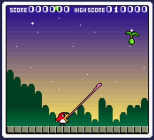

...similar games... 'w';
So similar that sometimes I worry Wario is gonna come to my house and beat the tar outta me. Wario, if you're reading this, I can explain
In 2020, when I finally found out you could download DSiware games on the 3DS--not for long tho :')--I immediately remembered a game I had on my DSi as a kid: Bird & Beans, a standalone version of Pyoro (and Pyoro 2!) with 50% more floor space to maneuver in. I bought it and absolutely fell in love with it! It became a sort of hyperfixation of mine for a little while, and so naturally, as one does, I started thinking "alright, but what if this was a platformer?"
See, I think arcade games and platformers mix really well. Platforming is often fun to do all on its own, and a lot of arcade games have sort of non-linear goals. It's a great combination if you wanna break platforming gameplay out of the usual get-from-A-to-B design, which is something I'm always wanting to do. Shoutout to any good boss in a platformer btw
One thing leading to another
So my immediate thought was like, what if you could just jump up there and pop the beans yourself? You could bounce off of them and get a combo going!
And so, if the beans themselves hitting your head is no longer a hazard, naturally the pits they create should be how you lose the game. In Pyoro they're functionally walls, but in a platformer that doesn't even make sense
But wait, if you pop beans just by touching them, can't you stand in one place forever and the ground under your feet will be safe for eternity? Ok, there'll be a special, extra dangerous flavor of bean that sends explosions left and right when it hits the bottom of the screen
As you can see, a lot of the game's design just flowed naturally from solving the problems caused by turning it into a platformer. Just by changing these few things, the game is already pretty distinct from its inspiration, but I took it a little further
Taking advantage of the genre
Beyond just patching holes in the design caused by that one change, I wanted to change other things in order to better take advantage of the focus on platforming
This is where @bisthefairy comes in. While ground in Pyoro is restored by eating a white bean to summon an angel to fill in nearby holes for you, I wanted to encourage the player to use platforming to get high up on the screen. I also wanted ground to be stackable, because that could spice up the platforming and even lead to unique, creative strategies
This led to the idea of having something like the angels from Pyoro flying around up high, so you'd have to bounce up there to get them to drop their block, pit or no pit. I gave the role to my friend Bis since they're small and they fly around
This desire to get the player to bounce up high also led to the creation of the worst feature in the game, the "clear line," which was quickly cut. As you'd rack up a big combo, a horizontal line would start rising up from the bottom of the screen. If you fell below it, it'd kill your combo and clear all the beans off the screen. 0/10. Having to play on half the screen and barely having time to react to incoming beans suckssss
Seriously. One of the worst aspects of Pyoro is that you get huge score for nabbing a bean right as it comes onscreen, so the best strat is to just keep spamming your tongue out hoping to get lucky. No idea why I thought making you play near the top was wise. The best interactions happen near the ground anyway, where you can skid and bonk into blocks
Also, stripes!
Not sure if this counts as a connection between the two games, but I feel like it's also worth mentioning a very indirect source of inspiration: the color banding on the sky in Pyoro. See, in Pyoro, the screen is divided into horizontal slices, and eating a bean from a higher slice gets you more points. I remember thinking the color banding on the sky should indicate the different slices, but it just doesn't! I think that put the idea of stripes conveying information in my head though, and that's probably unconsciously where Pyo's distinctive pit-indicating stripes come from
So, will Wario harm me?
Well, I got pretty bold using a bird and some "beans" in my game. I could have used the classic trope of a horse and some babies. Honestly, I used a bird and beans because I was sketching up ideas for the game and really liked Margie as soon as I drew her, and I liked the beans too much not to use them
"What about the name?" I hear you say, complaining you've not been able to tell which game I'm talking about this whole time. Well, I found the "Pyo" part of "Pyoro" really satisfying to say, so I put it in as a placeholder name, intending to change it later. Then I decided the sound of that syllable was so satisfying that Margie should say it every time she pops a bean, and by then it had grown on me so much I, once again, couldn't resist. It's all ok though, because baby chickens say "pío" in Spanish, and Margie is a chicken!
Well, I've baited some mouse traps with garlic just to be safe, but honestly, I think Pyo stands on its own two talons
Its inspiration is extremely obvious, but I think everyone agrees that, after the first passing glance, it has an identity all its own, in terms of both gameplay and presentation. I might even say it surpasses Pyoro in a few aspec--Oh fuck guys he's here
40 notes
·
View notes
Text
i am at the end of my fucking rope

#i know im showing my whole ass here but ahgdhfgshdfgdsgg GOD#im on arcade mode anji an got thru 3 stages extreme mode#then i got to fucking Ky Kiske.#i have been here for 11 fucking rounds. sometimes i get so so close.#there are two answers here. one is to git gud. fair.#the other one is to please god play someone that isnt anji. which im physically incapable of doing#i can FEEL places where im lacking which frankly is better than it was before where i simply didnt know what to fix#one.... idk how to keep the pressure on. i dont know how to Keep It My Turn#there are places where its like ok. a better player would keep this combo going. i stop at like. 3 hits fhadghsdufg#two. there are places where im like man if i knew how to use roman cancel that would help here. that ones just a matter of practice cos idk#how to use them still LMAO#three. i need to learn how to react RIP#part of it is lack of familiarity with other characters movesets. not good#the other is that i literally have no understanding of my own fuckign range i keep WHIFFING#but that im having problems with ky Specifically...#HES JUST FAST.... and again part of that is that i keep fucking up which like. hit is actually the fastest for me lmao
7 notes
·
View notes
Note
Hey sup I LOOOOVE spideypool and was wondering if you could do a soulmark spideypool fic cause you're the best writer I know it's ok if you dint want to tho🙂
It should have been a comfort after Vanessa died that Wade still had someone else’s name on his wrist. It wasn’t. Her name was still there like an ugly reminder of just what he’d lost when she’d been killed. He’d trace it sometimes, the curly lettering of the N swooping into the E. It felt almost like it was mocking him.
The two names on his wrist had been the only thing that hadn’t been fucked up by his skin. It was like not even Weapon X could destroy that one part of him. While the skin around it matched the rest there was one perfect circle of skin that remained un-uglied. A circle with two names.
Vanessa and Peter.
While Vanessa’s name on his wrist was all loopy and pretty, Peter’s name looked like chicken scratch. Messy and jagged like it was written in a hurry. Wade had spent a lot of time very deliberately not thinking about Peter. Vanessa had known right from the beginning that Wade had two names on his arm. She’d never really said anything about it, just making the occasional joke about threesomes. But Vanessa didn’t have Peter’s name on her wrist, she only had Wade’s.
Now Wade knew why and that was so fucked up.
A part of him hoped he’d never meet Peter. For one, it felt shitty to move on from Vanessa no matter how many times he touched other people’s butts. Also it wasn’t like he was in the mood to meet another soulmate just to lose them. People around Wade had a tendency to die and he didn’t think he could handle it if he found Peter just to be the reason he got killed too.
(But he’ll be perfect for us! Just like Vanessa was!)
{Besides, all this moping is getting pathetic.}
(I bet Peter’s hot.)
{Not too hot or he won’t want anything to do with our fucked up face.}
(He will because he’s our soulmate!)
***
Peter sighed restlessly and turned over in his bed, staring up at the ceiling. He’d gotten all of two hours of sleep and his eyes felt heavy. Patrol had kept him out later than usual when he’d found some arms dealer selling in Central Park. He’d managed followed them back to their base of operations all the way down in the Bronx. He’d spent the rest of his night fighting bad guys and webbing them up. Of course it would have taken him half the time if Deadpool hadn’t shown up.
They’d spent almost the entire time passing quips back and forth and arguing. Peter hadn’t been sure if Deadpool had been there to buy weapons or to stop them. That was the problem with Deadpool, you never really knew who his allegiance was to. It was why even though Peter liked Deadpool, purely for his sense of humor, he really couldn’t trust him. And maybethe way Deadpool was always complimenting him was flattering.
He’d ended up leaving Deadpool webbed with all the other bad guys because he hadn’t really known what else to do. Deadpool was dangerous and a mercenary. He couldn’t just let him go.
Peter turned on his side and slid the sleeve of his hoodie down. He traced Gwen’s name for what felt like the millionth time, ignoring the name beneath it. He had never thought he’d lose his soulmate when he was only seventeen and he wondered if it was why the universe had given him two names. But even though it had been three years since Gwen had died, it still felt weird to think about being with someone else. He’d tried with MJ and that hadn’t exactly worked out and not just because they didn’t have each other’s names on their arms.
Peter didn’t like having to keep secrets but that was the nature of being Spider-man. Not being each other’s soulmates basically meant that MJ had very little reason to put up with Peter’s bullshit for very long. Being Spider-man meant that Peter had a lot of bullshit to carry around.
Even though there was a second name on his wrist, Peter couldn’t imagine anyone putting up with his lifestyle for long. Whoever Wade was, Peter almost felt bad for him.
***
“Hi baby boy!” Deadpool cooed, skipping over to Spider-man and putting his head on his shoulder. It was the sixth time they had met – yes, Wade was keeping count – and Wade hoped this time would end better than the time when he’d been left webbed to a wall with a bunch of scumbags. It would have been a great Saturday night if it was just been the two of them.
“Deadpool,” Spider-man said, shoving Wade away. “I’m surprised they called you in for this.”
Wade shrugged. “Guess it’s an all hands on deck kind of situation. Speaking of, I’ve got dos manos if you ever need them.” Wade did spirit fingers at Spidey. “You know, for backrubs, holding your spider-purse, anything you need I’ve got two thumbs, eight other varying digits and I’m your guy.”
“Thanks, I’ll, um, keep that in mind?”
Wade snorted and crossed his arms over his chest. He didn’t miss the way Spidey seemed to be checking out his biceps. “So is this alien invasion of the cuter variety? Because I’ve got to say I don’t think I have the heart to shoot E.T. Alf maybe and that Mac and Me fucker definitely but not E.T.”
“So you’ll kill people no problem but you draw the line at lovable aliens?” Spider-man asked, putting his hands on his hips disapprovingly.
“You’re not an alien are you?” Wade asked, worrying he might have offended Spidey. “Don’t worry, baby boy, even if you were an alien you’d definitely be of the cute variety. I could never shoot you even if you had antennae and like eight eyes. Do you? I mean you could have anything under that mask.”
“No, I’m not an alien,” Spider-man said with an amused huff of breath. “And just the two eyes.”
“Oh good,” Wade said, wiping his brow in relief. “Not that I’m above fucking an alien. If it was good enough for Captain Kirk it’s good enough for me. I would have fucked Worf any day of the week.”
“That was next Gen.”
“Oh my god,” Wade said, squealing slightly. “I think I just got an erection.” He glanced down at his crotch and yup that was definitely half a chode at least.
“And on that note…” Spider-man said, walking away from Wade. Wade cocked his head to the side and watched him walk away, blatantly staring at his ass because damn!
(break us off a piece of that!)
{Spidey is such a babe. Bet he’s got someone amazing on his arm!}
(Maybe it’s Black Widow. Arachnid buddies!)
Wade followed after Spidey, keeping an eye on his booty as he walked, singing Bootylicious under his breath, unable to help himself. That spandex was hugging Spidey in all the right places. When they got to where the rest of the heroes were huddled up he finally looked away or it was going to go from a half to a whole. “Ooh first day of superhero camp! If we’re doing team games I call anyone with that maximum power level. I want to be team captain so I get to pick first! Thor, buddy, you’re with me. Brawn and beauty, the perfect combo!”
“Wilson, if you don’t mind,” Nick Fury said with a heavy sigh. “I’d like to start the debriefing.”
“I call dibs on debriefing Spidey!” Wade called out, putting his arm around Spider-man. Spidey turned and scowled at Wade. He couldn’t tell for sure with the mask on but it definitely felt like a scowl. For his part, Fury was also scowling at Wade. “Oops, sorry Mace Windu, master. The floor is yours.”
Fury continued to glare for a moment and then looked around at the other heroes. “According to Danvers the aliens have just entered our atmosphere and are headed this way.”
Wade kind of spaced out for the rest of the explanation. He wasn’t much of a team player anyway and was going to do his own thing. When everyone started to break away, Wade pulled his katanas from their holsters and flipped them once. He glanced up at the sky just as a few large ships appeared. “We’re going to live on! We’re going to survive! Today we celebrate our Independence day!”
“Easy for you to say, man,” Clint said over the coms. “Of course you’re going to survive.”
“Yo bird man!” Wade exclaimed happily. “Didn’t see you earlier. How’s the wifey and kids?”
“Not bad,” Clint responded. “Good to see you out here with us.”
“Clear the coms, please,” Fury said, clearing his throat pointedly.
Wade rolled his eyes and got ready for the action. A few nasty alien bastards landed near him and he grinned with excitement. “Let’s get ready to rumble!” he shouted, running towards them at full speed.
***
Peter had just barely missed being shot by a laser gun thanks to his Spidey sense. He did a leap in the air to get out of the way and then shot a web to the gun, yanking it out of the alien’s hand and sending it flying towards another one’s head. He was just about to shoot a web towards its foot to knock it off its feet when he heard something in his earpiece.
“Wade!” Hawkeye shouted. Peter was so caught off guard that he missed and ended up webbing the space next to the alien he’d been aiming at. He quickly shot out a few more webs to contain them and then went to the edge of the building he was standing on to get a good look down below. His eyes narrowed on Clint who was kneeling down besides Deadpool. “Hey Wade, man, you okay?”
Peter’s feet stumbled underneath him as he shot out a web and swung down to where Wade was laying in the alley. “Oh hey, baby boy, you didn’t have to come down here. I’ll be fine. Honestly you two make such a fuss over me, it’s embarrassing.”
“Your name is Wade?” Peter asked, blinking slowly, his mind still processing.
“Yeah,” Wade said, coughing slightly as he sat up. “I thought everyone knew that. Not like I have a secret identity like you, pookie.”
Clint seemed to think Wade was in good hands because he got gracefully back to his feet and took off running back to the fray. Wade’s suit was torn slightly from where he’d been blasted by their laser guns and he had a rip right by his wrist. Peter couldn’t help rolling his eyes at that. Fate or some such nonsense was clearly intervening.
“You doing okay, Spidey?” Wade asked when Peter didn’t say anything. Peter reached out and pushed Wade’s suit up his arm to reveal his name – or names – as it turned out.
Peter swallowed, his throat suddenly thick with emotion. “Hi,” he said softly. “I’m Peter.”
Wade’s jaw dropped. “No way. You can’t be serious… but you wouldn’t joke about something like that, would you baby?”
Peter shook his head just as an explosion happened above their heads. “Shit, this is the worst fucking time. But you heal and I’ll go and help and we’ll talk later, right?”
“Of course.”
Peter nodded and shot out a web, crawling up the wall on the outside of the building to get back into the thick of it. It felt wrong leaving his soulmate injured in an alleyway but he didn’t have much choice. Sometimes saving the world could be so inconvenient.
***
Wade was swooning, actual honest to God swooning for real. Not only was Spider-man (Peter!) his soulmate, but he was also carrying Wade home like a damsel in distress. It was the greatest moment of Wade’s life. “Fucking laser guns!” Wade said, looking down at his charred suit. “They seem so fun in the Goldeneye game. Not so much in real life.”
Peter set Wade down by the front door and then unlocked his apartment. Wade couldn’t believe he was actually going to get to see where Spidey lived!
(This is the best day of our life like ten times over!)
{We got to play with the Avengers, Spidey is our soulmate and we get to see the Bat Cave. So cool!}
“So…” Peter said, pulling off his mask and throwing it onto the couch. He turned and Wade got the first good look at his soulmate.
“Oh fuck!” Wade said, putting his hand over his mouth.
“What?” Peter asked, blushing like a damn cartoon prince.
“You’re fucking hot!” Wade said, throwing his hands up in the air over his head in exasperation. “How is that possible?”
Peter chuckled and shook his head. “Shut up. We should probably talk about some stuff, don’t you think?”
“Or we could skip right to the kissing part,” Wade offered with a shrug. He really didn’t want to relive his whole tragic backstory but he knew Peter wasn’t going to just let it go, especially now that he’d seen the other name on Wade’s wrist. “I’m guessing you want to know about Vanessa, right? Ex-girlfriend, love of my life, all that jazz. Knew her before I got cancer, left to go join Weapon X, got a whole heap of fuckery for my trouble, saved her life when the baddies got her, didn’t save her the second time when some chucklefucks showed up at our apartment. Tried to kill myself. Tried to kill myself some more. Saved a kid. Went to TGI Fridays. I think that about catches you up to speed.”
“I’m sorry,” Peter said, shuffling awkwardly. “Uh my turn, I guess? Bitten by a radioactive spider on a school trip to Oscorp. My uncle got shot and I became obsessed with trying to find the guy that did it. Became Spider-man. Fought some baddies. One was a giant lizard man.” Peter pulled one of his gloves off and walked over, showing Wade his wrist with two names, just like Wade’s. “Fell in love with my classmate Gwen. Turned out she was my soulmate, or at least one of them. She was killed and I couldn’t save her. That was about three years ago. Haven’t been to a TGI Fridays in years though.”
“This is going to be a disaster, Peter, you know that, right?” Wade said, gently wrapping his hand around Peter’s wrist.
Peter laughed softly. “There’s not much in my life that isn’t a disaster, honestly.”
“Sounds like we’re perfect for each other then,” Wade managed to joke. He felt overwhelmed being faced with his name on Peter’s wrist. All the time he’d spent hoping he’d never find Peter and keep whoever it was safe from him. Now it turned out it was a fucking superhero.
“Can I see your face?” Peter asked, taking a step closer to Wade.
“I don’t know…”
“Please?” Peter begged, his big eyes like a god damn anime character. Wade didn’t have the strength to say no to him. With his free hand, he pulled the mask off in one go like a bandaid, getting it over with as soon as possible. He stood there uncomfortably as Peter stared up at him, his eyes roving all over Wade’s face, taking it in. “Does it hurt?”
“Yeah,” Wade responded, unable to lie about it. He wanted Peter to know the truth. He wanted Peter to know everything. Just the small point of contact of his hand on Peter’s wrist was sending little shivers up and down Wade’s arm. “But I’ve learned to live with it.”
Peter nodded. “I guess we’ve both kind of learned to live with a lot of things.”
“I guess so,” Wade concurred, taking a step closer to Peter because it seemed like the thing to do. “Maybe we should start a dead girlfriends club.”
“Sounds depressing,” Peter said, raising a skeptical eyebrow. He sighed heavily and dropped his head onto Wade’s chest. “I miss Gwen a lot but I’m so tired of feeling like this. I want something good, you know? Something that doesn’t make me feel like shit all the time.”
“Yeah, that’s how I feel,” Wade said, bringing his hand up and running his fingers through Peter’s hair. “That sounds good. Not sure I know how to do that though.”
“Mm,” Peter hummed, lifting his head up slightly until it was buried in Wade’s neck. ”Well this is nice. We could just keep doing this.”
“I think I could handle that, baby boy,” Wade said, bringing his other arm around Peter and holding him. He felt Peter melt against him with their suits pressed together. Peter was a good head shorter than him and it made him look so small and precious. Wade couldn’t believe this kid actually went out and fought crime on a regular basis.
Peter lifted his chin up and stared at Wade. “Don’t take this the wrong way but I’d really like to get out of my suit.”
Wade smirked. “And what wrong way would that be?”
Peter snorted. “We’re not having sex, Wade. But I believe someone mentioned a backrub.” Peter grabbed Wade’s arm and slowly began to back them up towards what Wade could only assume was the bedroom.
“Sorry, all I heard was having sex,” Wade joked, following after Spidey willingly. Already he couldn’t think of anything he wouldn’t do for him. Christ, he’d forgotten what this felt like, the crazy blissful happiness of falling for someone new. He’d thought he was done with all that mushy bullshit but here he as turning back into a marshmallow.
Peter stopped in the door way and tugged Wade forward. “Behave yourself,” Peter said, pushing up onto his tiptoes and kissing Wade sweetly on the lips. Wade’s eyes widened in surprise at the contact.
“What fun would that be?” Wade quipped, ducking his head down and kissing Peter again, those same shivers now surging through his entire body and the name on his wrist tingling. As much as he had been dreading finding his second soulmate, he had to admit this had turned out better than he’d ever dared to hope for. He kissed Peter again, just because he could, wishing that against the odds he could keep this one good thing.
#spideypool#I write things#long post#anon prompt#soulmate au#soulmarks#fluff#death tw#mention of suicide#peter parker x wade wilson
78 notes
·
View notes
Text
Arle Nadja for Smash Bros. 2: An addendum!
GO READ THE FIRST PART IF YOU DIDN’T YET
So! We’re back! With yet another Arle in Smash post. Didn’t I say that I wasn’t a believer of Arle in Smash, then why am I back at it again with another post? Well, to not only share more info on the topic, but to also emphasize on the details I left vague on my first post, without having to reconstruct the entirety of it from scratch. Or without having to add on top of it and then tell you to go read it again, hoping you’ll find the new details on that post.
Número 1: More ideas equal more fun!
Let’s get things started then with my first addendum: more moveset ideas! Ever since posting mine, I’ve stumbled upon plenty of other moveset ideas that I think deserve more attention. All of these which were shared in the #ArleForSmash Discord server, so if you’re still not there, go do it.
My highlight from the ones shared goes to the moveset concept by Celerity910. I took a read to it way after I finished up mine (considering that the Tumblr post went live almost three months after I finished up writing it down), and I noticed the subtle nuances and similarities later on as I kept on reading it. Celerity inspired it fully on the SEGA side of Puyo Puyo, referencing stuff from Puyo Puyo Fever onwards and basing the whole moveset under the rules of Puyo Puyo itself, and under the assumption that Arle would be included as a base fighter in Ultimate. It even includes a mention on Amitie as an Echo Fighter! It’s a fantastic read, honestly.
But upon reading it I was left with an impending question on my mind, that I had to write down after my original post...
Número 2: What does No COMPILE mean for my moveset plan?
Shocker. This is what struck me like lightning. What would happen to my moveset if I had to remove all of the COMPILE-era references? What would become of it? I then found out that nothing on that matter, well, mattered. SEGA isn’t too afraid to reference the COMPILE-era Puyo Puyo games specifically, so the moveset wouldn’t fall apart if moves taken from games like SUN or Puyo Yon are considered. The only two I could think of that could give me trouble, would be the ones from Madou Monogatari: the proposed Down Tilt and Forward Smash attacks, since those reference Madou in its fullest (and, c’mon, a tackle attack isn’t truly a reference, the body does like, what, 70% of the work there?). If these had to be cut, they could perfectly well be replaced by similar moves in motion: a Nuisance Puyo pop as her new Down Tilt (from the Puyo series), that could work exactly like the proposed one, and a four-Puyo pop for her Forward Smash, keeping the motion and replacing the fire with the popping Puyos. Everything else could very well be kept without sacrificing anything that was established before. Other things such as animations and the like would need to be changed, but that’s par for the course, and the animations would most likely be similar.
Now that those two are said, it’s time for...
Número 3: Her playstyle.
Now that we have a moveset, and since we have a notion on how she behaves on the battlefield, it’s time we addressed how she would play. This is something I omitted in the last part, already due to how insanely big that post ended up as, so it’s time to address it now.
Even though her main gimmick is Chaining through her Down-B move, that doesn’t mean that her neutral should be ignored. Her whole kit, when looked at separated from Diacute, is perfectly capable of putting enemies at a disadvantage. Her Up-Smash is perfect for catching landings or a missed air dodge, her Down-Smash is a good shield-pressuring tool that could very well lead to some crazy shield breaks, and her projectile game should keep opponents on their toes when trying to approach, mostly considering Fireball’s explosiveness on contact. I couldn’t say more about Ice Storm, her Side-B move, but this could lead to some crazy 2-frames, ledge traps or stage spikes if placed accordingly. Her stage control would be insane if the players learned how to properly lead their foes into some traps, such as anticipating a recovery with Fireball, only to then trap them with Ice Storm and sending them off with an Up-Smash. And her aerial game, while mostly situational due to how three of those moves have some anticipation, would be useful when attempting to stop some landings or when trying some follow-ups. Like, I’m just creating scenarios, imagine a Fireball into a spike combo. How crazy would that be, eh? Her off-stage game would be very balanced, too. Given how she could chase down her foes for an off-stage aerial or set up traps with her Neutral-B and Side-B would be ideal for her, too.
So, her regular plan seems really interesting and enticing. And the Chaining mechanic makes things even better. Most of these moves don’t necessarily have kill power or follow-up potential. So, the regular increases in knockback and damage from Arle’s chains could get things from regular to interesting to downright insane in a couple of minutes. Things like chaining together some aerials to then finish it off with a special would be sick. Or connecting some attacks at first and gaining the necessary buffs by keeping your distance with some Fireballs, then catch up a landing with a buffed Up-Smash. Sounds crazy. I mentioned it in the first part, that her grabs do not get affected by the buffs of Diacute, and that they do not increase the chain counter. But that doesn’t mean they can’t be used to extend or start a chain. So imagine the follow-ups you could do from starting up a grab after the first Diacute!
Her prevalent problem, however, lies within her archetype. Magical characters aren’t speedsters when it comes down to their attacks, so Arle players would have to be mindful on that at every minute. Her fastest attacks to get out of certain situations, would be her Side and Up-Tilts, her Jabs, Up-B and her N-Air. Every other attack could be interrupted from other angles, or before the attack even comes out. And in some cases, the endlag from a move could be catastrophic for Arle. Not to mention, if the player depends way too much on Chains, this could lead up to several, terrible mistakes that could potentially mean disaster for Arle, more so if you consider how chains work and your attacks don’t land. Her Up-Air move has a small shield that could stop attacks from above, but that still leaves her unprotected from the sides and from below. Another important thing to mention is the endlag on Mind Blast, both her Down-Smash and Up-B variants: it’s huge. So if you miss it, you’re left in a terrible situation that could lead to a hard punish, or even, an early KO. Not to mention counters and reflectors, Arle would have to handle extremely carefully against reflector-type characters, considering how Fireball and Ice Storm would be treated as projectiles. And there’s nothing worse than meeting your end by your own medicine. Not to mention how feeble certain characters are against rushdown or fastfallers, and Arle wouldn’t be an exception to that.
But if you learn the playstyle, then knowing when to push and when to retreat will be second nature to you.
Número 4: What if... she had an Echo?
I’ll say this short: I was not prepared for this type of scenario. Her moveset does come with a strong variety of attacks that could very well suit up a character like Amitie to take her role as an Echo Fighter. However, I’d have to rethink what to do on spells that Amitie logically doesn’t know or that have no equal on her. The ones that do have an equal would be easy to pass over: Flame over Fireball, Blizzard over Ice Storm, Lightning Bolt over Thunder, Fairy Fire over Heaven’s Ray, Explosion over Judgement, Reflection over Counter, and Accel over Diacute. Stuff like Mind Blast would have to be reworked to be compatible with Cyclone or Tempest, and maybe have Wind properties instead of shield-pressuring. Most of her other moves would also be changed to better fit Amitie’s happy-go-lucky personality. And as for her colors, well, I was not prepared for them, but they’d have to be inspired on her classmates, as well as on other characters of the series, or on obscure Puyo colors, like the Chu Puyo or the Block Puyo. Maybe give her that sweet Puyo Quest Fever alt? Who knows.
Número 5: More flair!
I didn’t mention on topics like a Guidance (mostly because DLC Guidances are out of the question), or her Boxing Ring title. I’ll get the second out first: The Apprentice Sorcerer (魔導師の卵 [Madō-shi no tamago] [”Magician’s Egg”, in context, this refers to a magician still growing, thanks, Celerity <3])
This title isn’t really seen in Puyo games at all, the Japanese one is used as a passive skill in Chronicle. So where does this translation come from? Surprise surprise, it’s from Hatsune Miku: Project mirai Deluxe, Stamp #110, the hint reads “Put on your best impress of the apprentice sorcerer”. The Japanese one reads similarly:「魔導師の卵になりきってみた。」(loosely translates to ”become like the apprentice mage” [thanks for the translation, Kei <3]) thus tying the titles together.
As for her victory theme, I was thinking maybe a shortened version of her titular theme could work.
And as for Carbuncle... Well, I wasn’t too keen on sharing this idea before, but I wouldn’t feature him as an important element of her moveset. Much like Morgana or the Slime, Carbuncle would be more visible on her Down-Throw, her taunts, and her victory screens, but outside of those cases, it’s Arle, all by her lonesome.
Número 6: Special thanks and additional notes.
Ok, I swear, this is the last time I’ll address this topic. I have a hunch feeling that Arle won’t be in the game, but... it’d be really cool if she was. She’s a character as important to SEGA as Sonic and Joker. It’d be horrible if by any reason SEGA decided it was better to go with a Sakura Wars character instead. C’mon, let Arle have this one, SEGA.
By the way, I’m not sure on what Hosoyamada-san thinks in regards to Arle in Smash Bros. or anything the like. It would be really cool if someone could ask him what he thinks, maybe, just maybe, he’s silently wishing for that as much as we do, like Phil Spencer with Banjo. We just have to wait and see.
If you made it this far, then congratulations, you’ve made it yet again through a wall of text, and I couldn’t thank you enough. I also have to thank Kaite20, Celerity910 and Schezoroark for their small, yet incredible contributions. I promise I won’t touch on the subject ever again. I had my fun, I had my time in the sun. Now I need to sleep.
Did you know? Arle Nadja knows more spells than the ones she shows in the Puyo Puyo games, including one called Contia. I wonder if she ever used Contia to pull off an all-nighter...
©SEGA. 2019.
#arle nadja#ARLE FOR SMASH#super smash bros#super smash ultimate#smash bros#puyo puyo#Madou Monogatari#arle#ぷよぷよ
12 notes
·
View notes
Text
Fandom Growth Exchange 2021
Fandoms:
The Marianne trilogy - Sheri S. Tepper
Jutro će promeniti sve | Morning Changes Everything (TV)
Senke nad Balkanom | Shadows over the Balkans a.k.a. Black Sun (TV)
Бeсa ǀ Besa (TV)
Oficir s ružom | The Officer with a Rose (1987)
Dear author,
Hello and thank you for writing for me, and extra special thanks that you’re tackling one of these tiny canons of my heart. :-)
I’m Miss_M on AO3. For all requests, I am asking for fic.
General likes:
-pre-canon, canon, post-canon, canon-divergent, and missing-scene stories
-character-driven as well as plot-driven stories
-fics which mix humor and angst/serious business (when this fits the canon)
-characters at work and play
-group dynamics, family dynamics (including constructed families), professional partnerships, friendships, alliances, rivalries, intimate couples (new lovers/first times as well as long-term/established couples), UST-ridden couples who are not just UST-ridden but connected in other ways too
-irony, snark, humor, angst – all arising from the characters rather than the plot crowbaring it in
-linear, non-linear, and 5+1 stories
-hopeful endings, happy endings, bittersweet endings, “everything is awful but you’re here and maybe I don’t entirely hate that” endings
-worldbuilding
-spiky characters who keep their jagged edges and spikiness in adversity as well as when their lives are going well, square-peg-in-round-hole characters, tough characters with (maybe not so well) hidden vulnerabilities, characters who are their own worst enemies, characters who manage to get over themselves when the occasion calls for it, characters with conflicting values which may or may not be reconciled/resolved, characters who treat each other with respect and as equals even if they hate/annoy/can’t stand/love to dislike each other, characters who may not be exactly friends and may well irritate one another but manage to rub along to get the job done and maybe even grow to care about one another (much to their surprise/reluctance/discomfort), characters who just cannot get along with each other or find common ground
-workplace stories (this can mean anything from an actual workplace/casefic/procedural setting to anything that revolves around the canon world in which the characters live) in which the characters get to be competent
Shippy and smutty likes:
-(where it fits the characters) banter
-competitiveness or antagonism shading into attraction (this tension need not be resolved)
-”oh god why did it have to be you what did I do to deserve this“
-”come here and say it to my face/do that again/kiss me, you motherfucker”
-bickering yet loving couples
-characters who are serious about their romantic interests
-characters who think they are much better at flirtation than they actually are
-characters forced to work together only to prove much more compatible than they initially assumed
-fics which mix an exploration of characters’ professional and everyday lives with shipping
-characters who are incompatible in some important way (they are ideological enemies, cop and criminal, spies from opposite sides, or there has been betrayal!!!), and while they love and/or want each other, they’re not willing to change sides or abandon/compromise their identity/beliefs for the other’s benefit
-I don’t know how better to phrase this than: smut which fits the characters; how does their canon dynamics spill over into hubba hubba stuff?
-sexual scenarios that subvert expectations a little and surprise the characters themselves
-sexual scenarios that contain an element of competition or antagonism
-“this is a bad idea but we’re going for it hammer and tongs”
-not wanting to admit feelings or show vulnerability except oops it happens anyway, whether the characters acknowledge it or not
-characters getting way more into the sex or being more affected by it than they thought they would
-quick and intense sex, slow and intense sex, rough yet willing sex (when it fits the characters), unexpectedly emotional and/or tender sex
-masturbation while thinking of the other half of the ship (or not wanting to think about them only oops there they are in the fantasy!)
-first time sex
-established relationship, we-know-each-other-so-well sex
-”we’ve both wanted this and now we both know it so here we go diving in headfirst” sex
-for het and/or slash, oral, vaginal, anal incl. pegging, manual (ifyouknowwhatImean) – all is good. You can go as veiled or as explicit as you like, but please avoid excessive medical jargon – I don’t find a lot of mention of “penis” or “clit” sexy.
Ship/smut DNWs:
MPREG, A/B/O, knotting D/s, formalized BDSM, painful sex, hard kinks (holding someone down playfully, hair pulling and such like, the odd spank are a-OK) scat, watersports knife/gun/blood play incest deaging/infantilization, mommy/daddy kink under-16yos in sexual situations humiliation body distortion/horror (feeding/weight kink, come inflation, vore, etc.) unrequested ships/pairings soulmates and soul marks pregnancy and children (can be mentioned if canon, just don’t make the whole fic about them) wedding setting/theme secondary characters shipping the main pair like it’s their job xeno, tentacles, bestiality noncon/dubcon
Other DNWs:
torture and abuse (this and noncon/dubcon can be mentioned, but please don’t dwell on it in loving detail or subject any of my requested characters to it) descriptions of vomit, shit, and piss (”He pissed up against a tree” and the like is fine), toilet humor lots of gore/blood (mention it, yes; lovingly describe it, no), cannibalism, serious illness or injury character bashing genderswap/genderbent characters, characters as kids/young teens issuefic, gender/sexuality/race/ethnicity/religion/ability/identity headcanons death of requested characters hopeless, unrelenting gloom/angst/horror RL holiday setting/theme, RL religions as a major theme (invented fictional holidays and rituals are fine) reference to RL current events 1st and 2nd person POV unrequested crossovers or fusions AUs which have nothing to do with canon fic written in lapslock
Requests:
The Marianne Trilogy - Sheri S. Tepper
Marianne Zahmani, Makr Avehl Zahmani, Aghrehond, Therat, various combos thereof
What is this canon: Low fantasy, feminist trilogy about Marianne, a student at an American university who comes from the tiny, fictional country of Alphenlicht, wedged in between Turkey and Iran, with a native religion that vaguely resembles Zoroastrianism, a long tradition of both light and dark magic, and civil conflict with echoes of the Cold War (one part of the country seceded with Soviet help). Marianne is financially dependent on her abusive older brother Harvey, but trying to assert her independence. Then she meets Makr Avehl, a cousin and de facto president of Alphenlicht, who’s both a mage and a charmer. And then Marianne gets targeted by dark magic and has to become self-assertive and figure out how to save herself, even as Makr Avehl also tries to save her (and sweep her off her feet), often with more complicated results than he intended. Every book introduces a different set of magical challenges, most of which transport Marianne to a different constructed/magical realm, with disturbing parallels to the cruelties of the real world and some interesting meta commentary on gender relations. Also in the mix are Aghrehond, Makr Avehl’s loyal retainer, chauffeur, and all-around kind soul, and Therat, an intense young mage in training.
The books came out in the late 1980s and were reprinted in a one-volume omnibus edition. They’re long out of print now, but you might find them at your library or used copies for sale online.
While I have a like-get-annoyed relationship with most of Tepper’s work I’ve read, I adore this trilogy unreservedly. I love the mixture of dark fantasy, sly humor, creepiness, complex magical systems and surreal constructed/parallel/hidden worlds described in just enough detail while remaining, for lack of a better word, magical, the intersection of old and new and invented worlds… I adore Marianne, whose lives (it makes sense in context) have made her many things: the traumatized yet defiant survivor, the semi-skillful player of the game of life and magic, the lover and wife and mover-and-shaker in her own right. Her relationship with the other characters – romantic, sometimes overbearing, arrogant, yet loving and lovable Makr Avehl; intense and dedicated Therat; loyal, warm, kind, humorous Aghrehond – are so rich and wonderful. I love all the playing with and inverting and deconstruction of tropes and cliches, the aforementioned magical/constructed/parallel worlds of whimsy and creepiness that riff on ordinary aspects of the real world while also running on their own internal logic…
Canon-specific DNWs: Harvey or Madame Delubovoska appearing in the fic (you may mention them); focusing on Marianne’s pregnancy or on her and Makr Avehl’s daughter; anything over M rating for sex
Some prompts:
Any/all of these characters visit the Cave of Light and then try to solve a problem or complete a quest (however grand, mundane or cracky) according to its message.
Road trips with Aghrehond – exploring Alphenlicht and/or magical realms.
Marianne said at the end of the last book that Therat may be surprised – I’d love to see what might surprise Therat, in addition to Marianne and Makr Avehl’s firstborn sharing her name. Or give me Makr Avehl having to work closely with Therat due to some magical/mystical/political issue, given that he’s always dropping unsubtle hints about her scary eyes. Or Aghrehond being deferential yet unintimidated by Therat – and maybe even making Therat laugh.
Any/all of these characters end up visiting fields on the board-game from book 3 which the book didn’t describe – what kind of a place do they encounter? What (probably dangerous, troubling, and/or creepy) adventures do they have?
Marianne promised to meet Queen Buttercup for a meal at Frab Junction’s Marveling Galosh – magical promises are serious things, so what happens when Marianne has to make the date and the others come to save her and possibly get in each other’s way more than they help?
I loved how canon gently sent up Makr Avehl’s image of himself as Marianne’s protector/lover/white knight in the first and third books’ magical worlds. Actually, Makr Avehl as the Freudian chimera in book 1 and as the hapless hero in book 3 are my favorite things about this canon, beside the general worldbuilding and Marianne’s character development. So I’d love to see more variations on that theme - Makr Avehl as Marianne’s hero, both swoony and ridiculous, gentle yet lecherous, intense and funny with it - either in the real world or in some new (and sinister) magical realm (you can tell that I would love worldbuilding for this canon).
As a general note, I do ship Marianne/Makr Avehl, but I would prefer any shippiness to remain at the books’ level, so nothing too explicit and nothing that overwhelms the non-shippy plot, please. I’m more into this canon for the worldbuilding and the inventive magic, and I like how the books mix the shippiness with adventure, magical horror, and often-meta humor. Oh, and I would prefer not to have Harvey Zahmani or Madame Delubovoska appear in the story – they can be mentioned, just no walk-on parts for them please. Walk-on parts for Marianne’s parents or aunt, or for Makr Avehl’s sister are fine.
Jutro će promeniti sve | Morning Changes Everything (TV)
Anđela Knežević, Aleksandra “Saša” Tomić, Ivona Spasić
What is this canon: one-off Serbian TV show, 39 episodes in total. A slice-of-life drama that follows one year (even though it was all filmed in spring and summer, and it shows) in the lives of four thirtysomethings in contemporary Belgrade, dealing with life issues common to that generation but also specific to being a still-young, educated, professionally and existentially frustrated person living in Serbia today. The main characters are: Filip, a programmer who’s lived in the US for several years and kicks off the show by coming home for what’s supposed to be a vacation but turns out to be a permanent stay; his sister Anđela, who’s finishing her PhD, expects to get a permanent teaching position at the University of Belgrade, and has a nice, steady boyfriend she’s bored of, not least because she eventually figures out she’s not straight; Anđela’s roommate Saša, who starts the show running a bar and running through men like Kleenex, and gradually reveals her issues and vulnerabilities; and their friend Ljuba, who’s from a small town, works in a gym, and pinballs between several girlfriends in part because he’s homeless and needs a place to crash. A major supporting character is Ivona, Ljuba’s on-again, off-again girlfriend whom none of Ljuba’s friends like due to her severe personality.
You can watch the whole show here (free account needed).
Listen, this is my show. I feel it in my bones. I rewatch it at least once a year, and I always get so immersed and then wish there were more, even though I respect the showrunners’ decision to let it end with a kind of low-key “and the adventure (their lives) continues…” vibe. So I would be delighted with pretty much anything you choose to write! I am only asking for the female characters because I find them especially rich and interesting, and their dilemmas and problems especially poignant. Feel free to write something funny (that specific city humor!), something with a sad or melancholy or happy or totally open ending, something with or without a plot, a character vignette, a slice of life… All of those would fit the show’s mood and narrative arc. Also, as much local color and detail as you want to work in, I would love love love, especially if it’s from the proverbial krug “dvojke” – and if you want to write the fic in Belgrade Serbian (all the slang! all the cultural references that people born in the 1980s would know!), or include some phrases/words/lines of dialogue in it, I would probably dance a literal jig of joy and celebration.
Canon-specific DNWs: explicit smut (M rating and/or fade to black is fine); Saša/Filip-centric fic; fic centering only on Ivona’s pregnancy and/or baby; soapboxing about Balkan history/conflicts/ethnic relations
Anđela:
-Anđela in Iceland. Dealing with culture shock, especially when she least expects it. Making friends with her African roommate – two people’s experiences of culture shock clashing and/or meshing. Trying to date or hook up with girls in a society that’s a lot less homophobic but also less familiar in every way than Serbia. The emigrant’s inescapable sense that something’s missing: adjusting to her new life and homesickness, knowing why she left but wishing things could be different anyway. Or, it’s the end of Anđela’s postdoc year and she has to decide (again): now what?
-After her year in Iceland, Anđela moves in with Saša again. How has their relationship changed and how has it stayed the same? If she decides to make a go of staying in Serbia, what are Anđela’s career prospects? Anđela’s canon arc is all about figuring out what to do when your life and what you want out of it turn out very differently than you always assumed they would, so it would be cool to see her forge a career path that uses her education and professional skills in unexpected ways.
-She runs again into some of the people who shaped her decision to leave in the first place: Darija, Marta, Miroslav, the two lecturers who squeezed her out of the Psychology Department… Those encounters are not easy or even pleasant, but they give Anđela something important nevertheless: closure or…?
-Of all the main characters, Anđela has the most intense connection to places, like when she rides her rental bike around the city before she leaves for Iceland, or how she’s often framed as being alone in spaces even when there are other people present (the moving-in party, many of her scenes at the university and in Studentski park). Give me more of Anđela just taking in and experiencing a place, whether that’s Belgrade or Iceland or wherever she goes after Iceland.
Saša:
-AU where Saša is the one that goes abroad at the end of the show. What drove her to it? Where does she go and why (or at least, what’s her excuse for visa purposes)? How does it go – does she stay abroad permanently, or does she come back after a while?
-Saša’s half-sister moves to Belgrade to attend FLU (the art academy) and moves in with Saša after Anđela goes abroad. They learn to be friends and sisters and roommates. They grieve the loss of their father in their own as well as in shared ways. There’s a generation gap, despite Saša’s cool-girl persona – how do they navigate it?
-More of Saša and Ljuba running their restaurant. I’d love either something dramatic (someone’s trying to force them to pay protection money or force them out of their rented space, a kitchen incident happens and there are hungry people waiting…), or a totally mundane, cozy vignette (putting together the menu for next week, chef Ljuba absolutely must have this one ingredient and he wants it from Bajlonijeva pijaca because they may charge 350 dinars but quality matters – and Saša really doesn’t see why they can’t just go to Tempo…) It would also be cool to see more of Dina, the high-strung but pretty cool manager at the restaurant where Saša and Ljuba worked before they opened their own place.
-Saša and her mom Svetlana have the hardest time being kind to each other, and it’s not for lack of love. Sometimes people just can’t get along easily. How do they get along not-easily after the ways in which canon changed them both?
-I’m not really interested in Saša/Filip, but you can include that canon ship in whatever you’re writing. Just please don’t make the whole fic be just about the ship.
Ivona:
-I may be the only person who’s watched this show who actually likes Ivona. I love her self-possession, how she is absolutely herself and doesn’t bother to pretend otherwise even if it annoys or makes others uneasy, and she’s arranged her life in a way that works for her. I also love her brief flashes of vulnerability and even relaxation. Maybe a day in her life as a career woman and single mom, either with or without her nice boyfriend and/or Ljuba being around? Re: my blanket DNW for fic revolving around babies and pregnancy – you can include Ivona’s pregnancy and motherhood in the fic, just please don’t make the whole fic be just about that.
-Ivona takes her dog Marlena to a dog show. She has to be very cool and serious, and is like that by nature, but it’s exciting when her dog wins something!
-Ivona interacts more with Anđela and/or Saša. They were once very incompatible roommates, maybe that’s how Ljuba met Ivona in the first place? They happen to just hang out one time, and they won’t ever be friends but maybe they can find some common ground? Saša especially dislikes Ivona and judges Ljuba’s involvement with her, and Ivona’s aloofness and humorlessness can make her seem harsher than she perhaps is – it would be interesting if those two could maybe learn not to dislike each other quite so much.
Senke nad Balkanom | Shadows over the Balkans a.k.a. Black Sun (TV)
Andra “Tane” Tanasijević & Stanko Pletikosić
What is this canon: Serbian historical crime drama set in the interwar era. Loads of characters, the city of Belgrade and the Kingdom of Yugoslavia itself being almost characters in their own right, plot twists all over the place, people’s allegiances changing on a dime, murder mysteries, the drug trade, and the illicit pursuits of both rich and poor influencing the RL course of some major events. For comparison, think Babylon Berlin but, like, super Balkan. Two seasons so far, 10 episodes each, set in 1928 and 1934, respectively, with a third season currently in production, set to tackle the early days of World War II. The two leads are a fun variation on the old cop-young cop trop. Old cop is Andra Tanasijević (Tane), veteran homicide investigator, also veteran of World War I, (semi-)alcoholic, cynical, terminally unimpressed by everything and everyone (himself included), but still with a white knight streak he can’t seem to suppress even when it gets him in trouble. Young cop is Stanko Pletikosić, war orphan, trained abroad in forensic science, earnest, sometimes snarky, wet behind the ears but by mid-S1 he starts to get more streetwise without losing all of his idealism. Together They Fight Crime! Also get tangled up with all sorts of criminals, spies, government operatives, and shady dames, while they try to set the world and history straight.
The second season is available here, and the first one can be found, ahem, torrenting around.
All I want in fic for this canon is MORE. More canon-style shenanigans, more of that rich atmosphere, more historical detail, just MORE. Play with the canon however you like! Plot out a case fic! Embroil the two detectives in more historical goings-on, either before WWII, during it, or even after it! The show tends to reassert ontological inertia so historical events always fall into place as they did IRL – you can work with that, or go ahead and change the course of history (rather, have Tane and Stanko do it)! Have them interact and likely get in trouble with some of the other characters! (I am fond of the entire cast, especially Pršo, Stanko’s grandfather, all the Jatagan Mala folks, everyone who works at Glavnjača, the entire Macedonian mafia, all the historical characters – yes, all of them, even the really nasty pieces of work benefit from their actors’ commitment to the role. I would especially love for some of the supporting female characters – Mara, Mina, Violeta, Jana, Sonja – to get a chance to shine, or kick ass, or get their own revenge/heart’s desire, or even just fuck shit up and get in other characters’ way.) Or you could just have Tane and Stanko drown their troubles and shoot the shit in a tavern long past last call!
I would be happy for their dynamic to be what it was when they first met, all rubbing each other the wrong way and reading each other wrong (and sometimes right), or what it becomes later, when they’re a crack team even if they sometimes get on each other’s nerves big time. If you’re writing a case fic, feel free also to bring in Božidar Zečević, Stanko’s S2 partner, at least while he was along for the ride as a fellow investigator, before his role in the plot is revealed. I was very amused by his and Tane’s mutual animosity, very “the missus and the ex” over who gets to call Stanko his partner. (Also Zečević was totally in love with Stanko, come on!)
If you wanted to include some dialogue or phrases or hey write the whole fic in any dialect of what used to be called Serbo-Croatian, I’m here for that with bells on!
Canon-specific DNWs: Tane/Stanko; focus only on smut or ships (you can include the characters’ canon or invent non-canon ships, I just don’t want a fic only about those); anything above M rating for sex; soapboxing about Balkan history/conflicts/ethnic relations (the characters can clash about this, use stereotypes, etc. – I just don’t want the fic to be an excuse for the writer’s hot takes, ‘kay?)
Бeсa ǀ Besa (TV)
Petrit Koci
What is this canon: crime drama, one 12-episode season so far, produced in Serbia with dialogues in Serbian, Albanian, and English, and created by Tony Jordan of “Hustle” fame. Set in (and with a cast including actors from) several ex-Yugoslav states, the story follows three main characters: a Serbian family man and regular joe who accidentally kills the daughter of a major Kosovar Albanian crime boss in a car accident; said Albanian crime boss, who coerces his daughter’s unwitting killer to start working for him as an assassin; and a half-Albanian, half-Serbian Interpol agent who’s after the crime boss but starts investigating the regular joe turned assassin as well.
You can find it on Dailymotion if you search for “BeEp.0[episode number]”
The show has a twisty plot (with one plot hole I would love to get fix-it fic for, see below), gritty and handsome visuals, excellent performances, IMO is really good at depicting the various ethnicities and the complicated history behind the present-day events, and has a great through-line of deconstructing Balkan machismo and patriarchal culture. All three of the main characters have an image of themselves as MEN who Provide and/or Take Care of Business and Put Family First, each in their own way, and all three end up compromising on all their principles by season’s end. The women in the show’s ‘verse sometimes become collateral damage but also assert themselves in unexpected ways, which is great. The title refers to the Albanian (but more broadly, Balkan) cultural concept that one’s promise/vow/word of honor has to be kept and carried out no matter what, at peril of losing face, dishonoring both oneself and one’s family, even death. This gets deconstructed five ways from Sunday too, and it is awesome.
I’m requesting the Interpol agent because I find him to be the most fascinating. He is so committed to being the “good sheriff” and carrying out his professional duty regardless of whom he has to piss off along the way, but is also often quite ineffectual because the local police forces with which he has to cooperate tend to resent both his attitude and his ethnic background – not to mention that when everyone’s corrupt and compromised, the man who refuses to play the game makes lots of enemies. He’s also a real hard-ass who made a conscious choice long ago to have nothing in his life but his work, is a bit of a bastard, has a huge blind spot about gender which comes back to bite him, and ultimately is driven by a desire for personal vendetta more than an abstract commitment to justice (I love a character who is super focused on their goal and presents themselves as invulnerable, yet whose insecurities and traumas are always just beneath the surface of what drives them). And yes, by the end of the season he’s presented with a Faustian bargain and gets a huge target on his back. There’s a lot to unpack there!
I will eat up any local color you want to throw in. Ditto, the canon is super intense, but if you find a way to bring in some vintage Balkan pitch-black humor, I’m here for it. If you wanted to include some dialogue or phrases or hey write the whole fic in any dialect of what used to be called Serbo-Croatian, I’m here for that with bells on! Alas, I do not read Albanian, but if you want to include dialogue/phrases in it, go for it, so long as you tell me (in parentheses, in footnotes, whatever works) what’s going on.
Canon-specific DNW: soapboxing about Balkan history/conflicts/ethnic relations (the characters can clash about this, use stereotypes, etc. – I just don’t want the fic to be an excuse for the writer’s hot takes, ‘kay?)
Prompts:
-Any kind of casefic, either a divergence from S1, something pre- or post-canon, or a side investigation spinning off from the canon’s central plot. Anything that requires Koci to again traipse all over former Yugoslavia, butt heads with everyone, interrogate people, and do that soft-spoken “you don’t want to give me what I want but you’ll do it anyway” thing he does along the way. Maybe he gets a case that seems to have nothing to do with his pursuit of the Berisha clan, is annoyed by this (how dare his bosses expect him to work a case in which he’s not personally invested), but then surprise! There’s a connection between the cases.
-Something that requires Koci to use his knowledge of Albanian language and culture even more than in canon. I love how the canon depicts the existential discomfort of never fully fitting into – or being accepted by – either of the cultures/communities to which one has a connection, and how a person can become antagonistic and volatile as a result. Leaning into that would be wonderful.
-The Petrit Koci we meet at the start of the show has a solid façade of having no one, needing no one, wanting no one in his life. But what we learn about his background along the way (his police-chief father’s murder by the Berisha clan when he was a kid, the ex-fiancée whose family found him “a little too Albanian” for their taste) suggests that there was a lot of repeat heartbreak along the way, like he had to build his hard-ass persona one unpleasant life experience at a time. I would love something that explores his background in more depth – maybe a 5+1 fic, five times Koci let something get to him and one time he refused to care?
-Related to that: we learn a little about Koci’s father (whose murder when Koci was a child is his primary motivator), but we learn nothing about Koci’s mother other than that she’s ethnically Serbian. Is she still alive? What is/was their relationship like once they were alone and relocated from Prishtinë/Priština to Belgrade (in the 1980s, 1990s, 2000s, oh my)?
-Koci has devoted his whole life to bringing down the Berisha clan. He finally gets his wish. Now what the fuck does he do (with himself)?
-I was really struck by the one scene of Koci talking to Skënder Berisha – everything about the past history between the Koci and Berisha families, but especially Koci’s line that his late father didn’t believe in blood vendettas, but he (Koci) does. The end of the season implies he might go totally rogue, because if he can’t bring down the Berishas through the law, there are other ways. Tell me how this goes. In general, tell me your version of S2, there’s other stuff (ahem, spoilers) at the very end of S1 that suggests more trouble is coming down the pike.
-The one glaring plot hole which made me want to throw stuff is when Koci repeatedly dismisses one suspicious development as “oh that guy was lying because he’s cheating on his wife, nothing to see here.” I hate it when smart characters act dumb because the plot needs to keep going for however many more episodes. This does come back to bite Koci by season’s end, but I’d love to see it go a different way.
-Ship fic? Yes to ship fic! I would love either gen or ship fic for Koci paired with any of the following characters. Maybe the other character has to turn to Interpol for help/becomes a material witness/gets arrested/enters witness protection, or otherwise has to do teeth-clenched teamwork with Koci. If any of those dynamics turn porny, the antagonism and complicated dynamics and maybe a reluctant recognition that they’re not so different would perpetuate themselves in the porn too, and I’m here for it. (For this canon, I’m waiving my dubcon blanket DNW, but for M/F ships I want both to be motivated by anger/revenge/general existential bleakness instead of or as well as lust – so no M/f dubcon, please):
Uroš Perić – the regular joe turned assassin, who gets multiple chances in the course of the show to seek Koci’s help and doesn’t because he gets in deep and wants to be the guy that protects his family and takes care of everything himself. I keep thinking back to their very first scene, when Koci gives Perić his calling card and tells him to get in touch, and Perić could have done that before he committed his first murder but… didn’t. And then at the end, there’s that huge spoiler setting up S2. Despite becoming a murderer several times over, Perić is a much softer character than Koci, but he doesn’t like getting pushed around either. How would they work together, how would they clash?
Marija Perić – Uroš’s Croatian wife, who has the thankless role of being married to the guy who’s keeping her in the dark about major plot developments, but makes up for it with how she reacts to the hints she gets of Uroš’s continuing troubles as well as getting on Koci’s radar. She’s scared and out of her depth, but she’s also angry and antagonistic when she thinks Interpol is harassing her for no reason. I love the scene where Koci interrogates her and she won’t give him an inch even when he blindsides her with evidence of her husband’s activities – more of that kind of thing, please!
Dardan Berisha – the grieving crime boss and main target of Koci’s obsession (even though it was actually Dardan’s old uncle who had Koci’s father killed decades earlier). They’re both such hard, intense men, in part because they’ve had to be, and the narrative sets them up as mirror images of each other (while Uroš Perić is more a study in how someone becomes hard when circumstances push them to it). Yet while their conflict underpins the whole show, they rarely share a scene. Put them together more; let them fight or y’know *waggles eyebrows*.
Teuta Berisha – Dardan’s wife, who first loses her daughter, and by the end of the season her family is totally blown to smithereens, in part because of how she chooses to assert her agency within the super-patriarchal context in which she lives. She was ambivalent about her marriage before we meet her, and I love how canon events bring out her anger, grief, and quiet steeliness. Also, that moment at her daughter’s funeral when Koci gives her his condolences really hit me – they know they are enemies, but there’s that moment of standoffish respect between them. What if somehow they had to work together? A divergence from the end or any part of S1 would be very welcome.
Divna Dukić – Koci’s Interpol colleague and maybe the only character that likes him. Their dynamic is both very professionally respectful and yet… “flirtatious” may be too strong a word. They obviously have a little thing for each other but choose not to act on it for a whole mess of reasons (he’s an emotional disaster area, she has enough on her plate as a single mom with a shitty ex, they work together). Also, I have a theory that Divna, while seeming loyal, may take her marching orders from one of the criminal elements or maybe from the more corrupt parts of Interpol or the Serbian police. I would love any or all of that to get explored more.
While I do not want them shipped, the conversation at the hospital between Koci and Skënder Berisha is one of my favorite scenes, so if you want to throw those two together more as gen antagonists – yessssss, give it to me!
Oficir s ružom | The Officer with a Rose (1987)
Petar Horvat/Matilda Ivančić/Ljiljana Matić
What is this canon: Yugoslav movie set in Zagreb in 1945, right after the Partisan (communist resistance movement) victory in World War II. Matilda is a young widow whose husband was a little too close to the Croatian fascists and the Nazis, and she herself is too much of a rich bourgeois lady for the new regime’s liking. She runs afoul of Petar, a Partisan officer who threatens her with jail time and having her lavish apartment turned into communal housing – but in the end, Petar only moves his girlfriend Ljiljana into Matilda’s apartment and then starts hanging around more and more himself. Ljiljana is very young, naïve, and unworldly while also being a hardened soldier and true believer in the better future that communism would build, and she adores Petar and develops a very obvious girl-crush (or maybe just a crush) on Matilda, who is both bemused and reluctantly fond of Ljiljana. Matilda and Petar initially treat each other with anger and a kind of amused contempt, then they start to fall for each other. Uh oh – on both the personal and the political level.
You can find the movie floating around various sites with ex-Yu movies, it was/is on Dailymotion too.
I love how this movie is quite gentle with its characters while they deal with violent and horrific world events, how the narrative lets each of them fully embody their class, gender, and ideological self, plays up the conflicts and the barbed humor and the reluctantly-nascent commonalities between them for emotional payoff, and even when they’re happy (or think they are), the times in which they live just don’t allow for anything like a simple HEA. How to improve on canon? Clearly the movie should’ve gone the threesome route! I would love something set either in those early days, when Petar foisted Ljiljana on Matilda as a tenant and basically moved in himself, or a divergence so Ljiljana never leaves Zagreb and the ending isn’t such a complete bummer.
For early-days scenarios, gimme more of the merry war between Petar and Matilda, with Ljiljana’s crush on both of them stirring things up even more. Teasing and fighting and not wanting to admit they actually do get along, while enjoying breakfast for three. People walking in on each other in the shower. More of how, in the movie, Matilda’s apartment is an oasis from the massive changes happening outside, but the world keeps encroaching on the trio’s intimacy anyway. Maybe Petar and Ljiljana discover other elements of bourgeois living they start to enjoy, or they know they shouldn’t care when Matilda has to give some of her creature comforts away or trades them on the black market, but they mind anyway. Or, by painful fits and starts, Matilda adjusts to the new reality; maybe for some reason Matilda has to accompany the other two to the working-class neighborhood where Petar grew up or to Ljiljana’s village, or they bring her along/she gets sentenced to work on a public reconstruction project (radna akcija), and she hates it, but she has people on her side whether she’s ready to see it or not. If you want to write smut, I’m here for three-way sex, or for one of them to egg the other two on or spy on them so they can watch (oops they don’t end up just watching!), and/or for one or two of them to teach the other(s) something they haven’t done before or consider to be beneath them, and everyone enjoys it greatly. There’s great potential here for emotional manipulation and mind games, and I’m here for it.
For a canon divergence from the end, I don’t need a HEA – just don’t let people be dead and/or alone and inconsolable. The historical era was what it was, these characters are who they are (for one thing, Petar is strongly implied to participate in executions of political prisoners). I am good with as much historical detail as you want to throw in, and I’m good with an open-ended or bittersweet or even ominous ending, just so long as it’s not all unrelenting gloom and there is acknowledgment of the attachment between the trio.
If you wanted to include some dialogue or phrases or hey write the whole fic in any dialect of what used to be called Serbo-Croatian, I’m here for that with bells on!
Canon-specific DNW: Ljiljana’s canon pregnancy featuring in the fic; breaking up the threesome into just a series of twosomes in a smut scenario (I’m good with twosomes leading to some kind of three-way scenario, but not twosomes alone); soapboxing about Balkan history/conflicts/ethnic relations (the characters can clash about this, use stereotypes, etc. – I just don’t want the fic to be an excuse for the writer’s hot takes, ‘kay?)
0 notes
Text
SUPERHOT: Mind Control Delete: Thoughts
Ok, so that took longer than expected to beat, but in my defense SUPERHOT: Mind Control Delete is a really weird game. Its gameplay is just a tiny bit deeper than that of its predecessor, which is really nice, but some of the added elements really take the experience of the game down a peg. Enough about the summary, though, let’s dive right into the game.
SUPERHOT: Mind Control Delete is a sequel to SUPERHOT that tries to take a randomly generated twist and mash it into the original gameplay, with varying degrees of success. The levels are now split into a bunch of little “nodes”, that have you placed randomly into one of ten or so areas with randomly spawning enemies to let you duke it out until the game decides “yeah, good enough”, and lets you move on. It’s essentially a survival mode with a loosely connected story, but I found it was enough to keep me motivated, and working towards the finish line. The SUPERHOT devs are really lucky they stumbled onto such a perfect gameplay loop in their first game, because if I was playing anything else I think I would have quit.
One thing you should know before you decide to play MCD is that this game is hard, and not always the fair kind. The random nature of the game means there are times when you die over and over through no fault of your own, just waiting for the game to give you a run where you have enough weapons, or just the right placement to succeed. This can be frustrating, especially when the game expects you to go through 10+ levels without getting hit three times, almost ensuring that some unfairly placed enemy is going to mess you up. It’s never too frustrating though, and the RNG nature makes sure that as long as you stick with it, you’ll eventually have the right combo to succeed. It’s ok, but the best way I can think to describe the way these levels are formatted is… messy.
Aside from the overall structure of the game, the moment-to-moment gameplay has never been better, it’s a completely perfect refinement of the combat from the first game. In addition to the basic shooting/punching/slashing from SUPERHOT, MCD introduces unlockable abilities that can entirely change up your style of play, my favorite of which was the one that gave you the ability to recall your katana like Mjolnir. Overall these abilities add a needed sense of variety to the otherwise repetitive levels, and give the player a choice on how they want to play. Another new element is the ability to throw certain objects into the heads of enemies to kill them instantly. This is probably my favorite addition to the gameplay, as it creates some Borne-esque scenarios where you can clear a room using nothing but some wooden shivs, or a floppy disc. Also, there is no greater feeling than seeing an 8-inch vinyl embed itself into a red dude’s skull.
These new abilities are complemented by the addition of new types of enemies, which is another addition that improves on the original. In the way of standard enemies, there are spiky dudes that explode when shot, dudes with red weapons that keep said weapons when hit, and white dudes that are indestructible, save for a certain weak spot. Additionally, each of the main abilities unlocked through the game has a corresponding enemy, and these are completely indestructible. On the one hand I enjoy the concept of trying to survive long enough to win against an unbeatable enemy, but here’s another place where the randomization hurts the game. Whenever one of these megabads showed up, I never got enough of a chance to test myself against them, because the first time I died the run was reset, and I usually didn’t run into them again.
One element of the randomization that was done well, however, was the layout and design of the levels. They’re satisfyingly complex and varied, and the way you’re placed randomly each time gives you a good chance to explore and appreciate them. There are times I’d be dropped in what I thought was an entirely separate level, and find out that it was connected to another area the entire time. It doesn’t have much of an effect on the game as a whole but it is really neat.
After looking at everything, I don’t think SUPERHOT: MCD is quite as good an experience as its predecessor. While that was meant as a concise story experience, this game exists to just be more of the classic gameplay for those who were completely hooked, and it serves that purpose admirably. As with any experience, it’s a bit of a mixed bag, but it is still good enough to try out, especially if you already have the original game, as you can get a copy for free.
0 notes
Text
What I Thought Of Every Single Game I Played In 2017
2017 was a weird year for me. In terms of my personal life, it's been something of a holding pattern; I'm a year older, but I've not accomplished nearly as much as I'd liked to. I've had a lot of good times, and I've done my best, but I probably haven't made an entirely meaningful use of my lingering youth.
But on the other hand: I got to play a whole bunch of video games! 2017 was a good year for video games. It had to be a good year for something, I suppose, and if the rest of the world was going to be getting it nasty this year, video games might as well be the thing that gets its due.
This write-up is an overview of what I thought about every single game I played this year. Only games that released this year qualified for a numbered “place”, as interpreted through my own rules. Here we go!
[2015] | [2016]

19. Fire Emblem Heroes – Android – ★★ – 2017
As a latecomer to the Fire Emblem games, this did nothing for me. I don't have a great amount of affection for the characters in the abstract, three lines of dialog and a couple cut-ins of them stabbing a guy don't even qualify as “fanservice”, and the narrative that is there is just plain bad. It's admirable that they managed to reduce their permadeath-driven tactical RPG to an experience that works on phones, but I have zero interest in throwing myself into gachapon hell in the hopes of a “dream team.” Besides, the second orb I cracked open had a five-star Camilla in it, so my experience was guaranteed to be a down-hill one.
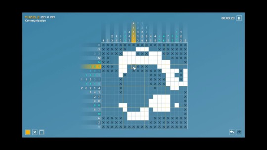
18. Pictopix – Steam – ★★ – 2017
Pictopix is a fascinating lesson that not all Picross games are alike. It's not just a matter of creating puzzles that are secretly pixelized art: there is a flow to good nonogram design that is apparently quite hard to achieve. Where I get a lot of enjoyment from the Picross E- and Picross S- titles, I didn't care for this one, despite being on a platform well suited for a picross-a-like experience. I'm not sure I can even articulate just what rubbed me wrong about it (though the shoddy controls didn't help); the puzzles just felt clunky in a way that other takes on this style of puzzle did not.
Shantae: Half-Genie Hero – Steam – ★★ – 2016
I accidentally backed this game on Kickstarter a few years ago. I thought an artist I was a fan of was attached to this project, when they just did some contracted promotional material for the Kickstarter. It's on me for reading into that, I suppose. In any case, I backed this game, it came out last year, and I couldn't honestly be bothered to actually play it until this year.
After having finally done so: I'm not sure why people like these games? They feel like baby's first platformer; it's well-produced, but threadbare in terms of mechanical complexity. There's a vague Metroidvania-aspect to re-exploring levels you've already completed, but it lacks the simple mechanical joy that the best of those have. The characters don't really do anything for me either; I presume if you've been following these since the mid-90s you get something from their interactions, because personally I just find it kind of lame? The art is fantastic, and the game looks good in motion, but overall, it's just not for me.
17. For Honor – Steam – ★★★ – 2017
Until I started making this list, I had completely forgot that For Honor even existed. Remember this game? It's the one where you play as an assortment of medieval warriors assembled from across the globe to stab each other in 4-vs-4 3 rd person capture-the-point combat. It was OK, but the experience overall fell flat— largely because of an abundance of flaws peripheral to the core gameplay.
The basic combat and mechanics felt and worked well; the simple axis-based block-or-attack combat system enabled some truly awesome duels that really felt like you were in a melee. But while the combat worked quite well, there wasn't a whole lot going on around it to justify the overall experience. The campaign was functional, but it was clearly an afterthought, bereft of even characters. The multiplayer was fun, but severely hampered by a poor progression / unlock system, as well as bad matchmaking and server issues.
In another year, perhaps For Honor would have stood out more. If the game had received post-release support in the way Ubisoft's more Clancyesque titles, perhaps it'd have had longer legs. As is, I spent enough time with it to know that it was maybe worth coming back to once they had hammered out their online issues— something that never really happened. And then the rest of 2017 happened and put it in its proper place. Oops!
16. Picross S – Switch – ★★★ – 2017
Where Pictopix disappointed, Picross S is functional, acceptable Picross. It's far from the best Picross offering in this line (I think I had the most fun with Picross E3, and not just because of its dumb name), but it is Picross on the Nintendo Switch, which is basically all I was really wanting out of it. The loss of touch screen interactions from the 3DS release is bizarre (the Switch has a touch-screen my dudes!), but I can live with it.

15. Shovel Knight: Specter of Torment – Switch – ★★★ – 2017
It's been interesting to watch Yacht Club take the baseline premise of Shovel Knight— a retro-styled platformer shouting its Mega Man inspirations via megaphone to anyone who'll listen— and alter their execution with these different DLCs. Where the original Shovel Knight was a relatively straight-forward platformer (with Ducktales-inspired down-stab action), and Plague of Shadows was something of an odd build-your-own-shooter, Specter of Torment focuses instead on aerial combo-attacks. These changes really alter the gameplay; where the others could be a bit mindless at times (particularly Plague of Shadows, which was fairly easy given the number of projectiles you could throw across the whole screen), Specter of Torment is considerably more demanding of one's attention; you have to be more deliberate with your actions relying than relying on flow to get you through.
The design of the levels doesn't feel entirely there; while they certainly have been more redesigned than Plague of Shadows' were to fit the different style of movement, it just wasn't that fun to play through. Rooms were either too easy or too frustrating, with little in the way of a middle ground. The boss fights were trivially easy (which is dire in a game aping a series that largely relied on the quality of its emblematic show-downs). The plot was… fine? It certainly was a Shovel Knight prequel alright, that's for sure. At this point, I must imagine Yacht Club and I are both on the page on wanting see them work on something else at this point. They've proven themselves to be extremely competent developers, but it's time to put Shovel Knight to rest; they've gotten about as much blood as they can out of that particular stone.
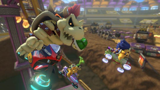
14. Mario Kart 8 DX – Switch – ★★★★ – 2017-ish
OK, seriously Nintendo— when are you going to make a new F-Zero? Don't you give me this bullshit about “Why would you want a new F-Zero when we've already done it before!” when you keep making new Mario Karts with little different beyond the platform you put it on. All Mario Kart 8 DX did was pack-in all the DLC and add a true battle mode— which is great and all, don't get me wrong. It's just a sign that your excuses suck and you need to fund a new Captain Falcon vehicle-vehicle ASAP.
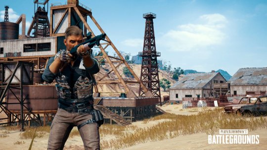
13. Player Unknown's Battlegrounds – Steam – ★★★★ –– 2017
I want to like Plunkbat more than I do, but I don't. What's there that's good is great; the open-world mix of random-luck and skill-based shooting (especially with friends!) is a real hoot, particularly when one is either taking it entirely too seriously or entirely not seriously at all.
But something about the game just feels… incomplete? Despite leaving early access, it really has a lot of work that it should be still getting. The physics is jank (the vehicles annoy me to no end), there's still absolutely 0 tutorializing for new players, and the problem with persistent hacking and aimbotting has been dire as of late. There's also something to the notion that a lot of the skill in the game comes down less to polished learning of the mechanics and their interactions and more a sort of base memorization of Plunkbat Best Practices. That's not innately a bad thing, but I personally find these sorts of experiences better when they're focused more towards tactical mastery than strategic mastery. Both are important in Plunkbat, but I prefer mastering the former over the latter. The game seems to disagree. I feel like the quality of my gear should be less important than how good I am at using what I find. That is not the case. Oh well.
I'm looking forward to putting more time into this with buds in the future, but I've fallen off the wagon as far as general enthusiasm goes. Eh!
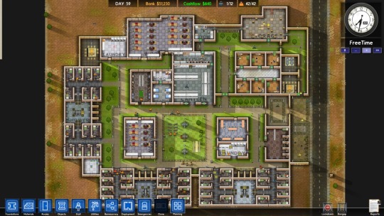
Prison Architect – Steam – ★★★★ – 2015
Prison Architect is sort of a highly-specialized, more accessible Dwarf Fortress. Much of the appeal of Dwarf Fortress is the immersive unpredictability of managing emergent personalities trying to go about their tasks, and ultimately, it's so complex that an ASCII-based rendering is the only way to handle it all. Prison Architect constrains the variability by its very nature (the things people do in a prison are typically well-regulated, and there's not a lot of agency within those bounds), resulting in an experience that is nowhere as impenetrable as Dwarf Fortress— but also nowhere as appealing.
There's just not as much going on when you get down to it; while there's certainly variability in prisoner personality and actions, there are just so fewer variables in terms of what someone can do and interact with. Plus, given your funding regimen and in-take are totally under your control, the actual form your prison takes doesn't need to vary; you're not incentivized to innovate beyond a desire to keep things interesting. You can just your layouts entirely towards efficiency and nothing else, and even then, there's no real end-game to it beyond making numbers get bigger.

Mini Metro – Android – ★★★★– 2015
Mini Metro is a slight mobile puzzle experience, but it is quite engrossing while it lasts. The pairing of simple mechanics and style works very well on the phone. You make subway lines connecting points. It looks like a subway map. It's pretty good.
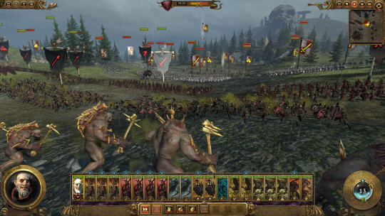
Total War: Warhammer – Steam – ★★★★ – 2016
I've always been vaguely interested in the Total War games— just never enough to go out of my way to actually, y'know, play them. Warhammer Fantasy has never been my thing, but I like fantasy things in general, and the idea of applying battle tactics to lines of zombies was appealing enough for me to give this a look. Overall, it turns out I enjoy the tactical depth of Total War!
I'm not sure how I feel about the strategic-layer in the few factions I played—it's a bit micromanage-y, and any faction managing to sneak its way to the back-end of your empire becomes a real chore-- but the tactical level is very good. The interplay of artillery, cavalry, and troops-of-the-line is realistic enough to where you can apply real-world know-how and be rewarded for it. The types of troops are massively varied, both inside and outside of the factions. I was mostly drawn to this game by the monster-y factions, so those were the ones I played most.
I'm looking forward to checking out Total War: Warhammer II... eventually?
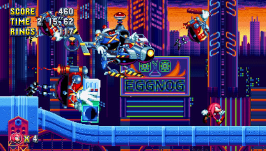
12. Sonic Mania – Switch – ★★★★ – 2017
Sonic is bad. If you add up the total of what Sonic has been over the last two decades and average it out over the amount of games he has had the misfortune to appear in, the average Sonic is hardly deserving of the fawning devotion he receives. Those first few mainline Sonics were good, no question—but that was over two decades ago. SEGA has never succeeded in recreating the feel of those games—even when they have ostensibly tried.
Thankfully for them (and us), there are those that can succeed. Sonic Mania, created by long-time Sonic fans and hackers, perfectly captures the feel of those first three games almost too well. It's basically Sonic 1-3+K+CD, warts and all. The Sonic CD-based stages in particular carry on Sonic CD's design of being too long and really fucking annoying, which is rather indicative of the ethos of Whitehead towards recreating the feel of the older titles. I'm very curious to see if they'll be given permission to do a Sonic Mania II, where they'll perhaps have a chance to innovate more and burn off those warts. I'm not sure if they would, but I certainly hope they do. Sonic deserves better than, well, Sonic.
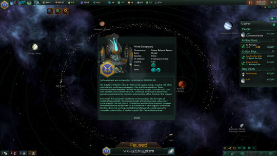
Stellaris: Utopia & Stellaris: Synthetic Dawn – Steam – ★★★★– 2017
This is technically a 2017 release, but it's so miniscule an addition to the existing Stellaris that it's not worthy of a numbered ranking. Stellaris in 2017 is a lot like Stellaris in 2016, but better. The addition of end-game specializations, new government-types, and the ability to play as both hive minds and robots are extremely good, but there's still a lot of room for improvement. That's the Paradox model, I suppose; they'll continue iterating and adding onto Stellaris over the next half decade until it finally achieves some near-ideal state—or the engine buckles under all they're trying to do with it. One of the two.
My favorite Stellaris moment this year must be the creation of "The Borth Problem". The Borth are a race of space Hyper-Platypuses, whose traits were specially selected by their creator (me) to be absolutely trash. They're short-lived, xenophobic pacifists who hate being around each other almost as much as they hate being around everyone else. I force them to spawn as one of the empires in every game I play-- not because they're particularly threatening, but because watching them repeatedly balkanize every two months under the strain of their own ineptitude and malfeasance is extremely good. Occasionally some fool attempts to annex Borth planets, which is a tragedy in and of itself.
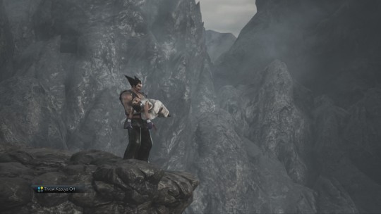
11. Tekken 7 – Steam – ★★★★ – 2017
God am I terrible at fighting games. I've just never put in the time to get any good, and I'm way too prone to mashing out moves I think are cool than learning combos or hit-strings. God do I love fighting games though— and Tekken 7 is a good one. It is a Tekken game through-and-through, but the additions they've made to the cast have been good, and the limb-specific combat system continues to hold up after all these years.
To be completely honest? I've been playing mostly as Eliza—whose special strings are just Street Fighter entry strings. She's basically Ryu if he was in a bustier (and a sleepy Dracula). It's allowed me to get past the hump of learning how to pull-off her specials, though it's done little to actually get me good at stringing combos together. It's still a lot of fun though.
10. Puyo-Puyo Tetris – Switch – ★★★★ – 2017
IT'S PUYO PUYO AND TETRIS, WHAT ELSE DO YOU WANT FROM ME?
Final Fantasy Tactics: War of the Lions – PSP – ★★★★ – 2007
Coming to Final Fantasy Tactics two decades on from its initial release on the PlayStation, one can still understand the appeal. The tactical RPG system has phenomenal mechanical depth, supporting wide-ranging customization and gameplay specialization. There's lots of weird systems to learn and exploit. The setting is austere and grounded in a way that few RPGs are; the story it tells is ultimately yet another Japanese tale of man-killing-god, but the way that it's presented is more about fighting back again the abuse of systems by society, and the futility of one man trying to change the world.
At the same time, two decades have passed since Final Fantastic Tactics came out, and it honestly has not aged superbly well. The controls are bizarre, its job system is rather annoying in practice, it suffers from the usual problem games with permadeath carry where the second a character joins the party and becomes non-essential, their relevance to the story ends. The story which was apparently once so astounding seems almost quaint now; “Organized religion… may be bad!” is far from a hot take in these days, and there have since been hundreds of other games (JRPGs, even) playing in the same sandbox.
As someone introduced to the Ivalice setting of Final Fantasy through Final Fantasy XII, it's also somewhat strange looking back at this series and trying to conceive of them as some connected timeline. A lot of what I liked about Final Fantasy XII was its diverse races and their cosmopolitan associations and interactions. Tactics has even less than none of that. It goes out of its way say with a ringing finality “AND EVERYTHING NOT HUMAN OR DEMON WENT EXTINCT, THE END.” Pour one out for my Ban'gaa homies, I guess??
I had fun with Final Fantasy Tactics, but I suspect I may have had a miserable time if I didn't have a friend warning me of points-of-no-return and making sure I didn't build myself into an unwinnable state. Also: exposing me to the utterly broken arithmetic / mathematics magic system, good lord.
9. Splatoon 2 – Switch – ★★★★ – 2017
Splatoon was a good game; Splatoon 2 is that same game, on a different platform.
The additions made to Splatoon 2 are really quite minor; there's some slightly different weapons, and the campaign is denser, but all in all it's just the same good game. The only meaningful addition to Splatoon 2 is Salmon Run, Nintendo's take on the cooperative Horde mode. And you know what? Salmon Run fucking rules. My best multiplayer experiences this year were playing Salmon Run with my boys on Discord. If it were more reliably available, I'd probably have played it more!
youtube
8. What Remains of Edith Finch – Steam – ★★★★ – 2017
The latest in the Walking Simulator genre, What Remains of Edith Finch is low on the interactivity, but high on the graphical fidelity, atmosphere, and emotional heft. Sometimes that emotional heft veers into the realm to over-sentimental schmaltz (the ending engendered some real roll-eye), but it doesn't diminish the overall experience. What interactivity that is there is quite good, and it all-in-all made for a great evening experience. I like these sorts of evening-games where you can plop down for 4 hours and just have a nice, self-contained emotional experience.
7. Metroid: Samus Returns – 3DS – ★★★★ – 2017
Maaan, it's good to see Samus in a properly ass good video game again. Other M was bullshit that I wasn't down with at all; this is some proper Metroid-ass Metroid. While there's perhaps still a bit too much Metroid 2 in there (the game is remarkably linear for a “Metroidvania” and the area design is a bit one-note – befitting its Gameboy origins), Metroid: Samus Returns is a very excellent proof of concept that yes, you can make a good Metroid in 2017.
It's also proof that even if we can no longer trust the franchise to Sakamoto's hands without him ruining everything and throwing a tantrum about Prime, others are capable of doing what's necessary to ensure that Samus remains a galactic badass and not Sakamoto's weaponized nadeshiko. Uugh.
As an aside: The references back to the Prime Trilogy, as well as the REALLY WELL-HIDDEN sequel-hook, are extremely good and appreciated. I am pumped to see what Mercury Stream (or someone else!) does with Metroid moving forward. Is that sequel hook actually a Metroid Prime 4 hook? That'd be cool as hell.
6. SteamWorld Dig 2 – Switch – ★★★★ – 2017
SteamWorld Dig was a relaxing, though ultimately rather forgettable take of what would happen if you crossed Metroidvania with Mr. Driller. SteamWorld Dig 2 would be the same, if it wasn't for the fact that it's just so god damned well-polished. Everything about it from the core gameplay feel, the movement, the digging speed, the music— they're just so damn well executed. The game world is just a delight to be in.
The story and ending are disappointing (as legally required of every SteamWorld game) but that's not really the point; this is absolutely a game where it's absolutely about the journey rather than the destination. When your journey revolves around such a fundamentally satisfying gameplay loop, the greatest sin it has is ending in the first place.
youtube
HITMAN – Steam – ★★★★★ – 2016
HITMAN is good! IO Interactive has created the ultimate encapsulation of the Hitman formula. The game is built to encourage replay and iteration on the game's limited number of maps. This is great, because replaying missions to achieve the perfect murder is a real joy. HITMAN is a game about perfecting the art of playing it: learning the systems, the maps, and the routines of people to the point where you see the clockwork that everyone else is beholden to— so that you can slide between the cogs like a bald, sardonic time-ghost. The game is grimly hilarious and cool in equal measures. I can't wait to see what they do with Season 2.
Stardew Valley – Steam – ★★★★★ – 2016
Stardew Valley is a celebration of the routine. While so many games are about providing novel experiences and spectacles to keep our interest, Stardew Valley enables you to a build a routine, iterating and adapting as the world twists and turns around it. It's about riding a slowly swelling wave while maintaining flow; your farm and experience gets more and more complicated as the seasons go on, but it's always at your own pace; there's no real stakes beyond a desire to prosper and discover. It's charming and addicting in equal measures.
I'm glad they stopped development on it to focus on porting it to new platforms, because I'm pretty sure they'd have honest to god killed people with it. It turns out the cup-and-ball game from that Next Generation episode is actually a game about pleasing your peepaws' ghost by growing corn and hooking up with the goth chick down the lane. You're welcome, peepaw.
Valkyria Chronicles – Steam – ★★★★★ – 2016
Man, SEGA used to make brilliant RPGs back in the day, huh? I really liked Skies of Arcadia, and this is another RPG in that vein from that era. You wouldn't think “fantasy World War II European Front through the lens of Japanese RPG developers” would work, but… it does! They manage to evoke some genuine ethos, and their depiction of the brutality and horror of war, the in-grained senselessness of inherited discriminatory beliefs, are actually pretty OK. You'd think “We're going to depict ANIME FANTASY HOLOCAUST” would be the Worst Thing Ever, but they manage to thread that line enough to make it work… mostly.
Perhaps the craziest thing about Valkyria Chronicles though is that they somehow managed to make a tactical JRPG about trench / tank warfare not only work, but work well. While it's kind of breakable in areas and has balance issues, it managed to hold my interest through the dozens of hours without getting bored. I wasn't invested enough to do much in the way of the extra / repeatable missions, but I thoroughly enjoyed the combat for what I played.
That all said, Valkyria Chronicles could have done with less anime all around. If you turned that anime dial down a good 20%, this would have been a vastly superior work— perhaps even an all-time great. Unfortunately, its tendency towards Anime-ass composition and design, and some frankly juvenile characterization means it will forever carry that stigma of “it is very anime” that prevents it from penetrating into less anime-immune audiences. Still, for those willing to give it a shot and endure some really ham-fisted anime-as-all-hell ruminations on peace, Valkyria Chronicles is a real gem.
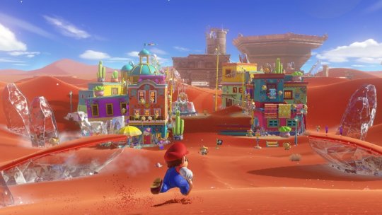
5. Super Mario Odyssey – Switch – ★★★★★ – 2017
The single thing that has defined Mario since the halcyon ape-threatening days to his hat-tossing present has been his movement. Over the years, the movements available to “Jump Man” have become more varied and complex, but they still harken back to what set him apart in the beginning: it's all about the jump. Mario Odyssey, while ostensibly about his more obvious hat-trick, is in reality just another stage of the gradual, ever-evolving repertoire of Mario's jump. He just… jumps so damn good y'all. It feels real damn good to run around and jump on shit as Mario. The hat even makes it so he can basically jump in the air, it's ridiculous.
Mario's new ups are made even better Mario Odyssey's excellent collections of worlds for him to mark with his kicks. The sheer variety and volume of unique platforming experiences is great, and it's ultimately up to you how deep you're willing to take it. Mario is something of a casual completionist's nightmare, given just how many stars there are to find. But for those willing to take a step back, the game allows you to engage it just as much you'd want. You could work on polishing your platforming skills to where you easily master the Darker Side of the Moon, you could just play enough of the game after “beating” it to get your fill, or you could just play what's needed to get to the credits. If you're a complete mad-person, you could try even collecting all those stars. All are valid end-points, and no matter what the experience is a complete and quality one.
Some one-off thoughts:
The new enemy designs in the game are so good. A particular shout-out to the Oni Thwomp!
THERE IS A BOSS WHOSE NAME IS “Brigadier Mollosque-Lanceur III, Dauphin of Bubblaine”, FUCK
Steam Garden's God Hand surf rock theme music is so good
The entire end-game sequence leading into the post-game zone was one of the most surreal things ever
NEW DONK CITY
youtube
4. Cuphead – Steam – ★★★★★ – 2017
Cuphead is a magic trick. At first glance, it seems impossible, like an actual sorcerer has walked in and done something impossible. “There's no way anyone could recreate the style of Fleischer-era cartoons and make a genuinely good video game!” Like any magic trick, once you look at it long enough the magic goes away, and you see it for what it is. You see the sleight of hand, the smoke and mirrors required to resurrect a nearly century-old style and make it work in what should be a wholly incompatible medium. But the skills required to pull that trick off, and that such a small studio accomplished it, is itself a feat worthy of a wizard with a sizeable beard. It's not perfect, but it's as damn close as any person could ever expect to see, really. The game looks, sounds, and plays damn good.
It's been funny following the discourse around Cuphead's gameplay, particularly the reaction to its difficulty. It's nowhere near as hard as people make it out to be; it's got a lot in common with bullet-hell shooters like the Touhou games, to be sure, but the difficulty about those games, like Cuphead, are more about learning how to play them right than anything particular crazy about most of the challenges they put in front of you. Once you learn how to precisely move the character, you can basically relinquish yourself to the flow state and soldier through pretty much everything (within reason). Cuphead's real trick in this regard is that the types of things going on screen look so fucking cool that it can pull you out of the flow through sheer wow-factor. It's a game that is harder because it looks so good. Unreal.
youtube
3. Pyre – Steam – ★★★★★ – 2017
The cruel hands of mother nature have evolved Supergiant Games into the perfect predator of my species. Their approach to writing characters, stories, and music is such that whenever they release one of their games, they burrow a tendril into my brain and maneuver my zombified body into a hole so they can lay eggs in my chest cavity. I'd feel more broken up about how they play me like an acoustic guitar if they weren't so, y'know, good at playing acoustic guitars.
Ostensibly, Pyre is NBA Jam meets Oregon Trail meets a Visual Novel, but it's so much more than that. It's the archeology of uncovering the history of a world through half-heard conversations and vaguely-written reminiscences. It's the trepidation of holding the fate of friends in your hands and knowing that you can't save them all in the end, and still having to choose. It's the struggle for glorious revolution, even though the odds of a bloodless one is low. It's all these things. You plot the end of an empire with a pipe-smoking treeman in between games of mystic slamball with a mustachioed dog. Everything about how it carries itself and presents its world resonated deeply with me and held me enraptured to the very end.
youtube
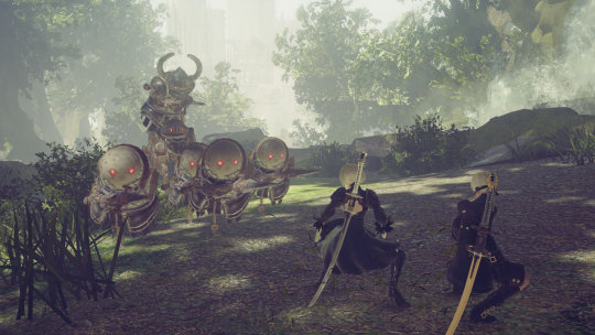
2. NieR: Automata – Steam – ★★★★★ – 2017
I've spent a lot of the last year thinking about Nier: Automata. At this point, I'm not even sure what to say about it. Do I talk about the questions it raises about humanity and what we may leave behind? Do I talk about its astounding visual and audio design? Do I go on a long aside on Yoko Taro's writing and directorial style? They're all valid things to talk about, but they're also all meaningless. They're only important in how they made me feel over the course of my journey with Nier. Intrigued, lost, depressed, uplifted. Nier: Automata invoked all these emotions in me in turn.
In the end, I'm left somewhat in awe of the experience. Not because Nier is a perfect game; it's a very flawed one. But it's a game that's really made me feel and think. Yoko Taro weaves the threads of narrative, emotion, and atmosphere with the deftest of hands. So what if the loom he was forced to work with wasn't a particularly good one? Nier: Automata is one of the most complete explorations of the nature of humanity and how impossible it is to grasp. I imagine I will carry thoughts of it with me forever.
youtube
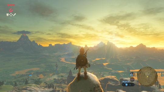
1. The Legend of Zelda: Breath of the Wild – Switch – ★★★★★★ – 2017
Breath of the Wild is my favorite video game of all time. Thanks, Nintendo.
youtube
#game of the year#2017#nonfiction#think piece#breath of the wild#nier#pyre#cuphead#mario odyssey#valkyria chronicles#final fantasy tactics#hitman#steamworld dig 2#stardew valley#Stellaris
15 notes
·
View notes
Photo

Quan Zhi Gao Shou / The King’s Avatar Manhua (Chapters 6-10)
Onto the next five chapters! Thank you to everyone who read my weird ramblings in the first part!
There will probably be some overlap between this liveblog and my liveblog of the novel, but I’ll try to minimize it.
Chapter 6: Thief Shouting Thief

How nice of you to offer to help dry clean his coat, Chen Guo!
xD Ye Xiu’s “Oh...” reaction.

Ah, so he actually said this through audio. I couldn’t tell when I read this part in the novel. That makes it funnier, him saying it with that flat expression. And Sleeping Moon’s “Hello my ASS” comment haha.
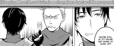
Decided to live up to that ‘shameless’ label, I see. The funny thing about this being in-game is that you can have that comedic moment of Sleeping Moon pointing up at the banner and have it not be a sort of fourth wall thing you’re supposed to ignore for the sake of the story. Like, the notification can actually be on screen here.
Did you not learn your lesson, like you really think you can screw him over, haha.
The names aren’t as fun this time around, though: Drifting Water, Sunset Clouds, Seven Fields. I think these guys have more experience than the previous party though, so perhaps that is meant to reflect that.

lol this time, no one is fooled. I love the chibis. Everyone’s expressions are really great throughout this thing, actually.
Actually it’d be better to say: use him for hard labor, then kick him out.
I LOVE THE HONESTY. AND THE IRONY.

You actually made your in-game avatar yawn. I know it’s a first person game and this is technically just an expression of the characters in real life for the benefit of the readers, but.

There was no way to represent the hilarity of these panels without screenshotting them all. Their progression through the cave, each expression changing with each panel, the little “being careful” vs. “vigorous strides”. I love how they’re so on edge, and Ye Xiu is looking bored. And Sleeping Moon looks like a scary imp.

I need to make icons of all the funny expressions made in this manhua or something.
lol after their wild theorizing on how he could be that good or pull off those combos, they then go “you know what, we shouldn’t piss this guy off” to being in awe of his skill.
Chapter 7: A Showdown in Spider Cave

T-the little chibi characters trying to climb up giant Lord Grim...it’s so cute.
LITTLE MOON MOON. I actually remember this from the animation, but it’s still hilarious.
AH. It’s Blue Brook Guild’s arrival on scene...They’re half the reason I got so confused with all the names in the first place. Their names all follow a theme and they’re too similar urgh. Ok. I’ll get it straight this time.

Pretty boy here is Blue River, yes?
Lol, DRAMATIC FIRST KILL CLAIMING SHOT--
Oh, never mind someone beat you to it!

lol someone who’s not freaking out about it right this moment. I liked Blue River in the animation, he was a fun character.
Chapter 8: Seizing first kill by ten seconds’ lead
They needed 11 ellipses for the silence that befell them after they were done killing the boss.
And back with the ragtag team with Lord Grim...they’re singing his praises up the wall.

Poor Little Moon Moon. Why do I keep screencapping him? His super dejected expressions are gold, that’s why.
He’s a far cry from his confident, smug first appearance:

remember when he had some class?? xD
Ah, I remember when everyone started calling him Little Moon Moon too xD I love how no one even listens when he threatens them to stop calling him that.
We’re all adults here. Don’t be childish. It’s just a game. Don’t let this upset you.
words of wisdom to live by. too bad a lot of people are so horrible at this irl.
Blue River’s manhua version is so pretty...I have a weakness for bishounen characters, ok. Even if he’s currently just a character in a game and I don’t know what his real life character looks like.

OH GOD. it’s the nice ones that snap first.
I wish they would decide whether they want to censor curse words or not...I’m not going crazy, am I? It was spelled out some chapters ago.
CHEN GUO. “You don’t want to live anymore!?” She went to sleep, got up in the morning when it’s nice and sunny, and he’s still playing...Furthermore, he’s teamed up with the guy who trash talked him and everyone is willingly giving up drops to him. No wonder she’s bewildered.

I mean, it’s stopped absolutely no one before, but yes he has a point.
“You not only transformed your foes, you made them your followers as well!?”
The madness and shenanigans of the 10th server are just beginning.

What a handsome Ye Xiu. You do not look like you pulled an all-nighter. You should be dead on your feet.
But aww, Chen Guo fixed up the spare room for him. She did feel bad about it earlier, I remember from the novel.
Uh, is he taking his shirt off to sleep in the middle of winter...? he didn’t bring a change of clothes or anything either.
Chapter 9: I was exiled to to the Qin Mountains in the autumn wind
What’s with the chapter title this time around? I think I’m missing so many references here.
The press conference and announcement of Ye Qiu’s retirement was a strong moment in the animation, and it’s presented nicely here as well. The look on Ye Xiu’s face is particularly painful, as he stands alone in the back of the room essentially watching the last 7 years of his life summed up on screen.
As well as Chen Guo being absolutely devastated that her idol retired. Haha, he’s still coming out right and telling her his identity, but she doesn’t believe him.
The irony in asking if he wants tissues to cry over Ye Qiu’s retirement, and he says “Why would I? How could I ever cry?” when he really has the most cause to cry out of anyone at that moment.

For someone who was never into publicity and stuff, he has a suuper charismatic smile apparently. Look at that thing.
omg yeah I remember now, Sleeping Moon being a fan of Ye Qiu and depressed that he retired. Must be so awkward for Ye Xiu.
Speaking of awkward, he feels awkward having to keep relying on the others, in his words ‘free labor’ lol. I don’t think his feelings were so clear in the animation.
Wow, these skeletons are well-drawn. And wonderfully gross.
Chapter 10: At the blue bridge, you returned to Changan with the spring snow

Had to take this page directly, I wanted to get a better look at all the character designs. Aaah, I really love the designs. All the little details~
Ooh, so this is where the manhua works in its explanation of the weapon types. Nice little graphics to go with it too.

Was this the best image to pick to go along with the idea of ‘professional research facility to create silver weapons’...?
So Blue River is Blue Bridge Spring Snow, but in the 10th server. Thaaat’s not confusing at all. (his name is a reference to the chapter title which is a line from a poem, right?)
T-the Cleric’s name is Bound Boat...

I didn’t recognize her at first either. HAHA Ye Xiu was also surprised.
I do like Chen Guo’s explanation why she doesn’t think Ye Qiu should retire, she’s quite perceptive and analytical. Even though this is her idol, she sees that his performance hasn’t been good and that was probably why Excellent Era used him as a scapegoat over the years (apparently more than once).

Once again, the designs are so nice. And we get a little sneak peek of the real people behind the characters.
lol Ye Xiu not listening to Chen Guo at all. SHE WAS ONTO SOMETHING, TOO.
“But that machine’s the server!” “I’m the boss.” hehe Chen Guo is too much.
“I forgot to read the guide.”
oh no. so much for mr. textbook player.
← back・onward →
8 notes
·
View notes
Text
Top Fives: Ade The Terrible’s Top 5 Skateboarding Video Games
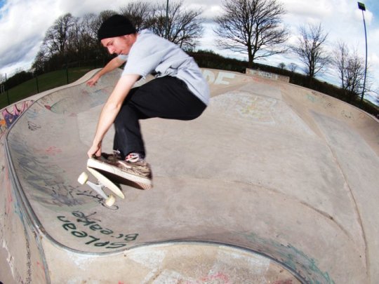
With this Coranavirus shit kicking off, and the sensible advice being to STAY THE HELL INDOORS, it’s understandable that you might get bored and have that itch to skate. Unless you have your own private skatepark, you’re gonna have to get creative and dig out some video games so you can still shred. With almost 10 years of experience working in the games industry, and as someone who has held a BAFTA, I know what I’m talking about when it comes to all of this video game malarkey, so join me as I talk you through my top 5 skateboarding video games.
5. Thrasher: Skate And Destroy (PS1)
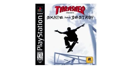
This game had literally everything going for it back in 1999. It had the Thrasher license. It had legit, authentic skate spots like the Brooklyn Banks and Southbank. It had gameplay based on getting kicked out of spots by security guards (#sorelatable). It had a realistic approach to skateboarding that made tricks difficult, yet satisfying. And it was published by (arguably) one of the best video game companies in the world - Rockstar Games. However, it near enough flopped, because a competing skateboarding game came out a month later and completely trounced it in sales and critical praise. That game was Tony Hawk’s Pro Skater. For this reason, not as many people probably know about Thrasher as they should.
youtube
The only thing Thrasher didn’t have was actual pro skateboarders. The game had a bunch of unlicensed generic skater characters who you could customise, so at the very least you could alter them and create someone who looked like you instead - something THPS wouldn’t get until the second game. It had an awesome hip hop soundtrack (which, to me, isn't really in keeping with Thrasher, but when the soundtrack is as good as Skate And Destroy’s, you could see it getting a thumbs up from the Phelper), and the gameplay was far more slow paced, methodical and grounded in reality than THPS. It doesn’t particularly hold up well today, but it’s well worth a look.
4. Session (PC)
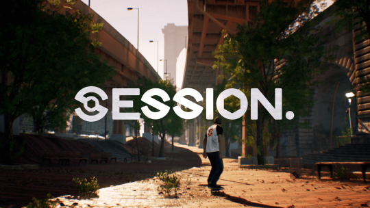
Despite being in early access on Steam, Session is already a far more satisfying experience than half of the stuff that came out in the “extreme sports” boom of the early 2000’s. In many ways, despite people pinning their hopes of it being a spiritual successor to EA’s Skate, it has far more in common with the previously mentioned Thrasher: Skate and Destroy. It’s authentic, urban location gives me strong Thrasher vibes, and it’s slower, methodical gameplay, where combos and scores are non-existent, rewards practice and patience. It exhibits details that other games have largely ignored, like boards having different deck and wheel sizes, or stance literally mirroring your controls, or the ability to do pressure flips.
Recently they just added Update 0.0.0.3, which adds Skate-like controls and some new levels to play: whilst some (myself included) hoped this might improve the experience, it becomes painfully clear this game was never meant for Skate’s control scheme. To have the option, however, is a nice touch if you are itching for something like Skate. The new locations in the game add a “modified” version of the Brooklyn Banks designed by the developers, which adds a ton of stairsets, ledges and handrails. There’s a lot to skate here, and a lot of fun to be had. There’s also a mini ramp, but (and this is probably a symptom of the game still being in early access), the transition skating is extremely buggy and doesn’t work properly at all. This is a problem Session’s main competitor, SkaterXL, also suffers from. I worry these newer games are going to get transition skating all wrong, which would suck, but it’s still too early to judge either one.
youtube
The game very obviously lacks the budget and scope of a AAA console game made by Activision or EA, but in many ways that gives the whole thing a scrappy, DIY feel. Comparing Skate to Session is like comparing Fully Flared to a local scene video - they are doing completely different things and going for completely different vibes, despite both being about skateboarding. One has a near infinite budget, and the pick of every pro on the planet, and the other scrapes by on what the people behind it can throw together within a limited budget and a small crew. I think the hope of Session being “Skate4” might have hurt its reputation slightly, but if you go in with fresh eyes and judge it on it’s own merits, you’ll have a lot of fun.
3. Tony Hawk’s Pro Skater 4 (PS2)

This game is on my list because it is, I feel, the culmination of the best features in extreme sports games at the time. I liked the THPS games that came after (OK, maybe not THPS5… or the ones where you stood on an actual skateboard), but the new ideas in THUG1 and 2 just felt like they started to veer away from authentic skateboarding and turned the game into “Jackass: The Video Game”. THPS4 felt like the last game truly grounded in skateboarding culture, with challenges that truly referenced stuff you had seen in skate videos, with little jokes for skateboarders, and a list of locations which had a few nods to Thrasher: Skate and Destroy’s level selection, but through the lense of Neversoft’s excellent level design.
youtube
The game cribbed features from a competing game of the time - Aggressive Inline (developed by Z-Axis, who had been the team behind Thrasher), featuring no strict time limits, and treated each level as a mini open world, allowing players the freedom and time to just skate freely and pick up challenges at their leisure. This was the first THPS game to do this, and compared to the constrained time limits of past games, it felt like a true evolution for the series. The basic building blocks of the THPS controls were at their peak here as well, with spine transfers being a big edition which made you feel like you could flow skateparks like Grant Taylor at the push of a button (or, Rune Glifberg, to use a more era appropriate comparison).
2. Tony Hawk’s Pro Skater 2 (PS1)
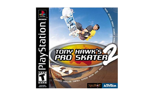
Yeah, I know, this makes it look like I ran out of games to put on the list. But, this choice is intentional. There are so many other PS1 skateboarding games I could mention here (Grind Session immediately came to mind, if only because Ed Templeton was in it), but THPS2 has a special place in my heart. It is the reason I started skateboarding; without THPS2, this blog wouldn’t exist. I remember THPS1 being a fun game, and it definitely grabbed me, but THPS2 is where I remember the series really stretching its legs, and the authentic elements of skateboarding really expanding.
The weird downhill levels were gone, and the level selection was a combination of great real life parks (Marseille, Love Park and FDR in Philly), and references to skate videos (The Bullring from Tony Hawk’s part in The End was expanded into a full level!). Character creation, and park creation, were added, to give you infinite hours of fun building your dream skate session. The soundtrack is, still, I think, the best soundtrack to grace a skateboarding video game.
youtube
Manuals were added, as the first step toward THPS giving you the tools to land never-ending combos. There are a lot of jokes about THPS feeling like a weird, unrealistic, arcade game - but at the time it was genuinely the closest thing you could get to playing a game that had the perfect cross-section between authenticity and playability. Even better, with the “sim physics” cheat, the game felt far more realistic, and skating the mini at Skatestreet Ventura felt like skating a real ramp. It is instant nostalgia for me, and I feel it is the most replayable of the THPS games.
1. Skate 3

EA’s foray into skateboarding seems like it was over within the blink of an eye, but they bashed out 3 games very quickly in that time. 2007’s Skate, 2009’s Skate 2, and 2010’s Skate 3 are perhaps the closest we have ever got to the “game-feel” we expect from AAA games perfectly aligning with the authenticity of skateboarding. Skate 3, for all of it’s unfortunate, weird glitches, is still the peak of the series, with a wealth of features that give players the tools to skate and create. Even 10 years after release, I play Skate 3 far more than any other skateboarding game I own (even newer games like Session and SkaterXL get ignored in favour of Skate 3), and having the game on the Xbox One’s list of backwards compatible games has been one of the best things to happen during this console generation.
Skating street in Skate has always felt natural and intuitive. You can literally frontside flip a 16 stair and feel like Andrew Reynolds from the comfort of your living room. The room for inventive street skating is limitless within the game’s main city, and the park creator gives you a palette of options to create even more insane spots to invent tricks on. Transition skating has always been a bit hit or miss in these games, with vert/mega ramp being the only thing which they nailed. In Skate 3, however, they got the closest they had ever got to making it fun and realistic. With small touches like characters “dropping in” from tail and nose stalls, footplants which behave (mostly) in a way you would expect and a good selection of pools and mid-sized transitions for realistic skate sessions; Skate 3 had just enough to it for anyone wanting to skate transitions properly. I’ve debated with people whether the transition skating was really that good in Skate 3, but Nollie BS Bigspin Tailstalls and Noseblunts look so, so good in it - so I think it gets a pass.
youtube
Skate 3, for me, represents a gold standard for skateboarding games - perhaps even open world games in general. In many ways it pre-empted gaming trends that would come years later; an increased focus on user generated content, online connectivity (originally used to create a sense of community not unlike a local skate scene), and tutorialisation and a wiki for game mechanics to aid accessibility. The game was welcoming and intuitive for most players, and made bombing hills fun and rewarding. It’s deep selection of tricks was engaging, and it’s open world (although splintered into 3 hubs) was fun to explore and navigate. There was a real feeling of discovering new spots, and maybe being the first person to skate something. I can see in Skate 3, what I saw in THPS2 - an experience that sums up the raw, creative, positive energy of skateboarding, and a game which could inspire millions to get out and skate in real life. For these reasons, it is my favourite skateboarding game, and will take nothing short of something akin to “Skate 4” to top it.
0 notes
Text
QUESTIONS AND ANSWERS AND DEVELOPMENT UPDATE ROUNDUP
We’ve gotten a number of questions from our Discord members in the past month and it’s time to share them with everyone along with our answers.
See what a handful of our backers have been asking Rob, Aivi, surasshu, and me after the jump.
Kishou asks the following questions:
Can you change Esmy's appearance? Like, with armor sprites?
Sadly, given how Cryamore’s sprites are designed, it’s too taxing to make armor sprites for Esmy as we’d have to make armor sprites for a lot of unique animations, idle, running, hit, ground cast, mid cast, high cast, Vanish animations, Boulder Dash animations, etc. and then multiply that with 3 or 5 directions each.
The most we can offer for visual customization are palette swaps.
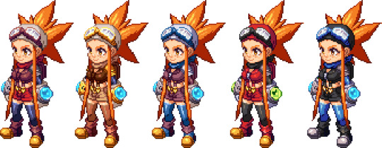
Featured above are palettes for default, Braxton, Bliss, “Dewritos”, and Black & Blue
I just want to see Esmy in something revealing like a swimsuit
Rob can probably arrange that in another artwork. I could sprite Esmy in a swimsuit but I don’t think we have any scenarios written down that feature her in one.
Of course, we could always write one in...
I'm not sure if this is asked before but is there a love interest in mind for Esmy?
Esmy’s too focused on her work and studying cryamore to notice anyone that may have feelings for her.
Right?
There's no "right" or "wrong" way to clear the game right? Like, surely some spells solve puzzles but there will be proficiency in not just weapon choices but spells in fighting too?
We’ve done our best to make sure your offensive/defensive ability and weapon loadouts will always be viable so whether you like playing ranged weapons with hard hitting close combat abilities, using mobility enhancing abilities with melee weapons or whatever playstyle tickles your fancy, we’ve spent a lot of time ensuring we got everything balanced and fun enough so there won’t be an absolute god tier and worst tier loadout.
Phosphatide asks:
About story flow: with games now searching for the perfect balance between "linear progression" and "open world freedom" to avoid blatant in-game walls preventing the possibility of sequence-breaking exploration or aimless wandering with no sense of urgency... what was your goal for Cryamore?
Alan: Honestly, I personally wanted full-on freedom to go explore some of the hardest areas of the game and risk the chance of getting wrecked, but we had to corrall things a bit to ensure you stay within the story bounds. Rob being the lead on this has final say on direction.
Rob: I wanted to instill a sense of survival in the game and make sure that the abilities are a big focal point for both puzzles and combat so we were able to block off certain areas of the world the way Metroidvanias would; give you a hint at what might be ahead, but you're blocked by something that needs a new ability
Alan: There's still freedom to be had but you can only go so far before you either hit a roadblock which needs an ability or sometimes story progression (you need clearance to explore south of the island)
So yeah, the goal was to give some freedom but not too much and I'm hoping we managed to achieve it with the world design I've done and with enough usage of the puzzle solving abilities we've made.
Tomar asks:
Curiosity here. Do you guys do art asset sharing through your VC system, or do you use something simpler like dropbox/google drive?
We’ve mostly used Dropbox all throughout to share asset files.
Above are the four folders we have set for Cryamore. Backgrounds has Rob and me contributing to it, Illustrations has Rob, me, and JC and Juby’s contributions, Inspiration Music has Aivi and surasshu’s work (a lot of unheard of to the public music WIP files) and Sprite-Animations has my work.
Once something like music, animation or an environment asset is set, Rob or I transfer it to Unity, apply any settings necessary (import and display settings for 2DToolkit, audio settings for Master Audio, etc.) and then upload it to the SVN so the file and all its settings will exist for anyone on the team with a Unity key and access to the Cryamore SVN.
Do you use freecamp for like kanban/task management stuff?
When we had more people in our team, we used OpenOffice and then switched to Freedcamp to keep track of tasks and bugs. Now that it’s just Rob and me, and Aivi and surasshu on sound and music, we mostly just keep a personal to-do list.
Xaelon asks:
I have no idea if this is possible with how the game is built, but something you could add to promote replay after the base game is completed would be a "randomizer mode" that shuffles various things into different places.
We could probably apply that to enemy spawns and some cryam deposits but the environment layouts though aren't as flexible sadly as we don’t use tilesets and the collision bounds of the environments aren’t generated by object due to a lot of irregular organic shapes.
We definitely have considered implementing a NG+ option though, maybe with levels and certain abilities intact on the next play but with more mobs and other difficulty boosts.
shadowreaper5 asks:
Do skills with timers (like the buff to breathe underwater) have a visual representation of the time left?
To a certain extent, yes. Esmy’s going to have a breath meter over her head while underwater without the Oxy Barrier ability.
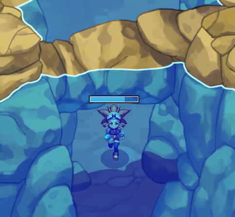
We initially wanted to just have a blue fill over Esmy’s status portrait (which changes to her holding her breath) while underwater but so it’s easier to keep track of, she’ll have a meter above her head when she isn’t using Oxy Barrier underwater.
While we do have spells with durations, some of them won’t have a meter and rely on visual cues: a timed magma mine will blink when it's about to explode, time paradox clones should blink when they're about to fade, and shadow cloak should fade back to full visibility upon ending. As it is though, we will mention the duration of spells in their info box at the menu.
Tarquinn2049 asks:
Ok. This question is a bit on the other end amd might make me sound like a jerk due to timing. But does it support 4k? And if so is it by pixel doubling? I can totally play it at 1080p if hardware scaling will ultimately look better.
Our native resolution is 720p which we’ll be upscaling to 1080p. We won’t be able to provide 4K support as working primarily in 2D where our target resolution is 720p would require us to rework the assets in a larger size so as not to lose crispness of lines and pixels on a larger resolution.
Rob: The game looks freaking good on a 50-70 inch, though haha! I for one can't wait to playtest a lot on console (devkit).
DEVELOPMENT UPDATES
Unity editor-wise, Rob has been working on optimizing the code further. The sorting order of the game was archaic and clunky, so Rob decided to squish it down to a simpler and more effective form that relies on Sorting Order that Unity didn’t have early on during our development. We instead relied on Z index which required a lot of fiddling around with when setting objects up.
youtube
You can see in that test room video that the “Order in Layer” is changing value. Back then it would be the Z in the Position attributes and we’d have to manually set the value beforehand to make sure things appeared behind or in front of objects right.
youtube
Rob also implemented full analog movement instead of just the D-pad, this allows for more control, though it’ll need a bit of tweaking as it currently looks like Esmy’s skating along the ground like she’s about to break it down and provide everyone with boosted shields.
There’s been polish going on in multiple fronts on the graphical end as animations and environment assets get fixed.

Above is the fist weapons, we initially were going to go with brass knuckles but decided that it wouldn’t be that noticeable on the sprite unless we made it large but I wanted to make sure you wouldn’t miss the weapons so I designed these gauntlets that shows a bit of the transition from steamtech to cryamtech and also offers a more interesting silhouette while also making a bit more sense as a viable weapon against dangerous monsters.
The fists primary function work as a mashable combo. One press of the attack button does a jab, two presses in quick succession performs a jab and punch, three does a jab, punch, uppercut combo. It’s quick but it doesn’t have that much range or width in its melee attack range.
The second function is the parry which allows you to negate any damage if timed right. Rob’s in charge of securing the timing for all these as he’s the one in Unity and more well-versed with the parrying system this was inspired from (Street Fighter 3) so I trust he’ll make sure it’s balanced. We wanted to make the fists fun to use but even better if you master it and hopefully it’ll show.
The crossbow also underwent an animation rework during its polish phase. The old animation was too focused on being realistic that it didn’t look interesting (i.e. it looked too slow) and the crossbow already has it tough in being interesting when up against the pistols. So far everyone feels it looks much snappier now while still keeping to the timing of the old animation.
What differentiates the crossbow from the pistol is that Esmy can hold her shot and slowly strafe while doing so, only firing when you let go of the attack button. The crossbow also has different types of bolt quivers that you can equip. Currently we’re playing around with piercing properties and stagger/slowing/knockback properties.

We’re also looking into displaying the ammo/bolt count below Esmy everytime she fires so the player can easily keep track of their shots (we’ve been running on infinite ammo all this time just to get a feel of the weapon first before applying a limit).
The rapier’s animations will still need the pixel pass but its roughs are ready.
You’ll notice two phases in the rapier animation. The basic thrust and the secondary backdash. These are the primary and secondary functions of the weapon. One allows you to dash forward with a piercing strike and another for quick evasion, making the rapier a weapon all about mobility (which could be handy for speedrunning too).
The Ghilcrest buildings are undergoing their design polish as well. You’ve all seen the Cryatisium and Esmy’s Home and now the Inventorium and the Cafe are joining them in polished goodness.

The overworld environments have also been undergoing its rework. More unique object assets have been made and its design is now following the Overworld map that I completed.
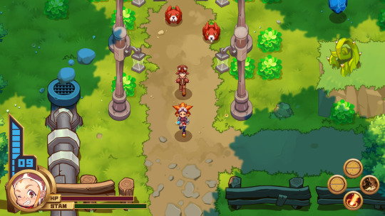
Worry not about the above image. Though we do have Brax (and some other characters) following you at some points in the game, it’s not a dangerous escort mission where you’ll have to struggle to keep your companion alive, the Berribuns were added on the map just for this screenshot (they ignore Brax and only go for Esmy).
I’ve tried to incorporate hints of the past steamtech throughout areas of Noka Island that the settlers covered, some machines like the one on the screenshot above were retrofitted to use cryam instead of steam (I did receive comments on how the smoke blobs look more like rocks so I’ll probably change it to wispy smoke).
The HUD has also undergone a visual polish to make it look more bronze plated to go with the early post steampunk-ish feel.
I’ll be continuously working on more animations and environment asset polish all throughout while Rob cleans up code, works on other background assets or lays said assets out in the Unity editor.
ART SPOTLIGHT
Every now and then, Rob (and sometimes I) take a breather and make some art (which will all eventually end up in the artbook) so here’s some of the choice pieces as of late.
Rob made something that could be wallpaper material once he cleans it up in a higher res, it’s an array of Bliss in a custom outfit.
Another wallpaper-ish piece from Rob with Deseret, Bliss, and Sorbet looking all tough and showing what I’ll just assume to be Ghilcrest gang signs... despite it being a small community.
Here's a more realistic pin-up style Bliss that Rob also made.
Rob also pays tribute to Atlus’ Persona and Shin Megami Tensei series by rendering Esmy in Shigenori Soejima’s style.
I did the same and tried making a Shigenori Soejima tribute using his soft paint style commonly present in Stella Deus and some Persona art. I chose to represent Team Bliss.
COMMUNITY SPOTLIGHT
We’ve also got a few new submissions of fanart from the community that we’re proud to share with everyone. We’re grateful to have all your support and enjoy seeing everyone’s renditions of the Cryamore cast.
@Cliffist pays tribute to the fab queen, Bliss because clearly, she’s supposed to be the star.
@boss_ruru also decides to rep Team Bliss with this lovely piece of Ms. Barson in one of her many alternate outfits.
But it’s not all Bliss as MellowMarz aka @HeartlessHat provides a pistol toting pixel-art Esmy.
I’ll be working on the pixel art and animation featurette next. I had to hold it off since I needed to prep this first.
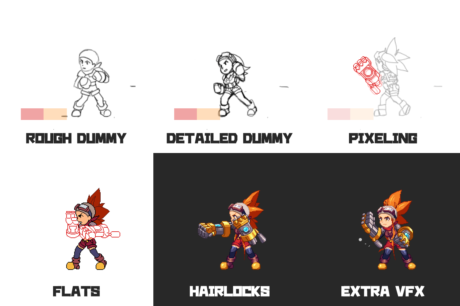
It should give an idea of what the update will cover.
I hope you enjoyed this update and all the news! Thanks for taking time to read through these.
- CM Alan
P.S. I also managed to secure one of the previous builds we made and will be preparing a guide to go with it for the backers on Discord.
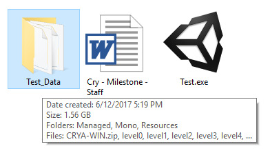
28 notes
·
View notes
Text
Rambling about environment statistics
I play several hobby games. Some have healthier metagames, some have less healthy metagames. I will say up front I no longer play magic, but I follow it, and I have also stopped playing some other things that have critically unhealthy metagames.
The thing that makes a metagame a metagame is information. People with zero information build whatever deck or army list they want, rock up to tournaments and get roflstomped by some middle of the road competitive list. Even the basics of being competitive is non-trivial. There’s no point playing Warmachine if you straight up don’t have anything to protect your warcaster from an assassination run. You can’t win a Magic standard tournament with your horse tribal deck (probably). There’s a certain amount of information you have to take into account to ride the ride.
Every game has bad game pieces. There’s always a worst game pieces, definitionally. Good games make these bad pieces situationally useful: a skavenslave is terrible, 20 skavenslaves are 40 sunk points, but can at least tie up a unit for a turn or deny a good charge line.
Similarly definitionally, every game has a best list. Good games make sure that the best list is only slightly ahead of its competition, so that the other lists can give up some power in some other range to beat the best list. Now it’s the best list, and the wheel turns. This is, in a very real way, the metagame.
The problem with metagames is if other lists either can’t afford to give up power elsewhere and beat the best list, or can’t actually gain enough power to contest the best list regardless of how much they give up. I remember back in the day when Ork Nob bikers were the meta list in Warhammer. Being able to beat them was the ‘you must be this tall to compete list’ - and doing so was Hard. Anything that couldn’t got forced out of the meta, and anything that could now only had to tech against the other lists that could.
The problem with the new way magic is approaching decklist publishing, is that it provides no insight into how tall you have to be to ride, except to say there are at least five archetypes in the meta (NB: not necessarily even viable archetypes, just that they were played). Blocking ‘proper’ statistics of the metagame just means that the only people who know what the real metagame looks like are the most heavily enfranchised players: you can see this in action already, where teams keep secret tech before the pro tour, as they’re constructing and optimising an entire gauntlet, trying to determine which list is the best. The people who don’t have a team now won’t even have aggregate statistics to work with, just ‘these lists exist’.
It’s often explained that reducing the number of decklists published is ‘to stop the metagame being solved too quickly’. If the pro teams had aggregate metagame statistics, they would have a leg up, sure, but they’re already the groups who can rock up an unexpected list that takes the game by storm, and no amount of lack of aggregate statistics will solve that. What it might do is stop the less enfranchised majority of players from discovering a list that places very well but doesn’t break top 8, to be optimised down the line and break out at a GP or something else. Even then, Wizards has added the post pro-tour ban window, just in case something is too dominant and needs dealing with.
I happen to know that in X-Wing, there’s a tool that aggregates every tournament that wants to submit data, from 12 man store championships up through worlds. The metagame there is a bit stagnant, but it’s not because you can find out that an Attack Shuttle with an Autoblaster Turret does 5.88 percentage points better than one that doesn’t. In theory, someone should be able to use that tool to generate the most efficient points-to-percentage-point list possible, but mostly they fly what they want or fly the Known Good lists.
The thing is, a good metagame can’t be solved. A good metagame should have circular dependencies, a la rock paper scissors, except with flair for direction and style of play rather than exact moves. It should have its escape valves for when something goes wrong. It should have ways to punish things that might be dangerous; for example, with a real brief look, artifact destruction doesn’t really show up in Kaladesh to deal with Smuggler’s Copter, or, more importantly, any other vehicle which might have been a problem.
To me, it seems like something is going wrong inside R&D. With five bans in standard, on a) acknowledgedly pushed cards and b) an infinite combo R&D missed(!), we’re third for most banned period of standard, after Combo Winter, and Mirrodin. Notably, one of those periods of time is Combo Winter, world of degenerate, presumably unintended combos, and the other Mirrodin is, effectively, broken due to lands that both tap for mana and also provide extra mana from some spells (incidentally, Modern recently banned Eye of Ugin). And yet today we have a bunch of random good stuff getting banned. Nothing at the power level of a land that taps for 3+ mana at once, free spells, or draw-sevens. Well, OK, Marvel is free spells, but at least it’s expensive and clunky free spells.
I don’t really have a conclusion outside of statistics aren’t solving the metagame any quicker, as pro teams already build every deck they can find anyway, so much as R&D has lost its way a bit recently and is trying to deflect some attention.
#effortpost++#effortposts are effort though#now i need a new tag for complaining specifically about magic#so many words#smaller sets would also be a solution here as there'd be a smaller environment to INSPECT FOR INFINITE COMBOS#also stop pushing cards it keeps going wrong
3 notes
·
View notes
Text
Pantheon Scrim Notes 3-17-19
(I play on a low ranked PS4 team and needed a place to post notes from scrims because they don’t fit on discord)
Route 66:
Should of been on Mercy instead of Moira. Comp was passive (not bad).
Try and not talk about what heroes you should be on and instead talk about what ur doing on what you have.
Talk about the other team more than ur own team. TK is getting focused and no one has said anything about it even tho the fights is almost to 2nd point.
You really pick it up during the end of streets tho. Keep cleaner track of ults. Ginger called them out but I dont think anyone noticed.
You talk about ur own team comp too much instead of trying to play what ur on. Losing team fights is ok but the team is falling too down mentally from it. Some people keep talking about the past or too much about what you could be doing instead of the current goal ur on.
Zarya gravs were good but they werent called out.
Better understanding of what team comps are supposed to do.
We start every scrim strong. We only play worse thruout a scrim because we mentally get down. Mentality mid scrim is r biggest problem.
Attack
Team comp doesnt have a clear direction. The team has a clear direction tho which is good. Ginger shouldn't be calling direction of team. Tk needs to be calling direction. Ginger has a solid grasp of ult tracking and situations.
Ults arent important. Capping points are important. Dont be afraid to use ults even if its on one person.
Poor primal usage by Tk (sorry its ur pov). Being called to not use ults earlier hurt you than you waited too long the fight after and everyone was dead by the time you used primal. Use it aggressively.
More people need to ask for you help. Everyone needed to respect the Dva more 5 minutes ago.
Attacking team comp has gone off the rail and has barely any direction.
The main tank needs to make more decisions and the support shouldn't be microing positioning as hard. Especially on winston.
STOP CALLING NO MORE ULTS ITS GETTING PEOPLE KILLED. LET PEOPLE ULT TO FINISH FIGHTS. TK HAS DIED MULTIPLE TIMES WITH PRIMAL.
Team played good. Shot calls relied too much on one person. Frontline needs to take over control of its own decisions. Too much No Button not enough Go Button.
Kings Row
Defense
Please run more Mercy with Ashe. Ana Zen on Kings Row isnt even something weve run before. Comp is solid, positioning is poor. Please stop acting like team comps dont work and talking about what heroes to play because you lost a fight after somebody was picked. There is no team comp in overwatch that actively finds success when one person dies.
We need a proper understanding on how cooldowns and abilities interact with each other.
Gurima: “That Dva is really good.”
There is nearly zero focus on r own front line. The tanks are not allowed to do there jobs. You will crumble. You will slowly walk backwards. You will lose every team fight one death at a time when the front line is not supported.
No one is talking about how to take and win fights. Not only are you not talking between fights. You have no direction. No attainable goal to help you win.
YOU GUYS AREN'T PLAYING BAD.
You are just actively missing important shot calls, decisions, and stall hero swaps that could gain you advantage. Could turn a 2 minute time bank into an overtime time bank. If you aren't grouping up properly somebody needs to shot call grouping and pre positioning.
Both maps no one is pre positioning and the team is waiting to be pushed into by the enemy. Any focus fire on attack seems to be whispered and just a coincidence. Important targets are being called whether the team is capable of doing anything about them or not.
TK WORK ON PRIMAL RAGES
TK TALK MORE ABOUT FRONT LINE
TK!
Its hard to track ults. But if ur getting beat the fuck up by something like a zarya or sym call it out. They probably have half there ult charge if ur playing a tank.
Ilios
We need to come to a common understanding of what works for team compositions. We continue to call for heroes that need a mercy but dont play mercy. We continue to lose to teams that run mercy. Stop being too good to run mercy.
WE ARE NOT PLAYING AROUND THE MAIN TANK AT ALL. NOT ONCE THE LAST 3 MAPS.
The main tank provides a lot of solutions to the problems the team is having. The main tank enables positioning and success.
For a team lacking so much direction in synergy it doesn't play that bad.
Lighthouse isnt the best map for double sniper.
When playing snipers please play in the LOS of the snipers. Its where youll find the most success with the team comp.
Nobody tracked the Shatter????
Why is the main tank constantly alone????
Stop playing so passively. Good coms on the attempted Bob Shatter combo. Good of TK to realize he could shatter for free when Rein charged by him. There was a lot of good at the end of Ilios and nobody should be as down as you guys are.
Hanamura (can we stop playing this map holy shit)
Defense
Supports have been playing the whole scrim well but the support hero choices and passiveness in direction of the frontline has been poor.
Storm enters the game and instantly inserts logic into the team composition
Tk please call for bubbles and plan ur cleave around zarya bubbles when playing Rein Zarya.
YOU HAVE NOT BEEN ROLLED FOR THE LAST 4 MAPS.
Tk, ur cleave can be used (when used correctly) to claim ult charge. Ults can be used to flip fights and eat away time on defense. Please attempt to manage ur ult charge aggressively to create more advantage for you and the people around you. This applies to Rein and Winston.
Attack
Rein and Bubbles are very out of sync. Learn to call them and demand them from each other.
The team relies too heavily on DPS picks instead of overall team play to create advantage.
TK I don't think you tracked the rein shatter at the end. If he came back to point in time he would have had shatter off the cleave he got off of you.
2nd Attack
TK a lot of the time ur the first to see the other team. Try and call out heroes you see. Especially odd ones. On Hanamura first choke it would be strong to call out there positions also. Ur eating too much damage and not creating a situation where ur team would benefit from it.
At this point nobody is talking and nobody has tracked a single ability the entire scrim.
Storms fight call was really strong and well executed by everyone. Like as individuals everyone is making good decisions but no one is making them together.
2nd defense
Orisa, Sym, Bastion is also strong on 2nd point. Very strong Hanamura defense comp.
Conclusion
We need to work as a team on enabling the tank front line. Communicating ability and ult cool downs. Ginger was really good at tracking some of these things but could improve on ability call outs. TK needs to call for direction more. If its not TK it needs to be another tank. Most the scrim was spent waiting for a DPS player to do something. Try and not talk about hindsight shit mid game. Remember when you die doesn't mean the fight is over. Other people on the team are still playing. DON'T CLUTTER COMS WITH RESPAWN TALK THAT DOESN'T DIRECTLY TALK ABOUT WHAT IS HAPPENING IN THE FIGHT.
Most importantly we need to stop getting down. Honestly this was a solid scrim to watch and I was expecting much worse with how some of you talked in discord afterward.
Last but not least we need to grow a common understanding of how team comps works and what heroes are played in certain team comps. Mite be easier to play certain style of team comps for the time being.
I love all of you, especially TK.
0 notes
Note
hello sorry new player, feel free not to answer, what is the overwatch meta as far as good and bad heroes and team balance (how many supports etc) goes
i guarantee a check on google would yield more useful knowledge than me at 2am but i’ll try my best
s3 has been the time of ana’s glory with the tank meta and its various iterations. not relevant to helping you but i remember when i heard about NiP running 3 tank 3 healer for the first time i was just amazed. this was back when 2-2-2 was god.
for a fair length of time over the season, the meta has (generally) been 3 tank, 2 healers (ana w/ zen or luci), 1 dps (s76). the current meta has been an exploitation of ana’s ridiculously high healrate, s76′s ridiculously high dps, and other stuff like d.va’s buffs (though she was nerfed again recently because it was a little too hard to kill her) and the fairly high dps that the tanks have (fighting a high energy zarya, d.va who can aim, hog who can land hooks, or nano+speedboosted rein is nothing to scoff at).
this meta’s keystone is ana, like with the 3-3 meta. and the tanks revolve around her. s76 added for spice. by swapping out different tanks, you can construct the team for different purposes.
not every team will run triple tank. most of my comp games were 2-2-2, but a fair number have been triple tank, especially at this meta’s peak. within the context of this meta, here are the general hero breakdowns. though i’m sure s4 will have its own surprises with whatever balances/hero additions (if any) we get.
ana: you almost always want to have an ana if you’re running 3 tank. even after the biobomb nerf, her healrate remains high and her kit in general is imo one of the best in the game, if not the best.
zen: some more dps here, utility with the disc orb. not a super high healrate, but his defensive ult is good.
lucio: utility with the speedboost, some extra heals, good defensive ult. you’ll probably want him over zen as 2nd healer if you need a dive comp, so he can help your team get right in.
mercy: LOU D … SUFFERING … SIGH …… alright, she has a very high healrate. her ult can be very good if she can stay alive, but it also means she’s better on defence. would not recommend pairing with ana. less of a shot in the foot if you’re pairing her with luci/zen.
d.va: i’ve heard plenty of complaints about her being shit after the nerfs, but i’d say she’s still strong. matrix being able to eat ults and proj/bullets is pretty good, and she has mobility. even with the decreased armour, her hp remains solid. ult is good, esp in a grav. pick for dive comp.
rein: the shield is useful, never underestimate it. sure he’s not super mobile, but he’s still pretty good, especially on def or payload atk. even if we’re past the prime era of nanoboosting rein, he can still do a lot of dmg if he has his ult or even a lucio speedboost. or if he’s on defence and the enemies are forced to approach.
hog: you get more dps, what do you have to complain about? the hook 2.0 isn’t fantastic, but i can’t say much about it because its change was pretty recent in comparison to the meta. i’m sure it’s still a good pick tool in the hands of a good player; displacing the enemy can very well be enough to secure a kill. even better if you get a healer.
winston: after the symm buffs? with mobility? dive comp. all i really need to say. also counters the pesky flies that are genji and tracer.
zarya: another one of the best kits in the game. really can’t go wrong having a good zarya on any team. if she can charge high energy, she can help shred through the enemy tanks. and her ult is amazing, of course.
s76: he was buffed. he has yet to be nerfed. his dps is high enough for him to get a place in this meta as the primary dps pick. he’s strong and versatile, and can work with a dive comp b/c of sprint.
this post is getting long but i guess i can mention the others real quick
genji: can be good for picks, but hog’s hook and rein’s ult can shut him the fuck down. zarya bubbles can work against him too, as usual. unless you’re a good genji, he probably won’t do enough dmg against the enemy tanks for it to bother them much.
mccree: all the tanks but hog have shields to fuck him and his ult over. and hog has his hook anyway. poor mccree.
pharah: again, not really enough dps and the shields present quite the obstacle. a decent enemy ana/zen can snipe her out of the sky easily.
reaper: you’d think that as a tank buster, he’d be ok against the tanks. that’s just not really the case. getting close enough to do good dmg against them is not easy. and when you get close enough, you have multiple tanks to contend with.
sombra: unfortunately i am far from qualified to comment on her, but i will say that she can be very, very effective. if she can land a good ult and keep solid hold of the health packs, maybe get a pick, she can be very strong against a lot of team comps. esp b/c hacking removes shields. she can nullify lucio’s entire ult, but you’d have to be pretty good at her to be effective at her.
tracer: same as genji
bastion: imo the success rate of running bastion against a tank meta depends entirely on how incompetent, uncoordinated, and stupid the enemy team is. ymmv
hanzo: not as shitty as you might assume. can shred through tanks if he can aim, and graviton dragonstrike is one of my favourite combos because it can’t be countered like a gravnoon/barrage. (predictably, one of my other fave combos is gravblade). doesn’t really have mobility so if the enemy team’s countering with winston, might get a little fucked over if the team can’t deal with the counter.
junkrat: can’t say much on him either, but zarya can get pretty easy charge off of him, and d.va can eat his bombs. the trap won’t help a TON against the tanks, because you can’t trap/mine combo for an instakill unless they’re low. too often, his ult feels like tissue paper (speaking as somebody who plays with/against him more than playing him, though) with its 100 hp. the dmg isn’t too bad, but again, zarya can bubble and it might not even be a killing blow if detonated on tanks.
mei: not great against the shields. yeah she’s a hog counter, but to get to him, you’ll probably have at least a rein/zarya shield to contend with. rarely does enough dps to swap for a tank/s76 if you’re playing meta, though.
torb: his armour + symm’s shield gen = hellfire. but like w/ bastion, being able to run torb depends on the same factors. still, if the enemy team can’t handle his turret, it’s like another player (and a strong tank if he ults). better on defence, of course.
widow: kind of like hanzo above but shittier because she can’t really get on the point to contest effectively and she doesn’t have a dps ult. even if she’s good, she has to be very very good to take a tank/s76′s slot, because her team is fighting 5v6 unless she can get a pick or just do a lot of dmg.
symm: hoo boy. good with torb’s armour, but the utility of her tp/shield gen alone must not be ignored. even the photon barrier can be good. the turrets are great for letting her know when enemies are taking a certain route, and this can be very effective in an organized team because you can just tell your teammates where the enemies currently are. and her fucking beam isn’t called a microwave as a joke (well i guess it kind of is a joke). it’s instalock and very high dps. do not underestimate a defence symm. not always a justifiable pick, but in this meta, she’s a lot more reliable than the majority of the other dpses because she has high dps AND excellent utility/support. photon barrier can be helpful with good timing or when tossed a teamfight.
7 notes
·
View notes
Text
Modern Combat 5 Mod Apk Free Download Latest Version+ Offline Mode
New Post has been published on https://www.apkrich.com/modern-combat-5-mod-apk-free-download-latest-version-offline-mode/
Modern Combat 5 Mod Apk Free Download Latest Version+ Offline Mode
Modern Combat 5: eSports FPS game Create a squad from 9 classes, add your friends for team play and test your skills in dynamic warfare against online rivals from around the world! MC5 aimbot Apk Mod God fps game has provides you with No Ads for Android. Download this MC5 because it is one of the best online FPS on mobile.
Modern Combat 5: eSports Latest Version Features
Modern Combat 5 (mc5) has great graphics, music and voice performances perfectly adapted for a first-person shooter game and Play the new Spec Ops missions for a real online FPS adrenaline rush. This is a Perfect for anyone hungry for solo play first-person shooter fun, or team play eSports competition. Here are some user reviews:
Mrityunjoy Das: It was my first ever multiplayer gameplay that I have ever played. Earlier I played this game in my iPhone & IPad I. e. on ios version way back on 2015 where I have unlocked all the available fighter characters and reached level 50 stage. Thereafter, the game was updated to a higher version which my ios version didn’t support. Thereafter, 3long years now I have finished all the story levels which I was unable to finish it earlier. Hence, one could imagine how much I liked the game. LOL
Prabhakar Singh: The game is awesome. amazing maps and adventurous campaign missions. for Multiplayer matches it can be improved more. I’d love if they introduce a new option in setting controls, i.e rearranging the tapping points for the trigger, grenade, Crouch, etc on the screen. Thank you…
Devin Smith: great game good graphics but when the last update came out today it had a flaw…. on April 19, 2019, when the new update came out when I want to go play multiplayer it won’t let me it says that my connection was lost but I didn’t have bad internet at the time.
Sarah Abdullah: Awesome Game! Like this is an awesome game! My 7-year-old brother loves this game and also askes me to always play it on my phone. The downside is that I feel like this game should be for everyone! Besides this problem…Awesome Game!
Umer Khan: I got great experience it is the game I wanted.it is historical, it is fantasy, and it has the great graphics and the important thing it is shooting game but I love its graphics are better than I thought I really recommend this game I love it a really nice adventure.
Broc Sampson: love the gameplay. fairly balanced weapons & armor. I don’t like the knife Jack’s. works with an Xbox controller. wish they would add more maps.
Gaby Villa: I was so happy when I started playing this game it’s because of it challenging and fun. I just want to say though that this game has a very big potential in going at the top of the ratings but it has a lot of improvement before it gets there, like adding more stuff in moving your character like rolling to avoid and jumping to reach high places I really had some cool ideas but I don’t want to state them cuz this game is yours and it your idea that matters. So, all in all, it best game there is.
Renga nathan S: This game is awesome and I am very excited while playing this game. This game has good graphics in weapon detail. And the other graphics also very good. This game more weapons so it increased the rate of playing. No fix in this game, but very hard to get a blueprint of a weapon so plz make it easy It will increase your rate of plays. Another good work is multi-player have increased the game in the first TPS Thank you.
victory egwuatu: it’s an awesome game alright but the graphic a wasn’t the same as the video on my phone, the multiplayer is cool and all but sometimes when I’m shooting an opponent it’s his bot doesn’t move and next thing I’m dead cause the same person killed me from behind. kinda sucks. as for the story, its really ok, plus I’ve been trying to download the remaining chapters but it isn’t downloading for some reason and it keeps disconnecting from the server continuously good game overall but please help fix it.
Grant Stuarte: Honestly, love this game, but there are several things that really annoy me that keep me from giving 5 stars. First being it 9/10 times will put you on the same map no matter what. literally today I tried it just to see; 15 times in a row I left streets, because I had already played several matches there, and it put me back in that map every single time. 2nd is just small glitchy things like someone stabbing you when they are facing away from you.
Basheer vi: Best Shooting Game. I love to play this game please make it offline soon. My Island has a low speed of internet. So make it offline it will help more gamers to play like me. I don’t want it fully offline but you need to add offline story mode too. And also online multiplayer for fastest network users. Thank you.😍😍😍😍
Charles Parr: I have been playing this game since 2013. Its a great game with awesome graphics. With that being said, I am very disappointed with this latest update. The app keeps disconnecting and when I do manage to keep a stable connection I can’t play multiplayer because it is stuck at 64% downloading map data. I hope the developers fix this soon. I have a lot of money invested in armors, weapons, etc!
Lucas Henrique: man this game is so good, great graphics and great history involved on the game but, after this last updates, I can’t play multiplayer matches and it’s always reconnecting and reconnecting… I almost uninstalled it( Just didn’t do it ’cause it has cost a lot of my time to download). And it would be the smallest problems if I could get out of the tutorial when I access the game;-;. So I really hope this game come back to normal.
Tboy Brima: The game is fun. Unlocking weapons is satisfying and they give a nice amount of free credits. The controls are very wonky. Too difficult to aim even when I use a gamepad. Sensitivity is on either side of the spectrum of being too low or too high. Higher tier weapons are very overpowered. Developers need to finetune the controls and gameplay.
kalo tamanikaiyaroi: The best graphical game so far. The 3/4d is amazing. The multiplayer freezes sometimes. Control needs a combo mode, the knife is not available to new players and support staff should be buyable with in-game cash, gold, and coins. The game sometimes freezes at the end of a match mostly multiplayer. Campaign mode the game always verify files and starts download all over, even when opening the app. The boosted mode is most of the time freezing in-game, after and when count down to start. Almost like PS4 on mobile.
Download APK
Additional Information
App Download Version 3.8.0n Last Updated April 18, 2019 Apk Size 58 MB Offered By Gameloft SE Category Action Content Rating Rated for 16+ Support Android Version Android 4.1 and up Installs 100,000,000+ Play Store Available
0 notes
Text
The King vs. Pawn Game of UI Design
If you want to improve your UI design skills, have you tried looking at chess? I know it sounds contrived, but hear me out. I’m going to take a concept from chess and use it to build a toolkit of UI design strategies. By the end, we’ll have covered color, typography, lighting and shadows, and more.
But it all starts with rooks and pawns.
I want you to think back to the first time you ever played chess (if you’ve never played chess, humor me for a second—and no biggie; you will still understand this article). If your experience was anything like mine, your friend set up the board like this:
And you got your explanation of all the pieces. This one’s a pawn and it moves like this, and this one is a rook and it moves like this, but the knight goes like this or this—still with me?—and the bishop moves diagonally, and the king can only do this, but the queen is your best piece, like a combo of the rook and the bishop. OK, want to play?
This is probably the most common way of explaining chess, and it’s enough to make me hate board games forever. I don’t want to sit through an arbitrary lecture. I want to play.
One particular chess player happens to agree with me. His name is Josh Waitzkin, and he’s actually pretty good. Not only at chess (where he’s a grandmaster), but also at Tai Chi Push Hands (he’s a world champion) and Brazilian Jiu Jitsu (he’s the first black belt under 5x world champion Marcelo Garcia). Now he trains financiers to go from the top 1% to the top .01% in their profession.
Point is: this dude knows a lot about getting good at stuff.
Now here’s the crazy part. When Josh teaches you chess, the board looks like this:
King vs. King and Pawn
Whoa.
Compared to what we saw above, this is stupidly simple.
And, if you know how to play chess, it’s even more mind-blowing that someone would start teaching with this board. In the actual game of chess, you never see a board like this. Someone would have won long ago. This is the chess equivalent of a street fight where both guys break every bone in their body, dislocate both their arms, can hardly see out of their swollen eyes, yet continue to fight for another half-hour.
What gives?
Here’s Josh’s thinking: when you strip the game down to its core, everything you learn is a universal principle.
That sounds pretty lofty, but I think it makes sense when you consider it. There are lots of things to distract a beginning chess player by a fully-loaded board, but everything you start learning in a king-pawn situation is fundamentally important to chess:
using two pieces to apply pressure together;
which spaces are “hot”;
and the difference between driving for a checkmate and a draw.
Are you wondering if I’m ever going to start talking about design? Glad you asked.
The simplest possible scenario
What if, instead of trying to design an entire page with dozens of elements (nav, text, input controls, a logo, etc.), we consciously started by designing the simplest thing possible? We deliberately limit the playing field to one, tiny thing and see what we learn? Let’s try.
What is the simplest possible element? I vote that it’s a button.
This is the most basic, default button I could muster. It’s Helvetica (default font) with a 16px font size (pretty default) on a plain, Sketch-default-blue rectangle. It’s 40px tall (nice, round number) and has 20px of horizontal padding on each side.
So yeah, I’ve already made a bunch of design decisions, but can we agree I basically just used default values instead of making decisions for principled, design-related reasons?
Now let’s start playing with this button. What properties are modifiable here?
the font (and text styling)
the color
the border radius
the border
the shadows
These are just the first things that come to my mind. There are even more, of course.
Typography
Playing with the font is a pretty easy place to start.
Blown up to show font detail.
Now I’ve changed the font to Moon (available for free on Behance for personal use). It’s rounded and soft, unlike Helvetica, which felt a little more squared-off—or at least not as overtly friendly.
The funny thing is: do you see how the perfectly square edges now look a tad awkward with the rounded font?
Let’s round the corners a bit.
Bam. Nice. That’s a 3px border radius.
But that’s kind of weird, isn’t it? We adjusted the border radius of a button because of the shape of the letterforms in our font. I wouldn’t want you thinking fonts are just loosey-goosey works of art that only work when you say the right incantations.
No, fonts are shapes. Shapes have connotations. It’s not rocket science.
Here’s another popular font, DIN.
With its squared edges, DIN is a clean and solid workhorse font.
Specifically, this is a version called DIN 2014 (available for cheap on Typekit). It’s the epitome of a squared-off-but-still-readable font. A bit harsh and no-nonsense, but in a bureaucratic way.
It’s the official font of the German government, and it looks the part.
So let’s test our working hypothesis with DIN.
How does DIN look with those rounded corners?
Well, we need to compare it to square corners now, don’t we?
Ahhh, the squared-off corners are better here. It’s a much more consistent feel.
Now look at our two buttons with their separate fonts. Which is more readable? I think Moon has a slight advantage here. DIN’s letters just look too cramped by comparison. Let’s add a bit of letter-spacing.
When we add some letter-spacing, it’s far more relaxed.
This is a key law of typography: always letter-space your uppercase text. Why? Because unless a font doesn’t have lowercase characters, it was designed for sentence-case reading, and characters in uppercase words will ALWAYS appear too cramped. (Moon is the special exception here—it only has uppercase characters, and notice how the letter-spacing is built into the font.)
We’ll review later, but so far we’ve noticed two things that apply not just to buttons, but to all elements:
Rounded fonts go better with rounded shapes; squared-off fonts with squared-off shapes.
Fonts designed for sentence case should be letter-spaced when used in words that are all uppercase.
Let’s keep moving for now.
Color
Seeing the plain default Sketch blue is annoying me. It’s begging to be changed into something that matches the typefaces we’re using.
How can a color match a font? Well, I’ll hand it to you. This one is a bit more loosey-goosey.
For our Moon button, we want something a bit more friendly. To me, a staid blue says default, unstyled, trustworthy, takes-no-risks, design-by-committee. How do you inject some fun into it?
Well, like all problems of modifying color, it helps to think in the HSB color system (hue, saturation, and brightness). When we boil color down to three intuitive numbers, we give ourselves levers to pull.
For instance, let’s look at hue. We have two directions we can push hue: down to aqua or up to indigo. Which sounds more in line with Moon? To me, aqua does. A bit less staid, a bit more Caribbean sea. Let’s try it. We’ll move the hue to 180° or so.
Ah, Moon Button, now you’ve got a beach vibe going on. You’re a vibrant sea foam!
This is a critical lesson about color. “Blue” is not a monolith; it’s a starting point. I’ve taught hundreds of students UI design, and this comes up again and again: just because blue was one color in kindergarten doesn’t mean that we can’t find interesting variations around it as designers.
“Blue” is not a monolith. Variations are listed in HSB, with CSS color names given below each swatch.
Aqua is a great variation with a much cooler feel, but it’s also much harder to read that white text. So now we have another problem to fix.
“Hard to read” is actually a numerically-specific property. The World Wide Web Consortium has published guidelines for contrast between text and background, and if we use a tool to test those, we find we’re lacking in a couple departments.
White text on an aqua button doesn’t provide enough contrast, failing to pass either AA or AAA WCAG recommendations.
According to Stark (which is my preferred Sketch plugin for checking contrast—check out Lea Verou’s Contrast Ratio for a similar web-based tool), we’ve failed our contrast guidelines across the board!
How do you make the white text more legible against the aqua button? Let’s think of our HSB properties again.
Brightness. Let’s decrease it. That much should be obvious.
Saturation. We’re going to increase it. Why? Because we’re contrasting with white text, and white has a saturation of zero. So a higher saturation will naturally stand out more.
Hue. We’ll leave this alone since we like its vibe. But if the contrast continued to be too low, you could lower the aqua’s luminosity by shifting its hue up toward blue.
So now, we’ve got a teal button:
Much better?
Much better.
For what it’s worth, I’m not particularly concerned about missing the AAA standard here. WCAG developed the levels as relative descriptors of how much contrast there is, not as an absolute benchmark of, say, some particular percentage of people to being able to read the text. The gold standard is—as always—to test with real people. AAA is best to hit, but at times, AA may be as good as you’re going to get with the colors you have to work with.
Some of the ideas we’ve used to make a button’s blue a bit more fun and legible against white are actually deeper lessons about color that apply to almost everything else you design:
Think in HSB, as it gives you intuitive levers to pull when modifying color.
If you like the general feel of a color, shifting the hue in either direction can be a baseline for getting interesting variations on it (e.g., we wanted to spice up the default blue, but not by, say, changing it to red).
Modify saturation and brightness at the same time (but always in opposite directions) to increase or decrease contrast.
OK, now let’s switch over to our DIN button. What color goes with its harsh edges and squared-off feel?
The first thing that comes to mind is black.
But let’s keep brainstorming. Maybe a stark red would also work.
Or even a construction-grade orange.
(But not the red and orange together. Yikes! In general, two adjacent hues with high saturations will not look great next to each other.)
Now, ignoring that the text of this is “Learn More” and a button like this probably doesn’t need to be blaze orange, I want you to pay attention to the colors I’m picking. We’re trying to maintain consistency with the official-y, squared-off DIN. So the colors we go to naturally have some of the same connotations: engineered, decisive, no funny business.
Sure, this match-a-color-and-a-font business is more subjective, but there’s something solid to it: note that the words I used to describe the colors (“stark” and “construction-grade”) apply equally well to DIN—a fact I am only noticing now, not something done intentionally.
Want to match a color with a font? This is another lesson applicable to all of branding. It’s best to start with adjectives/emotions, then match everything to those. Practically by accident, we’ve uncovered something fundamental in the branding design process.
Shadows
Let’s shift gears to work with shadows for a bit.
There are a couple directions we could go with shadows, but the two main categories are (for lack of better terms):
realistic shadows;
and cartoon-y shadows.
Here’s an example of each:
The top button’s shadow is more photorealistic. It behaves like a shadow in the real world.
The bottom button’s shadow is a bit lower-fidelity. It shows that the button is raised up, but it’s a cartoon version, with a slightly unrealistic, idealized bottom edge—and without a normal shadow, which would be present in the real world.
The bottom works better for the button we’re crafting. The smoothness, the friendliness, the cartoon fidelity—it all goes together.
As for our DIN button?
I’m more ambivalent here. Maybe the shadow is for a hover state, à la Material Design?
In any case, with a black background, a darkened bottom edge is impossible—you can’t get any darker than black.
By the way, you may not have noticed it above, but the black button has a much stronger shadow. Compare:
The teal button’s shadow is 30%-opacity black, shifted 1 pixel down on the y-axis, with a 2-pixel blur (0 1px 2px). The black button’s is 50%-opacity black, shifted 2 pixels down on the y-axis, with a 4-pixel blur (0 2px 4px). What’s more, the stronger shadow looks awful on the teal button.
Why is that? The answer, like so many questions that involve color, is in luminosity. When we put the button’s background in luminosity blend mode, converting it to a gray of equal natural lightness, we see something interesting.
The shadow, at its darkest, is basically as dark as the button itself. Or, at least, the rate of change of luminosity is steady between each row of pixels.
The top row is the button itself, not shadow.
Shadows that are too close to the luminosity of their element’s backgrounds will appear too strong. And while this may sound like an overly specific lesson, it’s actually broadly applicable across elements. You know where else you see it?
Borders
Let’s put a border on our teal button.
Now the way I’ve added this border is something that a bunch of people have thought of: make the border translucent black so that it works on any background color. In this case, I’ve used a single-pixel-wide border of 20%-opacity black.
However, if I switch the background color to a more standard blue, which is naturally a lot less luminous, that border all but disappears.
In fact, to see it on blue just as much as you can see it on teal, you’ve got to crank up black’s opacity to something like 50%.
This is a generalizable rule: when you want to layer black on another color, it needs to be a more opaque black to show up the same amount on less luminous background colors. Where else would you apply this idea?
Spoiler alert: shadows!
Each of these buttons has the same shadow (0 2px 3px) except for different opacities. The top two buttons’ shadows have opacity 20%, and the bottom two have opacity 40%. Note how what’s fine on a white background (top left) is hardly noticeable on a dark background (top right). And what’s too dark on a white background (lower left) works fine on a dark background (lower right).
Icons
I want to change gears one more time and talk about icons.
Here’s the download icon from Font Awesome, my least favorite icon set of all time.
I dislike it, not only because it’s completely overused, but also because the icons are really bubbly and soft. Yet most of the time, they’re used in clean, crisp websites. They just don’t fit.
You can see it works better with a soft, rounded font. I’m less opposed to this sort of thing.
But there’s still a problem: the icon has these insanely small details! The dots are never going to show up at size, and even the space between the arrow and the disk is a fraction of a pixel in practice. Compared to the letterforms, it doesn’t look like quite the same style.
But what good is my complaining if I don’t offer a solution?
Let’s create a new take on the “download” icon, but with some different guiding principles:
We’ll use a stroke weight that’s equivalent (or basically equivalent) to the text weight.
We’ll use corner radii that are similar to the corner radii of our font: squared off for DIN, rounded for Moon.
We’ll use a simpler icon shape so the differences are easy to see.
Let’s see how it looks:
I call this “drawing with the same pen.” Each of these icons looks like it could basically be a character in the font used in the button. And that’s the point here. I’m not saying all icons will appear this way, but for an icon that appears inline with text like this, it’s a fantastic rule of thumb.
Wrapping it up
Now this is just the beginning. Buttons can take all kinds of styles.
But we’ve got a good start here considering we designed just two buttons. In doing so, we covered a bunch of the things that are focal points of my day-to-day work as a UI designer:
lighting and shadows;
color;
typography;
consistency;
and brand.
And the lessons we’ve learned in those areas are fundamental to the entirety of UI design, not just one element. Recall:
Letterforms are shapes. You can analyze fonts as sets of shapes, not simply as works of art.
You should letter-space uppercase text, since most fonts were designed for sentence case.
Think in HSB to modify colors.
You can find more interesting variations on a “basic” color (like a CSS default shade of blue or red) by tweaking the hue in either direction.
Saturation and brightness are levers that you can move in opposite directions to control luminosity.
Find colors that match the same descriptors that you would give your typeface and your overall brand.
Use darker shadows or black borders on darker backgrounds—and vice versa.
For inline icons, choose or design them to appear as though they were drawn with the same pen as the font you’re using.
You can thank Josh Waitzkin for making me a pedant. I know, you just read an entire essay on buttons. But next time you’re struggling with a redesign or even something you’re designing from scratch, try stripping out all the elements that you think you should be including already, and just mess around with the simplest players on the board. Get a feel for the fundamentals, and go from there.
Weird? Sure. But if it’s good enough for a grandmaster, I’ll take it.
http://ift.tt/2BnocDc
0 notes