#the wizard of speed and time
Explore tagged Tumblr posts
Text


132 notes
·
View notes
Text
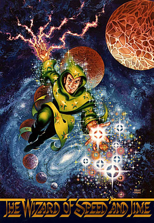
#movies#polls#the wizard of speed and time#wizard of speed and time#80s movies#mike jittlov#paige moore#richard kaye#deven chierighino#john massari#philip michael thomas#requested#have you seen this movie poll
80 notes
·
View notes
Text

32 notes
·
View notes
Text
youtube
Late career horseshit from Mike Jittlov.
2 notes
·
View notes
Text
I was starting write a whole lead in but
You like wizards right? And practical effects? How about stop motion?
youtube
The Wizard of Speed And Time by Mike Jittlov
I promise it's an hour and a half well spent
#Youtube#the wizard of speed and time#Mike Jittlov#stop motion#this is the long movie#and apposed to the short film#there is no official release of this movie#but my friend had a vhs when i was growing up
2 notes
·
View notes
Text
I. Didn't know there was a song about this guy! Mike Jittlov. Other than the song he has in his video, I mean.

3 notes
·
View notes
Text
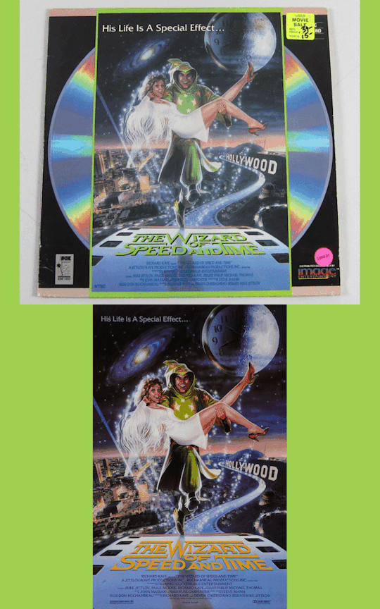
The Wizard of Speed and Time (1988) is an underappreciated masterpiece that needs restoration and preservation
0 notes
Text
The Wizard of Speed and Time: A cult classic film with special effects in practically every shot, but it's from the '80s...
At one point during Desert Bus this year, they got to talking about the Jittlov Font and its legendary readme file. (I looked at it; it's interesting, but it's not legendary. Back then, stuff that we all do regularly could make quite a stir due to its novelty on the Internet.)
Eventually, they got to talking about how its creator, Mike Jittlov, also made a movie. Like, an honest-to-goodness feature film that was released in theaters. They mentioned that Jittlov was a special effects artist by trade, and had done some work for Disney, and that his movie had special effects in virtually every shot.
Today, with our overproduced, CGI-heavy, do-it-all-in-post film production paradigm, we take that for granted. I remember George Lucas smugly joking about how he put one shot in The Phantom Menace that had no special effects work just for nostalgia's sake. But with The Wizard of Speed and Time this has a very different meaning: His film, being from the '80s after all, used almost entirely practical special effects—usually animation (e.g. stop motion), but definitely not limited just to that. The Desert Bus peeps mentioned how Jittlov did a scene where he's underwater in a pool for several minutes, and how that actually happened for real: It's one continuous camera shot, and Jittlov has no breathing equipment. He just held his breath for several minutes. (One of the few perks of being skinny, I suppose.) The film features a very wide showcase of different types of special effects. A little of everything that existed at the time, honestly.
The Wizard of Speed and Time is on YouTube for free (with the tacit consent of Jittlov himself), and over the weekend I finally got around to watching it!
I almost didn't make it out of the gate. Jittlov's editing style is horrifyingly frenetic. The camera cuts are almost constant (notwithstanding that pool scene). The opening of the film is very disjointed, and on first viewing it's hard to know for sure when the credits end and the movie proper begins. The pacing is just so, so fast, and this warps everything. I almost turned it off immediately, and it wasn't until the 12-minute mark that I paused, had a think, and decided that I would indeed commit to watching the rest of it.
Having watched it, I can say that I'm glad I did! This is one of those rare films that's worth watching purely for the special effects. The story and plot are very basic. The acting is not world-class. The music is charming at points but ultimately forgettable. The cinematography as I mentioned is uncomfortably frenetic. But the craftsmateship of filling almost every camera shot in the movie with special effects is something worth seeing for its own sake. It's a tour-de-force and there's nothing else like it that I know of. It's a real "museum piece," if that makes sense.
The effects work is all done not only expertly but very lovingly. In fact, I would say the other main strength of the film is its theme of preserving and celebrating the humanity in industry. In the movie, Jittlov portrays the motion picture industry in Hollywood as largely soulless, and presents this soullessness as the true antagonist of the story. There's also some anti-tax and anti-union stuff in there under similar auspices, with the IRS billed as the "Infernal" Revenue Service; but, despite being pro-tax and pro-union myself, it's easy to see where Jittlov was coming from, and that he was doing so in good faith.
Jittlov made this movie on a tiny budget by doing most of the work himself. He directed, did the special effects, played the starring character, etc. His name shows up in the credits frequently. Even still, the film was a box office flop, and I can understand why. But I will say that the film delivers splendidly on its implicit promise built up in the plot of showing us the special effects work that Jittlov's character is working on. We do get to see it by the end, and actually that whole sequence is an adaptation of a short film Jittlov had done in the '70s.
I like people like Jittlov. I'm one of them, myself. Very much a mate of his own mold. Very passionate. Artistically driven. Wants to believe in a better world but is oppressed by the current one. I feel better about myself for having given his movie a chance. We should all be so lucky as to have people bear witness to our work!
He was an early user of the public Internet, and his website, Mike Jittlov's WizWorld, is still online. It's a time capsule of what the Internet looked like 25 years ago, which I find immensely refreshing and also filled with cultural curios I'd forgotten about, like how he has a list of quotes on one of his pages. Just quotes that he happened to like, and gathered them all up. That used to be a popular thing to do on websites! That Internet was a lot nicer than this one, in many respects.
1 note
·
View note
Text
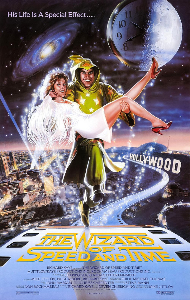
Chris: The Wizard of Speed and Time is a rare low budget 1980’s biography / comedy / musical about a man trying to get into show business by making a film with incredible effects including stop motion animation, based on a popular short Night Film film, this film might be liked by those who like Pee Wee Herman, neat effects and well worth watching, Watch: When Free.
Richie: I thought it was a lot of fun, very entertaining, Watch: When Free
1 note
·
View note
Text
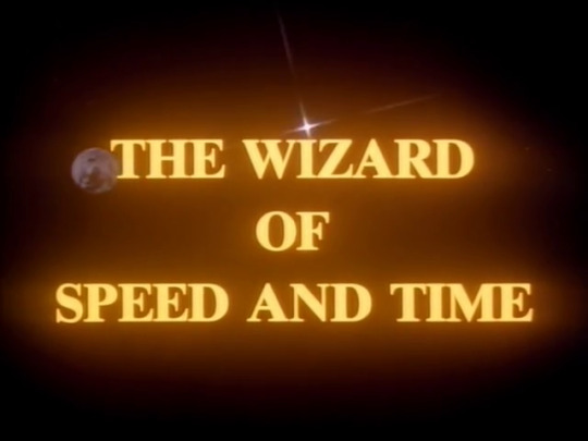
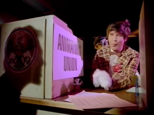
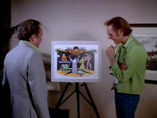
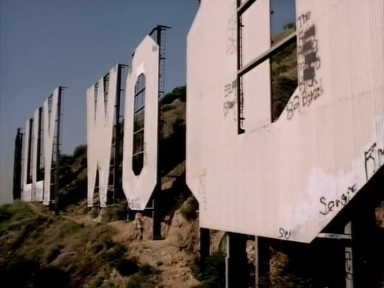
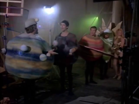
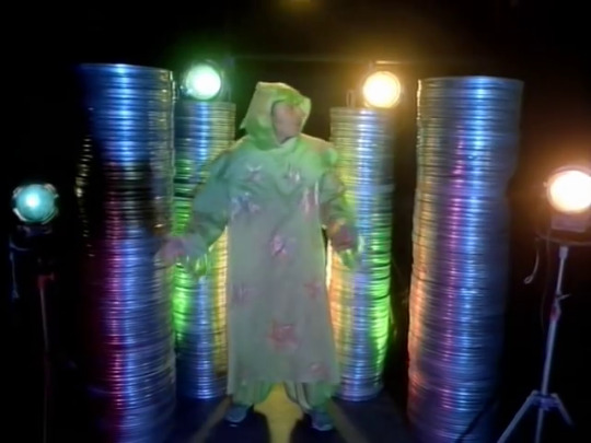
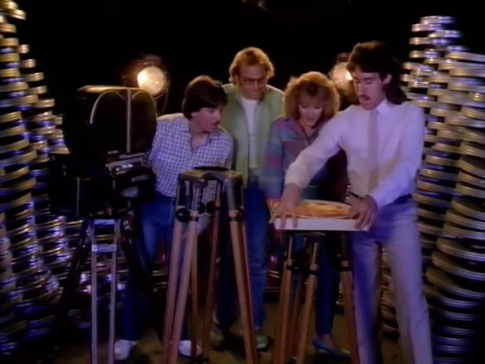
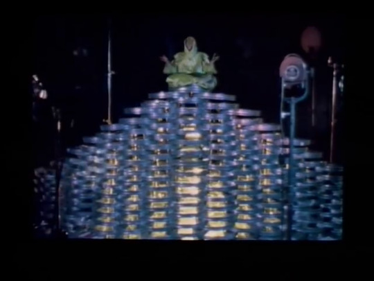
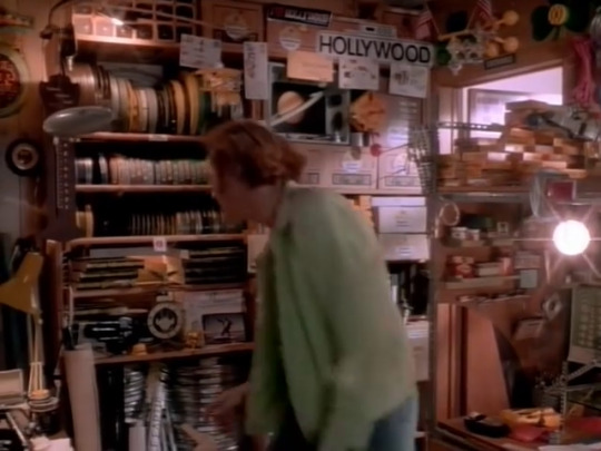
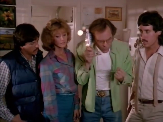
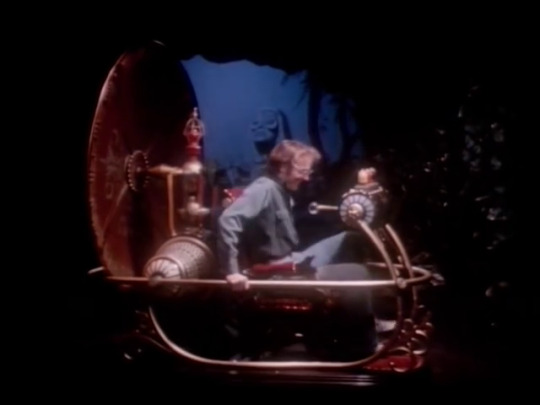
The Wizard of Speed and Time (1988)
Film review #625
Director: Mike Jittlov
SYNOPSIS: Mike is a stop-motion special effects artist who is trying to make it in Hollywood and get his screenplay produced. When his script catches the eye of some executives, they hire him to work on a feature for them, but being executives, they also make a bet on whether he can actually pull it off. Mike has to somehow assemble a crew and get his film done in the hopes of being paid...
THOUGHTS/ANALYSIS: The Wizard of Speed and Time is a 1988 semi-biographical film. Directed, written, produced, and just about everything else by Mike Jittlov, the film stars Mike Jittlov as Mike Jittlov (surprisingly), a special effects artist who is trying to make it in Hollywood. He gets his big break when some Hollywood executives task him with producing a feature. However, the execs make a bet with each other that he will not be able to complete it in time, so Mike must navigate that trials and tribulations of making a film in Hollywood to get it done on time. The film is an expansion of the short film of the same name, which was a showcase of some really creative stop-motion effects, and wrapping a semi-biographical story around it. The story is a fairly simple one, which takes swipes at the Hollywood film industry, as well as showcasing the frustrations Jittlov himself experienced in the industry. Despite that, it never feels bitter or defeated: the humour is quick-paced and sharp enough in it's satire that it pokes fun without being mean-spirited. Also, the focus of the film is ultimately in it's stop-motion scenes and effects that triumph over any negativity, expressed through statements of affirmation and positivity hidden within the sequences. This is also the message of the film in general as well: that the making of films, and the creativity, outshines any attempt by the film industries machines to dismantle creativity in favour of profit. The main story about Mike must making a film is a bit bland in isolation, but you can't really judge the film solely based on that: it would be like judging Jaws solely based on all the non-shark scenes. All the different elements of the film are weaved together well, and there's just an overall sense of fun and passion that shines through.
Packed full of little references and jokes that keep the film interesting, and never losing that personal touch, The Wizard of Speed and Time delivers something unique. It avoids the trap a lot of films mostly made by one person of being too self-indulgent and inward looking, but oddly enough, I think this is one of the most personal films of this type I have seen. It is reminiscent of Fellini's 8½ in a lot of ways, but rather than being a surrealist tour-de-force of the filmmaker, The Wizard of Speed and Time is a lighthearted, celebratory look at filmmaking rooted in it's time, with that 80's flair and synth-driven soundtrack that capture the feeling of 80's Los Angeles. Some of the humour gets a bit too involved with the intricacies of the industry, including union rules and the use of film reels, but these aren't too much of a problem.
Spending ten years in production, Jittlov refused any financial backing for this film that would have meant sacrificing any of his vision, and I highly respect that. The making of the film reflects the actual making of the film too, and it's this constant weave of real-life and fiction, interspersed with these explosions of creativity, which makes it so captivating. Apart from the special effects, you've got Jittlov doing some intense stunts, such as one scene where he spends two minutes underwater in a pool, which he actually did by holding his breath. The more you realise how much is authentic and done by hand or without stunt doubles, the more you appreciate the film as a whole. Maybe if you've got no interest in filmmaking or the creative process, then this film might pass you by, but I genuinely enjoyed all aspects of it, and it rises above the pitfalls of other films mainly produced by one person on zero budget with it's quick-witted humour and fun visuals.
0 notes
Text

Thematically appropriate comic for Make a Terrible Comic Day!!
I saw the original post this morning and it made me get out of bed to make something, so thank u Pseudonym Jones mission accomplished
#makeaterriblecomicday2024#comic#comics#sketch#does this count as horror like comment subscribe down below#Ever since I stopped being on social media as often/stopped taking it deadly serious I've been able to fall back in love with the process..#...of art which is fantastic!! I do enjoy taking my time with things but it's still very easy to get caught up in making something Perfect#ESPECIALLY WITH COMICS#As a comic maker and comic enjoyer you have to remind yourself people speed through reading them. It's ok to take shortcuts#Every frame does not need to be a painting#Anyways this was a great way to make something after falling into an MMO hole for a few days...#unrelated did u guys know Wizard 101 is still alive with an active player base#Ok hopefully I can get back on track to finishing my next short horror comic in the next month or so wish me luck fellers
13K notes
·
View notes
Text
Danny has to work off his Sentence
So! Danny isn't the King of the Infinite Realms. And he is not above the Law.
Sure, he has many friends in high places, and he did defeat the King in single combat, but that doesn't mean he is above the Law in the way The King would be.
And unfortunately for him, Walkers Laws do actually have some backing.
Not all of them. Some are just laws he placed over his Lair and surrounding Territory, which he is really nitpicky about, but the Big ones he touts are the Laws of the entire Zone set by the First King. Don't Tresspass on Lairs without an official challenge, don't End a Realms Being without permission, Don't bring Humans into the Zone without permission, etc.
And Danny has broken quite a few of them, meaning Walker is entirely in his rights to put him away for a few Thousand Years. Thankfully, there is an alternative.
Since Danny wasn't wanted for any major crimes, Walker offered a different path for him. Danny was still one of the Strongest Ghosts in the Zone, and as the Portal was technically his Grave he had full authority to use it however he liked, so if he ran a couple of errands for Walker, he could consider his Sentence served.
All he has to do was round up a few of the Trouble Makers that had escaped his grasp by virtue of being in the Living Realm, and he would forgive his previous crimes.
So, Danny took him up on the offer. It was better than being constantly hounded by Walkers Guards. The fact that he could beat them easily was moot, it was extremely annoying and he wanted it to stop.
So he was given his First list of targets, and went on his way.
Ra's "The Demons Head" Al Ghul, for Tresspassing on Ghost Zone Waste Dumping Grounds
Solomon Grundy, for continued use of copyrighted poem, requested by copyright holder post mortem
Vandal Savage, for failure to notify the proper authorities about his absence on the day of his intended death
Jack "The Joker" Napier, Special Request by 1000+ Ghosts for purposes of Vengeance, Torture, and general Catharsis.
...interesting list...maybe he should have this through a bit more...
#Dpxdc#Dp x dc#Dcxdp#Dc x dp#Danny Phantom#Dc#Dcu#Danny is a Ghost Bounty Hunter#Danny is the only one legally allowed to use his Portal since it is his Grave so he is the only one Walker can legally ask to do this#The Portal is Danny's Grave#The others were technically given permission by the fact that the Door was Open and Danny hasn't closed it yet#He is pissed that it was that easy this entire time#I find it funny that the others have warrants for small stuff like tresspassing or using a copyrighted poem#But Joker has a warrant for murdering so many people their collective screams for his death were loud enough to be heard across the Zone#Also with all the stuff Ra's and Savage have done it's funny that they are only being arrested for the small stuff like Tresspassing#Also Danny gets a few special requests#The Ghost of the Wizard asked for the arrest of Black Adam because he didn't want for Billy to have to go through all that#Clockwork asked for the arrest of Reverse Flash for his careless manipulation of time#And to give the Flash Family a speeding ticket for running through Time#He's petty
2K notes
·
View notes
Text
had a surprisingly lucid idea for an Asterix and Obelix story last night while i was half asleep.
it’d be a backstory issue like their origin set while they’re still kids, a bit after Obelix gains his powers. the Romans are trying to deal with this village of indomitable Gauls and are beginning to realize how much of a struggle it is when they have the magic potion. so, one Roman general and the antagonist of the story comes up with a scheme to solve this problem.
the plan is for the Romans to distract everyone in the village by attacking while a small team sneaks into the village and kidnaps all the children. with the kids gone, there won’t be a next generation to take the magic potion and defend themselves. instead they’ll be taken back to Rome and taught Roman law and supremacy until they forget they’re Gauls, thereby conquering all of Gaul (eventually). it’s a long term plan, but it’s guaranteed to work.
the only problem is, they also kidnap the two smartest and strongest (respectively) kids in the village who aren’t about to let the Romans get away with their plan.
it’s a fun lil lighthearted plot with plenty of room for shenanigans as Asterix and Obelix try to free their friends and escape before they’re taken to Rome. Obelix is still learning his strength and how and when to use it, Asterix gets to use the Romans underestimating him to his advantage, and they both want to prove they can be great warriors like their parents and stop the Romans themselves. it’s a glimpse into their past that shows a bit more of how they ended up where they are now.
#asterix and obelix#if i wasn’t elbows deep in wizard of oz rn i’d write this fic#i always thought it’d be neat if we saw more of them as kids#they’ve got a lot to adjust to after all#you don’t just get permanent super strength and speed and immediately know what to do with it#and it takes time and some impressive feats to become the most respected warrior#apologies if i got the characterization wrong at all. i’ve only seen a couple movies and haven’t read the comics (yet)
37 notes
·
View notes
Text
i straight up cannot play plain ass wizard after playing sorcerer, what the fuck do you mean you can't quickened spell, what do you mean you only use haste on one target--
#i get to lv 5 on a wizard and i can't even feel happy#knowing every time i use haste will be agony unless i just use potions of speed...#and then if i'm going to be using potions to compensate why use fucking haste at all#and sorcerer gets most of the benefits of wizard with just a couple of levels into the latter#wizard gets very few benefits from JUST dipping sorcerer#bc your sorcery points are given by the level
10 notes
·
View notes
Text

uniting canonical information and deductions from my beautiful mind to construct a list. perhaps a "list" you can "play".
#important note that frownland and temporary secretary are there both unironically#reminder that their favourite movie is the wizard of speed and time
7 notes
·
View notes
Text
Women 😍😍😍/j (not really tho.......hjhjhj)

She so pretty (* >ω<)
Character: Susie(Miitopia oc)
Time taken: little over 9 hours (sketched on canvas tho)
App used: Ibispaint X
Speedpaint/Timelapse (only 1 video allowed[sad]):
I have a full unedited Ibispaint speed paint but it only really shows the main art piece for 1/3 of the video (ノ`Д´)ノ彡┻━┻
Also hetalia ref in the corner heh
#my art#art#digital art#drawing#oc#ibispaint#oc art#oc artwork#original character#women 😍#like be so fr#women are art#my bi side is showing lmao#miitopia oc#miitopia mage#miitopia#mii enjoyer#miitopia art#mage#wizard#witch#IDK what her official title would be so have all 3 I guess#speedpaint#timelapse#time lapse#speed paint
5 notes
·
View notes