#the ui is too minimalist its killing me
Explore tagged Tumblr posts
Visit Tumblr Blog
Explore Tumblr blogs with no restrictions, modern design and the best experience.
Last Seen Tumblr Blogs


Fun Fact
25% of US internet users with an annual income of $80-100K use Tumblr.
Note
hii!!! sorry, i was just thinking about how annoying procreate’s colourpicking is and remembered i saw you tweet something about how it’s irritating to use? my current workaround is colourpicking the hex codes elsewhere and then just inputting the hex codes into procreate in a new palette (so i can reuse the colours)
oh yeah i did that before figuring out that i needed to reselect this and restart the app multiple times ?? honestly i think this section is stupid as hell and should not exist in the first place its just an unnecessary overcomplication, its kind of buggy too 💀
ty tho ! if anyone else has the same problem as i did but this doesnt work still u can follow this tip ☝️
#actually i have a lot of nitpicks with this app like how their color history is ass#the texts dont go in one layer so if ure a comic artist ud have 30 layers for every seperate sentence#colordrop is also unnecessarily over complicated i hate it#just be a normal bucket tool my god 🤦#the ui is too minimalist its killing me#the things procreate has better than ibispaint is that they have better brushes and its less greedy as shit tho#so i applaude them for that#SIGH procreate needs to start stealing ibis' ui id pay for that#(im lying im broke)#watch andy spiral into madness#wow look at mr ramble here
4 notes
·
View notes
Text
oboro’s cute in that bumbling istj way

girl help i stood in an aoe!

So I tried out a new minimalist ui and learned how to “code” macros today!. I run around on backspace/hide all but that way its easy to miss npcs, so i was looking for an alternative and this was the solution.

this fate was pretty fun! im the light blue one. and wow chickens are bigger than lalafell in eorzea

chad midoriya
also i was reading through the ishgard leves (for materials since I don’t have idyshirea access until well...) and the more i know about this world the weirder it gets. Not sure how much of this is the localization teams going bananas again like the communal ishgardian salt lick. there’s also some disturbing information too like how after killing one’s way through solm al, you know the sacred final resting place for dragons, the ishgard military has occupied it and used it as a base of operations for invading the churning mists and WOW i do not like that. we are definitely the baddies here to quote that one meme. the upside of these is that they do confirm that ishgard has running water, though i do wonder how they keep it from freezing.

also the sheer number of people passive aggressively snarking about jannequinard is funny. love how no one respects him. remember that this is posted publicly for all of ishgard to read.
and then there’s the saga of house hallienarte and the pugilist. ishgard having the equivalent of thamuturges makes a lot of sense given that thamuturges are battle priests and ishgard priests serve a war goddess in a war. and then there’s the people just posting other’s scandals in public. and there’s also the saga of some knights starting a yak religion

I got my first 100!

hehe. chicken

game is trolling and wow that is cruel
i will kill for them

so fun fact, I never explored this area of la noscea because it was always covered in fates so i ended up doing the moogle mail quests while having no idea who ratata was. but ... yeh the salt hounds seems pretty miserable there.

and then there’s the “hermit’s hovel” and the place is filled with books and some telescope thing and framed documents and i wonder who lives here because the lights are all on and it doesn’t look deserted

*sigh* yeah ishgard is a death cult

but at least they love their chocobos
uuuuuuh so i forgot to take a screenshot of when I actually got my zeta weapon, and that’s how i learned that the journal in the inn, the unending journey is actually missing a ton of cutscenes. I noticed the moogle mal quests aren’t there either.


you make me feel SPECIAL (i don’t actually know the song)

another day in limsa
1 note
·
View note
Photo
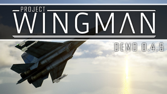


Catch Up
Current latest version : 0.4.5
Hey everyone it's been a while!
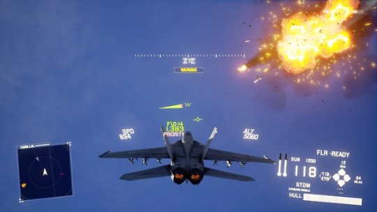
A new patch for the Project Wingman alpha demo is here! This will be the final update to the demo as now we need to fully focus on the 1.0 release of the game.
This update mostly contains QoL and Bugfixes submitted by the community. I've made sure that there is nothing gamebreaking in the demo but if there are any bugs be sure to let us know about it!
I will certainly try my best to keep this blog updated now that the ball is rolling again on development after the Kickstarter. And again I can’t thank everyone enough for all the amazing support and the feedback all of you have provided. It really makes me happy that a lot of people are enjoying the game even at its early stage right now. I hope this update can improve your experience in the game while you wait for the final release.
Thank you so much everyone!
Update Highlights:
Allied Kills
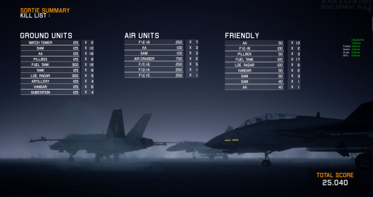
Allied on enemy kills now net the player 40% of the original enemy kill reward. It certainly makes sense especially with the introduction of Conquest mode where money means everything. A new column has also been introduced in the Scenario debriefing screen to accomodate for all the kills your allies has done.
Airship Hit Detection
Hit detection on the airship has been significantly improved. Now missiles and gunshots that should hit airship components will actually hit the components instead of hitting the airship hull. The old hit detection method wasn't suitable for components with multiple collision nodes so close in proximity to each other. So the missile and cannon hit detection has been slightly altered to accommodate the new requirements the weapons need now.

Radar Overhaul
The radar has received a bit of a facelift and functionality improvements! Now the radar zooms appropriately depending on the distance of the player to the target. It's not final yet as the UI as a whole could still go through a few iterations to improve its look.
Guns Guns Guns
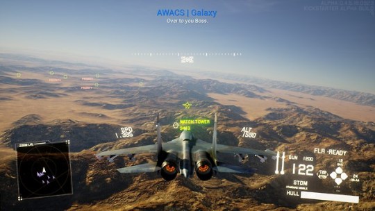
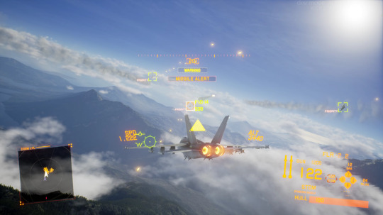
A small little change yet in my opinion adds so much to the overall feel to the game. Enemy Fighter jets now can fire their guns, so be careful when going head on with the enemy!
Additional Configurations
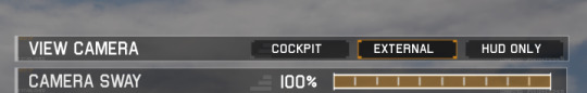
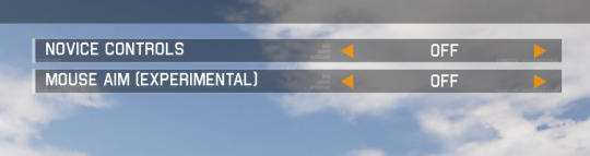
Added a few more options such as Mouse Controls (Still Experimental) in the Controls section and Preferred Camera view in the Gameplay section.
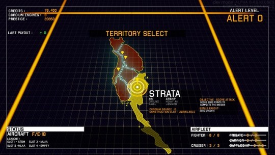
Conquest Balance Changes
Various changes to the balance in Conquest mode has been implemented to reduce the difficulty spike within the game mode. That being said the gamemode is still quite difficult, but it should feel much fairer than the previous iteration of the gamemode. Please check it out! The final boss encounter has also been changed slightly so let me know how that goes!
Hangar + Conquest Hangar overhaul
The hangar has received a few layout improvements along with homogenization of the UI between the default hangar and Conquest hangar. This should make the whole interface more consistent and more intuitive as now they both use the same look and functionality.
As usual, I hope it meets your expectations! Please send your feedback through the channels we've described in the Project description page.
Thanks for reading!
-RB
Keep reading for the full patch notes (very long)
Patch notes below:
PATCH NOTES:
Project Wingman Alpha Update Patch Notes for Version 0.4.1.0625 -> 0.4.5.0923
Gameplay: -Fixed cannon hit detection radius on water. -Enemy railguns now show a charge up animation before firing. -Slowed railgun projectile. -Fixed projectiles not colliding with instanced static meshes. -AI Aircraft can now shoot their cannons at their target. -Fixed hit detection on airship VLS/SAM to be much more accurate with the model appearance. -Allied kills now nets 40% of the original score reward. -Added UI warning when the player gets near the map limits. -I/A-52 HP increased from 70->75
Controls: -Removed default keybindings for rookie flight controls and mouse controls. -Adjusted UI cursor controls and deadzone. -Mouse controls has been enabled -Mouse controls and rookie flight controls now disable each other in case of a conflict -Mouse controls and rookie flight controls is now saved in user settings.
Conquest: -Adjusted map lighting on all areas to be more consistent with the rest of the game. -Removed ominous black circle in some conquest maps. -Conquest cursor now remains in the same location after and before sortie. -Increased fighter count at lower alert levels to reduce loiter times. -Conquest no longer spawns random AA facilities throughout the map as it adds too much targetting noise for players. -Revised Conquest final boss fight.
Chainlink: -Adjusted the lighting to be more consistent with the rest of the game.
Clear Skies: -Adjusted the lighting to be more consistent with the rest of the game.
Operation Blackout: -Adjusted the lighting to be more consistent with the rest of the game. -Fixed collision profiles on the power lines near the transformers to no longer block missiles. -Fixed collision profiles on the power poles so that collision is now enabled for both players and projectiles. -Overhauled the appearance of the forward base facility. -Overhauled Oil Silo/Tanks to include destroyed models.
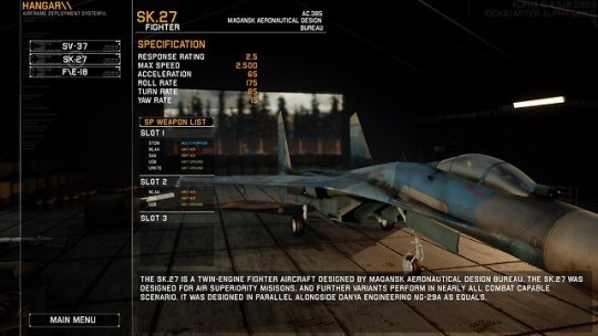
Hangar : -During loadout selection, the camera now remains static in front of the Aircraft. The camera can still be freely moved by toggling free camera mode. -Overhauled Conquest hangar to use the same hangar/loadout selection as Scenarios. -Added missing SV 37 picture on hangar screen. -Hangar now shows weapon compability list on each aircraft. -Weapon listing is now separated into category onto what they are effective against. -Readjusted the placements of a few UI elements in the hangar to be less intrusive.
Effects: -Adjusted flare particle effect. -Adjusted ground explosion effect. -Added cannon impact effect on water. -Adjusted water wake and dust effects activation distance. -AI aircraft now correctly shows water wake effects. -Fixed wingtip trail effect still appearing upon aircraft destruction.
UI: -Adjusted on which elements gets shown and hidden in cockpit minimalist mode. -Fixed rebinding UI that would occasionally show more sections than it should. -Revised the cockpit pitch ladder appearance to show more clearly on positive and negative pitch. -Revised radar UI appearance. -The radar now zooms in and out depending on the distance of selected target for better visibility and awareness. -Added grids onto the radar overlay for situational awareness. -Adjusted the opacity of friendly units on radar to be not as opaque. -Fixed inverted X and Y view axis in calibration view. -Fixed Target indicators to be consistent in size no matter the field of view. -Added preferred camera view. -The game now remembers which camera view was used last. -Adjusted the credits scene. -Resolution scale now rounds to the nearest whole number. -Fixed kill log not removing itself properly. -Water splashes and heat haze no longer distorts the UI.
Visuals: -Fixed the alignment of the F/D-14 model. -Fixed a bug where some Post Process effects were flickering on lower settings. -Adjusted Sk.27 external textures. -Adjusted SV 37 cockpit txtures. -Adjusted F/E-18 external textures. -Fixed shadows pop in on parachutes and the radar dishes in Operation Blackout. -Improved tree appearance in various levels. -Further landscape optimizations. -Fixed SV 37 cockpit textures where it would remain blurry for an extended period of time.
Audio: -Lowered STDM lockon tone volume. -Fixed Stall sound persisting on death. -Fixed where audio effects did not play during a cloud dive in some camera views. -Normalized some audio that were too loud or too quiet. -Fixed some subtitle mismatch. -Added gun hit sound on player. -Added projectile whizz sound when it flies near the player.
Patch notes for Project Wingman Alpha version 0.4.5.0923 "RC" to 0.4.5.0923 "Release"
Operation Blackout: -Re-adjusted the ground texture brightness in Operation Blackout -Fixed a map boundary issue where the player would start the mission with exiting map warning.
Conquest: -The mouse now moves the Conquest overworld cursor regardless of keybindings. -Fixed the timer not going up when HUD is hidden.
Controls: -Fixed an Issue where it would occasionally unbind everything unless the user presses "RESET" button.
Gameplay: -Fixed an issue where pausing and unpausing the game would cause a split second camera jitter. -Fixed an issue where Airship collision doesn't work properly on the player aircraft. -Fixed missile hit detection on airships where sometimes it would simply pass through or miss on shots that should hit.
Targeting system: -Fixed an issue where the targeting system would bias something that is closer to the player (despite being behind them) rather than what's in front of the player. -Fixed a sticky targeting issue where sometimes it would target the same thing despite having other units in the area to target.
UI: -Fixed UI elements misaligning in the Conquest Hangar -Fixed Conquest hangar where a player can endlessly bring up the exit confirmation menu. -Fixed the selected target indicator to be more distinct to the player. -Fixed Mouse Control cursor not dissapearing properly when disabled. -Mouse controls re-labeled as an Experimental feature. -Hangar UI now will no longer display weapons that has been removed/disabled from the game to appear in the weapons compatibility list. -Fixed the UI reappearing for the player despite HUD being disabled in the options menu. -Fixed some UI elements from still appearing for the player despite HUD being disabled in the options menu.
Visuals: -Fixed an issue where fade out to black to loading screens would constantly dissapear on lower settings making the screen flash constantly during loadings. -Fixed long distance shadows (again) -Fixed Mouse Control pointer appearing in subsequent playthroughs after a level. -Readjusted the Sk.27 textures.
still reading?
181 notes
·
View notes
Photo

New Post has been published on http://simplemlmsponsoring.com/attraction-marketing-formula/internet-marketing/wordstream-employee-spotlight-taylor-chan/
WordStream Employee Spotlight: Taylor Chan
WordStream has some impressive employees in its ranks: from industry influencers to marathon runners, from analysts to authors. The Employee Spotlight series aims to highlight the talented individuals who work here. Each month, we’ll be featuring an interview here on the blog and on our social accounts.
For this month’s Employee Spotlight, we spoke with Taylor Chan. As a product manager here at WordStream, Taylor works closely with our engineering and design teams to design and build new product features. Specifically, she oversees basic connections between our flagship software, WordStream Advisor, and ad platforms like Google Ads and Bing Ads. She also works on the 20-Minute Work Week (helping you make all your weekly optimizations in 20 minutes!) and a new, exciting feature called Strategies, which we’ll dive into imminently.
Originally from the Philadelphia area, Taylor graduated from Cornell University with a degree in Biological Engineering. She joined WordStream about a year ago, bringing with her no shortage of product development expertise, a passion for shrimp-filled spheres, and an irrefutable mastery of board games.
How long have you worked at WordStream?
I’ve worked here for just over a year— I started December 2017. I came from a company that was much bigger, and everyone was super specialized in their roles. There were four or five flavors of product managers and you had to pick just one. I was really looking to join a smaller team—something that would help me learn a wider range of skills and continue to become more well-rounded. It’s been really great. I’m a lot closer to the strategy aspect of the business than I was previously, which is huge.
How did you hear about WordStream? Why did you want to work here?
I worked in consulting for a little bit—manufacturing consulting. I have done a lot of strange things actually! At that time I was working in a water bottle factory and an almond factory on the ground floor trying to make their lines more efficient. I can’t say I joined WordStream for the marketing aspect, per se, but it’s been very cool learning it. I really didn’t know anything about it beforehand; it’s been crazy to learn what an integral part of our lives it is. But as far as what attracted me to the company, it was more about the people I��d get to work with and the size.
I found WordStream via a random job posting, but once I came in I really gelled with the people on the product team that I interviewed with. They seemed really thoughtful about their choices and what they were doing, which was something I wanted. The conversations felt natural with them.
Can you talk specifics about what your role involves?
I was originally hired specifically for the 20-Minute Work Week. The whole idea of that instantly appealed to me. I’m a person who loves to-do lists, and I’m huge on optimization and efficiency. So the job is really about bringing all those things to our customers at scale. It was really exciting for me. The 20-Minute Work Week is essentially where our customers want to go for quick hits; quick optimizations they can execute on in just a couple of minutes. And then you have the strategy piece where you’re looking for that next big, meaty thing to take your advertising to the next level. That’s the new project I’m spearheading.
Can you talk a little more about that Strategies feature?
Sure. When we say “Strategies” we’re talking about some of the more advanced things our customers can do—things that our customer success team consults them on now. They tend to be pretty complex, and often need to be done over the course of many different sittings. These are things like getting remarketing fired up or creating competitor campaigns or optimizing for mobile. At the moment, these kinds of strategies aren’t really accessible to people who aren’t super familiar with the native platforms. So what we’re trying to do is bring the things our customer success reps are preaching into the software.
That’s really cool. What kind of work goes into that? Is there a timeline for completion?
So it’s not out yet. But the way it works is we have a huge amount of data about all of our different customers, and we’re going to use all that data to identify the top strategies that are right for each customer. So we might find that a particular strategy like RLSAs works well for SaaS (Software as a Service) customers. The software would then automatically recommend that strategy for the customer and prompt them through a nice multi-step flow, a flow that would be both understandable and also faster than manual implementation.
As far as a timeline goes, we’re hoping to come out with the first iteration of the feature in February 2019. There’s a lot of basic work that needs to be done to get the first strategy out the door, but then they should come more rapidly. Ultimately, we’re hoping to have 10+ strategies that span Google, Facebook, and Bing. It’s incredibly challenging, because it involves taking the art that’s in our reps’ heads and getting it down on paper. For instance, how do you actually correctly set up a competitor campaign? And how can we bring that into the software? There are a lot of people here that are bigger marketing experts than I am, so it’s going to require a complete cross-functional effort to actually hash the whole thing out.
Has any other project here been particularly challenging?
Last year, I was working on improving the Add Negatives algorithm. That’s the most used 20-Minute Work Week alert. We are always trying to improve our algorithms so that the suggestions customers get are as relevant as possible. This one was really challenging for a few reasons. First, it’s extremely difficult to nail down a one-size-fits-all algorithm. For example, locations might be really good negatives for one customer, but they might not be great for another. And because a lot of our customers are small business owners, there’s not always an abundance of data to go off of.
So that project was very difficult. Right now, our engineering team is working on totally redoing the UI of that alert so that it uses the new algorithm, then also incorporates knowledge that only the customer knows. We’ll walk them through a process that helps them decide: do we really want a negative, or do we actually want a new keyword? Or do we actually want a new ad group? Whereas before you could only accept or reject what was suggested, now you can really analyze your search queries to select the best option—even if it’s not what our algorithm came up with.
Very cool. Switching gears a bit—has any one thing you’ve learned here particularly stuck with you?
I think I’ve learned to have more empathy for other departments here. For example, I learned Python here when one of the engineers taught a class about it. So, now I can read some of the code the engineers write, and I see just how much effort goes into my “easy” feature idea. I also have gotten the opportunity to shadow a bunch of Sales and Customer Success consulting calls, which helped me build empathy for all the work they do.
What’s your workspace aesthetic like? Minimalist? Homey? Neat?
It’s very neat. Like usually if the cleaning people move something just a little bit I can tell. Especially if they have the monitors out of the line…Everything has a place [laughs]! But yeah, I like to have some plants or some homey touches. I had this little eco ball, like a water sphere that had little shrimp in it. I killed them, though, so I don’t have anything right now. But in the future I hope to get them again.
You killed them accidentally or on purpose??
Accidentally! They were in the wrong sunshine when they died. It’s called an ecosphere, and it’s this entirely closed system that has like plants and shrimp. You can’t open it so it’s supposed to be self-sustaining…but obviously it was not.
You need to put your head down and get some work done asap. Do you have a go-to song?
When I’m at work and I want to focus, I like quieter acoustic music. But it has to have words; I can’t do classical music that would make me even more tired. I listen to this one playlist on Spotify over and over. It’s called “Calm Down.” I don’t even know what you would call the genre, but it definitely helps me decompress.
If WordStream announced a last-minute day off for tomorrow, what would you do with your suddenly free day?
OK—so I play Pokemon Go. You remember that? From like 2017? Well, I still play it. I have played it every day since it came out. I’m really into that. My husband plays it, too. It’s a game that involves a lot of walking around to different places so if I had the whole day off, it would be great to just walk around and do that.
What are the best spots to catch Pokemon around the city?
Probably the best spot is Castle Island, but Castle Island and Boston Common are both really great. The first week the game came out there were just like hundreds of people at Castle Island, and there was a Blastoise. I took a video on my phone—I was running in a crowd of a thousand people trying to get this thing.
If you didn’t work in marketing, what would you do?
I’m very into board games so I think I would do that. Maybe I could be like a board game designer or a board game tester. Or I have this idea where I would open a board game café. I also have this idea where I could go into schools and teach board games. Because it really develops a lot of different skills—problem solving, cooperation, etc. Two of my favorite games are Eldritch Horror and 7 Wonders. I’ve joined various meetup groups over the years. I also play board games with a group of WordStream people that meets every other week.
Anything else you do in your spare time?
I play volleyball, pretty poorly, in the Social Boston Sports leagues.
I also volunteer for the Crisis Text Line, which is basically a suicide crisis line but over text. I used to do it over the phone when I was in college, but I like it over text better. A lot of people in that kind of crisis feel more comfortable over text. It’s a lot of younger teenagers who don’t really know what other resources they have available.
How long have you been doing that?
For two years. It can be pretty intense. Sometimes I’ll take a break for a month or so. Especially over text, it can sometimes feel like you’re talking to the same person over and over again and they’re not getting better. But it definitely feels good when you can help someone. Like sometimes the texter will tell me it’s the first time they’ve told anyone about this. It’s rewarding to know you are helping in that way.
Read more: wordstream.com
0 notes
Text
20 Best New Portfolio Sites, June 2017
Welcome readers, it’s June, and the Brutalism bug is back. No, really. After disappearing into the phenomenon I called “post-minimalism”, plain old Brutalism seems to be making a comeback.
Oh, it’s had a few refinements; good designers would never let their brutalist sites actually look bad. But the underpinnings of the style are definitely there, and present in more than a few of this month’s entries. Beyond that, it’s a fairly varied assortment of portfolios for you all to dig into. Enjoy.
UI Viking
Our first entry this month is actually from a designer we’ve featured before, only he’s gone and redesigned his portfolio. The inimitable UI Viking brings us a star-studded design that’s just plain loaded with color, personality, and illustrations of a badass viking. In space. In true commitment to the joke, things like “continue reading” buttons on the blog say “Kill This Post” instead. The contact form says, “ODIN OWNS YOU ALL! I’ll respond you ASAP… between robberies and lootings.”
Overall, it’s a great-looking site that—despite the inherent simplicity of the layout��is just overflowing with personality. You’ll never mistake it for being anyone else’s work.
Nick Jones
This is the first time I’ve ever seen a website designed around a golden spiral. Nick Jones’ portfolio is exactly that, and it feels ingenious. Hit the down arrow on your keyboard (or click any of the content cards), and you’ll spiral right on into his site, giving the experience a weird feeling of depth.
It’s playful too. Go to the site and hold the up arrow. Just try it out. The whole site is pretty, though the text might be a bit small. It also loses points for not letting me use my scroll wheel to move into the site. I mean, it’s the one kind of site where I might forgive scroll wheel hijacking.
On the other hand, it gets massive points for having a more accessible version that is linked to right at the start.
Senthil
Senthil’s portfolio just about makes me nostalgic for the days when everyone wanted their site to look like Apple’s. Oh, this is by no means a rip-off, but the influences are certainly there. It actually reminded me of the beautiful things inherent in this kind of minimalism: the perfectly distributed white space, the type, the focused use of imagery…it’s all there, and it all still works.
Rick Waalders
Longtime readers of this series will know how I feel about the over-use of animation, and how that can affect accessibility. On the other hand, there’s something to be said for just going all in like Rick Waalders.
The site looks good, with solid type, plenty of contrast for the dark layout, nice color palette… oh, and the huge spinning 3D thing that stays with you throughout the whole site. Every element is pretty much animated out the wazoo. In a weird way, it works. I guess if you’re going to create an experience like this, you may as well commit.
Doberman
Doberman is a design firm that likes to mix things up, apparently. Their use of collage-style layout, color, and typography combined leave me feeling like the site is a mix of post-minimalism and brutalism. It’s not often you see a designer successfully tie two bandwagons together and charge ahead at full speed, but that seems to be what happened here. The clash of styles is surprisingly effective.
Leszek Juraszczyk
Leszek Juraszczyk’s portfolio is almost aggressively post-minimalist. From the monospaced type to the bare-bones layout, to the near monochrome palette, it hits all the right notes. It also looks refined, and elegant even, with some of the imagery overlapping other elements to give a sense of depth. This is everything ’90s print designers dreamed of when they started designing websites too.
Roger Burkhard
Roger Burkhard has opted for a horizontal layout to showcase his projects in a somewhat brutalist—but still good-looking—design. As this style permeates the rest of his work, it seems appropriate.
Mario Hugo
People involved in the arts seem to adore masonry layouts and serif-laden type. Mario Hugo is no exception. It’s a fairly simple site whose only concession to flashiness is the fact that the gallery thumbnails rotate when you hover over them. For all that, it’s well-made and just plain pleasant to look at. Part of that is the organization. Part of it is the focus on putting the art front and center.
Chris Biron
Chris Biron’s portfolio believes in keeping it simple. no really, it says that on the home page. The rest of the design lives up to the promise, with a simple, minimalist layout. The site is stylistically separated from others by skewed text, and slight ripple effect when you hover over images. All in all, it’s well done, if occasionally reminiscent of WordArt.
dn&co.
dn&co. puts the work front-and center, with just the slightest hint of brutalism hiding around the literal edges of the design. And between the images in the case study. Well, it’s either brutalism or post-minimalism, and I’m having a hard time telling the difference at this point.
Cole Townsend
Cole Townsend’s portfolio reads a lot more like a resume, and studiously avoids using images. Always a bold choice, as you have to rely on the user’s willingness to click through links. That said, the text is very beautifully laid out, so I enjoyed this one nonetheless.
Kennard Lilly
This is certainly one of the more colorful portfolio entries this month. The use of a painting as the background gives the site an unforgettable style, even if it sometimes makes the text hard to read. This is toned down when you click on a portfolio piece, but you still get the sense that “vibrant artsy stuff is going down” all throughout the site.
Julia Chistiakova
Julia Chistiakova’s site is every bit as colorful as her illustration and web design work. It also uses simple gallery that makes use of modal windows to present each case study. Despite its simplicity, it’s highly stylized, and just plain oozing with personality.
Jack Morgan
Jack Morgan has definitely worked for Google.You can tell the moment you land on his site, because if I didn’t know better, it could be a Google product. It has the same minimalism. It feels a bit like Material design. All the text is set in Roboto. Every div has about ten classes.
Yeah, this guy works for Google. His site is a master class in Google-branded design.
viget
viget marries the familiar portfolio trends we’ve come to know with a distinctly corporate feel. With clients like ESPN, the World Wildlife Foundation, NBC, and more, that makes sense. Corporate is what you want. It never fails to impress me when I find designers who can take designs that seem fairly traditional—and all-purpose and tailor—them to their audience through attention to detail.
Clement Simon
Want a break from all of the flashy new trends? Have a look at Clement Simon’s portfolio. It’s a simple site with a masonry layout, solid imagery, and elegant typography. And by “elegant typography” I mean the text is a bit too small. That said, scrolling through this site is almost like Zen meditation in comparison to others.
Nik Papic
Nick Papic clearly wants to stick with clients who like reading. Aside from the logos of client’s he’s worked with, there’s nary an image to be found. That said, you probably don’t need an image gallery when you have a resume that reads as well as Nik’s. And I mean that both in terms of typography and content.
Bukwild
Bukwild uses a lot, and I do mean a lot of background video. However, instead of letting the background video and imagery do all the talking, each has been carefully chosen and edited to fit the theme of the site, which is no surprise, as Bukwild bill themselves as experts in branding.
The branding is really what stands out about this site. Every element feels like it was very carefully made to fit together, beyond the normal efforts of designers. It takes a fairly normal site (for professional designers), and turns it into something recognizably theirs, even if it’s a bit hipster-ish.
Nicole Saidy
In a world of minimalist sites that are so often monochrome, and super-colorful sites that blind the eyes, it’s nice to see a compromise. Nicole Saidy accomplishes this through using a rainbow of accent colors in very small decorative elements, combined with a sort of pastel gradient for buttons and other larger UI elements. Combined with a design that’s just plain solid overall, and you get a minimalist site that still stands out.
Andrej Cibík
Andrej Cibík’s portfolio is minimalist, and does that thing where a designer forgets to turn off his grid view when he launches the site. I kid. The grid is there for style reasons. Beyond that, the typography on this site stands out as excellent, as do the eye-catching-yet-understated animations, which I love.
He also stands out for having a section in his “About” Page that details all of the thing’s he’s bad at. That certainly helps set realistic expectations for the client.
Beauty Mockup Scene Generator (500+ Items) – only $24!
Source from Webdesigner Depot http://ift.tt/2rRz22T from Blogger http://ift.tt/2rmmLjk
0 notes