#the purple was the original pallet but since the orange was already there i thought a orange and blue alt would be fitting for portal <33< /div>
Explore tagged Tumblr posts
Visit Tumblr Blog
Explore Tumblr blogs with no restrictions, modern design and the best experience.
Last Seen Tumblr Blogs


Fun Fact
Tumblr has 4 main sources of revenue.
Text
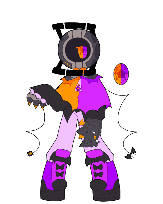

Made a portal oc!! Wanted to make a character based on the new artfight teams!!
#i was actually thinking of making a vampire core before the team reveal and it aligned so i did it :)#i guessed the team was gonna have a vampire side before we knew purely because Splatoon one had vampires once and i was like what if lol ‼️#the purple was the original pallet but since the orange was already there i thought a orange and blue alt would be fitting for portal <33#if this fucker had a mouth he'd be an ankle biter#since cores don't have mouths i think it'd be funny if instead it just uses a puppet to bite for it#i need to stop putting 'core' and 'mouth' in the same sentence i keep thinking of wheeth#those images of normal Wheatley with human features on the ball haunt my brain and a new version of it comes out at least once a week /lh#portal 2#portal oc#☆Vampire core☆
8 notes
·
View notes
Note
Does Caro have albinism? I noticed their light hair, violet eyes, and penchant for night time.
Hmmm, officially in canon, no. I’ve been asked this a few times and it’s something never addressed in comic, I feel like it’s up to the readers interpretation on this one, because while it’s true Caro has some traits that could be considered albinism, since I didn’t write them that way I feel it isn’t a very good representation, so for me, I wouldn’t say so personally.
Caro’s design is kind of interesting to me though, so I’ll tell you how I got there with it. Originally they were not part of Seemingly Dark (my bigger webcomic project), they were meant to be in a monster of the week stand alone comic called Mil-Liminal. I had written a few stories but never designed their character other than an orange gas station uniform, backwards cap, small and transmasc/nonbinary. When I decided to pull them into SD I had to decide how they looked. SD is a limited pallet comic where I only use shades of purple, blue and pink, so I needed to make them stand out from my other already established characters as someone new. None of my characters had light or blond hair, I use shades of pink for most of them, so I needed something a bit different. Their hair is blond but yellow isn’t a color in comic either, though canonically their hair does go white in SD, so that works, but it’s out of fear haha. Purple in the comic usually represents something to do with the In-Between or Ghost Realm. Since Caro’s a Seer, I thought it would be cool if their eyes and majority of their clothes were the same color I make the In-Between in comic, plus I don’t use orange in the comic. That’s really it! Limited palette comic dictates what i can do with color and design.
Here’s some of their design over the years including the very first drawing I made of them ever! The bottom two pieces are from Seemingly Dark in the limited palette.


32 notes
·
View notes
Text

So I’ve been wanting to draw out Ceres’ beta designs for a bit now, and today I finally did that
Admittedly I probably should have drawn more than just top half sketches, but whatever
They come from this page I have saved from the art book

She has a couple others, but the picture I had on my iPad was just these five, so that’s what I did. I do like the other ones though
And now because I want to, I’m just going to talk about my thoughts on each design. It’s also why I numbered them, since they’re all Ceres, so I can’t really refer to them by other names
So let's start with 1. On the drawing side, I admit I think she ended up having a case of "being the first one drawn". You know, she's got that weirdness to her look. But anyways, back to her design in general. I really like her hair, I think it's cool looking and it's got a unique color pallet. But her outfit is literally just one of beta Velvet's outfits, so if that had been her final outfit, it would not have been that subtle who she's connected to. Even if Velvet had her final outfit, it still looks incredibly similar to hers
I do find it interesting that she's the only one to have the yellow Demon eyes, while all the rest have her normal pink. I imagine they changed it to pink to be more creative, but it is the only one different. Generally, I assume that with these concepts, they had bases of the characters already made that they put the outfits and hair on. Cherry/Plum and then Reno also have the same unchanging skin and eye colors and unchanging horns (Velvet is also the same but her eyes get to change colors). I get why they did that, but it does personally leave me wanting to see Ceres concepts where she had different horn shapes or skin tones, or even eye colors. But we don't see it, and I was trying to stay faithful to the original concepts, so oh well
Moving on to 2, I don't think her outfit's half bad, but it's still pretty Velvet-like. And her hair straight up just looks like Velvet's but with different bangs, and orange highlights instead of her pink. And personally, I just think that's kind of boring in all honesty
Now on to 3 (I don't have a tangent to go on this time). I quite like her design honestly, and when I was looking at the art before drawing, she gave me this vibe I really liked, but I don't know if I really translated into my drawing. I don't really know how to describe it other than her feeling slightly younger? But anyways yeah, I think her design's pretty neat. It's still somewhat Velvet, but it's getting unique to the point that wouldn't really be your first guess. I also originally was wondering why her hair had pink/red, since Menos doesn't have any but his other kid does, but then I realized her hair colors are Menos' blue but in Velvet's purple's shade, and then her pink comes from Velvet's pink, but with the Demon vibrancy and brightness, and I just think that's neat
Moving on to 4, something that strikes me as interesting is her hair color. It's wildly different from the others I've seen, being dark red/brown and then with gold streaks. Though honestly, I couldn't tell you where she gets it from, since her parents have pretty much only cool colors, outside of Velvet's pink, which isn't that much of a warm color. Though we do see that beta Velvets had brown, or at least warmer hair color pallets, so maybe that's where she gets it from? I don't know but I find it interesting. I also do think her design's pretty cool, and is quite unique looking. My main gripe with it is how the top bit is shortened so much. For whatever reason, in basically every other Ceres outfit design other than her final, she has to be showing off her midriff, and I really don't see why. Is it just because Velvet does it? But regardless, I feel like this is the design where it's at its most unnecessary. Like just have it extend to her waist, it'd make more sense that way. But yeah, she's interesting
And then we come to 5. I think her outfit's pretty neat, I like her pant sash thing she's got going on, and I think her shirt fits with it (though I again don't know if it needs to be a crop top). I think it's one of my favorites, and it's probably the least Velvet-esque. I also find it interesting how her hair seems the most human here, not having much spikiness at all, as well as being generally less saturated. I feel like by proxy, it has her looking the most like a mix between Demon and Human. Though admittedly, with it just being out and flat, it may not be the best to animate, especially since almost all of Ceres' scenes are in 3D. Maybe if it were in a braid or something? And also I'm a little irked that the colors are just her normal ones but more desaturated, but oh well. By that point they were likely still figuring out her color scheme, so I'm looking at it from the wrong way
Also this is random, but I want to point this out, 4 and 5 aren't wearing boots, but rather shoes. I only point this out because every main character wears boots in this game, with the exception of Menos, but you can barely tell given his pants are the exact same color
Also as I'm typing all this out I realize, Ceres was very clearly designed to be Velvet's kid, but her dad basically doesn't factor in at all in these designs outside of the hair colors and spikiness. Menos is basically just the Demon genes donor. Poor guy
Anyways yeah, that's my thoughts on these beta designs. Honestly, I want to try and take parts from each (or make up parts) to try and make an alternate Ceres design I like
But also then I realize, what would be the point of that? She already has an official, final design, and it's not like this is going to change that or how I draw canon her. Why am I even judging the beta designs in the first place? They're just concept art, and things that for whatever reason, didn't end up being incorporated into her final design. And the game came out 9 years ago, what's the point of rating old designs from an obscure game made likely over a decade ago?
I don't really know, but I also feel like furthering this line of thinking would lead me to questioning why I'm so invested in concept art and designs in the first place, since similar questions still apply
I mean sure, people can use concept art to make something new out of things, like how the CRK fandom basically made Rich Cheese into a character despite her officially just being a scrapped concept, or how people have basically made a new Wish story out of the stuff from the concepts, but here I feel like there's literally no point
I don't know, but I should probably stop now
Take these drawings I suppose, while I try not to think about questioning my life's priorities
#I probably need to start tagging Evoland 2 spoilers again#not that this entirely counts here since it's just beta designs#but I do talk about endgame spoilers technically#and for someone who only wants to talk about Evoland 2 to people who have already played the game#specifically because I want them to experience it blind themselves like I did#I need to remember that I need to tag spoilers for those people that care about them#but uh yeah back on topic#I really like beta designs#and I'm personally pissed off that Menos basically has none#other than other hairstyles and markings/scars#anyways#evoland 2#evoland ceres#evoland 2 spoilers#beta designs#concept design#my art
6 notes
·
View notes
Note
i think a light/pastel yellow would suit/complement yukaris' purp hair more but i assume they picked it/going with a theme or so since i think akari also had lime green too (there was also a post about yukari 'sake' but i don't think it was purp colored like those noodles haha) tho kinda odd they made her pigtails smaller while giving akari super long flowing hair but at least they're not like, kids again lol (nothing wrong with that tho i wouldn't think most ppl needed them sounding younger)
Yea, it's probably a design decision to tie them to each other, but I feel like they can just color swap their palletes for highlights (Yukari gets yellow/orange and Akari gets purple/pink) and get a better looking result. They're already tying them together by swapping their original V3/V4 poses with each other anyway I wouldn't mind them not having similar colors.
Kid!Yukari kinda makes sense to me since she can sound pretty mature (which is why I thought she was like 20+ before seeing her official age lmao) but Akari always read teen to me so it was kinda surprising.
0 notes
Note
Hi there! I was wondering, how do you come up with the designs for your characters? Like this cool idea to give Loki a huge golden snake and a fur mantle, or the violet palette for Hela?
Hello! My imagination is wild, but I started drawing Loki a long while back- sometime around 2015- and I was so caught up in making him/her look like the original that I was never happy with the outcome. But started looking at other people's art of Loki and Lady Loki and I was inspired by how original they looked so slowly I came up with my own originalish character of him/her. As for the color pallets, I'm not quite sure why I chose purple. When I was designing the three of them, I wanted them to have colors associated with them (like how in Marvel Thor's colors are silver and red and Loki's are green and gold and Hela's are green and black). Since green (and blue if we're talking about mine) is Loki's color, I wanted to do a different color. I thought about red, but that was Thor’s color, orange or yellow would’ve looked weird for her character, and Loki already had a lot of blues. So I chose purples and dark pinks for Hela’s design. This came out a lot longer than I expected, just goes to show how weird my imagination is. Thank you, and I hope you have an amazing day!
2 notes
·
View notes