#the og info is on the psd linked ^_^
Explore tagged Tumblr posts
Photo

⁂❀ Imryll Lavellan ❀⁂
PSD here
#inquisitor lavellan#female lavellan#mage lavellan#lavellan#dragon age inquisition#dai#creations#imryll lavellan#i changed a bit of the info stuff! i used tarot instead of zodiac etc!#the og info is on the psd linked ^_^#my v pink bb#i was gonna use her artbreeder pic but the dimensions didn't work well rip#immy doesn't really have a perfect fc but this model comes close#so does lana condor but she's not dark enough its more her features#anywho here is my fluffy baby
41 notes
·
View notes
Photo


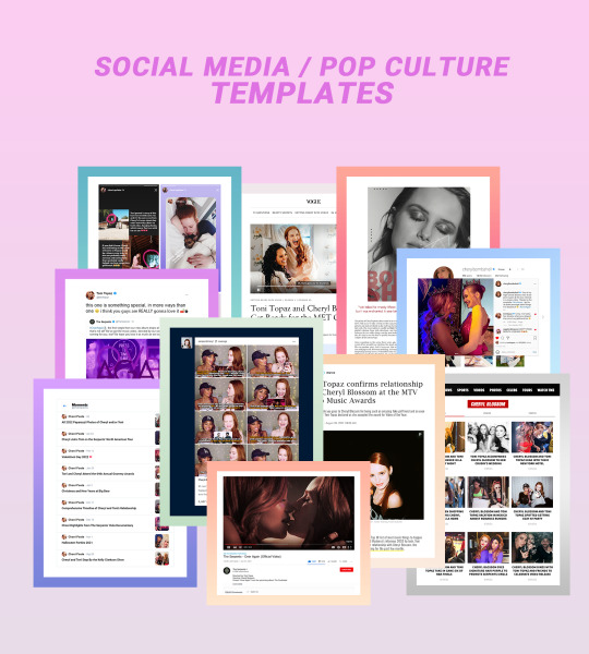
SOCIAL MEDIA/POP CULTURE TEMPLATES
last year, i spent way too much time putting together social media/pop culture edits for a famous ship au, and despite only ever receiving one request inquiring about the templates for said edits, i finally decided to put all my hard work to use and share the templates i made for it with anyone that might be interested.
some of them i made myself from scratch (twitter moments, vogue page, tmz tag, people magazine dot com article, tumblr gifset) while others i built updated and bigger versions from various templates from other people (of which i’ll try my very best to give proper credit to in this post!). these were up to date at the time i made them eight months ago but might be/probably are slightly outdated now but what can you do! free free to make any necessary tweaks to them if you’re a stickler for that kind of thing like i am.
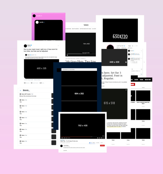
i tried my best to organize each psd to be as simple as possible, included fonts when possible/needed, as well as picture sizes and any other limitations or tips. i hope someone else finds use for these and has as much fun creating things with them as i did!
INFO:
download link
please like/reblog if you download
credit isn’t necessary but an inspo link to the og post would be cool
basic knowledge of photoshop - especially clipping masks - is necessary
templates included: tweet with reply, instagram post/page, youtube video, tmz page, twitter moments, tumblr gifset, people dot com article, vogue getting ready with article, magazine interview, instagram stories
base credits: magazine base by fabphotoshop, instagram base by aqualvng, youtube bases by itsporcelain & luc van loon, twitter bases by unblast and sharkresources, instagram story base by thlaurgraphics
enjoy!
#itsphotoshop#yeahps#social media templates#social media psd#templates#psd template#character templay#rph#completeresources#chaoticresources#allresources#instagram template#twitter template#idk what else to tag this so hopefully it finds anyone that's interested#*#1k
2K notes
·
View notes
Text
graphics guide
a guide filled with basic info, tips, and answers to common questions that i hope helps people who want to start making graphics
*this was made based on my experiences of making graphics and is what i thought was important to cover but everyone has different ways and approaches so dont feel the need to follow everything on here
what is a graphic?
a graphic (also known as ‘gfx’) is a image edit that incorporates various elements (textures, filters, text, etc) in order to visualize a idea or to create a aesthetic composition
unlike making gifs, there is no right or proper way to make a graphic so dont get too caught up in the idea that a graphic should look a certain way - just stick with your style and what you think looks good
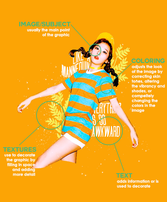
anatomy

image/subject
usually the main focus of the whole graphic
you should always try to use a sharp hd picture - getting it from the original source is always the best option
make sure the source of the picture allows editing - pictures from public sources like a company or the news can be edited while fansite pics and scans need to have permission asked (and if they give you permission make sure you link them when you post your graphic!)
coloring
often referred as ‘psd’ because that is the format they are in (i.e. pink psd pack)
comprise of multiple layers that can alter the images look
a lot of people make their own colorings since the outcome of the look also depends on the image’s original coloring
textures
smaller cut out images that are often used to decorate the graphic
can also refer to a image that can be use as a background of a graphic
can be found in the form of a png (copy + paste into graphic) or a brush (”painted” on to the graphic)
avoid using any textures that does not state the original poster made them - you could unintentionally be using someone’s work that was not made to be used [read more about it here + resources that you can actually use]
text
text can be used to tell information or just for decoration
try to choose fonts and colors that are legible
faq
what software can i use to make graphics
most people use some version of photoshop (i currently use photoshop cc 2018) and a lot people have it cracked but if you cant afford photoshop, find a cracked version or a patcher (i used adobe zii 3.0.4 for mac), or are uncomfortable with getting a cracked version then there are other softwares that are just as good!
i can only vouch for gimp since i used it when i first started making gfxs. it is very similar to photoshop and shares most of the same tools and has a similar look to photoshop. it is also probably the most popular photoshop alternative and would totally recommend it if you cant get photoshop!
[visit + download gimp here]
where do you get your pictures from
official sources such as teasers companies release, photos released by press, photos from idol’s instagram - basically photos that are made for the public to see are whats best to use for a gfx. you should download the photos straight from the source so you get it at its highest quality
some phrases you can use to search for pictures on google: - [group name] photoshoot - [idol name] press - [group name] showcase - [idol name] teaser
remember the more specific you are in your search the better! also when you search through google make sure you check your source!
avoid getting photos from reposting websites like we heart it and pinterest avoid using fansite pictures and scans unless you are granted permission
i don’t know where to start/i’m overwhelmed and i don’t know what to do/ where should i begin
figure out what you want to make or a theme you want to follow - do you want to make a simple graphic or a infographic? do you want it to center around a certain theme like a comeback or a photoshoot? once you determine what you want to do it becomes easier getting ideas and finding stuff you will need for the gfx
example thought process: “i want to make a loona graphic” → do you want it to be the whole group or a certain member or unit? will it just be a simple gfx or a AU gfx or based on a event that the group is doing? “i’ve decided on doing a kim lip one” → do you want it to have a certain theme like kim lip smiling or kim lip with blonde hair? is there a certain frame of time in which you want the graphic to represent like during eclipse era or hi high era? “i want it to be from max and match era with her teasers” → from here you can start finding pictures to use and thinking of colors and textures that would fit your theme
where do you get ideas/inspiration from
i mean it’s different for everyone but for me i literally just think of stuff and i’m like wow i want to make that happen asdfsdfj but mostly when i see pictures or watch something thats where i suddenly get a idea
but tumblr is full of graphic makers!!! ive seen so many amazing graphics from various fandoms like kpop, anime, marvel, etc.
some amazing graphic editors i know myself include: primirene, ireone, nctjaemin, celo-mar, 1hyungseo, jeongahn, haechxnie, sonxiumin, syua, lulumelody, dinomite, lovelyeo, joohys, whatchatalkabout, yveu, maerinah, mihyon, lorbits, cherryjennie, thatporcelain, monoka, ifbin, 7ww
some other places you can look at are behance (dont go on behance if you have a cracked ver of ps - it might trigger a ingenue software alert that is a huge pain to deal with), pinterest, deviantart, dribble, and probably any social media platform if you just look up #graphicdesign
remember if you take inspiration from someone’s work then you should cite them in your caption - if you are afraid that you might’ve accidentally copied someone when you were trying to take inspiration from them its best to either try to remake the gfx again or just to ask the creator permission if its fine if certain details are similar/same
my stuff sucks how do i get better
literally just keep on making stuff aka practice. you can’t improve if you don’t bother putting effort.
ways i’ve forced myself into practicing making gfxs is by: 1) starting a gfxs series - its self paced and is based on what you want to make (i.e. introducing my biases gfx series, my favorite outfits gfx series, etc) 2) taking in requests - people who would request from you probably like your stuff so its a win win situation (i.e. send me a idol + era, send me your bias + palette, send me a group and i’ll make a gfx of my fav member, etc)
tips
only sharpen your pictures after you are done resizing them, if you sharpen and then resize it might result in a more blurry or grainy picture
always save your graphic every 5-10 mins in case photoshop crashes
have two copies of your image cutout: one will be the original and the other one will be the one you edit with - in case you mess up like over erasing or over sharpening your image you have a back up you can use
stick with a color palette so you don’t get overwhelmed when having to color everything and it makes all the graphic panels you have look more cohesive
on photoshop you can favorite fonts!!! take advantage of it!!! your computer has a lot of fonts saved on it and it takes forever to look through a whole list of fonts so by favoring fonts you can see all of the fonts that you like to use for graphics
combine a png pack to one psd → when you open a png pack you will probably get a lot of png files and it gets annoying having a lot of tabs open in photoshop when most of them are just textures so by putting all of those pngs into one psd you can cut down the files you open and can easily see all of your options
make folders dedicated to colorings and textures that way you can easily access them instead of looking through your computer for a certain file
name your layers... i dont do it because its easy for me to tell what layer is what but when you are working with a lot of layers its best just to name them it’ll make life easier
lock your main image/subject so that when you play with texts’ and textures’ location you don’t accidentally move your main image
use curves to help get a photo back to its original coloring! like if you have a photo that has a weird filter on it just use curves and it’ll help the picture look more natural! [tutorial]
try warping your text to make it stand out more! you can access it by pressing the icon on the top text bar that has a T with a curved line under it. i use flag and wave the most
alter a particular color by using a selective color layer
rather than changing the actual color of an image/texture you can: create new layer → select the image/texture and color it on the new layer instead of on top of the image/texture → change the opacity or the mode of the layer so that the color is put on the image/texture while keeping its detailing and not affecting the actual image/texture
resources
colorings: can be found on deviantart or tumblr just look up ‘psd coloring’ or ‘[color] psd’
textures: can be found on deviantart (check to see if its og content or stolen) simply just search what you are trying to find or ‘png pack’ or ‘texture pack’ common textures you can try to find: vintage flowers, memphis shapes, organic shapes, doodles other wesbites: pngtree, creative market, lost and taken, spoongraphics
fonts: if you are looking for a certain font then you can just do a google search but if you are browsing then dafont and font squirrel are really good websites too some of my favorite fonts: abril fatface, agfatumc, antonellie calligraphy, arcadeclassic, bebas neue, century gothic, couture, daily news 1915, dark larch, hondurhas, kotori rose, krinkles, risingstar, sant joan despi, studly, zing rust
color palettes: i made one myself which you can find here, color hunt, and honestly a quick google search will give you tons of options
if you have any questions, other stuff you want me to cover, or want to add more resources and tips then please dm or send an ask! i hope this helps!
#i really hope this helps someone and that it makes sense#i literally woudlve been so happy if i saw this when i first started it took me so long to figure things out and im still learning#also i basically told where i got everything so like please dont take advantage of this and end up copying my gfxs... its happened to me a#lot#idk what to properly tag this alfkjasd#ps help
129 notes
·
View notes