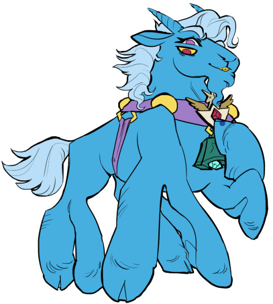
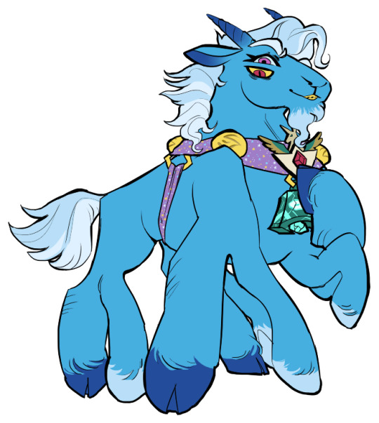
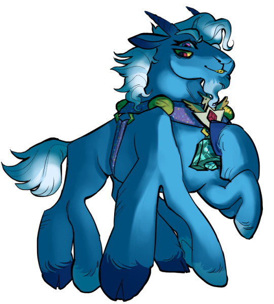
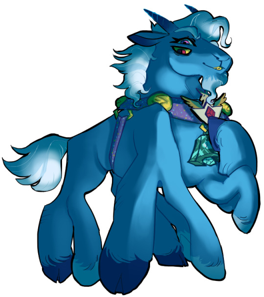
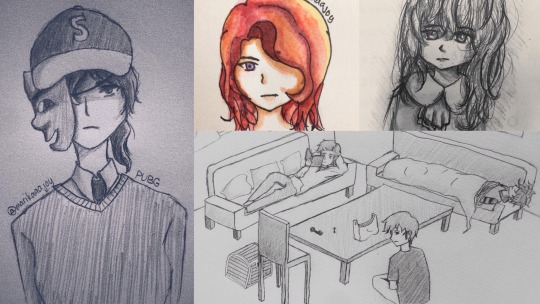
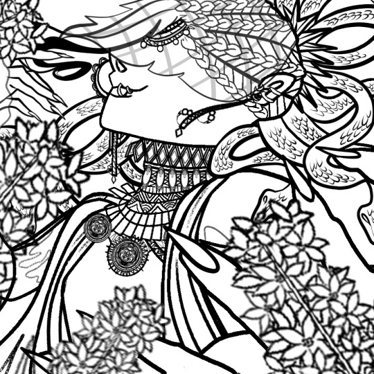
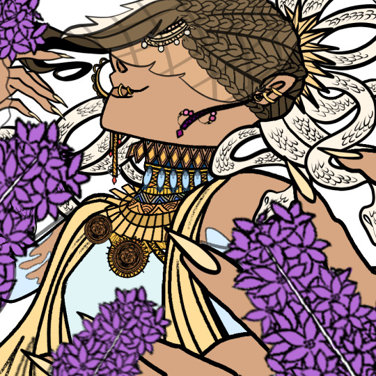
#the lineart only took me a day but the coloring took me 3 whole days to finish 💀
Explore tagged Tumblr posts
Visit Tumblr Blog
Explore Tumblr blogs with no restrictions, modern design and the best experience.
Last Seen Tumblr Blogs


Fun Fact
There were a total of 171.5 billion posts on Tumblr in 2019.
Text

it was suggested I post this to the tags as well >:D
fuck it ima tag @transcendence-au as well because tbh I'm very proud of my silly little animation
some me being a nerd under the cut!
okay so this all started when I read the original post this was inspired by and though 'wouldn't it be silly to add some art to this 3 year old post?' but then I decided to animate it for funsies!
and gosh I sure do love animating!
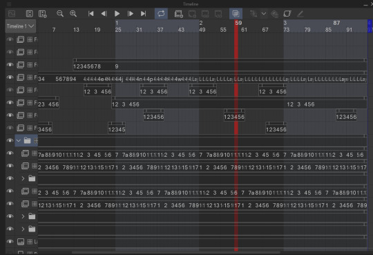
So I got the base sketch and then got into the lineart animation for each component!
i don't have the sketches/wips saved at all sense this wasn't really a project and it took less than a day to complete. but here's a peak at the timeline
I animate entirely in my ususal drawing software: clip studio paint. It's just what's easiest for me.

all of these layers outside that folder are just the sparkles! after I finished I added some sparkles for fun! there's a lot of them because it involved a lot of copy and pasting sparkle layers
the bottom folders here are the wings body and facial expression! for everything like the wings arms and flags I was able to just copy paste, reverse, and then align the timing correctly in the timeline
one thing unique about this animation is that the lineart and colors are in separate layers! I tend to do line and colors on the same layer but this time I was using a brush that doesn't have the same lack of anti-aliasing and sense it's a small animation I wasn't as worried about keeping a minimum of layers like usual.
also the movement of the body is only 4 frames! and one one of those is just the hat shifting position
initially I wasn't going to have the second facial expression but when I got stuck on animating the flags I added the second facial expression while taking a break.
the arm animation is just 8 frames! honestly the only tricky part in this is the flags, everything else was pretty simple, which made it super fun to work on because I got both a challenge and mindless therapeutic drawing out of it.
NOW THE FLAGS there was 3 throw away attempts before I got it: you see the thing that made this tricky is finding the balance between believability and visual appeal. a big part of animation is creating the illusion of physics, this is the 'believability' part, I need these to look like flags that are moving and made of flat fabric, HOWEVER if I animate these one-to-one with realistic physics: it won't look good! I can't apply wind to the whole drawing because then the hair would have to react, and wind goes one way, and I wan't the flags to be pointing opposite directions. so without wind the flags would be laying down flat, but that won't look good at all! and furthermore realistic physics would have the flag not being all nice and front facing most of the time. so the trick here was figuring out how much physics to apply to make it look believable, while still making it look good.
one trick I did to help me animate the flags is I actually made a plan rectangle flag as a guide so that the general mass/volume of the flag would stay consistent, this is something i highly recommend when animating! like having a circle guide along a characters head to keep their height and proportions consistent.
after I finally found the balance with the flag lineart coloring wasn't too hard! sense I just had to follow the lines, and THANK GOODNESS the trans and aroace flag have the same number of stripes: saving me time!
and then it all comes together to make a satisfying perfectly looping bundle of cuteness >:DDD I feel like the tau fandom doesn't have as many artists with particularly cartoony/chibi art styles so I've gotta play my part in spreading the joy-whimsy-adorable-sillys >:D
anyway! hope you get to see a cool beetle today :D
#kyukyudraws#animation#alcor the dreambender#tau#transcendence au#the transcendence au#gravity falls
112 notes
·
View notes
Text
linktober 31 - HAPPY HALLOWEEN!!!
I thought for the last day I'd write a little retrospective on what this whole thing was like and what I learned. I'm too tired to draw literally anything else I'm due for a break lol
So this was my second time ever attempting a linktober/october drawing challenge, but my first time managing to complete all the days and prompts. I feel super proud of myself and accomplished for pulling it off.
There were a number of things that were surprising and that were challenging for me that I wasn't expecting this month. If anything, I think this challenge really highlighted my flaws and mental blindspots with how I approach making art.
For one thing, I came away from this not liking everything I made. I think I only like about 9 or 10 of the 30 pieces I put out there. When I don't like my art, I tend to get stuck in this mental stalemate of refusing to finish a piece until I like it, but also refusing to retrace my steps and erase/rework what I have so far for fear of losing progress or not being able to replicate the line/angle/color/etc that I liked.
It was surprisingly hard to accept when I didn't like a piece but had to move on for the sake of time and post it anyway. But once I did it a few times, it got easier. I realized prioritizing my standards over my available energy is not gonna promote progress. If I kept sinking myself into one piece and not moving on until it was optimal, I never would have finished anything-- that was the pitfall that ultimately made me bail out 10 days in last year.
I also realized my sunk cost fallacy/"what if I erase this and can never redraw it good again" stems from some real lack of confidence in my knowledge and techniques with art. I'm self-taught, and I think I tend to believe that everything I make is a dumb happy accident, even though I have mental rules when I draw, use tons of references, and have a process lol. There are a few pieces I started over 2-3 times before I got them right, and that's starting to feel liberating instead of like failing to me now, which I never expected to come out of this experience so that's cool.
Another place I had to learn to let go of control in this was with allowing for style variation. I really wanted each and every piece to be coherent and painterly, like they all came from the same book or something. But then I couldn't decide whether I wanted to do all/no lineart, all/no detailed background, all/no heavy rendering, etc. At the end I settled on just keeping the same canvas dimensions and just prioritizing filling up the space. Glad I ended up doing this, because I really would benefit from continuing to chill out and scale back how much I default to making dramatic, high-render pieces. I gotta break out of my comfort zone and make more sketchy little guys!
Sometimes my attachment to the prompts fluctuated; some prompts I thought I would love and then just wanted to get them over with. Some prompts I thought I would hate and subsequently half-ass, then I ended up redoing them and putting more effort & time into and loved the end result!
It was funny to also see how some pieces that I loved straight up did not get a whole lot of notes or attention. Some pieces I was "meh" about did crazy numbers lol. I'm used to posting maybe 5-6 times a year on here, so I'm usually indifferent to getting notes (by which I mean, I'm super grateful for likes & reblogs and the super sweet & funny messages in y'alls tags, but I'm not butthurt when I don't get notes because whatever happens, happens). Churning out 30 pieces in 30 days made me sometimes get bewildered by what did and didn't get notes, but frankly in the end I think it helps reaffirm that I should continue putting whatever I want out there because it! is! not! graded!!!
So would I do Linktober again? Probably not, sorry! it was a lot of time & effort and took me away from fall festivities more than I would have liked. I kinda only managed to pull this off because I was transitioning between jobs this month and had a week off to just draw. But I also completely see the value in taking on a challenge like this and finishing what I started, I'm super glad I did this, I think my art improved from it. I would definitely do future drawing challenges/prompt things that are quicker or have less prompts!
My advice to prospective future linktoberers: pace yourself and be gentle; this is a great chance to do something exciting and new with your art, but above all it's about you having fun. There are no prizes at the end except for what you've learned and how you feel about it, and that's for the best!!
One thing's for sure, I am zelda'd out lmao so I'll be branching out towards some little projects I have lined up for personal art and other fandoms I'm into right now
So anyway thanks to all of you who read this or who gassed me up this whole month, I appreciate you!!!!!!!! ヾ(^∇^)
73 notes
·
View notes
Note
hiii!! your artstyle is SO COOL to me- as in sometimes i'll just stare at some of your pieces because theyre all so great. i was wondering if you were comfortable sharing your process when it comes to art?? i'd love to see how you do things!
Hi!! I'm sorry this took so long to answer, I hope you still find it useful. It means a ton to me that you enjoy my art so much! <3 It's easy to feel discouraged by the Invisible Hand of Internet Engagement, so I really appreciate your ask.
General thoughts (NOT rules, just things I consider or do a lot):
Things that appear one solid color irl can be broken down into multiple colors through artistic interpretation. I see a lot of beginner artists paint trees as solid green, when there's a lot of yellows, blues, and browns in there! A FANTASTIC example of this is jadenvargen, whose color use is masterful and I can only aspire to emulate one day.
Base colors are not saturated; saturation is reserved for pops of color and details
Shadows are purples, blues, and greens
Reference is your best friend!!!
So the nitty gritty for those who want to see: with digital art there's two main avenues I take. The first one is lineart, and the second is painterly. All IDs are in alt text.
My process for lineart pieces:
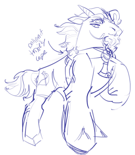
I always start off with a sketch; for this example I'm using one of my pieces from @/mylittlefusions (that isn't actually posted yet but will be later today) - a Grogar and Trixie MLP G4 fusion. I like to fiddle with brush selections until I get the effect I want, and then go slow on the lineart to make sure it's how I want it, so this can be time consuming!
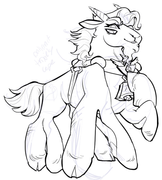
I've been trying for distinct shapes; I hate when my art gets muddled, I feel like the end piece is less impactful when I don't put in the right amount of contrast and distinctive silhouettes. Just something I've been thinking about and trying to improve.
Then I add base colors, going for slightly desaturated colors. I like to use saturated/bright tones to contrast or draw attention to something. I put the base-base colors down in one layer and then add details as a mask layer:
Then comes shading!! I'm a big fan of a multiply layer set to cool tones like blue, so I usually start there. If I think it needs to be different I can change it later. In this instance, I filled the whole canvas in the shading color as a mask over the base colors, and then erased where needed. Now that the shading is done, I often go back and color the lineart :)
Last but not least is my favorite part, painting on top! The extent to which I do this depends on what I think is needed, but I usually at least paint on top of the multiply shading to add some nuance, i.e. the greener bits on the background limbs. Here I added bright magic outlines to pop from the more desaturated character.
My more painterly style is a different story though! I use the same thoughts about color and shading, but I usually forgo multiply layers entirely and just do colors by eye. I still do a sketch, usually. Here is an example using my Lae'zel / Shadowheart piece.
The sketch is a disaster zone lol - but I painted below it using base tones, again desaturated. Once I feel I don't need the sketch anymore, I keep painting, making a new layer when I feel like being cautious about a change I'm making.

After I feel that I've got base colors down, it's time to get more contrast in using darker and/or more saturated colors! Then, like with my lineart process, I paint more details on top of everything else - reflections, jewelry, body hair, etc. I try to communicate shadow and distance with purples and blues, but I'm still working on it.

Another example real quick, where i did my typical lineart process base work and then painted on top of the shadow layer and the entire piece as a whole:
Thanks for reading if you stuck around, and thank you for the ask, friend! ^^
6 notes
·
View notes
Text

tags by @bingusluvr5
i'm really embarassed rn. i never expected someone to comment about the speed specially considering it took me extra time to make this one. i wasted 2 days helping my mom in a festival and then was DRAGGED to a 4 day vacation with no computer. my hate for france GROWS. half the time between posting issue 1 and issue 2 I was barred from working hjjghjghgjgj.
my speed comes from a lot of things
i'm on college break so i have all day to myself. also my method.
i use the comic industry timeline. i pencil (rough draft), ink (lineart), color (with the exception that i color flat the whole thing first and then shade). and only move to the next step once all pages are done. this means i can keep the current headspace while working. different steps damand that i think of different things
panel frames and speech bubbles are in a vector layer so its easy to adjust
color fill. good line art makes it easier to color fill
simple shading. if i could i'd shade everything like the covers
small number of brushes (3+eraser)
cutting corners. you'll see a lot of mistakes big and small that i refuse to fix, like painting the journalists microfone. i didn't want to pick a color so i didn't and everything got easier. the max shirt is supposed to look like that. i refuse to shade it but its an artistic choice not laziness
my current *estimate* for how long it can take me to do one issue is 1 week if i go all in. im not going all in for every reason imaginabe, so its actually to 10 days. it took me around 9 days to make this comic so it checks out
also the reason it feels very canon is because i understand DC better than everyone working there
reminds me of my terumob comics i posted every other three days (with the exception of the three week break for college work :/)
6 notes
·
View notes
Text
The Komi Month 2023 Thread!
Welcome, one and all, to Komi Month 2023!
For those who don't know, a few years ago I decided on a whim that I'd exclusively draw characters from my favorite manga, 古 (こ) 見 (み) さんは、コミュ症 (しょう) です (Komi-san wa, Komyushou Desu, or Komi Can't Communicate in English), every day for the month of November! It was a huge success for me, as it finally got me off my butt and forced me to start consistently practice my drawing skills! And so I repeated it the next year, and last year as well! And now, here we are!
While I originally drew every day, as I've grown as an artist and my schedule has gotten much busier I've since nixed that part. Last year I was only able to produce one piece of art for the month (b/c of grad school taking up all my time and focus), but this year I've decided that I will do 4 3 2 drawings this month!
(Originally I was going to do a drawing each week, but that just didn't work out with how slow my lineart process was. Maybe next year!)
While I never had a plan in terms of what to draw for Komi Month initially (~90% of drawings were thought up and drawn on that day during the first two years), last year I introduced a theme that I want to continue this year! I had planned a whole series of drawings featuring the Komi-san cast cosplaying as Touhou characters, so I want to bring that idea back and really do it justice this time around!
I'm going to make individual posts for each week's artwork, but I'll put the links down below for easy access!
Hope you enjoy, and Happy Komi Month!
------------------------------------------------------------------------------
Drawing 1:
Drawing 2:
1 note
·
View note
Text
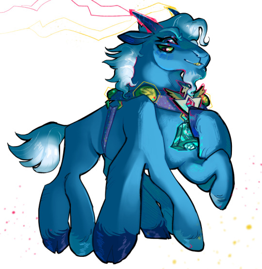
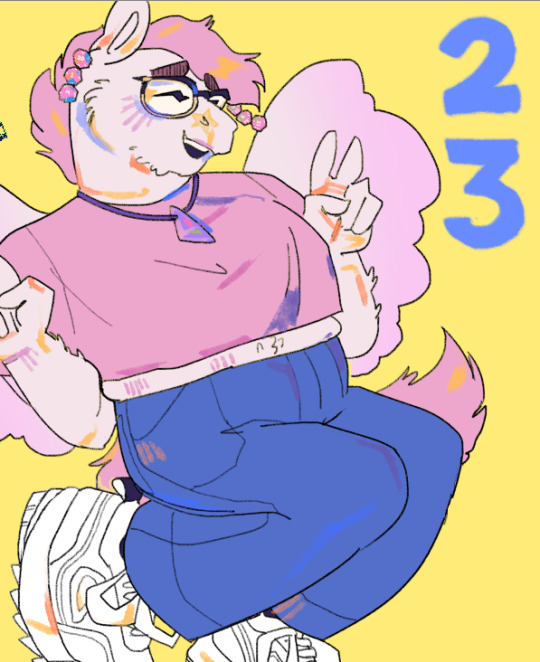
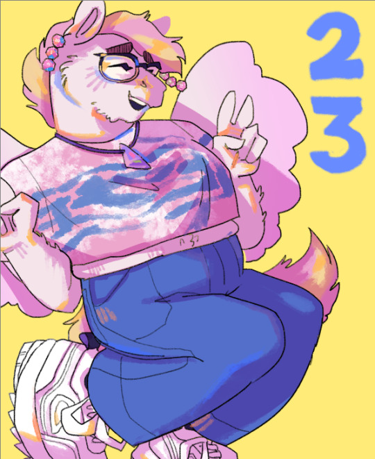
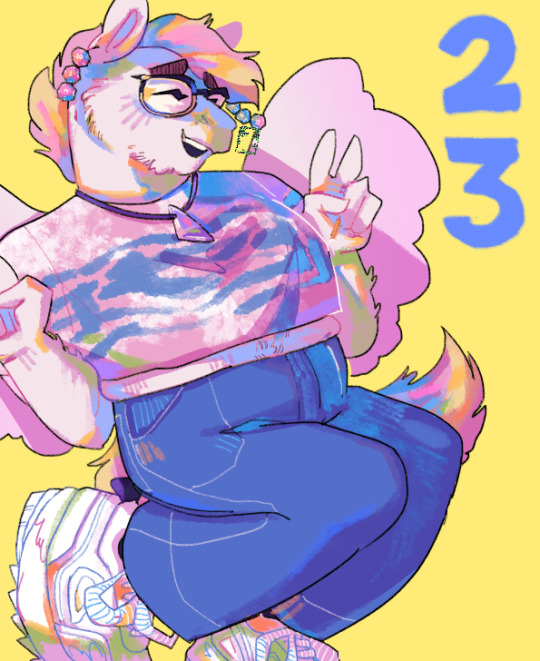
Six Fanarts!✍️
I wanted to have a nice reference for whenever I draw my fav blorbos so i did the six fanarts challenge hehe
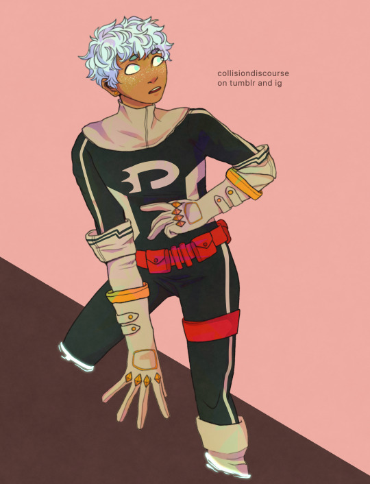
I like the lineart more than the colored pieces tbh.. I'm not that good at colored pieces but this also serves as practice I suppose :)
Keep reading to see the subway twins without their hats and some lineart! ( ╹▽╹ )
Also! It'll be late but Valentines piece coming soon! (^^)
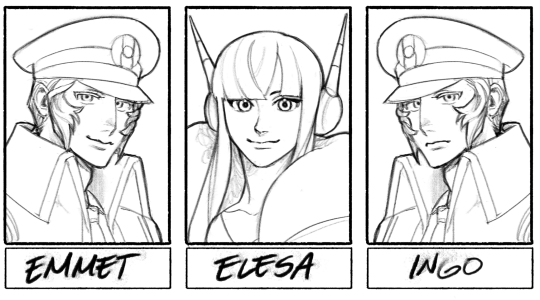
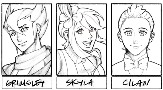
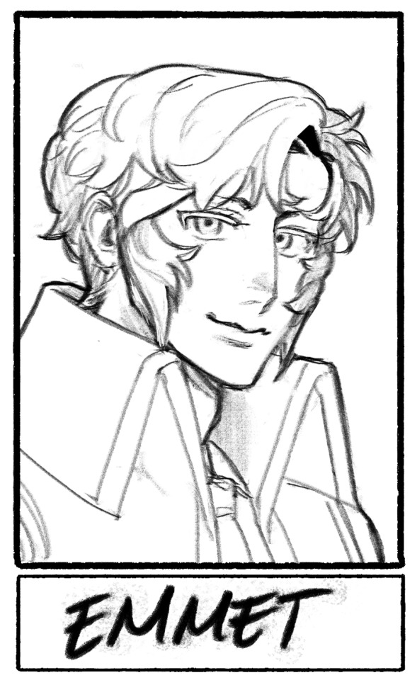
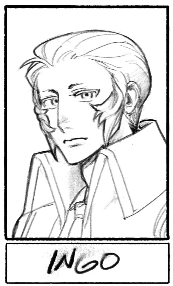
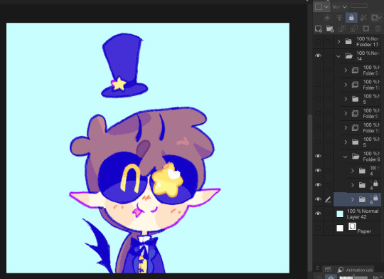
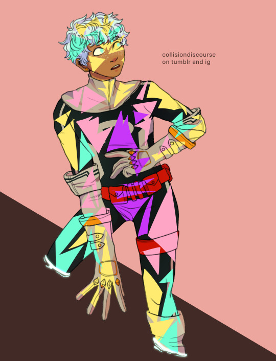
#pokemon#submas#subway boss ingo#subway boss emett#gym leader elesa#elite four grimsley#gym leader skyla#gym leader cilan#ingo#emmet#elesa#skyla#grimsley#cilan#sixfanarts#the lineart only took me a day but the coloring took me 3 whole days to finish 💀#time to do some late valentine stuff
384 notes
·
View notes
Note
Hi! i just started reading your confessions comic and i am OBSESSED!! and i didnt want to spam you by rbing all of your posts so i am going to write my Thoughts here :3
First of all i just wanted to say how much youve improved over the course of making this comic!! the lineart is so much Smoother and neater, the shading is so PRETTY, i love how youve done the backgrounds, whether you actually draw them or put flowers or something else behind the characters, and the layout looks so much more proffesional and puts the focus on the right things!! ALSO your anatomy has improved sm and i love all the wild expressions!!
Also i LOVE the teal colouring with pink accents, its such a pretty combo and its kinda like your trademark now!!
And obviously the whole story is so GOOD. i love how you cranked up the Idiot Meter to 1000000 bc YEAH theyre IDIOTS!! I loved the whole Clownbug part with ladybug discovering chats in love with marinette and being ANGRY abt it, its one of my favourite flavours of love square, and pt 6 of the comic was also SO entertaining!! miscommunication my beloved <3
I also love the first panel of pt nine, its just so pretty!! and ofc the shenanigans with the design contest, it feels v realistic and you absolutely NAILED mari's character!!
And the bee miraculous akuma is GORGEOUS!! it looks v menacing but also rlly cool and i would KILL to see the full design
i also love the way you showed marinettes progress with the jacket!! the montage of them bonding and working on the jacket is so cool <3 (and the shoulder gag is rlly funny lksdjhghjkgfdkjh)
FINALLY the jacket itself is just. BEAUTIFUL. the design on the back is absolutely stunning, and i love how you incorporated the miracle box and roses (did mari draw inspiration from chat? 👀👀) and the pink inside is so cute!! and the paw mark w marinette's signature!! (also i see you have a weakness for bomber jackets and you are RIGHT they ARE the pinnacle of fashion)
and buttercup reveal my beloved!! the blush!! the awkwardness!! the wild expressions and gestures!! i LOVE IT!!
also, i love all the small details!! like how you shaded marinettes palms as hearts, its so cute! <3
Anyways im just REALLY exited to see where youre going with this comic!! <3
omg omg omg okay I woke up to this, immediately read it FIVE TIMES IN A ROW, and have spent all day trying to figure out how to reply to so many lovely compliments 😭😭😭
THANK YOU SO MUCH OBVIOUSLY it means the world that you read every part and then took the time to type this up! This comic is such a labor of love for me and I'm always trying to work in a lot of fun and cute little details/moments so when people notice and point out those things it makes my heart SWELL WITH JOY. (If you like the hearts on her palms, part ten has some hidden hearts as well heehee)
When I started this my only goals were to scratch my lovesquare itch and get comfortable drawing again after being out of the habit for years. I had, idk maybe ten followers and did not expect anyone to read it or that I would actually manage to draw more than five parts or so AND NOW HERE WE ARE lol. I am so happy that you can see an improvement in the art, not just in how the characters are drawn but stuff like backgrounds and the visual storytelling as well. I hope to get better and better with each part!
Reading your comments about the characterization makes me wanna screech with happiness because I LOVE. THESE. IDIOTS. SO MUCH it is ridiculous!! RIDICULOUS! And as much as I adore leaning into them being incredibly stupid, it is important to me to show how much tenderness lies at the heart of their interactions. They are so, so stupid because they’re so, so sweet. Confessions is very much “journey over destination” because I just want to indulge in as much insanity, humor, awkwardness, confusion, affection, devotion, and partnership I can manage to tease out of their relationship in one story.
The color palette btw was a complete and total happy accident! Sometimes a thing works because you put lots of thought and effort into it, and sometimes a thing works because you fell on it. The color palette is an example of the latter but THE JACKET is an example of the former, haha. The amount of time it took to develop not just the meaning of it but literally the physical design (gotta look like something Marinette might actually make, gotta be something that I can draw a bunch of times, gotta be something that [spoilers redacted], gotta be something that fits over Chat’s shoulders, gotta be something that actually looks good, omg.) I have a whole post about it already but still more to say because I always have more to say! this is so much rambling I’m sorry
One of the big challenges I’ve had in trying to make a comic is figuring out how to balance what to say, what to show, and what to imply. The jacket is first and foremost exactly how Marinette presents it, a means to hopefully reach Adrien and deliver the card from his classmates. The specifics behind the design are more implied. Marinette pours a week of blood sweat and tears into creating this jacket, and as far as Chat Noir sees, she is single-mindedly focused on that task. But we all know she’s ALSO carrying the responsibilities and concerns of being Ladybug. Losing the Miraculous is obviously like... the biggest thing, a terrible and invisible weight that she carries alone!
Except not, because Chat Noir is there. He’s there for Ladybug, he’s there for Marinette, he’s a constant presence in her life and his support allows her to move beyond the shame and horror of losing the Miraculous. Marinette embroiders the symbols of the stolen Miraculous centered around the ladybug and surrounded by irises (sorry they aren’t roses!), and it looks like a topical show of support for her local superheroes; Ladybug embroiders the symbols of the stolen Miraculous centered on the ladybug and surrounded by irises and it’s a promise to her city that she’s going to get them back. (That she stitches the symbol of the cat in the left-hand side of the lining so that it zips over the wearer’s heart might mean something too but that was... more subconscious.)
ANYWAYYYYYYYYYYY I hope that my long-winded rambling comes across appropriately as a sign of JUST HOW THRILLED I am to have received this beautiful thoughtful ask. Hopefully the behind the scenes talk was fun to read haha. I am so honored and I hope you continue to enjoy the story!!
#sandra talks#confessions rambling#ask#bugaboooooooooo#someday I might actually finish designing the bee akuma#dsjaklf;#NO PROMISES BUT IT MIGHT HAPPEN
43 notes
·
View notes
Note
How long does your art take to make?
Uhhh... this is not something I could answer in one sentence wwwww well let's see...
It varies greatly depending on the medium used, poses, technique used, body parts to draw, characterizations, perspective, details, lighting, etc. I do both digital and traditional art, and while I'm generally quicker (and bolder) when drawing on paper, my digital speed is quickly catching up to that these days
Not to mention when I do watercolor. The total time of a fairly complicated piece could only be five to ten hours but in reality it could be like four days bc I have to wait for the paint to dry before applying the next layer
Digital piece is far more varied bc I have so many different techniques and finishing to choose
Simple sketches are usually quick. Usually under five minutes. The lil incorrect comics you guys've seen took around ten to twenty minutes each
Colored sketches took longer, obv, but bc I don't have to deal with lineart, it's still quick. A piece with not-too-complicated-pose like this took me around an hour:
Digital lineart takes me so long tbh, esp when I need it to be clean and precise. But coloring with cell-shading is quicker than loose painting, so pieces like this took about 2-4 hours:
The lineart of that piece itself took over an hour gfsrkgh
The most time-consuming technique is ofc the painting, as in I directly apply colors atop each other instead of using multiply layers like I do with cell-shading. Pieces like this usually took at least 4-6 hours:

The most complicated painting-style I've done so far was the spread-page of the fashion zine, which has complicated background and meticulous details. That took me at least 40 hours I think, technically, but in reality it took me at least a month bc I didn't do it in one go wwwww and the entire idea itself took like four months or smt bc I kept changing things and redid the whole piece over and over until I found a composition I'm happy with
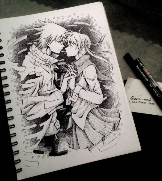
Oh, as for ink pieces like the last SoulEatober series, they usually took me around 2-3 hours for a piece like this:
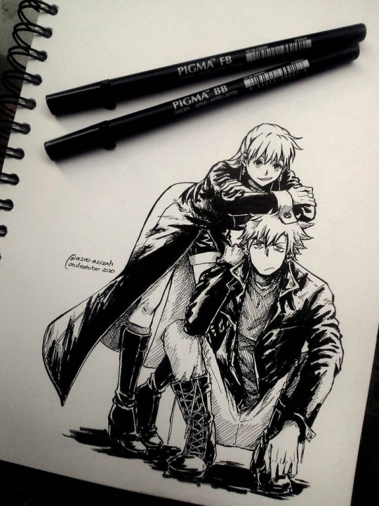
All hail the Pigma brushpens, they made linearting so quick (took me abt 30 mins)
It's obviously longer when I do complicated poses or techniques that require patience such as the hatching in this one:
That took me like five hours maybe
But of course, all of the pieces above were with the characters I'm familiar with. I already know their characterizations and facial features, so sketching them is quick. When I do things like commissions with new characters, it could take me hours or even days just to get the sketch right.
Poses and perspective play a big part too. Full body action poses could be a bitch and I would spend hours to look for references.
Soooooo that's it, I'm sorry this became such a long babble gdhsklhdj I hope this could give you an idea of my drawing speed, thank you for asking, dear anon!
209 notes
·
View notes
Text
A totally self indulgent compilation of my favorite works on this blog of the year June 13, 2020 - June 13, 2021
2019-2020
The following lists are all in chronological order according to the date each post was first published.
Top 10 panel edits:
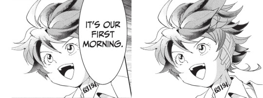
#1: It's our first morning
Date: Aug 20th, 2020 Time: ~ 2:18 h I really like how this one turned out!!! The 2020 Emma b-day edit has a lot of major panel redraws, but this is probably my favorite. I I really enjoy how I made the shadows work!! And the ear banfage looks pretty neat. Nice!!! Immagine
#2: Norman birthday edit 2021
Date: Mar 20th, 2021 Time: ~ 2:21 h Awww, soft Norman :') There was a bit to redraw, but I think everything turned out pretty neat!!! I believe everything works out fine. Though looking back at it, the part of the ID I added is definitely top small :')
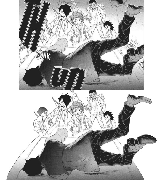
#3: Manga dub: Yuugo gets knocked out
Date: Mar 27th, 2021 Time: ~ 5:05 h Here start the Manga Dub redraws to which I gave my everything ahah. This one turned out nice! I think the shoes turned out particularly good eheh. I like how Yuugo's clothing lineart- for the texture, I wanted to go for something heterogeneous, but I'm not fully confident in the final result. Gilda looks very rushed but ¯\_(ツ)_/¯
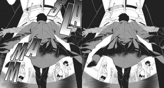
#4: Manga dub: Yuugo makes his dramatic entrance
Date: Apr 5th, 2021 Time: ~ 4:02 h This is pretty cool!!!! The coat took ages to redraw, but sis it turned out perfect!!! I'm very proud of this.
#5: Manga dub: RayGildEmma hug!!!
Date: Apr 9th, 2021 Time: ~ 1:31 h Awww, a beautiful panel I was really happy to have the chance to redraw. Taking into account what there was to redraw, I'm actually surprised with how little this took! Ray's backpack was a pain to make, but I think it turned out fine. I'm very happy with Emma and Ray's heads!!
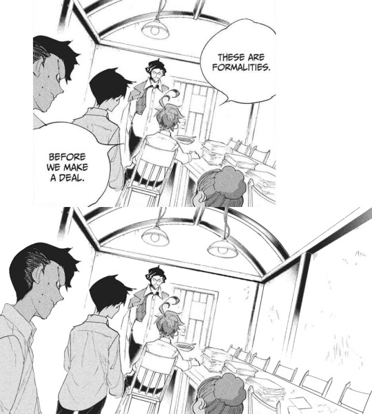
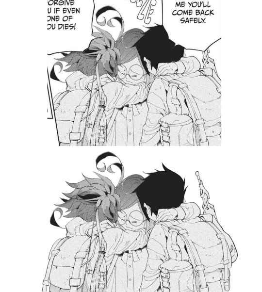
#6: Manga dub: Formalities
Date: Apr 12th, 2021 Time: ~ 5:31 h It is not always easy to give sense to Demizu's perspective, but I do my best!!! In this I am *so* happy with how Don and Ray turned out, they look neat! The background on the other hand... It took hours to make ahah. I'm not fully confident in the perspective, but I'm happy with the details I've added- I really did my best to make it look like athe other manga panels and I think it paid off!!!
#7: Manga dub: We may be weaklings, but we're still alive
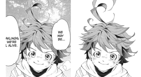
Date: Apr 30th, 2021 Time: ~ 1:37 h This little Emma is so cute!!!!!! I think the redraw turned out pretty perfect. I'm really satisfied with how this one turned out, and it's such a cute little Emma!!!! She's so brave and optimistic, I love her. It's a shame this panel didn't make it to the episode :')
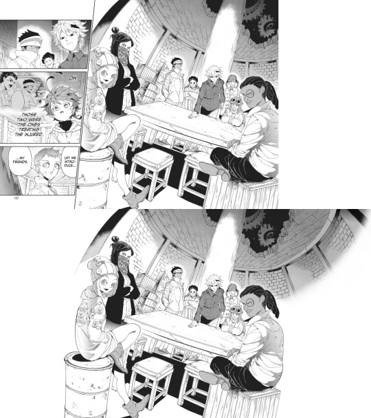
#8: Manga dub: Goldy Pond Gang
Date: May 7th, 2021 Time: ~ 8:44 h lmao This is probably the panel redraw I'm the most proud of ever :') Just think everyone turned out very nice!! The ceiling is not exactly perfect, but it still works somehow. I'm very happy with how Gillian's back turned out!! I don't really like the fading effect on the right, but 8h in I got pretty tired of working on this ahah
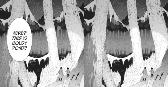
#9: Manga dub: This is Goldy Pond
Date: May 21st, 2021 Time: ~ 1:29 h I'm very glad for how the Manga dub has been challenging me to learn to redraw backgrounds, something I had quite literally never tried before. It can be a little frustrating, but it's so satisfying to see the final cleaned piece!! With this panel, I also learnt to use copy and paste, which is something I had never done before beyond texture
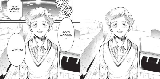
#10: Manga dub: Good morning doctor
Date: May 21st, 2021 Time: ~ 3:42 h This is another background that turned out pretty good!! That one Norman is one I knew I would have had to fully redraw sooner or lager- the background was a bonus ahah. I'm very happy with the final result!!
Top 5 edits as whole:
#1: The Promised Neverland manga ending edit
Date: Jun 14th 2020 Time: ~ 12h 41min (5h 45min of cleaning panels in the edit + 5h 37min of cleaning panels that didn't make it to the edit + 1h 19min of resizing) + time spent cleaning panels I've deleted the file of so I can't see lmao This is overall very nice!!! The concept of an Emma evolution through her back is cool, and I think overall the edit turned out very aesthetically pleasing. The concept idea came to me while I was working on the 2019 Emma's birthday edit, a long time before the manga ending announcement- back then I wouldn't have imagined using it in occasion of the manga ending, but I think it ended up making a nice tribute. The colors add a nice touch, since so far my edits had always been black and white- it makes a sweet closure. To make that edit I selected 76 panels of Emma framed from her back; I plan to make other versions of that edit using the discarded panels eventually!
#2: Emma - Chapter 181: Beyond Destiny
Date: Jul 12th 2020 Time: 2h 57min My last edit for the manga 🥺🥺 I think this one is my very "manga ending edit" because to me it really signed the ending of weekly chapters and their weekly chapter edits. It makes me a little sad to look at it, but it's also, I don't know, kinda sweet to see how I grew both in my panel cleaning and as a person since I first started my blog. I'm glad I got into TPN!
#3: Emma birthday edit 2020
Date: Aug 22nd 2020 Time: 8h 54min This one turned out so well!!! Though I used the same concept for all the trio edits, I think this one is the best one. The two panels on the left / two panels on the right alternation combo never fails ahah. The colors are nice (shout-out to my sister for making me a palette), despite the fact that it was hard for the lighter ones to make them work with the images without having those disappear. I'm very satisfied with the panels I chose for this, I think they work really good together! Also, it got me very happy to read everyone's comments saying they liked the fading effect in the last panel :)
#4: Emma + Eyes Close Ups [1/?]
Date: Jan 24th 2021 Time: 5h 55min This one was really nice!! Another idea I got when working on the 2019 Emma birthday edit I was glad to finally execute. Started the edit in September, finished it in December. I'm overall very happy with how it turned out... I hope I will be able to make more in the future!
#5: The Promised Neverland Parallels → (9/?) » 114 // 122
Date: Feb 23th 2021 Time: 5h 7min (panel cleaning only) Aaaaahh I really like this one!!!! A parallel I love very much, and I'm really happy with how the edit turned out. All the hair redrawing looks neat!!!! The gif is maybe a little excessive, but I think overall it's a nice edit. I like it!!! Fun fact, I completed it on August 26th 2020, but I couldn't find the right moment to post it ahah.
Honorable mention: The Promised Neverland Parallels → (5/?) » 08 // 16
Date: Aug 30th 2020 Time: 2h 52min (Second picture cleaning only; I deleted the first picture art file so ¯\_(ツ)_/¯ ) I don't have much to say about this one except!! It turned out very nice!!!!! Love the pen lmao.
Top 10 analysis:
Too many analysis,,
#1: Post chapter 181 Emma analysis
Date: Jul 9th 2020 Mmmh a nice analysis. I think it was important for me to put down in words what I think of Emma's characterization and the manga ending, so I'm happy I did it!
#2: A long Oliver analysis because I love him very much
Date: Dec 6th 2020 What can I say I just love Oliver tons 😔😔💕💕 This was very fun to make!!!
#3: TPN s2 previsions
Date: Jan 14th 2021 Really love the effort that went into this + me proving that 11 episodes GP could have possibly worked + it's just a lot of fun to read again after s2 ended pffft
#4: More s2 delusional previsions lmao
Date: Jan 27th 2021 I think the points and previsions I made where pretty neat!! In my defense, it was pretty impossible to predict the anime would have ended with this season. I always feel honoured when friends and Anon ask for my opinion, I'm like "you wanna know what I think? Wow. I'm flattered (◍•ᴗ•◍) " Thank you to anyone who ever sent me an ask!!
#5: Why Emma not wearing pants is 𝕨𝕣𝕠𝕟𝕘
Date: Jan 29th 2021 Really proud of this!!! Pants Emma is important!!!!!
#6: Post episode 5 manga Emma analysis
Date: Feb 4th 2021 A depressed analysis, but a necessary one 😔
#7: Norman analysis
Date: Feb 12th 2021 I love him!!!! And I'm happy I eventually got to put down in words what I love about his character. The day I posted this ww3.readneverland was in maintenance so I couldn't use the volume scans for it- the thought of that post having fan edited and fan translated scans still haunts me
#8: RayDon rambles
Date: May 12th 2021 I had a blast writing this and like. It's likely the post of mine I reread more often of them all. I love this ship tons!!!!! I'm satisfied with how I put down in words what I like about them. I LOVE THIS SHIP
#9: Chapter 58 analysis
Date: May 23th 2021 I've wanted to express this concept since like the first time reading the manga- I'm so happy I finally did!!!! This concept is one of my absolute favorite things about tpn- the feelings that people are good. The concept that kids who got to live in an healthy and supportive environment will always be inclined to kindness and altruism, because humans are just inherently good. From the Three Character Classic: “people at birth are inherently good”. I want to have faith and courage to hold on the goodness in myself, and to hold on the goodness in the world, no matter how difficult it to do that (Chloé Zhao).
#10: Norman and Lambda squad relationship analysis
Date: May 24th 2021 I think this was a pretty sharp analysis and I like what I did with it!!
Other stuff:
#1: Krone birthday edit
Date: Jul 15th 2020 This edit is so good ;; Like not perfect since it was my first attempt at coloring gifs but still I believe it turned out so good ;;;;;; The time and effort that went unto this is crazy, but... Maybe I'm happy to have dedicated time to something I like for a satisfying result.
#2: Get to know my ship- Wolfpack Trio
Date: Aug 24th 2020 Uuuh a good post. A good ship.
#3: Gilda + blank glasses
Date: Aug 27th 2020 This is such a cute nice compilation!!! I love looking at it. A few panels are missing but still :')
#4: Apollo Ray AU
Date: Sep 7th 2020 (Though it was written Sep 2nd 2019 lmao) I'm so happy I finally gathered the courage to post this 😭😭 I really enjoy what I did with this AU, so this one and its other installments are all posts I have a lot of fun rereading. More than everything, I was astounded and overjoyed by the positive response it got: that gave me tons of confidence to put my ideas out there, no matter how unique they sound!!! Here's to hoping I will be able to post my RayEmma Hadestown AU, by other big AU from late summer 2019 :')
#5: TPN timeline project
Date: Dec 2nd 2020 This is like. I don't know it's a lot ahah. Arguably the project I'm the most proud of ever making. I'm just so happy of all the months long hard work and of the final result!! The post didn't receive much response (though the ones I got were extremely kind and sweethearted so that totally makes up for it), but in the end I don't really mind? I'm just so proud I accomplished that idea :')
#6: TPN calendar
Date: Jan 4th 2021 A nice sum of the tpn timeline + everyone's birth dates!!! I really like how it turned out visually. It's a cute little tpn calendar!!!
#7: Ray smiles compilation
Date: Jan 17th 2021 Ray's smile. That's it that's the post :')
#8: Trans Oliver headcanons
Date: Jan 24th 2021 MMMH really like this headcanon I think about it a lot
#9: Thoma and Lani theory
Date: Jan 28th 2021 I really don't want to brag but this is the best joke I've ever made :')
#10: My TPN AUs
Date: May 10th 2021 Ok you gotta admit those are very good AUs, I'm glad to have made a list out of them!!!
#11: Ranking Emma promotional art outfits
Date: May 16th 2021 This is one people seem to have liked a lot which makes me happy ahah. I'm glad to know we can all agree Emma deserves more pants outfits!! Please stop it with the gendered clothing :') This is the post I want to be remembered for
#12: TPN musicals AU part 2
Date: May 20th 2021 A GREAT POST I can't stretch enough how happy I am with those character-song associations. I hope I have time to make a part 3 in the future!!
#13: TPN Drive folder
Date: May 30th 2021 This was born as a way for me to have all the tpn extra contents easily accessible, but I'm happy to have shared it with people- I hope it will turn out to be useful to others too!
#14: TPN s2 recolorings
Date: Jun 12th 2021 A more diverse children cast is good for the soul :')
That's it, this year was really fun!! Thank you to everyone who supported me through it, I can't express how grateful I am for all the kindness and validation I received. Here's to many more months in the fandom!!! (ノ◕ヮ◕)ノ*.✧
#mine#tpn#the promised neverland#tpn manga spoilers#Tumblr: *literally refuses to let me open the post*#Me: *Turns on my computer* B*TCH YOU THOUGHT I'M POSTING THIS TODAY AND NOTHING IS GOING TO STOP ME#Been working on this for four hours now.. I'm literally dead...#Also thank you Tutu for deleting the other post you're the sweetest :')#Once again this is just a personal report you don't have to read all (or any) of it unless you want to :)#Ok to reblog btw#I'll click the post button now I don't want to hear anyrhing else
27 notes
·
View notes
Note
What art are you most proud of? And please show us a pic if you can! <3
Not gonna lie, this was actually p hard to answer. I’m honestly proud of any piece I get done, especially any full body, full color, full background pieces, and I refuse to let myself out-right hate anything that I draw in general now-a-days, unfinished or no. I draw for fun, always have, so I try not to put too much worry on how good something looks so long as it gets my idea across in a way that I like, or that I tried?? (And ik being proud of a piece doesnt have to tie into what the end result looks like, im just covering that base) I looked through all of my recent digital art on my ipad(that i’ve had what, 3-4 years at this point?) and found myself about just as happy with each finished piece-
-Except one. There is one piece that I forget about constantly but I’m honestly super proud of the amount of effort it had put in to reach the end result. It probably sees a number of glances infrequently(due to my sporatic activity on said blog) but isnt posted to this blog’s art tag.
It’s the blog banner I drew for my @thelostguardianau fic, of the(at the time) whole cast in the au. You can find the post to reblog it from here but i’m also adding it below for reference. (* and honestly I’ll mention every other art piece in this au posted to it’s blog stands at having this same proudness, as each individual characters complicated design fed into this big banner, each one having a giant set of uniquely drawn wings, complex body markings, and unique clothing and features. And I would not have been able to complete this banner without having those singular character chart pieces finished first, except for Thomas’s design, who has yet to be posted for ✨reasons✨)
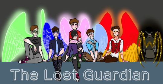
This fricking Banner was and still is(for now, *wink*) the most ambitious piece I’ve managed to finish. It took me so long, my wrist hated me, my ipad hated me, my ipencil hated me, medibang hated me, this piece pushed the limits of the poor app. Every time I try and open this piece up on the app it takes a solid couple seconds to open, save, and close.
From sketching to lining every single character, to having to uniquely match up Their Wing Sizes and Heights, because Guardians are fucking Tall, so Wing size and Height size was hell to calculate and portray. Why, you might ask?
Because I was limited to the proportions that would actually fit into a tumblr mobile banner. Which, funfact, is much smaller than you’d think!
I had to make sure they’d all fit, wings and all. And they didnt fcking want to. But I made it fit, because I wanted a full body + wings cast banner and goddamn it that was going to happen. And I did. And I lost a fuck-off amount of detail-space for it.
Coloring it wasn’t exactly difficult, but I will once again point back to this app hating this piece and it draining my battery because of it. I work in layers. My lineart will have 5-6 different layers in color before I combine them and set the hue to black, but I still keep my lineart seperate in that each character has their own lineart, and the background lineart is seperate.
I had their lineart, and probably still do, seperated into Seven different layers, one per character, each one w/ an extra masking layer for their wing glow. Each character got their own folder for colors, and had multiple layers for each colored section: clothing, skin, skin blush + eye whites, hair, wings, body markings, marking glow. And then there was the background layers, and the glowing affects, ect. The whole piece stands at having about 80 total layers having been used over the course of making it.
So yeah, Medibang does not like this piece when I try to open it. xD
But really, setting aside fighting and babying technology thats being pushed close to its limit, the real pride comes from the fact that this piece has Seven fully colored, near-full body characters drawn, all touching and interacting and accurate to the scale that I made. It is the most amount of characters in one piece that I’ve ever drawn, colored, and finished, and I’m pretty fricken proud of it.
Which makes it all the more daunting that said banner is going to get an upgrade, because it’s a Character Cast Banner after all, and its going to have four more fully designed and full winged characters added into it.
And by upgrade, I mean I get to redraw the whole dang thing. Because I gotta rearrange ✨everyone’s✨ positions. And at this point, the only way thats possible is by starting over.
wish me luck on that. o_o;
128 notes
·
View notes
Text
my art process: a simple(ish) guide to how i (kinda) do things
okay!! so, i said i was gonna post my art process after i finished doing the danny phantom piece so... here it is! the drawing i used for a step by step process explanation is actually... simpler? less clunky than how i usually do things. i must preface this entire post by saying that i am fully self-taught for anything to do with art so if there are some things here that are exceeding no-nos... very sorry OOPS
The drawing took an estimated 4 hours total and for software I used FireAlpaca. My tablet is One by Wacom (aka the tiny ass red one). Without further ado... here’s my narrated guide on how i kind of do art!
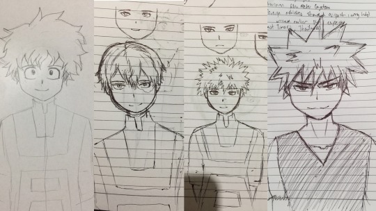
1. Sketch Layers
sketches, are ofc, one of the fundamental steps in art. Some artists do them differently, whether they do color blocking/splotches first or silhouettes or your standard messy-lineart-before-the-actual-lineart
i personally do 2-3 different lineart/sketch layers, each layer specializing in different aspects. i took this technique from julia lepetit, a host from the drawfee show--a channel that i really recommend watching if youre an artist, like art, or just generally like having fun background noise while you work on something because... untreated adhd lol
this is the first sketch layer! i color coded them for reference and i use the yellow sketch layer to figure out poses. i use this gesture sketch layer to figure out where i want limbs to go and how i want the body to twist.

after i figure out the posing, i move on to my second sketch layer. the green layer is my refined sketch layer where i figure out the form and anatomy of the sketch. this is also where i start planning how expressions, special costume bits, and hands work!!
the red layer is my last and final sketch layer. technically, the red layer sometimes also doubles as my final lineart! the reason why i do this final step instead of doing the final lineart simply is so i can work on details of the costume. i end up refining certain portions, or even stretching/free transforming the whole body.
The red helps with the refinement of the drawing bc the ink being a color that isnt black kinda,,,, tricks my brain into not believing that its all permanent. its easier for me to go back and erase/change some parts when my brain doesnt think that everythings final. when im finished, i simply go back and change the color of the lineart to black with the protect alpha function.
this is how the final lineart looks! be sure to close the lineart (aka make sure that everythings connected) so that the bucket tool can work and make your life 2000% easier.
2. Coloring
my coloring process is kind of... a mess LMAO its super dependent on how i feel like coloring on that day, but this is the usual method i use when im not thinking too much about it.
first are the flats! i use the magic wand tool to select all the areas around the lineart and reverse the selection so that all the areas inside your lineart is selected. color it with a base color, turn on protect alpha, and begin chunking in all the colors.
all of the flats excluding the pupils, background, ectoplasm rings, and danny phantom logo are on one layer. once that is done, we move on to shading!

for shading, i use a combination of the normal pen tool and the airbrush tool to smooth out the edges of the cell shading. since all the flats are on one layer, i simply set this one to clipping mask so that i dont have to worry about coloring within the lines. I only use one color really for shading (here, i used purple) and then protect alpha and add splotches of other colors (pink, orange) in relevant areas.
once i finish doing that, i set the layer to multiply and adjust the opacity so that it looks softer and more attuned to the colors of the actual piece
its at this point that i fiddle with the hue/saturation/brightness settings on the flat color layers to my taste, seeing what works and what doesnt.
i then lightly go over the piece with a bright color (very very very light cyan) and put focus on the areas i think should glow like his freckles, eyes, and ectoplasm rings from where he’s coming out of a wall.
i rlly rlly love layer effects, so i set that one to add and again adjust the opacity to how i want it to look.
3. Finishing Touches
...yeah i know it looks like a hot mess but hear me out.
on a new layer, make a CRAP TON OF GEOMETRIC SHAPES. ALL OF THEM IN NEON OR PASTEL. i get comments about my coloring methods sometimes and honestly im pretty sure its all due to this step. i make all these goddamn weird shapes, colored according to levels of lighting (yellow in lighter areas, turquoise in areas affected by the glow, purple in shaded areas etc. etc.) and also clip this layer.
i then set the layer effect to either hue, overlay, or add and set its opacity really low to make it unobvious and cleaner to look at. this is a method that i learned from tumblr user zephyrine-gale who is... exceedingly talented and pulls this off way better than i can WKSDJSKKS
after that... ur basically done!! i add a few more layers like the noise layer for extra texture and sometimes some very light gradients (usually yellow to purple bc of something something color theory)--but after that, the piece is basically finished!
thanks for sticking around and reading this monstrous thing!! i might do more posts like this in the future, so who knows?
if you enjoyed this tutorial, want to support me and my art, or just wish for a way to pay for me to shut up... you can tip me 3 dollars or commission me here at ko-fi
(also reblogs are much appreciated. thanks <3)
35 notes
·
View notes
Photo
As anyone can attest, 2020 has been a rough year. A punctuated rough year in a string of rough years. My experience has been no different, but as for my personal artistic growth, 2020 has actually been exceptionally good to me. I went from thinking that doing a picture a month was asking way too much, to doing basically a drawing everyday. It’s a bit funny, I’ve been on tumblr since 2012, and i’ve posted some art here and there, but this year is when people finally noticed. I’ve had a couple of people say to me “I didn’t know you did art.” I don’t know how I feel about that, but I’m happy that my art is finally getting notes at least.
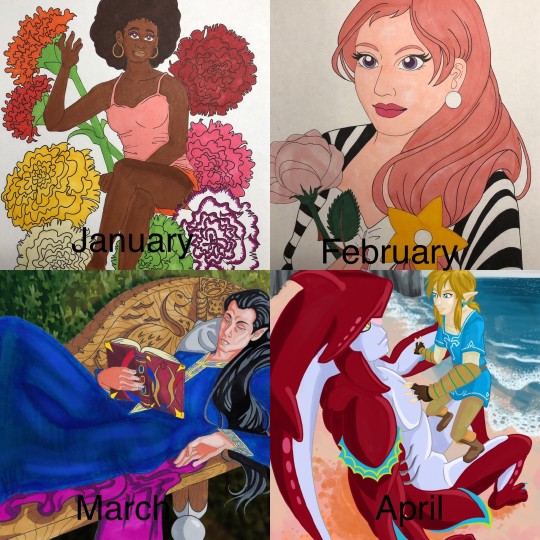
January - This is when i’m still in my dark phase. Drawing hurts, but I’m still trying my best to put something, ANYTHING on paper. i’ve spent 2019 drawing lines and squares on paper to just get used to drawing again. I’m trying to do people again. I had an idea that i was going to do a drawing a month for birth month flowers. January was carnation, and i had a sketch for February, but it never made it to completion. I’m still using traditional markers, pen and pencil.
February - This is where I found out that using a reference for art made things %100 percent easier. This is my very old OC Zora, made when i was in middle school. Using references cut out a lot of the initiation process i had when starting a drawing, all I had to do was trace, i didn’t have to think at all and the product was still good. Honestly pretty revelatory.
March - this is when i bought some really neat artists models that i could pose in any number of ways. They have proved their worth over and over again. Still doing traditional, but i did enhance this picture on the computer.
April - My markers were running really dry and I couldn’t afford to buy a new set, so I dragged out my laptop and drawing tablet to see if i could start drawing digitally. I was never really good at drawing digitally, though I got a little better in my animation classes. Colors aren’t true on the monitor and doing lineart feels odd and hollow. i can’t put it into words. but I downloaded Krita because i also couldn’t afford Photoshop. so on top of learning digital art again, i was learning a whole new program. So this picture was a culmination of a lot of things, and a really good first step for the rest of the year.
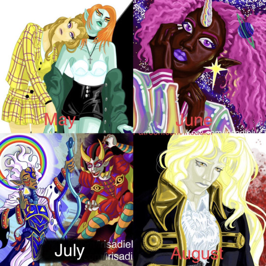
May - Here, this is when quarantine was in full swing, but drawing is no longer painful and i’m actually looking forward to it. Still learning digital again, so I decided to go with my tried and true love of fashion and clothes because that’s what i know best. Backgrounds suck
June - This month i was doing a lot of sketches and little doodle drawings. i decided that i wanted to try something more realistic, just to see how it would turn out. i think it is a bit of a mixed success.
July- July was busy, so i didn’t do a whole lot. This drawing was based off the designs of another artist that i loved a lot. I’m really big into character design, and I go crazy over a really good design.
August - My busiest month! I did so much in August! i wanted to take a break from all the Zelda art I was doing and decided to try doing an Alucard. Yoshitaka Amano is a big inspiration for me, and the way they do Alucard absolutely melts me. Someday i’ll draw Alucard as pretty as Amano does.
September - I dragged another OC out of the grave and thought to myself “How can i improve on my art?”. It’s amazing that in January i didn’t know if i would still be drawing, but here I am trying to not only draw as much as i can, but also trying to improve. I loved the way this picture came out, but the process that i used to color it took 3 days! I don’t have that kind of time to spend on my art, but maybe someday i’ll do that technique again.
October - This month was a bit of a low point for me. I was getting depressed again and was struggling to draw. I didn’t do a whole lot. But i didn’t want to go back to the way things were at the start of the year, so i just took a break for myself and reminded myself that low points were going to happen, but it didn’t mean that my progress was erased. i went back to trying a more realistic approach because with LOTR characters, i can use actual human models which is great for getting the subtleties of shading.
November - Busy month that i didn’t have a lot of time to draw for. but i did a series that I am very fond of, the picture shown being my favorite of the series.
December - the end of the year! and i’m still drawing. I’m drawing so much! December isn’t over yet, and I’ll have more drawings to show later, but i can’t show them here yet because a lot of them are presents. so, this picture is the one that everyone liked the best, or at least it got the most notes. instead of using my usual ultra saturated color, i went with greys and sad colors. but people liked it a lot, and i don’t know how to feel about that.
8 notes
·
View notes
Text
Creator tag meme
I was tagged by the only, the fabulous @georgiawarrs !! Thank you so much, honestly you are so talented
rules: it’s time to love yourselves! choose your 5 favorite works you created in the past year (fics, art, edits, etc.) and link them below to reflect on the amazing things you brought into the world in 2020. tag as many writers/artists/etc. as you want (fan or original) so we can spread the love and link each other to awesome works!
1. Osemanverse on TikTok - it took super long to make because I was playing with lighting and adding in all the text, but it was so fun and I wish their accounts were real
2. These IWBFT fan posters - with this I took a bit of a new approach, it’s not so lineart-heavy as my usual fan art, but I think I kinda nailed the aesthetics lol (and it was a follower suggestion! How cool!)
3. Valentine’s day post - the initial process was “I want to say these things but I’m too lazy to actually color the characters” ... but it keeps getting notes and I think that I made some people feel a bit better, and that is what makes me happy
4. “Seconds before they kissed” - again, I tried something new and I liked it - the colors, the faces, the FEELS
5. Crows. - a little elaboration on my autumnal escapist thoughts in another lockdown. it didn’t get notes but I still like it a whole lot
okay, and I'm tagging: @kindaorangey @cottonsockssssss @saevity
(if you don’t want to do this it’s totally ok, just know I appreciate you <3)
9 notes
·
View notes
Text
my relationship with digital art and how BNHA salvaged it
I just wanted to let out my thoughts but I can only do it here :>
This might be a downer for some people but I’d like to share it with people here. BNHA means the world to me and this is why.
I first started drawing when I was 7 years old in 2006
I think it’s ugly now, but 7 year old me remembered being so proud of this because this is a drawing of my stepfather. This is the only drawing I have that was from my childhood. I think the aim here is to draw in anime style BUT I didn’t even watch anime back then. I had a classmate who loves anime and she taught me to draw in school. Drawing became a favorite hobby immediately after that.
Then it was 2013 and I was 14 years old. Drawing is still my favorite thing to do besides being on the computer. I love anime at this point too. My parents bought an iPad for the whole family, but I was almost always the one using it. I discovered an app called ArtStudio and thought “Wow, I can draw without making a mess and with only my fingers” because I was always too lazy to take out my drawing materials and clean up afterwards.
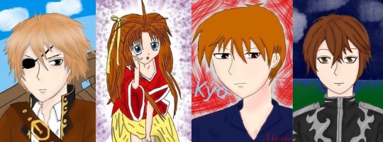
These were my first digital drawings. The pirate one was the very first. I got obsessed real fast. I can color so easily, undo any mistake, layers are a blessing too. There was just so much more freedom. I always sucked at coloring in traditional art and I didn’t like the mess (idk my hands get so messy traditionally)
The next year, it was 2014, I was 15. My birthday is in a couple of months and I knew my parents were planning to buy me something pricey (I think it was a laptop) so I approached them and asked if they could just buy the Wacom Bamboo as a present which was cheaper anyway and I even explained how it works to them and how it would allow me to draw on the computer instead of the iPad. I tried really hard to be convincing. I would have prepared a powerpoint presentation if I had to.
They did give me the wacom as a present. They even gave it to me months before my birthday so I could use it already. I thought I was the luckiest teen in the world with my parents.
These are a collection of my favorite works from 2014 to 2016. The middle one was my second drawing using wacom and Paint Tool SAI. I was a part of a lot of fandoms in those years lol
It gets downhill from there :/
April 2016, my mom and I moved to Japan, while my stepfather and siblings stay in my country. It was tough. For someone who is obsessed with anime, you’d think I’d be thrilled to live in Japan.
I was. Though only at the first few months. It’s not the same as it’s portrayed in anime (I should’ve known but I used to be blinded by anime). It was just lonely. The language barrier sucked and then lots of financial and family issues until my parents split. I got my first boyfriend too and I thought I was blessed by the nicest boy, but the relationship became extremely toxic but I didn’t have it in me to walk away.
All the shit that happened affected me mentally and emotionally. My biggest outlet which was digital drawing, was also out of the question because I did not have a computer/laptop when we moved to Japan. We left it in our home for my stepfather and siblings, even the iPad. I have my wacom with me, but no computer/laptop to use it with. I couldn’t draw.
I tried though. I used my phone to draw, but it wasn’t the same. Then the life problems got piled up, things got worse, and I just lost motivation in anything. Literally anything. From 2016 to 2019, I stopped watching anime, I dropped out of all the fandoms I’m in, I stopped watching my favorite TV series or movies, and I stopped drawing. I even got a bit disconnected with my friends who lived in my country (we talk regularly online). My family was broken so I gave all my attention to my toxic relationship as well which made everything worse too lol
I didn’t draw besides from a few scribbles and the drawings above. I did try digital art on my phone a couple of times again and even posted them on my IG, but they weren’t any good. Eventually, I got mentally and emotionally drained and dropped out of senior high school. I just stayed home for almost a year, leeching off of my mom. I felt even more worthless and my life had no direction at this point. Nothing mattered anymore.
April 2019 or so I think, my (ex)bf bought me a laptop. He says it’s a gift, but I think the real reason was to make up for something horrible that he did (which is stupid because money /gifts won’t resolve anything). I have a laptop. I can draw again, but I didn’t. I didn’t care, I wasn’t interested in drawing anymore anyway.
Welp. June 2019, I went back to my country. My (ex) bf stayed in Japan. The distance helped me end the relationship and my friends were there (they always were) to help put me back together along with two trips to therapy. I went back to finish my senior high school in my own country this time. That said, I have to stay in my country for school (but I was happy because I didn’t wanna go back to Japan yet when the breakup was still fresh and with going back to school, my life has a direction again.)
It was weird. I remember just being sorta lost and confused because I used to put my time, effort and everything into my previous toxic relationship, which was now gone. I was free and I had so much free time that I didn’t know what to do with it. I got so used to doing nothing and being nothing.
This is where BNHA enters.
Dunno when it started, but I started seeing Bakugou frequently online. It’s usually just Bakugou. I knew who he was because my friend suggested BNHA to me back in late 2018 I think but I didn’t watch it since I’ve lost interest in everything at that point in my life.
But ye I thought he hot af but I still didn’t watch BNHA.
But then for some reason he REALLY kept appearing in my social medias and it was really frequent. The last straw was when I saw a pic of him in UA’s gym uniform and thought “damn boi aight imma watch bnha for u” (y’all gotta admit he looks good in those colors with his combat boots XD )
I watched BNHA. Fell in love with Iida along the way. Then I switched to Tokoyami (but Shoji was hot too so aaaaa), but then angry emotionally-constipated sea urchin head caught my heart again. But oof. BakuDeku moments really made me feel some type of way I haven’t felt since I moved to Japan. It felt new but nostalgic. I fell hard in that ship.
I started obsessing. From memes to posts to fanfictions to buying merch to filling my room with BNHA posters. I realized I was reverting to my old self from the time I was still happy and it was thanks to BNHA (and the good people who helped me through the worst too)
Shit I wanted to draw BNHA, I thought.
I mean, I have a laptop, I still have my wacom and drawing softwares. I could totally draw digitally again if I wanted to.
But guess what
I can’t :c
My hand physically cannot draw. My drawings don’t look the way I want them too. 3 years of not drawing really destroyed any skill I had. I was back to square one.
September (yeah they’re ugly, I laughed at it). If you’re wondering why I drew on paper, it’s because, for some reason, I really CANNOT draw digitally. I mean it. I can barely sketch digitally at this point. The lines and shapes just doesn’t come to life. They’re just scribbles. But somehow, I can kinda draw on paper with a ballpoint pen. But yeah, that was the best I could do at this point in my life
After that, I still tried to draw, to regain my old art style, but it didn’t happen... It just doesn’t look or feel the same. Drawing used to be fun. But during this phase, it felt like my ugly drawings were just mocking me (probably was just too emo that time lol)
Weirdly, around a week or two I think, after my half-assed attempts at drawing, I managed to draw digitally somehow o.o
I did a Midoriya and Todoroki drawing like this too. It was my first post here on Tumblr I think. The annoying part here is that I cannot draw digitally unless I draw on paper first, take a pic, and then trace the lineart. I couldn’t draw directly on the computer. Granted, drawing on paper and drawing on digital is very different for me in the first place anyway. But it was still a pain. And it still looked like shit. I can only draw stiff poses :/ it seems like my brain decided to delete all data about anatomy and posture and backgrounds. My lineart here is even messy af. It still really not the same as my old style.
By 2020, I think I got my old art style back. On March, I made this. This took me 27 total of hrs to make.
Right now, I think it’s not bad, but back in March, I was disappointed with the result. This is when I finally broke down crying because it didn’t look good enough and I hated that it took me 27 hrs to draw “bullshit.” I was angry at myself for losing interest in drawing for 3 years when I could’ve used that time to improve. I had to start all over again and it still didn’t look good. (Current me thinks that the drawing above is alright. I was just a lot harsher to myself back then. Used to have a lot of issues but I’m doing great now)
I cried myself to sleep that night. Woke up wanting to cry again. I wallowed in sadness for a couple of days. Eventually told my friends what’s up. Got some pep talk. Even talked to my sister (she’s great, she always hypes me up with my stuff and sometimes I think she’s my biggest fan with how she appreciates my drawings and I’m really grateful for that).
My world turned a 180 and I was weirdly positive after all that crying because brain chemicals and shit. I had a revelation. If I hate how my art style looked so much, then I should have been putting effort in changing my art style, not trying to regain my old art style (that I don’t like anymore)
I researched a lot. I analyzed different art styles and anatomy again. I did everything I could think of to find a style that works for me. I might have even neglected school for a bit to focus on digital art lmao
After all that work, I posted a fanart of middle school BakuDeku in their classroom. I love that fanart so much even if I probably have better ones by now because that was the first fanart I made that I felt like I could be proud of and it was the first one I made in my new art style. It was a milestone for me.
March 2020, I moved back to Japan and without the toxic relationship, I’m a lot positive now. Happy. I’m myself again after the previous bad years. I’m still continuously learning though, trying to improve, but at least, now, I found my own art style :) I really suck at interacting with people online, but I’m always grateful for the support everyone has been giving my fanarts. I’m happy when my content makes people happy.
This is why BNHA is important to me. The series is great alone, but it’s not just that to me. BNHA is so much more. It’s what made me find the passion to create again, only this time, it’s focused on drawing (I used to write, but now I just draw, but maybe I’ll write again for BNHA).
My family is supportive with my love for BNHA, but I think they don’t know the deeper reason why I love it. Sure, I was fine living on with nothing much going on in my life. I’ll finish school, get a job, work until I die or something. It was okay. It was the way of life. But BNHA gave my life color again. I wasn’t just blindly going through life anymore. I have something to look forward to everyday now. BNHA even became a bridge to other things. Ever since then, I’m a lot more open to people, to try new things, to explore and not just live through life and waste away. I got better at leaving my comfort zone. I’ve never been happier in my life :D
Thank you for supporting my fanarts. Thank you so much for giving me a chance to express myself through BNHA. I hope to make more content in the future and improve even more :)
30 notes
·
View notes
Text
[TW]- A Stranger’s Dead
Trigger Warning: The following content contains kind of explicit gore (vital organ showing- heart) , with blood as well. You have been warned. I will post a blurred image before you are going to see it if you are willing to take the risk by clicking ‘’Keep reading’’. It may also contain explicit description. If you haven’t seen the explication posts before you can go check them before seeing this: Wolf’s Rain General AU Info ; Original Wolf’s Rain AU Ikari (The one you see below) ; Yami’s Return Version Of Ikari

''A stranger's dead, the night is red His heart is cold, his lungs are blown The stranger's last breath, a quiet death (Ikari’s ->)His silence is stronger than the voice he had'' - https://www.youtube.com/watch?v=u2HRq9nEkrI

Ok so! Oh ye this took so long. Originally planned and started in 2018, some days ago I've found the song above and couldn't stop thinking of how it fits Ikari ( =Mad Yugi) and then I remembered I had the started lineart remaster/remake of the original and thought ''Let's do this!''. Originally this was planned to have no background,but because of the song I also thought of a background.
Now: 1) I want to thank everyone who helped me finish this! Not only people that I looked up tutorials of, or people who helped me with figuring out how to do saliva digitally, but to everyone who even told a opinion while i showed the progress! Every opinion made me keep going when i wanted to give up, so thank you!! 2) This is my second gore art I have ever done COLORED (had done gore casually on paper ,nothing too complicated). The first one it was kind of a commission and was a headshot with no background so finished in 2 days and had a lot of fun doing it. 3) I wanted to do a gore art for a while, inspired by BlitsAzalisDash 's speedpaints of Princesses' Deaths and the Mane 6 Deaths. 4) This took 5 almost continous days to color and all that (+ 1 day for the lineart made way back in 2019) and my wrist keep hurting me like hell but it's alright. 5) That in Ikari's claws is a WOLF heart BUT since the refs I found where looking like a HUMAN heart so I then referenced a HUMAN heart but it's up to the viewer to decide which they like most. (Since Ikari kills both humans and wolves). This whole work made me frustrated, to cry, to be angry at my poor little mouse,to be excited later etc etc. Credits: Yugi design by Kazuki Takahashi Ikari design by me (my oc) Program used: Paint Tool Sai 2 DO NOT USE,TRACE OR REUPLOAD!!!!!! YOU ARE NOT ALLOWED TO DO IT!!! Highly recommended to zoom in to see details as I've let it at it's original size (if you break the rule above i'll make this super small so no one will use) (all that was my dA description. I hope it’s alright though. I worked so hard. Also do not force your hand. After this artwork I had to take a week break because my wrist’s pain was insufferable. After this I learned to take it easy. If you made it this far into the post: Thank you. And thank you even if you did not :) )
#tw: gore#tw gore#tw: blood#tw: organ#tw: heart#blood#lots of it actually#digital art#mouse art#ikari#yugioh x wolf's rain au#original au#really proud of it#it was all worth it#long story but if you are confused by this as in why Yugi has another dark half when he had Yami/Atem then please just...dont bother to und#understand anymore..#it's not dark half but his own darkness inside his heart
9 notes
·
View notes
Text
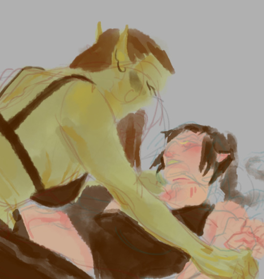
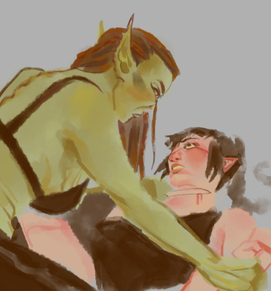
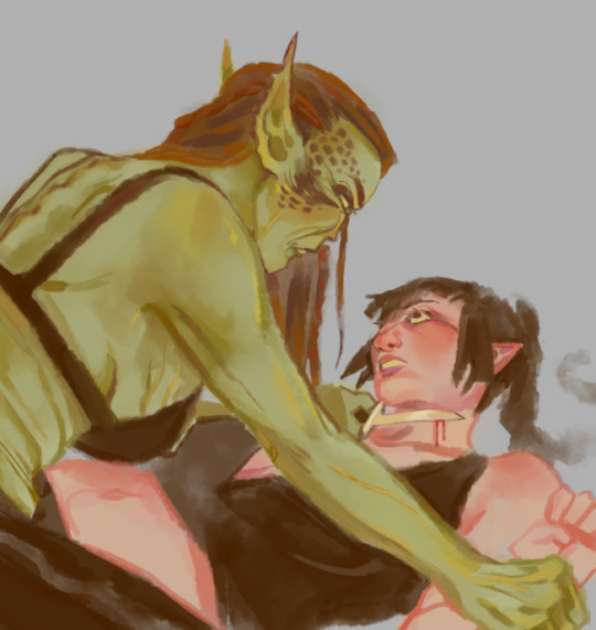
Hyacinthus Art Process! (Part One)
ART PROCESS BELOW!!! (forgive me if I’m salty, I was looking for the link for Step One for almost HALF AN HOUR)
Also end and forgive me I made the bunning Hyacinthus PURPLE. Luckily I change it but S T I L L I’m ANGRY ABOUT IT
Step One - Rough Draft

Okay! So I started this album around October 20th, 2020 on a Tuesday (lol).
When I was thinking of the song (while doing the covers of the last two), I really wanted to show that power and desperateness of Jamil (and how he indulges and relishes in it). I remembering see this pose by yama_kome and I really liked how they represented Jamil’s overblot.
Ever since I saw this incredible piece of art, I wanted it to be done in this kind of way. Now, since I’m releasing covers of Scarabia (Mystique and Cardenalia), I decided to do it this time for his overblot.
Besides, I wanted to change things up a little bit!
This took me a while to get (almost a day I believe?), but when there’s a will - there’s way.
Just to let you know: I was originally going to name the song Hyacinth but if you say all the Scarabia Trilogy’s Tracks in order - it wouldn’t sound right. So that’s why I changed it to Hyacinthus.
Secondly, I feel like if you say a flower’s scientific name than its common name - it gives that effect of a beginning, of a source and of an origin. I feel like the Overblots are a representation of their true feelings and emotions (in this case, Twisted Wonderland) so that’s partly the reason why I changed it as well.
Step Two - Rough Lineart

This dang lineart took me till Thursday, October 22nd. Here’s why.
1. I COULDN’T WING IT THIS TIME - there was a lot going through my head as well as references about what I wanted him to wear. Other ideas popped into my head such as, “Should I add some blot there?” or “What should I do for the shirt?”.
So many ideas, but few were added.
2. The DESIGNS. - So many interpretations and stuff were everywhere, and they all looked good. But the problem was the amount of time to put such beautiful details. That killed me.
To sum up one and two, my brain for ideas went brrrrrrrrrrrrrrrrrrrrrrrr-
Steps of Lineart (at the top of my head - yes. I don’t write this in the time I’m doing it because it slows me down lol):
1. Face (was done already) - more specifically the side profile to the neck
2. Nose Piercing (yE-)
3. Mouth Piercing (hOt-)
*4. Braided Hair (*dies*)
*5. Veil on Face (then the pattern waaaaaay after)
*6. Dazzling-Jewelry-Neck (more sure about doing the neck first, but #6 and #7 can be interchangeable)
*7. Snakes (only the right of the art piece though/snakes nearest to braids or plaits)
8. Upper Body
9. Robes
*10. Chest
11. Shoulders
12. Right Hand - Fingers
13. Right Hand - Fingernails
14. Right Hand - Palm
15. Left Hand - Fingers
16. Left Hand - Fingernails
17. Veil on Body
18. Ear (YUP, I FORGOT THE BUNNING EAR-)
*19. Snakes (left of Jamil and his beautiful hair strand)
20. Right Earring
21. Left Earring
22. Thing on his head (nope, don’t know the name and I ain’t bothering)
*For numbers 4, 5, 6,7,10, 17 and 19 in particular, I had to do multiple layers to make the detail. I would say:
#4 - Two layers: One for the plaits and one for the line...thingy...
#5 - Six layers: It’s technically two, but I had made multiple to get the pattern I wanted. Sadly, I didn’t achieve it so I decided to stick with the one above.
#6 - Six layers: THE FULL DANG TRUTH. The diamonds were first (1), then the line separating the pearl and diamonds (2), Later the designs of the pearls + rectangular thingies (3), The triangle into multiple triangle thingies were next (4), Soon after was the circles into multiple circles + Two triangles overlapping each other (5) and then that last bit at the end of the neck (6).
There’s actually more due to the designs of the diamonds and pearls, but I’m not going that far into memory lane.
#7 - Eight layers: If you count them, that’s how much layers I had to go through.
#10 - Four layers (without counting the two (or three) patterns that you see up there): That darn pattern (1), Them s p i k e s (2), That thing it’s being held up in (3), that pattern near the spiky pattern (4).
#17 - Four layers: Just count, please. Going up and down with my eyeballs is killing me.
#19 - Seven layers: Not as bad (because it’s pretty small), but whatever. (1 - 3) First three ear piercings you see (you may see two though), that tail, long thingy (4) that crap Bubbles wear...them circles (5 & 6), and that diamond. (hehe cATER DIAMOND)
HI!!!
You better read that crap. I took a good while writing it. If you did, you earn my biggest respect and time in the inbox.
Step Two and a Half: Cleanup WITHOUT the Background

Ah. The nostalgia. That feeling when you forgot the flower you were supposed to be working on...
Words, text and speech can not even compare to the feeling I had when I rEALiZED, I foRGOT the BUNNING FLOWER-
Step Three: COMPLETE Cleanup
Perfection. Isn’t that nice?
Step Four: Coloring
October 22nd, 2020 at 11:03 AM...
Immediately when I thought of Jamil I immediately wanted to give him that w h i t e s c h e m e
The reason why I wanted to was because he hard more darker colors in his normal design, and besides - his power has something related to the meaning of white ;). Anyways, I made sure that the ivory (celestial?) theme continued to flow through the whole art piece. Basically, making this smol boy a goddess-
Also, I was thinking that this Overblot scheme would be his true form or something, but he kept it locked away maybe due to how much it takes up his health. Consider this idea though as 100% “Not-Fully-Developed-But-Getting-There” Idea.
I really wanted them snakes to be white. Sorry not sorry.
Plus, I wanted that veil black instead of white, but I was way too into it to ever think of that apparently. In particular, them f i n g e r n a i l s. I absolutely wanted Jamil to have that light peach color and all that so I did it! Makes my heart go UwU-
<>
Annnnnnnd cut! That’s Part One for you.
Hyacinthus [ Art Process - Part Two ] here!
Thank you for your continuous support!
#just#please#end me here and now cause I'm just like ://///////////////#it's easy to fix though so anyways-#TWSTxDAL art process#TWSTxDAL overblot#TWSTxDAL#twisted wonderland#date a live#scarabia#kalim al asim#jamil viper#twst kalim#twst jamil#this is the final one...:(((((#at least original Jamil's back again!#Requests are open - including Overblot Jamil HEHEH-#finally I queued this! Thank goodness...#now you guys don't have to wait! YAY!#but dang#ever since I've made music for scarabia I've started to love the characters in them espECIALLY JaMIL-#YE#UwU
4 notes
·
View notes