#the dying art of typography
Explore tagged Tumblr posts
Text
Good Design is usable. Great Design helps with Usability and Disability (with a side rant about why AI sucks yet again)
So I've been seeing hot takes from authors and writers lately about typography and I've been correcting them about typography rules and some designers are sticking out their heads going, how dare you even speak such a thing. Design is about being...
~*~PRETTY~*~
and seriously, screw that. How poor were your graphic design teachers and professors that you only think type is about being Pretty?
No, the rules for type are there for a reason, but if you can't state that reason I'm going to doubt you as a graphic designer entirely and that you had some crap professors who didn't bother to learn it either, and you know how I feel about passing down bad information.
Look, as a writer and graphic designer, and all of those things, trained both formally and informally, I can tell you that if you do GREAT typography, if you really put thought into it, you can help with disability too. So when you argue to me, that design is only there to be pretty, I'm going to call you effing ableist.
I mean even in my Scrivener document I put in fonts that help with dyslexia. That is GREAT design when you can help with disability seamlessly.
I'm saying as artists, we have a duty to respect other artists, and try to at least understand their rules and reasons why. It's like writers backstabbing artists by using AI.
99% of typography isn't about being "pretty" 99% of typography helps with disability. So stop fucking with the rules without understanding any of it. Type looks easy nowadays with the internet and people not bothering with typography anymore and seeing rivers and lakes all over the place, but that doesn't mean it's automatically "better" because it's "easier".
Typography in its purest form—I found that of all of my art classes that I took the most difficult to understand and do, because I knew that doing it well will help people, doing it poorly and everyone notices. Which is why I say it is ice skating of graphic design.
Do you, as a writer, need to understand every single last rule? No, but I will say that learning typography forced me to understand that I shouldn't be falling back on bold, italics, etc and I should absolutely do more to choose my words more carefully. If you're going to break a rule, at least take the time to understand it.
For this reason, this is why I miss formal typographers in the publishing industry. Because I want to look out for the people who are also disabled in this world.
And this is also why AI sucks. I've never seen an AI image that understands the nuances of human feelings around art and design. Gasoline Pasta? really? A stone oven that looks like a pile of shit that is not remotely historically accurate. Please no.
An AI that knows and can spot disability issues in a problem posed to it? No, I had to effing coach it. You know what humans can do that AI can't all of those things. And this is why great typography helps people with disabilities.
#the dying art of typography#great design helps with disabilities#inherent ableism in our systems#I hope that graphic design teachers are thinking about teaching their design students about design ableism
10 notes
·
View notes
Text

Sylvia Plath, from The Collected Poems of Sylvia Plath; "Lady Lazarus,"
#lit#sylvia plath#dying is an art#like everything else...#lady lazarus#fragments#poetry#typography#tw: death#p
531 notes
·
View notes
Text
बारा.
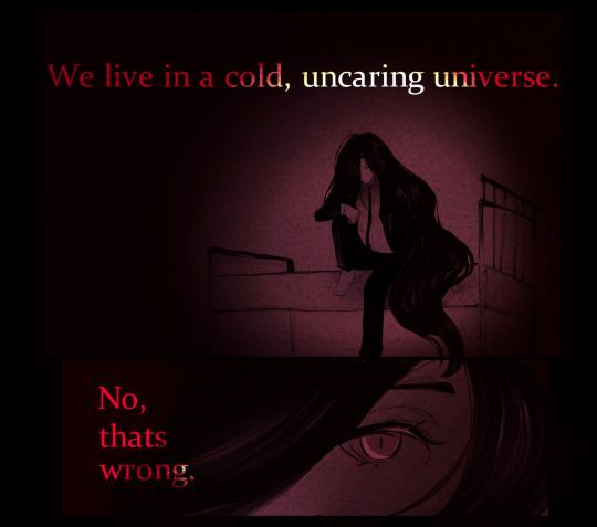
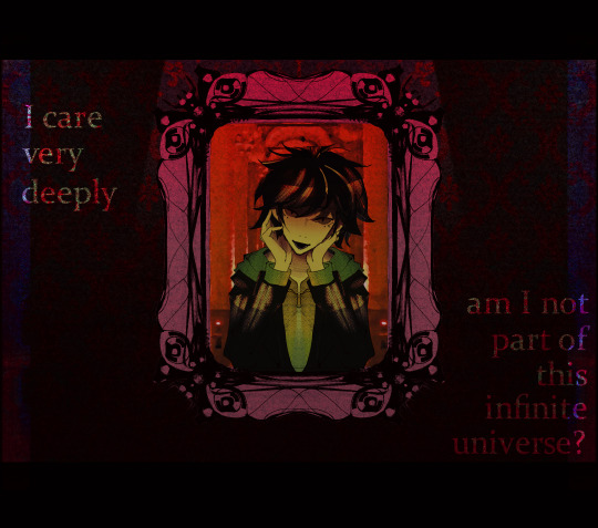
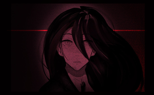
Nihilism and Absurdism
one/?
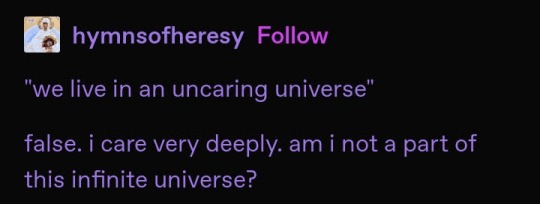
#originally intended this to be charcoal and oil pastel piece on canvas but then i realized i have limited supplies and money#starting a short comic with these two. and note to self please stick with black and white from now on please#kannon stop drawing men with mascara challenge difficulty level: impossible#please do zoom in. the textures here are delicious#art#illustration#krita#artists of tumblr#artists on tumblr#danganronpa#anime#makoto naegi#hajime hinata#izuru kamukura#fucked up typography somewhere out there a design student is dying
3K notes
·
View notes
Text

Sarah Tolmie, from The Art of Dying [ID'd]
#q#lit#quotes#poetry#typography#id included#sarah tolmie#the art of dying#sanctum#the book#reading#m#x
135 notes
·
View notes
Text

this quote really stuck with me so something abit more simple with it again [ on prints, stickers and things: redbubble | teepublic | threadless ]
#deadbeat typography#I don't have it in me to do anything more- currently dying of a level 50 throat curse and have been sick aaaaaaallll week yay!#artists on tumblr#redbubble artist#teepublic artist#threadless artist#quote art#typography#digital art#trans artist#positive quotes
1 note
·
View note
Text

As promised here it is, Definitelynot-tober!! the beloved @isjasz requested some alternative inktober prompts, and these are the ones i came up with! This is free for anyone to do if they'd like, should be compatible for both art and writing, and a plaintext version of the prompts will be found underneath the cut!!
Massive and insane shoutout to my incredible friends @kunehokki and @corvidaearts for making the graphic and doing the typography for this prompts list respectively!! They both went SO HARD on this 😭😭😭😭 you guys are so insane for that thank you so so much for making it!!!
Be sure to tag your pieces as #definitelynottober and #definitelynottober2024 if you use these prompts so I can see them, and feel free to directly tag my blog as well!! Hope everyone enjoys, I had a lot of fun making this so I'll probably be doing it again next year :] (oh, and as a bonus, if you read these prompts all together, they form a poem!!)
DEFINITELYNOTTOBER2024 PROMPT LIST
REVEALING YOUR NATURE
ON THE EDGE OF A KNIFE
ONE EYE OPEN
TWO LIGHTS IN THE DARK
HEAVY IS THE HUNGER
BUBBLING UP
BETWEEN YOUR TEETH
A HAZY TEMPTATION
STEALING YOUR BREATH
LIKE SAND FROM THE HOURGLASS
HEART IN YOUR FIST
A MIDNIGHT CONFESSION
WARNING SIGNS
IN THE WEBS WE WEAVE
WEARING FAMILIAR MASKS
THE ANATOMY OF THE HOUSE
SETTLED IN STONE
CHALK LINES ON THE FLOOR
WALKING THE TIGHTROPE
AROUND THE FIRE
OLD BONES
SCATTERING THE SOIL
FOLLOWING
MAZES AND LABYRINTHS
BEYOND THE BRIGHTEST STAR
THE LIGHT THAT BLINDS
MIRRORED
SILKS AND SATINS
CARVING
THE SUNSET HARVEST
UNDER DYING LEAVES
#prompts#writing prompts#art prompts#inktober prompts#definitelynottober#definitelynottober2024#october prompts#poetry#my poetry#<- bc it counts#ftr i made these prompts first and THEN looked at them and decided to make them a poem#i did not edit a single one i just shuffled them and they came together *beautifully*#also sorry for how long this took to get up!!! we all wanted the graphic looking nice EKFHWJDJD#<- group of chronic overachievers#shouting speaks#ph
308 notes
·
View notes
Note
Hi! I was wondering if you would consider selling the "we are all going to die" typography as a print in the future? I'm dying to hang it on my wall xD If not that's totally ok tho!
Yes! Thank you for asking!
I am planning on adding it along with some of my other designs to my redbubble (writtengriffin) this weekend. Hopefully I’ll have some time to set up an inprint or something similar soon, but for now I just have the redbubble
Also! You are totally free any of my art as lock screens, banners, pfps and anything like that, though credit me if you get the chance. Just don’t repost it.
And I’m very much in favor of diy and fanbase stuff. So if someone is broke, or just in a situation where they can’t spend anything extra, and just wants to print it out and pin it to the wall, I’m chill with that too. I’ve been there and I get it. But if you’ve got some extra you can spend, I’ll put it on the shop this weekend!
7 notes
·
View notes
Text
december song recs
i can't believe it's the end of the year already. i have to say i'm really proud of myself this year. it was completely different than last year. i'm so happy things have turned out differently. also i got to interact with a people a lot more. even though it is inevitable to get hurt when you talk to people, you can also learn a lot and be really happy too. however, as i'm writing this, i'm really anxious over a project. #ihateanxiety makes me feel like it's the end of the world when it's literally nothing lmao. it's okay, i believe in myself. also i had so many tests this month my teachers have to stop giving us so many tests in addition to finals. praying i didn't fail physics and math (my grades are dying). for some reason i didn't listen to that much music this month??? i also went on a trip maybe that's why
--- hymn to the decadent life - ro2noki thanks ashe witch's heart for showing me this song. seriously... i love songs like these. all nihilistic. like "yes, yes, it's my fault" and things like that. being a useless adult. reminds me of positive harassment by kurage-p. it's so catchy too, i definitely looped this song. however listening to this song too much just makes me depressed because it's a really depressing song lmao... makes me not excited to be an adult.
--- liberation of the soul - b2tsm tsv you will always be famous. they mean a lot to me. i mean, duh duh duh dum was one of my most listened to songs last year. this is one of my favorite song of theirs. the song itself flows so smoothly, and i absolutely love the chorus. it's so deep. "i must live / for art and for mankind / may god give me the strength to conquer my desires" and "my music, my muse / my true eternally beloved" are my favorite lyrics. it's just a really heavy and deep song.
--- ciao adios - anne-marie i love the phrase "if you're giving her all of your money and time / i'm not gonna sit here wasting mine on you, yeah, you". like... it descends so smoothly and nicely. also wonderful chord progression. yes i know this from gacha life.
--- help me, erin UTAU COVER - seall (on youtube) did you think i would stop listening to help me erin??? yeah, not possible. i went through the massive playlist with all of the help me erin covers and really liked this one! the tuning was off-putting at first but now i find it so charming. i really like teto's "aah" and "mou" slides. they sound very realistic/emotional to me! and i love teto's voice in general too. also the art by the creator is super cute! speaking of teto, 2024 might have been teto's year with the number of bangers/popular songs she has starred in. like mesmerizer, override, hymn to the decadent life (it's popular right), outlaws, tetoris, obsolete meat, etc. etc. (also i can't believe outlaws is so popular i'd never even heard of it until i saw the wh animatic lmao)
--- balloon - aoiko um.... witch's heart. wilclaire. that's all i gotta say. okay other than that... why can't i find info about this song anywhere????? is it a j-pop or vocaloid song???? there are no lyrics in english???? idk man. deepl and google translate are also telling me different things lmao. however this song is so good. i'm pretty sure it compares happiness to a balloon... or something. i love how it opens up with a muted version of the chorus. and the chorus is so heart wrenching....
--- a lot of witch's heart ost ahem... battle for their lives, 05 tower 1, tsuki no kobune, carefree conversation, picking flowers, wilardo's youth, hosibosinosoko, tiara's theme, invective's challenge, among others
--- a lot of kururingo songs mary and the amusement park, undersea family restaurant, final wonderland, a certain family's tea party, even jessica. like man why are their songs so interesting. they're very surreal (combined with the art style and typography/mv editing style), it's a very fun experience/style i really haven't seen anywhere else. and their songs tell super cool stories too and even though i don't know yugioh i can still appreciate it. also my username comes from a certain family's tea party's apricot tea, and now that i watched all of their songs i'm happy to learn more about them lol. also yes... i was recommended kururingo via wh.
honorary mentions: underneath the tree (#christmas, i really like her "then, one day, everything changed" it kinda scratches my brain), juno (heard it too much on tiktok lmao also songs about love make me feel...), all the b2tsm songs actually like uhhhhh why are they so good, my heart (finally found this song after like 4 years wtf), override (still, yeah i know. it's really fire okay), nightcore/gacha life playlists on youtube (helps me study???)
#music#december 2024#help the witch's heart obsession is still here and it's influencing all my music lmao#i would tag witch's heart like i did with milgram but the thing is milgram is a music based media#witch's heart is not... idt ppl care about how i found these songs lmao
1 note
·
View note
Text
B.Des in Visual Communication Design will shock you with opportunities
Life is not supposed to be ordinary for everyone. We are all the same, and then some people can shock the world with their extraordinary talent. We are surrounded by opportunities in all the fields we look into. In this world of limitless possibilities, B.Des in Visual Communication Design introduces you to the world of extraordinary creativity, inspiration, and innovation.
Pursuing B.Des in Visual Communication Design
B.Des in Visual Communication Design program covers a diverse range of subjects like sketching, visualization techniques, and more. This program follows internationally acclaimed academic standards and frameworks, offering a proven syllabus that makes students ready with the skills in conceptualization, visualization, design principles, and the execution of creative ideas.
B.Des in Visual Communication Design is a dynamic program blending key elements of visual communication involving film design. It emphasizes graphic design, typography, branding, digital media, and photography, and presents you with the aspects of film and motion design. The syllabus integrates design principles with digital technologies, focusing on storytelling in many sectors like marketing, education, and entertainment.
The students are involved in practical projects promoting brand identity, web design, animation, film production, AR-VR technology, and enhancing skills in conceptual thinking and visual narrative.
BDes in Visual Communication Course Highlights
B.Des in Visual Communication is a 4-year program with 8 semesters to nurture and create quality visual communications professionals to meet the rapidly growing, complex communication design needs. The program focuses on students undergoing fundamental design foundation in the first year, followed by project-based semesters.
The first year is geared to introduce students to design fundamentals and build core skills like drawing, observation, visualization, color, form, composition, digital tools, attitudes, and values. In the second and third years, students undergo intensive design learning modules in print, motion, and interactivity, implementing the core values of visual communication design. The BDes program ends in the eighth semester when students undertake a semester-long professional project and understand the industry conditions.
Throughout the four years of the program, students go through intense communication design projects — implementing their foundational skills to build a significant portfolio along the way. In addition to the core courses, students can also take General Education classes. These subjects help students understand the context of their core subjects better and create the best visual communication designers.
Career Opportunities
A degree in Visual Communication offers a diverse array of creative career opportunities, you may choose to work for a design consultancy or establish your own studio. Here are potential career paths that you can become capable of with this degree:
Art Director
Animator
Artworker
Creative Director
Graphic Designer
Illustrator
Brand Designer
Entrepreneur
Freelance Designer
AR/VR Designer
UX/UI Designer
Why Choose ADYPU in the Journey of Your Success?
In this journey of Visual Communication, Ajeenkya DY Patil University, Lohegaon Pune offers a BDes in Communication Design program with the latest software and tools including cinematography and editing, enhancing the learning experience, keeping pace with industry trends like AR/VR and interactive designs.
ADYPU promotes independent thinking and innovation through internships, live projects, and study tours. The institute offers a research-driven approach to exploring the aspects of design and preparing students for careers in advertising, digital marketing, film production, and more. The BDes in Communication Design program promotes entrepreneurship and creativity, and the program builds strong industry connections, preparing students to meet the needs of the visual communication and film design industry.
ADYPU also conducts a Common Entrance Test who want to seek admission to undergraduate/postgraduate programs.
The journey from concept to creation in visual communication within a B.Des program is a vast and transformative process. It offers students the theoretical knowledge, practical skills, and professional acumen needed to succeed in the dynamic field of design. Thus by understanding and applying the principles of design, developing innovative concepts, and mastering technical tools, building a strong portfolio students emerge as the best designers to make their mark in the world of visual communication.
Ultimately, the reality is a lot of trouble can be saved if you enroll in a university that brings the best out of you in this journey of the B.Des Visual Communication Design program. Thus Ajeenkya DY Patil University, Pune is dedicated to nurturing creativity, innovation, and the transformative power of design. With a strong commitment to excellence, ADYPU is known as a premier destination for designers and innovations. The programs offer hands-on experiences, motivating students to explore innovative solutions through creativity and design principles.
#adypu#ajeenkyadypatiluniversity#school of design#product design#graphic design#fashion design#design#B.Des program
0 notes
Photo


Success is counted sweetest By those who ne’er succeed. To comprehend a nectar Requires sorest need. Not one of all the purple Host Who took the Flag today Can tell the definition So clear of Victory As he defeated-dying On whose forbidden ear The distant strains of triumph Burst agonized and clear! – Emily Dickinson Success is Counted Sweetest poem by Emily Dickinson Typography Art Print
0 notes
Text
Updated intro/reflective and rationale
Intro
My name is Sarah. I was born in Palmerston North; I lived the first year of my life out on a farm, then moved to central Palmerston North. I moved out of Palmerston North when I was 18 years old to Wellington, where I lived for two years. At the beginning of last year, I moved to Auckland with the plan to pursue my studies again. I enjoy playing sports, mainly netball, although I have not done it in the past couple of years, but I do like participating in fitness as much as possible. I’ve enjoyed design /photography arts for as long as I can remember. I took it all the way throughout high school, and I’ve also taken a Yoobee course relating to creative media/technologies. I’ve enjoyed the behind-the-scenes of creating the work as well as the final results with the message it is sending to the audience. I’ve chosen to study at AUT to gain skills so I can bring my ideas to life and strengthen them, so they are to the best of my ability. As well as bringing awareness to deafness as that is a big part of who I am and my identity as it is a very isolated community, and there is a long way to really support those with different impairments. I am currently unsure of where I want to go with my career in this Bachelor, but I am hoping that throughout the next couple of years studying at AUT, I’ll find what career pathway I am passionate about some of the career pathways that somewhat interest me being my own artist creating the art that i want to, and do freelancing as well to challenge my skills. I am interested in designing artwork or products and applying other principles to it like film, photography and mix medias etc., anything that my mind has a interest in.
Reflective
For my research, I had my own personal experience with deafness/ New Zealand Sign Language (NZSL) for my theme as well my previous time of research about New Zealand sign language. About the News article about NZSL dying, I want to portray what it is as it is not very common to see people communicate in NZSL.
Creative Processes
After I narrowed down my idea as well as the direction for the theme for my posters, I was able to list ideas that communicate NZSL through typography. I felt this theme gave me a great opportunity to think outside the box and find ways to portray visual and verbal in text. I have different types of poster, twin posters, similarities with both posters and different styles of posters as well, so I could see the different ranges I could produce. I tried to do it with light colours; however, I felt the darker the colour was, the better it was with contrast. With Indesign, I’ve learned different techniques that I have been able to apply to my posters, like text along the line to create a face with the text or different opacity levels for the text or shapes or playing with the drop shadow or inner glow as well to get that 3D look to the text.
Decision Making
I used the feedback I got from the lecturer to have the text more as a visual element rather than having shapes around and covering the text as well. I decided to strip the colours right back to two colours until I felt what colour would best suit the poster rather than having a colour palette that clashed against one another. The feedback from people and lecturers helped me to further my thinking for my indesign posters for my skills by striping back my posters and starting of simple then playing with the rotation of the text, text in shapes or the drop shadow that helps to have more of a effect of the text and my message that I wanted to get across
Challenges
One of the few challenges I experienced while working on the posters was the technical skill of manipulating the text, using the text in an image to get the audience to feel the message that I am trying to send. Another challenge I experienced with the posters was the colour palette, trying to figure out which would best suit the posters as well without it clashing or bringing the poster down.
Rationale
Political message is about NZSL Being in endangered. Layout i want it to represent NZSL visually to the best of my ability with the text. I choose the colours Black and white with red and dark navy blue to help bring out the contrast with the words but also to make the audience feel something with the word verbal and visual. Navy blue is the colour that represents the deaf community so i want to put that into my posters. Red i felt was a good contrast colour with the navy blue to get people’s attention. I chose to have the language is verbal more structured and balanced as that what verbal is like there is sentence structure as New Zealand Sign Language is broken English but is more visually expressed with body language, using the eyes, mouth, and facial expression. As well verbal is about tone with speech as that why i had the verbal in a different type of font than the word language is not just and the words It can be visual is more flowy and relax and there’s no structure for that. The font i used for the words Visual is DoUbLeBaSs- regular i felt this best gave off the feel of what visual is to the eye especially with sign language is it not structured it more broken English, things overlap with signs, expressions are key to send the message across to the other person while verbally speaking it more of the tone and English is more structured. Which is why Cooper Std – Black was the font that i used for verbal as it was more structured for the word compared to visual. Then for the word Language can be and it is not just i used ITC Avant Grade Gothic Pro – Book as it was more of neutral ground for the two vastly different font style, more balance.
0 notes
Text
ARTIST RESEARCH
I wanted to attempt to make an outcome using typography as it's not something I have delved into completely yet despite how I enjoyed the taster we got in year one.
MARS WRIGHT
Mars Wright is a trans man and trans activist that I have followed for a few years. He focuses mainly on apparel and shirt designs but he has made several art prints that incorporates typography.


He also makes work about deconstructing toxic masculinity which is quite an unspoken phenomenon in the trans masculine community and was something I had to tackle quite hard myself. One of Wright's more notable works would have to be the mural he was commissioned to do by projectQ which reads "Trans Joy is Resistance":

KEVIN FRANKLIN

Kevin Franklin was responsible for one of the most iconic designs for the LGBT community in the UK. In partnership with LGSM, a benefit concert was held in the Electric Ballroom, Camden. Franklin was commissioned to design a poster for this concert and he did a fantastic job. They raised £5650 (around £20k in today's money) which went towards helping mining families in South Wales (my area!).
I believe this poster was made using a screen printing method.
SASHA ALLEN
Sasha Allen is a trans singer and song writer. He recently wrote a song called "Bones" that was originally created to respond to a hate comment but because of Sasha's clever lyrics, people wanted to hear more and so a song was made.
youtube
Here are some lyrics from the song I found to be especially powerful:

This lyric is referring to the hypothetical anthropologists finding Sasha's bones years in the future and not assuming he's a woman simply because of his skeleton. This lyric really spoke to me as I have been told many times that when my bones are found, they won't see me as male. This has always bothered me as it isn't correct and it assumes we will always be as closed-minded as we have in the past.

This lyric is especially clever in its rhyming and accuracy. There is always the saying of being on the wrong side of history and there is always the chance to hop over to the correct side. I also like the use of the metaphor of dying on a hill as many transphobic individuals do.

This lyric struck a chord with me. As a trans person, I have always struggled with the idea of being "clocked" which is a term coined by the trans community to refer to someone other than yourself realising you are trans. This can come in the form of someone straight up outing you to a group or people who have good intentions and suggest you're an "egg" (another term coined by the trans community to describe someone who hasn't transitioned/doesn't know if they're trans but shows signs of being trans). Being clocked as a trans person can sometimes be dangerous, or even fatal. A lot of transphobic individuals will say they can spot a trans person from a mile away but couldn't point out a trans person in a line up when actually put to the test. There is an insistence that trans people are so different to their cis counter parts that it almost becomes a parody that people are looking out for.
Based on Sasha’s song, I created an image to illustrate the point of the song;

0 notes
Text
Process Blog Three
Reading Responses:
Chapter Six of the textbook reading (Becoming a Graphic and Digital Designer: A Guide to Careers in Design, by Steven Heller, pages 120-137) is about designing book interiors and book covers / book jackets. It was quite interesting to read this chapter, as the designs were phenomenal, and it brought my attention to designing book interiors which I had never really considered much before. While I understood that book interiors and layout had to be designed, I didn't realize that there were designers who devoted their entire careers to the typography and flow of the fairly simple seeming pages of books.
Chapter Seven of the textbook reading (pages 138-147) is about editorial design such as magazines and newspapers. Personally I think I would prefer designing magazines over newspapers, as I already have a little bit of experience designing a magazine layout for my high school art magazine. However, I feel like designing a newspaper would allow for the designer to focus more on the layout and the flow of the design rather than worrying about how to fit in all the images with their variation in sizes and style.
Chapter Eight of the textbook reading (pages 148-155) is about social innovation through design. Using design as a tool for social innovation is incredibly meaningful and important, however I can't really see myself going out of my way to pursue it in a career or without someone prompting me to pursue it.
Chapter Nine of the textbook reading (pages 156-161) is about branding and packaging. I also have slight experience with branding and packaging, as I had a number of assignments previously with rebranding certain companies and designing product packaging as well. I feel as though I fit better with designing products and branding rather than product packaging as I have slightly less experience with packing. However, I could completely see myself focusing on these in my design career and I would be thrilled to design product packaging and branding for my own company.
Chapter Ten of the textbook reading (pages 162-184) is about illustration design. While illustration design is beautiful and I love to look at it, I am not particularly interested in making illustration design myself. When it comes more to creating visuals in this sort of way, I would prefer to draw or paint in a way that focuses less on how to 'design' it.
Reflection:
The class project that our class has been working on since the last progress post is our Great Ideas Poster. I started off with a quote that I liked by Marcus Aurelius where he said "The soul becomes dyed with the color of its thoughts." I chose this quote because I thought that it would pair perfectly with some really colorful imagery, which I thought would be really nice and fun for a poster design.


Then I refined these designed on my iPad in Procreate and created three refined sketch images.
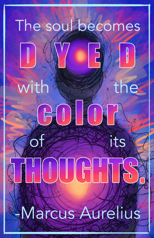

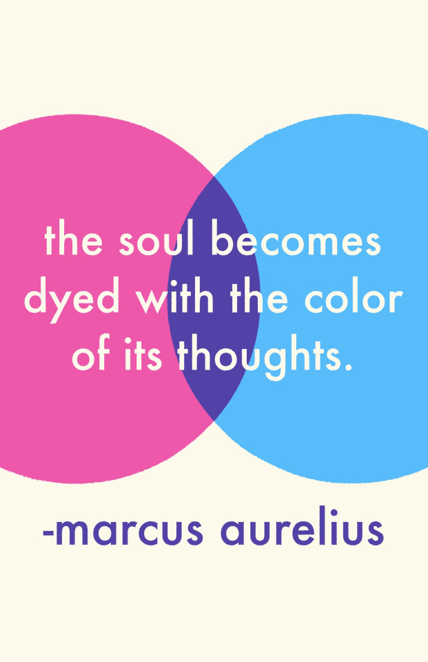
I had a lot of fun playing with the colors and looks of all three images, but the third image was my favorite conceptually as I really liked the simplistic and less messy look as I had become very used to the messy look while designing the first two. I did however LOVE playing with the text and color gradients in the first image.
I then began to create the shapes of the third image in Adobe Illustrator for my final poster.

Once I had the shapes the way I wanted, I brought them into photoshop to play with the layer options as well as to add in the text. After that, I brought it back into procreate to add some colors and character back to the image that I lost when I chose the simple design over the chaotic ones in the refined sketch process.
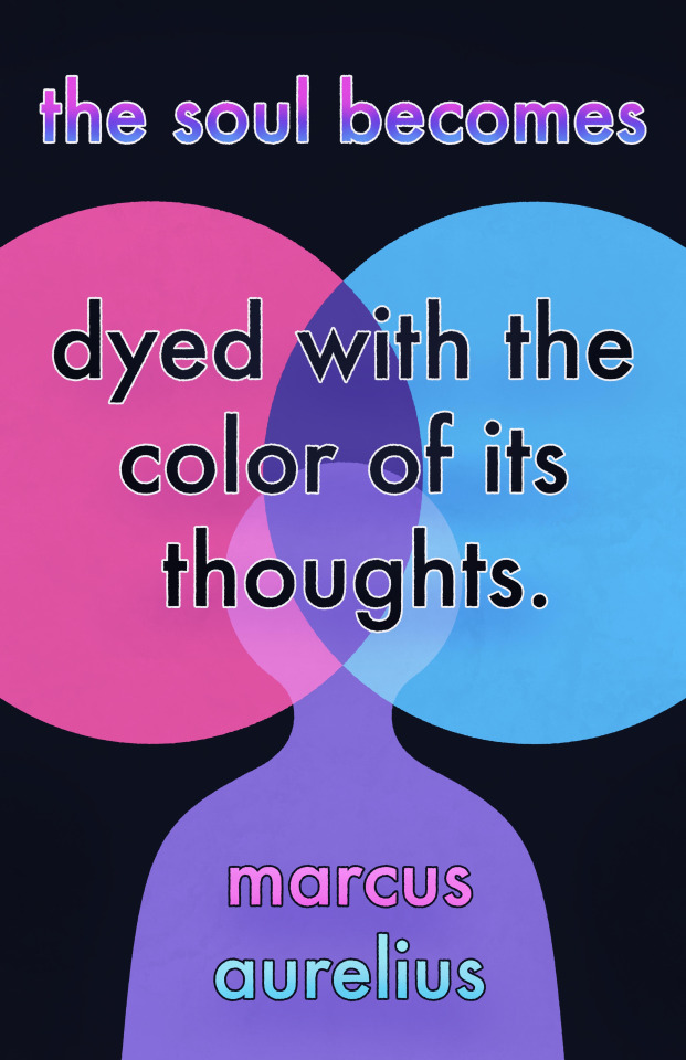
0 notes
Text
More than texts in papers: the love for Print Publishing
Print publishing is a timeless art form that has played a crucial role in preserving human knowledge and culture for centuries.
Its significance lies in its ability to capture moments in history, share diverse perspectives, and ignite imaginations. The tactile experience of holding a well-crafted book or magazine, the smell of ink on paper, and the carefully designed typography all contribute to its unique charm. Print publishing continues to be a source of inspiration, fostering a deep connection between readers and the written word. Its enduring legacy is a testament to the enduring power of human creativity and communication express your appreciation for the art and significance of print publishing.
The love for print media has a rich history, rooted in the tangible and tactile experience it offers. Print media, such as newspapers, magazines, and books, has traditionally held a special place in people's lives for several reasons:
Tangibility: Print media provides a physical product that can be touched, held, and collected. The smell of ink and the feel of paper evoke a sensory experience that many find nostalgic and comforting.
Aesthetic Appeal: The layout, design, and high-quality printing in print publications contribute to their aesthetic charm. Artful covers and illustrations often draw readers in.
Collectability: People enjoy collecting print media, whether it's a stack of vintage magazines, a shelf of well-loved books, or newspaper clippings from significant events.
Credibility: Print media has historically been associated with credibility and authority. Established newspapers and magazines were often trusted sources of information.
However, the advent of digital media and the internet has transformed the landscape of media consumption.
They say that Print is dying but I beg to disagree.
"Print is Transforming"
The shift on the target audience of print makes it look like its dying. Print media will never die, but will be remodeled into something that adapts to the current trend.
Here's how the love for print media has transitioned to the digital realm:
Accessibility: Digital media is easily accessible to a global audience. Readers can access content from their smartphones, tablets, or computers, making it convenient and instantaneous.
Interactivity: Digital media offers interactive elements like hyperlinks, multimedia, and user-generated content, providing a more engaging experience.
Searchability: Finding specific information within digital content is much easier through search engines, making research and fact-checking more efficient.
Cost and Sustainability: Digital media is often more cost-effective to produce and distribute, and it's seen as a more sustainable option due to the reduction in paper usage.
Real-Time Updates: News websites and digital magazines can provide real-time updates, keeping readers informed of breaking news and events.
Environmental Concerns: As environmental awareness grows; some readers prefer digital media to reduce their ecological footprint compared to print media production.
Multimedia Integration: Digital media allows for the seamless integration of text, images, videos, and interactive elements, providing a more immersive experience.
Social Sharing: Readers can easily share digital content with their networks on social media platforms, contributing to broader exposure.
Despite the shift toward digital media, the love for print media hasn't entirely disappeared.
Many people still appreciate the aesthetic and tactile qualities of printed books and magazines. Print and digital media coexist today, each catering to different preferences and needs. The transformation to digital has broadened the reach and capabilities of media, but the nostalgia and appeal of print remain relevant to those who cherish the traditional reading experience.
0 notes
Text
Difference between Hand Lettering and Calligraphy

Writing and illustrating words is a type of art. Creating words on paper with neat and clean designs, stroke is a well-crafted and patient art. There are many such art forms which promote writing into THE ART Here is a list of the most famous: Hand Lettering Calligraphy Typography
They are all beautiful art of writings in their own way. It has been noticed that people are often confused between them, especially between hand lettering and calligraphy - due to a few similarities. What is Hand Lettering? Hand lettering is an art of illustrating letters to give them a dramatic effect by shaping and drawing them in various characters and patterns. The best part about this is that there are no particular rules to be followed, except for that they should be readable. This art of illustrating letters was developed a hundred of years ago, majorly in the early 1800 with the rise of industrialization worldwide. Gradually, it became very popular and was vastly used in signage advertising. and lettering was thought to be a dying art in the late 1900s to early 2000s due to digitalization. But on the contrary, thanks the digital age, hand lettering has now become a famous art, spurring it into various commercial fields of art forms. To practice hand lettering these the tools would come in handy- Pencil - You can sketch and erase your ideas easily off the paper unlike with the pen. Roller scale - Roller scale is a great tool when you've to draw grids. It is otherwise also a very tricky tool to use and if not managed can spoil the art. Miscellaneous - The other things required are water colours, acrylic colours, brushes, palette, etc.
What is Calligraphy? Calligraphy is the art of writing beautifully in the tweaking pattern while writing the words. Calligraphy is an ancient and globally popular art form. It has been in continuance since 600. B.C., where it was originally invented in Rome. Since then, with the rise of modern calligraphy, calligraphy has undergone many major changes. As mentioned before, calligraphy is an art of writing and does not speak just one language. It is adaptable in various languages, which has given birth to doing calligraphy in many languages as below-
Chinese Calligraphy Indian Calligraphy Western Calligraphy Arabic Calligraphy
Calligraphy is immensely popular and requires practice and concentration to master the art. Calligraphy unlike hand lettering, has set of rules to follow for each pattern. It can be freely used in any shape too.
The tools required for Calligraphy are
Dip pens They are the traditional calligraphy tools and are used for scripts such as copperplate, etc. Brush pens They are also used for calligraphy and they are usually cheaper and a more approachable tool for beginners. Brush lettering can be done with brush pens. Flat nib pens They are used for calligraphy scripts such as gothic calligraphy, italics, uncials, roman capitals, and many more. Fountain pens They are more suited for penmanship as (most of them) don't have a flexible nib by default which is necessary for creating thick and thin lines like with the dip pens.
The conclusion is that it is important for artists to understand the work that goes in two different art forms.
Penkraft conducts classes, course, online courses, live courses, workshops, teachers' training & online teachers' training in Handwriting Improvement, Calligraphy, Abacus Maths, Vedic Maths, Phonics and various Craft & Artforms - Madhubani, Mandala, Warli, Gond, Lippan Art, Kalighat, Kalamkari, Pichwai, Cheriyal, Kerala Mural, Pattachitra, Tanjore Painting, One Stroke Painting, Decoupage, Image Transfer, Resin Art, Fluid Art, Alcohol Ink Art, Pop Art, Knife Painting, Scandinavian Art, Water Colors, Coffee Painting, Pencil Shading, Resin Art Advanced etc. at pan-India locations. With our mission to inspire, educate, empower & uplift people through our endeavours, we have trained & operationally supported (and continue to support) 1500+ home-makers to become Penkraft Certified Teachers? in various disciplines.
1 note
·
View note
Text
History and evolution of book cover design
The cover of a books original sole purpose was for the protection of the book itself, even referred to at times as dust jackets, over time this changed and now the cover of the book can be manipulated using typography and graphics to bring the reader into the book before ever reading the back pages or even opening the book.

Above are some previous covers that have been used for books, these are prime examples how covers could still be ornate and make the book look good but no information regarding the content of the story of even the name of the book itself is displayed. As time progressed so would the material and techniques used.
Around the 1820s the materials and machinery used to create books started to change, less expensive items like paper and book binding machinery was now a cheaper and quicker way to get books on the market. This would then progress to machine powered presses and mechanically produced paper. This would make creating book covers cheaper and with the introduction of processes such as multi colour lithography then evolving to print would help books covers to start to create and identity.

The introduction of Art Noveau and Arts and Crafts in the 20th Century began to make its ways into book production in Europe and New York.
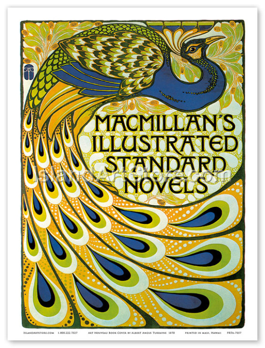
Throughout the 1920’s artists such as Aubrey Beadsley and Alexander Rodchenko were known to create strikingly different covers. Artists from the soviet union had a massive influenece creating some of the most radical book covers of its time which would go on to shape the movement going forward and by post war the book covers had became a competitive market. I feel this was a sign of the times, not only had the techniques and materials became more widely available but also the artists themselves had developed specific niche the for some people the cover of the book could be deemed more important than the actual substance of the book. This can also be seen through the use of typography and more graphics that are used.
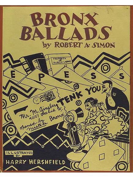
Publishers like Penguin had a massive factor in shaping how books would develop. Allen Lane was travelling to london when he stopped at a book stall and found the the quality of the books to be poor and expensive. He came to the realisation that what was need was good stories at affordable prices. In 1935 Penguin books, a revolution in creating paperback books was founded and by 1936 they had printed over one million books. By the 1940s they created Puffin picture books helping evacuated kinds to the country adjust to life.
During World War 2 certain restrictions and and limitations were put upon publishers, the shortage of workers as well as materials with paper shortages and not to mention now more than ever there was controls put in place on the content of publications due to the censorship of the information which was released to the public. For such a difficult time in the world and conflict in every corner of the world publishers managed to survive the period.
Many of the book covers that we see today can relaunch a book over 100 years old. The use of bright colours and bold lettering as well as the advancement in modern techniques as well as the revival of the older techniques that have been used for centuries can help sell a book. I feel right now the way people view reading has massively changed. The introduction of movies that have been created from using books has helped create and interest in books again, big titles like Lord Of The Rings and Harry Potter have created interest in people that would not usually read go back after seeing the movies and take an interest.
now more then ever people love picking up a book whether that has to factor in the popularity of books or that people are in need to switching off and getting lost in the story of a book again helps the development of book covers last and progress for years to come.
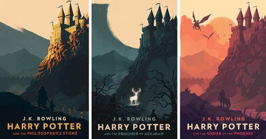
its not hard to see how far the evolution of book covers has came from a dyed leather 22 karat gold version of Frankenstein to a print and pressed copy to a student developing a book cover on their laptop for a college course I think sums up the development perfectly.

0 notes