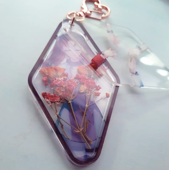
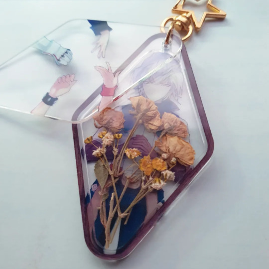
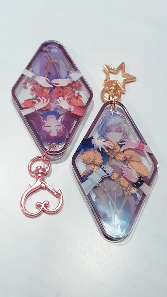
#the colors irl are most accurate to that last photo!
Text
THEY'RE FINALLY IN MY HANDS MY COFFIN RAY ZARCS
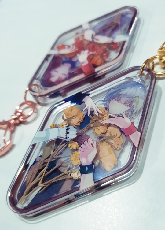

(me hurriedly making use of the afternoon sun right before the clouds cockblock me)
sorry for the mid photos but i've been waiting for these bitches to finish production for months im so happy they're finally in my hands🥺
unlike the beans these have limited stock since they're already made, except I still have to switch out the clasps (I got rose clasps for them specifically!!!!) but the clasps ALSO need new jump rings which i still need to go order and... man merch making, huh...
I'll be sharing more info once that's done! (hopefully with cooler photos too)
#arc-v#yugioh arc v#yugioh arc-v#zarc#akaba ray#ray akaba#pasu makes merch#the colors irl are most accurate to that last photo!#and yes the flowers are real!!
86 notes
·
View notes
Text
How to describe your characters appearance without making it sound unnatural?
■ For describing side characters (not MC):
○ Make your MC reconize a certain physical trait/piece of clothing when your new character appears.
○ Make your MC find some photos. That way you can describe everyone in a perfectly natural way.
○ Make some other character make a remark about their apperance. It can be mean, or maybe even flirty?
○ Make some character reference to their looks in a certain situation. Ex: "Are you really going to cook in a white hoodie?", "Are you seriously planning to sneak out in the most colorful clothing ever?".
■ For the MC:
○ Mirrors are always a good idea, but make it natural. Like, your character passes next to a mirror and realizes their clothing is dirty etc.
○ Photos work for MC too!
○ Remarks of side characters are cool af too. Especially when it's a remark in a snarky mean way, because they are usually very accurate irl (when your friend tries to make fun of you for shit n giggles they are usually very specific because they know you, right?)
○ Make some other character notice the change of your MC looks. Ex: a childhood friend noticing how much taller your MC got then when they last saw him.
Okay, that's it! Hope I helped <33
#writing#fanfiction#writing tips#writing characters#writing stories#fanfiction writing#random#lgbtqia#t&ac writes
15 notes
·
View notes
Note
dumb question but how do you do those color studies for fictional characters (like the one you did for the dr2 cast)? i can do color/light/shading studies when i have a reference but when i try to make them up from imagination my brain has trouble checking whether the shadows and colors are accurate. any books/videos youd recommend?
there are no dumb questions when it comes to art!! its hard to figure things out on ur own :D
honestly its difficult to describe how i do them because for me its a very self-indulgent "turn my brain off and put colours wherever until it feels right" type of activity. but i will put my general advice under a cut because i talk a lot about drawing
my main advice would be to keep doing what ur doing, studies will always be more useful than anything else. for me i see the most improvement when i just chill out and observe things irl even if im not drawing them. i genuinely just stare at things and think about their colours, no need to do anything more than observe.
im the worlds #1 art tutorial hater so i don't have any cool youtube recommendations or anything but The Practice and Science Of Drawing by Harold Speed is public domain and is very good for just bringing ur brain back to the fundamentals of how drawing works if you haven't read it before.
in practical advice, my drawings improved hugely once i started paying attention to values. its easy to check this when doing digital art by having a layer thats just a flat midtone grey with the layer style set to saturation. i constantly turn that layer on/off whenever im drawing to make sure im happy with the amount of contrast between dark and light, and also to see whether im happy with the shapes of the highlights and shadows in my drawings.
to me making sure the values are correct is much more important than anything else. its always possible to go in and change the hue or saturation of a colour to make the drawing more cohesive, but much more difficult to correct the values if you've placed a bunch of colours in the same mid value range.
while im doing studies or just drawing in general i also save swatches of colours that ive used that i think look good (not sure if this is a feature on all drawing applications but i think it is in most major ones like photoshop, procreate). you can probably see similarities in colours that i use throughout the things ive posted because if i feel like i don't know where to start, i often start by placing colours that ive used before and then modifying them to whatever i want. its also fine to look at real things when you're drawing fictional characters, i'll often just take breaks to look at a bunch of photos or videos or even just go outside to refresh my brain on how things look.
last and most important thing ever is that sometimes ur colours will just look like shit. i have made so many bad drawings in my life with muddy colours and poorly done lighting but i just keep going until i make something that i like 💪 i think for me the most important thing ive ever done is just let go of the expectation for my drawings to be good. sometimes they are just complete garbage but to me thats an indicator that im doing something outside of my current skill level, which is exactly what leads to improvement. so i wouldn't worry if it feels like your brain is having trouble working through certain things at the moment, it just means your practical skills are in the process of catching up to your observational skills
#i hope i dont sound like an asshole or pretentious or anything sorry if i do#i just unload all of the things i wish someone had told me earlier whenever someone asks for advice
29 notes
·
View notes
Text

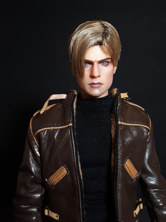

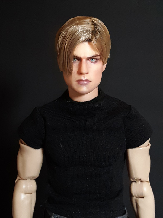
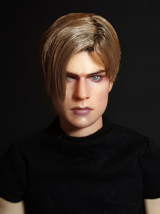
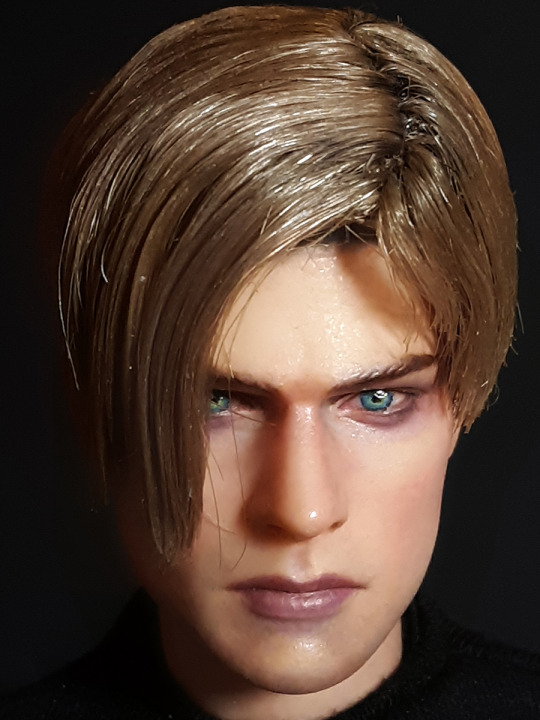


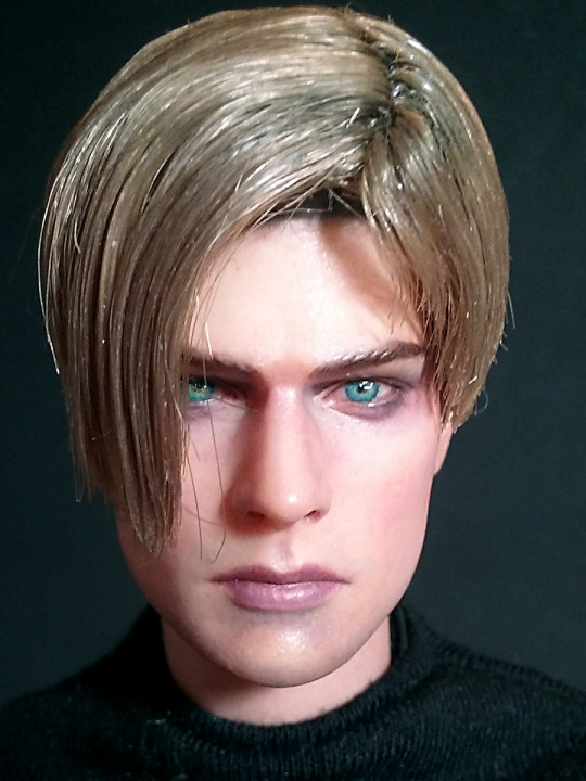
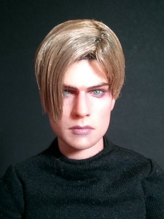
More of my 3D-Artist resin cast 1:6 scale Leon Scott Kennedy head sculpt. I decided to "enhance" the eye area a bit further. I have extremely shaky hands, even with all the techniques that are helpful to keep hands steady when painting miniatures. My hands still shake. I can't do cleaner, sharper lines, as much as I am frustated. There's pretty much sh1t I can do about it. However, I am happier with him now. I am always complaining that his facial featuers are not as accurate, and one of the main reasons for that is because I suck at painting miniatures, but also because I am very picky when it's about accuracy of characters I love. HT version of OG RE4 Leon was so off, i didn't even considered ever owning him. Later, once he was completely sold out everywhere, I did regret it a bit. Now, I kind of don't. He's not accurate, doesn't even seem like they tried it to be.
This head is a beautiful sculpt, but not accurate and a lot of the featues are simplified so much, that it makes me wonder which original sources the aritst was referencing when 3D modeling the head.
Regardless, I am much happier with him now, that I added more detail to his eyes, and made the shape more OG RE4 Leon-esque. He has a very unique eye shape that just wasn't sculpted right. So, me, with my crappy old-person hands, have to try a thousand times harder, just to get the lines around the eye and the shading in tiny places in the eye, to look not as sloppy as I can manage, due to my shaky hands. T__T;;
The last repetitive extreme close ups were taken with my older-than-dust cellphone's camera, because it takes photos that look more accurate lighting and color wise. My newer cell's makes things look extremely pixelated and "glam" as my bff calls, them, like it makes him seem like he's wearing mascara, which is not what he looks like IRL, nor do I want him to look that way. Simply because it's not accurate, and accuracy is more important to me than anything and everything else. When it comes to characters I love and want to own figures of.
I placed the black basic T-shirt this RE4 clothing set came with. It's pretty old, so the jacket is starting to disintegrate. I never owned anything like it before, so it's way more frustrating than anything. The original RE4 Leon's jacket is probably one of the most nostalgic aspects of the game, for most anyone who has ever played the game and loves Leon. I'm sure I'll never be able to find anything close, so it's kind of highly disappointing. There's no way in h3ll I would ever be able to attempt sewing something like that. Finding the fabric was a nightmare when I was hopeful a million years ago, when I was still young and adventurous. Now that I'm a much-older-old-fart, I don't even contemplate it. I will be attempting his tactical 5.11 top, although neoprene in under 1mm is probably not a thing and I'll have to settle for whatever other material looks rubbery but not shiny like vinyl. DX
#LeonSKennedy#LeonScottKennedy#LeonS.Kennedy#LeonKennedy#OGLEON#OGRE4#ResidentEvil4#OGResidentEvil4#OriginalResidentEvil4#3DPrintedHeadSculpt#3DModeled#FanArtFigure#Photography#VideoGame#Collectible#ToyPhotography
10 notes
·
View notes
Text
tagged by the lovely @britneyshakespeare to answer these 10 questions & come up with 10 of my own. thank you !! 💗
psa i wrote way too much please don’t read this. just skip to the questions at the end if i tagged you
1. What are 3 songs that mean something to you, and what do they mean?
that’s hard because i don’t usually find personal meanings in songs. i’m a lot more interested in what the song means to the artist who wrote it. but let’s see if i can think of some
-um. after all by david bowie was always Highly Relatable. like. prattling on & on waxing philosophical only to suddenly realize everything i said is wrong and don’t hate me and also now i’m having an existential crisis and i shouldn’t have started talking in the first place? M e
-when i was first getting into rush i was a big fan of Self Isolating To Cope and also i had no friends and was proud of it (bc if i couldn’t find a way to take pride in my [perceivedly] unchangeable flaws my entire self image would come crashing to the ground and that just wasn’t a good time . anyway). so the lines “nothing can survive in a vacuum / no one can exist all alone” from turn the page pissed me off. but now! now i have loads of friends and i feel legitimately cared about and i feel like i can comfortably reciprocate that and now when i hear that song i think you know what neil? you’re goddamn right.
-uh i s’pose i relate to another brick in the wall pt 3 which is not a good thing but. i dunno i really love being angrily in denial of needing any help whatsoever along to this song. it’s my flaw-pride anthem (don’t worry i don’t take it literally. it’s just fun in the moment)
-shit i know this said three but the one person who i relate to EVERY FUCKING SONG he’s ever put out is bill wurtz. never have i felt so understood than when i listen to bill wurtz’s music. god it’s the most uncanny feeling, i really really understand it a lot
ok i have to stop thinking of more . turns out a lot have meaning to me ive spent like an hour on this question alone Moving On
2. What’s your ideal self like?
. this was The Worst question to ask me because i can and will ramble on for hours given the opportunity
well i’d be able to execute my ideas, for one. instead of just having a half-baked - quarter-baked - fleeting concept with no real idea of how to achieve it. more specifically i want to be able to write songs. more more specifically i want to be able to write the music aspect of songs. i can’t do it. i dont fuckin know why i just can’t. but if i could i think i just might be content with life.
but that doesn’t mean there aren’t still things to improve. i wish i was funnier. i like my weird brand of humor/abstractity online but that’s hard to replicate in real life. i wish i was better at thinking on the spot. i wish my memory didn’t only retain stuff when it feels like it. i wish i was better at putting my thoughts into words, more concisely and accurately and effectively.
um i wish i didnt have executive function issues. like i wanna just do stuff and not have it take all the energy out of me. wish i had the energy to do it to begin with. wish i could keep up with socializing and not ignore people for hours/days because i can’t get myself to maintain conversation.
ok clearly this is leading down an endless tunnel of what i’d change so . i’ll just say my ideal self is a successful musician with a good social life but also an element of mystery and intrigue. my ideal self is just david bowie
3. Who, of all your family members (immediate or extended), do you think has had the most influence on you, for better or for worse?
my mom for a lot (a looooooot) of reasons but if i go into it this is gonna push it over the line from a tag game into a therapy session (if i havent crossed that line already)
4. What’s your main outlet of expression?
writing. journalling. fuckin , social media. actually yeah that more than anything. my Self is on display here if you look at my tumblr(s) my twitter(s) and my instagram(s) you’ve got a pretty goddamn decent picture of who i am
5. What was the first album you ever bought for yourself?
uh i mean i listen to most stuff off of youtube if i don’t already have it so like,,? i dunno. does itunes count? the first vinyl i ever got was wish you were here (for forty fuckin bucks god) but i paid with my aunt’s money so does that even count. i don’t know.
6. Do you like to go shopping?
depends on a lot of things. lately i’ve been in the mood to just get out of the damn house whenever possible (love being a high school dropout !) so the answer is pretty much yes anytime. but it really depends.
7. Kind of cliche but, if you could have dinner with any person, living or dead, who would you pick?
i wanna be the fourth person at the dinner with rush table. just to observe. i’d be terrified to actually have a conversation with any of my idols. okay but if i had to get over that fear i guess i’d pick..... bowie? todd? i don’t know this is hard. alex lifeson circa 197something so he can take me back to his place afterwards you pickin up what im puttin down
8. What TV show do you watch when you’re feeling stressed or low and you need a quick feel-better fix?
i don’t watch tv like ever not even in this case but i guess full house
9. What was the last intriguing conversation you had about?
everything my girlfriend said to me today (edit: yesterday but i did this last night) was great everything my girlfriend’s ever said to me was great
oh that didn’t answer the question at all i just realized. uh they were telling me about the star wars prequels (which i have not seen) and earlier we were having a very analytical conversation about a particularly interesting rush photo
also me & @swanky-trash were discussing our plans to take down trump and all the rest of those bastards while wearing jareth from labyrinth costumes and eating mushrooms. because it’s our destiny as clones separated at birth. yknow just life stuff
10. What’s something about yourself that you don’t think comes across as painfully obvious online, but is, in fact, in person?
shit are we at the end already? damn. i was enjoying this (can you tell).
okay here’s another one i could go on for 12 years about. but uh. i probably come across as way more perky irl? like my voice is all high pitched and i talk really fast and smile and laugh at everything and i have a whatever the opposite of monotone is voice. i don’t like that. i try to combat it online with the all-lowercase typing and shortening of words and omission of punctuation and that sort of thing. i think it’s worked. also i may be terrible at typing but i am WAY worse at speaking. i’m scatterbrained as hell and if i seem at all interesting or witty online that all goes to shit irl. also i can’t fucking talk to people who i only know in person? it just doesn’t work. thank god i have you guys
haaaa okay sorry for the rambling here are the questions
1. what’s the best day/one of the best days you’ve ever had?
2. how important is your social media presence to you?
3. what achievement are you proudest of?
4. describe your sense of humor.
5. is there anything you’re good at or like to do that people who don’t know you well probably wouldn’t expect?
6. what’s your most interesting family story?
7. favorite color palette?
8. what’s something that would be very “out of character” for you to do?
9. yknow that thing on twitter that’s like “pick 1 & rt for good luck” and the options are good grades, meet your idol, money, or crush texts you? which one would/did you pick and why?
10. what’s a song you either wish you’d written or feel like you could’ve written?
i tag @thetemplesofrush @thumbnailoak3 @swanky-trash @lavender-layne @realalexlifeson @davies-jones @goallines-and-musicrhymes @fruitthemed @graveyarding @cosmikdebris99 and anyone else who wants to do it and dont feel pressured to do it etc etc god i hope none of you actually read this whole thing i am so sorry
14 notes
·
View notes
Text
Some Things, off the Top of My Head, an Artist Should Know
(Crosspost from the main blog.)
Please don’t take my extended absence personally: I barely wrote anything in 2017. Let’s change that this year.
But this post, as the title says, wasn’t planned. It started out as an answer to a Reddit post asking what you should study if you want to go pro, but as I kept writing, I realized it was turning into a blog post.
So here you go: a list, from memory, of what I think an artist with career hopes should be reading up on.
BEFORE ANYTHING ELSE
Your first priority should be learning to think in 3D. When you look at a reference, think of it as a rotating 3-dimensional object, not what it looks like from that exact angle, in that exact lighting, taken with that exact lens. You should never let a reference photo dictate what you’ll draw. And the first key to that is learning how to break everything you draw down to five basic shapes: Cube, sphere, pyramid, cone, and cylinder. Everything else is just stretching and combining them.
PROPORTIONS
You should know how to draw people from two heads—super cartoony—to eight heads—superhero—tall, how to build a body from a stick figure, and the differences between male and female body structures. Learn the relationships between different parts of the body and how to use the bony landmarks (the parts where bone is right below the skin, e.g. elbows and knees, since those don’t change with the amounts of fat or muscle) to measure proportions.
PORTRAITURE
You should know classical portrait proportions, the Loomis method of building a head, how to do it from any angle, and how all the features look from those angles, even the ones you can’t see. Read up on ethnic features so trying to draw other races doesn’t get you, to quote Yahtzee, “a white woman dunked in tea.”
ANATOMY
Even if you don’t know the Latin, you should know by sight the bones and where they go, the joints and their ranges of motion in all directions, the surface muscles, the muscle groups, and how the shapes of body parts change when they’re squashed and stretched. Learn how muscle and fat are distributed and how to draw all body types. Learn animal anatomy too, but since it varies so much, you can study that for each animal you draw as you go.
CLOTHES
Have a basic knowledge of how clothes work. More important than learning the individual styles is knowing what holds a strapless dress on, where the stitch lines on jeans are, what makes for a nice suit, things like that. Learn how different types of cloth flow over objects, drape, and fold, both at rest and in motion.
PERSPECTIVE
First study vanishing points, then learn how to break away from the standard “one point, two point, three point” rote techniques they teach you (long story) so you can accurately draw diagonal or tilted objects into a scene as well. Learn to measure in perspective and deduce sizes and vanishing points from a photo. Know how to create perspective grids – even if just digitally – and eventually, how to do curvilinear and five-point. Learn how to foreshorten objects and people from a subtle to an extreme degree.
LIGHTING
Know how light falls across the five basic shapes from different angles. Know how light direction, light intensity, and shadow lengths change depending on the time of day. Know how light hits unusual textures like brick and glass. Once you start getting into painting or digital art, know how to portray a subject lit in a certain color.
BACKGROUNDS
Study architecture to the point where you at least know the terms for the various building elements and where they go. Learn how to render rocks and mountains. Learn how to portray distance. Learn about plant structures and how to simplify them for a drawing.
PENCIL TECHNIQUE
Know how to both sketch and do precision work: I’d suggest practicing them with wood and mechanical pencils respectively. Know how to do rough gesture drawings, semi-rough figure drawings, and refined and fully-shaded studies. Learn to do both hard and gradual shading transitions, blend, use a tortillon, and draw using only value instead of lines.
PEN TECHNIQUE
Know how to ink with markers, brushes, and maybe even dip pens. Know how to hatch and crosshatch in all directions, create textures, and spot blacks.
COLOR
I was a pen boi until just last year, so this is my weak point. I wish I’d worked on it earlier. Learn how to develop good taste in color, and study how other people use it. Learn about color theory, harmonies, and symbolism. Learn how to turn a value drawing into a colored one. Learn how ambient lighting affects the color of objects, how color is relative and subjective, and how to use different intensities and saturations to achieve different effects.
DIGITAL TECHNIQUE
This is what I’m struggling with now, since I got started with tablets much later than most artists. You can start with a simple cel-shading style to introduce yourself to the tools, learn to blend colors, then move on to fully-rendered digital paintings, photobashing, and concept art-style environments. Know what programs are best for what purposes, and maybe dip a bit into 3d modeling, even if it’s just using posable figures and Sketchup.
ART STYLES
Even if you want to have a defined art style, study as many others as possible so you can do them if you want. And study caricature: knowing how to exaggerate features without breaking the likeness will prove invaluable, as will the speed drawing aspect.
If you’re a weeb dumpster like me, put a decent amount of time into studying various anime and manga styles, not just generic moeface and “Atlus ripoff,” so you’ll have a solid idea of how the medium evolved and the basics behind it. If you want to draw in that style, it’ll mainly be for fun (or to make side money from low-level commissions), but there’s nothing wrong with that, since having fun is what keeps you interested.
OTHER STUFF
Study visual storytelling. This is a super-important step a lot of artists skip. Study both other comics and film so you can get a sense of how composition and motion aid the plot. Study color symbolism, and symbolism in general. Learn how to come up with clever visual gags, jokes, and metaphors. I’d suggest reading some scripts and screenplays too.
Study graphic design. It’s a mandatory side skill for digital artists nowadays. Learn to scan traditional art and print digital art, as well as making—and designing for—different types of prints, merch, video, and other digital media. You should have a thorough knowledge of how to work across design programs, DPI requirements, and all the basics of putting pictures on stuff as quickly and cheaply as possible. Study branding. Learn to build a website.
Start building a reference library now. Back it up on an external hard drive or in the cloud. Keep it for the rest of your life. Make sure to add “inspiration” from artists you particularly like too.
Finally, read up on how to network and put yourself out there, both online and IRL. That’s how you get work in the first place.
It’s a lot. I’m going into my 9th year studying art, and I still don’t have a firm grasp on some of this shit. But no matter what level you’re at, good luck!
#artist#art tips#art advice#art reference#art skill#art skills#self-taught artist#art school#learn art
2 notes
·
View notes
Text
The Story Of Farm Animal Canvas Art Has Just Gone Viral! | farm animal canvas art
Fine art is all the acerbity in Animal Crossing: New Horizons. Last week, players of Nintendo’s adjustment of Animal Farm were alien to an in-game art banker (in the anatomy of a somewhat counterfeit fox). And in the absolute world, museums are transforming art from their collections into New Horizons designs.

Jungle Farm Animal Canvas Print 650 | Jungle Canvas Print .. | farm animal canvas art
But accurate connoisseurs apperceive that the world’s finest art isn’t some suprematist agreement or Seurat canvas. Rather, it’s that ailing lit photo of your cat dabbling his impaired little arch out of a abrasion machine. Exhibit A:
Who wouldn’t appetite that—or article like it—hanging on the walls of their Nook-issued bungalow? Well, as alternation superfans can attest, it’s not aloof accessible to about-face your camera cycle photos into New Horizons designs. It’s acutely easy. All you accept to do is accomplish abounding use of the Animal Crossing Arrangement Tool browser app.

HORSE ART SMALL OIL PAINTING EQUINE FARM BARN HOME DECOR .. | farm animal canvas art
Nook Link is yet addition Nook Buzz app that grants the Nook authority some Bezos-like ascendancy over New Horizons.
G/O Media may get a commission

Pluto by Jennifer Counts | Farm art, Cow art, Cow painting – farm animal canvas art | farm animal canvas art
You’ll charge the Nintendo Switch Online app for either Android or iPhone. Once you’ve downloaded it, assurance into your account, and afresh abutting the app. Afresh blaze up New Horizons. At the appellation screen, accessible up your settings (by acute the bare button). Baddest “NookLink Settings” and about-face on NookLink. That should affix your IRL buzz app with your in-game Nook Buzz app.
First, acquisition a photo you appetite to convert. For purposes of this exercise, let’s use the aloft account of my cat, Puck, assertive with all of his affection that he is a amount of laundry. Once you acquisition the account you want, crop it into a square. Trust me: Things are easier this way. From there, crop the photo afresh into abate squares, all the aforementioned size. Otherwise, your end aftereffect will attending somewhat like this:

Cow painting, Original impressionistic oil painting of a .. | farm animal canvas art
You can do bigger than that. It’ll depend on the affection of your photo, so you ability accept to comedy about with how abounding squares you breach your photo into and how baby you accomplish them. I begin (relative) success by breaking Puck’s account into four abate squares sized at 200 pixels wide.
Once you accept your called crops, accessible up Animal Crossing Arrangement Tool and go to the Editor section. Afresh hit “convert” and baddest

Red-Wolf-Legacy – farm animal canvas art | farm animal canvas art
The Story Of Farm Animal Canvas Art Has Just Gone Viral! | farm animal canvas art – farm animal canvas art
| Pleasant to be able to the blog, in this particular time I am going to show you in relation to keyword. And from now on, this can be the first image:

Modern Wall Art Farm Animal Highland Bull Photography Canvas Painting Picture Freedom Highland Cow Canvas Art Print and Poster Home Living room Decor .. | farm animal canvas art
What about photograph previously mentioned? is usually which remarkable???. if you think thus, I’l m provide you with many graphic again below:
So, if you would like have these awesome shots about (The Story Of Farm Animal Canvas Art Has Just Gone Viral! | farm animal canvas art), click save icon to store these graphics to your pc. They’re prepared for save, if you like and want to have it, simply click save symbol in the article, and it will be immediately downloaded to your desktop computer.} Finally if you desire to secure unique and the latest picture related with (The Story Of Farm Animal Canvas Art Has Just Gone Viral! | farm animal canvas art), please follow us on google plus or bookmark the site, we attempt our best to present you regular update with fresh and new photos. We do hope you enjoy staying right here. For some up-dates and recent news about (The Story Of Farm Animal Canvas Art Has Just Gone Viral! | farm animal canvas art) images, please kindly follow us on twitter, path, Instagram and google plus, or you mark this page on bookmark section, We attempt to offer you up grade regularly with fresh and new images, love your exploring, and find the best for you.
Here you are at our website, contentabove (The Story Of Farm Animal Canvas Art Has Just Gone Viral! | farm animal canvas art) published . Nowadays we are delighted to declare that we have discovered an incrediblyinteresting contentto be pointed out, namely (The Story Of Farm Animal Canvas Art Has Just Gone Viral! | farm animal canvas art) Most people trying to find details about(The Story Of Farm Animal Canvas Art Has Just Gone Viral! | farm animal canvas art) and definitely one of these is you, is not it?

farm animal canvas art prints Archives – Darren Gygi Home Collection – farm animal canvas art | farm animal canvas art

Framed Baby Animal Canvas Painting Squirrel Pig Prints .. | farm animal canvas art

Pig Face Watercolor Farm Animal Canvas Print by susanwindsor – farm animal canvas art | farm animal canvas art

Details about A19 white cute farm animals collage Animal Canvas Wall Art Framed Picture Print – farm animal canvas art | farm animal canvas art

Watercolour Painting – Indian Artist Anikartick,Chennai,Tamil Nadu,India – farm animal canvas art | farm animal canvas art

Amazon.com: sechars – Farm Animal Wall Art Cow Cattle Painting Art .. | farm animal canvas art

John Steuart Curry (American) 1897-1946,Wisconsin Landscape,oil on canvas – farm animal canvas art | farm animal canvas art

This colorful pig painting is perfect for any room in the .. | farm animal canvas art

Amazon.com: HIBIPPO Farm Animals Selfie Canvas Wall Art .. | farm animal canvas art

FARM Animals Wall Art Canvas or Prints Country Baby by .. | farm animal canvas art

Animal Farm Canvas Print 220 | Farm Animal Canvas Print .. | farm animal canvas art

ZFKOB 19 panel canvas print art painting Highland Cow Canvas Art .. | farm animal canvas art

Gigantism And Dwarfism In Farm Animals Canvas Print – farm animal canvas art | farm animal canvas art
The post The Story Of Farm Animal Canvas Art Has Just Gone Viral! | farm animal canvas art appeared first on Wallpaper Painting.
from Wallpaper Painting https://www.bleumultimedia.com/the-story-of-farm-animal-canvas-art-has-just-gone-viral-farm-animal-canvas-art/
0 notes
Text
An open letter to Hamilton (etc) fan artists, Re:whitewashing
Hello. Time for another ill-constructed rant on probably already well-tread ground. Specifically whitewashing in fan art (even more specifically Hamilton art though this could be applied to any fandom) and when it is ok. lol jk it’s never ok.
PLEASE NOTE: I am an (amateur) artist. I am not ragging on artists because I “don’t understand how hard making art is,” “how hard artists work,” or what have you. These are legitimate problems of representation in fanart (that I have witnessed firsthand) and this is my earnest attempt to elucidate these issues. Feel free to interact with this post as you see fit. I am always free for debate if you disagree, would like clarification, or have anything to add.
+Look out for those embedded hyperlinks for more content
Preface: I am a member of far too many fb Hamilton groups. Sometimes people post their art, apparently forgetting that when you post things online you open yourself to critique. Hilarity ensues.
I often see Hamilton characters (generally portrayed as original Broadway cast members - Lin-Manuel Miranda, Okieriete Onaodowan, Anthony Ramos, etc.) who have been horrifically whitewashed - complete with lightened skin, bizarrely red or light brown hair, lightened eyes, and so forth. The most common defenses for this misstep, from both artists and fans, are personal style and apparent inability to approximate accurate skin tone (“I tried but skin color is hard”). Here’s why both of those excuses are utter bullshit.
1. Personal Style:
A lot of things in life are open to interpretation and all art is inherently interpretive. But the racial and cultural identity of a real life person is not one of these interpretive things. [PAUSE: before anyone says that this is precisely what Hamilton is doing with its casting, don’t.]
First of all, I get it, personal style is important to art. Some people trend toward realism while others prefer more abbreviated, abstracted, and/or cartoony styles and part of that is selecting stylized color palettes, interpreting color in new and inventive ways, and playing with light, value, line, form, etc. This is NOT what I am talking about. It is entirely possible to honor a person’s background using relative or approximated shading/tone/coloration and to create beautiful art in the process [example: Chris Vision’s color series]. This little rant is specifically directed at people who "attempt" to depict Hamilton (etc) actors/characters using realistic/semi-realistic color palettes (as in, how they appear irl, accounting for abstraction, drawing style, etc) but fall short when it comes to depicting the actors, particularly in regards to racial background. You can find excellent examples of what I mean at Calling Out Whitewashed Hamilton Art and I’m positive you can find far too many examples in this and many other fandoms simply by scrolling through the tags on Tumblr and Instagram.
So without further ado, lightening a person/character’s skin in fanart is racist. There’s really no ifs, ands, or buts about it. Foremost, the practice of editing a person of color to appear more European (skin, hair, eyes, even facial features) intentionally erases the cultural, racial, and ethnic background of the person in question. This is incredibly disrespectful to the actors who portray these characters and works to undermine what Hamilton as a whole is trying to build. If Hamilton is trying to reclaim American history for People of Color, stripping the racial, ethnic, and cultural backgrounds from the actors represents a rejection of conceit and, perhaps, even a form of appropriation. It is as though “fans” are saying that they want the art that is made by and for POC while simultaneously rejecting the distinctly racialized aspects of that art. When artists depict Lin!Hamilton as white, they are rejecting the Nuyorican background which Lin brings to the character in both writing and performance and projecting faux whiteness upon the character. In doing so, whether consciously or not, they are rejecting the actor’s race as well. Lin is beloved because of the art that he makes which allows many fans to look past his racial and cultural identity rather than accept it as an intrinsic aspect of both the man and his art.
Moreover, the ubiquity of this whitewashed art also reveals a lot about what “fans” find visually appealing and acceptable - e.g., the Eurocentric standard of beauty. Whitewashing in art represents not only a rejection of POC’s culture but, obviously, their physical attributes as well. Dark skin is lightened and or whitened, hair is often straightened and/or lightened to a light brown or red hue (with the exception of Laurens, whose features, hair in particular, are often feminized as a form a queer fetishization but that is a rant for another day), and features are changed to appear more European. Often, depictions of characters are changed so much it is nearly impossible to tell that the art is based on any particular actor. In addition to being, again, extremely disrespectful to the actors, this further perpetuates the extremely harmful notion that beauty only exists in European features and sends a direct message to POC fans that their appearance is neither beautiful not accepted by the fanbase of a piece of media that was made by other POC specifically to appeal to them. This seems especially true of dark skinned black individuals who are often completely stripped of the melanin in fan art, further driving home notions of ingrained cultural colorism and anti-blackness.
With Hamilton in particular, it is fine to “change” a character’s race if and only if you are depicting a character as a different actor. For instance, while Lin!Hamilton is Latino, Michael!Hamilton is a black man and depicting Hamilton as such, while uncommon among fan communities, is better than fine [*the lack of art of dark skinned actors is another point of contention. Not only are dark skinned actors frequently whitewashed, many are ignored altogether]. Depicting Michael!Hamilton as light skinned or white, however, is obviously not fine.
Having established that lightening a character’s skin or depicting them with more European features is inherently racist, the claim that whitewashing is a stylistic choice is invalid. If you make the “stylistic choice” to depict a POC as white, you are racist. End of story.
And if you want to do better but find yourself wanting to draw Lin!Hamilton as white, remember that this guy existed and just draw him instead. It’s not that hard.
2. Technical Difficulties:
One of the most unfortunately common excuses for whitewashing in fanart seems to be that, for some reason or another, artists have difficulty accurately approximating actors’ skin color so they presumedly just make something up, This results in Lin!Hamilton and Phillipa!Eliza looking a bit like Snow White, Oak!Mulligan looking a little tan, and so forth. As an artist, I understand that approximating realistic skintones can be rather hard, especially with traditional mediums, but it is glaringly obvious when artists don’t put in any effort.
With traditional mediums such as paint, markers, or color pencils, artists can blend to create the colors which accurately (or as accurately as possible given the limitations of certain mediums like watercolors) approximate actors’ skin tones. If the colors dry lighter than intended, the artist generally layer and blend more to achieve a better approximation. If they then scan their image, they can use a photo editor to fix or correct any mistakes. It might not be the easiest to find good matches (speaking from experience, there aren’t a ton of good warm brown toned markers and thus a lot of blending is sometimes required) but, as previously stated, it’s generally easy to tell when someone at least tried to get close to a correct skin tone.
With digital art, it’s even easier. Fact: Nearly all art programs have a nifty eyedropper tool which can be used to pull color swatches directly from a reference picture. Even MSpaint has this function. By pulling multiple swatches from a variety of reference images (to account for different lighting conditions), an artist can build a relatively accurate gradiented palette for skin tone. It’s really that simple! And if an artist notices that the color isn’t quite right, it’s nothing a few tweaks to hue and saturation can’t fix!
If my tone seemed a bit sarcastic/passive aggressive in that last paragraph, it’s because it totally was. I see this excuse so much more often than I see any other excuse for whitewashed fan art and it is incredibly frustrating but also, as an (extraordinarily mediocre) artist myself, it rings incredibly inaccurate, especially for digital art. I completely understand that it sometimes takes a lot of time to get used to a medium but when an artist’s color palette is literally limitless, there is absolutely no reason (aside from personal, possibly subconscious/implicit but no less real, biases) for an actor/character to be depicted as white/light skinned when they are not. As previously discussed, that is disrespectful and harmful, and really only serves to make the artist (and those that support work) look like a jackass.
And look, if you find yourself making whitewashed art, it’s not as though it is impossible to change. When someone criticizes your whitewash-y art, don’t get defensive. Don’t claim that it’s your style or that you don’t know how to color POC. It looks and sounds really fucking ridiculous. Instead, evaluate your art and place it into a cultural context. Take it as an opportunity to improve. And maybe also take the opportunity to learn a little about yourself and your biases.
This wasn’t meant to be a call out post and I’d like to end this on a positive note so here are a few wonderful Hamilton fan artists who are worth a look:
terror-in-a-dream
zzzoehsu
linmanwhydididothis
mikiprice
thegentlehoneybee
dorothywonderland
maeng
#hamilton#lin-manuel miranda#fanart#fan art#whitewashing#racism#longpost#rant#daveed diggs#Okieriete Onaodowan#phillipa soo#alexander hamilton#anthony ramos#lams#discourse#Renee Elise Goldsberry#john laurens#michael luwoye#jasmine cephas jones
8 notes
·
View notes
Text
The Five Bleakest 'NBA Jam' Pairings in the NBA Circa Now
Basketball video games had some notably serious verisimilitude issues well before NBA Jam arrived on the scene and in arcades in 1993. What gave NBA Jam its edge, and made it immortal, was how absurdly hard it leaned into that unreality. Where other games struggled to replicate the reality of five-on-five basketball played at its highest level or render the dampness of Michael Cage's jheri curl, NBA Jam simply shrugged and spun the dial hard to the right, as far as it would go.
The players were crudely animated, with poker-faced and brutally digitized oversized heads staring out from atop spindly and primitive bodies; the two-on-two game play could be described as cartoonish but could more accurately be described as psychedelic. Players leapt into the rafters, sometimes attended by literal flames. It's tempting to say that NBA Jam anticipated the broader Golden State Revolution by roughly a generation, and not just because Steph Curry looks, in real life, more or less the way that NBA Jam would have animated him back in '93.
It's maybe more accurate to say that the vision of NBA basketball espoused by this goofy and hilariously overstated video/arcade game, which was all avant-garde dunks and 35-foot three-pointers, somehow proved to be prescient in the fullness of time. It's surely not what anyone involved intended, but looking back at this game from where we all are now, we might as well say it: the NBA is more like NBA Jam than it has ever been, and give or take the last inexorable and bummerish postseason, it's hard to say that we're not all richer for it.
Or, anyway, almost all of us. The original slate of NBA Jam rosters was hamstrung both by licensing issues—ctrl-f Michael Jordan, for instance—and the inherent limitations of a two-on-two-basketball-as-less-viscera-intensive- Mortal-Kombat approach, but it is difficult to pull together viable two-on-two pairs from NBA teams even without those restrictions. The game hewed, where it could, to a guard-and-big format but was willing to make exceptions where necessary. This is just a small part of what made the game so indispensable and hilarious, but it's one worth acknowledging.
Jeff Hornacek and Hersey Hawkins are not the two-on-two option you'd go to war with, but if you're pulling from the '92-93 Philadelphia 76ers roster they're the one you have. The same goes for the Dallas Mavericks delegation of Derek Harper and Mike Iuzzolino, who had the unlikely distinction of making it into an iconic video game in his second and last NBA season. I have no comment on the Milwaukee Bucks pairing of Brad Lohaus and Blue Edwards beyond the basic assertion that all of us, regardless of race or color or creed, deserve better than reading the words "Milwaukee Bucks pairing of Brad Lohaus and Blue Edwards." You have my sincerest apologies on that.
The gaming and NBA worlds have both marched forward, fitfully and pissily and not really on any kind of reasonable schedule, in the years since, but the NBA Jam format has endured through numerous reboots and in the broader public memory. NBA Jam is legendary, but more to the point it is a thing for basketball fans, which makes it tough to look at photos like the one of recent Brooklyn Nets acquisitions D'Angelo Russell and Timofey Mozgov and think anything but Goddamn that is not a great NBA Jam team.
That is why, in the interest of honoring both this classic game and our own intellectual laziness, we at VICE Sports have tried to suss out the most depressing NBA Jam pairings currently available in the league. The really good ones are obvious and honestly a little dull, although it might be illuminating to spend a week at a meditation retreat pondering the fine points of LeBron James and Kyrie Irving versus Kevin Durant and Steph Curry. As usual, though, it's the Iuzzolino side of the continuum that's more intriguing. So let's go there.
Orlando Magic
Elfrid Payton and Nikola Vujevic
Did you know that the inaugural Orlando Magic NBA Jam pairing was Scott Skiles and Shaquille O'Neal? More to the point, did you remember that the Orlando Magic are, in 2017, still playing in the NBA? It's true: they played 82 games during the 2016-17 NBA season, and the same number the year before. All the stats accrued during those games counted in official NBA statistical rankings and standings. Anyway, Elfrid Payton and Nikola Vujevic, who are both flawed but talented pro-grade basketball players and real humans that exist in this world, are currently on the Magic roster. For all you know, their heads are, in real life, three times as large as their bodies. Terrific!
Brooklyn Nets
D'Angelo Russell and Timofey Mozgov
Nothing helps a potential NBA Jam pairing more than the presence of a player who looks like an imperfect George H.W. Bush-era video game animation. Timofey Mozgov, who is improbably enormous in stature and somehow also always kind of blurry-looking, is doing a lot of the heavy lifting here.
Just the two of us. Photo by Raj Mehta-USA TODAY Sports
Sacramento Kings
De'Aaron Fox and Willie Cauley-Stein
Here is a confusing thing I encountered often in thinking through this list: two-man pairings that are objectively fun and cool drawn from teams that are decidedly neither of those things. If the Sacramento Kings were to move from the boring, top-heavy five-on-five NBA to an In Real Life N BA Jam League, they would be pretty fun to watch. Sadly, such a league does not exist.
Detroit Pistons
Reggie Jackson and Andre Drummond
Fine players both, although once again there is a sense that both might be better off in an IRL NBA Jam League than they are in the NBA. And yet I imagine that, if given the choice, fewer basketball fans would choose to play as this team than as just about any other. Playing as Payton/Vujevic is a little prank you play on yourself; playing as De'Aaron Fox and Willie Cauley-Stein gives you a guiltless, safe way to feel like John Calipari for a few minutes. Why would you play as this duo, though? What would you get out of it? Don't you think you should value yourself a little more than that?
Phoenix Suns
Devin Booker and Alex Len
If you're going with the two best players on the team, guard-and-big format be damned, then this would be the smurfy but entertaining pair of Booker and Eric Bledsoe. But given where the Suns are, and what the Suns are, and how the Suns are, and honoring the broader guard-and-big template, it just feels right to pair the team's rising young star with a plodding former lottery pick who could see his rights renounced in the next week or so.
HONORABLE MENTION
New York Knicks
Carmelo Anthony and Kristaps Porzingis
On the merits, this is one of the better and more entertaining potential NBA Jam pairings in the league. In the world we live in, it forms the core of a team that cannot go 48 hours without accidentally stapling itself to something. The gap between "fun to play with" and "devastating to think about" could not be any wider, and even in a thought exercise about a game in which players leap hundreds of feet in the air and dunk fiery basketballs, this might just be too real.
The Five Bleakest 'NBA Jam' Pairings in the NBA Circa Now published first on http://ift.tt/2pLTmlv
0 notes
Photo

Multichromes, holos, shimmers and sparklers!
I will add photos later, at some point.
ILNP holos last really long, like way longer than all the other polishes I have (finished with Seche Vive, which I’ve noticed IS more glossy than Seche Vite).
Usually other polishes last 2-4 days before chipping, but there’s something about the ILNP holos (I have a whole bunch, from Mega X/S/L to the new Color-Kissed collection) that seems to make them last well over a week without chipping). I do a lot of stuff with my hands and don’t baby my nails, so that is pretty impressive.
ILNP Nostalgia didn’t last quite as long on my fingernails but lasted FOREVER on my toenails with no top coat (like, three months? really).
ILNP The Magician also seems to last as long as the holos, and gives the nail a really smooth finish. This is definitely better over plain colours and especially dark colours. Even with three coats it is hard to see on stuff with bright and light metallic flakes or particles, like ILNP Empire or Zoya’s Ziv, so I wouldn’t waste it on that. Over a plain silver holo it has more effect (you’ll get a really expensive version of the Color-Kissed holos, basically...). It looks stunning over black, or purplish-blue, which gives it a lovely contrast. It is actually quite subtle and over black, for example, gives the feel of Nostalgia and other red/green/gold shifting multichromes.
The sparkle is very very fine and gives a sort of fireworky scattered feel, with sparkles activating from all over the nail when you tilt it. Kind of hard to describe and capture on camera; it’s like tiny pinpricks of red light flashing at you, if that makes sense...
ILNP Empire -- It’s so bright and mirror-like, super noticeable even from a distance, like Cirque’s Halcyon (see later!). Empire’s flakes are silver in a golden base with holo particles. I could have done without the holo even. A very brassy gold.
ILNP Versailles -- The fine sparkle/glitter in this is really quite strong and beautiful. Though Empire is VERY brassy gold and way more flashy from further away, like all large metallic flakies, the finish on Versailles is really pretty when seen closer. It also has a more even feel to it and is less brassy. Looks good even with just a single coat, ILNP really crams a lot of pigment/sparkle into these bottles.
ILNP Rosewater -- this shade is so gorgeous, the reddish-pink shimmer is pretty unique. The swatches I’ve seen are just not as eyecatching as the colour is in person; the colour flash is visible in all lighting. It does have a hint of gold shift in it at some extreme angles.
ILNP Sunday Brunch -- still not sure how I feel about this shade. I’ve had to isolate it from Versailles because Versailles is such an eyecatching gold shimmer even with one coat. I think I’d like it more if I didn’t already have Versailles and Empire and Rosewater, and I also prefer a stronger effect. If you’re after a mild coppery-gold shimmer that doesn’t look very strong, it might be for you. Versailles is much flashier and Empire is by comparison blinding. I found that putting Versailles and Rosewater together (doesn’t seem to matter which order as long as the no. of coats is equal) gives a pretty good approximation of SB.
The reason Sunday Brunch doesn’t seem to swatch well is because it just doesn’t seem that strong compared to Rosewater and the rest of the collection’s colours. I keep looking at it and trying to decide if I actually like it.
All in all, I really like the finish and consistency of ILNP’s polish range.
Non-ILNP:
Cirque Halcyon -- WOW, just wow. This is crammed full of sterling silver flakes apparently, in a rose tinted base. It is on the pink coppery side of rose golds. It has a beautiful, even finish and coats really well. And it really catches the eye. The diff between Empire and this: way more metallic because this bottle has far more flakes in it and there’s no distracting holo. Empire is probably the flashier colour in bright artificial/yellow light though when the holo is activated.
It seems to last almost but not quite as long as the ILNP holos.
Zoya Ziv -- It’s gold. Not on the same level of METAL-ness as Empire and Halcyon, but it’s a pretty shade of gold. I would say a slightly warmer gold than Empire. It’s for someone who prefers a less bling/mirror-like finish to their metallics. The Magician (and other shimmers) over this is almost unnoticeable, for some reason.
Revlon 745 Pink Glaze -- I have seen swatches of this online and I don’t understand why it’s so blah in a lot photos. It’s a vibrant and obvious magenta shimmer. It’s less fine than the shimmers in ILNP’s Color-Kissed line, and a looks a bit more like a pigment made from a film? hard to describe... the ILNP shimmers look like very pure colours. However, it’s still a beautiful shade that is most definitely pink and not as flat white as it appears in a lot of photos. It also shifts to gold if you angle your nail.
You can see it more accurately over a black base here: https://youtu.be/4p4OWEIG6PY?t=3m16s. This photo on instagram shows it well over a light shade: https://www.instagram.com/p/BRWDQkfhWmT/?tagged=revlonpinkglaze
Stuff that chips more easily
ILNP Flower Girl -- lasts 3-4 days before chipping. A pretty, dusty pink with gold flecks. Loads of the golden shimmers/holos/The Magician/Revlon 745 look great over this.
Stuff that chips really easily:
Color Club -- Oil Slick Collection -- Burnt out, Cash Only
Dance Legend -- Protuberance
Burnt Out is incredible (from swatches I’ve seen of Dance Legend Boo, it looks like a match for that (particularly in this pic where the shift is really pronounced -- that’s what it’s like all the time in daylight. Looking at the bottle is mesmerizing because the shift is so strong. I heard China Glaze Cabin Fever was a dupe but it totally isn’t anywhere near as strong, it’s more of a bronze>rose shift. In Burnt Out you can see the turquoise shift fairly often, too, and I haven’t noticed that in Cabin Fever at all.)
Cash Only has a very strong shift as well, it’s another favourite of mine.
I picked up Dance Legend - Protuberance even though I’m not that big a fan of multichrome + holos together. I really wanted The Knight, which was unavailable -- Protuberance is the holo version.
Although Cash Only and Protuberance look similar in some swatches I’ve seen, they are quite different in shift, with Protuberance being far more bronze. Both are very unusual multichromes which go outside the usual blurple and pink/red/green/gold spectrums. They don’t seem to have any dupes and have very distinct shifts IRL. Best results in daylight, as always.
0 notes
Text
Art F City: We Went to Mexico: Barbara Kruger and Juan Pablo de la Vega Take the Subway
Barbara Kruger: Empatía
Bellas Artes Metro Station
Angela Peralta, Colonia Centro, Ciudad de México, D.F.
What’s on View: Giant blocks of white, green, and red text, oriented in different directions. Each has a different question or declarative platitude such as “WHO SACRIFICES HONOR FOR MORE TIME?”, “WHO HAS THE LAST LAUGH?” or “ENOUGH SHOULD BE SUFFICIENT”. The vinyl signage is installed in a narrow transfer tunnel between two metro lines in a busy station below the national art museums.
Michael: I know these GIFs are dizzying, but I’m including them because they give a pretty accurate sense of what viewing this piece is like IRL. If anything, the text is more legible in photographs. There are a few design issues here that give the impression this piece was planned without a good grasp of the site. For starters, I had been in this metro station several times before I actually encountered the piece. It’s installed in a one-way transfer tunnel that one would only use if changing trains from the 8 to the 2. We arrived via the 2, and I think we actually had to disobey signage to enter the installation from the opposite direction of foot traffic? It’s therefore unlikely that most people would even be able to read the text pointing in the opposite direction.
On top of that, most of the text is squeezed into an aspect ratio that makes it extremely hard to read in a small, crowded space. At first, I thought this might be a “Spanish-as-a-second-language” issue for us, but our Mexican friends seemed even less impressed. The color choice (the Mexican flag) kinda made it feel like Christmas advertising and it seemed like most people were breezing by without paying attention. It seems like it’s not a very effective piece of public art, if for no reason other than the fact that it requires a lot of logistical effort on the part of passers-by to maneuver their bodies against the flow of traffic in a crowded but out-of-the-way space to actually read the text.
Molly: The GIFS are dizzying but accurately reproduce my experience descending into the Barbara Kruger tunnel. At first I thought the text was purposefully illegible, like a magic eye trick I should try to decrypt, but upon further investigation I think it was just poor planning. The ceiling work was the most effective part of the installation for me because it transported me out of the space and seemed slightly more readable. Trying to view the installation made me feel guilty I was intruding on people’s paths as they were trying to go about their day. I also haven’t been able to make a connection between Kruger’s use of Mexico’s national colors and the text besides the fact that the installation is *in Mexico.* Kruger doesn’t paste stars and stripes on the wall when she installs in the United States so I don’t know understand why she thought it necessary here. The hallway gave me more of a feeling that I was at the north pole than any sense of nationalism.
Michael: Exactly! I liked the ceiling too, which had sequential panels in one direction reading:
WHAT DO YOU WANT?
WHAT DO YOU NEED?
WHERE HAVE YOU BEEN?
WHERE ARE YOU GOING?
Leading to a larger statement on the wall “IN VIOLENCE WE FORGET WHO WE ARE”
It was one of the few areas where the text seemed to have a logical relationship with the space. I also really liked “BLIND IDEALISM IS REACTIONARY SCARY MORTAL.” I read that as very timely, as she installed the work shortly after Trump was elected, when the Left was in full-on finger-pointing/name-calling mode. It helped that this text wasn’t squished, and was positioned in a place where it was clearly legible as you descended the stairs from the “correct” side of the tunnel.
This leads me to believe the work in general would be more effective in a larger space, such as the mezzanine levels or platforms themselves, where people are already standing still and can have a bit of distance rather than being rushed and smushed against the text.
Juan Pablo de la Vega: Untergrund Metro
Celaya Brothers Gallery
Mérida 241, Colonia Roma Norte, Ciudad de México, D.F.
On view in D.F. until Jan. 25th, 2017. On view at Laboratorio Oaxaca February 3-5
What’s on View: Presented as part of a year-long cultural exchange between Germany and Mexico, nearly-symmetrical photos of different train platforms from the Berlin U-Bahn. Each station has been photographed when completely empty of both trains and humans.
Michael: I really love each of these photos, but as an exhibition I found myself wanting more. Perhaps it’s an issue of scale? I think I might’ve liked these more had they been printed larger, but the problem could also lie in the fact that a room-full of nearly-identical photos of empty train stations can only do so much. Individually, most of the images are gorgeous. Collectively, they make me appreciate the impulse to archive. The series feels almost more like a documentary endeavor than a “fine art” gesture. I’m curious about your thoughts, Molly, because I’m a total urban planning/public transit nerd so of course I was engaged.
Molly: One of my first thoughts entering the show was “I bet Michael loved these photos.” I know how passionate you are about urban planning. I don’t usually think about metro stations beyond being a means to an end. I appreciate that these photos forced me to treat spaces, which I usually regard solely transitory, as fixed destinations. I had a lot of the same criticisms you did initially, but as I spent more time in the space the collection of images began to feel like a visual diary and I enjoyed that intimate feel.
Michael: Yeah! I became weirdly more curious about these images maybe because of the scarcity of information in them. I started playing a game where I guessed which stations were from the East and which ones were from the West. I am pretty sure the ones with two rows of columns on the platform are from the sole subway line the Soviets built under Karl Marx Allee and the ones with a single column are from the much larger U-Bahn network that the West controlled.
I am a nerd.
from Art F City http://ift.tt/2iFXGk3
via IFTTT
0 notes
Text
The Five Bleakest 'NBA Jam' Pairings in the NBA Circa Now
Basketball video games had some notably serious verisimilitude issues well before NBA Jam arrived on the scene and in arcades in 1993. What gave NBA Jam its edge, and made it immortal, was how absurdly hard it leaned into that unreality. Where other games struggled to replicate the reality of five-on-five basketball played at its highest level or render the dampness of Michael Cage's jheri curl, NBA Jam simply shrugged and spun the dial hard to the right, as far as it would go.
The players were crudely animated, with poker-faced and brutally digitized oversized heads staring out from atop spindly and primitive bodies; the two-on-two game play could be described as cartoonish but could more accurately be described as psychedelic. Players leapt into the rafters, sometimes attended by literal flames. It's tempting to say that NBA Jam anticipated the broader Golden State Revolution by roughly a generation, and not just because Steph Curry looks, in real life, more or less the way that NBA Jam would have animated him back in '93.
It's maybe more accurate to say that the vision of NBA basketball espoused by this goofy and hilariously overstated video/arcade game, which was all avant-garde dunks and 35-foot three-pointers, somehow proved to be prescient in the fullness of time. It's surely not what anyone involved intended, but looking back at this game from where we all are now, we might as well say it: the NBA is more like NBA Jam than it has ever been, and give or take the last inexorable and bummerish postseason, it's hard to say that we're not all richer for it.
Or, anyway, almost all of us. The original slate of NBA Jam rosters was hamstrung both by licensing issues—ctrl-f Michael Jordan, for instance—and the inherent limitations of a two-on-two-basketball-as-less-viscera-intensive- Mortal-Kombat approach, but it is difficult to pull together viable two-on-two pairs from NBA teams even without those restrictions. The game hewed, where it could, to a guard-and-big format but was willing to make exceptions where necessary. This is just a small part of what made the game so indispensable and hilarious, but it's one worth acknowledging.
Jeff Hornacek and Hersey Hawkins are not the two-on-two option you'd go to war with, but if you're pulling from the '92-93 Philadelphia 76ers roster they're the one you have. The same goes for the Dallas Mavericks delegation of Derek Harper and Mike Iuzzolino, who had the unlikely distinction of making it into an iconic video game in his second and last NBA season. I have no comment on the Milwaukee Bucks pairing of Brad Lohaus and Blue Edwards beyond the basic assertion that all of us, regardless of race or color or creed, deserve better than reading the words "Milwaukee Bucks pairing of Brad Lohaus and Blue Edwards." You have my sincerest apologies on that.
The gaming and NBA worlds have both marched forward, fitfully and pissily and not really on any kind of reasonable schedule, in the years since, but the NBA Jam format has endured through numerous reboots and in the broader public memory. NBA Jam is legendary, but more to the point it is a thing for basketball fans, which makes it tough to look at photos like the one of recent Brooklyn Nets acquisitions D'Angelo Russell and Timofey Mozgov and think anything but Goddamn that is not a great NBA Jam team.
That is why, in the interest of honoring both this classic game and our own intellectual laziness, we at VICE Sports have tried to suss out the most depressing NBA Jam pairings currently available in the league. The really good ones are obvious and honestly a little dull, although it might be illuminating to spend a week at a meditation retreat pondering the fine points of LeBron James and Kyrie Irving versus Kevin Durant and Steph Curry. As usual, though, it's the Iuzzolino side of the continuum that's more intriguing. So let's go there.
Orlando Magic
Elfrid Payton and Nikola Vujevic
Did you know that the inaugural Orlando Magic NBA Jam pairing was Scott Skiles and Shaquille O'Neal? More to the point, did you remember that the Orlando Magic are, in 2017, still playing in the NBA? It's true: they played 82 games during the 2016-17 NBA season, and the same number the year before. All the stats accrued during those games counted in official NBA statistical rankings and standings. Anyway, Elfrid Payton and Nikola Vujevic, who are both flawed but talented pro-grade basketball players and real humans that exist in this world, are currently on the Magic roster. For all you know, their heads are, in real life, three times as large as their bodies. Terrific!
Brooklyn Nets
D'Angelo Russell and Timofey Mozgov
Nothing helps a potential NBA Jam pairing more than the presence of a player who looks like an imperfect George H.W. Bush-era video game animation. Timofey Mozgov, who is improbably enormous in stature and somehow also always kind of blurry-looking, is doing a lot of the heavy lifting here.
Just the two of us. Photo by Raj Mehta-USA TODAY Sports
Sacramento Kings
De'Aaron Fox and Willie Cauley-Stein
Here is a confusing thing I encountered often in thinking through this list: two-man pairings that are objectively fun and cool drawn from teams that are decidedly neither of those things. If the Sacramento Kings were to move from the boring, top-heavy five-on-five NBA to an In Real Life N BA Jam League, they would be pretty fun to watch. Sadly, such a league does not exist.
Detroit Pistons
Reggie Jackson and Andre Drummond
Fine players both, although once again there is a sense that both might be better off in an IRL NBA Jam League than they are in the NBA. And yet I imagine that, if given the choice, fewer basketball fans would choose to play as this team than as just about any other. Playing as Payton/Vujevic is a little prank you play on yourself; playing as De'Aaron Fox and Willie Cauley-Stein gives you a guiltless, safe way to feel like John Calipari for a few minutes. Why would you play as this duo, though? What would you get out of it? Don't you think you should value yourself a little more than that?
Phoenix Suns
Devin Booker and Alex Len
If you're going with the two best players on the team, guard-and-big format be damned, then this would be the smurfy but entertaining pair of Booker and Eric Bledsoe. But given where the Suns are, and what the Suns are, and how the Suns are, and honoring the broader guard-and-big template, it just feels right to pair the team's rising young star with a plodding former lottery pick who could see his rights renounced in the next week or so.
HONORABLE MENTION
New York Knicks
Carmelo Anthony and Kristaps Porzingis
On the merits, this is one of the better and more entertaining potential NBA Jam pairings in the league. In the world we live in, it forms the core of a team that cannot go 48 hours without accidentally stapling itself to something. The gap between "fun to play with" and "devastating to think about" could not be any wider, and even in a thought exercise about a game in which players leap hundreds of feet in the air and dunk fiery basketballs, this might just be too real.
The Five Bleakest 'NBA Jam' Pairings in the NBA Circa Now published first on http://ift.tt/2pLTmlv
0 notes
Last Seen Blogs

fatesforgottcn
Untitled

dopaminne
Dopamina

dongthapbongsen-blog
Đồng tháp bông sen

kamilbialous
The Woods By The Sea Kamil Bialous Blog

captainfile
The Captain