#the colored lineart makes it worse lol
Explore tagged Tumblr posts
Visit Tumblr Blog
Explore Tumblr blogs with no restrictions, modern design and the best experience.
Last Seen Tumblr Blogs


Fun Fact
Tumblr was acquired by Yahoo for $1.1B in 2013.
Text
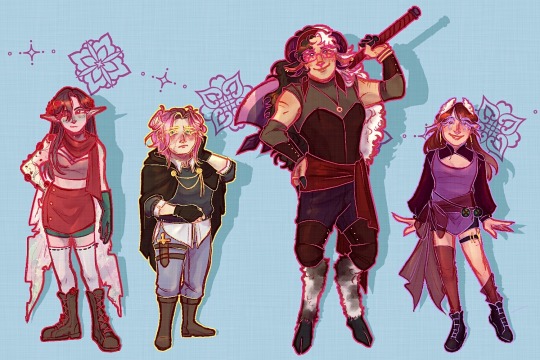
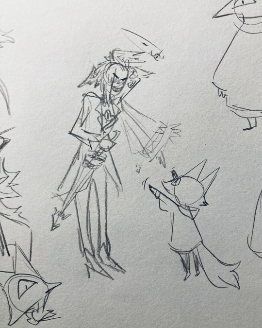
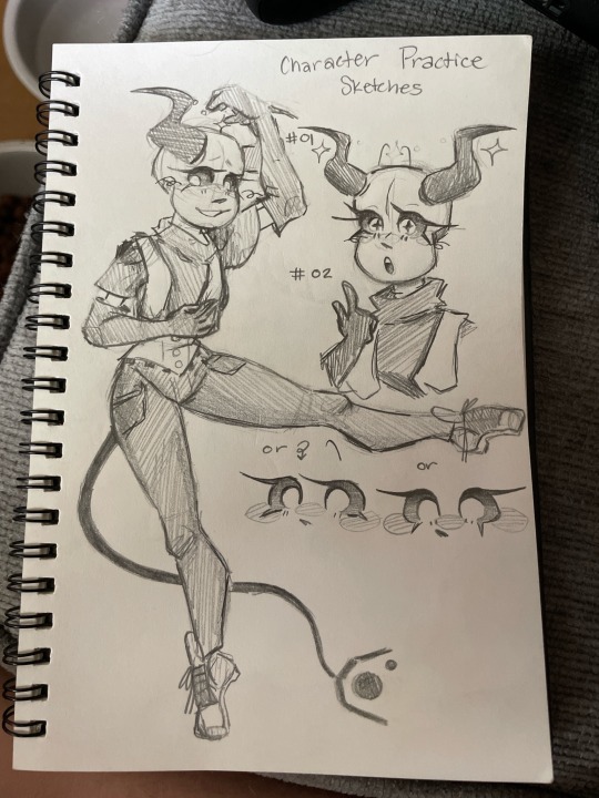
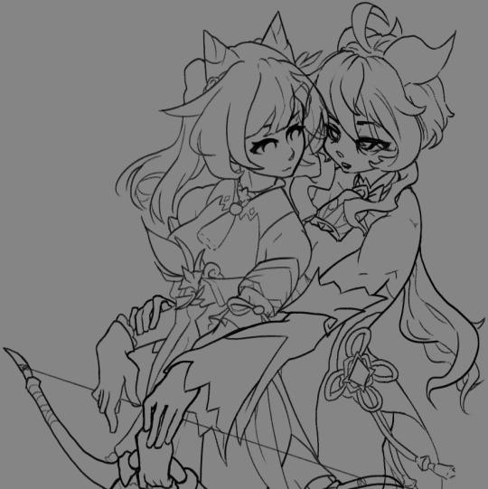
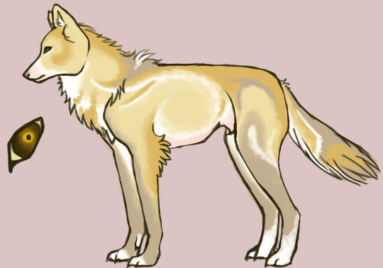
Women of the DSMP (casual, late era)
I was also working on a sketch for Alyssa, but I think I want to work on her design more before doing anything. She’s more relevant in my HJSMP AU than the canon dsmp, so I do want to work on her. Once that’s done, I think I’ll post her with Sally and Girl Dream.
Btw, Niki does still have an argyle pattern on her sweater, but I didn’t feel like drawing it. A similar sentiment can be had about Puffy’s rainbow scarves and gold accessories.
#personal#dsmp#dreamlessart#c!hannah#c!niki#c!puffy#c!tina#niki nihachu#captain puffy#tinakitten#hannah rose#I never realized how few female characters there were#like I knew there were only four female strangers#but I thought there were other female characters#I don’t think pokimane counts#fun fact#I had to tone down the colors in post#because I like to use early vibrant colors#the colored lineart makes it worse lol#tina kitten
262 notes
·
View notes
Text
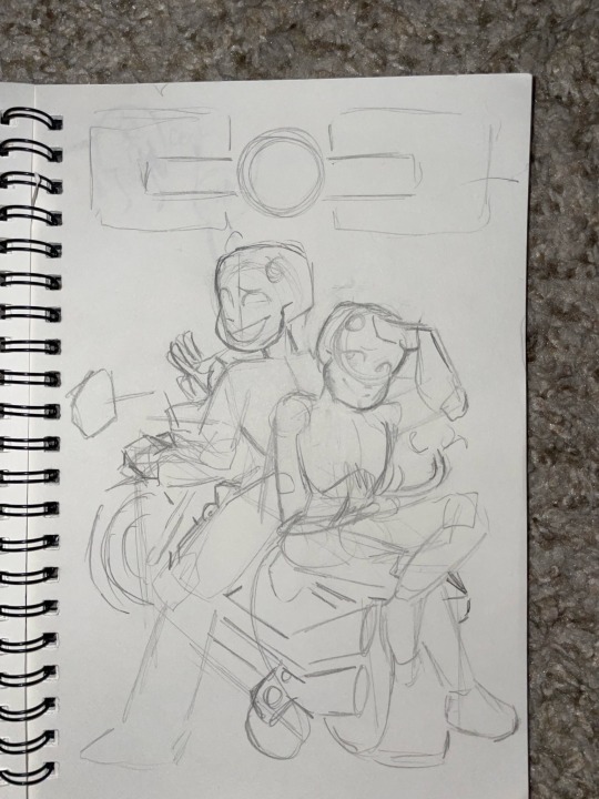
Meet Constance!
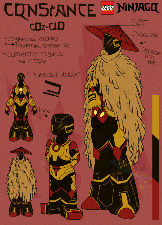
Constance is actually a personal oc from my own personal world called Plague Doctor that I brought into Ninjago cuz i had been wanting to design a robot oc and decided, why not use Constance since she's my baby girl
So here she is!
(Was gonna do clean lineart, but then realized i have zero patience for it lol)
She does have different color palette and backstory compared to my own universe to make sure she fits in
So let's get to know her, shall we >:3
____
Constance (or C0z-C1.0, C0z for short) is a servant android who's original blueprints were made by ???.
She was originally supposed to be a testing model for a now discontinued line of very advanced servant androids, a project that was shut down by Emperor Levo after being presented to him, who felt that it was unnecessary. She ended up being the only one built of her type before the project was cut short and everything associated it was to be destroyed, disposed or refurbished for something else
Because they had already built her she was allowed to be kept. She essentially became a servent/helper of multiple departments moving around and lending aide when necessary. She wasnt treated the best but it wasnt that bad. This continued for quite a few years until...Beatrix.
When she came into power she had C0z become solely her servant, sticking by her side and obeying her every whim. Under Beatrix's control, C0z was treated way worse than before and despite confusion to the sudden change C0z saw this as normal.
At the peak of the battle when Beatrix was facing off against the Ninja, C0z was shut down and sealed away so that she wouldn't interfere and when the merge quakes happened the lil pod she was sealed into was sucked in sending her off to who knows where.
Her pod was eventually discovered by Jay who had just become a Rogue and was traveling on his own tryna find his place in the world. He had set her free from the pod in his curiosity. Once C0z was free from her pod and awoken, she mistakenly took Jay as her new master much to his confusion. Once she explained her role he then proclaimed that she no longer had to listen to anyone and that she could choose her own life and promptly left.
He had no intention on sticking around, but she immediately followed him still convinced he was her master and kept proclaiming that she wasn't to leave her masters side. No matter what he did to evade her she would always find him somehow. This kept up for quite sometimes until he eventually gave up and accepted he's stuck with her.
So now, she currently travels with Jay (or Rogue) and they work to help eachother out. Jay tries his best to show Constance that she has her own free will and that she doesn't need to listen to him or anyone(with very little patience for it btw lol). That she has the choice. Constance helps him by giving him someone to care for(not that he would ever admit that outloud) which may or may not lead to memories coming back.
..It's a long work in progress and she's definitely not making it any easier
___________
___________
Tis alot but I had alot to say lol
#kkpaaw#my art#ninjago#lego ninjago#ninjago oc#Ninjago oc Constance#oc#Constance#lego ninjago dragons rising#jay ninjago#ninjago jay#jay walker#rogue jay
31 notes
·
View notes
Text
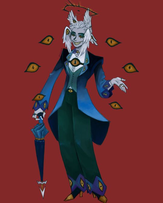
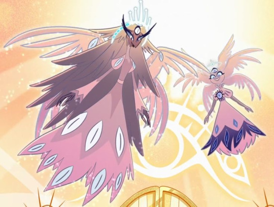
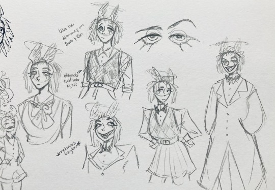
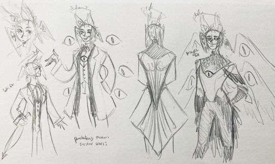
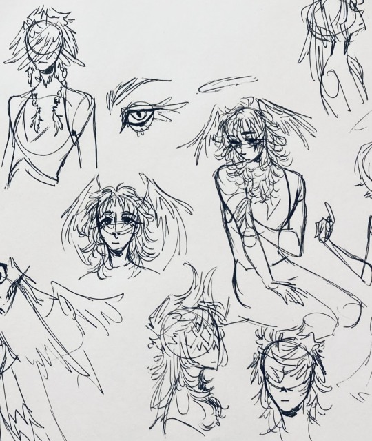
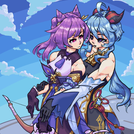
I finally finished the piece for @prince-liest's OC, Tzafael! this really reminded me of how fun character design is (and also that I've completely forgotten how to make digital art, but that's besides the point...) <3
credit to @hogbogglerspirits for the umbrella design! I kind of butchered it so please look at the original and throw lots of love at them
LOTS of notes, draft sketches, brainstorming, etc. below the cut. enjoy!
(note: a lot of what I'm talking about is based on posts prince made under their #tzafael tag, so take a look at those if you haven't yet!)
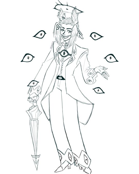
thanks for joining me below the cut! here's the sketch without the colors as a treat (in case you want to color it yourself or something, idk).
notes about making the digital drawing:
holy shit this took me forever -- I was not kidding about forgetting how to make digital art lmao. I forgot how much less forgiving digital lines are and genuinely lost the spoons to even attempt lineart, hence just a sketch below the colors.
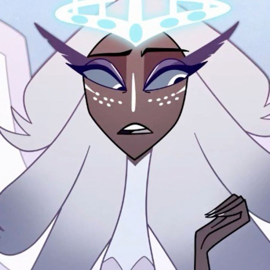
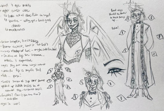
some of you might've seen the original sketch I sent to prince, which the digital version diverges from just a little. it's mostly the halo which I'll explain later, and I finally caved and drew the sixth eye (you can tell I drew and erased it multiple times in the sketch lmao -- still don't know if I prefer it with or without)
here's the original color ref by the lovely @gendermeh! my color scheme ended up looking really different, so some notes about that:
I was looking at references for magpies like this
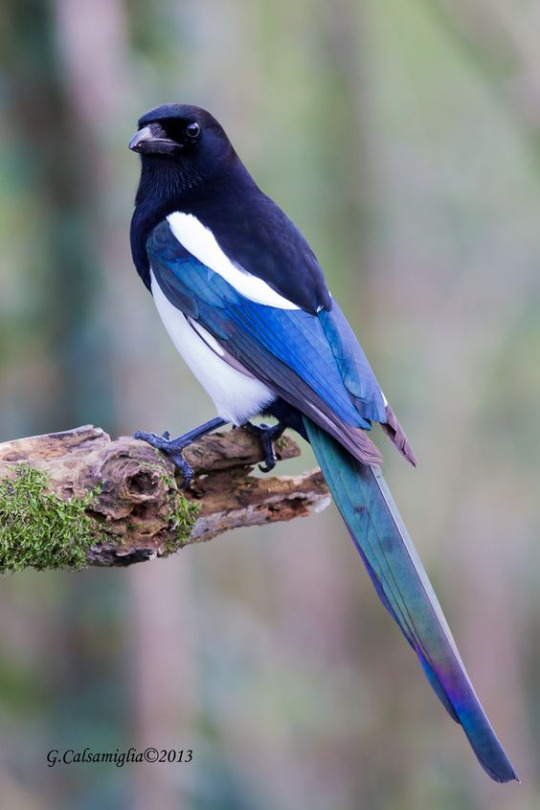
and I wanted to basically follow that color scheme while also being somewhat similar to the original -- dark head/shoulders --> dark top of the jacket, bright blue wings --> bright blue bottom of the jacket, greenish tailfeathers --> green pants, hints of purple --> purplish sleeve and pant ends
I also tried (and mostly failed, let's be real) to capture the iridescence of the feathers -- they look like oil spilled on the pavement or iridescent hematite to me! I think the key ended up being adding bright greens/purples and roughly blending them into the blues or vice versa but I didn't really figure that out until I got to the pants lol.
I'm gonna be honest; I don't remember why I went with this shape for the tailcoat. I just remember being unhappy with the sketch and then trying a bunch of different shapes that mostly looked worse lol -- I think I landed on this because a split tail kind of looks like wings?
KEPT the shoes -- absolutely magnifique. I wish I knew how to color gold better.
added lots of jewelry! they like shiny things :)
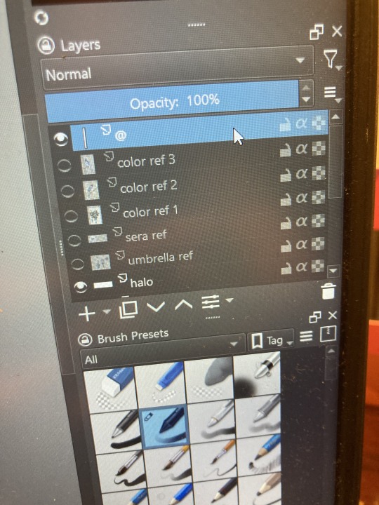
ALSO PLEASE LOOK AND APPLAUD ME. I FINALLY REMEMBERED TO LABEL MY LAYERS!! NO I DON'T REMEMBER WHY THE HALO HAS ITS OWN LAYER.
alright, time for some more design notes/explanations + draft sketches!
but first, a couple disclaimers:
I want to make it very clear that I LOVE everything about the original design. I made a lot of changes based on personal preference/the way I interpreted the character. I was actually planning on making a digital piece that was more faithful to the original design too, but I was just out of spoons for it cause of life stuff.
you probably shouldn't try to read the notes I made in the sketches I'm about to show you unless I say otherwise. most of it is incoherent brain vomit in illegible artist handwriting and I'll transcribe/explain the stuff I think is important :) (the stuff in quotes are direct transcriptions of my notes)
I know my sketches are very messy lol. I only draw for fun, so I usually don't force myself to make stuff any neater than necessary unless it's supposed to be a formal piece. try to bear with me.
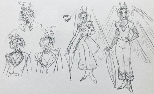
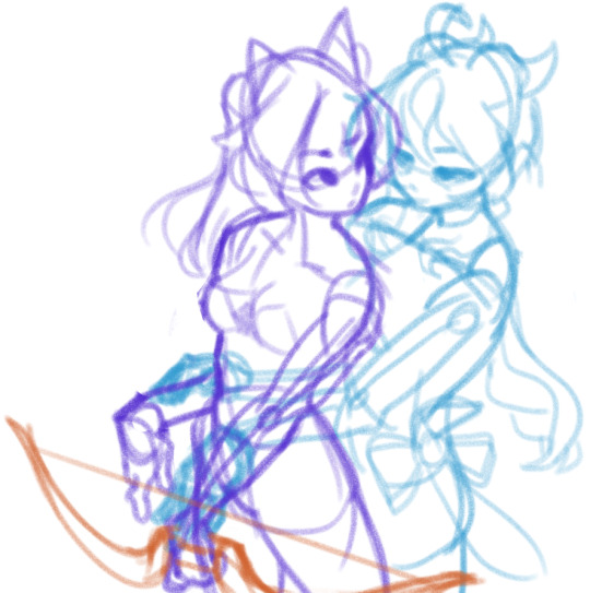
1:
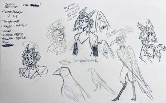
my first few sketches of them! (I think?) this was before I sent prince a laundry list of questions so I was still trying to get a vibe
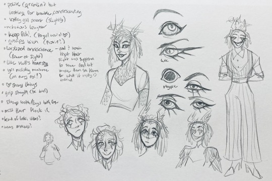
"magpie -- beak lips?" -- you'll see this in a few sketches; I considered giving them the lipstick design that velvette has since it looks like a beak. I still kind of think it's cute, but 1) I'm pretty sure velvette is the only character that has them, so I didn't want to make it seem like they were related somehow and 2) I thought it might be distracting with how much other crazy stuff I ended up including in their head/face
also, sidenote since it's relevant to what I said about vel: something I realized was important is how one character's design relates to the designs of the rest of the cast. I wasn't sure how much I should've gone for what looked good in a vacuum, how much should be based on what other characters looked like canonically, or what other characters would look like if I also designed them. it ended up being mostly the second option, but it was honestly still a struggle. should I take away some of the tumblr-sexyman-ness (no shade to tumblr sexymen; I love them) because there are other characters that already have it? should I relate their design to sera's and emily's in the show or should I think about how I would've designed sera and emily? should I follow some of the design philosophy of the original show and just throw stuff on there because it looks cool (the answer is yes btw)? decisions, decisions ...
I don't think this showed up really well in most of the drawings, but they actually have a black line down their nose! let's take a look at sera:
since they're siblings, I wanted to include some similar facial markings. the nose line ended up being the only thing I kept though -- I was going to include freckles, but I have a compulsive need to give every character giant bottom lashes so there ended up being no room T.T I like that the magpie's hints of purple kind of match hers tho!
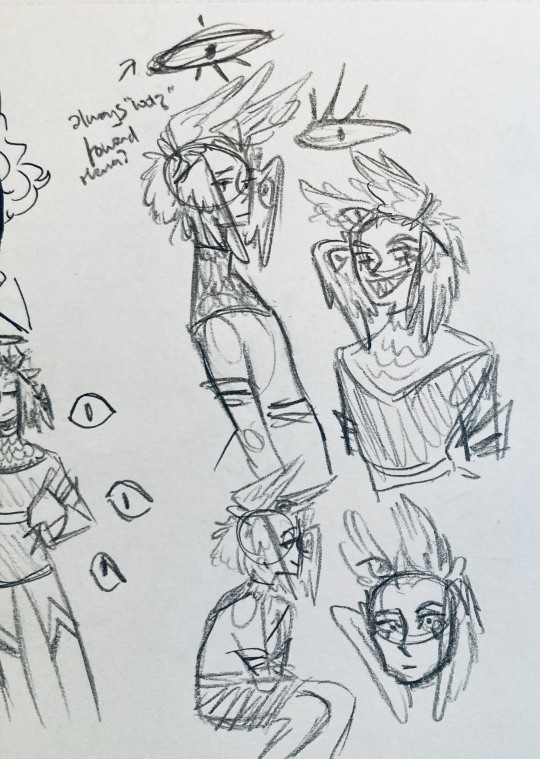
the wingification of the hair begins! I was still unsure of it at this point, but it was an idea I had since I was kind of struggling with how straight the feathers were in the original.
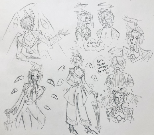
"maybe the ones on their head count as wings (so only one main pair)" -- I originally just had the 2 pairs of wings on their head, so I was thinking of just giving them 1 pair on their back so there would be still be 6 total. also this middle drawing of them is meant to be their exorcist outfit (I wanted it to be a cross between what the other exorcists wear and sera's outfit)
at this stage, I was thinking of giving them more magpie-like characteristics, so I looked at some references and tried to emulate them in a more human design. this ended up being really awkward so I scrapped it, but I still like the idea that their exorcist mask looks like a bird (kind of like a plague doctor's)
2:
peekaboo! I love the idea of them using the wing hair to cover their eyes lol. (ended up using that idea for my own seraph OC since that's their biblically accurate purpose: to cover their eyes/faces in reverence/humility -- doesn't really fit with tzafael tho lol, so they show their face most of the time)
an eyeball in the bowtie -- pretty self-explanatory. the eyeball motif is important.
the one in the middle is just me practicing drawing the original design, and the one on the right is another exorcist outfit I think. I wanted to include the diamond motif/points that sera has on her dress (the diamonds on the bottom turn into eyeballs, which is why the final design also has eyeballs on tzafael's sleeves/pants)

3:
lots of notes on the side based on what prince said in response to my ask
"localized omniscience (power of sight) -- cool + ironic that their sight was supposed to serve God but made them see Heaven for what it really is instead"
another exorcist outfit, this time including the feathers
I was also experimenting with the halo; I was trying to make it look sort of like sera's crown, but that didn't feel right ...
some practice with eyes -- my style is pretty flexible with eye shapes, so I try to make them suit the character. I drew lute's eye and also an actual magpie's as references -- lute's because of the exorcist background and also because they looked appropriately sharp, magpie's for obvious reasons. once again, my compulsive need for giant bottom lashes strikes
there was honestly a lot to balance with the eyes -- I wanted them to look condescending/bored (lowered top lid) but also amused (raised bottom lid) and like a magpie (round) but also harsh/mischievous (sharp, maybe slit pupils like a snake) and similar to sera's (but not too decorated -- also does it make sense for them to look like sera's if emily's don't even look like sera's?)
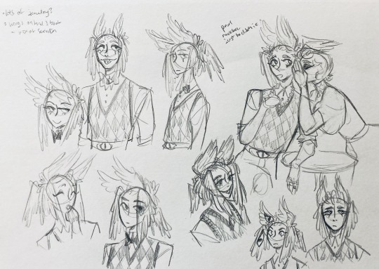
considered having wings on the shoulders -- the magpie pattern is super cool, so it would've been nice to have that somewhere more explicitly in the design. I still think that might fit in an outfit they would wear in heaven (maybe for formal occasions)
the introduction of the sweatervest! honestly I kind of love this for the way it captures more of the preppy, spoiled old-money upper-class vibe some heaven residents have, but it was scrapped since I couldn't imagine them wearing that while trying to scare the denizens of hell. maybe something they wear casually though.
"yes nictating membrane (on every eye!)" -- AHH I'm so sad I didn't end up putting this to use. I just feel like the whole effect is based on actually seeing them blink, and I don't animate lol.
4:
ugh, the nefarious laughter one ... don't worry I tried harder on a sketch later on lol.
"like the diamonds on Sera + Em" + "diamonds turn into eyes?" -- I draw the diamonds on the sweatervest turning into eyes later.
tried an actual bow instead of a bowtie -- very cute but didn't fit the vibe.
a skirt! I think they would wear a skirt sometimes.
5:
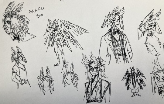
"FUCK ASS BOB" -- asghdk the wingification of the hair continues. unfortunately, I'm realizing at this point that the silhouette of the hair is starting to look a lot like alastor's. I gave a very half-hearted attempt at mitigating this, but it goes back to the thing of how much I am obligated to the original show's designs and what looks cool to me -- I think the wing hair fits them and I didn't want to change it because of alastor, plus my alastor design actually has completely different hair anyway. I did add a third pair to the back to look like a ponytail though.
introduction of the scarf! I was actually going to include this in the final design but uh,,, I forgor. are you starting to see a pattern.
the reason for the scarf is that the "tzafael going to places they know they'll draw attention/can incite chaos" reminded me of that scene in avengers where loki walks into a fancy building looking pretentious af and just casually stabs a guy's eye out. not really the same thing but I felt like the vibe matched. hence, loki's funny little scarf fit.

6:
uaoughdfjh it was SO FUN to draw the wing hair, and it was at this point that I realized they had to stay even though I wasn't sure if it was too different from the original.
gossiping with rosie cause that's the first person I thought of -- tzafael also summoned a pearl necklace to clutch because of the sheer drama of it all (your ex-husband did what??)
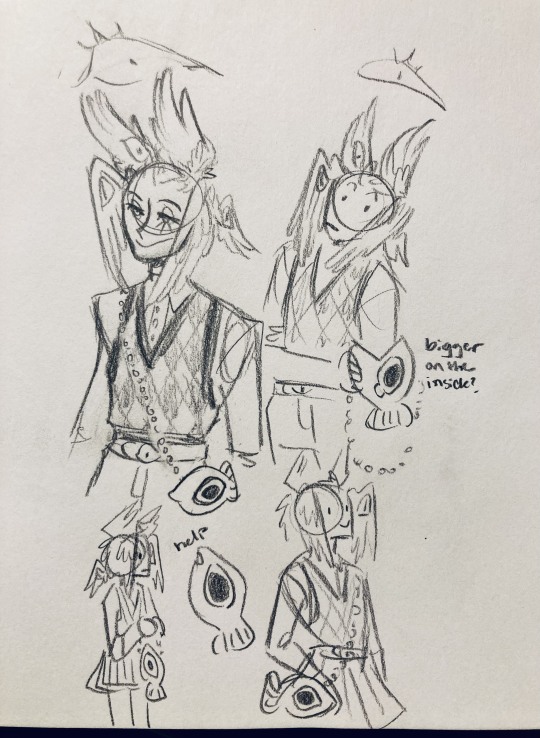
also started drawing the rings on their hands. magpie like shiny.
7:
lots of notes cause I was trying to compile the things I still needed to think about/incorporate into the final (I thought this was gonna be the last draft ... haha)
trying to include more bird/eye motifs
"fish ... purse?" -- ha! I forgot I was gonna give them a fish purse. I think I drew that in a later sketch, but not them wearing it.
"picked up Hellish traits bc of extended stay -- existential crisis?" -- I asked prince about the sharp teeth, and their answer implied that they became sharp as they stayed in hell longer, which got me thinking ... I feel like that's actually a great body horror concept. lucifer falling and looking like a normal angel at first, eventually waking up to more and more devilish features and feeling more and more like he's lost his home and his past self ... spooky.
another exorcist outfit -- I actually really like the eyes on the ribs! I never made a final draft for the exorcist uniform, but it would probably look close to what I drew here.
the one on the bottom was meant to be similar to the feathered shoulder pad idea, but this time with the whole magpie (with giant eyes). tried putting the "freckles" (really just dots in this case) over their brows, but that ended up looking kinda weird.
the eye is pretty close to the final design
the one on the right was supposed to be the full final design, but I was totally off lol -- the long trench coat really doesn't give off the right vibe at all
8:
playing around more with the loki vibes of the scarf, also added an eyeball to the chest
I never got happy with the design of the back of the coat -- I think it should probably just be blank at this point. but the sketch here is meant to look like wings/tailfeathers.
yet another exorcist outfit, this time with more magpie motifs. I actually like this one a lot, but I probably should've added the eyes on the ribs from the last sketch. I think I also considered giving them actual tailfeathers at this point.
9:
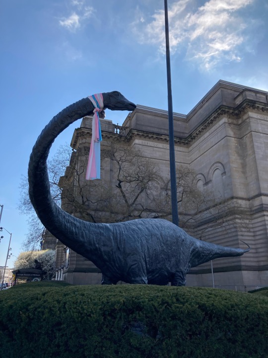
thanks for sticking with me! I promise we're almost done. have a trans dinosaur I saw while I was travelling as a treat <3
10:
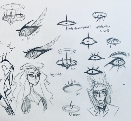
this is after I finished the sketch for the final piece and realized I didn't like the halo design. I drew lute's, sera's, em's, and adam's as refs. (honestly I love the show's idea that each person/people of each rank have a different kind of halo -- I wonder if they can switch them out?)
my main inspiration ended up being the exorcist halo, but I made it look more like an eyeball -- since it always points toward heaven, we can say it's always "looking" at heaven.
(also sera's feather lashes! they're so cute)
11:
EVEN MORE EXORCIST DOODLES
12:
tzafael shooing away my fox demon OC
13:
these are actually sketches for my own seraph OC (raguel), but I wanted to include it since it has even more wing/feather hair variations. I also think the idea of the eyelashes being feather-like could've been cool for tzafael.
14:
some more OG design doodles
tzafael and raguel together because self-indulgence is the name of the game babey (also wanted to draw tzafael freaked out with their wings flared)
(raguel's blind btw, hence asking for eyes -- tzafael has so many!)
you can probably read the dialogue here so give it a shot. I believe in you.
15:
you know what? the fish purse deserves some doodles
16:
putting them in Situations! I was reading over prince's posts again and I realized there were some funny things I could draw them doing/saying
again you can probably read the words here
angel dust also loves fish (but is apparently bad at taking care of them, hence the suffocating blobfish), so tzafael shows him their aquarium (complete with live fish and flora ofc)
I thought alastor was 8 ft but apparently he's 7.3 ft? so tzafael is enjoying the .2 ft they have on him
trying and failing again to come up with a design for the back of the jacket lol
THE crowley quote
apparently the halo still sends signals from the exorcists -- thought their reaction to the battle at the hotel would be funny
the nefarious laughter (take 2) that I promised -- based on a doodle of alastor viv did that I found
them being sad and curling up in a pile of shiny things like a dragon
OKAY I'M DONE. huge, huge thank you to prince for sharing their OC! this was a lot of fun and clearly inspired me a lot haha. please check out their writing; it's literally so good that I can't read anything else these days. I am chewing on their thoughts constantly.
this was an absolute monster of a post, so if you're still reading, I am both impressed and bewildered at your patience. I hope you enjoyed! (I certainly did!)
#prince (because they are very sweet): I'm excited to see your thoughts!#my thoughts: magpie like shiny hehe#hazbin hotel oc#prince-liest#hazbin hotel#my art#character design#sera hazbin hotel#em hazbin hotel
55 notes
·
View notes
Text
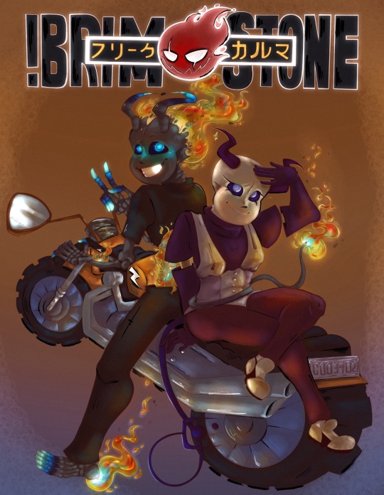
Context- I had been commissioned for this piece. Being in a financial pickle I picked it up and immediately set to work on it. Since I’m in need of money I put my all into the request to make sure it checked every box they could need. It turned out amazing I think! However I just checked our chat where I put the almost finished piece to find their account deleted. What’s worse is I had given them an update without my signature on it since it was unfinished and all…so if you see it floating around please message me!
Without further adeu~ the piece!
╔══*.·:·✧ ☎️ ✧·:·.*══╗
Information
I was messaged by the user Freaky (later changed to Dust) for the commission of their two Characters Brimstone and Karma. Ecstatic we began consultation!!
They decided on a photo reference from the anime “Soul Eater”. They liked the old anime style and requested their piece would be similar. That meant a full body with simple background but a lot of technique put into the old anime style! Ofc I wouldn’t shy away from the challenge (since my bills won’t shy away from me- the apple did not work on the doctor….no matter how hard I threw it)
Upon requesting their budget they said between 130-200$ which worked fine with me. I always tend to under charge anyhow. Due to my needs this time was no different. I assured they would receive updates to let them know how the piece was going and that I would collect their input on any fixes needed. They agreed and without further wait I began.
『•🪱•✎•🪱•』
[ T o o l s ]
✦ Cheap sketchpad
✦ Mechanical Pencil 7.0 lead
✦ My Phone (to send to the iPad)
✦ Fathers IPad (Im broke don’t judge)
✦ Procreate
✦ Color Pencil procreate brush pack
✦ Lineart procreate brush pack
✦Paint procreate brush pack
*ੈ✩‧₊˚ˏˋ°⁀✎ 🫎 P R O C E S S 🫎 *ੈ✩‧₊˚ˏˋ°⁀✎
Once saving the many provided refs I began by creating character reference sheets. Due to the customer not being artistic they provided me with several other commissioned pieces of their characters. Not all…looked the same… so I created these sheets to compile the parts that fit the personalities portrayed. Then I checked in with the user to figure out which features looked most like what they imagined for the characters.
Then I continued with the base sketch of the pose. The original reference for the pose didn’t entirely fit the characters so I chose to tweak it. I think I like the way they interact on the piece. I even made them doing rock paper scissors if you pay close enough attention! Karma lost but well…Brimstone would get what was coming for it later lol.
After all that it was finally digital art time!!! So I put my color references sent to me before adding the anime ref and my character refs. On the iPad I started with adding the details of the characters and sketching the pieces in further.
When that looked good I shifted the background a little to see it all before doing the motorcycle. (This is the first one I’ve ever drawn too- I know it’s funky! Don’t look too close)
Once the sketch was confirmed I began lineart. The title was changed to say Brimstone in big and in Japanese it reads “Freak Karma” the user of the customer and their second character.
Following that was color blocking which absolutely murdered me! I simply started with a big blob and did Alpha lock. Then I continued to block out base colors. Probably the worst experience of my life…goodness..
After I did a big dark brown layer with the opacity lowered for the look of a darker environment. From there I lightly erased the spots for lighting.
Then it was additional coloring and shading to the color block layer followed by additional erasing on the shadow layer. Building it up until I was satisfied.
Finally I did two layers- a layer for specific color lighting such as the flames reflection and the color to their skulls and a layer for the black and white liner.
All that was left was adding noise, Bloom, and a little bit of halftones to achieve the desired look.
With everything done I added my signature into the mirror on the bike!
ALL THIS ON ONLY 4 LAYERS! Due to the sheer size of the canvas (6000 pixels by 5000 pixels (ish)) I was only able to have 4 MAX layers. So pain…
🪳✨ Time ✨🪳
//this is the longest I’ve ever spent on a piece btw! (These are timed and rounded down to the simplest form. So these are all slightly UNDER what I actually did.)
Ref sheets 🎨 45 min
Layout Sketch 🔆 24.3 min
Digital Sketch 🛏️ 1 hour 30 min
Lineart 🍿 8 hours
Color Blocking 🥲 23 hours
Lighting + Final touches 👍 1 hour 25 min
Total- WAY TO FREAKING LONG! This has 26,543 strokes on it!!!!
Anywho! I hope you enjoy the piece as I sure as heck have not due to my suffering and now lack of money that I now have to try and find elsewhere with bills gripping my now every thought.
If you’d like to commission me I’ll have to ask for a base payment upfront now due to this situation. I am unable to spend such time to provide my very best just to be left when I truly need the money.
Thank you for your time!
#undertale au fanart#au undertale#sans undertale#undertale au#undertale#alternate universe#au sans#au fanart#sans au#soul eater#commission#scammers#digital art#digital illustration#digital drawing#anime art#anime au
23 notes
·
View notes
Text
⚠️ CRINGE FANFIC PAST THE BREAK ⚠️
"Keqing..." Ganyu murmured, "your form?" She lazily placed her fingers atop Keqing's wrists, guiding them. "Would you like me to remind you?" she continued.
Keqing's posture stiffened slightly and her eyes widened for a moment. Ganyu's breath tickled the back of Keqing's neck, causing jolts of Electro to dance down her spine. She slowly turned her head while cracking a shaking smile.
"Yes- I mean- No, I remember. Straight wrists. To line up with the force of the weapon, right?" Following the pressure of Ganyu's fingers, Keqing started relaxing her wrists.
"Mmhmm, better," said Ganyu, yawning.
Ganyu's morning voice took out whatever parts of Keqing's brain were still functioning. Her mind was sent swimming. She couldn't help but notice how the groggy morning Ganyu was a bit more informal, a bit less reserved...
These archery lessons would be more affecting than Keqing anticipated.
---- End of Fanfic. Beginning of random thoughts ----
I want to believe that Ganyu uses war bows with serious draw weight: she fought in a war, didn't she? So, God as my witness, she should have the muscles to do that.
I bet Ganyu's lat spread is crazy. Wings and horns? Is she an alicorn? buffalo wild wings?
I also don't personally ship these two very hard, but just Aesthetically though?
I had a lot of fun with this one. For the sake of learning, I tried using no blending (full cell shading), no blending layers, and choosing every color using the color wheel. I definitely wouldn't do it this way again, but it felt instructive!
I think i'm gonna draw some class of '09 next because if i don't get some of this out of my system i'm gonna be watching jeckole animatics forever
Here are the progress shots of this because i just love how the sketch/lineart of them look
I wanted to draw a complex background but I just hated how it looked, so i scrapped it and put them on the jade chamber.
i want groggy ganyu! i would love to see an irritated/fed up Ganyu. Do you ever think Ganyu gets finished with a 30 hour shift and just go "fuck work, fuck this, i can't believe this shit. the whole country is resting on whether or not i decide to slave away working inhumane hours"
I also made pfps of these for myself and the loml. This makes it kinda look like I headcanon Ganyu as trans; lmao. i don't but nothing against anyone who does. if you wanna use these, idk credit me ig. if you dm me and ask nicely, i might send you one with a transparent background instead lol. if i have time

the keqing border looks worse imo but it was mine so idrc
#genshin#genshin fanart#ganyu#keqing#ganqing#gay#i wish genshin had time to make time for its characters#there could be a different mini-series for each nation and its characters getting up to hijinks#instead we get like 1-3 events per patch which spoonfeed a tiny bit of character here and there#gayshit impact#HOYO give me a real keqing hangout and my life is yours#HOYO please ganyu's immigrant story was a bit weirdge but the most seen i've felt in any character story#genshin impact
13 notes
·
View notes
Note
OMG YOU'RE SEVENTEEN?? (I've been following you for months and I didn't once read the pinned message beyond the line about no AI and NFTs lmao) YOUR ART IS SO CRISPY I THOUGHT YOU WERE A PRO ARTIST AROUND 30 WTF
(sorry for the yelling via text)
HOW DID YOU GET SO GOOD!! (Tips on lineart please?) WE'RE THE SAME AGE, BUT HALF OF MY ART IS SHIT AND THE OTHER HALF IS FART
ALL HAIL LITTLE RED FOOL, BESTOW THY GREATNESS UPON THOU MERE MORTAL SERVANTS
But in all seriousness, any tips on, like I said, lineart or just digital art in general? (I just started digital, and... Ten hours of work and I'm just on base colors 😎🕶️🤏🥲) I love, LOVE your style and especially COLOR! How do you tie it all together? Like, I'm 17 too, but I'm not even close to your stuff?? I'm scared as fuck from ever trying color traditionally because I spend SO MUCH TIME ON A SKETCH, so I just picked up digital and HOURS LATER IT'S STILL AWFUL
Sorry for the rambling and repeating, man, it's been a long day and it's late in the Balkans... Don't let the rambling force you into answering tho
Have a good one. ->excited fellow artist
(tip of the day: did you know that in Romanian, moon and month are the same word, with the same pronunciation, spelling and plural? It's called: lună [loonuh] and I think it comes from latin, since Romanian is a heavily latin language, with bits of french and turkish (HEAVY bits), dacian, slavic, italian)
OUAHFSHD THANK YOU SO MUCH I’M REALLY HAPPY YOU LIKE MY ART!! Also I’m sure your art is better than you think it is (we generally tend to view our own creations as worse than others because we’re the ones that made them, don’t worry I’m the same as well ajdbsjd) but yeah I’ll be happy to give you some tips and stuff! (and yeah I never colour traditionally either I just leave everything in plain biro because I don’t want to mess it up lol)
(I haven’t seen your art so these will probably be more general tips but hopefully they’ll help a bit, also keep in mind that I’m not a professional so this will be more about what has worked for me but I hope it might help you a bit)
So for stuff like lineart, avoid using chicken-scratches—it might seem easier or less daunting to do shorter overlapping lines like that but it will give your sketches and drawings that overall fuzzy look, the trick is to have longer confident strokes. It might seem a bit tricky at first if you haven’t done it before so don’t worry it happens but if you keep practicing they’ll eventually look smoother and less shaky. For the longer lines it better to draw from either your elbow or shoulder, and by that I mean keeping your wrist still and letting the larger parts of your arm do most of the work—this will also help your wrist in the long run. For things like shorter lines and smaller details then absolutely use your hand to move the pen, but generally try to use your elbow and shoulder as it will help you get those longer smoother lines. Also this is just a personal preference of mine but I generally use brushes that have a bit of pressure sensitivity which helps add some line weight. If you don’t have pressure sensitivity another way you can get line weight is by taking an eraser to some of the edges and narrowing some parts.
For colours it mainly depends on the lighting—lighting is everything and will affect how the rest of the colours will look, so it’s important to have an idea of the brightness and colour of your lighting. The background also plays an important role in picking colours for me as well as it helps provide colour context and makes it easier to pick colours by eye if you want a certain mood. If you want a more dependable way on getting colours to match up then I’d recommend having a layer that’s just colour on top of the rest of your piece—you can play around with the blending modes and opacity, I mainly use either an overlay layer with a medium colour that’s slightly desaturated or a colour burn layer with a light saturated colour; most of the time I use colour burn because if you put it over your lineart then it will also tint the parts of your lineart or sketch that’s at a lower opacity too. But with figuring out colours I’d highly recommend researching some stuff about colour theory, there are a lot of good and easy to understand explanations and art tutorials on YouTube so I would recommend starting there (unfortunately I can’t link recommend specific videos because my playlists are a mess ajdbsjdbsj but some good channels to learn from are Sinix Design, Marc Brunet and Marco Bucci).
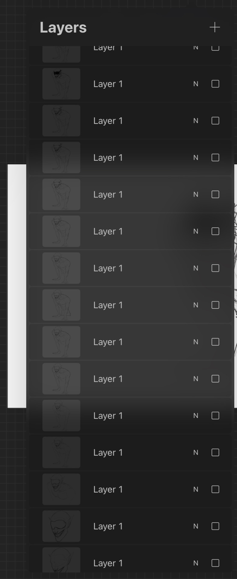
In terms of general digital art tips, ALWAYS FLIP YOUR CANVAS. You will not believe the amount of times I’ve looked at a drawing and thought it looked pretty good, flipped the canvas and found that everything’s wonky. In cases like these the liquify tool is your best friend, as well as the lasso tool and transform tools, as well as just manually fixing them by redrawing some parts. Also use as many layers as you need, and by this I mean if you’re working on your sketch, lineart or colouring or whatever and you want to do something you’re not sure you’ll like, duplicate the layers so you have a backup in case it goes wrong and you want to go back. When I say use as many layers as you need I mean use as many as you need, these are some of mine and they’re all from just one sketch because I get really anxious about messing stuff up lol, also don’t be afraid of drawing separate parts on separate layers and merging them afterwards if you want.
Also take your time, unless you have a deadline don’t feel like you have to complete a drawing within a certain timeframe, if you want to get faster at drawing then that’s great but don’t feel like you need to push yourself, especially if you’re just starting. Practice takes time and patience is your best friend, and you probably hear lots of other artists saying this but trust the process. You might get to a bit you’re struggling with and not like it and want to abandon the drawing, but I found that rather than saying “this is bad” or “this is wrong” start asking “how can I make this work” because a change in mindset can help you a lot with art. Also don’t feel like you have to reach certain milestones with your art by certain points either, like with the age thing and comparing your progress with other artists of either the same or different ages, because it can make you feel worse about your art. Trust me there are some artists younger than me who are like 14 or 15 who’s art I envy and—again with the mindset thing—instead of getting down that your art isn’t similar to their’s or worrying that you’re “behind” in your artistic development (there is no such thing btw everyone learns at different ages and speeds so don’t feel bad if you haven’t progressed as much as you would have liked to) it helps to ask what you like about their art and what you would like to incorporate into your own—this has helped me learn and improve a lot faster.
I don’t know if I have any more tips at the moment, but I hope that answered some of your questions! (also sorry it’s a bit long or some bits don’t make a lot of sense I like to ramble a bit lol) (also also thank you for the little fact as well!)
Have a nice day anon 🧡
19 notes
·
View notes
Note
I really hope this doesn't come across wrong because I don't mean any shade or criticism, just genuinely curious. Why have you progressively muted color in your artwork over the years? Again, I don't mean anything negative. Your artwork is truly gorgeous, and the softer colors suit your style and make it stand out. I'm just genuinely curious since you've mentioned it yourself several times, and I'm someone who struggles with color theory to begin with. Is it a conscious choice, brighter palettes being overstimulating, some combination, etc.? Thank you for sharing your art, and I apologize profusely if this was a bad question to ask.
you're all good! i love sharing my journey. i get this question a lot and all i can really say is uh my brain took color theory a little too seriously and now it can't stop its subconscious descent
basically, once i learned color theory in 2019/2020, my brain hooked onto that concept and could match a lot of colors to a specific hue in the canvas
unfortunately for me, this extended to clip studio paint's UI (and the gray canvas i'd start out with) and it started to influence my palettes. gradually, as i got better with color, the desaturation/low contrast took over because of it. and it just progressively gets worse lol
my old laptop (used 2015–early 2020) had the WORST display for art with insanely inaccurate colors, so i wasn't able to delve too much into less intense palettes until i had gotten my gaming laptop in june 2020. along with that, the UI of my old laptop's clip studio was much lighter and higher contrast than that of its current one
here is a great example of how my art's progressed over time
i think a major pivotal point into my current style (which if you asked me at the time, i would've said nah my style was already desaturated oh boy was it not looking at my art now) was doing huevember, where i had created my own prompts with muted colors. the extreme palette of that event just absolutely set my brain on its path and you can tell by the end of that month (done bottom right first, top left last)

i do find it a lot easier on the eyes, which absolutely is a reason why i still follow it so strongly. i don't do well with bright screens, which is why i ditched the white canvas SO quickly in 2017 when i first started out. funny enough, nowadays i have to turn my brightness up so far just to be able to better see my art ...which absolutely kills my eyes if i switch to my light mode browser or something lol
my art's definitely softened up too since a) switching from pencil to gouache to rectangle brush, and b) colored lineart and then painting over lineart. it's a combination of things, yes but mostly just my brain like to play "match the colors" n all ahaha
that's my ramble 😌 thank you! <3
#i will say my colors absolutely dipped in late 2020 early 2021 i believe it was#because i just was not used to a) color theory and b) my new laptop#so i got a LOT of complaints that my art was just too dark LMAO#so now it's a little lighter and the desaturation/low contrast feels more prominent somehow#guess because it's so evenly toned with that 50 value gray there lol
29 notes
·
View notes
Text
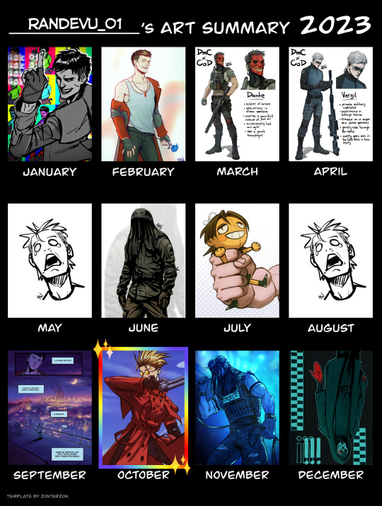
2023 art summary time!
some of my thoughts and comments are below the cut :)
This was... an interesting year. I got out of my DmC shell (after 3 or 4 years) and spent most of the year obsessing over other fandoms, e.g. Call of Duty of all things lol. I also got into Trigun, watched and loved both adaptations, as well as Fullmetal Alchemist and Death Note - quite an accomplishment for someone who generally doesn't like anime. Oh, and closer to the end of the year I discovered a whole new world of music band fandoms after I somehow got invested in Sleep Token and Ghost (it's the masks I'm sure)
Productivity-wise, even though I couldn't even fill in all the spots in the template, I feel like I did pretty good. Some months I didn't manage to finish anything, but October was wild, I did a lot of nice complete pieces then. A significant portion of my time and effort was put into drawing comics for the DMC ask, and I also took some commissions at the start and in the middle of the year, so there was very little time for me to make personal art, which I miss greatly and hope to make more of in 2024.
Speaking of future plans, I definitely want to give more attention to my OCs from Waffen AG and City Ghouls. When it comes to making OC content, I tend to stop at colored sketches at best, but in 2024 I hope I can make actual polished art of my characters. (Though I'm convinced that this will make my social media reach even worse than it is now, I'll try to not gaf, 'cause I learned that making and developing OCs can be super fun, and oh boy do I need that serotonin lol)
Skill-wise, I think I've definitely improved at making comics, lineart and anatomy, which were my 2023 goals a year ago. However, I feel like I could've done even better. But, again, I was pretty busy with irl stuff, so it's okay.
In general, life was pretty exciting in 2023. I visited 4 cities this summer, met my old friends and made some new ones. Despite some heath issues, I had a great time!
Thank you all for sticking around and appreciating my art! I cherish every little comment and reblog ^^
Hopefully, I'll be able to reach even more people on this platform in 2024. Happy New Year!
#art summary#art summary 2023#2023 art summary#2023 summary of art#summary of art 2023#summary of art
14 notes
·
View notes
Text
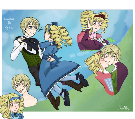
What if we were both kids who had become entangled in dangerous things beyond our understanding, and you just want to be loved and take great care in upholding a cute persona to be liked, and I just want to be loved and uphold a persona to seek it through shallow relationships and being desired, and while you were protected and became a protector I was harmed and became harmful. What if we both need to be needed. What if we both craved attention and were overly willing to give it. What if we’re both sidelined and dismissed and whereas I came to loathe the world and want it reduced to ashes you see beauty in it everywhere, what if you brought me understanding and elation, an actual connection that I hadn’t had since my life became a cycle of pain and trauma and acting. What if I said I hated butterflies because they act all pretty and fancy but without their wings they’re actually really ugly, and you told me that they had to live as ugly caterpillars before earning their pretty wings. What if I was a caterpillar and you were a butterfly and I love you but I hate you but I love you but I hate how you might leave me. What then.
"When I’m with you I feel like a kid again." Alois just stab me, it’ll be less painful than hearing you say this to Lizzie
At first in my drafts I had these lyrics of Someone to Stay written all around them but if you’re not in an intense aloizzy mindset it looks crazyyyyy lol. I still made it an alt version and put it under the keep going line though. Also I made them wear each other’s eye color hehe, blue and green <3 Oh yeah man the sketch for this was from yearssss ago and the lineart it’s gotta have been a solid year as well… Look I just have tons of wips and I’m a slow artist. But yesss this is one of my guilty pleasure OTPs… Even as a kid I was a rarepair shipper gbdgdg. So uh this is my obligatory aloizzy post!! There will be more, hopefully
Fic recommendation!! Ice into intimidation is visceral and childish and timeless and universal. It touched me as a 11 years old and my appreciation for it has only grown as I became less and less childishly innocent like Lizzy and more acquainted with the horrors of the world that Alois has lived and seen. THIS FIC Y’ALL. CHANGED MY NEURONS. It’s like bruised ribs, an all-encompassing hug that softly hurts. It probably influenced my tastes in ships and fiction a lot gdbgdgd. I will never recover from it being discontinued, I will forever dream and wonder about what could have been. They’re so tragic. I’m gonna draw so much fanart of this fic when i can. Like just for his post I took the opportunity to go back and read the "butterflies are ugly" scene and the last chapter and many more excerpts and it makes me go rabid it makes me on the verge of tearssss, I could make a whole essay about this fanfic… Though! CW for ptsd, but otherwise it’s all very implied and not told. If you’ve seen the season and Alois’ character you know you have to prepare for actual dark shit. The fanfic isn’t graphic at all as I said, but if you know Alois’ backstory you know. As mentioned I did read this as a 11 years old and the dark stuff flew over my head it’s chill 👍
My aloizzy playlist!! I have a longer one but it’s 16+ because of aforementioned dark themes and I don’t wanna post it here. If you’re curious about some of my other playlist picks though, I recommend Appetite of a People Pleaser & Hansel by Soddiken
For better or for worse i don’t know But for what it’s worth I made you my whole world
— October passed me by, by Girl in red
#Black butler#kuroshitsuji#elizabeth midford#Alois trancy#alois x lizzie#Alois x lizzy#aloizzy#aloliz#fuumiku art#i want them to stumble into something caring and increasingly healthy despite everything#i think they should have a princess tutu au#Yes i will draw that#… in a way Alois is a sort of book Howl Pendragon if something had gone very wrong#Another au for my wips#I did a mix of improvizing clothes and making up my own#Sorry for the barechested alois. I’m worst at improvizing whatever the hell he wears. I only know like 2 canon outfits of his#And drawing him in the red kimono would inflict me severe psychic damage#Sorry for the long post but when else do i get to talk about this ship#ship playlist#character playlist#I experimented with my shading and I really like how Alois’ hair came out especially#Why does alois’ coat outfit kinda looks like a Onceler fit#I can’t believe dunmeshi just ended and this is what I finish
17 notes
·
View notes
Text
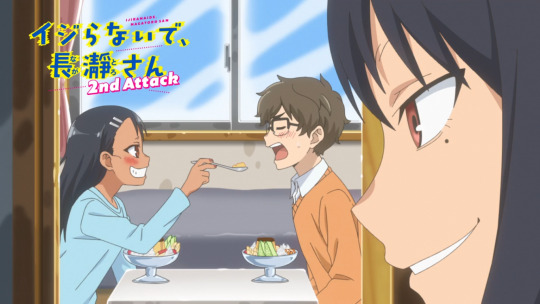
Ijiranaide, Nagatoro-san - Rant
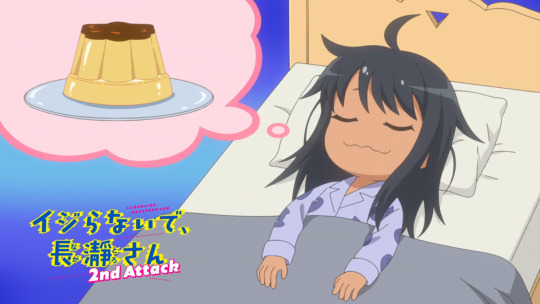
I am currently watching season 2 and I have some thoughts (about both seasons).
First of all why did I start watching this anime? Erm... So I know what the target audience is, it's people who self insert as Naoto and want to date Nagatoro. As for me? Oh, it's the other way around. I think Naoto is cute and I want to bully him. I thought maybe my female friends were similar but the only friend I have who read the manga wants to make out with Nagatoro. Sorry, I forgot lesbians exist.
Uh, anyway yeah Naoto is cute and I want to be Nagatoro. Not sure if girls like me watching this was intended since these anime are usually made for lonely dudes, lol. Anyone else feel like me though?
The scrunkly.
Okay, so, my thoughts on season 1... Lemme check the episodes to bring back my memory a little bit, as I watched that to calm down from the stress that is social work during last Winter.
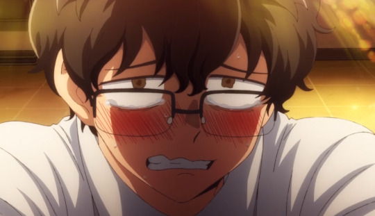
The first two episodes made me really scared to watch this series, for real. Nagatoro just straight up mentally tortured Naoto, and not in the hot way. I felt really bad for him because I know what it's like to be the shy nerd kid. Anyways at around episode 3, I think, Nagatoro starts showing her softer side more. And she hardcore crushes on Naoto.
The dynamic between Nagatoro and Naoto is really cute in my opinion, even if it is very simple. Nagatoro has her first crush because she finally found a guy that doesn't bore her to death but she doesn't know how to handle it so she bullies the fuck out of him. Naoto is pretty much the opposite? He doesn't really realize how much he likes Nagatoro sometimes and thinks he would rather not be around her. He tries to manage that by fighting her off in which classic anime romcom things happen. You know the "Holy crap you did something on accident, PERVERT!" thing, except it sometimes works really well. Maybe it's just because I think both of them are really cute, but I like when they have their little "Oh god, we both fucked up" moments.
Then there's the more obvious romance aspects and they're by far my favorite. The momens of honesty and the cute glances... Yep, they're adorable. I don't want to give away too much, sorry. Just know it's, in my opinion, the best thing in the series.
I don't care for the side characters by the way, but they can be enertaining when they point out how obviously both of our main characters are trying to "prove" that they don't like each other. They're the audience, the "just kiss already!" guys.
Also funny face cute. I like when she snaps. I like her. The cutesy. Okay no, for real, I love when Naoto and Nagatoro support or protect each other when they really need it. They can be a bitshitty towards each other sometimes but in the end they're actually kinda... healthy? Like Nagatoro is creepy but I love when the girl is a creep instad of the guy, since Naoto is actively watching out not to disturb Nagatoro. And how she will constantly accuse him of being a creep makes sense later when you realize that she's actually much worse than him, lol.
Okay let's get to season 2, since I keep using too many screencaps of that season anyway.
Oh boy, another anime studio took over with season 2 (now OLM, before it was Telecom) and it's very noticeable. The animation is stiff and sometimes just straight up doesn't move right, the art is a lot more bland, in season 1 there were a lot of beautiful warm colors and lineart, and the voice direction is very strange... That and also our main characters seem to regress a bit? Now being overly flustered over small things that they would've been fine with in season 1? I get it, they're supposed to be cute and awkward but it's the classic romcom regression...
I'm in the middle of watching season 2 and sadly the things I loved in season 1 just aren't that apparent anymore. It's still cute and I love Naoto and Nagatoro together, but I can hardly pay attention to that when Naoto is animated like Chargeman Ken.
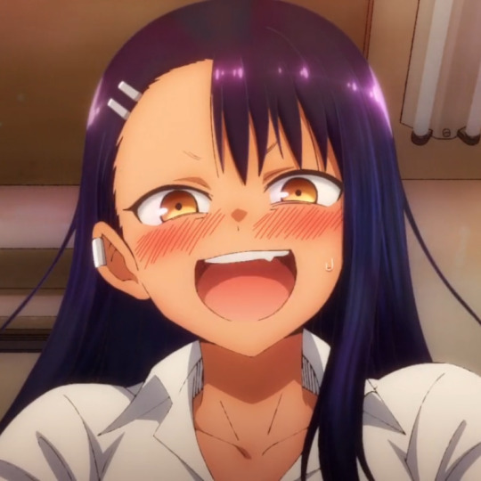
^ little appreciation for the beautiful lighting in season 1!?
Anyway, Ijiranaide, Nagatoro-san will forever be my biggest guilty-pleasure comfort anime and I'm only a little ashamed.
Love ya
#anime#otaku#rant#anime review#ijiranaide nagatoro san#nagatoro#don't toy with me miss nagatoro#naoto hachioji#hayase nagatoro#anime rant#weeb#romcom#comedy anime#romance anime
33 notes
·
View notes
Note
for the artist askgame, idk how many youve answered already but 3,4,10,12,21,24 and 35!
hello helloo!! sorry im just answering this now, been pretty busy^^ (also, using this chance to thank u for your support!! i always see u interacting with my stuff here hbasfcyhdb you're a sweetheart😭💕)
Your fav piece/s?
Probably this vergil one! i still love how it looks djddgnds my art peaked here im afraid,,,,,
Piece you wish got more love?
hmm, this is an interesting one!! tbh i dont mind it much but this johnny fanart got waaaaay more attention on instagram!! i mean,,, i have a lot of mk moots there so it makes sense lol (and also just got to 1k followers on IG!! crazy stuff💌)
How do you deal with artblock?
to be honest, once i realize i have artblock i stop drawing for a couple of days. if i keep insisting on drawing i just get more and more frustrated and it makes it worse imo. so i like to spend some time doing my other hobbies!!! (´▽`)
usually i just come back to drawing once i regain motivation or i get a cool idea that i need to sketch so i wont forget. and when that happens, my artblock is usually gone!! so,, i guess i just wait for it to go away? lol not much advice i can give on that sadly :/
Describe your process while drawing!
CHAOTIC. to say the least.
i spend like. half an hour on pinterest beforehand getting inspo & searching for refs and ONLY THEN i can start drawing. i start on SAI1, do the sketch and if i like how it looks, i just clean it up. if it dont, i do 'proper' lineart. after that i start coloring and shading!! this is my fav part tbh. once im done shading i color the lineart so its not completely black. then i open up SAI2 and start doing more rendering, adding overlays & effects. that part is also SO FUN cause it makes everything come together so nicelyy. my art process is a pretty big 'trust the process' till that part lol.
there's ALWAYS music or yt videos playing in the bg, and me taking A LOT of 15 minutes breaks cause that one song is so good and i have to stop drawing and start singing while looking at the spotify lyrics like im hypnotized LMAO
What do you thin you artstyle woukd taste like?
people always say my art looks so tasty and. i kind of agree!! like. smth very sweet. it really depends on the colors i use on the piece but,,, either hard candy, gummies, marshmallows or even syrup i think!!!
What's a compliment about your art that has always stuck with you?
i get super giddy with every compliment i get so i dont think i can remember one in particular??? but istg people always say the funniest, most sweet things ever and it's so nice to hear :3 but if i had to say smth,,, i once had the chance to talk with this one incredibly talented illustrator, and he kept telling me how he thought my stuff looked amazing. and i was like!!! wow!!! you actually like my stuff?? what!!!!
Piece of advice for my younger artist self
i would sit this little girl down and talk to her for hours tbh poor thing was STRUGGLING 😭😭😭
i guess my best advice for her (and for anyone who reads this, too!) is to not be so hard on yourself. art is a skill, and it takes a lot of time to build it up!!!
i used to get SO extremely upset when my stuff didnt look the way i wanted it to and ughhh. took me literal years to find my artstyle too and that didn´t help AT ALL with how frustrated i was feeling. i felt,,, stuck??
but now i look back at my art journey and. wow have i improved!! maybe if that little girl saw the stuff i do today she wouldn´t be so sad about her art :´] not to say i don´t struggle today, i still feel stuck and frustrated often!! but i guess i learned to be kinder to myself. but i still have lots of things to improve about my art!! i wonder when i´ll take another look back and see how much i´ve progressed since today,,,
thank you for the ask!! (´▽`ʃ♡ƪ)
2 notes
·
View notes
Text
Tagged by: @thevoiceofthanatos
Favorite color: warm bright yellow, mustard yellow & old gold, and just yellow in general. its a good colour. it makes me happy
Currently reading: idk, probably star trek fanfic my friend @rubbertplant was writing to give my opinion on it. i often read through my own stuff too lol, like whoah i wrote that??? ADHD has taken everything from me including my capability to read though, for real. ive been thinking of trying to listen to some audiobooks recently though, this cannot continue... its just that i also have no ears disease so idk how well that would go. determined to try though
Last song you listened to: havent been listening to music so much bc ive been playing videos instead but my last.fm has all my spotify listens so itll stay up to date on whatever i listened to last. currently seems to be “please play-bite” by pinocchioP. i often just let spotify play me whatever it recommends anyhow so theres variance. and i only started this account like a few months ago max so its not really a full picture of my music-listening
Last movie (in theaters): its not really a movie, but if it counts, the first ginga nagareboshi gin stageplay (recorded and released in finland in theaters with subs)

ginga was always huge in finland for some reason. idk. the anime is so violent though that i got really afraid of bears for some reason. theres so much blood... i never read the manga either i just knew of the anime and partook in my share of wolf roleplays (dogs were uncool! so i didnt do dog roleplays. iirc that really was my reason).
heres some funny wolves from my wolf rp days
2010. one of the first things i coloured digitally... i painstakingly cleaned the scanned pencil lineart with a mouse
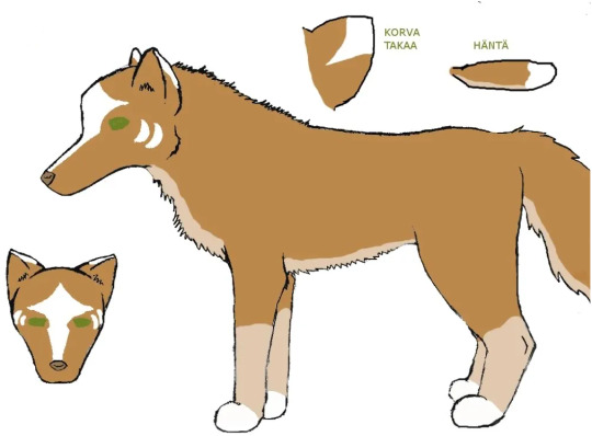
2011. i had gotten my first drawing tablet as a birthday/xmas gift and practiced a ton around this time (more than just wolves lol)
Last series I watched: trigun stampede. even changed my phone bg into vash... but millions knives is probably my favourite. he just does everything wrong and makes his life worse. and everyone elses life too bc he sucks. but hes multifaceted so hes also my meow meow and whatever. i hope a ford explorer drives over him

if it counts though, ive seen some star trek TOS episodes and movies because my friends have been watching them. im not super into it but its always fun to hang. i also dont watch a lot of stuff. i dont even know what i do. guy who doesnt read or watch things but listens to jerma videos on youtube without actually looking at them while i “draw” and “write”
Craving: food honestly. i should cook something lmfao. i also want soda so bad but i dont have any. id make some tea but its disgustingly warm in my house so i only want cool drinks. could kill for a nice milkshake or a smoothie rn i think
Tea or coffee: tea... im the only finnish person who doesnt drink coffee for real. also got really into loose leaf tea bc i befriended a chinese lady who is really into tea and has a tea shop in the city near where i live
Currently working on: drawing this and trying to think how i want to do it. somehow want to incorporate flat colours and maybe shade his body naturally, and make the blood look realistic instead of flat colours... hmm not sure yet what i want to do

other than that im trying to proofread the chapter of my ryanyuri fanfic i already published because theres a lot of typos and strange sentences in there but its been a chore bc my body breaks down when it gets too warm smfh... not looking forward to when my apt goes over 30 degrees celsius it is unlivable. im also trying to complete a “lookbook” of my tnb sims. but i always start huge projects that take three million years to complete and im really slow lmfao
Tag people you’d like to get to know better: i could just ask these questions from everyone i talk on discord with. fuck my friends i know irl or otherwise, only asking people who r my friends through tumblr. no need to do this though. also this isnt probably meant to be answered so long-windedly... thats just me. i cant answer with one word i gotta write an essay. heres three tags though @basslinegrave @vita-divata
(record scratch before 3rd tag) and @rubbertplant bc they were streaming a game in discord when i started typing this and i was like hey wanna do it and they were like yeah
i expect replies on my desk by 5pm TOMORROW!!!!get to work!!!! no i jest, do it or dont, i dont mind either way, just if you feel like doing this. if you see this and want to do it feel free to consider yourself tagged. godspeed
5 notes
·
View notes
Text
DAY STARTING OFF STRONG….!
—okay I saw some super cute comic from diff fandom and it really got me fired up. I wanted to draw comics of MY otp. 🥺🥺🥺 and I thought going for a more simplistic style would help with my high expectations of likensss that I can’t meet right now 😭😭😭 and so I got to sketching!!!!

—had some kind of idea and it was a very simple one and I just went….to do it. it did seem very ambitious too (with lol a big panel of holding…..hands…….)with the FOCUS but ehhhh just yesterday I was practicing hands I would be fine. they thought<3 lolllll
—I had thoughts of changing the comic to be different but I was like nahhh this is simple let’s stick with it! just go for it! I didn’t want to over complicate stuff or anything
—and so I got to overlarging the sketch and making it big so it can be the size I want it to be… and so I got to drawing over it and that’s when I immediately hit a block….
—the thing was the first rough sketch I did was so much cuter and better…. I feel like when I tried to draw over it….i tried to more capture likeness and then it just didn’t turn out as cute or as good as the rough sketch… so obviously I had to redo that. I did try to fix it at first (seeing the diff:larger eyes extra but ehhhhh it didn’t work) so I just went to redoing it. And ah!!! this attempt was def better!!!!


—also ha………drawing bust shots are Hard……….so I tried to (during first redraw over rough sketch) to also include in bits of torso etc to see how things would look like. I remembered this video I watched that said it’s best to draw things that aren’t in the shot so you can know where things are or smth. my quoting isn’t the best. anyways! it def helped…. also initially wasn’t even gonna include the bit I drew to help imagine the rest so I can draw bust shot… but I ended up including… I think it was good to hand in bits of the arm… also I remembered that they’re were supposed to be holding hands so I had made sure to make the hand their moving to hold hands looked like that
—I don’t even wanna talk about ssk’s hair it was so fcking annoying. clothes…….im so glad that ssk’s clothes is very simple in this era… lol… just a cape…. and I tried to remember to add in wrinkle since hand was moving…. sskkr clothes were simple too…. I’ve gotten used to it while drawing a lot of Srda who wears similar to her mom 💗
—I went straight to lining it… I didn’t even redraw over the hands… was impatient lol and just wanted to get to lining the characters…. and so I went! and did! and lol it’s obvs I started to loose the patience lmaoo. I didn’t take that much care when it came to skkr hair and roughly lined it like I was sketching. I didn’t mind. it looked okay.
—also crazy that I just went into lining the hands like that. my rough sketch of the hands was super rough sketch too lmaooo but somehow…?! it turned out well….?! this is the one im almost surprised at. I thought it’d turn out way worse. I mean yeahhhhh skk’s fingers over hers make no sense but skkr’s turned out better than I’d hope for…..im really proud of them…. so djjdjdjd I just didn’t want to cover up with ugly skk fingers so I made his fingers still continue to not make sense 💗
—finished the line art and honestly at this point…..I wasn’t feeling great about the art………….. which made me feel sad…. anyways I thought to add colour??

—and my GOSH do I need so much practice with color like wtf….picking the right color can be so hard wtf………it was turning out worse and I didn’t likeeee ittt. one bitttt. but I decided to just continue and go to ssk and do his hair and THIS WHERR THINGS CHANGED!!!!!


—like okay I was thinking what color for his hair…..since I did the line art dark purple….black made no sense. I usually just scribble in lines for darkness so I just decided to do the purple line art color for the hair and WHEN I LOWERED THE OPACITY A LITTLE… SO I CAN BETTER SEE THE LINEART SO I CAN COLOUR IN MORE ACCURATELY… TAHTS WHN THE MAGIC BEGANZZZZ

—-I realized I can do this in MONOCOLOUR!!!!!!!!! omg I forgot that so much and by gosh, was I so happy by this discovery!!!!!!!!!’ ahhhhhh I love monocolor so muchhhhh. my fav shit. it turned this into super fun drawing. I had much fun in trying to decide the diff opacities/values of diff stuff and really —when I was doing his cape for the hand…..that’s where the magic really flourished…. ah it made this drawing a very happy one for me… <3333
—it did still a lil empty so here I was just adjusting and trying to figure what to add and how to not make it too much and now looking back this version is totally fine……ahhhhh…..I kinda wish I kept the hearts. I did like how I scribbled it in…..they looked fun….oh well.

—also seriously lol I gotta stop posting stuff as soon as I finish it…. There should be something about looking at stuff with fresh eyes but also man…. I’m just pretty lazy abt that lol.

—RIDING THIS HIGH!!!! I WANTED TO DO ANOTHER SS PIECE!!!! THIS TIME MORE LOOKING LIKE THEN!!!!! I had this pose/idea in mind and just went straight to sketching the idea and very happy with it…. it feels so nice too to just have an idea for pose and get to sketching it and be able to doing it ahhhhhh. also felt very nice when I roughly sketched it in and cleaned it up a lil like the face and stuff… properly adding in some features n stuff. also hmmmm i probs should do something with ssk’s other arm….

—also lmao I really have neglected the feet too much. I need to do something about learning them but also ahhhh I really don’t want to. also did have some struggle with trying to find out if they were sitting or what they were lying on… or kneeling or whatever. floor or actual sofa/chair…. I need to better visualize stuff like that… also I think for me, ss in side view I think im the best in… also man I really need to work on her hair a lot.

—anyways as I was doing this I had started to get a better image of like a story so I kinda wanted to turn this into a comic and while I was drawing the hair that kinda turned into a redraw of face too… I ended up trying to draw the comic bit that I wanted to include and ha………..this where things started to fall apart….. 😭😭😭😭 my problem of deawing ss faces came back to me 😔😔😔

—and ahhh seriously I don’t know what it is. I thought maybe the nose…? So I tried different way but nope. it’s not that. it got me so frustrated n sad I just stopped the wip there. I was already planning to pause anyways since I was getting tired… and plus trying to think of clothes was also too exhausting but sad to have to pause the wip in that moment…
(now looking back at this as I am uploading the images on to here… I think it might be the mouth of her face that’s the problem…..? also lol noticed problems with her side profile face too it looks a bit off but eh well I can always fix that later)
—-ahhhb seriously I need to do ss face sketches…. I looked at the manga to see what it is that im just getting so wrong that feels so frustrated…. and I think maybe the eyes…? is a big one…? and maybe nose???? anyways I just really need to practice!!!! but forgetting that part. today start was very good!!!! im pleasantly surprised!!!!
—I want to go back to the comic sketch that I drafted yesterday…. and also I want to do lots of figure pracs so I don’t go out of practice…. yeah….! and more hand studies… feet I can’t be asked to do. BDJFJKFKD. im just not interested into doing it and don’t care to right now even though I probs should be….. 5.56
6.00 I kinda just wanna do the ss face prac right now but also I really am too tired for more art stuff… Rn…. I just wanna take break….
#art journey#13th jan#wow can’t believe it’s already 13th#time flies….#Also lol yeah I didn’t end up doing anything later. I couldn’t be bothered too my art energy levels were just Low#so I didn’t even do the usual day figure pracs but whatever I guess.#idk when I’ll be back to work on this food ss wip… thinking of the clothes in side profile is gonna be a painnn#but maybe I can just observe how it looks in side view….? when im not working on it#also did have some urges to do some juv face arts but ehhhhh I couldn’t be bothered#I do want to perhaps tmmr draw for that new series I read the other day and fell for I want to draw drawing them……#also man I really need to prac some faces#and continue prac hands…#and obvs general figure prac so im not out of focus#cuz lol I did none of that today. The pose I drew for the food ss wip was just from imagination too….#I hope I don’t get out of prac#btw I did watch some art videos on pelvis and stuff#so that’s good#strengthen my knowledge….#also ahhhh I really want to work on that Taka idea#also I think maybe it’s time for me to proper draw that skkr shirt idea….?#I did do a fix redraw for the pose… I can just actually draw it now….#hmmmm maybe I should do a prep for that now… (23.43)
1 note
·
View note
Note
okay so this is going to sound a little weird but whenever you do a comparison/redraw of your art tge new piece always feel so much more alive and mature! in particular the ranboo pride pieces come to mind where despite being drawn a year apart they have two completely different feels! the tubbo comparison you made a while back with your profile pic and your old tubbo drawing had the same vibes! the new pieces feel like your drawing an actual person if that makes any sense. like whether it’s the colors or the composition older pieces just feel stagnant, like you are just making a drawing but new pieces feel like you’re creating a world/person/scene/they just have so much character and i can’t quite put it into words lol :p anyways! sorry about my mini ramble that probably made no sense and have a nice day <3
this is so sweet thank u!! i understand what you mean :) i think a lot of it is my use of undertones in shading that really brings a figure to life. back then i was still kind of just coloring in the lines, whereas now by doing lineart last, i can force myself to sculpt out the facial structures or clothing bulk using my colors, and THEN use the lineart to put visual priority on specific spots.
so for example:


here's two eret artworks! the left one was done june last year, and the right one was done around halloween when she poster her halloween costume pics :)
you can see how much heavier and intrusive the lineart is on the left, combined with a worse understanding of anatomy, and flatter colors (though that metfell technique is peeking in), the left does not feel as alive or..... advanced, i guess? as the right, which has clear evidence of looking at anatomy references, studying how corsets work, looking at how leather reflects light, and using undertones and multiple different colors in shadows and highlights to really bring that whimsical feeling to life that i think so much of my art has.
another example is this:

the left piece again- aside from being horrifically anatomically incorrect and a completely wrong body type in my opinion for c!wilbur- looks like i used only one brown to color the main body of the coat. which i did! a lot of my improvement as a traditional artist has come from expanding the amount of colors i have to work with. instead of using only 75 total marks i have around 200-300 markers. and in particular i focused on buying as many different skin tone options as i could find. and i think that's evident in the right wilbur art, which has many rich warm browns making up both his coat and his hair/tail. and again, i referenced my poses for the pride art series this year, and did not do that last year. so they absolutely feel more human! because im referencing humans!
sorry this got long i love talking about my art its so fun
24 notes
·
View notes
Note
I first notice the Texture of your art. From the lineart to the colors/shading, your art has a distinguishable texture, and I love it. It has the consistency of frosting to me, and idk how to explain why. But another feature is that a lot of the time, especially with your IZ art, the characters are posed in a way where they have clear and readable silhouettes.
Idk you rag on your art skills a lot, but I find that you have a good understanding of many different elements of art and design. Your art is charming, and I think you have a lot to be proud of
Awwwaaa 🥺💕💖💕💖 😭
Beps you're so sweet.
I've been trying not to barate my art how it is now. But I feel a lot of my stuff around 2016 was so much better. When I was starting to get back into art. I could make things in my head how I imagined them.
I think it just feels that way to me just cause my attention span and patience for my art has gotten worse over the years.
It's rare I'll make a fully colored or rendered peice on anything. Art fight was a crazy acception and I'm glad I participated.
However, I do think my linework is way more confident and a lot cleaner than seven years ago.
I didn't even know my art had a texture before today. Lol. I appreciate it and I'm glad you like my charming style 💕
6 notes
·
View notes
Note
how do you render your art? i swear whenever i try to do it each extra step just makes it look WORSE
I slap overlay and lumi/shade and multiply layers on EVERYTHING lol it really helps bring out the colors or unify them a bit more so everything looks brighter and warmer (bc I usually tend to go for warmer colors). I've also gotten into the habit of coloring my lineart lately and that really makes a difference! Just experiment with it, sometimes less is more so you don't even have to take the extra step with shading or highlights and you can just apply color effects instead.
49 notes
·
View notes