#the art took me way less time than compositing a screenshot for the right part of the room. originally i was gonna give him a table too
Explore tagged Tumblr posts
Text
[image description: screenshot of a quote retweet. the original says "reviewbrah with his hair down" and has three pictures of reviewbrah, an androgynous white guy with light blue eyes and side-parted brown hair that goes almost to his jaw, wearing a floral top over a button-up and tie.
the quote retweet says "persona 2 innocent sin npc called shit like The Demon Taster who resides in the velvet room". end ID]
oh yeah there he is right next to igor in my psp copy. huh. i don't remember this

(teehee jkjk sprites under the cut and image descriptions in alt text)


The demon taster is still making me laugh
#idk who this guy is and i don't actually wanna know more than i learned in the 20 seconds i spent on knowyourmeme to figure out dialogue#but the tweet inspired me and it's been a long time since i've done any kind of persona 2 shitposting even tho it's my favorite one#so...woe! shitpost be upon ye!#persona#draws#the art took me way less time than compositing a screenshot for the right part of the room. originally i was gonna give him a table too#but i couldn't get enough space to add it in a way that made sense so. meh.#anyway i committed to the fucking bit! the portrait Should only be in 256 colors (though csp is sometimes kinda weird abt color encoding)#and the overworld sprite should be 16 or less (again assuming csp was kind to me and didn't enfucken my palette lol)
2K notes
·
View notes
Text
2019 Mega Drive Explorations [1]
It takes me a long time to do some things and I’ve finally gathered up a bunch of Sega Mega Drive / Genesis titles that I’ve been meaning to play, hopefully through their entirety, or replay and take as many screenshots as I can. These aren’t going to look like most other screenshots you’ll see online, though; I’ve been using an NTSC filter because I believe it’s the visual format in which these games look best. So, let’s take a stroll through the material so far.
Super Hydlide (1989)
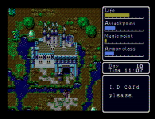
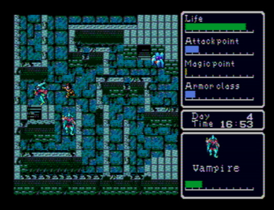
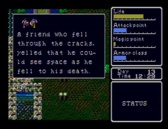
This is one of the best “old style” action-RPGs I’ve played. I’ve gone in with barely any prior knowledge, and I think that’s how to best experience it. Spoiling yourself on the extent and workings of its mechanical systems would, I think, turn it into nothing more than leveling up and finding the next place to go. The range of overworld which you’re initially able to explore is fairly restricted, and, as the action-RPG designation suggests, there are no randomized battles. Because of details like your need of food and sleep, or the encumbrance limit, though, it’s a deep relief to return to a town after some exploration in a way that reminds one why this trope of wilderness vs. domesticity caught on. You might just find yourself exhaling when your enter an inn. In another game, your character’s attack would likely be assigned a hitbox straight ahead of the sprite, but Super Hydlide locally assigns it to your right arm/hand, and it’s a welcome quirk in a game with super basic combat. There is no in-game map (or, if there is, I haven’t found it yet), and so -- as with Simon’s Quest -- I’ve been drawing my own on a sheet of gridded paper.
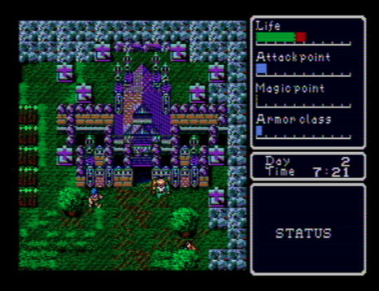
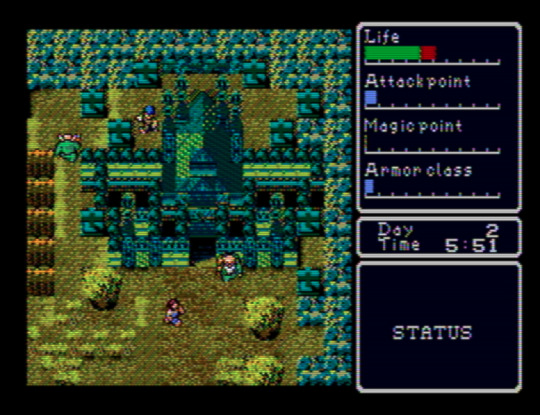
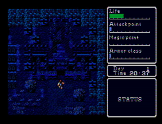
Above: the same screen at different times of day.
I hope that this blog’s emphases and its audience make the claim that I think Super Hydlide looks amazing at least appreciable. Everything has just enough detail to render the object, being, or space as categorically legible while retaining ambiguities, and there’s a variety where you might not expect it, like the grass around the building above, that gives each screen a kind of visual grain that an ornate and time-worn carpet might have. Complementing this is a soundtrack that seems unaware of the console’s audio capabilities in a way that another contemporary Mega Drive release, like Sword of Vermilion, certainly was not. That’s fine, though; the sound’s smallness, with those lite approximations of exclamatory synth brasses and the percussion’s dusty, dinky punches, enhances the cute visual aesthetics: people, monsters, and buildings you could hold in a pair of cupped hands. Especially remarkable is the overworld theme, “Chaos Separator” -- almost three minutes long, a duration that was basically unheard of at the time.
Atomic Runner Chelnov (1992)
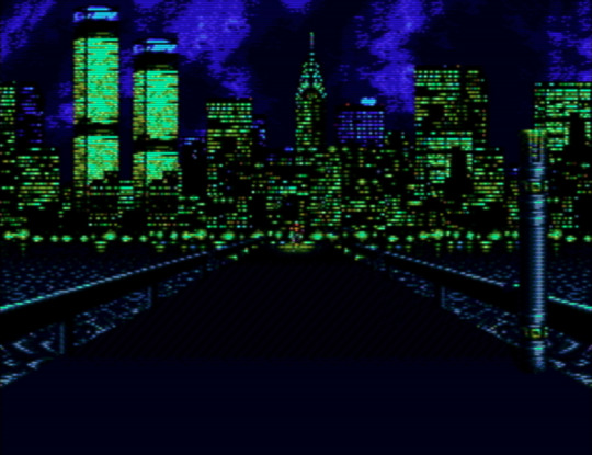
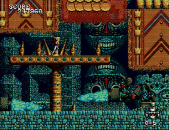
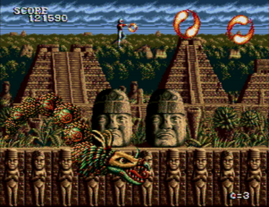
Chelnov has me torn between wanting to share either as many screenshots of it as I can or as little. It’s so stunning to behold that exposing anyone who hasn’t played it to its sights seems like a disservice. It’s in extreme contrast to the game’s original arcade version, too, which may as well be a different game. Every stage is a stream of layered ornaments, and continuing to play to see more of this is motivation alone. At first I thought the graphic theme was one of a general “exoticism”, with ziggurats settled above lava giving way to stepped Mayan pyramids, but then the penultimate stage threw architecture designed by Antoni Gaudí my way, making me wonder if the theme is more broadly “eclectic” -- choosing certain settings and motifs for their dazzling power alone. This is one of those run ‘n’ gunners where your character will keep running unless you stop them -- but you soon have to start running again anyway, since the screen keeps moving right and only stops for bosses. It took me playing through half of the game to figure out how to turn around. Please, if you want to give Chelnov a look: consult a controls FAQ.
El Viento (1991)
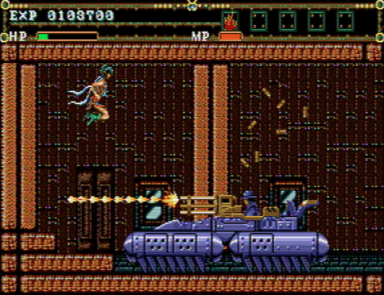
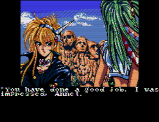
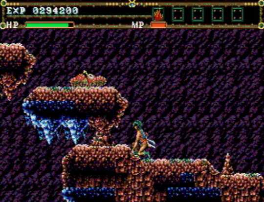
If you’re looking for level design that’s a mixture of the mundane and the out-of-control, El Viento might be for you. One moment you’re walking through an open sewer channel, exploding the occasional fish; the next, you’re navigating a bundle of platforms that feel way too closely packed together for your character’s sprite size as you attempt to outrun a never-ending flood of rats that move at speeds never before recorded. One moment you’re going through an apartment’s door into an empty interior; the next, a tank bursts through the opposite wall and just starts hammering you with missiles and bullets, giving you only five feet of space to work with. It’s the second in a trilogy of games, which includes Earnest Evans, a game perhaps most notable for all of its footage making it appear that the players are incompetent on purpose, but which in fact plays more or less the same no matter how good you are. Grave sacrifices were made so that the titular character could be a composite sprite. El Viento’s level design hews closely to Earnest Evans’, with the important difference that its protagonist, Annet Myer, is controllable.
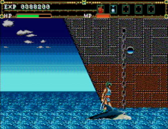
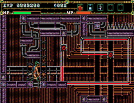
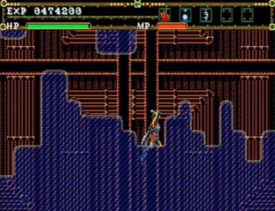
Even with its problems, El Viento is charming. It’s nice to play a videogame with a female protagonist who’s not creeped on by the artist(s) (perhaps we can, in part, thank technical limitations for this). The palettes and style of pixel art bear an uncanny resemblance to Master of Darkness, released for the Game Gear and Master System, and give each stage a distinct, almost dirty granularity. For me, El Viento gets especially interesting around the fourth stage, a ship’s engine room (or... factory?) that’s preceded by a short segment that has you crossing water on top of a cartoon-eyed dolphin. The level design transitions to looking like a network from Metroid Fusion -- a knotty maze with small destructible points that cause chain reactions, oddly small platforms, moments where you’re not sure what’s interactive and what’s not, and low ceilings underlined by spike-beds that necessitate you make use of a crouch-dash mechanic that feels like it shouldn’t work the way it does. It’s a hardly perfect yet precious occurrence of extinct, or endangered, level design, and the developers apparently had a confidence in letting it, as it were, speak for itself, because there’s not a single enemy to defeat throughout.
Jewel Master (1991)
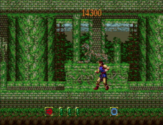
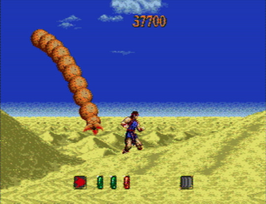
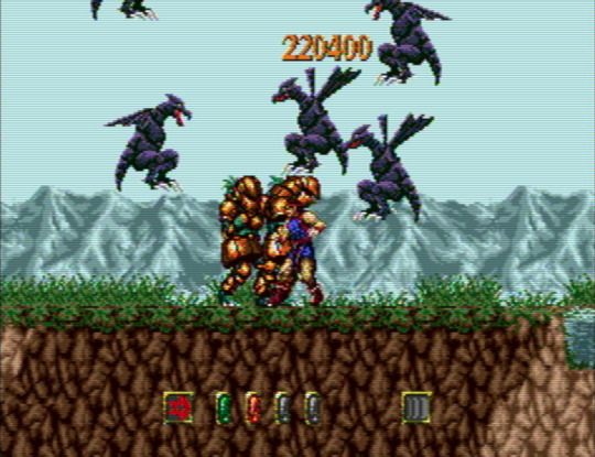
Wanting to hear Motoaki Takenouchi’s incredible score, one of the Mega Drive’s best, in its intended context was almost totally my incentive to play Jewel Master. It’s a fine, somewhat haphazardly designed action game; not bad, not memorable, but for the music. You acquire different rings, some optional, as you go from stage to stage, and can assign them to a total of four active slots on an equipment menu. Different combinations will lead to different effects -- or you might want to leave a ring on one hand on its own. It’s a neat idea in the abstract. In practice, you’ll often be better off sticking to one set-up per stage until a boss demands a switch. The level design is pretty uninspired, and it increasingly makes artificial attempts at challenging the player by burying you under swarms of suddenly-appearing monsters. When this happens, you just have to hope that you can make it out alive. There’s not a whole lot to look at, either: the stages’ environmental peculiarities and palettes are minimal to an extreme, although I do love that the protagonist’s sprite seems to take a cue from Rastan’s by only moving his legs when he walks.
Gynoug (1991)
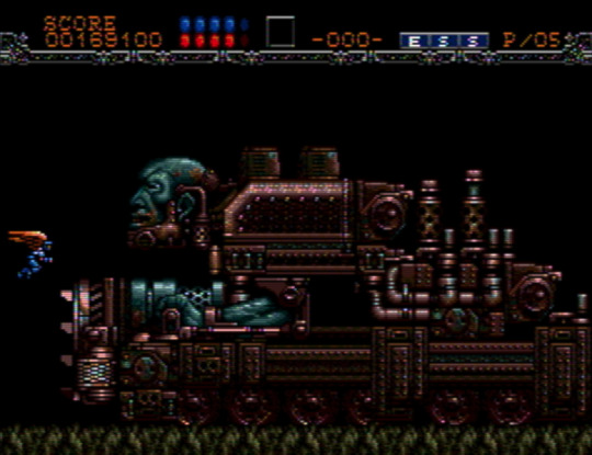
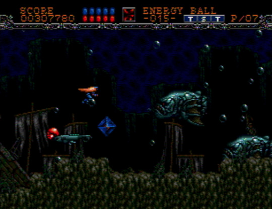
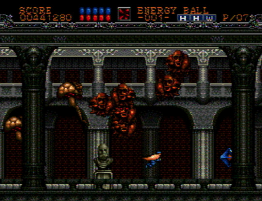
My experience with, and interest in, shumps, is next to nonexistent, so I don’t have a ton to say about Gynoug. Why’d I bother? Well, because of the weird and grotesque enemy and boss sprites, which combine the mechanical, exoskeletal, and visceral. The first miniboss is like a floating snapping turtle... except without legs, and a head that’s a toothed skull. Later, in stage two, you’re confronted by the bow and head of a ship that reveals itself to be the hat atop a colossal, wrinkled face. Maybe it was expecting too much to hope that the settings would match the bestiary’s inventiveness, but only stage three and four wowed me. If it’s not a game I’m going to be returning to any time soon, it was worth going through once.
That’s all for now. Other titles I’ve been exploring and will write about at some point include Alisia Dragoon, Cadash, Chakan: The Forever Man, Elemental Master, Light Crusader, Mazin Saga: Mutant Fighter, Mystic Defender, Shining Force 2, Splatterhouse 2 and 3, Two Crude Dudes, and Ys III.
14 notes
·
View notes
Text
RWBY - Volume 6, Chapter 9 Production Analysis
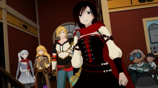
Previous Volume 6 Production Analysis Posts:
Chapters one, two, three, four, five, six, seven & eight
With the holiday break behind the CRWBY and the show’s fan base, it is easier to look back at how things have been steadily maintained in volume 6, minus a couple of small bumps in production and presentation. So let us now see what chapter 9 provides.
Since the first scene centers with the two characters that originally were seen to help make Cinder look more intimidating, Emerald and Mercury, this is a convenient time to highlight some notes from the February, 2018 CRWBY Ask Me Anything event over on the RWBY sub-reddit. A few things were hinted at as to what they planned on covering in volume 6′s narrative, some of which have more or less already been shown prior to this episode. Director and co-writer, Kerry Shawcross answered that beyond Jaune being at the younger end, we would find out more about where he places compared to his sisters. He also addressed the matter of having to push a character out of volume 5 and reserve him/her for volume 6 which may have been likely Maria Calavera. He even casually mentioned Salem’s backstory as being the one to look most forward to in the future. Then there’s the matter of why Mercury decided to work for Cinder, to which Kerry vaguely replied that it’s “not simple”. There were other questions answered that directly tie to this chapter, but for now, there’s one more thing regarding Mercury’s character that was touched on by Gen:Lock director, Gray Haddock, along with Miles Luna and Kerry via the volume 3 directors audio commentary:
Miles: "More uh, more subtle hints at family life! Apparently Mercury's Dad smells like Qrow after a long day."
Kerry: "Yeah."
Miles: "Daaark co-me-dy!"
Kerry: "Yeah uh, we're not gonna get into it right now probably. But uh, yeah, Mercury's had a life."
Miles: "Yeah, we didn't get as far into Mercury's backstory as we were going to mainly because we were like, "why reveal all that right now", and uh, looking forward to more of that."
Gray: "But a lot of fans are already starting to clue in the real differences between him and Em and uh, which one you might actually be more sympathetic in the end despite kinda how you thought that dynamic was work going to work out after volume 2".
This insight is basically to further reinforce that despite Monty Oum not being around anymore, there was always a forward momentum with what to tell with many characters and aspects the show and Mercury was among them. There was another answer from that AMA that plays into this episode specifically, but let’s save that for later in this analysis. For now, let’s shift focus into the set design, which is nothing short of breathtaking. There were no mentions from anyone in the art department via Twitter about the set, but there were a few notes from a screenshot of the artwork shown during the ending credit (courtesy of Changyuraptor). One to the far left says, “windows on opposite side filled in w/ stone”, while three on the bottom say, “book wall”, “ignore floor texture”, and “use texture from the old circular training room but as square tile.” The last three notes can’t be fully seen from the above picture (at least not without adding the end credits text being there), but let’s examine what these mean. With the last note, by “old circular training room”, this is probably referring to the one in chapter 11 of volume 4 which was likely used as a reference while at the same time straying away from the design to make it be more of Emerald and Mercury’s scene. The added tatami mat designs were probably also there to further indicate that the setting was more of a sparring room compared to the one Cinder was in.
However, the one note that was especially intriguing was the one about windows on the opposite end being filled in with stone. This was a deliberate choice to make the lighting from the stained windows be one-sided and I believe the reason has to do with providing visual subtext to the story behind the scene. Both Emerald and Mercury deeply wanted something before meeting Cinder for different reasons and while both take the fact Cinder is not around to guide them very differently, they do feel currently muddled and express that in their own ways. One could even interpret the lighting through stained glass can serve as a Christian metaphor for wanting to seek salvation and the shot composition supports this. In one shot, Emerald sulks in the light, explicitly stating she doesn’t know what to do next while Mercury actively trains right outside of it, as if he’s fine. Then cut towards the end of the scene and both of them are seen in the light after talking with Tyrian. Speaking of which, both he and Watts are first shown from utter darkness and the former playfully goes right back in. It’s also worth adding that the colors of the stained glass themselves are the same as Salem’s palace, helping further indicate that despite wanting better, both won’t easily find it through Salem.
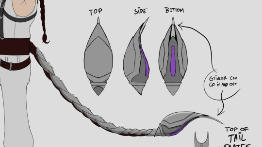
I’ve gone on record on how much the cinematography has been utterly incredible this volume, which is saying a lot considering how previous volumes had already been praised. There have been excellent uses of staging and framing through objects like windows, doors, and stair banisters, as well as the usage of height to display conflict and power struggle. But rarely has lighting played a key factor in volume 6, so to see it done so effectively here makes a great way to mix things up. Of course, the animation helps compliment things which I suspect Hannah Novotny may have done the first half before Tyrian arrived. The the types of facial expressions being emoted by Emerald and Mercury are a bit of a giveaway, what with the snarl-like mouth movements and shrunken pupils to help sell the tension between them. Finally, there’s Tyrian’s new tail which had a few notes, including the stinger having a retracting ability.
With that out of the way, next is the Argus scene which the work-in-progress version emitted a bit of controversy a few weeks prior. The matter had already been addressed in detail through a previous post, so not much more will be touched on here. But to put simply, the one shot of this scene simply did not go yet through the compositing and final rendering stage where lighting, effects, and characters could be properly layered to avoid the phasing through aspect. The animation was already done if you compare the shots in the video side-by-side.
What’s much less controversial to talk about and more intriguing is the Argus setting in general. To say a great quantity of thought was put into this setting would be an understatement and in the eighth episode of CRWBY - Behind the Episode, a lot of insight is shared with screencaps provided once again from Changyuraptor. First, there’s the matter of it being a combination of San Francisco in terms of the landscape and trolleys (which most fans recognized) and Greco-Roman architecture. Second, there some notes about the structure of buildings for both residential homes and shops in order to distinguish them from each other, right down to the latter having “flatter fronts” than the former. There were also designs and notes about the plants and trees and lamp posts which altogether, just make for a very pleasing-looking setting that no doubt took a lot of time, planning, and crafting to make. The scenes in this episode especially help sell the bustling, yet peaceful and vibrant feel. RWBY has done nighttime city settings, most of which were in Beacon during the earlier volumes. But the differences are just night and day (pun not intended) and while it’s definitely a coincidence, as a fan of the Tales Japanese role-playing games series, I got strong Flanoir vibes from Tales of Symphonia.
youtube
The next scene to follow is of course the one fans could not help but get deeply emotional over. Though to sidestep from talking about how gut-punching the scene was for a moment, let’s break down certain aspects of it. Based on how her design the concept art for the courtyard matches that of concept designs by Ein Lee, I imagine that the statue was based on Pyrrha’s exact model in volumes 1-3 which would be rather fitting. Moving on to the character animation, there were very strong moments on Jaune’s part. The way his shoulders lowered as his clothing and hair were briefly blown by the wind to express shock and bewilderment when he first saw the statue and how in another shot, he wanted to say something but hesitated to and attempted to pardon himself as if he didn’t deserve to say anything all concisely present how he felt without a word being uttered. There was also a cute and endearing moment of him gently rubbing the red cloth besides him as he talked to the red-haired woman. Even his expression when he learned the woman already knew who he was only made his guilt seem more explicit which followed with him initially puzzled by what the woman meant by Pyrrha already standing there.
As stated, the character acting told so much and maintained great nuance, which is why I was especially surprised to find out that at least part of the scene may have not been animated by Asha Bishi, but rather by Alyssa Lisiecki. I’ve gone on record on how much the former’s character animation can feel snappy yet abundant and lively. So I really did believe at first it was Asha was the one who animated the sequence between Jaune and the Red-haired woman. But this isn’t the first time I’ve been tripped over between a sequence either her or Alyssa animated. In chapter 6, Alyssa confirmed to have animated, “Qrow being angsty”, which I responded through the production analysis for that episode by expressing uncertainty that she did the part where Qrow stormed back inside the house to drink and thought that was Asha instead. This was honestly due to not having a clear grasp on how Alyssa animates in general. While it’s still a bit unclear how she animates, it’s possible she conveys similar approaches in character movement that Asha does. Then again, it’s also possible that be it between the both of them or whoever else animated the courtyard scene, they were asked by Kerry to make the animation feel seamless. It wouldn’t be the first time that would happen as a noteworthy example of this was Jaune and Pyrrha’s scene at the Beacon Academy courtyard as mentioned again in the volume 3 blu-ray directors audio commentary:
Kerry: “This was a tough scene, this was uh, again, just the new style of animation, some of the rig challenges that we had this year just with having so many different characters built at so many different times. All of our new rigs are great! Some of the older ones are starting to show their age a bit.
Uh, this is the first scene that four different animators animated this scene. Kim (Newman), Paula (Decanini), Melanie (Stern) and Millie (Gonzalez), I believe, and ya can’t tell! I don’t think there’s a single scene where you can actually see the shift and I thought they did a phenomenal job working with each other and uh...
Koen Wooten (lead producer): “A lot of that, ya know, some of that goes to the leads as well. The animators did an amazing job, I don’t want to take away from that. But the leads also, they go around with you Kerry and they look at every single shot to give your opinions and everything else. there’s a lot of work from day-to-day that goes into that to kind of make it seamless.
Kerry: “Yeah, there’s a lot of, “hey, Melanie, you’re working on this shot right now. Millie was just doing the shot right before this, you should go look. let’s get the continuity right”, and there’s some things they had to go back and fix. But again, they wanted to fix it and they wanted to make it right because they realized that between Paula and Kim, the hand shifted.
At the end of the day, having to second-guess these things to such a degree makes things more perplexing, but that is not necessarily a bad thing, as it encourages examining some scenes between different animators more closely. The last part of this scene to cover of course is the visual direction. It’s simple, but the statue is focus of every shot composition. When Jaune meets the Red-haired woman, at first, it’s shots of just their own expressions with the only shot of the both of them together being the statue framed to stand between them. It’s not until the woman acknowledges Jaune as someone close to Pyrrha that we see a shot of both of them. Once she turns to face Jaune directly and openly expresses what she believed Pyrrha’s last actions meant. By the next long shot, Jaune turns to face her in a way that the statue doesn’t feel like it’s keeping them separate but is instead bringing them together. This is supported by the following shot of Jaune openly talking to the woman with the latter also being in the shot. Slightly later on, when Ren and Nora run into Jaune, we get the same kind of long shot of the three of them gazing at Pyrrha’s statue and then when Jaune attempts to apologize, the camera pans to Ren and Nora who try to be closer as well. By the end of the scene, Jaune looks up at Pyrrha’s statue one last time as a plane aptly flies by to probably hint at Jaune eventually coming up with a plan.
Intimacy is the theme of the storyboards in this sequence. It’s similar to Yang and Blake’s scene in the Brunswick farms shed, but with a nice, slight variation. Now some may notice the persistence on referring the the character Jaune spoke to as simply “Red-Haired woman” as displayed in the ending credits and not whoever various fans think she really is. While I and others have our respective guesses, I'd rather keep the speculation out of this analysis. All there is to go on is that according to the voice of the character, Jen Brown, there is a particular identity behind the character. Beyond that, she has no idea when or even if he identity will be properly revealed and that apparently, a lot of fans have theorized wrong. As frustrating as that may be to some, the lack of confirmation shouldn’t be seen as hindering how the role of the character was crafted into the scene in all the ways it was.
Moving on to the next scene, there’s one more thing to talk about regarding environment designs, that being the Cotta-Arc home. Rooster Teeth’s twitter account released the set designs themselves and with it, came a few interesting notes. One of which stated, “the Arc house is slightly wider than main modular buildings. This is to account the interior floor plan.” One educated guess to make is that since Saphron and Terra’s living room would be a setting for the main cast, making their house a bit wider would help make things more believable to viewers. Then there’s the note that says, “metal Atlas tech shutters and heating”, which help indicate to what Atlas contributes to Argus right down to an individual home. Honestly, given the whole, “Atlas and Mistral”, collaboration, it wouldn’t be wrong to compare the cultural-fusion design philosophy to Republic City from Avatar: The Legend of Korra. A couple of other notes aside, there is finally the note of the choice of flowers sitting in front of the windows. Apparently, Terra has blue rose flowers while Saphron has yellow pansies/primroses. What these choice of flowers are suppose to say about the two characters beyond their relationship is something I won’t go into here since it may invoke endless speculation (even the matter of what the flowers the Red-Haired woman carried were suppose to represents varies from one fan to another).
With that said, now is the time to address the elephant in the room: Oscar’s scene. It wouldn’t be wrong to say that every fan who took issue with it, did so for the same reason. Whether everyone agrees on the sense of scale regarding the conflict of Oscar’s agency, the fact he is bound to carry on a seemingly hopeless burden all of his previous incarnations were tasked with had definitely made him anxious. When he got accused by Jaune in the previous episode, the end of that scene combined with the cliffhanger implied more would be centered on Oscar’s concerns before moving on to the next phase of the story. So to have that conflict that would otherwise be addressed and resolved, be instead glossed over in a manner comparable to how Weiss got over the fact Blake was once a White Fang member by not caring, it would definitely rub a lot of viewers the wrong way.
Back on October 10th,2018, Miles Luna posted a Tweet expressing how he had to commit a “darling massacre.” This amusingly led to a misunderstanding of what he meant, but basically, there was an idea for a story he worked on that ultimately had to be cut out of the script. This is far from the first time a narrative beat had to be either pushed out of the current scripts or be cut entirely, as trimming a script is a necessary process for various reasons Miles spoke of before like allowing time for home video authoring for a scheduled release. It could be argued that maybe Oscar originally had a scene written where he managed to transition his state of mind more positively but that had to be cut. The only problem is that it would be inconsistent with what was said about where Miles and Kerry were up to with the script for volume 6 back during one of the RWBY panels at RTX Austin 2018. Now it’s possible that he was really referring to having to cut something for the next installment of say, Camp Camp and not RWBY. But assuming another scene dedicated to Oscar was cut, maybe it was something that got to the storyboard stage but had to be cut then due to whatever the circumstances were. This wouldn’t be the first instance of something having to be cut altogether as oppose to be reserved for a later volume. To summarize an extensive anecdote from the volume 3 director’s commentary, there was supposed to be a comedic fight between Sun, Neptune, Pyrrha and Nora during the double rounds of the Vytal Festival tournament that had swamp and anti-grav biomes. While the former two characters would lose, Neptune was given an opportunity to overcome his insecurities after being made fun of by Weiss and then the whole audience for showing off his “water wings” to help out Sun. had storyboards and even an animatic, but it had to be cut to avoid putting a strain in volume 3′s scheduling and production.
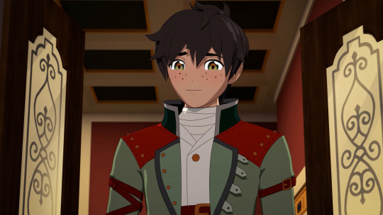
So that could’ve happened or maybe something else occurred behind the scenes. Either way, the execution behind Oscar’s resolution definitely felt a bit clumsily handled and maybe in a more ideal situation, what may have been cut could’ve been kept as is. Then again, something may not have cut at all. Without more concrete information, all there really is to do for now is speculate. One thing that doesn’t need to be speculated though is who did the animation for the cast hilariously dog-piling on Oscar, which was Vince Cappelutti. His name has been mentioned before, having been credited for doing part of the Adam Character Short and doing the first scene and the tunnel chase scene with fellow animator, Nicole LaCroix in chapter 6 of this volume. But this is the first time he confirmed to have done something by himself. As a result, there’s not much to comment on regarding his style, but if nothing else, it’s likely that his sequence extends to Weiss, Ruby and Nora asking questions towards Oscar since the quirky animation is carried through, albeit presented differently. Moving on to another sequence is Jaune telling Qrow his plan, which was confirmed to be animated by Hannah McCravy. Her name has been credited in the show since chapter 2 of this volume, so she is among the newer recruits. Regardless, she nails the right reactions out of each character, including when Adrian giggles. Though beyond that cut, it’s unclear if she animated anything afterward. My best guess is that when comparing to the timing of the animations of the scene between the main cast and the Nubuck guards, Nicole LaCroix animated Jaune explaining how he didn’t think of the details to the plan yet before Qrow shut his idea down. But that part is once again, left to speculation.
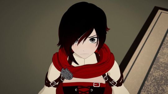
One last thing to go over in the scene is Ruby’s character. As mentioned earlier, there was something from the CRWBY Reddit AMA that directly connects to this episode that Miles Luna answered. Among the things he and Kerry believed they could improve on was “ More attention and meaningful conflicts for Ruby.” Seeing the titular character be given the kind of focus she has been is definitely considered welcoming to many fans of the show. But to give Miles and Kerry some credit, they have been conscious about giving Ruby a sense of conflict before. There are a couple of interesting quotes from the volume 4 blu-ray directors commentary that demonstrate this.
Chapter 6:
Miles: “Oh, this is another fun little moment too where we really are kind of pointing out the fact that Ruby... she’s very idealistic and optimistic, but not always super practical and really, he’s (Tyrian) putting her on the spot like, “y-you really don’t know what you’re doing out here kid, do you?”
Chapter 7 (when Ruby stepped in to fight Tyrian):
Miles: “Ruby you’re optimism is gonna... really bite you in the butt here, girl. There are things at work that you do not know about.”
Chapter 8:
Kerry: “So this is um, another good example of what happened a second ago (when she asked Qrow “what should we do”) and what’s coming up in a second (when she asked Qrow about not trusting her) about Ruby’s... ya know, like, her naive nature being both a good and a bad thing. She’s hearing all this stuff, she’s starting to learn what she’s wrapped up in and the consequences of everything and she’s still like “alright, what’s next?” Ruby, like... Tyrian just wrecked y’all. You shouldn’t, like she shouldn’t want to be badly into this, but she is and it’s just a really important thing to her character.”
Similar to Mercury’s character, there is a forward momentum with Ruby’s character and it seems that in her case, it has a lot to do with exploring when her decision making can be a benefit or a detriment and why. Volume 6 can be seen as a juxtaposition of her character in volume 4 where she criticized by Maria for not giving herself enough credit. Speaking of Maria, if the character/sub-plot that was taken out of volume 5′s script was actually her, then given what role her character played into volume 6 so far, it’s possible that more focus to Ruby’s character was planned at the time but ultimately had to be reduced.
That marks the end of a rather lengthier production analysis this time around. This was the episode where some major story ideas expressed via audio commentaries or Q & A’s in hindsight are being presented explicitly here and more attention to design notes for the settings in this episode helps provide insight as to what kind of thought goes into helping make scenes have a bit more going on than just be aesthetically pleasing. With the main party having a plan to go on, it’s safe to say that volume 6 is entering its third and final act in the story which will doubt result in potential action sequences and hopefully more interesting analyses to touch on.
#rwby#rwby6#rwby spoilers#rwby analysis#crwby#production analysis#production#analysis#kerry shawcross#kerry#shawcross#monty oum#monty#oum
2 notes
·
View notes
Text
Month 5
1) What did you learn from the reading assignment about the field of instructional design that you were not previously aware of? Why is this important to your goal of achieving mastery and your future as an instructional designer? Your response should be 3–5 paragraphs in length Include at least three quotes from the reading assignments with in-text citations using APA-style formatting.
After reading this chapter, I am very familiar with many of the ideas presented and can add volumes to what they say. The authors have taken an overarching theme, and barely show the first few steps of the twisted path an educational idea takes within the DoD system. Three challenges that are mentioned strike a nerve as;
“Using technology wisely when technology is evolving more rapidly than the ability to accommodate change; assuming the responsibilities dictated by one’s role and relationship to the military (federal worker or contractor); designing for individual projects, which may be repurposed into other training products or delivery environments” (Bratton-Jeffery & Jeffery, 2012, p. 187).
In each of these challenges, I have faced them first hand, and have had to change course in the direction of projects to better accommodate the needs of the program and the people on the ground using the training in the fight. Our current IEDES (Improvised Explosive Device Education System) has an electronic module that mimics GM20 and PRO45 signal jammers and that is mounted in up-armored vehicles to block radio signals to trigger blasts. They produced the training modules and equipment faster than the actual units to be mounted, and when the final version of the product hit the military vehicles, it was 4 generations forward of what was being trained. Colossal amounts of time and money were wasted, as Soldiers eventually came back and told the designers how they were being used in the field, and then they put together the revisions, which became an entirely new project under a new contract. The technology moves at a pace that is not predictive with the evolving scope of the battlefield, and many times it is the Soldier that with be the best sensor and trainer. And out of everything that was made in the forefront, only the illustrations of the unit remain.
I design much of the written literature that our training center oversees with diagrams and illustrations, which is then translated into 14 different languages to help our NATO allies use the same equipment. This brings to light another of the ideas from the authors, that there is a partnership for our military and many of the nations we train, fight alongside, and supply with our weaponry and tactics. Bratton-Jeffery and Jeffery (2012) state, “Designers must recognize the cultural diversity of the clients and select training or learning solutions that can accommodate dissimilar audiences” (p. 189). For our European, Central and South American counterparts, the writing only changes in language formats and labels. For some of our Southwest Asia partners, we have to go a step further and provide cartoons to go along with our training. It seems small, but they understand the material easier reading cartoons and seeing the action in the strips than having the information in manual format.
The last issue I wish to weigh in on is one issue that will always affect the instructional designer: funding. Budgets today fluctuate, and every program can cease to exist in the military marketplace in as little as six months. What the book fails to mention is the understanding of programs of record, training directorates, and fund appropriation allocation. Without getting into the weeds of the government machine, there will always be money for training, but the government wants to get the most bang for the buck. Programs of record are the first funded projects that support main operations, and have the ability to be interconnected with other service branches, groups within a service, and international reach. This involves direct training like Apache repair or weapon systems, or a DoD wide program like the EST 2.0 (Engagement Skills Trainer) which uses a digital range to hone the skills of military members across all the branches. They fluctuate in dollars and this is important because, “Whatever funds are applied to one project may be taken from another, and the designer must be able to help the client weigh the costs or trade-offs” (Bratton-Jeffery & Jeffery, 2012, p. 189). Money is shifted from time to time, and there is a five-year cycle where the funding is revised, and long term goals and monitoring are implemented. Training directorates have pet projects that will usually be funded, but are on the yearly cycle for renewals. These projects are done usually through contact bidding, and awarded to the low bidder. Many of these projects are started, completed, and then revised by another company in another cycle. The Army’s NCO 2020 Vision and transgender training fall under these categories. Fund appropriation allocations are the shortest lived of the budget projects, and have a very short shelf life and are designed to tackle one issue very quickly. The Marine Corp is currently in a rapid development process with all of the news and focus on the Corp for the abuse of female Marines on social media. While these contracts can be lucrative, the turn-around times and deadlines are very tight, and the product has to be a flawless as possible.
I did not learn anything new from this chapter reading, but I found many ideas that I face even without being the instructional designer on multiple projects. The military is not that different from other large corporations in some of the difficulties that will be faced, but the margin for error is very slender in light of what improper training can yield. Understanding the military system is the first key to being successful in this environment where rank and structure can sometimes be the only thing holding together a fragile peace. After that, knowing how government works and operates is the second most important in order to be successful and expedient. Many ideas can die quickly if they do not have the correct route to funding, approval, and contracts. Finally, the end user is the defender of freedom and the American way. That makes them far more important, and worth the time and effort to make them the best training possible.
2) If creativity in instructional design refers to the use of special human talents and imagination in generating original ideas, how did you use your creativity to expand your work beyond the limitations imposed in this month’s design projects? Elaborate in 2–3 paragraphs. Use images or screenshots from your projects to illustrate your points.
I tried my hardest to create outside of the box, but within the limits of the assignments. My first foray was for our Instructional Design Models. I wanted to do something closer to a nature, top-down perspective with natural materials and new design illustrations. I made some that I am really proud of, and one that just missed the mark. I was unhappy with my last poster for the gradual release model. It lacked the appeal I was desiring to capture. The timeline was a success for me, as I decided to hand-code instead of use a prefab program. I took longer, but the quality was much better than I expected. I also tried a new js coding for horizontal scrolling, and I worked out the bugs in less time than it usually takes. I am really proud of my psychological theories interactive. I used some old materials and then made new composites to fit the theme. It really looked good, and on first glance it was a home run. There are some design issues upon review, but I am still proud to stand by this work.
The final project was something of a challenge for me. I do not like keynote, and I know my colleagues have heard enough about this. I really wanted a video, but I was not the project lead, but I was the art director. I had to use many different techniques to tell this story and make it seem closer to video, which is where I am really comfortable. I made a specific color palette, suggested a firm looking logo, and went to town in DVIDs to find pictures to use. I ended up using 75 percent of my own photos, as I shoot with design in mind, and they were easier to work with. When I started working in the transitions, I found the edge I was looking for to mimic film movements. I do like what I was able to create, knowing that I had to look out for the team above myself. I have the tendency to try new and more exciting things when working on schoolwork, but I stayed conventional to please everyone.
3) List at least 3 main takeaways from this course and how they may apply to your monthly milestone and long-term goals. How will you use what you have learned in this course to continue to learn and improve your work as an instructional designer?
Deadlines and circumstances are in place to push the envelope of developing work within a timeframe, and to hold us (students) accountable. I had a rough month with having to report for duty in week two, and it threw my entire schedule into an uproar. I battled back and was able to complete all of the work, even if outside the timeframe. Clients will not always be forgiving, so professors may not be as well. A good lesson learned.
Theories and models are nice, but it is always about how they are applied. I learned a few new theories that are used in the instructional design world, or at least their names, as these models are in place at work. I like the ideas they present, and I even tried to use one as I was working on two projects. As an individual, they did not work as well, because I was lacking a client and a quality control process. I was not asking myself the right questions, and that gave me poor answers. Understanding where I am working from and what I need to do, I can use the models better as part of a team.
I have rarely had the opportunity to be the client. In most of my situations, I am the one taking orders from the client, and then I work hard to make a product. If I have a need, I usually figure it out for myself before coming to someone else to solve a problem. The project gave me the opportunity to be the client, and I see how some of the problems happen from the beginning stages of a project. There were so many other questions I feel I should have been asked, and when I reviewed what they were proposing, I did not agree at first. I really tried to put myself in the mind of one of the G3 guys sitting across the table from a contractor describing my training problem and what we needed to fix it. I will take this experience when I sit across the table next month, as I will have to begin working on the next recruiting tool of the Army. I want to meet the goals, and I know how to ask better questions to get the communication straight from the beginning.
Bratton-Jeffery, M.F. & Jeffery, A. B. (2012). Instructional design opportunities in military education and training environments. In R. A. Reiser, & J. V. Dempsey (Eds.), Trends and issues in instructional design and technology (3rd ed.) (pp. 187-196). Boston, MA: Pearson
0 notes