#the 100 icons psd
Explore tagged Tumblr posts
Text


alycia debnam-carey like/reblog ✨
#alycia debnam carey#alycia debnam carey icons#icons alycia debnam carey#it's what's inside#the 100 icons#fear the walking dead#fear the walking dead icons#the 100#saint x#icons#girls icons#twitter icons#without psd#female icons
45 notes
·
View notes
Text


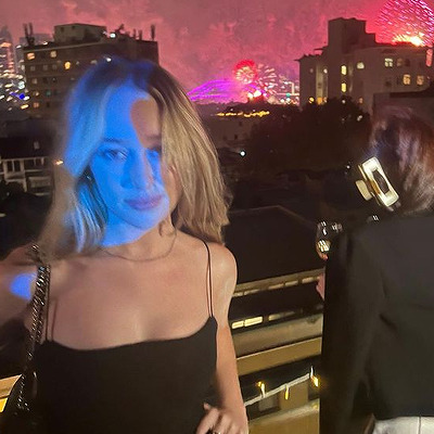

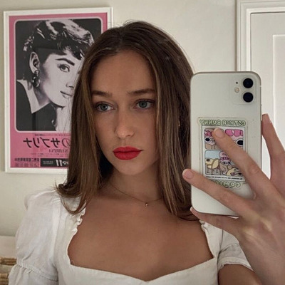
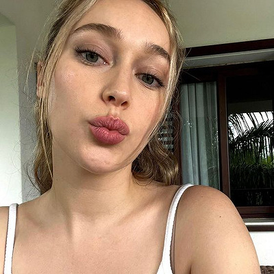
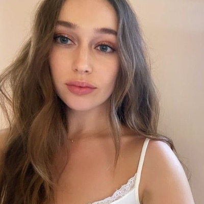
#alycia debnam carey icons#the 100 icons#fear the walking dead icons#ftwd icons#the 100#lexa icons#alycia debnam carey#lexa#icons#icons without psd#female icons
93 notes
·
View notes
Text


Clexa Icons
Like if you use.
#the 100#the 100 icons#the 100 edits#Clexa#Clexa icons#icons Clexa#Clarke Griffin#Clarke Griffin Icons#eliza taylor#lexa kom trikru#Lexa kom trikru icons#alycia debnam carey#icons with psd
25 notes
·
View notes
Text


#icons#maika monroe#maika monroe icons#maikamonroeedit#mmonroeedit#twitter icons#icons without psd#actresses icons#female icons#girls icons#women icons#woman icons#womanedit#photoshoot#mirror selfie#random icons#2024#longlegs#longlegs movie#on set#selfie#100 nights of hero#100 nights of hero icons#with friends
9 notes
·
View notes
Text
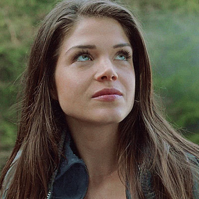
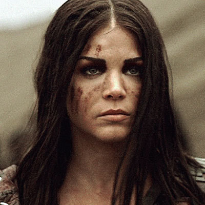
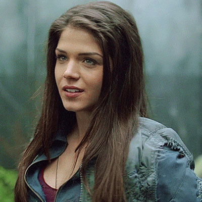


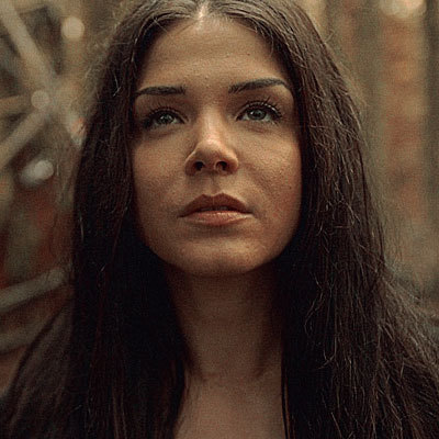

like or @maryonacross00 xx ♡
#maduda#icons#icons with psd#octavia blake#neverscreens#octavia blake icons#icons octavia blake#Marie Avgeropoulos icons#icons Marie Avgeropoulos#the 100#the 100 icons#icons the 100
38 notes
·
View notes
Text

beep boop, new header & dash icon! (so i guess this is a 'she's one of the muses i added this summer but said nothing about on the blog' moments lmao)
#tbd later //#// i guess u can say it was a spark of inspiration#// idk i need to screencap stuff for alice#// consider this me testing this icon psd for her#// i'm not 100% on it#// but!! i AM v happy with the header tho- unfortunately there's a handful of details u can't see#// but i like it anyway
3 notes
·
View notes
Photo


psd coloring : 𝐏𝐒𝐃 𝟒𝟓𝟖 : 𝐂𝐋𝐀𝐑𝐊𝐄 𝐆𝐑𝐈𝐅𝐅𝐈𝐍
a psd coloring on deviantart. feel free to adjust layers if you want to. just keep the credit to me still ! it might not work on all colors the same. this psd comes with some adjustments
PRICE : free for my watchers there ( if you don’t have deviantart or don’t want to watch my account there, hmu and i can send you my ko-fi you can donate on and ill send you the psd after it ! )
https://www.deviantart.com/anniexoxos/art/psd-458-clarke-griffin-free-psd-coloring-960256060
#clarke grififn#the 100#the 100 psd#psd#psds#psd coloring#psd colorings#free psd#free psds#psd resources#resources#icon psd#tumblr rp#roleplay psd#roleplay help#photoshop#photoshop resources#roleplay resources#free psd coloring
7 notes
·
View notes
Text
…make a psd look interesting?
aka, how to fuck up a psd no glue no borax. have you ever looked at your psd and gone, damn, this shit doesn’t fuck? happens to the best of us. here are easy ways to spice up your psds so you don’t end up with the editor equivalent of communion bread
for example purposes, i made a simplistic psd to test these methods on. they should work with most psds, but, as always, fuck around and find out on your own for best results <3
i. threshold + gradient map
this one is an easy way to add specific colors to your psds. step one: add a threshold layer, and adjust it your liking. typically, i set mine to somewhere between 60-40. if you’re making a psd to work on dark skintones, you may want to set it even lower, but if you’re working with, say, pjsk characters, you can go pretty high
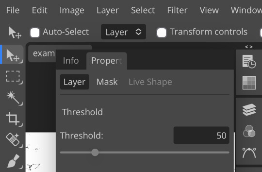
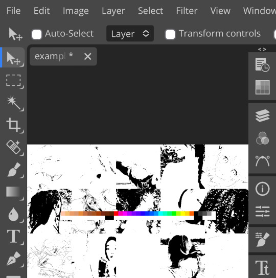
wow flashbang. you can see on my example behind that it doesn’t work super well on irl pictures, and my pjsk images don’t have threshold at all lol. next thing you want to do is set the blending mode of your threshold layer to either multiply or darken—they’re basically the same thing
(psst, if you want to know more about blending modes, check out this post!)
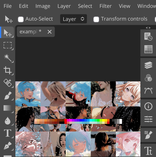
waow crunchy! but still boring right? still boring. not to worry, here’s the fun part: add a gradient map layer, tap it, and go to the slidey icon on the side, which’ll bring up a page like this:
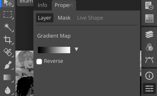
click the gradient in the middle there to edit it. once in, edit the black color to be at about 80-90%, and then change the white color to whatever you like. edit out, and tap the little square next to the text that says “reverse” which should make your gradient look more or less like this:
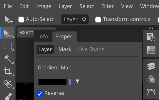
then change the blending mode on your gradient map to ‘screen’ which’ll axe all the black and just leave your color. now your image looks like this:
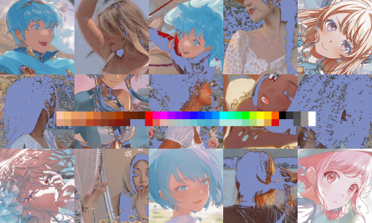
boy howdy, isn’t that fucked up! it is more interesting, but if you don’t want to be looking at that abomination, change your color in your gradient map to be darker, which’ll give you something more along the lines of:

…which is much more reasonable. this is a fun way to add color to your shadows slash lineart, and can be a quick and easy way to make a psd look less flat.
ii. noise gradient map
some of you may be thinking, but, canarysage, what the fuck is a noise gradient map? to which i reply: you’re boring. let me show you.
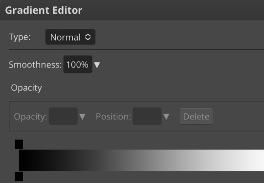
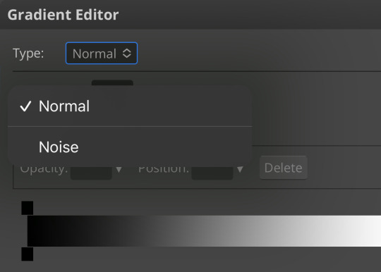
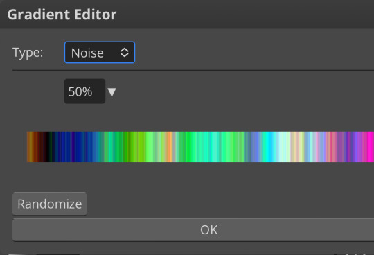
kinda fucked up, right? well, that’s the goal. unfortunately, there isn’t a way to directly edit a gradient map, but you can just click that little button that says ‘randomize’ a couple times until you get something you like! you can also mess with the percentages but i don’t do that because it looks weird

boy howdy, that’s weird looking. not to worry, though. once again, our best friend blending mode is going to come in handy
i typically go to soft light and set the opacity to about 20-30%, but, as with anything, feel free to mess around and do whatever you want. luminosity is also a fun setting for noise gradient maps, just make sure to crank the opacity way down for the sake of my eyes

wow, much better! you can see that the gradient map added a bit of purple coloring and a funky little texture. super cool! thank you, gradient map!
iii. channel mixer
i already have a post on channel mixer and i’m not rewriting all that so if you don’t know how channel mixer works check that shit out but the tl;dr is: ideally, all your channels should add up to 100 (including negative numbers) but that rule can be broken if it looks cool enough. capiche?
iv. color lookup
photopea has a few default color lookups that are pretty easy to use, but i have a couple of presets that i like to add if i’m feeling stuck. to make your own color lookup, open up a psd, and go to file > export color lookup
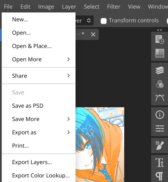
then save it and open it from your files. when you open a color lookup layer, you’ll see an arrow next to the text saying LUTs—click that and your new color lookup should be there
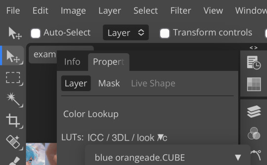
once you tap that, you’ll get a compressed version of your psd added to your folder. it’ll look something like this:
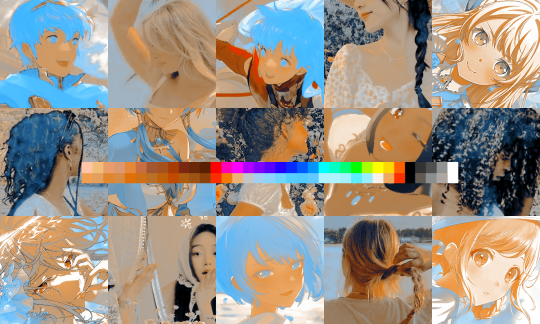
holy orange and blue, batman. luckily, you can apply blending modes to color lookups just like any other layer—mess around with them until it looks how you want!
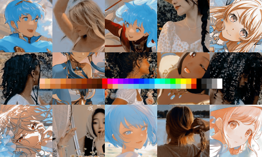
waow much more reasonable! i set this one on color and about 55% opacity, but that is really dependent on what your color lookup looks like and how you want your psd to look. remember, there’s no right way to do things!
an additional note: if you want to, you can save the psd you’re working on as a color lookup instead. if it looks too simple or just isn’t turning out how you want, that’s a good way to incorporate it later :3 just follow the same steps as above!
v. no shame in starting over
if you’ve added and taken away, duplicated and removed, fucked around and found out, and your psd still isn’t how you want: it’s alright to just axe it. the edit police aren’t gonna kill you for it, i promise. if you’re worried about wanting it later, just save it as a psd and come back when your brain is refreshed ¯\_(ツ)_/¯
psd-making isn’t an exact art, so, obviously, there’s no real simple solution to making it look how you want. you just have to mess with it and see what you’ve got. these are just my methods of making my psds less blagh, but, obviously, my editing is moderately more deranged than your average editor.
…so that’s how you do it.
101 notes
·
View notes
Text
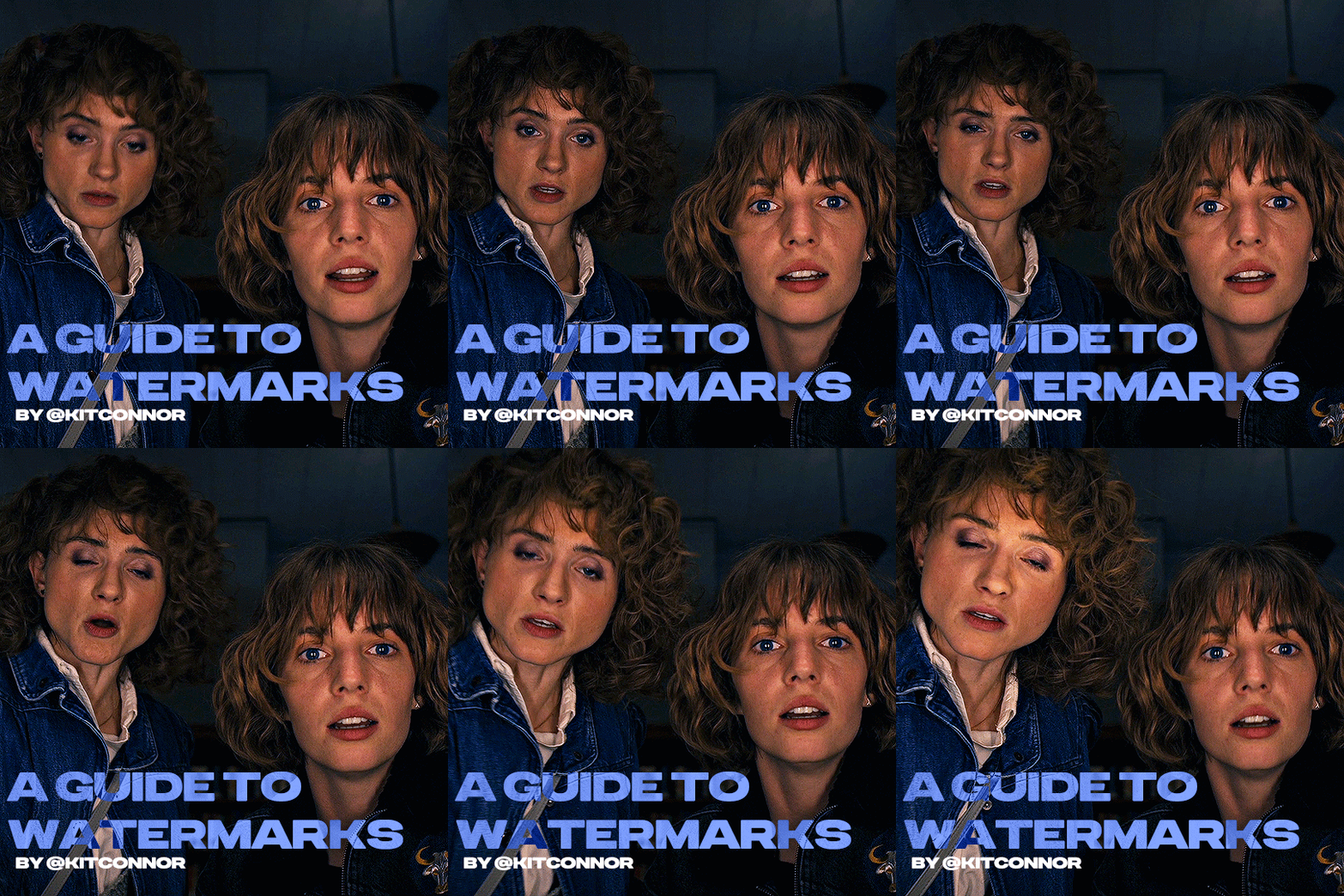
recently, a lot of people have been losing their gifs to reposters, whether that be a whole set stolen or just one gif taken for a textpost. which leads to a lot of us turning towards watermarks to not lose our work. it's not everyone's first choice, particularly because of aesthetics, but it's the best way to keep what you own.
of course, it might seem silly to do a whole "tutorial" on watermarks, but there's a lot of different ways to watermark in a subtle way that still protects your work. i've also seen a lot of people incredibly hesitant to move to watermarks because they believe it marrs their work, which may be true, but there are definitely ways around that. anyway, let's begin !
WATERMARK 1: URL/TRACKED TAG
the most common watermark for people is usually 'thisismyurl.tumblr.com', 'thisismyurl | tumblr', 'thisismyurl' - at least, this is assumed for most people as the best way to watermark.
but if you're like me and constantly want to change your url, you know that there's a good chance a watermark on a gif 3 months ago could be completely different to one now. this is why people are turning to tracking tags.
tracked tags change less frequently, if at all. it's smaller, which makes it more subtle. if you want to go the extra mile like me, you can create a blog under your tracked tag (eg. i track tuserlucie) which means you can reblog anything with your watermark to the blog, showing that it is yours.
placement is key though ! here's 3 different ways you can place it.
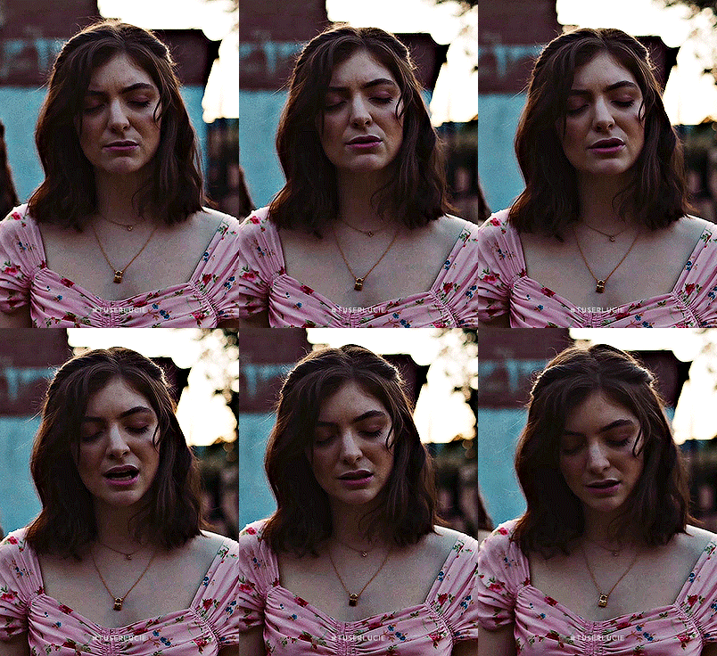


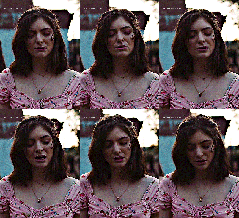
NOTE: opacity has not been altered on any of these. depending on how it looks with your gif, opacity looks best at 10-30%.
Font settings: Momcake, thin, 10pt, #ededed.
each of these placements have different advantages.
the first placement (top left) is the one i personally use. it's centered right on the middle but not too high up.
the second placement (top right) is probably the most popular. corners mean people can kind of tuck the watermark away where it doesn't seem obvious. the fourth (bottom right) effectively does the same.
the third placement (bottom left) is 100% the most effective. it sits in a point exactly where it's noticeable, making it less desirable for reposters. on the right opacity too, you hardly notice it.
WATERMARK 2: ICONS/SIGILS
this is an idea that i've seen used mostly by nik @cal-kestis , but is a great and creative way to do it !
an icon or sigil makes your gif totally unique to you. and it's something cute on there which is different to having to put text on there.

(i've put it in orange for the purpose of seeing it)
but you can see here, it doesn't need to be anything special. i've just used an oval shape plus the initials of my url and that's it !
but a sigil can be anything. it doesn't need to have text; it could just be an image. it could just be your icon. either way, it's a cute little alternative to using text.
here's the different options that i preference in action.
SIGIL - bottom right corner

URL - bottom middle

TRACKED TAG - face/body

RESOURCES
here's some resources to use if you want to start watermarking !
FONTS:
Momcake (this one was used throughout all the text watermarks !) Cocogoose Lemon milk Bebas Quicksand PSD
you can access a psd of editable watermarks here.
#tutorials#ps tutorials#resources#**l.myeditss#mine: resources#photoshop tutorials#idk who to tag so sorry 😭#usersmia#usercats#usernorah#userrsun
277 notes
·
View notes
Text

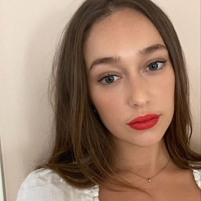



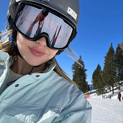
#alycia debnam carey#alycia debnam carey icons#icons#female icons#icons without psd#the 100#the 100 icons#lexa icons#lexa#lexa kom trikru#lexa kom trikru icons#commander lexa#commander lexa icons#heda icons#heda#fear the walking dead#fear the walking dead icons#ftwd#ftwd icons#alicia clark#alicia clark icons
36 notes
·
View notes
Text


Lexa kom triku Icons
Like or reblog if you use.
#the 100#the 100 icons#Lexa kom triku#Lexa kom triku icons#icons Lexa kom triku#alycia debnam carey#icons with psd
10 notes
·
View notes
Text

I don’t usually do this, but I’m opening some emergency base icon commissions just so I can guarantee to have some money at the end of the month to buy meds and food for my cat.
I crop all my icons to be 100x100 with no fancy PSDs and no icon borders. What you see is what you get. However, I can make my icons rectangular or bigger / smaller by request! The standard prices are as follows:
30 icons: $10 USD
50 icons: $15 USD
100 icons: $25 USD
Please bear in mind that those are just standard prices, but the minimum amount is 30, and that is non-negotiable. However, if you want more than 100 icons, the price will be discussed privately. Adding onto that, payment will be upfront through P.ayPal after we agree on the price.
If you just want to donate, you can do so here! And please spread the word, it helps a lot!
37 notes
·
View notes
Text
Icon commissions available!
Hello, and good evening! I have a vacation coming up next month where I need to raise about $500 before then, so, I figure- what better way to help raise money for my trip than spreading the word of my comms, as I'm getting back into iconing again!
I specialize in making simple 100x100 RP icons. I do not make PSDs or borders, I enjoy making large quantities of RP icons, on some good days of upwards 50+ for a single episode or chapter. I like making enough expressions for threads. Basically, my goal when I make my RP icons is so less on things like borders or their edits as opposed to giving RPers enough expressions so that they can respond to most situations in their RPs.
For example: for my icons of Miku Okazaki from Gal Gohan, I have made over 1220 icons. For Ann Takamaki from Persona 5 I have made 966 icons from the anime (I still need to do the Dark Sun specials) and 137 icons from the manga. For Maggie Lacivi from Ava’s Demon (on request) I made 396 icons. For Cardia Beckford from Code:realize (only iconed episodes 1-6), I made 347 icons. For Milly Ashford from Code Geass I made 377 icons. For Doona Cheon of Sadistic Beauty I have made 945 icons. Basically, when I make icons, I make a lot, and that’s what I’m offering for you if you consider my services!
10 cents per icon, so $10 for 100 for example (I might consider adjusting this number if I make a ton of icons to be slightly lower, but this is unlikely). These icons will be published publicly; if you want this to be private (available only to you) I will up-charge you 5 cents per icon (so $15 for 100)
In order to make the time worth my while, I am currently only accepting commissions where I feel I can at least earn $10, so 100 icons at minimum!
Icons from games such as Genshin Impact, Final Fantasy XIV, etc are on a case-to-case basis. These are more time consuming for me to make as I must find cutscenes on youtube, and make use of both a screenshot extension and a frame-by-frame extension, and as such these icons take much longer for me to make than television or manga/comics. And as I'm trying to get icons done quickly, please understand to take these comms means I will have to take more time than I normally would for other. I will likely accept them, but be aware I will likely request an upcharge per icon due to the extra time taken.
I am willing to icon virtually any source, including that of most “problematic” media or N/$/F/W things like an h-manga or films showing graphic scenes (I’m not stranger to iconing things most dislike just for a FC, so I understand what you want) and even full out dead dove content. I however have a personal right to icon something that does not make me feel comfortable. If you’re going to be ask me to do something extremely sketchy please understand for my own personal comfort and for the sake of reputation I might reject it entirely. We will discuss this on a case-by-case basis, I will likely accept most commissions but I have my personal right to reject business I feel will make me uncomfortable.
I will give you periodic updates on what’s going on, the quality of your icons, etc.
I care greatly for the quality of my icons and your icons as well. When in the process of iconing JJ from YOI I was dissatisfied with the quality of my torrent and halfway through redid the process with a new torrent to ensure my customer had the best quality icons I could make. Even for my personal iconing projects I care about using the best quality possible so that the icons look good. If you want an anime (my specialty) or tv show quality I will look for the absolute best quality, 1080p or better to ensure you have the best quality icons you can have once I’m done cropping and resizing to 100x100.
In addition to the 100x100 icons I keep the original sized expressions as well. So once I take a screenshot and crop and resize, you will still have the original sized icons as well. This is not an upcharge or anything; I always do this. Good for expressions for personal use, I believe.
If your source is an exceptionally long-runner (like HxH, One Piece, or Yu Yu Hakusho) I will not icon the whole thing most likely; somehow I doubt most people are willing to pay for an icon commission that might be hundreds of dollars if you asked me to icon Gon or something. Most likely I will icon a specific arc of your choosing.
I do not icon fanart. If the character is very obscure and there is little official media, then I likely can’t make much. I am only willing to icon official media (such as anime and tv shows), official art, and perhaps doujins that were already being sold for money.
I can now make icons efficiently from youtube videos, so video games and the like provided there’s an LP of decent quality can now be iconed!
I do not do extensive editing, but with manga icons, I try to do very minor cleaning such as removing kanji from the background and and removing speech from speech bubbles. Basically, whatever I can do with Paint’s erase button, but that’s it.
If your source is a youtube series or the like, something I cannot easily torrent and convenient download in order to take screenshots and icons, there is a chance I might upcharge.
Below are examples of icons made from me from various sources, 100x100 and some full size icons! For the sake of length those (the full-sized ones) will go under the cut. I hope to hear from you soon! Please send me an ask or IM (IM preferred) to discuss business, and I will use the IM feature to keep in contact with you!
I hope you’ll consider me, and consider hiring me!


#icons#anime icons#manga icons#manghwa icons#anime rp#manga rp#indie rp#manghwa rp#manghwa rp icons#commissions available#commissions are open#fate icons#love live icons#oshi no ko icons#fate#love live#oshi no ko#< i'm especially eager to do icons for those three
51 notes
·
View notes
Note
oiii tudo bem? me diz como faz esse efeito 3D nos seus icons?
oiee, tudo sim e contigo??? fiz um mini tutorial explicando do 0 como fazer os icons igual eu faço, espero que lhe ajude!
atenção: siga atentamente os passos!
1° – baixe o pack da magnífica yiza; é nele que vamos encontrar o action e darmos o efeito 3d no icon (e nesse pack ainda tem colorings maravilhosos);
2° – entre no site photopea.com no seu navegador;
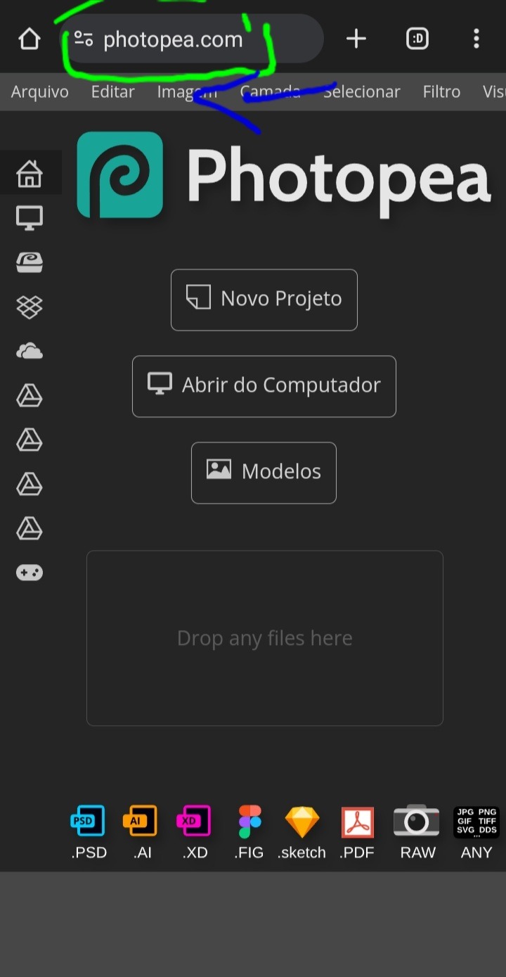
3° – assim como na imagem, deslize da direita para a esquerda na parte cinza claro, onde está opções como: arquivo, editar, imagem, etc;
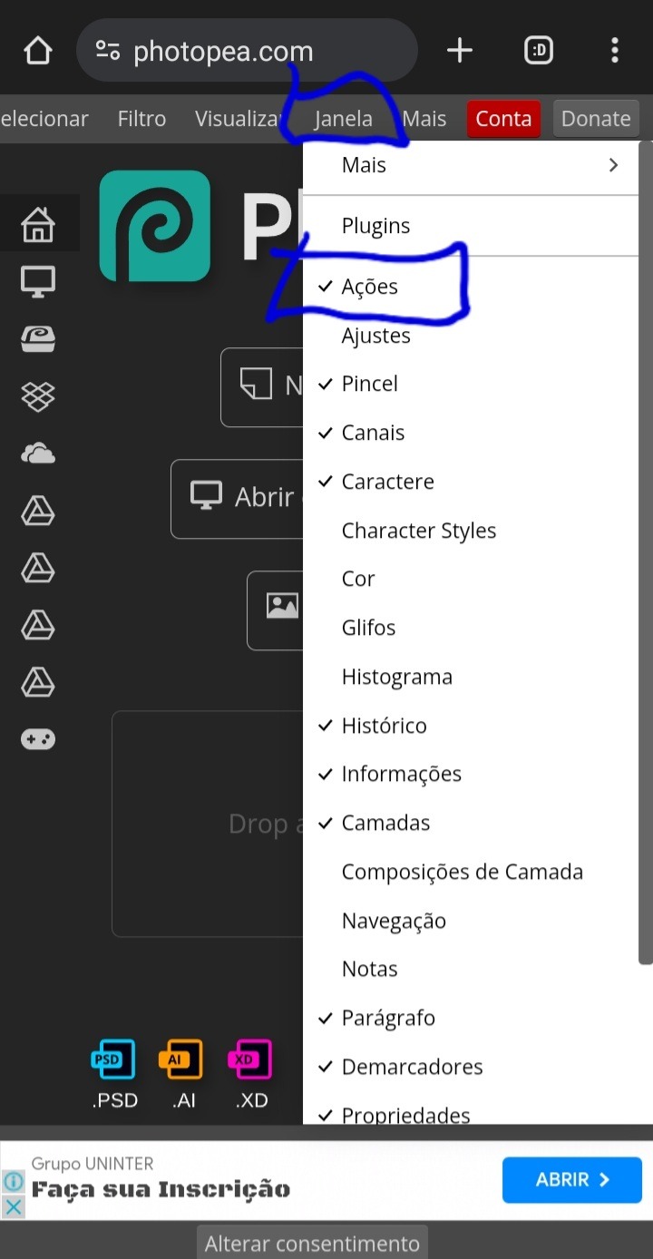
4° – ache a opção "janela" e clique UMA VEZ nela e aguarde abrir as opções dela. irá aparecer diversas opções, mas clique na "ações" para ativar;
5° – depois disso a opção de adicionar ações já vai estar habilitada, então feche a aba "janela" e clique em "abrir do computador", e selecione o action que baixou (ATENÇÃO: SE NÃO ACHAR O ACTION, VÁ ATÉ A LUPA DE PESQUISA E PESQUISE POR "ATN", ASSIM ELE VAI APARECER)
6° – vai aparecer um aviso mostrando que foi instalado um action no seu photopea, e pronto, o action temos; agora vamos ver como colocar ele no icon:
7° – aperte em "abrir do computador" e selecione a foto que vai usar;

8° – com a foto aberta já, vá até o quadradinho ali que deixei em destaque, e aperte 1 vez nele;

9° – aperte no retângulo que está destacado;

10° – selecione a opção "tamanho fixo";
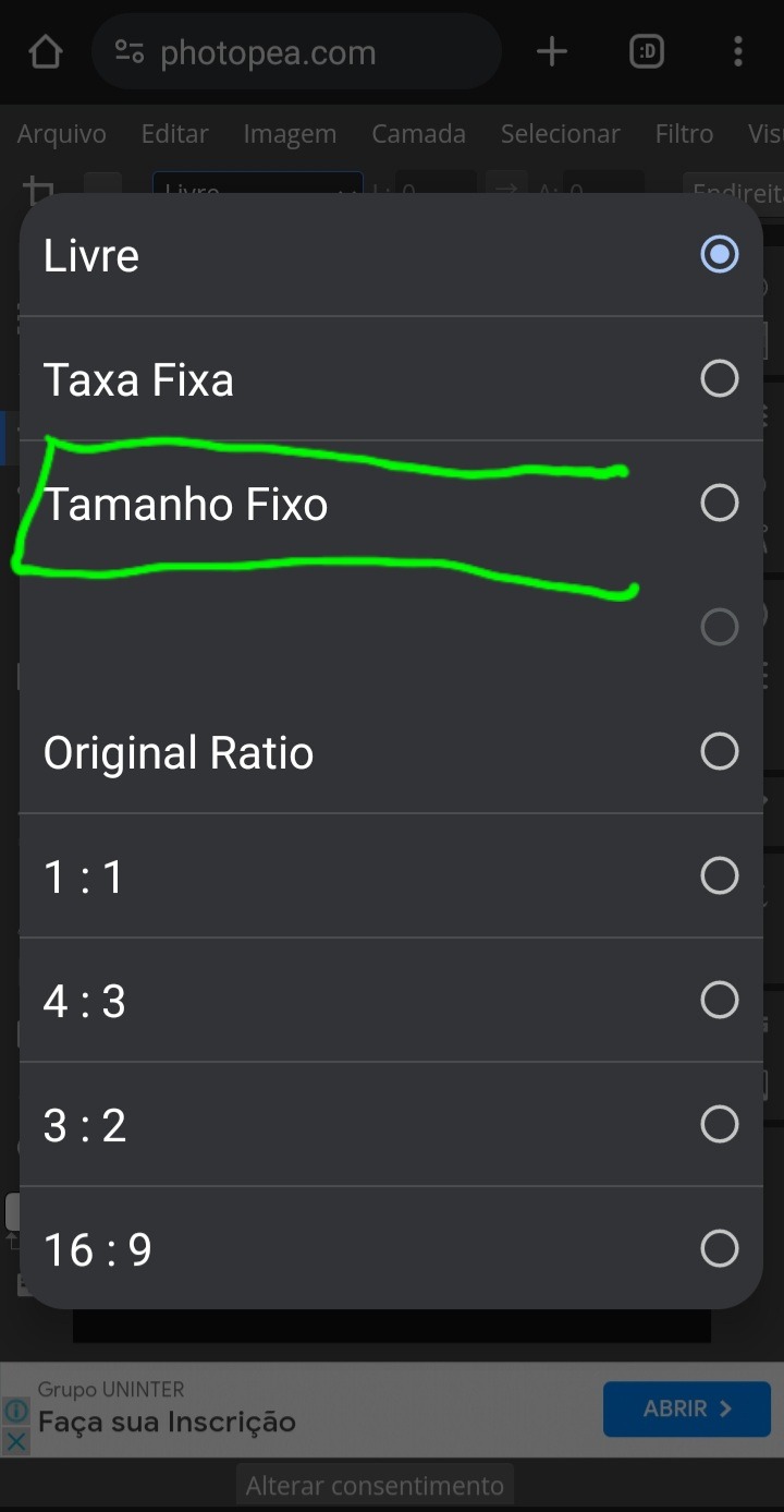
11° – mude de 100×100 para 120×120;

12° – corte do jeito que preferir a foto, e depois arraste da direita para a esquerda a parte cinza claro;

13° – no final vai ter um ❌ e um ✔, aperte no ✔;

14° – pronto está cortado em 120×120, e do jeito que queremos, então volte deslizando a barra novamente para onde estávamos;

15° – vá até a opção "filtro" e aperte uma vez nela, aguarde abrir e depois selecione a opção "aguçar"
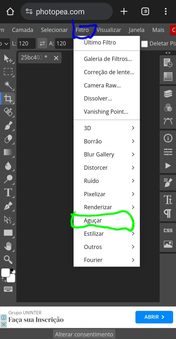
16° – clique em "nitidez maior";
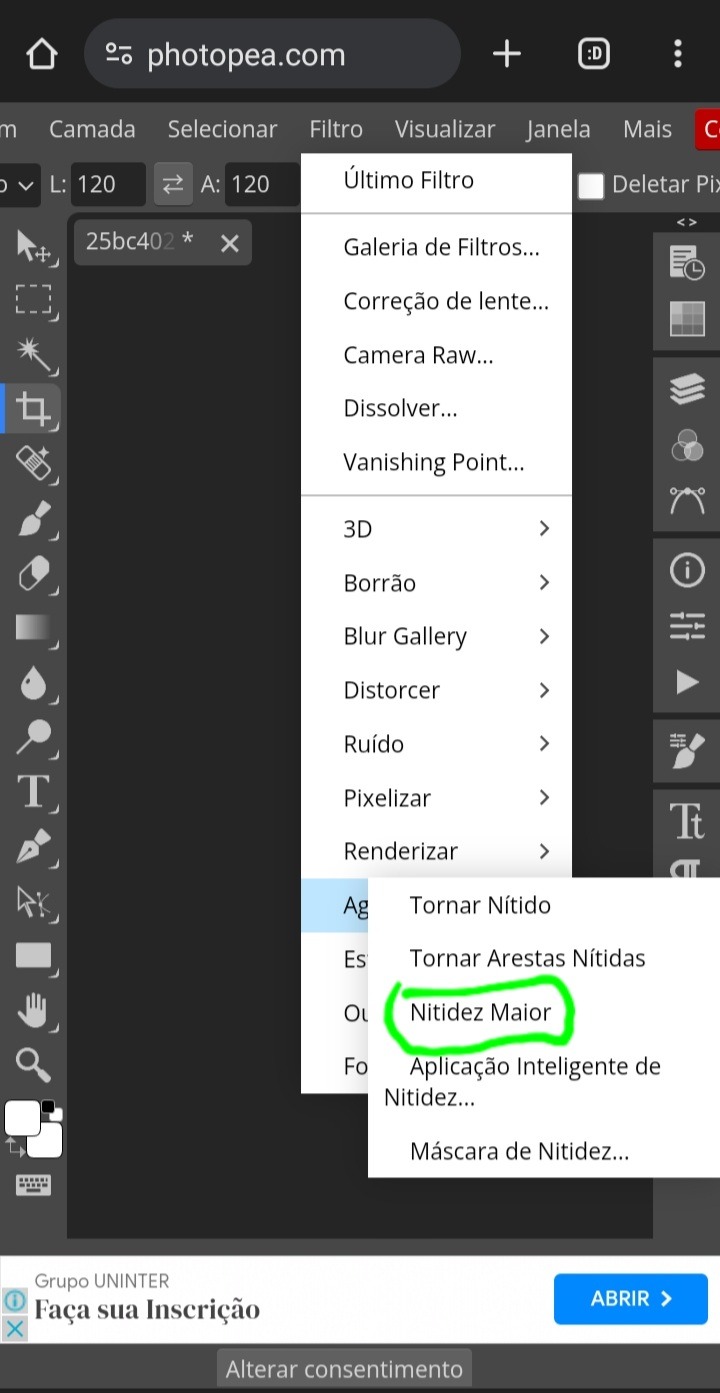
17° – pronto, nosso icon está com qualidade e nitidez, agora aperte nesse símbolo de play que está em destaque;
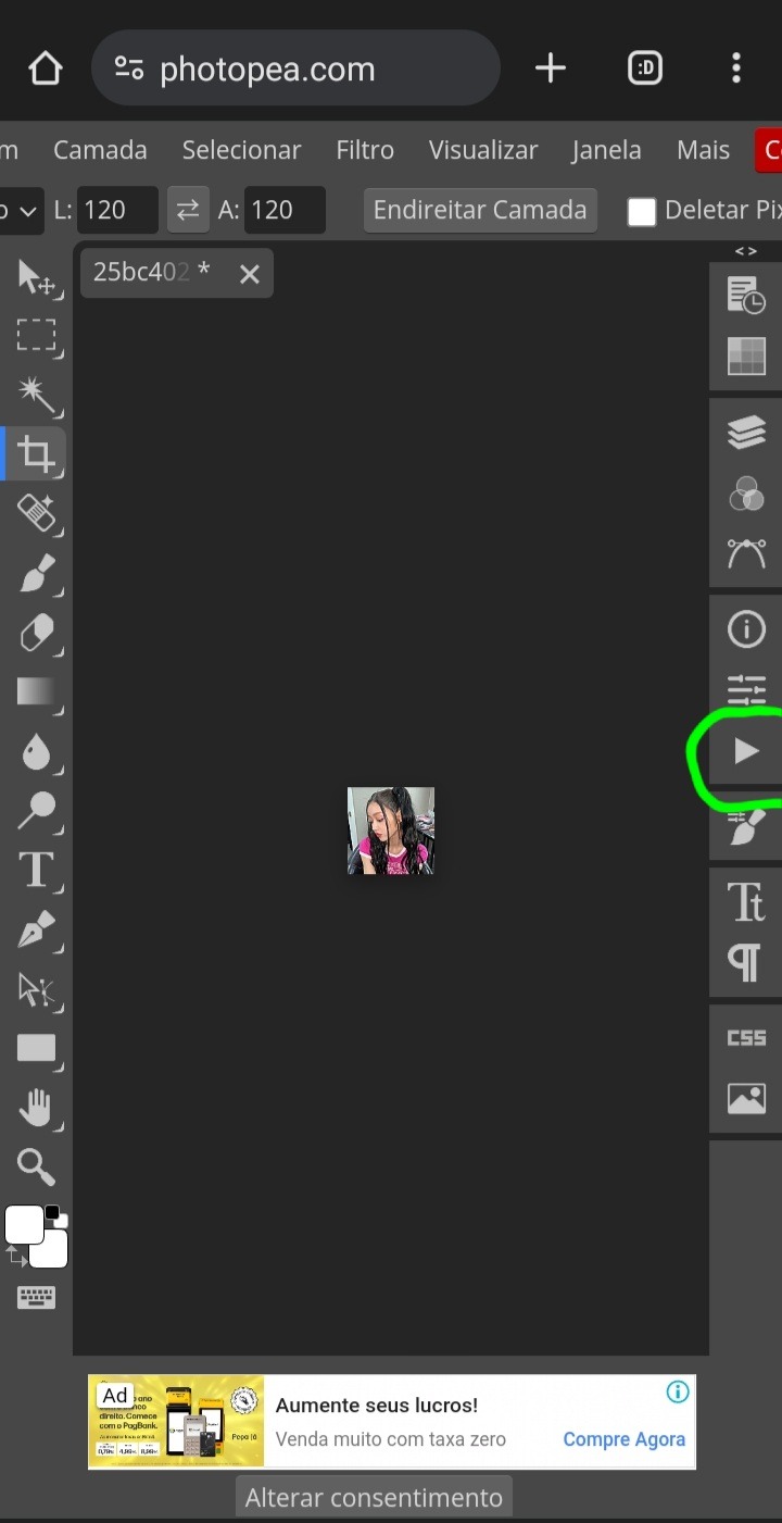
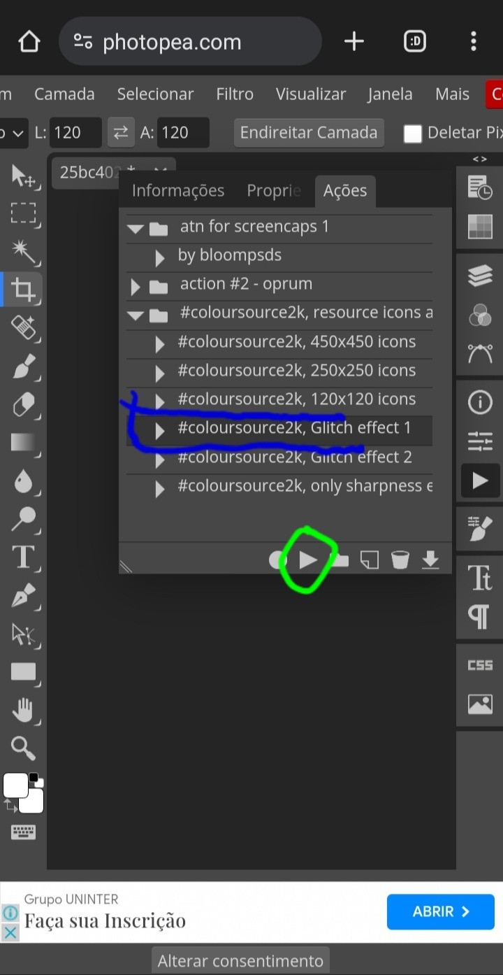
18° – selecione a pasta da coloursource e depois aperte na flecha que está destacada em azul;

19° – aperte na opção "glitch effect 1" e depois no play que destaquei em verde;
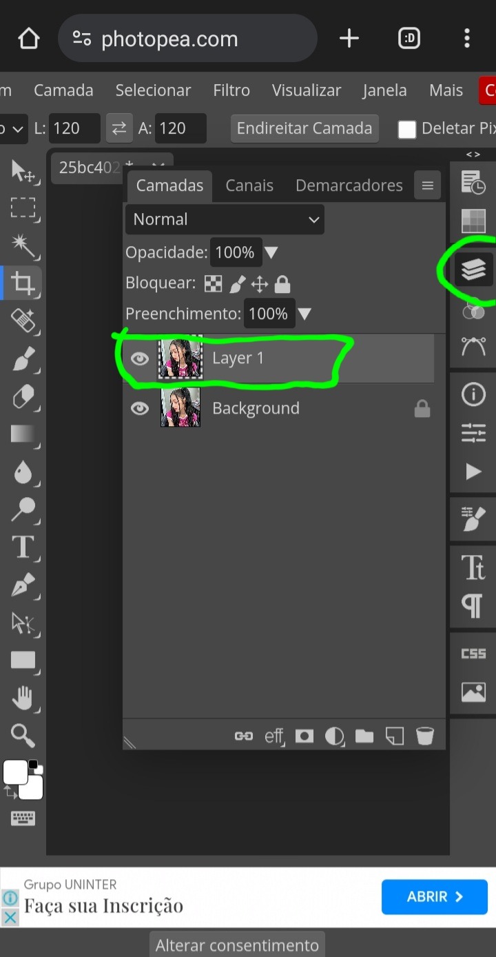
20° – vá até a opção onde tem três retângulos, e aperte lá para mostrar as camadas do nosso icon, e depois aperte DUAS VEZES RAPIDAMENTE na camada "layer 1";
21° – vai aparecer essa janela, e preste bastante atenção nessa parte destacada, é somente nela que vamos mexer!

22° – deixe selecionado apenas a primeira opção, e depois clique em "aceitar"

e prontinho, seu icon já está com nitidez e efeito 3d, agora é só aplicar seu psd de preferência!
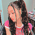
depois de colocar o psd e só salvar como jpg e ser feliz!
#ask#ask blog#tutorial#tutorial como fazer icon#como fazer icon#icons para spirit#social spirit#120x120#liwony#hyemps#aespearl#ocenvie
73 notes
·
View notes
Text
haaaaa so. i am in a really bad place financially because the mortgage went up to more than my mom and i make so we're in trouble! i'm disabled physically, and i have autism, adhd, anxiety and agoraphobia to name a few things wrong, and cannot work well on my own.
so would anyone be interested in writing commissions? i can do hazbin, as well as arcane, soul eater, and the magnus archives. i'd probably do $15 - $20 per 1k words? willing to do nsft but do have some limits for it specifically.
i can also maybe do icons? i'd have to do plain icons because i don't know how to make psds myself, but i'm willing to screencap (for additional cost) and icon? probably $10 per 100? i'm not sure if that's a good price though
and if you're able to spare anything i would deeply appreciate any donations as well.
30 notes
·
View notes
Text
Tidbit: Placronym Pixelation

So you got this fresh placroynm that you don't want engraved with a sophomoric name? Not a problem. You can reject that stupid shit with a pixelize/pixelate filter.
Photoshop
First, you will have to make two more duplicates of your name text layer, so three text layers in total. One for when it's first displayed, one for the first frame of pixelation, and one for the second frame.
With your first duplicate layer selected, go to Filters>Pixelate>Mosaic..., which is a terrible name for it, but hey, I'm no Photoshop developer. Set the cell size to 11.

For the second duplicate layer, set it to 14.
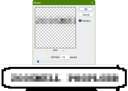
GIMP
Pretty much the exact same steps as in Photoshop, this time the filter is located under Filters>Blur>Pixelize...


I would suggest right-clicking on the text layer and choosing Composite Space>RGB (perceptual) instead of the default (Auto), or going to the top-right corner of the Layers tab and switching the group of blend modes from Default to Legacy. Basically, doing so will make the semi-transparent pixels as dark as they are in Photoshop, otherwise they will appear too light.


Check out the read-more link below for bonus information on easily animating the name being typed out in Photoshop.
ADDENDUM
Typing animation (Photoshop)
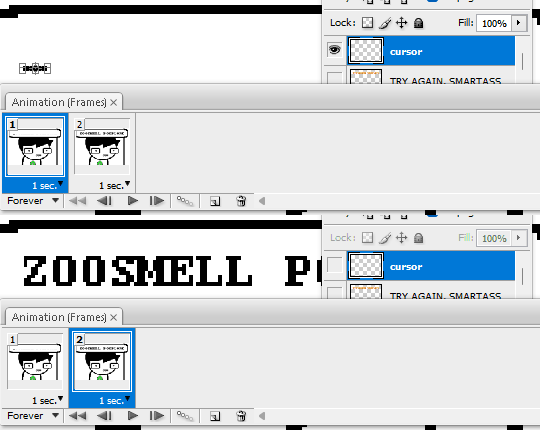
Photoshop's frame animation timeline makes doing this a breeze. First, add a layer mask to your text layer. This will add a white box next to the layer's thumbnail.
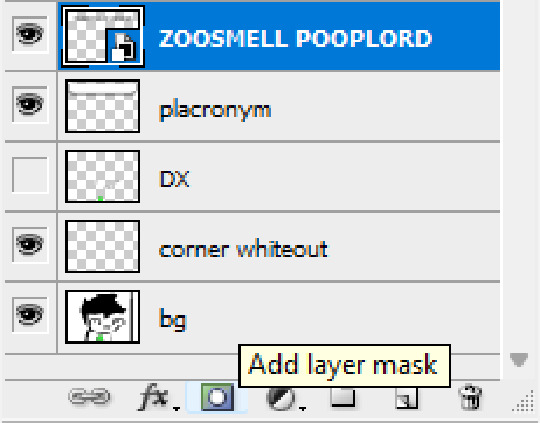
With that layer mask selected (click on it and it will be highlighted in the layers tab), use the marquee tool to make a rectangle selection around the text, then use the paint bucket tool to fill it in with the color black. This will make the text invisible until the layer mask is moved.

Go to Window>Animation if you do not already have the animation timeline open. Click on the little sticky note icon to duplicate the first frame. In newer versions of Photoshop, you will probably first have to click on a button that reads "Create Frame Animation", and the duplicate frames button icon is the "+" in a little square.
Making sure you still have the layer mask selected and not the entire layer, use the move tool and arrow keys to move it all the way to the right, revealing the text on the second frame you've just made. Don't move it too far off now.
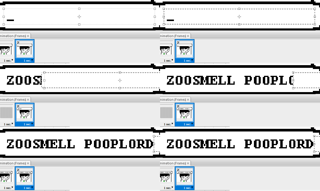
Move the typing cursor layer to the right as well, except you don't have to move it all the way at the end, only where it will be last seen.
Make the typing cursor layer visible on the first frame, and not visible on the second.
Select the first frame the animation and click on the tween button. This will add all of the frames in between the first and the second one for you. Make sure you only have "Position" checked under "Parameters". For the numbers of frames to add, here's a neat trick for finding the right amount: count the amount of letters in the name. "ZOOSMELL POOPLORD" is 16 letters, so add 16 frames.
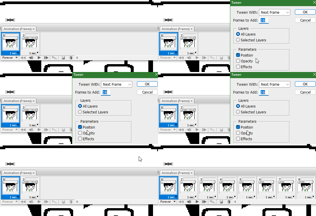
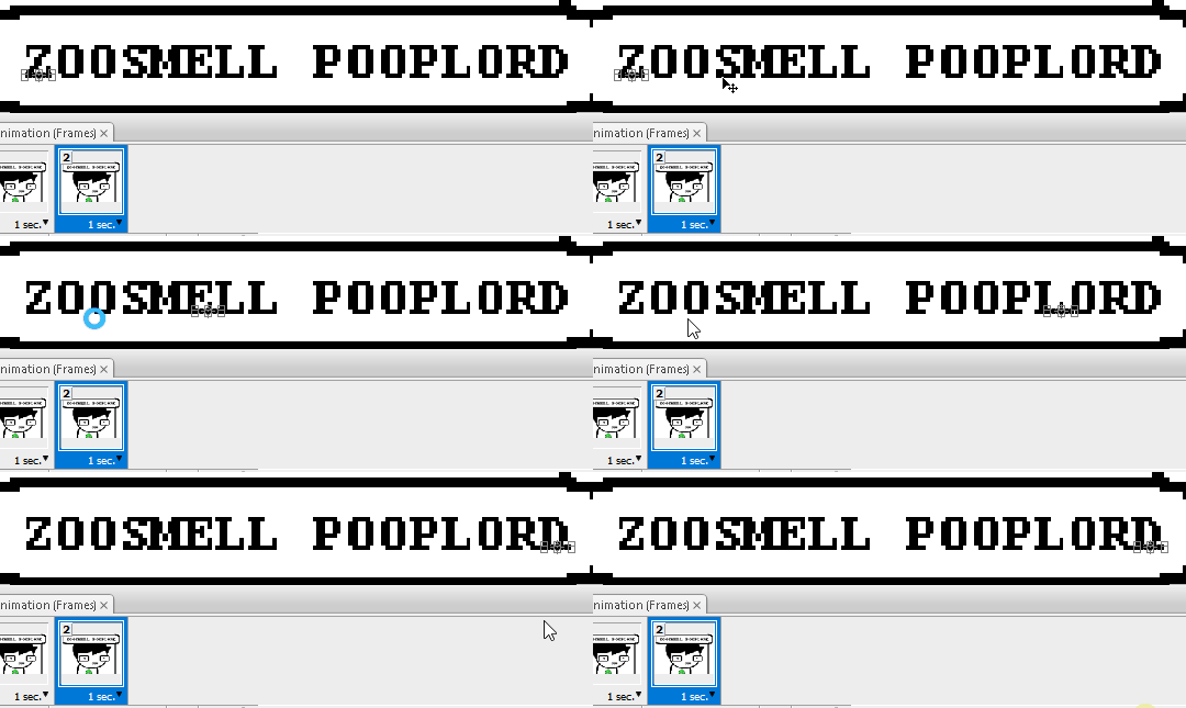
Most of the work is already done, though there might be a couple frames that will need some minor tweaks. Just use the move tool and arrow keys again to finetune the layers' positioning.
This is why it was important to not move the layer mask too far to the right away from the end of the text. Tweening the position spaces it out linearly, evenly, so the farther away the end goal is, the more space each frame will use. Thankfully the font this panel uses is mostly monospaced, and I got a little lucky with my positioning, so I needed to only adjust three or four frames. Way less tedious than having to create each frame of animation myself, at least.

To change the frame delay (the time duration each frame takes up) of the newly created frames, click on the first frame you want to retime, hold down the Shift key, and then click on the last frame. This will make a selection spanning all frames in between. Click on the little dropdown arrow and select 0.1 seconds (100 milliseconds).

Here's the original panel:
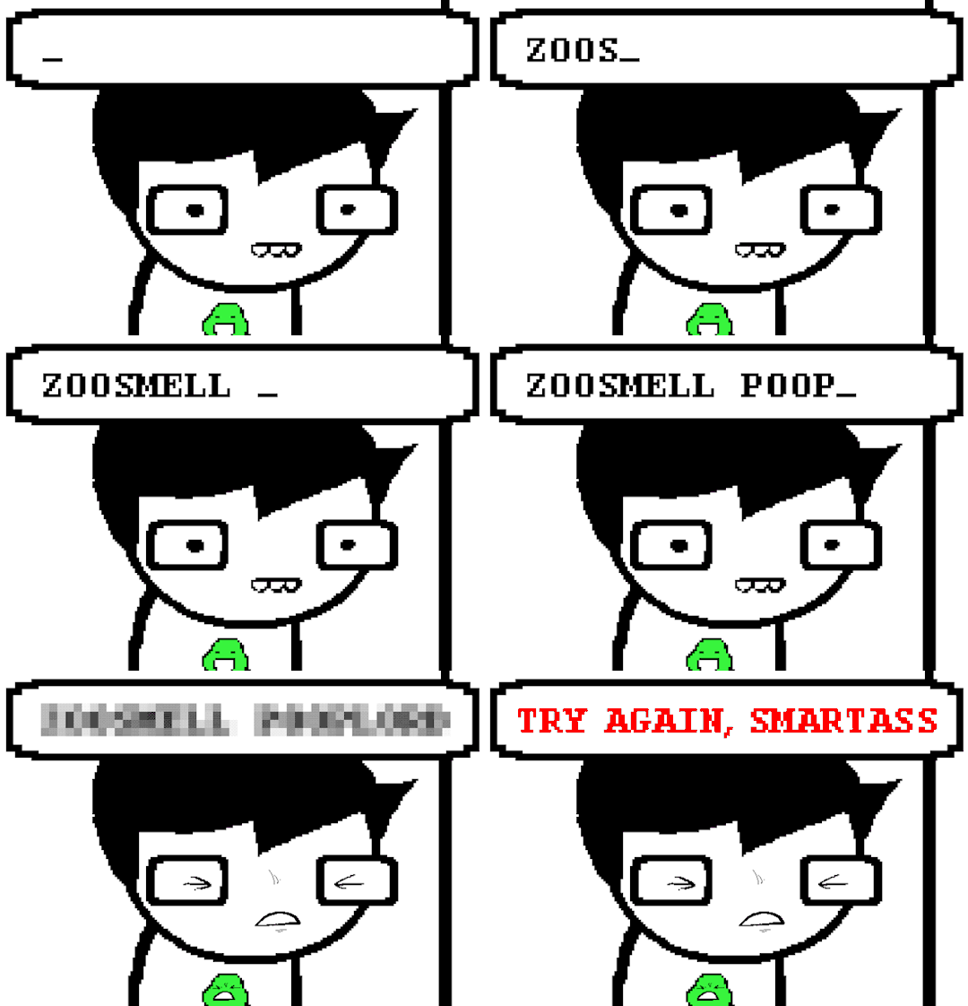
And here's my recreation:

Here's the PSD, too.
76 notes
·
View notes