#testing out a different shading technique
Explore tagged Tumblr posts
Text

#dungeon meshi#delicious in dungeon#izutsumei#izutsumi#meijack chils#meijack#I've been wanting to draw them all week and then a fic was posted on AO3 on Friday and it filled me with so much serotonin#the power of rarepairs lmao#art#testing out a different shading technique
674 notes
·
View notes
Text

grace! ✿
#i tested out a slightly different shading technique and quite liked it!#precure#healing good precure#cure grace#nodoka hanadera#magical girl#pretty cure#mahou shoujo#stacy draws
394 notes
·
View notes
Note
do you have any tips for thin (anime-style) lineart? I always tend to end up with much thicker lines unintentionally X-x
It depends a lot on what exactly you’d like to achieve, but my biggest recommendation would be to change brushes if your lines are naturally coming out too thick. Not just because of brush size, but because the kind of brush you use will change how you line things, technique-wise.
As an example I’ve tried lining a sketch using two different brushes here:
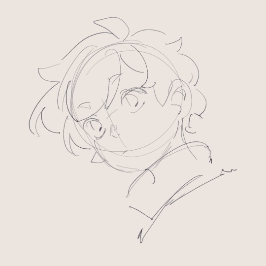
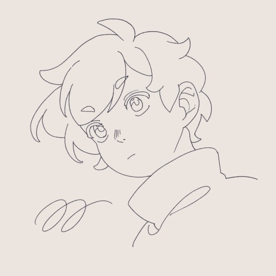
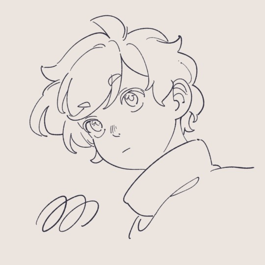
Though they’re both from the same sketch, in the first I used a thin brush with high stablization and almost no pressure sensitivity. As a result, I’m forced to line slightly slower, and it looks slightly stiff but achieves the sort of clean anime look you usually expect to see— almost no line breaks! This is the standard for anime I think because you have to have clean and closed line boundaries so that coloring and shading can go quickly.
On the other hand, on the right, I’ve used one I’m a bit more accustomed to, a round textured brush with a lot of pressure sensitivity. It’s also got lower stabilization, meaning I work quicker, my strokes are a lot more spontaneous, and you see a lot more natural variation in line width. That’s what I mean also by it depends on what you want to achieve— though this is also an anime style you wouldn’t find it as a screenshot anywhere because that line width variance would probably look really inconsistent in animation.
I als only switched to this round brush relatively recently, about half a year ago now??? Previously most of my lineart was done with a rectangular brush which also tended to yield thicker lineart than expected.
I would suggest playing around with different brush shapes and settings, especially in stabilization and pressure sensitivity, since I think those are often what affects my drawing style the most! You can do a similar exercise to this and try lining the same sketch multiple times with different brushes to test which feels best for you. Hope this helps!
101 notes
·
View notes
Text
ART DUMP !!!!


Been testing out new brushes and different types of shading techniques 🎉🎉
The MP one is approved too which is awesome sauce
I love making story pieces because they just help expand my AU better :]
#animal jam#jamblr#art#my art#animal jam lore#animal jam au#phantoms&fireflies aj#artists on tumblr#oc#animal jam oc#animal jam story#aj posts#aj alpha#griza#practice#art dump
42 notes
·
View notes
Text


Made In Abyss | Riko, Reg, Nanachi, Meinya, Prushka
October 10, 2024 Time:
⚠️⚠️SPOILERS- Don't look too closely at this illustration if you haven't seen the first season and movie of made in abyss.⚠️⚠️
Made in abyss illustration I made. I mainly worked on this during lectures when they were going over content I already knew ✨
I wanted to take a stab at doing the whole grayscale painting thing before adding colours for once. I think this was a pretty metal way to test that technique out 💀. complicated ass drawing right here
The problem I had with doing the colour layer is that it took a while for me to find something that would look like the right colour. Most colours were fine, but browns were really annoying in particular (they often showed up as bright oranges xd). It also took some finagling to make the shading look good (as in not shaded by pure black), but i got the hang of it. Honestly it was pretty fun using different colours to make the shading look better 😌
I basically painted everything on a single layer (it was divided between foreground (all the characters) and the background sections). yeah, I prolly could have done it in a much more efficient manner, but I had fun so it don't matter.
Really like how it turned out overall (they're so cute but the story is so fucked up it's all so fucked up) and the plan is to make posters out of this bad boy >:)))
Annoying ass watermarks are back because fuck you get away from my hard work!!!
#cyclamen dig#cyclamen fanart#fanart#made in abyss#anime#art#digital art#illustration#poster design#made in abyss fanart#anime art#nanachi#riko#reg made in abyss#made in abyss spoilers
29 notes
·
View notes
Text
Art Challenge 4/9
Fight Songs Album Cover Redraw
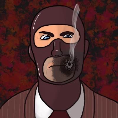
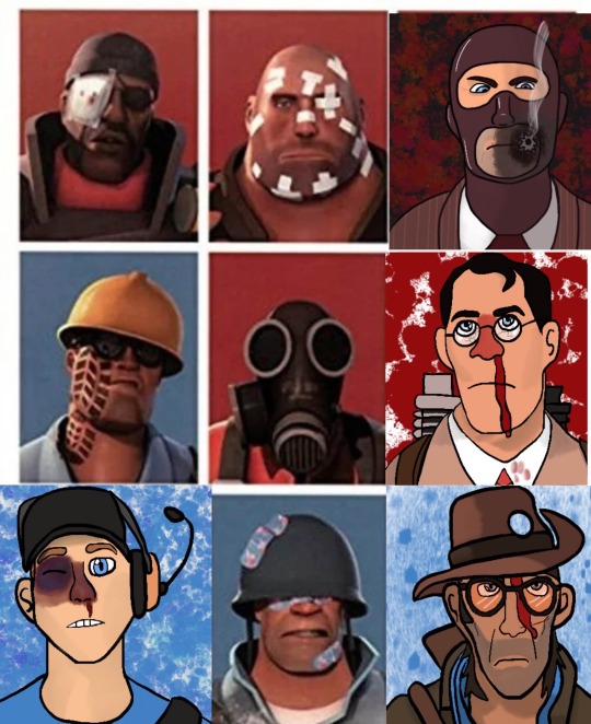
Mannnn it’s been a hot minute ain’t it? I kinda forgot I was doing this till I saw the pictures on my computer. And I found a new shading technique on Tik Tok and I wanted to test it out.
So I figured I’d come back to this and draw Spy! I can really tell the difference between my old shading and this one. I know it’s not much, but I feel like there’s more depth, definitely gonna have to work on it though.
Not sure when I’ll do the next one, but Pyro is next! Yippeeeeeeee ☺️
#tf2#team fortress 2#tf2 scout#tf2 sniper#tf2 pyro#tf2 spy#tf2 heavy#tf2 soldier#tf2 demoman#tf2 engineer#tf2 medic#redraw#art challenge
21 notes
·
View notes
Text
𝕓𝕝𝕚𝕟𝕕 𝕕𝕒𝕥𝕖𝕤 𝕒𝕟𝕕 𝕞𝕚𝕕𝕟𝕚𝕘𝕙𝕥 𝕥𝕣𝕪𝕤𝕥
(tighnari x shy!fem!hybrid!reader) A/n: This is my first post from my hiatus. I really hope you all enjoy it. I've really been hooked on some new characters so you all might see some more variety in the future, as always- drink water, and enjoy <3
✧⋄⋆⋅⋆⋄✧⋄⋆⋅⋆⋄✧✧⋄⋆⋅⋆⋄✧⋄⋆⋅⋆⋄✧✧⋄⋆⋅⋆⋄✧⋄⋆⋅⋆⋄✧
𝚜𝚢𝚗𝚘𝚙𝚜𝚒𝚜: 𝚛𝚎𝚊𝚍𝚎𝚛 𝚒𝚜 𝚜𝚎𝚝 𝚞𝚙 𝚘𝚗 𝚊 𝚋𝚕𝚒𝚗𝚍 𝚍𝚊𝚝𝚎 𝚋𝚢 𝚊 𝚌𝚕𝚘𝚜𝚎 𝚏𝚛𝚒𝚎𝚗𝚍. 𝚠𝚑𝚎𝚗 𝚝𝚑𝚊𝚝 𝚍𝚊𝚝𝚎 𝚝𝚞𝚛𝚗𝚜 𝚘𝚞𝚝 𝚝𝚘 𝚋𝚎 𝚊 𝚍𝚘𝚞𝚌𝚑𝚎, 𝚛𝚎𝚊𝚍𝚎𝚛 𝚖𝚊𝚔𝚎𝚜 𝚊𝚗 𝚞𝚗𝚎𝚡𝚙𝚎𝚌𝚝𝚎𝚍 𝚊𝚚𝚞𝚊𝚒𝚗𝚝𝚊𝚗𝚌𝚎 𝚠𝚒𝚝𝚑 𝚜𝚘𝚖𝚎𝚘𝚗𝚎 𝚠𝚑𝚘 𝚖𝚒𝚐𝚑𝚝 𝚓𝚞𝚜𝚝 𝚋𝚎 𝚊 𝚋𝚎𝚝𝚝𝚎𝚛 𝚏𝚒𝚝….
𝚌𝚘𝚗𝚝𝚎𝚗𝚝 𝚠𝚊𝚛𝚗𝚒𝚗𝚐; 𝚛𝚎𝚊𝚍𝚎𝚛'𝚜 𝚍𝚊𝚝𝚎 𝚒𝚜 𝚊 𝚌𝚛𝚎𝚎𝚙𝚢 𝚊𝚜𝚜𝚑𝚘𝚕𝚎, 𝚜𝚑𝚎/𝚑𝚎𝚛 𝚙𝚛𝚘𝚗𝚘𝚞𝚗𝚜 𝚞𝚜𝚎𝚍, 𝚏𝚕𝚞𝚏𝚏, 𝚖𝚒𝚕𝚍 𝚊𝚗𝚐𝚜𝚝.
✧⋄⋆⋅⋆⋄✧⋄⋆⋅⋆⋄✧✧⋄⋆⋅⋆⋄✧⋄⋆⋅⋆⋄✧✧⋄⋆⋅⋆⋄✧⋄⋆⋅⋆⋄✧
Walking down the street, you were dressed up for the evening, dawning a stunning cocktail dress. The shade complimented your eyes perfectly, and sleeves slightly rolled up just enough to maintain a reasonable temperature in the summer night heat. You’d put a bow hair clip just next to your left ear that really brought out the wonderful shade of your fur. Feeling it sway as you walked helped build the confidence you were surely going to need.
Your friend Brian had set this up for you, in his words you “needed to get out more, and live life before it’s too late”. Something you didn't entirely agree with, but he did make a decent point that you were indeed a little lonely. You didn't particularly like people, as you typically got nervous around strangers, making you into something of an introverted loner. You much preferred studying medicine in the previous years occupied the majority of your time, leaving little to no breathing room to have a partner, let alone try to go on dates with anyone. It was just more comforting that way.
Well, it seems this evening you were lucky enough to find some time. You had spent the previous days testing for your senior finals. These were the last few classes you needed to graduate from the akedemyia. A difficult road, spending years studying different healing techniques, the mechanics of medicine, how to make the medicine, how the body works, and much much more.
The evening was pleasant besides the heat, mid-August seems to do that. The sun was minutes away from being fully set, reds and pinks painting the sky waiting to retire, leaving the city to the night-dwelling population of insomniacs and party-goers.
Arriving at a small cafe you were instructed to, you took in the sight of the sign reading “Puspa cafe”. You’d heard of this cafe before, but never quite got the chance to visit it.
Taking a breath, you settled your nerves, readying yourself for your blind date, and walked to the door- opening the wood frame and stepping into the warm atmosphere.
The lights were slightly dimmer than you expected- as is with most eateries in the evening-early night. Wandering around, you noticed a seat at a table that Brian himself had been occupying. walking over in your attire, you chuckled a little awkwardly- you hoped this date would go well.
“Well don’t you look lovely, I can see you went all out for your date.” Brian greeted, his tone slightly teasing but you could see he did genuinely think you looked nice. Taking the seat across from him, you took his glass of wine and took a sip, much to his dismay at the loss of his drink.
“Thank you, but to be honest- I have no idea what I’m doing. This is my first date ever really and I’m really nervous.” Brian took notice of the sweat drops forming just to the side of your temples. You saying you were nervous was an understatement, it was bad enough that your knees nearly gave out the moment you noticed someone walking towards the table. The man looked to be around yours and Brian’s age, maybe a few years older. His hair was platinum blonde and his eyes a jade green with tints of blue. He had freckles- and what seemed to be a very salty face since he walked in.
You turned back to Brian a little panicked, what if he didn't like the idea of being on a date and only agreed out of pity or something? Brian only looked at you and chuckled, “You’ll be ok, just be yourself. He just has a resting bitch face. He's really sweet.”
You glared for a moment, silently cursing Brian for not giving you this information to start with. That would’ve been especially helpful given the fact that people talking was not your forte. Shaking it off you put on a smile for this stranger, standing up at the same time as Brian to greet him. You took in his appearance for a moment. He was dressed up, but more casually than you’d done so.
Were you overdressed?
“y/n this is Ethan, he moved here from Fontaine not too long ago actually. Ethan, this is y/n, she’s a student at the akademyia. Now that the introductions are done, this is my time to dip. Play nice you two, wishing for the best” Was all that Brian said before throwing you to the wolves and running out the door, damn near tripping over himself. Your jaw dropped a little, just enough to stay under Ethan’s radar.
Closing your mouth, you looked back at the blonde hair brooding boy and smiled once again. When you spoke your voice was timid and a little shaky. “hi, I’m y/n…it’s lovely to meet you, Ethan.”
He looked at you with a raised eyebrow and his scowl only seemed to drop further. “I figured that you were y/n. Who else could it be?”
Well, this is awkward now. You looked away, feeling a little silly, and red-faced. “Yeah, that’s true.”
The both of you stood in silence for just a moment, the air was thick and awkward beyond comprehension. Without speaking a word, he turned and sat in the seat Brian had just stood from not 10 minutes ago. You took the cue to sit back down in your own seat. Taking the glass you’d stolen from Brian and tinkering with the handle to ease the anxious feeling, you tried to break the ice.
“So…uh…tell me a bit about yourself. What do you do for a living?" You looked at him slowly, hoping that this would start somewhat of a conversation. He turned his attention to you, seemingly squinting at your facial expression. He took a few moments, examining you and your body language.
“I’m a practicing medical professional.” He deadpanned, looking almost bored. When he didn't say anything further, you took the chance to ask more about his answer.
“Oh! That’s really cool. How long did you study? Could you tell me a little about what it’s like being in the medical field?”
He only sighed. “I studied for 8 years, and I graduated a few years early due to my advanced abilities in the subject. honestly, I wish I chose something else- it seems I can’t make enough money in this profession.”
“Graduated early you say? I wish I was that smart. I've been studying medicine by myself for a few years, it sounds really helpful to have been able to shave off some of that time.” You expressed, speaking a little fast. It was exciting to see that he also studied medicine! Maybe this wasn’t a lost cause after all. Feeling a little more comfortable, you leaned forward feeling your tail swish behind you. He seemed to take notice of this, smirking a little.
He leaned over making it obvious that he was looking at the appendage behind you. You blushed a little out of embarrassment, tucking it away a little bit to give him a hint that you would rather he be making eye contact than staring so intimately. He leaned back and finally stuck his two cents to your response.
“Well, not everyone has the ability needed to leave school so early, it’s difficult enough for us people, let alone someone like yourself.” His tone was matter-of-fact and you swear you heard your own thoughts shouting ‘what the fuck’ right at him.
Going between raising your eyebrow and narrowing your eyes, you settled on a gaped mouth and glare.
“I'm sorry? I don't think I follow.” Being a bit defensive was only natural in moments like this. Now it was his turn to glare right back.
“Well know, your kind’s only real reason for socialization is mating and doing what we humans tell you to do. Given you are derived from literal animals-” His words were cut off by you standing up. You hadn’t even eaten, hadn't even placed an order at the restaurant. you walked over to him and slammed your hands on the table.
“For someone who graduated early, you sure are stupid. Maybe take that misplaced confidence and stick it right up your ass, you jerk.”
This made Ethan stand up, looking livid at your outburst. At this point, most of the restaurants had all paused their meals and conversations to watch the scene playing out in front of them.
You took a slight step back, “Why’d you even agree to a date if you thought that way huh? What are your intentions?”
Ethan stepped closer as you stepped back. No one had intervened just yet, all simply staring in shock. You felt the eyes on you slowly breaking your confidence. He leaned over, still angry. “I think you can put two and two together. Now sit.”
You looked at him for a moment, distaste clear on your face. You scoffed and turned to leave but he placed a hand on your wrist harsh enough for it to hurt. You winced and a few folks stood up from their tables and walked over to your aid.
One of them took Ethan's wrist in his hand. Gripping with the same strength, making him let go. “That is not how you treat people. Get out now before I make you” Was all the older man had stated. Another person, the woman who’d been accompanying him had come over and taken you away from the situation. She led you outside a side door on the other side for fresh air and at least a little privacy.
She looked at your wrist, turning it over a few times to check for injury. When all she saw was a faint red mark that’d leave only a small bruise by morning, she released your hand. Looking up at you, her eyes were a beautiful brown, something you didn't mean to take too much notice of at the moment but ended up doing so.
“Are you alright?” She queried. Her voice was calm and a little husky with age. She smiled sympathetically, providing comfort given the situation. You returned the smile a little bit and nodded your head. “Good thing! Please don’t listen to that miscreant. He doesn’t deserve your tears or your time. You’re too pretty and too kindhearted for that. Don’t worry about having to go back in there, we’ll take care of him.” You nodded your head one last time, feeling thankful for her kindness, and you played with the hem of your sleeves a little bit. “Thank you, ma’am. It means a lot that you helped. I’m not even sure why I agreed to a blind date, maybe dating just isn't for me, but I’m glad you stepped in… you and your partner really saved me.”
“Oh shh, don’t say such silly things, you just haven't found the right one yet. There’s still plenty of fish out there, just give it some time. And there’s no need to thank us, we’d’ve wanted the same if we were in your place.” Was her rebuttal. “Will you be alright to head home, or would you like me and my partner to walk you home? There’s no pressure, we wouldn't mind at all with whatever you prefer!”
Your smile spread. Her kindness was touching and began erasing the words Ethan had said about you. It made you feel a bit better. Not entirely so, but enough that you felt happier than you did before. Shaking your head you let her know that you’d be alright walking alone and that you’d actually be stopping somewhere in town to get some fresh air for a little longer. She happily let you go, wished you a happy evening, and advised you to take some time to do self-care for healing before returning to the building.
You took your leave, walking a little ways into town. You stopped to look at the shops and what they had to offer. You still felt a little down by Ethan practically telling you that your “only purpose” was spreading your legs and living as a walking incubator. It both made you pissed and self-conscious.
Walking down the winding maze of Sumeru City, you came across a larger crowd. They seemed to be surrounding a performer and made quite a loud ruckus. Pulling your ears gently down to the sides of your head, you groaned. The sound was painful and honestly- headache-inducing. Though you did admire the music and performance of the city, the noise became something of a deterrent. You could usually get away with it in the day since you’d only needed to head to the Akademiya, but given tonight's agenda- you were exposed just a wee bit more than usual.
As you were turning around your attention was caught by someone. You took notice of his similar reaction to the music. He'd pulled his ears down to his head, and grimaced. His hair was two tones of green, both almost darkened to black, and a bright forest green streak ran through his bangs. His eyes had a similar green fading up into a brown-hazel color.
He was slightly taller than you, you took notice as you walked over to him- still covering your ears. He made eye contact with you and smiled- albeit awkwardly due to what you presumed was a mild headache he’d probably be forming.
As you finally fully approached him, you lowered one of your hands from your ears and tapped his shoulder. Once you were sure that he knew you were trying to communicate, you mouthed ‘follow me’ to him. Something he happily agreed to, it got him out of the loud crowd didn't it? And you seemed to have good intentions given the similar circumstance.
You both walked for a moment, just until you reached an area where letting your ears go didn't feel like excruciating punishment. You took a breath, finally being able to hear at your full potential. You looked up and smiled at this handsome stranger-
“Are you a little better? I noticed it was a bit loud over there. Figured you could use a hand”
he returned the smile politely, seemingly appreciative of your rescue. “Yes, it was rather loud. Thanks for that. I don't know if you’ve found any way out of that crowd.”
You felt your face heat up. His voice was intoxicating and honestly gave you butterflies. And his smile- though you knew it was more polite than anything- was beautiful. You cleared your throat putting a fist to your mouth to hide your blush, something he took particular notice of and felt his own face heat up.
“Are you alright, miss? You seem to be overheating a little. I’ve seen my fair share of ailments so I may be of assistance.” He stepped closer to put a hand on your forehead, seemingly from instinct. He stepped back quickly. “I’m sorry, I should’ve asked first, I’m not sure what’s come over me. I’m not normally this forthcoming.”
The moment his hand met with your forehead you felt yourself melting into his touch, though you didn't outwardly show it. His hands were warm and softly calloused. When he pulled away, seemingly panicked, you simply smiled and chuckled at him.
“It’s alright, no worries! My name is Y/n. Who might you be, and what brings you out to the city at night?” Your question was welcoming, almost with silly intent while laced with curiosity. You would be lying if you’d said he didn't pique your curiosity just a little bit.
He relaxed a little when you excused what he thought was crossing boundaries, chuckling at his own embarrassment as well, cheeks dusted in pink. “Tighnari, I’m a forest watcher. I came to collect some materials for some research, thinking that night would be the optimal time to avoid loud crowds. But it seems I miscalculated. What's your name, and what brings you out here? You seem dressed rather formally for a night-time walk.”
Looking down, forgetting that you’d just come from a bombed date still wearing your dress, you looked back up and chuckled. “I’m y/n. Failed date, he ended up being a jerk (dickwad) so I decided to ditch and take a walk before heading home." Your response was honest, though you left out a few details. He cringed sympathetically.
“Failed dates are the worst. I’ve personally never been on a date, so I wouldn’t know firsthand, but a few of my friends have been and they sound awful when the other person seems to be such awful company.”
“It’s quite alright, this was the only one I’ve been on really. Though Brian is gonna get an earful when I see him again. he set up the blind date, even told me Ethan was a ‘sweetheart.’” Tighnari looked at you a little nervously but also seemed to hold a little humor in his gaze. You both just looked at each other silently for a moment. It took but a few seconds for your tail to betray you and sway happily from side to side.
His eyes were so pretty- that captivating ombre of earthly hues. The way they twinkle in the nighttime lights of the city, along with the moon overhead. They held the same aura that he did. strong-willed but humane. Wise and passionate. Caring, nurturing, calm, collected, kind, gentle-
“Hey, would you like to take a walk with me? I could use the company.”
You couldn’t stop yourself from speaking as your mouth moved on its own. The feeling of the words coming out- dripping like honey from your tongue. You panicked internally for a moment, he was a stranger! It’s not like he’d just accept a request to walk around. You certainly wouldn’t be following a stranger around only 5 minutes after meeting, why would he?
“I would love to. I’ve collected all my needed materials and have some time to burn before returning.”
…
Well, that caught you off guard-
Your smile grew exponentially as your tail sped up in its swaying, something he took silent notice of without any comment. He held his arm out for you, “Whenever you’re ready.”
~~~~~~~~~~~~~~~~~~~~~
“No way! Really? you studied in the Amurta Darshan as well?!” You asked enthusiastically. Your arm around his as you listened to him talk.
He nodded his head back, “Yes, I actually specialize in botany, I find it’s quite fulfilling. You practice medicine, you said, correct? Perhaps we can arrange for you to stay in Gandharva ville to practice medicine there. Archons know that with the obnoxious travelers eating random flora and getting sick all the time- we could really use your skill.”
You both banter, coming up with ideas continuously. Playing on each other's minds.
Coming round a corner, you both sat down on a bench near the edge of town. It’d been high up in the city and hosted a perfect view of the moon in all its glory.
You took a deep breath, smiling to yourself. This evening started off crappy, utterly awful, but something good did come of it. Turning your head to the side to look at Tighnari who seemed preoccupied with the moon, something good came of it indeed.
Shaking your head- you shook the thoughts away. You’d only known him for one night. You shouldn’t have feelings that quickly. He's just charming, that’s all. and smart, and funny….
The night seemed to be perfectly peaceful now until there were footsteps coming up the path to your little reprieve.
“You!-”
‘Here we go again....' was all you could think as Ethan came storming up the way to you and Tighnari, leading you to look at him wide-eyed. Tighnari looked at him and then at you, seemingly very confused. He had a hunch this was the ‘bad date’ you mentioned but was unsure.
Ethan came closer and closer and you couldn't help but stand up as he got close into your personal space, face mere inches from yours and yelling.
“You little bitch, thinking you can run off like that, leaving me to embarrass myself because you’re too much of a prud-”
“That's enough.”
Tighnari had put himself in front of you, pulling you behind him. You were shocked. He was willingly standing up for you?
You couldn’t see, but Tighnari’s glare was dangerous and aimed directly at the bastard that ungracefully graced tighnari with his attitude and fishy breath. “Who the hell are you?! This has nothing to do with you, fox.”
Ethan tried to step to the side to get to you, but Tighnari stepped in that direction too, continuing to block Ethan’s path. “Better question- who are you?” Was all he spoke, his tone was venomous and sharp. You noticed that Tighnari’d taken up a stance that seemed as though he was ready to fight. Before Ethan could answer, Tighnari had cut him off, “I wouldn’t try anything if I were you. it won’t end very pleasantly.”
You gripped the back of Tighnari’s shirt, to which he responded by grabbing your hand softly in his own, holding it visibly so that Ethan would get the hint.
Ethan only scoffed, and turned muttering something about “tease, just not worth it.”
As he turned the corner, you let out a breath of relief, finally he was gone. Tighnari turned around and looked you over, taking notice of the tears pricking your eyes. He gently put his hands on either side of your head, placing his forehead on yours. Normally this would’ve flustered you, but the moment called for comfort, something you desperately needed a pinch of.
“Archons, the pheromones coming from that guy, what an asshole. Are you ok?”
You placed your own hands on his and nodded, letting a few tears fall. “Yeah…I’m ok.” This was his cue to move from holding your face, to holding your shoulders and pulling you into a hug tightly. One hand on your back, the other on your head. “Why’d you help me?..”
He sighed, leaning closer into the hug comfortingly. “Can I be honest with you?”
You nodded your head.
He took this answer to finally say his piece. “I…I’m not sure..something about you just makes me want to protect you, to spend more time with you, I just want to be around you…”
You were silent, utterly stunned. So he was feeling the same way as well? Was it an instinct thing? Was it…
“I’m sorry, that was brash wasn’t it? We barely met...I hope I didn't scare you off.” You leaned back, looking into his eyes that now seemed anxious for some form of response.
You chuckled and put your hands on either side of his face, much like he’d done with you before. “Do you trust me?”
He nodded his head, leaning into your touch. “Close your eyes.”
He obliged without objection, eyes squinting shut as your hands tightened around his jaw ever so slightly.
You took a breath, now or never. Make or break, this was it.
You leaned forward slowly, inching closer to his face with your own. The air was thick and your heart was pulsing beyond belief, it felt like it would jump out of your chest at any moment. You stopped just an inch or two in front of him.
When he felt your breath graze his lips he gasped a little bit, eyes relaxing from their previous squint. He seemed to understand what was happening finally, what he was feeling, what you were feeling.
Finally, you tilted your head slightly and connected your lips gently.
His lips were soft and relaxed, you could feel the tension release as you felt him lean into the kiss. His ears flattened to the side identical to as yours did. You let your thumbs brush under his eyes and then trail down to his neck and finally at the nape of his neck to play with the short hairs of his undercut.
His hands went from his lap, to holding your waist. His own thumbs ran circles over your hips, kneading at the skin concealed by the fabric of your dress.
The kiss was intoxicating, it felt like all the world around you had evaporated, leaving nothing but you and the wonderfully addicting man in front of you. You never wanted to leave this feeling, it felt like a dream that you could hold onto.
At some point, you both needed air, so you leaned back just enough for oxygen to enter the same lips that’d just been dancing with Tighnari’s.
“Meet me here tomorrow night?” was all you could mutter out, feeling blissful beyond words. You didn’t know you needed this, you finally understood the fuss about finding the one, the joyous other half.
“I’ll be here”
#tighnari x reader#tighnari x yn#tighnari#genshin fic#genshin boys#genshin impact#genshin impact x reader#tighnari fluff#genshin tighnari
193 notes
·
View notes
Note
What techniques do you use to get your T28 guys to look so magnificently dirty?
I wish you asked this a week ago, I had just finished painting a bunch of Fodder. Luckily for you the backlog is never ending, so I painted some more guys and took pictures!
The short answer is: Texture Paint, Drybrushing, and Oil Washes. But here's a more in depth tutorial with pictures. For this technique none of the specific colors or brands matter so I'm going to be very general about what to use.
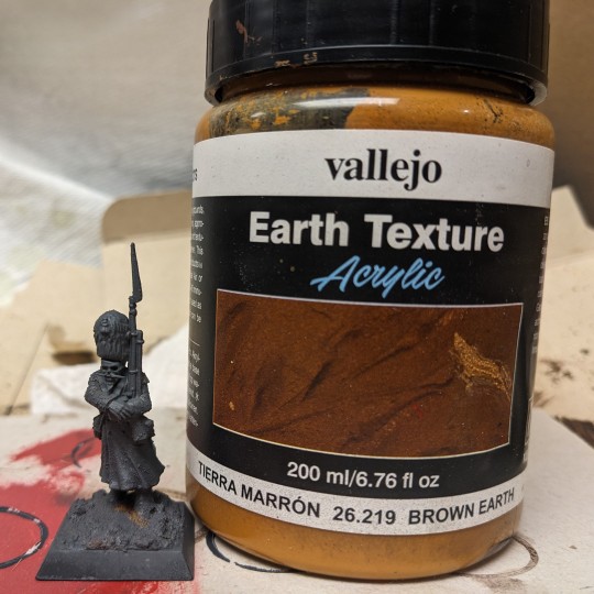
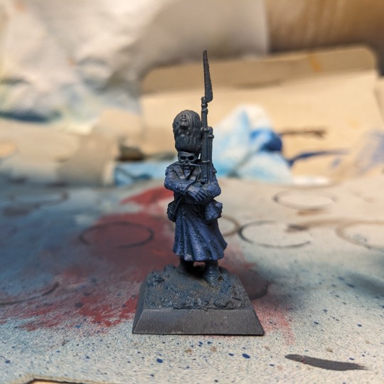
Before priming, I applied texture paint to the the model's coat, and his rifle. The dirt texture on the rifle will help sell the rusty appearance later. For pretty much every different color on the model I will paint it a dark color, then drybrush/rough highlight the same color in a lighter tone over it. Since the majority of the model is his coat, I paint the entire thing dark blue, then drybrush a lighter blue over it.
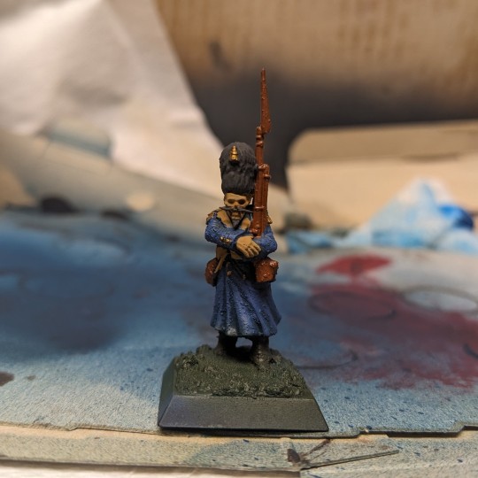
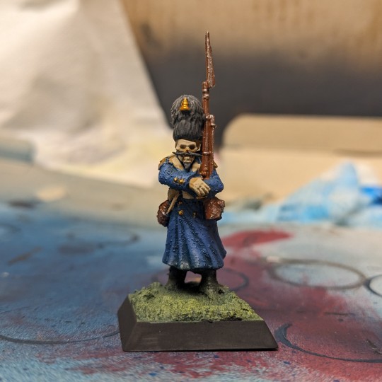
Next I paint all of the base colors for the rest of the model. Dark Grays for the boots and hat. Brown/Beige for the sash, skull, and hands. Dark brown for the leather and rifle. Dark gold for the shoulders and tassel on the hat. Once dried, I drybrush or dab rough highlights on these same spots with a lighter tone of paint. Light gray for the hat, bright gold for the shoulders and tassels, light beige for the bone. For rusty metallics, I drybrush silver over the brown painted rifle.
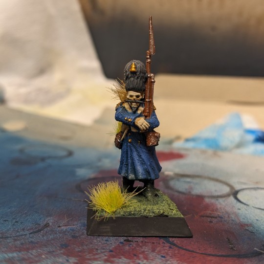
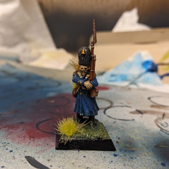
Grass tufts are carefully superglued onto the miniature. Do not overglue and be sure to let it dry properly before continuing. Too much glue will fog up the surfaces and ruin the paintjob! The miniature is then varnished with gloss clear coat. Wow, look at that shine!
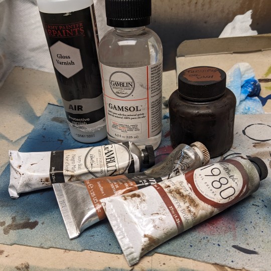
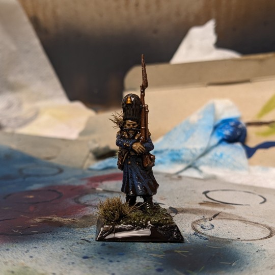
Now its time for the turnip oil! I have a shade wash I created by mixing Brown, Red, and Black Oil Paints with Mineral Spirits. I mix it thoroughly and test a small drop on a paper towel to make sure its not too thin or too thick. If you've ever spilled Agrax Earthshade, you know the consistency of the wash you're looking for! This is applied over the model to pick out the details like any other shade wash would, as well as give it that really dirty look.
Again, make sure the model was covered in Gloss Clear Coat first as it helps the Oil Wash spread out on the miniature and get into all the recesses. After the model dries, you can dip a cotton swab in Mineral Spirits to reactivate the oil wash and move it around as necessary. If you're happy with how everything looks, apply a final coat of Matte Varnish (Or Gloss or Satin, whatever your preference) to seal your miniature and done!
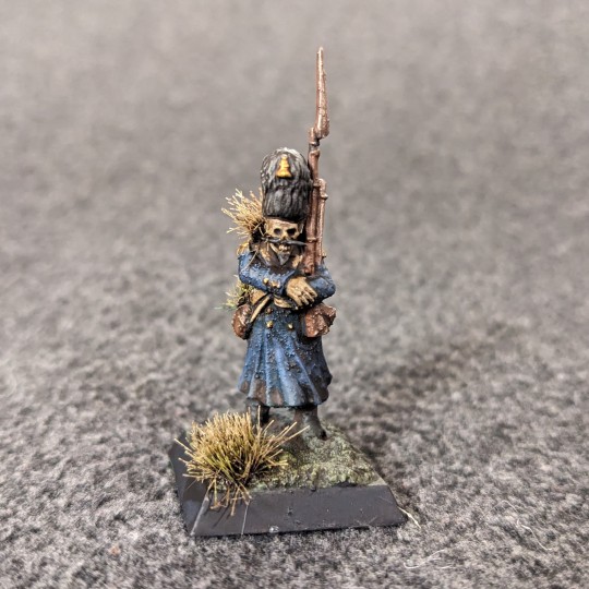
Ready to die an unglorious death for the Roots! Thanks for the ask, I hope all this makes sense, I've never done a tutorial before. Happy Hobbying! :D
#maniakminis#hobby talk#hobby tutorial#painting tutorial#turnip28#miniature painting#miniature wargaming#wargaming#long post#longpost
22 notes
·
View notes
Text
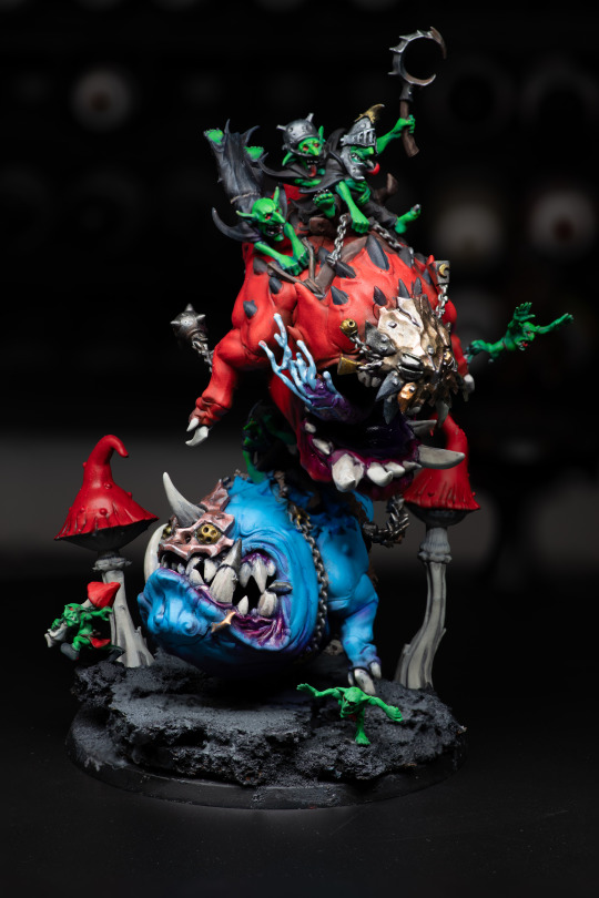
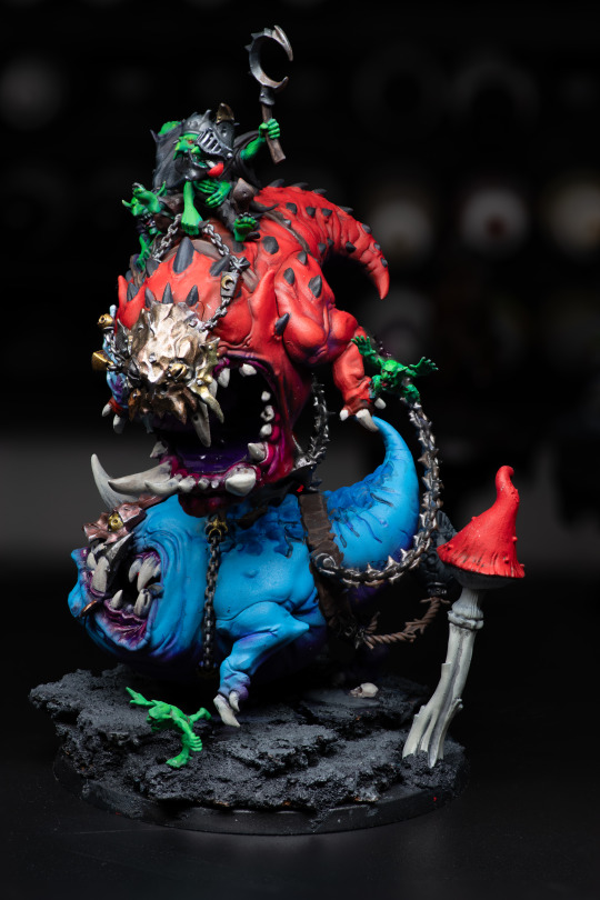
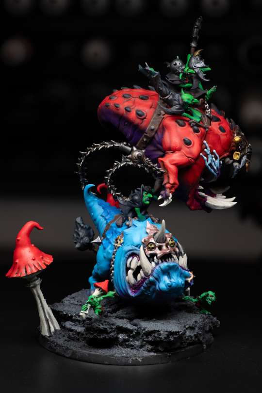
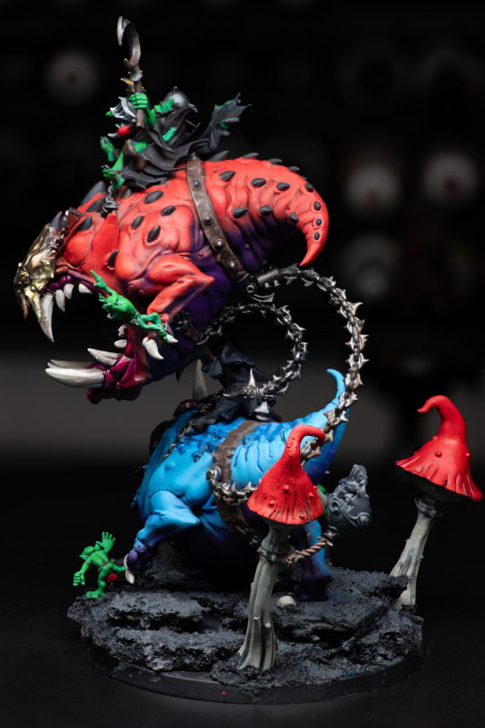
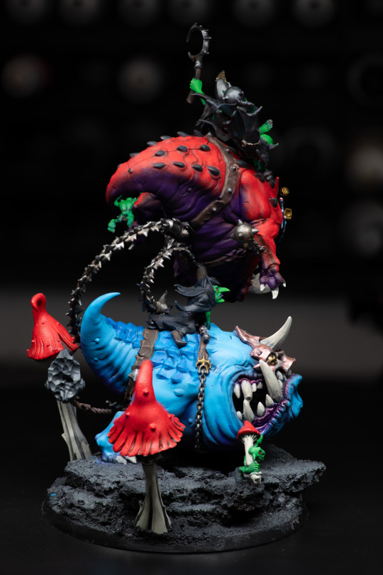
My secret santa took way better photos of the Mangler Squigs I painted than I did so I need to share these.
Damn was this a great project that I got to play with a lot of things I don't normally get to.
This was in part a test to see if it was worth graduating up in airbrush quality by seeing how it worked on larger models, as well as playing with what I could do with different types of selective shading techniques, and adding different effects to metal that I don't normally like to apply to minis. Lastly a test with different types of varnishes (though I accidentally clogged my airbrush with that because I didn't clean it enough afterwards. Oops).
Anyways, I really do recommend if you're into mini painting to pick up a stellar model from a range or army you don't normally do to test some things out. It can be really neat to not feel the need to paint something to match a theme.
6 notes
·
View notes
Text
Mewtwo's cloning machine colored became my most popular post so I'm making a tutorial with it.
I know I only colored it but I did use some pretty important techniques when doing original art too so I'm hoping it helps.
Okay so let's say you have a sketch, or in my case an image you want to color. Rule of thumb, you don't want to leave that in grayscale.


If you have a color scheme in mind you'll want your starting point to reflect that. Most art programs have ways for you to do tonal correction.

I like using levels for cleaning up the brightness and making lines sharper, and color balance for adding colors. Gradient map works nicely too. Generally you want to pick contrasting colors for light vs shadow. I did yellow for lighting and blue for shadow because I wanted to catch that oceanic underwater feel. But you CAN do cool lights with warm shadows!
2. If you want to color under your image or sketch, set it to multiply. Lower the opacity to help you see better if you want to do linework over it, or leave it as is if you just want to color your sketch.
3. Block in your colors to get a feel for the lighting. You'll want to make sure you have a CLEAR sense of foreground/middleground/background. Which means you need to pick colors that are bright/medium/dark shades and assign them accordingly.
In this case my foreground is darkest, I chose to make middleground (the machine) my light source, so it is brightest, and background is my medium shade. You don't have to do it in that order, but just keep those rules of three in mind. Foreground, middleground, background. Light, medium, dark. Assign accordingly as your piece needs.


A great way to test your composition is to set your image to greyscale, or even remove your sketch. If you still have a clear impression of depth and where everything is, you're on the right track.
4. What's your focal point? What's the main subject of your piece? What do you want to draw the viewer's eye, to stand out, to be the whole point of what you're drawing? Because that's the part you're going to focus on rendering now.
For me it was the shell.


This was three different layers on different blending modes where I just played with textures, colors and brushes until I got an effect that I liked. In fact I liked it so much that these layers are actually above the base image, so that the texture is untouched by the manga scan texture and the yellow-tinted multiply effect.
5. By this point, if you're applying these steps to any art piece you're working on, you should have a pretty good basis. You should have your colors mapped, your composition, and your focal point for your work. You can continue to render the details, but try to stick to your composition.


None of these steps are particularly complicated. It's just a matter of coloring within the lines, staying true to your chosen color scheme, and remembering where the light source is.
6. If you have a secondary focal point, (in my case, Team Rocket) you can give it a little bit of special treatment to help it not get lost in the image.


I went as far as to copy and paste them, adjust their levels separately from the rest of the work so they looked sharper and cleaner, gave them their own colors separate from the scheme of the main peace, and only tied them into it with their shadows. I painted some rim-lighting around them true to their colors (like Jessie and James's hair) just to help them pop. They're not the main focus of the image, but they're somewhere that they aren't supposed to be, so they need to stand out a little in their own right. 7. Add some finishing touches.


This can be things like adding soft glows to your light sources (I keep mine simple, just a few strokes with a watercolor brush set to the add blending mode) and some shines to shiny objects.
And that was about it.

Coloring this piece was just an excuse for me to play with color composition and textures without having to worry about my own line work for once. But I still used some pretty important principles in illustration to catch what I saw in my head while looking at the original uncolored page. (Especially step 3!! Try that in your next work!)
15 notes
·
View notes
Text
One of my biggest regrets is that I never drew as a kid. I did draw a little, but never really outside of an art class or anything better than a stick figure. Luckily for me, I can just start now! So, I'm going to slowly learn to draw. I'm thinking of posting some of it occasionally here as a way to keep a record of my progress and to just put some of my thoughts down.
I don't have a lot to say about this one except that shading is pretty nifty and it feels so much easier to draw a character without hands, hair, and a face. (All I have to do is just never draw a character with any human features!)
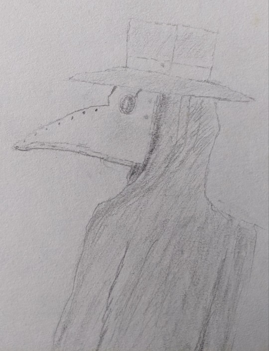
Drawing expressions is so fun! I have a lot to learn about it, but something about it just fills me with joy. I was testing out different small changes and I think the big smile is my favorite, though I like most of them.
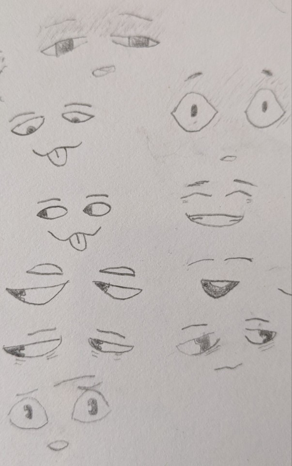
I can draw Siffrin! It's not great, but I can draw the silly little guy. The bottom half is a bit rushed because it was 12 at night. There's a ton of things I want to do differently and better next time, but for now this will do.
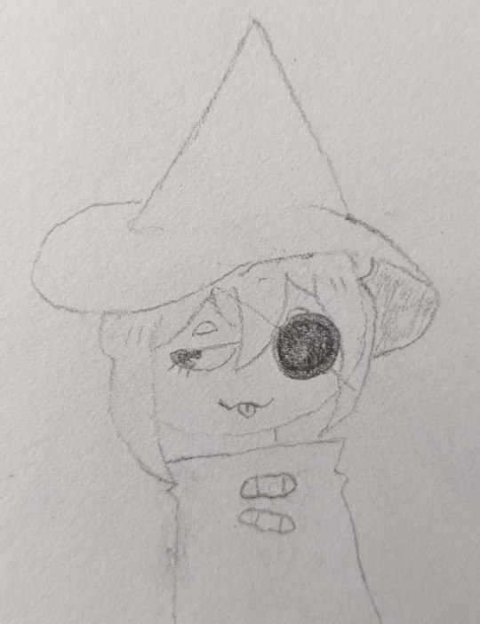
I don't want to talk about it...
It was more about trying the technique and I'll get better at it eventually...
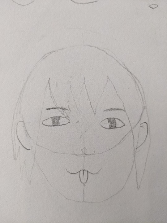
#i want to move to digital art eventually but i gotta walk before i can run#this also makes me notice so much more in other people's art#small things that made a difference that i never really thought about#tenrats art
6 notes
·
View notes
Text
Thanks for 1K reads guys!
It really means a lot to me!
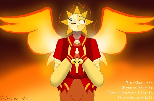
And just as I promised, I bring to you a drawing in honor of The Superstar Miracle reaching 1K reads on Wattpad! I call it: "Mini-Sun, the Daycare Phoenix".
For context in case you don't get the symbolism: in The Superstar Miracle, Mini-Sun rose from the ashes of his father (Sundrop) without him even knowing until Mini-Moon came to be... but then in the actual FNAF fandom, he rose from the ashes of what I like to think was the golden age of the DCA fandom, as a fankid of the pride and joy of modern FNAF... think about that for a second... in both his story and in the fandom he's for, he rose from the ashes of his predecessor, just like a phoenix rises from its ashes in a more powerful form!
This was also kind of me testing out different shading techniques ^^
#fnaf#fnaf au#fnaf security breach#fnaf daycare attendant#security breach#sundrop#fnaf fanfic#the superstar miracle#mini-sun#fnaf dca generations au#fnaf dca generations#daycare attendant generations#daycare attendant generations au#dca generations#dca generations au#1k reads special#phoenix#thank you all for the reads#it means a lot to me#<3#announcements
20 notes
·
View notes
Text
My Canon-Compliant Headcanons 'Bout Nohara Rin:
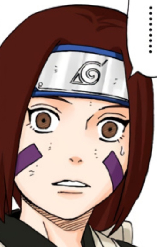
Her Number 1 most Favourite colour is black. She even befriended Uchiha Obito & Yūhi Kurenai initially coz of it. Rin saw their hair on the 1st day of school then instantly went to go tell them "Your hair is pretty!!" as soon as break-time started. Rin likes pouring black ink onto white sheets of paper & shift the paper around, watching the ink spread as she tilts the paper. Her 2nd Fave colour is shades of violet, but she's allergic to all flowers in the genus Viola and doesn't particularly care 'bout flowers nor flower language at all (Rin doesn't dislike them, though; she's fully neutral).
Rin fidgets with her hands a lot; whenever she's not doing so, her feet move instead. It's basically impossible for Rin to stay still unless she's unconscious or under the influence of a genjutsu. Even when asleep, Rin keeps moving the entire time; sometimes she falls off her bed as a result. The red headband Rin wears on her wrist is a 5th birthday gift from her mum since her fingers messing with it helps Rin concentrate when someone is talking to her.
She feels an ache behind her eyes each time Rin makes eye contact with someone, so she tends to look at people's noses or foreheads when trying to indicate that Rin is paying attention to someone who is speaking to her and she openly stares all over her surroundings if she thinks the person won't get angry at the incorrectly assumed lack of listening. Rin's eyes also are sensitive to light, so she carries sunglasses with her everywhere in a pocket or in her weapons pouch. Regardless of whether indoors or outside, she puts them on to give her eyes a break from the pain brightness causes to them.
Rin loves strawberries and sea turtles!! She ever since infancy is always eager to eat the former and ever since age 3 adores any strawberry or turtle themed item she can find. Her biological parents' 4th birthday gift to her is a strawberry (Fragaria × ananassa) in a pot suspended from the ceiling of her bedroom. Rin's dad works as a gardener, so he helps her take good care of it. Her bio fullsister Nohara Ren's 4th birthday gift to her is a shuriken in the shape of a sea turtle (Chelonioidea).
Ren & Rin are very different from each other. Where the former is good at interacting with other people, the latter is fully socially incompetent. Where Ren easily wakes up early & enjoys sunlight, Rin can sleep through anything & anywhere and likes moonlight. Where the former can't use medical ninjutsu & is skilled at using genjutsu, the latter is skilled at using medical ninjutsu & can't use genjutsu. Where Ren can read a 205-paged textbook in 5 minutes and remember & understand everything she'd been reading, Rin needs to take a lot of breaks for the same book & give herself practice tests then revise before she manages to learn anything. The former is energetic, the latter is mostly quiet. Ren has zero issues with her eyes and can sit still without moving at all, Rin (as mentioned earlier) struggles a lot. However, despite all of these differences, the 2 sisters love each other and Rin (who is 5 years younger than her big sis) respects Ren a lot.
Until tragedy strikes. Ren graduated at 6 years old then was recruited into Root by Shimura Danzō (who secretly had the jōnin whose apprentice she was assassinated). The mental strain eventually caused 12 years old Ren to murder her loving bio parents and spare Rin (who witnessed the whole thing) solely coz her sisterly love had turned twisted. Ren knocked Rin out with 涅槃精舎の術/Nehan Shōja no Jutsu/Nirvana Temple Technique then snuck out of Konohagakure and lived the rest of her life as a nukenin, travelling all over the Human World 'til she died from microscopic polyangiitis at age 17. Rin started learning medical ninjutsu and how to identify & resist & break genjutsu due to her trauma from Ren's betrayal & their caring, civilian parents' death.
Rin usually is genuinely nice, but her social incompetence & her bluntness often get Rin into trouble. She dislikes arguments & so tries to be the peacekeeper between Obito and Hatake Kakashi, but often fails at it since Rin lacks diplomacy skills. She respects Namikaze Minato a lot for having the same background as her – a kid with civilian parents and no kekkei genkai – yet growing extremely skilled thus Rin develops a fascination for fūinjutsu.
Rin's most Fave word is friendship (in Japanese yūai which is written as 友愛 in kanji). She's a lonely person who holds tight to the very few friends (her parents, Ren, Kurenai, Obito, Kakashi, Minato, and Uzumaki Kushina) she manages to gain; although Rin doesn't always forgive them if they wrong her in some way, she does always give them a second chance and never holds grudges. It's not that Rin is unable to hold a grudge or incapable of spite; she feels those emotions, but they fade away as soon as Rin sees her loved ones since she's grateful that her family interacts with her at all. She's bad at setting boundaries and a hypocrite whose morality vanishes when her friends are the ones who do something she'd never tolerate from anyone else (not even if the person has always been sincerely nice to her). If she had lived past her suicide at 13 years old, Rin coulda grown out of these traits with some help from her family and a competent therapist. She also woulda bit by bit befriended Isobu the Sanbi (as Rin at the time of her canon death is the Three-Tails' jinchūriki).
Rin likes following her usual routine and dislikes it being interrupted (she's not a spontaneous person). She hates the taste of tsukudani and feels conflicted 'bout kids, in her teens wanting to someday become a bio or legally adoptive mum yet her whole time as a ninja up to that point always being utterly terrible at D-rank missions which involve babysitting (Obito is good at those and Kakashi relies on books to be at least semi-competent at them, her teammates' success lowering Rin's self-confidence since she sometimes compares herself to them, Kurenai, & Ren).
Ren & Rin's parents are civilians who were born in the Village Hidden in the Leaves, their respective bio parents having been civilians who were born there too to a few of the first civilians to join Konohagakure after the Village Hidden in the Leaves was founded. As stated above, the cisgender girls' dad Nohara Daisuke works as a gardener; he also grows as much of the family's food as he can. The girls' mum Nohara née Terada Ran is a housewife who (after a talk with her husband to figure out what they'll do) upon finding out she was 3 months pregnant with their 1st kid quit her job as a waiter in favour of focusing on raising the couple's children, Daisuke raising their daughters whenever he wasn't busy with work or his garden. Ran has the same violet filled-in square tattoo on each facial cheek her daughters have, getting the 2 tattoos on her 5th birthday same as her children do. The tattoos are a tradition started by Ran's bio mum Terada née Ōkan Ruki who at age 4 got them for herself; upon 3-year-old Ran wanting them, she told her only kid: "If you still want them next year, you can have them." Ren & Rin got the same choice too.
Her hobby is collecting sea shells, coz she ever since age 3 loves how pretty they are.
#rin lives!au#...kinda#more a bunch of canon-compliant headcanons with a few brief mentions of rin living instead of dying#pro rin nohara#nohara#nohara rin#rin#rin nohara#nohara family#rin headcanons#naruto headcanons#alex's thoughts
9 notes
·
View notes
Text
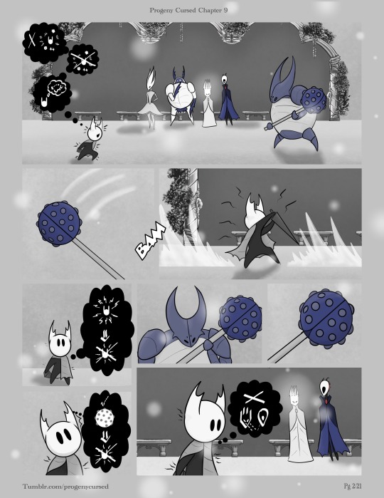
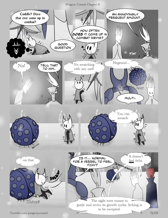
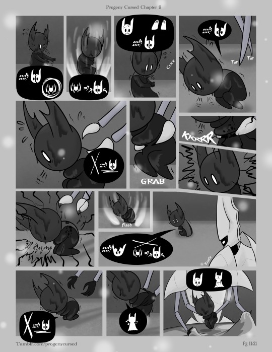
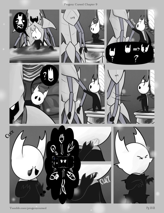
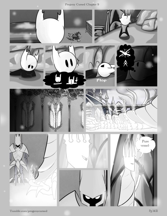
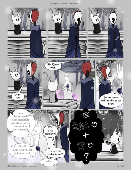
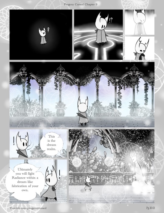
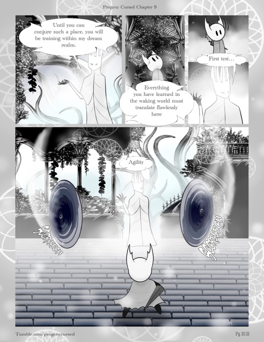
Progeny Cursed Chapter 9
The Pure Vessel learns what that painful procedure was meant to do. Once they stop panicking after some help. The Pale King misses a developmental milestone, and has to figure out how to explain how to do something that the body usually does on its own.
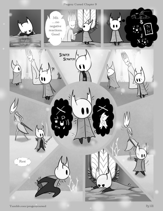
{that} test for reactions thus don’t react <Itchy> Don’t react Don’t scratch <itchy>
<irritating> Don’t feel Stop feeling Think tactics <ow> <itchy> Pain stop itch Weapon could stop itch Can’t be seen
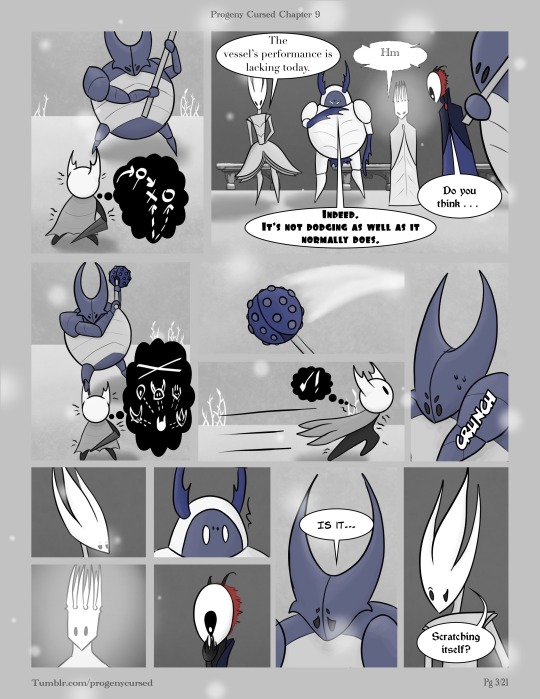
<prickling> Tactics Can’t be seen Yes!
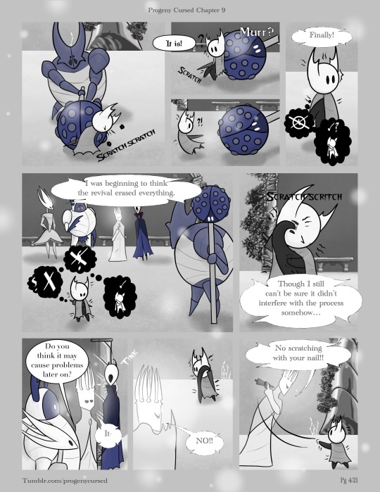
<itch> *content* *startled* Stop time, can scratch Why- no. No ask why. Can scratch <itchy> *shock* <itchy>
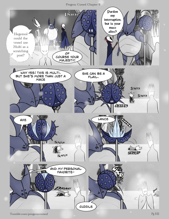
<itchy> Floor bad *awe*<itchy> *nervous* <itchy>
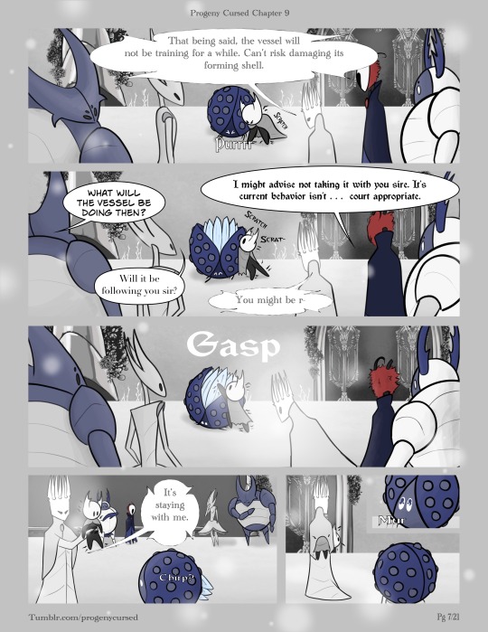
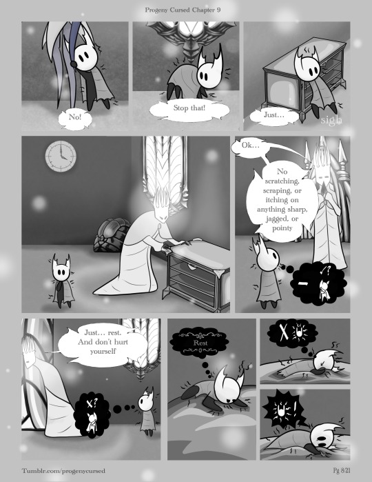
<prickling> But can scratch? Can’t scratch? {rest} <I T C H Y> Don’t feel itchy ITCHY!
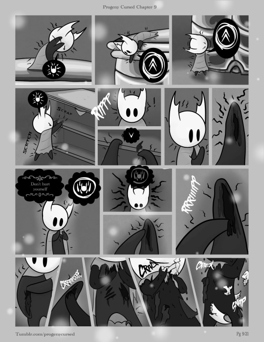
<scratchy> itchy Need better! Need better! <crawling> itchy! *shock* Bad {don’t hurt yourself} should heal<scratch> should heal <scratch> <CLAW> <RIP>
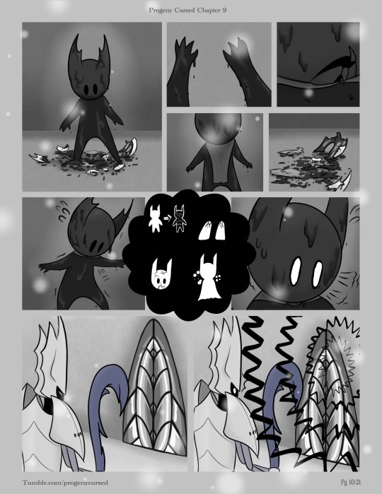
*nervous* *scared* ~frantic~ Skinned self! Claws cracked! Mask cracked! Bleeding! *panicking* ~hyperventilating~ [terrified scream]
~*panic*~Going to die Must heal Heal fix ~*panic*~Mask cracked, claws cracked, dying Dying ~*panic*~Don’t want to die <[pain]> Dying, healing can’t fix Dont want die Bleeding. Mask cracked, body cracked
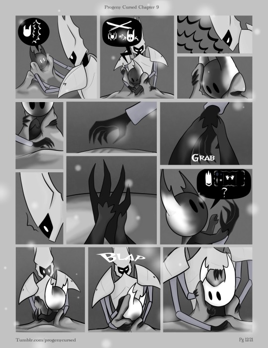
*hysteric* Help Heal can’t fix [help] *surprise* (You) have cracked claws?
Not bleeding? what mask crack? Mask break kill? Do (you) broken mask? (People) all have fractured claws *<grossed out>*
Mask crack spread if lay on Itchy stop is great
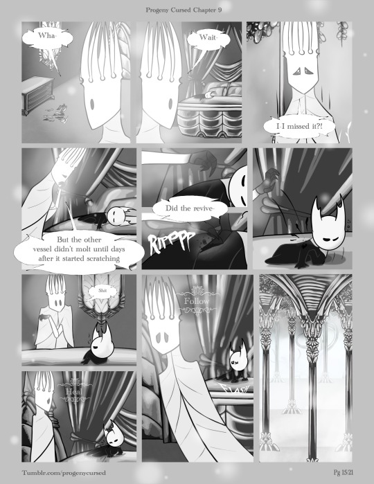
<hurt> <half asleep> <pain> <exhausted>
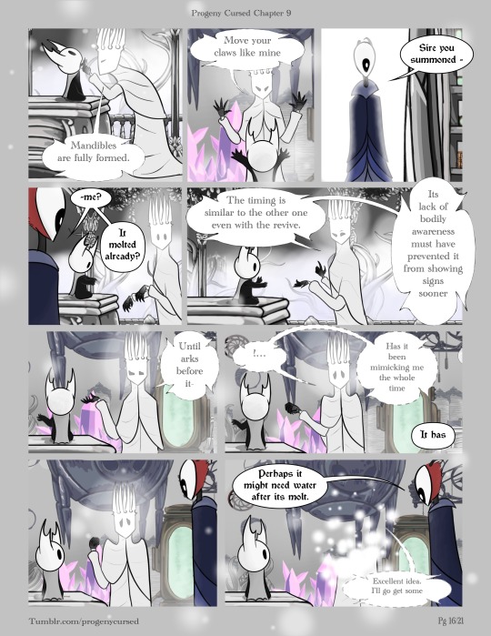
*nervous* stop time, {that} again and {that again}
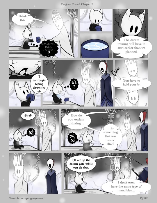
{drink}? <mask dry?> ~chocking~What is?! ~hacking~ stop this ~sputtering~ can’t stop this ~cough~
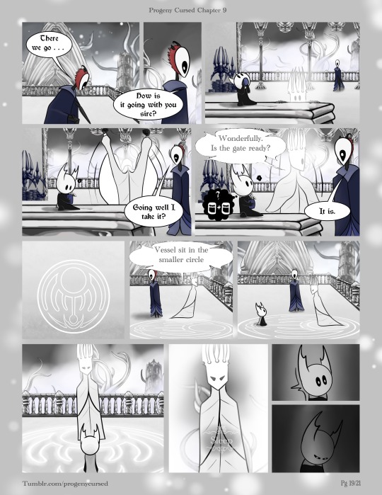
*content* Can have another?
First | Previous | Next
Void Translations: Quick guide: () is referencing a person and due to the nature of void speak, don’t have direct translations. {} memories. Recalling past moments ** emotions. Little particle effects floating around or on their head <> physical feeling/reaction. Lines/arrows in speech: single line=direction. Double line=a word/part of the sentence. Solid line=present tense. Dotted line=future tense. Hollow line=past tense
Imagine how terrifying a molt would be if no one told you anything about it. You suddenly just peel off you own skin to find the body underneath isn’t the same. Different size, new parts, and and extremely delicate.
Tried a new shading technique this time around. Went a little faster than the usual. I think…
#progeny cursed#hollow knight#hollow knight comic#pale king#comic draw app#pure vessel#comic draw#hollow knight pale king#hollow knight pure vessel
57 notes
·
View notes
Note
I’ve been peeking in your art for a bit and it’s absolutely lovely ! Specially your hades fanart? It’s so so good, I wanted to ask what brush you use for your lineart? It gives such a nice touch to your art I’m curious haha, so sorry if you’ve answered this already
thanks a lot! and i don't think i've said what brushes i use before so i might as well give a full rundown. i use CSP with a mix of default and downloaded brushes
i'm assuming you're talking about my chaos drawing? for the lineart here i used the default milli pen with anti-aliasing set to minimum. this is basically just a round pixelated brush with no pressure sensitivity so i think you should be able to get a similar effect on other software pretty easily. (this specific illustration also used the technique of copying the lineart layer, setting it to a strong saturated color (eg bright pink or purple), blurring it a little and setting the layer to reduced opacity. this adds to the crunchyness and might be the effect youre looking for!)

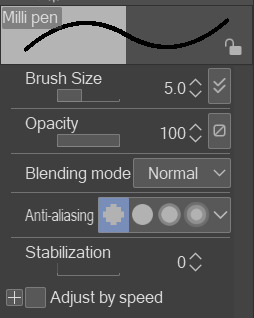
this pixelated effect is one i find really fun personally. the optimal brush size in my experience has been 5-9 with this brush, with occasionally 3-4 for detail lines
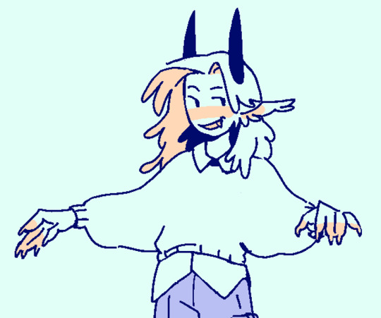
as for other art, sometimes when i'm not feeling the pixel effect i used the same milly pen brush but with the second anti-aliasing setting. it keeps the lines crisp but not pixelated (example)

although recently i found the wiggly brush on the asset store that can work as an inbetween alternative. still in progress with the drawing im testing it on and while i think i'll stick to the milli pen it adds an interesting texture

you didn't ask about rendering brushes but i'll say anyways. my other three main brushes come from the arubrush set i saw someone mention on tumblr i believe? theyre by knight zhang the link is in the faq section. i downloaded a the motherboard set and experimented until i found a few i liked, though there's a lot of stuff worth checking out in there!

i used the painterly and alector brush for any painting and rendering. the chaos piece was done using a mix of both (mostly the alector brush) for the shading.
this oc painting was done almost exclusively with the alector brush, while this melinoe piece was done with the painterly brush, if you want to compare the textural differences.


and i use the last one for sketches occasionally! its more textured than i prefer for finished works but its really nice to draw with

that's about it! hopefully this helps
7 notes
·
View notes
Text
Art Log - 06/2024
It's been about 3 months of using Procreate for me!
Would have never happened if it wasn't for my good friend who's an incredibly talented graphic designer. She let me test drive Procreate on her iPad. Back in the day we bonded over being weird artsy kids in school and now we're being weird artsy adults together 🤝 Best friendship dynamic.
According to tumblr, I posetd my first digital painting on April 4th (over on my other blog). I think I made a bit of progress since then, even though I didn't make a lot of paintings in the meantime.
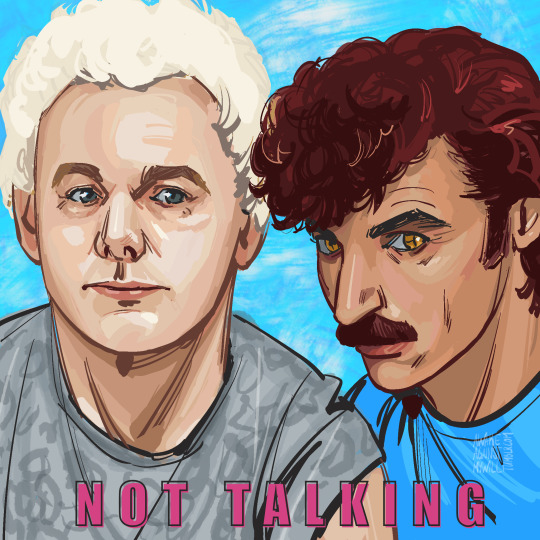
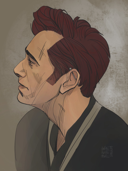
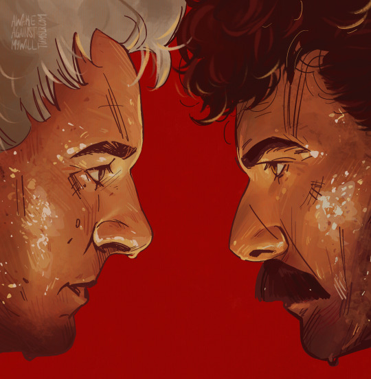
For every single painting I'm still making a traditional pencil sketch, upload that to Procreate and then start coloring on top of it. Not sure if I'll ever get fully confident sketching directly in Procreate.
I started liking the process and the result more around the third painting when I started using a combination of soft and hard shading with some hatching for texture. So that's the 'technique' ended up using more deliberatly for this portrait of Aziraphale.
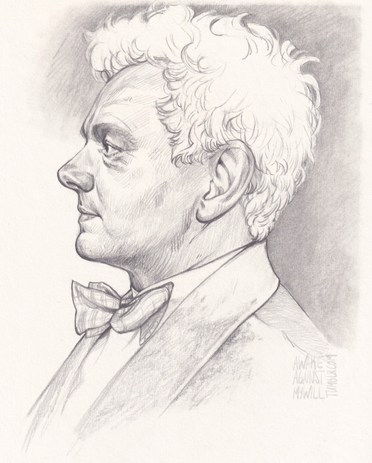
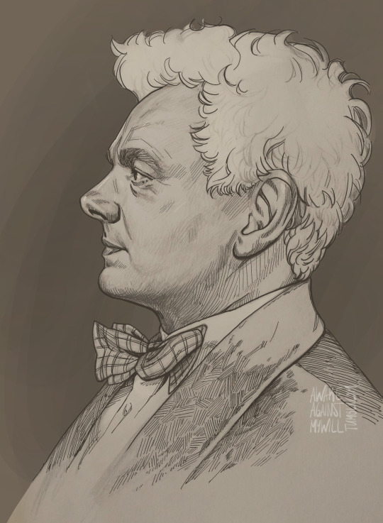
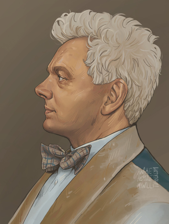
Gotta stop drawing side profiles, that's way too many side profiles 🙈
I'll post a more detailed making-of of that portrait to document my process a bit.
The trajectory of the stats is a little concerning: 1st painting (3hrs 50min, 16 layers), 2nd painting (5hrs, 21 layers), 3rd painting (9hrs, 23 layers), 4th painting (23 hrs, 62 layers). Yeah, probabaly not a sustainable trajectory. I need to learn how to make some quicker illustrations. I tried here, but did not like the result that much.
I will forever love traditional drawing and painting, but. Digital art ... it's nice! There's no extra space needed to store paints, no brushes to clean later, fixing mistakes is easy, trying out several different color variations not a problem.
It's a goal of mine to make more complex paintings some day. It will be hard for me, I just love portrait drawing too much, it's my happy place, you see? Right now I'm working on another portrait. And then I have another planned after that. So. I'm definetly not going anywhere fast with those plans, that's for sure 😅
#art stuff#art progress#art log#good omens fanart#digital art#procreate#what even is this blog idk#awakesfanart#awakesfanart:go
16 notes
·
View notes