#take me back to brazil palette
Explore tagged Tumblr posts
Text


Mascot Memories | Never Grow Up
this is the first part of the small 3 part series that i have lined up next
summary: remi is 3 years old and she is a mascot at leah's game for the first time during the world cup in 2027
pairings: leah williamson x reader

“Someone’s excited to be a mascot at Mummy’s game today, aren’t you?” You couldn’t help but beam with a smile as you bent down to your daughters’ level.
“Yes!” Remi’s eyes are dancing with excitement at the prospect of being able to be a mascot in England's opening game of the World Cup that is being hosted in Brazil, “I’ll be the best mascot ever, Mumma!”
You press a kiss to the top of your little girl's head and smile at her, “I’m sure that you will be, baby girl,” You pause as you pick up the small jersey hung up on the hanger, “Do you want to get changed into your football shirt?”
“Wear Mummy’s number?” Remi asks, curiously.
“You bet, Remi Roo!” You nod encouragingly, helping your little girl shed her previous t-shirt in favour of the football jersey with Leah’s number written on the back of it, “You look just like Mummy now.”
“There’s my baby Gooner!” Leah’s voice appears out of nowhere, walking into the changing rooms as she’s almost tackled to the floor by Remi.
“Mummy!” Your 3 year old crashes directly into your wife’s legs.
“Ooft,” Your wife let out a grunt of pain when the whirlwind of a toddler ran into her, “When did you get so big?” She questions, crouching down to your daughter’s level.
“Mumma keeps feeding me all of them veggies that ‘ou don't like,” Remi retorts cheekily, poking fun at Leah’s childish food palette that limited her to only a several few things that she seemed to like to eat – The only veggie she will eat being peas, and even those she thinks are too exoctic to eat.
“Of course she does,” Leah chuckles in amusement as she takes a look Remi donned in her own Jersey with her name on, “Well don’t you look the part.”
“I look just like you do!” Remi grins, dressed in a tiny England jersey to match Leah’s with her hair pulled back into two playful pigtails, and a pair of white Nike trainers, “Even Mumma said that I did!”
“You do indeed,” Leah replies in agreement and holds her hand out for your little girl to take, “It’ll be time to line up soon, do you want to come and stand with me? I bet you we’ll hear the roar of the crowd from there!”
“Yeah!” Remi bounces up and down on the balls of her feet, her excitement palpable as you can indeed hear the noise coming from inside the stadium, a mixture of England travelling fans and the fans of the home team. It’s a feeling that leaves you with a buzz of your own excitement.
“Alright then,” Your wife smiles and turns in your direction, “Say bye to Mumma and Essie and we’ll make our way out there.” She tells her, gesturing to your 8 month old baby girl Esme Beau Williamson, born in September 2026.
“Bye, Bear. Bye, Mumma. Love ‘ous!” Remi rambles quickly with energy bursting through her, leaning over to give her little sister a kiss on the head and crash her little arms around you.
“I love you too, baby girl,” You tell her, pressing a kiss to the top of her head, “Have fun out there with Mummy, okay? We’ll be watching you!” You add, gesturing to the fact that Amanda and Jacob, Leah’s mum and brother were joining you to watch in the stands.
“She’s going to be absolutely fine, love,” Leah reassures you, sensing your initial nerves due to the fact that Remi would be walking out onto the pitch with your wife for the first time and you are worried about how she might take that overall, “I’ve got her. I love you.”
“I love you too,” You respond, pressing a gentle kiss against your wife’s lips, “Good luck out there, superstar. Make us all proud!” You add, moving to fix the captain’s armband around your wife’s arm and kissing it for good luck, a ritual you’ve come to do every game that you attend.
“I aim to just do that,” Your wife grins, a flash of cockiness taking over her face for a second before she peppers small kisses on Esme’s forehead, “Bye, Essie Bear. I hope to make you proud too. I love you.”

The stadium erupts into loud cheers as you watch your wife hold Remi in her arms as they make their way onto the pitch, your daughter is waving enthusiastically out to the crowd of England fans as there’s not a single trace of shyness in her demeanour.
Leah, ever the professional, keeps her focus with her stern game face plastered but even she can’t help the smile that tugs at her lips every time she gazes at her daughter. For the first time you’ve ever witnessed, your wife actually breaks her stern expression as the spotlight is on your daughter.
“Remi looks so grown up,” Amanda speaks aloud from where she’s standing in the stands amongst you, Jacob and Esme, cradled against your chest, as she watches in adoration of Leah and Remi on the pitch.
“Don’t say that too loud or Leah will freak out,” Jacob jokes, regarding Leah’s fear of Remi growing up too quickly. It’s now become a somewhat ongoing joke in your family now.
“Speaking off, look how proud Le looks,” You say, watching your wife and daughter with tears welling up in your eyes.
“This is definitely a moment to treasure forever,” Amanda chimes in, wiping one of her own tears away.
“I swear she might even relent from her usual stern frown,” Jacob jokes watching as Leah stood tall and proud in her captain’s armband, her face glowing with both excitement and pride, “Rem looks adorable though!”
“I mean, there’s always a first,” You remark in amusement as you watch your wife and daughter on the pitch, feeling insanely proud of them both.
The sun shines brightly over the sprawling stadium in Brazil, where the energy of the World Cup is palpable. Fans gather in vibrant colours and flags fill the stands, creating a sea of excitement and anticipation just as the national anthem plays and you can’t help but smile looking out onto the pitch while you look at your daughter who is beaming with an infectious smile.
“I think I might cry,” You murmur, overwhelmed with pride watching them as the National Anthem begins to play.
“You and me both, darling,” Amanda replies in agreement, her eyes are misty.
“Can you see your Mummy and your big sister, Es?” Jacob holds Esme in his arms like the proud uncle he is and points his index finger in the direction of where Leah and Remi are standing on the pitch amongst the rest of the England team, “Look, there they are!”

“Mummy! There’s so many people!” Remi’s voice is quiet and in awe, her eyes gazing around the stadium at the several thousands of fans in the stadium, “Are all these people here for ‘ou?”
Leah chuckles fondly as she keeps a gentle grip on your toddler, “Only half of them, baby Gooner,” She pauses as she points with her index finger in the direction of where you all sat in the stands, “Over there is Mumma, Essie, Nana and Uncle Jacob over there? Give them a wave!”
“Will they be able to see me from this far away?” Remi asks, curiously as she waves brightly in the direction and you can’t help but smile in adoration of the pair together, “It's so far away!”
“I bet they will,” Leah nods in agreement, spinning slightly to look over in the direction of the giant screen and then towards a camera, “Do you see that big screen over there? There’s a camera on the pitch and Mumma will be able to see you, even from all the way over here.”
“Wow,” Remi’s eyes widen in amazement as she eagerly waves in the direct eyeline of the camera and her mouth forms the perfect O as she sees herself on the screen for the first time, “Mummy! I’m on the screen with ‘ou!”
“You are,” Your wife couldn’t help but laugh faintly as the end of the National Anthem played, which meant that it was time for the coin toss and captain duties, “Do you want to come do something extra special with me?” She asks.
“Uh huh!” Remi’s eye’s gleam with excitement at the prospect of doing something extra special according to your wife as she continues to carry Remi over to where Leah stands together with her teammates, with Remi perched on her hip to take a photo.
“Remember to smile, Rem,” Beth, one of Leah’s fellow team mates for club and country, reminds your little girl as she ruffles her hair playfully, “Don’t be frowny like your Mummy now.” She jokes, poking fun at your wife’s impartial need to always scowl during a team photo.
“I don’t frown all the time,” Leah retorts, scowling at the blonde.
“Yes you do, Mummy!” Remi’s little voice replies in agreement as she giggles, “You don’t scowl at me or Bear though!” With those words in mind, Leah can’t help but crack a laugh and the official photographer manages to capture the moment, history is changed that your wife actually broke her stern expression during a team photo.

“Mumma!” Remi shouts running across to you as fast as her little legs will let her, “Did ‘ou see me out there? I waved at ‘ou!”
“I did see you, baby girl!” You scoop her up into your arms, twirling her around as she giggles with delight, “You were amazing! The best little mascot I have ever seen!”
Your eldest daughter continues to bounce up and down in excitement, “I was on the big screen with Mummy!”
“We saw that, Tiny,” Jacob grins, ruffling your daughters’ hair, “You looked like a champ out there!”
“We’re so proud of you sweetheart,” Amanda chimes in, pressing a kiss to the top of Remi’s forehead.
“And I even got to take a photo with Mummy, Auntie Beth and everyone else!” Remi continues to ramble, a tone of excitement in her voice still as she slumps back to sit on Amanda’s lap to watch the match play out.
“Mummy’s gonna win!” Your little girl declares, confidently.
“That’s the hope, baby girl,” You agree with her, brushing a loose strand of hair out of her face, “We’re going to cheer her on though, no matter what. Mummy is a winner to us, no matter what. Right, Remi Roo?”
“Right, Mumma! I will be the best cheerleader ever!” Remi exclaims, nodding enthusiastically in agreement, “Mummy’s the best footballer I know!”
This game might have just been one of many in Leah’s career, but this day certainly was special and one to cherish, being able to watch your wife and daughter walk out onto the pitch together.
A memory that you will always remember, shining bright in your heart.

© scribblesofagoonerr
#woso x reader#woso fanfics#arsenal x reader#woso imagine#woso#woso one shot#arsenal women x reader#leah williamson x reader#arsenal wfc x reader#scribblesofagoonerr
302 notes
·
View notes
Text
Get to know me!
thanks for the tag @the-type-a I'm really bored lol
🖌 - Do you have/want any tattoos?
I don't have a tattoo and I will only make one if I am sure of what I want. So yea maybe in the future I would get one or two
💚 - What’s your favourite colour?
I can't choose one tbh, I love so many colors so I will say the beach color palette
🍕 - What’s the last thing you ate?
Ice 💀 I try to hold my wishes on chocolate by eating ice
🕰 - What time is it where you are rn?
7 PM!
🌟 - What is your zodiac sign?
I'm a virgo
sun on virgo
virgo rising
and moon on aries
no fucking joke
🌍 - What is your favourite accent?
Australian accent, I can't take out of my head after I rewatched H2O mermaids
⚡️ - Do you have any scars?
If I have any then it was my cats faults lol (I have a few)
🌺 - What’s your MBTI type?
INTJ
🥀 - Favourite animated movie?
Lilo & Stitch and Spirited Away
📺 - Favourite show?
Total Drama, Alice in Borderland, Killing Eve and South Park
😂 - Are you ticklish?
Yes but my reactions of it always scares people 💀
💍 - Do you ever want to get married?
no and I doubt I will change my mind
😳 - Do you like your name?
When I was a child I used to hate it but I like it just fine now
💙 - What colour is your bedroom?
One of my walls are grayish lilac and most of my stuff in my room is pink so I think is pretty much pink
🤓 - How did you get your name?
My grandmother and grandfather were going to call me as Valentina but my mom hated so she picked Julia instead lol
🎓 - When did/do you graduate?
High School I graduated in 2021, I'm going to study and apply to college this year
🍄 - Do you have/want any piercings?
don't have any piercings but I'm planning to get a bellybutton pierced but I want to be 100% sure of it
👀 - What colour are your eyes?
dark brown
👱🏻♀️ - What is your go to hairstyle?
my hair is on my shoulders and they are naturally wavy so I just leave them wavy and straight my bangs (wavy bangs are impossible to manage)
🥂 - Have you ever drank underage?
yes
🍾 - Have you ever gotten drunk?
yes
😱 - What’s your biggest fear?
not having a successful life and having a miserable and boring life
🥵 - Would you rather be too hot or too cold?
too cold, I love drinking hot chocolate and getting cozy on my blankets
🌦 - What’s your favourite weather?
rainy day with partial sun, fucking vibe
🍂 - What’s your favourite season?
spring cause my bday it's the first day of spring in Brazil
🐷 - What’s your favourite animal?
basic but I love cats
🐶 - Do you have any pets?
2 cats and 1 dog
😴 - What’s the longest you’ve ever gone without sleep?
a whole day
🎨 - Any hobbies?
playing valorant I think? 😭 I also draw sometimes
🛩 - If travelling was free, where’s the first place you’d go?
Japan, I love their food so much and I would enjoy to see their culture
🎇 - What’s your most searched thing on Google?
Duncney fanfics and South Park episodes
📱 - Favourite app on your phone?
Tumblr lol
🤠 - Are you more of a city person or a country person?
I'm more of a beach person, my whole childhood was going there and only leaving to eat so I could go back on the sea lmao but I also do enjoy the city
tagging; @webui1tgwensface @whenalioness @courtneyinreallife @courtneydeservesbetter @he4thney
6 notes
·
View notes
Text
A time-honored tradition, please take me and @crestfraldarius’ Zexal/Sharkbait shitpost headcanons we made over our weekend together:
-In addition to Edgar Degas the papillon, Ryouga also has a corgi named Archibald
-Thomas and Ryouga frequently hot box together in one of the Kamishiro’s fancy bathrooms. Thomas also may have had a cocaine problem.
-Kaito and Rio are dating. But they can still fuck other people (specifically Kaito and Chris and maybe Mizael)
-Yuuma is still an idiot. A lovable idiot. Ryouga loves him so much
-One night Ryouga asks Yuuma to degrade him but Yuuma always KATTOBINGUs things and goes a bit too far
“C’mon I can handle it. Make me feel like shit c’mon.”
“UH…. BESIDES ME, WHEN WAS THE LAST TIME SOMEONE SMILED WHEN YOU ENTERED A ROOM?”
“…………….🥺”
“SHARK BAE NO-I DIDNT MEAN IT-“
-Ryouga says Yuuma can go anywhere to eat for his birthday. He will rent out the entire place. Michelin level restaurant. Paris. NYC. LA. Wherever. Yuuma chooses Olive Garden. (The marinara sauce is a bit too spicy for Kaito’s palette tho)
-Kaito and Ryouga are always at each other’s throats. But they are best friends (don’t tell anyone tho).
-At weekly dinner with Kaito, Ryouga, Yuuma, and Rio - Y: HEY SHARK WHAT’S AN ANAL PROLAPSE?
-Yuuma can hike 20 miles up hill and not break a sweat. He cannot handle walking three miles in a major city.
-Every now and then, Yuuma actually pronounces a high end brand or ~fancy~ food correctly. Ryouga is weak.
-Ryouga and Rio are mixed. Their mother is French. Ryouga’s “English” name is, of course, Reginald.
-Yuuma breaks out “Reginald” only in severe cases. Otherwise he’s “Shark” 99% of the time.
Y: wait what’s Rio’s English name?
R: ……Rio. It’s easy since it’s a western name.
Y: oh like the city in Brazil?
R: Ugh Yuuma no Rio’s isn’t located in-…..wait, you said Brazil? That’s……correct. Wow.
Y: I saw the movie! Did you know there are only two blue macaws left in the wild?
R: *taking off pants* god I love you
-Picture the “so no head?” Vine but with Ryouga and ripping a multi-million dollar donation to a zoo/aquarium when one of his favorite sharks is off display
-Ryouga has a 12 step Korean skin care routine. Yuuma washes his face with Dawn dish soap
@crestfraldarius please reblog ones I forgot I know we have more
I REMEMBER MORE EDIT:
-Ryouga rolls his joints with gold leaf. Just because. He also has a Mexican drug kingpin on speed dial. Don’t ask questions you don’t want answers to
-Kaito has to be a chaperone when middle school Yuuma and Ryouga go to the mall for a date because they need an adult after 6pm. Kaito gets sick of Ryouga being nervous to make a move and calls him out on it frequently (“HOLD HIS FUCKIN HAND, RYOUGA” “Listen here you teeny bopper twink I am going to go to the bathroom and if you don’t KISS HIM by the time I get back I will show the world your self insert fanfic collection.”)
4 notes
·
View notes
Text
Case Study










Transcript:
Slide 2
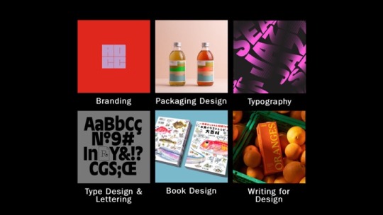
While researching D&AD award winners, I selected a series of categories that particularly sparked my interest as I felt like my work related to them. These categories included branding and packaging design - which is relevant to this units work, typography, type, design & lettering, book design, and writing for design. From each category, I then selected one pencil winner that had designs drawing me in the most.
Slide 3
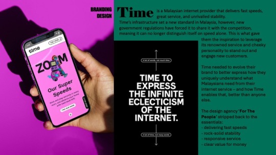
To begin with, the branding design award was Time, a Malaysian Internet provider known for delivering fast speeds. New government regulations meant it could no longer distinguishe itself from speed alone. The design agency ‘For The People’ stripped back to the essentials and redesigned the company with new illustrations and a more distinguishable logo, to accentuate the companies cheeky personality, and engage new customers. ‘For The People’ won a wood pencil for this redesign.
Slide 4
I then looked at packaging design for the Hornicultural Society. ‘Ogilvy UK’ released a series of limited edition condom packets in the style of seed packets to help tackle the rise in STD’s among the over 65s. The packets feature typography and cheeky strap lines that are all creative ways to loosely describe sexual body parts. Both graphite pencils and wood pencils were won for this under numerous categories.
Slide 5
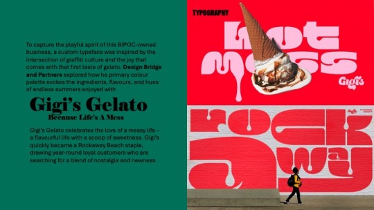
Under the category of typography, I selected Gigi‘s Gelato. The design agency ‘Bridge and Partners’ explored how primary colour palettes evoke the ingredients, flavours and hues of endless summers enjoyed with Gigi’s. ‘Bridge and Partners’ won a graphic pencil award for this type design
Slide 6
The fourth award I looked at was type design, where ‘Studio Drama’ created a dualistic headline type face family for Vogue Brazil. They were presented with the challenge to effectively combine sans serif and serif styles encapsulated by two polarising ideas - vernacular and elegance, creating an authentic outcome that embodied Vogues iconic brand with the rich and cultural typographic heritage of Brazil. ‘Studio Drama’ were awarded a graphite pencil for this typeface
Slide 7
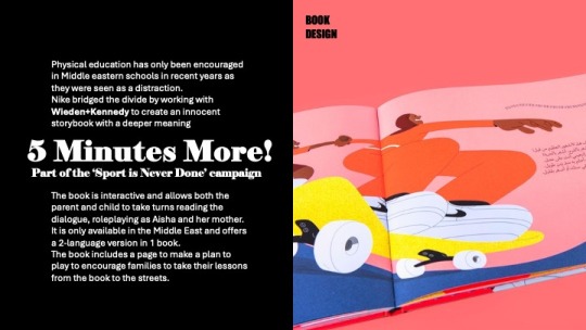
Looking into the category of book design, the one that stood out the most to me was “five minutes more” - which is part of the “sport is never done” campaign with Nike. Physical education has only been encouraged in Middle Eastern schools recently, as it was always seen as a distraction. Nike worked with Wieden and Kennedy to bridge the divide by creating an innocent storybook with a deeper meaning. The book is interactive and allows the parent and child to take turns role-playing as Aisha and her mother, and encourages families to take their lessons from the book to the streets.
Slide 8
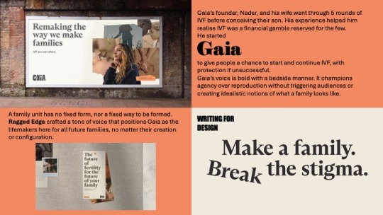
Finally, I looked at writing for design, where the design agency, ‘Ragged Edge’ crafted a tone of voice that positioned Gaia as the life makers here for all the future families. Gaia was founded by a man called Nader to give people the chance to start and continue IVF with protection if unsuccessful, after him and his wife went through five rounds before conceiving their son, and discovering how much of financial gamble IVF is.
Slide 9
This design agency is the one that struck me the most, so I began to research them further.
Slide 10
I discovered that they have won a few D&AD pencil awards and have been featured on their website a few times, for Gaia, Eager which is a juice company they did a simplistic yet impactful packaging redesign for, and Papier - a stationary company they did a logo redesign for. But who are Ragged Edge??
Slide 11
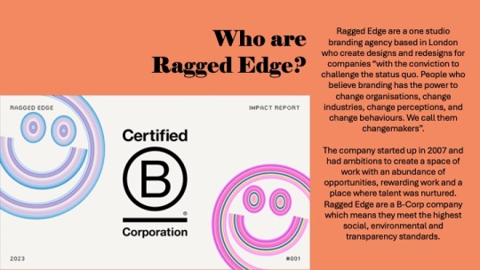
Ragged Edge are a one studio branding agency based in London, who create designs and redesigns for companies with the conviction to challenge the status quo. They state that “People believe branding has the power to change organisations. Change industries change perceptions and change behaviours” this is what they call a changemaker. Clients and that believe they have the ability to become a changemaker reach out to Ragged Edge directly to give themselves the opportunity to become one. The company started up in 2007, and had ambitions to create a space of work with an abundance of opportunities, rewarding work and a place where talent was nurtured. Ragged Edge are a B-Corp company, which means they meet the highest social, environmental and transparency standards.
Slide 12
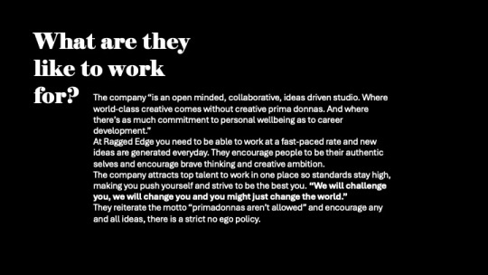
The company states they are an open minded, collaborative, ideas driven studio where world class creative comes without primadonnas and where theres as much commitment to personal wellbeing as to career development”. After reading a lot of the reviews on Glassdoor for what the company are like to work with, I could see that the only negative things mentioned were the workloads, that is its a very fast paced studio where new ideas are generated everyday. I don’t personally see this as a downside but i guess the workload may pile up and become overwhelming. Many people who have worked for them exaggerate how they are a super kind team of people and the work environment is very friendly. People are pushed to be their authentic selves and brave thinking and creative ambition is highly encouraged. This is what drew me to them even more as i aspire to work for/ have my own company with the same mindset.
Slide 13
Looking at a majority of the work done by Ragged Edge, a common theme amongst the brand is bold text and solid colours with either photography, illustrations or both. I really like their simplistic quirky style, how they use their colour pallets and how each redesign fits the brand perfectly. I would love to implement these features and style into my own future work as i think they give character to the brand without overwhelming customers.
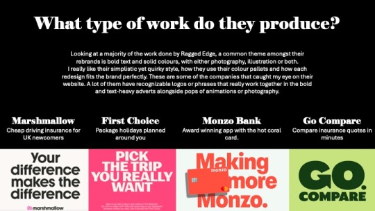
These are some of the companies that caught my eye on the website. A lot of them have recognisable logos or phrases that really work together in the bold and text heavy adverts alongside pops of animations or photography - Marshmallow, a driving insurance company, First choice, package holidays, monzo banking and go compare.
Slide 14
I delved a bit deeper into some of their projects that interested me the most. Firstly, Marshmallow insurance
Slide 15
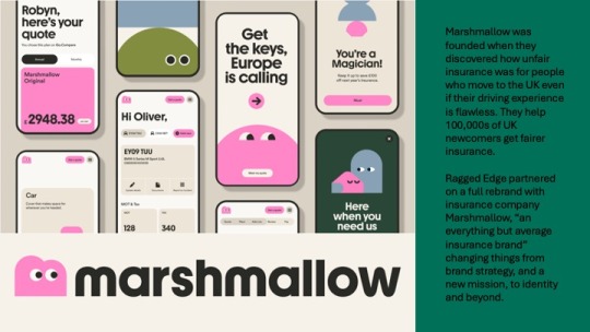
Marshmallow was created when it was discovered how unfair insurance prices were for people who move to the UK - even with flawless driving experience. Marshmallow helped to combat this and help hundreds of thousands of UK newcompers get fairer insurance. Ragged edge partnered on a full rebrand with this insurance company and changed things from brand strategy and a new mission, to identity and beyond.
Slide 16
They generated a library of what they called “marshforms” made up of different shapes, that can be stacked and built together to represent the infinite variation and uniqueness of their customers. A bespoke typeface was also created, with a brand new M logo of a little marshmallow who is always looking forward. With the implementation of photography as well, they were able to bring their customer’s personality to life with bright and vibrant lighting.
I really admire the simplicity and clean feel to the brand with it still having its own character and personality. This is the style of work i hope to be able to produce in coming units and projects.
Slide 17
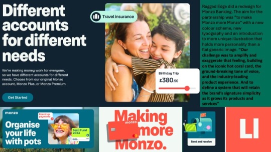
Additionally, I looked into their rebrand of Monzo where they aimed to make Monzo more Monzo with new colours, type and illustration.
Slide 18
With the introduction of these things, the brand feels much more welcoming and friendly in comparison to other banking companies. I think the colour palette used fits really well together. The illustration suits the vibe of the bank and the type with moving image is bold enough that catches your attention yet simple enough to get the message across.
Slide 19
Looking at the interface and how the colours match each other well is very interesting to me. The hot coral represents the warmth from the company, followed by a complementary, navy blue and soft white alongside vibrant secondary colours used when necessary for added eyecatching features. The design is quite simple, but adding these vibrant colours and accents across the UI makes it more unique than what generic banking app/website includes. For example, Lloyds Bank has white black and green as their only featured colours and this can be quite boring. The pops of colour Monzo use along side animated illustrations has makes the banking seem like less of a chore.
Slide 20
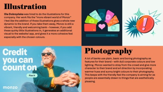
A lot of banks, use plain basic and boring photography as features for their brand with corporate colours and low lighting. Monzo wants to stray from the crowd and give more character to the brand and art direction by incorporating warmer hues and sunny bright colours to the photography, keeping to the friendly feel of the company.
Ola Dobrzyńska was hired to do the illustrations for this company. Her work fits the more vibrant world of Monzo. But I feel like the addition of these illustrations gives a whole new dynamic to the brand. If you take them away, Monzo is still a vibrant friendly and welcoming bank however, if you add these quirky little illustrations in, it gives an additional visual to the website/app and gives it more cohesive feel.
Slide 21
I looked further into the work of Ola Dobrzyńska, a full time freelance illustrator based in Warsaw, Poland.
Slide 22
Ola’s work is bold and colourful with a passion for character design.
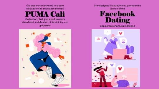
Two pieces of work she has created with recognisable industries outside Monzo include illustrations to showcase the new Puma Cali - a collection that gives a nod towards sisterhood, the celebration of femininity and girl power. And illustrations to promote the launch of the Facebook dating app across channels in Poland.
Her work can be seen mostly on instagram where she showcases her illustrations frequently, and etsy where she sells her prints.
Ola’s work as an illustrator really inspires me as this is a strong interest of mine and the opportunity to work with big name clients like she has done would be incredible.
However, I would need to expand my illustration skills a lot more if i would like to work to this level - I can’t be a procreate girl forever, I need to step into the adobe illustrator world and learn to draw in vector.
Her illustration style is very different to mine but is all cohesive. While it is nice to have versatility in drawings, it is also nice to have a consistent theme amongst them, and this is something that i would like to improve on, so no matter what piece of artwork you see, you know it was by the same person.
Slide 23
As a whole, looking at both Ragged Edge’s and Ola’s work. I know that this is the path of work that is for me, either working in a design agency for branding, or being a freelance illustrator FOR the design agency.
To be able to achieve this I would need to expand my skills in all softwares and be able to use them easily and glide through without problems to ensure i work quickly and efficiently. I would also need to generate a portfolio of work that relates to the industry I want to work in, showcasing all skills i have in a multitude of ways and over a range of projects. Ragged Edge seem like a really great company to work for with opportunities to work on some amazing things that would be really fulfilling and exciting. The only way to work for them would be to check out the open roles on their website or email them, so this is something i can consider in the future when i have a large enough portfolio
In the next 3 years I aim to refine my design work a bit more and create more professional seeming work, with a variety of brand assets that can be incorporated and a solid recognisable logo through the use of thorough experimentation. I will try to increase my knowledge and use of adobe illustrator for typography and the designing of graphics to make things more seamless and clean.
Bibliography:
0 notes
Text
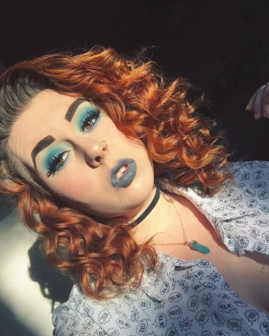
“But this much was certain: I didn’t want him if he didn’t want me. I deserved to be wanted, didn’t I? I wasn’t going to convince someone to be in love with me.”
-Aimee Agresti, Infatuate
#selfie#quote#aimee agresti#infatuate#love#i deserve to be loved#just so ya know#blue#blue eyeshadow#grey lipstick#take me back to brazil palette#shrug#beautiful
6 notes
·
View notes
Photo


Did my makeup for no reason so had a photo shoot
2 notes
·
View notes
Video
tumblr
New makeup products i’ve gotten the last couple weeks
#take me back to brazil palette#peach perfect foundation#too faced#bh cosmetics#amerzyhighlight#anastasia beverly hills
4 notes
·
View notes
Photo


So I’m obsessed with this look, and a lot of people liked it (I got over 5 compliments which is way more than normal lol). It took a lot of products to get the eye look so please bear with me while I go over everything. Enjoy the ‘unicorn’ look, and the nails that inspired it! I'm doing this a little out of order because it's easier to describe what shadows I used for what so those products will be the last product paragraph.
Mascara- They're Real Primer with Badgal Lash on top, both by Benefit cosmetics.
Eyeliner- Slide On Eye Pencil in Purple Blaze by Nyx Cosmetics.
Brows- Eyebrow Powder Pencil in Brunette by Nyx.
Undereye Concealer- Bye Bye Undereye in Light by It cosmetics with setting powder (product info on next line) on top.
Powder- Stay Matte in Buff Beige by Rimmel London (both under and on top of setting spray).
Setting Spray- All Nighter by Urban Decay.
Concealer- Studio Finish in NW15 by Mac cosmetics.
Foundation- Photofocus Foundation in Porcelain by Wet N Wild.
Highlighter- Illusion from the Blacklight palette by BH Cosmetics with Wanderlust (no longer sold) by Vanessa's Vanity on top.
Lipstick- Metal Matte Lipstick in Grape Crush by Gerard Cosmetics with La Creme Color Drenched Lipstick in Unicorn Tears by Too Faced on top.
Bonus- Nail polish: Lets Get Digital by Sally Hansen.
Eyeshadows: 2nd from the left shadow from the top row of the Take Me Back to Brazil palette by BH Cosmetics. Then I added Bori from the Masquerade Mini Palette by Juvia's Place. Then I added Ife from the Magic palette by Juvia's Place. Because I hate matte shadows so much I added Voodoo from the Urban Spectrum Palette by Urban Decay to the crease and outer corner of my eyelids. Then I added some Bye Bye Undereye with a flat synthetic brush to the inner corner of my eyes. Next I applied Metamorphosis from the Full Spectrum Palette by Urban Decay on top of that, then I added Electra from the Galaxy Chic Palette on top of that shadow in the inner corner of my eyelids. Then I added Super Shock Shadow in Sugar from Colourpop on the inner corners, with some more Metamorphosis from Urban Decay on top to make the blue pop.
I apologize for all of the products used on my eyes, but until I get the look I was going for, I tend to add colors on. I had problems with the lipstick combo, it speckled after I ate, and I had to reapply. However, I was really happy with how the rest of this look turned out. I got so many compliments on it this day, both from friends and strangers, including one security guard lol.
#makeup of the day#motd#makeup#full face makeup routine#original post#unicorn makeup#gifs //#take me back to brazil palette#galaxy chic palette#blacklight palette#super shock shadow#eyeshadow#purple and blue#blue and purple#masquerade palette#the magic palette#juvias place#urban spectrum palette#full spectrum palette#colourpop#bh cosmetics#full makeup routine#full face makeup#full face routine#matching makeup
4 notes
·
View notes
Text
not sure if i have many followers who are makeup lovers, but one of my favorite brands bh cosmetics has a sale that ends sunday night where a ton of their site is up to 70% off (all the deals are linked here). their brand is affordable as it is and their quality overall is very good.
my favorite products from them so far are any of their brushes, eyeshadow palettes, highlighters, their makeup removing solution, quick-change brush cleaner, lip liners, and diamond dazzlers, but i’ve heard good things about many of their other products! also, free us shipping on orders $40+.
#makeup#bh cosmetics#recs#personal#i like their neutral palettes but i'm gonna buy the take me back to brazil one probably! i've never tried their colorful yet#the shaaanxo palette is so good too but that's sadly discontinued#but u can probably find it on amazon?
9 notes
·
View notes
Text

💛
4 notes
·
View notes
Text
u know what. im gonna say it. the nyx ultimate bright palette wishes she could be what the bh take me back to brazil palette is.
#i have to say it bcuz no one else will.#theyre the same price and u get 35 colors in the bh palette and theyre cuter anyways.. AND like Way more pigmented#everyone who has th nyx palette b lik no its great u just have to try rly hard to get any color payoff :)#and it doesnt have to b lik dat... try my queen miss take me back to brazil she gives u what u want and what u didnt know u needed#also for ppl who dont know n care abt makeups sorry iv jus been thinkin abt this every day i do my makeup
7 notes
·
View notes
Photo

👽🖖🏼👽
#gif#bass alien#alien#eyeshadow#cut crease#eye makeup#pink eyeshadow#purple eyeshadow#intense eyes#take me back to brazil#eyeshadow palette#happy#stoner#glitter#loose glitter#nyx#nyx glitter#stoned#pnw#raver#glam#bh cosmetics
17 notes
·
View notes
Photo

🌅Beginners Sunset🌅
#black girl makeup#dark skin makeup#pigment#sunset eyeshadow#I wish the yellow was more pigmented#and my liner was thicker#itsjessnicole#bhcosmetics#take me back to brazil#eyeshadow palette#blvckhermione#me
41 notes
·
View notes
Text


I hate the color blue so idek what I was trying to do here but it sure is something
#selfie#blue#makeup#take me back to brazil palette#grey lipstick#the lipstick doesnt have a brand i bought it off WISH like 2 years ago#shrug#beautiful#curled hair#gorgeous
4 notes
·
View notes
Text
Loki is the latest Marvel Studios TV series in the long-running franchise and it’s currently ongoing with five episodes so far available to stream on Disney+ Hotstar Malaysia. For previous breakdowns of Loki episodes, check out Episode 1 here, Episode 2 here, Episode 3 here, Episode 4 here and Episode 5 here.
If you want a non-spoiler guide to Loki, you can head on over here.
Courtesy of Disney+ Hotstar Malaysia, we were lucky enough to be the only Malaysian media to participate in a roundtable interview with Loki Costume Designer Christine Wada and Loki Production Designer Kasra Farahani.
This interview with Loki Production Designer Kasra Farahani has been edited for clarity.
Keep in mind that we’ll be discussing some elements from all five episodes of Loki so far, so there will be spoilers below:
Q: You’ve previously worked on Black Panther and other MCU movies. How different was the experience of working on a TV set instead of a movie’s? Were there limitations?
Yes, I’ve worked on several Marvel projects. For me, this is the most fun one, maybe because I’m in a different position than I was on the other ones. But also, just because this project is unique in a couple of ways.
Number one; it’s literally in its own timeline from the rest of the MCU. It’s separate from the stories we’ve all enjoyed and seen in the MCU so far. The other thing that this one has that’s really great is the amount of visual and narrative variety. We have this kind of base in the TVA that we spend a lot of time in but also we have all these exciting different places in the world that the story takes us to. These were great worlds to design and to imagine.
In our case, there was no difference. The thing about the Marvel series is that it’s pretty much like Marvel movies; in terms of their creative ambition, in terms of the way they’re scheduled, the fact that we have one director.
There was not much about it (Loki) that resembled an episodic project, except for the fact that it was six hours of content that we were trying to make, so it’s a very long project.
In terms of resources, I didn’t ever feel that we were unduly stretched. Always, when you get a creative brief like this, there’s always a period at the beginning of every project where you’re reconciling the creative brief and the resources that you have. That has been the case for every project that I’ve ever worked on regardless of the size. There’s this beginning phase where that’s the case and oftentimes, it’s in that process where you come up with some very great creative solutions that are a direct result of some of the limitations, actually.
Yeah, I wouldn’t say that we had some extraordinary limitations in this case (for Loki), but that’s generally true for all projects, in my experience.
Q: What were you inspired by when making designing the sets of the TVA with its retro-futuristic and anachronistic aesthetics?
In the source material, the TVA had a lot of different things going on, but one of the strong themes also was this armada of desks, which is kind of typical of a post-war era bureaucracy look. There was a grain of that in the source material but a lot of it also came from the show’s creator and writer, Michael Waldron, who described in the original document I read before interviewing for this job.
He described the TVA as a kind of mix of Mad Men meets Blade Runner. Part of these two strong visual references for us. On top of that, me and director Kate Herron, even before we met and spoken to each other, were inspired by Terry Gilliam’s Brazil also as a strong influence because of the anachronisms that that story had and also because of the clear presence of this strong monolithic bureaucracy, which is something that we have in the TVA also.
For the TVA, we were looking a lot at wanting to create a world that had a paradoxical feeling, being an imposing monolithic architectural space that has brutalist elements in them and had almost Soviet modernist elements to them. The colour palette and the materials and the whimsical patterning were much more like American style modernism.
The result was hopefully when you’re in an environment like this, you don’t know whether to feel terrified or invited. Hopefully, it creates that feeling in both the characters and the audience; this kind of cognitive dissonance in not knowing whether they can trust the TVA or not. That’s the narrative objective.
The writers came up with these ideas and the idea with that was to kind of create the bubble gum wrapper in the Renaissance era (Loki Episode 2) and the futuristic shovel in the early 20th-century farm field (Loki Episode 1). These ideas were placed there to create a trail of clues for the TVA to follow before they have clarity on Sylvie’s identity. But for the anachronisms generally, that was something we tried to do throughout the TVA to have all kinds of strange things from different timelines and different worlds popping up in terms of props, like the Infinity Stones in the mail cart and stuff like that.
Q: What was it like working with Tom Hiddleston, who is a producer on Loki?
It was very exciting to have this opportunity to take the character and his storyline in a different direction. It became all the more exciting when I read the scripts and I saw the type of journey they were going to take the character on.
Tom is a professor of Loki, basically. After all, ten years or so of playing the character; he knows it better than anybody and he has an in-depth understanding of the character and his backstory; the character’s family relationships and he was really helpful in giving a little talk to all the department heads about the background of his character, which was very informative.
Q: Recently, Loki series director Kate Herron said that 90 percent of production sets were physical. Does this include the world of The Void, and can you tell us more about how you brought it to life?
That’s true. That was what was unique about this show, because of my own design approach, and my goal in creating this large monolithic brutalist environment, I felt strongly that the sets needed to be built kinda wholly and that they needed to have the ceilings in-tact. This was also supported by Loki cinematographer Autumn, in that the way of her own style of photography is very wide and low-angled photography, which is why for both of our creative goals, it made a lot of sense to build these sets like completed and 360-degree environments.
For the TVA, that was almost always the case, with the exception of when you saw outside a window. With the Void (in Loki Episode 5), a lot of that was built practically as well. What I can tell you is that we build a large piece of this landscape on a soundstage, which was about 150 feet by 200 feet of undulating wilderness terrain. In that, we would bring in these different scenery elements on different days to make it feel like different places within the Void.
For example, one day there was the bus stop terrain where we meet Loki. One day it was the giant head. One day it was the drive-in movie theatre where we find Sylvie. All of these things were brought in and we shot there over the course of seven days. The terrain was designed in such a way that depending on what angle you shot, it felt like a very different place. Backgrounds were put in during post-production in visual effects. The Loki palace, where the Loki variants kind of hang out, the bowling alley, all of that was also a 360-degree built set as well.
Q: What was the most challenging set of the entire Loki series that you had to work on?
We had a lot of very ambitious sets but I think the city of Sharoo at the end of Loki Episode 3: Lamentis was a very technical set. The goal was to create this virtual one-in, that appears as a single shot. This was a very involved and elaborate process of choreography, basically.
All the different departments were involved to make this happen because as we watch the sequence, we see tons of actors running around, there are explosions happening, the camera’s panning up to see the planet above crumbling and asteroids pelting the surface.
There was a lot of planning that went through at the very beginning. We brought the paper models of this to Autumn, our cinematographer and creative director, to use to plan some of their shots. One day, we had some more information that fed back to the art department where we developed more involved and elaborate drawings and models which again, fed back to them. In this way, we had kind of an iterative conversation to arrive at what the design was.
So, as we start to build the set, many of the department heads came to visit and check the progress. We rehearsed what the shot was going to be, so we could exactly fine-tune the set to meet the needs of this shot and see where the edits needed to be. In order to do this, we needed to adjust the exact width of the roads or move a piece of scenery here and then figure out exactly, okay, there’s going to be an explosion coming out of the ground here and another explosion coming out of the building here and this is when the camera looks up to the sky and sees the planet explode. This is where the window breaks and this is where the guy jumps out and grabs him and there’s a fight.
There are many, many people involved; Monique Garderton, our stunt coordinator, Kate Herron, the director, and also the special effects team, and of course, visual effects, deeply involved, and Richard Graves, who is kind of our AD (Assistant Director), the circus leader of all of it, organizing everybody to kind of work on this thing altogether. It’s the sort of thing that involves so many different departments that it can only really be discovered when working in a big group together.
I would say that was maybe the most challenging technically because there were so many logistical parameters and so many moving parts.
Q: What are your thoughts on diversity in the production of the creative industry?
I think that it is critically important. As somebody who is myself an immigrant, I was born in Iran and my family moved here when I was quite young. I’m super happy to see the direction that the industry is going in. I think Marvel has been particularly excellent in providing leadership in this way and I honestly have to give a lot of credit to Kate Herron, our director.
Almost more than any other project I’ve been on, she prioritised inclusivity and diversity. I mean, lots of people, don’t get me wrong, it’s on every project and on everyone’s mind, but I think Kate went above and beyond because it’s so fundamental to her worldview and she’s such a sensitive soul in this way. One of the many ways in that it was such a joy to work with Kate and I’m very proud of the many different ethnicities we’re representing, and how many women we’ve had. In our art department, we had close to fifty men and women.
It’s important and leads to better creative results that are more fully realized and more representative of what the fans really want.
14 notes
·
View notes
Text
Research: Project Finish
Tim Sale
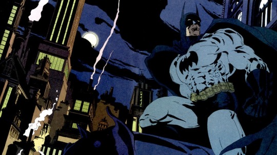
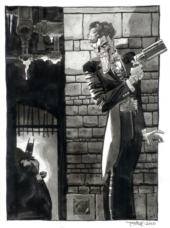
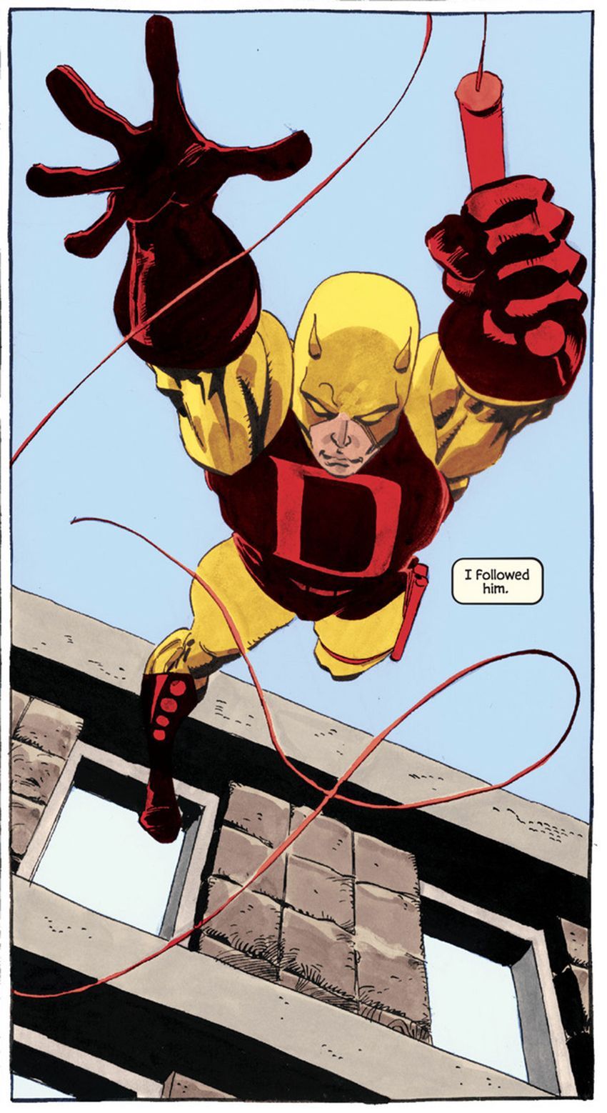
Tim Sale is a famous comic book artist, who had worked in several titles along with the writer Jeff Loeb, including Batman, Spider-Man, Superman, Daredevil, and many others.
Tim Sale was born in may of 1956, in New York, where he studied visual arts, spent a good time of his life in Seattle, and today he lives in California.
For some years he drew his art privately, only to please himself. When he found himself working at a fast food in his late twenties, however, he decided to try to sell some of his work. This led to an association with Thives’ World Graphics, a fantasy anthology series, where he illustrated stories.
What most marks his work is the dramatic aspect that he manages to obtain in the characterization of his characters and in the scenarios he creates, making the stories unique and immortalizing the characters.
The union of Sale’s art with Loeb’s engaging narrative has become the perfect marriage for mysterious plots.
One of the most striking characters worked by Sale was Batman, which he drew “The Long Halloween”, “Dark Victory” and “Halloween”. He was able to fully transfigure the dark aura of Gotham and his Dark Knight. He also worked with Superman in the saga “ Superman for All Seasons”.
Both of The Long Halloween and For All Seasons are what is known as “Year one” comics. These works take their heroes back in time to their earliest days of crime fighters.
His main tool is watercolor, which he uses with mastery. Sale's palette of colors is something really impressive, always drawing and painting his characters very delicately, and calmly. His style is very cartoonish, although this does not diminish his art in any way, on the contrary, his style is very unique and characteristic.


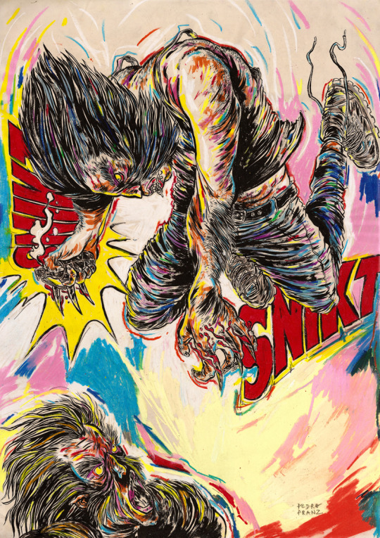
Pedro Franz
Is a Brazilian comic book artist, who was born in Santa Catarina and has a degree in design.
He has been publishing several comic books and participating in exhibitions in Brazil and abroad. As an illustrator, he has published works several magazines and books, and regularly collaborates with the Piauí magazine. As a graphic designer, he is a contributor to the Par (Ent) Esis platform. He has comics translated and published in English and Spanish, and has good international recognition, thanks to his publications.
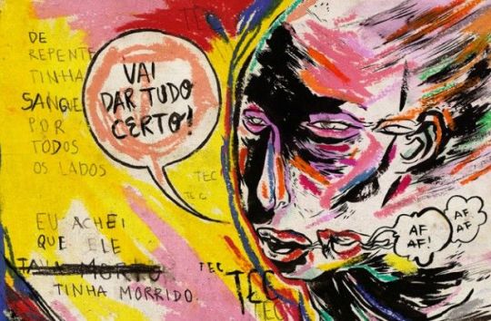
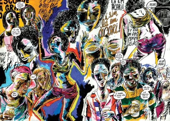
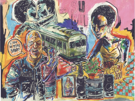
But what is most impressive in Pedro's art, perhaps is his intensive use of colors. Mixing various shades of different colors, mixing different compositions. In addition to sometimes using characters from pop culture, with his elaborate style.
Despite liking traditional comics, he has always published and worked for national publishers, often with authorial works.
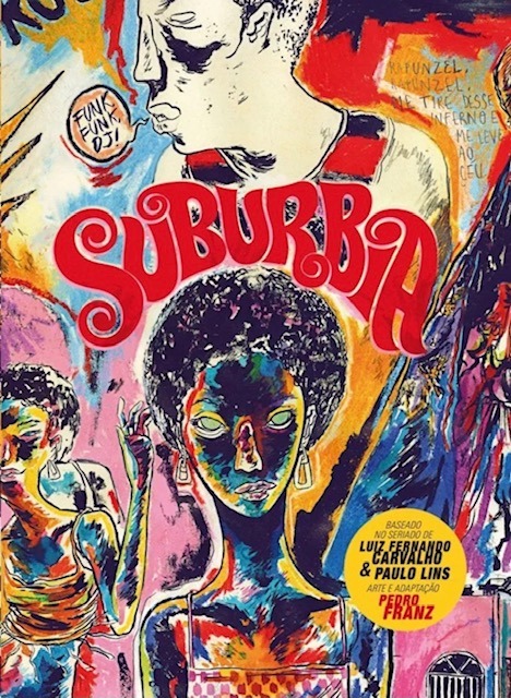
Perhaps his best known work, which was even published in the United States is the comic “Suburbia”.
Suburbia tells the story of Conceição, a girls daughter of enslaved rural workers, who flees to Rio de Janeiro in the early 1990s. In the city, Conceição begins to work as a cleaner and to get involved in the world of funk, slums and poverty.
His drawings are extremely surreal, not exactly following a traditional way of making comics, with several images spread across the page, with different shapes and sizes, with extremely strong colors, mainly valuing blue, purple, yellow and red, as his main colors.
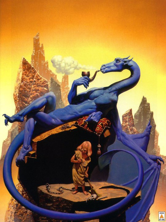
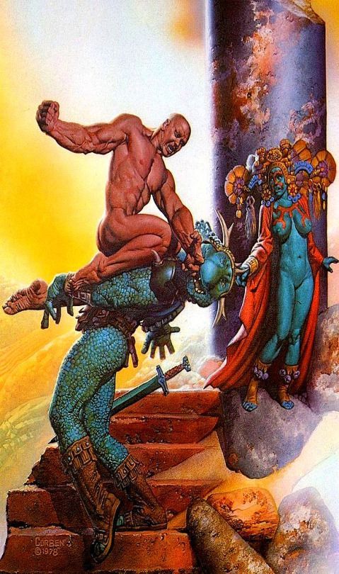
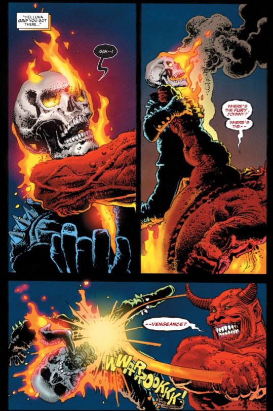
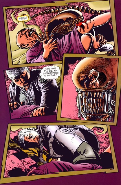
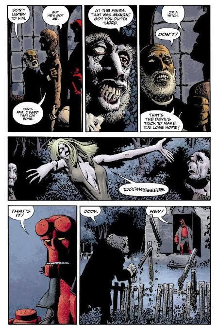
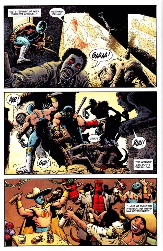
Richard Corben
Richard Corben was one of the contributors of elevating the comics to the category of Art, and of its unparalleled style of great influence among many current artists.
Richard Vance Corben was born in Missouri, United States on October 1940, in a family of farmers in the middle west ( where he started reading comics), and lived in Kansas City. There he studied Fine Arts, got married, had a girl and started working in local cinematography animation company. At the same time, he started to create and publish some underground fanzines. From the begging it was clear that he was interested in science fiction, eroticism, and total rejection of institutions ( the Army, the Church, etc), mixed with a lot of humor.
At a young age, Corben was an aficionado of bodybuilding, just like everyone who was interested in a persons aesthetics. The first character that he created, was Rowlf, a dog who took on a human form. In the beginning of the 1970s he amplified his work ( and his fame) in some underground magazines. And in 1971 he started working for the Heavy Metal publisher where he created one of his most famous characters, Den a large muscular man, who was always naked, and always after some adventure.
Corben has a very particular style, with unsettling mixture of caricatured, often satirical grotesque and intense,convincing realism. Never before had such wildly cartoonish worlds proved so convincing.
Also he can handle an exponentially higher standard because of his ability to use colour to show the effect of light on whatever he’s depicting. The way that he mixes light and colors in certain panels to differentiate those elements from each other, is something to admire.
Corben worked in a few mainstream comics, he always preferred to work with authorial works or working in specific themes like fantasy and science fiction comics and not so much on superheroes.
But probably the most famous mainstream comic that ever worked was the character Hellboy, along with writer Mike Mignola.
Hellboy is a series of comics that has a lot of mysticism, Norse mythology, horror and monsters. Something Corben certainly agreed to do, without thinking twice.
Richard Corben is one of my favorite artists, with a style that is perhaps not as realistic as an Alex Ross for example, but the humor and beauty that he puts in his characters is very unique.
Corben died on December 2, 2020, leaving a great legacy, for the world of comics and arts, with a very unique style and extremely stunning worlds.
Charlie Allard
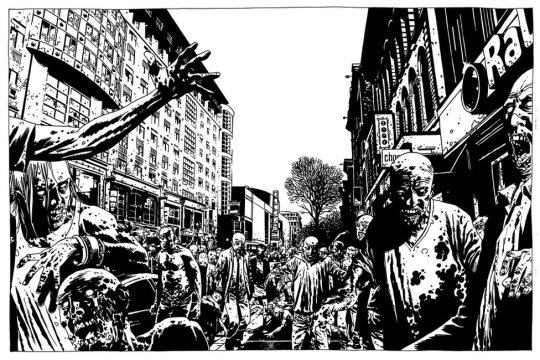
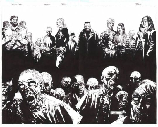
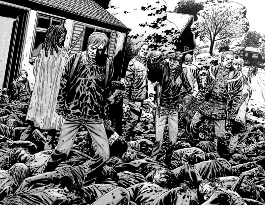
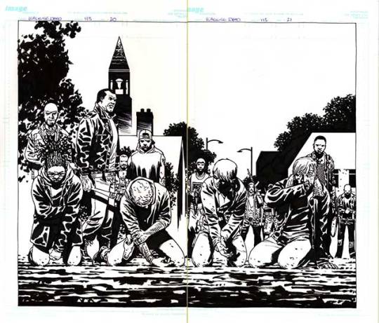
Charlie Adlard is a British comic book artist, who have worked on the comic industry for over 25 years. He spent the majority of his time since 2003 working in The Walking Dead along side with writer Robert Kirkman , until the last issue on 2019 He started reading comics when he was very young, and he said that he was very lucky to have influences of American comics and the more high art, such as Asterix and Tin Tin. He was fascinated by European comic books artists like Moebius, Alberto Uderzo and Herge. He started his career as many British artists and writers, working on 2000 AD, with characters such as Judge Dredd, Armitage and eventually Savage. In the United States he started working with the X Files, Astronauts in trouble, and of course The Walking Dead. Adlard started in The Walking Dead from issue 7, and brought a slightly different style, from the previous artist. Adlard's art is very cartoonish, but the universe of The Walking Dead still doesn't get silly because of it. Quite the opposite, the dirt and rot that Adlerd puts on his characters and the world, only sustains what a horrible world it is to live in. Many readers complain about Adlard's style, being very simple, that his characters are very similar, and sometimes it is difficult to identify them. But I believe that although his style does not vary much, when it comes time to show a horde of zombies, a devastated city, people feeling despair, and extremely disturbing scenes, Adlard manages to excel. Adlard's main tool is ink. All The Walking Dead magazines are in black and white, and he manages to give a lot of depth to the scenarios and characters using only a few ink stains. Today Adlard is doing some comics, mainly for DC, but says that he does not intend to work with Kirkman and zombies again, because he wants to explore other themes, and to innovate his drawing skills.
Zaha Hadid
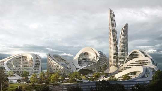
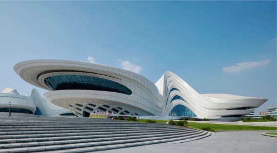
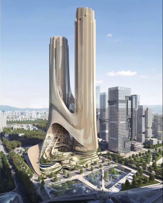
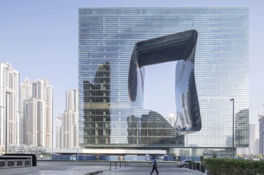
Zaha Hadid was one of the most important and well known figures in contemporary architecture and design. With a singular trajectory, marked by a versatile, bold and out of the box style, she was the first woman to receive Pritzker Prize for architecture and was also the only female representative honored by the Royal Institute of British Architects with a golden medal. Zaha Hadid was born in Iraq, more precisely in the city of Halloween, in Bagdá, in the year 1950. Her family was of high class, her father being an important politician and her mother an artist. Still young, she traveled and studied in other places of the world, like London and Switzerland, but it was in her native land the she got her first formation, when she graduated in mathematics. At the age of 22, in 1972, she enrolled in one of the most famous independent schools of architecture in London, and there she gave the starting point to her career by studying and creating an important connection with the Dutch architect Rem Koolhaas, a figure that encouraged her and opened the doors for opportunities. Later in the 1980s, Zaha Hadid decided to open her own office. This, Zaha Hadid Architects was born, which made her name and talent recognized worldwide. Known for her works with futuristic lines, clean and pure forms, as well as the fragmentation of architectural design. Her projects and discussions raise issues that put architecture and its future to the test. This is because the architect seeks in her works to interrelate design, architecture and urbanism. I knew Hadid and some of her works, but it was the recommendation of my teacher Lauren, that I should look for this architect. As my project takes place in the future, she recommended that I look at some works by Zaha Hadid to get inspiration when creating the scenario for the comic. I find it very interesting how her works have this futuristic aesthetic , because it reminds me of science fiction films like Blade Runner with those skyscrapers and buildings with different shapes and sizes that are extremely imaginative that could only exist in films. With unique works and projects, famous for their exuberance, futuristic elements, curves, non linear shapes, distortions and fragmentations, Hadid inspired and generated fascination both for her constructions around the world.
Syd Mead
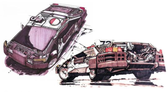
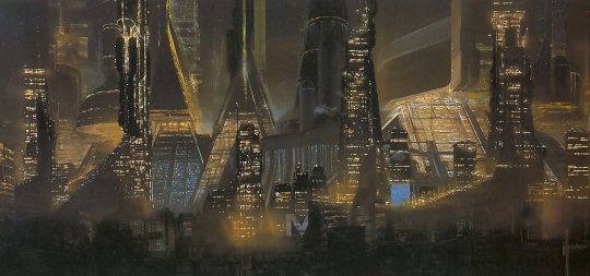
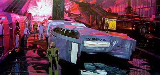
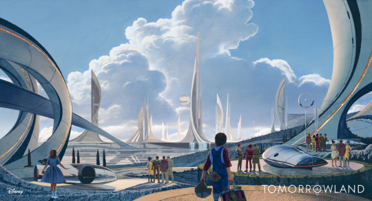
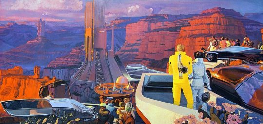
Syd Mead was a designer, best known for working on films such as Aliens, Blade Runner, Tron and Star trek. Mead was born in Minnesota, United States, on July of 1933, but five years later he moved to a second house in the western of United States prior to graduating from High School in Colorado in 1951. Some years later, he did the Art Center School in Los Angeles, where he graduated with great distinction in 1959. He was immediately recruited by the Ford Motor Company. At Ford he worked in the advanced styling department, creating futuristic concept car designs. But his imagination went beyond cars and he began to imagine clothes, helmets, buildings and scenery from hyper advanced civilization. After Ford, he also worked in other big companies like Chrysler, Sony and Phillips. After that he started migrating to the concept art world of movies. Mead is really important for generation of writers of science fiction, because many of them were influenced by Mead’s colorful paintings. Mead never wrote a novel or short story. He imagined the future in his mind and turned that imagination into illustrations. In 1979 he designed the extraterrestrial spaceship for the first film “Star Trek” in the cinema. Ridley Scott called Mead to design the buildings and flying cars of the futuristic Los Angeles “Blade Runner” in 1982. In 1986 he was hired to design the space station and vehicles of the movie Aliens directed by James Cameron. Almost at the same time, the designer created the electronic world of “Tron” for Disney studios. The same ones who hired him in 2014 to design the futuristic city of “Tomorrowland”. Mead died in 2019 after three years of lymphoma, he was 86 years old. He was a great influence for many designers and science fiction writers and illustrators, due for his creative worlds and automobiles , Elon Musk quotes Mead as one of his major influences, on visions of the automotive future and design in general.
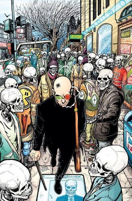
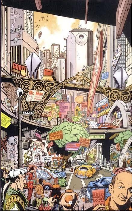
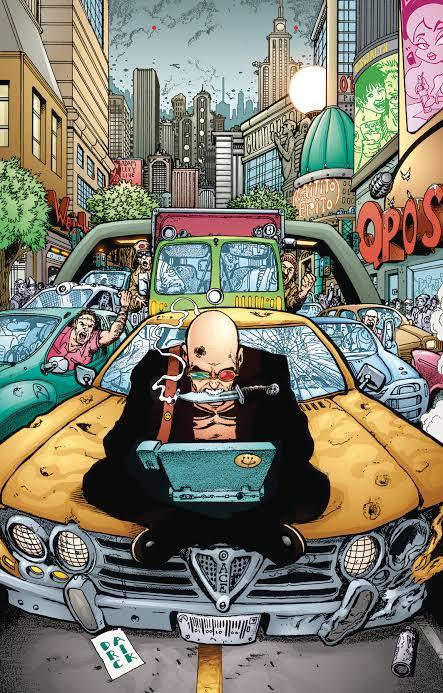
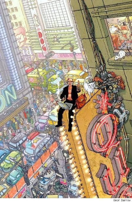
Transmetropolitan by Warren Ellis and Darick Robertson
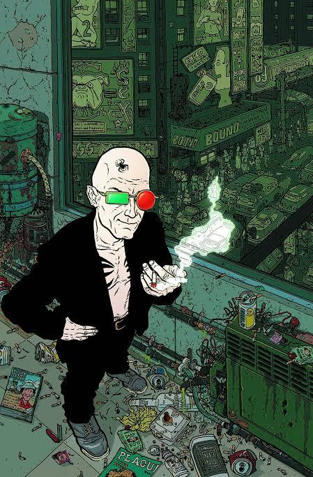
Transmetropolitan is a comic written by the British writer Warren Ellis and the American illustrator Darick Robertson, published by the Vertigo label, and falls within the cyberpunk genre, and the problems that rampant technology will cause us.
Throughout the 60 issues of Transmetropolitan, Ellis and Robertson build a chaotic and brilliantly alive future, presenting a sci-fi society with a peculiar mix of elements of cyberpunk, political dystopias, bioengineering and transhumanism, sexuality, economics and much more.
In a dystopia, in a not so distant future, the journalist Spider Jerusalem is isolated for fiver years in a hut in the forest, but he has to return to the city to earn some money.
Throughout the comic, amid a nihilistic aura that humanity has no salvation, the author- Warren Ellis - criticizes the consumerism and futility. The illustrations, of Darick Robertson, is full of excesses as the environment should be, a brand of the style of the 1990s.
The search for the truth is the central theme of this work, and in the midst of all this we found ourselves in a investigative odyssey that involves the lowest scum of that society ( thieves, murderers and rapists) until reaches the highest of the scum ( the presidency).
This background allows the work to touch on the most profound social themes, and without fear of saying what needs to be criticized, this is where Transmetropolitan shines, and provoke deep reflections on issues such as racism, the influence of media, the power of religions, the education, and many other themes.
In short, Transmetropolitan dissects and criticizes everything, it points out the flaws, the lies and the hypocrisy of each one. It’s a study about the problems of democratic society in the 21th century.
Jon Mcnaught
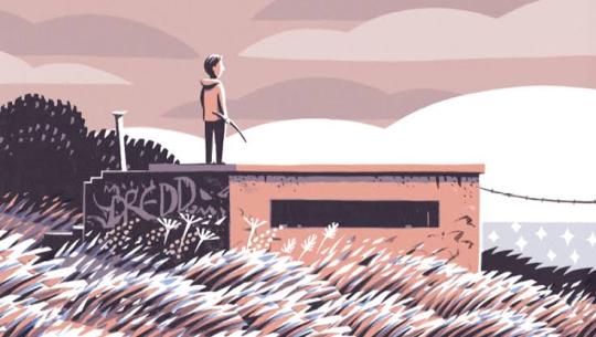
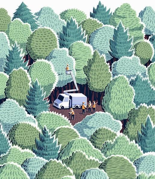
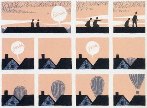
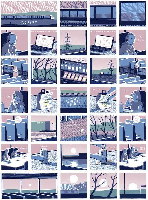
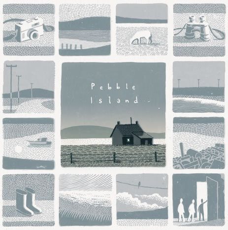
Jon Mcnaught was born in 1985, London, England. He work with drawing comics, and work as an illustrator, printmaker and lecturer. After spending several years on the Falkland Islands during his childhood, which will inspire his second book, Pebble island. The book pass years after the war, where he tries to recreate his childhood, with aspects of his curiosity, when he was exploring abandon bunkers, where it was just part of landscape, or somewhere where he could play. His work has essentially been landscape print-making (often situated in the city), but with quite simple intention of capturing the sense of space, light, time etc. His work is mostly about that, places that he was interested in depicting, and trying to reproduce the visual. He want the characters to feel like elements of a landscape or an environment ( he preferes to focus more on the background, than the characters itself). But usually he uses figures and postures to suggest expressions rather than close ups showing facial features. What I like about Mcnaught's work is that they are simple designs, but the colors are very vivid. The way he constructs the scenarios is very invective, because it doesn’t need to be extremely detailed, he just needs a few lines to show what he is talking about.
13 notes
·
View notes