#subtractive color mixing lesson when :[
Explore tagged Tumblr posts
Visit Tumblr Blog
Explore Tumblr blogs with no restrictions, modern design and the best experience.
Last Seen Tumblr Blogs


Fun Fact
If you dial 1-866-584-6757, you can leave an audio post for your followers.
Text

Goober...
#HE'S LIKE#THREE#BUT WITH NO INSECURITIES#I HATE HIM (positive)#god i CANT wait for the crossover#i want the one-sided beef with 3 so bad#but knowing how much younger the demographic for colourblocks is compared to the later series of NBs its probably just gonna bestie scenari#like purple is “royalty” and three is a jester#They didnt bring a magic mirror from what i can remember so its possible the numberblocks wont be multiplying huh?#i guess that could be why they took many large numbers with specifically 100 leading the mission#they'll most likely just be dividing#Actually im not even sure if the colourblocks have ever seen their reflections before????#their water is B L U E blue#subtractive color mixing lesson when :[#they already touched on additive (cmyk) when is the lightshow❗️❓️#i keep going on tangents#why was purple in the Christmas special?#he isnt really a Christmas-y color#is he a fan favorite?#is it because he has a crown and those fake paper crowns in crackers are an important part of british christmas?#anyways#colourblocks#learningblocks#purple colourblocks#i meant additive color mixing i mixed up which was which
44 notes
·
View notes
Text
Written In The Stars XXXV (Harry Potter xF!Oc)
A/N: I am so sorry for forcing you to read this. The twins had an excuse but truly it is me saying I have no idea how to be funny.
Words: 2,168
Warnings: None!
Series’ Masterlist
Previous Chapter // Next Chapter
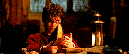
Chapter Seventeen: Valentine's Day.
Hermione had a dreadful time as a half-feline.
People thought she'd been attacked and tried to take a look, Mel was having a hard time controlling her temper, but she managed to not scream at anyone, which was an utter success.
She was currently waiting for Erick at the far corner of the library, he'd sent her a note saying it was time she returned the favor and help him with his own search, she didn't know what he'd meant, but she wasn't too worried about it.
Harry and Ron were in the Hospital Wing, giving Hermione her homework for the day, so she wasn't expecting to see them in a while.
"Good afternoon, Miss," Erick sat down, going straight to business, "I've a list with all my doubts- I also have some petitions but don't worry, nothing about stealing human hair or making someone fall unconscious-"
"You'll never let me forget it, won't you?"
"Not ever," He pulled out a fancy notebook and opened it on its first page. "First thing on my list- What things do muggles teach to their kind?"
"You mean at school?" He nodded, "They teach them to write and read, then math-"
"Math?" Erick frowned, "subtractions and all that?"
"Yes, Erick. They need numbers too," She rolled her eyes, "What else... oh! They also have their own History lessons, science class- we don't have science here, but I guess we don't exactly need it since magic has its own rules..."
"Science?" The boy wrote it all down, "You have books on that?"
"Some, from when I was in muggle school- they're pretty basic, but they should do. I'll send a letter to my mom asking for a pair"
"Alright," He nodded, still writing, "You know about farmers?"
Mel laughed.
"A thing or two," She said, "what do you want to know?"
"How do they grow things?- And their animals?"
"They do that on its own, you don't need magic for that- wizards don't use magic for that either, I know it because the Weasleys had chickens and all"
"Oh," a faint pink color tinted his cheeks, "I didn't know that."
"You don't have a farm then," She tilted her head, "why do you live around so many?"
"The house belonged to my ancestors for centuries- we've lived there for ages," He shrugged, "my parents don't exactly love it but they never leave the house unless absolutely have to- the neighbors probably think we're mental"
"Anything else you want to know?"
"Yes," He turned the page of his notebook, "I... I need to know who's Rapunzel"
"What?" She raised a brow.
"Anne," Erick explained, "when I talked to her she told me I was like Rapunzel- that I was always locked down in my castle... is it some sort of muggle royalty?"
Mel tried to contain her laughter.
"N-No," She said with a strained voice, "Rapunzel... She's... She's a princess from a story"
Erick's eyes widened, his face turning completely red.
"Oh"
Mel snorted, hiding her face so the laughter would come out muffled.
"I-I think she didn't mean to insult you- maybe just teasing," She bit her lip, "Rapunzel's a fairytale. I could lend you that one too?"
"That would be nice. Thank you," He cleared his throat, "that's all I have."
"Alright," Mel smiled, "so... you've only talked to Anne that one time?"
"I didn't get a chance after that," The boy frowned, "my parents didn't know but they suspected something was off when she started to take the long path to her farm, the one closest to our home- They didn't allow me to leave the house after that."
"No wonder why you're so pale- Your family," Mel sighed, "are they like... the Malfoys?"
"They certainly want to be," Erick raised a brow, "but not really, some relatives have married half-bloods and muggle-borns- distant relatives though. My grandfather, my mum's dad- he's good with me. Never said anything dreadful- I think he doesn't care about blood. My parents are the problem... I don't know why are they so obsessed about it, I really don't. Guess I'm just that unlucky..."
"You're not," She reached for his hand and patted softly on it, retreating before he'd react. "You'll grow up one day and you'll be able to do whatever you want"
"That won't come fast enough," He scoffed, leaning back on his chair.
"Tell you what," Mel grabbed her bag and took out parchment, quill, and ink. "I'll write the letter while we're here so I send it today, what d'you say?"
"I say I would walk you to the owlery- although someone might see us"
Mel smiled.
"That's the fun part."

"A diary?" Mel asked for the third time.
"Did you hit your head?" Ron frowned, "Yes a diary- We found it in Myrtle's bathroom"
"And you just picked it up," She raised her eyebrows, "bit thick from both of you- that thing could be haunted"
"That's what I told him!" Ron argued, "But he insisted-"
"I think it might be important," Harry handed it to her. Mel held it away from her body, "oh, don't be dramatic..."
"I'm being careful, there's a difference," She huffed, "have you told Hermione?"
"No, we found it after we visited her"
"Well now, and what're you going to do?"
"Dunno, wait for Hermione?"
"You could give it to Dumbledore," She offered, "it's a bit strange... I don't like it. It feels..."
She frowned, Mel didn't know why she felt that way about an empty diary, but she hated it.
"Come on now, and what we'd say? 'Excuse me, Professor, we found this on a toilet, thought you might appreciate it-' Ouch!"
Mel had hit Ron on the head with the book.
"Stop talking to me like that," She snapped, "why are you so moody?"
"Hermione can't help with our homework," Harry explained.
"Get it together," Mel demanded, "I'll help you if you promised to behave."
Ron's interest peaked.
"Would you?"
"I like to think that I'm clever enough to help others, you know?"
"You've got a lot to do," Ron dragged her to the nearest armchair and let all his works fall on her lap, "I've no idea of what've been doing in Potions and Transfiguration."
"The moment their acne clears up, they'll be ready for repotting again," Sprout was telling Filch as they walked into their herbology class, "And after that, it won't be long until we're cutting them up and stewing them. You'll have Mrs. Norris back in no time."
It was February and the attacks had miraculously stopped, things were going back to normal, even for Mel and her friends. Less people thought that Harry was the heir, and they were finally leaving him alone, now she could focus on her to-do list.
One morning she walked in with Hermione and Ron to the Great Hall -apparently, Harry was too tired from Quidditch practice and Ron didn't want to wake him up- and got attacked with a mixed set of emotions.
Everything was sickeningly pink.
Mel liked pink a fair good amount, but this was just excessive: Roses on the walls and confetti shaped like little hearts coming from the ceiling, she felt inside a doll's house.
"Gross!" Ron hissed as soon as they walked in, reluctant to step further, "Who did this?!"
"Locktwat," Mel pointed to the teachers' table, where their professor sat, proudly wearing the pinkiest set of robes she'd ever seen.
"I should've known," He groaned, dragging his feet towards their table.
After half an hour, Harry finally arrived.
"What's going on?"
Ron pointed to the teachers' table this time, Mel had her eyes fixed on her plate.
"Happy Valentine's Day!" Lockhart finally spoke up, getting her attention. "And may I thank the forty-six people who have so far sent me cards! Yes, I have taken the liberty of arranging this little surprise for you all - and it doesn't end here!"
Lockhart clapped his hands and through the doors to the entrance hall marched a dozen surly-looking dwarfs. Not just any dwarfs, however. Lockhart had them all wearing golden wings and carrying harps.
"My friendly, card-carrying cupids!" beamed Lockhart. "They will be roving around the school today delivering your valentines! And the fun doesn't stop here! I'm sure my colleagues will want to enter into the spirit of the occasion! Why not ask Professor Snape to show you how to whip up a Love Potion! And while you're at it, Professor Flitwick knows more about Entrancing Enchantments than any wizard I've ever met, the sly old dog!"
"Ugh..." Mel groaned, pushing her plate away, "I think I lost my appetite"
"Just eat quick," Ron said to Harry, "I can't stand this for another hour"
"I think it's nice he's trying to cheer us up," Hermione shrugged.
Mel glared at her, she was certain Hermione was one of those bloody forty-six letters.
After the first half of the day, a dwarf appeared out of nowhere and stood in front of her, he didn't seem in the mood to get a no for an answer.
"I've got a musical poem to deliver-"
"Oh no," Mel backtracked.
"Sweet as butter mellow," The dwarf started to sing -more like yell- and people stopped to listen, "Mel Dumbledore, your temper turns every boy yellow..."
She was dead, she had to be, this felt very much like hell and she was paying all her crimes.
"It sure hurts to fall on such bounder, but how pleasant it is to have our requital!"
She didn't have much experience with valentine's, but that didn't sound romantic at all.
"The twins," She growled- and sure enough, Fred and George were laughing at the end of the corridor.
"YOU!" She bolted over to them.
"Oh, come on, we went easy on you!" George snorted.
"The poem was lovely!" Fred added, "We did it in like, ten minutes or so. I'm sorry is not the best-"
"Be thankful I'm trying to control my temper now, otherwise you'd be running away with your heads turned into owls' nest!"
"Why are you so mad? We just declared our undying affection," George replied, Fred's chortles kept him from talking.
"Affection my-!"
"Mel, we'll be late if you don't hurry!" Hermione urged her, grabbing her arm and taking her away from the twins.
"They'll regret it," She growled, "those idiots- I'm going to win-"
"You won't amuse them," Hermione said severely, "don't let them get into your head!"
Ron and Harry's teasing definitely broke the deal for her, she was sure that by the end of the year the twins would end up regretting their decision.
On their way to charms, Mel got a bit of consolation.
'His eyes are as green as a fresh pickled toad,
His hair is as dark as a blackboard.
I wish he was mine, he's really divine, The hero who conquered the Dark Lord'
"Oh, don't you love irony?" She smiled at Hermione.
Harry got up and started to pick up his things, Mel helped him with a little smile on her face.
"All right, divine boy?" She smirked.
"Shut up."
"Off you go, off you go, the bell rang five minutes ago, off to class, now," Percy said. "And you, Malfoy-"
Harry looked up and turned pale. Malfoy was holding Riddle's diary.
"Give that back," He said.
"Wonder what Potter's written in this?" asked Malfoy.
"Hand it over, Malfoy," said Percy.
"When I've had a look," he replied.
"As a school prefect-"
"Expelliarmus!" Harry pointed to Malfoy and the diary flew up in the air.
Ron caught it with a triumphant smile.
Mel had to admit that looked extremely cool.
"Harry!" said Percy loudly. "No magic in the corridors. I'll have to report this, you know!"
Malfoy was fuming, he pushed some kids to walk past and snapped at Ginny.
"I don't think Potter liked your valentine much!" She ran into class with her face hidden behind her hands.
During their charms class Harry poked her arm to get her attention, she turned to see him hold the diary above the rest of his things.
"What is it?" She examined the book. "Is it ruined?"
"No," He frowned, turning the pages, "it's completely blank- the ink vanished!"
"Really?" She leaned forward, "How weird! D'you think that Hermione's right?"
"Looks like it," He admitted. "I'll give it a look tonight"
She nodded, then Harry perked up again and searched further on his bag.
"Look!" He took out a chocolate's frog in perfect state.
"Nice," She grinned, "finally a good thing happens to you, huh?"
He broke the chocolate in half.
"To us," He corrected innocently, "happy valentine's, Mel"
"Oh," She mumbled, grabbing a half, "I don't have anything for you..."
"S'not like I planned ahead, it's half a chocolate frog," He laughed, "you don't owe me anything"
"Still, it was nice..."
"Shut up you two," Ron groaned from Harry's side, "the last thing I want is to deal with your mawkish interactions"
"Shut up!" They replied.
Next Chapter —>
Taglist.
@tiphareth2018 @vampiregirl1797 @siriuslysirius1107 @celestialhayi @mikariell95 @tomshollandz @omiwashere @steve-thotgers @kylosleftbuttcheek @reverse-hxlland @thesuitelifeofafangirl
#twoidiots writing#Harry Potter#harry potter fanfiction#harry potter xoc#harry potter x y/n#harry potter x reader#ron weasley#hermione granger#fred weasley#george weasley#WITT fic
25 notes
·
View notes
Text
Quick science lesson, there are actually two sets of primary colors depending on how you add color.
When painting, we start from white and then add pigment to absorb the other wavelengths, leaving a color. This is called subtractive color mixing, and it considers the primary colors cyan, magenta, and yellow, or in earlier theories, blue, red and yellow.
However, in other media we start from white and add light to produce color, such as a computer screen. This is called additive color mixing which uses red, blue, and green. The subtractive primary colors we use now are actually derived from these, for example yellow being the complement of blue (in the additive theory) means that adding yellow pigment is the same as subtracting blue light.
So basically there is a sense in which green could be considered the “true” third primary color in terms of what we actually see, with yellow being considered due to the logistics of pigments absorbing light. Really though I’d say they’re both primary colors according to their respective fields’ ideas of what it means to be a primary color.
still peeves me off to no end that yellow is a primary color
16K notes
·
View notes
Text
Blog 103: Ang buhay ay parang gulong, makulay (Color Wheel).
In today’s blog, we will talk about RGB and CMYK Wheel. The activity was to recreate the Color Wheel in RGB and CMYK using Photoshop. Sir Ced gave us instruction on how we will do it. Before that, what is the difference of RGB and CMYK?
RGB Color Wheel stands for Red, Green and Blue. Any color can be made by mixing with this three colors. It is “Additive” color system, it is started from black then color is added.

A sample photo of RGB & CMYK. (Taken at the Digital Imaging PPT.)
CMYK Color Wheel stands for Cyan, Magenta, Yellow and Black. It is a “Subtrative” color system, it is started from white then color is subtracted.
I didn’t really had a hard time in doing RGB color wheel in photoshop, you will just use the hues (degree) starting at 0° (Red) then add it 30 to have Orange to be followed until you reach 330° to have Rose. This will be filled in the 3rd layer of the slice. The slices has 23 and has 5 layers, now let us do the outer layers the 4th and 5th layer. We will just use the brightness and saturation, set it in 100 to reveal the color, by using a color picker, click the color then as you clicked it you can already do the 4th layer of the Color Wheel, just minus the 100 (Brightness) to 60 and just leave the saturation at 100, to give you a dark shade of the color to be filled at the 4th layer then to be followed, same instruction minus the 100 to 30 and it will give you a darken shade of color to be filled at the 5th layer. Now, let us focus at the lower part of the layers, the second and first layer. First, click the color then minus the 100 to 60 (Saturation) that will give you a light shade of color to be filled at the 2nd layer, to be followed with the same instruction 100 to 30 then filled it at the 1st layer. This would be my final output for RGB Color Wheel.

As you can see, the colors are more focus on brightness and saturation. While in CMYK, it is more on hues and tints. This is my final output for CMYK Color Wheel.

To be honest, I did had a hard time doing this because it focuses on primary then secondary and tertiary colors that should be followed so that you won’t be confused of the process in doing it. Now, instead of changing HSB (Hues, Saturation and Brightness), we will change the CMYK values in the color picker dialog box. Let’s start the middle layers first which are pure hues. Start at the primary colors the Cyan, Magenta and Yellow.
Yellow: Y=100% C & M=0%
Magenta: M:100% C & Y=0%
Cyan: C=100% M & Y=0%
The secondary will lie between the two primary colors. While the tertiary colors which are made by mixing two primary colors with 1:2 ratio meaning 100% : 50% ratio.
Orange: Y=100%, M=50%, C,K=0% (between Red and Yellow)
Chartreuse: Y=100%, C=50%, M,K=0% (between Yellow and Green)
Turquoise: C=100%, Y=50%, M,K=0% (between Green and Blue)
Azure: C=100%, M=50%, Y,K=0% (between Cyan and Blue)
Violet: M=100%, C=50%, Y,K=10% (between Blue and Magenta)
Rose: M=100%, Y=50%, C,K=0% (between Magenta and Red)
Next, let us filled the outer layers the 4th and 5th layer. Click the color using the color picker then go to the CMYK Values, not touching the other values rather click the K then type the value to 30% for the 4th layer to give dark color then 60% for the 5th layer to give a darker color. Then focus on the inner layers, the 1st and 2nd layer. Click the color using the color picker, to have a light tint color just change the 100% of the color to 60% and the 50% to 30% this color value will be filled at the 2nd layer while the 1st layer change the 60% to 30% and 30% to 10% to have the color value in a lighter color. This instruction are to be followed.
This color wheel thought me to be patient because it will really test your patience but as you try to comply it and doing it precisely, it’s worth it. I get to be more interested about digital imaging and how to appreciate RGB and CMYK and also its use when we do lay-outing or graphic designs. I just can’t wait what DIGIPUB could teach me, as a creator this gives me tips and also lessons in dealing or doing a creative output. It is just like thinking out of the box and appreciating colors and their values.
0 notes
Text
11 Halloween Lesson Resources
Halloween is just two days away. If you’re looking for some Halloween-themed lessons, take a look at the following resources that I featured earlier this month.
All About Poe In Why Should You Read Edgar Allan Poe? students can learn about Poe’s guiding principles for writing, the recurring themes of his work, and the personal factors in his life that contributed to his writing. Find the complete lesson here or watch the video as embedded below.
youtube
Introduce The Pit and the Pendulum to students is through Flocabulary’s rap of the story. That video is embedded below.
youtube
Here is an animated telling of Edgar Allen Poe’s Tell Tale Heart.
youtube
Halloween safety is a hoot with Kahoot! Playing Kahoot games is a fun way to review almost anything including Halloween safety. That’s why I made the following video to demonstrate how you find and modify Halloween safety games in Kahoot.
youtube
Halloween Reading ReadWorks published a collection of forty-two articles and lesson plans that have a Halloween theme. When I looked through the collection it appeared that all of the articles were for a K-8 audience with a few 9-12 articles mixed in. The articles covered topics like the history of Halloween, pumpkin farms, and the history of ghost stories.
Halloween Math and Science SciShow Kids has a playlist of videos covering topics that are frequently connected to symbols of Halloween. Those topics are bats, spiders, skeletons, and the changing colors of leaves. In the video about bats students learn how bats use sound to find their way at night, how and why bats hang upside down, and how they rear their offspring. In the video on spiders students learn about the role of spiders in controlling flying insect populations and how spiders create webs. In the video about the human skeleton students can learn about the functions of the skeleton as well as how bones grow and heal over time. Finally, in the video on leaves students learn about the correlation between chlorophyll, sunlight, and leaf color.
youtube
The Halloween Collection by PBS Learning– Links to a variety of Halloween-themed lesson plans for students of all ages. Make sure you don’t miss the video of the flesh-eating beetles!
Coding with Monsters– Who doesn’t love to code? When it is involves monsters it is even better!
31 Days of Halloween STEM activities– Engineering, edible science, chemistry, and slime! Kids of all ages will love making glow in the dark slime!
Number Chase – Math vs. Zombies is a free iPad game with a Halloween theme. The game is has three virtual worlds each containing ten levels of basic math problems. The object of the game is to correctly solve as many math problems as possible before the zombies catch you. The math of the game is basic addition, subtraction, multiplication, and division.
Halloween Greeting Cards
If you’re looking for a writing activity that has a Halloween theme, consider having students create Halloween cards. Storyboard That offers great tools for creating Halloween comics that your students can then quickly turn into printable Halloween cards. Watch my video below to learn how to use Storyboard That to create Halloween cards.
youtube
Disclosure: Storyboard That is an advertiser on FreeTech4Teachers.com
This post originally appeared on Free Technology for Teachers if you see it elsewhere, it has been used without permission.


Related Stories
How to Find and Modify Halloween Games in Kahoot
More Halloween Science and Math Lessons
TED-Ed Explains Why Students Should Read Classics
11 Halloween Lesson Resources syndicated from https://buyessayscheapservice.wordpress.com/
0 notes
Text
11 Halloween Lesson Resources
Halloween is just two days away. If you're looking for some Halloween-themed lessons, take a look at the following resources that I featured earlier this month. All About Poe In Why Should You Read Edgar Allan Poe? students can learn about Poe's guiding principles for writing, the recurring themes of his work, and the personal factors in his life that contributed to his writing. Find the complete lesson here or watch the video as embedded below.
youtube
Introduce The Pit and the Pendulum to students is through Flocabulary's rap of the story. That video is embedded below.
youtube
Here is an animated telling of Edgar Allen Poe's Tell Tale Heart.
youtube
Halloween safety is a hoot with Kahoot! Playing Kahoot games is a fun way to review almost anything including Halloween safety. That's why I made the following video to demonstrate how you find and modify Halloween safety games in Kahoot.
youtube
Halloween Reading ReadWorks published a collection of forty-two articles and lesson plans that have a Halloween theme. When I looked through the collection it appeared that all of the articles were for a K-8 audience with a few 9-12 articles mixed in. The articles covered topics like the history of Halloween, pumpkin farms, and the history of ghost stories. Halloween Math and Science SciShow Kids has a playlist of videos covering topics that are frequently connected to symbols of Halloween. Those topics are bats, spiders, skeletons, and the changing colors of leaves. In the video about bats students learn how bats use sound to find their way at night, how and why bats hang upside down, and how they rear their offspring. In the video on spiders students learn about the role of spiders in controlling flying insect populations and how spiders create webs. In the video about the human skeleton students can learn about the functions of the skeleton as well as how bones grow and heal over time. Finally, in the video on leaves students learn about the correlation between chlorophyll, sunlight, and leaf color.
youtube
The Halloween Collection by PBS Learning- Links to a variety of Halloween-themed lesson plans for students of all ages. Make sure you don't miss the video of the flesh-eating beetles!
Coding with Monsters- Who doesn't love to code? When it is involves monsters it is even better!
31 Days of Halloween STEM activities- Engineering, edible science, chemistry, and slime! Kids of all ages will love making glow in the dark slime!
Number Chase - Math vs. Zombies is a free iPad game with a Halloween theme. The game is has three virtual worlds each containing ten levels of basic math problems. The object of the game is to correctly solve as many math problems as possible before the zombies catch you. The math of the game is basic addition, subtraction, multiplication, and division. Halloween Greeting Cards
If you're looking for a writing activity that has a Halloween theme, consider having students create Halloween cards. Storyboard That offers great tools for creating Halloween comics that your students can then quickly turn into printable Halloween cards. Watch my video below to learn how to use Storyboard That to create Halloween cards.
youtube
Disclosure: Storyboard That is an advertiser on FreeTech4Teachers.com
This post originally appeared on Free Technology for Teachers if you see it elsewhere, it has been used without permission.


Related Stories
How to Find and Modify Halloween Games in Kahoot
More Halloween Science and Math Lessons
TED-Ed Explains Why Students Should Read Classics
11 Halloween Lesson Resources published first on https://medium.com/@TheftBackpacks
0 notes
Text
Better, bolder, brighter! Improved Multicolor+ for your designs
Many of you will already be familiar with (and smitten by) Multicolor+, our 3D printing material that lets your designs shine in full color. As of now, we’re tickled to be able to offer even smoother, sleeker finishes – and faster lead time! – for your Multicolor+ 3D prints!
Multicolor+ is a 3D printing material that enables you to print models directly in more than one color. And here’s the kicker: you can print 10 million different colors!
3D prints created with Multicolor+ are made using UV inkjet printers to produce full color strong parts that are on par with injection molded parts. 3D printed Multicolor+ has a layered buildup which is visible when looking closely.
Check out this video to see how the technology works:
youtube
What’s new with Multicolor+
Everything you love about Multicolor+ remains the same, but what we’ve done is add a cherry on top in the form of improved color quality. This is due to a change in ink formulation—while still using CMYK inks and whites, the finish is now matt rather than glossy. You’ll love the result: it has the appearance of a high quality material—less plasticky, if you will. Furthermore, individual layers are slightly finer (32 micron vs. 42 micron), resulting in a smoother surface.
To make your technicolor dreams come true faster, we’ve shortened the lead time from 15 days to only 10.
Before (left) and after (right). Sydney Opera House by Matthias Flück in Multicolor+
What colors should you expect from your Multicolor+ 3D print?
A short physics lesson on colors will help you get the best possible color on your print, because the color you see on your screen can differ slightly from the printer’s colors. The pixels on your screen are all composed of red, green, and blue (RGB), whereas multicolor printers use cyan, magenta, yellow, and key (black).
Since your screen and our printers do not use the same color system, the set of colors might shift slightly.
In both CMYK and RGB, mixing these basic colors leads to new color options.
CMYK works pretty much like the box of paints you used back in school. If you don’t have the color you’re looking for, you need to mix two existing colors together. Adding colors together usually means that the new color will be slightly darker (when you mix yellow and black, the resulting color simply cannot be brighter than yellow, can it?). That’s why this system is called a ‘subtractive color model’. Adding all colors together produces black.
Screens, however, do not work like our box of paints. Instead of using paint or ink, they use light. The colors of light are red, blue and green (RBG). When the colors are added together, the result becomes brighter. When all three colors overlap, the color becomes white. That’s why this system is called an ‘additive color model’.
When colors are converted from RGB to CMYK, the color intensity changes a bit. So, what you see on your screen and what comes out of the printer might look slightly different.
Bright colors on a screen tend to look duller and darker in CMYK. Generally, the brighter, more vivid and vibrant the colors on your screen are, the bigger the difference between your 3D model and your 3D print will be.
Example of a 3D print in multicolor and a bright computer screen
Another problem is that computer screens have adjustable settings – so things like brightness, gamma and color temperature can make a huge difference. Monitors can also vary greatly in color accuracy, depending on the technology (TN, PVA, IPS, OLED) and the calibration setting.
Example of two monitors with two very different color and brightness settings
Does this color variation make a huge difference? In most cases, it really doesn’t. But if you need a really precise color that must not change even slightly – let’s say for a 3D model that features skin color – you might want to order a smaller test print first and experiment a little to get the color exactly the way you want it.
Keep in mind:
If your 3D file doesn’t contain any color information, it will result in a white print
For multicolor, you must either upload a file that already includes the textures (e.g. 3MF, colored STL, VRML, SKP, X3D, and DAE) or a ZIP file containing all the necessary color information (e.g. an OBJ file with a texture map and an MTL file)
For full design guidelines you should follow to get perfect Multicolor+ prints, as well as more insights into the technology, read this article.
Curious about Multicolor+ but not yet sure what kind of things you can 3D print using it? Check here for lots of inspiration.
Take a look at the design guide and get cracking by uploading the 3D file of your model to our online 3D printing platform. Go forth and be colorful!
Better, bolder, brighter! Improved Multicolor+ for your designs published first on https://getyourprintingcompanies.tumblr.com/
0 notes
Text
Top 2 Kids Apps for Learning Addition and Subtraction
The fundamentals of maths can seem like a menacing or forboding concept. But when you look at a child’s brain and the way they learn it becomes much easier. Young minds excel when presented with problems in play and they love to overcome them, which is why the market for apps and games that lean into that core concept has exploded in the past few years. There is a wealth of apps and websites marketing educational content that elicits as much laughter as it does learning and that is why we’ve scoured the cream of the crop to present two of its finest offerings.
There are many games that might promise a lot but never actually deliver and it depends on what parameters you’re truly focused on which one might work out best for you. We’ve taken the major considerations into account when narrowing it down to these two final contenders. The first being price; whilst many apps claim to be free there are many that later offer additional supplement or price walls between your child’s benefit or enjoyment. In this respect, we’ve leaned towards value in regards to how much spend and how much gain you actually get. The second and perhaps most important measuring stick is educational benefit and how much improvement and the quality of the learning the app offers. Finally, we looked at enjoyment and how much entertainment the app provides; whether your child will actually want to engage with it or not. When it comes to learning addition and subtraction these are the best two that we found.
1. Mathlingo
This is a great new app that mixes beautiful graphics and intuitive interaction. It’s easy to use and a pleasure to play. The games are all expertly designed to bring your child into the fundamental basics of mathematics and to get them to enjoy interacting with them. The characters are memorable and colorful and the interface easy to navigate to ensure that repeat visits continue to provide not only an educational experience but an enjoyable one. The app offers a broad range of lessons across the board and to every age range and difficulty. As your child progresses they are rewarded with fanfare in the form of stunning visual trophies and encouragement. The games geared around learning addition and subtraction at a basic level are by far the best designed and they have many different ways in which they present problems in order to keep them fresh and original whilst retaining their charm and challenge.
To know more information about the Mathlingo app by Mafooly, check them out in the App store or the Play store.
2. Counting Caterpillar
This app is absolutely gorgeous. You can watch your child play over their shoulder and possibly get as much as enjoyment as they will. The core concept is quite basic, you play as a hungry caterpillar and you have to collect numbered aphids in order to complete a sum. As your child progresses they earn ever more exotic and beautiful butterflies which they can display in a trophy case to encourage their improvement and showcase their achievement. It may not be the most challenging app on the market but it does introduce and improve upon the learning addition and subtraction model that is the fundamental concept behind the basics of mathematics.
The post Top 2 Kids Apps for Learning Addition and Subtraction appeared first on Mathlingo.
from https://mathlingo.com/learning-addition-and-subtraction/
0 notes
Text
New Moon in Libra // October 8th, 2018 // Weight of the World

As we delve deeper into the crisp month of October, we come upon the annual New Moon in the sign of airy Libra.
New Moons happen once a month, resetting the theme each sign has to teach us for the coming year, and in a sense marking a true new cosmic calendar for the sun signs in which it inhabits. They are not only a great time to plant seeds for future endeavors, but to begin new projects, and set intentions for where you would like to be, come the next New Moon in that sign.
Every sign of the zodiac has a lesson worth learning, in order to become a whole and balanced being. We pass through tests, and triumphs ushered in by their movement around the zodiac band above us. No one sign is above another, no one sign is better. That is exactly the nature and true divine power of Libra. When Libra reaches it's highest positive nature, it can bring balance to the most chaotic situations, empathize with the untouchables, and unify the jagged corners of our world as a whole. Along with Aquarius, this sign truly cares about others, and can put them self in the shoes of the underdog mentally with ease. Unlike Aquarius, who cares more about unifying the masses, Libra chooses to focus more with one-on-one interactions. Unifying in ways such as marriages, or contractual agreements. They are more likely to actually go out to the homeless, and hand them a sandwich (and even share conversation/socialize with that actual being)...than to donate to mass food bank organizations. This to Libra, is the perfect way to find true balance.

As this Libra New Moon energy begins to pour down around your physical being, your desire to be more of the one-on-one balancer will come more into your conscious awareness. You may feel more like being charitable, and trying to see more the tree than the forest persay. You may find yourself venturing out to more social settings, searching for someone/something which will balance you. Libra is known for being a very sociable sign, loving to mix, and schmooze with all different types of people. In their minds they are the most graceful, charming, and welcoming individual at any social setting. You may find yourself receiving invites to parties at places you've never been, with all types of different people, of all different backgrounds. Libra believes they know what is beautiful, creative, and aesthetically pleasing. They believe they can judge the fairness of a situation, and would love to give you advice about it, if it would please you. Libras want to please someone, leading to you agreeing with all these things they think about them self.

They can have a bad habit of picking your brain, just to know the right thing to say to whoever they're talking to. Which in the end can have a negative effect of them being superficial, and more of a people-pleaser, than an authentic friend. If you do find yourself schmoozing with some random people, don't let your desire to be well liked by the crowd you're in, dictate your level of authenticity. One of the bravest things any of us can do is be authentically ourselves. Then the people who enjoy you, will be people you will also enjoy. Thus forming solid, and balanced friendships. Take the power of this New Moon to set an intention to bring more authenticity into your social interactions. There is more than one way to find that perfect, ideally beautiful, Libra balance.
Speaking of that Libra balance...
let's consider the scale.

The sign of Libra is symbolized by the cold, steel scale. The inanimate, non-sentient, and still scale. It's shine glinting under sunlight, and dull under shadow. Like a rock, it stands. Unwavering to any desire of change on it's own, a testament to the idea that WHAT will balance, has been set in stone, and the world is/isn't, there is black/white...there is this/that. There is only one way to balance...to have each plate of it's arms in perfect alignment.
It takes our movement, our placement of these things, and our will to truly set it in balance however. As we add in the human element, the scale shifts, and wavers to our wills.
What we see in each plate may appear to be the same...yet the scales still shift.
Two objects can APPEAR to be in balance, having the same shape, size, and color...yet...it is the contents of their weight which defy visual logic.
With Venus (The ruler of Libra) in retrograde motion in the deep, dark sign of Scorpio...it is the depths that really count! It is the contents of our characters, our truest desires, our wildest, deepest dreams. Two men may look much alike, but behave rather differently. Twins are born identical, and yet one is more passive at times, or vice versa. The outside does not guarantee balance internally. The weights have to add up. The contents have to mirror one another in some way.
For the fixed signs (Taurus, Leo, Scorpio and Aquarius), this means giving in sometimes when you'd rather not. For the mutable signs (Gemini, Virgo, Sagittarius and Pisces), this means adding on a bit more when you'd rather hush, or standing up when you've sat in the past. For the cardinal signs (Aries, Cancer, LIBRA and Capricorn)...this sometimes means ending things where you once would have begun them. In order for each of us to make sure we are balanced in our personal lives, and in society as a whole...sometimes we have to subtract from or add to the weight of the world.
We are the ones who create the balance/imbalance. When we view the world around us, we perceive it, we create the balance/imbalance by perceiving it. This can be one of the downsides of Libra. As we feel the empathy to help those in need around us, we have to first judge someones need. To decide who is in need, is to pass judgement on the state of another’s life. When you take it upon yourself to reach a hand out to another person, take care to make sure they ASK for it first! It can be a rather insulting thing to another persons dignity to be presumed a charity case.
Also worth noting, the Sun and Moon are in a Conjunction (stressful aspect) with Libra squaring off with lord of the underworld Pluto. During this period it can seem like as you want to give and help others, you wouldn't want to see them do better than you. Subconsciously it can seem like if the other person you want to help, were to gain a lot, you'd somehow have given them too much, with nothing in return. This is a rock-and-a-hard-place kinda thing.
In a situation where you try to help someone who didn't ask for help... you have to ask yourself why you were really wanting to help that person in the first place. A part of Libra's superficial side is balancing for the camera per say. They didn't help you to help you, but to help them. Weather it be for the way they'll appear to others, the way it feeds their own ideal of what "a good person" they are, to stiffen their personal guilt, or because they'll use your charity to avoid taxes...during this phase ask yourself why you really want to balance a situation. Who is gaining what, and where from it.

Due to that Venus Retrograde we mentioned above...whatever solution you find to add balance into your life will not be a permanent fix. Retrogrades are actually ill advised times to begin projects in areas where they're concerned. As such, this shall test the authenticity of your will to help others, to socialize authentically, and to really get to the heart/depths of the imbalances in your waking life. Sure you wanted to help your friend move that time...because you love them, and have the free time, and that's what friends do, and that's what would please them...
but suddenly they need to move AGAIN right after you just helped them!
And shocker! That place is wrong as well...causing you to have to help them move 3 times in a row in less than 2 months!
How much did you really want to help them is tested.
How much you did it really for them...is questioned.
How much is in it for you becomes a question.
And the list goes on as you find ways to authentically set a balance for yourself, and those whom you love. As you weigh out your impulses, with your goals, you'll find places where you can tweak your socialization skills to unify the needs and wants of everyone around you.
It takes getting tested, and shook up sometimes to make new beginnings that will truly stand the test of time.
There's one other little shift going on with Mercury opposite Uranus, which leads me to believe some of you touched by this New Moon deeply will hear some form of shocking news soon. It would come out of the blue, possibly in one of the areas Mercury rules (snail mail, e-mail, or someone visiting). But regardless something you hear soon, is likely to shock you.
New Moons are times of metaphorical seed planting, and we must be patient as these messages are delivered, and these signs seen. We are all on our own line in a way along the zodiac...and some of us pass through sooner than others.
Happy New Moon you guyz!
Use that Libra energy to see the divine beauty all around you!

0 notes
Text
On The Other Side

If you've been following my articles recently you may have noticed that I've begun experimenting, and playing, with what I know and refer to as Mixed Digital Media. By manipulating a digital photograph in a software paint program a unique image with roots tying it to both art forms is created. The lifelike medium of photography and the more symbolic and whimsical nature of a painting are intertwined creating a new visually enhance narrative within the image.
This piece, titled 'On The Other Side' was originally taken in a high rise hotel in Miami, Florida while on a business trip some years back. At the time I was struck by the vivid blues and yellows that appeared outside my room window as the sun began to come closer to setting. I picked up my camera and created several images to document the moment and what I was seeing. That was the easy part. The more difficult part was yet to come when attempting to infuse what I was feeling at the moment in to this digital image.
Often it is difficult, if not impossible, to convey to the outside viewer the emotions the photographic artist experiences at the moment an image is created. When the shutter is released and the image is captured there is a release of another kind. This release is the creative energy and emotion experienced by the photographer who is in the moment and aware of the purpose behind the creation of the image. This emotion is often lost on those who were not at the place and time the image was created and significantly diminishes the narrative and the experience the photographer / artist felt. In other words the bias of the moment, not simply the visual bias, but the sounds, the smells the time leading up to the instant when the image was created is lost on the viewer.
In the world of the painter, who is free to add and subtract visual ques as to what is not only seen but heard and felt through the other physical senses, and therefore symbolizing the emotion and feelings of the moment, the viewer becomes more informed. This can be anything from actual inclusion of visual ques that are identifiable and those things that are more subtle such as the use of color and shape, light and dark, texture and juxtaposition. These factors play in to how the painter influences and manipulates the feelings and emotions of the viewer. By combining the digital medium of the photographer with that of the digital painter a new narrative becomes possible in the world of the visual artist. This is the realm that I am having a delightful time playing with at this time in my life.
So, what is it I feel when I view the image I share with you along with this article? The title is a clue. What's on the other side of that glass door? Bright light, blue sky, and an ocean expanding to the horizon. This is exactly what I was feeling at the moment. This image symbolizes closed doors that can clearly be seen through to the wonderful expanse on the other side. This is what I was experiencing on both a personal and professional level at the very moment I released the shutter. I knew that all I had to do is take action to walk over and open that door, feel the warmth of the sun and the ocean breeze on my face, and know that the possibilities were truly mine not for the taking but rather for the making. The symbolism in that thought and this image neatly packaged the opportunity that existed in my life at that moment perfectly. I'm happy to say I did open that door and I continue to feel the warmth and breeze on my face to this day. I've made the possibilities I felt then the reality I feel and experience now. I've found that below the surface often there are life lessons hidden within the images I've created. It's sort of like my life's work as a photographer is a visual diary that I can visit and read for clues as to how I got to where I am today.
I hope you don't mind my sharing them with you in this Mixed Digital Media manner that I'm currently playing with and find so wonderful and refreshing. In fact, I encourage you to pull out your own family album of photographs if you have one handy and start looking intently at those images. I'm sure you'll find some clues and surprises there that will serve to inform you as to how you got to where you are today. We all look through glass doors and marvel at what we may experience on the other side once we choose to walk through them. We must simply choose to take the actions that will get us on the other side.
-MDD
©2018 Michael D. Davis All Rights Reserved Michael D. Davis is a communicator by vocation, a mentor by avocation and a social media maven by choice. His work can be found on popular channels on the web and on his blog at http://thedailychalkboard.tumblr.com/ Michael welcomes your comments and invites you to join him. Just Google #michaelddavis or #thedailychalkboard to find him and request to connect.
0 notes
Text
You’re Already Harnessing the Science of Learning (You Just Don’t Know It)
Ten years ago, I read an article in the New York Times with dismay. It was about how clickers were all the rage in schools across the country. It featured colorful photos of students using clickers and quotes from teachers who were thrilled with students’ newfound enthusiasm in class.
The article focused on how clickers could help boost engagement and gamification in the classroom. But it only mentioned the word “learn” twice.
As cognitive scientists who conduct research on learning, my colleagues and I were baffled. Scientists have demonstrated the power of retrieval, or bringing information to mind, for more than 100 years. Our research on using clickers in a public K-12 school district near St. Louis showed dramatic benefits on student achievement—even increasing students’ grades from a C to an A. So why wasn’t learning featured more prominently in an article about clickers in schools? (We wrote a letter to the editor of the New York Times; it didn’t get published.)
Now, a decade later, I see the same clicker-like trend: tools like Kahoot, Quizlet, Quizizz and Plickers are wildly popular due to the increased student engagement and motivation they can provide. Meanwhile, these tech tools continue to incorporate powerful strategies for learning, which are discussed less often. Consider, for example, four of the most robust research-based strategies from the science of learning:
1) Retrieval practice boosts learning by pulling information out of students’ heads (e.g., quizzes, clickers and flashcards), rather than cramming information into students heads (e.g., lectures). Retrieval practice is a no-stakes learning opportunity that increases student learning, beyond formative and summative assessments.
2) Spaced practice boosts learning by spreading lessons and retrieval opportunities out over time so learning is not crammed all at once. By returning to content every so often, students’ knowledge has had time to rest and be refreshed.
Approaches that encourage students to use what they know, revisit it over time, mix it up and learn about their own learning are core elements in many current edtech tools
3) Interleaving boosts learning by mixing up closely related topics, which encourages students to develop the ability to distinguish between multiple concepts. For example, learning increases when students practice addition, subtraction, multiplication and division problems all mixed up, rather than one type of problem at a time.
4) Feedback boosts learning by providing an explanation after retrieval that indicates whether a student was correct or incorrect, which increases students’ metacognition or understanding about their own learning progress.
Sound familiar? It’s because approaches that encourage students to use what they know, revisit it over time, mix it up and learn about their own learning are core elements in many current edtech tools. Kahoot and Quizlet, for example, provide numerous retrieval formats, reminders, shuffle options and instant feedback. A century of scientific research demonstrates that these features don’t simply increase engagement—they also increase learning, higher order thinking and transfer of knowledge.
Instructional Strategies
Even without tech tools, you’re probably implementing these strategies in your classroom. Here are two common instructional strategies that incorporate the science of learning (although you might not realize it):
1) Think-pair-share: You’ve likely heard of or used this instructional strategy, which is simple and interactive. It encourages students to think about a topic or prompt, pair up with a partner to talk about it, and then share their reflections as part of a larger class discussion. But what are students doing during the “think” stage? If they’re writing down a quick response to a prompt before pairing up, they’re using retrieval practice. And if you ask students to think-pair-share about previously learned content, that’s a perfect use of spaced practice.
2) Peer feedback: We give feedback to students all the time. Based on rigorous research, the key is to give elaborative feedback—an explanation to students, not just correct/incorrect feedback. Peer feedback can be a quick way for students to give and receive elaborative feedback, without any grading involved.
Ask students, “What did we do yesterday?” and give them one minute to write down what they can remember.
But here’s the rub: Just because we’re already using strategies such as retrieval practice, spaced practice, interleaving and feedback, that doesn’t mean we’re all set. We need to push ourselves by asking a critical question: Are we truly harnessing the science of learning intentionally and purposefully, or is learning simply along for the ride?
For example, do you often start class by saying, “Here’s what we did yesterday,” followed by a review of the content? Next time, simply ask students, “What did we do yesterday?” and give them one minute to write down what they can remember. Based on a wealth of research, this subtle shift from reviewing to retrieval practice transforms student learning without additional prep time or classroom time. Even just one question, prompt or short no-stakes quiz helps students pull information out of their heads, which makes a big impact on engagement and learning.
Yes, many of us are already using strategies based on the science of learning. But we have the power to do so much more with what we’re already doing. It’s time to move beyond the days of that 10-year-old New York Times article when we focused solely on engagement. We need to start harnessing research, examining our teaching practices and implementing evidence-based strategies in our classrooms. The science of learning must be at the center of our conversations and it must become a driving force in education.
We’ve waited long enough.
You’re Already Harnessing the Science of Learning (You Just Don’t Know It) published first on https://medium.com/@GetNewDLBusiness
0 notes
Text
Our Homeschool Curriculum Choices (2017-18)

Every year in the spring I start researching and choosing our homeschool curriculum for the fall. This is probably my favorite thing about homeschooling (from the mom side of things anyway). I love browsing and comparing and choosing, I even love the ordering and especially the part where it all comes in the mail!

First, a little about our homeschooling style and schedule. In Georgia we are required to school 180 days per year. In the past I've tried to use the M-F scheduling method, but with our family's comings and goings we often do school on weekends and I needed our schedule to be more flexible. So rather than M-F we do blocks of 5 days. If we take off time from school it is always in blocks of 5 days. This keeps our schedule from becoming muddled. On any given week this is a simple version of what our schedule looks like: Day 11 Day 12 Day 13 Day 14 Day 15 Math English Spelling Reading Science Math English Spelling Reading Science Math English Spelling Reading Science Math English Spelling Reading History English Spelling Test Reading So we do Math 4 days, English/Spelling/Reading 5 days, Science 3 days, and History 1 day. Handwriting and Keyboarding are thrown in about 3 days a week. You can read below why and how this all works.

Math
7th Grade: Teaching Textbooks Math 7 4th Grade: Teaching Textbooks Math 4 & XtraMath.com 1st Grade: BJU Math 1 & XtraMath.com Teaching Textbooks has less than 180 lessons (each grade level is a little different) and after I ran the math we decided to do math 4 days per week. BJU Math has 160 or 165 lessons per grade so it's simple to do one lesson everyday and finish a few weeks early, or in Lulu's case she likes to do 2-3 math lessons some days and skip it others. XtraMath.com is FREE, though they do have an app that costs money if you'd prefer to do it on-the-go. You can customize the settings for each child, choose Addition, Subtraction, Multiplication, and/or Division and check their progress. This helps so much with memorization.

English/Language Arts
7th Grade: BJU Writing & Grammar 7 4th Grade: BJU English 4 1st Grade: Explode The Code, books 1, 2 & 3 I really love BJU English courses. They alternate between grammar chapters and writing chapters, so they get exposure to both in one book. The elementary levels have one page (front & back) as the daily lesson. Secondary levels have more pages each day, but are not an overload. Most days my kids do not need instruction or a lecture from the teacher's edition. Their lessons have a very thorough section at the beginning that covers what is new that day. Explode The Code is my favorite for learning teaching beginning phonics and how to read. They are so simple in their design and my kids don't get overloaded or overstimulated by the colors and graphics. The pictures sometimes need to be interpreted by an adult, but by Book 2 my kids are usually able to read the directions and do the pages with minimal help from me.

Spelling
7th & 4th Grades: Building Spellings Skills Building Spellings Skills are great. They are cheap (>$8 each) and they are thorough. Each unit groups words together by spelling rules or a theme (i.e. homophones). There are 36 units in each grade level (one for each week of our school year). Each unit has 5 lessons, the 5th being a final spelling test so it fits perfectly into our 5 day block schedule. Note: We don't start a formal spelling curriculum until 3rd grade because their phonics (Explode The Code) includes spelling in it.

Reading
Teacher Created Resources Daily Reading Warm-Ups: Grade 7 & Grade 4 Daily Warm-Ups for Reading are great workbooks that work on reading comprehension. There is a daily passage to read on various topics then 3 to 5 questions to ensure understanding. Simple and to the point. They take about 15 minutes to complete on average.

Science
7th Grade: Wonder's of Creation: The Ocean Book & The Ecology Book & God's Design for Chemistry & Ecology 4th & 1st Grades: God's Design for Chemistry & Ecology This year I let my 7th grader choose two Wonder's of Creation books so he could do some independent science study. He chose these two and it worked out that there was a parent workbook that includes lesson plans and worksheets for these {NOTE: This parent lesson planner is out of print, but they have it available as a download and others available for the different books in this series at Master Books}. They are meant to be done one per semester. He also sits in on our group science. God's Design for Science is a 4 year set that is meant to be repeated. Our edition (3rd Edition) has sections in the first two sets (blue & green) for 1st and 2nd graders so the whole set can be repeated again 1st - 8th grade, doing the harder sections as kids get older. They removed the section for younger kids on new edition and they are meant for grades 3-8. I'm glad our younger kids can participate in these with us as a group. So far we've worked through all 4 sets and will start the rotation again in the fall.

History
7th Grade: History Revealed: Romans, Reformers, Revolutionaries & Drive Thru History Adventures 4th Grade: You Report! with Big Book of History & Noah's Ark 4th & 1st Grades: Where On Earth Is Carmen San Diego?, Liberty's Kids & Drive Thru History Adventures Videos History Revealed is such a good curriculum, but I bought it (the whole set) hoping it would be more fun. It is very reading, reporting, and project heavy, which doesn't suit my kids very well. I'm going to keep it though and possibly use it for high school level. When this wasn't working I was so excited to find Drive Thru History Adventures. I reviewed the American History course and we will be using the rest over the next few years. For 4th grade I found You Report! and we've enjoyed it. It has a good mix of projects and reading to cover a lot of information. As a group we've been watching the various history videos mentioned above together to get the younger kids some exposure to history.

Handwriting
4th Grade: Handwriting Without Tears Cursive Success 1st Grade: Handwriting Without Tears My Printing Book Since discovering Handwriting Without Tears years ago this has been our go-to for teaching proper letting formation for printing and cursive. I love how they teach to build each letter with basic shapes. The lessons are simple and not overwhelming.
Keyboarding
Mavis Beacon Keyboarding Kidz & UltraKey Online We started out the year using Mavis Beacon Keyboarding, but found it very juvenile and my older boys didn't care for it. There just isn't much structure to it so they didn't learn much from it. Over winter break we were given a chance to try UltraKey Online and review it. The lessons are more straight forward and less childish. We've enjoyed it much more and plan to use it again next year. Overall I've been happy with what we are using this year, with only a couple of changes mid-year. I am already browsing and shopping for our 2018-2019 year!

Read the full article
0 notes
Text
11 Halloween Lesson Resources
Halloween is just two days away. If you’re looking for some Halloween-themed lessons, take a look at the following resources that I featured earlier this month.
All About Poe In Why Should You Read Edgar Allan Poe? students can learn about Poe’s guiding principles for writing, the recurring themes of his work, and the personal factors in his life that contributed to his writing. Find the complete lesson here or watch the video as embedded below.
youtube
Introduce The Pit and the Pendulum to students is through Flocabulary’s rap of the story. That video is embedded below.
youtube
Here is an animated telling of Edgar Allen Poe’s Tell Tale Heart.
youtube
Halloween safety is a hoot with Kahoot! Playing Kahoot games is a fun way to review almost anything including Halloween safety. That’s why I made the following video to demonstrate how you find and modify Halloween safety games in Kahoot.
youtube
Halloween Reading ReadWorks published a collection of forty-two articles and lesson plans that have a Halloween theme. When I looked through the collection it appeared that all of the articles were for a K-8 audience with a few 9-12 articles mixed in. The articles covered topics like the history of Halloween, pumpkin farms, and the history of ghost stories.
Halloween Math and Science SciShow Kids has a playlist of videos covering topics that are frequently connected to symbols of Halloween. Those topics are bats, spiders, skeletons, and the changing colors of leaves. In the video about bats students learn how bats use sound to find their way at night, how and why bats hang upside down, and how they rear their offspring. In the video on spiders students learn about the role of spiders in controlling flying insect populations and how spiders create webs. In the video about the human skeleton students can learn about the functions of the skeleton as well as how bones grow and heal over time. Finally, in the video on leaves students learn about the correlation between chlorophyll, sunlight, and leaf color.
youtube
The Halloween Collection by PBS Learning– Links to a variety of Halloween-themed lesson plans for students of all ages. Make sure you don’t miss the video of the flesh-eating beetles!
Coding with Monsters– Who doesn’t love to code? When it is involves monsters it is even better!
31 Days of Halloween STEM activities– Engineering, edible science, chemistry, and slime! Kids of all ages will love making glow in the dark slime!
Number Chase – Math vs. Zombies is a free iPad game with a Halloween theme. The game is has three virtual worlds each containing ten levels of basic math problems. The object of the game is to correctly solve as many math problems as possible before the zombies catch you. The math of the game is basic addition, subtraction, multiplication, and division.
Halloween Greeting Cards
If you’re looking for a writing activity that has a Halloween theme, consider having students create Halloween cards. Storyboard That offers great tools for creating Halloween comics that your students can then quickly turn into printable Halloween cards. Watch my video below to learn how to use Storyboard That to create Halloween cards.
youtube
Disclosure: Storyboard That is an advertiser on FreeTech4Teachers.com
This post originally appeared on Free Technology for Teachers if you see it elsewhere, it has been used without permission.


Related Stories
How to Find and Modify Halloween Games in Kahoot
More Halloween Science and Math Lessons
TED-Ed Explains Why Students Should Read Classics
11 Halloween Lesson Resources syndicated from https://buyessayscheapservice.wordpress.com/
0 notes
Text
Studio Saturdays: Mixed-Media Vision Board
How are you doing with your New Year’s resolutions so far? I’ve been trying to keep up with my goals, but somehow life gets in the way. Just in time, mixed-media artist Rae Missigman has created a vision board that’s perfect for staying inspired, no matter what you want to achieve.
Her project is featured in the January/February issue of Cloth Paper Scissors magazine, in the article “A Vision Board: A reminder to create every day.” I love this board for a number of reasons: It’s creatively satisfying to make, can be customized, and is a piece you’ll be proud to display.
I decided to make one for myself when I realized that since the start of this year, I’ve barely worked in my sketchbooks and art journals. I know that even 15 minutes a day can make a difference in an art practice, but I haven’t been carving out the time. A vision board was exactly what I needed to get me motivated.
For a substrate, I chose a discarded book cover, and painted it with off-white acrylic paint. Although the back of the vision board may never show, I still wanted it to look nice, so I stamped over it with some damask stamps in turquoise and dark magenta paint.
I repurposed a discarded book cover to use for the base of the vision board, then painted and stamped it with acrylic paint.
I added a few more stamped images and aged the cover with a burnt umber glaze, then sanded everything back a bit. I painted the interior off-white, but you can art it up any way you like with paint, collage, stamps, etc.
I aged the cover for a more vintage look.
I wanted this vision board to be something that I could change as I set new goals. I created a quilted fabric piece to hang over the inside of the book cover, so I could clip and pin things to it, altering it at will. Rae’s substrate is made from pieces of natural muslin and linen fabric that are free-motion stitched together. I sandwiched a piece of cotton batting between two pieces of washed canvas duck that I ripped, instead of cut, to get ragged edges.
The board itself was made from two pieces of canvas duck and cotton quilt batting.
I’m no expert quilter, but I eyeballed the lines for a diamond pattern, spacing them about 1″ apart. Don’t look too closely at the stitching. I figured if I messed up, I’ll be covering up most of the piece anyway, so no harm, no foul. Sometimes you just gotta go with it.
After quilting the pieces, grommets were attached, and the fabric piece was attached to the book cover with a hanger.
Holes were punched in the top corners of the book cover, and matching holes and grommets were put in the quilted piece. I laced a braided rag handle through all the holes for hanging. One thing to note: The piece will buckle if you try to place it on one hanger, because the book cover is not stiff. I created mine this way because I want to be able to fold it up when it’s not in use. If you want the book cover to be stiff, glue heavy chipboard to the inside cover.
One of Rae’s most fun techniques for her vision board is dyeing paper and ribbon with spray inks; the paper can be used for art journaling or sketching, and the ribbon for tassels. To do this, spray some inks into a shallow pan. I used analogous shades of pink and purple. If the color is too concentrated, mist some water in the pan as well. Place sheets of watercolor paper into the pan and let them soak up the inks for a few seconds. Remove, flip them over, and let them dry.
Paper was dyed with spray inks to create colorful backgrounds.
I like allowing the pools of color to dry naturally, rather than speed the drying time with a heat tool, because I like the way the color saturates the paper. When the papers are dry you can add complementary colors without getting a lot of mud; I oversprayed some with shades of green and blue, and wiped another across a non-stick craft mat that had some color left on it.
After the papers have dried, you can add more spray inks to them.
If you have any leftover ink in the pan, grab any scraps and dye them: book text, ledger paper, watercolor paper, envelopes, tags, fabric scraps—I guarantee you won’t regret it. Try wrinkling some papers before you place them in the ink. I dyed some ½” strips of muslin; wetting them before placing them in the ink helps them absorb the color better. I used them to create a tassel, a la the one Rae creates in her vision board article.
Grab any scraps you can find and color them with leftover dye. I used fabric strips to make a tassel for the vision board.
When I thought about how I’d attach the pieces to the board, I envisioned the usual suspects: clips, pins, etc. While gorgeous ready-made clips are easy to find, altering and embellishing my own seemed like a better idea. I gathered some boring bulldog and binder clips and straight pins and went to work. I glued scraps of paper and fabric to the binder clips with a glue stick. Alcohol inks were brushed onto the bulldog clips and heat set, and I glued round plastic epoxy stickers to the handles. Straight pins were glued between ½” punched circles of decorative cardstock. Mini wooden clothesline clips were painted with acrylic paint and decorated with a black permanent pen.
Embellish your own clips for your vision board, using office and sewing supplies.
I used a couple of the inked papers as backgrounds for sketches and art journaling techniques and clipped them to the board; these help me remember what can be accomplished in 15 minutes. I also drew a pocket watch as a reminder about those 15 minutes. A hand-stamped piece that reads, “Progress, not perfection,” prompts me to not get intimidated or stymied by thinking everything I do has to be a gem. A few other key elements include a couple of magazine photos that I can use for sketching practice, a vintage paintbrush just for its beauty (attached with embroidery floss), and a vintage photo, which I sometimes like incorporating into art journal pages.
I have this vision board hanging in my home, and so far it’s done its job–I regularly steal 15 minutes and do a sketch or work on an art journal page. It’s made a huge difference in my art practice, and I’m already thinking about my creative goals for March.
I can add and subtract to this vision board, changing it as I add new goals.
I hope this inspired you to take a look at Rae’s article, and also to check out other resources from the North Light Shop that will make a difference in your creative life!
See Rae’s full article on making a vision board in the January/February 2017 issue of Cloth Paper Scissors magazine.
Get inspired to create with the great columns and essays by artists in this Art Inspiration digital download.
Get more of Rae Missigman’s techniques in the digital download Art Lesson Volume 6: Nature’s Stamps.
Encourage your artistic genius with Creative Strength Training by Jane Dunnewold.
Add some hand lettering to your vision board with techniques learned in the video Artful Lettering with Joanne Sharpe.
Overcome your creativity blocks with the ideas and prompts in the book Creative Freedom by Maggie Price.
The post Studio Saturdays: Mixed-Media Vision Board appeared first on Artist's Network.
from Artist’s Network http://ift.tt/2lXbXXq
http://ift.tt/2kSHMzW
0 notes
Text
Studio Saturdays: Mixed-Media Vision Board
How are you doing with your New Year’s resolutions so far? I’ve been trying to keep up with my goals, but somehow life gets in the way. Just in time, mixed-media artist Rae Missigman has created a vision board that’s perfect for staying inspired, no matter what you want to achieve.
Her project is featured in the January/February issue of Cloth Paper Scissors magazine, in the article “A Vision Board: A reminder to create every day.” I love this board for a number of reasons: It’s creatively satisfying to make, can be customized, and is a piece you’ll be proud to display.
I decided to make one for myself when I realized that since the start of this year, I’ve barely worked in my sketchbooks and art journals. I know that even 15 minutes a day can make a difference in an art practice, but I haven’t been carving out the time. A vision board was exactly what I needed to get me motivated.
For a substrate, I chose a discarded book cover, and painted it with off-white acrylic paint. Although the back of the vision board may never show, I still wanted it to look nice, so I stamped over it with some damask stamps in turquoise and dark magenta paint.
I repurposed a discarded book cover to use for the base of the vision board, then painted and stamped it with acrylic paint.
I added a few more stamped images and aged the cover with a burnt umber glaze, then sanded everything back a bit. I painted the interior off-white, but you can art it up any way you like with paint, collage, stamps, etc.
I aged the cover for a more vintage look.
I wanted this vision board to be something that I could change as I set new goals. I created a quilted fabric piece to hang over the inside of the book cover, so I could clip and pin things to it, altering it at will. Rae’s substrate is made from pieces of natural muslin and linen fabric that are free-motion stitched together. I sandwiched a piece of cotton batting between two pieces of washed canvas duck that I ripped, instead of cut, to get ragged edges.
The board itself was made from two pieces of canvas duck and cotton quilt batting.
I’m no expert quilter, but I eyeballed the lines for a diamond pattern, spacing them about 1″ apart. Don’t look too closely at the stitching. I figured if I messed up, I’ll be covering up most of the piece anyway, so no harm, no foul. Sometimes you just gotta go with it.
After quilting the pieces, grommets were attached, and the fabric piece was attached to the book cover with a hanger.
Holes were punched in the top corners of the book cover, and matching holes and grommets were put in the quilted piece. I laced a braided rag handle through all the holes for hanging. One thing to note: The piece will buckle if you try to place it on one hanger, because the book cover is not stiff. I created mine this way because I want to be able to fold it up when it’s not in use. If you want the book cover to be stiff, glue heavy chipboard to the inside cover.
One of Rae’s most fun techniques for her vision board is dyeing paper and ribbon with spray inks; the paper can be used for art journaling or sketching, and the ribbon for tassels. To do this, spray some inks into a shallow pan. I used analogous shades of pink and purple. If the color is too concentrated, mist some water in the pan as well. Place sheets of watercolor paper into the pan and let them soak up the inks for a few seconds. Remove, flip them over, and let them dry.
Paper was dyed with spray inks to create colorful backgrounds.
I like allowing the pools of color to dry naturally, rather than speed the drying time with a heat tool, because I like the way the color saturates the paper. When the papers are dry you can add complementary colors without getting a lot of mud; I oversprayed some with shades of green and blue, and wiped another across a non-stick craft mat that had some color left on it.
After the papers have dried, you can add more spray inks to them.
If you have any leftover ink in the pan, grab any scraps and dye them: book text, ledger paper, watercolor paper, envelopes, tags, fabric scraps—I guarantee you won’t regret it. Try wrinkling some papers before you place them in the ink. I dyed some ½” strips of muslin; wetting them before placing them in the ink helps them absorb the color better. I used them to create a tassel, a la the one Rae creates in her vision board article.
Grab any scraps you can find and color them with leftover dye. I used fabric strips to make a tassel for the vision board.
When I thought about how I’d attach the pieces to the board, I envisioned the usual suspects: clips, pins, etc. While gorgeous ready-made clips are easy to find, altering and embellishing my own seemed like a better idea. I gathered some boring bulldog and binder clips and straight pins and went to work. I glued scraps of paper and fabric to the binder clips with a glue stick. Alcohol inks were brushed onto the bulldog clips and heat set, and I glued round plastic epoxy stickers to the handles. Straight pins were glued between ½” punched circles of decorative cardstock. Mini wooden clothesline clips were painted with acrylic paint and decorated with a black permanent pen.
Embellish your own clips for your vision board, using office and sewing supplies.
I used a couple of the inked papers as backgrounds for sketches and art journaling techniques and clipped them to the board; these help me remember what can be accomplished in 15 minutes. I also drew a pocket watch as a reminder about those 15 minutes. A hand-stamped piece that reads, “Progress, not perfection,” prompts me to not get intimidated or stymied by thinking everything I do has to be a gem. A few other key elements include a couple of magazine photos that I can use for sketching practice, a vintage paintbrush just for its beauty (attached with embroidery floss), and a vintage photo, which I sometimes like incorporating into art journal pages.
I have this vision board hanging in my home, and so far it’s done its job–I regularly steal 15 minutes and do a sketch or work on an art journal page. It’s made a huge difference in my art practice, and I’m already thinking about my creative goals for March.
I can add and subtract to this vision board, changing it as I add new goals.
I hope this inspired you to take a look at Rae’s article, and also to check out other resources from the North Light Shop that will make a difference in your creative life!
See Rae’s full article on making a vision board in the January/February 2017 issue of Cloth Paper Scissors magazine.
Get inspired to create with the great columns and essays by artists in this Art Inspiration digital download.
Get more of Rae Missigman’s techniques in the digital download Art Lesson Volume 6: Nature’s Stamps.
Encourage your artistic genius with Creative Strength Training by Jane Dunnewold.
Add some hand lettering to your vision board with techniques learned in the video Artful Lettering with Joanne Sharpe.
Overcome your creativity blocks with the ideas and prompts in the book Creative Freedom by Maggie Price.
The post Studio Saturdays: Mixed-Media Vision Board appeared first on Artist's Network.
from Artist's Network http://ift.tt/2lXbXXq
0 notes