#still need to learn how to take screenshots that actually are a decent resolution on this pc BUT they are very cute
Explore tagged Tumblr posts
Text


#astarion#wyll#baldur's gate#astarion x wyll#wyllstarion#still need to learn how to take screenshots that actually are a decent resolution on this pc BUT they are very cute#no gifs until i figure out how to make astarion's hair less pixelated 😞
130 notes
·
View notes
Text
Square-Enix announces FFVIII remaster. I wish I could be excited about it.
Me desperately trying to convince myself that I'm happy we got some acknowledgement of the 20th anniversary.
So Square-Enix just announced that Final Fantasy VIII is getting a remaster and first things first, in case you haven’t seen it yet, here it is:
youtube
Many of us FF8 fans are of course very excited about this announcement and even though I made sure not to set my expectations too high when I first heard the rumours, I too was happy to learn that Square-Enix was acknowledging the 20th anniversary of our favourite game, and that it was finally getting some recognition outside of crossovers and the occasional cameo or reference.
But then, I watched the trailer again and as the euphoria of the original announcement faded, I started noticing some things I was less than impressed by, and within an hour, I came to the realization that... I just plain don’t like the direction where this thing is going.
Let’s look at the characters one by one and let’s immediately address the elephant in the room:
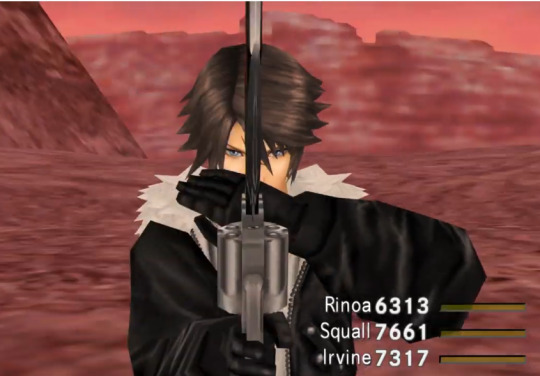
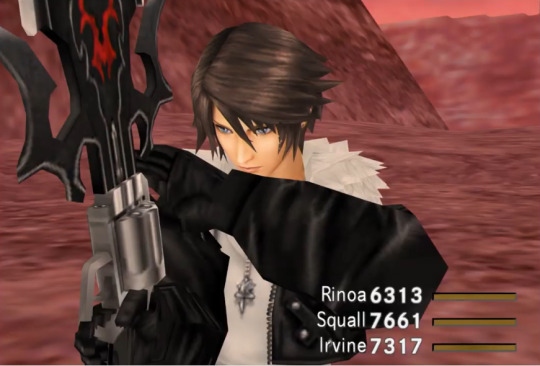
Squall’s stupid Dissidia face. This was an immediate disappointment. At least they stuck to his original outfit, I suppose, but man, I cannot comprehend this decision. Why? Why can’t they leave the original design alone? Everyone loves that design, even the people who hate Squall. And why mess with the character’s design in a product that’s made solely as fanservice for long time fans?! Why must Dissidia replace every. Goddamn. Thing whether the fans like it or not?!
That’s actually a joke I made to myself. “Man, can you imagine if at E3 they announced that they’d just replace Squall’s model with the Dissidia one! HA HA HA!” and I actually didn’t even bring it up in the Discord because I didn’t want to be obnoxious with yet more bashing of Squall’s Dissidia redesign. And yet, here we are, they actually fucking did it. They actually just took the original FF8 and fucked it up by putting Dissidia Squall in it. Guess I am justified in my bashing (and I do like the Dissidia games a lot, make no mistake, I just can’t stand that stupid and pointless redesign of Squall).
And it’s not just that it’s different, and it’s not just because it’s blatantly a recycled asset that’s been retooled slightly, it really does look terrible to me. I really don’t like his overly thin face, his overly soft features, and the fact that he generally looks like he’s 14. Yes, I know he’s a teenager, but he’ still not THIS young, and his original design really gave you the impression that it was someone who trained to be a professional fighter, as opposed to a shoujo manga character.
The hair also looks off. It looks less like hair and more like a plastic helmet or something.
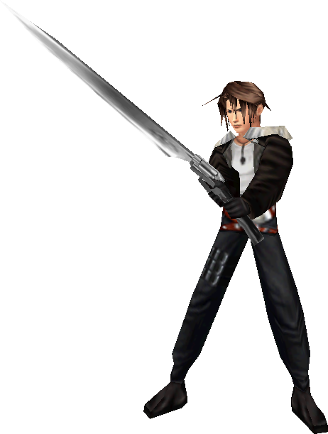
And I know people made jokes about how spiky it was in the original game due to the technical limitations of the time, but it still looked good in my opinion, and it was designed in such a way that it actually looked like his biggest bangs rested naturally on his ears. Here his hair just makes weird solid spikes because... I don’t know, he’s related to Phoenix Wright, now? I used to joke that Squall must be the type of guy who spends hours making it look like he spends no time on his looks, but here it really looks like the dude is just slathering his hair in gel to create these spikes and make them fashionable.
And speaking of the bangs, I have no idea why they thought making the ones on the sides of his head all curvy was a good idea. To me, it just looks like armpit hair, or really unkempt sideburns. I’m just amazed by how not a single strand of hair on that model wants to obey the laws of physics.
These changes are especially jarring to me considering they apparently haven’t touched the CGI cutscenes, making it blatant that it’s not what he’s supposed to look like. So at least it’s creating inconsistencies that didn’t exist in the original game, so that’s a bonus.
Also, looking at the folds on his jacket, they... really don’t look good. Looking back at the original model, they really knew how to work with the limitations of the time, so the folds are more understated, yet at the same time, there was more of a contrast with the rest of the jacket, making it again look more real in spite of the lower resolution.
Oh and it looks like they gave him skinny legs like in Dissidia because Heaven forbid that a professional mercenary looks like received para-military training.
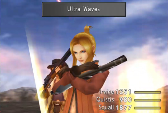
Next on the list is Quistis and she does look a lot better than Squall. I especially like how serious she looks. All business all the time. But again, the hair is where it falters. It looks weirdly... poofy, for lack of a better word, compared to her original self and much like Squall’s jacket, the texture of it feels far less sharp than originally, especially when you look at where the bangs meet the pulled back part of her hair. It really feels like there should be a bigger contrast in the shading to highlight the shape of it and give it more volume.
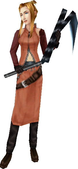
Again, compare with the original, which had a much sharper contrast between the shadows and the highlights, and so made it look a lot more voluminous and lively. Also notice that there was more shading on the original model, giving it a more defined shape. And much like with Squall, the hair gives me that weird impression of just being clipped on and not actually connected to the head, which wasn’t a problem with the older models. This will continue to be a trend, but more on that later.
The same goes for the clothes. Again, in spite of being lower resolution, you can see folds and you can easily imagine the texture of it, but in this trailer, everything is completely smooth and flat. It really takes away from the personality this outfit shows.
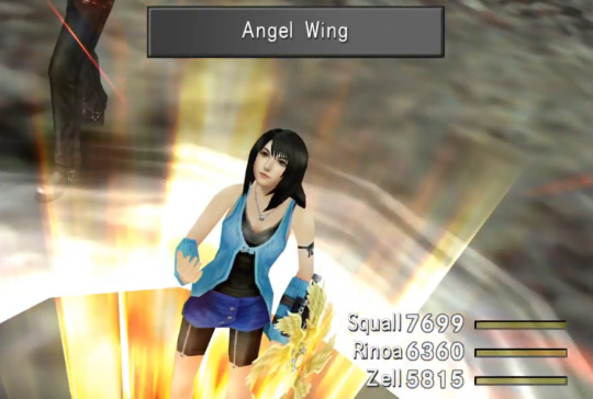
Then, there’s Linoa, and she too I’m pretty sure is based off her Dissidia design, though there’s a bigger chance they actually made a new model seeing how Dissidia NT models have a much higher polycount than the PSP games. Now, I actually liked her Dissidia redesign. It wasn’t quite the same as in the original game, but I liked how they made her look more mature and even a bit curvier, which makes sense since it’s set after the events of each character’s game.
So even though the rounder face seems a bit odd in the original game, I can could have been happy with it and besides, there seemed to be quite a few differences between her CGI model and her battle model in FF8 anyway, so I’m not gonna complain about it looking a bit different. But then, once again, there’s the hair...
So... what happened to her caramel strands? You know, the signature part of her looks? If you look veeeeery closely during the video, there’s what might be a couple very faded strands, but the fact that I’m not sure should tell you everything you need to know, as they’re pretty much gone. And overall, the modeling just isn’t very good and much like with Squall, her bangs just look weird, overly stiff and spiky. Unlike with the original model, it feels like it was cut out that way like cardboard or something rather than naturally following the shape of her head.
One positive I’ll give it is that we can clearly see the two rings on her necklace, and I’ll give them bonus points if there’s only one before Squall hands her his ring.
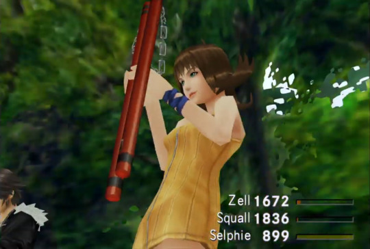
On to Selphie.
...
She actually looks fine and is definitely the one who comes out the best from this whole thing. No complaints there, even though we don’t get to see much of her. Even her wristband/bracelet thing is more detailed, which will come in very handy for fan art.
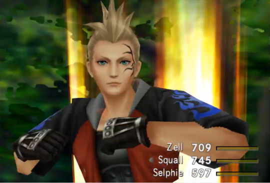
Next is Zell. Now, I’ve seen people mention/complain that they gave him a babyface, but I actually don’t mind that. Zell’s whole deal is that he’s trying to act tough and dangerous even though he’s clearly a loving mama’s boy, so it fits in that he’d look more youthful and innocent. Hell, one could even argue it explains why he wanted to get a face tattoo. No, I have far more of an issue with everyone else having baby faces as well.
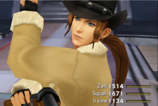
And last but not least, we have Irvine. Now face-ise, I don’t have much of a problem with it, looks pretty good. The bangs are a little weird and again give me that cardboard/wood cutout feel, but still, doesn’t look bad.
What does look bad is Irvine’s shotgun:
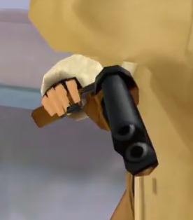
The barrels look weird, right? Well that’s because as you may have noticed, the texture for the holes isn’t aligned with the 3D model. That’s also why you can see a bit of wood texture on one of the cannons. And you can’t see it very well on this screenshot, but the chamber also has mismatching textures.
That’s right, in the trailer announcing a remaster that's supposed to celebrate the 20th anniversary of the game, a product whose only purpose is to make the game look better, they felt comfortable showing us graphical issues that weren’t present in the original game.
Now sure, this will probably be fixed by the time the remaster gets released (at least I hope it will) but I cannot stress this enough, the one thing this remaster is supposed to do is make the game look better and the big announcement trailer cannot even promise us decent texturing.
It also says a lot about the different treatment of fandoms that on the same day, FF7 fans get more insight on an awesome remake of a game that’s already been ported to pretty much every current system in existence, has had multiple sequels, spin-offs and adaptations and constantly gets referenced in other games, with all the love and care that one should expect from a major AAA project but for FF8 fans, proper texture mapping is too much to ask.
It just boggles my mind that a major publisher would create a trailer blatantly showing broken graphics, but to do so for a remaster is just incomprehensible to me.
And speaking of the textures, this leads me to my main issue with these models, which is that they just plain don’t look good. Final Fantasy VIII had a really strong visual identity and compared to the rest of the games, it looked extremely realistic, to the point that even the more recent games that do go for a more realistic feel, like XIII or XV, still have a more overtly fantasy feel. And FFVIII pulled off that realistic style amazingly well. Even though it was made using technology that wasn’t anywhere near as advanced as what we have to day, they still felt like flesh and bone people, and that made them that much more relatable.
But here, that strong identity has been completely neutered. Everything looks way too soft and clean. The textures have no definition to them and are overly smooth; they look airbrushed. And look, I’m not gonna pretend that the characters in the original looked gritty or anything, they were still pretty boys and girls, but they were believable pretty boys and girls. There was still something about them that made it feels like they could be people you’d meet in the streets. Here, their uncannily smooth and featureless skin looks like plastic. They look like action figures.
These models not only look bland and boring IMO, but they just do not fit with the style of FF8, which is going to be especially jarring considering they apparently don’t intend to upgrade the backgrounds. Hell, these models don’t even fit with one-another, as Squall and Linoa really don’t look like they belong with the rest of the team, IMO.
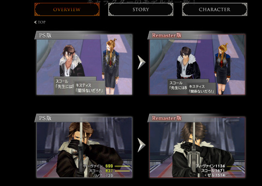
To really ram home how badly this remaster fails to understand FFVIII’s aesthetic, just look at this comparison, which just made me go “Urgh!” when I saw it. Just look Squall and Quistis don’t fit in with this environment. See how especially out of place Squall looks. Behold how stiff and awkward his hair is. Marvel at his collar made of crumbled up tissue paper! Admire how his once intense expression now looks bland and boring! Behold how what few folds left on Quistis’ overly smooth outfits no longer follow the shape of her body! Gaze in wonder at how lifeless these soulless mannequins look.
It’s just so sad and what makes it worse is that just a few months ago, we had the FF8 Mobius event which gave us an HD version of Squall and Ultimecia and that looked amazing! Now obviously a full game with that look wasn’t gonna happen, but I really would have hoped that they’d at least use it as a guideline for the direction to take the art in. Instead, all we get for the 20th anniversary is a remaster that can’t even promise to look as good as the original.
It’s just so sad, and some people are already defending it by saying that we should be happy we got anything at all, or that we shouldn’t be “ungrateful” about it. No! We shouldn’t be content with mediocrity just because it’s better than nothing, especially when I’m not convinced it is. It’s a terribly apathetic to have, and I’m pretty sure it’s the exact sort of attitude AAA companies want to cultivate: be happy with what you get because you ain’t getting anything else.
As for being ungrateful, that’s just laughable. They’re not giving us a present, people, it’s a re-release of a 20 year-old game and as far as I can tell, all they’re doing is change the 3D models, and we’re still gonna have to pay for it. It’s a glorified mod and yet it barely competes with fan-made ones.
Add to this how quickly slapped together the trailer blatantly was, using what is hopefully an early build of the remaster and being half made of CGI footage despite the fact that they don’t appear to have done anything new to it, and it really doesn’t give me the vibe of something made with love.
Honestly, I used to think I was gonna buy it either way, partly because I still wanted to see how it was, partly because I wanted to support Square-Enix but honestly, seeing how this is shaping up, I don’t want to support this any more. I already bought the game on PS1 and PC, why should I buy it a third time in a worse-looking version?
Look, I really wanted to get excited for this. I really wanted to celebrate some new official FF8 content with everyone, but I can only judge it from what I’m seeing, and what I’m seeing is an unfitting art direction, recycled assets and mismatched textures. I just cannot bring myself to cheer on something that really doesn’t seem
So unless they really show us stuff that blows me away before release, I think I’ll stick with the PC version (or maybe the PS1 version on emulators if I’m feeling REALLY nostalgic), even if there is no good reason why it should still be doing such a better job of improving the game’s graphics than an official remaster. Oh and by the way, let us not forget that this is something that console players don’t get the luxury to do since FF8 was infamously not ported to modern consoles, unlike all the other ones. So if you play on consoles and want to play the original without the remastered graphics, fuck you, I guess.
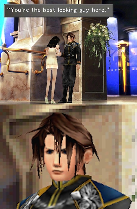
Yep, still the best looking guy here.
#Final fantasy#Final Fantasy VIII#Final Fantasy 8#FF8#FFVIII#remaster#E3#Square-enix#trailer#redesign#disappointment#underwhelmed#rant#déception#PC#PS4#Xbox#Switch
23 notes
·
View notes
Text
Precure Day 127
Episode: Futari wa Precure Splash Star 29 - “Flappi and Choppi are in Dire Straits!” Date watched: 8 June 2019 Original air date: 27 August 2006 Screenshots: https://imgur.com/a/9LKKaID Project info and master list of posts: http://tinyurl.com/PCDabout
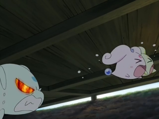
“I’ll kill you!” - Optimus Prime, 2014, colorized
I was all ready to write this episode off as more goofy filler. But then, I changed my mind. Why? Let’s set the scene.
Saki and Mai are chilling at the Mishous’ place, finishing up their summer homework. Interestingly, despite Mai being a little more academically inclined than Saki, she also hasn’t made much headway on her homework, because she’s gotten absorbed in drawing all the sights around town over the summer. This results in both of them helping each other when they gain some understanding about a concept the other is struggling with, and it’s lovely.
Unfortunately, the fairies are restless and rambunctious. They keep disrupting the girls by making lots of noise and running around them.
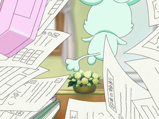
and through them
Saki and Mai try to distract them in various ways: television (where Moop and Foop get entranced by an ad for soap which reminds them of the Fountain of the Sky, more on this later), letting them run around in the next room, letting them run around outside, but invariably, Moop and Foop do something that sets Flappi off as he’s trying to make moves on Choppi, and he starts chasing them around.
Yeah, he’s actually the big troublemaker this go-around, not them. A little surprising, I know. Little dude has murder in his eyes (see top pic) and it takes Saki telling him to chill the fuck out before he calms down temporarily. So the lesson here is that even Moop and Foop can see that his love for Choppi is one-sided. Where does that put him on the maturity scale? Low.
Moving on, down in Dark Fall, Akudaikaan is giving Miss Shitataare crap for being inept, as usual, but she says she has a plan that will work this time, as usual. Once she leaves, Akudaikaan tells Gohyaan to go after her.
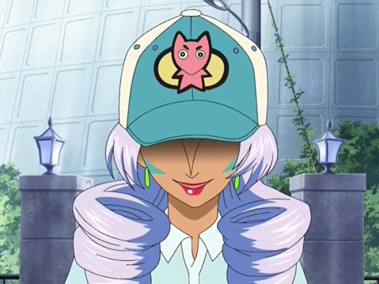
Up at Mai’s place, the doorbell rings and they receive an unexpected package from Underwater Delivery Services later (lit. Mizushita something something) which is not at all suspicious. It turns out to be a set of bath soaps, which they don’t really know what to do with, but they smell nice. Flappi continues to flirt with an oblivious Choppi, only to be distracted by that most treacherous of enemies..... bubbles. The younger fairies have gotten into the soap and made soapy water that they’re using to blow bubbles. This sets him off and he gets in a shouting match with them about their intentions, trying to spoil his advances, which results in Saki and Mai having to intervene again, placate all parties, and get an understanding about what’s going on. However, someone interrupts.
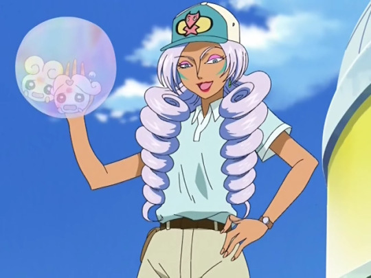
raise your hand if you saw that coming
Yes, it turns out the soap was from Miss Shiitake (actually I think they make that joke in a later episode), in some ploy to capture Moop and Foop and learn the location of the Fountain of the Sun. She gloats that she has the upper hand because of the soap, which she makes her Uzainaa out of, but it’s not shown to be especially dangerous without her making it into an actual monster, and she could have used literally anything else aquatic, like the water in the pond that the soap bubbles were in, or the kitchen sink, or the toilet, or the plumbing itself, or [insert long list of water-adjacent objects in a modern household]. What I’m saying is that, as usual, her plan doesn’t make any sense and last episode was an anomaly. In fact I’m going to pause the recap here to analyze her methodology thus far, because there are particular reasons I don’t want to do it at the end.
Miss Shitataare was introduced as a bigger threat than the enemies the Cures had faced thus far (except for Gohyaan and Akudaikaan, of course). She came out swinging, attacking the girls with water sickles at point blank range before they had even transformed, and even when they did transform, she was still able to overpower their Twin Stream Splash and leave them weakened until Moop and Foop gave them the Spiral Rings, powering them up enough to win the fight. She’s seemed to have a grudge against the tiny fairies since then, because in almost every subsequent appearance she’s made it a point to hold them hostage. Her strategy is generally: Put on a disguise, get close to the girls, and then attack. The one time her disguise was useful was the last episode, where she separated the girls. In this episode, she makes a big show of presenting the soap to the girls and acts like it’s a key component to her plan to defeat them, but as far as I can tell it’s just soap. Then there’s the detail that her Uzainaa are generally not particularly more threatening than we saw the prior generals using. The eel was fast and gave the girls the runaround but that’s been about it. Without any particular signs of struggle greater than what they were able to overcome without the power boost, they always summon the Spiral Rings to finish off the monsters. Granted, this is a creative choice driven by the desire to sell toys, and there’s narrative gain by showing how their new friends contribute their power to the cause, but as far as purely needing the power boost, there hasn’t been much need for that. However, that’s an endemic problem to a toy-based franchise and I don’t want to go down that rabbit hole too far.
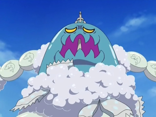
Back to the matter at hand. This Uzainaa’s special ability is that its bubbles are apparently explosive, and it manages to force Bloom and Egret all the way down the mountain from Mai’s house to the beach. They get tossed around a little but they trick Miss S. into momentarily letting go of Moop and Foop, who break out of their bubble and provide the Spiral Rings so that the Cures can finish off the monster with Spiral Heart Splash. With peace restored, Saki and Mai ask Moop and Foop why they were dead set on playing with the soap bubbles, and they explain that the scent reminds them of their home in the Fountain of the Sky, which everybody present is able to sympathize with. Following this exchange, the screen fades to white and the credits-
JUST KIDDING!
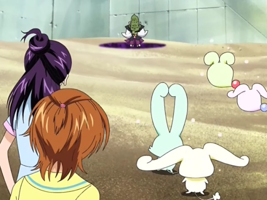
Remember that exchange in Dark Fall earlier? Well, since Miss S. failed, Gohyaan is here to pick up the slack, and he’s no slacker. With three minutes left in the episode, he brutally attacks the detransformed Precure and grabs Flappi and Choppi, taunting them that they’ll have plenty of time to tell him where the Fountain of the Sun is, or if they truly don’t know, divulge whatever they do know, and mocks the girls because they can’t do anything in their current states. Then he descends back into Dark Fall as the two lunge at him, but they are too late and are left grasping at sand. Thus, the episode actually ends with Saki, Mai, Moop, and Foop staring at the ground looking shocked and afraid at what just happened. They can’t transform, they don’t know how to reach Dark Fall, and their fairy friends are in serious danger. How’s that for a cliffhanger?
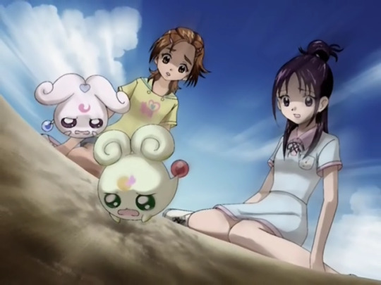
As I said at the start, I was ready to write this one off as goofy, inconsequential, maybe a little sentimental but not better than the emotional bonding and general fun of the last two episodes. By the end, I had almost forgotten about Gohyaan (probably a side effect of spending ~90 minutes watching a 24 minute episode to get screencaps, ps check the gallery), so when by all accounts it was looking like a textbook happy resolution, the fairies will work out their differences and everybody will get along, I was surprised when Gohyaan showed up and kidnapped Flappi and Choppi. Consider me rightfully shocked. Then I remembered what happens next episode, and realized maybe I should have seen this coming, but I’m glad I didn’t because it allowed me to be surprised. The twist ending doesn’t completely negate the wishy-washy (no pun intended) rest of the episode, but it certainly makes for a powerful subversion of expectations, and I give the show a decent amount of credit for that.
Next time, the moon shines bright on a windy night! Look forward to it!
Pink Precure Catchphrase Count: 0 Zekkouchou Nari!
Miracle Drop Count: 5
13 notes
·
View notes
Text
Our Thoughts on Season 3
Hey everyone!! as you may have seen...Alan and I have been just a bit let down by some of the stuff going on. Luckily, we’re both huge ass nerds so we wrote it all out in a multi-paragraph post. With visual aids! if you’ve been feeling a little offput by the new episodes but can’t place why, we probably have your reason put into words somewhere in here.
Reviews, replies, general additions to this post are not only permitted, but strongly encouraged!! :D
bold is nicole. italics is alan
Scent of a hoodie
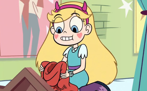
I mean. one word summary;... Uncomfortable. it was rough to watch my girl obsess like that and honestly??? there was no clear message at the end... with the whole ‘the scent is in ur heart....’ do they mean to imply she’s getting over marco or that he’s always gonna be around in her mind??????????. yeh. not much to say here.
this episode was kind of strange and felt really awkward with star’s obsession with marco but had a sweet ending with star learning that its really unhealthy for her to latch onto marco like this and its time to move on. it felt like one of those iffy episodes throughout most of it but the end was decent enough
Rest in Pudding
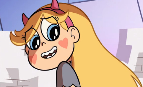
Her little monologue to glossaryk was super cute and well done!! that whole bit was just. Good! felt like Old Times! but then there’s
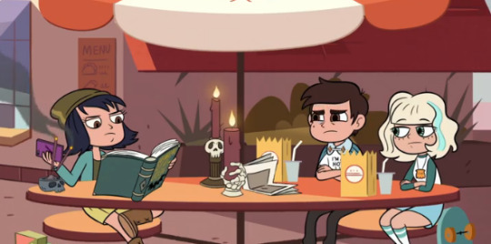
This was... a gag? I dont know. when i saw it first my gut reaction was that they were setting up some angst about how star’s calling people on earth that aren’t her best friend Marco and THAT got me!! i was Ready To Be Hurt by that! but then like...nothing. Unless it comes up in a nearing episode this was just a bad joke. overall episode wasn’t bad at all though!!
i really enjoyed this episode! the pacing, mystery, and comedy all held up to the Star standard and only had a small amount of plot progression which felt appropriate for a halloween episode. my only gripe is that after the whole Battle For Mewni deal, i expected Moon to believe Star a bit more when she says Glossaryck is alive
oh yeah that too for sure
Club Snubbed
pretty much made me want to die and barf simultaneously. when it got to the scene above, where she talked about just needing a friend i thought, hey, thats cool. and accurate. maybe that dance scene clip, since its unfortunately not a flashback, is going to be presented as platonic!
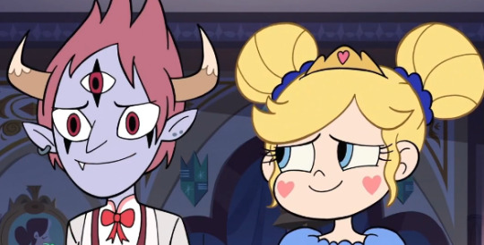
nope. anyone in for a suicide pact?
To be fair, i should elaborate. Tomstar, in theory, is super cool. I definitely vibed with the fire and butterfly magic mix happening, back when I thought it was a flashback. But...Its been, what, 5, maybe 6 episodes since marco left and she’s already just...whoop? who’s marco? haha what? There’s not enough time.
And from what I can tell, none of their old issues have been addressed. Tom still has anger issues, but because ‘its hard’ and he’s ‘trying’ suddenly star’s all over him? sleazy ppl come to their exes like ‘i’ve changed!!’ for a reason. the ex should actually. want. to see. change. Star seems content to say ‘fuckall, tom’s here, why not’
WHICH..could actually be good? If it’s presented that way? My hope is that she’s latching on to Tom because they have history, and a bond already. Marco’s gone suddenly, she’s urging for somewhere to direct her affection- lord knows the sweet girl has lots to give. and then they’ll part as friends after she realizes whatever they are now is unhealthy and ingenuine romantically. I have no backing for this and honestly it doesn’t look like that’s the way they’re going but... I’m gonna hope.
this episode definitely throws a spin on our view of tom as an “uncaring, lying, manipulative ex boyfriend” and for the first time i felt like i really saw Tom Lucitor, a boy with anger issues and an unfortunate history with his actions. i was really glad to see this character growth for him but i feel like the writers completely skipped over the real impacts that a relationship like tom and star’s had on each other.
yes!! i didn’t say but, i kinda love tom as an independent character. his anger issues are presented as a part of his personality, he is a guy who has anger issues, not Anger Issues in a physical form. lots of cool depth on that.
realistically, star would not immediately fall back in love with tom because...why would she? we as the viewers know that Tom has changed but to Star? he has a significant history of lying to manipulate her and marco to get closer to them and star doesn’t have a real reason to believe what he’s saying is true and she shouldn’t have 100% faith in him so quickly especially when she had 0 trust in him just a few minutes prior. overall i was impressed with the development for tom but the future implications were disappointing to me
i will be talking more about my issues with Star and her trust issues later.
Stranger Danger
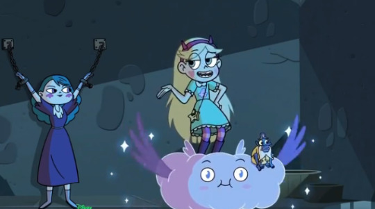
My only issue with this episode is that it doesn't exist outside of its own ten minutes. I literally forgot about it til i looked up an episode list of s3 to write this post. Eclipsa is sitting there, queen of darkness, in the same castle grounds as star, and shes nor the trial is brought up in the subsequent episodes. Alan goes wild on this one so I’ll let him take it away- he’s 100% on point here.
THIS IS A LONG ONE BOYS, STRAP IN,
i agree with nicole here, there is no buildup to the immense revelation that eclipsa is free and roaming the castle gardens. battle for mewni had planted the seed that eclipsa was breaking out but there was no mention of this in any other episode. and then there’s this:

what was this all about?? did no one notice that Eclipsa, the Queen of Darkness, one of the most powerful queens and magic users in Mewni’s history, and a wanted criminal, was FREE FROM THE CRYSTAL THEY FROZE HER IN?? And in BFM, Moon even visits Eclipsa’s crystal prison to check if she’s still there but now? she didnt seem worried about it AT ALL. only when Star is peacefully talking to her does Moon and the magic high comission show up because...plot reasons.
aside from that, however, i feel like the pacing in this episode was not planned very well. from the opening scene of Star taking care of Glossaryck for well over 4 minutes, it felt like this was going to be a fun silly episode with general shenanigans (there’s nothing wrong with silly episodes, it just didn’t end up being one). but halfway through the episode, eclipsa shows up and suddenly the plot is moving at a rapid pace. and while this felt like it should have been the climax of the 11-minutes, the climax just continues? there is no falling action in this episode. it continues with star being decontaminated and at one point she is strapped to an examining table and flashes through some disturbing faces
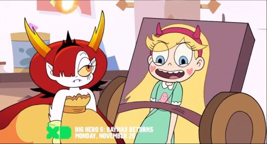
why is she smiling? who drew this? this feels really creepy, like someone is putting their kinks into the show and its really uncomfortable to watch and think about. there is a heart touching moment with Moon and Star talking about their actions and both side have somewhat understandable reasons, though star clearly has the show’s bias so the plot progresses (which is not necessarily a bad thing). afterwards, Star meets Eclipsa in her cell and still, the climax of the episode has not fallen at all with all the arguing. and then finally when star confronts eclipsa in her tower, she says,
“Just because i didn’t want you crystalized again, doesn’t mean i trust you.”
????
She literally has no past with eclipsa other than having a pleasant conversation with her. She knows next to nothing about her actual actions or personality but immediately doesn’t trust her? but in Club Snubbed she immediately trusts tom? the guy who directly had severe negative impacts on her life?? Why?! Why are the writers so inconsistent? nothing makes sense! It’s cheap, forced romance that’s why!
and after this ridiculously long climax the episode just ENDS. there is no resolution, and it doesn’t touch on it again anywhere in the next four episodes. It’s bad show writing.
Demoncism

I picked this screenshot because it was the most disgusting!!! this is just...more of an opinion here but I really like the trope where one is out of their mind, dangerous, causing magic destruction and the other defies the risk and holds them, curing the issue with The Power Of Love. it’s corny but I love it. and yet.
here. they decided to just. chuck it in. I’ve seen shows do this trope Very Very well (oddly, one example i can think of also involves a wild demon kid and a forest in blue fire.....) but to just...throw this in there. with. like 8 seconds of buildup. n-o. no. ESPECIALLY because tom and star, where they are currently in the show, aren’t ready to be romantic, and this trope always has romantic implications.
i got extremely mixed feelings from this episode. on one hand it had a great message that you shouldn’t force change but rather to grow naturally and learn from your mistakes. on the other hand, a lot of it is still tainted by this cliche, boring, romance. Star immediately barges in and claims that he’s only doing this for her and generally is untrusting of his actions.
......
are you noticing a common theme here? writers purposefully twisting characters’ interactions for the sole purpose of causing drama? give me one good reason for star’s sense of trust to be flip-flopping like this over and over again. im being serious, if you even read this far, leave a reply and call me out because i CAN NOT THINK OF ONE GOOD REASON.
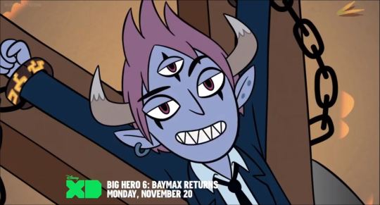
“Okayy, but no tickling.” Again, more creepy bdsm, moving on.
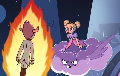
Then later when hes doing that whole floaty, blue veined, writhing scene i will actually commend the writers for making a very good analogy of how painful and unhealthy this process is for tom to quickly force himself to change. then star comes back and hugs him and says shes here for him which would have actually been a very sweet moment if they had just been friends but of course, they’re not. its just a reminder that “uwu they’re in love now”. and then there’s this:
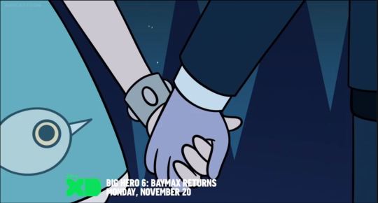
confirmation that yes, the show is going to do that. rush star and tom’s relationship bc #teendrama. and the worst part of it is: star and tom could actually have been an acceptable, if not role model relationship if it wasn’t written so poorly, which is what the next paragraph or so is dedicated to.
I don’t hate Tom and Star’s relationship. I don’t. i see it as a missed opportunity. Tom and Star were two people who used to be a couple in the past and broke up for reasons unknown. we can speculate that it was because of Tom’s anger issues and problems with lying, and also Star’s inability to deal with complex situations and face her problems. THIS IS AN INCREDIBLY COMMON REAL LIFE SITUATION. This was a ripe opportunity to go in-depth with Star and Tom’s issues, not just their own but also the issues between them. and it is wasted. I know that its hard to fit this into one measly episode but there’s a whole half season to develop them at a proper, realistic pace! i wouldn’t care if the entire season is dedicated to Star and Tom working to solve these issues if it meant we had this enormously important topic resolved in a healthy and wholesome manner.
But the problem is, none of this happens. And it’s not going to. The writers completely skip over all of Tom and Star’s anger towards each other and go straight to “UWU THEYRE IN LOVE NOW”. Star is just rebounding off Marco and onto Tom and there’s going to be more unnecessary drama, and someone’s going to get hurt.
And I am disgusted.
Sophomore Slump
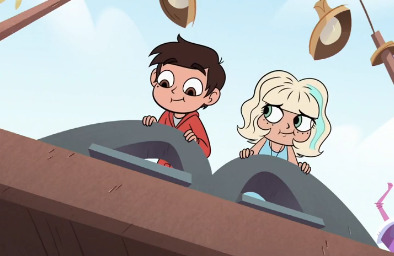
jarco saved this ep ? the only parts of it i could really relax and enjoy was the little jarco montage it was cute. and then. and THEN. the random dumping. I get what the writers were trying to say, y’know? ohohohoh, nudge nudge, we all know who marcos REAL best friend is...hohoho...except. they shouldnt have. said it. at least not via jackie. She was used in this disgustingly common way where she’s just there to deliver a message and help marco realize something. do y’all realize the most drastic adjective i can apply to her realizing she+marco wont work is like....”bummed”. It’s realistic to cry, to be fucking mad, to show...FEELING...i don’t care how cool and chill she is. It’s an absolute travesty to her to not let her be upset about it.
AND THE CAPE. it was obnoxious, I hated his attitude about it, not because it was annoying but because he expected others to stop ‘acting weird’. I had hope when jackie knocked sense into him but then he...was then REWARDED for his obsession with it? He ended up getting what he wanted, a ticket back to Mewni, by being a stubborn arse about it. no.
god where do i begin. alright.
Marco was so out of character this episode. im not talking like “he isnt the safe kid anymore he takes some uncharacteristic risks”. no. I don’t know who this kid is but it is not Marco Diaz. He’s some plot device created by the writers to create drama. Why is he so obsessed with his cape? Why is he forcing his experience on mewni into every conversation? Why. Is he. The Croissant Girl. The dude spent over sixteen YEARS in other dimensions going on quests of epic scale and comes back home without a single issue readjusting. Not one word. but then he spends one week in the butterfly castle and serves essentially no purpose the entire time other than freeing Star from her chains one time. He was completely and utterly unimportant in the grand scheme of the BFM movie. and then he comes back to earth and feels this great pride as if he was some great part of the event. Why? what does he have to be proud of? there was no mention of this development in any of the earlier episodes. and i havent even mentioned the ridiculous forced breakup yet.
at some point it seems like Jackie’s words really do come through to Marco. He snaps out of his daze and seems to genuinely want to make it up to her. the scene with Marco and Jackie having a fun date at the pier was incredibly sweet and was generally a good experience. We got to see more of Jackie’s fun side that we were desperately searching for in season 1 and the first half of season 2. it was very satisfying to know that jackie was a character everyone would eventually come to love. but then
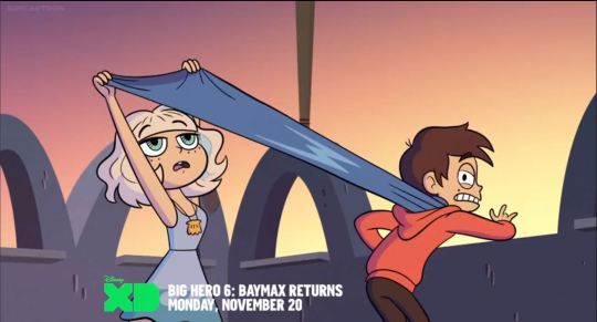
that. Why? Why has Marco not moved on at all and learned his mistakes? why does he not understand that he’s being destructive. why do the writers like creating unnecessary drama. you know what show had a very similar plot issue and resolved this properly??

That’s right! Everybody’s favorite racist, ableist, offensive, generally unfunny show: The Big Bang Theory. I don’t even remember this dude’s name but when he came back from space and was being annoying, his girlfriend talked to him and he realized that “WOW IM ANNOYING LET ME THINK ABOUT OTHER’S FEELINGS FOR ONCE.”
100%. if they had stopped with the callout via jackie, and he had actually taken off the cape, I would have been fine. lesson learned. but, obviously, they didnt do that.
If this show (which has an incredible track record for doing crappy show writing) can get it right then why can’t Star vs the Forces of Evil? A show that is usually praised for it’s amazing talent for intelligent, easy to understand, and great moral messaging?
Because of the writers. They don’t want to teach important messages for these kids (the target audience may i remind you) to latch on to and learn from. They want to write their angsty fanfiction and throw it into canon.
Nicole-TL;DR my lasting hope is star’s affections for tom are, and are revealed as such, a way to cope with going cold-turkey on marco and things resolve without a stupid fucking love triangle also jackie and janna start dating. aaand im just. disappointed with the show rn. something’s different and after shoving this amazing ass show in everyones face for so long just to see it kind of...well, it’s starting to peel. idk why. but im just hoping this is like...banagic incident but...several episodes long.
Alan-TL;DR
49 notes
·
View notes
Text
Experience with Scaling Devices using PlayStation 1 (PS1)
I’ve been playing around with PS1 games on my old LG 1080p TV using different devices and wanted to do a little write up (keeping it brief but also describing what I saw). Apologies for no screenshots, but I’m not really set up for it and any pictures I took wouldn’t really convey much.
The reason the PS1 is so interesting to me is because it’s still that early time in 3D graphics as far as hardware, but it lasted long enough to where the developers got really good at attempting realism. So while simple polygonal games like Spyro the Dragon look good no matter how you scale or filter them, games like Gran Turismo 2 or Need for Speed III either need to be left original or with subtle scanlines. You can’t just anti-alias or blur your way through these games. Every little pixel (from the trees to the dirt) has been placed there to resemble reality in a very “crunchy” graphics sort of way. That’s part of the art and the fun of PS1. The little system is trying to do the most with what little it has and I want that carried through to me while playing the games.
First of all; here’s my setup: I use an original PS1 1001 console (the one with the audio jacks in the back). I use Retro Gaming Cables RGB Scart cables going through a GScartSW (which is an expensive switching device that offers sync regeneration) going out to a scaler. Here are the setups I tried.
Framemeister - Though I’ve sold my Framemeister recently, I had tried it extensively with the PS1 and used the custom configurations from FirebrandX. The scaling was right, but didn’t look great on my TV at 5x due to positioning. And 4X looked really sharp and centered, but it was leaving a lot of unused screen space and I ended up having to use the zoom feature on my TV. Not ideal for many reasons. Also, I wanted scanlines and those only looked good at 4X as well. Plus it’s annoying switching back and forth and having to use the remote to load different profiles (more on my solution for that later on). Back when this is all we had to use, it was more than acceptable. But with so many awesome choices these days, it just seems like an over-priced way to go these days (I bought it for $300 and sold it at around $800).
Scart2X - Whenever Mike Chi (RetroTink Store) came out with the Scart2X I jumped at the chance to try it. The $95-ish device takes RGB Scart input and outputs straight to HDMI. It doubles 240p input and deinterlaces 480i, so you get a crisp 480p output. There’s also a button to add either scanlines or smoothing to the image. I used this setup for a couple of months and I really appreciated the simplicity. All my 240p consoles look fantastic through this (Genesis, SNES, Sega Saturn, etc). There were a couple of downsides, however. The first was that the device doesn’t pass through 480p or anything higher. It really only accepts 480i and 240p. Secondly, the scanlines are 100% black lines and this made the image really dark on my TV. So I ended up not using the device’s scanlines and - instead - using a separate HDMI scanline generator. This actually helped a lot but not being able to input other sources with higher resolutions kind of bothered me. As far as being simple to use, this is the ultimate device. But I just wanted a little more than this had to offer in the end, but I’d have no problems recommending this - especially to those that want an unaltered original experience.
GBS-8200/GBSControl - At this point, I learned about the developments around the GBS-8200 from watching one of RetroRGB’s videos on the subject. Turned out that I had bought this really cheap ($25-ish) VGA scaler device years back and it sat in a bin in my basement without use (because it didn’t really do what I wanted from it on a VGA monitor). A developer (ramapcsx2) came up code so that you can use an Arduino to control the GBS-8200 board. The neat thing is that - once installed - you can control resolution and features through your phone using WiFi. You can also add a clock generator module to the board to prevent screen tearing (for PS2 games like Dead or Alive 2). So - after spending maybe $25 in additional parts and conducting a mod that took me an hour and a half to figure out - I had a really nice scaling device that rivaled the Framemeister in features, but also had most of the simplicity of the Scart2X. Well one extra addition I need was a SCART to VGA converter (which I luckily had). I can leave it on 1900x1080 output and it automatically adds scanlines (letting you pick the intensity - which I leave on 50%) if the input is 240p (so that higher resolutions just look normal). Turns out that this is exactly what I wanted all along. The board also provides adaptive motion deinterlacing (which you can turn off or change to BOB deinterlacing at will). This ends up looking great on my TV - it’s nice and centered and sharp.
mCable Classic - I’ve also tried using the mCable Classic (I’ll just refer to it as mCable) with the GBS-8200 to add smoothing since it essentially adds no lag. Since this article is focused on PS1, I’ll just mention what I’ve found it useful for and what I haven’t. First of all, the mCable doesn’t really do anything at 1080i, so you need to feed it 480p or 720p from the scaler output to see a difference. And that’s not really convenient (as I’d just prefer to leave thing set as they are), but you could leave the cable hooked up and turned on and just disable the smoothing it offers by upping the resolution from the scaler to it. Second of all, using scanlines really only works well with 1080p output on the GBS-8200 and the mCable doesn’t really do much with scanlined output going into it.
mCable/GBS-8200 - So here are some games that are use-cases (combining mCable and the GBS-8200):
Tekken 3 - Using smoothing has mixed results here. Menus look great but the characters in-game looks pretty rough at 480p. Upping to 720p results in the characters looking decent smoothed (especially when paused), but I’m 50/50 on whether to go this route or just to use the 240p scanlines to be honest. For simplicity, the mCable isn’t really worth since this isn’t a game you’d play for a long time.
Crash Bandicoot (and Ridge Racer) - This at 480p going into the mCable is probably the best-case scenario. Game looks smoothed and great. Simple polygonal 3D games is kind of what smoothing is best used with. The mCable is especially great because of how it treats defined solid lines. Scanlines looks great, but if you were going to sit down and beat this game, setting up the mCable would absolutely be worth doing.
Need for Speed III (and other realistic-looking racers) - This is a case where you want to preserve the pixels that were trying to make the streets and scenery look realistic. In this case, scanlines really beat out the mCable’s smoothing. With the smoothing (even at 720p), the barely-visible pixelated leaves on the ground just look like a brown smear. There wasn’t a lot of resolution to go on here and it’s only detrimental to remove it with smoothing.
Parasite Eve (and FF7) - This is another case where smoothing really isn’t useful due to the way the very pixelated/blocky characters look. Sure, you’d see some nice smoothing on the backgrounds, but they’ve used every pixel to carefully represent the characters on the game field in a way that smoothing just doesn’t work with them. In this case, scanlines works at 50% intensity because at this point your eyes will blend things for you and also you won’t be missing the information your eyes need to do this.
1 note
·
View note
Text
Even since the introduction of the iPad back in 2010, Apple touted the device as a great device for consumption. Whether it was apps or games to watching movies and TV shows, the iPad was great for all of that.
But now, Apple is reshaping what the iPad can be used for. With the latest 9.7-inch iPad (which is technically the 6th generation), Apple is aiming is not just aiming it at consumers but also towards teachers and students with a renewed emphasis on education.
I’ve been using the new 9.7-inch iPad for about a week, and while it’s great, there’s still some left to be desired.
Design & Hardware

The new iPad has a 9.7-inch Retina Display which is the same screen size that Apple has kept for the past 8 years. The resolution is 2048-by-1536 to give is a 264 ppi. Videos look good but nothing compared to the screen on the iPad Pro with their ProMotion technology.
The iPad is still around the same thickness as its outgoing model and weighs around 1 pound. The device is being powered by the A10 Fusion chip, which is a variation of the chip introduced with the iPad Pro 10.5 last year.

In terms of battery life, I was able to get around 8-10 hours of usage on the iPad. Like other Apple devices, the iPad has good standby time, so if you left it for a while, it would still have a lot of its charge.

The new iPad has a Lightning port, volume buttons, headphone jack and stereo speakers. The speakers do the job but nothing like the four speaker setup on the iPad Pro. The new iPad does have Touch ID but I did find it to be slow and not as quick as other Apple products with Touch ID.

Apple also added support of the Apple Pencil in this latest iPad which is a welcome addition. Not only is the Apple Pencil is a great accessory to use but it means that you won’t have to spend $900-1000 CAD on an iPad Pro to get the same experience. The Apple Pencil still costs $129 CAD and is sold separately.

Here are some sketches I made using the Apple Pencil on the new iPad.
The iPad is available in three colours, Silver, Space Gray and Gold. It comes in two storage options, 32GB and 128GB.
The pricing for the new iPad is as follows:
32GB (Wi-Fi) – $429 CAD
128GB (Wi-Fi) – $549 CAD
32GB (Wi-Fi & Cellular) – $599 CAD
128GB (Wi-Fi & Cellular) – $719 CAD*
* The model I tested
The new iPad is available from Apple’s website.
While $429 CAD might not seem like too expensive for an iPad. It’s still definitely cheaper that the iPad. The other thing is that Apple is promoting this iPad to be used in classrooms, and paying almost $500-600 if you add the cost of the Apple Pencil and a keyboard.

Meanwhile, you could get a Chromebook or a decent Windows 10 laptop for around $200-300 and you could do some much more. With the iPad, you’re still somewhat restricted of what you can do in iOS. Sure you can create stuff but if you wanted to actually work done, then you’ll need something more powerful and useful.
Software

The new iPad is running iOS 11.3, I’ve talked about iOS 11 in my review of it and in my iPhone 8 Plus and iPhone X reviews.
With iOS 11 on the iPad, you can use the Apple Pencil in a number of apps including Page, Numbers and Keynote. iOS 11 also supports handwritten notes and sketching with the Notes and Mail apps as well as annotation of photos, PDFs and screenshots.

iOS 11 brought a new way to navigate the OS with the addition of the Dock on the iPad. You can just swipe up from the bottom to access your favourite and most recent apps.
iOS 11 is an overall improvement over previous versions with stuff like a more natural sounding Siri, a Files app and better performance.
Another big feature of iOS 11 is the addition of AR. Essentially, you’ll be able to run augmented reality apps and games using your iOS devices. AR is probably my favourite feature of iOS 11, it’s one that I’ve had the most fun with.
With the addition of AR, it opens up the possibilities of the classroom. Some educational AR apps that I tested include:
Froggipedia
WWF Free Rivers
BBC Civilizations AR
JigSpace
Froggipedia also you to see the anatomy of a frog in AR and WWF Free Rivers puts “an entire landscape in your hands,” where you’ll be able to see how river flow through people’s lives and wildlife. There are also AR apps that teach kids how to code, see mathematical equations in 3D models and learn better in 3D.
You will also find the usual creative apps like iMovie, GarageBand and more. There’s no shortage of great apps for iOS on the iPad.
Camera

The camera on the new iPad is nothing too amazing. It’s 8-megapixels and stuff like body and face detection and auto image stabilization. It also records 1080p video at 30 fps and slow-motion video at up to 120fps.
Pictures and videos look good but I wouldn’t rely heavily on the iPad’s camera. The camera is great to be used in conjunction with some of the AR apps that I mentioned earlier.
The front-facing camera is a FaceTime HD camera that can take 1.2-megapixel photos and 720p videos. It’s good for video calls and not much else.
Final Thoughts

Overall, the new iPad is a solid device but it may seem pricey especially for schools, when a Chromebook could be had for the same cost or much less than the new iPad and can do more.
However, the new iPad still makes a great media consumption device for everything from games and apps to movies and TV shows.
Pros
Apple Pencil Support
Lots of apps, including a great selection of AR apps
Great battery life
iOS 11 really shines on the iPad
Cons
Touch ID sensor is a bit slow
Design needs an update
Slightly pricey for schools

iPad 9.7 (2018) Review Even since the introduction of the iPad back in 2010, Apple touted the device as a great device for consumption.
#9.7-inch iPad#Apple#Apple iPad#Apple iPad (2018) Review#Apple iPad Review#iPad Review#new 9.7-inch iPad
0 notes