#starting to regret all the textures patterns and layers in this design
Explore tagged Tumblr posts
Text
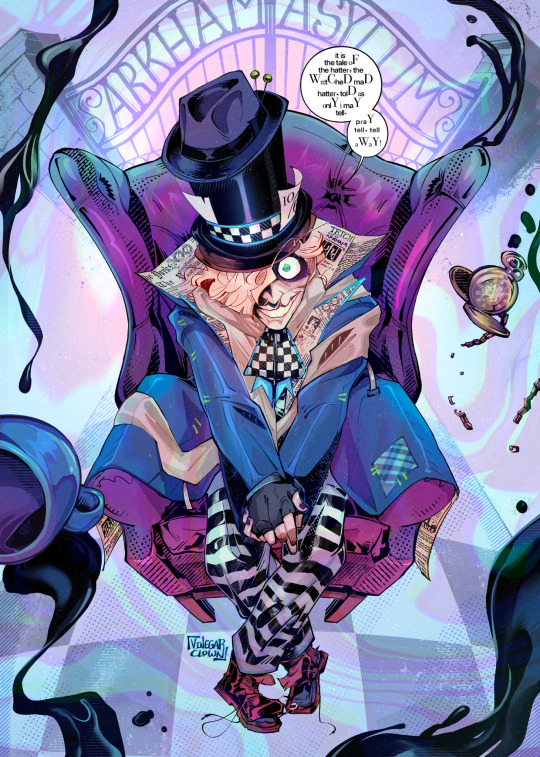
Wonderland.
#vclownverse#jervis tetch#mad hatter#his shoes are on the wrong feet but that’s probably in character#reminder that he doesn’t wear nail polish he just slammed his hands in the car door#arkham asylum#digital illustration#fanart#batman#character design#panel redraw#vinegarclown#creaman#starting to regret all the textures patterns and layers in this design
901 notes
·
View notes
Text
Lan Wangji: Simply Blue
AKA Lan Wangji’s costumes in the Untamed, part 5/9
Now it’s the turn of the second mainly blue costume, which is the simplest of all the outfits Lan Wangji wears during the series. Bit of a blessing, since it was really hard getting good screencaps that show the outfit, but the simplicity means I didn’t need that many😉. On the other hand, I have several sad faces in my folder because of reasons.
He wears this outfit in episodes 25 to 29, and as always, I’ll first talk about the costume and then the context.

The Costume
This second blue costume is the least elaborate out of all his costumes in both shape and detail. Gorgeous fabrics are used once again, but they’re not textured the way his three earlier outfits had.

(Sidenote, it was impossible to get a capture where you could see the full outfit from front clearly in a neutral lighting 😤)
As we see, the silhouette is as basic as it gets, a robe closed with a sash, and the cuffs with the criss-crossing bands are one of Lan Wangji’s basics. It feels a lot more casual than any of his other outfits, with minimal tailoring and more loose and relaxed at the top.
Far as I can tell, the top robe is made of two layers of fabric; the fairly lightweight blue one, and a bit sturdier silvery one underneath. It seems they’re only stitched together at the collar and front down to waist, because we see the blue and silver fabrics move independently as he walks at the front and side slits. The layer underneath is unsurprisingly a white robe.

Coming to the details, first we might note that the cloud embroidery is present but relatively understated in this outfit, it’s at its usual place on his lapels but runs down only part of the way and in a narrow row, not covering the whole lapels. Second, even his sash is simpler than usual. Usually it’s been wider, with the layers of fabric crossing over each other, but this narrower blue one is just very simply wrapped around his waist.
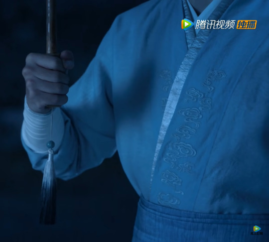
I’ve pointed out previously how his outfits tend to especially shine during some of his key scenes. Often it has been in darkness, which makes sense since white is pretty great to light in those conditions, but they’ve also enhanced the effect with fabric choices (the matte white in the cave that was great with the warm fire, and the shiny white of his Sunshot campaign outfit which meant he basically glowed under the moonlight when they sat on the roof). Especially great with this particular outfit is that different aspects of it are enhanced by different lighting.
On top of this post is the daytime scene on Phoenix mountain, and under the sun the blue is at its best, giving LWJ a softer appearance than his more common whites do, especially combined with the simple and loose cut. And above, during the rainy night scene the silver next to the blue is absolutely gorgeous.
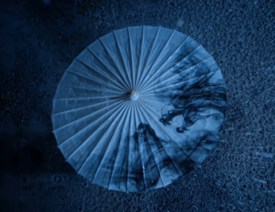
He also came with an accessory once again, an umbrella. Surely it’s just a coincidence that the black pattern on it looks much like the resentful energy Wei Wuxian summons with his flute.
The Context
Lan Wangji actually doesn’t care a bit about your hunting event, Jin Guangshao.
It’s so funny to me, when everyone last saw him, there was an actual war going on and he was wearing a super elaborate outfit that was so pristine white that anyone who looked at him probably saw afterimages, and now that it’s an event designed for showing off he comes in the least detailed outfit he can get away with. The thing is though, he doesn’t care about politics or the general showing off, he’s laser focused on one thing (one person, that is):

(Yes, it was absolutely necessary to have two images from this scene.)
Again, a blue outfit is an outward symbol of his priorities swinging toward Wei Wuxian rather than his sect, and this time it’s much more pronounced than during their search for the Yin Iron. It makes narrative sense for LWJ to dress simply, because it’s as big a difference compared to his previous outfit as he can have and still keep to the Lan Sect dress code. After WWX came back, even though they made up and got along well enough together, they still didn’t manage to fully connect, there was still a wall between them, and now LWJ is trying a different strategy. Now that the war is over and his sect safe as ever, he can with a good conscience (albeit probably not in the eyes of his uncle) take a visible distance to his identity as the Second Jade of Lan and try to signal his priorities to WWX.
It’s very obvious from the start of the hunting event; as soon as they leave for the forest, LWJ doesn’t stay with his own sect but goes looking for WWX. It’s obvious in the way he asks, who he is to WWX, and affirming that he doesn’t consider their connection a thing of the past. He’s holding a door open, and it almost works, too. We see WWX contemplate his flute, as if deciding whether to confide in LWJ, and I think he even might have, had they not been interrupted. It’s very characteristic to all of their interactions while LWJ is in this outfit, there’s always a turn for worse, something of an outside influence or they meet an internal barrier they just can’t breach.

While LWJ is very persistently trying to reach WWX, he’s also perhaps the most conflicted during these episodes. His upbringing is waging a war against what his heart wants, and during this time frame he can’t resolve that battle. When WWX distances himself from the norms of the cultivation world, the conflict just gets more difficult for LWJ. It’s impossible for him to let go of WWX, but it’s equally impossible for him to leave his family and what he’s been brought up to be, and at this point in time he also doesn’t see any way to resolve the problem that would allow him to fulfill both those needs, and so he’s left in between.

At this point in the story it’s very visible how the difference in their upbringing affects the choices of LWJ and WWX. In principle, they agree that the way the Wens are treated is wrong, but LWJ has been brought up to rely on the rules rather than on his heart, to rely on the established structures of the world and to think of them as the right, and we know his uncle was and is extremely strict about it too. At the time, he’s still a teenager, and it would be practically impossible for him to let go of all that, when the only thing telling him different is his heart that he’s always been taught to not rely on, lest he become like his father. Meanwhile, WWX spent his first years with rogue cultivators and after that some time alone on the street, and those experiences most likely left him very little will to trust the establishment. Even after he’d been brought into Jiang Sect, he was still allowed to question and to not follow the rules, and so for him it’s the natural choice to follow the voice of his heart and his consciousness, even though it means breaking a promise to his sect brother.
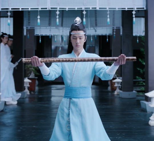
And here is the last we see of this outfit, LWJ kneeling for a long time. I’m pretty confident in saying that no matter how long, it doesn’t really work as a punishment since he doesn’t actually regret going to Yiling.
Next we get to my favorite outfit, and more heartbreak on the side. I’m still undecided what the title for that part should be, I’m currently leaning on “everything is awful but at least he looks good,” or is that too long?
You can read the other parts of this series on my blog’s “lwj costume series” tag, and there is also a link on my blog contents page. I’d put a link here but we know how this site is with those.
34 notes
·
View notes
Text
Accent Patterns Furnishings in the Living Room
Integrating patterns into your cushion setup will certainly bring instantaneous pleasure to your space. Making use of patterns does not constantly indicate that you have to be eccentric with your style. Actually, a pattern is a method to add rate of interest to your sofa and will certainly bring depth to your block colours. Think about your patterned cushions as your accents, something that will produce the wow element or exude a tranquil feeling. Whether you are choosing a stand-out colour or a marvellous black and white, ensure to pick a palette that will seamlessly enhance the simple coloured cushions. The texture is so vital when it comes to your sofa as well as its soft home furnishings. If you desire a cushion setup that showcases stunning style, adding appearance is a wonderful means to bring interest. Furthermore, textural cushions are the ideal alternative for those that do not intend to discover the globe of patterns. Whats much more, a lovely distinctive cushion will include variety and personality to a bold eclectic screen. From calming cotton and voluptuous velvet to bohemian tassels and also beautiful grains, there are a lot of methods to bring texture right into your cushion plan. Click on this link to shop our magnificent cushion options where colour, pattern and appearance can be checked out! So since we have actually discussed every one of the incredible cushion designs, let's undergo just how to set up cushions on a sofa. By congregating your terrific styles, this is a possibility to really take the program with your spectacular display. At xxx, we love any kind of excuse for a restyle as it can actually boost your scheme. This is why we constantly urge a revamp in any kind of corner, just for the enjoyable of it! See below to find how to prepare your cushions on a sofa in an oh-so-chic method. To begin, prepare your block colours straight of three along the back of your sofa. You can utilise as a number of these as you wish depending upon your sofa dimension. The base cushions will certainly add convenience along with a starting colour for your combination which is essential for both functional usage as well as a harmonious design. In addition, having these cushions as your base is excellent all year round as you can after that change your extra cushions accordingly. For your accent pattern, pick two matching cushions that you can't get sufficient of. These could be textural delights or quite patterns to layer before your base cushions. Just location these two cushions in front of your first layer of cushions in the spaces, forming a pyramid format. Both accent cushions that you choose will bring symmetry and added appeal to your existing display so easily. For those that like to go for it, you can top off the appearance with some striking show-stoppers! These will be the last cushions to really make your arrangement pop. Choose 2 unique cushions to put at the front of your screen or probably one large cushion to develop the wow variable. In addition to this, as these cushions will certainly go to the leading edge of your sofa, this is where you can experiment with eccentric shapes also. Presenting a distinct cushion form is a remarkable means to attract eyes to your fabulous showpiece. You will not regret it! Click here to see our complete sofa cushion range at https://www.buydesignersofas.com
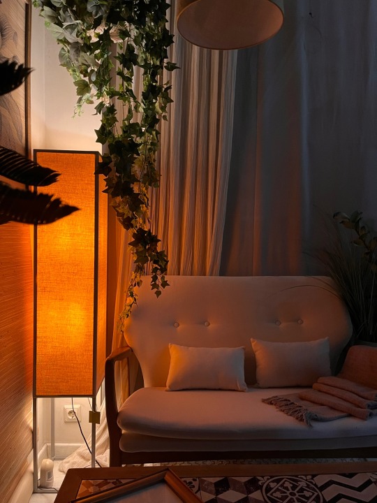
A random shop window that felt like home
17 notes
·
View notes
Text
15 cutest long hairstyles for women over 50
New Post has been published on https://www.easypromhairstyles.com/15-cutest-long-hairstyles-for-women-over-50.html
15 cutest long hairstyles for women over 50
Long hairstyles for women over 50 are said to work with texture. Don't you want to be on the safe side with the same old, boring short hairstyles? Read on for your most fashionable alternative!
Experienced Hollywood actresses Michelle Pfeiffer, Julianne Moore, Angela Bassett and Sandra Bullock should be your ultimate inspiration. After wearing her hair long and flowing and proving to the world how a woman over 50 could be the embodiment of class and sassiness at the same time.
With modern styling and cutting techniques, it's now very easy to lose sight of decades. From layered cuts to precisely placed highlights and pony cuts, you can be chic, up-to-date and sophisticated even in your prime!
Arkansas-based hairdresser Kami Cale specializes in structured, mixed, and colored cuts that improve her clients' manes in the healthiest way. Having long hair can mean a lot of grooming, but the key is to groom your curls regularly through thorough grooming and monthly trim appointments.
In front of you are the latest, professionally designed hairstyles with which you can celebrate not only life, but also your impeccable style! Check out these trendy long hairstyles for women over 50!
With thin hair
How would you describe this look?
This look is awesome if you have healthy, thicker, or just thicker hair. I don't think just because you're over 50 and you have to cut your hair off. She was ready to move on to her snow-white natural tone, so I made a full, high-loaded highlight and tinted it to match a silver / white! She was in round 2 and will probably need round 3.
Patience is the key to keeping long hair healthy. At some point she will no longer need color services!
Any advice for someone who is thinking about it?
As mentioned above, hair is best when it is thicker or when you have plenty of it to keep the hair long and make the waves. For this look I used Oway Moisturizing Hair Bath (shampoo) and Moisturizing Hair Mask. For the styling I used Oway Glossy Nectar for protection from heat and Oway Sea Salt Spray for the texture! All of this can be bought on my homepage in organic or in the salon! And since the hair is prone to fading or discoloration, purple shampoo is a must! You can also find Oways Silver Steel Hair Bath on the website! All products are grown on a biodynamic farm in Bologna, Italy, or for ethical reasons.
Talk to me about the fact that you don't shampoo every day because of longevity. You can do it! I usually wash and dry the first day and roll the next day. I use Original Mineralie from Original Mineral for Gold (also available on site) and it prevents roots from becoming oily. Victory!
Long, wavy hair
How would you describe this look?
This is my Beachy Balayage Babe (the three B’s). It's a gorgeous, confident blonde who makes her look like she's been on the beach all summer, catching these rays. My favorite thing about this long style is how natural it is, which makes it less maintenance-intensive for my guest who gets highlights 3-4 times a year. (Some get highlights 1-2 times a year!)
I love a bright pop around the face to highlight the color. The guest pictured is a natural blonde. If you're naturally brunette or darker, a similar sun-kissed look can be achieved that matches your hair, skin color, and eye color. I also like the effortless waves I created with my 1.25-inch Babyliss curling iron with large sections in alternating directions.
Any advice for someone who is thinking about it?
This sun-kissed look can be achieved for most hair types and colors, as long as the highlights stay within three levels of your natural color. If you're a brunette, these golden highlights may not look as vivid and natural as a lighter brunette. It's one of my favorite styles for busy ladies who don't make it to the salon every 6-8 weeks.
Maintenance for this is around 8-12 (provided you use your stylist's recommendations at home and a good shampoo). The best styling products to achieve these loose curls are good leave-in conditioner / heat protection, volume mousse and a sea salt spray to blow dry for texture and bounce. Then finish with a texture spray to rake and cut out the curls for a beachy, natural look. If you are a girl who can do without laundry for a few days, you can enjoy the curls longer! I always recommend washing your hair only 2-3 times a week as it will keep your hair healthier and your color longer! Win win.
With thick hair
How would you describe this look?
I really like this medium length layered hairstyle. I think it flatters almost every face shape and works well for medium to thick hair type! It works so well with rich, dimensional hair colors and can be styled in several ways. For this look, we did a simple blowout with a 1.5-inch round brush.
Any advice for someone who is thinking about it?
This is a great length for active women as everything can be pulled into a bun or ponytail if needed. Customers should be ready and able to use 2-3 styling products as well as a hair dryer and a round brush to achieve this look. We used a heat repellent, a voluminous spray at the roots and a light styling cream for softness and frizz protection. The maintenance for long hairstyles like this is 6-8 weeks for braids and hair color touch-ups!
For gray hair
How would you describe this look?
This is a very natural and soft long hairstyle. This customer's color is completely natural! I love the bright white splash in front! This look is good for a woman who wore her natural silver color. It is very difficult to achieve this effect artificially.
Any advice for someone who is thinking about it?
Moving from dyeing to natural gray is a process, but I think once it's natural, it's a lot less maintenance. Long cuts like this are easy to care for with soft layers and medium length and grow out well. We keep soft long bangs that emphasize the white before. In this picture, I styled her hair with Living Proof 5-in-One styling cream, which is spread all over damp hair. Then I did a round brush blowout to get ready. She is a beautiful silver fox!
With curly hair
How would you describe this look?
This look was created by gently carving and cutting into the curly pattern of her long, naturally curly hair. This way, they can interlock and create a seamless mix of layers that add volume and life to their long curls! I love that it is very easy to care for, yet very stylish and flattering for your face shape.
Any advice for someone who is thinking about it?
This long cut would work well with anyone who wants to hug their natural curls. Only a handful of salon-quality products are required to achieve this result, starting with a light leave-in conditioner, a curling gel, and a moisturizing hairspray. Air dry or diffuse for more volume!
Long and youthful
If you have long curls, you can look more youthful. Long hairstyles for women in their fifties benefit from adding textures, curls, and waves to mimic the pimped out look that says, "I'm looking for an adventure!"
For fine hair
Ash blonde babylights and highlights, voluminous hair, and a long layered haircut with bangs – when everything is merged, this results in an amazing look that is perfect for fine hair from women over 50 how beautiful an older woman can be.
With blunt bangs
Sometimes a woman's true glamor is evidenced by a long haircut, so find one you won't regret if you have one. This long hair with blunt bangs and voluminous curls is better than what is easy. The highlights on hair painted with balayage and ombre dyeing techniques are an amazing inspiration for hair.
Simple hairstyle
Life is full of drama, but your hairstyle shouldn't be. This simple long hairstyle achieves a glamorous result by adding loose curls and such a fine-tuned bangs to the hair. With or without extensions, long strands with blonde highlights will surely keep their perfection.
Elegant chignon
A woman of sophistication can easily pull off this elegant chignon. This structured upstyle bun looks fantastic on women over 50 with long hair and can be worn on special occasions such as weddings.
Long ponytail
This long ponytail hairstyle looks so simple, yet stunning and stylish full of grace in older women. With subtle, voluminous waves at the tips and a blonde dimension of the entire hair, created by the hairdresser Yamila Scalise from Villa del Parque, CABA, it is not just for the wedding, but can be a typical day outside the home kill.
With glasses
Women with glasses will kill this look, which is designed with voluminous waves and brown highlights. Look creator Carolina from Hairtrix Carolina said, “My goal is to help you achieve the ultimate beauty, both inside and out.” This only proves that some people were born with finesse that runs through their veins and that they only have to enter into a long partnership hairstyle.
Layered hair
Thanks to this creative and entertaining cut, you can improve volume and texture with feather-light layers on this long BobVarious blond color.
Fancy updo
If you miss the old days, you can always pull off this fancy updo for long hair, inspired by a ball from the 1920s. With curls and volume, you are the most sophisticated woman of the night. For a touch of youthfulness, set bright red accents on your mahogany balayage locks.
For black women
How cheeky can your long curls be? This hairstyle is the kind of style you will ever need in your life. Ultimately, this look is twisted and curled for a black woman to give you an invincible glamor.
0 notes
Text
Figure out a plan for how to decorate your home
Designing your space can be incredibly exciting, but also intimidating. It’s easy to feel overwhelmed and discouraged when the vision in your head doesn’t seem to be materializing. That’s why it’s important to have a clear idea of what you want and a plan for making it happen. You should also know what you want to spend on the project, and keep in mind that decorating your home on a budget is possible. Inexpensive home decor doesn’t mean low quality, it just means that you need to get creative to find affordable decorating ideas that work for your space and your budget.
FIGURE OUT WHAT YOU WANT
Before you get started, answer these questions to figure out a plan for how to decorate:
Where am I hoping to make changes? Identify the spaces you want to address, and list them in order from the highest priority to the lowest priority. breakfast bar ideas for small kitchens https://www.justdiydecor.com/kitchen-decor-ideas/4-easy-and-affordable-breakfast-bar-ideas-for-small-kitchens/
o What am I trying to accomplish? Create a vision for your space through sketches and inspiration images. o Why do I want to design (or redesign) this space? It’s important to understand your motivation for starting the project. Identify what is not working and why it needs to change. o How involved do I want to be? Decide whether you’re more of a DIY enthusiast or if you would prefer a surprise reveal, in which case you should hire an interior designer. Who do I need to help me execute the project? If you need to hire an interior designer or other professionals, like contractors or electricians, do your research. Always hire people who make you feel comfortable and share your vision. When do you hope to start and complete your project? Create an ideal schedule for your project to keep you organized and on track, and be prepared to adapt as needed.
FIND YOUR STYLE
o Once you’ve determined your goals, involvement, and team for the project, choose a decorating style. If you don’t already have a strong sense of what you want, start exploring design blogs and magazines to figure out what you gravitate towards. Create home inspiration boards on Pinterest and start pinning anything and everything you like or don’t like. (If you decide to hire an interior decorator, it might be helpful to create a board for them of looks that you want to avoid.) After you’ve been pinning for a while, you’ll probably start to notice some patterns and similarities, which means that your personal style preferences are emerging. upstairs loft ideas https://www.justdiydecor.com/interior-decoration/7-functional-upstairs-loft-decorating-ideas/
o Space You have to know the space you’re working with before you can make informed decisions about furniture and artwork, so take about 30 minutes to measure the room–including the size of the doors. That way you won’t be heartbroken when your dream sofa doesn’t fit through the doorway, or frustrated when your new furniture looks like it belongs in a dollhouse.
It might be tempting to buy all your furniture in one trip, but a more affordable strategy is to just buy a few things at a time. By living in the space, you’ll get a sense of what you need, like a side table next to the sofa for your drink. This is also a good way to spread out the cost of furnishing the room. Also, there’s nothing wrong with having an empty wall or floor space. You don’t need to cover every square inch of your room with furniture or art. twin girl bedroom ideas https://www.justdiydecor.com/bedroom-decor-ideas/7-timeless-twin-girl-bedroom-ideas/
o Lighting During the day, evaluate the amount of natural light the room gets and figure out where you need to brighten things up. Make sure to layer your lighting so that the room is lit from various levels and sources, like floor lamps, table lamps, and wall sconces. If your space doesn’t get enough natural light, mirrors maximize the light you do have. Also, be sure to buy the correct wattage bulbs–it may sound obvious, but it’s a common mistake.
o Color If you have a lot of room color ideas swirling around in your head but you’re not sure which to choose, consider whether you want a warm or cool palette. Next, introduce new hues in the form of commitment-free items like throw pillows, blankets, and other accessories. You might regret a bold living room paint color like lime green, but if you change your mind about a lime green pillow? That’s a much easier problem to solve. You don’t need to prove something about your style or personality by saturating every surface with color. On the contrary, thoughtfully-chosen pops of color make a bigger impact. kids bathroom decor ideas https://www.justdiydecor.com/bathroom-decor-ideas/10-kids-bathroom-decor-ideas-every-mom-will-love/
o Furniture One of the biggest mistakes beginners make with furniture is not understanding the importance of a statement piece. Instead, people tend to be too safe with their choices, and as a result, nothing stands out and the room looks bland. You don’t need to go matchy matchy with your furniture. So, just because a company sells sofas and chairs from the same line, resist the urge to buy the entire set. It’s more visually interesting to have a variety of different, though complementary, profiles. If you’re unsure about mixing styles, look for a common thread between two pieces, like a similar style or silhouette.
o Flooring Adding an area rug is an easy way to add color or texture. Make sure to get one large enough to define the space. As a rule of thumb, make sure the area rug extends either six inches under your sofa or starts six inches in front of it, and six inches away from the wall. If you’re choosing a rug for a high-traffic area, choose something durable, like a low-pile wool or sisal. For low-traffic areas, you can choose more luxe options, like sheepskin, or delicate bamboo silk.
o Art Art is another opportunity to reflect your personality, so take your time choosing it, and don’t be afraid to experiment. Figure out what styles inspire you, and how much you’re willing or able to invest in art at the moment. If you have a limited budget, there are plenty of options, like art shows, street vendors, and websites where you can purchase prints from more well-known artists, or original pieces from up-and-coming talents. Also, keep in mind that art isn’t just framed photos or canvases–it can be objects, too, like plates or macrame wall hangings. Art also doesn’t have to match the colors of the room. In fact, it’s more striking when it pops against neutral or contrasting colors. lighting ideas for living room with no ceiling light https://www.justdiydecor.com/livingroom-decor-ideas/top-3-lighting-ideas-for-living-room-with-no-ceiling-light/
Next, decide whether you want to hang one big piece or a gallery wall. Pay attention to scale when choosing and hanging art. For example, if you have high ceilings, a large vertical piece will draw the eye up. Hang pieces at a height where you can easily look at and enjoy them–you shouldn’t have to crane your neck to see your art.
o Accessories Pillows, throw blankets, books, and decorative objects are the final layers you add to a room to unify the space. This is an opportunity to personalize the room with items that reflect your style and interests, like a coffee table book of work by your favorite designer, or a vase you bought while traveling.
Edit your objects. It still needs to be a functional living space, so don’t crowd every surface with accessories. Make sure there’s space to put down your phone or a beverage.
Let go of the idea that a room needs to feel completely “done.” One of the fun things about decorating is that your space is always evolving. If an item doesn’t bring you joy, don’t force it into your design. Take things slowly, and enjoy the process.
0 notes
Text

Moodboard
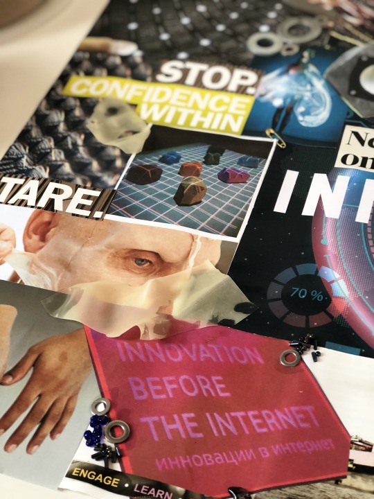
To start our mixed media workshops off, we firstly were each given a word pulled from a hat. My word was ‘INNOVATION’ - meaning a new idea/device/method. From here, we had to produce a moodboard using anything we wanted (printed images, words, collages, colour palettes, magazine cutouts etc).To begin my moodboard, I wrote out a list of things the word innovation brought to my mind. This list was as follows:
brain → thoughts → cogs → lightbulbs inspo → ideas → imagination creativity success → business technology → medical advances → mechanics → prosthetics → bionics transformation → rearrangement → change → alter
From here, I chose the starting points that I felt were most interesting, which to me excluded the business/success area, and went more for the transformation and medical advances area. Then, I began to find images on the internet of prosthetics and bionics, as well as items I felt fit into the transformation and ‘new idea/device/method’ definition. This included things such as smart textiles → thermochromatic beading, uv fabrics etc; innovative packaging and product designs → new ways of lighting and packaging every day objects; as well as completely out of the ordinary architecture.
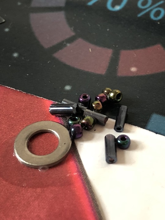
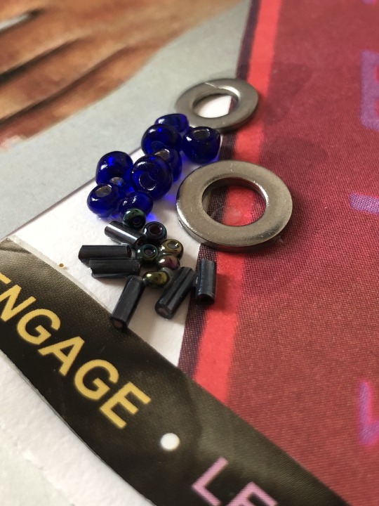
I also wanted to include prosthetics, so brought in 3D areas - adding nuts and bolts to represent the machinery and torn sections of latex and skin coloured balloons to replicate this.

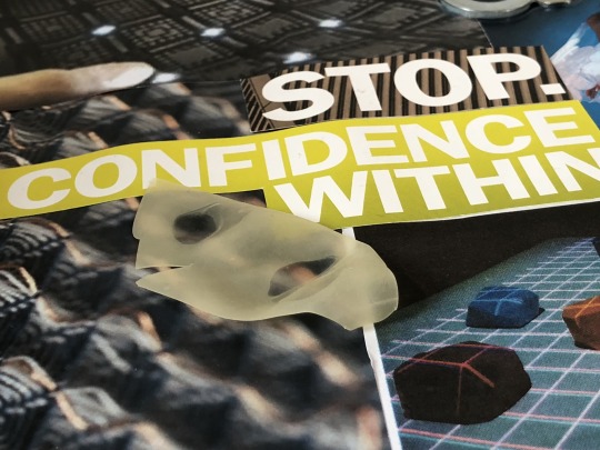
Alongside this, my moodboard included words cut from magazines, which focussed on the element of creativity and superiority → ‘more features’, ‘more space’, ‘confidence within’; all which make me think of something that is a new idea/method - whoever came up with the innovative idea had to have the confidence to do so, hence the ‘ahhh!’ and ‘behind the nonsense’, and the ‘we the people are the work’ motif; and the idea itself must have been better than older ideas in order for it to be new, hence the repetition of ‘more’ and ‘stare’.

From here, we are to use the ideas from this moodboard to produce a piece of non permanent art to install at college, surrounding our individual word: innovation.
Art Bomb
The second mixed media workshop was to produce a non permanent art piece to be placed around college, using any media (but not painting on walls etc.). We were to make our statement as a piece stemming from our moodboard, therefore my piece was to represent my theme ‘innovation’.
My plan for my piece was to produce a bionic hand, following this inspiration image that I found when creating my moodboard, seen above. I was to create the hand and ensure it stayed light enough to be able to adhere it to a window, allowing me to draw the ‘computer screen’ surrounding it. To build the hand, I used newspaper bunched and rolled up to produce each singular finger joint and the palm of the hand. Then, I attached each joint to a straw, keeping the finger print end of the finger connected to the bending section of the straw, and the lower part of the straw connected to the palm of the hand. I attached each finger using masking tape and continued to wrap the tape around the palm to ensure they were secure. Once the base was done, I then covered the structure in paper-maché, to make it more sturdy and one piece.
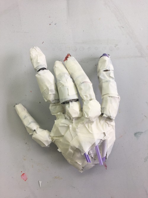
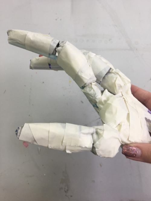
Once the maché dried, I went on to paint a base coat of emulsion to block out the newspaper print; before then painting the hand using metallic acrylic paint, following the pattern for the joints on the inspiration image. As I painted the structure, I came to realise that the hand was too messy, and the maché had given a rough, folded texture which I didn’t think suited the point of the piece. Instead of continuing to build up the base and trying to make it smoother, which simultaneously would continue to thicken up the fingers - to the point where they were too thick for those of a bionic hand. To move on, I started over again, this time using a different medium as oppose to newspaper and paper-maché - clay. This would allow me to get a much smoother finish, and would allow me to make the fingers as delicate as possible, something newspaper wouldn’t allow me to do. I made each joint and finger separately, as above, then assembled them into the palm of the hand using thin floristry wire. Once air dried, I was then able to paint the structure. I used the metallic acrylic again, firstly painting a base coat of light silver all over the hand.

Then, I went in with a mixture of silver and black for the shadows between each joint. I continued to do so for the patterns across the rest of the hand.
When thinking about this further, I decided that I hadn’t captured the look I had hoped for, and much preferred the style of the paper-maché hand, regardless of how textured it was. I returned back to the original hand, and painted the joints similarly. For my final outcome of this workshop, I photographed the finished hand on an acetate futuristic touchscreen, seen below. with an edited gradient background (done in photoshop).

Whilst I still really dislike the texture, I am much more pleased with this outcome as I feel the joints are much better placed and the position of the fingers is considerably more realistic than the clay hand.
Oil Paint
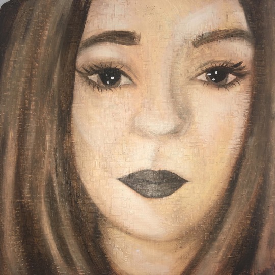
Our third mixed media workshop was to produce a self portrait using oil paints. We began by coating our board in a layer of emulsion, to give the oil paint something to cling to when painting. After this had dried, we went on to use modelling paste (a mixture of PVA, white acrylic and talcum powder), pushed through a stencil, to produce a raised 3D pattern on the board. This would add an interesting element to an otherwise flat surface. My stencil produced tiny squares and oblongs, a pattern I liked, seen below.

Although I have used and loved oil paints throughout my A-Level, I found this particular technique of layering yellow ochre and burnt sienna as base shadows beneath the fleshy tones a difficult and lengthy one, which I didn’t particularly enjoy. Using the oils watered down considerably with white spirit meant that we were able to continue to layer as much as we wanted to get deeper base tones, but overall to me meant I was struggling to get a strong enough colour when it came to adding actual colours and skin tones, meaning my outcome had a very strong ochre tinge to it which I didn’t like. In past experiences I have found oil to be thoroughly enjoyable and easy to work with, but this technique just didn’t work at all for me. I liked the looseness that drawing our outline with a thin wash as oppose to pencil gave us, however I didn’t think this made up for how ineffective the end outcome was, therefore I wouldn’t use this layering technique again; but it hasn’t put me off using oils and this is a well loved medium for me which I will definitely return to in my development.
Paper Making
Our next mixed media workshop, was to produce our own homemade paper. Once made and dried, we will then use our paper for our upcoming life drawing classes, alongside our graphics and print workshops; and in our general development.The paper making process was as follows:
Cut up lots of paper into small pieces.
Fill bucket with water three quarters of the way.
Put the chopped paper into the bucket and churn with the paper churner.
Fill a large tray with water.
Pour the churned paper into the tray.
Use the sieving frame to scoop paper and drain the excess water.
Transfer the paper to a J-cloth on some newspaper and add any extras (eg. plants, flowers, petals, glitter, sequins, magazine clippings, string, thread etc.) ensuring they aren’t too chunky.
Make sure to ‘pin down’ the corners of the extras with some more of the churned paper.
Place a J-cloth on top and drain excess water, then remove it and leave the paper on drying rack to dry.
I have used this technique before, in A-level, which I used to print on, and it was very effective. Due to producing a whole class batch this time, as oppose to doing exactly what we wanted with a tiny kitchen blender as I had in the past, we were all using the same dye batches and therefore were limited to the colours/extras we were to add in. For this reason, I concentrated on using the plain white tray of paper, and adding in petals and flowers and patches of separately done dyed paper.The first sheet, seen in the scan below, was white with patches of teal and purple dye. I then added in purple flower petals, and matching ripped up sections of teal paper. I really liked the petals, and felt they worked well. The paper was quite thin, which is what I wanted, and ended up to be fairly flat, meaning I will be able to use this one for life drawing/printing on in future workshops.
For the next sheet, I added mini pieces of jigsaw, yellow flower petals, and tiny mixed ripped strips of orange paper. On top, I added glitter, as previously I have liked the look of glitter, however here I regretted adding glitter, as it was too thick and messy looking. I thought the pieces of jigsaw were effective, and using the two tones of orange paper was too, as were the petals.
For my third piece of homemade paper, I experimented with inks, filling a pipette with red and squirting it all over the page, then doing the same again with black. Then, I added glitter, not knowing that in hindsight I wouldn’t like the outcome. Whilst I quite liked the colours I had chosen, I think this was by far the least effective of my papers. The inks just looked messy, and didn’t bleed into the page as much as I had hoped, leaving exact lines and squiggles which I didn’t feel was very effective.
For my fourth and final piece of homemade paper, I used the yellow communal dye tray. This was by far the most effective and my favourite outcome, as the whole sheet was coloured, and my additions of matching yellow petals, leaves and threads were very effective. I will definitely be using this sheet for the printing and life drawing workshops and in my future development.
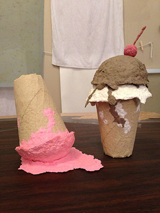
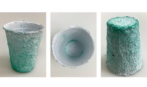
I additionally produced a 3D cup from my paper, using teal coloured paper, and moulding it around a plastic cup. I then left it to dry, and once done removed the plastic cup from the inside, leaving me with the cup itself. I felt this was very effective, and was inspired to do so after researching Brittany Spencer, a paper maker who produces 3D pieces, reminiscent of childhood, seen below in her ice cream sculptures.
My cup is pictured below. I didn’t actually expect this to work, so in fact I am actually very pleased with the outcome, and would like to further develop this, perhaps adding more than just paper to the object.
To finalise my experience, I would definitely use the paper making technique again, now knowing that the particular type of glitter I used wasn’t effective, and that petals worked well. Mixed tones of paper was more effective than using only one colour, and matching the colour of petals/leaves to the colour of paper also worked best. Overall, colouring the dye tray itself as oppose to adding pipettes of ink worked the best, and therefore this is what I would take further when producing my own homemade paper again.
Mixed Media Sculpture with artist Mark Gibbs
For our fourth mixed media workshop, we were introduced to Mark Gibbs, a mixed media sculptor, who focusses on using wire, recycled electrical goods, cardboard and newspaper to produce his work.
Gibbs first explained his own practice, and challenged us to use ‘contextual analysis’ to analyse his work, trying to pick apart the layers in one particular piece to uncover the meaning behind it. Although I found this very interesting, I do disagree with his view that all art has to have a clear, easy to see story/thought behind the piece. I think this is a very set opinion, and realistically in the real world there is a great deal of art which can be appreciated without clearly being something very specific. There are lots of pieces with meaning behind them, which I covered a lot in my A-level, like Marc Quinn’s ‘Self’, which doesn’t need to be so obvious to have a very deep and thorough meaning behind it. I feel that these sorts of pieces, with meanings that have to be researched to be fully appreciated, as oppose to pieces that very clearly bit by bit tell a story, which I prefer considerably, and appreciate a great deal more; however this is just differing opinions.
Then, we were told our pieces would depict ‘Craft&Conflict’ and that we were to choose an animal of significance, and an item of ‘military technology’, so I first set about producing some initial sketches of my ideas, in which I wanted my focus to be English Fox Hunting, as my conflict. I chose this idea as I felt it was a different kind of conflict; being more animal rights based as oppose to being ‘military’ as such. My choice of military technology was a gun, and from there I had to choose which animal I wanted to create to go alongside it. I had some options, seen in my sketches below, but settled on the main animal, the fox itself.

From here, I began to build both, steering away from the use of newspaper and paper-maché, and instead challenging myself to use the electrical wires and stiff chunks of cardboard etc. in the same way as Gibbs. This was a new technique for me, and I realised that attaching the wires required hot glue, which looked very messy and took away the more raw, natural aspects of the work. I found the cardboard not malleable at all, and as equally hard to work with as the wire. I felt that it was very hard to make the pieces look professional, and no matter what I did I couldn’t get anything to look anything other than childish. I felt that my choice of creature and weapon meant that it was hard to make anything very intricate and detailed, emphasised more so by how difficult I found the materials and technique to work with.
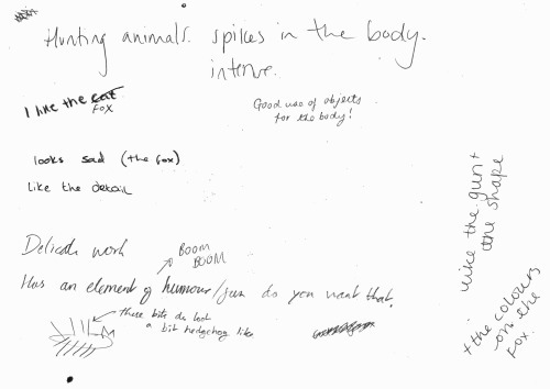
We stopped halfway through our making, and did a whole class crit, in which we each left a sheet of paper out to allow people to write their thoughts on our piece so far. Below, is my page from the crit, with people’s opinions on my piece so far. Gibbs explained that it is good to give both positive and negative points, and that as we grow as artists its important to be able to defend our pieces and explain why we have done certain things. I am pleased with my responses, particularly the ‘the fox looks sad’, and at the time I hadn’t clipped the fur yet so I understand the hedgehog feedback. One thing I didn’t understand, was how there was an element of humour, as I felt that a gun was probably the least humorous object, and couldn’t see any humour in the fox either, other than the large spikes.
After the crit, we were able to go back and continue with our pieces, where I built up some more extra details on the gun, and trimmed the foxes’ fur so they no longer resembled ’spikes’. Below, the fox and gun can be seen separately.

Overall, whilst I’m not particularly pleased with my end result, at least I now know that I find this style of working, technique and mediums hard to use, and that it is easier to work on a much smaller scale to allow for more intricacy and detail. I won’t be using this any further, but working alongside an artist and having a first proper crit was interesting and a learning curve.

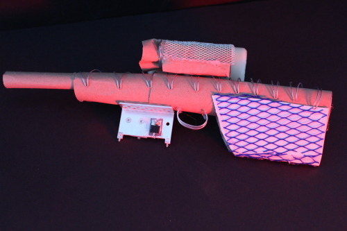

Craft&Conflict Exhibition

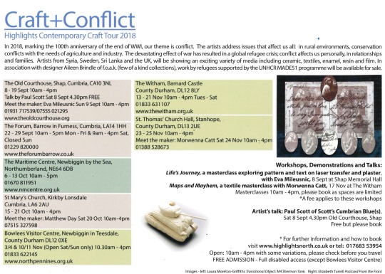
As part of our workshop with Mark Gibbs, our produced work was then going to be shown as part of the Craft&Conflict Exhibition, in The Forum, Barrow. This exhibition is part of the Highlights Contemporary Craft Tour 2018, and featured the likes of Conrad Atkinson and Paul Scott, amongst others.
We entered the exhibition and began with a talk from Karen, the curator, who explained that the theme of conflict was to mark the 100th anniversary of WW1; addressing issues that affect us all. After the introduction, we were able to walk around and explore the exhibition for ourselves.
Some of our work from the workshop with Gibbs was on show (seen below), which was great and showed us an exact timeline of how art moves from being a concept, an idea, to a base structure, to then being a finished piece in an exhibition.

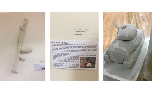
Laura Moreton - Griffiths: Moreton-Griffiths’ work was by far my favourite of the exhibition. I loved her use of textiles and 3D structural work, and also felt that the bold juxtaposition between the soft materials and harsh reality of the war weapons the material depicted was extremely effective, making her work stand out amongst the rest; hence why it was my favourite.
Matthew Day: Day’s work as a sculptor questions the taboo of missing limbs, celebrating them in plain sight. His pieces ‘explores the potential for limbs that move away from trying to replicate the human form’. Whilst I like the concept behind Day’s work, I didn’t feel that I necessarily felt they depicted ‘conflict’, and whilst the modern, more architectural take on prosthetics was effective and interesting, I didn’t feel very inspired by the work and therefore this part of the exhibition wasn’t my favourite.

Paul Scott - Scott’s work took a different direction to the other artists’ in the exhibition; creating ornate ceramics - porcelain plates and bowls, depicting a range of issues; such as inserting nuclear and coal fired power stations into pastoral landscapes on the plates. Similarly to Moreton-Griffiths’ pieces, I find the juxtaposition between the delicate, intricate medium (ceramics) and the horrific, conflict based additions, seen below, very effective.

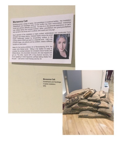
Morwenna Catt - Likewise to Moreton-Griffiths, Catt specialises in sculptural textiles, seen in her installation of sweethearts and sandbags, seen below. Whilst I think the use of military fabrics and embroidery suits the piece, mimicking the small hearts traditionally created by recuperating soldiers in the wards of WW1, the work isn’t to my taste, as I feel it looks too busy, and somewhat childish.

Eva Mileusnic - Mileusnic’s work ‘Counter Flow’, seen below, represents pairs of migrants’ feet, produced from slip cast porcelain. I love Mileusnic’s work, as I feel the detail and meaning behind the piece, which can only be properly understood upon reading the description, gives the viewer a connection to each pair of feet, and an overall touching and moving aura. I also love how each pair is adorned with a different pattern; referencing the movement of cultures from one place to another, and showing how each migrant’s story is different.

Overall, the exhibition was a good experience, and from here I have realised that I much prefer the pieces that depict moving, heartwarming stories that need further reading to understand (like Mileusnic’s) , and pieces that show contrast and juxtaposition through the use of materials and context (Moreton-Griffiths’/Scott’s). I think I will definitely re-visit Moreton-Griffiths’ work in particular in my future endeavours.
0 notes
Text
On Creating a Brand Booth for a Conference, aka the Whole-House Takeover of 2018
In February, I created a booth for Rust-Oleum at the first-ever Workbench Con. And in true UDH fashion, it became a crazy story all its own.
For more than eight years (April 1st was my blogiversary, actually), I have spent time regularly updating this blog, (mostly) all about my ups and downs of DIY home remodeling. It’s been about individual projects aplenty, but most of all, it’s been about the journey. It has taken years to build a home I love, and there’s more yet to do. Through that, I created a business I’m passionate about. And even more astonishing to me, I created a brand that is recognized by companies I admire.
And? That’s all super, super surreal. Frequently. Because things come at ya fast, and you wind up saying yes to things you can still fail at because you’ve never really done them before. That’s how I wound up building a brand booth at a conference that took over my kitchen and living room and made my new roommate wonder what the hell he’s gotten himself into.
Booth & conference backstory
Over the winter, I was asked by Rust-Oleum — a brand that I’ve used so. many. times. and even featured as some of my first projects — to build their booth at the first-ever Workbench Con in Atlanta, GA. You guys have heard me talk about Haven before, and this conference is sort of like its rough-around-the-edges cousin. More focused on woodworking, set up in a warehouse instead of hotel ballrooms, and more influencers of all kinds (Haven is mostly blog-focused, while this also drew YouTubers and Instagrammers and such, who collectively refer to themselves as “makers”).
For a new conference, I didn’t really know what to expect or what other brands might be bringing to the table. I mostly had Haven as reference, which meant I needed to bring my A-game! I knew Rust-Oleum had previously asked bloggers to create booths for other conferences in the past, such as when Bower Power did it for Haven in 2016. I never thought I’d ever get an opportunity like that.
They asked me to help with the event since I was local, and sent me a few of their ideas to work with. I came back with my design concept, and they agreed! Part of what I was commissioned to do was to showcase some specific new products. One of these is a product designed to chemically mimic the look of aged wood (I nerded out a little with some of the Rust-Oleum reps while setting up, and they have some real smarties in product development). Neat.
Rising above self-doubt
As you might expect, when faced with a totally new challenge and completely unanticipated circumstances, I had a lot of self-sabotaging thoughts leading up to the conference.
I’m not really “into” farmhouse/rustic style, and didn’t know if I could take my own style and still give Rust-Oleum something that would showcase well. After all, this was about them making their product look good, and I really wanted to do that job well. (I later changed my mind about the product once I started using it, and may even like it better than regular stain now.)
I was intimidated by the fact that the conference was targeting woodworking experts; would my beginner-level skills hold up to their discerning eyes?
I’d never built furniture meant to be transported before; what if the whole darn thing fell apart before I even got there? Exactly how crazy am I to agree to this?
Still, with a whole lot of ambition — and perhaps naive enthusiasm — I said yes. I gratefully said yes, because it sounded like something that would be too cool to pass up. I knew I would always regret turning it down… and would challenging myself be so bad? As long as I put in the work, I would gain new experience and possibly the chance to shout “Look at what I made!! It’s so cool!!!” from the rooftops.
Battling fear with research
As I do with my house renovation projects, I went into research mode. I asked the event organizer for a breakdown of what was to be expected, and to physically see the warehouse before the event to get a better minds-eye for what I needed to do. I even called Katie from Bower Power to get her behind-the-scenes take at Haven; I furiously took down notes and came up with my game plan.
Getting to work
Rust-Oleum sent a huge shipment of products to my door to help me create the booth. The overall plan involved living elements, lighting, and lots of texture. From Rust-Oleum’s product line, I used stain, the wood accelerator product, and lots of spray paint.
Here’s where the first part of my plan goes awry, though: it was a few weeks before the conference, and the weather predicted nothing but RAIN until the day of. For weeks!! And I really needed to work outside with stain and spray paint. My kitchen had just undergone a mini-makeover with new appliances, and the garage was full of the old ones until I could sell them off. My boyfriend was right in the middle of moving all of his stuff into the house, and we’d just cleared out the guest bedroom for renovation. I had basically no workshop, and without the weather cooperating, no option to work outside. Womp-womp.
I waited as long as I thought possible (in vain), hoping the weather would allow me to stain and paint outside. Short of that, I started building in the living room.
The living room takeover
Starting with the back of the booth, I built frames out of 2x4s and ripped down large sheets of 1/4″ oak plywood into strips. I matched them all up to form a chevron pattern on each wall segment.
The general idea was to build in sections. This way, I could lift and move them into the warehouse myself. About a day before the conference, the sky gave me a short reprieve so I could cut down the plywood overhanging each segment and stain them all. I know this will sound like a cheesy product plug to say it, but part of the reason why I like Rust-Oleum/Varathane stains is because of the short dry time. This was probably not the exact reason for engineering them that way, but it made the difference between finishing and not finishing on time.
The kitchen takeover
With the panels for the back wall taking up all available space in the living room, I created the booth table and storage in the kitchen.
Creating the chevron pattern for the wall meant cutting off excess along the sides of each panel. These leftover cutoffs didn’t go to waste. Instead, I tacked them onto the front of the booth to create a layered wood effect. This was partly inspired by the West Elm store in Ponce City Market, one of my favorite local spots with that same industrial-chic vibe (lots of shops and really unique eateries).
For the top and front of the booth table, I used pre-painted MDF for the trim and stained the plywood with the new aged wood accelerator. This is where I was pleasantly surprised: I loved the look! It’s water-based and went on beautifully, no matter how sloppy I had to get to fit my brush into all the little nooks and crannies of the layered wood. Unlike stain where you would wipe on/off, with this you just put it on and let it work its magic. Truly fun to see it work into the wood grain and the rich color it creates.
The hallway takeover
For the back wall, I was tasked to show off some of Rust-Oleum’s spray paint line. I was eager to use my new scroll saw that I received for Christmas, so I cut out each letter of Rust-Oleum’s logo and mounted it to a wooden sign. The letters were spray painted white, while the back was metallic. I thought it fun to make the square grid of their logo carry the living element theme, so I placed succulents inside (to be mounted when installed).
There were other little extras, like converting some square planters into wall mounted ones, getting each piece ready to assemble and hang day of, etc. I just barely finished in time. Even though I’m proud of what I accomplished, I will always wish I could have done more.
The booth!
The day of installation, it was a mad rush to load everything onto a rental truck (K had helped me load a few items the night before, but there were still lots of big pieces to load next day on my own — and unload, of course!), wheel it all into my designated booth spot, and set up. And here it is!
I also want to say a special thank you to my friends, Charlotte (yes, my Dueling DIY nemesis!), Erin Spain, and Yuni from Love Your Abode for helping me finish! They came by for some words of encouragement and to say hello, and got roped into helping (knowing full well I’d put ’em to work). Thank you, ladies!
I took a few super-short clips while I was at the conference (mostly shared on Instagram stories), so I was able to extract a short video clip of the booth as well.
Here’s the crazy part
The rest of the conference went by in a flash, and it was just as most conferences tend to go: lots of meeting new people, lots of seeing familiar faces, and lots of learning. It was a great conference, and I’m planning on coming back in 2019!
As part of building the booth for Rust-Oleum, they also wanted me to disassemble after the conference and drop it off to one of their local buildings for future use (part of the reason I tried to build things in separate parts, so it could be shipped later). Right after the conference closing ceremonies ended and all the giveaway prizes were handed out, I grabbed my rental truck and returned back to the booth to take it apart. Only part of it had mysteriously been done for me. It cracks me up now, but in the moment, I was panicked.
Somehow, in the chaos of the other brands taking apart their booths, there had been a miscommunication that Rust-Oleum had left their booth behind for the conference crew to take apart. Who, in turn, encouraged attendees to take as much as they would like home with them (makes sense, since it’s less work to haul away). Since I had made everything deliberately to be taken apart in pieces for shipping, I suppose I made that extra easy. So the plants, planters, and all the smaller decorative items, including the lights on the back wall, had all disappeared.
I called the Rust-Oleum team to let them know of what happened, and later even learned of where some of the items wound up (one of the conference attendees even sweetly offered to ship me back what they had taken after seeing my post on Instagram, wishing a new happy life to the objects that had walked away ).
I swear, this is the kind of thing that would only happen to me. I am forever grateful for this experience — even the nutty story.
Two inspired pieces
But, the story doesn’t quite end there. Remember how I thought my wood carving project for the Wood Art Challenge might crash and burn? I still had a bunch of scrap plywood left over, so I thought it would be perfect for a backup art piece, just in case the carving failed and I needed something else in time for the challenge.
Originally, I was planning on making that inspired art piece and a short recap of the conference as one post. But as you can see, the story got… a little long. So, I’m splitting the two, and you can find that second post right here. You don’t want to miss it. I LOVE this new art! It fits perfectly in my home office.
I actually have a third related post in store that is also inspired by my booth. The white planters you see hanging on the wall of the booth is an Ikea hack, so that will be shared soon too. After making them the first time, I really wanted some for the house. That’s a little further down on the priority list until I get more of the shed done, though. So go click over to the air plant wall art post. I hope you enjoy!
The post On Creating a Brand Booth for a Conference, aka the Whole-House Takeover of 2018 appeared first on Ugly Duckling House.
More Where That Came From
Haven Highlights: What Frogtape Is Made Of
Haven Highlights: A Lengthy Recap
Haven Conference in Atlanta
Ten Hilarious Things I Learned at Haven
.yuzo_related_post img{width:170px !important; height:170px !important;} .yuzo_related_post .relatedthumb{line-height:14px;background:#ffffff !important;color:#454747!important;} .yuzo_related_post .relatedthumb:hover{background:#ffffff !important; -webkit-transition: background 0.2s linear; -moz-transition: background 0.2s linear; -o-transition: background 0.2s linear; transition: background 0.2s linear;;color:#454747!important;} .yuzo_related_post .relatedthumb a{color:#102a3b!important;} .yuzo_related_post .relatedthumb a:hover{ color:#113f5e}!important;} .yuzo_related_post .relatedthumb:hover a{ color:#113f5e!important;} .yuzo_related_post .relatedthumb:hover .yuzo__text--title{ color:#113f5e!important;} .yuzo_related_post .yuzo_text, .yuzo_related_post .yuzo_views_post {color:#454747!important;} .yuzo_related_post .relatedthumb:hover .yuzo_text, .yuzo_related_post:hover .yuzo_views_post {color:#454747!important;} .yuzo_related_post .relatedthumb{ margin: 0px 6px 0px 6px; padding: 0px 0px 0px 0px; } jQuery(document).ready(function( $ ){ jQuery('.yuzo_related_post .yuzo_wraps').equalizer({ columns : '> div' }); }); from Home https://www.uglyducklinghouse.com/on-creating-a-brand-booth-for-workbenchcon-2018/ via http://www.rssmix.com/
0 notes
Text
On Creating a Brand Booth for a Conference, aka the Whole-House Takeover of 2018
In February, I created a booth for Rust-Oleum at the first-ever Workbench Con. And in true UDH fashion, it became a crazy story all its own.
For more than eight years (April 1st was my blogiversary, actually), I have spent time regularly updating this blog, (mostly) all about my ups and downs of DIY home remodeling. It’s been about individual projects aplenty, but most of all, it’s been about the journey. It has taken years to build a home I love, and there’s more yet to do. Through that, I created a business I’m passionate about. And even more astonishing to me, I created a brand that is recognized by companies I admire.
And? That’s all super, super surreal. Frequently. Because things come at ya fast, and you wind up saying yes to things you can still fail at because you’ve never really done them before. That’s how I wound up building a brand booth at a conference that took over my kitchen and living room and made my new roommate wonder what the hell he’s gotten himself into.
Booth & conference backstory
Over the winter, I was asked by Rust-Oleum — a brand that I’ve used so. many. times. and even featured as some of my first projects — to build their booth at the first-ever Workbench Con in Atlanta, GA. You guys have heard me talk about Haven before, and this conference is sort of like its rough-around-the-edges cousin. More focused on woodworking, set up in a warehouse instead of hotel ballrooms, and more influencers of all kinds (Haven is mostly blog-focused, while this also drew YouTubers and Instagrammers and such, who collectively refer to themselves as “makers”).
For a new conference, I didn’t really know what to expect or what other brands might be bringing to the table. I mostly had Haven as reference, which meant I needed to bring my A-game! I knew Rust-Oleum had previously asked bloggers to create booths for other conferences in the past, such as when Bower Power did it for Haven in 2016. I never thought I’d ever get an opportunity like that.
They asked me to help with the event since I was local, and sent me a few of their ideas to work with. I came back with my design concept, and they agreed! Part of what I was commissioned to do was to showcase some specific new products. One of these is a product designed to chemically mimic the look of aged wood (I nerded out a little with some of the Rust-Oleum reps while setting up, and they have some real smarties in product development). Neat.
Rising above self-doubt
As you might expect, when faced with a totally new challenge and completely unanticipated circumstances, I had a lot of self-sabotaging thoughts leading up to the conference.
I’m not really “into” farmhouse/rustic style, and didn’t know if I could take my own style and still give Rust-Oleum something that would showcase well. After all, this was about them making their product look good, and I really wanted to do that job well. (I later changed my mind about the product once I started using it, and may even like it better than regular stain now.)
I was intimidated by the fact that the conference was targeting woodworking experts; would my beginner-level skills hold up to their discerning eyes?
I’d never built furniture meant to be transported before; what if the whole darn thing fell apart before I even got there? Exactly how crazy am I to agree to this?
Still, with a whole lot of ambition — and perhaps naive enthusiasm — I said yes. I gratefully said yes, because it sounded like something that would be too cool to pass up. I knew I would always regret turning it down… and would challenging myself be so bad? As long as I put in the work, I would gain new experience and possibly the chance to shout “Look at what I made!! It’s so cool!!!” from the rooftops.
Battling fear with research
As I do with my house renovation projects, I went into research mode. I asked the event organizer for a breakdown of what was to be expected, and to physically see the warehouse before the event to get a better minds-eye for what I needed to do. I even called Katie from Bower Power to get her behind-the-scenes take at Haven; I furiously took down notes and came up with my game plan.
Getting to work
Rust-Oleum sent a huge shipment of products to my door to help me create the booth. The overall plan involved living elements, lighting, and lots of texture. From Rust-Oleum’s product line, I used stain, the wood accelerator product, and lots of spray paint.
Here’s where the first part of my plan goes awry, though: it was a few weeks before the conference, and the weather predicted nothing but RAIN until the day of. For weeks!! And I really needed to work outside with stain and spray paint. My kitchen had just undergone a mini-makeover with new appliances, and the garage was full of the old ones until I could sell them off. My boyfriend was right in the middle of moving all of his stuff into the house, and we’d just cleared out the guest bedroom for renovation. I had basically no workshop, and without the weather cooperating, no option to work outside. Womp-womp.
I waited as long as I thought possible (in vain), hoping the weather would allow me to stain and paint outside. Short of that, I started building in the living room.
The living room takeover
Starting with the back of the booth, I built frames out of 2x4s and ripped down large sheets of 1/4″ oak plywood into strips. I matched them all up to form a chevron pattern on each wall segment.
The general idea was to build in sections. This way, I could lift and move them into the warehouse myself. About a day before the conference, the sky gave me a short reprieve so I could cut down the plywood overhanging each segment and stain them all. I know this will sound like a cheesy product plug to say it, but part of the reason why I like Rust-Oleum/Varathane stains is because of the short dry time. This was probably not the exact reason for engineering them that way, but it made the difference between finishing and not finishing on time.
The kitchen takeover
With the panels for the back wall taking up all available space in the living room, I created the booth table and storage in the kitchen.
Creating the chevron pattern for the wall meant cutting off excess along the sides of each panel. These leftover cutoffs didn’t go to waste. Instead, I tacked them onto the front of the booth to create a layered wood effect. This was partly inspired by the West Elm store in Ponce City Market, one of my favorite local spots with that same industrial-chic vibe (lots of shops and really unique eateries).
For the top and front of the booth table, I used pre-painted MDF for the trim and stained the plywood with the new aged wood accelerator. This is where I was pleasantly surprised: I loved the look! It’s water-based and went on beautifully, no matter how sloppy I had to get to fit my brush into all the little nooks and crannies of the layered wood. Unlike stain where you would wipe on/off, with this you just put it on and let it work its magic. Truly fun to see it work into the wood grain and the rich color it creates.
The hallway takeover
For the back wall, I was tasked to show off some of Rust-Oleum’s spray paint line. I was eager to use my new scroll saw that I received for Christmas, so I cut out each letter of Rust-Oleum’s logo and mounted it to a wooden sign. The letters were spray painted white, while the back was metallic. I thought it fun to make the square grid of their logo carry the living element theme, so I placed succulents inside (to be mounted when installed).
There were other little extras, like converting some square planters into wall mounted ones, getting each piece ready to assemble and hang day of, etc. I just barely finished in time. Even though I’m proud of what I accomplished, I will always wish I could have done more.
The booth!
The day of installation, it was a mad rush to load everything onto a rental truck (K had helped me load a few items the night before, but there were still lots of big pieces to load next day on my own — and unload, of course!), wheel it all into my designated booth spot, and set up. And here it is!
I also want to say a special thank you to my friends, Charlotte (yes, my Dueling DIY nemesis!), Erin Spain, and Yuni from Love Your Abode for helping me finish! They came by for some words of encouragement and to say hello, and got roped into helping (knowing full well I’d put ’em to work). Thank you, ladies!
I took a few clips while I was at the conference, so while this video really won’t make much sense, you can see more of the “real” look at the conference and everything around us.
Here’s the crazy part
The rest of the conference went by in a flash, and it was just as most conferences tend to go: lots of meeting new people, lots of seeing familiar faces, and lots of learning. It was a great conference, and I’m planning on coming back in 2019!
As part of building the booth for Rust-Oleum, they also wanted me to disassemble after the conference and drop it off to one of their local buildings for future use (part of the reason I tried to build things in separate parts, so it could be shipped later). Right after the conference closing ceremonies ended and all the giveaway prizes were handed out, I grabbed my rental truck and returned back to the booth to take it apart. Only part of it had mysteriously been done for me. It cracks me up now, but in the moment, I was panicked.
Somehow, in the chaos of the other brands taking apart their booths, there had been a miscommunication that Rust-Oleum had left their booth behind for the conference crew to take apart. Who, in turn, encouraged attendees to take as much as they would like home with them (makes sense, since it’s less work to haul away). Since I had made everything deliberately to be taken apart in pieces for shipping, I suppose I made that extra easy. So the plants, planters, and all the smaller decorative items, including the lights on the back wall, had all disappeared.
I called the Rust-Oleum team to let them know of what happened, and later even learned of where some of the items wound up (one of the conference attendees even sweetly offered to ship me back what they had taken after seeing my post on Instagram, wishing a new happy life to the objects that had walked away ).
I swear, this is the kind of thing that would only happen to me. I am forever grateful for this experience — even the nutty story.
Two inspired pieces
But, the story doesn’t quite end there. Remember how I thought my wood carving project for the Wood Art Challenge might crash and burn? I still had a bunch of scrap plywood left over, so I thought it would be perfect for a backup art piece, just in case the carving failed and I needed something else in time for the challenge.
Originally, I was planning on making that inspired art piece and a short recap of the conference as one post. But as you can see, the story got… a little long. So, I’m splitting the two, but will share that second art piece today as a tandem post to this one! You can find that project right here.
I actually have a third related post in store that is also inspired by my booth. The white planters you see hanging on the wall of the booth is an Ikea hack, so that will be shared soon too. After making them the first time, I really wanted some for the house. That’s a little further down on the priority list until I get more of the shed done, though. So go click over to the air plant wall art post. I hope you enjoy!
The post On Creating a Brand Booth for a Conference, aka the Whole-House Takeover of 2018 appeared first on Ugly Duckling House.
More Where That Came From
Haven Highlights: What Frogtape Is Made Of
Haven Highlights: A Lengthy Recap
Haven Conference in Atlanta
Ten Hilarious Things I Learned at Haven
.yuzo_related_post img{width:170px !important; height:170px !important;} .yuzo_related_post .relatedthumb{line-height:14px;background:#ffffff !important;color:#454747!important;} .yuzo_related_post .relatedthumb:hover{background:#ffffff !important; -webkit-transition: background 0.2s linear; -moz-transition: background 0.2s linear; -o-transition: background 0.2s linear; transition: background 0.2s linear;;color:#454747!important;} .yuzo_related_post .relatedthumb a{color:#102a3b!important;} .yuzo_related_post .relatedthumb a:hover{ color:#113f5e}!important;} .yuzo_related_post .relatedthumb:hover a{ color:#113f5e!important;} .yuzo_related_post .relatedthumb:hover .yuzo__text--title{ color:#113f5e!important;} .yuzo_related_post .yuzo_text, .yuzo_related_post .yuzo_views_post {color:#454747!important;} .yuzo_related_post .relatedthumb:hover .yuzo_text, .yuzo_related_post:hover .yuzo_views_post {color:#454747!important;} .yuzo_related_post .relatedthumb{ margin: 0px 6px 0px 6px; padding: 0px 0px 0px 0px; } jQuery(document).ready(function( $ ){ jQuery('.yuzo_related_post .yuzo_wraps').equalizer({ columns : '> div' }); });
0 notes
Text
On Creating a Brand Booth for a Conference, aka the Whole-House Takeover of 2018
In February, I created a booth for Rust-Oleum at the first-ever Workbench Con. And in true UDH fashion, it became a crazy story all its own.
For more than eight years (April 1st was my blogiversary, actually), I have spent time regularly updating this blog, (mostly) all about my ups and downs of DIY home remodeling. It’s been about individual projects aplenty, but most of all, it’s been about the journey. It has taken years to build a home I love, and there’s more yet to do. Through that, I created a business I’m passionate about. And even more astonishing to me, I created a brand that is recognized by companies I admire.
And? That’s all super, super surreal. Frequently. Because things come at ya fast, and you wind up saying yes to things you can still fail at because you’ve never really done them before. That’s how I wound up building a brand booth at a conference that took over my kitchen and living room and made my new roommate wonder what the hell he’s gotten himself into.
Booth & conference backstory
Over the winter, I was asked by Rust-Oleum — a brand that I’ve used so. many. times. and even featured as some of my first projects — to build their booth at the first-ever Workbench Con in Atlanta, GA. You guys have heard me talk about Haven before, and this conference is sort of like its rough-around-the-edges cousin. More focused on woodworking, set up in a warehouse instead of hotel ballrooms, and more influencers of all kinds (Haven is mostly blog-focused, while this also drew YouTubers and Instagrammers and such, who collectively refer to themselves as “makers”).
For a new conference, I didn’t really know what to expect or what other brands might be bringing to the table. I mostly had Haven as reference, which meant I needed to bring my A-game! I knew Rust-Oleum had previously asked bloggers to create booths for other conferences in the past, such as when Bower Power did it for Haven in 2016. I never thought I’d ever get an opportunity like that.
They asked me to help with the event since I was local, and sent me a few of their ideas to work with. I came back with my design concept, and they agreed! Part of what I was commissioned to do was to showcase some specific new products. One of these is a product designed to chemically mimic the look of aged wood (I nerded out a little with some of the Rust-Oleum reps while setting up, and they have some real smarties in product development). Neat.
Rising above self-doubt
As you might expect, when faced with a totally new challenge and completely unanticipated circumstances, I had a lot of self-sabotaging thoughts leading up to the conference.
I’m not really “into” farmhouse/rustic style, and didn’t know if I could take my own style and still give Rust-Oleum something that would showcase well. After all, this was about them making their product look good, and I really wanted to do that job well. (I later changed my mind about the product once I started using it, and may even like it better than regular stain now.)
I was intimidated by the fact that the conference was targeting woodworking experts; would my beginner-level skills hold up to their discerning eyes?
I’d never built furniture meant to be transported before; what if the whole darn thing fell apart before I even got there? Exactly how crazy am I to agree to this?
Still, with a whole lot of ambition — and perhaps naive enthusiasm — I said yes. I gratefully said yes, because it sounded like something that would be too cool to pass up. I knew I would always regret turning it down… and would challenging myself be so bad? As long as I put in the work, I would gain new experience and possibly the chance to shout “Look at what I made!! It’s so cool!!!” from the rooftops.
Battling fear with research
As I do with my house renovation projects, I went into research mode. I asked the event organizer for a breakdown of what was to be expected, and to physically see the warehouse before the event to get a better minds-eye for what I needed to do. I even called Katie from Bower Power to get her behind-the-scenes take at Haven; I furiously took down notes and came up with my game plan.
Getting to work
Rust-Oleum sent a huge shipment of products to my door to help me create the booth. The overall plan involved living elements, lighting, and lots of texture. From Rust-Oleum’s product line, I used stain, the wood accelerator product, and lots of spray paint.
Here’s where the first part of my plan goes awry, though: it was a few weeks before the conference, and the weather predicted nothing but RAIN until the day of. For weeks!! And I really needed to work outside with stain and spray paint. My kitchen had just undergone a mini-makeover with new appliances, and the garage was full of the old ones until I could sell them off. My boyfriend was right in the middle of moving all of his stuff into the house, and we’d just cleared out the guest bedroom for renovation. I had basically no workshop, and without the weather cooperating, no option to work outside. Womp-womp.
I waited as long as I thought possible (in vain), hoping the weather would allow me to stain and paint outside. Short of that, I started building in the living room.
The living room takeover
Starting with the back of the booth, I built frames out of 2x4s and ripped down large sheets of 1/4″ oak plywood into strips. I matched them all up to form a chevron pattern on each wall segment.
The general idea was to build in sections. This way, I could lift and move them into the warehouse myself. About a day before the conference, the sky gave me a short reprieve so I could cut down the plywood overhanging each segment and stain them all. I know this will sound like a cheesy product plug to say it, but part of the reason why I like Rust-Oleum/Varathane stains is because of the short dry time. This was probably not the exact reason for engineering them that way, but it made the difference between finishing and not finishing on time.
The kitchen takeover
With the panels for the back wall taking up all available space in the living room, I created the booth table and storage in the kitchen.
Creating the chevron pattern for the wall meant cutting off excess along the sides of each panel. These leftover cutoffs didn’t go to waste. Instead, I tacked them onto the front of the booth to create a layered wood effect. This was partly inspired by the West Elm store in Ponce City Market, one of my favorite local spots with that same industrial-chic vibe (lots of shops and really unique eateries).
For the top and front of the booth table, I used pre-painted MDF for the trim and stained the plywood with the new aged wood accelerator. This is where I was pleasantly surprised: I loved the look! It’s water-based and went on beautifully, no matter how sloppy I had to get to fit my brush into all the little nooks and crannies of the layered wood. Unlike stain where you would wipe on/off, with this you just put it on and let it work its magic. Truly fun to see it work into the wood grain and the rich color it creates.
The hallway takeover
For the back wall, I was tasked to show off some of Rust-Oleum’s spray paint line. I was eager to use my new scroll saw that I received for Christmas, so I cut out each letter of Rust-Oleum’s logo and mounted it to a wooden sign. The letters were spray painted white, while the back was metallic. I thought it fun to make the square grid of their logo carry the living element theme, so I placed succulents inside (to be mounted when installed).
There were other little extras, like converting some square planters into wall mounted ones, getting each piece ready to assemble and hang day of, etc. I just barely finished in time. Even though I’m proud of what I accomplished, I will always wish I could have done more.
The booth!
The day of installation, it was a mad rush to load everything onto a rental truck (K had helped me load a few items the night before, but there were still lots of big pieces to load next day on my own — and unload, of course!), wheel it all into my designated booth spot, and set up. And here it is!
I also want to say a special thank you to my friends, Charlotte (yes, my Dueling DIY nemesis!), Erin Spain, and Yuni from Love Your Abode for helping me finish! They came by for some words of encouragement and to say hello, and got roped into helping (knowing full well I’d put ’em to work). Thank you, ladies!
I took a few clips while I was at the conference, so while this video really won’t make much sense, you can see more of the “real” look at the conference and everything around us.
Here’s the crazy part
The rest of the conference went by in a flash, and it was just as most conferences tend to go: lots of meeting new people, lots of seeing familiar faces, and lots of learning. It was a great conference, and I’m planning on coming back in 2019!
As part of building the booth for Rust-Oleum, they also wanted me to disassemble after the conference and drop it off to one of their local buildings for future use (part of the reason I tried to build things in separate parts, so it could be shipped later). Right after the conference closing ceremonies ended and all the giveaway prizes were handed out, I grabbed my rental truck and returned back to the booth to take it apart. Only part of it had mysteriously been done for me. It cracks me up now, but in the moment, I was panicked.
Somehow, in the chaos of the other brands taking apart their booths, there had been a miscommunication that Rust-Oleum had left their booth behind for the conference crew to take apart. Who, in turn, encouraged attendees to take as much as they would like home with them (makes sense, since it’s less work to haul away). Since I had made everything deliberately to be taken apart in pieces for shipping, I suppose I made that extra easy. So the plants, planters, and all the smaller decorative items, including the lights on the back wall, had all disappeared.
I called the Rust-Oleum team to let them know of what happened, and later even learned of where some of the items wound up (one of the conference attendees even sweetly offered to ship me back what they had taken after seeing my post on Instagram, wishing a new happy life to the objects that had walked away ).
I swear, this is the kind of thing that would only happen to me. I am forever grateful for this experience — even the nutty story.
Two inspired pieces
But, the story doesn’t quite end there. Remember how I thought my wood carving project for the Wood Art Challenge might crash and burn? I still had a bunch of scrap plywood left over, so I thought it would be perfect for a backup art piece, just in case the carving failed and I needed something else in time for the challenge.
Originally, I was planning on making that inspired art piece and a short recap of the conference as one post. But as you can see, the story got… a little long. So, I’m splitting the two, but will share that second art piece today as a tandem post to this one! You can find that project right here.
I actually have a third related post in store that is also inspired by my booth. The white planters you see hanging on the wall of the booth is an Ikea hack, so that will be shared soon too. After making them the first time, I really wanted some for the house. That’s a little further down on the priority list until I get more of the shed done, though. So go click over to the air plant wall art post. I hope you enjoy!
The post On Creating a Brand Booth for a Conference, aka the Whole-House Takeover of 2018 appeared first on Ugly Duckling House.
More Where That Came From
Haven Highlights: What Frogtape Is Made Of
Haven Highlights: A Lengthy Recap
Haven Conference in Atlanta
Ten Hilarious Things I Learned at Haven
.yuzo_related_post img{width:170px !important; height:170px !important;} .yuzo_related_post .relatedthumb{line-height:14px;background:#ffffff !important;color:#454747!important;} .yuzo_related_post .relatedthumb:hover{background:#ffffff !important; -webkit-transition: background 0.2s linear; -moz-transition: background 0.2s linear; -o-transition: background 0.2s linear; transition: background 0.2s linear;;color:#454747!important;} .yuzo_related_post .relatedthumb a{color:#102a3b!important;} .yuzo_related_post .relatedthumb a:hover{ color:#113f5e}!important;} .yuzo_related_post .relatedthumb:hover a{ color:#113f5e!important;} .yuzo_related_post .relatedthumb:hover .yuzo__text--title{ color:#113f5e!important;} .yuzo_related_post .yuzo_text, .yuzo_related_post .yuzo_views_post {color:#454747!important;} .yuzo_related_post .relatedthumb:hover .yuzo_text, .yuzo_related_post:hover .yuzo_views_post {color:#454747!important;} .yuzo_related_post .relatedthumb{ margin: 0px 6px 0px 6px; padding: 0px 0px 0px 0px; } jQuery(document).ready(function( $ ){ jQuery('.yuzo_related_post .yuzo_wraps').equalizer({ columns : '> div' }); }); On Creating a Brand Booth for a Conference, aka the Whole-House Takeover of 2018 published first on https://landscapingmates.blogspot.com
0 notes
Text
On Creating a Brand Booth for a Conference, aka the Whole-House Takeover of 2018
In February, I created a booth for Rust-Oleum at the first-ever Workbench Con. And in true UDH fashion, it became a crazy story all its own.
For more than eight years (April 1st was my blogiversary, actually), I have spent time regularly updating this blog, (mostly) all about my ups and downs of DIY home remodeling. It’s been about individual projects aplenty, but most of all, it’s been about the journey. It has taken years to build a home I love, and there’s more yet to do. Through that, I created a business I’m passionate about. And even more astonishing to me, I created a brand that is recognized by companies I admire.
And? That’s all super, super surreal. Frequently. Because things come at ya fast, and you wind up saying yes to things you can still fail at because you’ve never really done them before. That’s how I wound up building a brand booth at a conference that took over my kitchen and living room and made my new roommate wonder what the hell he’s gotten himself into.
Booth & conference backstory
Over the winter, I was asked by Rust-Oleum — a brand that I’ve used so. many. times. and even featured as some of my first projects — to build their booth at the first-ever Workbench Con in Atlanta, GA. You guys have heard me talk about Haven before, and this conference is sort of like its rough-around-the-edges cousin. More focused on woodworking, set up in a warehouse instead of hotel ballrooms, and more influencers of all kinds (Haven is mostly blog-focused, while this also drew YouTubers and Instagrammers and such, who collectively refer to themselves as “makers”).
For a new conference, I didn’t really know what to expect or what other brands might be bringing to the table. I mostly had Haven as reference, which meant I needed to bring my A-game! I knew Rust-Oleum had previously asked bloggers to create booths for other conferences in the past, such as when Bower Power did it for Haven in 2016. I never thought I’d ever get an opportunity like that.
They asked me to help with the event since I was local, and sent me a few of their ideas to work with. I came back with my design concept, and they agreed! Part of what I was commissioned to do was to showcase some specific new products. One of these is a product designed to chemically mimic the look of aged wood (I nerded out a little with some of the Rust-Oleum reps while setting up, and they have some real smarties in product development). Neat.
Rising above self-doubt
As you might expect, when faced with a totally new challenge and completely unanticipated circumstances, I had a lot of self-sabotaging thoughts leading up to the conference.
I’m not really “into” farmhouse/rustic style, and didn’t know if I could take my own style and still give Rust-Oleum something that would showcase well. After all, this was about them making their product look good, and I really wanted to do that job well. (I later changed my mind about the product once I started using it, and may even like it better than regular stain now.)
I was intimidated by the fact that the conference was targeting woodworking experts; would my beginner-level skills hold up to their discerning eyes?
I’d never built furniture meant to be transported before; what if the whole darn thing fell apart before I even got there? Exactly how crazy am I to agree to this?
Still, with a whole lot of ambition — and perhaps naive enthusiasm — I said yes. I gratefully said yes, because it sounded like something that would be too cool to pass up. I knew I would always regret turning it down… and would challenging myself be so bad? As long as I put in the work, I would gain new experience and possibly the chance to shout “Look at what I made!! It’s so cool!!!” from the rooftops.
Battling fear with research
As I do with my house renovation projects, I went into research mode. I asked the event organizer for a breakdown of what was to be expected, and to physically see the warehouse before the event to get a better minds-eye for what I needed to do. I even called Katie from Bower Power to get her behind-the-scenes take at Haven; I furiously took down notes and came up with my game plan.
Getting to work
Rust-Oleum sent a huge shipment of products to my door to help me create the booth. The overall plan involved living elements, lighting, and lots of texture. From Rust-Oleum’s product line, I used stain, the wood accelerator product, and lots of spray paint.
Here’s where the first part of my plan goes awry, though: it was a few weeks before the conference, and the weather predicted nothing but RAIN until the day of. For weeks!! And I really needed to work outside with stain and spray paint. My kitchen had just undergone a mini-makeover with new appliances, and the garage was full of the old ones until I could sell them off. My boyfriend was right in the middle of moving all of his stuff into the house, and we’d just cleared out the guest bedroom for renovation. I had basically no workshop, and without the weather cooperating, no option to work outside. Womp-womp.
I waited as long as I thought possible (in vain), hoping the weather would allow me to stain and paint outside. Short of that, I started building in the living room.
The living room takeover
Starting with the back of the booth, I built frames out of 2x4s and ripped down large sheets of 1/4″ oak plywood into strips. I matched them all up to form a chevron pattern on each wall segment.
The general idea was to build in sections. This way, I could lift and move them into the warehouse myself. About a day before the conference, the sky gave me a short reprieve so I could cut down the plywood overhanging each segment and stain them all. I know this will sound like a cheesy product plug to say it, but part of the reason why I like Rust-Oleum/Varathane stains is because of the short dry time. This was probably not the exact reason for engineering them that way, but it made the difference between finishing and not finishing on time.
The kitchen takeover
With the panels for the back wall taking up all available space in the living room, I created the booth table and storage in the kitchen.
Creating the chevron pattern for the wall meant cutting off excess along the sides of each panel. These leftover cutoffs didn’t go to waste. Instead, I tacked them onto the front of the booth to create a layered wood effect. This was partly inspired by the West Elm store in Ponce City Market, one of my favorite local spots with that same industrial-chic vibe (lots of shops and really unique eateries).
For the top and front of the booth table, I used pre-painted MDF for the trim and stained the plywood with the new aged wood accelerator. This is where I was pleasantly surprised: I loved the look! It’s water-based and went on beautifully, no matter how sloppy I had to get to fit my brush into all the little nooks and crannies of the layered wood. Unlike stain where you would wipe on/off, with this you just put it on and let it work its magic. Truly fun to see it work into the wood grain and the rich color it creates.
The hallway takeover
For the back wall, I was tasked to show off some of Rust-Oleum’s spray paint line. I was eager to use my new scroll saw that I received for Christmas, so I cut out each letter of Rust-Oleum’s logo and mounted it to a wooden sign. The letters were spray painted white, while the back was metallic. I thought it fun to make the square grid of their logo carry the living element theme, so I placed succulents inside (to be mounted when installed).
There were other little extras, like converting some square planters into wall mounted ones, getting each piece ready to assemble and hang day of, etc. I just barely finished in time. Even though I’m proud of what I accomplished, I will always wish I could have done more.
The booth!
The day of installation, it was a mad rush to load everything onto a rental truck (K had helped me load a few items the night before, but there were still lots of big pieces to load next day on my own — and unload, of course!), wheel it all into my designated booth spot, and set up. And here it is!
I also want to say a special thank you to my friends, Charlotte (yes, my Dueling DIY nemesis!), Erin Spain, and Yuni from Love Your Abode for helping me finish! They came by for some words of encouragement and to say hello, and got roped into helping (knowing full well I’d put ’em to work). Thank you, ladies!
I took a few clips while I was at the conference, so while this video really won’t make much sense, you can see more of the “real” look at the conference and everything around us.
Here’s the crazy part
The rest of the conference went by in a flash, and it was just as most conferences tend to go: lots of meeting new people, lots of seeing familiar faces, and lots of learning. It was a great conference, and I’m planning on coming back in 2019!
As part of building the booth for Rust-Oleum, they also wanted me to disassemble after the conference and drop it off to one of their local buildings for future use (part of the reason I tried to build things in separate parts, so it could be shipped later). Right after the conference closing ceremonies ended and all the giveaway prizes were handed out, I grabbed my rental truck and returned back to the booth to take it apart. Only part of it had mysteriously been done for me. It cracks me up now, but in the moment, I was panicked.
Somehow, in the chaos of the other brands taking apart their booths, there had been a miscommunication that Rust-Oleum had left their booth behind for the conference crew to take apart. Who, in turn, encouraged attendees to take as much as they would like home with them (makes sense, since it’s less work to haul away). Since I had made everything deliberately to be taken apart in pieces for shipping, I suppose I made that extra easy. So the plants, planters, and all the smaller decorative items, including the lights on the back wall, had all disappeared.
I called the Rust-Oleum team to let them know of what happened, and later even learned of where some of the items wound up (one of the conference attendees even sweetly offered to ship me back what they had taken after seeing my post on Instagram, wishing a new happy life to the objects that had walked away ).
I swear, this is the kind of thing that would only happen to me. I am forever grateful for this experience — even the nutty story.
Two inspired pieces
But, the story doesn’t quite end there. Remember how I thought my wood carving project for the Wood Art Challenge might crash and burn? I still had a bunch of scrap plywood left over, so I thought it would be perfect for a backup art piece, just in case the carving failed and I needed something else in time for the challenge.
Originally, I was planning on making that inspired art piece and a short recap of the conference as one post. But as you can see, the story got… a little long. So, I’m splitting the two, but will share that second art piece today as a tandem post to this one! You can find that project right here.
I actually have a third related post in store that is also inspired by my booth. The white planters you see hanging on the wall of the booth is an Ikea hack, so that will be shared soon too. After making them the first time, I really wanted some for the house. That’s a little further down on the priority list until I get more of the shed done, though. So go click over to the air plant wall art post. I hope you enjoy!
The post On Creating a Brand Booth for a Conference, aka the Whole-House Takeover of 2018 appeared first on Ugly Duckling House.
More Where That Came From
Haven Highlights: What Frogtape Is Made Of
Haven Highlights: A Lengthy Recap
Haven Conference in Atlanta
Ten Hilarious Things I Learned at Haven
.yuzo_related_post img{width:170px !important; height:170px !important;} .yuzo_related_post .relatedthumb{line-height:14px;background:#ffffff !important;color:#454747!important;} .yuzo_related_post .relatedthumb:hover{background:#ffffff !important; -webkit-transition: background 0.2s linear; -moz-transition: background 0.2s linear; -o-transition: background 0.2s linear; transition: background 0.2s linear;;color:#454747!important;} .yuzo_related_post .relatedthumb a{color:#102a3b!important;} .yuzo_related_post .relatedthumb a:hover{ color:#113f5e}!important;} .yuzo_related_post .relatedthumb:hover a{ color:#113f5e!important;} .yuzo_related_post .relatedthumb:hover .yuzo__text--title{ color:#113f5e!important;} .yuzo_related_post .yuzo_text, .yuzo_related_post .yuzo_views_post {color:#454747!important;} .yuzo_related_post .relatedthumb:hover .yuzo_text, .yuzo_related_post:hover .yuzo_views_post {color:#454747!important;} .yuzo_related_post .relatedthumb{ margin: 0px 6px 0px 6px; padding: 0px 0px 0px 0px; } jQuery(document).ready(function( $ ){ jQuery('.yuzo_related_post .yuzo_wraps').equalizer({ columns : '> div' }); }); On Creating a Brand Booth for a Conference, aka the Whole-House Takeover of 2018 published first on www.uglyducklinghouse.com
0 notes
Text
ART TODAY 10.5.17: THE BOOK – SELF & OTHERS, THE AUTOBIOGRAPHY BY ALINE SMITHSON, PRONOUNCED AL (RHYMES WITH PAL) LEAN SMITH SUN TribeLA Magazine • Los Angeles #Lenscratch #Alinesmithston #Arttoday
New Post has been published on http://tribelamagazine.com/art-today-10-5-17-self-and-others-portrait-autobiography-aline-smithson/
ART TODAY 10.5.17: THE BOOK – SELF & OTHERS, THE AUTOBIOGRAPHY BY ALINE SMITHSON, PRONOUNCED AL (RHYMES WITH PAL) LEAN SMITH SUN
Self & Others: Portrait as Autobiography by Aline Smithson Hardcover, The Magenta Foundation, 2015 Available at Amazon.com and BarnesandNoble.com Excerpted Foreword below Acrostic Interview
Book description Created over an almost 20-year span and drawing from 18 bodies of work, this is the first published monograph of Aline Smithson’s work and features her defining series Arrangement in Green and Black: Portrait of the Photographer’s Mother. From black-and-white to hand-painted photographs, this collection of portraits combines humor and family to create a universal expression of motherhood, to capture the essence of childhood, and to examine created realities, the poignancy of childhood, and the pathos of aging and relationships. She brings a background in painting and fashion to her images, but at the heart of her work is her ability to recognize the inner self of her subjects. The photographer considers all her portraits as a reflection of herself and the stories she wants to tell and in this way she has created a visual language that is her own unique autobiography.
About the Author: Aline Smithson is a photographer and teacher who curates for the Los Angeles Center of Photography. She has received the Griffin Museum of Photography Rising Star Award for her contributions to the photographic community. Her work has been selected for Critical Mass Top 50, PDN Photo Annual, and Review Santa Fe. She lives in Los Angeles, California.
TribeLA Magazine Acrostic Interview.5
Room: Where in your home do you work? If not in your home, where do you feel most compelled to create? I make almost all of my photographs close to home, with the exception of a few series. I shoot against my garage and throughout my house. I have a pink office where I surround myself with inspiration. But most of my creativity comes from inside my head, not in a room, pulled from a deep well of influences.
Tools: What do you prefer to work with, physically and otherwise? 80% of all my photographs are made with a 1960’s twin lens Rolleiflex. For a few series, I use a Hasselblad or a toy camera. I find that my Rolleiflex has a soul and also harbors magic. I still only shoot with film.
Indulgence: What is your favorite indulgence? Do you cook? What is your specialty meal? What is your favorite restaurant in L.A. where you indulge yourself? If I could eat guacamole three times a day, I would. I make excellent guac and I’m best known for my salads. My favorite restaurant is Gjelina, in Venice. I always look forward to an incredible meal there.
Self & Others: Portrait as Autobiography by Aline Smithson
Foreword When I think about portraiture, I believe we all start taking mental portraits from infancy. I can picture my mother in a belted, pink cotton dress with white rickrack trim, her hair pulled back with curled bangs as she stood at the edge of my crib; I can vaguely make out our overweight German housekeeper named Donnie, wearing a loose stained shift that hung over her braless barrel chest, her hands stinking of chlorine; I can see my father, always in a good mood, packing the back of the family station wagon, layering the suitcases and sleeping bags into a perfect puzzle that allowed just enough room at the top for a travel day bed. I remember my best friend’s mother, Rosemary, running her hands across the Danish Modern dining table, feeling the texture of the wood as she served up her habitual tuna noodle casserole. Or sitting with my sister on a hard wooden church pew watching my grandfather preach to the masses, taking in his deep and resonating timbre as we waited patiently for the grape juice and crackers, a little bit afraid of who he was. These are the portraits that I never captured on film, unremarkable to the rest of the world, but part of the scrapbook of who I am. Little did I know it was the beginning of a lifetime desire to look at people with curiosity and great interest.
I studied art in college, focusing on large conceptual abstract oil paintings inspired by Rothko and Diebenkorn, but the one regret that I had as an artist was that I couldn’t paint a meaningful portrait. My work was more about color, form, and visual connections and less about capturing the physical self. I made a few attempts at portraiture using photographs projected onto canvas, but I felt like I was cheating and gave up on the idea.
Growing up, my visual stew of influences were seasoned by a variety of ingredients. I spent hours as a young adult, lying on the living room rug, examining album covers in hopes of illuminating the meaning of the music I was listening to. In love with a number of musicians, I read the liner notes over and over as if to find some secret message meant only for me. I combed the artwork and photographs that were used to describe an offering of 12 songs. I remember one album cover in particular that changed the way I looked at a photograph: Boz Skagg’s Silk Degrees. Boz was dressed in a black suit and sunglasses, sitting sideways on a gray green bench. A brilliant aqua ocean spread out in front of him as a candy apple red manicured hand edged into the frame behind his back. I was more than intrigued. That one image was a powerful metaphor and set the tone for what was inside the sleeve. Without knowing it, the idea of a single image telling a story, whether it be an album cover, book jacket or accompanying a short story, began to seep into my consciousness. And it also began my love for the square image.
Like every other teenage girl, I devoured fashion magazines at record speed and became a Vogue Magazine devotee by the age of 12. I loved a photograph’s ability to transform, inspire, and create stories that made me want to wear those fall wool plaid ensembles as I sweltered in the Southern California summer heat. Those photographs made me desire to be part of a perfectly coiffed world: they inspired me to wear false eyelashes and white lipstick as a nerdy 13-year-old, telling myself it was all in the attitude. Those photographs made me feel chic.
Other influences certainly seep into my work. Growing up in California, the quality of light is so important to how I see. I lived in a neighborhood that was filled with Mid Century masterpieces by Richard Neutra, R. M. Schindler, Gregory Ain, John Lautner and Frank Lloyd Wright. Many afternoon walks with my friends in middle and high school were spent picking out the various Eames-filled homes, placing value on quality design at an early age. Needless to say, I married an architect.
I attended the College of Creative Studies, a school within the University of California at Santa Barbara. As an art student, my visual palette was influenced by California painters such as Ed Ruscha, John Baldessari, John Altoon, Billy Al Bengston and Ed Moses. Some favorites were and are, Richard Deibenkorn, Wayne Theibau, and David Hockney for transporting color and light in a way that feels almost edible. I was most influenced by Rothko for his color, Duchamp for his intelligence and humor and finally, James McNeil Whistler for his range of work that resonates so completely with my sensibilities. From his remarkable Arrangements to his exquisite Nocturnes, Whistler embodies an artist whose work moves seamlessly into new subject matter.
Moving Through
I moved to New York right out of college, in hopes of becoming a significant painter. But life had other plans for me. After a year of working as a gallerista, I was offered a job in the fashion industry and shifted gears. For the next decade, I worked as the fashion editor for Vogue Patterns and Vogue Knitting magazines and was responsible for producing 19 issues per year. It was an incredibly creative job and required me to concept story ideas, select designs and fabrics, work with dressmakers, guide the accessory editors, hire the models and hair and make up artists and show up at the shoot with ample ideas and a good attitude. It was a job that I was totally unprepared for, but one that I loved so much. I was completely enamored with fashion photography—my office was covered in pages torn out of magazines by photographers like Guy Bourdin, Helmet Newton and Paolo Roversi. On shoots, I absorbed the way photographers ran their studios, how they treated their assistants and which creative solutions they came up with for clothes that were sometimes less than exciting. Two photographers were my favorites to work with—the first being Mario Testino for his positive and joyous nature. For him, nothing was impossible and he was generous and wonderful to be around, but also was so incredibly talented. Patrick Demarchelier surrounded himself with only the best assistants—an important part of being successful—and he had the ability to make anyone look spectacular. He was a man of few words, but he truly couldn’t take a bad picture. Had I known that I too would become a photographer, I would have paid closer attention to the lighting and the technical side of things, but I was too busy pinning safety pins to improve the fit of a dress or steaming a finicky silk blouse.
After a move to California and the birth of our daughter, Charlotte, I continued to photograph life in ordinary ways. Stacks of drugstore-printed photographs captured birthday parties and vacations; I photographed holiday smiles and celebrated the birth of my son, Henry. Motherhood meant navigating new waters—where I found myself at a turning point, frustrated by my lack creative expression, coming to terms with a tethered life with small children afoot.
I was still painting in the mid 1990’s when I picked up a camera as a way of creating art. Over the years, I had documented my life photographically without considering myself a photographer: I wasn’t shooting with intention. I took a photography class to learn how to make better photographs and in the midst of it, discovered a suitcase of cameras belonging to my father and uncle in our garage. That discovery was the moment that everything changed. With Rolleiflex in hand, I began to see anew. I was fascinated by witnessing humanity through a medium format lens, capturing moments and gestures that could translate into a form of storytelling. I felt like I had finally found my artistic path that enabled me to fold in film stills and storytelling and color and noir and humor and family and the pathos of simply being human. Photography felt like a perfect fit and I wondered why I hadn’t realized it earlier—my father and uncle had been photographers, we had a darkroom in our basement, I spent years surrounded by photographers, and yet never considered it my path.
So now, those non-photographed portraits of my childhood were being captured on film, like split-second memories edited into an artistic narration of the world around me. But, at the end of the day, I still make portraits without my camera, in fact, my mind photographed one today, of my waitress at a mountaintop coffee shop. The lunch rush was over, so she strapped on what looked like a canister jetpack capable of launching her into outer space, and began vacuuming the soiled patterned rug that should have been replaced long ago.
Get caught up with Aline Smithson stories and art
http://tribelamagazine.com/art-today-10-01-17-getting-to-know-photographer-aline-smithson-whose-work-has-been-featured-in-ny-times-the-new-yorker-et-al-and-now-tla-mag/
http://tribelamagazine.com/art-today-10-2-17-photographer-aline-smithsons-new-childrens-book-releases-smithsonian-air-space-museum/
http://tribelamagazine.com/art-today-10-3-17-aline-smithson-creator-of-lenscratch-com-describes-l-a-as-where-korean-bbq-meets-a-shredded-beef-taco-meeting-persian-rice-and-a-chinese/
http://tribelamagazine.com/art-today-10-05-17-energetic-style-of-aline-smithson/
0 notes
Text
The Apartment
I moved into my apartment on Sunday. The day before I moved into my apartment, I was up all night with nerves. What if the apartment was in a bad area? What if I hate the whole thing? What if I’m unhappy for the whole time I’m there? Also, I was feeling miserable, as we had walked a ways to get to church that morning, and my feet had developed blisters on the way there, and on the way back they had popped and bled. I was now nervous AND in pain and totally sleep deprived. I know people have worse problems in life, but my problem was that I thought and stressed over my few minor issues far too much. I should have been focusing more on the positive than the negative, and I do regret that now.
Getting to the apartment ten minutes early, we hopped out of our taxi, and I waited with the luggage as the taxi driver laughingly tried to convey the price of the trip to my sister. In the end, he laughed and grinned as he wrote the number into the dirt on the car window, and Vicki then laughed and handed him the money. He was a really awesome person and was more than willing to help us out, and he was so sweet opening doors for us and making sure we didn’t have to lift anything. Not all taxi drivers here are like that, so we definitely appreciated the kindness and cheerfulness.
Just as he pulled away, Rosemary, secretary of the art academy, drove up and hopped out of the car. She looked so Italian I wanted to whip out my phone and take a picture of her outfit. Italian fashion here is extraordinary: hardly casual, always looking elegant, and mixing and matching patterns with textures like crazy. The small details like earrings and, OMG, the purses, were just even more incredible!!
Rosemary unlocked the door to the apartment building and stepped into the entrance. We were suddenly faced with four flights of sky- high cement steps. Vicki, at home, had told me not to worry when I was stressing about getting my luggage up the stairs, because she read there was an elevator. Now, as I stared up the stone steps, and with no elevator in sight, and my back just aching, I turned to Vicki and said, “I TOLD you there wouldn’t be an elevator!!!” Vicki claimed she never said that, and gulping, took a hold of my giant luggage and started to drag it up the steps. My back was still recovering from being thrown out three weeks before, and so I really could not be lifting any luggage. So, my saint of a sister DRAGGED BOTH PIECES OF LUGGAGE UP FOUR FLIGHTS OF STAIRS. Imagine, OC Nation people, taking two fifty pound suitcases up all four flights in Mott, only having the stairs a little steeper. Every time the banging of the luggage stopped somewhere up high above me, I gave a sigh of relief that it was over; she had made it. And then the banging started all over again. This happened three times. I felt SO, SO bad at the bottom of the stairs, listening to her dragging them up. I had packed WAY too much; I knew it, but there was no changing it now. Granted, I did help with the last flight of stairs, but I was still feeling super guilty, as I listened to her gasps for breath echo down the stairway.
Entering the apartment, I was shocked. IT... WAS... GORGEOUS... It seemed like the Ikea gods themselves had designed every inch of the place. Really, not kidding, everything in this apartment was from Ikea. Now, my two roommates had already chosen rooms, and Rosemary half apologized as she showed me mine, because it had a balcony with a mosquito net, but no real screen. GOD IS GOOD. All I had dreamed of was having a balcony. I DID NOT care if it didn’t have a real screen. I HAD A BALCONY LOOKING OUT OVER FLORENCE. OH! MY! GOSH! I had a literal mountain of towels in one of the two towering grey metal cabinets in my room. The bed sheets they gave us were like a mile wide by a mile long. I had a fan. I had pretty curtains. I had TWO nightstands. I had A GIANT bed. Everything was designed with grey, yellow, and white. Oh! And I/we have a cleaning lady, Lucia, who comes every week. I was in Heaven. Rosemary kept saying she hoped it would all be okay for me, and if I had problems to contact her, and I just kept laughing. How could this be any better?
Vicki left a little later. Avery, my ultra-cool, sculptor- from- Maryland roommate, was in her room, and my other temporary roommate, Alice, from South Africa, was not home yet. So, I sat alone in my room for a little bit and tried to take it all in. Yes, I was thrilled with the room, but the worries and anxiety about tomorrow’s classes began crashing in. I called Vicki and the two of us sat and chatted. Vicki helped to remind me that I’m not here to get an ‘A’ or even to be incredible. I was there to learn and take it all in. I suddenly heard our front door open and close, and two South African voices passed my door and trailed into the kitchen beyond. I told Vicki I would call her back, and I said goodbye.
Hanging up the phone, I walked out to the kitchen and saw Alice Toich and her sister- in- law, the two most delightful (and the first) South Africans I have ever met!!! Alice, I had been told, was a professional baker. If anyone doubted that fact, all they had to do was take a peek into the fridge to see a most glorious, scrumptious- looking cake! It stood out in the fridge, as if someone had stuck a painting of Marie Antoinette’s “let them eat cake” actual cake inside with all the other mundane foods around it. It was soft white, with delicate white dots of frosting along the top, and pressed flowers all around its sides and top.
After I had said hello to both Alice and her sister- in- law, we began talking about flights and weather. Afterwards, we conversed all things Florentine and art, over a slice of her incredible three layer tower of cake and cream and flowers, along with a cup of freshly brewed hot, peach- green tea. As Alice had suspected, the peach blended so well with the orange blossom of the cake, and as her sister- in- law pointed out, one could get lost in the tea, as it was so heavenly.
As we sipped from our cups, Alice began drawing out a map for me of the area around, and the three paths I could take to school. I have to say, it was a huge comfort for me, personally, as I was already so nervous and anxious for the coming month, but her attitude, joy, cake, and tea helped to soothe my stressing soul.
0 notes
Text
The Elsa Dress - Part 1
I wasn’t going to make Elsa’s Snow Queen dress.
When I found the pattern, I going to make Anna’s Mountain Dress, with the cute little muff and cloak combination. I hadn’t been able to make a solid costume for myself in two years - the previous two Halloweens had found me in the midst of graduate program things with neither the time nor the energy for making anything that wasn’t going to be submitted for marks. Cloaks and muffs sounded like just the things I needed, but after researching the character design for Anna more thoroughly, I came to the conclusion that given the time, budget, and the sheer number of pieces required to properly create the Mountain look, that Anna’s dress would be a Bad Idea.
That’s when I looked at the Elsa research and, while outrageously sparkly, the Snow Queen look didn’t actually seem so bad. Bodice, skirt, train, shoes, and a truckload of glitter that I knew I would regret, but perfectly achievable.
Patterning
The McCall M7000 pattern turned out to be considerably less useful than I’d hoped. I tend to prefer historical-inspired and drafted patterns rather than character-specific patterns - I find that I can get more accurate silhouettes if I Frankenstein the historical shapes with my own draped and drafted patterns. Character patterns, particularly if they’re unlicensed, tend to simplify silhouettes to decrease the difficulty and avoid lawsuits with the companies that own the characters’ likeness, but I’d gotten this one on sale at Jo-Anns for two dollars, so I figured I give it a shot.
The McCall pattern is designed to make the whole garment as a single piece and cuts the train length to the hem of the skirt. I had all ready decided it would be best to keep the top and the bottom separate, since I wanted my bodice to be textured and that I wanted the train to actually hit the floor, so I did what I always do and Frankensteined, using the skirt and the princess seamed bodice from the McCall pattern, the sleeves off of a generic “medieval fantasy dress” from the Butterick pattern B4377, and draping.
In general, I rarely cut out store bought patterns - the theatre hoarder in me that just knows I’ll need a different size for something, someday demands I keep them completely intact just in case. Instead, I trace the appropriate size of the pattern onto newsprint (ideally I would use pattern paper, but I have large pads of newsprint left from undergrad drawing classes that need to be used up). The Elsa pattern was no exception - I traced and cut out what I needed off both the McCall and the Butterick patterns and held off on patterns for the chiffon top and the train until I had the fabric in hand.
Fabric and Other Materials
Before shopping, I hit up my old friend Google. Google revealed quite a collection of other creators’ Snow Queen dresses. Skirts appeared to universally be purchased sequined fabric. Trains were either generally sparkly or were hand rhinestoned in the icicle pattern from the film. The bodice options included hand beading, purchasing sequined fabric, using foamy cutouts, and layering fabric rectangles using calk adhesive.
I knew I wanted my Snow Queen dress to be as light and as accurate as possible. I also knew I wanted my bodice to be at least a little bit flexible and I knew I wanted it to be if only a little practical for moving through crowds, so I ended up modifying ideas from the research. The bodice would be foamies, the train would have the icicle pattern, but I'd use glitter rather than rhinestones, and the skirt purchased fabric.
For the skirt, I couldn’t find quite the color and sparkle I was looking for, so I ended up combining a glittery nylon organza (two yards) from Jo-Ann’s with a remnant I picked up from Britex (roughly a yard and a half).
The train and blouse fabric I picked up at Jo-Ann Fabrics - a poly chiffon. I decided to shorten the train by several feet, just so I could move around a room without being stepped on or catching on furniture, so I ultimately purchased four yards. I knew I wanted to glitter (rather than rhinestone) the pattern onto it, but I wasn’t sure what would work best, so I picked up some options - glitter glue and regular, fine glitter in white with liquid E6000.
The bodice I decided to base in muslin - no one was going to see it anyway and I could put the money into other things. For the bodice’s texture, I picked up five sheets of foam, three in teal and two in white, a tube of regular E6000, and Golden Acrylic Gel Medium.
For the shoes, I knew I wasn’t up to tackling shoes from scratch, particularly heels. Instead, I found a blue pair of discounted pair of Christian Sirano pumps from Payless ($10, on sale) with the pointed toe box of Elsa’s ice shoes. I had some vague notions of experimenting with the Gel Medium, though nothing concrete.
It was, all said and done, enough to get started.
Next Time: The Skirt and the Bodice
0 notes