#started thinking about Magritte's 'Not to Be Reproduced'
Explore tagged Tumblr posts
Text


With only a few days left, we managed to get the 100 Xigbar Challenge to the $100 goal. There's still more art you can get, so please share and contribute what you can!
#Orion's Art#Kingdom Hearts#Xigbar#Braig#Luxu#100 Xigbar Challenge#for Robyn and Salem Blake#the number 1 Xigbar fans#when I started drawing the reflected hands#I was like ''hmm I really should've found reference for this''#ah well#tangents be upon ye!#started thinking about Magritte's 'Not to Be Reproduced'#what's with the painting inspiration lately...#cw eye contact
278 notes
·
View notes
Text
The Surrealist
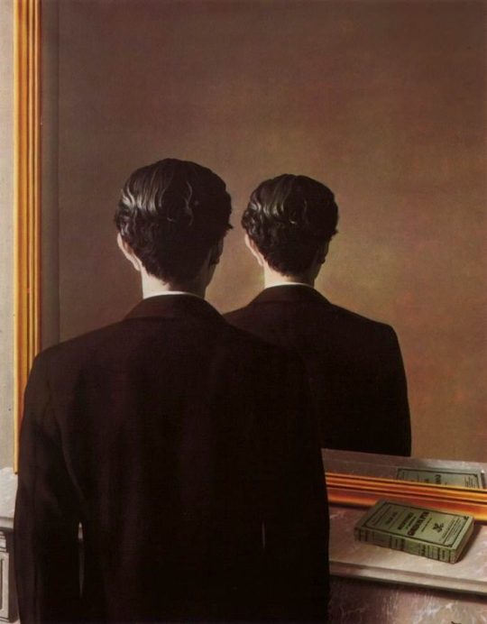
— Not to be Reproduced (La reproduction interdite), by René Magritte (1937).
–
I don’t examine myself that way. I just am. I just go through it. I just wake in the morning and go to bed at night and whatever happens during the day just happens. I don’t really know how I am.
— Paul McCartney, in Music Express: 'Paul McCartney Wings It Alone' (April/May 1982).
–
“In an attempt to explain the significance of surrealist art, René Magritte expressed the view that surrealist images emerge spontaneously, as in dreams, and only after that are the images given meaning. As a result, the genre has the power to convey important ideas even if the artist does not consciously set out to do so.”
–
This series – I just woke up one morning and I had a germ of an idea, which is all I want really. I don’t want too formed an idea, it’s just not who I am. This little series comes from this image I got of someone scratching three fingers down a wall. I woke up with this thing and I thought it would be just a black canvas and these three-fingered scratches, like someone in prison and they’re either trying to get out or they’re trying to mark the dates. I woke up with this thing and I thought it would be just a black canvas and these three-fingered scratches, like someone in prison and they’re either trying to get out or they’re trying to mark the dates. It’s like graffiti. That set me off on a little bunch of paintings. And things happen, like I didn’t want it to just be black, so I was going to make it blue-black. So I threw some blue on the canvas and was going to blend it. But then a shape emerged with this blue, and I still don’t know what it is. It looks vaguely phallic, or somebody’s ass bending away from you. But that’s what started to fascinate me. It’s probably an accident, but also what I like about that is the inner content, that I have no idea what my dreams are about. I’ve no idea, yet they’re every bit as real as sitting here with you. But my interior world, I think it’s not a bad idea to try and tap it.
My view is that these things are there whether you want them or not, in your interior. You don’t call up dreams, they happen, often the exact opposite of what you want. You can be heterosexual and be having a homosexual dream and wake up, and think, “Shit, am I gay?” I like that you don’t have control over it. But there is some control – it is you dreaming, it is your mind it’s all happening in. In a way my equation would be that my computer is fully loaded by now. Maybe in younger people there’s a little bit of loading to go, but mine’s loaded pretty much, so what I try and do is allow it to print out unbeknown to me. And I’m interested to hear what it’s got in there.
I think we must be interested as musicians as often our music arrives that way. I dreamed the song Yesterday. It was just in a dream, I woke up one morning and had a melody in my head. so I have to believe in that.
— Paul McCartney, in “Luigi’s Alcove” by Karen Wright, for Modern Painters (August 2000).
–
John: Now whether he’s – [Paul] was expressing himself because whether we plan it to express our innermost feelings, or sort of surreal it like Dylan, or – Paul, you could say, his lyrics are very sort of… non-specific – if one knows the person, one knows what is coming down. You know, you can read what’s being said—
Yoko: Between the lines.
John: Between the lines. Because people’s expressions and feelings come out in their work whether they want it to or not. So I always express myself directly, or [in the] language of the streets, and other people don’t. And that’s what it was all about. And I don’t go ‘round thinking, “how do you sleep?” the same as I don’t go, “imagine there’s no heaven,” you know. Because it’s 1973 now, and it’s a different world. And as you’ve probably heard, or people have read, Paul and I have communicated [...].
— John Lennon, interview with DJ Elliot Mintz (16 April 1973).
–
I think everything that comes out of the songs – even Paul’s songs now, which are apparently about nothing – the same way as calligraphy shows and your handwriting shows you everything about yourself. Or [Bob] Dylan too. Dylan might try to hide in a subterfuge of clever, Allen Ginsberg-type words, or hippie words, but it was always apparent, if you look below the surface, what is being said. Resentfulness, or love, or hate. And it’s apparent in all work. It’s just harder to see when it’s… written in gobbledy-gook.
— John Lennon, interviewed by David Sheff for Playboy (August 1980).
–
McCartney has written some of the world’s most famous love songs, but has he ever worried about revealing too much of himself? “Yes, but you’ve got to get over that feeling quickly, because that’s the game.” Some songs turned out to be more personal than he realised when he was writing them. The Beatles’ Yesterday will be 50 years old in August. McCartney famously dreamed the melody. But its opening line was originally, “Scrambled eggs/Oh my baby, how I love your legs.” McCartney followed his own advice and “bombed through”, ending up with a universally known song about loss and regret. But its initial spur was more prosaic. “There are a lot of mindsets when you’re writing a song – and one of them is commercial,” he admits. “It’s like any job, where if you do a certain thing you’ll progress in that job. In songwriting it’s an unspoken thing, but I recognise it. I remember hearing somewhere that people like sad songs, so I thought, ‘OK, I’ll write a sad song.’ I knew what I was getting into…” So, in a way, you were acting when you wrote it? “Yes. I wrote from the point of view of someone who was sad. But when you’re taking on a part, it’s usually you you’re writing about. Your psychiatrist would say it’s you.”
— Paul McCartney, interviewed by Mark Blake for Q: Songs in the key of Paul (May 2015).
–
John: There’s no comparison for me. ‘Cause we’re—
Hilburn: You mean comparing artistically, or you mean comparing sales-wise and stuff?
John: Oh, sales-wise, forget it. [Paul] always had more fans than me, in the Cavern… So there’s no comparison on that level. And on the other level, I don’t think it counts. I think it’s like comparing… I don’t know, Magritte and, er – Picasso, if you want to put it on that level. Or whatever. How can you compare it?
Hilburn: Was there ever any sense of competition when you—
John: It’s like trying to compare Gaugin and Van Gogh. They were friends, as well.
— John Lennon talks with Robert Hilburn from The LA Times (10 October 1980).
–
In the beginning, art was what we talked about. [John] told me he thought he was like [surrealist painter René] Magritte. Why? Because, you know, you have the image of Magritte with the bowler hat and the suit, looking very square, but really his work was very surreal and far out. John was living in suburbia, and he was very embarrassed about that, because he felt as if he was not very hip. When he invited me to his house the first time, the first thing he said when I got there was, “I think of myself as Magritte.”
— Yoko Ono, interviewed for The New York Times (7 October 2004).
–
The dream is over Yesterday I was the dream weaver But now I’m reborn I was the Walrus But now I’m John
–
I told you about the walrus and me, man You know we're as close as can be, man Well here's another clue for you all The Walrus was Paul
–
I’ve always loved Mr Magritte’s work and have admired him since the 1960s when I first became aware of his work. I love his paintings so much that I once took a trip to Paris to visit Magritte’s art dealer Alexander Iolas and had a very pleasant meal in his apartment above the gallery. We then went downstairs to see the paintings and I was able to select three pictures.
Robert [Fraser - art dealer and friend] also brought me other interesting Magritte’s pictures over the years and one of them became the inspiration for the original Beatles Apple Records label: the big green apple was inspired by Magritte.
We were amongst the many people who have been hugely influenced by this great artist's work.
— Paul McCartney, in Paintings On The Wall - René Magritte (1898 - 1967) (March 2015).
–
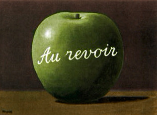
— Le Jeu de Mourre (The Game of Mora), by René Magritte (1966).
–
I had this friend called Robert Fraser, who was a gallery owner in London. We used to hang out a lot. And I told him I really loved Magritte. We were discovering Magritte in the sixties, just through magazines and things. And we just loved his sense of humour. And when we heard that he was a very ordinary bloke who used to paint from nine to one o'clock, and with his bowler hat, it became even more intriguing. Robert used to look around for pictures for me, because he knew I liked him. It was so cheap then, it's terrible to think how cheap they were. But anyway, we just loved him ... One day he brought this painting to my house. We were out in the garden, it was a summer's day. And he didn't want to disturb us, I think we were filming or something. So he left this picture of Magritte. It was an apple - and he just left it on the dining room table and he went. It just had written across it "Au revoir", on this beautiful green apple. And I thought that was like a great thing to do. He knew I'd love it and he knew I'd want it and I'd pay him later. [...] So it was like wow! What a great conceptual thing to do, you know. And this big green apple, which I still have now, became the inspiration for the logo. And then we decided to cut it in half for the B-side!
— Paul McCartney, interviewed by Johan Ral (1993).
–
Linda bought me these for my birthday once [he produces the paint-spattered spectacles of surrealist painter René Magritte which he keeps in a Perspex box on his desk]. Georgette, his wife, was selling the contents of his studio and Linda bought me the easel and his spectacles and some small linen canvases which I didn't dare paint on. I'm such a huge fan that was just mega. I was intimidated for weeks about painting on the canvases but in the end I just went, "Agghhhh!" and I did. Then I tried on the glasses which are a very powerful prescription; they'll give you a headache! What I love about Magritte is he turned the world upside down and inside out in terms of meaning and significance. Science and philosophy and religion are starting to converge on this idea that, whatever hat you put on, you are still you. Dickens writes Little Dorrit but he still comes through in her character. Burroughs and Ginsberg show through in their writing. Magritte's specs are a reminder: the world is a jungle of crazy interpretations.
— Paul McCartney, interviewed by Michael Odell for The Guardian (29 November 2008).
–
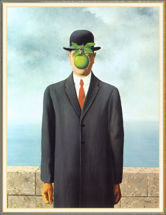
— Son of Man, by René Magritte (1964).
–
If I was to shout, “NAME A SURREALIST PAINTER!” at you, the name you many might reach for first, is one of his contemporaries: Salvador Dalí.
Based in Paris for the early part of his career, Dalí was a flamboyantly dressed dandy, with a manically upturned moustache, a colossal ego (who writes a whole book dedicated to their moustache?) and a propensity to drive around in his white Rolls Royce with 500kg of cauliflowers stuffed in the back, as he liked their shape. Fellow Paris-based artist, and founder of surrealism, André Breton kept and bred praying mantises – on account of how the female of the species rapaciously devours the male after mating.
Magritte could not have been any more different. He looked like a banker, dressed in a sober black suit and a bowler hat. [...] But once you come face to face with his paintings, you realise that the bowler hat was merely a front.
Magritte was, in many ways, far more subversive than the flamboyant Dalí. While it’s fair to say that no one painted better scenes of tigers-escaping-out-of-fish-mouths-while-simultaneously-mid-pounce-onto-a-naked women-on-an-iceberg, Dalí’s hallucinatory dreamscapes didn’t anchor in reality. Magritte’s work did: he made ordinary objects shriek.
[...]
He liked to obscure the views of faces – particularly his own - as well as places. Hiding objects over other objects was one of his parlour tricks: like placing a perfectly aligned painted canvas in front of a window and simulating the real view from it.
Magritte was always hiding behind something, whether language or class, or bathing in the anonymity of dozens of faceless salary men. Perhaps all that levitating in his 1953 work ‘Golconda’, was how Magritte saw himself: conducting extraordinary feats of ordinariness.
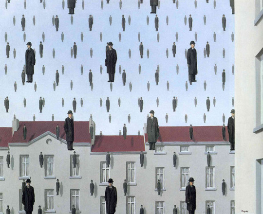
— Golconda, by René Magritte (1953).
He wasn’t the only artist who, through the cracks of a quiet, clean-cut image, you can glimpse subversion: like all the lonely people, his work stood slightly behind from his public persona.
— by Adam Jacques, on Paintings On The Wall - René Magritte (1898 - 1967), as suggested by Paul McCartney.
-
More on the painters series:
The Painter of Sunflowers and The Man in a Red Beret | Lennon-McCartney VS Gauguin & Van Gogh
#René Magritte#Salvador Dalí#Pablo Picasso#paul gauguin#vincent van gogh#I don't examine myself that way#Better than looking in the mirror#we were more artsy#Paul’s idea of being different is to look almost straight but just have his ear painted blue#songwriting is like psychiatry#and if i say i really knew you well#that's funny I had the same dream#paul is the one#There are two sides to me#There's me and there's him; that famous guy#and nothing to get hung about#The Beatles as Artistic Movements#my stuff#the person I actually picked as my partner#macca#johnny#linda#yoko ono#Robert Fraser
238 notes
·
View notes
Text
Past Present and Future
I’m sharing this project with Anastasija and Luke. We started off pretty well, with a good brainstorming on the idea of time and how to represent it.
After coming up different ideas, we focused on the theme of mental breakdown and we went down a quite weird path, deciding to have past present and future at the same time on screen. This choice came out after Anastasija recalled an animation about a guy who opens a box and finds himself in the other side opening a box - this made me think of the surrealist artwork by Magritte, Not to Be Reproduced:

Thinking about the theme of the double, we found other inspirations in different films we watched like 2001: Space Odyssey, Moon, Twin Peaks.

A scene from Moon, a film where the protagonist lives with his clone on a spaceship.

In the ending of 2001: A Space Odyssey, the protagonist faces older stages of himself and identifies with them in a seamless cut from a point of view shot to a wide shot of the same scene.
4 notes
·
View notes
Text
Upcoming Tarot Decks Part I
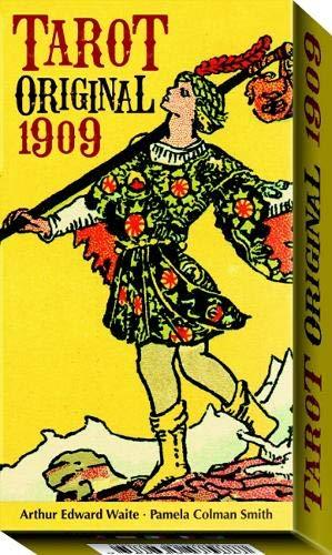
Tarot Original 1909
Let's start with the classic Tarot Original 1909
The masterpiece by Arthur Edward Waite and Pamela Colman Smith, reproduced from the very first edition of December 1909.
A top qual-ity edition of the original timeless Tarot, for clear, insightful and deep Readings. With instruction by renowned writer and Tarot expert Sasha Graham
This title will be released on 25th March
You can buy this deck for £17.99 on
Amazon
SYMBOLIC TAROT OF WIRTH

SYMBOLIC TAROT OF WIRTH Oswald Wirth is the last and greatest author of the French School of Tarot. Strength is XI and Justice is VIII, but more than anything the Tarot of Wirth expresses the powerful symbolic depth of each Arcana - even the Minors - through the system of the Tetrads, as built by Wirth itself and developed by Italian scholar Mirko Negri
Symboliic Tarot
will be released 25th March for £17.59
VALENTINA TAROT
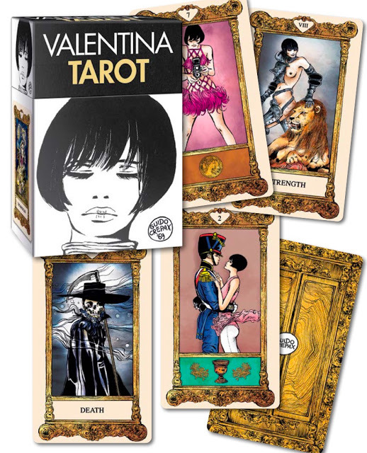
VALENTINA TAROT The deck with the seductive and enticing art of Guido Crepax. Valentina and her friends - heroes of the sexual revolution of the senses of the seventies - take arms in the world of Tarot to challenge our prejudices and schemes, for an erotic - and yet symbolically deep - Tarot of Love.
Valentina Deck
will be released 25th March for £23.76
DANCING IN THE DARK TAROT

Dancing in the Dark
A deck of mystery and blinding clarity, like a sudden spotlight focusing on a dancer over a dark stage. As Luigi Pirandello - a famous Italian writer - said “Life is full of strange absurdities, which, strangely enough, do not even need to appear plausible, since they are true.” Sometimes we need to pursue the questions, in order to give light to our answer DANCING IN THE DARK TAROT will be released 25th March for £17.59
I think this one look quite nice
GOETIA TAROT IN DARKNES

GOETIA TAROT IN DARKNES
The new deck of Fabio Listrani, after the overwhelming positive Kick-starter campaign, reached the wider public. Goetia is a deck about De-mons, extracted from the esoteric lore of the Lesser Key of Salomon, but seen in a modern psychological way. As darkness is none other than a path to light, the unconscious is just a mirror of the conscious
GOETIA TAROT IN DARKNES will be released on 25th March for £23.76
TAROT AT THE END OF THE RAINBOW
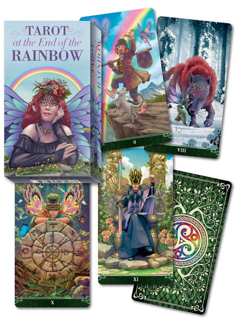
TAROT AT THE END OF THE RAINBOW
Davide Corsi’s new deck. Inspired by the British and Irish folk tales, it is a deck of fairies, of brownies and pixies, but also a deck of rainbows and luck. Luck is for those who seek it, at the end of the rainbow, with clear spirit, pure intentions, and a little fate with fortune
TAROT AT THE END OF THE RAINBOW
will be released on 25 April for £17.99 I think this deck looks cute, I'd be a perfect deck for St. Patrick's day if they release it earlier. SURREALIST TAROT

Surrealist Tarot
If the dream is a translation of waking life, waking life is also a trans-lation of the dream.” These words were spoken by René Magritte. Sur-realism is about reality, the way man perceives reality and translates it into his own inner world made of imaginations, feelings, experiences and insigh
SURREALIST TAROT will be released on June 25th
TAROT OF OPPOSITIONS

TAROT OF OPPOSITIONS
Duality: Good and Bad - Light and Dark - Negative and Positive - Active and Passive - Receptive and Assertive. Everything has its opposition. In Tarot, this happens within every card, as the interpretation brings the Reader to see every Arcana from different points of view and embracing a yin-yang vision of each answer, as well as each question
TAROT OF OPPOSITIONS
will be relased on 8 Aug
I like this one as well
Your Donations Are Graciously Accepted To Help Me To Keep All About Paranormal Online! All About Paranormal is not intended to be for profit, but does carry an expenses with domain cost, books, decks etc. The links I use are affiliate links, I earn commission for referring you, the price you pay don't change. If you liked my work please buy me Coffee
#Dancing in The Dark Tarot#Valentina Tarot#Tarot of Opposistions#Surrealist Tarot#Tarot Original 1909#SYMBOLIC TAROT OF WIRTH#Tarot At The End Of The Rainbow#Goetia Tarot#GOETIA TAROT IN DARKNES
0 notes
Text
Reinventing a Classic with Award-Winning Results
Editor’s Note: This project won Best of Show for the 2018 HOW Promotion & Marketing Design Awards. See all of the winners here, and don’t forget to enter the 2019 Promotion & Marketing Design Competition — accepting submissions now!
Best of Show — 2018 HOW Promotion & Marketing Design Awards
THINK CLASSIC — Design Army, Washington, DC
Design Army had the covetable chance to refresh and rebrand Neenah Paper’s CLASSIC Collection, resulting in a contemporary twist on a classic favorite.
It had been seven years since the iconic Neenah CLASSIC brand and product had been refreshed. So working hand in hand Neenah Paper, Design Army set out to give the collection a modern spin. “It was time to revise, edit and create something fresh, imaginative and exciting that would continue to speak to Neenah Paper’s current audience and to new a generation of designers,” says Pum Lefebure, Design Army’s chief creative officer.
Designed by and for designers, the new CLASSIC Collection has been consolidated to three swatch books featuring eight new colors and two new textures. Since the re-launch, Neenah has seen a steady increase of orders and countless media impressions from both the design and fashion industries. The revamp also earned Design Army the Best of Show in this year’s HOW Promotion and Design Awards.
But there’s an inherent challenge to making paper relevant and exciting in a digital world. Things move faster, evolve quicker. The goal was to simplify the design process for the designer, which meant streamlining the design of the swatch books while creating a user-friendly experience. “Swatch books are a key element, the first step in a designer’s journey when looking to buy paper. It’s sensory—where sight and touch meet,” Lefebure says.
The 18-month project began with research and development for new papers. This included an exploratory period—looking at color and texture—before moving into concept and design. The first question the designers asked themselves is how they could make classic current again. “We wanted people to go beyond the surface and start to rethink the meaning of classic,” Lefebure says. “Classic doesn’t mean old; it’s foundational. Like learning the principles of design. It is a way of thinking, and it is the only way to create work that is timeless.”
Making Paper
The greatest challenge the project presented was a technical one: product development. “It’s really art and science to create the right formulas to reproduce a color. Essentially, a color recipe that produces a result that is not just ‘close,’ but exact—it had to be perfect,” Lefebure says.
It was a long process that involved some predictive analysis to determine what was relevant yet classic. What colors would last for years? What colors represent classic? And they not only had to create the colors, but also name them.
One lesson learned: The more saturated a color, the more difficult it is to find the right formula. “Imperial Red, one of our favorite colors, was also one of the most challenging to bring to life,” Lefebure says. “The smallest addition of blue would turn the vibrant red a deep purple. It was a process of trial and error, less and more, requiring not only a great deal of patience, but determination. Because color is a key part of the audience journey, even when the lab techs wanted to give up, we kept pushing a little bit more, until the perfect recipe was found and the exact color produced.
“For an uncoated sheet of paper, the Neenah team was willing to push and try to produce what was in my head,” she continues. “The Imperial Red was the reddest red I have ever seen. It was inspired by my trip to Beijing and took multiple rounds to produce the color. I am amazed at how hard the Neenah team works and how dedicated they are.”
Dallas Duncan Franklin, creative director for Neenah, is equally impressed with Design Army’s dedication. “Design Army is passionate about paper, experts at forward-looking trends and creative thinkers. Working with them helps to raise the bar for our own work,” he says. “We love that the partners are hands-on: Pum ran to the art store to buy tubes of paint to mix the exact hues that were envisioned, she personally supervised multiple photo shoots, and she collaborated in-person with our color lab and papermakers to make sure the final recipes were just perfect.”
Shaping Swatch Books
Once the colors were finalized, the team turned to the swatch books. Each one features a beautiful, well-organized alley of color, like a waterfall, making it easy to see the range of color and to touch and feel textures and weights. From a functional standpoint, Design Army wanted designers to see how different designs can look on color paper, how they can use color paper for their projects. And they wanted to spark imaginations. So they included printing samples show potential uses for the papers.
For the art direction, they was inspired by classic art movements, but the interpretation was very modern. For example, the Classic Crest cover is a nod to Magritte, but they reimagined the work in very new way. With Classic Linen, they were inspired by the Bauhaus movement, incorporating classic geometric shapes reinterpreted with a surreal edge. The Classic Textures book was inspired by Rodin’s work—specifically his hand and foot studies. They painted arms in Neenah Classic colors and used textures found on the papers.
Design Army also wanted to communicate the strength and potential of Neenah CLASSIC Paper by illustrating different production techniques. “Neenah CLASSIC Collection is premium paper. As the foundation of a project, it makes the work enduring, more beautiful and more special,” Lefebure says. “Hence, we showed a full range of printing techniques to highlight the quality of the papers: 4-color offset printing, die-cutting, embossing, foil stamping, debossing, letterpressing and duotone.”
Since the launch, Lefebure has seen work from other agencies and designers using new papers from Neenah Classic that were inspired by their work. “It is really exciting to see how other creatives use the paper and colors we created,” she says.
Dreaming big, responsibly
The opportunity to work with a paper company is an enviable one for many designers, and Design Army has had the good fortune to collaborate with Neenah Paper for more than a decade on numerous projects including the original CLASSIC rebrand, Neenah Environment and the forthcoming Neenah Design Collection. “I think every designer’s dream is to work on creating paper,” Lefebure says. “We were fortunate that we were given so much freedom. However, as in any project, there are still some guardrails. We still had to hit timelines and due dates, budgets had to be adhered to, and there are revenue goals and business objectives that need to be met. So, you can dream and do big, but within a frame. I had this vision of a beautiful, bold fuchsia in my head, but I knew that I would be the only person who would use the paper. As amazing as it would have looked, it was not practical and it was off brand—too trendy for Neenah Classic.”
Lefebure says she has learned over the years that those types of restrictions can actually push you to be more creative. “While we wanted to create something for the design community, we are also responsible to Neenah Paper,” Lefebure says. “We want to help them achieve their goals. I am actually still just amazed that we had so much room to move on this project.”
She’s also a believer that Design Army’s work is only as good as the client allows it to be. “I think the most important thing is the relationship we have with Neenah Paper, our client, and the trust they have put in us,” she says. “We don’t take them for granted, and we try to outdo ourselves every time. In turn, they allow us more freedom to push boundaries and innovate.”
Neenah was equally pleased with the collaboration: “The results for the full range of work—the new textures, a completely refreshed color palette, new sampling materials and exciting promotions—truly exceeded our expectations,” Neenah’s Franklin says. “But the real payoff is what our customers are saying and buying: The results are even better than we had projected. Design Army is an incredible partner!”
Best of Show — 2018 HOW Promotion & Marketing Design Awards
THINK CLASSIC by Design Army, Washington, DC; www.designarmy.com: Pum Lefebure (chief creative officer), Jake Lefebure (CEO/co-founder), Sucha Becky (art director); Neenah Paper (client)
The post Reinventing a Classic with Award-Winning Results appeared first on HOW Design.
Reinventing a Classic with Award-Winning Results syndicated post
0 notes