#sorry the image is like 4 pixels big
Explore tagged Tumblr posts
Visit Tumblr Blog
Explore Tumblr blogs with no restrictions, modern design and the best experience.
Last Seen Tumblr Blogs


Fun Fact
US Tumblr user growth rate is estimated to slow down to 4.1%.
Note
your art is really good!
thank you !!!

15 notes
·
View notes
Note
Hellooooo! I’m working on a clangen blog of my own, so I’m going around asking my favorite clangen blogs some questions. I’m happy to get answers to whichever you feel like answering (or none at all if you don’t feel like it!)
What program and file size do you use?
If you use a font, what font is it?
How far ahead do you recommend playing?
Do you have any advice for layouts?
Do you have any tips for lighting/drawing fur?
Do you have any tips for making cats look more unique?
If you do backgrounds, do you have any advice for creating them?
If you use them, where do you recommend finding reference images?
hi hi! Thank you for the questions 1. Clip Studio Paint, my comic pages' size is 1600x2900 pixels when I'm working on it, but that includes empty space on the sides where my lines can go over the limits when needed
2. "HP Simplified Hans Regular"... I sort of want to hand-write all of my text tbh, but I thought I shouldn't make things too energy-intensive for myself
3. Depends what you want the structure of your story to be like. For me the important part was the setting that was generated for me so the moons going forward & the brisk pace that that gives you have less importance for my story than they would for most Clangen stories, and therefore I didn't go very far in the moons before I started sketching down pages
4. nah, i'm a newbie on that
5. can't think of anything, sorry
6. I think looking for uniqueness itself can be kind of a trap, and i think it's most important your characters are distinct from their surrounding cast of characters than them looking unique when looking at the wider art community. Any kind of design can be recognizable if it makes an impact. I think using patterning especially can be something people might fall back on too easily to make characters distinct. These are the other ways I like to try make a cat character recognizable and interesting (among their cast): - Experiment with different, even subtly different whiskers, ear sizes and shapes, fur texture (sleek, puffy, curly, spiky, flowy etc) and where that fur might be most prominent in each character (one fluffy cat might have a huge puffy chest fur, another long hair cat might have their long coat look more heavy and pulled by gravity, another cat might have the puffiest tail but less in the chest, etc). Also of course the usual, like different eye and nose shapes. - Use color contrast to make the character demand more attention to itself. If a cat has a big white patch on their face when the rest of their body is dark, it immediately brings your attention to their face. I often like to play up and heighten the contrast of a warm-toned body against cool-toned eyes like Whisperingpaw's reddish body against his deep blue eyes, but it works just as well in reverse or with other color contrasts. This can be muddied though if the design is full of highly contrasting small elements in unimportant places of the body which instead can just become confusing to the eye. It's why I don't really like designs from for example Genshin Impact
^ Whisperingpaw, I even made his grey pawpads more cooltoned than usual for some extra contrasting details - Try designing two characters at once instead of one at a time. When you design two at once, especially if they have some connection to each other, you can already start laying out some opposing or just different physical traits to them. If you make a huge cat next to a small cat, both of their sizes are immediately noticeable traits about the cats that you can perceive and build on. If you only drew one huge or one small cat, you might not really even register their size as part of their design because there is nothing to compare it to. Let their relationship & direct comparison be something that contextualizes them and gives them something more than an empty paper to relate to - Continuing on the "let the characters have something to compare to", a character will always look more beautiful if they are surrounded by more bland or even "ugly" characters. A character's intricate patterns will be more noticeable if surrounded by very simple-style characters. Use this to your advantage and let things like beauty or cuteness be character-specific traits instead of something expected of each design. This is just another benefit to having a diverse cast, it doesn't just give representation to less charismatic styles of characters (which already has so much value by itself), it lets the "beautiful" designs be more convincing to the eye.
for 7. and 8. i don't have an answer to!
Hope that helps :3
82 notes
·
View notes
Note
hiya! I did check if you had a resource page but couldn't find one (sorry if I missed it!) I was wondering what re/gshade preset your using? Also how did you make your weather/task templates for gameplay like here (post/736165530204028928/completed-task-swim-for-1-hour-in-wakabas) I wouldn't even know where to start in photoshop lol Thank you!
hello, hello!! I don't have a resource page yet so don't worry! l'm using a personal, sorry.
how i make my templates under the cuts (reminder that english is not my first language and that i have photoshop in spanish so i don't know the actual name of things in english)
we'll be creating the simple one from here:

Now, for the templates, it depends on what i want to do, but i usually try to keep them simple, so I use mainly 2 photoshop tools: as you can see here, the weather template I made has (1) a rectangle layer, (2) an image and (3) text layers.

keeping this in mind, let's create a thing (a bank notification) together so I can show you the steps I follow:
(0) Create a new file
There's no size I ALWAYS use, but i usually choose a bigger size since i can always resize it down later when I use it (if it's too small and you have to resize it to be bigger, it might end up looking pixelated). You can also open one of your screenies in the size you usually edit them, and deciding how big your template has to be.
(0.1)
I recommend creating a group (using the little folder icon) where you will drop all the layers of the template so you can move it around and all that
(1) Shapes
This is the first thing I always do for this type of templates, just create a base shape that will contain all the other stuff on top. In this case i created a rectangle with rounded corners.
you can use those circles in the corners to round them or make them pointy. If you press alt while doing it, you can round corners individually.
I added a parallel shadow so it integrates better with the whole screenie, but that's a personal preference.
(2) Now, if you want to have icons/images/etc. I recommend creating another shape (in another color, just so you can see it), and positioning it where you want your image to go.

Now you want to transform that shape to an intelligent object (right click the layer and click that option). This way, if you double click the layer image, it will open in another tab: you can add your image/icon there, click save, and when you go back to the other tab, it will be there. Much easier to edit it! An intelligent object layer will look like this:
(2) Text is literally what MAKES most of templates. When you're creating templates, i recommend looking for inspo AND getting fitting fonts for it. Let's say I want to create a netflix template: i'd do a quick google search to find what fonts does netflix use. Sometimes fonts are not free, but try looking for similar ones.
I'm using manrope for this one because it's simple and easy to read, but when i'm doing this kind of phone notifications i also use fonts that are usually called something UI.
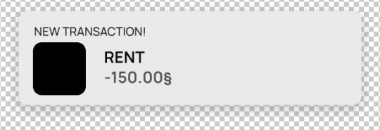
Now you only have to move things around until you like it. Then save it as a .psd so you can edit it and use it whenever you want and that's it!
(4) This is how it looks like

you can now edit it as you want, lower the base rectangle opacity, add more shadow, change the colors...
From this simple thing, i created another version using... you guessed it: another shape, another icon and another text layer. Here you can see the final templates being used in a screenie:

Honestly, don't let the big amount of tools and options photoshop scare you! As you can see, you don't need much to create something like this
Hope this was helpful enough! Let me know if you have questions 🧡
104 notes
·
View notes
Note
Hey Bear remember the detailed art where it’s a place and there’s a just filled with different bears, I think it will be a great excuse to practice but idk how to approach it. Any tips?? Or just things you learn when you started drawing those
Hellow 👋
I have a feeling you asked this a while ago, but I only saw it now
If it's the case, sorry must be a tumblr glitch💥
👏a wall of text warning👏/silly
Planning
First thing I usually do is - I plan a lot beforehand
Especially if it’s a drawing with existing characters
Ironically TSP/STP drawings were easier to do for me
Even though bear megadrawings look simpler (I think?)
Basically when you already have a list of character you want to include - you just need to think where to locate them
When you just draw a lot of random characters - you need to design every single one
Which is kinda a nightmare on your brain 💥
The second type is a lot more flexible tho (you can add or remove characters at will, no count needed)
Project stages
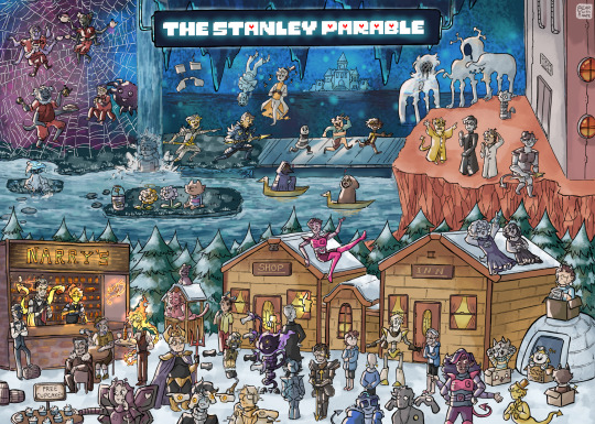
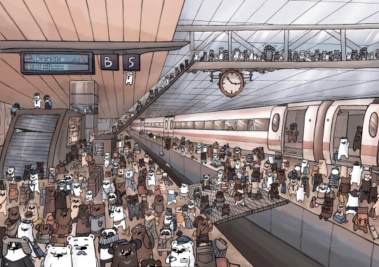
I will use TSP + Undertale reblog chain drawing as an example
1) Collecting references - if you plan to draw existing characters, it’s better to gather all the references
Making an additional list of all characters helps too (this way you can track which character you already drawn)
2) Planning the area
Photobashing or finding a good location reference really helps here
Sadly don’t have a photobash I did for this, I deleted everything 💥
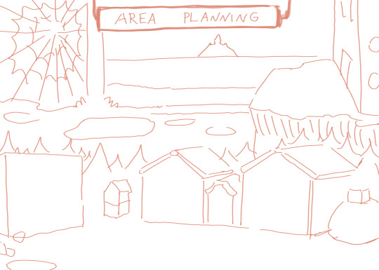
This is just an example to demonstrate things 👆
I usually just do a rough sketch on a small piece of paper
You don’t have to have it 100% planned, if characters don’t fit, you can just extend/edit the area
3) Character planning
You have to determine where your characters will be located
The common mistake I see when ppl draw detailed drawings: they draw a singular character and move on to add others
If you’re doing it digitally, this may not be a problem for you (ya know just make a character smaller or move them, problem solved)
But what I recommend doing:
Is drawing shapes where you plan to put characters in
This will help you plan out the composition more and regulate the character amount in different parts of the drawing
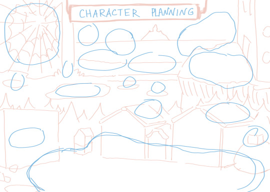
Also keep in mind the size of you character
I struggle with it to this day tbh
Usually the characters on the foreground are bigger then the ones on the background (this is one of the art principles used to showcase distance)
But an interesting thing you may notice when looking at illustrations like “Where’s Waldo” series
This principle often may be ignored
It’s still kinda present, but you can pretty much say many characters are -+ the same size
My theory is that it’s done to make every character equal, so the purpose to find Waldo is still challenging
+ I think to keep the whole picture harmonious
I may not know certain principles (the nitty-gritty of detailed art like this)
So keep in mind this is just my experience, do your research too >:D
4) Key characters
This one is a bit vague, but I will try to explain it the best I can
When you have a specific character, who, for example, is way bigger or has brighter colours then the rest
Special bois 🌸
You need to give them more attention
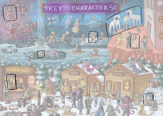
Let’s see an example
- Big creatures on da background - they were drafted first, bc they required a lot place
- Spider Barry - a special area for spider characters
- Thierry - active action, running, led to a chain of characters interacting
- Narry Grilby’s, Bearline, Pixel Alphys - themed areas for certain characters
(my apologies if I made a mistake in any character name here, let me know, I will fix it)
+ Advice for colour: try to keep them the similar saturation, so the image looks harmonious
You don’t really have to have key characters, it’s just my method that makes the process easier to plan out
5) Art part let’s gooo
This part is up to you obviously, different ppl draw differently
For me it’s usually > small draft > sketch > line art > scan > colour
Advice for my traditional artist - ya’ll need a big paper sheet
I usually work on A3 format, bc it’s easier to scan
But the bigger the paper the more detailed characters you can draw
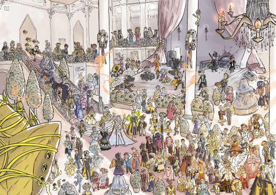
This one as an example
Bc rookie mistake
Too many characters, not enough paper
I used A3, but looking back A2 would work way better here
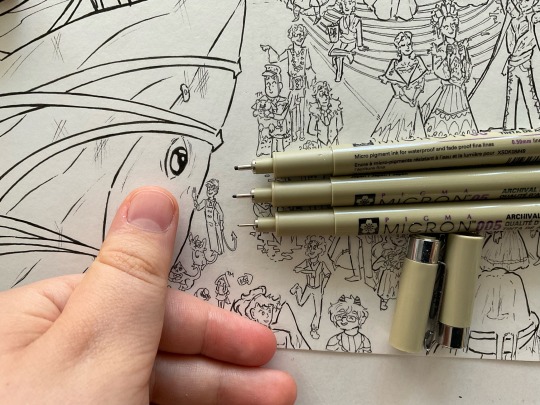
I used a really thin line pen (005) and didn’t realise the consequences of that 💥
As a result scan turned out not the best quality (+ if you zoom in on the faces 🐻❄️🔫)
It was impressive at the time, but rrrr I wish I just bought a bigger piece of paper back then 💥
Just to illustrate the issue
On the top are pens I usually use for comics lineart, the bottom one is 005
And my finger as an obscure reference lmao 💥
As you can see the lines are REALLY DAMN THIN and everything is smol, tiny even
So just keep that in mind 👍
And for my digital fellas
🫵 Big canvas 🫵 big 🫵 the pixels will eat u 🫵
How much time it takes
Practicing concentration and patience is important 💥
This may sound silly, but it does help with finishing stuff
Projects like those require a ton of patience and focus
So just mentally prepare yourself for sitting on your desk for hours™️
From my experience I would recommend to start with small drawings with a small amount of characters
And then gradually build up to bigger amounts and more details
My first ever megadrawing was this piece
Line art took 2 weeks, colouring -+ a week I believe
This was exhausting the first time 💥
After practicing the process became faster and less tiring
The TSP x Undertale took about 4 days (but like full 4 days)
Remember doing lineart in 1 day, taking breaks just to like eat
🫵Ok don’t worry about me🫵
I have a tendency to concentrate on things for a really long periods of time, so it’s not a “🔥I WILL BURN MYSELF OUT WITH THIS PROJECT LET’S GO🔥” type of deal, this is pretty much how I am
If I enjoy a specific process I can spend an entire day doing just that, without getting tired (the only problem could be not enough movement and eye pain, my eternal enemy 👿)
But 🫵 don’t expect yourself to do the same 🫵
Start small, practice, don’t push your limits right away
Take breaks and care about yourself fellas 👏
Good luck with your projects🫡
Alright
Hope it was helpful, thank u for you question ❤️
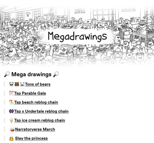
For new ppl here, you can check the megadrawings section in navigation (pinned post), if you got interested
#bear answers#megadrawing#megadrawings#detailed art#art tips#also#I see that how would Stanley react to Narry bros ask ���#maybe#mayhaps#I will answer it with comic later#(way later)#I have a specific idea in mind#I know the more I wait the more ppl forget about Barry#unfortunately 💥#I have a folder with a story for Barry#but there is a bunch of things holding me back from actually doing it#I can make a separate post with my thoughts if anyone interested#long post#bear text rambling
34 notes
·
View notes
Text
let’s see how many incorrect quotes I can get here before church starts
putting them under cut. @ask-a-snobby-fencer @ask-finn-hollis @ask-jasper-cameron @ask-sora-aguilar @baileythebean
Finn: I am your king, long may I reign! Sora: Well I didn’t vote for you! Finn: You don’t vote for kings. Sora: Well how’d you become king then? Finn: Zaria of the Lake, their arm clad in the purest shimmering samite, held aloft Excalibur from the bosom of the water, signifying by divine providence that I, Finn, was to carry Excalibur. That is why I am your king. Sora: Listen. Strange people lying in ponds distributing swords is no basis for a system of government. Supreme executive power derives from a mandate from the masses, not from some farcical aquatic ceremony.
Finn: You use emoji’s like a straight person. Zaria: That’s literally the worst thing anyone has ever said about me.
Sora: very seriously You need to stop doing weird things to cope with the stress. Going outside might help. Bailey: I went to the park today. Sora: There you go! I hope you got something from that. Bailey: opening their coat This duck.
Bailey: I don't want to tell you to clean your room again! Finn: …but you will, right? Bailey: Oh, for sure.
The squad's reaction to being told they're the chosen one Zaria: I will not let you down. Bailey: Sounds fun. Sora: K. Jasper: No, I'm fucking not. Finn: Do I have to be? Flynn: Please god, I am so tired.
Zaria, ordering coffee: I’d like a light roast. Bailey: You're kinda ugly.
Jasper: coughs blood Bailey: Don't die, Jasper! Jasper: Don't tell me what to do!
(mod: army dreamers starts playing in the distance)
Sora: Please, Jasper, after everything we’ve been through together. You can’t do this. Sora: I’m sorry Jasper. Sora: I’m begging you. Don’t do it. Jasper: It has to be done. Sora: Jasper: Sora: Jasper: Places +4 Uno.
Finn: I'd make fun of your height but there isn't enough to make fun of.
Zaria: Can you PLEASE peer pressure me into doing my project? Jasper: Do it or you're straight. Zaria: I said peer pressure, NOT THREATEN!
(fun fact: Zaria is a lesbian)
Sora: Would you like something to drink? They open the fridge We have water, milk, juice, spiders, Dr. Pepper- Zaria: Spiders? Sora: Spiders it is then. Zaria: No, that wasn’t- But they were already pouring them a brimming glass of spiders…
Zaria: This should be illegal! Bailey: It is.
Zaria: What do you think Finn will do for a distraction? Jasper: They'll probably, like, make a noise or throw a rock. That's what I would do. Building explodes and several car alarms go off Jasper: …or they could do that.
Finn: Just took a personality test and got an A+.
Flynn: Alright Jasper, what do you want? Jasper: I want Zaria to disown you and adopt me!
Zaria: What's the most illegal thing you can do with one dollar? Sora: Exchange it for a hundred pennies, put them all in a sock, and then beat someone to death with it.
Zaria: I’ve become a bread crumb dealer to four crows at the lake. They pay me with a bit of everything. Like shiny things, fabric, or pens. But recently they paid me with a 20 dollar bill they found somewhere. So I decided to buy them some more expensive bread. They loved it. So they understand what to do. Give me money. I’ve probably racked up about 200 dollars at this point. Is it morally wrong though, I mean. They’re the ones who steal the money from others. Or perhaps they just have a big pile laying somewhere. Should I keep on doing this? Jasper: You sound like the start of a Batman villain.
(this is canon now)
Jasper: shoves their hand in the slot of a toaster Sora: … Jasper: …I get confused sometimes. Sora: Me too.
Sora: What do you call quantums of electromagnetic radiation that don’t get along? Flynn: What did you just say- Sora: Foetons! Laughs Flynn: Wh-what?
Sora: Posts a super low-quality image to the group chat Bailey: If I had a dollar for every pixel in this image, I’d have 15 cents. Sora: If I had a dollar for every ounce of rage I felt in my body after I read this text, I would have enough money to buy a cannon to fire at you. Finn: Actually I did the math, Bailey would have $225, not $0.15. Bailey: Fam I’m right here…. Flynn: If I had a dollar I would buy a can of soda :) Sora: while you’re there could you buy me an apply juice please? Flynn: Sorry I only have a dollar. Sora: :( Finn: Hey I just realized my friend is right, Bailey would have $22,500 because it's a dollar for every pixel, not a cent. Flynn: If I had $22,500 I would buy a can of soda and an apply juice. Finn: You can buy anything you want with $22,500. Zaria: Yeah and they want soda and apply juice. Finn: Apply juice to what. Zaria: Directly to the forehead. Bailey: Great chat everyone.
I’m just gonna stop here there’s only a few seconds left and this is getting long. anyways I’m obsessed with these
13 notes
·
View notes
Note
hi! sorry if this is rude i don’t mean it to be, and obviously if you like it keep doing it that way it’s your blog and all, but as feedback if you care for it, the fact that you put 4 pictures together in photosets instead of uploading them by themselves makes it harder for me to enjoy them, because clicking on them does virtually nothing to make the image bigger, and ever since tumblr updated the app to disable double tap zoom it’s just a hassle to try and look at things closer, and quality tends to be worse too. it makes me not want to bother to even look at the posts sometimes because i can’t make out what i’m looking at. just wanted to let you know, feel free to ignore.
hi hi!!! i hope this doesn't sound rude because i feel like it might but i promise it's not meant to, but i know that, those photosets are actually edited to be that size on purpose. i've always posted big collections like that (except for the like 6 months when i didn't have a proper working laptop so i couldn't use photoshop), they're 540px wide and there's four 268px photos per single photo, so you're not supposed to be able to zoom in actually that's why you can't, it'll always look weird and pixelated if you do. edited like that, i am able to post large collections in easier to look through posts, so people don't have to scoll forever and the photos always look sharp and crisp, which they wouldn't if they were a bigger size. HOWEVER! if there's any outfit you'd like to see in a bigger size, you can always request that, send me a link to the post and tell me which one and i'll make it. posts will still be 540px, because again the sharpening on photoshop wouldn't translate to tumblr if the photo is bigger, but it'll be bigger than the photosets, so you can see the details better for sure.
34 notes
·
View notes
Text

Pour one out for every time my heart skipped a beat while watching Dragon Quest: The Adventure of Dai (1991) and thinking I was finally about to see a DQ4 character but got juked.
See, part of the reason I put this anime on my list oh so many years ago now is because I grew up with the Dragon Warrior games on NES, and 4 in particular was one of my world-reshaping JRPGs (I feel like most everyone has at least one JRPG they played in their childhood or teen years that completely rocked them to their core; this was one of mine). In the early 00s when I learned what Google Image Search was, I got really into looking for fan art of characters I had only seen previously as pixel sprites. And while looking up DQ4 characters (I only knew their early NA translation names, not the modern ones they have today), I saw an image of what I THOUGHT must have been a screenshot from an anime featuring two of my favorite characters from DQ4. I only saw that one image by itself and nothing else like it, so I figured if it was a screenshot it must have only been like one scene in one episode, so it probably wasn't a big deal, but it was still cool and stuck in my memory for years.
Eventually, I found out that there was in fact a Dragon Quest anime, about original characters and an original plot with no direct ties to any of the games I grew up with. But it sounded like it could be fun nonetheless, and hey, maybe it still did have that screenshot after all! So now here I am in 2023, finally got around to watching it and keeping my eyes peeled for that so-called screenshot, just in case. This is also a big reason I watched the 91 anime instead of the new 2020 one, even though the 91 version doesn't cover the complete manga series. I've been catching all the little references to DQ trivia and monsters that I know along the way, but it's been mostly centered on stuff from DQ 1-3, with 4 mostly only reflected in the background music (which in hindsight makes sense, given that the game debuted around 1990, and the anime aired in 91-92, adapted from a manga that started in 89).
Anyway, I'm 99% positive now that what I saw back then was not, in fact, a screenshot of Mara and Nara (oh sorry, guess I should use their modern names now - Maya and Meena Mahabala), but just a really cool fan art. A mild disappointment, but I can't fault the anime for that. Now I wonder if I can still dig up that fan art to show what I was talking about...
#dragon quest: the adventure of dai#dai no daibouken 1991#dragon quest#ragnar mcryan#badak#meena mahabala#torneko taloon
17 notes
·
View notes
Note
I am curious. What r your top five video games
WHOOPS I only just saw this now lmfao sorry
I'll stick to one game per franchise but u can assume im recommending the whole series
5. Oddworld: Abe's Oddysee
One of my two biggest childhood influences. Ps1/PC puzzle/platformer/adventure game about a funny blue guy escaping from slavery when he discovers his whole race is about to get butchered and sold as food products. Gets back in touch with his native roots and gets granted spiritual powers to help him free his fellow captives and topple capitalism while killing hundreds of cops along the way. There's no guns but there are grenades occasionally. Or you can possess the cops and make them use their guns to kill other cops. And then blow themselves up. Has a ton of sequels and a couple remakes, ports and remasters on PC and just about every other console. Cannot recommend enough. Also you can fart on command this game has a dedicated Fart button you use it for communicating (and then in the sequel you can possess farts too)
4. Myst
The other childhood influence. This game and whole series made me a huge wanderlust slut. Point and click adventure, puzzle solving, world exploring, journal reading. Some puzzles will definitely have you Stumped (but feel free to hmu bc I still have the first game memorised like the back of my hand and am happy to offer guidance ^^) my fave is actually the third game Exile, but I gotta pay respect to the OG. It's full of images and sound effects that remain engraved in my brain in vivid detail 20+ years later
3. Bloodborne
I'm actually not talking abt the whole "series" here I dont rly care much for dark souls etc. It's just this one lmao. Love the tone, love the gameplay, love the level design, love all the horrid monster designs. Love the Rally mechanic discouraging you from hiding and playing safe when you should be going full throttle wailing on everything as fast as possible. I love learning to party attacks with a firearm instead of a shield. I love the blood vials system. I love the doll I love Eileen the crow I love lady Maria I love all the funny little creachurs and most of all I love dying and being dead
2. Final Fantasy V
This ones kinda personal and maybe a bias I guess but idk this was my first FF and even now when I go back to it it just Hits Different somehow. Maybe it's nostalgia/bias but even comparing it to the other pre-ps1 FFs it's just got this vibe of its own. The music helps ofc the music is so fuckin good esp the new pixel remaster arramgements. Anyway it's a nice fun story about Four Complete Randos And Their Grandpa And Pet Chicken And Pet Dragon And Pet Sea Serpent And A Gay Pirate Gang And A Furry And Also A Tortoise At One Point who fight against a Giant Evil Tree that spent like a hundred years absorbing all of the most Evil souls in the world and now he wears a big blue suit of armour and calls himself Exdeath. He wants to conquer and kill and maim and destroy and eventually suck the entire world into The Void for no other reason than he's evil and loves being evil and badass. Not a whole ton of complex plot depth but that's why it's so approachable as a FF game. Also this game is where Gilgamesh and Battle on the Big Bridge came from, plus Omega and Shinryu, so if you like those then you're obligated to play this one. Also one of the main characters is a genderfluid twink with a thing for silver foxes and another is a non-binary/transmasc pirate
1. Kingdom Hearts
I couldn't not lmao. The entire series Of Course but also in this case I specifically mean the first one. Again it might be nostalgia bias but the first KH just has this unique charm to it, this warm atmosphere that none of the others have been able to replicate. Traverse town feels like a second home to me
5 notes
·
View notes
Text


Old Art Archive Part 6.
Original captions under the cut.
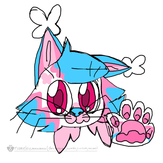
1 -2. Title: New Icon :]. New Nea icon cause its been a while since I have drawn him :]. I do like having myself as my icon but Nea is my mascot and I like how chibi this came out.
3. Title: I need a idea 44 [original filename]. Artblock? Just tired? Melting from the current heatwave here? [Yeah but still]. Point is haven't really been drawing much lately. So here is a sketch I had lying around of an attempt to slightly redesign Meta [I wanted to give her bigger paws and more face fluff like an actual lynx].
4. Title: Met-a Cute. Hi my brain has been pestering me to draw a cute Meta for a while so here's this, its a bit rough but overall like how it came out. In doing this I tried to do a pose I haven't done before without a ref so the pose probably looks at least a bit off lol. As well as that I had fun with the symmetrical tool [for the big butterfly] and even made a very quick brush! [those little butterflies in the back].
5. Title: What the 'dog' doing? The slightest design update, he now has hands rather then paws [oh and his scythe is now cooler now :]] Need to figure out how to get his eyes to look properly creepy though. Also I tried to do something interesting with the perspective and shading.... -w-
6. Title: Horse. This is a week or so old but didn't know what to do with it so just slapped some yellow and purple light and a bunch of sparkles :], the hair shading looks kinda nice!
7 -8. Title: Metamorphosis * Glitter. Just wanted to make another of these pixel glitter gif with little pixel borders things with Meta... Like how it came out [especially the shading and the border] :]
9. Title: Just a Lynx. Just wanted to draw a little Meta, cause its been a a bit. Shading is a bit scuffed but eh, whatever.
10. Title: Catboy Jumpscare! I finished this a few days ago but keep delaying posting it to get the energy to not just leave this with a blank desc. Like 100% of my writing anything energy for the past few days has been going into the yuri game jam submission I posted about a few days ago [which is currently at a whole 300 words! /sarcastic [I am not good at dialogue at all].
11. Title: My at least once a year pinkie. Been to long since I have drawn my favourite pink pony :] Even tried to make it look like a birthday card [ish], I also made a little confetti brush :]
12. Title: Metamorphosis now in 3D! A little Paint 3d thing? Feels a bit weird to call it a model as most of the parts are just 3d shapes in front of eachother. Also I didn't mean for the image to be so small but that's how big I made the model I guess??? Oh and the little glitchy looking stuff in the back is a brush I made :].
13. Title: Metamorphosis now in Motion! I have been trying to get into animating and I been starting with this very uh... square style? cause its alot easier than my usual style. That right ear is very scuffed though lol, but the rest didn't come out that bad! [for someone that can't animate well]. I think maybe I should try more tweening rather than frame by frame like this one.
14. Title: Them. Just a little thing of my immortal giant sentient plushies... particularly when they were younger, they look alot more like plushies when they get older [they get a bunch of stitches and scratches]. Hope that its possible to tell that there eyes and mouths are shiny plastic [which is why they can't change expressions, faces are just plastic.]
15- 19. Title: Sparkly Unicorn. Uuh wanted to make a very very simple little pixel thing but ended up just adding more and more stuff.... had alot of fun! I made the pixel star brush and the lil heart border : D Oh and Petal still does have the verrrrrry long hair but couldn't figure out how to fit it all in so gave her some short ponytails : ] Looks cute
20. Some arm practice stuff, yeah not very great at arms [or legs] yet but at least I'm practicing. Sorry just verytired so idk what to say…
21. Title: An anthro raccon idk. Hi! been a bit busy but hopefully will be able to post more! Worked on these over a few days... originally was going to be more simple but just added more and more little accessories..... Shading the little chains and studs took soooo long [though thankfully didn't decide to draw the chains individually, just made a chain brush for that :]] Also the slight texture over everything was an attempt at a 'tv static' brush, not sure how well it will work for that but its nice for texture [love when digital art has texture to it!]
0 notes
Text
Specular Maps Tutorial
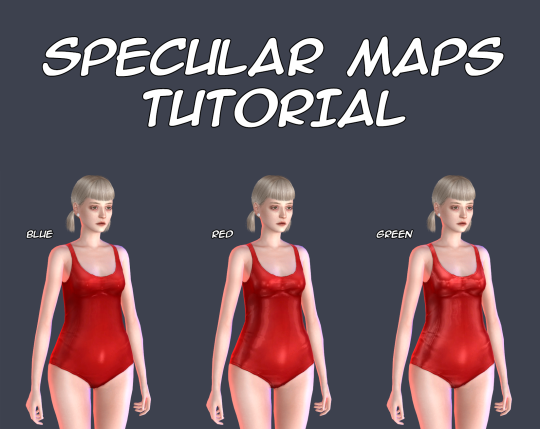
There is no so many information about these maps and most of this information is too difficult for my understanding, so I decided to make my own tutorial about them. This tutorial shows you how to make your own specular maps from scratch without using EA’s maps as a base. You can read it under the cut. Note: English isn’t my native language and I’m pretty bad in writing in it, so sorry for any mistakes. Still hope this tutorial will be understandable for you.
First of all I recommend you to check out this tutorial for specular maps. It’s for build CC and it’s in Russian (still can translate it with google), but it has some nice examples. It also helps me a lot to understand the process.
That you need? Any image editor that supports dds format and alpha channels. In my case it’s Photoshop C6. You also need to download dds plugin for it.
Let’s start!
I’ll be working with this EA’s swimsuit.
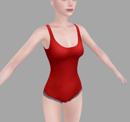
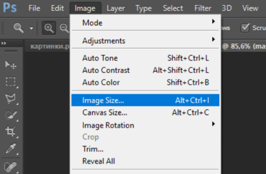
1. Open your texture in Photoshop. For now, we need change image resolution. If you make non-hq texture the size for your normal map should be 512*1024 pixels, if hq then 1024*2048 pixels.
Easy way to doing it is to go to «Image->Image Size», copy the first value and past it in the second. Don’t forget to check out «Costrain Proportions». It should be turn on.

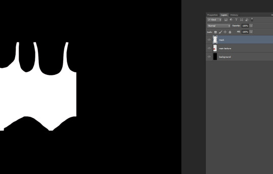
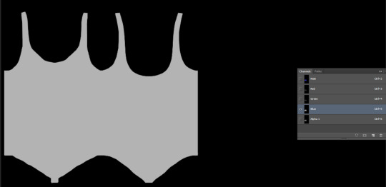
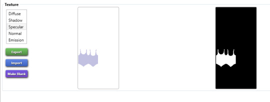
2. Now make new layer under the layer of texture and fill it with black color, lets name it «background» and the texture as «main texture». Then create the another new layer, name it «mask». It should be the plain white copy of the «main texture» like in pics below.

Easy way to doing it in Photoshop:
3. Save the file as psd format. This is our base for the specular maps.
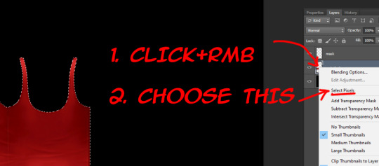
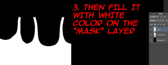
4. At the first we should make mask map. This map is needed for avoiding speculars from others CAS items to overlap your own. Examples can be found here.
For mask map you need to delete «main texture» layer, merge remaining layers in one and save file in dds format. Name it «spec.mask».
The saving settings which I use for dds plugin.
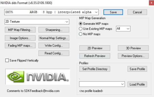
Note: If you want to make your specular map without any shines you need to save your mask map as DXT1 and spec map as DXT5, otherwise your specular maps will be broken in Studio.
5. Close your psd file without saving and open it again. Now we start to make the spec map. It’s responsible for the shine.
There is two ways. You can work with plain texture or with texture itself. The first option is good for clothes with normap maps, the second can be pretty useful for make up, stockings, gloves and ect (the CAS items which can’t have normal maps). In this tutorial I’ll be working with plain texture.
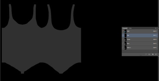
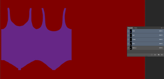
Merge all textures again. Select the layer and copy it (ctrl + A and ctrl + C).
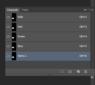
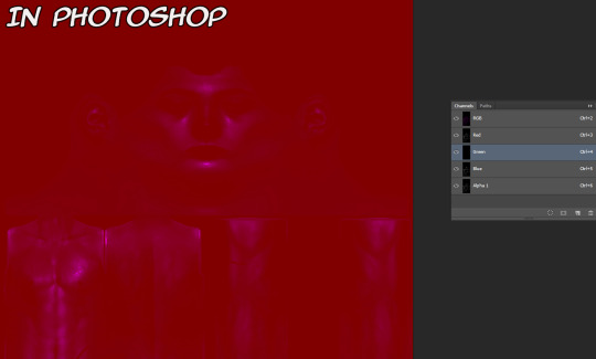
Go to channels and create Alpha channel. Paste your layer in this Alpha channel (ctrl + V). Should be looking like this.

I will use lighter shades of gray to make the tutorial more obvious. But for my CC I personally use more darker shades to make CC barely shine.
Choose “Brush Tool” with black color and put it’s Opacity to 50%.
Note: You also can use “Paint Bucket Tool” or “Brightness/Contrast”, but they don’t always work fine, so be aware of that.
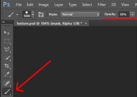
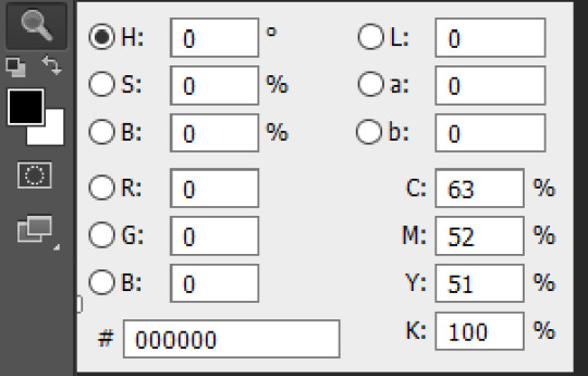
The choosen color should be black! (#000000 color code)
Make the size of brush big enough to color in channels in one touch.
Go to channels. I decided to color in Alpha channel in 50% Opacity.

Red channel in 80%. (Put Brush Tool’s Opacity in 80%. Make sure the color is still black.) The same way with Green channel.
For Blue chanel I chose 30% Opacity.
Make all channels visible. The result should be looking something like this. Making different shades of gray in different channels causes the diffent results in game, so I recommed to test this channels more to get more interesting results.
Note: Make shure that the area around your texture is still black while Alpha channel invisible and red while all channels is visible! Otherwise the whole body of your sim and any CC without mask map will be shiny!
6. Save your file as dds format, name it “spec”. You can close your psd file without saving it or saving it as another file, if something goes wrong.
Your specular maps should be lookig like this.
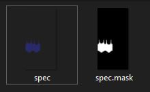
Note: If you name your spec map as “myspecmap”, the mask map also should have the same name, but with “.mask” in the end ( for example: “myspecmap” and “myspecmap.mask”). Otherwise Studio won't see your specular maps.
7. Open your CC in Studio and put your specular maps back. Choose one of the files, the other file will be placed there automatically.
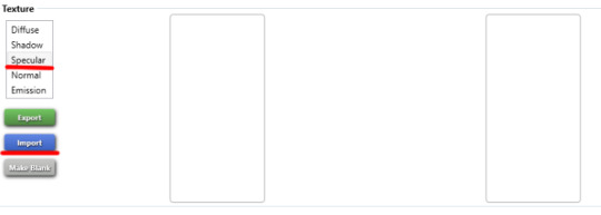
Don't forget to change to dds format while looking for your maps.
Should be looking like this. The first map is transparent and the second is black and white. It’s important!
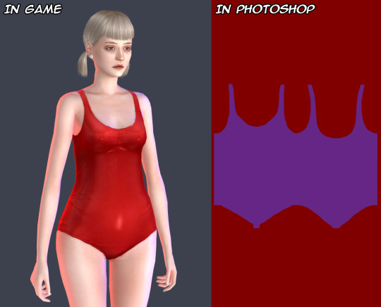
8. Lets check out our maps in game! I also made others specular maps to feel the difference between their effects.
If Blue channel is lighter than others RGB channels. Result of the tutorial.
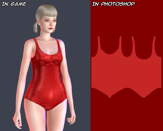
If Red channel is lighter than others RGB channels.
If Green channel is lighter than others RGB channels.

For a better view.
And another example how specular maps can be used. You can make speculars with wet skin vibes for your sim. I used skindetails by obsurus-sims and by me.
Note: Make shure not posting for public such СС and use it only for personal uses or with creator’s permission! Let's respect the work of others creators!
That's all! Maybe in future I'll add more information about specular maps and some tricks. But for now the language barrier still is problem for me :(
Hope it’ll help you somehow! Wish you good luck and inspiration for your future creations!
544 notes
·
View notes
Photo


Back to the classics -
a retro theme by palemona
preview 1 | preview 2 | code
Please follow my new blog @themesbypale
Hey there it’s been a while, a long time ago I wanted to do something with 90′s/early 2000′s internet vibes, so here is it. This theme it’s suupeeeer customizable, so let’s get crazy.
General Features:
RESPONSIVE: looks good in big screens, small laptops and even in cellphones :3
Custom Background: it can be an image or color, and you can change the repeat behaviour, position and size of the background.
Custom theme colors: You can choose 2 colors that will be the primary colors of the theme.
Enable Grayscale effect on images
Choose between 3 fonts, 2 pixelated and one sans-sarif.
Change font size
Change the default tittle of the windows (and it can be empty too)
Show tags if you want
Custom pagination icon (preference to be an emoji :3)
Snowing emoji effect (you can disable it too, and it can be words too if you want)
1 custom link
Link for pages are shown in the menu automatically if you want too
Disable/Enable Ask
Go to top button
Nice effect on menu links (a ▶ will appear if the cursor is over it, you can disable it too)
Main Card Features
Responsive: it will resize depending on how much text you add (and it has a 700px x 400px limit, if you add to much text the scroll bar will be enabled)
2 Mini Layouts Options: You can choose between two layouts, grid mode for 1 to 4 mini sections and the simple card mode, for 1 to 2 mini sections.
Custom Background: it can be and image or color, and you can change the repeat behaviour and size of the background.
Portrait Image for Card: it will adjust to the height of the card automatically, so you don’t have to worry for the sizes, even if you upload a landscape image it will be cuted automatically to fit :3
Change the color and size of the text.
Option to add a “transparent layer” if your background image it’s too colorfull and the text isn’t too legible
Notes
If you don’t add a card image the space will remain empty
In mobile version, the image will be cut in a square with rounded borders
If you want to enable de mobile version, you have to go to advanced options of the theme and disable the option “use default mobile theme”
The grayscale option will also affect the images on the card.
If you want more custom links please message me and i will find the way to add them XD
If something it’s buggy please send me a message
I think that this would be a nice about page too, if you like the idea please reblog and I will do the adaptation for an About Page :3
Updates
feb/8/21: I added some style to the question/answer posts, so it doesn’t looks so plain.
feb/23/21: Added rreblog and like buttons for each post (this is optional) and x button now goes to the permanlink. Also fixed some bugs and made the tumblr controls a little smaller.
may/11/21: Fixed a bug with photosets in mozilla firefox
Hope you like it! It all came with a “personal card” I wanted to do for my profile on everskies.com XD The main idea was to create an about you card simulating a little retro website/program. I recommend adding a pixel or anime scenery for the background image card, that was the whole original idea. Sorry for the spam of images, but I really wanted to show all the layouts you can make, aesthetic, anime, kawaii, minimalist, etc. If you like it please reblog! :3 remember it’s freeeee.
#theme#tumblr-theme#tumblr themes#tumblr theme#themes#free content#free theme#kawaii theme#aesthetic theme#free themes#palemona#anime#palemona-theme#web design
4K notes
·
View notes
Text
GIF Tutorial for Beginners
People keep asking me to teach them how to make gifs and I end up writing them long confusing messages, so I figured maybe it’s time to just write up an actual clean tutorial instead! This is supposed to be for total beginners! (Or people who want to switch to a new process that I’ve curated and streamlined over 8 years of making gifs.) I’ll try to keep this as barebones as possible, and won’t include all the advanced stuff I usually add. I hope it’s easy enough to follow, and I’ll include some links at the end for more stuff. I really do think it’s better to make a few simple gifs before doing more complicated stuff though, just to get used to it!
There will be three sections in this tutorial: #1 Basics - How to make a gif in PS at all #2 Sharpen - How to use sharpen/denoise filters in an easy way #3 Colouring - Just a few very basic adjustment layers
What you need:
A video (most common formats should work, although .mkv doesn’t always)
Photoshop (I use PS CC 2018 - this one because I'm morally opposed to Adobe’s subscription model - but versions aren’t super different from each other)
In the end, you should hopefully be able to make something like this:
This is gonna be so long. Sorry. You can make a gif with just part #1! The rest is just to make it look better.
#1 Basics
If any of the tools/functions aren’t where they should be for you, your best bet is googling it, you might need to change something in your preferences!
Make sure to save your PS file... often. PS has a tendency to crash, especially on laptops.
First, you need to get the video file. I recommend a shorter video, a few minutes long, if it’s longer you might want to cut it into shorter parts beforehand. This is just because PS’s video import tool sucks.
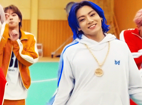
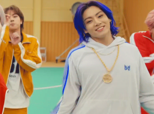
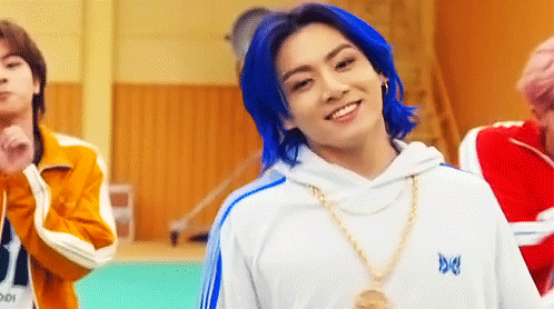
I chose the Butter MV, specifically Jungkook’s body roll at 1:24 because that’s what I want to look at for the duration of this tutorial. No further questions, thanks.
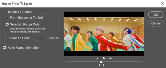
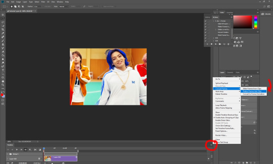
1. Open PS, go to File > Import > Video Frames to Layers

2. In the little pop-up, choose the part of the video that you want to gif. This will import every frame of the video into PS as a layer, so it has to be a relatively short part, or it’ll take ages (and gifs can’t be that big anyway). Now you can also see why it’s almost impossible to select the correct part if the video is too long.
The little controls at the bottom are for trimming, the one in the middle just for the preview. Make sure “Make Frame Animation” is selected! Then click OK.
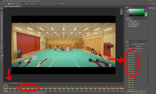
3. Now you have your layers, and you have a frame animation! On the right are your layers, that’s where we’ll apply the colouring etc. later on. On the bottom, that’s your timeline or frame animation - that’s what the gif will be in the end! So if you delete frames, the layers will still be there, but they won’t show up in the gif. If you click on a frame, you can see the little eye checkmark on the layer that’s currently visible.
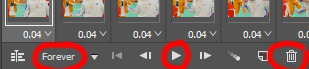
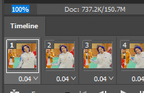
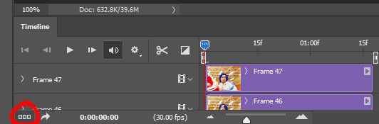
4. The timeline controls at the bottom that are relevant right now: set to “forever” so the gif will loop, you can play the animation with the play button, and you can delete the selected frame(s). The number on each frame is the speed of the gif, depending on the video I usually set it to 0.05 or 0.06 (photoshop lies to you when you play the animation, the only way to test this is to open the finished gif, preferably on tumblr or wherever you want to upload it).
5. As you can see, the animation starts a bit before the actual part that I want, so go ahead and delete all the frames in the animation that you don’t want! You can delete the corresponding layers too if you want, to make the PS file smaller, but it has no influence on the gif. (Hold Shift to select multiple frames as usual)
6. Next, we’re gonna crop the gif however we want! You can do this with the crop tool in the left sidebar, but with gifs like this where there’s a lot of moving parts, I sometimes just use the selection tool in the left sidebar, like so:
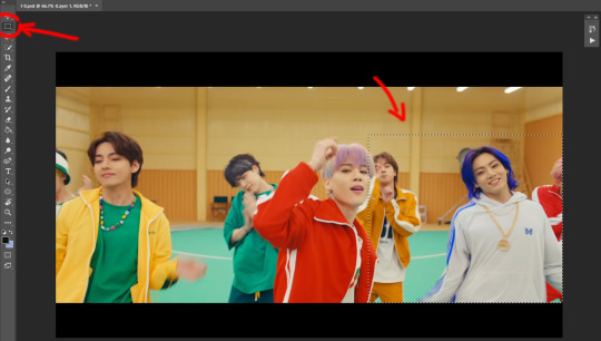
When you click on different frames, the selection stays, and you can check to make sure Jungkook doesn’t suddenly go out of frame if you crop it like that!
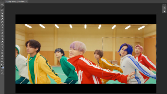
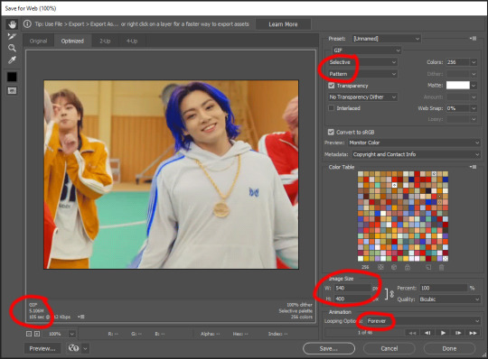
At this point, make sure the selection/crop isn’t smaller than you want the gif to be! For tumblr, what matters is the width (in pixels) of gifs. In the end, the width dimensions on tumblr should be 540px (1 gif per row), 268px (2 gifs per row), or 177/178px (3 gifs per row). Anything else will lead to very shitty resizing!
For this gif I’m going full sized, meaning 540px wide, so I made sure my selection isn’t smaller than that.
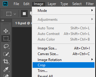
Then just go to Image > Crop, and it’s done!
7. Check to see if this is what you want, then resize: go to Image > Image Size to resize the picture. Make sure the little “link” between Width and Height is active (to keep the same aspect ratio), then set the width to 540px or whatever you chose. I always set the resample option to Bicubic.
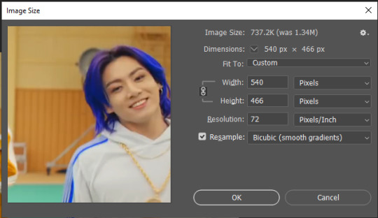
Once that’s done, set the zoom to 100% right above the timeline, to see what it really looks like.
Almost done! A little note about the sizing: width is the important part for tumblr, but if you want to make a whole gif set (especially with more than 1 gif per row!!!) make sure to make all the gifs the same height, otherwise they won’t line up and tumblr will do whatever it wants.
I ended up making mine 540 x 400 and ended up with this:
8. Time to save the gif!! Go to File > Export > Save for Web (OR just use the shortcut Ctrl + Shift + Alt + S) (or whatever it is on Mac).
In the pop-up, you can change things about the gif, but most things should already be the way you want it (Image size, Looping option forever). Selective should be the default, just like the rest.
You can choose between Pattern and Diffusion, some gif makers swear on one or the other, I go back and forth.
On the bottom left, you can see the size of your gif. Keep an eye on that! I believe Tumblr allows every single gif to be up to 10mb, but I try to keep mine under 5mb or close to it, because I think tumblr adds compression if it gets closer to 10mb?? Anyway back in my day you couldn’t upload anything over 1mb. You’ll never know our struggles.
Then just save it, and that’s it, you made a gif! Well done!! Here’s the end result:
:)
#2 Sharpen
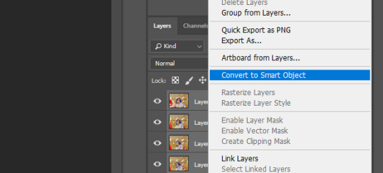
There are countless ways out there to make gifs as smooth and clean as possible! Here I’ll show you the easiest way, but it also provides a good basis for other methods. The main difficulty is that you you need to sharpen the layers, but you don’t want to 100 layers one by one. So what we’re gonna do is convert the layers into a Smart Object, which functions as one layer!
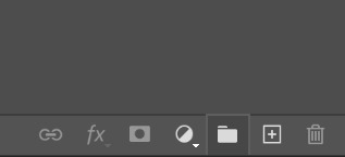
1. Convert the frame animation timeline to a video timeline with the little button right underneath on the left:
It should look like this, and I’m sorry but I can’t explain this one because I’m not an expert here, but you can just ignore it:
2. Select all layers: Select > All Layers, or just manually.
Then right click on the layers > Convert to Smart Object. Now there’s only one layer left, but don’t worry, the frames are still there!
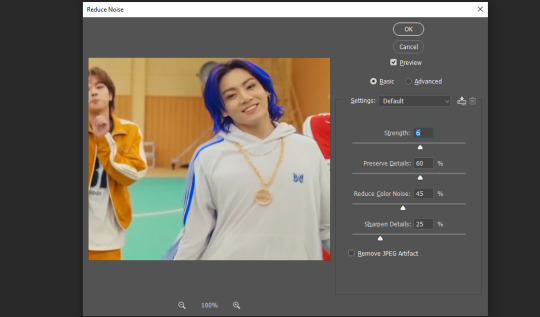
3. De-noise! It reduces noise, takes away some of that grain. More necessary in some videos. It also makes it less sharp, so I do this one first. Filter > Noise > Reduce Noise

My default settings are, Strength: 6, Preserve Details: 60, Reduce Color Noise: 45, Sharpen Details: 25, Remove JPEG Artifact: No. But you can play around, especially with the strength, and see how the little preview looks. Don’t apply too much of it! Or it will look weirdly smooth with no details in the end.
4. File > Sharpen > Smart Sharpen.
Settings: I usually have mine at Amount: 500, Reduce Noise: 5, and Radius at either 0.2 or 0.3, depending on the video. I’ll actually do 0.3 here, because I find it a bit blurry otherwise. If you sharpen more, it can quickly get grainy.
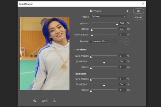
The difference isn’t huge, but here’s a little before and after denoise & sharpen:
5. Technically you can just save it as a gif (save for web) as shown above now, or you can convert it back to a frame animation, which I’d recommend especially if you use certain other sharpening methods (I’ll show you how to convert it back at the end of the colouring part), but for now, let’s go straight to the next part:
#3 Colouring
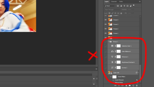
Now, you CAN do this part right after part #1, still in frame animation, without a smart object. I prefer it like this because sometimes PS acts weird, but if you want to skip the smart object stuff: select all frames, and add the adjustment layers at the very top, above all the other layers. (It only affects selected frames; and it only affects the layers under it.)
The adjustment layers should be above the layer tray, and these are the ones we’ll use today: Brightness/Contrast, Curves, Vibrance, Color Balance, Selective Color.
All of these are optional! You can do one, or all, or any combination. This is just the very most basic for me to get a gif to a point that I like. I’d recommend sticking to these for a start, but once you get the hang of it, definitely feel free to play around! It’s fun! Every gif maker has different preferences here, too, so there’s tutorials for everything.
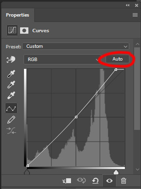
1. Curves: Just click Auto, tbh. You can play around, but Auto works fine for me as a start, just to brighten or darken some parts as a base.
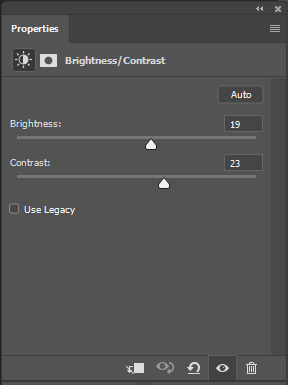
2. Brightness/Contrast: Usually videos are a bit dark, and contrast can help to make it seem sharper AND cut down on gif size, so I usually just up both of them a bit (but not too much! Or it’ll look cheap). Here I put them at B: 19, C: 23
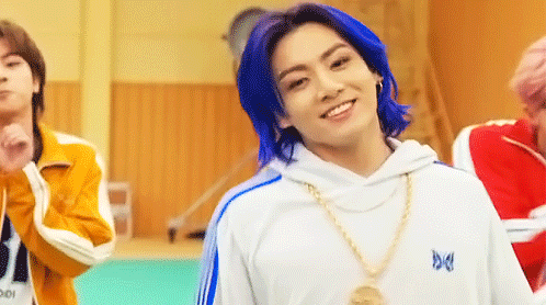
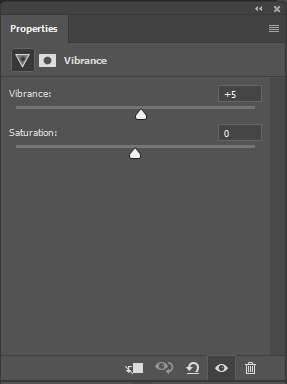
3. Vibrance: I love very vibrant and colourful gifs, so I usually up the vibrance (and sometimes the saturation). This one is already very vibrant, so I only put +5, but if you try to colour, say, a very moody tv show, this can help wonders, especially if you want to work with the colours more later.
If you prefer less vibrant gifs, you can also lower the values here!
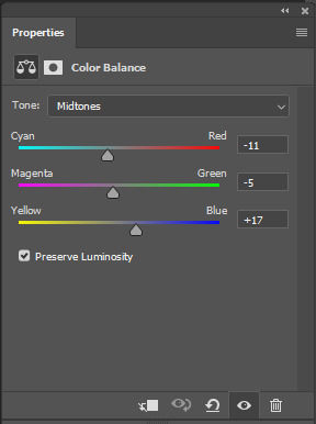
4. Color Balance: getting a bit more complicated now. Often, videos will have a slight yellow or green or blue tint, and this is where you can correct that. This video is a bit yellow, so I added +17 Blue. It was still too warm, so i added -11 Cyan as well. This neutralized the yellow tint, but I wanted some of the reddish tone back, so I added -5 Magenta. I usually do a similar process like that, depending on the tone.
Instead of Midtones, you can also do this for Shadows and Highlights individually.

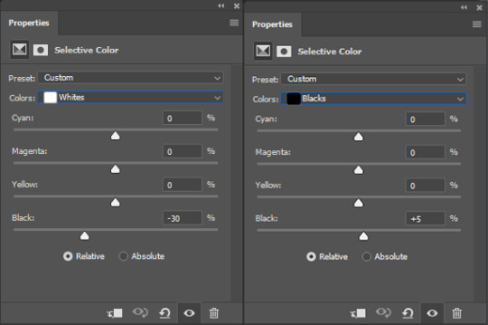
5. Selective Color: now this is the most complicated, but also the most fun to play around in my opinion! Be careful here, if you do something too extreme it’ll look like shit or make the gif super grainy. I some rough goals in mind here: make the blue hair as blue as possible, make their skin tone a bit less pale, and enhance the black and white (which I always do).
You choose a colour at the top, and then add or subtract cyan/magenta/yellow/black values for that colour.
Skin tone: yellow and red. For this gif, I just added black to both, making them darker. Sometimes, if you change one or both those colours for a different part of the gif (for example, if I wanted to make the background less yellow, I’d subtract yellow from the yellows - but then I’d add yellow to the reds, to make the skin tone natural again.)
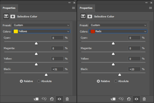

Blue hair: Just ramp up the cyan for the blues. Be careful with putting anything to +100, but here it’s already so bright that it should be fine. His roots are more purple, so I changed the magentas by adding cyan and black, and subtracting magenta and yellow. It’s not super clean, but fine for our purposes.
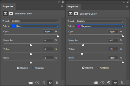
Black/white: depending on the gif, I often either add or subtract black to the whites. Adding makes the highlights less blinding, a bit darker, and flatter (I like to do that if one side of the face is bright white in the sunlight, for example). Subtracting creates contrast, makes it brighter, can wash it out. It can also lessen the gif size, and here it’s mostly just the tracksuit instead of important details, so I subtracted black. For the blacks, I almost always just add a bit of black, to make it more intense. Just like adding contrast, this can make the gif seem sharper and less grainy.

And done!
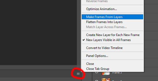
6. You could just save it as gif now, but as I said, I prefer to convert it back to frame animation timeline first, if only because I like to let it play through before I save it, and it works better for me there than in the video timeline.
Select all frames, then click the little menu on the top right of the video timeline > Convert Frames > Flatten Frames into Clips
7. When you scroll down to the bottom of the layers now, the old smart object + adjustment layers should be at the bottom, under all the new layers. Delete the old ones, we don’t need them anymore.
8. Convert the timeline back to frame animation, by clicking the little button at the bottom left of the video timeline:
9. Click on the menu top right of the timeline again > Make Frames from Layers
10. Now, just some potential cleaning left to do. Sometimes, there’s a doubled or empty frame or layer at the beginning or end, just delete those as necessary. The timing of the frames is probably off, too, just select all frames and set the delay time to 0.05 (or whatever).
Now your done! Save as gif, and you should get this:
I included some bonus links and tips after this but tumblr ate that whole part so I guess it’s going into a separate post. (Here is is)
Anyway, I tried to make this as easy to follow as possible for beginners, but feel free to send me an ask for clarification anytime. Hope this helps, now go make gifs and have fun!!
#photoshop#tutorial#gif tutorial#ps tutorial#btsgif#*#*tutorial#this took so much longer than i expected i'm not giffing for at least a week now
233 notes
·
View notes
Note
hi there! i’m sorry to bother you but i really love this gifset /post/677933707658739712/tv-women-appreciation-week-day-4-favorite and i was wondering if you have a tutorial on it or know any? thank you, have a nice day!
ah thanks for the ask! um, i asked around and no one knew of an existing tutorial, just as i finished typing up my reply i was sent this tutorial. that one uses frames instead of timeline so if you're a frames person that is probably going to be more your thing!! i'll do my best to try to explain how i did it (which is a timeline heavy method). i also want to acknowledge that i did not originate this idea!! the version my set is inspd from is this timeline bly set
the set combines basic gif making, multiple gifs on a canvas, calculating layouts and adding lines/text
a disclaimer is that the way i gif is really chaotic and there is probably a way better way to do it!! this might get long, so putting it all under the cut!
so first i get the clips (or screencaps if you use screencapping) i want to use, for me that is the most time consuming part and i get clips before i decide on the layout because i feel like it's easier to size the layout to the clips.
calculating layouts (you can skip if you are using layout templates!)
once i have my clips i look at what would suit tall rectangles, long rectangles and squares. and decide which ones should be big v small etc.. the batwoman set i did is especially erratic because the six gifs did not all have the same canvas size...
the width will always be 540px. any white space between gifs (gutters) is 4px. the gifs and gutters must add up to 540 across and whatever canvas height down (popular ones are 540px, 450px, 400px, 350px etc)

combining multiple gifs
after you have decided the layout, make all the gifs as normal - remember to crop and resize them to the calculated dimensions
after i make the first gif, i save as and create an exact copy to work from as my collage base. then i go to image>canvas size and resize that canvas to the size i want the combined gif to be. i use anchor to put the first gif i made in the right place on the new canvas.

if the layout is really complicated you can use guides to ensure all the gifs go in the right space and the gutters are 4px. again linking this tutorial of how to out multiple gifs on one canvas
then make each gif at the size you need and put them in a group folder or convert them to a smart object and drag them onto the canvas. move the group into the right place and repeat.
some people try and match frame lengths etc before giffing to make sure the length is even. i literally couldn't imagine anything worse, so i just use the timeline end clip to make everything the same length as the shortest gif

adding lines/text
this tutorial explains generally how to add text to a gif
the exact setting is used for the text was:

for the lines i use the line tool, guides + remembering to write down entry and exit points! the place your line exits gif 1 will need to be the place it starts in gif 2, this is why guides are super helpful!
this wildmoore set, my lines are 1px and white. the line shape is under the shapes tool.

use vertical + horizontal guides to set out where the lines will go, then when you drag the line tool along the guide it will highlight in blue what you've done.
if you use a stoke thicker then 1px make sure you are consistently positioning the line to the left/right/center etc of the guide so it will always line up.

after you finish either clear guides or really zoom in because sometimes it's the lines are missing a pixel at the corners so you need to just select whatever line it is and drag it to be a pixel longer.
i think that's basically it!! any other questions let me know!
28 notes
·
View notes
Note
I’ve recently taken up fallout 4 based photography after getting inspired by your blog.
However, I’ve noticed that my photos experience a notice dip in sharpness and quality if I edit them (such as to make more centred). I suspect it’s probably a compression issue but wondering if you’ve encountered similar problems
Hey, thanks for the ask! I'm absolutely delighted to hear that someone was inspired by my work, and I would love to see it sometime if you'd ever like to send it my way.
Unfortunately, just about any time you alter or save an image in a JPEG format (the default for Steam screenshots), there will be some compression. Most websites such as facebook, instagram, and tumblr also tend to compress their images upon upload as well, which can be pretty frustrating at times.
If you're doing any heavy editing or screenarchery, here are some of my personal recommendations:
Avoid saving or altering the same image multiple times - instead make each save a new file, such as "screenshot-2, screenshot-3", ect. This will also allow you to compare different versions, or revert back to an older version if necessary.
Saving the image as a PNG, rather than a JPEG - this will result in less compression. However, the downside is that the file size will be pretty big, so it will take longer to upload, and can sometimes take longer to load on slower computers.
If you are doing anything to alter the original size of the image such as zooming or cropping: I highly recommend trying to keep the image the same aspect ratio. Or at least try to stick to one of the more common aspect ratios (such as 16:9, 4:3, ect). This seems to reduce some of the quality issues when uploading to a website.
If you still want to use JPEG, I recommend using Photoshop (which is fairly easy to acquire a legitimate copy of, recommend using a VPN just in case) and choosing the "High" quality option when prompted. I personally use around 8, and haven't seen any noticeable drops in quality.
Bumping up the in-game shadow/lighting quality or using an ENB can also be useful, as it can help "soften" some of the sharper edges, and reduce pixellation.
I also rely on a lot on in-game mods such as iHUD, which will allow you to hide or toggle menu elements such as the compass when not in use, and reduce the need to crop or edit many images almost entirely.
As stated previously however, any kind of alteration will still affect the image quality in some way. For that reason, recently I have been trying to avoid zooming or cropping my images almost entirely, and have mostly been relying on Photoshop to remove any unnecessary or distracting elements. But I know that's not an option for everybody.
Anyway, sorry for the text wall, but I hope this helps! Note that I am only speaking from personal experience, and am hardly a professional. So if there's anyone out there who knows more about photography than me, feel free to correct me or add to this post.
#i apologize for the super late response#apparently tumblr decided not to notify me of this message#faq#anon asks#asks#2021#wasteland-photography#film workshop
11 notes
·
View notes
Photo
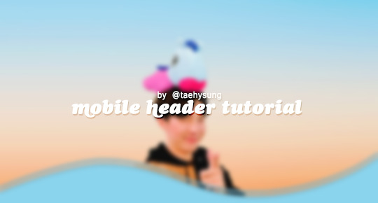
mobile header tutorial
hello! I’m here to share how to create a header similar to these that i’ve done in the past. here are the tools i’m using:
photoshop cc 2018 (from @birdysources)
some picture of hoseok probably from either twitter or weverse i don’t remember lol
i included pictures and tried to make it VERY beginner friendly, but please, send me an ask or dm if i’m unclear at any point. it’s 2:38 am as i’m making this tutorial and i just downed my cold brew so i’m sorry if it’s messy
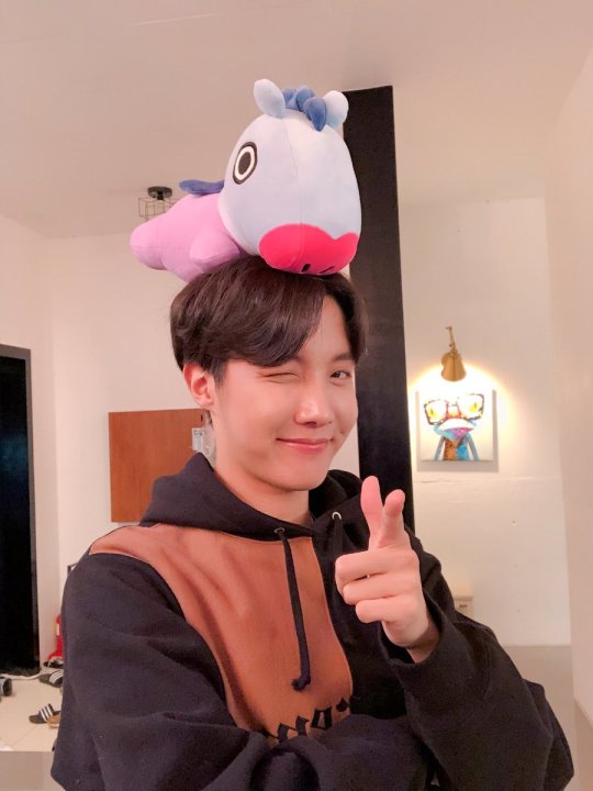
1: open your picture in photoshop (here’s the picture of hobi if u wanna follow along)
2: find the quick selection tool
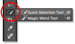
you’ll find it in the left sidebar, fourth from the top. i’ll often use this and the tool above it (polygonal lasso tool) depending on the photo. the quick selection tool is faster but more tedious, in my opinion, but hoseok was easy enough to cut out just using the quick select. use both! whatever u are comfortable with.
here are my settings for the tool:
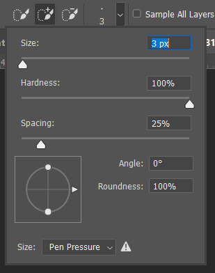
i almost always keep it at 3px. unless the image is huge, then i’ll go up to 5px, but never really above that.
3: trace over your subject(s) (aka hobi) by dragging the tool along the edges, until you’re happy with the accuracy:
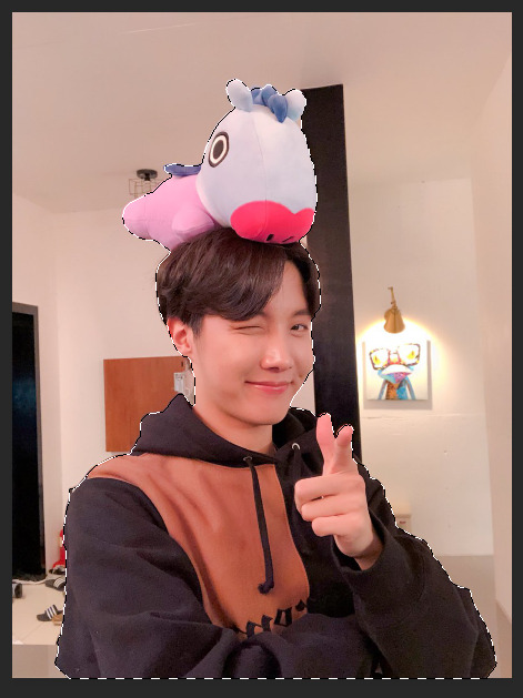
4: find Select and Mask (directly above the image):
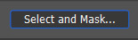
and here are the settings i’m using:
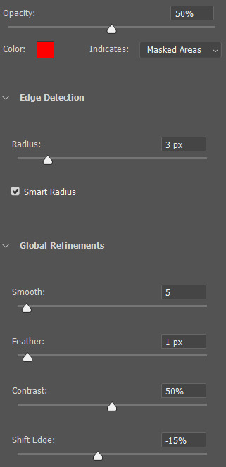
then press ‘Ok’ !
5: Select Inverse (right click inside subject)
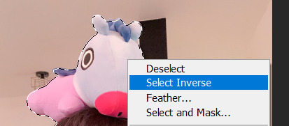
now we’re going to press ‘backspace’ on your keyboard, and the background will be gone~
make sure your file isn’t locked! it should be labeled ‘Layer 0′ and not ‘Background’ (if it’s locked, just double click it and press ‘Ok’ on the window that pops up)
after pressing backspace to delete the background, it should look like this:

then deselect it all. now is the time to look closer at your newly made render and see if there’s any cleaning up to do. i’m good to go, so i’m gonna continue on with making my header.
tip: drag the subject (hobi) with the move tool (very top tool on your left sidebar) to the center so he’s in the very middle. it should click to the center (you’ll see the pink line)

it’s not necessary for the tutorial but if you plan on saving this render as a .png and dispersing the renders you make-- it’s just cleaner looking to have them centered!
6: File > New

i always use 800 x 430 for mobile headers. for gifs, i size it down to 650 x 349.
7: resize and drag hobi into the new canvas (Image > Image Resize)

for single subjects like this i usually resize them to ~300 to ~400. whatever you think looks best tbh
now drag the file from its place up top:
then the file from where it’s labeled ‘Layer 0′

8: now hobi is inside the canvas where the actual header is going to be made~ you can get rid of the render, or save it as a .png, whatever u plan on doing w it
i’m gonna center my hobi for the header i plan on making! from this point it’s just gonna be coloring, sharpening, etc. if you’re interested in using any textures like flowers or bring in other renders of objects, DeviantArt is a great place to search for texture packs. @beapanda on DeviantArt makes beautiful resources (kpop and non kpop related) be sure to credit them or whoever u save ur textures from!
for this header i’m not going to be using any outside resources, i just want my hobi to be the focus~
for the background, i’m gonna use a gradient from this site (this pack is 200 images. phew)
i’m using no. 200 from that pack.
9: optional- i’m gonna make some extra layers and start coloring hobi using clipping masks.
make a new layer > right click the new layer and find ‘create clippink mask’ > set the layer to either color, overlay, or multiply (whatever you think looks best and does what u are trying to achieve)
here i’ve just make layers to color things like his hair, his hoodie, and baby mang
here’s with vs without:
and when you’re done, go ahead and right click your primary layer (subject layer) and click ‘merge clipping mask’.
10: coloring~
find a psd you like or being to color the header yourself. for this header i’m gonna be using a homemade psd. i’m not gonna go into detail bc there are sooo many places to find psds on tumblr and deviantart. just like you brought hobi into the header canvas, drag your psd there, and that’s how u apply a psd.
when u are happy with the coloring, right click the bottom layer and flatten the image.
11: topaz clean + unmask sharpen
topaz clean is an addition u have to manually add to your photoshop program. u can google how to do it, but if anyone’s struggling i can show u how i did if i remember (but i’m pretty sure i do)
topaz settings:
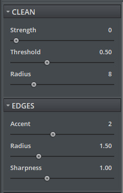
unsharp mask settings (go to filter > sharpen > unsharp mask):
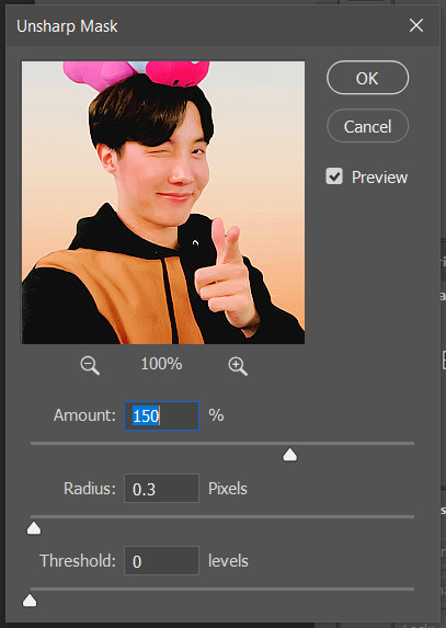
honestly, topaz is completely unnecessary, but i like the way it looks so i’m gonna go with it anyway. sharpening the header alone will still give you a great outcome
12: final step, header border time~
over on my film/tv blog @gusdapperton i’ve made a header template pack (click here if u just wanna use my premade borders) but for this tutorial i’m gonna show u how i actually made those (minus the cloud one, i was just fucking around lol) (it’s so simple)
>>> if u DO just save one of the borders i made in that pack, resize it so the width is at 800 and drag it to your header canvas. set the layer to ‘screen’ and bang there u go!
BUT with that method u can’t change the color from white. so if u want a border with any other color, keep following the tutorial >>>
go to view > rulers and select that to show the rulers (duh)
click from inside the ruler (light grey) and drag out your guides. here are where i’m placing mine:
they should ‘snap’ right into place, but if they don’t, make sure u go to view > snap and that’ll fix it. u will know what i mean once u try it lol
select the curvature pen tool (right click the pen tool to show more tool options):
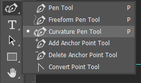
and begin to place your dots. thanks to the guides, these dots will also snap into place
here are mine:

(i eyeballed the two in the middle, it doesn’t need to look perfect tbh)
this next step is sorta stupid but i haven’t found a better way to do it yet lol
to close the shape just make sure to closely follow the direction of the dot you last placed, then go around to make your way back to the first... it looks silly but like this:
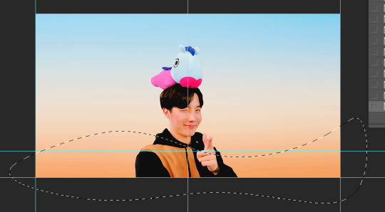
just play around with the shape and the tool... u will get the hang of it lol
now look up ^ and press Selection

then ‘Ok’ in the next window. then boom~ there’s your selection for the border we’re about to make.
make a new layer then select the rectangular marquee tool (second from the top on the left sidebar) and either drag with your mouse or use the arrow keys to move the selection we just made. here is where i’m placing mine:
then select your paint bucket tool (if you can’t find it, right click the gradient tool and it’ll be one of the sub tools, like i showed u with the pen tool)
make a new layer, then fill it in (i’m using white)
you can stop there, but to make that line like i did in my border template pack, press the down arrow on your keyboard and go down 5-10 pixels, press backspace, go down the same amount of pixels, and re-fill that area.
now unselect. there’s the border~
now go to view > clear guides to get rid of those. u don’t need em anymore :) i’m also going to move the border we’ve just made down to the bottom of the canvas since we don’t need that big gap there.
>>> tip, don’t fill in the white directly on the layer if you wanna change the color. create a new layer on top of the border layer, right click > create clipping mask > fill the layer with the color u want for the background. example:
it saves the integrity of the shape. if you color fill right over the white, look closely and you’ll see it looks sort of pixelated and not as clean or smooth. it’s subtle but noticeable enough to me where it bothers me.
since this color i chose is kinda vibrant and clashes, i’m gonna help it out some. go back to the quick select tool and select everything inside your border layer. make a new layer, fill the layer with black (any color will do, it doesn’t matter) and set the fill to 0%. double click that new layer, and a new screen will pop up. go to drop shadow, find the settings you like, and boom. here’s what i did and what it’ll look like:
now u are finished~ i didn’t do this but u can skip sharpening the header earlier in the tutorial and reflatten the image again to sharpen it at this point instead but, yknow, i didn’t do that lol
here’s the final product (save by going to file > export > save for web)
preview of how it looks on mobile:
background: 8bd4ed
the end~ please send me an ask or dm if you haven any further questions, i will try my hardest to help <3
#photoshop tutorial#header tutorial#allresources#completeresources#mine:tutorial#i probably fucked up somewhere but it's bed time so i will find out in the morning hehe
149 notes
·
View notes
Text
Replies, finally!
Anonymous said:
Hi! I recently found all your content and I really love, I don't mean to bother you, but I was wandering where did you get the brick wall texture from Hemlock Bend house. I've been looking for this but I didn't found it. Well I really hope to the release from Feverfew! Greetings and thanks!
Hey there anon! These walls are custom ones I’ve made just for this lot. You can have them if you want!
@pocketsfullofposies said:
Hi! Once again, I really appreciate all your work for this community.. I make a lot of use from your hood deco and facades and my question itself refers to hood deco and your default replacements. I know that you’ve already done default replacements for the forests and some singular trees, so I was wondering if you’ve ever considered doing replacements for the clump of trees? Sometimes I find the forests too big for my terrains and they float which bugs me immensely *_*
Hello @pocketsfullofposies! Thank you! Actually, there is a default replacement based on my linden trees made by @lowedeus, It replaced Maxis’ trees in clumps and rows with linden trees. As for the floating, there’s nothing we can do about it. Tree clumps will not follow the terrain relief. The only way to avoid floating is to place trees manually one by one.
Anonymous said:
Does this mean you will be releasing Feverfew this month or this year? *sparkling eyes*
Oh, anon. This year – is the most realistic option at the moment 😔
Anonymous said:
Hello Criquette, I'm running into an issue where road replacements are not visible in the neighborhood in lot view (not on the lot itself, I know how to fix that with overlays, but beyond the lot boundaries). Do you know what causes this and how to fix it? Thanks lots.
Hello anon! Yes, you’re talking about lot skirt roads. If you’re using Rural charm DR, make sure you’ve got all the files installed and there’s no conflicts. If you’re using other road DR, there’s a chance that it does not have corresponding textures inside. But that’s highly unlikely. Usually they’re okay. Anyway, if you’re still having this issue, please PM me. It’s hard to sort it out without screenhots.
Anonymous said:
Hello! I've a question about hood deco & figured you'd be the best to ask. :) How do I make hood deco invisible in lot view (but still placeable in lots in the neighborhood)? I moved some lots off grid, using hood deco to make it look like the streets are connected. But in the lot I've got two roads now--the hood deco road glitching on top of the regular one. I'd like to keep the Maxis road, cuz of the alignment, so I'm trying to make the hood deco invisible. Any help is appreciated; thanks!
Hello anon! There is no way to make a single hood deco to be invisible in the lot view. You either can have all of them, or turn them off completely in game settings. What I would suggest just delete road tiles using ‘movingObjects on’ cheat to make the original road disappear.
Anonymous said:
Hi! Sorry if I'm bothering you. I really like you neighborhood trees, but I feel i lack of trees on lot mode. Do you know wcif some? If you use them could you tell me? Thank you and sorry for my broken english.
Hello anon! Thank you! No bother at all. I do feel lack of good lot mode trees myself. I mean, there are plenty of trees, but there’s always something about them that bothers me. Since I never actually play my game, I rarely stalk for lot mode CC so I can’t recommend any resources.
Anonymous said:
hi! i think the way you do your roads layout is very aesthetic pleasing! i take so long planning my layouts to end up not even liking it, so i was thinking maybe you could explain how you do them? thx beforehand 💖
Hi anon! Oh, thanks ^^ Well, I don’t have any special solution to successful road planing. In fact, I always end up with editing the road layout multiple times. Feverfew road layout was completely different at the beginning and this is kinda went out of control since I’ve discovered that it is possible to move road tiles around by editing some data in neighborhood files. It’s completely safe, but extremely tedious. You have to alter XYZ coordinates for every road tile vertex, later bounding coordinates, orientation, texture type etc. Oh, I’m getting a bit carried away, sorry! Yes, well. I’d recommend just to imagine your future town as it would be a real place. This street is a town’s main road, there’s a little square, here’s a shopping district, etc.
@meltingmagnetz said:
Hii, i really like your rural charm, but i needed roads on them. So i made them than i found out that had already been done. Anyway i used your sidewalk texture for them. But i also wanted to make one that is maxis match. While making the other one was not a problem. With the MM one i can't get it to be seamless. Up close everything is fine but if i zoom out, i can see lines. I am not movies the road texture at all. Any tips on how to make is actually seamless. Thanks
Hello there! Yes, this often happens while DXT building process makes smaller versions of the texture with alpha channel. When the image is automatically resized, the algorithm makes the border semitransparent by blending opaque and fully transparent pixels together into one semitransparent pixel. The way to get rid of that issue that I use consists of making smaller versions of the texture manually via Photoshop and adding them one by one. So that I could just get rid of those semitransparent pixels by turning them into opaque ones.
@bayoubashsims said:
Hey Criquette, question about your Rural road & terrain mod from MTS. I was wondering if the road replacement would work without the terrain? As in, could I use this road replacement with your newer terrain replacement and not have ‘weird’ sidewalks from the terrain difference?
Hey @bayoubashsims! Well, to get rid of those ‘sidewalks‘ you have to edit the texture of that default replacement. There’s no other way to make them go.
Anonymous said:
Hello! I downloaded your set of shrubs and bushes in 4 sizes for hood deco, but some of them are glowing and flashing bright purple in winter, when there is deep snow. Do you know what is the cause?
Hello anon! That’s sounds weird. I’ll check if there’s any issues with it.
Anonymous said:
hi criquette!! i hope you are staying safe and thank you as always for the great content and inspo! i was just wondering if you were going to release your neighborhood deco tennis courts? I have a neighborhood that they would add beautifully to :)
Hello anon! Oh, you’re very kind, thanks! Yes, I’m alright and I hope you’re staying safe too! I’ve absolutely forgot about the courts, actually ^^’ I think I could release them this weekend!
17 notes
·
View notes