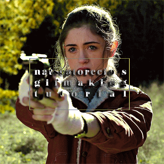
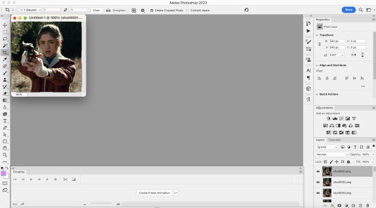
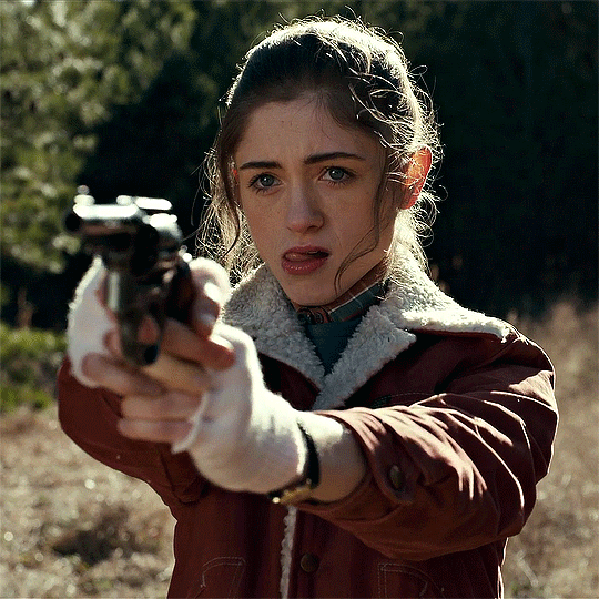
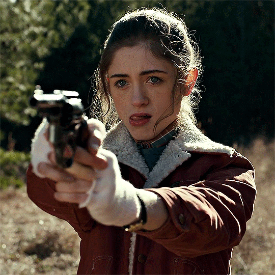
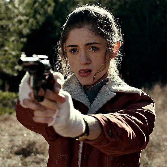
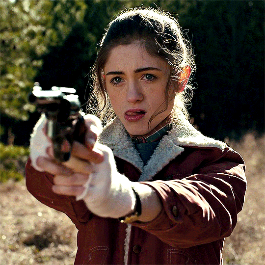
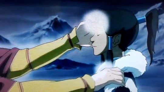
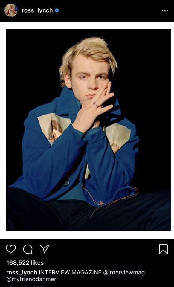
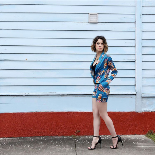
#sorry for the image quality this is not a screenshot it's an actual photo
Explore tagged Tumblr posts
Visit Tumblr Blog
Explore Tumblr blogs with no restrictions, modern design and the best experience.
Last Seen Tumblr Blogs


Fun Fact
Tumblr has 4 main sources of revenue.
Text
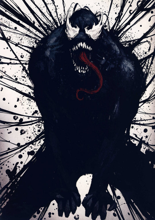
There are many reasons to NOT read uncanny avengers (2023)

But this speech not one of them
#if everyone actually embraced captain america as he's written maybe that country would be better#captain america#steve rogers#marvel comics#marvel#uncanny avengers 2023#sorry for the image quality this is not a screenshot it's an actual photo#to clarify most of ua23 is absolute garbage#I'm exclusively reading it for deadpool
22 notes
·
View notes
Text
I've got a small pile of unanswered asks, sorry for the wait! got myself busy again with other projects, like a christmas themed kids book I need to get done by thanksgiving.
I've been noticing that when my uncle has the books printed, they come out very dark and muddy, which is not great! I tried to research rgb to cmyk conversion and ran into all sorts of different advice on which profiles to use, found that most of the instructions rely on very specific art software, only to ultimately learn that many places used for printing art will just apply their own cmyk profile anyways. which can actually make the colors worse if you already converted the file yourself.
and furthermore, the problem is extra bad with these books because my uncle has been going through Amazon and they use a variety of third party printers! based on the results with the books, I'd say they're cutting costs with low quality cheap printers >:/ which means there's nothing I can actually do on my end to ensure that the illustrations accurately print with the colors I'm using.
However. I don't give up so easy. I've seen artists make all sorts of color choices just so the end results looks a specific way under specific circumstances. Like using negative colors so the image only looks "normal" when it's been inverted. or using blue and red so the image looks different based on whether it's under a red lens or a blue lens. making color illusions like that blue/black vs white/gold dress or the illusion of grey strawberries looking red when they're surrounded by cyan. I did a final project in college on the topic of color illusion, making my own example paintings.
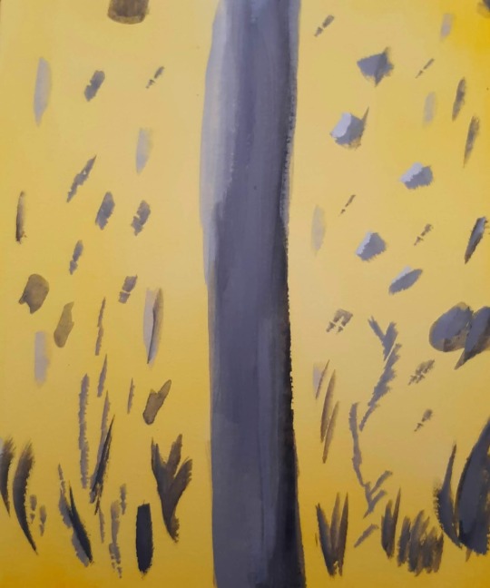
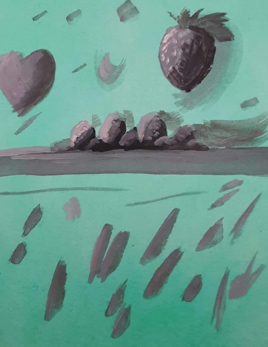
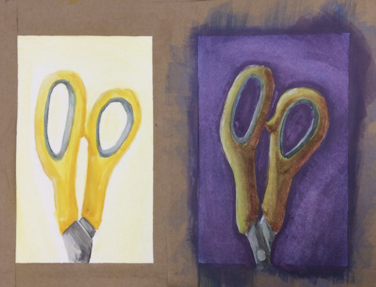
(image description: three photos of small paintings. the first two images are solid yellow and green respectively, with neutral grey abstract shapes painted over them. because of the solid color backgrounds, however, the neutral greys appear to be slightly tinged with the compliment color of their backgrounds; blue tinged on the yellow and pink tinged on the green. the third painting shows a side by side comparison of the same pair of yellow scissor handles. on one side, they are painted bright yellow on a plain white background. on the other side, a dark purple background and more dramatic lighting still give it the appearance of being yellow scissors, but in actuality the handles are painted in shades of green and orange, blended together in some places and darkened or lightened with other colors. they simply look more yellow because of the purple background and the warm shading. end description.)
So I know a thing or two about color strategy. and I am not losing a war against low quality cheap printers, not today. I spent a while looking for cmyk color charts and palettes, testing images through an online cmyk converter, and I have finally achieved my goal. the final test will come when the book is done and sent to print. essentially, I just ran a cmyk color chart through a converter to see how it might look after being printed, then set the original and the converted version next to each other on my file. I can now use the brighter original colors but base the colors I pick on how they'll look in the printed result rather than how they look on my screen. this means the version on my screen is far more pastel than I would normally go for! but the test results so far prove the method, and I think this book will print just fine.

(image description: screenshot of the rgb and cmyk versions of the same painting, which look very small and compressed because they're thumbnail images. the rgb version looks very light and uses a lot of pastel colors and soft shading, while the cmyk version looks much darker and has more distinct shading. it depicts a family out caroling around Christmas, standing at the porch of another family who look very happy to hear the song. end description.)
by golly I am not going to let Amazon keep turning my hard work into muddied disasters. I get paid for these illustrations and I'll make them look good in print by any means available to me.
here's the colors btw if anyone else needs to use this trick:
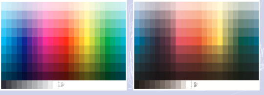
(image description: two color charts. one is very bright and rainbow, the other is much lower contrast and dark. the colors that are the most affected are the blues and greens, while the reds and yellows are somewhat more intact. the greys have also become more brown in the second version. end description.)
just figure out what the end result needs to look like and pick the brighter color accordingly. should make the low quality print jobs look at least passingly decent! sometimes you really have to plan ahead to make things look the way you want.
27 notes
·
View notes
Note
Sorry, why do you hate konig?
Some reasons I fucking hate König
These are in no particular order.
1. A lot of content involving him involves replacing Gaz with him in the 141.
König has never been a member of the 141. He is a member of Kortak. And it's not even that he's being added in as a 141 AND König; they are deliberately cutting out these single POC character within the main group and replacing him with a white guy that does not belong there.
I don't care what excuses you want to use, it is racist. Because there is not one single piece of media in which Price or Ghost or Soap is cut out.
2. Despite having a lot of fans, he does not have any major role in the game franchise.
He does not exist within the campaign. He is an operator, with no cutscenes or anything giving him any sort of characterization outside of the voice lines you get while playing as him.
3. The VA is a groomer and uses his role as König to talk to underage fans
His name is Jim Boeven. Multiple young female fans have come out with stories (and screenshots) in which he has been inappropriate towards them.
4. The VA is homophobic
Bro really came out here and had a public crash out because people were shipping König with Horangai. Although kudos to Horangai's VA who responded by uplifting shippers content and reposting multiple fanfics.
5. Jim fucking Boeven
I cannot find a single redeeming quality of this man. He is pro-Isreal. He liked and responded positively to someone who called fans that headcannon trans/gay König "schizos". He supports crypto scams. He wore confederate flags (the photo was old, but he did post the image in Nov 2024). This dude, who is the voice and who acted as a physical model for the character, is actually garbage.
14 notes
·
View notes
Text

I've been thinking about how little Marinette looks like her dad, and then thinking of ways that she reasonably could look like both of her parents in a body-type way, and then I thought about the body types of professional gymnasts, who are often short but with comparatively quite broad shoulders.
So, of course, once I came to that realisation I immediately picked a photo reference with an angle where you can't really tell how broad her shoulders are. Also, sorry for the poor image quality, I couldn't figure out how to upload the document itself so this is a screenshot.

Pose and figure reference, Olympic gymnast Simone Biles.

Face reference, Kristen Kreuk. Didn't spend much time on the face this time, since it's not really a focus and I couldn't find a side profile for her that had a particularly relevant expression, so this was mostly used to make sure her features were in the right spots.
Might draw an actual background and reupload later.
18 notes
·
View notes
Note
how do you get your screenies so crisp? i’m sorry if this has been asked before but im in awe. i have reshade but it appears slightly bad quality when i zoom in to my screenies :( also ur my fav simmer on tumblr ur content is so beautiful! thank u for answering if u do and sorry if this is a repetitive question 😣🥲
hi, anon! don't worry i don't ever get tired of helping other people make their screenshots look pretty <3
so!! i actually use SRWE to take my photos :)
when you take a screenshot, it captures the image exactly as it's shown on your screen. but sometimes, the game’s resolution (the sharpness or detail of the image) might not be high enough, especially if you're using a lower screen resolution or want better image quality
SRWE is a hotsampling tool that upscales the quality of screenshots by artificially increasing the resolution of the image before you take your screenshot (i take mine on a 3360x2400 resolution!)
the lovely @.pictureamoebae posted a very in-depth tutorial that helped me get started with this! and a quick tldr version which you can find > here! <
#let me know if you have any other questions i'll try my best to help!!#and also tysm for being so kind aaa i really appreciate it <3#anon#srwe#pxl.msg
20 notes
·
View notes
Text
Sonic and Infinite are so fucking GRAUGHHHHHHHH I want. To study them in a lab. I don’t know how to convey the emotions I feel for this dog and hedgehog so please bare with me
Before I start my bs I just wanted to say this post actually goes out to @neurotypical-sonic and uh @beloved-user (and maybe a few other people but those were the only 2 that I saw had said anything at the time of writing this) because they wanted to see this content in the world so shoutout to them for giving me the courage to post about these cringe fail mobians (I am the sonic and infinite psychoanalysis anon btw)
there’s so much under the cut please be careful also please be nice it’s 2 am and I’m very emotionally fragile
The fact that sonic and infinite are 2 sides of the same coin yet also thematic foils to each other is just sending me over the deep end I can’t take it ARGHHHHHHH (I am willingly taking it)
You’re probably asking “what the actual fuck are you going on about dude” and to this I raise you all of this entire post (you’re gonna regret asking)
A few things before I start, this is obviously gonna be Forces bullshit because I Bear The Curse™️also I’m only gonna be talking about the English version of the game because sadly I have not been able to play or see the japanese dub yet, I’ll do that later though
Also if there’s photos with shit quality, sorry, that’s on me
Ok autism activated let’s go
Let’s start with our obvious main man Sonic, the blue blur. I’m gonna start with something that irked a lot of people, and that is the fact that Sonic seemingly came out fine after being tortured for 6 months.
The thing is, he was absolutely not fine, at all, it was just so subtle that it was genuinely hard to tell, but once you notice, you continue to notice. The first thing you can see is that he is acting a lot more brutal I guess I could say???
I mean, look at the end of the Zavok fight, he beats the ever loving shit out of Zavok with his hands, not a few homing attack or spin dashes, his fucking hands, I don’t know how often that happens outside of games where the actual gimmick is hand to hand combat, but it seems pretty weird to me how he just keeps hitting Zavok and he just stares at him as he falls, panting and out of breath from how relentlessly he was attacking him
Second, he’s constantly talking about how he wants and will get revenge for what happened, he doesn’t let up that he’s going to get revenge, and I was actually kind of shocked when he started saying that I was kinda like “woah calm down buddy” (note, one of these screenshots is from the wiki because I couldn’t get the image from the game, also, these 2 are just from the cutscenes I could find, there’s so much more, this hog can hold so much malice and rage)
Third? Now this one is my favorite to talk about, because it really shows just how drastic Sonic and Infinite really are, the scene it occurs in is during the infinite fight with sonic and the avatar character, during the first stage where it’s just sonic
You may say “ok what’s special about the reskinned metal sonic fight?” sarcastically but this is a very important fact to me, and the fact is that Sonic just straight up implies to Infinite’s face that he’s gonna murder him!
The line he says is played off as a kinda joke, but the way Sonic says it is so genuine that it’s a little bit disturbing, it’s a fridge horror kind of moment where you look at the line, maybe giggle, but after a quick google you realize just how fucked the line is because of the inclusion of one word, one single word.
The word being “Epitaph.” An Epitaph being the phrase or words written on someone’s tombstone in memory of them.
Now, you may know what line I’m referring to if you’re like me and reply that fight alot, but if you don’t know the line that’s fine, I’m gonna explain it either way because it’s very important to me!
So the fight starts and the first lines said are these;
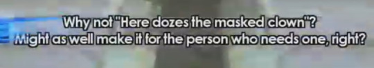
Infinite: What would you like your epitaph to read? How about “Here lies the blue buffoon”?
Sonic: Why not “Here dozes the masked clown”? Might as well make it for the person who needs one, right?
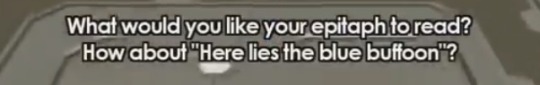
I think you can see where I’m going with this point, let’s move on now to the other point I wanted to make, which is also kind of a major tone shift from the point above
This point ties in with the “2 sides of the same coin” bit, but the point I want to make is that Sonic needed companionship to win. (Take a drink of water every time I write the word “companionship” or anything similar starting now, see how hydrated you get)
He needed the avatar character to support him throughout that fight, he needed the avatar & classic to help him defeat the eggman and ruby as well, he needed companionship.
This theme of him needing support and a companion is echoed through the very song that is the theme of forces, I am, of course, referring to Fistbump
AGGHHHH I LOVE FISTBUMP SO MUCH IT’S SO GOOD THEMATICALLY AND IT’S ALSO JUST A GOOD SONGi want you to know I’m snarling and biting and growling like a rabid animal but in a good way I’m sorry I just needed to say that real quick back to the point I was trying to make
Now, the first indication that Sonic needs companionship is that Fistbump is literally him “speaking” to the avatar character, the lyrics portray this perfectly, but I am going to stop myself before I go on a tangent about this song for too long, so next um dot point
The second indication he needs companionship using Fistbump is that it plays whenever he double boosts with the Avatar and during the level Null Space, the double boost is self explanatory, it’s them working together, they’re being friendly friends!
What people may not completely get is me bringing up Null Space, because, once again, there’s seemingly nothing special but there is. There is to me. In my heart. I love Null Space as well as the other stuff mentioned here because it ties into this insane bs I’m concocting for my viewing pleasure that just so happens to get to be on tumblr too!!
Null Space is a level where Infinite sends Sonic and, accidentally, the Avatar character to the level’s namesake, Null Space. Null Space is devoid of substance or life, it is the loneliest place you could ever be, but here Sonic and the Avatar are, the complete antithesis of such a concept, they are together, they are safe with each other, they are going to get out of there together.
And so they escape, and what is playing in the background as they do so? A version of Fistbump dedicated specifically to that level.
Before I can make the rest of my points, we have to talk about the elephant, er… jackal, in the room; Infinite.
Let’s start with a general thingy like we did with sonic, now, I’m not gonna go over his actions in game, they speak for themselves, I will, however, be talking about the implications of his actions; his morals, his values, all of that
First off let’s collectively discuss and by discuss I mean go ‘what the actual fuck is wrong with this dude’
It’s very clear that he’s just not a “good” person, he does morally frowned upon things like being a mercenary, of course, that’s one of the big ones, but the one that really fucks with me and makes me really wanna pick his brain is that despite Shadow being the one who hurt him, he immediately clicks to Sonic and the best way I can describe it is him going “i NEED to beat the ever loving shit out of that kid right now.”
Like, even during Episode Shadow, he still mentions Sonic with this personal malice that you don’t expect, stating that Sonic won’t be able to stop him, and it’s honestly just kind of weird tbh???
So he hates Sonic from the start, he gangs up on him, beats him to the point of unconsciousness, kidnaps him, is indirectly (at least) the cause of 6 months of torture, beats him again, tells him he’s not even worth killing, tries to kill him and the entire resistance by throwing the sun at them and then tries to kill him personally before Sonic can finally get the revenge he wanted.
So I’m sensing a lot of initially one-sided hostility between him and Sonic.
Another point is that his theme seems to be directed towards Sonic, it is mocking him, trying to tear down everything he establishes in Fistbump, stating that friendship will get you nowhere when you rely on it too much, asking who is going to save Sonic from Infinite when he is alone?
This is once again shown with how he interacts with Sonic, using Silver and Infinite’s little tussle as a comparison, yeah, Infinite throws an insult, but it’s as a collective, he says he’s happy to crush a hero to keep the “rabble” (the resistance) in line, but when Sonic appears it becomes very personal
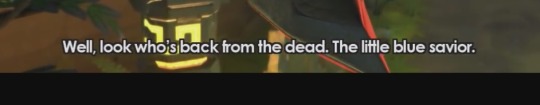
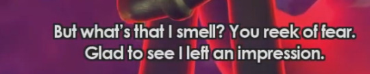
He’s immediately on him, stating that Sonic is “back from the dead”, calling him the “little blue savior” and insisting he can smell Sonic’s fear, glad he’s left an impression, noting that Sonic is “still thrashing around”, in his own words.
He speaks to Sonic so personally, hell, he waits for Sonic to quit talking before tossing Sonic to another part of the jungle to fight him alone. He very well could have gotten rid of Silver and then dealt with Sonic, but he instead decides dealing with Sonic immediately is more important than Silver is. He even says that he will meet Sonic again after that fight.
he also threatens to smash Sonic into blue jelly. I just wanted to mention that because it’s funny that he specifically said he would smash him into BLUE JELLY
So it makes me wonder, what is this dude's issue??? Why is he so obsessed with Sonic? And then it kind of hit me. Sonic is the antithesis of everything he values and believes in, of course he’d be intrigued.
Or, alternatively, he’s intrigued because Sonic is just like him.
Yep, It’s the moment we’ve (me) all been waiting for! We’re finally discussing the “two sides of the same coin” point!
Sonic and Infinite are exact opposites but they are also the exact same! They both so desperately need support and companionship (I’ve covered Sonic’s need, but we can see how Infinite needs support and companionship with how he handles the loss of his squad), they both have the same kind of goal (change the world to be a place they would want to live in, good or bad), they’re both associated with the same people (Shadow and Robotnik)!
They are the exact same but they are exact opposites! They are each other’s foils but they complement each other so well, they are two sides of the same tarnished, damaged coin!
I LOVE SONIC FORCES SO MUCH WHY AM I LIKE THIS
Sonic and Infinite are what they could have been based on how they responded to their own struggles. Infinite could have very well been just like Sonic, dedicated to helping people because of what happened at Mystic Jungle, and Sonic could have very well been just like Infinite, lashing out and hurting everyone in his way because of any of the copious losses he’s been forced to deal with.
But they don’t, they become the person they are because of how they respond to their own struggles, trauma, losses and wins. And that’s the beauty of their characters.
Sonic and Infinite are foils to each other, it’s a point you can’t argue, but the reason they are foils to each other is because they are the same in some weird, messed up way.
But I wanted to add one more thing before I finish this off.
Infinite very well left an Impression on Sonic. Like it or not, somehow, someway, Infinite’s concepts and ideals imprinted on Sonic and it made him and his own problems worse. So much worse.
I won’t go into too much about that because that links to other things outside of solely Forces, so yeah, tangent done. Thank you for listening
#infinite the jackal#sonic forces#sonic the hedgehog#sth#sonic#infinite#long post#what else should I tag#Sorry if you didn’t want to be @‘d I just love shouting out people because they are cool#*slaps roof of jackal and hedgehog* these bad boys can hold so much trauma and also rage apparently#*also slaps roof of shadow. Idk why I just felt like I should considering we’re talking about forces*
78 notes
·
View notes
Note
잔 ── hello ੭ ask
ᰋ ː ՞ hello everything is fine? first I would like to say that: your tumblr is amazing and beautiful!
ᰋ ː ՞ second I would like to know if you could tell me how you make your gifs and the quality of them. please. 🪺
hi!! im doing good, hope you are as well. and thank you <3
sorry it took me a few days to get everything together. but here's a basic tutorial of how i make gifs:
to start, i explained here what programs i use and how i choose source videos to gif. that link is actually an old tutorial I put together about my gif making process, but ive changed a few things since then that i think improve quality so i figured i would explain everything instead of just the changes . for the things that have stayed the same ill just be copying and pasting
so there's a few parts that ill go over here:
importing frames
converting frames to layers
sharpening
coloring
saving
STEP ONE: IMPORTING FRAMES
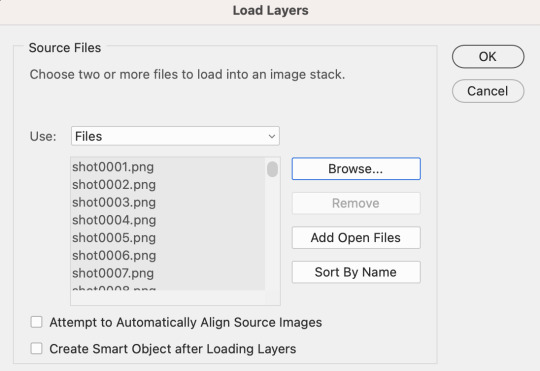
to start, go to file>script>load files into stack
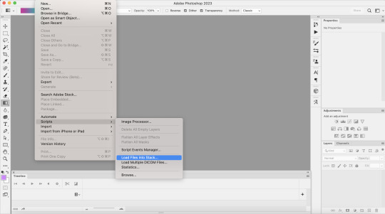
this is where you’re going to load in the screencaps you just took. go to browse, then select the first screencap and hold down shift until you select the last screencap, then hit ok
after that, i crop my gifs using the crop tool on the side of the screen. on the top of the screen i usually select square, but the exact size and shape depend on what exactly im making
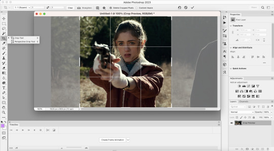
next I go to image > image size. tumblrs standard width for single gifs is 540p, so thats almost always what you'll use for width
STEP TWO: CONVERTING FRAMES TO LAYERS
so here's where we actually start to make the picture move. to begin, click "create frame animation" at the bottom of the screen. this is what it looks like once you've done that
next, go to the three horizontal lines across from the word “timeline” at the bottom. once that menu opens, click “make frames from layers” at this point the gif is backwards, so you’ll want to go back to that same menu and click “reverse frames.” I forgot to take a screenshot of this point, but you should see more individual frames in the timeline now - however many you imported during the first step
now that your gif’s frames in the correct order, you can set frame delay. select all the frames in the timeline, then right click. i almost always set frame delay to .05, but if i have less than ~20 frames ill set it to 0.06
next, click the symbol in the bottom left corner (you can see it in the photo above) to convert the frames to a video timeline. after this, on the bottom right side, select each layer of the gif under the “layers” tab. right click, then select “convert to smart object.” this is what your screen should look like before converting:
STEP THREE: SHARPENING
once you've converted your layers to a smart object, you can begin sharpening. this is the stage that can really improve the quality of your gif, especially if the source itself wasn't great.
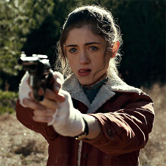
for example, this is what my gif looks like before i begin:

i personally sharpen my gifs four times. to start, my settings are 500% at 0.4px:

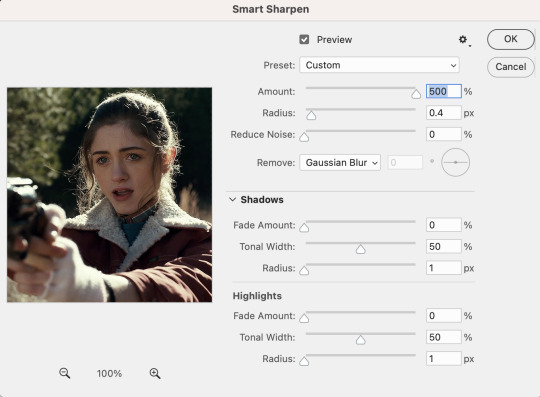
next, i repeat the same steps, except my settings are 10% at 10px
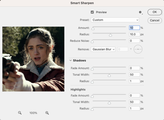
i then repeat those two steps again, so my third sharpen is 500% at 0.4px and my fourth sharpen is 10% at 10px. here's what it looks like after the third:
STEP FOUR: COLORING
so theres really two parts to coloring. first is adjusting the lighting, and second is adjusting the color. the amount of adjusting you do will depend on what exactly you're working on. for example, for this, im not really adjusting the colors, just fixing the lighting.
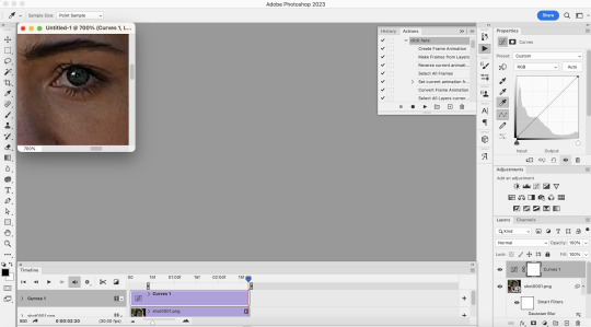
to add adjustment layers, you can either 1. go to layer>add adjustment layer>select the layer type 2. pick a layer type from the icons on the right side (above the layer list)
i always start with a curves layer. the key to this is using the bottom dropper tool on the right side (see below image) to select the lightest layer in the gif. personally, i always zoom in on the characters eye, because theres usually a white speck from the reflected light. your other option is just clicking "auto" and photoshop will make the adjustment for you.
next is brightness. for this, i almost always just hit auto

next is layers, and i use the same technique mentioned under curves

once these are done, i add a selective color layer specifically to increase black. to do this, i create the layer, go to black, and then increase black to whatever i think looks best. this is another way to try to improve quality, as it can kinda make the gif look sharper
next i added a vibrance layer. for this, i increase both the vibrance and saturation to make the colors stand out more.
after i added the vibrance, i realized that her face looked a little too saturated compared to how i wanted it, so i corrected it with an additional selection color layer in which i went to red and decrease the magenta and yellow a little, and then did the same under yellow. when you gif people, a lot of times you'll have to play around and figure out how to correct skintone, because sometimes adjusting lighting can make it look a little unnatural. in my experience, the easiest way to do this is by adjusting the red and yellow tones either under hue/saturation or selective color.
next, i added an exposure layer to the gif to brighten it a little more. ill usually always add this at the end because so many shows are so dark that giving it that final additional brightness can make a difference
STEP FIVE: SAVING
once you’re done coloring, you can save your gif. to do this, go to file>export>save for web (legacy)
the save settings i use are perceptual, diffusion, colors: 256, dither: 100%, quality: bicubic sharper
also, the gif size limit for tumblr is 10M, so make sure your gifs are all under that size. if they’re too big, you can either adjust the image size on the save page (or while making the gif) or shorten the gif. i would recommend shortening the gif because adjusting the image will decrease the quality
i hope this was helpful!! i tried to explain everything as much as i could, but let me know if theres anything you'd like me to explain more :)
and here's the first and last version of the gif, so you can see them side by side:
(also, i created the "tutorial" gif at the top way after i made the rest of the examples, so i dont have the full tutorial for it. but basically this is what i did:
selective color 3: green > +100% cyan +100% yellow -100% magenta, yellow > +100% cyan +100% yellow -100% magenta, then used the brush tool in black to paint over her face, getting as close to her surroundings as possible to remove the excess yellow
hue/saturation 2: green saturation +45
hue/saturation 3: green hue -60
the text effect i explain here
and the box is made by hitting "command" + clicking on the base layer of your gif > adding a new layer > "stroke" (edit > stroke) > choosing your settings, and then adjusting to the size you need)
2 notes
·
View notes
Text
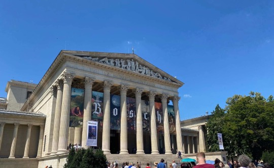
Okay so I finally visited the museum Steven worked at. The first part of the show takes place in London, but the scenes were shot in Budapest, Hungary. Steven’s museum scenes were filmed in the Museum of Fine Arts.
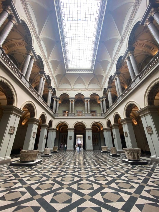
Most of his scenes are in the Marble Halll, the Renaissance Hall and my personal fav, the Romanesque Hall. These halls are actually empty, the Egyptian exhibition is on floor -1. Most of the relics displayed are just part of the set they built I guess, because the Egyptian part of the exhibition is quite small and for example the tall columns are not part of the collection (although I saw the sarcophagi and the crocodile that is shown very briefly in one of the scenes).
Here are some photos and reference images. (Sorry for the bad quality, I can’t make screenshots on my iPad so I took photos of the screen. But hey, I’m fairly sure you remember these scenes from episode one. :D)
The museum from the outside (yes there’s a Hieronymus Bosch exhibiton atm, I checked that one out too):

The Renaissance Hall:
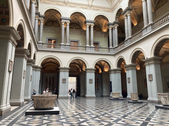


The Romanesque Hall:


I wasn’t allowed to take photos at the exhibition (I did anyway haha), but I saw a bunch of tiny stele, ushabtis, sarcophagi, actual mummies and canopic jars too.
Also, every visitor was so focused on Bosch that the halls were basically empty. I stood there in the middle of these vast halls and took them all in. It was kinda catarthic.
#museum visit#moon knight#steven grant#reference images#something interesting#dunno if it will interest pp but i’ll share it anyway#it was fun
58 notes
·
View notes
Note
I clicked on that link of xz supporting his friend and it looks like people were using that to say he's gay (not like b/jyx ppl I don't think but ppl who hate him) and then ppl saying no he's straight cause that's what his friend wrote, am I right?
Hi, anon! Sorry it took me soooo long to answer it. For those who have forgotten what anon is talking about, it was one of my reblogs (which I can’t seem to find rn), that included this link to XZ supporting a friend of his who had come out of the closet.
Short answer: your interpretation of the article wasn’t that wrong, but I’m not sure if you’ve got the correct sequence of the story, so here it is my answer.
Disclaimer: fake fake fake, ofc.
For those who don’t know Chinese, let me explain a bit first. The OP from the link is asking: is XZ straight?
The most liked answer is talking about a reply gg left on a friend’s post in 2011, back when he was still a university student (but the screenshot is from after gg had debuted, so his username had the X-9 part).
A friend of gg had posted about his new bf, effectively coming out with it.Gg appeared in the comments section:
Gg: Aiyo!! please explain
Friend: buf, seeing you appearing so suddenly, I feel a death aura from you~
Gg: Haha... you didn’t tell me even though you got a partner, congratulations! hehe
Friend: Maybe I can bring him next time we hang out and introduce him to you, haha, thank cute xiao-jie’s congratulations~ I just didn’t dare to tell you~
Gg: You didn’t dare to tell me... why? haha
Friend: (blurred out text) ... straight, you aren’t gay~
Gg: (embarrased/sad face 囧).... aren’t we friends.... if we are, I’d congratulate you...
The text that accompanies the photo says: because XZ is straight, his gay friend didn’t dare to come out of the closet to him, and xz answered: we’re friends, I’d congratulate you.
There are more screenshots accompanying that one:
A classmate saying in 2013: more than 180 cm tall, knows how to wear fashionably, sings beautifully, can take good photos, no saving for me. What’s more important, he’s not gay
A reply to a post asking whether gg’d been outed: what! his direct classmate (gay) vouched for him and told me himself that he was straight!
It also includes a photoshopped post of gg using “gay slang”, that was later proved by fans that it was photoshop and that gg never posted those words.
So the photo and the other rumours were being spread by haters and antis, saying that gg was gay in a not-good way. Please remember that there is a difference between believing that someone must be lgbt, and a whole another thing to say that someone has an “abnormal sexual orientation”. The tone is important!
This is very complicated in an upsetting way. The “proof” attached by this user replying to whether gg is gay was trying to prove that gg is not gay, just supportive of lgbt, because they believe that being gay is bad. So, anon, you’ve encountered well-meaning fans trying to defend their idol from rumours they believe will damage their image (there’s no need to say that they’re probably solo fans, I think).
In summary:
A user asked “is XZ gay?”
The most liked reply (673 likes) says that he must be straight since his gay friends said he is. This user also clears up some rumours about gg using lgbt slang in a public post, which is definitely false.
I think this reply was probably written by a xfx (gg’s solo fans), though the post was quite homophobic. They probably had well-meaning intentions, like “I’m defending his name and his reputation!” but whether it was actually beneficial is very debatable.
Once again, I don’t think it would be good for them if bjyx started to say “they’re gay” publicly (the use of their names is prohibited in the supertopic for a reason!) but to deny it so vehemently isn’t exactly helpful for them in the long run, imo. This doesn’t apply in this case, obviously, because the writer felt that saying that gg was gay is an offense.
A little bonus (pure speculation!):
Please notice that I’ve highlighted that there was a part of the friend’s reply that was blurred out, precisely in the part in which the friend says “you seemed straight, you aren’t gay” part.
This conversation is very old and gg’s posts aren’t visible if they’re older than 6 months, so we can only rely on screenshots for these things. The name of his friend is blurred out for obvious reasons, but for some reason, a part of his friend reply is also blurred out.
Why is it blurred out? It may be completely unconsequential and unimportant, just a editing mistake, but I can’t help but think that if a part of the text was blurred out by solo fans, there might be something they don’t want others to see. What does it say? Maybe we’ll never find out.
Bonus nº2:
Btw, gg has a very brave friend, who dared to come out when the things weren’t looking so good for those who dared to be different. Cheering for gg’s friend from here!
Bonus nº3:
A lot of the replies were affirming that he must be straight, since he had a girlfriend before, while he was studying at the university. And I’m like.... bisexuality? Discovering your sexuality after having a romantic partner? There are a couple options out there, but they are just... refusing to see them? I must admit that this is quite confusing, especially this phrase from one of the replies: “he had a girlfriend, he can’t be bisexual!”
Bonus nº4:
For those who might be disheartened by that xfx (and I feel very tired just by reading so much homophobia, since most of the replies had a very harsh tone), here I have the last sentence of a reply by another solo fan (at least they didn’t give the vibe of being a bxg, and they spent a long post talking about gg’s qualities), even though they said at first “he must be straight...”:
“... If there’s any possibility of you not being straight, I want you to not be afraid of letting us fans down, you have to chase bravely for your own happiness! I’ll be guarding you from here! As we agreed, protecting each other, feeling proud for each other!”
Another reply I liked:
“What age is it, is important whether he’s gay? In Taiwan same sex marriage has even been legalized, must our thinking remain so stubborn and traditional? Don’t fans like him because he’s a role model, a talented person? As long as he remains in this industry and keeps his heart, isn’t it enough? And I’d like to add another thing, must love be limited by gender? Whether he’s straight isn’t important, for me, as long as there are aspects I like of him, I’ll enjoy him”
And this:
Whether he is or not doesn’t matter, as long as he’s happy
181 notes
·
View notes
Note
what app do you use to make your gifs? how do you make them?
hi!! i use adobe photoshop 2021 to make my gifs!!
⮇how under the cut⮇ (i'm really bad at explaining things so sorry in advance for all the photos skfkwui)

— downloading and screencapping
i make my gifs using the screencapping process, meaning i download t*rrents from a site (i use rarbg, but others use different ones) and open them in a screencapping software (i use potplayer, but i know that mkvplayer also works well) that takes screenshots of each individual frame.
— opening screencaps
when i open photoshop, i go to "file -> scripts -> load frames into stacks..." [outlined in blue below]


which opens a menu that looks like this

then i click "browse" [outlined below] which opens the folder that holds my screencaps and i select the ones that i want

— making the gif
once i have all my layers (screencaps) laid out like this (using lena as my example skdjf)

i click "timeline -> create frame animation" (it may say "create video timeline at first"; all you have to do is click the little arrow to the right and click "create frame animation")

once the frame animation has been created, it looks like this

then i click the three little lines in the top right [outlined in white below]

in the menu that opens, i click "make frames from layers" [highlighted in blue below]

which does this, meaning all the frames have been loaded.

loading the screencaps this way reverses the order, so next i click (in the three line menu again) "select all frames + reverse frames" which puts all the frames in the order i want them to appear

then, with all the the frames selected, i click the bottom part that says “0 sec.” and click ‘other’ on the dropdown menu [highlighted in blue below]

when setting the frame delay, to get a gif that plays in the same speed as the film/tv show i’m giffing, i would set it to 0.05 or 0.06 because that’s the amount that’s in the actual film; i like my gifs to be a little slower than the media is, so i set mine to 0.07 seconds

then i click the bars at the very bottom of the timeline screen [outlined in white above], which turns it from a frame animation to a video timeline

next, i click the ‘layers’ tab and select all of the layers by selecting the top one and scrolling to the bottom and clicking the last one while holding shift and i right-click and select “convert to a smart object” [higlighted in blue below]

which combines all of the layers, making it look like this

— cropping & resizing
before i can save the gif, i have to crop and resize the image to fit tumblr’s limits, 540px wide & 810px high. most of the tv shows i gif are 540 by 260-300, so i usually make my cropping size within that range (crop shortcut is c)

i make it the image size as well, by clicking “image -> image size” or the shortcut, alt + ctrl + i


— saving
(shortcut: alt + ctrl + shift + s) my save settings are as follows. i change ‘adaptive’ to ‘selective’, matte to ‘none’ and quality to ‘bilinear’ instead of ‘bicubic’


et voilà! i have a gif ^_^ if this is all you needed, i’m glad i could help!! however, i’ve also included my colouring and sharpening settings so that you could have the full experience of how i make my gifs

— sharpening
personally, i like my gifs Crisp and Clear, so i use smart sharpen, and two layers of it. i click “filter -> sharpen -> smart sharpen”

the first layer is in the amount 500%, radius 0.4px and reduced noise at 10% the second layer is in the amount 500%, radius 10.0px and reduced noise at 0%, and removing gaussian blur


which gives me this:

i usually prefer my gifs to have noise (all further examples will contain noise), so i add an additional noise layer in the amount 1.2%, distributed gaussian and monochromatic

which looks like this:

— colouring
all of the colouring options i use are mainly adjustment layers, found in the adjustments tab (katie mcgrath is very pale, so my lightening settings might be a little too light for any other subject)

— brightness/contrast
most of the time, i start with a brightness/contrast layer, the icon for which looks like a shining sun that’s half-hollow

my brightness and contrast settings depend on the lighting of the scene and how i want the final product to look. for this gif, i found that having my brightness set at 45 and the contrast at -30 yielded the results i wanted

here’s the brightened gif:

— levels
next i add a levels layer (i’m not 100% sure how/what it does), the icon for which looks a little bit like a crown to me

i use the eyedroppers on the left-hand side to change the levels of black, grey and white in the colours i drop it on. [the grey dropper is outlined in white below; the black one is above it and the white one is below it] i pretty much always use the grey one, as it gives me the results i want better than the black or white ones. i usually click around until i find colouring that suits the scene

then i up the first blank to 20 and see whether i want to raise or lower it, and do the same with the second one, upping it to 1.70 and playing around with it until it looks the way i want it to

which makes it look like this:

— curves
next i add a curves layer, the icon for which looks like a graph with a curved line going through it

there’s really no rhyme or reason to how i use the curves layer, it’s all up to my discretion and how light or dark i’m aiming for the gif to be

and it turns out like this:

— exposure
exposure is one of my favourite settings !! the icon looks like a rectangle in the yin/yang fashion, divided diagonally, with a + in the white half and a - in the dark half

my exposure settings generally don’t exceed 0.500

which makes the gif brighter:

— vibrance/saturation
these help me make the gif either more or less vibrant. the icon is an upside-down triangle with some shading in the middle

i turn the vibrance down and bring the saturation up, mostly playing around until it looks right
achieving the colouring i want:

—gradient map
sometimes i add a black and white gradient map, set in soft light & in the opacity 20%. the gradient map icon is a rectangle with a dark-to-white gradient

without any change:

to change the light & opacity, i open blending options [outlined in white and highlighted in blue below]


to change the light, i click “normal” and select “soft light” in the dropdown menu [highlighted in blue below]

soft light, opacity 100%:


soft light, opacity 20%:

and i’m done! i hope that made sense and if you have any more questions, please don’t hesitate to ask <3
#ask#anonymous#gif tutorial#tutorial#clubgif#long post#i had to use small text otherwise this would've been entirely too long
12 notes
·
View notes
Note
What is your opinion on the portrayal of bloodbending vs that of energybending in atla? It might be a stretch but I think because energybending is solely used by Aang, it is not thought of as "evil" as the way bloodbending is.
That might be the most perfectly succinct way to describe the difference between the two bending forms that I have ever seen.
A part of the fact that Aang does nothing to gain the ability to energybend and instead it is simply bestowed upon him at the last second as a cop-out to making a choice, is that this technique, its cost and its consequences are not at all discussed in any form. In “The Puppetmaster” we got an entire episode dedicated to the way water can be harvested from practically anywhere, including the human body, and what it means, with the disturbing visuals of dead Fire Lilies and crumbled sucked-dry trees to drive the point home

and this comes as an extension to the already established manipulation of water in plants that we saw in “The Swamp” and the creative water sources in “The Runaway”. In “The Old Masters” and “Avatar Aang” we get, like, what? a combined 30 seconds of explanation of how energybending works? only it’s more of an inspirational quote than an actual explanation... Honestly, we still don’t know how this works or why it works and why is Aang able to preform this technique in the first place.
Considering the horror narrative of Hama’s story and the atrocities that she committed*, it’s obvious why bloodbending was framed in such a dark and heavy light when it was presented. The fact that is was never touched again except to be used when Katara was at her “darkest” in “The Southern Raiders”, shows what the creators think about this ability. It’s ridiculous to think that in thousands of years of history not a single waterbender besides Hama has ever bloodbent**, or that there is no existing traditions, discussions about it’s possible use in healing, or even taboos about this subject in Water Tribe cultures. But, anyway, the writers just tossed this ability aside and declared it “forbidden” in LoK, so that kids will know just how bad bad bad this bending form is.
Energy bending, on the other hand, never got this treatment, even though it is absolutely horrifying???? and lacking any redeeming quality that I can find like with using bloodbending for healing??? They didn’t bother to go into the depths of horror that is energybending in AtLA, but boy oh boy did they try to in LoK. But instead of actually talking about energybending they did a pretty sinister thing (in my opinion), that feels like it was specifically made so as not to taint the purity of the technique and its wielder, and just copy-pasted the implications of energybending onto bloodbending.
LoK’s first season actually tried to touch on the pain and devastation of what it means to be stripped away from your bending abilities. And even though it was far from perfect and never fully explored or resolved, at the very least they showed us that side. We see how drained and sad that pro-bending player (don’t remember his name) was after losing his bending, we see how heartbreaking Lin’s power-stripping was and what a sacrifice she had to make to ensure that the last airbenders in the world will not lose their abilities, we see how broken Korra is after losing her own bending, even though she still has airbending, and the very very much implied suicidal thoughts that it brought to her. We understand that taking someone’s bending has gravitas, has deep emotional implications. But... we can’t talk about energybending in a bad way, right? So...

HEY KIDS! Did you think ebergybending was a random ability that did whatever the plot needed it to do with no plausible reasoning or explanation? Well! From the people who brought you the Magic of the Pointy Rock, we re-introduce you to bloodbending!! But now! It can take your bending away! For some reason! We don’t know why! It just does!
**Bryke at some point, probably**
So beside shifting the entire discussion from one technique to another, even though only one of them actually does the thing we are talking about, they went so far as to make sure we don’t suspect for a second that what we see is actually energybending, showing Amon/Noatak always positioned behind the person he strips, using only one hand on the forehead
instead of Aang’s position in front of the person, with two hands, one on the forehead and one on the chest (don’t even get me started on what a horrible ending this shit was. I swear if I see one more literal deus ex machina in this franchise I’m gonna scream! oh wait, this is just season 1...)
(Sorry for the low quality of photos. I don’t have LoK for obvious reasons so I had to screenshot these from youtube)
So, in summation, yeah you’re absolutely right. Energybending is specifically and methodically portrayed in a positive way, even when it shouldn’t be, especially in light of and in contrast to bloodbending, a form that gets far too many beatings and more than it deserves, for reasons that I don’t understand at best and I don’t think I want to understand at worst (the fact that this is a Katara-centric ability and her lack of statues in LoK, its connection to Katara’s very much existing brutal and belligerent tendencies that are continually ignored and swept aside for the “dream girl” image, the connection between bloodbending and anti zutara rethoric in tsr... this list isn’t pretty)
----------
* I still don’t understand how Hama’s victims were alive. She kidnapped just one person each month, but the cave was full of people. Did she feed them? cleaned their potty buckets? like what was the point?? to make them live through the pain that she had to live through as a prisoner? how is this sustainable for one old lady? this makes zero sense and drives me crazy to this day. There should have only been one living person, the most recent that was kidnapped, and just skeletons around them. That would have been more logical. And it’s not like skeletons weren’t shown on the show... sorry, I’m rambling (and haven’t seen the episode in years, I hope I remember it correctly).
** Toph’s metal bending is a little different, since obviously metal had to be invented at a certain point so no one could attempt to bend it before that. Human bodies on the other hand have been more than available and full of water since the dawn of humanity, and I doubt there hasn’t been a single waterbender powerful enough who could sense the presence of water in people and, I don’t know, tried to talk to someone about it? also, waterbenders are healers?? they actively know the human body, not just coincidentally? how did no one talk about this before?? and regarding metalbending again, It’s not entirely unreasonable that Toph really was the first to bend metal, since of course there has to be a first in everything. But honestly if you ask me it’s a little... weird. But this is very much off-topic.
#shees i went off#i guess i got feels#sorry for anyone who liked this before my endless editing#i just keep seeing mistakes and things i want to change...#also#can you tell i’m an associative writer?#if tumblr would have allowed it i’d have footnotes#i’m a sucker for footnotes#katara#aang#energy bending#blood bending#bloodbending#energybending#atla#avatar the last airbender#atla meta#atla commentary#lok#legend of korra#korra#lok meta#lok commentary#amon#noatak#yakone
121 notes
·
View notes
Text
idol land pripara, huh?
maybe me having more interest in the pretty series these past few weeks was a premonition. Anyways here’s my epic analysis post (also as i write this pripara is trending on japanese twitter. Epic)
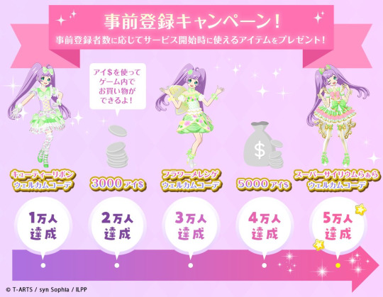
starting out with the pre-registration image. this confirms we’re getting new coords in the game. pretty cool. also this image confirms the currency used in game, ai$ which i assume is a pun on “aidoru” because the dollar symbol is pronounced “doru” in japanese.
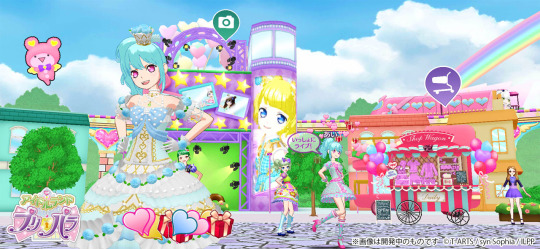
here’s a screenshot of the main menu/overworld? the entire game looks as if it was built using all idol perfect stage as a base which is likely. we see the photo studio directly behidn the player character, which i’ll get to in a bit. i assume the kuma that’s on the screen is the player’s mascot and will change depending on the player. we can see a shop wagon, which is how we’ll get new coord pieces i assume. it’ll most likely be a gacha system because it’s a mobile game and pripara already uses gacha systems in its non-arcade games but who knows.

mychara creation screen! we also get a glimpse of the rank up system above. considering this is a mobile game with a gacha system (probably) i assume this will work similarly to other mobile game level up systems but still using iines as exp. by this is mean itll reload whatever stamina system they have and also unlock new content.
onto the creation part. the sections here appear to be face type, hair style, hair color, eye color, voice, glasses, and Other™. anyways this means pripara is carrying over prichan’s “choosing voice separately from face type” system which is very cool. hopefully this also means they’ll have the new voices prichan introduced too.
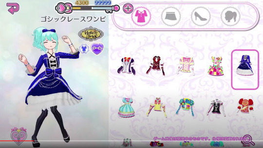
coord select screen! (sorry for the youtube bar over it i took this screenshot myself). first of all the rank bar looks different here. the numbers displayed are different on both sides which leads me to believe yeah this is an exp bar and it resets when u rank up.
anyways onto the actual coord select screen. it looks sort of plain compared to past ones but in terms of efficiency it is much better because u dont have to scroll through coord items one by one. i assume you can filter things through pressing the search button on the right.
(only vaguely related but i do wonder how coord color will matter? it’s displayed so it means something.)

bad quality here but photo studio! this is personally a feature im very excited for. anyways at first i thought the sidebar was for choosing characters but i think it’s for choosing poses considering the character’s pose is identical to shion’s in the sidebar also the “pose” button is lit up”
ok my theories on what these buttons on the bottom are left to right:
- return. this is pretty straightforward you exit out of the photo studio
- flip. just flips ur character horizontally
- pose menu. u choose the poses.
- this one probably changes the orientation of the photo? who knows.
- background select. in another screenshot its shown that you have a gallery of photos to pick from but a lot of the backgrounds arent displayed on the menu so. idk whats goin on there. maybe a camera roll select function? the backgrounds do appear very realistic
- photo button. pretty straightforward
- video button. on the sidebar the characters on the right have video icons on them so i think there will be static poses and also video poses to take video of. pretty cool!
- log of photos you’ve taken? maybe.

back to the overworld! here’s the building you use to play songs. im really hoping the screenshot above is like... accurate to the features in-game because it means we’re getting characer hairstyles/colors for mycharas again (epic)
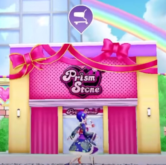
prism stone! this is also marked w/ a shop icon so it’s also a shop area. maybe it’ll work differently to the cart or something? idk
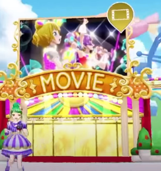
movie! this is very interesting because it looks like it’s a gallery for anime lives. i mean i’m certainly excited it’s kinda hard to find good quality versions of the anime lives on youtube nowadays

exit. it’s an exit. exits you out of the game
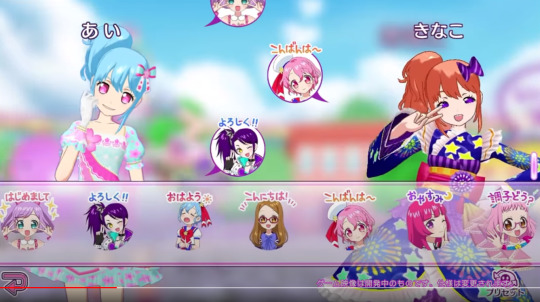
this is a very interesting screenshot! because it means we’ll have actual multiplayer? not just exchanging tomotickets but like.. actually playing together. also very cool stamps.

sorry for the horrible quality but it looks like there’ll be some sort of photo-taking function that isn’t the photo studio? in motion it looks basically the same as the prichan photo taking function so i think they just put that into pripara
anyways that’s all the content i have to look at for now.
other thoughts:
- at launch i think they’ll only have the mychara parts/coords from all idol perfect stage because i cant seem to find anything that wasnt in there. however this is a mobile game so it’s only natural that they will update it with new content over time
#pripara#idol land pripara#priparas trending above a ban//dori bday hashtag. wild.#also im only censoring that so it doesnt show up in tags not bcs i dont like it
8 notes
·
View notes
Note
ooook so like do u print the screenshots directly from ur laptop or do u edit them in like photoshop or something? do the frames usually fit on printer paper without looking weird or cut off? sorry for all the questions
depends on what i want to do with them. they’re just regular image files like any other image files, like the photos you take with your phone for example, so it’s up to you what you wanna do with them. you can alter them with photoshop or you can just print them as they are. i use windows and if i just want to print the image or the images, i right click and just choose printing with the pre-installed photo client of windows which lets me choose how many images i want on one sheet of paper and if i’d like them automatically formatted to fit my selection or if i want the original format. but you can also print through photoshop where you can choose the exact size of the printed image. i usually print two images on one sheet of a4 paper, especially if i want to manipulate the image a lot. but if i want a severly reduced image quality or want to save paper and don’t need a “good” image quality anyway, i also like to work with nine images on one sheet. there are some options given by the windows client. you can just try around what suits your needs. hope this is actually what you’re asking about. if you want to know anything further about a specific animation i made and what methods i used for it, just let me know which one it is.
5 notes
·
View notes
Note
How did you make your edits for the Austin Moon stuff?
hello bobby lol thank you for the ask!!! um my explaination is going to lack technical terms because i kind of just go with whatever looks right as i edit (hence some inconsistencies) but hopefully this makes sense.
to start: i do all the editing on my phone with the apps pixlr and proknockout. both are free, though they have a quite a bit of ads—they get the job done. additionally, all the original photos either came from ross lynch’s or laura marano’s instagram or a lot of google searching for the perfect picture
now the concepts for the playlists as fake albums came from me rewatching austin & ally this year and being like “wHAT HAPPENED IN THE TIME SKIP???” yknow those years between ally giving austin her book and them being on the helen show? yeah. i was like “what happened?!? i need to know” and originally i was thinking of a fic but i started also getting into the driver era and thus i thought up “what if like... austin moon had other albums?!” cos we kind of just know of his first album in canon. and then it extended to “hOLY MOLY WHAT ABOUT THEIR DUO ALBUM?!?” anyways that’s way more backstory so onto the edits
WiLdHeArT

okay so this was the simplest of the edits. basically i took this photo:
cropped it into a square, played around with some of the exposure and such to make ross look less washed out, and then rotated the image and put some text over it. the font is provided with pixlr and i chose it because it conveys how i’d kind of imagine austin moon’s handwriting. the “album” itself was meant to have a very personal/authentic aspect so i thought it fit.
for the back cover/track listing, i took this photo:
and used proknockout to crop out ross. then in pixlr, i layered it over a solid background, with some rotation. add some filters, played with lighting, then blurred the whole image before adding the text on top. definitely one of the more rushed back cover edits.
ECLIPSE

okay so i had fun with this! the front cover comes from this original photo from some magazine shoot the driver era did (i think it was MOOD but i can’t remember)
this “album” was intended to capture a darker side to austin moon’s music and i really love ross’ harley hair so i had to go with brunet ross lynch. in pixlr i cropped to a square, did a lot of filtering to have cooler tones (matching the darker feel of the playlist) and then played with a filter that adjusts texture. after that, i layered the image over itself with adjustments to size and position to get that distorted effect. then i added the font and such lol
for the back cover the original came from pexels which is a royalty/copyright free image site
basically to match the title i wanted to utilize an eclipse image. i played around a lot with how i wanted the track listing to be. eventually i figured it out, put the text down with pixlr, and then played with filter and exposure and such to get the bluish glow that matches the front cover edit along with a warmer tone for the background. then i used a filter that inverted the colors to get the contrasting blue-black side. then i used proknockout’s collage option to put the two together—kind of to convey the crossing-paths aspect of an eclipse.
last step was going back into pixlr and if you look closely, it’s not just a solid background. it actually has several lines of the text “there’s no way i could make it without you do it without you be here without you” which is an oblivious reference to the austin & ally theme song. it’s meant (in this au of sorts) to be austin giving recognition to ally’s impact in his life and career on an album that marks a step away from his past. ANYWAYS! the text just has very very low opacity to make it blend better.
where you are
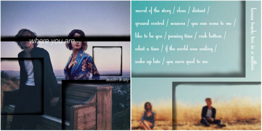
this one i think i had the most fun and the most trouble with because i could NOT find a nice image of both ross and laura. thus i had to search to find the right images. bc tumblr is limiting me to 10 images total on this, i’m only including one of the two images of laura i used. they’re both from the same photo shoot and screenshots from one of her recent instagram posts. the images of ross/base photos for the edits came from the driver era instagram.
okay so front cover edit took this phot of laura:
and used proknockout to crop her out of the background. then i used pixlr to layer it into this image of ross to kind of make it appear as if she’s standing behind the piano:
which you can see in the final edit! then i layered black squares, erasing majority of their inside, to get those black frames throughout the edit. finally i added text. originally I had a logo concept for austin & ally but then thought the simple font looked much better for the concept of the album—which was meant to convey their maturity as artists. also played around with the coloring and shadows and exposure.
finally for the back cover, i cropped this image (sorry rocky):
and used proknockout to take an image of laura sitting and layer it onto the driver era image. then i played with some exposure and filters to get laura’s lighting to match that of the original image. after realising the pic of laura was way higher in quality than ^this, i blurred it A LOT. then i used the same technique with the black squares, only this time lowering the opacity a bit. then i went with a font that was a bit more playful to set up the track listing. “two in a million” was left as a bonus track since it’s not on the playlist because it’s not on spotify.
and yeah! that’s how the edits were done! they were honestly a lot of fun and sparked by the playlists i made towards the beginning of this year. they all had a few different versions LOL but anyways, thank you for asking! i had fun sharing and i hope you enjoyed the playlists, the edits, and/or this explaination! sorry it’s not too technical!
#askbobby-t-wilson#mutuals#i dont have a tag for asks so i guess i’ll make it this#my writing#using the tiny font to save space on the internet lol#long post
1 note
·
View note
Text

For today's Venom book review, here is Japan's Venom movie program. Japanese movie theaters sometimes sell souvenir booklets that are not available in North America, so I'm super happy that I was able to acquire this for my collection! This publication contains pictures and information about the movie, including interviews and behind the scenes stuff. It's around the size of a magazine, but with a sturdier cover and pages made of high quality paper. Seriously, my scanner could not do justice to the front cover art (shown above). The cover actually has a metallic shine that looks gorgeous in person.
This booklet is not available in English or French (although there are a few little bits of English text here and there), but there are plenty of pics to enjoy. Some of them are in full color, and some of them are in black-and-white... well, perhaps black-and-pewter would be a more accurate description, because the program uses a silvery gray instead of white. It looks lovely, although some of the images are a bit darker than they would have been if regular black-and-white had been used.
Want an example of the contents? Check out this two-page spread from the center of the booklet, which shows the development of Eddie and the Venom symbiote’s relationship:

Sorry for the bad photo, but a two-page spread of that size is way too big for my scanner. Anyway, hopefully you can still see how that spread compares two images. One is a frightened Eddie having a face-to-face conversation with the Venom symbiote for the first time, and then the second pic is from near the end of the movie, with Eddie and the symbiote working together to stop Drake's rocket. Awww, they fell in love and saved the world!
Keep reading for the rest of the book review, plus a few more pictures!
The Introduction section of this booklet is illustrated with a stunning two-page spread that is half Venom, half Eddie. It's the same art that was used as the Blu-ray cover for the North American release of the movie, but in a huge size so the details can be seen more clearly. Wow! After that is a story synopsis and a few pages of screenshots from the movie. Here are two of those screenshots:
Next, there's an interview with Tom Hardy, and then a cool of drawing of Venom. So although most of the art in this book consists of screenshots from the movie (and a few behind the scenes pics), there are some additional images! Here is the drawing of Venom:
After that is the Making of Venom section, which is in black-and-pewter. I tried to scan one of the pictures from this part so you can get an idea of what I mean by "black-and-pewter", but once again my scanner couldn't really do it justice. Anyway, here it is:

It just looks black and gray in the scan, but if you see the booklet in person you'll notice that the gray has a slight metallic shine to it. Pretty! Anyway, for some reason the Making of Venom section stops after two pages so the booklet can cover a bunch of other stuff, and then resumes later. So the first part of this intermission is for short Cast Interviews with Riz Ahmed, Michelle Williams, and Jenny Slate. Then the booklet switches back to full color for a Cast Profiles page featuring Tom Hardy, Michelle Williams, Riz Ahmed, Jenny Slate, and Reid Scott.
Next is an interview with the movie's director, Ruben Fleischer. This interview is illustrated with some screenshots from the movie that have been modified with different colors. So a picture of Eddie sprinting down a corridor has been altered to look yellow, and a shot of Riot attacking looks greenish, and so on. After that is the center of the booklet with the two page-spread that I showed earlier in this review, then a column called "Kowakute Tanoshii Entertainment Venom" ("Scary and Fun Entertainment Venom"), and a couple more pages of screenshots.
Then the booklet switches back to black-and-pewter for the rest of the Making of Venom section, and after that it switches back to full color for the remainder of the booklet, starting with another cool drawing of Venom. Next is a Filmmakers page that credits some of the other people who worked on the movie, then a page with two more screenshots. This is followed by a column called "Kyouakuna Shugosha Venom" (Um... something like "Brutal Guardian Venom"? I guess it's the Japanese equivalent of Lethal Protector Venom). And to illustrate Venom's role as a brutal guardian, after that column there is a two-page spread of Venom defending Mrs. Chen from the "protection money" guy.
After that is another credits page, and then a page with comments from three of the voice actors who worked on the Japanese dub of the movie. Here are the Japanese voice actors (from left to right) for Venom, Eddie, and Anne:

For those of you who don't recognize those names/faces, Shido Nakamura (Venom) is the voice of Ryuk in Death Note, Junichi Suwabe (Eddie) is the voice of Victor Nikiforov in Yuri!!! on Ice, and Shoko Nakagawa AKA "Shokotan" (Anne) is a singer and also a presenter on Pokemon Sunday.
The booklet comes to an end with full color versions of the Eddie and Venom portraits from the Making of Venom section, and a couple of advertisements for Venom stuff. Check out this ad for a Venom figurine:
Overall, the Venom movie program is beautiful! It's so cool that Japanese theaters sell stuff like this! By the way, in Japan there are also little mini-posters called "chirashi" that are used to promote movies. I was able obtain a couple of those for Venom as well. Yay! So I'll take this opportunity to show those to you now. The first one has a very simple design, showing Venom's eyes:
In the above poster, the small line of Japanese text says "Tom Hardy", and as I'm sure you can probably guess, the larger line of text says "Venom".
The other mini-poster I have is the same art as the front cover of the movie program, although it doesn't have the metallic shine:

Cool, huh? Was the Venom movie promoted in unique ways in your area? If so, I would love to hear about it!
Well, I guess that’s it for today. Gosh, this was a long post, heh. I hope you enjoyed it! Keep my checking my blog for more Venom content! :)
#Venom#Symbrock#Veddie#Eddie Brock#Venom symbiote#Anne Weying#Carlton Drake#Shido Nakamura#Junichi Suwabe#Shoko Nakagawa#book review
90 notes
·
View notes
Text
Somethin’ Bout That Work
the one where Y/N and Harry talk about work, psychics, and Bingo
A/N: This was my most popular series and I’ve decided to re-upload it! :) Check here for the masterlist.

Harry. Y/N.
How was your day at work? New project, right? xxxxxx.
OH MY GOODNESS
Is this Harry Styles???
Did my phone decide to go to Church and get its ass blessed by the Pope?
The ass isn’t where they bless, Y/N. x
Weird, it’s always where I’ve felt my blessings.
Anal? xxx.
Also did you change my name from ‘XXX my ass’ yet - am I finally Harry ?
I’m into the Pope, ngl. What an absolute heartthrob.
[Y/N sent a photo.]

and absolutely not ? I cannot believe you’d shit all over our origin like that.
…so how was work
It was like that yellow drink you tried once - the one Nick texted me about.
That was nasty - I threw it up.
Yeah I have the screenshots honey-boo
But that’s how my day’s gone. Like, I had a presentation about how to transform the brand image and I’m using a mix of techniques that the best-selling juice brands are using, as well as my original concepts.. People don’t wanna drink juices that look gross, you know? Give them fun colors, give them quality things to relate to the juices, not body-loathing and self-hatred.
I’m sorry love :-(. x.
Your weird nose-smiley made me laugh and now I’m sadder.
Why are you sadder ?!
Because I hate that I laughed at a nose-smiley.
How was your day?
It was good, I had a bagel. xxx.
Honestly, I was gonna tease you about being an international popstar who eats bagels and considers that a “good day” but like…true.
It’s a fair evaluation of my day, if I don’t have a bagel - the best it can get is mediocre.
Can Harry Styles even strive for mediocrity? I feel like it’s not in the cards of fate.
I went to a psychic last week, btw x.
Really ? I thought you hated that shit.
Yeah but our texts from last week made me think it was worth a shot. xx.
Was it? What did they say? Are you going to meet a mystery brunette in two weeks?
The mystery brunette is kinda you, tho, you secretive lil punk.
MAYBE YOU’LL FINALLY MEET YOURSELF. Self-awareness n shit.
:-). xxx.
What did the psychic fucking say, my beautiful boy?
Can you pick a handful of sweet endearing terms for friends and stop trying new ones?
My sunflower from the highest mountain, my oodles of hugs, my baby swathed in the softest blankets, please tell me about your psychic experience.
They said I would be coming up on a hard part of my life, where a lot of my morals are tested and I’ve got to push through - but first decide who I really am, what I really want from life.
Sounds like baloney, you’ll be fine.
It’s something to think about. x.
My psychic told me that I might meet a mystery blonde in the next few days. Said that it would be startling but ultimately lead me to where I’m supposed to be.
I don’t think Chris Evans is in LA
He’s more like a dirty blonde brunette anyway…but TRU
---------------------------------------------------------------------------------------------------------
Have you ever looked around a room and GENUINELY thought “I’m richer than everyone else here”
It was once and I was 18. It’s justified. xx.
WOw. I cannot believe I actually know an Icon of my Generation.
Awwwww stop it :) xxx.
No! I was thinking about it the other day and I’m genuinely so proud of you. Like, Sign of the Times is going to evolve into something way beyond right now. It’s got that shit that means we’ll listen to it for years to come, consider it something of a snapshot of our generation and our time. It’s massive.
Also Kiwi….
hahaha thank you love x
Shut up I feel like you aren’t taking me seriously
No, I appreciate it.
Do you really or are you saying that
No I am, pinky promise.
..
.You’re the only one I’ve sent my ideas to, anyway.
What?
Like some of my song ideas.
I’m not the only one, Haz. No way
Yeah. I like your feedback.
…
Plus I only send you the ones I’m 99% sure won’t make the 2nd album.
You lil fucker oh my gosH
:-) xxx. I just like hearing your thoughts on them!!
I was gonna ask if you were free to call tonight, but now I just don’t know if I want to. So rude, sending me rejects.
No I’m free, I can do it. Can I let you know when I’m done with helping packing up? Xxx.
Sure. I’m going over to Nick’s and we’re playing Harry Styles Live Bingo.
What’s that ?
…
The free space is “Harry’s suit makes Nick’s Nan stutter” and some other spaces include “he makes everyone sing Kiwi more than twice”, “his suit costs more than Y/N’s rent”, “he calls someone out for not having the Harry Styles definition of a ‘good time’”, and “his hair floofs”
What’s the last one about xxx.
Your hair floofs and I love it.
How is that Bingo
It’s not. It’s just my appreciation and love <3
I’ll take it, then.
I wish you would grow your hair out a bit more though.
You said that last week.
And now you’re wearing bandanas? Don’t think I didn’t notice in that last snap, mister.
I thought it might be a good idea…doesn’t mean you’re right though.
It’s cool, I’m used to not being right. My boss, for instance, has never put “right” and “Y/N” in the same sentence.
…
I don’t want to be out of line…
What
But do you really feel like this job is meant for you?
What do you mean?
When we talk about your job, you never seem properly into it. Maybe this is a sign you’re meant to find something else.
I don’t want to be insensitive, though, I just want you happy and always in the right to your boss. xx.
It’s okay, I agree. You’re totally fine speaking your mind to me, pinky promise. I just have to find some job where I wouldn’t be working with absolute leeches.
…We’re in LA?
OK TRU. But still.
You’ll figure it out, I believe in you. You’re a smart woman.
…
Okay love, I gtg. I’ll call you after, win the Bingo for me, okay? I’ll try to knock out all the ones you mentioned.
OOOH I’ll send you my sheet, give me 10.
xxx.
xxx my ass boo
————————————————–
A/N: I hope you enjoyed! Let me know your thoughts here, and check out the rest of my works if you’d like!
#harry styles fanfic#harry styles fanfiction#archive of our own#mine#one direction fanfic#one direction fanfiction#one direction fic#harry styles fluff#harry styles drabble#harry styles blurb#harry styles fic#saint nick verse#snv
71 notes
·
View notes