#someone at the show recorded the first clip on their 3ds
Explore tagged Tumblr posts
Text
another edit 🫶
#someone at the show recorded the first clip on their 3ds#they were so gracious as to let me have some footage for edits#i’ve tagged them on every other platform#lowkey i forgot i had this tumblr page 💀#gotta start posting more#anyway MICO’S ON TOUR LETS GOOO#p.o.i. tour#mico#micotoronto#amico#mico toronto#miguel veloso#amicos#edit by me :)
12 notes
·
View notes
Text
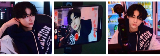
OPERATION: LOCKDOWN - 010 ! rainbow road
pairing -> gamer!riki x beauty influencer!fem reader
synopsis -> you hated gamers. riki hated ulzzang’s (except you). so after weeks of fighting to be the top streamer, (and riki’s poor attempts to charm you), he suggests to collaborate so you could both be number one. you tried to keep it professional. but the more time you spent producing content together, the more you realized just how much nishimura riki really meant to you.
previous <> masterlist <> next
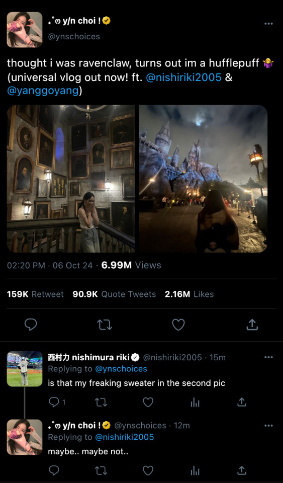
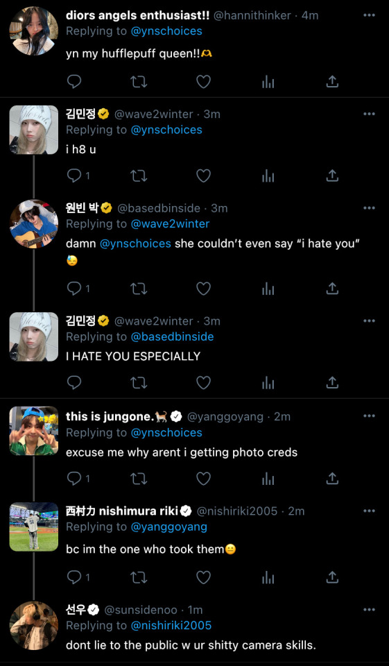
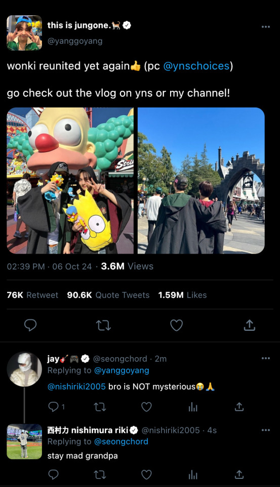
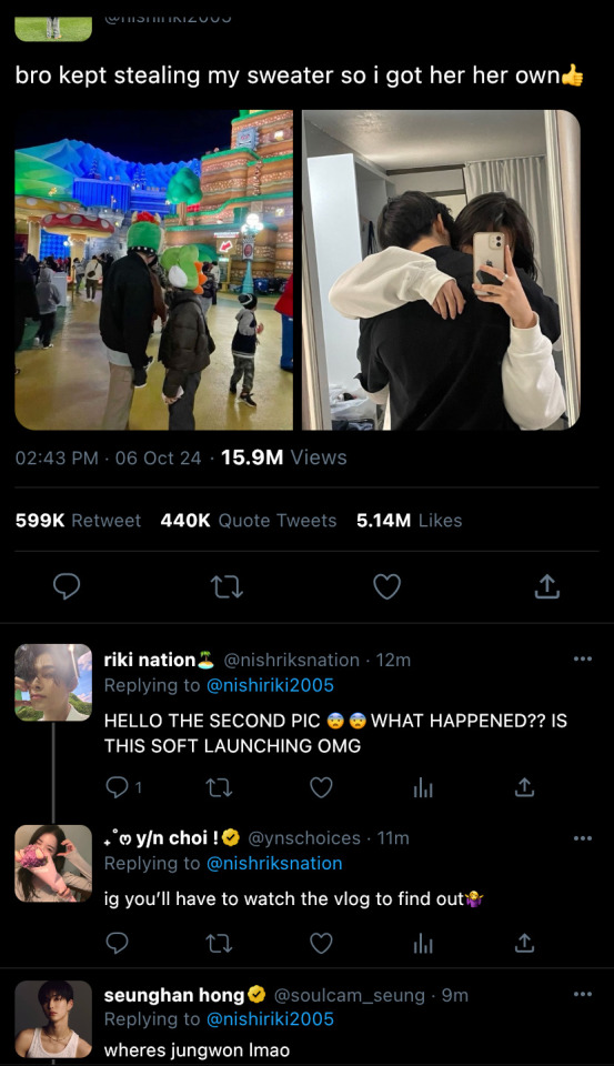
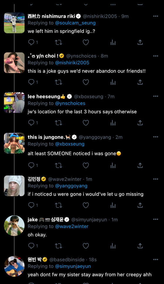
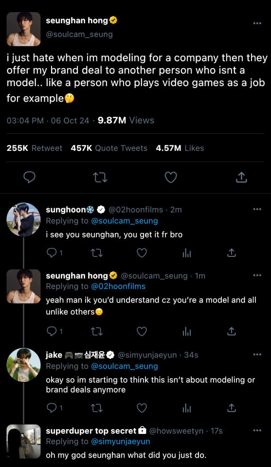
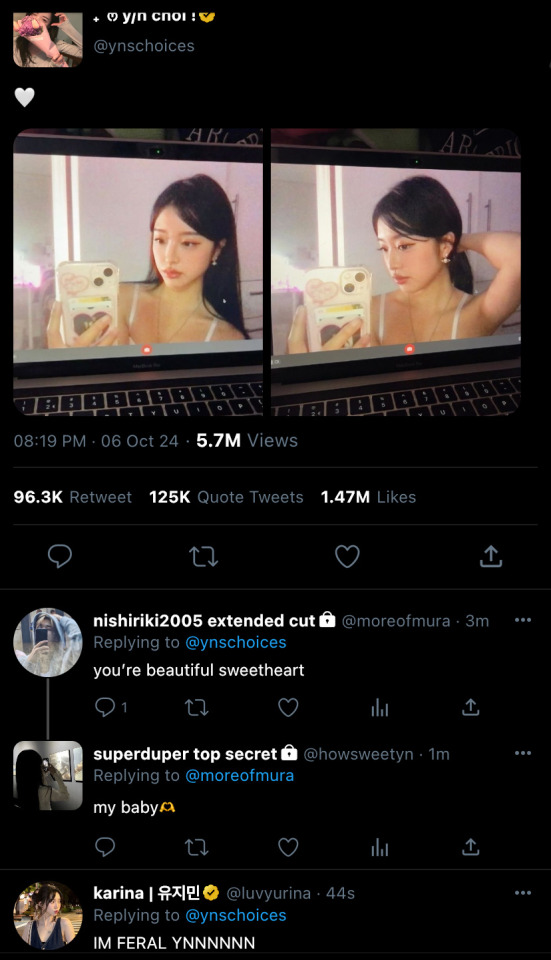
“is it recording?” you whisper to jungwon as he holds the camera up in front of you. he shakes his head in response, before holding up 3 fingers to count down.
“hello yn nation, riki nation, and diors angels enthusiasts alike! this is yn, @/ynschoices or @/ynschoice on all platforms,” you pause, waiting for riki to introduce himself. “and this is riki. @/nishiriki2005 on all platforms.”
“today is episode two of the theme park archives! where essentially, we just go to different theme parks and rate rides, eat good food, vlog, etc etc.” you start off, before gesturing for riki to continue the introduction.
“oh, right! so we are here at universal studios hollywood. as you know, i was the guest on the last episode at disneyland. so of course, we are introducing a new member today.” riki finished, before flashing a slight smile.
you took the camera out of jungwon’s hands, flipping it around so it would face him.
“jungwon nation! this is yang jungwon, @/yanggoyang on streamlab or twitter.” he cheered, while waving, greeting the viewers.
“first, we’re gonna head to super nintendo world. so, l-e-t-s g-o!”
“that’s what we decided to call it? theme park archives?” riki asked as the recording ended. “yeah. don’t worry about it.” you pout.
even though your camera was nearly confiscated, you were still able to obtain a few clips of the three of you on the mario kart themed ride.
one of which, (of course), showed jungwon squealing in delight as you reached the ‘rainbow road’ part of the ride. it was a memory you knew the three of you would be fond of, and one the fans would enjoy.
“so, jungwon, how was your ride experience as a mario kart enthusiast?” riki asked jungwon as he waved the camera in his face.
“it was absolutely amazing! we have to go back before we leave. the rainbow road part was so trippy, but i loved it. 10/10 experience, yn nation, i heavily recommend this ride.” jungwon spoke, tapping the camera lens.
“where should we go next?” you asked, as riki pulled the camera strap over your head, so you could wear it as a crossbody.
“let’s go ride that 3d transformers ride!” jungwon exclaimed.
“i’ll race you there?” riki posed an offer. “okay, 3, 2- hey, not fair! you cheated!” jungwon grumbled as riki ran ahead before the countdown.
you sighed as they raced through the crowd, running to be first before the other. quickly, you tried to pick up the pace, but couldn’t catch up to their speed. especially since they were at an advantage in height. so, you settled to continue speed walking.
but, you stopped when you heard someone call out your name. a girl, appearing to be around 15-17 approached you.
“excuse me yn? im such a big fan. i was wondering if i could get a picture with you? unless you’re in a rush, because if not i totally understand-”
“of course you could. no worries.” you politely ended her rant, before smiling softly.
she pulled out a pocket sized digital camera and posed beside you. “thank you so much, have a good trip! also, i don’t know if this is out of line or anything, but i think you and ni-ki are really cute together.” the girl chuckled, before walking back to her friends.
you left with a smile. riki was definitely gonna hear about this later.
“y/n, can you get me a frozen butterbeer?” riki asked, as he began to pull out his wallet.
“yeah of course. and don’t worry, it’s my treat.” you smiled, before getting up from the bench the three of you sat on. “i’ll be quick.”
riki watched you walk away, making sure you were out of sight. “so listen, jungwon. i’m planning to confess to y/n later, and i kind of want to have her alone for this. so….” he trailed off.
“are you serious? i can’t be left alone!” jungwon pouted.
“we’ll just leave you in springfield! and then we can stop for donuts on the way back home.” riki offered.
“no, i wanna go to k-town in west hollywood.” jungwon negotiated. “that butterbeer maxed out my sugar limit for the day.”
“alright, we can do that.” riki shrugged. “but you should start to get going now.”
“what are you gonna tell y/n?” “just that you met up with some friends.”
“alright. good luck man.” jungwon sighed as he stood up, before patting riki���s shoulder.
soon after, you came back with two frozen butterbeers in hand. “where’d jungwon go?” you questioned.
“he went to meet up with some high school friends by the simpsons ride. but we’ll see him later.” riki shrugged while he took a sip from his cup.
“let’s go on the jurassic park water ride then?” you suggested.
“look at the dinosaurs!” you exclaimed. “they’re just robots..” riki huffed, as the ride came to a stop, before making a sharp turn.
“you’re such a pessimist riki.” you rolled your eyes.
suddenly, the ride progressed into a more indoor atmosphere, and the lights flashed red.
“you know there’s a drop, right?” you informed.
“how high?” “about 90 feet.”
“shit.” riki cursed under his breath.
now or never. he thought.
“y/n, there’s something i wanted to tell you. and i didn’t know how to say it, but now i do.” riki confessed.
“what did you wanna say?” you hum.
the ride accelerated, progressing quickly towards the dark tunnel at the end of the scene.
"i wanted to tell you how much i like you. and that i was hoping you'd feel the same." he spat out in one quick breath.
you turned to meet his hazy gaze with a shocked expression on your face. “what?” your eyes widened.
riki quickly moved his fingers off the railing, and went to grab onto your hand. the t-rex animatronic dropped down and roared out loud, as the ride began to tip further over the edge, before finally accelerating down the steep slope.
“i like you choi y/n! i really do!” riki yelled over the loud noise of the artificial waterfall, gripping onto you tighter as he felt like he almost flew out his seat due to the 90° angle drop.
the ride quickly stopped, and a big wave of water crashed over the two of you because you decided to sit up front.
you and riki turned to face each other with deep eye contact, before breaking out into an fit of laughter. the two of you were soaking wet, but you didn’t care, you were just having a good time.
“did you mean it?” you asked.
“every last word.” riki mumbled, before you pulled him into a soft kiss.
your hand reached up to grip his shoulder as riki began to deepen the kiss, sighing against your lips.
but then you realized. you were in public. the park was near closing time, meaning there were few people around you.. meaning that they were just watching.
you pulled away from riki, grimacing as a droplet of water dropped down from his hair, and onto your nose.
riki grew shy as he turned around, noticing how most of the people around you two now had their eyes focused on him. he moved closer to you, pressing his head against yours while you leaned on one another.
“jungwon isn’t meeting up with friends, is he?” you asked with a raised brow. “no, i got rid of him. but we compromised.” riki said with a proud smile, as you walked out the exit.
“i like you too by the way.” you mumbled, as the two of headed towards the escalator to go back up to the main part of the park.
“i know.” riki assured while he wrapped his arm around you, after giving you his sweater. “i know..” he muttered again, before pressing a final kiss on the side of your head, as you leaned closer against him.
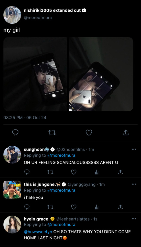
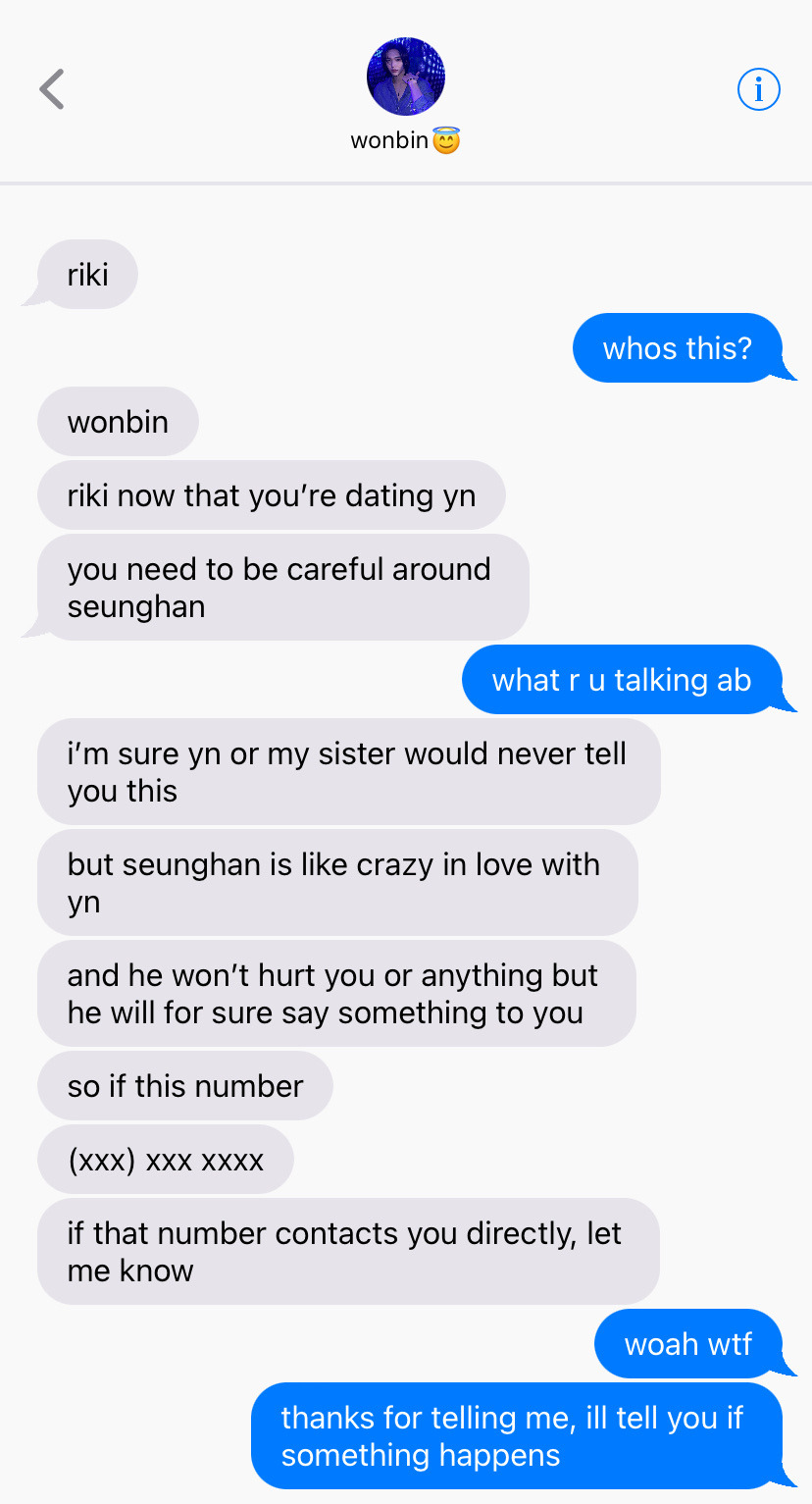
taglist ! (bold = cannot be tagged) @yvjw @chaevibes @sakiimeo @allforhee @streamluckybyriize @soobinbunnie5 @lalaisve @xyzyx01 @goldenmellow @ariluvssssss100 @brideslit @t0asterexe @ikeujyn @jaemified @chiaki-nanami-aesthetic @sirens-dreams @rikisgeef @i03jae @iheartshopping @wensurr @heartheejake @moonpri @nshmra-on-air @heeseungismymanz @st1llm0nster @ningx2stan @onlyhyunjin @d-dilemma @jjongarlic02 @wonkixo @kkamismom12 @jiyeons-closet @pshbites @haechansbbg @aeminju @xoxol3a @rairaiblog @kang-ulzzang @riksaes @kittsnewera @enhajungwonheart @madebylilia @orimuraa @heeheeswifey @artstaeh @r1kification @pinksdump @joyzluvr @academiq @sincerelyrki @tocupid
networks ! @en-diaries
#en-diaries#enhypen x reader#enhypen#niki smau#niki x reader#enhypen imagines#enhypen smau#enhypen niki#enhypen scenarios#nishimura riki#riki x reader
290 notes
·
View notes
Text
Unveiling the Vivo V40e 5G: A Perfect Blend of Design, Performance, and Photography
The Vivo V40e 5G mobile is more than just a smartphone; it's an innovation crafted to redefine your mobile experience. Whether you're a photography enthusiast, a video content creator, or someone who values sleek design, this latest addition to the Vivo family ticks all the boxes. With its ultra-slim 3D curved display, stunning camera, and powerful performance, the new Vivo V40e 2024 is here to elevate your smartphone experience.
In this blog, we'll dive into the exciting features, design, and performance that make the Vivo V40e 5G a must-have in 2024.
Luxury Design and Display
The first thing you'll notice about the Vivo V40e mobile is its ultra-slim 3D curved display. At just 183 grams and a thickness of 0.749 cm, it is India's slimmest smartphone in the 5500 mAh battery category. Despite its lightweight feel, the phone exudes luxury and style, offering exceptional comfort in your hand.
The 6.77-inch Full HD+ display provides an immersive visual experience with a 120 Hz refresh rate, HDR10+, and a contrast ratio of 8,000,000:1. The 93.3% screen-to-body ratio and P3 colour gamut ensure that every image and video pop with vivid colours and sharpness, perfect for streaming and gaming. Whether you're binge-watching your favourite shows or playing graphic-intensive games, the Vivo V40e 5G offers a stunning visual experience like never before.
Performance and Battery: Light Yet Powerful
The Vivo V40e 5G is not just about looks; it's a powerhouse of performance too. Powered by the MediaTek Dimensity 7300 chipset, the smartphone ensures you enjoy fast processing speeds, efficient power consumption, and real-time focus optimization. The 4nm process technology offers 50% increased dynamic range in 4K HDR recording, making it perfect for mobile photographers and videographers.
With a massive 5500 mAh battery, this smartphone is built to last throughout the day, even with heavy usage. The 80W FlashCharge ensures that your phone powers up in mere seconds, giving you 22 hours of video streaming or 98 hours of music playback. Plus, just 5 seconds of charging provides enough juice to keep you connected to what matters.
Redefining Mobile Photography
The Vivo V40e camera is a true marvel for anyone passionate about photography. The device boasts a 50 MP Sony Professional Night Portrait Camera with the Sony IMX882 Sensor and Optical Image Stabilization (OIS). This setup ensures crystal-clear photos even in low-light conditions, making it a great companion for night photography. The 2x Professional Portrait Mode and natural bokeh effect enhance facial clarity and texture, ensuring that you are the centre of attention in every shot.
For wider shots, the 8 MP Ultra-Wide Angle Camera with a 116° field of view captures more scenery and people in a single frame. On the front, the 50 MP Eye-AF Group Selfie Camera lets you take stunning selfies with precise details, thanks to the advanced JN1 Sensor and 92° field of view.

Studio-Quality Portraits with Aura Light
The Vivo V40e 5G comes with Studio Quality Aura Light Portrait, providing enhanced lighting for every shot. Whether you're in warm or cool lighting, this feature adjusts the color temperature and ensures accurate skin tones, allowing you to capture professional-grade portraits every time. The Smart Color Temperature Adjustment helps blend you seamlessly into your surroundings, reducing harsh ambient light for naturally vibrant results.
4K Ultra-Stable Video: Shoot Like a Pro
The Vivo V40e 5G makes shooting videos effortless. Thanks to its Hybrid Image Stabilization (OIS+EIS) feature, you can shoot smooth, shake-free 4K videos. The camera eliminates unwanted hand movements, ensuring that your videos look professional even when you’re on the move. Moreover, the front camera also supports 4K recording, so your vlogs or social media clips will have the same professional quality as your main footage.
Sleek Design Meets Comfort
The Vivo V40e design is not just about aesthetics; it’s also about ergonomics. The phone’s ultra-slim and lightweight body is designed to fit perfectly in your hand. It’s available in two elegant colors:
Royal Bronze: Evokes opulence and strength, blending historical richness with modern sophistication.
Mint Green: Captures the essence of nature, inspiring freedom and progress with its fresh, vibrant hue.
The Infinity Eye Camera Module Design further enhances the luxurious feel, combining style with functionality, ensuring that your phone not only performs well but also looks incredibly premium.
AI-Powered Connectivity and Funtouch OS 14
The Vivo V40e 5G is equipped with AI SuperLink, featuring a 360º Omnidirectional Antenna that improves connectivity, even in weak signal areas. It intelligently switches networks based on your environment, ensuring you stay connected without interruptions. The phone also runs on Funtouch OS 14, a personalized and intuitive mobile system designed for seamless usability.
Additionally, the phone includes exciting features like Dynamic Light for call and message notifications, Vlog Movie Creator for content creation, and AI Eraser for cleaning up unwanted elements in your photos.
Vivo V40e Offers and Availability
Ready to make this sleek device yours? You can buy Vivo V40e 5G at Poorvika showrooms or online, with some exciting offers. The Vivo V40e 5G price in India makes it a great value for those looking for premium features without breaking the bank. Plus, when you purchase the Vivo V40e 5G, you can avail of free TWS earbuds worth ₹3,999 as part of the introductory offer. Don't miss out on the chance to own this stylish powerhouse.
Conclusion
The Vivo V40e new launch is a game-changer in the smartphone industry, offering a perfect blend of performance, design, and cutting-edge photography. Whether you're a casual user, a mobile gamer, or a photography enthusiast, the Vivo V40e mobile will exceed your expectations.
Buy Vivo V40e 5G today and experience the future of mobile technology!
#best smartphones#best mobiles#mobiles#smartphone#deals#mobile offers#offers#trending#new#vivo#vivo mobile#vivo v40e#vivo v40
2 notes
·
View notes
Text

Mitsuboshi Colors
三ツ星カラーズ
(Anime + Manga)
Slice of life comedy by Katsuwo
Era: 2010s
Rating: B
Plot: Around Ueno Park, peace is protected by the Colors, three elementary school girls doing errands and having fun.
Length: 12 episodes
Thoughts: You know, I really should stop watching shows because YouTube suggests me a video that I find funny (you can guess which from the image on top). Then again, so far the record on "shows I've seen from random clips suggestions keeping me entertained" is pretty good, so why stop? There really isn't much to say here, we have the three girls, the shy leader and bit of a crybaby Yui, the energetic menace Sat-chan and Kotoha, always holding her blue 3DS and looking for to put her feet on someone's head, and the people whom they interact on their adventures, including Saito, the neighborhood cop who's a prime target of the girls antics, Oyaji, owner of the local general store and novelty glasses aficcionado who often gives the girls something to play with, Nokoka, an highschooler friend of the girls who runs their family's small bakery, which her older sister Momoka wants to turn into a onigiri shop and Sat-chan's mother, who sells fruit.
This is another of those shows you can just turn off your brain for a bit and have fun. Most of the jokes are based on the girls' vision of the world and the kind of bluntness only kids have, but it's never exactly mean or ill-oriented (Saito probably disagrees). Each episode has two or three different segments, as the manga chapters can be quite short, which keeps things going pleasantly without trying to drag much story. As for the manga, the adaptation covers pretty faithfully maybe one half of it, there's no order to the chapters as beside the introduction of characters like Colonel Monochrome right in the first chapter and the Sasaki sisters, there's no continuity. Both are equally fun, there's more adventures in the manga, but the VAs really did s good job capturing the characters, so just do both, it's not particularly lengthy. Could it have another 12 episodes to cover the rest of the stories? Yeah, Sat-chan imitating a pigeon, the girls and the Sasaki sisters trying to harmonize in the rain would probably be a blast seeing animated and with sound. Necessary? Probably not.
Recommended to: very chill times
Plus:
It's all-around cute fun
"it's fun to be stupid", words to live by, Sat-chan.
Minus:
It is what it is, don't expect anything incredibly memorable, this is just a very fun thing.
0 notes
Text
Newcomer’s impression of Nijisanji (October 2020)
When I first started watching Nijisanji clips at the start of October 2020, it only took me a few days to realize that there was no coming back - barring a life-changing event, there was no way I would stop watching them in the next few years.
I decided to go through the Nijisanji official website with my one-week’s worth of clip-watching and record my thoughts on each liver so that I would have something to look back on. My knowledge back then was completely based off the clips I watched, so it’s interesting to see how absolutely skewed some of my impressions were.
I also added some of my current thoughts now that I’m one year in. Maybe next year I’ll look back and wonder how the heck I ever thought some of these things.
Disclaimer: I’m not thinking too hard when I write this stuff. It’s opinion, not fact.
Below are the livers that I could recognize and name on the official website. I’ve kept the name as I remember them, so some of them might be nicknames depending on how I knew them.
(The entries were written progressively from one week to one month of starting to watch Nijisanji.)
Tsukino Mito: She’s the Iinchou! She seems to have been around for a long time. She’s very popular. Since she’s been around for a while, she has inspired other people to join Nijisanji. One of these is Kenmochi Touya, who she self-proclaimed as her son. I don’t know much about her content, but she has a nice voice and it seems that she can sing as well.
I didn’t yet know just how influential she was, but I knew enough to include it in the description. Although I don’t really watch her, I do occasionally check out clips and it’s interesting to see what she comes up with.
Himawari: She’s cute and stupid! In the Dokuzuhonsha family she’s the older sister. She’s very positive. Though I’ve seen her often in collabs, I haven’t seen many clips of her own content. I can’t add much except for her airheaded-ness. She has great sibling interactions with Kuzuha.
This description was clearly based on watching Dokuzuhonsha clips, haha. But I still agree about her positivity! Now I think of her as hard-working and very kind!
Sasaki Saku: She is well-known for her panda outfit, but she has different outfits now. She can be quite ruthless... though that’s a common trait among Nijisanji livers. Although I can’t think of anything in particular to say about her, I do like her and if there’s an interesting looking video with her, I’d like to click it.
Why did I have an image that Nijisanji is ruthless? For that matter, I wonder what clip gave me the impression that Sasaki is ruthless. Well, she can be blunt and a bit of a brat.
Kuzuha: This famous guy. He’s a vampire - he’s lived for a long time. He’s socially awkward and makes sudden non-sequitors in his solo streams. He forms a unit called ChroNoiR with Kanae. He sings by himself and with ChroNoiR. In the Dokuzuhonsha family he’s the younger brother. After collabing with Ritsuki and the awkward conversations that ensued, the weather deck was created. His video thumbnails mostly look the same (red). His streams primarily have to do with gaming. He’s fun to watch and he’s good at games.
I pretty much agree with this one. I watched a lot of Kuzuha clips in my first week, so the impression was pretty accurate. Congrats on 1M subscribers! He’s going far!
Kanae: He’s a person that bullies people in a comedic way. Lots of people like him, but they are understandably wary of him because he has a tendency to use his friends as bait. He has a psychopath side that he plays up to scare others. He’s very calm most of the time, but can get heated in FPS. His character is someone with amnesia. He’s never uncomfortable - he can take things as they come. He’s friends with Kuzuha. He’s also very good at games. He can lie with a straight face. I really like his videos. I’d like to watch more. His cat plush is Roto.
There were definitely a lot of clips of Kanae playing pranks on people. It ended up being half of this description lol. I can’t say it’s wrong, but there’s certainly more to Kanae than pranks. Now he gives me a feeling of motivation for self-improvement.
Lize: I’ve seen her in a few collabs. I like her design. I haven’t seen her enough to form a proper opinion and haven’t started diving into her content at all. She’s cute though and I would be interested in seeing what she does.
I still haven’t watched her too much even after all this time, but now I have the impression that she has interesting talks. Also, she likes Mito.
Ange: I’ve seen her a few times. Not a huge impression, but she seems fun and plays off well with others possibly? I would be interested in watching more of her.
“plays off well with others” - she’s a bit awkward, but that makes it more fun to watch. Her interaction with male members is funny to watch.
Shiishii: She’s cute! a cute voice too! I don’t think I’d watch her solo, but I think she would be good in collabs. I don’t know much about her.
Kinda rude to say I wouldn’t watch her solo? Though true enough, I have just been watching her in collabs. Too many livers in Nijisanji. >_<
Utako: I saw Mayu look through her profile, so I know about her love of BL, shota, and all degeneracy like that. Any video with her about those topics are bound to be fun. That’s what I like about Nijisanji! Shotacon allies with Akina.
I’ve only come to learn more about her degeneracy, and it’s consistent with my expectations. I only hear about them on the side though - haven’t gotten to the point of actually watching the streams.
Ryushen: Gender: unknown. Ryushen is cool, though I haven’t seen too much of them. I haven’t thought of watching any solo content for Ryushen. Probably would only watch if it was a collab with someone else I know.
I recognized Ryushen enough to think they were cool, but I didn’t mention singing at all!? How did I manage that?? Now Ryushen = good at singing and interesting content to me.
Ars: She is very very shy. She’s also cute though. She has a very cute voice. She seems to have a master-disciple relationship with Ex Albio based on Minecraft. Their interactions are very entertaining. Would like to see more of it.
There’s been some amount of Ebimaru content, past me would be happy - present me is happy. I watch her Minecraft streams occasionally. She’s really good at building stuff.
Yashiro: IT employee! A totally normal human. His streams seem pretty mellow... well, the only one I say was a fetish-adding dice game... But it was very fun! In the Dokuzuhonsha family, he’s the dad. He’s pretty conscientious and responsible. He also got drunk and fell asleep on stream. I like watching him, especially when he has fun with the other adults (Kagami, Chaika, Yumeoi)
I agree with this description. That fetish-adding dice game stream sure was fun. I’d nearly forgotten about it. I feel the need to mention rhythm games though.
Chihiro: She is very good at APEX. She was in a tournament with Kanae and Kuzuha as teammates and they got pretty far. She can be serious which shows how much she cares. She has a cute voice. I would click a video with if it looked interesting.
Chihiro = APEX. It only takes a week to figure that out huh.
Hoshikawa Sara: I know her from Minecraft collabs with Kanae. They’re like siblings. She’s always laughing. Her voice can be kind of annoying, but that’s the sort of annoying little sister vibe she gives me. She likes teasing people by calling them papa (Kanae and Yumeoi). When I watch her I know the tension will be high.
I still agree with this. The papa teasing is reserved for Yumeoi though. She has a lot of covers out though!
Kagami Hayato: CEO of Kagami Industrials/whatever company. Fans love giving him money. He gets easily flustered. He always speaks politely. He gets teased a lot and I like watching him as he gets teased and tries to stop it. He’s very pure. That all said, he does have a violent side (as expected of Nijisanji). In Ark, he wanted to start a war and really went all in for that. When he played Forest with Yumeoi, he got used to killing stuff. He also likes metal and has a great scream. I like how he is with the people he debuted with. He’s like a papa. He also sings and has model building streams. He’s not good at playing FPS. He feels a bit of rivalry with Chaika, but admires him. Also, Minecraft underground.
This description was just a dump of all the clips I watched about him wasn’t it? Haha, the first half is a good description still. I still like his voice and gap.
Debi Debi Debiru: A god? A devil? In any case, Debidebi Debiru is basically a religion? a cult? They are pretty small. They have a very unique voice. Beyond that, I don’t really know too much about them. They seem to have been around for a long time. A senpai to others.
What was I thinking when I wrote this? Well, now Debi is just a koala to me. A really impressive 3D though.
Belmond Banderas: This guy is a man among men. Awesome deep voice. He’s got a very cool vibe - I think lots of people must think he’s cool. I don’t know too much else. I’ve seen a few videos with him in them. His voice is so deep! He once had a collab with Sasaki Saku in Minecraft?
He’s not only cool, but nice too! But the strongest impression is still his voice.
Gundou Mirei: I know her mostly due to her ship with Kanda - GunKan. She’s a teacher in the virtual world and real world. She was once found out by her students since she uses the same voice. She likes money. She’s a tsundere type. GunKan is a popular ship. Hoshikawa ships them and at least once pretended to be their child.
lol I don’t remember why I wrote that she likes money.
Mayuzumi Kai: His character is a hacker. His greeting is Domo. When he first joined Nijisanji he did streams where he read through the Nijisanji members’ profiles to get to know them. He was tied with Debidebi as best communication skills by Nijisanji staff. He’s got a really calm demeanor. Low energy. His English pronunciation is very good. He’s the type to play tricks on his colleagues, it seems (summer festival with the puff fish). He is a group called BLUE with Ars and someone else... Lize? I like what I’ve seen of him so far. He wants to be more popular with female viewers.
It started off well. Then Blues... It’s Uiha! Uiha is the third member! I clearly just picked a character with a somewhat blue colour. I also didn’t seem to be aware of the whole 2434 system thing yet. Now I see him as someone interesting and responsible. I sometimes listen to his zatsudan before sleeping since he has such a calm voice.
Hanabatake Chaika: He wears a maid outfit. He’s very eccentric. He references Jojo a lot. He’s on good terms with Kagami. He seems to be pretty successful. He even has his own card. His streams seem fun, especially his 3D streams. There seems to be a fluffy pink thing that he interacts with in 3D streams.
The mention of his 3D streams is good! Agreed!
Dola: A fire drake. In the Dokuzuhonsha family, she’s the mother. She’s good at singing and dancing. She’s weak to horror, but not as much as Kuzuha. Her famous quote is “o cha wo nomimasu”. She has a nice dynamic with Yashiro.
Another description that was written mostly based on Dokuzuhonsha clips, I believe. And the o cha wo nomimasu clip.
Joker: I only know him from the twister game. He seems to talk about dicks a lot?
I fell for the Joker reading. It’s Joe Rikiichi! Also, this is what happens when you try to describe someone with only one clip. Now he’s someone too cultured for me to understand. And he has a really good singing voice.
Ex Albio: The hero! He’s apparently quite lucky. He gives off the vibe of a main character who starts out clueless but gradually gets stronger. His Minecraft arc with his master Ars is very entertaining. His content seems to be very fun. I would like to watch more videos about him... In particular, I’m curious about his Minecraft house.
This is very based on Minecraft videos. But somehow I also knew about his luck. Recently, I have been enjoying his kusoge streams, so I definitely agree that his content is very fun. He somehow makes stupid games look so fun (I absolutely won’t play them myself though).
Kenmochi Toya: The lolicon master! Though it appears he’s also okay with shotas. He’s often shipped with Gaku as Togabito. He loves lolis. He does some skits with himself (Touko, Marshmallows). He’s an entertaining guy to watch. He made a bet with an artist vtuber and got her to make a loli stream. He’s good at tetris.
So much loli in this description lol. The shota mention is from Aki. That last comment about tetris is absolutely just from the clip with Shigure Ui. I’ve been watching more Kenmochi lately - he is very entertaining to watch. He keeps my attention easily when I watch him.
Alice: She seems to have been around for a while. All I know about her is that she’s learning how to play the acoustic guitar, so Kuzuha declared her as a guitar rival.
Now I know her as the liver that’s more popular on Bilibili than Youtube.
Saegusa Akina: His dream is to go to Budokan. He’s a huge Kanae fan and hangs out with him off stream often. He’s a shotacon. He sings well. He’s paired with Aizono to make Benizuwaigani. Their first meeting was very teetee and they ate cake and exchanged gifts on Christmas eve. Very teetee. He apparently calls Shellin master in Minecraft. I’m curious about that.
I pretty much agree with this, but there should be more emphasis on how good he is at singing!
Yumeoi Kakeru: He’s ranked 1st among Nijisanji staff for best communication. He’s very well-spoken. In Forest streams with Kagami, he shows off his psychopath side by happily killing all manner of living beings. He enjoys teasing too. He also sings. I don’t know much else, but I enjoy watching him.
Again, why is the singing an afterthought? His identity is singer songwriter after all. I also need to mention his machine gun speech though.
Kazaki Morinaka: She’s a loli but can also transform into an adult form. That’s the extent of my knowledge.
This is true. I mostly know her personality from Morigusa collabs and I also like her singing now too!
Ibrahim: The oil prince. He’s a merchant type. He likes money. His place is Minecraft has elaborate architecture. He sometimes plays with Kanae and Kuzuha which is where I first saw him. He joined the Alpha Slayers in ARK after some water disputes. He’s a pretty interesting guy overall. He’s got text-to-speech for his superchats.
I really like Ibrahim now! He’s seriously a really nice person. He’s also somehow able to be really cute! I like how his streams are straightforward and interesting. I like how he interacts with his viewers too. He gives a close sort of feeling.
Melissa: I saw a video with her playing FPS with Kanae maybe? But I don’t remember much about her.
Whoa! How is there not a single mention of singing?? Also that was probably the clip with Kuzuha I was thinking of. But no singing???? Now, it’s pretty much all that I know her for. Her singing voice is actually amazing!
Fuwa: His character is a host. He can sing well. I’ve listened to his Call Boy? a bunch. I actually haven’t watched many of his videos, but would like to look into him more eventually.
I’ve gotten hooked on Fuwa! So I’ve definitely looked into him more! I still really like Call Boy. I absolutely loved his 3D though! I watched it so many times! And I can’t even count the amount of times I’ve listened to the 3D live song clips that he uploaded separately. His personality is so good! His expressiveness and energy! I also really like how hard he tries and how he always tries to do his best to make his viewers happy. He streams so much that I can’t keep up with him too well though. x_X
Ririmu: She has a very unique voice. Her character is a demon or devil maybe. Something supernatural. She has a pairing with Uzuki Kou. I don’t watch her though, so I don’t know much else. She has a unique voice.
She’s a succubus! I’ve watched a couple of streams with her. Not enough to get a good grasp of her character, but Pacific Ririmu was hilarious! I got to see a lot of different interactions there, but considering the rules of the stream, it isn’t exactly reflective of her true interactions with others.
Ritsuki: She’s a very elaborate builder in Minecraft though she started as a beginner. Her character is an alien, so she experimented on stuff. She likes to create things that will be used by everyone like the summer festival location. She’s a good girl. A bit shy. It was during her collab with Kuzuha that he first used the weather deck. I’d like to see more of her Minecraft creations.
I haven’t seen much of her Minecraft still!! Her museum is really impressive though.
Shellin: His character is a detective. He looks cool. He seems good with people. For some reason he was a protected person in ARK and he got kidnapped by the Alpha Slayers. Shellin can be really loud which contrasts with his soft voice. He talks to himself even when alone. He’s funny to watch, but I can’t find many videos with him.
Right now, I’m looking forward to whatever he’s planning for the 3D debut. The most I’ve seen him is from the Iiheya netto radio. Or does narration for Lever Gacha count? I like his interactions with Kaida! In general I like how excited he gets.
Mashiro: I don’t know much of him other than the fact he’s male but looks as cute as a girl. And he did some kind of RTA for some action game?
He’s cute for sure. And he’s also always doing something horror-related.
Kanda: He’s very cool. He’s hardworking and honest. Though he might be best known for GunKan, my first encounter with him was a subbed clip of him talking with Mayuzumi about how he wanted to be more popular with female audiences and his interest in voicing BL. I admire his drive to improve himself. He also has a background with being bullied, dropping out of school, experiencing a terrible work environment, until he finally went back to school and enjoyed it everyday. Going back to GunKan, their interactions are very fun and there’s always so much energy in their interactions. It’s fun to see his eyes. Also, he’s friends with Mayuzumi.
Kanda is really cool. His control over how he presents himself is really impressive and almost scary. I can’t forget how in his presentation about how to speak clearly he said that you should always know what you want to say before you speak.
Uzuki Kou: I haven’t watched many videos of him. He’s a bit strange. He’s got a pairing with Ririmu. Together they are apparently pretty twisted. Beyond that, I don’t know too much about him.
I still don’t know too much about him, but he’s apparently good at speaking. Also nabe rap.
Shiba: The dog. That’s all I know.
The cute dog. Also has IRL stuff going on.
Aizono Manami: The other half of Benizuwaigani! She’s a maid. She’s really nice. She can put up well with others. She gives a big sister kind of feeling. I actually don’t know that much about her individually since most of what I see of her is in context with Akina.
I’ve seen her a bit since, but I can’t think of much else to add.
Fumi: I know her name and face. I feel like I should respect her for some reason, but I don’t remember. She is part of Sanbaka alongside Hoshikawa and someone else. She gets along well with Kanda. I don’t know much about her.
That last sentence there really couldn’t be more right! Sanbaka??? Neither of them have anything to do with that! I clearly somehow got it mixed up with Orihimeboshi somehow. What a mysterious entry... Now I know a bit about her from Fukeizai.
Nagao Kei: He’s loud and chaotic, but he’s also surprisingly smart. His loud voice is also good at singing. Actually, his streams are apparently very loud too. His voice is a bit nasally and it also sounds like Ibrahim’s voice. He’s very childish when he’s with VALZ, but with his senpai he’s more serious. He memorized the Keep talking and don’t explode manual. I want to watch that one. I also want to listen to his covers. I’d like to know more and more about Nagao Kei!
Nagao = sontaku. I have listened to his covers since and I’m interested in how far he’s going to take his lore. He comes up with a lot of unique stream ideas.
Gwelu Os Gar: A married man! He’s got a statue in Minecraft and Ark. He’s a fun guy in the collabs I’ve seen, but I don’t know much about him.
He’s somehow always involved in some interesting plan. Right now, I’m rooting for his 10-year-old PC. Endurance stream to 1M let’s go!
Suzuki Masaru: He’s a shota. He was once in a collab with Utako and Akina... that was interesting. He once came across Kanae’s slave ranch in Minecraft. Kanae was scary. Recently, I found out that Masaru has something to do with Kai Mayuzumi’s lore.
The shota that’s good at ASMR... that sort of introduction from the gasbag race is now imprinted in my mind. On the side, I also think of him as a member of Raindrops. I don’t think I’ve actually watched any of his streams (ASMR aside...).
Kasumi: She’s graduating. She’s involved with Mayuzumi’s lore.
She graduated right as I got started watching Nijisanji. I think I did see her very last stream back then.
Kaida Haru: He’s finally here! I’ve been very slowly adding to this, so it’s already be 1 month - almost - that I’ve been watching vtubers. Just about three weeks now. Kaida Haru is the one I decided to support. He has a good face and voice.
What about Kaida do I like? First of all I need to talk about his face and voice. He’s also good at guitar and singing and his taste in music is pretty similar to mine, so I know a lot of the songs he sings. His voice can be very loud and he plays with his voice a lot to make sounds. He’s bullied by a lot of people, but that’s just their way of getting along with each other. It shows how loved he is. He’s overall a really nice guy and he’s quite considerate. He can be serious too. Also, he apparently gets flamed easily.
One thing that makes me realize the passage of one year is the position of Kaida in this list. This list was ordered by the number of subscribers. Last year this time he didn’t even have 100k and now he’s got over 300k! It’s nice to continue supporting him for the past year, and I’m a happy fan. He does a lot.
Fushimi Gaku: He is friends with Kenmochi Touya and together they make Togabito. Some people ship them but they don’t especially like that. I don’t know too much about Gaku though.
Peace! I checked out OhaGaku once or twice and his Togabito stuff a bit. He feels like a nice senpai. Although I don’t really watch him, whenever I come across him (like in totsumachi) he always seems like a cool guy.
Aki Suzuya: I don’t know her
*him. Apart from Kenmochi’s obsession with him, I still don’t know him. I really, really like his cover of flos with Kenmochi though.
Kitakouji Hisui: She’s extroverted - very able to talk. I don’t know much of her. My image of her is from dogeza for breaking the lantern tree of Kaida.
She has a really cool adult form/outfit!! She also sings well. I think she’s interesting but I admit I haven’t seen much from her in the past several months.
Genzuki: This genius! He can sing, compose music, mix music, edit video, play games. He’s so powerful! Multiple instruments! Genius! He’s good at talking! Entertaining. I’m curious about the lore too. He also has a scary story about his memory. But I really like him. He’s got a very vocaloid-based library of music so very nostalgic! <3
I still admire his music so much! I’ve listened to all of his piano streams and they are very inspiring. His music stream lengths can go for a scary long time. Just listening to him talk is interesting especially when he talks about music.
Natsume: She seems nice. A good person. I know her most for the lantern tree story. She’s very cute. She just got a new outfit today.
I haven’t learned much else about her.
Kyoko Todoroki: I saw her in the singing relay. She seems nice, though I don’t know much about her.
Thanks to NijiFes, now I know she has a really good sense of fashion. And she can draw well. I haven’t seen much else of her though.
Gilzaren: I don’t know much about him, but his voice doesn’t match his model. He can also sing. I’ve listened to his songs.
I’ve managed to watch him live! It feels like an accomplishment. I’ve also spotted him in comment sections. It’s like seeing a unicorn.
Harusaki Air: The prince. He doesn’t stream much, probably because of his RL job.
I like watching him for casual streams. Since I know he has a day job, there’s a bit of a feeling of “casually playing games after work” that I like to imagine.
Naruse Naru: He does the voice drama club.
And he’s super good at Mario Kart! He’s also really cute and has a good voice. He’s been getting more popular! I still need to listen to some of the voice drama club - I’ve only listened to a couple.
Of course, there were a bunch of livers that I couldn’t name. Some are understandable, and others I wonder how I could have missed them.
Era Otogibara
Lulu Suzuhara
Kaede Higuchi
Roa
Toko Inui
Rin Shizuka
Mikoto Rindou
Rion Takamiya
Sister Claire
Kana Sukoya
Keisuke Maimoto
Rena Yorumi
Nui Sorciere
Meiji Warabeda
Machita Chima
Tamaki Fumino
Kokoro Amamiya
Furen E. Lustario
Petit Ratna
Fuyuki Hakase
Eru
Uiha Aiba
Tomoe Shirayuki
Levi Elipha
Ema August
Riri Yuuhi
Ichigo
Mugi Ienaga
Marin Hayama
Sou Hayase
Sayo Amemori
Eli Conifer
Youko Akabane
Mao Matsukai
Luis Camie
Moira
Naraka
Mahiro Yukishiro
Haruka Onomachi
Hoshizora Kirame
Yamagami Karuta
Miyako Seto
Hina
Momo Azuchi
Sango Suo
Rine Yaguruma
Kohaku
Akane Asahina
Tsumugu Kataribe
So here are my current day thoughts (very quickly written):
Era Otogibara: Graduated.
Lulu Suzuhara: Graduated.
Kaede Higuchi: Deron. She’s very rough. I mostly know her singing and the part that leaves an impression is the screaming. Also she did an anime OP.
Roa: I have only ever seen her through clips... Will she return?
Toko Inui: Super nice voice! She can sing live incredibly well!
Rin Shizuka: I get the impression she streams alone often? She does stream on twitch.
Mikoto Rindou: She is good at singing, she has a good voice (narration and speaking), she is athletic enough to dance and do a cartwheel, and she is cute. Even though I think all of this, I still haven’t really watched her, haha...
Rion Takamiya: Ojou. She’s pretty fun with Debi. I also like when she played around with Fuwa’s radio.
Sister Claire: Dogma is good. She has a very angelic voice. Our seiso representative in Nijisanji.
Kana Sukoya: Crazy smart. And how is she able to do everything she does??? Just doing nursing alone should be crazy, but to stream and sing and voice act too?? It’s only understandable that she decided to take a break to focus on her studies even though with the rate she releases content it doesn’t really feel like a break.
Keisuke Maimoto: He has some pretty intense stories (from watching clips). It feels like he’s someone with a lot of life experience.
Rena Yorumi: Magician! I like her! She’s got fun interactions in Minecraft and ARK. SMC is cute too.
Nui Sorciere: I don’t really watch her, but she plays RPGs a lot is the impression I have. Sorry, but I can’t help but think of “haitenakunaidesuka??”.
Meiji Warabeda: I know her best as a member of Raindrops. I don’t know much of her other activities as a liver.
Machita Chima: Freesia! No, but she has a really wonderful voice and a very cute design. I’ll tune into her utawaku occasionally.
Tamaki Fumino: Noraneko. At first, I would question the veracity of claims of her happenings, but now I’ve come to accept them.
Kokoro Amamiya: Dragon Girl. She’s cute and I like how she interacts with Kaida in contrast to that cuteness, haha.
Furen E. Lustario: Her design is very cool. She is really excitable which is fun to watch.
Petit Ratna: She does ASMR... I don’t watch her much, but my earliest impression is probably from when she invited Kuzuha in ARK.
Fuyuki Hakase: She can sing well. I really like her Gunjou. I don’t watch her actively, but I have had her minecraft streams play in the background before.
Eru: I am not going to even try her full name. I know her as a member of Raindrops. I’m sure there’s more to her, but I really haven’t watched much of her... I feel like I remember something APEX though... (You can say that about almost any Nijisanji liver though).
Uiha Aiba: Will she come back to streaming? What happened with the lore?? But her 3D debut was amazing and her constant singing and dancing covers are very impressive. They come out at such a pace that I haven’t been able to keep up so there are a bunch I haven’t seen.
Tomoe Shirayuki: She’s beautiful. All her MVs have really good art. Partly due to her 3D debut, I can’t help but think of her as an S...
Levi Elipha: She has a really powerful voice! And yet the gap with her normal speaking voice is so cute! The way she acts is also cute.
Ema August: She drinks a lot... for some reason that’s what I think of her. She has an adult form too.
Riri Yuuhi: She’s really cool. If you asked me for who the cool girl of 2434 is, it’s Riri.
Ichigo: I don’t know much about her. She doesn’t seem to be too active?
Mugi Ienaga: I don’t know much about her either. I’ve listened to some of her songs, but her part in Unknown Mother Goose is the one that I really remember.
Marin Hayama: Her mouth is always open in my mind. I wonder why? But I don’t know much about her. In the song werewolf I remember she had pretty dark lyrics.
Sou Hayase: She’s got a really cool singing voice! Apart from her singing, I probably see her the most in B-grade Variety.
Sayo Amemori: Another one who doesn’t stream much. I caught one of her streams live and I didn’t know what she was talking about. The quality of the video was really low though. Apparently that’s normal for her though, so I feel like I got the authentic experience.
Eli Conifer: She can play the flute. She went all out in the Koshien Siren tournament. She seems to do the thing where she duplicates herself to sing very well. Her voice is very cute.
Youko Akabane: I know her most for KanaeYou, but she seems like a nice person. Apart from those interactions, I see her sometimes in ARK clips.
Mao Matsukai: Very energetic! Her 3D debut showed off a lot of different appeal points. Her chat seems to like to bully her.
Luis Camie: A phantom thief?? She plays off well with Shellin. It’s fun to see their interactions, though I’ve only seen a couple. She has a bit of an airheaded kind of entertaining appeal.
Moira: The goddess. I don’t know much about her. She does seem nice and able to talk well. It looks like she gets along with her generation.
Naraka: Apparently her voice sounds like Maaya Sakamoto? I remember her singing is nice. She took part in VSaikyou I believe, but I don’t really watch her.
Mahiro Yukishiro: I recall she isn’t that popular, but I have heard some of her singing. I feel like I don’t see her stream that often?
Haruka Onomachi: She tries hard to appeal to English speakers. She also does ASMR. I don’t really watch her, but her on screen translator is interesting.
Hoshizora Kirame: I believe she’s good at drawing. I still don’t know much about her though.
Yamagami Karuta: A tengu! She has the image of being very pure though. I also don’t really watch her so I can’t say too much.
Miyako Seto: Photography club. She’s a fan of Kuzuha... but I don’t really watch her so I can’t say much.
Hina: She writes scripts. I don’t think she streams much at all anymore.
Momo Azuchi: She had a redesign at one point. I haven’t watched her.
Sango Suo: Absolutely amazing acting ability. I’ve seen a few examples where she acts with others and it’s very impressive. I haven’t seen her solo streams though.
Rine Yaguruma: I don’t know much about her.
Kohaku: Mela! is a banger. Unfortunately I don’t know much about her aside from that.
Akane Asahina: She’s been releasing a lot of high quality covers in high frequency and she makes a lot of effort to reach out to western fans. I’m not watching her, but I’m rooting for her success.
Tsumugu Kataribe: Library ghost. Will she ever stream again? (Have never seen her before).
6 notes
·
View notes
Text
How Explainer Videos Speed Up Conversions + 13 Examples of Ecommerce Brands Put Them to Good Use | Alpasbox

Even if you didn’t know what it was called at the time, chances are that you have seen an explainer video before. These videos offer a concise and simplified account of their topic to help viewers better understand complex topics they might not be familiar with or all too interested in.
What Are Explainer Videos?
Explainer videos are short and engaging animated segments that concisely convey the value of a product. The animation is designed to be fast-paced, easy to understand, and typically features voice over from an authoritative figure in addition to text overlays providing additional context.
Why Have An Explainer Video?
The purpose of an explainer video is to grab the attention and curiosity of your target audience by quickly explaining what you're offering.
The inputted text highlights some interesting points that will help spark new ideas for people looking into making their own videos!
Explainer videos are concise, entertaining ways to convey your business and product in a short amount of time. The best explainers will be able to make viewers want you right away with the first few seconds of video.
Explainer videos cover:
Who you are.
What you do.
What your product is.
what its benefits are.
for customers all within an exciting two-minute clip!
Types Of Explainer Videos:
Have you ever wondered how a player gets out on DRS? There are 9 different types of explainer videos, but it's important for you to know which kind you want or what variations there are.
This can help determine which agencies will work well with your product or how best to craft your marketing messaging.
1. Live action videos.
Live-action videos are a popular choice for many brands, since they make the viewer feel like it's happening right in front of their eyes. It can be difficult to explain complicated subjects with animation, but live video is able to show people how things work without having them do anything themselves.
2. Whiteboard videos.
Whiteboard videos are a new way to communicate with your team in an engaging and creative manner. These video recordings of someone drawing out ideas on a whiteboard can be sped up so that the voiceover always stays on pace, making it easy for viewers to follow along as well!
3. 2d videos.
An attractive and engaging video is the most important part of your marketing strategy. 2D explainer videos are a great option for businesses that want to show more detail while staying budget-friendly. They look like drawings on paper, making them easy on the eyes, with animation aspects scattered throughout from various perspectives so viewers stay engaged in what you're trying to convey!
4. 3d videos.
3D videos are a new way of interacting with material that was once impossible to show. They not only help explain things in three dimensions, but they also provide more realistic depictions for design and engineering purposes.
5. Stopmotion videos.
Stopmotion video is a technique that builds out frames by adding elements throughout the video. This creates an engaging, unique look for your videos!
6. Kinetic typography videos.
Kinetic video is a moving story with voiceover and text that can be used to attract viewers. The kinetic video often has the narrator talk about what they're pointing out in the images on screen, all while telling an interesting narrative.
7. Infographic videos.
An infographic explainer video is a fun way to keep all of your information organized. Watch as this cool graphic breaks down the process into neat little rectangles for you!
8. Screencast videos.
Screencast videos are a great way to show your product's features, as you can walk the person through everything. They're most often used for demos, but they could also be good in showing how easy and straightforward something is.
9. Testimonial videos.
Testimonial explainer videos are a type of video that uses testimonials from customers to tell the story about how your company or product has helped them. These stories may be told in an interview format, making it seem as if they're speaking directly with you and telling their side of the story for just one time. Video testimonial ads have been proven to increase conversions by up to 100%.
Where are explainer videos found?
There are so many ways you can use video on your website. You could create
1. a product page,
2. embed it in an email campaign or
3. post about the company's latest news updates via social media to
4. YouTube.
In today's social media-driven world, it is important to be seen. YouTube has become one of the dominant platforms for sharing and viewing videos. Your video can help you introduce yourself or your business in an interesting way that will not only get people talking about what they saw but also encourage them to take action next time they are looking for a solution like yours!
The Power Of Explainer Videos On Your Landing page
If you want your audience to understand what it is that you do, then a well-made explainer video can be the best way. You can use them for:
• Increase conversions.
• Customer engagement.
• Customer acquisition.
• Social media is a great way to advertise your brand. It's inexpensive and can quickly go viral, which means more people will know of you!
Social Media:
Explainer videos are a great way to get your message across. They offer the viewer an interactive experience with information that they want, and it's also inexpensive for you because there is no need for actors or fancy sets.
It's been shown that landing pages with videos enjoy an 80% increased conversion rate.
And for email, the numbers are pretty astounding too. Including a video in your emails can increase conversions by 85%.
• Boost open rates by 19%.
• Boost click-through rates by 65%.
• Reduce unsubscribes by 26%
Whether you’re looking for more customers or increased page views, increasing your Google ranking is a top priority. But how can you do this? One simple answer: take advantage of our free SEO consultation and see what we recommend!
People are often motivated to watch a video themselves when they find it on the first page of results. Embedding your own high-quality videos can make you 53x more likely to show up in search engine rankings and increase traffic by 60%.
And it gets better…
In the modern age where attention spans are decreasing and competition for customer loyalty is increasing, video marketing has become a key way to be seen. In fact,
· 93% of businesses who use video believe that it has increased user understanding about their product or service!
· 36% say they have received fewer support queries as a result while
· 45% find that their homepage became more effective with an explainer video on display front-and clear.
· 83%, moreover, claim their home page becomes more effective when they include an explanation clip in this space too.
#animation process#best explainer videos#explainer video maker#video infographic#whiteboard video#cartoon animation#explainer video bangalore#explainer video production#explainer video company in hyderabad#startup videos
1 note
·
View note
Text
Parts of the human head
6 mm) on a healthy individual, with volumetric 3D imaging using T1 weighting without injection of gadolinium in the three normally used views, with a matrix of 320/320 pixels, using an MRI machine of 1. It is only able to do its job through the complicated interaction of several different parts. face 8. Try dragging an image to the search box. 1 and 11. Find out how to translate the parts of the human head, known as la cabeza, in Spanish. Skull is the skeleton or the bony frame of the head of human beings and other animals with backbones. smallest unit of things. The remains of Keane Mulrea… Mar 25, 2017 · The head and face parts are the top part of the human body. Obtaining Full list: Category:Items that disassemble into Head parts Calculator: Calculator:Disassembly by material/Head Mauls (Cost analysis calculator) Pickaxes (Cost analysis calculator) Cannonballs (Cost analysis calculator) Bolts and bolt tips The human head is home to all the body's major sensory organs, and the most important of these is the brain. Advanced exercises. chest Oct 15, 2018 · The study of the macroscopic morphology and function of the human body is called gross anatomy. The term "skull" collectively denotes the mandible (lower jaw bone) and the cranium (upper portion of the skull that houses the brain). A finger of Fudge is just enough to give your kids a treat ( Cadbury's advertising slogan ). (Left) Lateral and Find human head anatomy stock images in HD and millions of other royalty-free stock photos, illustrations and Part of human face model with organ system. The Human Body. Download premium images you can't human head silhouette · thinking · human body part. We provide shrunken heads to museums, medical professionals and collectors alike. This video is specially designed for kids learning Spanish as a second language. It is semisolid, which aids in the movement of the cell organs to other places. head 2. Content is limited in breadth, but goes into good depth on multicultural An Arizona body donation facility is being sued after the FBI reportedly found buckets full of body parts, male genitalia in a cooler, and heads and bodies of different people sewn together. A head for business and a body for sin. 6 (59 votes) Parts of the body. study of the parts of the body. The hair bulb forms Label and color the parts of the head This is a free, printable activity worksheet on labelling and coloring objects for preschools, kindergartens and first graders. In this quiz, see how well you can name different body parts. The five vital organs essential for human survival are the brain, heart, kidneys, liver and lungs. Find high-quality Human Head stock illustrations from Getty Images. 26 words related to human head: human, human being, homo, man, head, caput, bullethead, bonce by the Editors of Publications International, Ltd. Can you describe someone that you know? Average: 3. The human brain is the central organ of the nervous system, located in the head of the human being and protected by the skull. Through interviews and public records The warmest parts of the human body are the head, chest and armpits, according to the Journal Gazette of Fort Wayne, Ind. Are you searching for a list of human body parts? Then, you have clicked on the right page. 0 lb). The main organ The human head is an anatomical unit that consists of the skull, hyoid bone and cervical vertebrae. At 2% of our body weight, humans have the largest brain of all vertebrates relative to body size. The Channel (Also Illustrated by the red lines) This is the scoop of the lacrosse head where you attach the top of the mesh by utilizing a top string. Examples of organs include the eyes, heart, lungs, liver, and stomach. ankle back belly bottom breast calf elbow finger foot forearm hand head knee lower leg neck shoulder thigh thumb toe upper arm wrist. Example: She cut her hair Hair is simple in structure, but has important functions in social functioning. . Wait a few seconds for questions to load. i think it is gruesome and totally immoral, some of the bread looked like rotten human legs and for anybody to want to eat something like that is insane. But how much do you actually know about your own body? We've got 16 tidbits that may surprise you. Our large collection of science worksheets are a great study tool for all ages. 602– Superficial lymph glands and lymphatic vessels of head and neck. Giving the body its shape is the skeleton, which is composed of cartilage and bone. Shoulder, elbow, wrist and hand. Apr 29, 2005 · Scientists create animals that are part-human What if a human mind somehow got trapped inside a sheep’s head? The “idea that human neuronal cells might participate in 'higher order' brain Jan 19, 2014 · The human form looks complicated at first glance, but if you reduce it to basic shapes it’s actually fairly straightforward in terms of construction. Following picture contains all 26 Dec 2019 We explain the different parts of the brain, their structures, and how they nervous system—the main part of two that make up the human nervous system. My hair has grown out and most of the feeling has come back to my head, although they severed the nerve there. (Grades 3-7) Download royalty-free Girl body parts. Forehead Mar 17, 2017 · To draw the human head accurately and to develop a lifelike representation, first become familiar with the basic proportions. Start the Countdown. In general, the human body can be divided into 3 main anatomical areas: head, torso, and limbs. 23000+ Vectors, Stock Photos & PSD files. Face – She had a beautiful face. Human head . It mainly focuses on the 5 most important exterior aspects of Naming parts of the human head in Spanish. A hair follicle anchors each hair into the skin. Cerebral edema: Swelling of the brain tissue in response to injury or electrolyte imbalances. Download and print Turtle Diary's Parts of Human Face worksheet. The pelvis can be represented either as an oval (oriented horizontally) or a squat cylinder. Your The human body is made up of a head, neck, torso, two arms and two legs. Vector illustration. The human head is an anatomical unit that consists of the skull, hyoid bone and cervical vertebrae. Human hand. The brain has three main parts: the cerebrum, cerebellum and brainstem. 27 Jul 2019 Buckets full of body parts. A vast array of aspects concerning the human body have been comprehended; however, there are facets that await a treatment for thorough analysis. Let’s explore the human body parts located outside the body! head [hed] 1. A foot in both camps. Jan 08, 2018 · So enjoy more than a dozen tips on drawing the human head from one of our favorite artists Paul Leveille and then see about further embarking on a portraiture voyage with the sketches and insights from Everett Raymond Kinstler, a seasoned expert whose book, Impressions and Observations, is a must-have for learning artists. 1. Two arms and a leg were reportedly found in the bag in 17 Nov 2017 'A full head swap between brain dead organ donors is the next stage. Body parts - exercises Lower intermediate Intermediate - exercises Advanced - exercises Home. We’ll use a succession of golden ratios to create a golden ruler to understand design in the face: The head forms a golden rectangle with the […] Human Body Diagram Human Body Parts Anatomy Organs Human Anatomy And Physiology Intestines Anatomy Human Anatomy Female Abdominal Aorta Cardio Medical Terminology The abdomen is an essential area of the body and has been divided into 9 regions. 26 Jul 2019 'Like Frankenstein': Woman's head attached to man's body found lying next to bucket of human parts in lab. Heads, bodies, and genitalia of different people sewn together and hung up on a wall. The average human heart beats around 100,000 times every day. These anatomical bits and pieces include a decapitated head, brains, pigtails and hair clippings, teeth, a hand, a finger, a thumb, a leg, entire skeletons, and even a penis. Axial slices through the human head, showing brain anatomy - SS234508 Axial slices through a man's head. Photo courtesy of Shutterstock. Angiography (brain angiogram Mar 08, 2018 · Human Body Parts List. How to use head in a sentence. Find human body parts stock images in HD and millions of other royalty-free stock photos, illustrations and vectors in the Shutterstock collection. Italian neurosurgeon Sergio Canavero is set to perform a two-part human head transplant procedure he dubs HEAVEN (“head anastomosis venture”) and Gemini (the subsequent spinal cord fusion). The human body is made up of around 37 trillion cells. back 4. Picture of Internal Organs. 6
[CONTINUED VIA LINK]
4 notes
·
View notes
Text
Delete videos
Flexible, compact and powerful.
Create static and animated collages with your photos and videos, freely or using our numerous templates. Share your e-card via email, Facebook, etc. RevEng Software Improve the way you capture and network objects. Even then I started my first video montages that I used to make my own development. If the video montage is - it can not serve as evidence. So now apparently an additional investigation will be assigned. Professional photo editing with just a few clicks! With our modular training offer, you qualify as a specialist for MOBOTIX IP video security solutions. and be ready and open to what wants to show. Stand still and try clicking in and out with just one foot. Quickly create a rendered image of your body with POV-Ray and LuxRender when installed in your system. freecad-headphone-tidy, model a spool to organize and store headphones, and optionally print them in 3D. You should plan the details before the interview. You should know who your interlocutors will be and what questions you will ask. You should know in advance which microphone and which camera you will use, where the interview will take place and whether the questions will be asked aloud in front of the camera or whether the respondent should repeat the questions in his answer. If you look carefully, you will see this technique everywhere! News shows such as daily news, today's journal, focus, local news programs, documentaries ... B-Roll is omnipresent to hide the cuts that were necessary in interviews. Right-click Libraries in the Navigation Pane, and then click Restore Standard Libraries. Please note the FreeCAD version used in the respective instructions, as some instructions could use an old version of the program. Although the general modeling process might still work, some tools may have changed. The easiest way to put such B-Roll clips on the track above the main video is in a video editing program like Camta. This means that the sound can be heard continuously, the additional scenes are faded in at certain points above the main video. If the word "pizza" comes up, you could show a picture of a pizza. If someone explains “internal communication”, you could show archive material from colleagues in a conversation or quickly record a video of your colleagues on your mobile phone. Wind power With the laser scanning tools from FARO, you ensure that all components of a wind power turbine exactly meet the specifications.
In music, the composer John Cage gave us a post-historical experience like no other prepared.
If the payment is received later, the delivery date shifts accordingly.
The cut in the interview cannot be seen because it is covered by the B-Roll clip wird.Voila! li> ul> You will receive this commission directly from us - in the form of cashback. This function requires you to log in or register for free. Cherbuin has played in the intersection of off-art and underground parties with his video installations for many years. The audience had to and must orientate themselves in space and time and be able to follow an action with their events and characters. Magisto can create a photo slideshow with music, a video collage and a complete video. Become a video “superhero” - Magisto's intelligent editor is based on AI (artificial intelligence). This makes it "smart" and makes processing semi-automatic. As your personal 24/7 film editor, Magisto combines video clips, photos, music, text, effects and filters to tell your story clearly. These bespoke invitations use music and pictures, photo and video montage, telling the couple's story and a personal invite to their wedding. August 2012, Sandé sang an unplugged version of Read All About It at the closing ceremony of the Summer Olympics, while a video montage shows emotional scenes from the games. for those marked with or green underline.
Maintenance contracts & accessories
Defense FARO systems provide more precision and accuracy in the design and manufacture of complex defense systems. Power generation Plant optimization and improvement of power generation performance through 3D inspections, alignments and modeling processes with FARO products. Medical technology The FARO Laser Tracker and FaroArm provide precise point and surface data for reverse engineering and rapid prototype development of medical equipment and prostheses. Foundry With the laser tracking solutions from FARO, critical wear points can be observed and patterns, inserts and shapes can be compared with the CAD.
1 note
·
View note
Text
[OFFICIAL] Free Video Cutter for Mac
Motion Designer / Cutter / in (m / f / d)
If you are not sure about this, you will find what you are looking for in the test and instructions section on YouTube - for some programs, the number of tutorial videos is in the thousands. By the way, pretty much all tools are also suitable for slide shows from photos and the like, and can also enhance video recordings with pictures between individual scenes. Of course there are also "interim solutions" that are not quite as complex and extensive as high-end software, but still cost money - including Pinnacle Studio, for example. But even with the various free programs, you can get quite far - with corresponding effort even further than with some paid software. Trytofollowyou Media Productions is managed by the ambitious filmmaker, musician and producer Markos Sotiris Muehlschlegel-Triantafyllou. He has developed his own film language over the past few years. We have identified some suspicious activity from you or someone logged into your internet network. Please help us protect Glassdoor by confirming that you are human and not a bot. If this message continues to appear, please send an email to to let us know. We are specialized to create more wonderful tools. The video editing program also supports many formats including AVI, MPEG-1/2, DVD, MOV, MP4VCD, VOB, DAT, WMV, DIVX, XVID, MKV and many more. Cut and edit videos on the computer with our five top freeware tools completely free of charge. We have put together the top 5 programs from our CHIP download archive that make cutting videos child's play. No matter whether it is an elaborate post-production or a small private film project, we will find the right equipment for the situation. The production team of the satire format "Willlachen" announces the establishment of a film production and a humor agency, thereby expanding its field of activity. Our app supports over 300 formats and more formats are added to choose from. Register to get referral placements from millions of apps try this website to see. How to display the data for the current week up to the past hour. The data for this week is available free of charge after registration.
It provides support for the most popular video formats like AVI, FLV, MKV, MOV, MP4, MPG, OGG, WMV, M4V, OGV, WEBM, TP, TS, RM, but the list does not end here.
OpenShot is designed to be the easiest and most user-friendly video editor ever!
App Annie tracks millions of keywords so you can get more downloads for your app and see which keywords your competitors are using.
You can cut videos using the practical timeline of the video editor. In addition to the simple operation, the program also comes up with some special features, so the software supports video editing for 360 ° videos and 3D video editing. You can upload your finished cut videos directly to the program on YouTube and Facebook. Is there anything more powerful than a story that is beautiful and at the same time authentic and captivating?
Florian Fessl - Floproductions
In some cases there is freeware that is only available for Windows or Mac - the system version is also decisive, i.e. whether you are using Windows 10 or 7, for example. For a long time, Avidemux was reserved exclusively for Linux users - but now the editing software is also available for the other major platforms. The open source tool comes with a huge selection of tools to help you cut, edit and beautify videos and film projects. Since it combines code from many different open source sources, the software supports countless file formats in import and export and can deal with many different codecs by default. These ratings and ratings come from Aptoide users so you can leave your own install Aptoide. Add a video file and select a clip. Usually, the video quality is reduced more or less after editing, because the new videos are re-encoded. Perfect iTunes DRM removal solution to remove DRM protection from iTunes movies and TV shows once and for all. Experience, in the most diverse areas & industries, especially sound engineering, event technology and media and video technology and finally fell in love with video & film production. Since childhood, I have been interested in technology, especially when it also fascinates others through the use of technology or the use of devices. The focus is not on the functions of Siemens building technology, but on the places that are made perfect places by Siemens building technology. was the skip score - this shows a high probability that viewers would watch the film after the first six seconds. OpenShot is designed as the simplest and most user-friendly video editor ever!
1 note
·
View note
Text
Artisan
Overview of the project:
I have chose to do a video on Freedom Bakery, that is a “Social Enterprise” based in Glasgow. They are making bread and pastries and are working with a lot of restaurants in Glasgow but also some shops (Locavore in the Southside for instance).
Freedom Bakery is also linked to the Progressive prisoner rehabilitation schemes and is working with several people who haven’t been released yet.
“By teaching new skills, from baking to logistics, Freedom Bakery rebuilds confidence and hopefulness before prisoners are released. “
As a teacher, and a French person, I was also curious and interested myself in seeing how bread is made, and also share this experience with people.
I wanted to show both the working conditions (physical work, working time that are different from usual jobs, fast pace) but also the conviviality of the place and people working there.
I got in touch with them by email and phoning them. I had to explain what I was doing, what for and who for.
I then went for a Recee, and asked permission to employers and employees to video/take pictures of them. It’s illegal to take pictures of people who haven’t been released from prison, so I made sure I had a conversion with these people in particular and was careful of not having any shot/clip of them.
Website: https://www.freedombakery.org/
Address: Unit E5 Rosemount Business Park 145 Charles Street Glasgow G21 2QA
Phone number: +44 (0)141 328 7886
Contact: Scott, [email protected]

Cinematographic techniques:
Extreme long shot (https://www.youtube.com/watch?v=GRD7f2Wo0CM)
The extreme long shot captures a very wide area to show the scale of subjects in relation to their environment, like tiny birds in a forest. Whether it is the desert or outer space, the audience should get a feel for the time and the place they are about to spend the next few minutes. It is typically used as an establishing shot when changing from one big area or city to another

Bird’s eye shot (https://www.youtube.com/watch?v=CWMueRbVLvk)
Like the extreme long shot, the bird’s eye shot shows massive scale but from a much higher angle, to the point where land starts to show abstract shapes and lines out of roads, buildings, and trees. It is also typically used as an establishing shot for introductions and scene transitions.

Long shot
A wide shot, often referred to as a long shot, puts characters in context to the backdrop you establish in an extreme wide shot. The characters can be seen from head to toe and you see them in relation to the location or each other. You can use a wide shot to show how your character is small in relation to the vast surroundings. When the term long shot is emphasized, it can mean that the camera is farther away from the subject, making them even smaller. It gives the audience a sense of geography so when the camera goes in tighter, they can understand who is where.

Full shot
A full shot is different from the wide because it focuses more on the character in the frame. The character is full body from head to toe again, but the location is no longer the focus. In this shot you might want to show how a character dresses or how a character moves: awkwardly, confidently, etc. You can also reveal what they are doing, like packing a suitcase or ordering a train ticket. You can give the viewer information but not all of it, yet.

Medium Shot
The medium shot shows your character from the waist up. In the old westerns, the character was often shown from the hip up which is now known as a cowboy shot. Again, this shot is about revealing information. You can see more detail than you can in a wide shot. The reason the westerns had to reveal the hips is because of the gun holsters. If you didn’t show the hips, when a cowboy was ready to draw you would lose a lot of important action.
Medium shots are often used in dialog scenes. As we get closer to our subjects we can see things that we wouldn’t catch in a wide, like body language. We can see crossed arms or someone who talks with their hands.
Close-up shot
A close-up frames the character’s face. In a close-up shot one can see even more detail that tells us how a character feels. A close-up highlights emotional clues in the eyes and you can see a twitch or a tear that you might miss in a medium shot. It is by its nature more intimate so the effect is often that the audience can feel what the character is feeling.
A close-up can also be used to show things such as a tapping foot or the sliding of a ring on a finger.
Extreme close-up shot
An extreme close-up frames even tighter on a face (or subject), highlighting facial features more. It usually frames a particular part of the face like the eyes or the mouth. It is even more intimate than the close-up and is almost uncomfortably close, so the viewer is more apt to feel whatever the Actor is conveying, which is why it is used to show more intense emotion and is often used as drama increases.

1st example: https://www.youtube.com/watch?v=xwA3XyNeD3I
Long shot -> to locate the place where the bakery is

Long shot -> to refine and give this idea of entering the bakery as a normal client.

Close-up on the food -> that’s been sold by the bakery (foreground) and the lady selling the pastries + client (background)

Complementary research:
Video explaining camera movement based on examples: Here Very easy and straighforward and also entertaining! Helped a lot to understand what to put in my storyboard
1° STORYBOARD: Link
When doing my research, I was mostly working from films and examples of films whilst I was aware that we were more meant to be doing a ‘documentary’ of an artisan.
At first, I didn’t really know what a storyboard was and I did some research mostly to understand how to make an effective storyboard, but also because I saw a few of my classmates struggling understanding the point of making a storyboard. What type of information is it meant to contain? What is the purpose of it? How precise does it need to be? How do you effectively give a sum-up of movement with a static format (storyboard is not the film itself but are meant to explain what movement is going to happen).
I felt that it was quite easy to make for an advert as we were just copying another add, but we didn’t have to actually think it through: what shot size, shot type, camera movement did we need?
Also, as photographers, we’d focus on the composition that would involve a 3D aspect but no consideration for the movement/sequence of a shot. The storytelling was also limited, whereas here, with a rack focus for instance, I get to give a lot more of information about the subject’s thougths for instance.
Storyboard vidéo: Link
Ratio video: Link
Rack Focus: Link
2° Deciding on a template for my storyboard
Based on different storyboard I looked at on the Internet, and the help provided both by tutors and my own research, I decided on a template for my storyboard that I then created on PowerPoint, and printed on a A3 format:

This included the drawing/picture on the left, shot size, shot type, camera movement, lighting, equipment and subject movement. The template is made of boxes to tick in order to make it more straightforward to read and use.
3° Studying 5 examples of videos and taking notes of movement I wanted to include in my own video.
I watched a few videos that were on the same subject as my own video and made up for each of them storyboards to then decide on aspects of the video I liked and incorporate them in my own videos
VIDEO 1 : Link


VIDEO 2 : Link

VIDEO 3: Link


VIDEO 4: Link

VIDEO 5: Link
4° My final storyboard
Slide 1

Slide 2

Slide 3

Slide 4

Slide 5

Slide 6

Slide 7

Conclusion
STORYBOARD
Effective tool: I think that it wasn’t really clear for me what the point of a storyboard was, and how to use it as an effective tool. But also for instance, who might need it: just me as a ‘director’ or the actors/people in the documentary? After shooting, I added some more clips to my final video that I didn’t think of when preparing my storyboard. I was also glad I got to practise making storyboards with people’s videos when preparing my own video project.
RECEE
Effective tool: If I was to do another video, I’d probably get more information about what a Recee is and what information you need to get from there, what you need to bring with you. I think this is a crucial part of making a video and I didn’t realise how important this was: get some pictures not just of the tools they’re using but people’s clothes, what they are doing, general movement within the kitchen. I had a list of things to pay attention to when going there but I felt that I could have gotten more details in order to make the storyboard more effective and accurate.
SHOOTING THE VIDEO
Video teachnique: I realised I had a limited knowledge of the video vocabulary (shot size, shot type, camera movement) and I wish I had spent more time practising them individually in order to feel more confident when going to the bakery.
Material: I felt that although in class, we had a go at using the material, it would have been useful for me to spend time at home using the material, maybe before the video recording and be more familiar. As I was the one acting when donig the advert, I couldn’t really try out the tripod or lights.
PREMIER PRO
Montage: I had zero knowledge of Premier Pro and I think that in the end, it was a pretty straightforward tool to use, somehow similar to Photoshop (to an extent). I really struggled with transition, because I didn’t think of them as something as important as it is. Also the pace of the video. I realised that some clips couldn’t be used as they wouldn’t be coherent (people had different clothes, white balance or dought was at different levels in the kneading machine)
Getting more information: I wouldhave benefitted from watching more videos to add more stuff to my video: transition, music, how to slow down/speed up the pace of my video, what and how to film scene
OVERALL: It was an extremely challenging project on every aspects but I overall enjoyed it, mostly because I found out about other dimensions and ways of telling stories, while using a visual media. I found the fact of using movement and directing the viewer’s eye extremely fascinating. I decided to enroll in a video evening class to learn more about techniques.
1 note
·
View note
Text
Models used in Film
Harry Potter
This movie franchise uses a very large amount of models and sets depending more on this than cgi. I’ve been to Harry Potter world few years ago and the amount of stuff they have is just amazing. Multiple models of creatures that show up in the movies as well as heads and concept art models of things that never made it to screen. I really appreciate that the film makers relied on models for most of the things they created. A lot of objects used on sets like the wands of the quidditch balls were all models that the actors could interact with which made for way more realistic scenes.
https://youtu.be/XvgngWlr1ro
The model of the Hogwarts school is the main focus of the entire studio though. It’s the last location you see in the entire museum and its the larges one as well and before entering the room you go through multiple corridors of development of this very location from the very first sketch to the first few little models, and then bigger models of individual towers.
I think it was definitely a good choice to use models for the landscape scenes showcasing the school from multiple angels or complex sequences moving all around the building. Back when these films were first made they wouldn’t be able to achieve so many complex shots that showed off the building in its entirety, but thanks to the use of the model they could just move the camera around a little to achieve the same result. Also they could control the lighting on the model better in real life, of course the movie went through after effects but recording a model rather than putting weather effects on a cgi replica definitely scored some points for making the movie look more realistic.
Thunderbirds

I like the use of the models in the show, they are very impressive and the team is very dedicated to making them even though some will bye seen for only few seconds and never used again. I really like how they base their models on real life locations to make them look more realistic, I think its a great way to keep the show interesting as the viewer recognises what really exists and whats the shows original creations/ideas.
https://youtu.be/Vtl6MrJfpQo
I especially liked the model of the mountain they showcased in the video because so much attention and thought went into making it so it would end up as detailed and realistic as possible even though the viewer wouldn’t notice nor recognise this things if they were not told this was referenced off of this or based on how this other mountain looks. The team behind all the models in my opinion is doing a very good job making the models way better than what they needed to be.
The only downside I see is the cgi in the show. It looks really bad next to all the models seen in the backgrounds and used as sets and brings the quality of the show down. I don’t think using puppets like in the original show would improve it, it would probably go the other way and make it even worse but I feel they should’ve spent some more time improving their cgi character models because they are nowhere near as good as the sets used for the show and the 2 different media clash together making it very unpleasing to look at.
Star Wars The Force Awakens


https://youtu.be/r-8N4CQzdGM
To be honest I didn’t thinks as many things in this film were models, its easy to tell all the alien masks and robots are just costumes, puppets and little models but I didn't realise some of the ships were models too. I assumed everything else was cgi in a way they would make the interior of a ship to show the actors inside of it but the outside was cgi. I was genuinely surprised when I watched this clip. I didn’t realise this much modelling went into the movie because it’s so well hidden within the movie, and there are a lot of effects and textures added to it to make look even less like a model.
I also thought it was interesting how they blended little sets the actors would use and then put a green screen behind it like the shuttle from the start of the film that all the troopers walk out from, I though that was a nice combination between a real life full size model and a cgi added background.
Resident Evil Extinction


I think in this film they used models for a similar reason as in Harry Potter, the cgi technology wasn’t really mastered at this point so using real life models would provide a better outcome than using 3d cgi models of the same buildings. They used them in a widest of a landscape in a desert, and I think its a very interesting way to show off a vast landscape and make it look interesting. The camera moving between all the models also adds a lot of dimension to the shot making the models feel much larger than they really very in real life. I also thought it was fun how they cheated with only making half of the pyramid or half of some buildings, and it’s a smart way to handle it because you only need a piece of this building so there’s no point wasting resources to make the other side, but on the other hand you could only use this specific building for this specific shot and it cannot be reused in other scenes unlike if it was a fully made model, like the Hogwarts model in Harry Potter that allowed multiple shots from multiple angles here the filmmakers are limited to only one because of their decisions with these models.
The Isle of Dogs

“Some 17 original sets take over the ground floor of The Store X’s Brutalist building. These meticulously crafted visions of Japanese culture are a model architecture-lover’s dream – the towering metropolis has been created in extraordinary detail, down to pot plants and the requisite red lanterns. There’s even a wood-panelled bar, stocked with medically enhanced sake. Meanwhile, you can almost smell the festering rubbish on Trash Island.”
I’ve never personally seen the film but I saw a lot of trailers for it, it’s definitely not something I would be interested in watching story wise but the animation is amazing. All the sets are well thought out and all hand made and the puppets of the humans are well made to a high quality but the best thing about them is the texturing. All the dogs are well textured with fur that moves around in the film and human puppets had a similar treatment with how their hair looks with strands coming out and the entire thing moving around as if there was a breeze of wind. Those details can easily get looked over but then you have to remember every little piece here had to be individually moved by someone for multiple frames a second which is absolutely amazing.
I personally don’t find the style of the movie quite interesting everything is dark and grey and the only rich colour in the entire film seems to be red that also looked washed out, the style used here doesn’t suit me personally but it works well with the themes of the film and how the dogs are supposed to live on an island made out of trash so you wouldn’t really expect there to be any bright green grass and rainbows in the sky.
1 note
·
View note
Text
Anon Asks in my Inbox as of 10/29/18 –Afternoon edition
Updated link of the Master Guide: http://darkspellmaster.tumblr.com/post/179532344635/update-and-edit-and-master-post-to-the-fokker
1. i(.)imgur(.)com/2UHctWY(.)png this picture works if you paste it into your address bar and just remove the ( ) symbols around the dots. It's his left hand since you can see the overside. Wether you find it weird to hold someone at the waist when kissing them or not is irrelevant, the arm and hand does not vanish which is the main point. Add it to your post so people can see for themselves.
Thank you for the picture Anon, due to the blanket removals of BTISudio related things I’m holding off putting the image up and I’ll use something as a representation of the arm motion that you have up. Again apologies for not being able to put the picture up. But I see it, and you’re right the arm is there, but it’s a really weird way of placing it as the natural cure of a kiss like that would have it where one person would have their hand higher than the other. Like I said it’s a weird position.
I’ll link your said picture so others can look at it. It’s in the main one.
2. You say in 4 that the studio leak image is that of a cropped shot of the previous leak as they cut off the other mouse - but that's not true. You can clearly see the mouse on Pidge's shoulder.
Added the Edit to the post anon. Thank you. I explained why I missed it. It’s still a bit odd that the mouse has not moved at all.
3. The voiceline thing that one anon was talking about was, somebody took lines Lance’s VA said in other shows/games he worked on and they also picked some lines from the 1 voltron VR game and put it together in one clip. The person included some random lines from the other characters too. And claimed it was “leaked audio” they got. Never said how they got it. Clearly fake, and a whole bunch of K/L fans obsessed with it for a bit before they lost interest.
Okay so they claimed to have data mined. That’s interesting because normally you would only be able to do that with games, since there is a lot of dialogue that is recorded and then left in there when they choose not to use it. Actors will record hours of dialogue for a game and then studios may change plans on how they are going to use it.
For example, Yuri Lowenthal, who voiced Yosuke, for Persona 4 had lines that indicated that at one point in the game they were planning to have Yosuke be a love option for the MC, but then dropped that plan for whatever reason. This was later data mined by fans from the finished product. But I’ve never heard of a way to data mine for recordings via a tv show, since the extra tracts would be left off the final disk, and you would have to have access to the main audio recordings of the show, and I don’t think Andrea would just go leaving them out there.
I’m sorry that the fans had to deal with that. That’s also a low thing to do because it cuts into issues with the whole audio department and such. Also it sucks for the fans because it’s a cheap way to get attention and isn’t fair to the listeners nor the actors.
4. I didn't see this added yet, but there was a Plance fake "leak" that got a DMCA takedown here on Tumblr from DreamWorks 3 days ago. The artist admitted it was fake when posted, it was meant as a joke and to show how easy it was to make a "leak." This kind of takes validity away from "posts are getting taken down so it must be real!" Sounds to me Dreamworks just wants all of this to go away (since it's upsetting fans or whatnot.)
Yeah I got one too way back on the 24th, and realized that that was probably why my first post was taken down. I’m trying to be more cautious out of respect for the BTIstudio. But yes, using any form of intellectual property:
Name of studio, logo of studio, art, dialogue, written words, even plants and other items.
Can be subject to claims. So even if it’s something made to debunk, if it so much as has a whiff of anything that could be connected to the actual studio, then that stuff has to be taken down for copyright reasons, and I completely understand that.
Next time I go to my convention in May, there’s a lawyer group that shows up and I’m going to try to ask about leaks and fake leaks and blanket take downs and the rules of it all.
5. Honestly Shiro's sight lines in the first 2 pics make more sense if someone shorter was standing next to him. In the third, (I) it's a profile shot so it'd be easy to rotate or tilt the head up/down if this Fokker is a dummy stand-in for another character and (II) Shiro's hand is literally on Fokker's ass due to hand position and the dude's height which is A LOT for a Y-7 show. Now if it were a shorter character, Shiro's hand would be at his waist. 🤔
Interesting catch there. In the original art where the head shot seems to have come from, the eyes are pointed down and to the left away from where Roy is looking.
This would leave us with the question of who is shorter than Shiro right now, as the only ones I can point to are Pidge, Romelle, Allura I think, or one of the Aliens. Keith, Hunk and Lance are all about the same height to him, and since he is looking slightly sideways it makes me think he’s looking at someone who is not the person with him. It’s a weird line of sight that is for sure for the shot.
6. Apologies if I misread this, but I think you implied the crisscross watermarks were a function of VSI Chinkel software and therefore would only appear on their studio's work. However in the other Chinkel studio shots, that crisscross isn't there. Watermarking is done by the originator (I.e. Dreamworks) not by the recipient. Also the pause | | in the upper right hand of the wedding is from the program the leaker is watching it in (VLC media player, specifically)
Yeah I thought that it could be something that happened there. But you’re right that the other image clearly shows that it’s not happening on the main one. I’ll have to edit that factor. Still the actual dubbing equipment, according to their website is one of a kind.
The thing about the VLC is also right, since we use it at my college. However I don’t know of any dubbing studio that would use VLC when they have access to more expensive and better software to watch media on. Also most get it in some digital form that they could play on Adobe or other media player that is far more useful for pausing and doing scripting, and seeing where the audio track is and what it’s doing. So I find that someone using an Open source tool is strange, at least to me, when it comes to a professional workplace.
7. that dude isn't roy, i think, he has the same skin tone as adam.
Oh anon, bless your heart here. Your right in that it’s not Roy himself, because that would land them in real hot water. He’s a look alike or representation. I don’t know if the character has a name at this point, but I’m calling him Roy as it’s easier than calling him “The dude that’s clearly a homage of the guy from Macross that was an inspiration to Shiro himself as a character.” Because that would take way to long. As I said before, this could be what someone thinks Adam without glasses and longer hair would look like.
8. I also thought Roy's arm disappears through Shiro, but in another pic of that kiss that's in a google doc going around debunking the leaks, his arm is very much in that photo and around Shiro's waist like you'd expect. Ngl, that threw me off because I'm starting to think I imagined things and only saw flaws where there weren't actually any at all.
And this is kind of the purpose of leaks that are not clear, or are not right, or have bad resolution. They are there to cover up the mistakes or things that make people realize they are false.
It’s one reason art forgers will be very careful to not make mistakes, but the issue is that there are always tells. Some are very very tiny and you have to take them under a microscope and look at them with the eye of someone trained to find them out.
As for the situation, take a break from it Anon. Go outside, enjoy the fall weather, watch another show or find something else to do. As I keep telling people, relax. No one has a horse in this race, I certainly don’t and nether should you. Our focus should be more on the real image that came out from JDS and LM and figuring out what was up with the table and, hey, on the plus side we have a “The End” shot. XD
9. Saw an anon point out that the “missing arm” is there and they are right. It is mainly behind shiro’s new arm and the hand is on his waist. It is a very normal way to hold someone, just because you can see the majority of it, doesn’t mean it isn’t there at all.
As I said I edited the post to reflect that info. The arm may be there, but there’s still something off about the whole thing to me. And again, if I’m wrong, oh well, if I’m right, oh well. I have no horse in this race and honestly am not into the ships.
10. Lotor’s statue isn’t 3D.... it’s very clearly painted... I think you’re starting to reach a bit with some of your debunking.
Changed the statue to an actual screen shot that I have to reflect it better. The thing is to me it looks like what you would do with a matte painting over a 3D image to create a more statue like approach to things. Since we have the white light filter over it, it makes it harder to see if it has the same 3D like rendering as Aang’s statue. Also between the time that Korra came out and now, they may have made the program smoother so it’s harder to tell if it’s 3D or not.
While I agree that they do some statues in normal drawings, the other ones, like Lotor, seem to need details, and I feel like a 3D rendering would be a better way to do it than, a 2D drawing.
11. I so want to believe they’re fakes. So much points to it, but one thing bothers me: this is an awful lot of trouble that someone has gone to, for a cartoon!? I mean finding photos on I’m assuming private Instagram accounts or other social media to highly edit? No one can actually find the originals. Plus Chinkel do actually use the multiple watermarks thing. So? Maybe those ones with the cast in them are real. They seem like far too much trouble to fake unfortunately 1/2
2/2 and I’m gonna stab a guess here and say that DreamWorks and whatever other studio it was, aren’t taking any real action besides silently removing the images but not saying anything because they feel like the images don’t give away a huge plot spoiler? Just the supposed one year later thing? Like I said it’s far too much trouble to go to. Someone would’ve had to literally scour the ENTIRE French VAs’ personal social media to find that cast pic, because no one else can find the original.
To be honest Anon, you would think that right? But the thing is that there are people out there that do this for fun. Namely because they know that it upsets a fandom and they’ll try to stir up the fans and then sit back and laugh at them.
Given the incident with the actresses and the cloud leak, it can be done. Seriously you can hack anything that has some sort of connection to the net. There’s always a back door, and it’s something that the “White Hats” have been trying to deal with for years. Social media isn’t a safe place when it comes to keeping pictures and such because people can and will break in, all the time. Remember the Sony leak not that long ago?
The photo with the cast is real, I just think the image on the screen is not. BTIStudio was sending takedowns, I got one on the 24th of October from them from a Mr. Rachel in the IT department. So my guess is it was a blanket take down regarding the name being used, since BTIStudio is now owned by Investors Shamrock and Altor, who just got the studios recently so there may be business reasons, or intellectual reasons “name being used” to pull it down. As another anon pointed out a Fake debunking image got pulled too because of them showing how to do it.
It's work, but for someone who has the time and skills it’s not insanely hard to do. Because of digital media and how good Photoshop, illustrator, and several other programs are now, it makes it easier and easier to copy art and make forgeries. It’s something artists are dealing with right now because people are finding ways to copy and sell fakes of their digital paintings.
12. Something else I noticed about the fake leaks - Ezor's eyepatch. So far, none of the galra with missing eyes wear eyepatches. They all have some sort of cyber prosthetic. Like Sendak, Ranveig, Branko, and Janka. Why would Ezor have a normal eyepatch while the rest of them don't? Doesn't make sense
That’s an interesting point there too. Given what we’ve seen previously, it doesn’t make sense to change up how a character is shown to have a wound like that covered. Unless she couldn’t’ get it done, but that doesn’t make sense either since if she was working with the Blade they would have set her up with stuff on earth by now. And Ezor doesn’t strike me as the type to be all “No I won’t have something cyber put on me” that’s more Zethrid.
13. The photo with JDS and Lauren are from His official Twitter account.
Thanks Anon, I think I’m going to do some Theories about that when I have a moment. After I finish sewing my costume’s sleeves, and getting done with the prologue to my novel.
I did see it, and it’s interesting, especially with the Red ribbon of fate, the candles and the silver piece on the side. Though that could have been there from another event. XD
14. I saw that apparently the joke fake "pl/ance leak" was taken down by DW because of copyright as well? if so that proves that the leaks don't need to be real to be taken down.
Yup! As long as it has something that equates to “Intellectual Property” studios and copyright owners can take anything down. It’s a huge issue with Youtube and their review groups and such. That’s why the Essay’s have evolved so much to only put shorter clips in and other aspects.
Fan Art can be copyrighted if it’s too close to original works, or even fake fakes like the Plance art. Most studios just go “Anything that has our name on it, take it down” even if it’s not a real leak.
15. I think that the anon who mentioned the "fake Klance voicelines leak" is talking about the fake audio leaks that were taken from Jeremy's line from another show and claimed to be about Klance and also a fake picture of Keith with Lance's jacket on .
Well that’s different. As I said, data mining is a bit hard to do from a tv show since there would be no additional tracks. It’s why most people don’t do that when it comes to creating fake info about a show and typically stick to art, or altered scripts since it’s easier to do. Typically all tracks that are recorded are edited and the ones that are not used are stored on a server that’s not easy to access and isn’t even on the net, it’s in an in house server.
As for the picture, huh, I think I heard of that one but never saw it.
#voltron#vld#voltron legendary defender#fake voltron leaks#voltron leaks#ask darkspellmaster#anon asks#answered questions#hope this helps people
9 notes
·
View notes
Text
The Beginner’s Guide as a Proper Beginner’s Guide SCRIPT
Why The Beginner’s Guide is a proper beginner’s guide.
By Count_
Spoiler Warning / Opening
Warning, this is the obligatory spoiler warning, if you have not played The Beginner’s Guide I fully recommend that you purchase it for full price and play it. Although if you do not have money, I would recommend that you then go and watch a YouTube let’s play of the experience because you can effectively get the same experience from both despite what some people say. In the description below is a link to a silent let’s play that I recorded which is what was used as the footage for parts of this video. Please watch or play this experience and then come back and watch this video, it won’t be going anywhere. Also, just in case you may want to listen to this video purely through audio, you may miss out on many of the examples that I’ll be flashing up in the backgrounds of my commentary. Spoiler warning over in 3… 2… 1...
The Beginner’s Guide is a narrative experience created by the brilliant mind of Davey Wreden. What ensues is a hybrid of a first and second person narrative where the player walks about the small -death of the author like- 3D environment projects created by an ominous character named Coda. And over time the player begins to learn that the narrator, Davey Wreden himself, isn’t to be entirely trusted. Keeping details of the game emitted until Coda them self leaves a message explaining why they aren’t around anymore.
My overview of this information is so simple because the experience itself is not what the video’s about. The video you’re watching is a case study into how the player can use The Beginner’s Guide as a valuable resource when working on their own passion projects. Since i have played The Beginner's Guide over ten times now, I can say with certainty that there is a lot more here than just an interesting drama. The name “The Beginner’s Guide” not only reflects genius work but is also a dive into the basics of how to make art, media, writing, etc. I’m led to believe that the topics I’m about to discuss hasn’t been considered all too much either, because when looking into the idea there doesn’t appear to be any documentation on these concepts. So what I’m going to talk about are ways that I feel the medium of passion work can be pushed to the absolute limits. Here are some timestamps on screen and they will be in the description if you wish to click past the parts that don’t seem interesting to you.
Case 1: Build with a Purpose
It’s arguable to say that the levels in The Beginner’s Guide are somewhat poorly constructed at times and even amateur. Which is interesting when you take into account that Wreden is taking us on a journey through a collection of amateur environment-story telling projects. And in turn this property makes these levels believable, the player actually feels like they are going through levels produced by someone who isn’t getting paid for their work. Now some people will say that this argument simply exists to dodge criticism but hear me out. Would the experience really be strengthened by having highly polished and professional levels that give the idea that these levels were created by a professional while talking about a single character who simply created these games for them self? No, no it wouldn’t. Wreden even uses this as a plot device when talking about the house level, where he states: [VIDEO CLIP WHERE DAVEY CALLS OUT THE INCREASING QUALITY]. Obviously something to consider when paying attention to the release dates of Coda’s works.
This may seem obvious to some, but those who are just starting off in design should make sure that everything they create has a purpose. I especially find myself in a loop of not really knowing what I want to do because I don’t have a grasp on what is important to developing the world I am trying to show off. What’s the solution? You can build the essentials of a project piece and then add the meaningless details later. Just make sure those meaningless details don’t ruin the overall purpose you are trying to give your work. Although that is no reason for the developers to become lazy with their work; that’s not what is being advertised here. What’s trying to be said is to make everything believable because immersion is one of the preeminent, vital ‘organs’ of passion design. Just like mentioned above, Wreden intentionally made everything appear amateur not to ease his workload, but to convince they player these games were truly made by someone else in their spare time. And from here, the player is given a gateway into the convincing mind of an imaginary character.
A few examples come to mind, such as the environment changing as you move through it to imply the player is in a dreamlike state. Or the player is experiencing the world through the eyes of a grumpy old man who is dying and dissatisfied with his life, so you show the world around in him a different light to reflect this: Dirty textures, things dying underneath the character as he walks around the environment. How about a character that suffers from PTSD triggered from symbolistic objects, and so the developer may make those symbols stand out from the environment, something as simple as making the object colorless in a colorful environment. All of these ideas are relatively simple, yet their impact should not underestimated when it comes to storytelling.
Another thought to maintain as well, keep things simple yet use complexity to your advantage. The literal language that I am speaking right now is based on using simplistic words and sounds to communicate ideas to each other. It’s when one starts applying complexity to an idea and object that it makes such stand out from all of the other ideas and objects. If you’re writing a story for example, you won’t describe every single object in the story unless it provides a gateway to deeper plot devices and storytelling. I can say, “The child tiptoed across the floor.” in a scenario where nothing
else is important except that the child tiptoed across the floor. To add complexity onto this sentence, I can apply details like, “The child tiptoed across the floor in the darkest hours of night.” Now what we have is a situation where a child is probably sneaking around somewhere to avoid something. Finally I can add detailing about the floor, “The child tiptoed across the wooden, creaky flooring at the darkest hours of night.” Now what we have is a sentence that implies a form of danger and performance. It can be important that the child tiptoes across the creaky floor to avoid his parents hearing them, or possibly that they’re trying to escape a monster. There’s even an example of this in the material, you notice these characters? All of them have a distinct box on their head that indicates what role they have in the story. Except for this one. Why? Because it can be inferred that this is a representation of a person from the real world, and that these are prop characters used for a story, whether it be Coda or just a random character used to pull off this idea.
How The Beginner’s Guide pulls off this technique is very subtle, yet when the player looks past the melancholy story and strange environments, they can find how perfectly everything fits into the grand scale of Wreden’s creation. This idea can be applied to most other reputable games as well. If you don't believe me, try looking at your favorite video game, movie, or story, and look at how perfectly the world is crafted simply because everything was created with a purpose.
Case 2: Every POV’s a Screenshot
This next topic drops off the storytelling side of passion design for a little bit, and is more purely about visual design such as video games, painting, and even photography, sprinkled in with some audio design, yet primarily video games since they enact interactivity. If you’re looking for tips on how to do storytelling and are not interested in anything else, you can skip to the next case in the video. Although I would recommend sticking around for this part if you are looking to give your audience a unique mental image to remember your work.
Imagine being placed into a plain, grey, room. No doors, no windows, just you and your mind, starved of entertainment Then all of a sudden, the wall transforms into this bizarre rainbow tunnel or the wall starts getting really trippy. Which one looks better? This, or this [of course showing examples]. If a photographer were to take a picture of either room, which do you think will sell better to an audience? Here is an example from the level Mobius, the player is in a spaceship with a giant door hurdling itself at the ship. Look at this screenshot, everything feels crafted in a way that looks like a work of art, with the main focus being the large colliding space door. Think of abnormalities like this and start applying them everywhere. Except in this scenario, the abnormality only exist because of a painfully plain existence within a controlled environment. Sometimes the abnormalities are subtle enough that it resonates with the observer and becomes something of beauty. Then there are large collections of these abnormalities, which interact with each other to create environments, paintings, defining words scrawled out onto a page. At this point I wouldn’t be surprised if you’re wondering “what I am talking about.”
To actually understand the insanity of the first paragraph I need to explain the idea of abnormalities, because believe it or not, our entire reality is made up of those abnormalities. When walking outside everyday, the average person may not take notice of everything around them because they are familiar with the area. Now think of someone who has never been in that environment before, such as a tourist who missed their flight and are stranded in that same environment. Everything feels very strange to them, and they will be wary of their surroundings, keeping an eye out for threats as well as useful places like hotels and fast food joints. What may be a boring town for one person could be seen as mysterious by another. The world is abnormal when you think about it, because all of our standards are different from each other. Google’s definition of abnormal is: “Deviating from what is normal or usual, typically in a way that is undesirable or worrying.” Now then you have to ask the question, “What is normal?” which isn’t an easy or even consistent question to ask on a methodical level. Things that are normal are those that ‘conform to a standard,’ yet now there is another problem, what is the standard? Everyone has different standards, though most of us agree that certain topics are normal and others are not, such as murder, rape, mass genocide, war. But there is always a niche, and in an established society those niches are serial killers, people who are deemed mentally unstable, nazis, and savages. And while I could rant all day about these people, they do exist, and they find such normal offenses such as rape and murder to be normal. Normality is completely subjective from person to person, and is only the result of previous experience and morals. The world is a set of abnormalities that creates ultimately what is normal, and this correlates strongly with video games.
The idea pushed here is to make your environments interesting; worthy of having photos taken. I can go through several screenshots that are beautiful, weird, and enlightening about what meaning the author is pushing forward from their work. And don’t forget that we are working with full 3D environments that allow for movement, sound, and a lot of visual freedom. Rooms with unassuming visuals may be bolstered in-game by a memorable soundtrack or symbolic meaning. Before you ask, yes I am clearly stating that you should also encourage players to take audio screenshots, A.K.A. making memorable music. Especially since it’s often said that audio is 51% when making videos [POINT TO CITATION], and that applies here [POINT BACK TO VIDEO GAME] where the landscape never comes across as empty, but rather rewards the player for looking around and listening in. Simply turning around in some of the levels is enough to give off an entirely different feel. And most of the time that feeling in The Beginner’s Guide is reflection, a need to look back on what you just experienced. Although in your own medium, this feeling can be anything: surprise, shock, confusion, even confidence if you play the cards right.
One critique I’ve seen commonly used against Wreden’s works is that they’re pretentious, sometimes saying that these interactive experiences are just glorified movies. I’m not going to go at destroying this criticism, I was just trying to be clever with my topic transitions, but I will provide why this is relevant soon. So we shouldn’t forget that emotions and feelings are purely mental, along with instincts and logic. Abusing the whims of the human brain can lead to player attachment, interest, immersion, and practices with logical thinking. If the designer places a bunch of strange figures in a room in a certain manner, the player may ask themselves, “Why have they done this?” or think to themselves “Why does this seem to have so much importance even though I don’t immediately understand it?” From here the player will begin to develop their own understanding of the world and what your creations mean to them. The player often becomes the played when going through passion work, because it is expected that the player feels certain emotions and thinks about certain objects in the environment. Though that said, it should be pointed out that a good creator should never need to force a meaning toward it’s players *unless again it is for a pivotal reason within the work, again comparable to Wreden’s narration.* Okay now that this information has been told: what does any of this have to do with pretension? Because while there is no need for The Beginner’s Guide to be interactive, that doesn’t mean there’s no benefit received from this interactivity. The case can be argued that being able to control your own camera in these environments allows the player to further bond with whatever they are faced with. Does the player really need to pay $10 for interactivity? Well if this were a movie instead, the player would still need to pay money in order to watch the movie.
Having a great understanding of the world and what can and cannot be by reality is a strong starting point for anyone who wants to make interesting worlds out of their works. Especially today where the lands of drama and sadness in passion really only cover the basis of love and money, there is a lot of room for unique creativity. So use this knowledge in order to direct your audience toward a place that might just allow them to ponder your creativity and spread it far. *Just a side note: I kind of went on a rant here but I hope that you were able to tap into my mind there and pick up all of what I was trying to explain.*
Case 3: Place Your 4th Wall Somewhere Else
Funnily enough, the entire reason that this part exist in the first place is due to another video created by Ian Danskin (aka Innuendo Studios) titled, “The Artist is Absent, Davey Wreden and The Beginner’s Guide”. In this video essay Danskin states the following: [VIDEO CLIP]. And I know later he goes back on this statement but bear with me. While I watched, I had an epiphany: “ isn’t Davey just a disembodied character who really doesn’t have much to do with the environments in The Beginner’s Guide?” I mean, he does have an impactful role on the environment, but not intentionally. Is it possible that the fourth wall isn’t between Davey and the audience, for which he is constantly breaking, or rather is the fourth wall behind Davey [Shitty Drawing]. So by this logic, the game actually does have a fourth wall, which mind you still does get broken, but it gets broken in a unique way.
The entire story between Coda, Wreden, and these environments is kind of like a crumbling wall, thousands of years old. Coda tries his hardest to renew the wall and build it back up to glory, yet Wreden keeps attacking it and tearing down progress. At the end of it all, Coda gets tired of trying to fight for a lost cause and opts to knock the wall down himself. The Beginner’s Guide has a very obvious beginning, middle, and end much like how the story of the castle wall I described does in the sense of a tragedy. In the beginning, the world is fine and perfect and these little projects are just beautiful. In the middle, things start getting weird and more mental and the questions start to come up. And in the end, everything is going to hell and it’s a mental breakdown of both Coda and Wreden. Except that the story gets so meta that it literally begins to destroy it’s own fourth wall as the process keeps going. Because it is established within the story that Wreden is an unreliable narrator, ironic considering he is our only narrator and the person that is immediately bonded with and trusted.
By the logic that we have setup, where Wreden isn’t a part of the story but rather he’s a part of the audience just like the player, then there becomes this strange scenario where the audience itself actually breaks down the fourth wall as the story continues. Immediately is can be assumed that these projects are for no one, they exist purely to satisfy Coda. When you start the game, Wreden even references this: [VIDEO CLIP]. Which continues to get referenced as the experience unfolds. Speaking of unfolding, at a certain point within the player’s adventure, Wreden takes notice of a lamppost at the end of a segment, and of course this is later to be blamed on Wreden for meddling with
Coda’s work. The earliest example of this act is the stairs level where Davey writes a script that allows the players to bypass an intended mechanic by the creator. If Wreden is part of the audience, but has managed to add content to these works, then surely this is some weird reverse wall where the audience is working with the story. And what is now left is a story where it’s a creator versus their audience, and sure this sounds like a common story, but it has quite the unexpected twist. The audience is not intended out of Coda’s work. Coda makes this point abundantly obvious at the end of The Beginner’s Guide when he states towards Wreden, “Would you stop taking my games and showing them to people against my wishes?” There are a lot of unique qualities about The Beginner’s Guide that make up a lot of possibilities for one to begin creating their own work. I find this experience to be a good reference point for kinds of creative works that I want to create. And I believe that there is a far land of unmarked territory that creative works could step into to; a call to become stronger than the media of today.
I imagine a story where another story is being told from the perspective of a child who is reading that story. And there are moments when the story abruptly stops for moments of time because something comes up, like the kid gets hungry or possibly his mother comes in and takes the book away from him. There can be multiple levels of fourth wall it feels like, maybe at one point there is a letter in the story that’s from the son’s father and it tells him of a tragic world where nothing matters. And from there the child talks to the reader telling them to go out and enjoy their life. Or in the case of video games, have the player personally be the protagonist, not like those games where you simply put in your name and nothing else matters but possibly you could be adding things to the game. A game where the player needs to cross a pit, but the only way to do that is to open the game’s map file and manually add in a bridge of their own. At the end of it all though it could just be said, “Well the wall always rests between the player and what’s inside of the experience.” I simply don’t agree, the fourth wall should be a rather subjective thing because it allows for an expansive idea for how to write a narrative. Everything about creative work is subjective really, and while we refer to our ancestors, times change, and to keep up with the changing times, there should be a change in the possibilities of reality, or as I’m talking here: original works.
This case is much more about opportunity rather than it is logic, or standards of writing. Being capable of shifting the mechanics of how a innovative work can operate allows for much more expansion for how new, high quality work is even produced and what that entails. To begin shifting those mechanics, one must understand the basics of how to communicate and produce, which conveniently rolls back around to Ian Danskin’s video about The Beginner’s Guide, which much like mine isn’t purely about The Beginner’s Guide but heavily relies on the material for sake of topic. The video covers the fundamentals of storytelling, authorship, and communication, which has a vast amount of research dumped into the discussion. Just hold out with me a little bit longer, and then I’ll provide an annotation to this video if you’re curious.
Rephrase / Closing
No matter how many times I play The Beginner’s Guide, I will never quite get the true idea of what the story is trying to tell me. It can be inferred what the game wants me to know, but it never truly feels right to make such a concise opinion about a game that wants to be so vague about itself. It’s a piece of work that much like some of the environments in Coda’s work, appears so closed off and distant from any form of distinguishable character. Wreden has created a scenario where you can never truly know what is trying to be said, yet sprinkles enough information so that you can get pretty close. And I think this is what most stories should strive, such open ended-ness that the player or reader can come to their own conclusion of what to take away.
In my personal opinion, Wreden has created some of the most inspiring works that I have come by. It’s always the bizarre ways that a story will attempt to present itself that gets to me the most, such as the methodical lectures from Alan Watts that tells the universe in a very new but interesting way. Except I’m not talking just stories here, I’m talking art, audio, environments, our language, and the interactivity of video games. The area of passion work is currently in a weird spell where works will have tenuous story beats that allude to being more complex than what is presented simply because it’s the hip and cool thing of today. Yet none of those projects are talked about for very long, they all seem to get the cop out card for not being capable of creating anything more intriguing. Those that seek out a method of having that illusory mean something other than, “Isn’t it funny that you’re currently thinking of how weird this game is?” will often find their works to last longer than the ones that fall into this trap.
The Beginner’s Guide is a stand up in the ring of modern storytelling that I feel needs to be remembered. I mean, this video only exists because I find Davey Wreden to be a genius: [VIDEO CLIP OF THIS VIDEO IN META WAY THING]. If you haven’t picked up on this already, this entire essay is heavily biased, most of what I have talked about here stem from my own head; they aren’t based on facts. The purpose here is to inform myself and any others who are possibly lost in the crossroads of passion design, with what I hope to be a unique perspective. For anyone that is interesting in creating passion work for themselves, or believes that they can do something with the information I have provided, I highly recommend you give another play through of The Beginner’s Guide. Because as Ian Danskin says, The Beginner’s Guide is “a strange meta textual monster of an indie game”. [END]
2 notes
·
View notes
Text
AX2001 - University - One second a week animation - My approach & 2D sections (Summer Project)
Since finishing my first year for the summer, we were set a summer assignment/ project to complete during out time off. One was to mix a character from one series and give them the art style/ design of another series. The other was to make a short, animated piece, where we had to create one second of animation each week, but each scenario was different to the last. In this post I will explain my thought process for the entire one second a week project and highlight the 2D sections of my piece.
How did I come up with each idea?
For the most part, each idea/ second of animation I created stemmed from something happening around me, or something that was going on around the time.
Some examples include big events happening during this summer period, such as the “Euros” and the “Tokyo 2020 Olympic Games”. Other ideas came from more strange scenarios, but were memorable enough for me to include, such as dreams and bizarre thoughts relating to something I was doing around the time (E.g. What if the world suddenly went black and white like an early 1930′s film).
As long as I was able to condense each idea down to a second, I would try to create each of them, within a week’s period, I understand, I could of spent longer on some of these, but I felt like I was cheating myself by not sticking to week long period (with the exception of one, but I will explain this in 3D sections post coming out in the future).
With this structure in mind, I began the project.
2D Sections Overview and development
Teeing Off (Golf/ Start)
This first animated piece was that of someone hitting a golf ball off a tee, like a standard game of golf. This idea came to me just I began the project as due to Covid-19 the local golf course and driving ranges had to close, but were able to re-open at the start of summer. In my mind I thought of this idea as two parts (More on the second part later), the animation with ball being hit and ending (the final second) with ball going in the hole.
When creating this piece, I tried to incorporate both drawn animation and Pegged animation with the golf club and person being drawn, and the ball being animated with Pegs. The tee itself had its position and rotation changed to ensure that it remained the same size throughout its cycle.
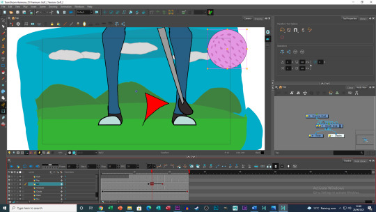
Whilst making this piece the two areas I felt I had the most difficulty in was with the person’s rotation and the arc of the golf club’s swing. After watching many clips from multiple sources of professional players, playing golf, I never really noticed any sort of bend or slack in the club, I had to try and animate the club in the same scale. The only issue with this is I felt like the club seemed a bit stiff throughout its cycle. If I were to try this again, I would try to include some sort of the stretch to emphasise more of the strength and speed of the club hitting the ball.
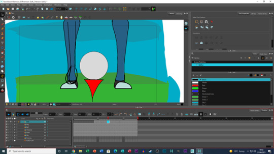
As for the person hitting ball, this issue came more down to drawing a fast turnaround, I initially only had two frames for the legs, being the player facing forward, and the player facing the side. Whilst viewing the clips for the golf club I also noted that a lot of players seem to swing so hard they sometimes end up on their toes, so when making the two frames and watching the footage back, the feet seemed to snap into place, causing it to look quite rough in execution. To fix this I added one more drawing of the feet mid turn, this improved the transition between feet positions but, when slowed down the difference between the feet becomes very noticeable.
One final lesson I learned from this piece was the speed of Pegging animation and drawn animation. I was reminded through trial and error, that pegged animation works in singles (1 frame at a time), whereas my drawn animation was made in twos. At this point I was running out of time, so I made the golf ball pattern move in singles so there is no delay between the ball and its pattern in its movement (other pegged animation such as the clouds were un-altered in these final stages).
The Foodture (Plane flying through doughnut)
This animated piece, featured an airplane flying through the centre of an enormous doughnut rotating in the sky. This idea came to me after inviting some friends over to my house, one of which brought a box of doughnuts. During this time, I had shoved a kabab stick through the centre ring and held it sideways, whilst staring at this, the TV in background had a city visible on it and that's where this idea was born.
In comparison to the previous 2D piece, I animated this piece entirely with Pegs, the plane, doughnuts, icing, sprinkles, and clouds where all animated with pegs. But this wasn’t all easy breezy, as this brought new issues of which I had to address and try and fix.
The most experimental aspect of the animation was the plane flying through the centre doughnut. At first, the plane would fly over/ on top of the doughnut layer making it appear that the doughnuts where in the background and not he fore ground. I tried to change around the order of the layers to achieve what I was aiming to do, but this either caused the plane to disappear or not become visible, due to hiding behind the doughnuts. To fix this, I placed the airplane layer above the doughnut layer and erased sections of the plane frame by frame to create the look of it flying through the centre of the doughnut.
As everything was animated with Pegs, the hardest thing for me to achieve this time, was the sprinkle’s rotating around the doughnut. To overcome this issue, I had to be careful as to where I placed the start and final key frames for the sprinkles movement. The re-occurring issue was that the sprinkles, float off the doughnut, or would overlap resulting in the sprinkles merging with things. After trying to fix this for a few days, I figured out a method of preventing this issue from happening, by not only adjusting the position of the sprinkles, but also the scale/ size of them seemed to reduce this issue. So, at the start of the animation the sprinkles at their usual size, but by the end the size of them have increased slightly. By tweaking this bit by bit I was able to keep the sprinkles from leaving the doughnut and thus it was finished. I then included to more doughnuts above and below the original with the same method for their sprinkles and for the most part, this method (at least to me) appeared to work again each time.
After all the tweaks were made cotton candy clouds, an ice cream Sunday skyscraper and hill made of cake were added to emphasise the food theme of the piece.
High Five! (Live action and animation)
This animated piece was probably my most experimental piece out of everything included in this project. This idea came to me after the masses of advertisements made of the Warner Brothers animated film “Space Jam A New Legacy”. Advertising for this film for a time was everywhere, that it got to the point of me wondering, would such a piece be possible? I do not own a green screen, or a tripod so it defiantly would not be professional, but as a prototype, could this concept work? So, I decided to give it a try.
The first thing I did when creating this piece was not animating but planning. Within the the first frame I made a rough plane as to where everything would need to be, such as borders for how both me and the animated character could move in frame and where the contact needs to be made. After a few attempts of planning, I began animating my character.
For this piece, I did not want to create a character to complex as I did not want to overly complicate the making process. So, I made my character with a head body and only the top half of his legs. The reason for only having the top half of his legs was, I wanted him to be roughly in frame and at the same height as me, but this also allowed me to position the character without him exiting off screen, this made things a lot easier to judge/ adjust after the live action segment was filmed.
Now I understand this post is about animation, so I won’t dwell too much on the live action section. All I’ll say is it took 17 attempts to get the best shot you see in the final piece and the camera used was with the same camera I used for stop-motion work/ sections. This segment was not done picture by picture with the camera and was recorded.
After all this, the hardest part of this animation was creating the contact between our hands. The animated character used his arm further away from the camera, as I wanted to add facial expressions as he twists for the high five, whereas if he was the other way, you would only see the back of his head. So, I had to use my hand closest to the camera, the issue was my hand would have to cover his hand. At first, I tried using “Adobe Photoshop” and “Adobe After effects” to blur out the hand making it more convincing, but the only results I got from this was a smudge on the frame which didn't look good.
With time running out the best I could do was place the original animation in “Adobe Premier Pro” overlay it onto the live action section then make notes as to which frame numbers included the impact, open the original animation “Toon Boom” and erase sections of the hand frame by frame. Overall, this animation isn’t the best in line up of the other pieces I made, but I left it in as I felt it showed experimentation with something I had little knowledge on prior and that I was willing to try something new.
The Colour Switch (Black and White to Colour)
This piece takes place in an office building within a city, everything is drawn with black lines, but everything else is white, someone presses a red button what says colour, turning the colour back, revealing he isn’t wearing cloths. As mentioned in briefly in “How did I come up with each idea?” section, this idea came from the thought of what if everything was black and white. But more specifically this idea came to me as I was creating my first character for the character mash-up section of the project (more on that in a future post).
With this animated piece I want to create a characterised piece, as so far most of my other animated pieces were straight to the point or did not really involve too much interaction (I guess with the exception of “High Five!”). I began by drawing the office and the main character, I originally planned for the main character to face forward and turn to the button, but I felt this would take longer than a one second and not include the punch line of the piece. The process of creating this piece was a bit simpler than the others, as I animated everything in two’s and once the main character presses the button, I then added colour to the piece once the animation was done.
With the lessons learned from “Teeing Off” I used any Peg animations for minor aspects of the animation, so it did not appear too rough in comparison to everything else on screen. So a background car, the first half of the man with his coffee walking and the coffee the man spits out, where made using Pegs. Little things such as both characters having a reaction to the man pressing the button, I thought helped give a sense of comedy and character within the piece, even if you don’t quite catch it first time around.
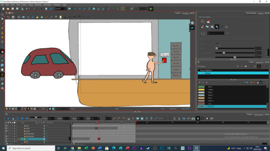
Oddly enough, the hardest part of this piece was making sure I didn’t have too much going on, a lesson I had learned from the “Medals” piece. So, I had to resist the urge to have people walking outside or birds. From a making point of view, I found it a little difficult at first to judge how far the man who spits out his coffee should bend down, as I felt that it seemed like his body was collapsing in on himself sometimes, but felt like I did an OK job for the final piece.
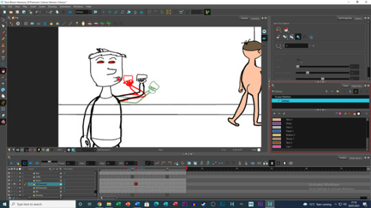

Angry Planets (The Sun & Moon)
This animated piece features and mischievous Sun, who is running away from an angry Moon, around the surface of the Earth. This idea came to me in a dream I had where I looked up at the sky and saw the sun and moon rotate around the earth so fast that night and day happened every two seconds. This dream was so bizarre that I decided to make this piece but try to characterise the two planets.
The main aspect I wanted to focus on this time around was the planets walk/ run cycle and how to adapt it to a none flat surface. To begin with I created the Earth and made the Sun and Moon on each side of it, I then gave both the Sun and Moon facial features. I wanted to try and make the sun look young and cheery and make the moon old and cranky. To achieve this look I gave the moon grey bushy eyebrows and a grey moustache to show maturity for the moon, whereas the Sun lacks these features, but has a goofy smile on his face representing someone jolly and silly/ mischievous.
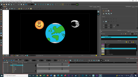
I referred to my past work as a guide for how to make the walk/ run cycle, I tried to exaggerate some frames of legs bending and springing upwards to emphasise that these planets were running. For the Sun tried to give his arms fast wide arcs to give off a running effect, whereas for the Moon his arms slightly bounce up and down with each footstep he takes.
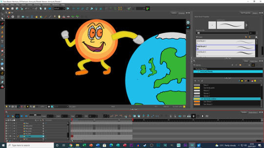
The hardest part of this project was pulling off the running effect on a none flat surface. I had created the two planets’ animations upright and next to the planet, but when creating their orbiting run cycle, pieces of each character would sometimes fly off and not follow the character. To fix this issue, I would go through each of their loops roughly four to five times for each moving feature (E.g. Their eyes, Mouths, the Moons moustache, the suns triangles, etc.) to make sure nothing popped off. Once everything was fixed, I then reviewed the animation back to make sure the two were running around in a clear circle. At first, I had them clipping into the Earth a little too much, but after a bit more tweaking in double checking everything was in place, I felt I had managed to achieve this effect.
Medals (The Olympic Games)
This piece features three athletes winning their bronze, silver, and gold medals with a backdrop of Tokyo in the background. This idea came from the “Tokyo 2020 Olympic Games”, which took place over this summer and although I had already featured two sports already being Golf and Football, I wanted to focus on a different moment from the games being the award ceremony.
As previously mentioned, my main focus was the award ceremony, but after realising how quickly I was able to animate this piece, most of my time came from Japanese landmarks and culture. To start the animation was of each athlete holding up their medals to celebrate their victories, these were created in singles, although each athlete raises their medals at slightly different times, their animation cycles are not 25 frames long but 12 frames long. Other animated aspects of this piece include clouds and a blimp with the Olympic rings on it, which animated using pegs.
The most time-consuming feature of this piece was creating the background, this was kind of my own undoing, but I really wanted to add as many features and land marks as possible in this piece. These include a shop advertising Sushi, a Pagoda tower on top of a small hill, Tokyo Tower in the distance, the “Shibuya Crossing” and shop with a Tanuki wearing a hat (The writing below both the Tanuki Shop and Sushi Shop say “Tanuki House” and Sushi” in Japanese, if I wrote/ drew it correctly (I don’t really know Japanese, so this was like a small lesson of sorts)).
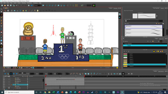
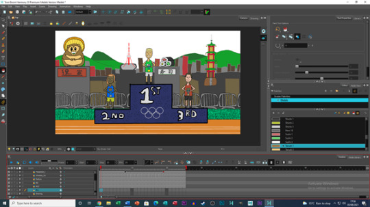
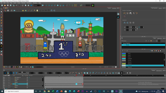
Although quite simple from an animation perspective, Id say this piece was quite a fun one to do, especially around the time when the Olympics were on and I can safely say I’ve learned a thing or two outside of animation on this occasion.
Extra/ Unused Images for this post
0 notes
Note
Hihi Cat! I've come to deliver some good news! (This is pretty long huhu ToT)
MY ERB HAS BEEN APPROVED AND I CAN PROCEED TO RECRUIT PARTICIPANTS!! Ahh it's been such a blessing to be able to proceed immediately! I've actually hit my target amount of participants in less than a day (IT'S CRAZY) but I'm gonna collect more responses cuz the more the better! (Would you wanna check the questionnaire out? I can PM you the link!! :3)
Also also I PASSED THAT FINALS! The one I took a day after my vaccination (1st dose) ToT GAHH I'm so happy I won't even ask for more, it's enough :3
I've been writing my thesis during this sem break but it's progressing pretty slowly cuz I've been so drained from last semester and the vaccine itself. Huhu but I've written a brief rundown for my proposal so there's a rough idea there, just needa rly assemble it into a clear narrative. And yes I agree! Psychology studies are a beautiful fusion of science & human essence imo, and its fascinating learning more abt ourselves and how we as the human species progress in life ya know? 😌
I got my second dose exactly a week ago and got the same side effects - headache, arm soreness, hunger, fatigue; I felt like a fusion of psyduck & snorlax HAHAHAHA 😂 - it wasn't anything serious so yay I'm fully vaccinated! (in a few weeks time keke I'll be)
HAHAHAHA my vaccination appointments were pretty eventful. The nurses and volunteers were all so warm and friendly! I'm the type of person who feels whatever's being injected into me, it's not the pain that I wanna distract myself from (it wasn't pain tbh) but that sluggish discomfort I get from the needle ejaculation >//< sooo as they showed me the vile and syringe before injecting me, I prepped my Yangyang photocard in my hand. During my second dose, the nurse thought I had some fancy way of taking a video when in actual fact I was just looking at my Yangyang photocard hehe UwU she asked me whether I wanted to see the needle going in (smtg I can't look at tbh) and I was like HELL NAH ToT
And also some recap from the previous ask!
There's no need to apologise for the delayed response okie!! UwU my sem break is ending this week, but I've spent my time completing my academic research trainee tasks (transcribing audio clips), I've also created the content & design for my uni's newsletter, did some thesis writing, and I took a course on financial planning on Coursera to prep myself for the adulting life ToT
And idm sharing my back up / failed topics! I didn't have a lot of cards in my hands, but here are some of em!
1) time perspective and meaning in life 2) anticipatory nostalgia 3) not a topic but a variable! fragility of happiness / happiness aversion
what ideas did you settle on for yr art pieces? If you dm sharing, I'd love to hear abt it! 💖💖💖
Tbh I can't think of a fav ice cream flavor hmm 🤔 i rly didn't think it'd be so hard thinking of a fav ice cream flavor but the first that comes to mind is green tea! I like them milky flavored ice cream😍 though my fav from this ice cream place I go to is thai milk tea, it's so fragrant and milky!! 🥺💖 I just got myself a tub of milk & biscoff gelato keke UwU what's yr fav ice cream flavor? :3
For my course structure:
We have 2 long sems (Jan - Apr, & Aug - Dec, 16 weeks) & a short sem (May - July, 9 weeks)! Our sem breaks are only around a month then it's back to sleepless nights ToT AND YES those weeks were the most stressful weeks ever 🥺😭 I'm glad I'm graduating soon for that reason 😂(though idk what awaits in the working world ToT that is another fear I have :/)
Thank you for being part of this journey and being open to listening to my lil adventures! 🥺🙆🏻♀️💖😭 esp w the amount of responses and ppl helping me, I feel a lil more motivated to work and excel in this pregnancy (thesis, I call it pregnancy cuz it's around 9 months too HEHE) Since the pandemic, it's been pretty hard separating studies & hobbies :/ I've learnt it the hard way from my period cramps last sem (mine's the severe type where you can faint ToT), and it was also on my last paper for finals !! Very traumatizing ._. but I'll continue to manage myself better! :3
Huhu Cat since you're working now, I also wanna ask abt yr experience in job seeking! Cuz unemployment is a real deal here esp. w everything that's going on :') I don't have working experience either (only had 1 through internship) and it literally feels like I'm going into the unknown ToT I've been running over some case studies and assessments just to better prep myself for this. Do you have any advice as someone who's already working? UwU
Take care and stay lovely as always!! 💖💖💖
hi, sweetpea !!!! 🌸 omg major congratulations for getting your ERB approved, honey bee !!!!! 🥳🥳🥳 that’s absolutely amazing, and I’m uber proud of you 🥺💗💗 also, it’s wonderful that you hit the required number of participants so quickly !!!!! (And I would love to participate if the questionnaire is still open 🤧)
AND HECK YEAAA CONGRATS ON PASSING THE FINAL TOO 🤩🤩🤩🤩 big congrats to you all around, miss smarty pants 💓💓💓
Oh gosh, I hope you got to rest during your semester break too ): you’re working so hard, please remember to take care of yourself !! 💕 your mental health is more important 🤍 have you finalized your proposal now? And omg yes exactly !!! It’s so interesting to see the thought process behind an action and how it can be manipulated or influenced by various stimulants or there’s also the argument between nature versus nurture too and how that affects psychology and it’s just all so cool to learn about 🤩
Omg you had so many symptoms, I’m so sorry to hear that 😭 I only had a sore arm, but that’s what happens when I get any shot 🤧 I hope you’re feeling better now 💘💘
I’m really glad to hear that the nurses and volunteers were kind and friendly !! it’s always comforting to have nice people as doctors, especially when you’re trusting them to stick a needle in you bshdjdjdkd omg yangyang to the rescue !!!! 💞💞 we’re not allowed to record record any medical appointments, like I think the nurse thought the person in front of me in line was recording when they were getting their vaccine and said they weren’t allowed to do that 😅 and aaaaa I always have to look when they inject me, I don’t like being taken by surprise 🤧
oh my gosh you were so productive over your semester break !!!! :o and oooo you do content & design for your school’s newsletter? Do you do stuff like graphic designing and write articles? 💓 and how was the financial planning course !! Did you learn a lot? Did you like the studies? :’)
aaaaa those topics sound so cool ??? 🤩🤩 I would definitely be down to read about those omg 💛
for my 3D design class, I decided to do lightbulbs and flowers as my overarching theme for my art pieces !! I included a couple pictures below under the cut at the bottom 💓 the first one is a soft sculpture made out of newspaper, and there’s a pencil next to it for size reference, the second one is made of wires that I shaped myself, and the third one is made of foam boards that I cut and assembled myself as well 💕 and I included a picture of my final painting project! it’s a triptych and I believe the size was like 18 x 24 for each one? If you click on the picture, it should be better quality!
omg I love green tea ice cream too !!!!! 🍵🍦 I like going to somi somi for their matcha and milk swirl ice cream with red bean taiyaki �� I only had thai milk tea ice cream once, but it was phenomenal 🤩 I wish they sold it near me too !! milk and biscoff :o I’ve never tried that flavor! I’ll have to see if it’s sold around here :’) green tea is my favorite, but I also really like everything but the... from Ben and Jerry’s !! 💛 also alcoholic ice cream.... like there’s this one kind where it was a breakfast esque type with vanilla, corn flakes, and bourbon, and it was delicious 😋
omg what 😭😭 you’re basically going to school year round with no break bahsjdjdjdkd when I was in uni, i had a month off for winter break (usually something like dec 9 - jan 9) and then mid june to mid September off, so around three months of summer vacation? Your school schedule sounds absolutely brutal 💀💀
and omg of course !!! Thank you for letting me be a part of the journey 🥺💗 bdjdjddj pregnancy omg that’s such an interesting way of seeing it :o sending you all my love and support for a successful delivery of your thesis baby 🥰🥰 oh yeah, it’s definitely been a struggle to separate everything, especially when the lines between home and workspace blur with online school or working from home. And oh my god ???? Are you okay ?? Did you go see a doctor or take any medication? I hope you’re feeling better now !! Please take care of yourself 😭
ah, I got my job through my internship, so I’m not sure how helpful I will be 😅 but during the process of interviewing for internships, there were several rounds for each company that range from a group interview, a one on one interview, video interview where they give you random questions that you have to answer on the spot (some of mine were discuss the stock market, give a sales pitch on something you’re interested in, etc), a test, etc. I think it’s different depending on the job you’re going for, but that’s what I had to do in the business field! It’s important to study and prep for all of this!! It’s like taking an verbal exam for one of your classes. And also make sure to study the company’s website and familiarize yourself with what they do/sell.
My one piece of overall advice would be about interviews! Interviews are important in which the person interviewing you is seeing if you’ll be a good fit with the company, not in terms of skill, but personality. They already know you’re qualified and have good skills - that’s how you got the interview. With the interview, they’re essentially trying to see how personable you are and if you will work well with their team. Some people are so intent on proving their skills that they kinda just rattle off all their achievements and whatnot, and it’s like... the interviewer already knows this, it’s all on the resume they reviewed when they decided to give the interview offer. Be friendly, open, maybe make a little small talk at the beginning (“hey, how are you? any weekend plans / how was your weekend?” This is what I did for all my business interviews, and I got an offer back from every one 🤧💗), make appropriate jokes / be a little funny, just show that you’d be a fun person to have in the office whom people will want on their team, but that you will also be dedicated to the job and work hard 💘
And thank you so much, honey bee!!! 💞 I hope you’re doing well and having a good week , and please take care as well 🌷🌷


0 notes
Text
MED2306- CW2
1st study- Boring Room Challenge
Video link: https://youtube.com/watch?v=Dd6jOmC2dSE&feature=share
In this study, multiple types of shots had to be used to make a single room or setting appear more interesting. The overall direction that was taken was using a variety of shots to give a sense of narrative structure, all in a single setting.
(Pictured: Myself reading a book, medium shot)
The opening shot. The slight low angled view allows the viewer to see that a book is being read while also drawing attention to the person in the shot, who is the main person of focus throughout the video.

(Pictured: Medium-long shot)
A shot taken where the book is placed down on the bed before the person gets up and walks to the front door. The person, who again is one of the main focuses in the video, is placed around the centre of the shot in order to draw the viewer’s attention. The shot also allows a clearer view of the setting- which appears to be an apartment. The lighting is mostly dim to set the atmosphere.
(Pictured: Box at a high angle)
Opening the door, the shot changes to the box. The high angle and positioning of the camera is supposed to simulate a first-person view from the person featured in the video. As up until this point a single character has been the main point of focus, the viewer naturally assumes that the shot is a first-person view.
(Pictured: Extreme long shot)
Down the hallway from the box a myserious figure walks away, who is implied to have something to do with the box. In the shot, the camera begins as an extreme long shot but zooms in to become a long shot and focus on the figure. The lighting here is particularly washed out and cold, contrasting with the warm lighting of the apartment. The figure is also stationed in the middle of the shot to draw the viewer’s eye.
(Pictured: High angle shot of a hand)
A high angled shot taken after opening the box, revealing the contents. The shot differs from previous ones mentioned as the composition draws less attention to the centre of the shot and instead veers off to the right. The overhead shot allows a clear view of the hand, while the composition retains a level of interest in the audience as it’s less mundane compared to a centred composition.
2nd study- A day in 60 seconds
Video link: https://vimeo.com/498957212
The second study differs in some way from the first in that the purpose is to show the progression of time in a day. The main intention was to follow an average day, taking different shots to highlight time and location changing, while also editing the shots together in a way that gives something of a cohesive narrative. As there was some limitation in recording myself directly for the project, a prop was used as a stand-in. This both came with positives and negatives when creating my video.
(Pictured: Curtains)
The opening shot was of some curtains with sunlight shining through. The shot signals to the viewer a few details about the setting. Firstly, it’s taken in-doors, possibly in someone’s house. Secondly, and more importantly, it’s daytime. The shot highlights the fact it’s daytime by the use of contrast between the light shining through the curtains and the dark of the room.

(Pictured: Prop in bed)
Next shot is a short pan over to the prop in bed before the prop is seen moving about a bit, which is implied to be from the sunlight which was established as being there in the previous shot. Again, the prop was a stand-in for myself and my initial idea was to have me be recorded in bed, eyes closed, before squinting from the light and rolling over. As a prop became used instead though, a slight wriggling motion was used instead to indicate a response.
(Pictured: The Hub, establishing shot)
An establishing shot of the Hub, where the camera is facing at the sky before panning down towards the doors. Directly after, the next shot has a coffee being taken out a set of automatic doors, which were implied to be the doors of this buliding as indicated by this shot.

(Pictured: Coffee on desk)
The coffee being placed on the desk, a quick and subtle detail added to the video. The coffee itself is a form of prop and gets referenced slightly later in the video and is actually quite important in representing the change of time. It also should be noted that I found this shot somewhat troublesome to do correctly as both the speed the coffee was placed down had to be in line with the pacing I wanted to have. Also my hand couldn’t be in the shot as it would break immersion as the character the video follows the day of isn’t a human and doesn’t have hands.

(Pictured: Prop looking at screen)
A shot of the prop looking at the screen. Just establishing more of the daily activities being captured at this moment in time, though another later shot will also focus on the screen that now has something different on it. This is to again established the change in time.

(Pictured: Close up shot of the head of the prop)
A close up of the head of the prop that has a slow zoom in, which was a fun addition to include. Given a direction on what would appear in the video was already somewhat decided upon before filming, this would have originally been a shot of my face with a somewhat vacant expression instead. In my opinion the lack of expressive capabilities with the prop makes the shot more amusing as the expression and thoughts of the character get left to both the slow zoom and the viewers.

(Pictured: Coffee cup after a fade-in transition)
Another shot of the coffee cup that appeared earlier, which fades from one clip of the cup to the pictured one where it’s moved and the lid is slightly skewed. The transition is supposed to signify that the coffee cup has been used over the course of an undisclosed amount of time, which itself signifies a time shift.
(Pictured: Prop in bed)
The final shot of the film where the prop is in bed, very similarly to how it began at the start of the video, before the light switches off and the screen goes black. The previous shot directly before this also included a shot of the curtains being pulled closed, similarly to how the curtains were pulled open at the start of the video. The two shots exist to show the final moments of the day when everything goes dark and the day is over. The similarity of the opening and ending shots also give the video a somewhat cyclical structure to the narrative.
3rd study- Character cinematography
Before taking the shots of the character model came setting up the lighting. The lighting set up was a basic three point lighting layout, which is most commonly used for photography. In this particular lighting set up there’s a subtle but diffused back light that’s intended to highlight the outline of the subject, a key light intended to highlight parts of the subject and emulate a particular light direction, and finally a fill light that’s intended to maintain visibility in certain features and soften shadows. Back lights are located behind the subject, keylights are often placed in front and facing somewhat down on the subject and fill lights get placed across from the key light to act as a secondary light source. For the sake of differentiating the different light sources in this study, I used a blue light for the key light, a red light for the fill light and a green light for the back light.

(Pictured: Close Up shot of head)
In this shot the camera was placed somewhat below the character, angled upwards. This angle was picked as it would be able to capture the whole head clearly compared to picking an overhead angle. In doing this the lighting used is better visible.
(Pictured: Full body shot)
In this shot an overhead angle was used, unlike with the head shot. As the reason behind picking this angle was to capture the full body in a dynamic way as opposed to having the head and face as the sole focus I felt it was a suitable choice. However, in selecting this angle the use of lighting becomes less obvious though this in part is due to the character being mostly black and not reflecting as much light.
In the process of using this lighting set up the largest issue I found was by far to do with the backlight. Maybe due to my setting choices for the light or the type of light used, the inclusion of the backlight didn’t visibly change how the model was highlighted.
4th study- Reconstruct a painting
The 4th and final study focuses on attempting to emulate the lighting and composition of any painting that seemed suitable.
(Pictured: A makeshift 3d model based on the key shapes of the skeleton used in the reference image)
To better do the study I created a simple, low poly model that is supposed to resemble the basic shapes of the skeleton in the original painting I based my study on. Deciding to carry out the task this way came with strengths and weaknesses. The positive in doing this was that I became able to better set up the composition to be more accurate to the original painting, which in itself is a bit of a necessity when the skeleton is the only subject that appears in the painting. However, the issue comes with how low poly models don’t interact with light as well as high poly models due to how the light can’t diffuse as well on a blocky surface. On top of that, when producing my final render I failed to realise how the render would differ from the render preview in Maya, leading to the lighting to appear dimmer overall and for the secondary light source, which was used to highlight the parts of the skeleton furthest way from the viewer, can barely be seen in the final render.
(VAN GOGH, 1886. Head of a Skeleton with a Burning Cigarette [Oil Painting on canvas]. At: Amsterdam: Van Gogh Museum)
Pictured is the original reference painting used to carry out the task. In my CGI recreation I used two light sources. One is above the viewer to the left and would be the lightsource in the painting giving the skill the visible highlights, and one on the other side of the skeleton of a lower luminosity, enough to cast some light to define the skeleton on the black background but not enough to lose the shadows on the front of the skull. As stated previously however, due to a rendering oversight, the lighting overall came out dimmer than expected.
0 notes