#some of this has to be rough storyboards so i can get more pages/panels out
Explore tagged Tumblr posts
Visit Tumblr Blog
Explore Tumblr blogs with no restrictions, modern design and the best experience.
Last Seen Tumblr Blogs


Fun Fact
The Tumblr app for Google Glass was released on May 16, 2013.
Text

This feels crazy to post but we've got a very rough chapter 1 of Fob Farms up!! 🫣💕💕💕 Big thank you to patrons for supporting this as January's project, and thanks to all my followers who enable me and my fantasies 🤭
This link is for the page by page version, please send me any thoughts you have since this is my first time trying something a little more long form 💕
#fob farms#comic#chapters#Patrick#pLEASE ANY FEEDBACK IM LIKE SO EXCITED AND NERVOUS#this scene is pretty small i wanted to fit more into the first chapter but it takes very long to make#it features patrickkkkkk and also sorry hes sometimes a very rough storyboard#some of this has to be rough storyboards so i can get more pages/panels out#okay im just gonna hit send because ahhhhhh
17 notes
·
View notes
Note
how do you plan the panel layouts for your comics? i always get stuck and it feels cramped or unsatisfying
okay so i went to college for 2 whole semesters and one of the only art classes i took (and definitely the only one i retained much from) was my sequential art & comics class. so i'm gonna try to explain my process in so many words, but there's a LOT of stuff that goes into a successful comic and i'm by no means a professional. i can however throw some tips and tricks and some recommended reading your way (another longpost ahead!)
first, know what you want to do. know where your comic starts and ends. if you find any joy in writing scripts, you can also do that, but i'm not the best at writing with no visual aide so i usually script while i thumbnail, but always make sure you've got a concept and a goal.
next, start thumbnailing. my initial thumbnails usually look like this:


(incidentally, my storyboard thumbnails look a lot like this, too)
there's no real structure, and i'm just noodling my way from the top left of the page to the bottom right. if you've got what you want from your comic in mind, this part can sometimes just pour out of you. i feel a very strong attachment to these characters and the situations i put them in, so that definitely has to do with how smoothly this part goes. draw the panels as small and as detail-free as possible. i usually don't do speech bubbles, and instead treat it like a storyboard, writing my rough script under the panels as i go.
once you're satisfied with the way your story is coming together, THEN you start laying your panels out. this part looks like this when i do it:

(these are actually from a gfalls comic i never cared to finish from like. five months ago but who's counting?)
honestly, it's best to do this as small as you can possibly get it, to really get your head out of the "but i have to fit all the panels exactly as i drew them on the page" funk. remember that, at least if you're writing the comic in english or other languages read in the same direction, that you're trying to lead the reader's eye from top to bottom and left to right. this is really hard to keep track of, and i still make mistakes and flub up the readability all the time. like here:

the panel layout should be reversed here. the panels in the top left and bottom right should be smaller than the other two, so the gutters would actually guide you to read it left to right instead of top to bottom, but laziness and initial drawing blindness struck me and i never fixed it.
once you have a layout that makes sense to you, it's as simple as blowing your thumbnails up to comic-size and going over your very rough sketches with your final clean panels & inks, or, if you're doing it traditionally, re-sketching your page on your big bristol board after doing some measuring to see where your panels should actually be.
there are other rules to keep in mind when you're in the thumbnailing phase of your comic, like the 180-degree rule (something that carries from film to animation to comics to, really, any form of sequential art), which is easiest to explain with a little diagram:


keeping this in mind really helps with readability. you can do a bunch of things with your angles, you can even omit the other character, but keeping them on the side of the frame you establish them on is very helpful. this is mainly for dialogue, but it does also help if you want to display one character walking in one specific direction, or if you want a fight scene to read as well as possible, etc.
and, if you look at your comic sketch now and think, hey, this looks great, this is so clear and easy to read, i highly recommend stepping away for a few hours to look at it again, or, if you're impatient like me, sending it to a friend. you're also totally welcome to send it to me, if you just need someone to tell you whether your comic is easily readable.
to learn more about drawing comics, i recommend two things. one, read some comics. by professionals in the industry, ideally, though there are many many competent and incredibly detailed comics by independent creators out there. people in the industry will (MOST of the time) be held to slightly higher standards of readability than the average independent artist, and the workflow for professional comics involves several people at once reading and reviewing and revising what's made so that it'll be digestible to the average audience.
two, i recommend getting your hands on a copy of "understanding comics" by scott mccloud. love this book. lots of comic artists love this book. it's fun and informative and packed full of tips, while also being a comic, which makes it even more fun to read. mccloud goes into a lot of detail on stuff i didn't mention, from the gutters between panels to lettering to working with other artists and writers and finding an art style that fits the story you want to tell. great stuff. go to the library, check it out. you won't regret it.
#ask#myart#wander over yonder#comics#rambling#comics are HARD man it's tough stuff to learn and even tougher to put onto paper#but when you learn about comics you also pick up lots of stuff for animation and writing and even film#because visual art is all connected. peace and love. but comics are one of the most involved mediums of storytelling out there#also quite possibly The best. because you get to read through it as fast as you want#but you can also hang back and look at the panels forever and really think about what makes them work as well as they do.#live laugh love sequential art
28 notes
·
View notes
Note
Have you a creative process when you make comics or stories ? (Storyboard ect..) and if yes, can you explain it please ??
it depends on what the comic is. Some of them, as a recent example being the upcoming Frilda confession comic, I just come up with it and start drawing. Some of the other's however I need more preparation.
Knowing where a comic is taking place helps to find/look for any references I might need be it screenshots of backgrounds, character model sheets/screenshots, etc etc. If there's a new character or place then either in a series bible (like for my Leilana comics) or on scrap paper make sure to do some rough drafts until u find the right design. Trust me, it'll save a lot of time and paper, there's nothing worse than wearing down the paper with constant erasing only for when u finally get a design u like to have phantom lines all around from how damaged the paper is.
When writing a comic in my head, I'm able to hear the characters' voices and how they'd respond to what the scenario is. Going back and editing it is easier (tho' it makes me redo the whole scene which...yea...) however when I get an opportunity I begin writing things down. This part has the most cuts to every version that was in my head until it looks like it makes the most sense. I'll ask a friend to look it over so I can edit it again and once that's done then I get started on the rest (when I can, I ain't drawing a 4 page comic at 3 am...). Sometimes the script on paper can be wildly different from what was in your head and that's fine, I see it as ur hand(s) (hands if ur typing) editing ur brain and only putting down the important parts of the story.
Because I've been doing this for a while, I can read the script and come up with the panel placements in my head, sketching out the panels with my color-sketch pencils and making adjustments as needed (remember to draw lightly), do brief sketches of the characters and the backgrounds (where needed) and then adding the dialogue, sometimes I change up the dialogue from the script when I notice that it won't fit a word balloon that well or awkwardly, then once it's all ready I ink the dialogue, word balloons and panels in that order. Then ink the characters and backgrounds and effects. I add whatever else I need to do, shading, marker, etc etc and then it's done. Scan it in and either post it or hold on if it's a piece of a larger part.
Don't be afraid to try both scripted and unscripted comics either. I'd recommend scripting it if it's longer, and unscripted can be good for random jokes. A mixture of the two are also fine, I tend to have an outline for my Leilana comics, basic idea on what characters, setting, dialogue/jokes and then once I get the reference stuff done I start drawing. Tho' for the longer arcs, I make sure to write out a script so I can know how many comic strips I'll be drawing.
This method of course is how I find it best for me, it might not be the best for u and so if something doesn't work then don't worry about cutting it out of the step process. Comics r a fun form of art & storytelling and I highly encourage more ppl to try it no matter the skill level.
13 notes
·
View notes
Text
Was so excited to see any update at all! Inouesatoh was very active on Twitter shortly after the Real 10 Dance event, then went pretty silent for a while, along with changing the tentative update date for chapter 40 from March 3rd to undetermined. Made me concerned that maybe she wasn't feeling well or had personal issues and perhaps the series wouldn't be coming back for a while (I mean, it has been 5 months since the last update, though we did get a bonus chapter in Vol 7's special edition...dropping so many links in this post lol, in case people missed stuff and need to catch up). So I'm glad one fan was brave enough to reach out and ask, since it gave us hope that things are going okay and the chapter is being worked on, plus a sketch and fun snippet of conversation between Inoue and Teacher.
Inoue's message says that it's the first time in quite a while that she drew a nude rough sketch for an older man. Teacher replies that she can see his nipples, and Inoue says that his belly button and balls are showing through, too (I personally can't make out those last two, even after zooming in lol, maybe they were more visible before she added the clothes).
I'm kind of fascinated by the unfinished page itself, like there's a panel in the bottom left that looks like a completed background, a vague sketch of something in the upper left, the detailed Max sketch, plus some completely empty panels. Just makes me curious about the process and order that the storyboards are made in.
Of course I want to know what's going on in the scene, too! With Max seemingly kicking back at some location other than the competition venue, it makes me wonder what we'll see of the afterparty. Maybe he doesn't attend and we'll still see what the Shinyas get up to (sorry one more plug lmao, I wrote a fic speculating about what might happen next if anyone's interested in reading). With the longer wait, I wonder if she's putting out a longer chapter with multiple scenes going on. She talked in the notes for volume 7 about the Shinyas taking the first step toward happiness starting from chapter 40, so I'm so eager to see any hints at all for what's to come!
New Sneak Peak for Ch. 40!
It's been so long since Inoue came out with any update on the new chapters. A fan tagged her on Twitter, asking if she was doing ok. Inoue's teacher then responded that they are working hard for chapter 40 and included a screenshot of her and Inoue-sensei texting. The screenshot includes a sketch of Max sitting on a couch and smoking (?). You can see his nipples under his shirt as well as a very emphasized foot. Maybe he's talking to Norman after the competition was over..?
As of right now we still don't have a release date for chapter 40.

Source: Twitter
14 notes
·
View notes
Text
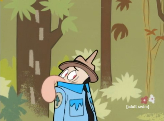
The Bear Roots of Burbank Cartoons: A Lookback at Boo Boo Runs Wild
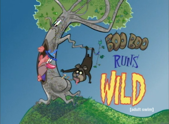
5 years ago, [adult swim] aired the greatest of all Yogi Bear / Ranger Smith episodes, “Boo Boo Runs Wild” (1999), on August 13th, 2016 A.D. at 4 AM.
Look and see, kids, how America’s not-so-average bear connects in the wide world of animation that produces many of the cartoons that you love in Burbank, Canada and more!
As and after I saw it, I knew that I found the greatest band of cartoonists out there, and that greatest band of cartoonists out there was none other than...
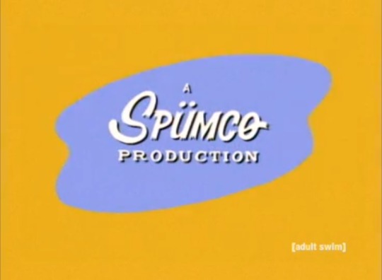
Spümcø, whose many creatives would end up working at Hanna-Barbera Cartoons, Cartoon Network Studios, and many other popular Burbank and Canadian studios that made the cartoons I grew up and beyond watching.
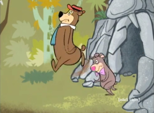
Obviously, the character design is rather different, but they still look like the right characters, even with the slight color changes...
and with their items of human attire out. Ranger Smith, on the other hand...
Ranger Smith is wildly off model, and probably on purpose, throughout the picture.
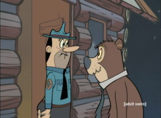
Only in one scene appears he with a more familiar face.
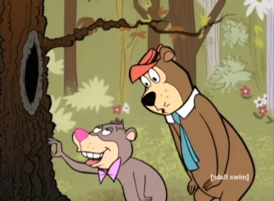
Now, I didn’t have to watch Wild Kratts (which, by the way, features 6 Spümcø Canada creatives) to learn that “there’s only one thing a bear likes more than raiding a pic-a-nic basket.”
As the title suggests, Boo Boo loses his temper when Ranger Smith restricts him from tearing bark and decides to go primal in returning to his bear roots: “From this day forth, I’ll not dress in the man’s attire, and I’ll not speak in the man’s tongue. From now on, it’s going on all fours and grunting for me!”
Boo Boo wreaks havoc for the trees with his natural bear roots.
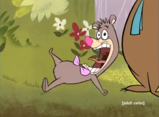
Unlike past episodes, however, the artists went far wilder than the usual Hanna-Barbera cartoon, making the trees alive and screaming in pain! OH, WHAT TOURTUE! Not to mention how I love Boo Boo’s goofy/manical laugh, a beautiful product of John Kricfalusi’s voice (Yes; I know that he was a formerly abusive megalomaniac who still has ADHD, but God knows what cartoons would be like today—at least those produced in Burbank and Canada—if it wasn’t for the many layout artists that he led).
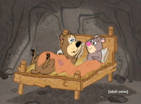
Also unnatural to a Hanna-Barbera cartoon is the extreme levels of slapstick, wackiness and graphic nature of cartoons since such shows as Mighty Mouse: The New Adventures, Beany and Cecil’s DiC reboot, and The Ren & Stimpy Show. Boo Boo and now Cindy Bear are licking away at all of the honey... and bees... with insanely long tongues (may be that they’re sloth bears?). This left Yogi Bear practically speechless.
The mere sequence of dialogue between Yogi and Ranger Smith, discussing what to do about Boo Boo, involved HEAVY work in the storyboards by Vincent Waller. So many expressions that they couldn’t fit in each of Spümcø’s 3-panel storyboard pages!
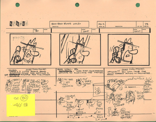
As you see, in addition to Vincent Waller’s storyboards, John K. added extra poses (storyboard revisions more or less, but definitely layout poses) under the respective scenes. That way, Vincent could focus on telling and writing the story in rough pictures. (source of storyboards)
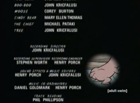
I also love the sound design. While it’s definitely true to a Hanna-Barbera cartoon, John K. and the late Henry Porch were very creative with some weird, dated and out-of-context sound effects, similar to what they and Horta Editorial did on The Ren & Stimpy Show in the first two seasons. The production music (probably APM and Capitol Records) also gave it a vintage, nostalgic feel.
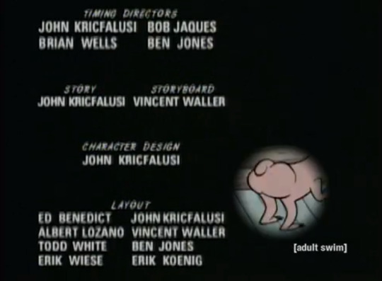
Ultimately, with the aforementioned abusive megalomaniac aside, Spümcø undoubtedly harbored some of the finest animators and artists ever. Such names as Bob Jaques (Spongebob Squarepants, Buy One, Get One Free*, The Baby Huey Show), Ben Jones (DC Super Hero Girls, Cats Don’t Dance, Teen Titans GO!), Vincent Waller (Spongebob Squarepants, Adventures of Sonic the Hedgehog), Albert Lozano (Inside Out, A Kitty Bobo Show), Todd White (Spongebob Squarepants), Eric Koenig (Atlantis: The Lost Empire, Madagascar, Cats Don’t Dance, The Simpsons, and The Tigger Movie), and Erik Wiese (Samurai Jack, The Mighty B!) are among the hundreds of creatives who ended up almost everywhere working in Burbank and Canadian animation.
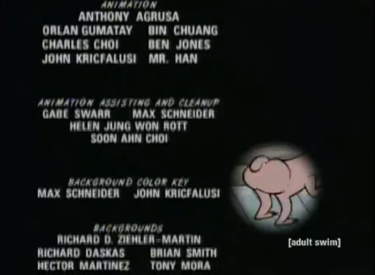
Other names on the Spümcø team that one might recognize include Gabe Swarr (Dexter’s Laboratory, The Buzz on Maggie, Foe Paws, El Tigre), and even background artists such as Richard Daskas ( @rdaskas - Samurai Jack, Time Squad, Sym-Bionic Titan, Batman Beyond), Richard Ziehler-Martin (Tiny Toon Adventures, The Wacky World of Tex Avery), Hector Martinez (Tom and Jerry: Robin Hood and His Merry Mouse, Timone and Pumba, Captain N, Evil Con Carne, Dora the Explorer), and Tony Mora (MAD, Teen Titans GO! to the Movies, Pickle and Peanut). I mean: in short, these artists worked for Warner Bros. Animation, Disney Television Animation and Walt Disney Feature Animation, Nickelodeon, and Cartoon Network Studios!
Spümcø’s production assistants on Boo Boo Runs Wild feature Matt Danner —a fantastic character designer, storyboard artists, director and producer, whose credits range from (Johnny Test and The Legend of the Three Caballeros to Team Hot Wheels and The Looney Tunes Show—and Cartoon Brew editor Amid Amidi. Brian A. Miller was an executive in charge of production, not for but probably in association with Cartoon Network.

Spümcø’s creatives, as I said, are all over the place in Burbank animation. Other shows that still air on @adultswim have ex-Spümcø creatives. For example: today’s re-run of Samurai Jack EPISODE XVI features Chris Reccardi (The Powerpuff Girls, The Grim Adventures of Billy & Mandy)...
Scott Wills (Genndy Tartakovsky’s Primal, The Twisted Tales of Felix the Cat)...
Lynne Naylor-Reccardi (The Shnookums and Meat Funny Cartoon Show, Wander Over Yonder) and Jim Smith (YooHoo and Friends, Tom and Jerry Tales, McGee and Me)...
and Leticia Lacy (TRON: Uprising, Sym-Bionic Titan, Wander Over Yonder, Korgoth of Barbaria).

Even outside of Cartoon Network Studios, where most ex-Spümcø artists end up, @cartoonnetwork’s The Amazing World of Gumball, from Cartoon Network Studios Europe (AKA Hanna-Barbera Studios Europe), features ex-Spümcø artist Charlie Bean (The Powerpuff Girls, Robotboy, Batman: The Animated Series, Timone and Pumba, Creature Crunch) on The Cartoon Network Europe Development Team.

One of Cartoon Network’s biggest and craziest hits, Teen Titans GO!, also features such ex-Spümcø artists as storyboard artist, director and producer Luke Cormican (The Buzz on Maggie, Brandy and Mr. Whiskers, Brickleberry, The Replacements, El Tigre)...
Gerald de Jesus (The Book of Life, The Ricky Gervais Show, TMNT)...

and Eric J. Pringle (Fosters’ Home for Imaginary Friends, The Problem Solverz). What wacky cartoon filled with live-action images, unpredictable visual gags and extreme slapstick humor wouldn’t?
Relatively, you could even tune in to Nickelodeon, the original home of Spümcø’s ground-breaking hit, The Ren & Stimpy Show, and see names of creatives associated with Spümcø and Ren & Stimpy, such as Zeus Cervas (Star vs. the Forces of Evil, Spongebob Squarepants, Clarence) on today’s episode of The Patrick Star Show...

or even Gabe Del Valle (Mighty Magiswords, Spongebob Squarepants) on today’s episode of Middlemost Post!
Overall, Boo Boo Runs Wild introduced me to the cartoon studio whose works I took for granted and on which I was missing out all of my life, and I strongly encourage this generation to support this Yogi Bear / Ranger Smith episode, which you can watch RIGHT NOW on [adult swim]’s site. It was officially on their YouTube channel, but it was removed for unknown reasons. This short never even got a DVD or VHS release!
The last televised airing of Boo Boo Runs Wild on [adult swim] so far was January 6th, 2019 A.D., but Spümcø also produced “A Day in the Life of Ranger Smith” and “Boo Boo and the Man” (based on true events in the life of John Kricfalsui) for Cartoon Network.
As I come to a close, it’s worth noting that layout Ed Benedict, an animator and artist whose credits go all of the way back to the 1930s with Disney and continued with MGM and Hanna-Barbera/Cartoon Network Studios, originally worked on Yogi Bear episode “Yogi’s Birthday Party” as a layout artist, and reprised that very role for “Boo Boo Runs Wild”. What a legacy the animators and artists of this episode leave!
Always will I remember how Spümcø, whose legacy connects to my Cartoon Network-infused childhood, blessed me and graced me that fateful day, August 13th, 2016 A.D., with the ultimate example of the fine art of cartooning that is the Yogi Bear / Ranger Smith episode “Boo Boo Runs Wild”. I was living in the moment, and I thank God for it.
“For years they have [been] asking me to make new Yogi cartoons, but I can’t even get a half a million [dollars] to make one, probably because I actually like the characters, but 60-70 million $ to make walking corpses is economical.” - John Kricfalsui on Yogi Bear (2010)
Another Ranger Smith, Boo Boo or Yogi Bear cartoon from the people behind The Ren & Stimpy Show is highly unlikely today, due to the abuse and harassment of John K. angering the world to the point of hating and condemning the man who helped to shape not only Cartoon Network but also television animation—and animation as a whole—with an undeniable legacy of artists and animators who deserve way more credit and respect than we perhaps thought of giving as kids.
Tweet version of this post here.
#boo boo runs wild#yogi bear#spümcø#spumco#cartoon network#adult swim#[as]#[adult swim]#ranger smith#vincent waller#john kricfalusi#john k#john k.#matt danner#ben jones#bob jaques#albert lozano#todd white#eric koenig#erik wiese#cartoon#cartoons#hanna-barbera cartoons#hanna barbera cartoons#tony mora#richard daskas#hector martinez#gabe swarr#ed benedict#boo boo
29 notes
·
View notes
Text
Alternate Cut - Cutting Room Floor
Story Progression Update
(So I am expanding this a bit more give a more realistic time scale. This might seem like a lot, but most of it should be done quickly depending on everyone’s schedule. But I just wanted to give a better behind the scenes of how this kind of process works since that’s the whole point of these blog posts. ^_^ )
Story Rough Draft : 75%
Editing/Review of Story: 50% (Halted waiting on story finalization)
Story Revisions: 40-50% (May change depending on story finalization)
Story boarding art draft for arc 2: N/A (Need to finalize story as arc 2 plot points can be impacted by end of story)
Review Arc 2′s Art drafts: N/A
Begin Arc 2 Drawing: N/A
----------------
So this week we will be talking about some things we decided to cut from the story!
While there is some things I wish I could discuss, unfortunately they would dive into spoiler territory so I can’t go really to much into that. (Maybe once we get to past that part of the story I’ll release those drafts.) But what I will discuss is some directions that I originally wanted to go but we decided we should not.
Font Family
So one idea I originally had for the comic was to give everyone their own font.
The concept was to give each text bubble a voice. Typically in comic’s it’s just black text in a bubble. While that premise has existed for ages I wanted to spice things up a bit.
As part of the draft of this comic I spent hours (honestly probably like 8-10 hours hahah) researching and finding a bunch of freeware fonts to use for every character in this comic. I really tried my best to pick a font that best represented each character and would give them a distinguished voice. The idea being you know who is talking just by looking at the font, especially when they are off panel. I wanted it to be like a show, where you could “hear” a character by immediately seeing their font and being like, “That’s Yellow Diamond talking”. Here is a taste of some of that.
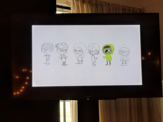
(Fonts)

(Panels using the fonts)

In the end we decided to scrap the idea. The problem came down to legibility. We wanted people all over to be able to read the comic, and fonts with a cursive or distinct styles may be to hard to read for some people. Other issues such as compression and size scaling made some fonts a bit to illegible. But we left the font color idea.
Was the time investment worth it? Probably not. But it was fun trying to find fonts that would represent everyone in the show! (Let me know if you want to see all the fonts I picked out hahaha)
It’s a musical!
Ok so hear me out, Steven Universe the movie is a musical right? (What?! It is?!) So I wanted to have some songs IN the comic. But that idea quickly went to the wayside as the logistics of that became hard to figure out. As we are designing this like a comic book and not like a web comic it would take pages and pages for all the lyrics of a song to be written out, not to mention figuring out how to write actual sheet music to go along with it. I enjoy writing poetry every now and then, so song lyrics would be a fun challenge. But I can’t find the time in the day to learn how to write music. Oh well. Maybe some other time. :)
----------------
So that’s it for this week! I hope you all enjoy these little behind the scenes glimpses into the comic process.What do you want to see next week?
Would you all rather see alternate titles for the comic that went unused, some storyboards from Arc 1, or story boarding process? Let me know below!
#SUMAC-Comic#SUMAC#The-Suit#Behind the scenes#Steven Universe#Steven SU#Blue SU#Yellow SU#Blue Diamond#Yellow Diamond#Spinel#Spinel SU#Update#Comic
68 notes
·
View notes
Text
Last Song
so here’s the rough outline for a Sona comic I wanted to make, but then ran out of time for. I had some pretty clear ideas in my head, but here’s the rough draft that’s... a little parallel to some more canon stuff. Given that, I thought it was best to post it now. At the time of writing this, I wanted to give Sona an actual character arc, and to give it an ending. My interpretation usually includes themes of acceptance and self-sacrifice, so those are aplenty. I have some thoughts on this, but I’ll put them all the way at the bottom. Click on the read more and enjoy.
I’ll probably reblog this a few times, because I am proud of it. Obviously a martyr ending is not good for a MOBA game and I took some liberties, but- Well, anyway. Here it is:
Ch 1: Orphanage
“Where you go, the world will bloom. You are never alone.” This note with baby Sona and the etwahl as the opening panel.
Several panels showing Sona standing in the center of the frame, growing up as the number of people around her both thin out and spread away (indicating both others getting adopted and her getting isolated). At least one of them should have her missing, then bring her back next frame to indicate she was adopted then returned (canon).
Finally, there’s no one left but her and she’s 17+. Caretaker puts their hand on her shoulder but she just smiles genially. Final panel of chapter is her sitting outside staring at the clouds. Sona. 17. Orphan.
Ch 2: War
A relatively short chapter that looks at Sona living her life in the orphanage, but haunted by nightmares. This is the part where her powers of empathy and prescience come in, and it’s shown she can see auras and is traumatized by what she senses. It ends with a panel of an extended hand from Lestara.
Ch 3: Suspicion (Demacia)
Another short chapter that details her practicing hard to learn her instrument as well as the suspicion and anti-mage sentiment. Paneling is split up into about three pages littered with mild flashbacks and “Remember, you must keep your magic a secret” or “What are you waiting for?” “For when I am needed.” It’s an almost slice of life chapter. It should also include a few panels of studying - both language and swordplay. We should also see Quinn in Sona’s home for at least one panel.
Ch 4: Invocation
The chapter opens with Sona opening the doors to the concert hall and walking on stage. There are brief reminders of anti mage sentiment through single line quotes and flashbacks that should take up no more than half a page each, to remind the reader that Sona feels like an outsider.
As the performance progresses, we should get close ups on various members of the audience, some familiar, who are emotionally moved by the performance. Garen, Jarvan, Fiora, Tianna, J3, Xin, etc are good options here.
The chapter should end with Sona bowing. Her face should be obscured by her hair and tears should be falling from her face. Next to her should be Sona but at a much younger age, also bowing - an indication that she’s grateful to finally feel accepted. This is where everything has led up to.
(The comic can end here, or continue on to something a bit more sacrificial:)
Ch 5: Sylas (Rebellion)
A short chapter that begins with Sona coming back from helping Ryze. As she enters the city and discovers what has happened, there are panels of people closing the door on her, looking at her with suspicion, and so on. The smiling faces of Demacia have turned sour and mean to her. Lux will not look at her, Garen turns his back, Jarvan is too busy, etc etc.
Ch 6: Tree of Life (Invocation, Part Two)
The conclusion to Sona’s arc. An unnamed battlefield, in which hundreds from both sides lie crumpled on the ground. We get close ups of several key characters on the ground. Demacia has many things, but it lacks this crucial element: A healer character.
Sona is stopped by guards who imply she can’t go forward because she’s got no training - she’s a liability on a dead battlefield. Someone calls to let her through - it’s Quinn and Valor.
As Sona walks into the battlefield, she kneels down and begins to weep/cry. This is her moment - what she has been waiting for, where her magical talents can be used. Both sides have collapsed under something (void, maybe? Singed bombs?)
And she sits there and plays her instrument and weeps and keeps playing as waves of healing pass over the entire battlefield. “Where I go, the world blooms,” some callback to that. She keeps playing as the scarred earth underneath her gives way to a meadow and tree roots begin to grasp her legs.
As the song progresses, people on the battlefield begin to get up. (Optional: Someone attacks her and she is defended by Quinn, Garen, or Lux). As the song continues, a tree grows around her and the entire landscape is healed.
Last panel is tiny child Sona bowing in front of the tree, and the story closes there.
===================================== ===================================== =====================================
The postword (?) / additional comments:
For me, I often find myself thinking that Sona should have a more active role - it often feels like things that lu/x does (and don’t get me wrong, my opinion on light lady has improved dramatically, we love her on this blog) could also be done in some respects by sona. often hcs I have (sona sneaking people out of demacia) end up in lux lore. Which is great, because same hat! Love that for Lux. Sad for Sona. I hope that makes sense. I really, really want to emphasize that this is in no way a jab at lux or lux blogs or anything of that nature. It’s just- as the other Demacian mage, Sona ends up being in a similar niche and so the ideas I have often end up being similar. And I’m really grateful to people for being kind to me about it, because feeling like I’m copying even if I came first makes me nervous as hell. It’s happened before, a lot. Drinking petricite, sneaking people out of Demacia, etc.

Anyway there’s the proof that this was something I drafted fully nine days ago, right before the new year. Cool. I did storyboard a little but I’m super uncomfortable with how it looks and it’s not digital.
Why are the two conclusion chapters called invocation? Based on a short story I wrote about quinn & sona, and Sona taking a stand to help her country.
Feel free to ask me as many questions as you want!
I’m @’ing the people who specifically said they wanted this: @eternallydamned, @toolbalance, and @aigaming. Thanks for cheering me on.
#the conductor#Dearly Beloved ( Saved )#drabble#//I will call this a drabble because it is basically a mini story#//they're rough ideas I only storyboarded a little but I hope you find them compelling!#//six whole chapters wow ! ! !
7 notes
·
View notes
Note
I would LOVE to hear your tipsy rant about facial expressions 💖💖💖🤩🤩🤩
A’ight. I’m having a Diet Caffeine Free Coke and coconut Bacardi at about a 1 to 1 ratio, which is the single nastiest drink known to artistkind. (Edit - halfway through this, my roommate has thoughtfully provided me with a mimosa, so I have a less nasty beverage.) I’ve had about half of it so far, and will continue to drink it throughout this treatise on facial expressions in comics. The editing of this post is going to suffer.
Inspired by (in a rage-y sort of way) this post. Everything is under the cut. This is gonna be long, folks. Buckle up.
I’ma start off by saying that I Do Not Care For most Western comics (webcomics and indie comics are excluded). Obviously, there are exceptions, like Habibi, Hawkeye, Tintin, Asterix, Scott Pilgrim, Persepolis, etc., which don’t follow the trends I’m about to harp on. I’m talking about mainstream titles by DC and Marvel… the big ones which OUGHT to be GOOD. But AREN’T. They’re either made as male power fantasies (see why I ADORE Captain America in the MCU, but can’t effing stand reading a single Captain America comic), or they’re made so damn quickly that no one has a chance to make them WELL, OR. OR MY LEAST FAVORITE. Ugh. Or they make comics where the pencilist doesn’t talk to the ink person who doesn’t talk to the colorist. And the results are HORRIBLE. See this post for one small facet of what I’m talking about. Styles don’t match and the results are D-R-E-A-D-F-U-L. Tone falls flat because the color doesn’t match the style of line art.
Now. The Star Trek comic I linked above has lovely coloring, and the technical quality of the lines is pretty good. You can look at those characters and go, “Ah, yes, Chris, Pine-Fresh Scent, as our Good Captain Sunshine, and his very good friend, Karl Urban, Son of Rohan, as the irascible Dr. McCoy.” But the FACES DO NOT SAY ANYTHING. LOOK AT THEM. THEY’RE DEAD, JIM.
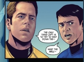
A NAKED MALE AVATAR OF THE USS ENTERPRISE, THE LOVE OF JIM KIRK’S LIFE, HAS APPEARED OUT OF THE AETHER IN SICKBAY, AND ALL THE EMOTION HE CAN CONJURE UP IS THAT FACE?!?!?!?!??!?!?!!!?!
I DO NOT ACCEPT THIS.
So the main things one needs to know about comics (and this is coming from a mostly self-educated-about-comics person, but I do make them on occasion, and my day job is like, storyboarding, among other things, for a vidya game company, so I think I can say I know a couple things about it?) are as follows:
You need movement in your page. This means that you gotta have some… flowyness of line, even if no action is being displayed. The Enterprise’s muscles coming over the skeleton in the link is a good example. Movement! Fluidity!! Hooray! But when you later look at Jim Kirk’s face, there’s no movement there. :( It’s as if they traced a picture of Chris of the Pines. The end.
Because there’s no literal movement, you sometimes have to exaggerate your expressions a little. It’s like in stage acting or voice acting - sometimes, you gotta play that up so the underlying emotion can come across better, because the medium can be limiting in some ways. Like, if you try to use ALL your skills as an actor in a voice acting thing, it won’t work, because your audience can’t see you. You have to put all that OOMPH you would’ve put in your expression and body language - AND BODY LANGUAGE, DO NOT FORGET THAT IN COMICS - into your VOICE. You gotta overdo it to do it right, sometimes. Chris Pine mighta pulled that face off on screen, but that won’t fly in a comic, but in a film, there would’ve been like, dramatic pauses and tonal inflection to indicate surprise and disbelief. But on paper, you gotta at least have like, an eyebrow raise or something. Sheesh.
DIFFERENTIATION BETWEEN EXPRESSIONS I CANNOT EMPHASIZE THIS ENOUGH. Not like every single panel has to be different, right? But this is not the way subtlety is conveyed in comics. One thing I’ve learned in storyboarding and comicsing is like. If the expressions aren’t different, you won’t know there’s been a change. You can’t really have microexpressions. They aren’t different enough for people to see the change.
SO. HERE’S WHAT YA DO.

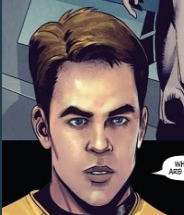
You alter the head’s position on the neck. You draw in the eyebrows a smidge. You make the eyes widen a touch, and for fictionally dramatic effect, maybe make the irises/pupils smaller. I DID NOT CHANGE THAT MUCH, YOU GUYS. I know the AOS comic was technically a lot more involved than what I just whipped out, but the theory would NOT have been that hard to apply to the inking person, and the colorist would not have noticed the difference in effort.

Like. Bones’ posture is so reserved, as is Jim’s. Jim’s expression is downright ROBOTIC. Has he been looking up youtube videos on How To Emote Like A Vulcan Who’s Achieved Kohlinahr?? Seriously!! It would NOT take much to alter these to have greater impact. See my red lines to the right. They’re not that good cuz I made them with my laptop’s track pad and not my tablet, but STILL. It wasn’t hard to alter the energy with very little effort!! As these were almost certainly colored digitally, it wouldn’t have been hard for either the inker or the colorist to change the line art before coloring. Or after, tbh.
Check out this link on micro-expressions. Seriously. I can well believe that we’d see these expressions (okay, no, I can’t… I’m trying to throw the artists a bone but I simply can’t… this is just bad comicsing) from Pinesol Chris in a movie, but AFTER he’d given us a brief micro-expression. Again, I lie. Pine is a much better actor than this.
AND ANOTHER THING ABOUT WESTERN COMICS THESE DAYS. They’re so hung up on getting characters to look like the movie actors that they hire artists who are “””””technically good”””””” and they either don’t have enough time to adequately create the comic, or they aren’t allowed to let the Strong Male Character Who Don’t Need No Emotions to emote!!!! LIKE WHAT YOU SEE HERE!!! JAMES TIBERIUS “THE ENTERPRISE IS A BEAUTIFUL LADY AND WE LOVE HER” KIRK WOULD ABSOLUTELY EMOTE OVER SEEING HIS SHIP TAKE A FLESH-AND-BLOOD FORM. If OOONLY because he was surprised to see someone materialize in front of his face.
See also: Steve Rogers has more emotions than “I’m in the mood to murder,” but you wouldn’t know it from the comics!!!!! (see why I don’t read them.) It’s like. The artists they hire are good at drawing bodies and good at drawing one (1) expression, and they just. Do that all over the page. Give me Mark Bagley, who at least knows how characters should emote, even if Mary Jane in Ultimate Spider-man DOES look like she’s a 21-year-old Victoria’s Secret Angel when she’s 16! Give me Hergé, whose first Tintin book was a little rough, but who really got there in the end! Give me Walt Disney, who wasn’t afraid to give characters fluidity and movement, imagination!
This is what Eastern comics often do so well at. There’s no subtlety, but you know exactly what’s going on in a manga. Those expressions aren’t messing around.
You want subtlety? Check out Craig Thompson, Marjane Satrapi, Art Spiegelman, David Aja, and even Bryan Lee O’Malley, on occasion! You can do subtlety in comics. Art Spiegelman is a prime example of NOT ALWAYS DOING FACIAL EXPRESSIONS BUT STILL CONVEYING MOOD!!!!!!!!!! Absolute MASTER of the craft. But there’s also a stylistic choice involved there. Here, we just have James Tiberius Kirk the Macy’s Storefront Mannequin. Go away and come back when you have a believable Jim Kirk.
My laptop’s battery is running down, so I must cut this short. REMEMBER, kids, don’t let your characters’ expressions be flat!!!! LET THEM EMOTE 2k19.
#zj has opinions#advice#critique#art critique#seriously i have opinions and this is largely me being frustrated with the comics industry#replies#therebewhaleshere#liss ilu and this is the best ask ever thank you
247 notes
·
View notes
Text
NYCC Panel Summary
Now that I’m finally home after a very long and very fun day at the SVTFOE panel (among other things) at NYCC, I’m gonna type up a summary from the notes I took. Note that some stuff is missing, I’m not gonna go into detail about every little thing; this is just what I found most important/interesting. Italics is my commentary on it. Bold is most important/new information. Not in any particular chronological order from the panel.
-Originally Ludo was going to pretend to be a student at Echo Creek Academy. She showed a bunch of her old sketches, most of which I’m told have been put online before but this one is supposedly brand new. Go birb boi go.
-Daron always liked doing character-first writing, and the other stuff was figured out afterwards. No shit sherlock, maybe more people should hear this.
-As most people know, the original concept for SVTFOE had Star as a 4th grader who believed she was magical but it wasn’t real. The new piece of info, kinda, is that when the direction shifted towards Star being older and being magic, this is what led to Marco having as much importance as he does. Hmm I wonder why.
-Star and Marco are “such good friends” -Daron Nefcy, Oct 7, 2018. Sure Daron, sure. That’s all they are.
-Dominic Bisignano built the scenes that Janna has in Mewberty which led to her becoming a more major recurring character. Also Janna’s personality and last name were “borrowed” from one of Daron’s friends. Dom is the best, as usual.
-Daron sees a lot of herself in Star, and a lot of her husband in Marco. HMMMMMMMMMMMMMMMMMMMMMMMMMMMMMMMMMMMMMMMMMMMMMMMMMMMMMMMMMMMMMMMMMMMMMMMMMMMMMMMMMMMMMMMMMMMMMMMMMMMMMMMMMMMMMMMMMMMMMMMMMMMMMMMMMMMMMMMMMMMMMMMMMMMMMMMMMMMMMMMMMMMMMM.
-The writers draft up 2-3 page outlines and give them to the storyboarders who get to actually make the episode in full (including dialogue, scenes, etc) over 6 weeks. Daron personally checks in a few times during that process to make sure it’s all gelling with their concepts. I always knew one of the show’s strengths was that it was board-driven while the writers still maintained pretty tight control over the broader narrative, but it’s nice to have some more concrete info for this.
-When asked about hardest eps to make, she mentioned animating crowds was tricky. Writing-wise, eps with tons of deep history/lore require more effort, and eps without the Star/Marco dynamic are hard because that dynamic is very reliable/sturdy. HMM IT’S ALMOST LIKE THAT’S A CORNERSTONE OF THE SHOW GUYS. If I have one regret about the panel it’s that I couldn’t ask a followup about how they felt writing so much of S3 with them apart. Clearly the distance was intentional to the story, but I wonder if they felt it would be as rough as it came across to the viewers.
-Daron has been involved in the writing of every single episode, the creation of every character, and selection of all of the voice actors. Neat.
-Patrick Stump actually contacted Disney about doing some sort of voice acting work on his own, and the casting director contacted Daron since Daron was looking for someone for the part of Ruberiot to sing a rock opera. She actually wasn’t totally sure right away, so Stump volunteered to audition, and did. He got the part. Shocker.
-Daron wrote the parts for Skywynne, Festivia, Crescenta, Estrella (well, drew), and a lot of Glossayrck in the Book of Spells. Amber and Dom split the rest. Also, Daron made all of Festivia’s tweets fit the character limit for Twitter, but that changed in editing. Stupid editors, ruining attention to detail.
-Dom actually tested all the pie recipes in the book of spells.
-Daron was bummed that the internet deciphered Low Mewnian so easily.
-Some details in the book were changed along the way last minute to connect to Season 4 content. Eclipsa will personally use some of her spells in the book (and will be very involved in S4 overall), and we’ll enjoy season 4 much more if we’ve read the book, apparently. Cool.
-They’re still hard at work on the show, and producing about an episode per week supposedly? Obviously she doesn’t mean a full episode is completely finished per week, because otherwise all of S4 would be done in a month or two.
-When asked about Tom, Daron said that he always had potential to be more than just the angry ex and that Rider’s performance was a part of that. She didn’t really give many specifics there and just reiterated that she did character-first writing after that.
-The 650 dollars running joke was just a random thing inserted in Goblin Dogs and they scrambled to make an explanation for it later, thus tricking us into thinking she is a wizard of foreshadowing.
-Daron’s approach to balancing comedy and seriousness is that the characters themselves should be more lighthearted and funny, so they can be lights even in dark situations. Which works except when they’re super depressed for most of the season. Not that comedy was ABSENT from S3, but it still just felt way heavier all around.
-Daron doesn’t really receive any pushback on political stuff in the show, but probably mainly because it’s all fantasy. They can get away with a lot when unrealistic character types are involved and can get really allegorical. For instance, she is not allowed to have a character punch another human character in the face, but with unicorns it’s totally fine. Season 4 montage of Ponyhead being used as a punching bag for Marco’s workout routine CONFIRMED. Star will eagerly watch him work out shirtless.
And of course the clip.
youtube
62 notes
·
View notes
Note
I've just read that word of god post you've reblogged and i agree that if it's not in the canon then it's not in the story. but what is the canon exactly? if we take vld as an example, can the extra materials like the guide books or interviews be considered canon when they give us information that is never talked about in the source material, that is in the show itself?
Canon, at its simplest, is “what the community consider the official record.” Its ‘things recognized as authentic,’ and by extension also ‘a standard by which something is judged [as genuine]’. Frex, to say ‘this album is modern jazz’ requires comparing the music to the modern jazz canon.
For fiction, canon applies the idea of an ‘official record’ to the story itself. The purpose is to delineate the ‘actual’ (genuine) story, and the standards by which new stories (sequels, spin-offs, etc) become canon. The common standards tend to be: who created it and/or was involved, form of distribution (ie official channels), and how widespread it was. Frex, a song played once in a small club in Chicago and never recorded would probably not be considered part of the ‘canon’ of modern jazz (that is, would not be used as the ‘standard’ by which newer works could be judged, because the work is too obscure).
That brings us to the next level (and often the most fiercely debated): which texts are deuterocanonical. It’s a fifty-cent word but it’s exactly the word we need, here. It means ‘secondary canon’ and it’s texts that could be canon but fell short by some measure. Different author (or ghostwritten), written years later or years earlier, retcons everything, completely different story but with cameo of canon character, and so on.
Adaptations are often deuterocanonical: a book to a movie, a movie to a TV series, a TV series to graphic novels. Each media has different storytelling conventions, so the story changes, and if you were a fan of the ‘real’ story, you might see the adaptation as just a shade too different. Plenty of fans of the Fullmetal Alchemist manga see the first anime (which diverged wildly) as a secondary canon — interesting, but not crucial; fewer say the same of the second anime, which was much more faithful.
Continuations also tend to be deuterocanonical, especially when the media changes. If your intro to a fandom includes the warning that everyone ignores a certain continuation, sequel, or spin-off, the community may have decided the later works are a secondary canon. This dismissal comes with the usual flamewars, at least until the fandom agrees to disagree.
Best criteria is whether parallel or subsequent stories impact or develop the ‘main’ story. Agents of SHIELD is a spin-off of the Avengers movie series, and it pivots mid-story due to movie events. The TV show may be deuterocanonical for movie fans, but the movies are canonical for TV show fans, because those stories have significant impact on the events in the TV show’s storyline.
And then we get to words about the story: meta. Tolkien’s estate has published his drafts and notes; these books satisfy canon per authenticity (written by Tolkien), and stamped as official by the estate. You don’t have to read every rough draft to get the final version, so Tolkien’s notes aren’t really primary canon, but they probably would be considered deuterocanonical.
The same doesn’t apply when it’s just anyone writing meta, even a published Field Guide or Annotated Glossary — a fancier and footnoted version of the same kind of meta fans have always written on their favorite works. No matter how well-researched, that third-party meta is not canon, no matter who wrote it or where it was published.
And then we get to word-of-god, however it’s relayed (panel quotes, interviews, tweets, blog posts, etc). Word-of-god, like handbooks and marketing material, are not the story; it’s talk about the story. It’s meta, and as such it can never be more than – at best – secondary canon, and even then under limited circumstances.
The next thing to consider in word-of-god is: who’s the god, here? It’s easy enough with Tolkien, Rowling, Kipling, Austin, any one-author work where one voice did the bulk of shaping the ideas and words and story. It’s another matter when we get into multi-creator, collaborative stories like movies, television shows, even stage plays or dance where the work passes through multiple hands on the way to becoming a final product.
If the actor chose to read those lines as though the character were in love, that has an impact on your experience of the story. Is it enough of an impact? Does that make the actor right to say, “this character is in love”? Does the actor have that authority? Or an executive producer who didn’t write the script, direct the episode, voice any of the lines, storyboard any scenes, or animate any frames? How do we measure the contribution of ‘enabling others to create’ to determine whether word-of-god applies? What about a story editor whose outline was informed entirely by exec notes? Can we say the writer of a particular episode even has word-of-god authority, if every line was altered by the actors to a smaller or larger degree?
Beyond that — and this applies from one-author texts up to multi-season series with a production staff in the hundreds — we cannot assume the author (if there is a single identifiable hand in the story) actually knows the story they’ve written. We writers can tell you what we meant to write, and what we wanted to write, but what we ended up with isn’t always where we’d planned to be. Hell, sometimes we don’t see the themes until a long time after the work is written, the same way we don’t always see where the story’s failed on other counts (representation, gender, cliches, plot holes, etc).
I could add a lot of words, but here I’m just going to quote some of TV Tropes at you, since the entry does a good job of covering all the bases.
A number of people reject [word-of-god]… If the creator had wanted a certain fact to be canon, the thinking goes, they should have included it in the work to begin with. [Others] go even further, considering the uncertainty and ambiguity of canon to be a good thing… Wimsatt and Beardsley’s “The Intentional Fallacy” and Barthes’ Death of the Author essay both argue that the interpretation of a work cannot be limited to attempts to discern the “author’s intentions.”
Another thorny issue is … collaborators may not actually agree with interpretations of their story that weren’t made explicit in the work. This is especially likely if they no longer work together, and particularly if they had a real-life falling out. In this case, there are multiple “Gods” given potentially contradictory explanations, so whose word is to be considered correct?
If a story requires the author pop up to explain each scene in some nightmarish reverse-MST3K scenario, then the story has failed. Point blank, full stop, do not pass go, do not collect two hundred dollars. The story has failed.
But let’s pretend the story is fine, and you just can’t take lying awake at night wondering about that damn watermelon. There’s a place and time for creator explanations; easter eggs (like in-jokes and homages) definitely count, and can be a lot of fun. There’s nothing wrong with word-of-god, after all, so long as it’s taken in moderation. In the end, it’s just a slightly more knowledgeable voice, but never let it drown out your voice or your experience.
Ultimately, this incessant emphasis on word-of-god has two sources.
One is the current penchant for throwing wild swerves as a way to combat audience boredom. These get called ‘plot twists’ but in the hands of less-skilled creators, they’re just cheap shocks. Pushed too far, they’ll break the story. Groundwork and foreshadowing are left off the page or screen for fear the audience will ‘figure it out’ too soon, and the result is an audience struggling to make sense of the quagmire. Word-of-god doesn’t fix the story, but it can at least provide closure. You know why the watermelon was there, and you can move on to obsess about something else.
The other source is our immediate and seeming direct access to a lot of creators: writers, directors, storyboard artists, voice actors, producers, all up and down the line. We could sit down and think hard about the story (if the story isn’t so broken that’s moot, at least), or we could just tweet or blog or tag a creator and ask. Or hope someone asks our question at a panel, or a podcast, or some other interview. Why bother with meta, when you can get a slightly more-informed meta from someone who looks like an authority?
Hey, authors have been getting questions from readers since Lady Murasaki sat down to write. No, the real issue are creators who’ve come to crave (and encourage) the audience asking how to interpret the story. It’s a pretty heady thing, getting that kind of attention, and it can get away from you really fast. What began as a simple question about indestructible fruit becomes an ongoing interpretative dance by the author on behalf of the work.
It’s flattering to have the audience clamoring for your words, but… it’s not about you, as the creator. It’s about the story. A creator needs to step back and let the story do the talking. The sooner some creators remember that, the sooner some fandoms will calm the fsck down.
Primary or secondary canon, word-of-god or radio silence; in the end, the story’s got to stand on its own. If it can’t do that, no amount of explanation in the world will prop the story back up again.
47 notes
·
View notes
Text
Victoria Turnbull

In this post, Victoria talks about her third picturebook, ‘Pandora’. This stunningly illustrated tale of hope and regeneration was originally published in the UK by Frances Lincoln Children’s Books, and has been translated into several other languages.
Visit Victoria Turnbull’s website
Victoria: ‘Pandora’ is the third picture book I’ve both written and illustrated. My first two books were developed on my MA in Children’s Book Illustration and published consecutively after finishing the course. So this was the first one I’d written outside the sanctuary of the MA, and it felt like a big step.
The seed of the story was planted after reading a news story about recently discovered cave paintings, where footprints of a child and a fox were also found. I began to imagine a world where man no longer existed, yet one where his former existence was evident in all the things he’d left behind. In this grey desolate landscape of rubbish I was starting to picture, a fox seemed like a natural protagonist. The fox has become a feature of our urban landscape and I felt this enigmatic creature would adapt well to a man-made environment.
‘Pandora’ was always a story of regeneration. Whenever I considered it, an image would pop into my head of a vast landscape of waste mountains that transformed into rolling hills at the turn of a page. Visually it felt like a satisfying conclusion and if I could figure out the catalyst for the change, it also told me how the story would end.
I searched for influences to fit this idea in the form of other stories, such as ‘Pandora’s Box’ and ‘Noah’s Ark’. Around this time, I also rediscovered a book of fairy tales from my childhood. In ‘The Nightingale’ by Hans Christian Andersen, an Emperor prefers the song of a mechanical bird to that of a real nightingale – only realising his mistake when he’s close to death. The story echoes the notion of mankind valuing material possessions over the natural world and added to the connections that were starting to form in my mind. Eventually these thoughts tumbled out onto a page in my sketchbook.
I came to picture book making through my love of drawing, and I still find creating a narrative an incredibly difficult process. By this stage I had an idea of the shape of the story but I didn’t know how it was going to fit into a 32-page format. In an effort to organise my thoughts, I started laying it out as thumbnails. In one of my early drafts, Pandora constructs a mechanical bird out of the objects she finds on the dump and the bird brings back seeds that transform her landscape. It seemed like a neat solution but I felt something was missing.
At the heart of all my stories is a search for something: a journey of self-discovery where the character finds the inner strength needed along the way. Pandora’s story only became clear when I realised, like the Emperor in ‘The Nightingale’, she wouldn’t be happy with an imitation of nature. She needed a real connection. Once I decided a wounded bird would come into Pandora’s world, the narrative fell into place much more easily.
I worked on the text and the illustrations simultaneously, adding corresponding text to my sequential drawings to show what was happening in each panel. The text reflects Pandora’s limited understanding of her world and serves to enhance her feelings of isolation. It changed very little from here to the final book.
I submitted the final storyboard alongside a couple of character sketches to my publisher and they liked the concept, so I was able to start work on the roughs. At this stage, compositions can easily change so I don’t like to invest too much time in the drawings. I try to keep them quite loose, so there’s still more for me to discover when creating the final artwork.
Sometimes a character just speaks to me in some way, and that’s how it was with Pandora. I really empathised with this little fox and I wanted that feeling to come across in the drawings.
I thought Pandora should look small and vulnerable in relation to the environment, so I proportioned her like a child and put her in a dress that allowed her tail to poke out from underneath. I also liked the way her markings gave the appearance that she was wearing socks. When I draw, I’m often looking for something elusive, a feeling I get when I know it’s right. It usually takes many failed attempts but it’s exhilarating when it happens.
I felt emotionally invested in telling this story and I wanted to do that as best as I could. My concern was that setting a picture book on a rubbish dump could potentially feel a little depressing. I also much prefer to draw natural forms than man-made objects but there was nothing I could do to avoid it here. So just as Pandora manages to bring beauty into her imperfect world, I endeavored to find little things of interest to love as I created the pictures.
My first step was to go to various London museums to photograph all the things that seemed to belong in this world I was creating. I wanted it to look alien yet familiar, so I tried to choose objects that reflected this. My hope was by introducing lots of detail, the reader would be forced to stop and consider the environment. But as a consequence, it also made me consider the areas of white space and how important it was for the book to work as a whole.
I try to adapt my technique to each narrative. For this book, I knew I wanted very little colour in the initial pages, with gradually more colour creeping in as the story progresses and as nature prevails. In an effort to preserve the spontaneity of my original sketches, I scanned and printed out my pencil drawings onto thick paper. These line drawings were then coloured with a combination of graphite pencil, coloured pencil, pastel and linseed oil. Creating the artwork by hand is quite a laborious process, and after straining my arm, I struggled to complete the final few spreads. But I think in the end it was worth it.
For me, ‘Pandora’ is a story of hope and humanity. Even though man doesn’t appear in the book, he is always present. Children have an innate sense of wonder and curiosity in the natural world, but it’s easy to lose that connection as we grow older. I hope the reader takes from this book the knowledge that they can affect their own story, and the story of the world they inhabit.
Illustrations © Victoria Turnbull.
Buy this picturebook
Pandora
Victoria Turnbull
Frances Lincoln, United Kingdom, 2016
Pandora lives alone in a land of broken things. She makes herself a handsome home from all that people had left behind, but no one ever comes to visit. One day, a bird with a broken wing falls from the sky. Pandora nurses the bird back to health, and it begins to fly away each day, bringing back seeds and small plants. When the bird stops coming, Pandora is heartbroken. But day by day, things begin to grow...
A beautiful tale of hope and regeneration.
English: Frances Lincoln (UK) — Houghton Mifflin Harcourt (USA)
German: Bohem Press
Dutch: Clavis
Chinese (Simplified): Beijing Green Beans Book
9 notes
·
View notes
Text
August 10th-August 16th, 2019 Creator Babble Archive
The archive for the Creator Babble chat that occurred from August 10th, 2019 to August 16th, 2019. The chat focused on the following question:
What is your process for planning out the paneling/layout of each comic page?
kayotics
I’ve finally gotten my process down to a process that works for me. For Ingress Adventuring Company https://www.ingress-comic.com/ I start with scripting the whole chapter out. Step two is thumbnailing the whole chapter out, so I can figure out pacing and paneling. I started to do thumbnailing on sheets of printer paper, which has been easier to figure out my drawings and to see how the comic flows on paper. Once that’s done it’s pretty straight forward. Panel borders in pencils > rough sketch & balloon placement > letters and tight sketch in pencils > ink letters > ink bubbles and borders > ink the rest of the page. Then I scan it and do the colors. With the thumbnail process I kind of do the chapter twice in pencils but it ended up being way easier in the long run, since I hate doing panel layouts and doing that work in the beginning is way easier.
Steph (@grandpaseawitch)
Afraid there's no scripting for https://oldmanandtheseawitch.tumblr.com/. It's all pretty much in my head but I go over it literally every day, and I have a few roleplays archived to keep things on the right track, but that's about it. Thumbnails are done in big batches. Last batch was about 20+ pages done at once. Thumbnailing is also where I figure out composition and such. Just detailed enough to give me the idea of what I want, with enough leeway to do as I please on the page itself. Thumbnails done, I make a batch of empty pages, and go in and make all the panels for the 20+ pages. Since I already know the composition from the thumbnails and I have digital guides set up on each page, that's super easy. With all of those done, then I just go back in, do rough sketches for each page. Cleaner than the thumbnails but not too clean yet. Once the rough sketches are done, this is actually where I'll add text and balloons, so that I know what the bubbles will be hiding and don't have to waste extra time. After that, I do as much in large batches as I can, usually cleanup sketches, then inks, maybe flat colors. But after that point, I just have to sit down to work on individual pages until they're done. And voila!
authorloremipsum
http://signsofthreecomic.webcomic.ws/comics/ For Signs of Three, I always start with the script, get the basic idea of what I'm going for in the page. Then panel layout and gesture sketches of people and the environment. THEN! BEFORE I START DETAIL SKETCHING! I LAY IN THE SPEECH BUBBLES. Seriously speech bubbles are critical to controlling how readable your page is and so so many people don't seem to see that. They must lead from one bubble and panel to the next in an easy to understand way or your reader will get lost and confused. So I always make sure to put bubbles in during thumbnailing. After that it's just basic refining the sketch, lining, coloring, and shading.
AntiBunny
Typically in AntiBunny http://antibunny.net/ I thumbnail a page first to decide what needs to happen. After that I look at those event and decide panel layout based on how best to depict them, factoring in what needs to fit, who needs to be there, and how time will pass. I'd say time is the most important aspect, followed by emphasis, and then content. Typically bigger panels depict more time passing, but that's not a concrete rule. A big panel can depict a very short moment in time. The amount of population has a big play in that as well. A lot of action in a big panel can be a short moment in time that's just heavily emphasized. A big panel with very little movement depicted is great for dwelling on a single moment, which is great for slowing down the pace of reading.
heroesofcrash
I used to not have a script at all, but now I tend to write out scripts in advance. I keep a four-panel format in mind (2x2) when I write a strip, but I'll sometimes combine or split panels depending on the flow of the story. (I'll place some sample strips below, showing a "default" 2x2 strip, and a few that combine or split panels based on that structure) I then draw guidelines in Manga Studio (I have the CD, not the digital version that became Clip Studio Paint) for where each panel will be. I put the dialogue in each panel, sometimes editing for space or to fit it nicer in a speech bubble. I can usually visualize how a speech bubble will generally fit in a scene; it's easier for me to draw around the bubble than to draw first and add the words later. After I sketch out the panels, I may move the words around to fit in the scene a little better. I may even tweak it a little when I draw the speech bubble around the text, if I don't like how the text fits in the bubble or how the bubble fits in the scene. As I mentioned earlier, here's two strips. One has four panels (which is the most common for me), the other has six. The latter is made by splitting the upper right panel into two skinny panels, and breaking the bottom half into three panels rather than two. Not only does it give me enough panels to do a complicated visual gag, but having panels with a similar layout next to each other makes the action easier to follow, and thus makes the gag flow better.
Desnik
For http://ask-a-warlock.tumblr.com/, I make tiny thumbnails to quickly go through layouts. I tend to have a few different ideas and doing small/quick is a lot easier on the revisions
LadyLazuli
For Phantomarine (http://www.phantomarine.com/) I've gotten into the habit of thumbnailing each chapter extremely roughly in a sketchbook, then bringing the pages into Photoshop and shifting the panels around to improve the flow throughout the chapter. I put in rough dialogue bits to anticipate balloons, then I get going on rough sketches and color placement in Procreate, then clean up and paint the sketches, then bring them back into Photoshop to finalize the page. It's honestly really haphazard, just because I tend to change details and dialogue around a lot, depending on what I feel is working/failing - but that core chapter flow doesn't change too much, just so I don't get caught needing more pages in one part. So... I keep the roughs very rough, but I adhere to them quite strongly? The details are where things get experimental (edited)
JUNK
I am a fool who hasn't been doing thumbnails lately, so my process is the typical script>sketch>inks>tone.
MJ Massey
I start with my storyboards, which are just skethcy first drafts of the pages in a sketchbook. I have a vague genreal story outline, but this is where I really figure things out--both the layouts and the script.
In my head, I tend to see things as if they were an animation, so I am usually trying to catch that sense of movement in the comic panels. I try to keep things interesting and thinking outside the typical grid layout, usually resulting in some pretty crazy stuff. It's easier with action scenes, but I try to mix up everything. I do my final pages on 9x12 bristol (I used to work on 11x14 but that was...too big for markers), but there are many times where I will scrap the storyboard and do something totally different for the final page, or add or take away things. But it's good to have that first draft down as an idea, it's easier to adjust from there if I need to
FeatherNotes
@LadyLazulii love your process ahhh!!!
LadyLazuli
@FeatherNotes MERCIIII
Nutty (Court of Roses)
For Court of Roses http://courtofroses.thecomicseries.com/ I mostly sketch out thumbnails, scan them in, and lineart/color. Like most of y'all, I have a general story outline, and specific scenes get more detail as I work closer to them. If there's a scene that has emotional hits and I want the right dialogue for it, I'll script it. If there's lots of exposition and detail, I'll script it. Just, largely winging it on my end!
Tuyetnhi
I usually work from loose script dialogue for a chapter, to get the feel for the page, then start thumbnailing. After thumbnailing tho, I redraw the thumbnails on csp, sketch, then change/define panel layout or render till finish. Often, my thumbnails don't give me enough info till I start the page. And that's good for me since it's still under a set guideline but I don't feel rigid on "Oh gotta make it exactly like this" or some sorts. Same goes with dialogue/scripts too since I tend to go back and correct panel layout if i don't think it was strong enough on the first go. Idk, I treat it more of a fluid process that I can go back and fix due to how I digitally paint/render things. Still the process depends on the page i'm working on, how strong the thumbnails are, dialogue, and color scheme theme I had with certain pages. Most of it is 40% gut feeling tho. Images shown here how I got OIYD! Ch. 2 - Page 15 to be to its finished form. [thumbnail-> Rough sketch -> add with color -> final render with dialogue]
ErinPtah (Leif & Thorn | BICP)
I took scans/notes about each step of the BICP page-making process back during chapter 5: http://www.bicatperson.com/comic/step-by-step/ ...and then again, seven years later, during chapter 28: http://www.bicatperson.com/comic/the-webcomic-page-making-process/ The art has gotten better, but the actual workflow...basically hasn't changed. (If it ain't broke...)
snuffysam
First I have the script for the entire book, which I'll have finished ahead of time. At the start of each chapter, I'll divide the upcoming script into pages based on how I want the comic to be paced - e.g. making sure the setup and punchline to a joke aren't on different pages, making sure there's not too much dialogue to read on a single page, etc. Then, when it comes time to do the page, I'll split things up into panels. That's pretty easy - I generally want to keep things to one line of spoken dialogue per panel, or one "action" per panel. Sometimes there'll be beat panels, sometimes two people will talk in one panel, but that's the general rule. Next I... put together the panels. I don't really use thumbnails to work this stuff out - important panels or panels with more dialogue are bigger, less important panels or ones with less dialogue are smaller. I try to make sure panels don't intrude on each others' vertical space, because i've always found that complicates things in a web medium - but that just means there's less for me to worry about. I make sure the panel layout is different from the previous page, and if there's an action I need to emphasize I'll do something weirder than just a rectangle. If there's not enough space on one page for the panel sizes I want, I'll make it a double-length or triple-length page. As for the actual artwork - I try to make sure the reader's eye line is led along the page. So panels on the left would have the characters generally facing to the right, and panels on the right would have the characters generally facing downward and to the left. I try to leave enough space for word bubbles - and in general, the characters on right panels will be placed lower than characters on left panels, because i want the speech bubbles to move downward as you read across a row. And, well, that's basically it!(edited)
authorloremipsum
finally someone who considers the eyeflow (am joking, mostly)(edited)
snuffysam
i didn't always, but a reviewer once told me how one specific action scene was really difficult for him to parse because the eye flow was just completely in the wrong direction, nearly every panel. so since then i've been making a conscious effort about it :p it's tough when there's two characters up against a wall and you need the page to flow the other direction from how they're standing though, lol.
#ctparchive#comics#webcomics#indie comics#comic chat#comic discussion#creator interview#comic creator interview#creator babble#comic tea party#ctp
0 notes
Text
Create storyboards for your animations
Rachel Nabors will give a talk about the web in motion at Generate San Francisco on 9 June, which will also feature presentation by Steve Souders, Stephanie Rewis, Aaron Gustafson, Josh Brewer and 9 other great speakers. Get your ticket today.
These days, we’re all used to seeing show-stopping animated and 3D movies. Technology has come a long way in recent decades, but, to this day, some parts of animation production remains unchanged.
Let’s go back to the first time anyone had attempted to create a feature-length animated film. The cosy team dynamics that worked so well for creating Mickey Mouse shorts would not scale for Snow White and the Seven Dwarfs. The Walt Disney Studios needed a way to coordinate many teams in order to tackle the massive undertaking.
It was a simple idea: dissect the story into its component scenes, illustrate them roughly on paper or cards, pin those cards on large cork boards, then distribute those boards to the teams every morning. The story department could steer the project, and the production artists would never be able to wander too far down any dead ends.
Storyboards brought what we now call agile development to studio animation. Since Snow White, they’ve become a production staple of film, interaction design and game design. Now, with animation entering the toolsets of web designers and developers everywhere, it seems that storyboards might become this industry’s new best friend, too.
Storyboards help map out sequences of animation
Storyboards for the web
When it comes to animating user interfaces on a project, communication between designers and developers tends to break down if they aren’t working side by side. In companies where animation deliverables are ‘thrown over the fence’ to developers, sometimes designs are handed down as animated GIFs or videos with little else to guide the developers when recreating them.
Storyboards can help designers and developers communicate this very visual topic using its lowest common denominators: words and pictures. They require very little training to make and read, and you can create and edit them without the need for specialised software.
Storyboards are great for sketching out quick UI animation ideas during a team meeting and gathering immediate feedback. For rapid prototyping teams, wireframes can be a great way to document the patterns used, so successful patterns can be applied consistently as the project continues. And as design artefacts, they fit perfectly with style guides and design systems for documenting reusable animation patterns.
Don’t miss Rachel Nabors’ talk about the web in motion at Generate San Francisco on 9 June
A perfect match
On their own, wireframes can help break down communication barriers between developers and designers by giving them a common, collaborative medium. But they are even more powerful when coupled with video and prototypes.
Often motion designers create and polish animations in a program that’s not designed for web development, like After Effects or Keynote. Indeed, it makes sense to experiment with animations using visual tools. But alone, video is a poor deliverable for developers. A developer might spend hours trying to recreate a subtle bounce effect that could have taken seconds if they had only known the easing value used by the designer in their animation program.
Delivering storyboards alongside videos lets developers know exactly what steps to follow to recreate an animation. This is less intimidating than having to make many inferences (which might also frustrate their coworkers). The difference between a cubic and quintic curve is nigh-on impossible for a harried developer to spot in a 500 millisecond GIF. But for a sharp-eyed designer, the difference in production is glaring.
The storyboarding process
Modern storyboards at the office are quite a bit smaller than the large corkboards of the 1930s; they look more like a comic book page than a billboard. Just like a comic page, each panel illustrates and details a different snapshot in time. Underneath each panel is text detailing what’s happening, how and why.
In web design, each of those panels could contain a screenshot, a wireframe, even a sketched microinteraction, supported by notes expanding on what interactions trigger the animations, and over what period of time they occur.
Two panels illustrate cause and effect. Words and illustrations are colour-coded to draw strong relationships
Storyboards can be as macro or as micro, as polished or as rough, as you please. Do what makes sense for you and your team. I have created storyboards with index cards, Photoshop, and even Keynote. It’s important to pick tools that everyone on your team can use and read. Often that ends up being pencils and paper!
For UI animation, storyboarding should start alongside wireframing; right after user research and information architecture. If your workflow is more vigorous, you might start storyboarding alongside design. As long as you’re thinking about animation early, you will be in good shape.
Code your colours
In addition to the black and grey of wireframing, storyboarding benefits from reserving two special colours to indicate action and animation. I use blue and orange respectively, partly because they are discernible for people with various kinds of colour blindness. Blue subconsciously registers as an actionable ‘link’ colour, and orange is very active and stands out. Use these colours to indicate what user interactions cause which things to animate.
Get those digits
A picture is worth a thousand words, but in animation the right numbers can be worth even more. Be sure to include the duration of each part of the animation. Even adverbs like ‘quickly’ or ‘slowly’ will help paint a mental picture for those that need to implement the animations.
Spell out what properties are being changed: from colour and opacity to width or height. Use descriptive words like fade, shrink, slide, expand. Phrases like pop, bounce and swoosh have more subjective values, often affecting more than one property. Does a ‘pop’ involve expansion and contraction as well as a rise and fall? Save these words for naming your animation patterns once they emerge.
Stipulate the animation’s exact easing. This value is supremely helpful to the people implementing the storyboard later on.
Number Each Panel
Numbering a storyboard’s panels is a best practice sometimes discarded by cinema, but invaluable in web design. Starting from 1, they tell readers which way the action flows. Storyboards could come in vertical or horizontal layouts, and numbers quickly reinforce which mental model everyone should be using. Numbered panels allow quick feedback (for example, ‘What about instead of panel 16, we use a nice fade?’), and let you index what animations and interactions happen and reference them accordingly.
Additionally, numerical panels let you add branching logic to your interactions or show several alternatives. For example, you could group several options for the fourth panel under 4a, 4b, 4c.
Use your words!
When adding notes to your storyboard, always detail why the animation is happening. Be sure you can justify the animation with sound reason. You may have to defend the animation to others, and if you can’t explain why it’s important to yourself, perhaps it’s unnecessary for your users.
In my A List Apart post Animation at Work, I list six different ways you can use animation to underscore relationships and hierarchy. Can you use two of these words to explain your animation?
Storyboard Checklist
Each panel (or pair of panels for complex interactions) of your storyboard should demonstrate the following:
What event or user interaction causes which things to animate
How said things animate
Why the animation improves the interaction
Often this breaks down into two panels:
A clear indication of the trigger for the animations (‘When the user clicks the button…’)
A description of the changes that follow (‘…the button fades away to reveal…’)
Colour-code your words, too, with interaction words (like clicked, hover and focus) being underlined or written in your designated interaction colour, and descriptive works (shrink, bounce, fade) using your animation colour.
Bringing storyboards to work
The most common challenge we face when bringing animation to our projects is building a strong rapport with the people who design or code them. The second most common challenge is not standardising those animations we do implement. Both of these lead to inconsistent animation that gives our creations a sloppy, half-finished feel.
Storyboards address both of these challenges: communication and documentation. As such, they are powerful not just for their technical depth, but also for their ability to bring people closer together on a project. This is the spirit in which we must embrace storyboards: not as a tool to dictate but as a conversation to join.
This article was originally published in issue 276 (February 2016) of net magazine.
If you can’t catch Rachel Nabors at Generate San Francisco on 9 June, there’s also a conference in London, which will see a rare appearance of top web animator Chris Gannon. Early bird tickets are on sale now.
This post comes from the RSS feed of CreativeBlog, you can find more here!
The post Create storyboards for your animations appeared first on Brenda Gilliam.
from Brenda Gilliam http://brendagilliam.com/create-storyboards-for-your-animations/
0 notes