#so i had to change it by fixing the contrast and exposure and the such on my phone in post 😭😭😭
Explore tagged Tumblr posts
Text
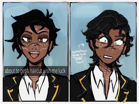
bro they fucjed his shit uppp 😭
i cant find the tweet for it but that one drawing challenge where its this and then your characters current then first design 💀
#my ocs#twst#twisted wonderland#emilio cruz#also ignore any color weirdness 😭#the program i drew this with whitewashed the FUCK out of him when i exported#but i had already merged the layers and couldnt easily correct it#so i had to change it by fixing the contrast and exposure and the such on my phone in post 😭😭😭
92 notes
·
View notes
Note
Hello! I love your gifs! How do you make yours so clear and high quality/What's your process? <3
Hi!! Thank you so much!! I've never really had to explain out my process to anyone and I don't know how much detail you need, but I'll try my best and try to be as thorough as possible just in case!!
For my D:BH gifs, the process starts out with recording my own game play. I have a gaming computer that already had the GeForce Experience app downloaded, so I use that to record my game play. It records at 1920 × 1080p, 60 frames per second, so the files can get... rather large 😅 The video of my playthrough of the Russian Roulette chapter (~11 minutes long) was just under 4 GB. So its not light...
From there, I figure out what in particular I want to gif (for the timestamp roulette series, I let a random number generator figure out whereabouts I'm looking). Once I know that, I open up VLC and use it to isolate that particular shot + a little more on either end.
After I have the shot(s) I want to gif isolated, I open up Photoshop. I use "File" > "Import" > "Video Frames to Layers" and choose the video I want. You can do this straight from the video of your playthough, but I find that the shorter the video is, the easier it is to work with in this step. I trim my video more, to about a click or two outside of the specific shot I want. Like so:

From there I delete any extraneous frames from the "timeline" section that comes up.

Then is cropping: my go-to crop uses the "W x H x Resolution" option - I put 540 px in the first box, 300 px in the second and leave the third blank.

After that, I have an action in Photoshop that does the next steps for me (to make things quicker), but what it does is sets the frame rate (which will have to be done again after saving the gif because Photoshop hates everyone apparently), converts all the layers into a single object, and sharpens the gif. I've only been gif-ing for about a year and a half, and before that I had exactly zero experience with Photoshop at all, so all the numbers from these steps are still the same as the numbers I pulled from the tutorial I used when trying to figure everything out. For those, you can look at this absolutely AMAZING tutorial, by hayaosmiyazaki, specifically steps 7. gif speed and 8. sharpening.
From there, I start adjusting the colors. From what I've noticed, I seem to do a good bit less color adjustment than some, or maybe even most, other gif makers. It's honestly all about personal preference, so play around with it and find what you like! I personally like to stick as close as possible to the original colors, while still brightening the image up enough to make it clearer and more legible. So, for a majority of my gifs, I only apply an "Exposure" layer, a "Brightness/Contrast" layer, and a "Hue/Saturation" layer (from the "Layer" > "New Adjustment Layer" menu.) The numbers here change dependent upon the lighting in the shot.
For example, here's a before and after of this shot I just did so I could type this out and make sure I got every step 😅 For this one, I did Exposure +1.0 (no change to Offset or Gamma Correction), Brightness +20, Contrast +10, and Saturation +5 (no change to Hue or Lightness).
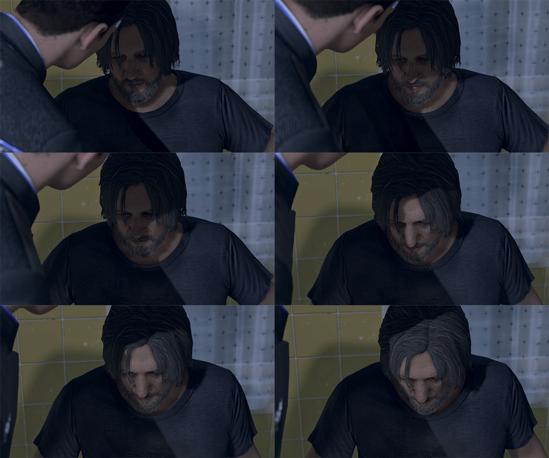
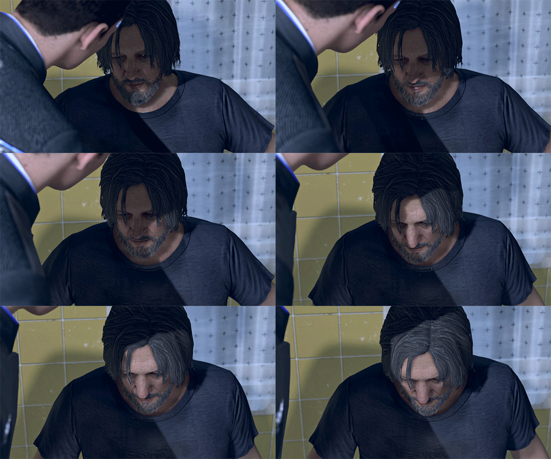
Once I'm satisfied with my coloring, I go to "File" > "Export" > "Save for Web (Legacy)". I watch the gif there to make sure it looks how I want, maybe go back and do a few tweaks to the coloring if I'm not quite happy, check the file size and then save it!
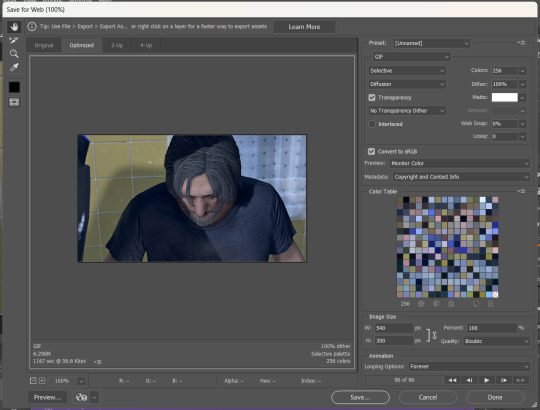
Tumblr's maximum file size is 10MB so if your gif is over that, you won't be able to use it on tumblr - in order to fix that, you may have to delete a few more frames. Or you can crop it to so there's less pixels in the "Save for Web" pop-up by changing the numbers in the "Image Size" section
And now, once I have my gif named and saved. I go back to "File" > "Open" and open up that gif. From there, I go to the little three lines icon in the top right corner of my "Timeline" section, click "Select All Frames" and then click the three dots on one of the frames and change the frame delay. For my DBH gifs, I do 0.02 seconds cause it looks best to me. Depending on how many frames per second your recording software does/what you personally like speed wise, this may be different for you. This is also different for gifs from live action or other media (for those, I prefer 0.05 seconds - it looks the most realistic to me.)
Then, I just save again, overriding the file from before I changed the speed, and voila! That's my process!
I hope this helps; if you have any more questions, my ask box is always open!! And again, thank you so so much 🥰 I'm so glad you like my gifs!!
21 notes
·
View notes
Text


hello everyone! i'm especially proud of the coloring of these gifs, so i wanted to take this time to remind you to please support gifmakers. please reblog, don't just hit the like button, and share what we make so others can see it too and do the same. the rest of this isn't necessary to read, but if you'd like a little insight: we do not just feed video into a gifmaker website/app and post. see how his skin looks green-tinted in the unedited gif? it took me 45 minutes just to correct that. color on gifs is split into red, yellow, blue, green, cyan, magenta, white, black, and neutral and you can adjust them either by selective color or hue/saturation; most gifmakers do both. the problem is, green is often also recognized as yellow and/or cyan. red is also part yellow, and sometimes part magenta too. black can darken unexpected things for the same reason. so when i was trying to adjust his skintone, i had to reduce the green, but i also had to reduce the yellow - which made the reds too bright. so i had to reduce the red, but then he looked orange. so i had to add in some cyan, but then he looked kind of ashen and desaturated. it went on and on and on, and that's before i even got to darkening or lightening the saturation on multiple different colors, or reducing or increasing the saturation itself. that's how it ends up taking 45 minutes just to fix one small part of a gif. all of that was after i had already done my usual settings for darkening neutral shades, increasing the exposure, a gamma adjustment, increasing vibrancy, changing the levels, adding a curve layer, and adjusting the brightness and contrast - and often all of that involves small tweaks too, even from one gif to the next from the same video because of changes in lighting or angle. i made 8 gifs for this set and fortunately didn't need to make adjustments gif-to-gif, so it 'only' took around two hours. and i'm a novice gifmaker! i've only been at it for a couple few months and still have so much to learn. but please support people who make content for your fandom. whether it's someone making art that takes 15 hours or gifmakers constantly churning out new content (constant is not an exaggeration in f1blr btw, there is a LOT of stuff to gif in f1) or people pouring their souls into fics, support us. let us know you appreciate what we're doing. give us a little warm fuzzies and a smile for the work we put in to make this a more enriching and enjoyable place. it only takes the click of a button. (not only okay to rb but encouraged!)
17 notes
·
View notes
Text
Homework Task
BEFORE AFTER


To improve this image I wanted to enhance some colours to make it appear lighter and brighter. So I started off with the curves tool and adjusted it a little bit as it wasn't doing anything for the image. Then I used the hue tool which I enhanced the sunset a little to be slightly darker but not too dark as started to look fake. Then I used the colour balance and adjusted it to cyan so that water pigment was brighter and lighter. Making it stand out more. I think make an improvement On this photo even if it's not huge.
BEFORE AFTER


For this photo I wanted to make this image look a bit softer, as looking a bit harsh on the eyes. It was a easy fix and only used curves for this process. I played around and manipulated the points until I was happy with the results. The change softened the white on the flower. I feel like the second image is clearer and easier on the eye.
BEFORE AFTER


For this photo I noticed that the original was very dark and harsh in places. So I wanted to soften these areas. I used the curve tool and adjusted it, which had a little affect on the photo. So I went in with the brightness and contrast tool. I adjusted the brightness up which lighten the photo, but still didn't look right. Then I went in with contrast and lowered it a bit which brought a god balance back to the photo.
BEFORE AFTER


With this photo I don't actually know if it is an improvement, I did lighten it up but still doesn't look the best. I think it doesn't help that the photo is bad quality. I went and used the curve tool which brightened the photo up quite well. This a used exposure a tiny bit which made a little improvement. Then I used the colour balance which brought out the a little more colour in the buildings and grass.
I feel like the more I'm doing this the better I'm getting, I'm understanding which all the affects do and which are benefical to each photo, Instead of just pressing random buttons. I enjoyed this task.
2 notes
·
View notes
Note
I've played Cyberpunk twice before but your posts have inspired me to go for my third playthrough and first as male V so I can try out the Kerry romance. Also attempting to learn my way around the AMM mod so I can play around in photo mode more, cause I'm loving the virtual photography stuff. I'm hesitant to share though cause I feel like I barely know what I'm doing (especially since photography is my actual job and I feel like I should know what I'm doing 🤦♀️) and you're the only person I follow that's even into Cyberpunk. Anyway, sorry for the rambling, I guess I just wanted you to know your blog inspired someone 😊
aöskdjfaödsjfdffj !!! I feel like I've unlocked a new fandom achievement :D that honestly means so much to hear that I inspired you like aaaahhh ;A;
Okayokayokay, but yes, first things first: I'm extremely biased obviously, but definitely go an play Kerry's romance! It's short (I'm just gonna assume you know his questline if you played the game twice before) but personally I found it so heartwarming and lighthearted and chaotic in a good way after all the horros V went through for the entirety of the game until then xD Also, Kerry is such a good, multilayered character and you're not gonna be in the slightest prepared for some of things he'll say to a romanced V (at least I wasn't, but I also mean that in the best way XD). Would love to hear your thoughts once you get there and I hope you'll love it as much as I do xD
Also!! Don't be shy to share your virtual photography stuff! Photography isn't my job, I do have a tiny bit of experience with it through uni (we had a half-year course once, with outdoor and photostudio shootings and all that, and I learned a lot and really enjoyed it). And it's true, there are some similarities, in terms of how to pick and frame your motives for example, but also: it's still very different tools you're using, so it's normal to not immediately get the hang of everything. I quickly went digging through my screenshot folder for some of my first pics I took in Cyberpunk just with basic photomode:
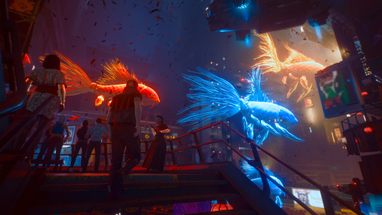

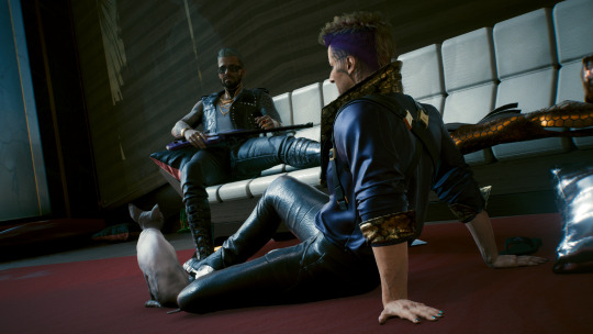
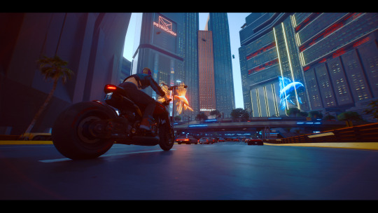
I still genuinely like all of these (even though I think I didn't share all of them publically so far). But looking back with what I've learned since then (the oldest is the one with Vince on his bike, from Dec 15th '22, the newest is the one with Kerry and Nibbles, from February 22nd '23) I also know what I'd do differently to make them even cooler now xD
AMM also had a bit of a learning curve for me, still does in some regards XD But it really brought my VP to the next level, just for the immense amount of new poses compared to the 20-something or so in vanilla photomode, the nicer and more natural facial expressions, and yeah... the ability to spawn multiple characters xD You can do shippy stuff even with vanilla photomode, but with AMM there's... so... many... possibilities...
ALSO! What I'm still trying to get the hang of but which is so so nice and one of the main things I'd change about my old screenies: custom lights. Spawning different colour lights, basically having your own little photostudio setup wherever you want, however complex or simple you want, is amazing and makes a huuuge difference!!
An example of my learning curve with AMM and one of my favourite photo subjects: Arasaka!Vince
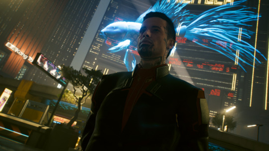
Feb 2nd 2023: The first time I styled Vince to look like he did during his time with Arasaka, vanilla photomode, the only mod I had was one to enter full CC with a shortcut whenever and everywhere. Already pretty cool shot, but in hindsight, the lighting is so bad xD I think I have a version of this edited to death in Photoshop somewhere, but I can't find it atm. PS helped fix the lighting a bit, but yeh... it's still not ideal, but not much you can do about it in vanilla except play with exposure and contrast more in the effects tab.

March 12th 2023: Spawned Vince with AMM, I think the pose is still a basic one that you also have in Photomode though. But his expression is an AMM one, there's custom lights, and I made use of AMM's awesome feature that lets you teleport to locations that are usually off limits (here the Arasaka Counterintel office you only get to see during the Corpo lifepath quest). Already so much better just with some red backlight and a bright frontal light that actually makes his face visible! XD This is also completely unedited!

May 7th 2023: One of my recent faves, post-graphics update, which also made everything look so much nicer in general! I think I had three custom lights (pale blue from the front, bright yellow from the left, and a small white one from top). And I've become a bit less scared about getting up close and personal into his personal space XD
TL;DR: It's a process! We're all starting somewhere, and if you're not comfortable sharing your stuff yet, that's completely fine. It's a learning curve, too, but don't give up :D I think I've really discovered an amazing new creative hobby through this game in the shape of virtual photography (and unlike real people, silly pixel men will hold their pose forever without flinching and I can fly around them and take pics from every angle... but admittedly, getting them to do exactly what I want is definitely a challenge sometimes, cause I can only say "noo, go 20 pixels further in Z direction... noo, too far, 1 pixel back again!! noo, look at Kerry, don't look at yourself, that's weird, stop moving your head around so much!" but when you then get that one perfect shot it's worth the effort and fiddling XD patience really really is key though).
If you ever decide you wanna share some stuff I'd love to see :D and if you need help don't hesitate to reach out! Now I gotta apologize for rambling, but yes :D Have lots of fun with male V and virtual photography :3
5 notes
·
View notes
Text
Small update...
They tracked down the original photo. My analysis was actually pretty much dead on, but I guessed wrong on a few things. I thought this was a press photo so I assumed it was taken with a professional camera. But it was taken by a staffer with an iPhone, which changes the processing aspect a little bit.
The original photo looked like this compared to the published version.


This is an HDR composite image. The iPhone does this automatically if you have the HDR setting enabled. It takes a really bright version and a really dark version and blends them together to balance the exposure.

People with older DSLRs (like me) do this same process manually when a scene has more dynamic range than our camera can handle.
It's similar to taking a RAW photo and boosting the shadows and bringing down the highlights. Just two different ways to do the same thing.
I was so close!
The photo was then post processed to crop the hangar ceiling out, warm the white balance, and boost the contrast.
It's crazy how hard it is to tell smartphone photos apart from ILC photos these days. Computational photography is so powerful. And if you add a little of your own editing on top, you can get some stunning results.
Phones still struggle with challenging lighting conditions. And they don't give you much in the way of depth of field. But under ideal circumstances they are pretty much on par with other cameras. Which is why if people are interested in photography, they should not think they need a better camera to get started. You can learn a lot just using your phone.
A few people mentioned this analysis does not matter. And that none of these people want to change their minds so they will not be convinced by the evidence.
But that wasn't why I wrote this. People were correct to be suspicious of this photo. It was altered and it had some unique and uncommon attributes that set off our uncanny valley alarm bells. Skepticism is good. Ignoring the evidence it was real is where they fell astray.
Our immediate future is going to be rife with images that could be fake. And so we need to improve our photographic literacy so we can help figure out fact from fiction. And I just wanted to demonstrate what that process was like.
We will need to know how light does and does not work. We need to know the common editing workflows photographers use. We need to understand how smartphones process images. And we will have to know signs something is A.I.
Some folks said they could tell this wasn't A.I. because there was not any extra fingers or body horror among the crowd. Others mentioned all of the text was legible. And I must caution people using these observations going forward. Because A.I. is going to improve. The body horror is going to happen less and less. It's going to be harder to spot. Text is already improving in different A.I. models. Eventually that will no longer be a good indicator either. Our current best indicators will not last.
And I think people were not considering another possibility—a combination of A.I. and human manipulation. Right now the best way to fake an image is to let A.I. do as much as it can, and then go in with more traditional Photoshop techniques to fix anything that gives away A.I. shenanigans. That is a sort of nightmare scenario. A human could have replaced all of the signs. Maybe turned one upside down. They could fix hands and erase extra fingers. I am capable of all of that myself to a degree you couldn't detect. It kind of scares me how much I could abuse the power of A.I. in its current state.
So, knowledge is power. And learning a bit more about photography and light and physics is a good idea. You may even improve your personal photography in the process.

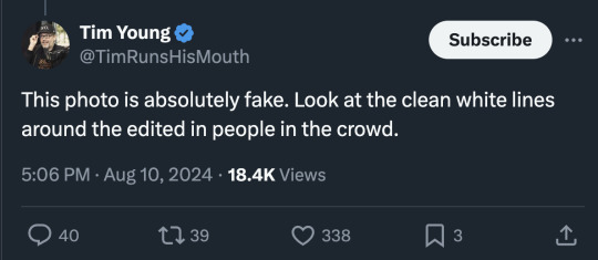

I think in this new age of A.I. the general public is going to need to increase their photography and lighting literacy. The response to this photo has just been a shit show.
There are people pointing out perfectly normal edge lighting and misunderstanding how reflections work.
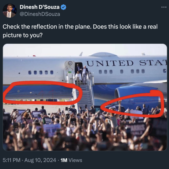
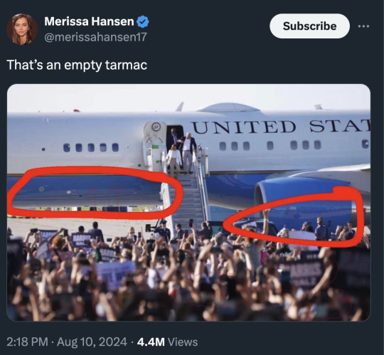
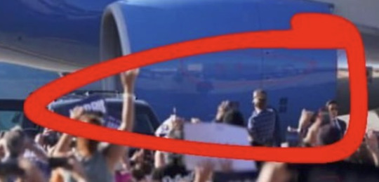
First the plane is parked at an angle. The tail is farther back than the nose. But also that is a curved surface and it tapers. It's reflecting the area to the right of the photo.
And the bottom of the plane is reflecting what is directly underneath. Which is the tarmac, not the crowd.
It should also be noted that photo was shot with a very telephoto lens and everything is super compressed. The crowd appears much closer to the airplane than they actually are.
But then someone who should have good understanding of lighting said this...
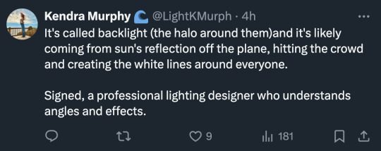
And now I'm worried for her clients. Because that's very... wrong.
Well, wrong-ish.
First, let's try to understand why this photo is setting off some alarm bells.
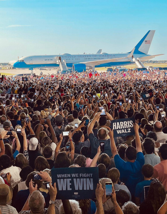
The crowd toward the rear is in shadow, but they are still very well exposed. But then there is also a bright light source creating a strong edge light on them. Looking at this photo with just the context of what is in it, there are some things that seem uncanny.
The information we do not have is the people in the shadow area are inside a very brightly lit airplane hangar.

So they have artificial light blasting them from the top.
But that light is still much dimmer than the sunlit areas outside so they appear in shade. But we are used to shade being much darker than areas in direct sun. So the balance seems off in our brain. We expect the people to be darker because we don't have the context of the bright hangar lights above them.
But the other issue is that the photo was post processed. It wasn't manipulated. The pixels weren't changed. But the exposure balance was altered.
If I were to guess, the original photo looked more like this...
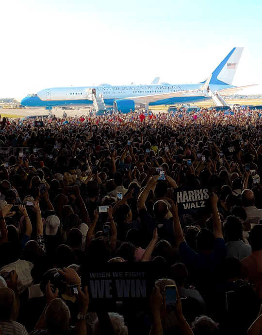
But newer digital cameras can have 13 to 15 stops of dynamic range. And if you shoot in RAW, you can easily lift shadows and bring down highlights. You can balance the exposure so the dark parts aren't as dark and the bright parts aren't as bright. This photographer might have overdone it a bit in this case, but this is a fairly standard edit used to bring balance to photos.
And lastly, where does the edge light come from?
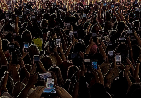
Edge lighting or backlighting or rim lighting (all the same) should probably be called wrap-around lighting if you want to be more accurate.
It comes from a homogenous light source that is larger than the subject being lit. So with my knife photo, I placed it on a large LED panel light.
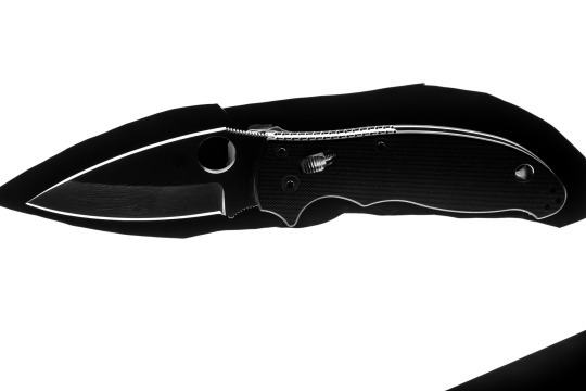
The light source was bigger than the subject so it wrapped around the edges.
And I'm afraid the airplane is not nearly large enough to create a light source to wrap around everyone in the crowd. It isn't even reflecting direct sunlight. So I'm sorry to say that lighting designer was mostly mistaken despite the confidence.
The light source is... everything.
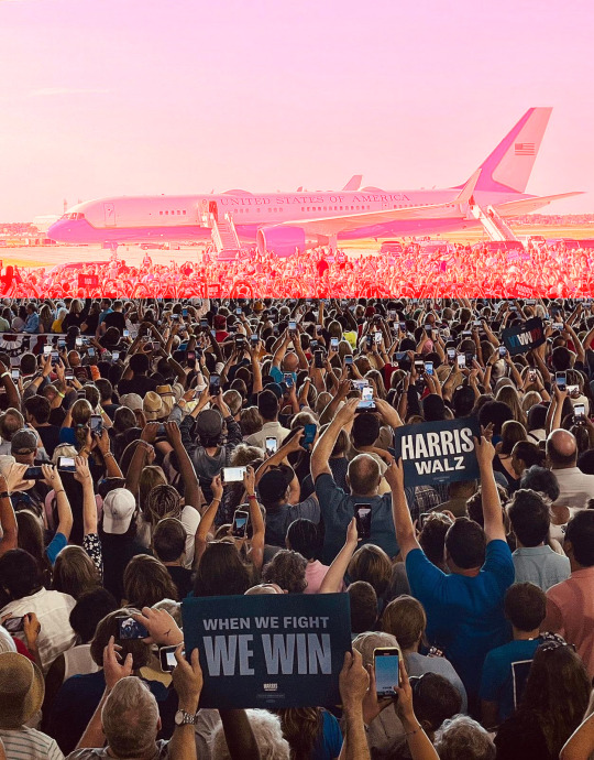
That entire red area I highlighted is the light source.
As well as everything above and everything to the sides.
And the biggest aspect of that light source would be the sky above. I think people always forget the sky is a light source. If you are seeing blue, you are seeing light. And I guess the plane is included in that, but that entire highlighted red area is so bright, and so filled with sunlight bouncing around, that it creates basically a giant softbox. It becomes a huge single light source for the people in the hangar.
If you look at footage taken from way inside the hangar, you can see the camera adjusting exposure for the crowd inside, but look at what happens to the sunlit area outside.
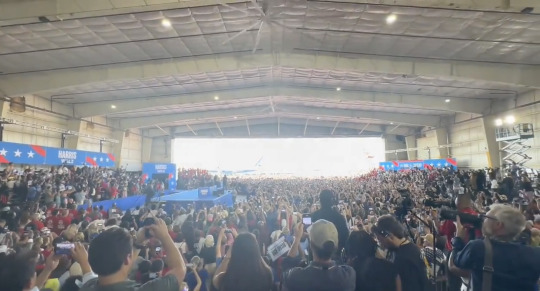
What does that look like?
A giant softbox.
A single homogenous light source blasting light inside the hangar.
The sun is so incredibly bright that even when it is not directly lighting something, the light just bouncing around outside is enough to overpower the very bright hangar lights.
So, what have we learned from this?
Perhaps people should hire me to be their lighting designer.
Though I'm sure she is actually very talented. She seems to work with stage lights and this is more physics and photography.
Phystography.
4K notes
·
View notes
Text
How a UV Sterilizer Changed the Game for My Pond’s Health and Clarity?
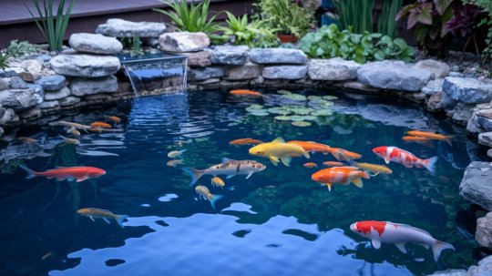
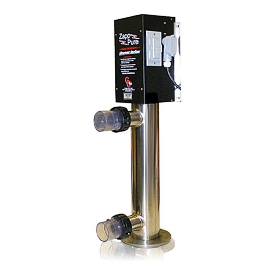
This writing is especially for all the pond owners like me. All the pond owners agree with me on the fact that we are all always in a battle to keep our pond clean and free from cloudy water, foul odor, algae growth or all kinds of pollutants. Chemical solutions or physical washing, two of the most common traditional approaches for purifying water, usually only give you temporary relief. Regardless of their widespread availability, these solutions fail to tackle the problem at its root. To keep a pond clean and healthy, I learned that a UV sterilizer is essential. I wanted to share with you all about the incredible change that happened because of a UV sterilizer, and more specifically, the Zap Pure ZP-20 Ultraviolet Sterilizer in my pond care routine. I was looking for a way to fix the pond's general health as well as its water clarity.
What Is a UV Sterilizer and How Does It Work?
An advanced tool that can potentially remove bacteria and microbes from the pond water to maintain its clarity and health is termed a UV sterilizer. The ultraviolet light from the sterilizer destroys algae, bacteria, or other harmful organisms grown in pond water. These hazardous organisms gradually die off since they can't proliferate, which greatly improves the purity and cleanliness of the water. I bought Grand Champion Technologies (GC Tek) Zap Pure ZP-20 Ultraviolet Sterilizer, which completely transformed my pond. When it comes to pond maintenance, GC Tek is a trusted brand. Their products are made to be trustworthy and effective, and they help keep aquatic ecosystems healthy. The Zap Pure ZP-20 UV sterilizer was exceptional because of its powerful build, efficient sterilizing procedure, and capacity to tackle larger ponds.
How the Zapp Pure ZP-20 UV Sterilizer Transformed My Pond
After just a few days of using the Zapp Pure ZP-20 UV sterilizer, the water in my pond went from cloudy and prone to algae blooms to clear. The UV sterilizer was so effective because of the following:
With the help of the Zapp Pure ZP-20 water sterilizer, the algae problem was significantly mitigated.
Exposure to such powerful UV radiation significantly impeded the growth of algae spores. Consequently, the unpleasant green and slimy water in my pond was no more an issue for me.
Additionally, the UV sterilizer eliminated parasites and harmful microbes and my fish seemed healthier and more active overall.
Because the water in the pond became so transparent, I could now see the bottom, which had previously been an impossible obstacle.
With the device's simple-to-follow instructions, I installed it without contacting a professional.
There is very little upkeep required for the sterilizer. Because it is built from materials that are resistant to corrosion.
Why Choose the Zapp Pure ZP-20?
The Zapp Pure ZP-20 isn't like the other UV sterilizers out there; it stands out for a few reasons:
Designed for Large Ponds
Eliminated Algae Blooms
Reduced harmful bacteria and parasites
Durable Construction
Powerful UV Lamp
Regular Filtration
Control Fish Population
Monitor Water Quality
Remove Debris
improved overall water clarity
As far as pond maintenance products go, Grand Champion Technologies (GC Tek) is a name you can trust. Ponds may be kept healthy and attractive with the help of their goods, which range from filtration systems to UV sterilizers. An example of the company's dedication to quality and innovation is the Zap Pure ZP-20 UV sterilizer.
Benefits of Using a UV Sterilizer
Using a UV sterilizer has several benefits, one of which is that it is an environmentally responsible approach.
You have the power to create a more stable and balanced ecosystem in your pond by using a UV sterilizer. Plants flourish, fish are less prone to becoming sick, and the pond looks better overall.
In contrast to chemical treatments, which have the potential to kill off good bacteria and upset the pond's ecology, ultraviolet light sterilizers zero in on only the bad bacteria.
Without adding chemicals to the water, you can keep your fish and plants in a healthy, natural setting.
Pond ecosystems are more capable of maintaining equilibrium when UV sterilizers are used to keep the water pure and lessen the need for harsh chemical treatments.
Pond owners can forget about algae blooms and water quality problems since the UV sterilizer takes care of much of the work when it comes to controlling microorganisms.
Relax and take pleasure in the pond to its fullest as the UV sterilizer carefully maintains equilibrium.

Investing in Pond Health
A UV sterilizer is an excellent device for every pond owner who is concerned about the health of their fish, the purity of their pond, or the proliferation of algae. My pond went from having a murky appearance to appealing and clear after using Grand Champion Technologies (GC Tek) Zap Pure ZP-20. The change was dramatic and long-lasting. The purchase of a UV sterilizer is more than just a tool; it becomes an investment in the long-term health and beauty of the pond. When you have a pond that is clean, healthy, and flourishing, you can rest easy. It was more than I could have imagined how much better the water was and how much healthier the fish and other aquatic life in my pond were. Pond owners can deal with water quality issues with a high-quality UV sterilizer, allowing them to enjoy a clean, healthy pond all year round.
0 notes
Text
Fundamentals 1: Week 4
15th March
This week in our fundamentals class we are taking a break from Illustrator to learn about the basics of Photoshop. Photoshop is an Adobe software that I don't have any experience with. It was something (like Illustrator) that I was fairly intimidated by and didn't really take the time to figure out so I'm glad that I have this opportunity to learn these skills and have guidance from the teachers on how to use the software best.
We first talked about the difference between colour correction vs colour grading. These are important to understand when it comes to editing photos to get the desired end result. Colour correction means to "fix an image" or "matching two or more images to fit together. It can be seen as a checklist of processes to improve an image, or moving image footage to an optimal appearance. Colour grading is often applied to images or moving image footage creatively with a stylistic image in mind (like a colour themes to set a certain tone)
Our task for the class today is to go through a series of photos provided to us by Toby on Moodle and learn about the different tools that we can use for colour correction and colour grading. The first photo that we looks at was this one.

As you can see the image appears to be really faded with a high level of brightness and our goal is to correct the image so the level of brightness and exposure is more realistic. After uploading the image we then learnt about the layers palette in Photoshop and the different adjustment layers that we can add to the photo that we are editing. The layers feature in Photoshop looks like this.


In the first image above you can see the layers palette which shows the image as a background layer as well as the "Layer 1" which is the grading scale on the side of the image. We learnt that by clicking on the fourth icon on the options bar at the bottom (looks like a circle that is partially filled in) we get a list of editing features that are called "Adjustment Layers". Toby informed us to use the "Curves" feature for editing brightness rather than the "Brightness/Contrast" feature as the curves graph can allow for better control of the brightness of pixels instead of the linear scales used in "Brightness/Contrast".
Here's what the curves feature looks like using the image of the woman above.

This is a curve histogram used for for colour correcting which shows the information of the pixels in the image, which shows the presence of darkest pixels (shadows) in the bottom left to the brightest pixels (highlights) in the top right. The line going on a diagonal angle through the histogram is the "curve" that can be used to manipulate the brightness of different areas of pixels. By changing the curve you therefore change the brightness of pixels with different brightnesses.
Here's how we changed the brightness of pixels in the image of the woman above.


By bringing the starting point of the curve further right to where to darkest pixels are, you are then lowering the brightness of these pixels which create more shadows on the image. We were encouraged to play around with the curves and add points through the middle to understand how it can influence the brightness of these pixels. Moving the points of the curve around enough where the image becomes too bright or too dark, undersaturated or oversaturated shows how the image can lose pixel information and not look as realistic and look like a low-quality photo.
We were then given another version of the same image but it was set in a darker tone. We then had to correct the image to look more balanced with its shadows and highlights.


As you can see by changing the end of the curve have its highest point where the lightest pixels are you are increasing the highlights seen in the image while the shadows are still present.
We then move on to the next image to learn about using curves on a photo with colour. Here's the image we looked at and edited.


As you can see with the original image on the left it's brightness and low and although it does have colour it is hard to see this with such low exposure. By adjusting the curve you can then increase the presence of highlights and maintain some shadows to show the presence of colour in the image.
We move on to the next image where we are still using the curves to adjust the brightness of the image and also learning about the "Hue/Saturation" adjustment layer. This layer can be used to manipulate the colour intensity and colour grading of the image by using hue and saturation slider scales. A hue is a colour or a shade, and saturation is the intensity and purity of a colour which is displayed in an image - the lower the saturation, the closer a colour is to being grey. Here's the image that we used.


First off we adjusted the brightness of the image using the curves adjustment layer to add more highlights into the image so it appears lighter and more realistic as it appears to be a cloudy day in the photo. By using the same icon to bring up the different adjustment layers we click on the "Hue/Saturation" which is shown below.

As you can see it has three slider scales - Hue, Saturation and Lightness can be adjusted. Increasing the saturation makes the image appear more vibrant and more intense colour in it. Lightness doesn't really need to be used as we can use the curves feature, and hue should only really be used if we want to change the colours seen in the image. Since we are still wanting to achieve a realistic colour correction we don't to need to do much colour grading here.
For the next image we are moving on to another adjustment layer called "Colour Balance". Colour balance can be used to adjust the hues present in the highlights, mid tones and shadows of an image. Here's the image we used.


As you can see in the two images above, the "Colour Balance" adjustment layer has three different sections which are the shadows, mid tones and highlights. It also has three different sliding scales which are the same for each option, these are: cyan-red, magenta-green, and yellow-blue. By playing around with adjusting these different scales we could see how colour balancing can influence the detail and overall appearance of an image. Increasing the presence of certain hues in the shadows, mid tones and highlights can alter which colours may stand out more than others. This feature can be used for colour grading if we are wanting to add some creative flare and colour theme to our images.


For now we are still aiming for a more realistic end result. I decided to add more blue to the shadows as I thought the shadows were too warm and yellow in the original image. To balance that out, I played around with adding more yellow to the mid tones to create a better balance of dark cold shadows and lighter warmer mid tones. The end result is shown above in the image on the right.
As we move on to the next image I realise I am starting to feel more familiar with the tools and feel more confident in getting the desired end result when editing these images. The next image has quite a strong blue hue to it and we have the freedom to use all of the adjustment layers that we've learnt about to create a more realistic end result. The original image is shown below on the left, and the image on the right shows how I have adjusted the curves adjustment layer to add more highlights while still maintaining an appropriate amount of shadows.


Next we move on to the colour balance. I realised it has quite a cyan-like hue to the image which seems to be most present in the mid tones. This led to me adding more red to the mid tones and in the image below on the left you can see how adding the red mid tones adds more of a natural range of colours and looks more realistic. I then just started to play around with the other scales for the mid tones to see what hues could help make the image look more realistic.


The final image above on the right is the end result that I got from using colour balancing. You can see how much of a difference the colour balancing can make when comparing the end photo to the original.
The last photo that we looked at on Photoshop was this one here:
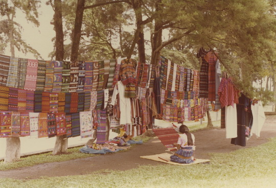
This one already looks like it'll be tricky as some parts of the photo look washed out where the saturation and contrast is low and there's not a lot of depth to it. Whether it was how the photo was taken or if it was edited afterwards, you can see that some pixel information is lost around the trees in the background. Trying to find a balance where you don't lose any more information but also bring saturation and contrast back into the photo will be interesting.
First off I got straight to the curves adjustment layer to see how I can bring back some darkness to the photo.

As you can see I adjusted the curves slightly and already it has brought in a lot of colour and depth to the photo. However, the loss of information in the background behind the trees and also in the bottom right corner makes it difficult to adjust the contrast any further without causing more of a washed out look. My next step is to do some colour correcting to make the photo look more natural. Already you can see that it is a very warm-toned picture so I think adding some colder blue tones may help.

By adding blue to the shadows it has changed to warmth of the photo drastically. It was hard to find the right balance of colours to get the most realistic looking photo, but regardless I was happy with this as it still maintained a vibrant colour to all of the woven fabrics while reducing the overpowering warm tones. It's the sort of photo that you could adjust over and over again but I was happy to get this result and called it a day.
I felt like this was a really great session on Photoshop as it helped me feel a lot more confident using the software and I learnt a lot about these different layers and tools that can be used to edit any sort of photo, and also understand how to get the desired results. Photoshop is something that I used to be intimidated by because as a newbie it does look really confusing to use, but I'm grateful for this Fundamentals paper where Toby is showing us step-by-step how to use these different software tools in class and also checking in on us to make sure we're on track. Using curves to adjust brightness, colour correcting and colour grading are skills that I will definitely use a lot to edit my own photos in the future!
0 notes
Text

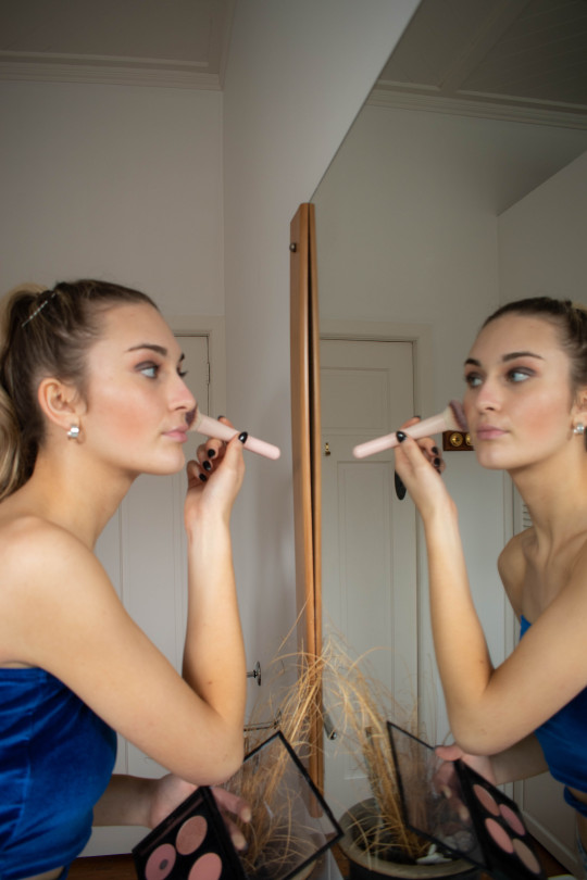
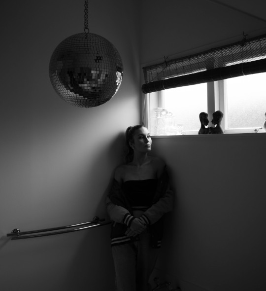
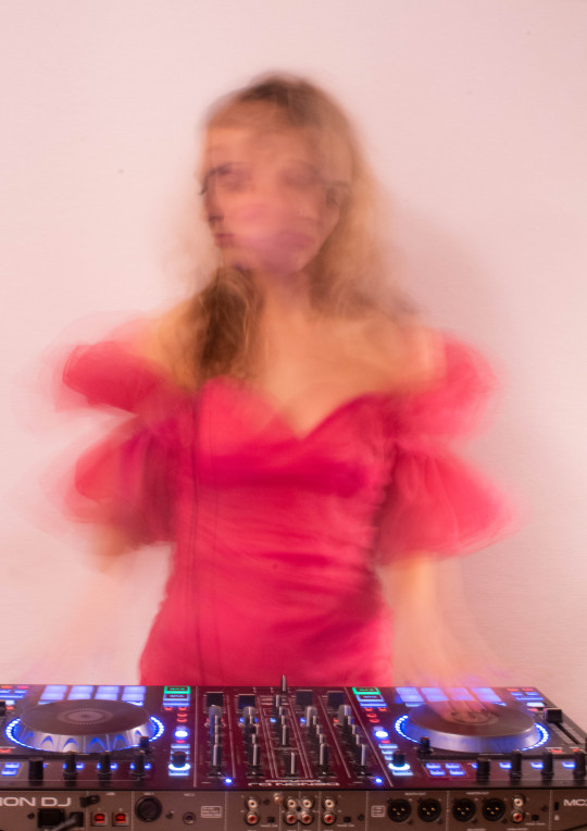
Here are some of my edited shots from week 4. I haven't fully decided on my favourites from this shoot, but for now these are the ones I have selected, I am sure this will change, same with my week 3 edited photos also.
For the first selected image, this was where I played round with exposure and shutter speed. When it came to editing, I increased the saturation a little to allow for my dress and the colours coming from the lights on the decks to pop. If I were to go back and do a second edit to fix a couple of things up, I would probably decrease the saturation slightly in order to try and remove the pink tint on the wall behind me. After the many struggles I had with achieving the right motion blur, I was pretty happy with how this turned out overall.
For the second image, originally I shot this in colour, but then decided when editing that black and white suited this particular image more. It allowed for the contrast of the white light coming through the window and the shadow I am casting on the wall to be more prominent. This shot was difficult to edit to perfection as I wanted to expose it enough for me to not be in darkness, but didn't want to over expose it so that the light from the window became too bright and took over the image. I'm sure I could edit this more to balance it out even more, but so far this is how I am keeping it.
This reflective mirror shot where I am applying blush was inspired by Isabella Bubola. She plays around a lot with reflection and I looked to her reflective self portraits when thinking of ways I could do my own. In order to improve this shot, I could probably improve the composition slightly by trying to remove the ceiling from the image, so may go back and give editing it another go.
This final shot was me trying out different depths of fields. When I was taking this series, I experimented with this by attempting to blur the camera lens in some and have myself in focus and visa versa. I like the over exposed look in this shot, as I wanted myself not to be sharp as I was trying to steer away from the direction of obvious portraits.
0 notes
Text
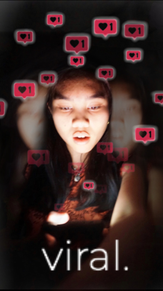
summary: My movie is a coming-of-age movie for our generation. It is about a girl who posts a video and it turns into a viral video. Her life is changed forever. She has to overcome life's obstacles as a teenager publicly. She was made an instant influencer.
a challenge and how you overcame it: I had a hard time having enough light come out of my phone. The light coming from my regular screen was already on full brightness and the camera wouldn't capture it. To fix this, I turned my phone upside-down and used the flashlight feature on the back to emit more light. I also used photoshop the increase the highlights and contrast the make the phone light more striking.
Inspo: I was inspired by tiktok. On Tiktok so many teenagers create viral videos not knowing the intensity of the exposure they receive. Turning viral may be a bad thing after all. I decided to capture the moment of realization to really emphasize the unexpectedness of becoming viral.
how do feel about the finished project: I wish my photo was a little clearer and maybe a change of background to a teenage room background.
0 notes
Note
Your gifs are so cool and vibrant. Please do a coloring tutorial??
Hi, thank you so much!
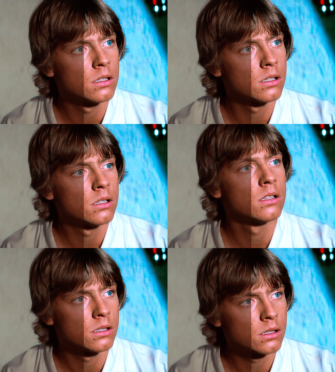
My coloring process is always the same, and very simple! Under the cut I will explain it:
1. CURVES
I always start with a curves layer and I use the first and third droppers. The first dropper adjusts the dark parts of your scene, so you'll click on the darkest spot of your gif (the closest that spot is to black the better.) The third dropper adjusts the light parts of your gif, but instead of clicking on the lightest spot of the gif, I prefer to click on the lightest spot in the character's face. This is how my layer looks like in that Luke gif:

This method doesn't work on all scenes, so sometimes I adjust it manually. Some scenes are hard to colour with the droppers (for example, scenes with neon lights) and in those cases I just click on ‘Auto’ to bring brightness to the scenes, without drastically changing the colours.
2. BASE PSD
After I have my curves layer I always follow the same method: Brightness, Levels, Color Balance, Selective Color, Curves and Vibrance. You'll probably have to adjust them depending on your scene, but the truth is that my settings are always very similar:
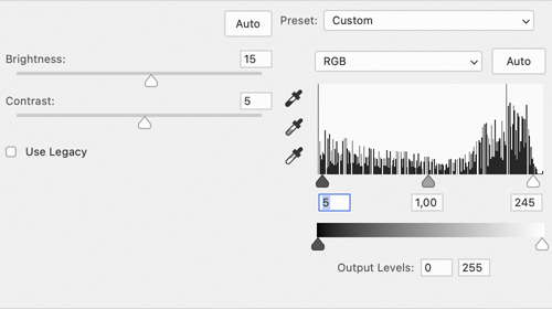
1. Brightness: Between 15-30 / Contrast: Between 5-15 (this will depend on your scene, if it’s dark I usually go with 30/15, but if it isn’t then 15/5 should work just fine.)
2. Levels: 10 / 1.00 / 245
3. Color Balance: This is the layer which will need more adjustment depending on the scene. That Luke scene has a plain background, and since I wanted to make it blue I edited this layer like this (Shadows: -0, 0, -12 / Midtones: -16, 0, +20 / Highlights: -14 / -5 / +13).

4.1. Selective Colour (reds & yellows): This layer is so important to make the colours look natural. The Reds and Yellows which will affect your character's skin tone. In this scene as you can see Luke’s face is a little bit red, so I used this layer to fix that (x x). For most shows/movies I’ve found that the problem is actually the opposite and the character’s skin is way too pale (it’s just that this scene has great lightning lol). To fix that I edit only the Reds by increasing the Cyan, Magenta AND Yellow until I’m happy with the result.
4.2. Selective Colour: Magenta (x), cyan (x) and blue (x). Sometimes, I also edit the black (like this: Black: +5/+10), but in this case it wasn’t necessary.
5. Curves: I just click 'Auto' to make the gif more bright. Sometimes, if the scene I'm working with is too dark instead of Curves I add another Brightness/Contrast layer or I use an Exposure layer.
6. Vibrance: Between 30-50 / Saturation: Between 5-20 (this depends on the scene too, because if you add too much saturation your character's face will most likely look yellow :/)
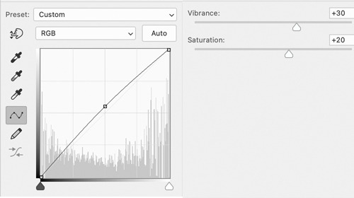
Obviously, these exact settings won't always work, so you'll have to play a little with them. My advise is that if your coloring doesn't look right, edit the Brightness/Contrast, Color Balance and Selective Colour (the red, mostly) layers.
3. BACKGROUND
As I said this Luke scene already had great lightning. After all the adjustments I made before the only thing I had to do to bring out the Cyan was adding another Selective Colour layer and edit the Cyan (x) and Blue (x).
But, let's be real, most of the time this isn't the case. I’m going to use this Han Solo gif as an example:

This is how it looks like after using the previous method. It looks pretty and bright, but I want the background to look more blue. I use different methods to make colourful gifs, but lately the one I've been using the most are Gradient Layers. So you’ll click on Layer > New Adjustment Layer > Gradient Map. I choose these colours (2776ec and 001dfa) and set the Gradient Map to ‘Overlay’ (depending on the scene I use overlay, soft light or colour.) Now my gif looks like this:

This is a scene with very little movement, so to fix Han I’m going to add a Layer Mask in the Gradient Map and paint with black all over him (if you’r not familiar with Layer Mask check this and this, they’re a life saver if you’re making colourful gifsets!) My Layer Mask now looks like this. And this is the final result:

Obviously with gifs with more movement this will be more complicated, but I usually don’t mind if the blending isn’t perfect.
And that's it, I hope this made sense!
1K notes
·
View notes
Text
Honor Students - Edith's live sessions
When Edith began her senior high school year - for the second time - she wasn’t what anyone would call an honor student.
But just weeks away from finals, Edith seemed to had turned around, getting the highest scores in every test. Even now, after her 20th birthday, she was leading live study sessions for everyone in her class.
Mr. Brown, her teacher, told her parents that all she needed was a bit of discipline and someone who knew what she really wanted.
All of his pupils in the “troubled” class seemed to have changed since he arrived at the school.
Edith closed the door of her room. After a day of arduous hours of study she deserved some time of her own, her little rewards, Mr. Brown called them.
She turned on the laptop.
Edith walked to her wardrobe and chose a cute “schoolgirl” outfit, her old pink plaid skirt. A blacktop that hugged her body so tightly she might as well not wear a thing, her nipples were indiscreetly outlined by the fabric. She made a little twirl in the mirror. Something was missing.
She pulled high kneesocks over her legs and pink heels, fixed her twin braids and smiled.
Edith climbed on top of the bed and logged in.
Everyone was already waiting for her. A private study chat for all the students in Mr. Brown’s class that finished their work on time.
Edith might be the smartest kid in the school now, but she never stopped being the sluttiest.
---
Edith had an exhibitionist fetish since before she met her Master. It was just that Mr. Brown knew how to harness her desire for exposure for good.
Weeks before classes began again, Edith was already doing cam shows and going on walks wearing a blonde wig, a facemask, and short skirts without panties or bra.
It was during one of those walks that Mr. Brown recognized her.
“Edith?” He called when she bumped into him. Her blonde wig fell off, and he noticed her brown hair and bright eyes. She tried to run, but she tripped, letting Mr. Brow get a very intimate show of her freshly shaven pussy.
He smiled
“Edith, I think you should come with me.” He said and led her to a nearby cafe.
He opened the door for her and pulled a chair for her to sit. He ordered for her and himself.
People stared at them like it was the weirdest date. He dressed soberly in a scholarly dark jacket and red tie. He was young, not older than 30, but contrasted with the way Edith was dressed...
Behind them, Edith could hear someone whisper “whore” and she knew they were talking about her.
Edith turned completely red and wholly wet.
She didn’t know if she wanted to run or touch herself in the middle of the cafe.
*snap*snap*
Edith looked up to Mr. Brown, snapping his fingers in her face.
“Did you hear anything I said?” He didn’t look angry. He showed her a kind smile.
Edith shook her head.
“I said I am going to have you in my class again next year, and I finally figured how to help you,” He sipped his coffee, “If you allow me.”
He pushed a cup towards her.
It smelled of cinnamon and nutmeg.
Edith finally found the courage to speak.
“Are you blackmailing me?”
Mr. Brown looked shocked.
“Blackmailing you?” he shook his head and hands. “No, no, no. Quite the opposite, Edith,” He placed his shoulders on the table, leaning in he looked into her bright brown eyes, “I want to enable you.”
Edith stared into his eyes. It felt like they were drawing her in.
“And call me Sir, Edith.” He said with a soft basso voice.
Edith shivered, she got lost in the wicked twinkle in his eyes.
---
Edith watched the boys in her class join the “study session”. All of them were like her, seniors that were held back.
All of them were watching her, hard cocks in hand. She mounted her pillow and began grinding her naked pussy.
Edith could almost smell and taste their cocks.
She saw Molly too; she used to be her partner in crime, now she was the best in math and science. And she was pushing a thick dildo up her bushy blonde pussy. She panted while watching Edith hump and moan.
Edith already wanted to taste their cum, Molly’s lips, feel them deep inside her. She wanted to be an active slut once again.
She could barely wait for the graduation party and the after-party.
Her unfocused mind drifted off for what Mr. Brown, her Master, had planned.
----
Years before, Edith had a hard time trying to remember the dates in history lessons. That was no longer a problem.
The first week, Mr. Brown explained the basis of his training.
She placed her phone on the counter, a little timer, and played a recording of Mr. Brown’s soft monotone basso voice.
Last year, Edith fell asleep in all of his classes.
This year, Edith kept her hands between her legs, intently listening to the recordings. There was no need to study, he repeated most of his lesson, but he guided her motions, he told her what to do with her hands, what to write, what to repeat out loud.
On the day before the first test, Mr. Brown handed her a small remote vibrator. He told her she had to wear it in class.
Edith nodded and did as he told her.
Sitting at his desk, Mr. Brown controlled the intensity. Subconsciously, and absolutely pleasantly, Edith knew the answer to all the questions.
When she handed the test, Mr. Brown nodded and smiled. Edith clenched her legs together and excused herself to the bathroom.
She tried to run, but Mr. Brown pushed the vibrator’s intensity to the max.
She dropped on her knees the moment she crossed through the door.
Everyone in the class was amazed to find she had a perfect score on the test. They asked her if Mr. Brown finally gave in to her; they asked her if she sucked his cock for the grade.
“It was only study and effort,” Edith said without an ounce of indignation. She was still a slut. But now she was his slut, even if he wouldn’t touch her.
She followed with the plan her Master had devised for the class.
“Say, if you want…” Edith licked her lips, “we can have a study session after class, I can show you everything I’ve learned.”
Most of them were skeptical, and a few joined in her suggestion.
She tutored a couple of students at first, when they were done she handed them a code for a zoom meeting.
“I am tired,” She said stretching, her tight pink blouse barely containing her tits, “Why don’t we keep this up tonight?”
Just Tommy joined her that night. She watched her hump and cum over her pillow.
With a pleasure-filled face and sultry voice she approached the mic and said, “If you get a perfect score on the next test, you can join me next week,” She sent him a kiss through the cam and logged off. He became a devoted student since that day.
----
Mr. Brown kept giving her daily private lessons, but after her second partial she could no longer cum after the recordings finished.
She confronted her Master about it.
“You scored 90 in your previous test” He said while grading the other members of the class without lifting his eyes.
“But-“
“But nothing, I can’t have you earning a reward for not doing your best.” He said. “From now on you will keep going as is, earn your orgasms with good grades.” He said and made a dismissive motion for her to leave.
Edith walked out and slammed the door on her way out.
“At least I still got the study sessions with everyone,” She said to herself and walked to the library. When she saw Molly joined her group. She smiled.
She tutored everyone in the group, paying special attention to Molly.
She knew Molly was like her, and she could use some of her special help.
After everyone left home, Edith invited Molly to her place where she played the first recording for Molly and knelt between her friend’s legs.
She heard the voice of her Master; she felt Molly’s breathing relax and tasted her melting pussy.
Molly came over and over again as knowledge flooded her mind.
And yet.
Edith’s arousal kept growing, but her hands drifted away from her own pussy.
Molly woke up from her trance panting.
“Let me do it for you too.” Molly said, ecstasy on her face, she reached for Edith’s face but she batted her hand away
Edith stood up and open the door with a frustrated smile.
“Maybe next time,” Edith said, flustered and gasping, “I have to study tonight!”
Molly understood and left Edith alone.
Edith climbed on her bed, placing a textbook in front of her and a pillow between her legs. She began reading and humping. Unable to reach an orgasm.
---
“Please, please, please” Edith begged on her knees in front of Mr. Brown.
“Edith, Stand up.” He ordered sternly.
Edith did as she was told. Her hands were fidgeting over her skirt; she felt the need burning inside her. She was wet and horny all the time. But she was also at the top of her class.
“Let’s go somewhere else,” Mr. Brown said and led the way. Edith walked steps behind him, clutching books over her chest. While her school outfit was more somber now, underneath her skirt she was wearing a buttplug and was desperate to use any other stimulation that would make her reach orgasm, but she needed her Master’s permission to do so.
“Edith,” Mr. Brown said as they walked out of the school, she rushed to catch up with him, he continued, “we are almost at the end of the school year, you need to hold on a little longer.”
“But, Master-“ Mr. Brown gave her a fulminating frown “I mean, Mr. Brown-“
He sighed, and Edith stopped.
“Edith, let me make you a new proposal, just like I did when we began,” Mr. Brown paced ahead, “if you are the top student by the end of the year,”
He stopped and gave her a once-over. A wicked grin formed on his lips. He approached and whispered into her ear so no one around would hear.
“-and after that, when you graduate, I will finally make you mine.”
Edith stood clutching her books. She was breathing fast, she could feel her heart beating fast.
----
“Next week are finals,” Edith panted onto the scream, she was sweating from the effort of rubbing herself to orgasm on her pillow. Her voice was pure desire, “the ones that ace their exam will get a ticket. And we will meet for a special celebration” She said and sent a kiss over the camera, accompanying it with a little wiggle of her chest before she cut the stream.
-------
Edith wore a vibrator to her final test. She kept her cool the entire time on the max setting, and everyone in the classroom could hear the sound and knew where it was coming from. The smell of her musk filled the enclosed space.
Everyone was particularly tense, not because of the test but because of the sexual frustration they had accumulated.
Edith told them to keep themselves from cumming this last week. It had come to a point that she cared more about getting the most of her party than the finals.
She slammed her test on Mr. Brown’s desk with a satisfied smile and waltzed out of the classroom swinging her hips. She was wearing the same pink plaid skirt she wore in their last week’s study session.
Before closing the door, she blew a salacious kiss to the classroom.
Everyone immediately became more focused on their respective tests.
When Edith arrived to her locker, she pulled out the vibrator in the middle of the hall, not caring if anyone saw. Everyone that mattered was occupied with the test. As she opened the door, she found a gift box with a pink ribbon waiting for her.
“Congratulations” It wasn’t signed, but she knew who it was from.
----
Edith graduated top of her class. When she got to pick up her diploma, she wore her Master’s gift around her neck, a black choker with a small tag with her name on it. Her classmates whistled and hollered as she shook hands with Mr. Brown.
At night everyone waited for Edith to appear for the graduation party, but she was nowhere to be seen.
After a while, they noticed Molly was missing too.
Music was blaring, and the dance floor was full with everyone but Mr. Brown’s class. Suddenly one by one they left the party.
A message began circulating from one member of the class to the next.
It was their after party ticket with a specific address.
Condoms were non-optional, the invitation said.
They arrived to an old house on the other side of town. No one would recognize them there.
The doors opened and Mr. Brown made them wait in the foyer until everyone arrived.
After the last kid closed the doors, Mr. Brown allowed them to walk in.
Molly and Edith were waiting in the middle of an empty room. They were wearing their graduation robes and the chokers, no, the collars Mr. Brown made them wear.
“Have fun everyone, be responsible.” Mr. Brown said and walked out of the house.
Edith and Molly pulled off their robes. Edith was wearing a white garter and stockings with a transparent demibra, while Molly wore a matching “outfit” in black.
They walked ahead and met their classmates, “You made us” they looked at each other, “And our Master, very proud.”
Edith and Molly knelt on the floor and helped the closest guys off their pants.
“It’s time to give everyone their reward,” Edith said and pulled a cock into her mouth.
There were 16 people in Mr. Brown’s class between men and women, not including Molly and Edith. All of them aced their final exams.
Edith wanted to taste all of them through the night. But despite their expertise, she could only please so many at the same time.
By the time she was done getting her second dose of cum out of Billy, the rest of her classmates had already paired off.
Some men didn’t shy away from coming out that very night, George and Oliver were making out while Wesley sucked their cocks.
Molly was bi, and was enjoying the lips of Evelyn, the lesbian of the class, while getting Tommy from behind.
Edith saw Sandra on her knees between two guys, and she was supposed to be the catholic virgin.
“Move, slut” Edith pushed Sanda aside and grabbed one guy by the balls, taking him for herself. She stood against the wall and settled his cock against her pussy.
She didn’t even remember his name, but she had waited for this long enough. She didn’t care as long as they were hard and full of cum.
He banged her against the wall until Tommy, little Tommy, her first tutoring partner approached. Edith looked down and saw his rigid cock. He wasn’t so little.
Edith fixed her hair and bent at the waist. She let the other guy keep fucking her with an irregular cadence that was distracting but quite pleasant.
Tommy handed her a condom, she opened it and placed it in her mouth, with a slow motion, and the rhythm the man fucking her allowed, she slid the condom up his cock using her lips.
The guy behind her emptied his balls inside the condom. He pulled out and Edith grabbed him by the balls again. “Wait,” She said, taking Tommy out of her mouth.
Edith sat Tommy down and slid herself on his rod. She moaned so pleasantly that the guy she was grabbing by the balls twitched and began getting hard again. She pulled off the condom with her mouth and dumped the thick cum on her tongue. Edith winked at him and moaned harder as Tommy pushed deeper than anyone before.
The guy walked back to Sandra, who was fucking someone else already. He kissed before he pushed his cock into her mouth.
Edith arched her back as she rode Tommy. She panted and screamed as she neared her orgasm. Tommy grabbed her by the hips and bit her nipples, making her shriek and clench his cock as he came inside her. Gasping, she fell on top of him. The two of them exhausted and covered in sweat.
Oliver walked by drinking a bottle of water and watched the two of them panting on the floor. He approached Edith from behind and caressed her ass; she made a soft sound of approval. Spreading her cheeks, he placed a new condom on his cock and pushed inside her ass.
Edith yelled with pain and pleasure. Tommy was still half erect inside her. She never pushed anything bigger than her buttplug up her anal cavity. And now she had two cocks filling her at the same time. She grabbed Tommy’s shoulders and moaned in his ear.
Oliver winked at Tommy and fucked Edith with hard, fast thrusts.
Edith’s nails scratched Tommy’s chest.
Oliver fondled her breast and pulled her for a kiss.
She came once again. Loudly and kissing Oliver.
It was better than she had ever dreamed of.
She could get used to being an Honor Slut.
The party dwindled down as pairs were formed and left.
Tommy was left alone between Molly and Edith, but even he had to leave when the sun came up and Mr. Brown walked through the door.
Molly and Edith were covered in dried cum from their chest, back and hair.
Tommy closed the door, Molly and Edith crawled up to their Master.
He caressed them and attached leashes to both of them.
They snuggled against his legs.
“Good girls,” He said. And led them up to the bedroom.
They purred happily. They were his fucktoys, his pets. And above anything, if he wanted, they would be Honor Student Sluts for him.
----
If you want to support my writing addiction you can join my Patreon where you can get ahead and read more stories at https://patreon.com/magisteramentia. Or you can invite me a coffee at https://ko-fi.com/magisteramentia
23 notes
·
View notes
Text
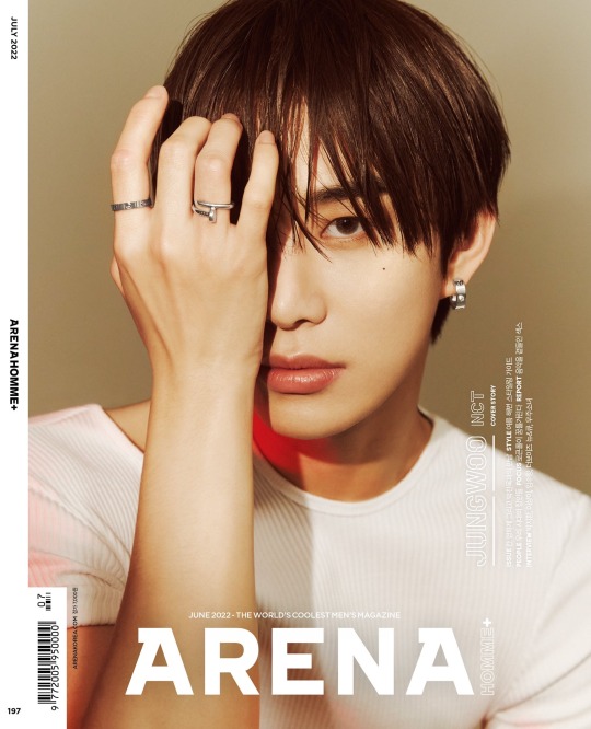
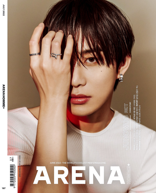
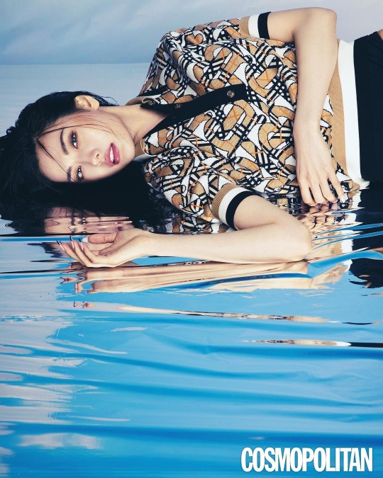
content creator tag : before and after coloring! i was tagged by @yxxna and @soonwnu
if you want to do one and havent been tagged yet then im tagging you.
1. example of when the original only needs some minor tweaks. in this case some added contrast and white balance since the original was leaning yellow-green.
2. example of when the original needs more significant changes to get it to where i’m pleased with it. added contrast as usual (both with the contrast slider and manually adjusting whites/highlights/shadows/blacks with sliders and curves) and brought down the exposure to add richness. it definitely had the blacks leaning blue so i corrected that with color grading. tweaked the white balance and colors. skin tone was mostly fixed but over saturated at this point so i also desaturated the orange and yellow and brought down the luminance. also i love a red lip so i often add that lol (it added a nice pop and also gives some color variation so it isn’t so monotone if that makes sense?)
3. similar process to 2.
4. example of when i want to bring up the brightness and shadows but keep the richness so it doesn’t look washed out. did that by lifting exposure and shadows and lowering highlights and blacks. adjusted reds/oranges/yellows to fix the over saturation but keep the vibrance.
5. example of how i edit a black and white image. although bw pics often have very different starting points, i always aim for this kind of end result. bw images are fun because you can really exaggerate the lighting in a way you simply can’t with color images.
5. example of how i edit a black and white image. although bw pics often have very different starting points, i always aim for this kind of end result. bw images are fun because you can really exaggerate the lighting in a way you simply can’t with color images.
7 notes
·
View notes
Text
the full bdam!schlatt design page!
hi friends :) got something really cool to show you today!!! gonna put it under the cut as there is quite a lot to go through here haha...
but! essentially what you’ll find here is design pages for bdam!schlatt i’ve been working on for about a week now! there are a total of 21 designs for various stages of the story, which I explained in detail. feel free to just skim through and look at the drawings, haha. and enjoy!
(all of the designs are put in chronological order of the story, rather than the order of which they are in the actual story. they are also ONLY designs for bdam, and don’t include anything related to bhav)
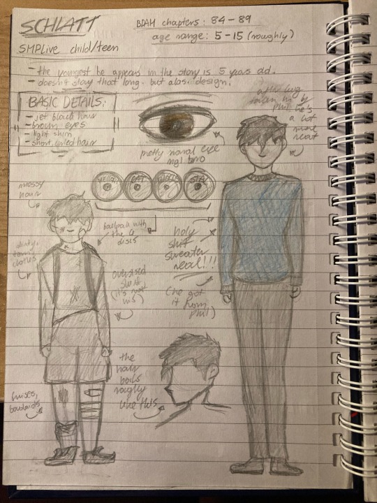
first what i drew up here are designs for schlatt in the first stages of the smplive chapters! on the left is his very first appearance, and on the right is how i imagine him to look around his teen years.
in the first design is how i imagine schlatt looking when he first meets wilbur. at this stage of the story he was of course living in the inner districts of the city with not a lot to his name, so you can see ragged and dirty clothes there. he would usually carry his four discs around in his backpack since he didn’t think it’d be smart to leave them unattended in his parents’ apartment.
after getting taken in by phil, there was an immidiate change in how he dressed and acted - mostly getting more clean and fitting clothes, as well as trusting his surroundings enough to leave the discs in the room he shared with wilbur, never really feeling they were in danger. you can see the design on the right is a lot neater, AND he’s got the blue sweater!
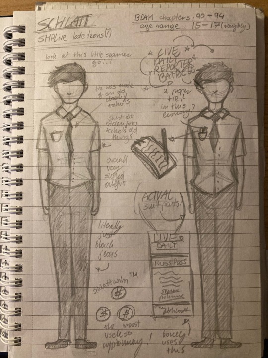
the second set of designs is mostly right before and right after phil’s banishment - more simply right before and right after schlatt was kicked out of the house the family stayed in and was forced to go work at the live daily
the design on the left is what schlatt looked like when he tried to make money for the family right before the banishment - he was described to have been wearing an old shirt of techno’s, a tie made up of a cut piece of techno’s old cloak and black jeans. it wasn’t a suit, but it was made to look close enough to one to help him sell things in a more convincing manner. up close, however, the outfit looked very clearly cheap.
on the right is schlatt’s design for the live daily! together with the aparment he got and everything else techno managed to put together through his connections with pete, he also got some actual suit shirts and pants he could wear, together with a tie. he would often carry around pens and pencils as well as a notepad (at least before he was barred from writing stories for the paper following the ted nivison piece), and was granted a press pass as any other worker at the paper, but he would hardly use it as it was near useless with his low position and permissions anyway.
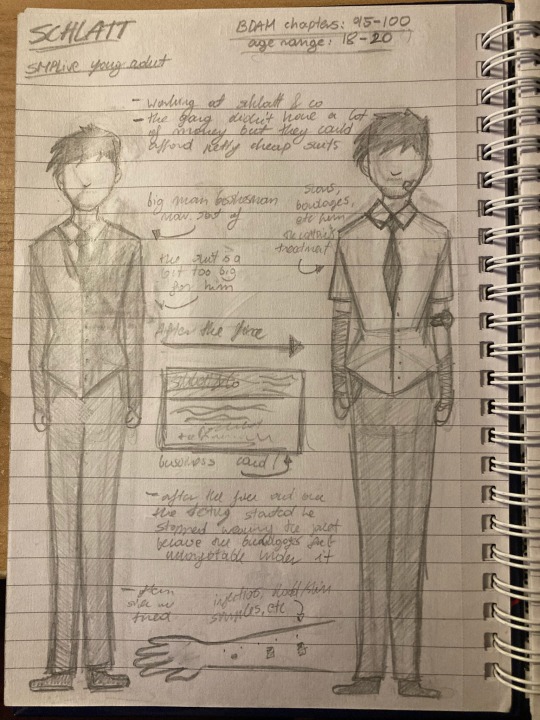
in the third set of designs we have both of his schlatt & co designs, from before and after the fire that lead him to finding out about the nether intolerance and everything else surrounding it.
at this point in the story, the company was set up and schlatt, connor and wilbur all had enough money left to get themselves nice suits they could use for work. not only that, they made business cards! they’d give them out to clients and new people alike to try and get exposure. you can also see a clear change in how he styled his hair - going from overly neat for his more stable job to more messy for a job he had more control over.
on the right is schlatt’s look after the fire - when the captain concluded what he had he started offering to test schlatt more to try and find some sort of work around for the intolerance, or at least to try and figure out how it worked. he would often be seen with bandages or small bandaids from skin samples being taken, injections, blood being drawn, etc. he wouldn’t wear his jacket a lot around this time since it would be uncomofrtable anyway, and he rarely did business up close around this time considering how he looked.
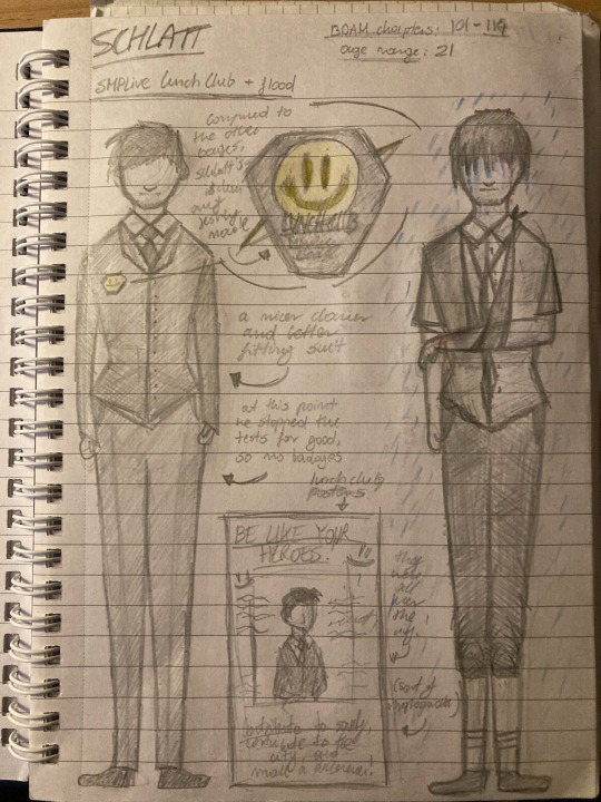
in this fourth set of designs, we have a design for schlatt during his time in the lunch club, and a design for schlatt during the floods. they are two widely different designs - but i decided to put them side by side for contrast.
in the lunch club design, you can see some minor changes. he’s back to having a full, clean suit, and clearly started presenting himself A LOT more professionally. and as every other member of the lunch club, his badge could always be visible - and hey, i finally designed the badge! it’s a sort of more serious spin of the normal lunch club logo. the other six members had badges from the previous six - but schlatt’s was newly made, so it lacked the wear and tear of the others. another thing about this stage of his life was that he would often be seen around the city on various posters - as all other lunch club members. this was a sort of pseudo-propaganda method to keep the city loyal to the seven leaders and to raise kids admiring them.
on the flood design you can see everything we learn from the narration - schlatt used the jacket of his suit for the most part to bandage up wilbur’s leg, and used whatever was left to make a make-shift sling for his broken arm. there’s not much to say about this other than it being a drawing of what i saw mentally as i wrote those sections!
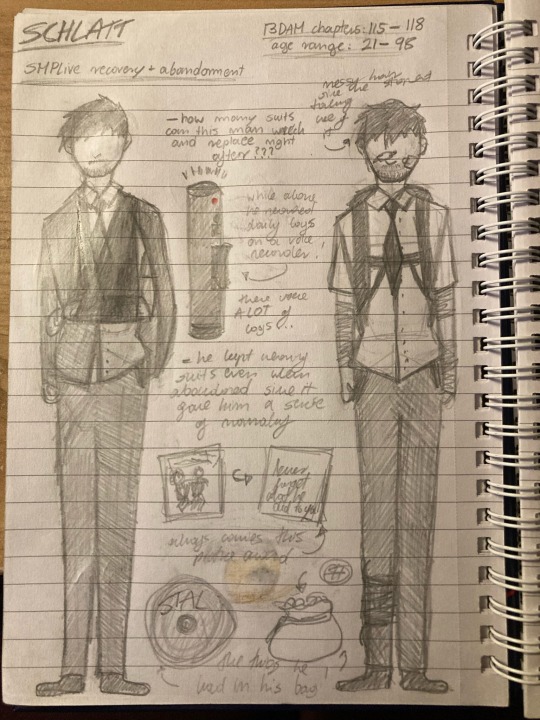
in the fifth set of designs we have one minor design and one far more major one - between schlatt after smplive’s recovery from the flood, and schlatt after he was left behind by everyone.
on the left, after everything returned to normal, schlatt got back to work at his, wilbur’s and connor’s company. he got a proper cast and sling for his broken arm, and he once more went back to a cheaper, but more comfortable suit. there’s really not much to say about this design, i just wanted to draw the cast-suit combo since i haven't done that before lol
the design on the right is a very important one! this is a design for how i imagine schlatt to look during his time alone in smplive. he would probably hang onto a sense of normalcy with the suit and everything - but would also try to get more functional with what he wore. he would carry a backpack with supplies he would need at any time and that he would fill with things he found around the city while looking for supplies, and he’d have a lot of straps to hang weapons, potions, etc... for the most part, he just tried to get an outfit that could keep things normal and familiar for him but also keep him alive. he always carried the picture of him and wilbur, stal, and a bag of schlattcoins. and of course, the voice recording device. that’s the only thing of those four he left behind when he left the city for good.
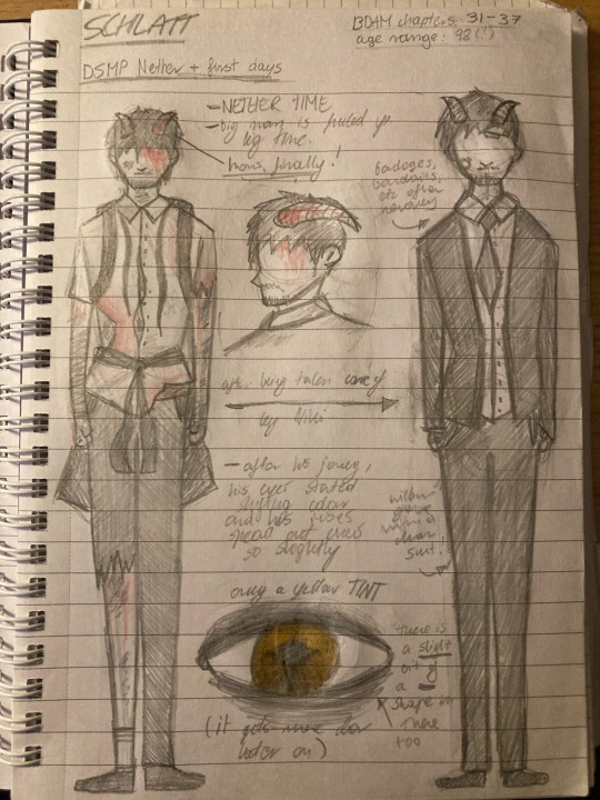
finally, some horn designs! these are really fun! on the left we have schlatt right after his first journey through the nether, and on the right we have him after he was nursed back to health by niki!
when walking through the nether, even despite minx’s magic, schlatt’s condition still left him hurt severely. he also, of course, got hurt quite a lot walking through a place that dangerous. through his walk he grew very small horns - but they were not as big as they would be later. his eyes also begun to shift colour from brown into yellow, but the colour did not show very clearly at first. a small split also showed in the pupil of the eye, but once more, it was barely visible at this time.
after recovering, there isn’t really much to point out. schlatt got fresh clothes, most of the wounds were cleaned and fixed up, and apart from the horns, it was quite hard to tell the difference between how he looked in the dsmp and right before the left smplive.
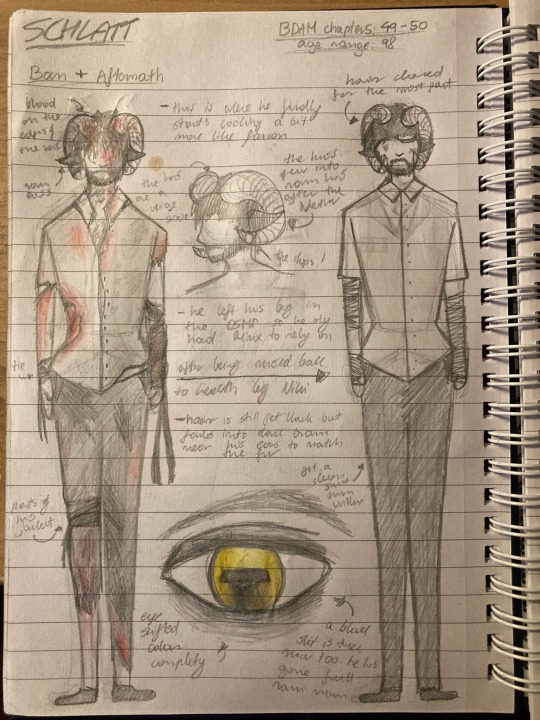
in the seventh design we have some more severe hybrid features! these got really fun to draw from this point on! on the left we have how schlatt looked during his ban, and on the right is how he looked after, once more, being nursed back to health by niki after coming back.
on the left design, you can see the hybrid features have gotten more severe. the horns grew out and curled, more resembling that of a ram, and his eyes fully shifted colour to yellow as well as their pupils splitting completely and turning a more rectangular shape. you can see his clothes being a lot more torn and dirty, as well as his jacket being ripped up and used as bandages for most of his body. at this point, schlatt had left his bag in the dsmp and had practically nothing to work with in the nether, especially in the early days when minx was still angry with him and very unwilling to help out in any way.
on the right we have his design after recovery. he has some bandages, some clean clothes, and once more, there isn’t a lot to say. you can still see some bruises around his face, as well. ah, and of course, at this point he has the chops(tm).
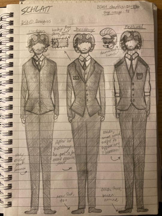
in the eighth design i put together 3 suit designs, since i didn’t need to get too detailed with these ones. let me quickly run through these!
in the first design here, we have schlatt during the election! he got a cheap suit from wilbur that he wore when he expected him to do a speech in support of pog2020, which we of course know didn’t actually happen. at this point he still had most of the damage the ban in the nether did to him underneath, whether it be bandages or bruises.
in the second design we have schlatt during his presidency! this was definitely at his peak, with a nice, custom suit (you can see the manberg flag sewn into it around the chest), which shows how in control of everything he was at the time.
for the festival, schlatt chose a more extravagant outfit, as did everyone who showed up. you can see a more casual, “human” suit to try and fit in with his people and try and paint himself as a fair ruler. he also put rings and other decorations on his horns for this event!
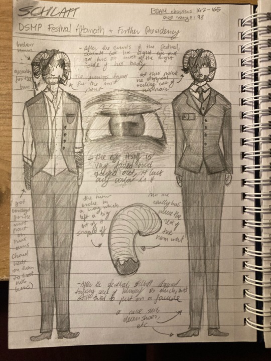
in the ninth design we have schlatt after the festival and during his further presidency. these were fun to do - let me walk you through them!
as shown in the design on the left, following the festival, schlatt lost an eye, burned most of the right side of his body, and lost a part of his horn. no one really know where it went. it’s believed it was lost in all the panic, eventually, and probably perished in the explosion. his right eye turned completely grey and faded, and he couldn’t see with it. following everything, he had bandages on most of his body for quite some time.
as shown in the right design, schlatt’s further presidency was a facade. he still has his clean, custom suit, but it doesn’t seem to fit the same. you can also see his hair got far messier and he never seemed to bother to actually clean it up.

and so we reach the final, tenth page of designs! we have schlatt during the dsmp finale, and then we have him during the bdam finale!
in the left design you can see i got HEAVILY inspired by sad-ist’s dawn of the 16th animatic! at this point, schlatt lost his eyepatch but didn’t care enough to replace it or fix it up, and you can see his dishevelled state with how he’s dressed and how his clothes look overall. you can clearly see the burns on the right side of his face, and how little he does to conceal them.
and finally, the finale design! schlatt and wilbur, when they were between life and death, sort of became a mix of their spirits and minds - on one hand was their normal selves, but on the other, was that more innocent side left long behind, symbolised by the blue sweater he USED to wear when he lived with phil, mixed with a nice shirt he’d wear normally. in this void, his state is also more clean and orderly, which is why his horn is back in place and there’s a lack of burns. it’s essentially the most stable representation of him that can manifest - without changing him completely.
and that’s that! hope you guys like these <3 i worked really hard on them, and i’m planing to do more in the future for different characters! i have a lot of time to work on these now that i’m taking a break, so i hope to get more done soon. for now, that’s all! thanks for taking a look at these! <3
#Character design#lore#between dreams and memories#mcyt bdam#jschlatt#schlatt#c!schlatt#c!jschlatt#fanart#art#dsmp fanart#dream smp fanart#mcyt fanart#mcyt#dsmp#dream smp
15 notes
·
View notes
Text
bathrooms.
i accidentally got poetic and romantic bathrooms. and then i wrote it down. and then i made it gay :)
OR, a story about love told in four parts.
-
-
i.
it’s a bit of an anything goes type of space—the bathroom. a half-way between the privacy and intimacy of a bedroom and the exposure of a living space. and that makes sense, AJ decides. makes sense that the bathroom would be where this happens then.
but just because it makes sense, doesn’t mean AJ had been expecting it. because she hadn’t. it happens sort of out of nowhere. not completely out of nowhere though. because they do have a history—messy and complex as most histories tend to be.
but the point is that she wasn’t expecting it. wasn’t expecting to see Poppy at the first frat party of the year. and definitely wasn’t expecting to wind up in a bathroom with her.
they’d bumped into each other in the line for the bathroom. it wasn’t a long line, so waiting wasn’t an issue. but it was just long enough for each of them to get a few catty remarks in. and they were at the end of the line, too. so, by the time it was Poppy’s turn to use the bathroom, they were alone in the hallway.
“you missed me over the summer, didn’t you,” AJ had said. her lips quirking up in the stupidly endearing half-grin.
Poppy had scoffed and folded her arms across her chest. “no i didn’t.”
“liar.”
and somewhere throughout their conversation, AJ and Poppy had drifted closer together. they’ll both deny it after the fact, but they were both aware of what was happening. how the space between them was slowly lessening. how the air felt taut around them, like it was just waiting for something to break it.
“why would i miss you? i hate you,” Poppy had said, her voice just a little bit breathy and her gaze flicking between AJ’s lips and eyes.
“if that’s the case, why are you still out here talking to me? the bathroom’s free.” AJ had leant in a little more, as though her words were a secret meant only for the two of them.
and that’s what finally broke it. Poppy grabbed AJ’s arm and yanked her into the bathroom. a surprised yelp slipped through AJ’s lips when Poppy pushed her up against the door. and then Poppy’s lips were on hers and her tongue was in her mouth and there was little else AJ could do— wanted to do, but kiss her back.
and now Poppy’s moaning and tugging at AJ’s shirt, trying desperately to fumble her way through unbuttoning it.
AJ pulls away, breathless. “what are— what’re we doing?”
“isn’t it obvious?” and as if to make her point, Poppy finishes unbuttoning AJ’s shirt.
“i just meant, like... are you sure?”
“it’s just sex. it’s not like we’re about to rob a bank.”
“i know. i still wanted to check, y’know?”
Poppy hums, seeming to regard AJ’s answer for a moment.
“what?” AJ quirks her head to the side a little bit.
“nothing.” Poppy shakes the thought from her head. “come on, we were in the middle of something.”
“right. yeah.”
AJ pulls Poppy in for another kiss that’s heated and messy and mostly just tongue at this point. and then, in one swift motion, she picks Poppy up and places her on the bathroom counter.
“that’s a fun new trick.” Poppy smirks and wraps her legs around AJ’s waist to pull her in close. “learn that over the summer?”
“jealous?” AJ grins.
Poppy scoffs. “as if.” and then she pulls AJ in again. kissing her hard, almost desperate, like she’s got something to prove.
it happens kind of quickly after that—they are in a bathroom at a frat party after all. shirts get tossed aside, belts undone, and skirts pushed up around waists. AJ’s fingers slip beneath Poppy’s underwear, teasing and waiting. it’s a breathy “hurry up already,” and Poppy’s nails digging into her shoulders that tells AJ to get to it. Poppy comes in a blur of panting and moaning and muffled curses.
they stay pressed together as Poppy comes down. and once she’s caught her breath, she pushes AJ back. and they get dressed and cleaned up in silence.
“thanks for that,” Poppy says once they’re both dressed and she’s fixing her hair in the mirror.
AJ hums, distracted, as she tucks her shirt back into her jeans.
“wait five minutes. i don’t want people seeing us stumble downstairs together.”
“what am i supposed to do then? just sit here?”
Poppy tosses AJ a stick of gum from her purse. “amuse yourself.” and then with a final satisfied nod at her reflection, she’s gone.
ii.
months go by since that initial encounter in the bathroom—winter break comes and goes. and it’s become a regular thing between them. almost like a rehearsed routine.
they’ll find each other across the room at whatever party they’re at. give each other a look that says “bathroom. five minutes.” then the bathroom door gets locked. and they’ll make quick work of buttons and belts. let their hands wander and explore until they’re both gasping and moaning. and then—
they leave the bathroom separately. pretend they were both drunk or that it meant nothing. it’s a lie, of course. because they aren’t drunk, not by a long shot. and it happens lots of times. too many times for it to mean nothing.
but none of that stops AJ. she follows Poppy upstairs. listens to the stairs creak beneath her weight and wonders why in the hell she’s noticing that before.
they’re both in the bathroom now. the door’s locked. it’s the same as it always is. but something feels different. it’s the air, AJ thinks. it’s heavy. foreboding. like it knows something she doesn’t. she wonders if it’s mocking her, but then she doesn’t really care because now Poppy’s kissing her and it’s softer than it normally is. and she’s not pushing against AJ as much or pushing her where she wants. like she’s ceding control. like she trusts AJ.
and there’s a lot to unpack there and AJ’s definitely not ready for that. so she goes with it. she’s careful and softer, too. and when AJ gets Poppy to come, she definitely notices the way her name glides off her lips like it’s something to be cherished.
once they’re finished and dressed and AJ’s left waiting in the bathroom again, she realises something. she realises that maybe she’s falling a little bit and that she’s definitely going to be the one to get hurt.
iii.
there’s another party a few weeks later and AJ goes to that. she has fun. drinks a little bit. plays beer pong when a few of the football boys insist that she team with them.
and then she sees Poppy across the room, and Poppy sees her and gives her that look. the look that says, “bathroom. five minutes.” and she’s about to follow because this is what they do. but then she remembers last time and what she realised. and the AJ doesn’t follow.
iv.
the weeks continue to fall away like dominos in a line. and then before AJ really knows it, they’re a month out from graduation. she hasn’t seen much of Poppy either. but figures that’s probably for the best.
there’s another party—isn’t there always?—and AJ figures she’ll go because it’s been a while since she last went out. there’s drinking and music and flashy lights and games.
the night dwindles on. and when AJ’s dancing, she feels someone grab her wrist and drag her away. it’s Poppy, AJ very quickly realises. Poppy who looks pissed and is now pulling her upstairs and into the bathroom.
Poppy spins around and pulls AJ to her. kisses her hard like she wants it to hurt. but not hurt in a physical way. hurt in the way that she wants AJ to miss it once it’s over. and AJ goes along with it. matches the enthusiasm, and bites and nips at Poppy’s lower lip. because she does miss it. she really fucking misses it.
it’s Poppy who pulls apart first. “what the fuck?!” and then she smacks AJ’s shoulder.
“what?” AJ looks nothing short of dumbfounded. “you’re the one who kissed me.”
“and you kissed back!”
“because you kissed me.”
and then she kisses AJ again. desperate this time. and she’s definitely trying to prove something.
“why do you keep kissing me?” AJ asks when the pull apart again.
“why didn’t you follow me?” Poppy cuts back with.
“what?”
“in March,” Poppy says and she sounds disappointed now. “when i looked at you and went upstairs. you didn’t follow. and then whatever we were just stopped.”
“why does it matter?”
“because— fuck you.”
“oh, that’s rich. you’re the one who dragged me up here! you’re the one who kissed me! you’re—”
“because i’m in love with you!”
and then it all just goes quiet. not even the muffled music from downstairs can break it. they stand in the silence. and it lays thick on their skin like a poison. seeping into their veins. wrapping them in a near suffocating embrace.
“remember,” Poppy starts softly, a stark contrast to before. “remember when you asked me if i missed you over the summer?”
AJ hums, thoughts racing.
“well...” she takes a steadying breath, “i did. i missed you so fucking much and i hated that. i hated that i couldn’t stop thinking about you. i hated that we weren’t together and that i couldn’t call you and that you didn’t text me. i just...” Poppy sighs and runs her hands through her hair. looking frantic and desperate and like she’s so close to falling apart.
“i missed you and i knew i was falling for you even then. but i wanted to prove to myself that i wasn’t. that we could have casual sex and have it mean nothing. except it didn’t work because now it means everything and i don’t know what to do.”
“i, um... i didn’t know,” AJ eventually says a moment later.
“yeah, well, now you do.”
“i didn’t follow you because i didn’t want to get hurt,” AJ says a moment later. “because i knew my feelings for you were changing. i just... i didn’t want to get hurt. so there, that’s why.”
“oh.”
there’s more silence, broken only by the muffled music carrying up from downstairs.
“what now then?” Poppy asks.
“whatever we want.”
and then they share a smile meant only for moments like these—quiet moments. intimate moments. and that makes sense, AJ thinks. because they’re standing in a bathroom. and it’s cramped and stuffy and there’s definitely some kind of mould growing in the corner. it’s far from perfect, but it’s an intimate space. a private space.
Poppy takes AJ’s hand and squeezes. and then they walk out of the bathroom and back downstairs together.
#my writing#poppy x mc#poppy min sinclair#queen b#playchoices#this is kinda me imagining what book two could be#so it's also me trying to be canon compliant#and that's what i like to call Character Development™
93 notes
·
View notes
Text
Essential Avengers: Avengers #242: “EASY COME... EASY GO!”

April, 1984
“Okay Avengers, the party’s over!”
Being a buzzkill, party-hating Cover Vision!
Hmm. Something about this cover makes it feel like from an older era. The returned Mighty Avengers logo or maybe the inking? Or perhaps the Silver Age DC superdickery energy to it? I can’t put my finger on it but this feels like a cover you’d see in the 70s instead of the 80s.
Last time on Avengers: Well, they went to San Francisco for a two-parter where they fought Morgan Le Fey to save Jessica Drew’s soul. As ya do.
Vision has also been a tube boy after he walked into a null field. Starfox hooked him up to the Titan supercomputer and that didn’t fix him, it did overclock his robot brain and let him broadcast giant holograms of his own head. That’s almost as good.
This time:

Some guy: “HOLY GEEZ!”
An interesting note, this guy has only ever seen Quinjets in pictures and never thought he’d see one in person. Tells you how often the Avengers hang around Ottumwa, Iowa.
We start with the Avengers in mid-return from California.
In one of the Quinjets, She-Hulk is telling Starfox that she wished they could have spent more time before returning to New York so she could have shown him LA.
Starfox: “Ah, well... I’m sure another opportunity will present itself, She-Hulk! Besides, the scenery around her has plenty to offer!”

Wanda looks like she’s trying to astral project away from Starfox putting his hand on her shoulder but she’s really just distracted thinking about Vision.
The Avengers on the Jessica Drew mission radioed back to the Mansion that they were bringing Hank Pym home but Wanda suggested that Hank could examine Vision and maybe fix him. But Vision rejected the idea and Wanda is at a loss for why he’s determined to overcome his robo-paralysis on his own.
I’m also a little confused why they didn’t call on Hank Pym sooner to examine tube Vision but then again that would have been super awkward for Wasp and Reed Richards, that hack, said Vision should have recovered quickly.
Speaking of super awkward, Hank and Wasp are alone together in the other Quinjet.
Hank is also baffled that Vision turned down his help. He repaired him once before! Remember? He got super tiny and had a fantastic voyage inside him? In Avengers #93?
Jan comments that she hasn’t heard Hank sound so confident in years and he confirms that devoting his time fully to SCIENCE and taking superheroing off the table as an option has done wonders for his emotional outlook.
He also reiterates that he never felt cut out for the superhero life. Aw, enjoy it while it lasts, bud.
And he thanks her for calling him Hank instead of “Dr. Pym” like she did at the hospital.
Wasp: “Oh... That. Well, when you flew out at my request to help save Jessica Drew’s life... after all we’d been through... the divorce and all... I’m afraid I slipped into my stuffy Avengers chairwoman voice. I thought it might make things easier, but it didn’t... For either of us. I’m sorry, Hank.”
Hank Pym: “That’s okay, Jan. I understand. Your ‘stuffy chairwoman voice,’ huh? Heh-heh. How often do you have to use that?”
Wasp: “Wellll... Most of the time the others will go along with ol’ ‘dingaling Jan’ -- but sometimes, I have to get tough. That never fails to grab their attention!”
Hank Pym: “No doubt! Once, I was the only Avenger who knew how tough you really were! I’m glad the others are learning.”
Wasp: “I guess that none of us are ever too old to learn, Hank.”
Feels like Hank is rewriting some things in his memories since Jan often had to diminish herself to make him feel better but then again it didn’t always work so maybe the idea is that he knew all along how strong she was?
Either way, nice to see these two interacting so amiably.
Also, I like that she’s able to be an effective leader while still being ‘dingaling Jan’ since it doesn’t change how smart and capable she is. And the contrast if she has to get serious only helps.
I think overall I like that her leadership style is so uniquely her and that when her character was retrofitted to operate outside of being ‘Hank Pym’s partner’ she still remained recognizably her.
We have a whopping several women on the Avengers at this time (glorious) and Wasp, She-Hulk, Scarlet Witch, and Captain Marvel all feel like different characters.
Since Vision declined Hank Pym’s help, Wasp drops him off back home in Central Indiana.
Once these two were husband and wife, friends and lovers. But they were very different people and, without meaning to, they hurt each other very much. Today, they have perhaps put a small bit of that hurt behind them. Today, they have again become friends.
Daaaaw. Friends.
Wasp returns to Avengers Mansion to discover there’s a full-on party going on. There’s even streamers and a Captain America who seems incredibly enthusiastic about streamers.

(In another fun bit, Monica knew about the party already because she flew ahead to the mansion before joining Wasp in the Quinjet after she dropped off Hank. And she was bursting to not tell Wasp what was going on as they landed.)
Wasp is even more surprised when she learns that the party is celebrating Hawkeye’s marriage.
Wasp: “Barton? You mean Hawkeye? Married?!?”
Hawkeye: “‘Fraid so, Jan! I’d like you to meet my bride... Mockingbird.”
Mockingbird: “How do you do?”
Wasp: “Oh... fine. You’ll have to excuse me. This is... quite a surprise.”
A reaction that Mockingbird says she’s getting used to because she’s seeing it from all of Hawkeye’s friends!
Hah!
Hawkeye asks Cap on the sly whether he made the right move, getting married, but Cap is very supportive, saying its the most responsible thing he’s ever done.
Hawkeye: “What?! Cap, you cut me to the quick! Haven’t I always acted in a mature, responsible manner?”
She-Hulk: “Look who’s talking... the man whose proudest achievement is the invention of the water-balloon arrow!”
Provided She-Hulk isn’t just making stuff up, there’s some serious off-screen shenanigans that we didn’t get to see, possibly involving Hawkeye shooting water balloons at She-Hulk all day.
But... CLINT. YOU INVENTED AN ANTI-GRAVITY ARROW!
Why am I the only one who remembers that?
Thor shows up at the party next, back from his own solo adventures, and offers his own congratulations to Hawkeye.

Mockingbird is undergoing some culture shock here, as she’s astounded that Hawkeye calls Thor “Goldilocks.” And when Thor turns his Thor charm on her, and blesses their wedding, she’s rendered briefly speechless.
Its fun that we get this side of her. I think she was similarly blown away when they met Cap on the subway.
But even though she was a SHIELD agent and then a freelance superhero, she doesn’t seem to have a lot of exposure to your Avengers types so Hawkeye pulling her into those social circles is a lot of fun.
She’s going to get used to it though. I know that she Avenges herself in the future.
Also, look at Thor’s flagon of mead. Holy shit. Its as big as his whole torso.
Jarvis is really dedicated!
Over in a quiet corner of the party, Wanda tries to convince Vision to let Hank Pym take a look at him but Vision dismisses the idea.
Vison: “Please, Wanda, let’s not spoil this happy occasion! Surprise parties are all too rare, and few of them are party to as many surprises as this one!”
And instead of explaining what he means, he turns his hologram off.
Well, okay.


AH HA HE WAS REPAIRED AND JUST DIDN’T MENTION
For reasons of surprise.
What a whimsical turn for the Vision.
Aw, that panel of them kissing and everyone cheering is sweet. That’s how I like to remember them. Not, err, later developments.
(I also like Mockingbird being confused whether or not he’s still a hologram because of his intangibility)
Everyone congratulates Vision for being bipedal again.
Vision: “It’s good to be moving, Jan. But my recovery shouldn’t come as that big of a surprise. As I told you a few days ago, it was just a matter of time before I isolated the cause of my body’s motor dysfunctions -- and initiated the proper repair systems.”
But he tosses some sweet cred to Starfox, for hooking up to an alien supercomputer. It’s like matchmaking but with networks.
The surprise of his surprise recovery pales compared to his next surprise, as he announces (without consulting Wanda at all, geez) that its imperative that she and him stay with the Avengers full-time.
All I’m saying is communication is important, Vizh.
And maybe you should have brought this up with Wasp too? She is the chairwoman and as Cap points out, the team is already pretty packed, especially with Hawkeye and Thor back.
Vision: “Yes, the ‘chairman’s privilege’ limit! But you’re not the leader now, Cap... the Wasp is! And she’ll just have to change that limit -- or the membership roster -- to include Wanda and myself! We will be needed in the upcoming emergency!”
Kinda dropping a lot of surprises on this surprise party, Vision! I don’t know if you really get the concept wholly? You’re not supposed to save up all the surprises for this one day.
Also, Vision’s speech bubbles have changed. They’re still rounded rectangles but they’re not yellow anymore and the font is a bit italicized. Hm. Wonder if that means anything.
Anyway, Vision announces that while he was a tube boy, he detected two major fluctuations of Earth’s electromagnetic fields by some “unknown energy of near-infinite power.”
He’s secretly been working with Reed Richards on this and neither of them have been able to track down what this nonsense is. But until this malevolent mystery is uncovered, he and Wanda as two of the more powerful reservists must obviously be active Avengers.
But how does he know its malevolent if he hasn’t been able to uncover what it is? Deductive reasoning and intuitive presentiment!
Pffffft.
I think this might be my favorite recent punchline from this book.
But Vision has more than just bad vibes to be given a frighten by this upcoming ominousness!
Vision: “The energy I detected goes beyond the limits of any known to man! The power flux showed on our screens for a mere fraction of a second, and then disappeared without a single trace. That concerns me... And it should concern all of us! If we cannot discover the source of this energy, there could be catastrophic consequences!”
And to show how seriously he’s taking this, he makes this horrifying face.

He looks like he’s trying to eat Wasp.
I do not care for this. Either the specific panel or the overall idea of someone eating Wasp.
Anyway, Vision and Scarlet Witch goes off to check the super advanced equipment he installed in the monitor room without asking anyone. He’s doing that a lot lately.
Wasp is both annoyed that he went over her head and impressed with his initiative in doing so.
But she has other matters to attend and asks Thor and Cap(tain America) head down for a private meeting with her.
And now the party is kind of over!
Yeah, you ruined it, Vision! You put too many surprises on the surprise party! You could have saved some for later!
Vision and Scarlet Witch went off to the monitor room. Wasp, Cap(tain America), and Thor went off to have an executive meeting. And Hawkeye and Mockingbird slipped away from their own party not long after that!
Leaving Captain Marvel, She-Hulk, Starfox, and Jarvis to stand around awkwardly wondering where the party went. They didn’t even cut the cake yet!
Dammit Vision!
Hawkeye snuck out to the garden behind Avengers Mansion that’s been there all along. And Mockingbird followed to see what’s bugging him.
Hawkeye: “I’ve always loved this spot. Great tree, isn’t it? Ya know, it’s not easy to get an apple tree to grow this big in the city!”
But Mockingbird sees through that and asks what’s really his beef.
Hawkeye: “Aw, it’s just that I can see another membership shuffle in the works!”
Mockingbird: “So?”
Hawkeye: “So, I’m the one most likely to get bounced!”
I like the range of Hawkeye emotions here.
Hawkeye says that since he has a life (marriage) outside the Avengers now, he doesn’t mind so much being cut from the team. But if they’re going to be facing the latest and greatest menace of all times, he wants to face it with them!
Mockingbird: “That was pretty profound... for a guy who’s supposed to be a butt-head!”
Hawkeye: “Well, thank you, Mrs. Butt-head!”
Aww.

This is a fun bit too.
Mockingbird asks if Hawkeye wants to go inside and get some cake but he shoots an apple from the tree and offers Mockingbird one.
Pretty slick, Clint.
Over at the monitor room, Vision is really into monitoring whatever is upcoming. Super into it. So Wanda has to ask a question.
Scarlet Witch: “Darling... Are you sure you’re all right?”
Vision: “What sort of question is that?”
Scarlet Witch: “You’ve been acting so peculiar lately!”
Vision: “Wanda, how do you expect me to act? I’ve just recovered from spending what seemed like an eternity in a life support tube, able to move about only as a holographic image! Before that, my body was possessed by the dying sorcerer, Necrodamus. And that was almost immediately after I’d gone through the agony of losing an arm. Thankfully, the Inhuman scientists of Attilan were able to restore my limb. But you must admit we’ve both been through a score of trails these past few months! And now, I’ve detected something which could be the biggest menace we’ve ever faced! All things considered, is it really so surprising that I’m acting this way?”
Huuuuuh. I mean, he has a point. That’s a lot of shit in a very short time frame to endure.
This could very reasonably be a reaction to it all.
That’s a very unnerving smile though.
Over at the not-secret but private just Wasp, Thor, and Cap(tain America) meeting, Wasp, Thor, and Cap(tain America) are meeting.
Well, really, its more that Thor is recapping the tale of Beta Ray Bill for the other two. But we, the readers, just get an editor’s caption telling us to read Walter Simonson’s Thor (and I don’t need to be told twice) and Thor summing up to the salient point that Donald Blake is gone forever and is definitely never going to come back multiple times.
What Cap takes from this is ‘hey i hope that means you’re back on the team then!’ which Thor affirms.
Thor: “Aye, Captain America! Some of my finest hours have been as an Avenger. It would be the greatest honor to continue my service in your company... if you will have me!
But Wasp isn’t going to dump Thor from the roster!
Problem being, what the heck is she going to do with the roster? She doesn’t want to dump anyone off it, she doesn’t want to tell Vision to eff off, but she doesn’t want to lead an unwieldy team either. Six is a good number of Avengers!
I love Wasp’s note paper where she’s scrawled various roster ideas, clearly getting more and more frustrated with the exercise.
Cap suggests that maybe a temporary expansion would be the best move, if there even is a menace!
He’s somewhat doubtful of Vision’s story but wouldn’t you know it, as soon as he says that, the priority alarm goes off because Vision has detected the Ominous Energy Readings again.... IN CENTRAL PARK!
And lest anyone doubt Vision this time, an enormous and blinding flash lights up the Manhattan skies.
Cap: “I... believe you, Vision.”
Hah.
The Avengers head for Central Park with devices that Vision has created that will help them trace the energy but he could have saved the time.

There’s a big obvious structure that wasn’t there before. Odds are pretty good that that’s the anomaly.
Hmmm... Y’know, that structure looks familiar. As if I’ve seen it somewhere... But wheeeeeeeeeerre. I guess its a secret to everyone.
The sudden appearance of a large structure right after a massive flash isn’t even the weirdest thing going on. As Reluctant Science Guy Starfox waves around the detecting device, he realizes that the Ominous energy isn’t coming from the giant structure. It seems to be coming from everywhere. But it dips as you get closer to the structure.
Starfox posits that the energy is being focused on the ring from another location.
Curiouser and curioserer.
The Avengers poke around some more. Hawkeye calls attention to an arch built into the wall of the structure. It’s just real interesting. It’s super, incredibly interesting. Plus, the air is nice in the arch.
And it’s an arch. It looks like it’d be a doorway or tunnel to the middle of the structure but it doesn’t go anywhere.
Huh.
How fascinating.
She-Hulk, Cap(tain America), Captain Marvel, Wasp, and Thor join Hawkeye in the arch and agree that it’s a pretty interesting arch.
Perhaps this arch was made for them.
As soon as they join Hawkeye in it, there’s another blinding flash of light and those Avengers vanish in a curl of smoke.
Wow.
I can’t believe Hawkeye, She-Hulk, Captains America and Marvel, Wasp and Thor are dead.
Huh. And Wasp was just complaining about having too many Avengers!
Everyone is appropriately shocked by this, especially Vision because there were no energy emissions coming from the thing so it should have been inert.
Scarlet Witch and Starfox wonder whether the missing Avengers have been teleported somewhere, into some other story... or destroyed.
But before they can investigate the structure for clues, or see if it’ll strike again?, the whole thing vanishes as quickly as it appeared.
The plus side is that it makes Starfox lean toward ‘teleported’ which still doesn’t answer where the Avengers have been taken or who would do it.
If it���s the Collector again, I swear!
Here we go... Follow @essential-avengers because I thought I had more time! Oh geez, I don’t know how I’m going to handle this... Also, like and reblog because I like to think I do good work.
#Avengers#Ominous Energy#the Wasp#Captain America#Captain Marvel#monica rambeau#the Vision#Scarlet Witch#Thor#She Hulk#Hawkeye#Mockingbird#Starfox#Vision ruins a party but not how you'd think#Jarvis is the world's best butler#Everyone's shock and alarm that Hawkeye got married#frequent culture shock for Mockingbird#Essential Avengers#essential marvel liveblogging
13 notes
·
View notes