#so I had to totally redraw her body proportions
Explore tagged Tumblr posts
Text
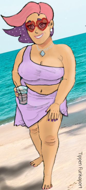
(Posting this in the dead of night literally just so I stop fiddling with it.)
Some time ago, I saw a picture of Alaina Scott in a confusing bathing suit and wanted to see Glimmer in it. I have since made that happen because I can.
#in my brain#this was going to be a very simple edit...#untill I realized Alaina was a lot taller than Glimmer#so I had to totally redraw her body proportions#then I got distracted trying to do lighting stuff even though it was supposed to only be a quick thing#and i will tinker with it for the rest of time if I don't post it right now so i can't#tippen attempts art#glimmer#spop#shera#she ra#alaina marie scott#fanart#bathing suit#bikini#i did not draw the bg obvs as it's a photo#like all my art attempts dont look at it too closely my lines are a mess lol#alaina scott#eminem#(she's his daughter)
100 notes
·
View notes
Text
Art style challenge: reflection
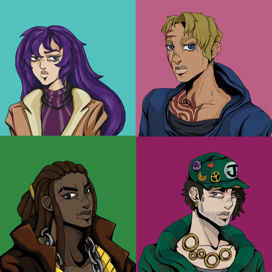
So, during this very challenging months and 3-4 weeks of social distancing I was stuck. Drawing became boring and I was in state of stale purgatory and it was annoying me. However, my sate of monotony came to a halt whenever I watch “Cheer Up!”, a show/DnD campaign created by Wrapped Lamp that was set in the world of JoJo, but in a bleak setting. It's wonderful, and the characters are brilliant. (This a link of the first episode on YouTube: https://www.youtube.com/watch?v=dVF6ShkYqU0 )
As I was watching the show I decided to challenge myself, I have never drawn in Hirohiko Araki’s style before. I have never tried to draw like that because it is a simple but complex approach to illustration that is very hard to draw, let alone replicate, but I tried and I proud of the results. So because of this I set myself some rules:
1. The illustrations must be based on the player/character icons in “Cheer Up”
2. They must look like protagonists that could be in the anime but are not copies of existing Jojo characters. (Because that's cheating)
3. Each illustration must be done within 3 days. (A personal thing for me, I get bored of drawing the same illustration for more than 3 days, if you want try this you don't have to follow this rule)
With these rules, Photoshop and google images by my side I was ready. And this is how it went!
(I am putting each reference of every character in groups of eyes, face, hair and body because I had to to a lot of research for this style, I have put the main influencers down there were more but are not important)
My process
At the start of all my attempts I create a beginning sketch of original icons. I am going in blind so doing this shows me how they created it without tracing it, sort of like life drawing. I then made a rough line drawing to see what the design looks like without making it official. I sometimes draw a second outline to figure out the details and then I compose the final line work but I also have the original art, the many characters in Jojo Bizarre Adventure and real life examples at all times. Paint the hair, skin, clothes and then create the shading and then they are done.
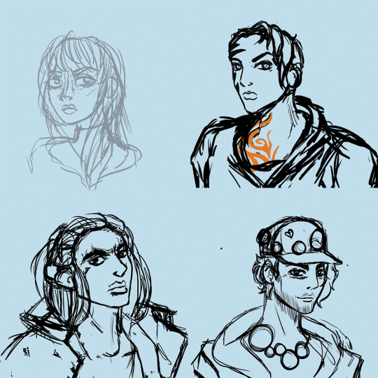
The first sketch

rough line work

The final outline with the shading
I also chose to try not to use part 3 as reference material. I personally dislike the seasons animation and character design. I don't know what happened in that season but they look terrible. It took me 3 tries to finish Stardust Crusaders and the art work was the main reason.
The Characters
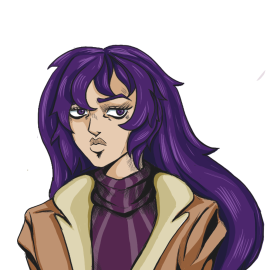
Isadora
Played by jay (Stabbyness)
Isadora was the first character I drew. I chose her because the next live “Cheer Up” episode was in 3 days and with that time I decided to give myself a fighting chance by drawing her first (I find women easier to draw than men).
With Isadora I had to also decide what Jojo season they would be in from the start, I wanted consistency because they are the protagonists. I decided to do a mix of part 4 but was mainly based in part 5. For me I liked the colour shading of part 4 but loved the structure and graphic style of part 5. This made shading and highlights easy and consistent.
Because I had never drew anything like Jojo I had to use multiple characters as a frame of reference, (I did not copy the originals, if I did then there would be no point of doing this challenge in the first place). I thought it would be good to show how many characters I referred to to help with this process.
Isadora was the easiest to draw out of the 4. She has a traditional female design, her only challenge was her eyes. As the first one this one was done in time and and looked good at the time. However now that I have got the hang of drawing in this style I want to redraw her again to show myself how much I have grown during this challenge.
Characters that i used for art style reference
Eyes: Trish Una, Narancia Ghirga and Yukako Yamagish
Face: Trish, Erina Pendelten, Yukako
Hair: the whole part 5 crew (I had know idea how draw Jojo hair at this point)
Body: Joylne Jostar, Yukako
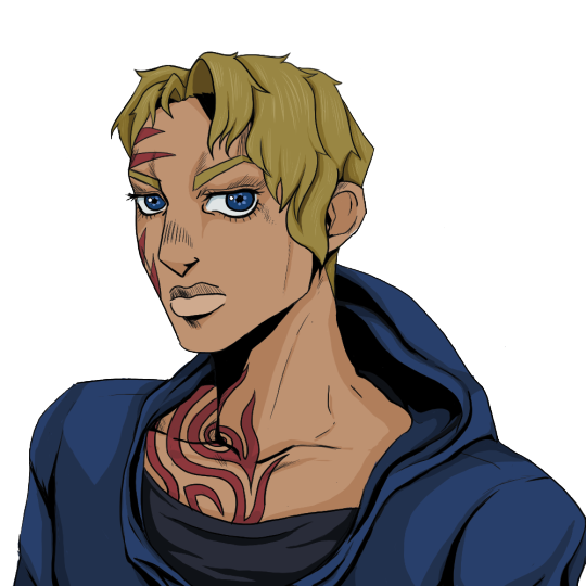
Donna
Played by Will (bigmovingtarget)
Donna was the hardest overall draw. She is a wonderful character but she does not typical female build. She is a MMA fighter, a tattoo, wears a hoodie and jaw that could cut glass. This created some problems, Araki characters rarely wear hoodies and his female characters are not normally drawn with strong features, they don't ever have a massive tribal tattoo. Also Araki’s female cast have a very small range of hair styles so I had to look at the male cast for inspiration and information because donna is an unusual design!!
Her tattoo was very difficult and I was in a pickle for the whole first day. The original icon has only a few red marks on her face and the thumbnail of “Cheer Up!” (created by Six) depicts Donna with her back to the camera and looking with side of her face without the tattoo!
This was driving me crazy.
In the end I had to reference real life tribal tattoos and the famous tattoo from the movie “Dusk till Drawn”. I like the result.
Her hoodie was also an unusual problem because I couldn't find a single character in the cast sporting a hoodie at the time of drawing her. So I wanted to draw her with a hoodie that the cast would wear. So when I was looking at fashion editorials I found Billie Eilish wearing the perfect hoodie and had to try to replicate it. (Elle 2019 interview, just incase you want to find it. Its the red coat!!) I also referenced part 1 and part 2 for her body because the those characters where drawn to fight, they are not frail and fawn like in appearance and think that is perfect donna.
Characters that i used for art style reference
Eyes: Josuke Higashikata, Yukako, Lisa Lisa and Gyro Zeppeli
Face: Gyro, Jolyne and Lisa Lisa
Hair: Enrico, Yoshka Kira, Caesar Anthonio Zeppeli and Koichi Hirose
Body: Lisa Lisa, Gyro, Leone Abbacchio and Jolyne

Jack
Played by Christian
Jack was easy to draw because he looked like a Jojo character. Like Isadora, Jack has a typical male design for Jojo. This meant I had a pool of reference material for him and had finished him in 2 days, the only real problems where his hat, stubble and jewellery. Lucky most of Araki’s cast have jewellery and chains and Jotaro Kujo has hair as a hat! Jack was heavily based on Jotaro Kujo but I made sure that he wasn't a copy!
Stubble...stubble doesn't exist in Jojo.
Jojo’s Bizzarre Adventure has magnificent beards or clean shaven men, and sometimes they have facial hair. This was the main issue with this character because with stubble you don't have Jack. So I had to take the beard of Joseph JoStar and looking at real life stubble finally got his lovely 9 o'clock shadow that we have now.
Characters that i used for art style reference
Eyes: Joseph Jostar (part 2), Jonathan Jostar
Face: Leone, Jotaro Kujo and Burno Bucciarti
Hair: Jotaro and Robert E. O. Speedwagon
Body: a mix of the cast of part 5 with a little bit of Johnny Jostar (like Isadora)
This one was the start of really using real life as a reference. Although really started using them in Donna illustration, drawing men has always been a challenge for me so drawing from real life actually made it more like Araki’s style. I realised that Jojo art style is based in realistic body proportions. I honestly think that this looks better than the other 2 because of the life drawing I had to do.

JJ
Played by Arimnaes
This was the last Icon I had to draw. I left this one last because I needed the practice to give this guy any chance of working.
his face and body were not the issue because most of the main casts (in their respective seasons) have similar features but slightly different body heights and proportions. However, JJ’s hair was a difficult.
In my research I found a total of 2 characters that could have his ethnic style or texture for his hair. They were Enrico Pucci and Muhammad Avdol, and no one else. This ended in failure because their hairstyles are wacky and imaginative and JJ’s dreads just flat out don't exist in the Jojo universe. If they have his hairstyle then I must of missed it because I wasted a whole day solely on research!!! Anyway, after that that I looked at male braiding and box braiding to figure out the hair line. Although I had the hair problem with Enrico I personally loved his design, he was drawn with an attitude and I thought it worked for JJ.
Characters that i used for art style reference
Eyes: Enrico, Bruno, Joseph, Gyro and Giono Giovanna
Face: Enrico, Muhammed Avdol, Johnny and Bruno
Hair: Giono and Josuke,
Body: Enrico, Bruno and Caesar
Reflection
Although the process was difficult, I had fun drawing these characters and have gained new techniques in drawing that I struggled in the past. I can draw stylised shading, tattoos, clothes and male characters better than I could before. I also learnt that I can draw surprisingly quickly and had finished both Isadora and jack in 2 days. After this challenge i also gains a new appreciation for Araki and the show Cheer Up and the number of literal hours it must of taken them to create an immersive show.
However now I have to find something else to do whilst being stuck indoors!
#jojo bizarre adventure#art challenge#art style challenge#cheer up#surprise round#dnd#art pdp#fanart#blog reflection
9 notes
·
View notes
Photo

Zasha Revisit - July 8th, 2017 [My DeviantArt]
Behold, a flamboyant lesbian.
I was in a bit of an art funk with my other projects, so I redrew an old character design from 2007 to shake things up a bit. Her name’s Zasha. Like Sasha, only with a Z, because 12 year old me was totally creative with names.
Drawing characters bending forward/foreshortened torsos is my artist Achilles heel. How’d I do? I’m really trying to draw more dynamic poses lately.
I intended to have this be a one time revisit of this character, but now I’m incredibly tempted to keep her. I want to vary her body type a bit if I do though, because right now she’s pretty same-y to the rest of my human cast of OCs. Zasha’s a sporty type, so it might be time for me to finally learn how to draw some friggin muscles. She’s beauty, she’s grace, she’ll suplex your face into the ground.
This is the old design I was redrawing. Zasha had designs after this one, but I liked this one best. Drawn on February 22nd, 2007.
Right click and hit “open in new tab” if you want to see this image without Tumblr stretching it to disgusting proportions.

Slightly over 10 years of artistic improvement, yippie-kai-yay.
90% of my characters in 2007 had fingerless gloves. Also, man, I drew small back then. And had poor font and cropping choices.
19 notes
·
View notes