#slowly learning how to 3d and edit renders
Explore tagged Tumblr posts
Text

#slowly learning how to 3d and edit renders#sorry i've been gone. life is killing me#tf2#team fortress 2#red#tf2 engineer#tf2 engie#bluekiivi
72 notes
·
View notes
Text
FAQ about Delta-Gambit
As I mentioned before, I think this post should clarify a lot of questions behind my project. If anything is missing, be kind to tell me so and I'll edit.
((05/OCT/2024 -- I'm going to unpin this temporally until I finish tidying up this post -- had a huge set-back IRL that will dent my ability to focus on the project)) ((15/SEP/2024 -- Still trying to catch up on pending stuff for my blog, now that I'm getting more confident with Ibis Paint on the phone and combining it with CSP, I'll be able to focus on doing some organizing on this blog soonish. After that I'll focus on the stuff I owe to other people 😳 (not 3D because I still can't buy a GPU replacement for my broken one, but at least I can draw picturs... if RL stops nagging me with their selfish requests) ((18/AUG/2024 -- I gotta do some cleanup in this post later down the month now that I'm learning how to handle better the blog's presentation by watching how other people do theirs. Please disregard the present mess until then.))
((05/AUG/2024 -- I think I should add some disclaimer here -- currently I'm working on the project very slowly due to several RL issues that doesn't give me enough spare time a day -- until I get a new tablet (now a new GPU) to work faster I'll keep posting sketches and other things that I can do on the phone and 3D renders of my AU and OCs of other people -- I apologize for the slow trickling of content on my blog and thank you for dropping by))
🔵 What is this AU about?
This AU branches out after a half-baked Pacifist Route in which the plea of Spamton has been ignored by Kris for too long. Everything else is as a normal Pacifist Route, but with a tasteful twist. The story revolves around Spamton mostly, but he isn't the sole protagonist of this story, as other characters come to prominence later on and get tangled in a deep conspiracy that puts all of their lives at stake. It's roughly a story about the lives of the Darkners in a Dark World more than character centric drama, but I get to weave a ton of narrative devices that so far is being loved by all my proof-readers.
🔵 Is this AU related to any other AU?
Nope. This AU was created without any knowledge about anybody else's AU in the past. In fact, I didn't know other people made theirs until I read about it and that's when I came to the realization that what I did was called as "AU" 👀 I started writing the prologue draft at the end of January 2024, but I did not make any contact with the fandom up until the end of March 2024.
🔵 Why you make so many experimental art not related to the visual novel?
Because that's my way of training art, and I'd rather pick my characters as theme and focus of my training than practicing with something else to be honest. I also need to practice drawing my characters more often so that I can stay consistent with the designs when I start to build up the visual novel in Unreal Engine 5.
🔵 Do you have any samples of the visual novel?
Currently nope, as I'm still in training, learning through an Udemy course a friend of mine gifted me to learn how to make visual novels in Unreal Engine 5. Until I get the script of the first season done, I'll not work on the visual novel, because it would be dumb to work on it and not have any complete chapters done to start sharing them.
🔵 Will the visual novel be free to play or?
The visual novel will be free to download, but of course, you can always give a tip of kromer if you think my work is worthy of it 😁
It will be published on Locals, Itch.io and on Steam (this last one further down the line because of how it must be setup and the $100 that costs to get a game slot on Steam).
I'd also upload gameplay of it on my YouTube and Rumble channels if you are more of watching others playing it than playing the game yourself.
🔵 You mentioned a "season". Is your visual novel split in seasons?
I thought about calling them "arcs" but then I settled with the word "seasons" because of how animated they are and visual-novel format is almost like watching a movie but with huge captions. I've enough material for 1 season (of roughly 12~15 chapters, depending if I need to split chapters more because of their length) and I have ideas for a Season 2 that can survive on its own up until Chapter 3, 4 and 5 of the original Deltarune comes. Then after we get more official Deltarune story, I'll be able to produce a third season.
(moved updates to a different post)
🔵 Why Spamton though?
idk, brainrot? My Spamton should be called DG!Spamton, to distinguish it from the original (or other Spamton in the fandom). Though both are similar (if not identical) mine has something that made a few Spamton haters to start to like Spamton. I don't know how to explain it… It just works ._.
🔵 How do you pronounce "Spwatchton"?
S-pwatch-ton
🔵 Are you a Spaniard?
Born and raised, and it shows in my odd way of writing. Hope you don't mind some typos here and there but I try my utmost to quash them when I see them 😅
Also and just in case, you may address me as he/him or they/them but since I'm NB you may use whatever pronouns you feel comfortable with 😉I love you all 💌 (in the most respectful way)
You may call me Spwatchton or Spwatch, we're not picky.
#[DG!FAQ]#removed some superfluous content on August 2024#I discovered the “Read More” thingy!#I should do more clean-up here...
12 notes
·
View notes
Note
3, 24, 28, 29? (I'd love to hear about your experience with AE but obviously you can answer these however you like~) ✨💜
omg wings (": i love how i am the 'ae user' of moablr PAHAHA i hope ur day has been doing well my love <3 i'll answer this moreso on the gfx side of things (since i don't feel like i'm qualified enough to speak on behalf of my gif making skills...)
ask a graphics / gif maker
3. who/what inspires your graphics / gifs?
i had to think about this one for a bit, and i've said this before on my blog but, i truly think nctzens and armys are absolutely insane when it comes to the gfx community... the sheer amount of creativity and talent in those two communities always outstands me !! i don't rmbr when or how, but i stumbled across @/neoheists blog and my mind was absolutely blown at the mockups and the amount of detail that went into their work ;; i found even more nctzens on instagram that make such insane graphics (i truly wish i could be up to par with their skill level in all honesty)
i don't follow many army gfx creators but armys do make a large population of the kpop community so it's only natural i find a lot of their edits on my pintrest.... just the sheer amount of diversity in designs and how people create such unique ideas absolutely blows me away and i admire their works so much (yours included wings <3)
other than that, it's simply- anything and everything. my yellow cab edit was inspired by a deobi making a yellow cab fmv for sunwoo or gyugle was inspired by just a youtube video i watched that had the search engine 'gyugle' at the beginning (": i think taking inspo from all sorts of places is very important in order to get fresh ideas hehe
(a little bit ironic i mention gfx makers from nct/bts because the gfxs they make are nothing alike to whatever i create </3)
24. what is something that you’re wanting to learn right now?
web design (": it's apart of my internship so naturally, i am currently learning it atm !! but i also just have this sense of urgency to learn everything already so i can execute my ideas (<- a little bit insane if you ask me) a lot of people associate me to web prototypes for txt but truthfully speaking.... if those were actual websites they'd be so impractical PAHAHHAHAH i want to start considering what actually goes into making a solid website and how i can incorporate my creativity into it other than just focusing on the aesthetics portion (:<
a few other things would be learning how to brand (creating logos, brand design mockups, etc) and more 3d renderings !! truly excited to step my foot into those and see how i can incorporate my love for my kpop boys with that ability overtime <3
28. advice for any beginner graphic / gif makers?
create. literally just make anything you have in mind. in my internship, my employer stated that as i familiarize myself with the program that they use, don’t feel as though i have any restrictions. if i have any sort of idea i want to execute, just try it. if not, google a video. if not then, ask him to see if he can help, etc. please don’t feel as though you ‘can’t do something’ because there’s just no straight answer to it.
one of the biggest hardships someone is going to face when they first start out is that they have an idea in mind, but they don’t know how to execute it. they won’t be able to find a tutorial because they don’t know the jargon, etc etc (i face this issue all the time as well). i think facing stuff like that is pretty natural and overtime as you learn more, you’ll actually learn the lingo of stuff you want to do/are doing. but please, if you have an idea and you have somewhat of a brief idea of how to execute it, just do it. even if it’s tedious and even if it takes you x10 as long as it would’ve been if you knew the proper steps how. it’ll get your creativity flowing and overtime the more you do it, the more you’ll actually learn the program itself then slowly realize the easier steps to take.
tldr : create whatever your heart desires <3 that is the most simplest (yet, perhaps, most complex) advice i could give (”:
29. advice for any advanced/expert graphic / gif makers?
your attention to detail goes a long way. perhaps the majority of people looking at it will not notice it but trust me- it adds to the viewing experience as a whole whether people acknowledge it or not. and for the niche minority that does recognize those little details, it feels the most satisfactory having it be acknowledged (”:
on another note: in beginners art, you’re taught the basic principles of design and elements of design. you may not notice it, but you subconsciously follow these rules a lot. i think it’s really good to look back onto those principles whenever you feel like something is missing and see which one of those best fits the book that you could add/improve on. don’t feel as though you have to create something that fits the bill of those principles/elements (i absolutely hated having to do that in art) but rather have that help elevate your ideas and morph it into something of your own. ultimately, that is the biggest power people have as creatives (”:
(tbh that’s literally all i could say for this i feel like i’m unqualified to give advice to experts LMFAO)
#asks#wings#rb games#god i realized by the end of this i literally did not answer anything catered towards ae im so sorry wings ASHDOKMAW#but UHHH <3 if u ever have questions about anything with ae i'm happy to try and help <3#ae overall is a .. program#believe it or not i didn't acc begin using it until last year#i think once u figure out the basics of ae it's p much how you grow from there#its . intimidating <3 but like all things once u dip your toes into it#it's really not that bad#also watch NONE of my wording make sense i wouldn't be surprised#also sorry for giving u a whole entire bibliography to read i just rlly like talking !! about design !!
4 notes
·
View notes
Text
Idk did some pixel art and I’m now gonna attach my danganronpa fancharacter biographies because I can :DD (sprite edits, character details and designs are subject to change btw and this very post will be re-blogged everytime I edit something.)
W/ SCARF AND BEANIE
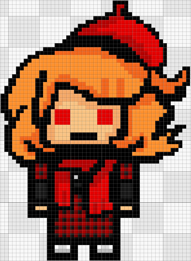
Name and Talent:
Ikani Rinyu, Ultimate Digital/Multimedia Artist
Birth Date and Age:
February 13, 16 years old
Race and Ethnicity:
Polynesian Japanese // Filipino Japanese
Accent:
Japanese, just...japanese.
Blood Type:
A+
Weight and Height:
128 lbs, 5'2 ft
Mental or Physical disorders:
Recovering Pyromaniac (I’m still researching about Inattentive ADHD and if this oc has accurate symptoms) and Peptic Ulcer
Sex, Pronouns and Gender identity:
Biologically Female, Prefer She/Her/Herself & They/Them/Themself or any pronouns & Demi-girl
Sexual and Romantic orientation:
Asexual Biromantic
Religion / Belief:
Agnostic
Other Hobbies:
Cooking, Baking, Making things out of matchsticks and wood and Drawing traditionally.
Likes:
Making digital artworks, playing with match sticks and flowers.
Loves:
The idea of setting things on fire or being around fire (for emotional reasons and urges) and warmth.
Dislikes:
Theft-related activity, acidic food and seafood.
Despises:
The idea of water and feeling cold.
Personality type and traits: ISFP
(INTROVERTED;SENSING;FEELER;PERCEIVING)
Personality description:
Ikani is mostly self-aware of reality’s hardships yet tend to keep up an ‘’whatever goes, is what happen and I cannot potentially do anything to change that.’’ carefree, reckless, will only believe when she has seen attitude that pretends to be a healthy optimistic nihilist way of dealing with life but when unmasked turns out to be a faulty uncertain self-hate of pessimism that pretends to be optimistic or a realist way of thinking and solving problems. This can badly affects her creative ability to do any problem solving, thinking outside the box or standing up for herself and the people she loves alone unless she has encountered that situation before or has help from someone with far more experience. She does not rebel that much to authority or dictatorship as she believes rules are rules or the law is the law and whatever unintended consequences that follow or reports of abuse of power are normal and natural but she’s open-minded and adaptable enough to consider changing rules and regulations peacefully if she’s convinced or confident enough. Either way, Whatever happens is whatever happens in the present and she won’t make any effort to neither change or preserve any rules or laws that much. She, most of the time, follows whatever happens in the present world with no consideration for the consequences that would follow because she doesn’t like to think philosophically or overthink.
Habits:
Stimming, flapping hands around, running around in circles when stressed, excited, happy, confused or afraid if she can’t bottle up her emotions, Running away from problems as much as possible (literally and figuratively) and bottling up her feelings. Also tends to get distracted and daydreams a lot yet when it’s her turn to talk about herself she goes a little overboard which can put off people and assume she is selfish. (when it’s just a habit she does)
Character morality alignment:
Lawful Neutral <-> Neutral Good
Name Etymology and Shenanigans 1:
Ikani Rinyu once translated from Japanese to English respectively means ‘’How’’ and ‘’Renew’’ forming the phrase, ‘’How renew.’’
Name Etymology and Shenanigans 2:
Mess with the letters on Ikani and you’ll get ‘’Ikanai’’ which means ‘’Don’t go’’ referring to her brother, ‘’Ika’’ which means ‘’not exceeding’’, ‘’Kanai’’ which means ‘’Flower’’, ‘’Kani’’ which means ‘’crab’’, ‘’Ikan’’ which means ‘’Fish’’, ‘’Ani’’ which is another term for ‘’brother’’ and ‘’Ni’’ which means ‘’to go’’
Name Etymology and Shenanigans 3:
Mess with the letters on Rinyu and you’ll get ‘’Rin’’ which means ‘’Cold’’ in Japanese and ‘’Dignified’’ or ‘’Severe’’ in Italian, ‘’Inu’’ which means ‘’Dog’’, and ‘’Rinu’’ which can mean ‘’Freelance of flowers’’ and ‘’Beautiful’’ or ‘’Pretty’’ in Indian.
Zodiac and Planet:
She is an Aquarius and is assigned the planet Uranus based on her zodiac.
Backstory:
Ikani Rinyu was born as a second child to a worker class family (Rinyu family) who mostly had time for her. Many years went by and her parents had to focus on things they deemed far more important in order to sustain a family with regular income. Her family’s income condition worsened when the day before Ikani 7th birthday, She, her brother and her parents were robbed of a lot of yen at gun-point by a gang after they went to the store and bought a digital tablet for her as a gift (because they felt as if they were neglecting Ikani because of work). After the incident happened, Ikani's mother divorced with her husband because it turned out that Ikani's father had connections with the gang that robbed them and never told her about it. Another reason for her parents divorce is that both of her father and mother had an underlying conflict in which both were never really interested in each other and only agreed to marry back when they were friends so that they can decrease their tax and avoid debt and they both felt guilty about divorcing each other because both felt that they were selfish with their underlying mutual motivations for marriage, they were still saving up money and investing and couldn’t afford to divorce early, and that divorcing will affect their children greatly if they will be honest about it to them at an early age (suprise suprise, bottling up your feelings worsens everything, yourself and everyone around you). This robbery incident went mainstream after the time Ikani’s mother divorced Ikani’s father and her remaining family was secretly interviewed by a group of ''journalists'' and this is how (insert academy name) found and scouted Ikani just so they can replace and -cover up an ultimate's death.- So her mom and the group of journalists made a contract in exchange for financial gain and basically free education for Ikani and her brother and also medical + financial insurance. Ikani started setting things on fire (mostly flowers, sticks and wood) on ‘’accident’’ just to gain attention from her busy mom, brother and everyone else she was close to and was forming a relationship with, in which her ‘’habits’’ slowly spiralled and developed into impulsive Pyromania because she felt that she was never loved enough + with her parents divorce taking a toll on her (her brother tried to help but also didn't know what to do and was busy with their own school). Around this time, she also felt like eating would decrease her family's money greatly so she tried skipped eating snacks at school but not basic meals yet she still developed peptic ulcer. On her 11th birthday, Ikani’s brother finally took a stand and consulted a ‘’reliable’’ therapist/psychiatrist and a dietician (who helped with the insert academy's goals) despite it being expensive and discouraged by her mom. Her therapist/psychiatrist then noted to her parents that Ikani should focus more on expressing her emotions in more artistic and creative ways in order to cope with her bottled up emotions, trauma and urges and using the digital tablet she got at age 7 when everything was still relatively alright should be a good head start. Her dietician also helped her with resolving her peptic ulcer and convinced her that she shouldn't feel bad about eating extra snacks and set out a diet for her to follow. Soon, The academy’s contract money given to her parents was enough to sustain her creative urges as Ikani eventually learned to create moving and still digital artworks including complex 3d and photography by simply using her tablet that had limited features over the years despite her age as she contributed to many famous and iconic company logos, designs, presentations, artworks, animations, movies, edits and videos that are found in the media. Over the years, Ikani secretly wished that the contract would stop as that diverted corporate's financial wants for themselves because of her hidden relations with the academy journalists and she wishes she was never born and regretted that time she was too ''needy'' at age 7 (she shouldn't blame herself though) but never took her own ground against it to her mom as she felt like she was selfish for wanting to do something her mom didn't desire so she ended up ONLY EVER venting her emotions through her work/hobby and sometimes forgot how to express her emotions.
Reasons for acting the way she does during the killing game:
The reason why she doesn’t vent her emotions and only bottles it up during the killing game is because just like in the original Danganronpa series, Monokuma would confiscate your belongings that allowed access to communicating with the outside world (and it just turned out her only venting item was a digital tablet that would probably screw up Monokuma) Also, it’s because the idea of ‘’Survival of the Fittest.’’, ‘’Being weak will kill you.’’ and ‘’No time for crying because it is not yet over’’ is in her head all the time + fear of being impulsive again and accidentally resurfacing her Pyromania and basically rendering her brother’s efforts to help her with her problems useless so yeah she’s guilty of wanting to feel emotions so she eventually becomes numb to the things happening around her. All of these are her ways of justifying being emotionless, being unintentionally ignorant and coping with loss and grief in a dangerous game that could kill you any moment.
Student percentile, Predictability and chances:
>Gets killed normally: 30%
>Punished and killed for breaking rules OR due to unfair trial misconduct shenanigans because plot: 4.6%
>ATTEMPTED to murder someone: 20%
>Blackened AND escapes: 10.5%
>Blackened BUT executed: 25.5 %
>Killed someone BUT died during or before their murder trial: 9%
>Betrays everyone as the MASTERMIND: 1.5 %
>Betrays everyone as the MOLE // TRAITOR: 5.7 %
>Survives the killing game as an forever evil MOLE // TRAITOR // MASTERMIND in the killing game: 0.8 %
> Survives the killing game as a redeemed MOLE // TRAITOR // MASTERMIND in the killing game: 0.3 %
>Survives the killing game as a normal person in the killing game: 35%
W/ VISION CORRECTING VISORS
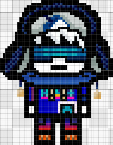
2. W/ VISION CORRECTING READING GLASSES
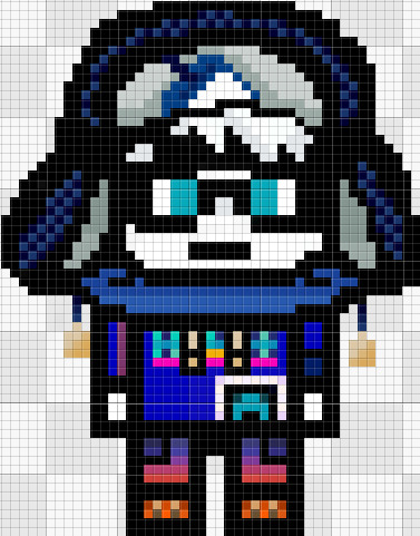
3. N/A EYEWEAR
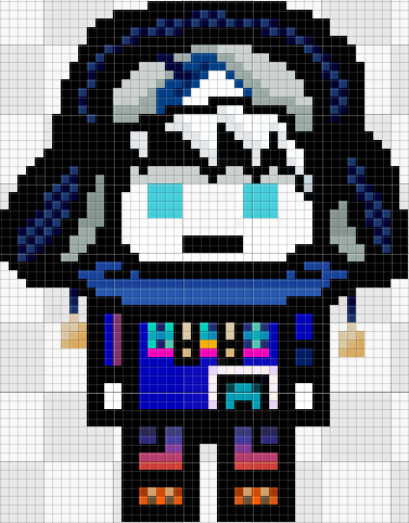
Name and Talent:
Cyl Bol // Cyden Boliver ^ Ultimate Arcade Attendant
Birth Date and Age:
July 9 ^ 15 years old
Race and Ethnicity:
Dutch Japanese
Accent:
Russian mixed with Dutch and Japanese
Blood Type:
B-
Weight and Height:
100 lbs ^ 5'5 ft
Mental or Physical disorders:
Developing schizophrenia symptoms (I’m still researching on this so I’m not sure) and PAPD (Passive-Aggressive Disorder) and has genetic Albinism + Astigmatism.
Sex, Pronouns and Gender identity:
Biologically male, Any pronouns but They/Them/Themself and He/Him/Himself are preferred, Gender-fluid
Sexual and Romantic orientation:
Toric // Quadrisan or Viramoric
Religion / Belief:
Reformed // Progressive Judiasm (yeah, this the correct term-)
Other Hobbies:
Debate, Internet surfing, Meditation, Reading philosophical/theology books, Practicing first-aid methods and crushing herbs.
Likes:
Salt, Bread, Dieting (fasting), Figs, Bread, Wheat and Grains, Krupnik with meat
Loves:
Philosophy, Theology, Basic human rights, Debating, Eating Chopped Liver
Dislikes:
The taste of pork (im sorry for adding this if it feels a little bit racist but I genuinely hate pork and I wanted to add it to a character that fits it the most without being too ignorant and stereotypical while still making the character that dislikes pork have an actual personality and backstory other than just RELIGION stuff. keep in mind this character hates pork not because it’s ‘’unholy’’, it’s because it tastes horrible for them), Immature // Karen customers, His own talent, Seeds, Human contact, Getting sick and parties/social celebrations.
Despises:
Strict people, Strict rules, Strict regulations, Dense and stubborn optimists, Peer pressure, Being taunted for being weak // frail, The sun’s warmth and sunlight, Going outside, Backstabbers and being manipulated.
Personality type and traits: INTP
(INTROVERTED;INTUITIVE;THINKING;PERCEIVING)
Personality description:
Really really intentionally and maybe unintentionally paranoid, superstitious, ‘’weird’’ passive-aggressive and lonely since it's his way of avoiding unnecessary conversations that could drain out his energy for him to save up on topics he deems far more important (philosophy + theology) and people that could potentially hurt him again unless they specifically ask him or want something from him for a short // limited amount of time and say it extremely extremely politely to the point where he feels pity or someone out-smarts his passive-aggressiveness causing Cyl to do your favor immediately out of embarrassment, anger, frustration or getting flustered. Most of the time, Cyl has a rather nihilistic and pessimistic (but sometimes, realistic and optimistic at times) views and mindsets of life and would rather die rather than following strict regulations // rules. Although he is a passive type of Nihilist and knows there isn’t that much value in life despite searching it (even with religion), He still is sort of a coward and ends up helping other people out of pity, jealousy, admiration or respect and will still be willing to fight for people’s rights things society deems unworthy despite the odds and his diminishing motivation on doing so. Cyl prefers to be individualistic, thoughtful, overthink for hours, alone and free when it comes to him making decisions or going onto places. Although he’s an INTP, He allows his emotions to run wild at times (even if in the process, hurting other people whether he realizes it or not) which allows him to make thoughtfully calculated decisions without having the burden of emotions and mood. Because of his defiance against the norms, He can usually think outside the box and think of solutions quick enough to solve an underlying problem on time in an creative yet messy analytical manner. Also yeah he struggles following rules.
Habits:
Praying a bit too much than usual, Rapidly cleaning visor goggles // reading glasses even when not needed, Limping hands and fingers to relax hand tendons, muscles and bones and tugging at Hanukkah snow cap when embarrassed / flustered.
Character moral alignment:
Chaotic Neutral
Name Etymology and Shenanigans 1:
Cyl is an abbreviation of ‘’Cylinder’’ which indicates the lens power your doctor is prescribing to correct your astigmatism (and this oc has astigmatism)
Name Etymology and Shenanigans 2:
Bol can be an abbreivation for Broek Op Langedijk (a dutch town), Beacon of light, Bread of Life, Bolivia’s (sounds like Boliver) ISO Country code, Beginning Of Life and Balls Of Light (paranormal phenominon associated with crop circles) Name Etymology and Shenanigans 3:
Cyden is of English origin and means "To stand strong and be brave together as one" and Cayden is of American origin and means ‘’Fighter’’
Name Etymology and Shenanigans 4:
Bolivar is the name of the South American soldier that had a country (Bolivia) dedicated to him. Oliver is a boy name that means ‘’Descendant Of The Ancestor’’ in English, In latin it means Olive (symbol of peace); peaceful. Olive is a girl’s name meaning ‘’Olive tree’’ and is another symbol of peace.
Zodiac and Planet:
He is a Cancer and is assigned the ‘planet’ moon based on their zodiac.
Backstory:
N/A (ITS ALMOST 2 AM LOL MAYBE TOMORROW)
Student percentile, Predictability and chances:
N/A (ITS ALMOST 2 AM LOL MAYBE TOMORROW)
#Ikani Rinyu#Cyl Bol#Cyden Boliver#Ultimate Multi-Media Artist#Ultimate Arcade Attendant#Danganronpa : Even in Digital Equality#Danganronpa Pixel Art sprite#Danganronpa#Danganronpa Fancharacters#Danganronpa OCs
2 notes
·
View notes
Text
I’ve been having plenty of fun with that 3D model of Marshall, and I do plan on posting more renders... but I actually want to try and improve it first before I go doing any more with it.
For starters, I plan on redrawing the textures (aka, images that are overlaid over the model so Marshall can have his spots, eyes, pawpads, etc). I’m doing this because a lot of them are pretty low-res... by that, I mean they’re small, and when resized/zoomed in, they don’t look good at all. Redrawing them actually won’t be difficult (mostly)... just a bit time-consuming.
The biggest thing I want to try and improve is the smoothness of the model, itself. Take a look at the brim of his EMT hat.

See how it’s pointy at certain spots? Models are, as far as I’m aware, made up of triangles, and even though the program does smooth them out, if there’s not that many triangles to start with, then you get a lot of pointy bits like this. Fortunately, I found a way to smooth them out and make it look nicer!

See how there are now less pointy bits on the brim? This will certainly make it look all the more nicer... except I ran into a problem when I did this. For some reason, some of the triangles separated from each other, and now there’s a crease that lets you see inside the hat. I’m not sure how to fix this just yet... but slowly but surely, I’m learning how Blender works, so this shouldn’t be too difficult to figure out.
You know, if you had told me two or three years ago that I’d be learning how 3D models work so I could pose a cartoon dalmatian, I would’ve thought you were nuts. Funny the kind of things you do for one of your most-favorite characters. :D
=======
Edit~
Hey, I actually found a solution to this! It’s fairly simple, too... though time-consuming.
11 notes
·
View notes
Text
Webcomic Recommendations
Check out this plethora of webcomic recommendations archived from Comic Tea Party’s Webcomic Recommendations Channel!
Nutty (Court of Roses)
Children of Shadow: Ashes https://spiderforest.com/comics/children-of-shadow-ashes/ Genre: Anthro/Horror/Urban Fantasy Trigger Warnings: Rated Mature for blood, gore, and intense scenes Reasons: Some of the most lovely pencil work I've ever seen, well-rendered animal art and a compelling world!(edited)
Heirs of the Veil https://spiderforest.com/comics/heirs-of-the-veil/ Genre: Drama/Urban Fantasy Trigger Warnings: Rated PG-16+ for transphobia, dysphoria, mental illness, blood, trauma, body horror Reasons: Absolutely gorgeous artwork, really compelling illustrations of the lgbt experience
Aloe https://spiderforest.com/comics/aloe/ Genre: Adventure/Drama/Sci-Fi Trigger Warnings: Rated Teen for violence and blood Reasons: I'm normally not into sci-fi but this comic is so bright and colorful, I really love it a lot. Also the main character is non-binary!
Millennium https://spiderforest.com/comics/millennium/ Genre: Adventure/Fantasy/Sci-fi Trigger Warnings: Rated PG-13 for Mild Violence and Mild Language Reasons: Lovely art, fun characters, and an engaging space world! I love it so so much.
Sombulus https://spiderforest.com/comics/sombulus/ Genre: Adventure/Comedy/Fantast Trigger Warnings: Rated Young Adult, no warnings Reasons: An absolute blast, super fun story and characters, with a nice long archive too!
Arbalest https://spiderforest.com/comics/arbalest/ Genre: Fantasy/Horror Trigger Warnings: Rated Mature for partial nudity, blood/gore, sex, themes of abuse Reasons: A really compelling story in a non-traditional narrative style, and super spooky to boot.
And finally, to top this off, I'll drop in my own comic as well! Court of Roses https://spiderforest.com/comics/court-of-roses/ Genre: Adventure/Fantasy/Comedy Trigger Warnings: Rated Teen, for Fantasy Violence and Alcohol Use Reasons: Because this is my comic and it's my pride and joy and I love my bards a lot. :3
AntiBunny
Dead Winter http://deadwinter.cc/ Genre: Zombie Apocalypse Trigger Warnings: Violent Reasons: Well it's a straightforward zombie survival comic. What's impressive is how well the artist has studied comics as an art form and put thought and purpose into every panel.
HiddenElephant
http://welcome2earth.webcomic.ws/ Snarky alien crashes onto Earth. Not enough people are reading it in my opinion.
snuffysam (Super Galaxy Knights)
Super Galaxy Knights Deluxe R: http://sgkdr.thecomicseries.com/ Genre: Action, Comedy Trigger Warnings: Blood, Dismemberment Reasons: A recommendation for @Goobatron . It's my comic. The creator is me. Super Galaxy Knights is a story about Mizuki Sato, who goes on adventures through a strange world, making friends along the way. The dialogue is like... 70% banter, 30% total non-sequiturs. The art style uses 3D models, in like a weird cel-shaded style that's meant to be reminiscent of games like Wind Waker and Dragon Ball FighterZ. And there's also a bunch of animated panels/pages. There's also a ton of really strange characters. Like there's a dude whose power is that he always wins knife fights. There's a wizard who shrinks hot dogs and carries them around in capsules. Etc. One warning - the early pages are a bit rough-looking. Some have been redrawn recently, but others haven't yet, so it can be a bit jarring to go back and forth between styles.
Cap’n Lee (Flowerlark Studios)
Clockwork http://www.clockwork-comic.com/ Genre: Fantasy / Drama CW: Some language and violence Clockwork is a comic about Cog Kleinshmidt, a moody teenager with an uncanny talent for repairing machinery. He feels he’s a nobody, but is swept into the turbulent world of politics, and is forced to learn magic in a world where magic is strictly forbidden. The art in this comic is incredibly polished and lively, and the characters are all instantly endearing. The writing is also top-notch. The first time I read it, I was completely sucked in after only a few pages. It’s currently on hiatus while the creator prepares the next chapter, but it’s well worth the wait.(edited)
Moral_Gutpunch
Micheal Morbius: Freelance Vampire http://freelancevampire.thecomicseries.com/ Genre: Drama, comedy Trigger: mentions of death and violence, talk of abusive relationships, mention of rape. It's all in dialog. Micheal Morbius, from Marvel comics, struggles to adjust to a as normal a life as a vampire can have. He helps a friend get back on her feet, he goes through therapy, and he's visited by Spider-heroes, this time a new one. Meanwhile, a true monster lurks int he shadows. The art isn't good, but the story and dialog are worth it. It's my comic. I hope after I get a few more pages going people will enjoy the story. It's a story I've been wanting to write for ages and I figured I'm not going to write for Marvel anytime soon (yes, I checked copyright law, Marvel allows this). Dedicated to Stan Lee.
Pakky
The Boy Who Fell http://boywhofell.com/ Genre: Drama, Adventure, Action, Comedy TW: Violence, blood, fighting, ptsd, suicide, death Synopsis (from the website): The Boy Who Fell revolves around an innocent, softhearted and almost-spineless boy named Ren who suddenly finds himself in Hell after accidentally falling off a school rooftop. He is then forced to partake in a tournament full of powerful and vicious beings in order to attain his only way of going home: an all-powerful wish from the ruler of Hell himself. As the story progresses, lines between allies and enemies are blurred, dark pasts are revealed, political issues come to light and all the while, Ren slowly realizes that in order to survive this journey, he might have to give up the very things that make him human I love this webcomic and have been following this artist for over 10 years now and recommend their work to anyone who will listen haha! Super long running webcomic with a well developed storyline and world.
Shizamura 🌟 O Sarilho
Broken http://broken.spiderforest.com/ Genre: Horror Trigger Warnings: Military, death, monsters Reasons: Broken offers a very interesting twist on the concepts of fairies, presenting you with a fairy general on the battlefield fighting against corrupted abominations. The concepts and worldbuilding here are very interesting and the battle/action scenes are great. Often makes use of animation and some HTML/CSS for extra effect. Of Magic and Muses https://xiicomic.com/magic-and-muses/ Genre: Magical Girls, mystery Trigger Warnings: There's a big monster at some point? Reasons: It's a magical girl story! Except nobody knows what's happening, the powers the girls get are maybe not of a friendly nature and they wear armor? The escalation of events is suberb. It has a large (and growing) cast, but each character has their own unique personality, making them super easy to follow and love. Ghost Junk Sickness https://www.ghostjunksickness.com/ Genre: action, sci-fi Trigger Warnings: violence, limb loss, death Reasons: There's a lot to be said about this comic! I really like the characters, who are deeply flawed and charming and make a lot of mistakes (the main duo having an especially interesting, yet sorta problematic dynamic). The worldbuilding is interesting and quirky to match. The mysterious bounty The Ghost is a looming presence, and apparently we'll be learning more about them soon. Super exciting and fun action scenes too!
Desnik
https://monsterhead.net/ Genre: LGBT+ American rural occult fantasy Trigger Warnings: Animal death, mild body horror Reasons: The author/artist is an OC-loving member of the LGBT+ community, and her work deals with self-love in the face of weird circumstances. Love the colors, Carter is an appealing and relatable main character, and the worldbuilding is something I've never seen before.
LadyLazuli (Phantomarine)
http://www.phantomarine.com/ Genre: Fantasy, Supernatural Trigger Warnings: Death, Mild Body Horror, Mild Violence, Mild Language Reasons: ...This is my comic! (edited)
Phantomarine is a spooky-but-sweet fantasy webcomic about a ghostly princess and her perilous journey across a haunted sea, hoping to save her soul from a devious, shapeshifting death god known as the Red Tide King. Expect all manner of maritime mysteries – monstrous sea creatures, sacred lighthouses, strange afflictions, accursed marauders, feuding gods, grand sea battles, and a heaping helping of humor in-between.
eliushi [Keyspace]
https://tapas.io/series/KEYSPACE-A-Winged-Tale/ https://www.webtoons.com/en/challenge/keyspace-a-winged-tale/list?title_no=322364 Genre: YA Science Fantasy, LGBT+ Trigger warnings: Mild body horror/violence/monsters, death Reasons: My comic Blurb: Florence thought her idyllic life living with the winged beings would last forever. However, when her mother disappears from a mysterious expedition, she fears for the worst. Through exploring hidden laboratory tunnels beneath the forest, facing Machines from a century-long war against humans, and seeking guidance from the Lost people from a civilization gone by, Flo and her winged friends must piece together the past in order to save all those they love.
Shizamura 🌟 O Sarilho
O Sarilho https://www.sarilho.net/en Genre: Post-Apocaliptic/Sci-fi Trigger Warnings: War, military, death Reasons: I make it Short description: A small team goes on a mission to enemy territory to find the remains of an ancient satellite and they end up finding a lot more. There are computers and dams and electricity-worshipping future romans (edited)
GGY
Tile: Over 8 Miles https://tapas.io/episode/859067 Genre: Drama, Comedy, Slice of Life Reasons I make it: Cause its fun and I enjoy sharing the existence of my characters and their life outside my brain
Emma (Friends or Lovers?)
Dreamwalker Felix by KT and TK https://tapas.io/series/Dreamwalker-Felix and https://www.webtoons.com/en/challenge/dreamwalker-felix/list?title_no=182487 Genre: Fantasy/Supernatural Trigger Warnings: There's some body horror in there Reasons: The art is just beautiful, and it has tons of funny moments Friends or Lovers? by yours truly https://tapas.io/series/friendsorlovers and https://www.webtoons.com/en/challenge/friends-or-lovers/list?title_no=49520 Genre: Romance/school slice of life Trigger Warnings: Mentions and depictions of bullying Reasons: It's my comic, so I'll just quote a reader: "Your comic is more accurate to real teens in love in high school than most. It's really good stuff"
keii’ii (Heart of Keol)
Earth in a Pocket http://earthinapocket.spiderforest.com/ Genre: Retro Sci-fi, Iyashikei Trigger Warnings: none Reasons: This comic posted its final page very recently! It's a relatively short read; very gentle and hopeful without being cavity-causingly sweet. The creator has put together such a heartwarming story that I've been adoring for a while. One of my faves, now complete!
renieplayerone
O Human Star https://ohumanstar.com/ Genre: Scifi, Robots, Drama TW: Dysphoria, Depression Reasons: The characters are so well written and emotional, plus I love the simplistic color palette. They get across the journey of self-discovery in such an interesting way.(edited)
carcarchu
Arcane Flames https://tapas.io/series/Arcane-Flames Genre: Fantasy Trigger Warnings: death? Reasons: I've been following kutty sark for many years now and I've really been looking forward to this comic which I'm pleased to say even exceeded my expectations. Fantastic art and the tone of the story is just lovely, i adore al'vis
Eightfish (Puppeteer)
https://sfeertheory.com/ The art is incredible. Every character, even the background ones, is full of personality. I love a good underdog story, and Luca's speech in chapter three made me scream into my hands and tear up. I can't recommend it highly enough
Tantz Aerine (Without Moonlight)
http://secondcrimeanwar.thecomicseries.com/
The Second Crimean War is a powerful and fun story in an alternate 1990s decade in Ukraine. The art is black and white and improves in leaps and bounces as you move on in the story! The story itself draws you in from page one. There's suspense, there's (black) humor, there's atmosphere and adventure. Highly recommended if you like war/action/suspense.
varethane
Have you ever read Nasty Red Dogs? https://nastyreddogs.com/
oh golly, haha
yeah, it's a fun and twisted and surreal little tale, the early parts especially are like walking through a really bizarre dream that if you describe it, it ought to be called a nightmare, but at the moment you're in it, it doesn't FEEL like one lol
the creator also does a comic called Feast For A King, which I think is more well-known but I haven't read yet (will at some point tho): https://feastforaking.com/comic/
kelly-zine
Title: Zyra Slash Genre: Sci-Fi, Comedy, Slice-Of-Life TW: None (for right now at least, it just started!) Reasons: I love Alex and their characters so much! ZS is a project I’ve been following and chatting with them about for a long time and it’s amazing to see it come to fruition. I think you’ll like it too. (Note that it’s on hiatus at the moment!) https://www.webtoons.com/en/challenge/zyra-slash/list?title_no=373763
keii’ii (Heart of Keol)
Title: Ark https://www.arkcomic.com/ Genre: Fantasy, Drama, Anthro TW: violence (nothing heavy yet, but my Spider Senses are tingling) Reasons: A 1920s-inspired, extremely believable fantasy setting. Hints of racial tension and a possible war brewing on the horizon. It's pretty early in the story, so hop in and claim the front row seats for this gorgeously illustrated comic! (edited)
Joichi [Hybrid Dolls]
Tamberlane https://www.tamberlanecomic.com/ Genre: slice of life, heartwarming, Anthro It has a cast of colourful characters. Charming story of a clumsy bat named Belfry who adopts a little human. Various animal neighbors to love
Joichi [Hybrid Dolls]
I found one of the Chinese webcomics I use to follow, is now on Webtoons. They rename the title to: The Emperor's New Body because it's about body swapping and has interesting depth while some silly hijinks https://tapas.io/series/the-emperors-new-body(edited)
trinketfox
May as well rec my first ever favorite webcomic! Warrior U! https://warrior-u-thecomic.tumblr.com/ It's so expressive and funny that I've always wished it would become a show on cartoon network or something. Only the first few pages are still up on this tumblr since the official site is down, but all chapters are on the artist's gumroad!
It's an episodic comedy fantasy that goes from page-long gags to full episodes. Reccomended for it's humor and a really fun art style.
SteffieMusings
Nebula Beings https://tapas.io/series/Nebula-Beings Genre: Sci-Fi, Fantasy, Horror/Thriller Trigger Warnings: Violence, scary imagery (especially in chapter 7), talks/implied past abuse Reasons: It's a fun series and the two main characters learn to overcome challenges during their travels.(edited)
Eightfish (Puppeteer)
http://humoncomics.com/elftaken-1
Very short comic about the fae!
shadowhood {SunnyxRain}
For anyone who wants really strong character development/plot/art in general, I’m recommending Heir’s Game https://www.webtoons.com/en/drama/heirs-game/list?title_no=1445 For slapstick humor and characters with strong platonic bonds I give you Waffles and Pancakes https://www.webtoons.com/en/slice-of-life/waffles-and-pancakes/list?title_no=1310 And because why not, and if you like Victorian romance with a cute bickering couple, I give you Miss Abbott and the Doctor https://www.webtoons.com/en/romance/miss-abbott-and-the-doctor/list?title_no=707
LadyLazuli (Phantomarine)
Encephalon Genre: Sci-Fi, Horror Trigger Warnings: Blood, Gore, Strong Language A rescue crew sent to an abandoned space station comes face-to-face with a bio-computer experiment gone horribly wrong. A sci-fi webcomic with body-horror elements. Very creepy stuff! It's just getting started, but after seeing the rest of the story in thumbnail form (my IRL friend is the making it), it's going to AWESOME places. Please check it out! https://encephalon-comic.com/
Joichi [Hybrid Dolls]
This is: Mirror Mirror for 'Brain' short story contest entry. The 1st ep caught my eye and I'm invested in it https://www.webtoons.com/en/challenge/mirror-mirror-b/list?title_no=427186(edited)
carcarchu
https://www.lezhin.com/en/comic/freak Genre: fantasy Trigger Warnings: violence? Reasons: sakon's art is brilliant and incredibly consistent. season 1 is now available to read for free!
sagaholmgaard
Genre: Supernatural, urban fantasy, slice of life Trigger Warnings: Maybe abusive parents? idk i feel like it will be explored in the future Reasons: I love the art style and the latest chapter have some CHAOTIC ENERGY and im living for it!! https://tapas.io/series/bygonesbe
GGY
Just got back from hiatus! If y’all are interested in some slice of life + comedy drama I’d like to share my webcomic Over 8 Miles: https://tapas.io/series/O8M/ep39
carcarchu
Veni Vidi Vici https://vevivi.blog.fc2.com/blog-entry-1.html Genre: slice of life, comedy Reasons: reading this comic feels so comfy and it reminds me of being in roman studies class again. you can really see the love and care that Ruby has put into this comic and her passion for ancient rome is really on full display in this work
Joichi [Hybrid Dolls]
This is the comic books for Cafe Suada I used to read way back. It's a fun slice of life about a teahouse shop keeper rivals with a coffee shop manager https://tapas.io/series/Cafe-Suada The artist used some traditonal tea staining for the textures. The story inspired me to draw my own slice of life series(edited)
sierrabravo (Hans Vogel is Dead)
The Strange Tale of Oscar Zahn https://www.webtoons.com/en/fantasy/the-strange-tales-of-oscar-zahn/list?title_no=685&page=1 Genre: Paranatural Investigation with just a dash of Cosmic Horror Kinda spooky, some light/fantasy violence From the website: Follow the journey of the world's greatest paranormal investigator - Oscar Zahn. Friend to lost souls, enemy of evil, he may lack a body but that doesn't mean he's missing a heart! The art is INCREDIBLE, the tone is really fun with some neat Hellboy vibes, it's complete and it's a good binge read. I really enjoyed it!
carcarchu
Short story about a cat, make sure you've got tissues ready https://akimiya.tumblr.com/post/129049384624
boogeymadam
just caught up with wychwood and it's such a huge treat!! there's some amazingly fun worldbuilding, a lot of intrigue about how the protagonists came to have the powers they do, and the motives behind the things that made the world the way it is * _ * it's also got soooo many pretty derelict environments, cool creature design and fun training montages! http://wychwood.sevensmith.net/comic/1
Yung Skrimp (Carefree)
I started reading Cloven Hearth, it’s interesting and has a really cool art style
https://twitter.com/ruinationcomics/status/1254126660007399425?s=21(edited)
carcarchu
Hana and Mr. Arrogant https://www.ciayo.com/en/comic/hana-mr-arrogant Genre: romance Reasons: Easy breezy read, with nice art and a super likeable heroine! Nothing we've never seen before, but delivered with genuine heart that makes it stand out
LabsZach
This one esp, with the greenery shifting into dirt, roots, and mushrooms, and how it compliments the figures on it is just aces. https://www.webtoons.com/en/challenge/cloven-hearth/touch-of-the-divine/viewer?title_no=396780&episode_no=14
boogeymadam
recently binged malverav's comic Love and War and it is sooo satisfying, about 2 competitors in a medieval tournament involving jousting, archery and more! The banter between Svanhildur and Marinelle had me grinning a lot. Also, it's a wlw rivals-to-lovers romance aka a GREAT kinda love story!! (my favorite kind ) it's on tapas https://tapas.io/series/Love-and-War/info
carcarchu
cronaj's sports comment got me thinking about this and how damn good it is https://tapas.io/episode/968762 Genre: Sports, drama Reasons: it's insanely creative and the art is so intense, i found it extremely memorable and powerful to read(edited)
carcarchu
Came across this stunning webtoon today. It was originally published on taiwanese webtoon and the author has decided to tl into english to share with a wider audience https://www.webtoons.com/en/challenge/intertidal/list?title_no=371176 Really gorgeous traditionally drawn comic and a lovely poetic writing style
carcarchu
the winner of this year's eisners awards for best webcomic. definitely worth checking out! https://friedricecomic.com/
3 notes
·
View notes
Text
Doom 3 vr edition

“The first thing you notice is how the weapons really become the stars of the experience. What can you tell us about some of the things that really come through in Doom 3: VR Edition that only Virtual Reality can allow? But in VR, things can get really immersive. Once you take that shotgun into your hands (literally, if you have an Aim Controller!) you know it’s time to do some demon-slaying damage.”ĭoom 3 at times can be a little dark and can be scary for some. There’s a lot of tension slowly built up to this point, but once things start popping off, you feel a visceral shift in the game. My favorite part of the game is in the first act: that moment when the big event kicks off, people are getting possessed left and right, and Mars City plunges into chaos. That gave us a great foundation to work from, and allowed us to put energy into building additional VR-only features, such as fully 3D weapons, a totally diegetic user interface, and subtle quality upgrades such as the weapon-mounted flashlight, laser sights, and comfort settings. DOOM 3’s strong FPS mechanics helped in a lot of ways because VR naturally fits that sort of intense, highly focused first-person perspective. Making a game like Doom 3, but for VR, what were some of the challenges and surprises that you came across, and do you have a favorite part of the game in VR that you cannot wait for the players to experience themselves?īringing any game designed for one medium to another medium will have its challenges. We feel it’s a great offering for players who are hungry for deep, high-quality VR content, as well as an extremely exciting step forward for the VR games industry at large.” Not only does it sport some polished new features that tailor the experience especially to VR, it includes all the original DLC, which adds up to over 15 hours of AAA quality gameplay. It’s a joint development project between Archiact and Bethesda/id Software: a true PS VR adaptation that merges the original game’s legendary horror action with the in-your-face intensity of virtual reality. “We’ve been saying this all throughout the project, but now that it’s live and out in the world, DOOM 3: VR Edition truly is one of the major highlights of our VR development career. It’s about building your expertise, but also leaving room for our design and development to grow while the industry is still figuring itself out.” Your newest game is part of a franchise that many know and have a place in their hearts, Doom 3: VR Edition for the PlayStation VR. But with that being said, with each project, we strive to bring our expertise over the years forward, while keeping our design and processes malleable. As of April 28, 2021, we’ve been in the VR/AR industry for exactly 8 years, and it’s still very much in its infancy. “I would say that formula is still being explored and discovered. What have you found to be the working formula in creating content for Virtual Reality? All the progress it’s made over the years feels like the birth of a new medium, especially as it becomes integrated into everyday lives.” Archiact has been known to develop some pretty good games in VR from Evasion, and Freediver to even publishing some good ones as well such as Darknet, Blasters of the Universe, Smashbox Arena, The Pierhead Arcade, and Waddle Home. It seemed inevitable that virtual reality would become mainstream, so I’ve kept my eye on it ever since. It was a crucial point early in computing where graphics were starting to be rendered in 3D real-time, and the imagination of live, fully simulated worlds that could truly feel like other realities took off. When I first learned about it from a newspaper back in 1991, I had this sudden epiphany of the possibilities to come. “Well, it was actually the moment of being introduced to the concept of VR in general. I oversee the products we develop at Archiact.” Do you have a favorite VR moment that really got you excited and you knew that you had to work with VR in some way? “”Hi! I’m Ken Thain, Executive Producer at Archiact. Would you please introduce yourself and what you do at Archiact? Interview with Executive Producer, Ken Thain

0 notes
Text
The Day You Called a Shadow “Nightfall”
We’re all living in a black & white sci-fi flick. That’s how it felt to me that day. All the fuss about and all the preparation for a solar eclipse. All the neighborhood kids running around with their NASA-approved, ultraviolet protection, paper sunglasses. I imagined an episode of the Twilight Zone where kids discover X-ray vision in the local theater’s 3-D glasses. But of course, only after the kids sat through an entire government issued propaganda film would the glasses get the X-ray capabilities. The film would seem harmless enough, just a bunch of ‘god and country’ and repeated promises about how men and women that behave properly receive nice, safe lives with such amenities as cross-country motorcycles and luxury motorhomes, camping sites at different National Parks each summer of their twilight years, and a local burial plot for after that final summer’s end. The kids leave the theatre feeling unaffected, but they slowly and almost unnoticeably stop questioning everything. And looking through the red and blue plastic lenses, they see only a prescribed reality where comfort and surplus are met with a misunderstanding of all things otherwise.
....At least that’s what I was imaging anyway.

My ex-wife called that same day. She was hysterical. Not because she thought I died in the car accident she’d only learned about through social media. But rather because if I had died, the two of us had not spoken in so long, there was a real chance that what was said last between us wouldn’t have been from the heart. Our hateful words and wrongful deeds can haunt us; but given one last chance for final words of amends, they may not. And so I wondered: what would anyone of us say to some lost loved one, if given one last phone call to do so? And that’s when I texted you. It had been a while since we last spoke, and I wasn’t sure how it had ended.

Here’s another silver-screen psychological thriller, I imagined. “A magical phone that gives one last call to the deceased,” says the show’s narrator with his smooth and ominous sounding voice. “Just tell the operator the name of the deceased, and she’ll connect you.” The show would explore the idea of who most people would choose to speak with, and if more people would refuse to make the call or if more would ask to call Jesus, Muhammad, or Krishna. Of course, in this “5th dimension”, this “dimension of the mind,” this “middle ground between light and shadow, between science and superstition,” these things always come at a price. Monkey’s Paw type’a shit. Speak to the dead and some thread of reality begins to unravel. Speak to a god and the seams of your sanity begin to unravel.

Of course my ex was as sweet and witty as ever. We just picked up at once like nothing, the way old fiends do. We did eventually speak about this so-called “Great North American Solar Eclipse.” And we made fun of all the locals driving north to Wyoming for a better glimpse. I quoted Hunter T. here and said that the “Great Whites, with their asses that wouldn’t feel an arrow, are the most dangerous creatures on Earth.” This also speaks to when they’re not warring for resources and vacation spots, as I suspect Hunter intended. During this time, for example, their motorcycles and motorhomes clogged the interstate north bound, rendering it unsafe and unusable. It was like a mass migration of pale-skinned sun-worshippers making their pilgrimage to Cheyenne. A Hajj of sorts. A journey to consult an oracle. ...Only, in all honestly … not even close. Nothing religious or meaningful about the herds of these pasty humans behaving precisely as strangely as they’d claimed other beasts do during these types of cosmic shifts.

I said to her — my ex — this woman that always was as fascinated with living as me and equally knew the urgency of doing so, “Everyone’s lives have become such that they’re this fucking desperate for a once-in-a-lifetime experience.” Then she pointed out that people have always been desperate for such things. It’s just that this time, the most any of them have to do is drive and not stare directly at the sun. Surely that’s doable for most of them. And surely that’s the key: most people do want a life enriched by experiences; it’s just that few would risk anything for them, hardly any would work hard or make sacrifices for them, and next to none would willingly suffer any amount for them. Here it was on a silver platter for all the silver-spooners in this 5th dimension on the silver-screen. And that’s when you finally texted back: “sorry for the delayed response. in WY for the eclipse.” Of course you weren’t dead or dying. As for a god or goddess - well, that’s arguable. But the seams of both my reality and my sanity began fraying all the same.

When the moon finally nudged in between our planet and the sun, the way one cuts in on two dancing, the tone of everything changed. The outside lighting and shading blurred everything into a photo edit — hiding flaws and enhancing fortes. Brush, Smudge, Render, Blur. We were all living in an Instagram filter. Ludwig, X-Pro. Juno, Lo-Fi. Which filter depended entirely on geographical proximity of the celestial dance. This became a Twilight Zone episode itself, one where the real world is augmented by the virtual. This episode depicts a life where everyone has perfect hair and thousands of friends, is successful and adventurous, only eats gourmet dishes that are arranged artistically. No one connects to the internet except to view things as they really are: un-cropped, not color enhanced, not always kosher, and not sensationalized either. And the only personal pics posted to social platforms are those of flaws and misgivings.

That day, however, in this reality, birds silenced and crickets loudened as if night had fallen, as if the planet was confused. Days later, to add to the confusion, you too would call. You told me that the drive to Wyoming was worth it, even if only to see a moment of nightfall during the day. You didn’t know what I meant when I asked about all the great whites (‘forest through the trees’ type’a shit, I suppose). I just went on imagining that instead of a moon positioned in front of the sun, it was a giant saucer-shaped UFO — and not even a good one either, just some kitchen pots suspended with strings and shitty camera tricks. All the hundreds of great whites tailgating in open pastures with Christian bumperstickers and USA flags on their motorhomes, I thought surely their glasses had some capabilities that mine did not. And their quiet, safe lives were proof that they’d behaved well enough to deserve whatever the glasses revealed. At least that’s what I was imaging anyway...

But at that time for me, that day — the day you called a shadow “nightfall,” I mostly ignored the hysteria and just posted to various social media formats in its stead. I uploaded pictures of wounds and updated other info about the auto accident that kept me bedridden. And as I became increasingly less interested in the so-called once-in-a-lifetime experience, I began to slowly and almost unnoticeably question everything. It wasn’t long after that more calls, texts, and visits came in from people I also hadn’t spoken to in many years. Everyone trying to get that last good word in with the deceased, I thought. Nevertheless, amends were made. I suppose cellphones are magical that way. Then I waddled with cane to the outside just in time to put on my paper and plastic, Nasa approved, UV protection, 3D/X-ray vision, super shades and looked for the frayed edges of a reality that no longer existed. You were gone. And all I saw was the moon’s silhouette as it made way in front of the sun.

#eclispe#eclipse2017#hunter s thompson#hst#twighlightzone#3dglasses#nasa#xray#onceinalifetime#instagram#instagramfilter#jesus#jesuschrist#zombiechrist#zombielastsupper#edgeofreality#hajj#oracle
1 note
·
View note
Text
Painting Program For Mac

Painting Program For Mac Free
Paint Program Mac
Mac Painting App
Painting Program For Mac Free
Graphics Painting Program For Mac
Painting Program For Mac
Clip Studio Paint is a versatile digital painting program that is ideal for rendering and inking with its many useful and unique features. It is easy to learn and has many tools and custom brushes that allow you to paint and render any type of illustrations you want. It even include 3D models of characters, items and backgrounds that you could. Free Digital Painting Software for Mac and Windows. FireAlpaca is the free Digital Painting Software that is compatible with both Mac and Windows. It’s FreeFOREVER! Download the latest version NOW! Mac Download OS X (10.7 or later) Windows Download Windows 64bit (Vista or later) Windows Download Windows 32bit (Vista or later).
Disclosure: This post may contain affiliate links. That means if you buy something we get a small commission at no extra cost to you(learn more)
Digital art software gets better and better each year.
The right software can help you paint faster and feel better about your artwork. Each program handles brush strokes and color blending differently, and the price tags vary from expensive to free.
Adobe Photoshop still reigns supreme as an all-round industry standard for digital artists. Yet there’s always new software coming out to compete against Adobe’s throne.
Choosing your art software is no longer about the biggest features, but rather finding an application that suits your specific needs as an artist.
Beginners who just want to practice are better off choosing a free program compared to professionals who want to learn software for an industry job. If your goal is to work for a game studio as a concept artist then you’ll probably have a different set of goals.
Painting Program For Mac Free
In this post we’ll take an in-depth look at 7 of the most popular programs for digital drawing & painting by comparing their features and seeing how they stack up.
But if you’re in a hurry here’s a quick overview to help you decide:
Professional Choice: Adobe Photoshop
Free Choice: Krita
Budget Choice: Clip Studio Paint
If you need a bit more info on these programs just keep reading.
Adobe Photoshop
Price: $9.99/mo Platforms: Mac, Windows
Adobe Photoshop is the most popular and widely used software for digital art.
It’s feature-heavy, regularly updated, and you can use it to create everything from concept thumbnails to comic book pages or even photobashed pieces.
Photoshop started as an image-editing program for photographers. Over time it slowly became a staple for many other industries, digital art included.
With this software you have a huge variety of painting tools, brushes, filters, plugins, and layer styles.
It’s an industry standard for all digital artists across the entertainment industry because it just works. If you want a career in video games, animation, feature films, or any general production studio, knowledge of Photoshop goes a long way.
The learning curve is pretty steep here. If you are a beginner you may feel overwhelmed by all the options and get lost in technical aspects of the program. But once you’ve learned the basics, your imagination is the limit!
You can do anything in whatever style you choose and edit photos to boot!
Being the most popular software for creatives artists, there’s a mass of Photoshop tutorials available online. Adobe even released a series of up-to-date free tutorials which will take you from beginner to expert level.
If you ever have a problem or question on anything, a quick Google search will get you a video answer or helpful forum post.
Concept artists like Photoshop’s custom brushes and often create their own. Detailed layer settings, regular updates, and a sleek user interface are the driving force behind Photoshop’s continued popularity.
You can rotate your canvas naturally to mimic the rotation of paper. And you can setup grids and rulers for complex scenes, or even bring in 3D objects to paint over. PSD files(Photoshop’s native file format) play well with other Adobe programs and this file type is an industry standard.
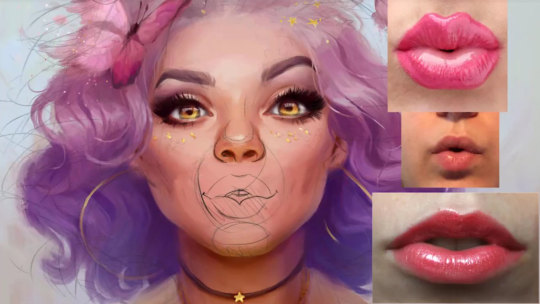
That means you can import PSDs into almost any other art software without a hitch. GIMP and Krita both accept PSD files along with many other programs.
This is why many artists combine Photoshop with other painting software. Depending on the workflow you’re going for you could do your concept and lineart in something like Clip Studio Paint, then bring it to Photoshop for coloring and final touch-ups.
Other digital art software doesn’t try to replace Photoshop but instead tries to improve on the interface for specific types of art(ex: comics, storyboards, environment paintings, etc).
Once you’ve signed up for a Creative Cloud membership you get a free, non-conditional seven-day trial version of Photoshop. This offer applies to Adobe’s other software as well. If you like Photoshop and want to buy it, there are four purchase plans to choose from.
The cheapest is the Photographers package which is $9.99(only available annually) and it includes Lightroom CC. If you want to buy a monthly plan you can get Photoshop for $29.99 a month.
If you want to go the extra mile and get the rest of Adobe’s software, the entire suite costs $74.99 monthly(or annual for $49.99 p/m).
Bonus Tip: Students 13 years and older get a 60% discount on the full Adobe suite plan!
People love Photoshop for its versatility and wealth of free knowledge online. Adobe has thrown millions of dollars into development so Photoshop isn’t going anywhere.
It’s a solid, professional choice for aspiring digital artists and concept artists.
Corel Painter
Price: $350 Platforms: Mac, Windows
Corel Painter is characterized by painterly brush strokes and a traditional artist’s feel to the interface.
Painter is for artists who love loose, messy brushwork and want to capture the beauty of traditional mediums on a digital canvas. It comes standard with 900 brushes covering every possible situation you could imagine.
As you might guess from the name, Corel Painter is focused on painting. But this should be great for artists who only want software to draw or paint digitally.
It has a 2.5D brush toolset that mimics real-world brushes giving you full control over the final “style” of your work.
Painter has been a serious alternative to Photoshop for several years and is the company always listens to user requests. They’ve been working hard to add new features every year and have added a bunch of artist-suggested tools into their latest release.
For example, some users complained of UI sensitivity and slow response times. Those issues were fixed with the 2019 version along with an entire UI design overhaul.
Paint Program Mac
Icons were redesigned to be more intuitive and the interface was changed to a darker theme.
Among all the new features with that version, the most celebrated was the pinned color wheel.
You can position the color wheel wherever you like on the screen giving an instant look at color options without swatches. This spectral feature means you can work in detail without the circular brush icon obscuring your view.
In Painter’s web series “Paint like Bob Ross” you can learn how to paint digital landscapes in 30 minutes using their brushes—a great introduction to conceptualizing landscapes for beginners.
The software is feature heavy and beginners might still feel overwhelmed by the sheer number of brush options and settings. But Corel is worth learning because it is another trusted industry staple among character designers, concept artists, and visual development artists.
Corel Painter has been around since 1992 and you can find an extensive library of free tutorials on their website. Or if you search on YouTube I’m sure you can find plenty of free tutorials there as well.
You won’t find as many resources compared to Photoshop. But Corel Painter is still a beast in the concept art world, or just the digital painting world in general, making it an awesome choice for hobbyists or newbies just picking up digital art for the first time.
As of this writing, a brand new copy of Corel Painter costs $350 making it an expensive once-off purchase. Although you can get a free 30-day trial to demo the software and see if it’s right for you.
Krita
Price: Free Platforms: Mac, Windows, Linux
Krita is a free open source digital painting program designed for cartoonists, illustrators, concept artists, and pretty much all digital artists.
The software was initially developed as a general image editing competitor to Photoshop but focused their efforts on digital painting starting in 2009. The Krita community donates monthly to the software efforts helping it to stay free and funding development of new features
If you have a background in some other digital art software(Photoshop for example) then Krita’s tools will be a little familiar and a little not-so-familiar.
Whether you’re switching or just getting into Krita it’s worth the time to watch a few tutorials to find out how everything works.
Krita hasn’t released many official tutorial videos but they have created detailed documentation online. If it’s your first venture into digital art then start off learning about the basic UI and toolsets.
Use the pop-up pallet to select your brushes, erasers, and colors intuitively. All other tools are stored in the panels to the left and right. Krita supports PSD files so that you can switch between Photoshop and Krita with ease.
And there’s a ton of freebies online like free brush packs that mimic everything from charcoal to watercolors and so much more. The beauty of Krita is the free price tag and the immensely supportive community around this software.
Krita has been criticized by some professional artists for its lag, seemingly unintuitive design, and uneven brush softness. Although the criticism has merit, the program’s core features work well and you will learn them with practice.
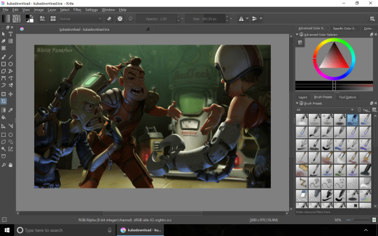
Also worth noting this has to be the absolute best choice for anyone on a Linux machine. Photoshop does not support Linux outside of a virtual emulator but Krita can run natively in any Linux distro.
This is a huge +1 for Krita since it’s really the best digital painting alternative for our Linux & Unix friends.
If you don’t have the cash to burn on digital art programs Krita is the perfect choice.
Use the program while you save up some money to grab another program. Or just stick with Krita and use it free for life! Many professional artists like David Revoy create all of their work with Krita and their stuff looks amazing.
Best thing about Krita is that it’s simple for beginners to learn and it doesn’t confuse you with a ton features or fancy tools. Krita’s purpose is digital painting and that’s precisely what it does well.
Clip Studio Paint
Price: $49 Platforms: Mac, Windows
Clip Studio Paint is the most popular software for creating comics and manga artwork.
Clip Studio Paint was originally named Manga Studio but changed names in 2013. It originated in Japan as specialist software for manga, illustration, and animators.
The program has long been a worldwide affordable alternative to Photoshop for digital artists but got more recognition with the name change.
The most notable drawing difference between Clip Studio Paint and Photoshop is the brush tool. In Clip Studio the brush tool instantly corrects any minor wobble you make while drawing on a tablet, leaving you with smooth clean linework.
Clip Studio is optimized for comic book creation and has various tools to speed up the process.
A canvas layout tool makes paneling quick with perspective rulers and a library of predefined formats. The pen tool lets you to work in a versatile vector format which means your creations can be scalable without quality loss.
In the most recent release there’s a new library of 3D objects and posable models. This is useful for concept artists who like to use references to get poses down quickly.
You can drop in a 3D model, pose it using an intuitive joint system, change the camera angle, make the character fat or thin, and choose between genders. After you’ve drawn over it you can use that same model’s shading as a reference for lighting.
Then when you’re done just delete it. Easy-peasy.
With CSP your art will always have a crisp digital finish as the software doesn’t strive for a traditional look. Although it’s possible to give your brush strokes a blended texture using brushes, Clip Studio Paint is not designed to mimic traditional mediums.
The standard version of Clip Studio Paint also comes with some very basic animation features. You can quickly test character movement over 24 frames without the annoyance of switching programs. But this is not really the best software for animation so it works best in conjunction with other programs for that purpose.
Now Clip Studio Paint comes in two versions: PRO(standard) and EX(full-featured).
Unless you’re planning on putting all of your projects through Clip Studio Paint and creating various manga & comic books, you’ll probably be happy with the PRO version. The EX edition has only a few extra features that would benefit expert users.
Mac Painting App
EX lets you save manga & comic pages in a ‘book’ which acts like one editable file. You can then bulk save them for printing which shaves off a ton of time and organizational effort.
The animation feature also gets an upgrade with EX and you can create an unlimited number of frames(instead of the standard 24).
EX comes with filters for 3D assets too turning them black and white for easier integration into your scenes.
Generally speaking, the PRO version is the same and EX minus the above features. It’s unlikely you’ll need those features as a digital painter or concept artist. Only serious comic and manga artists would find the EX features useful.
Try out either version with a free 30-day trial of both PRO and EX versions. If you don’t like it then just move on. The free version does give plenty to toy with so you’ll know whether you like CSP or don’t.
And it’s worth mentioning that the PRO edition is an affordable option at only $49 flat fee, while EX comes at a premium of $219.
Although sometimes you can get CSP at a discounted rate from annual sales so keep checking their prices.
GIMP
Price: Free Platforms: Mac, Windows, Linux
GIMP is another open source program built as a free Photoshop alternative.
Back when computer graphics were slowly becoming “a thing” it was up to software developers to create graphics for companies. With Photoshop costing a lot more back then, buying it was out of the budget for many companies.
GIMP was built to fill the need for a cheaper option to digital imaging editing software.
Unlike other free digital art software, GIMP was designed to be a full replacement for Photoshop. This means you can use it for digital painting but it’s really meant for graphic design, photo editing, text effects, and similar features.
Likewise this program has all the tools you need for digital art. If you are looking for Photoshop’s functionality without the price tag you’ll be happy to with GIMP’s default functionality.
If you know a little about software development you can also add to GIMP’s code by creating your own plugins for the system. But the default setup is more than enough for artists.
Many versions of GIMP have been released over the years, but their team of volunteers hasn’t been able to keep up with the sheer financial power of Adobe. The user interface is definitely unrefined and will be very confusing to beginners.
There are loads of GIMP tutorials created by their loyal users and there’s enough content to help you learn everything you need about the software.
Although GIMP doesn’t have a dedicated support team to answer your questions, many issues are well documented on various forums and you’ll be able to troubleshoot a solution with a few Google searches.
The painting tools are reasonable, although in my opinion Krita is a stronger option if you just need painting.
Granted you can find plenty of free GIMP brushes all made for digital drawing & painting.
But really this software is the best all-round alternative to Photoshop. If you see yourself doing a bit of design work, some painting, and some photo editing, try out GIMP and see what you think.
ArtRage
Price: $79 Platforms: Mac, Windows
ArtRage is a digital painting powerhouse that’s perfect for traditional artists moving digital and for existing professional artists.
Unlike other digital art programs, ArtRage has stepped away from the complicated user interface and ditched the blocky side panels. They want your focus on the canvas creating great work.
When you open the program you’ll find a semi-circular brush picker on the bottom left of the screen and a color picker on the bottom right. Both give you immediate access to the most important tools.

Small “pods” containing extra options hover just above the circles, minimizing extra clutter.
After you’ve picked your color and brush you can start drawing on the canvas. The UI automatically disappears(although this setting is optional) and without the UI you get a full screen canvas to work on without any distractions. Pretty cool!
If you’ve never used digital painting software before then ArtRage is fantastic. It’s beginner friendly and super affordable.
You can start off slow, familiarizing yourself with the various brushes, and slowly work your way up to painting full scenes and character designs.
If you are coming from Photoshop you’ll find the minimalist layout refreshing and easy to pick up. The brush presets are so good that you don’t need to waste time adjusting them much at all.
One of ArtRage’s most exciting features is called “real color blending”. It calculates realistic color mixing as you paint and it’s useful for digital painting in an oil or watercolor style.
If you want to try your hand at digital painting for the first time, this software will hold your hand and take you from hobbyist to professional if you put in the effort.
It doesn’t have all the gadgets and gizmos that some prominent art programs have, but it’s got all you need to make fun paintings(and a little extra).
ArtRage is budget software and friendly to those getting started. You can also use the demo version for an unlimited amount of time. The demo doesn’t let you save anything, which of course is a drag, but you can use that to familiarize yourself with the program.
If you decide you want the full version it costs $79 and you’ll receive all future updates included with your license.
If that sounds a bit expensive you could go for ArtRage Lite which is only $29.90. The lite version is great for beginners and includes all the painting features of the full version.
Think of this much like Krita but aimed for simplicity. It’s cheap enough that you could run ArtRage for life and it’s certainly refreshing when you come from a big bulky art program.
Paint Tool SAI
Price: $49 Platforms: Windows
Lastly on this list is Paint Tool SAI: a simple painting program that’s exceptionally popular among anime & manga artists.
Paint Tool SAI was first released in 2008 to a wave of popularity. It quickly spread among the art community who loved the clean brush strokes and unique interface.
SAI is a small, old program and has not been significantly updated over the years. It only runs on windows and has a limited set of features.
That being said, it’s aged remarkably well and is easy for beginners to pick up.
Many artists use SAI to achieve a digital watercolor effect where the blending modes can mimic watercolor, but the overall feel is smooth and sleek. Others use it primarily for lineart, or for creating a ton of anime.
You’ll find that Japanese artists almost exclusively use SAI for their artwork. It’s a very popular choice in Japan, likely because this software was originally developed by the Japanese Systemax Software.
SAI’s learning curve is minimal and if you’re coming from Photoshop you’ll pick it up almost instantly. It’s still very detailed though and great to use as a sketching program.
Use the pencil brush to get realistic sketches down on a textured canvas. Then switch over to brushes and color your line art to completion.
Now there are some minor limitations like that new projects are limited to 256 layers per canvas. It’s also known to slow down with larger file sizes and glitch when trying to preview .gifs in the explorer window.
They also have a weird system of brushes where you can import textures to merge with brush styles and create totally new brushes. I haven’t mastered this setup but you can find a ton of textures in this post with dozens of free brush assets for SAI users.
Painting Program For Mac Free
SAI is a Japanese program and is priced in JPY(Japanese Yen). It costs ¥5400 which roughly equates to $49.
Compared to other software on this list, SAI is a tad on the pricier side considering the last update was in 2016.
Small complaints aside, considering the price tag and the anime-centric fanbase I’d say SAI is an awesome choice for anime lovers the world over.
Graphics Painting Program For Mac
Get started using SAI by following some easy beginner tutorials on painting in the program. If you put in the time you’ll be a pro within a few weeks.
A fantastic program for anyone serious about anime-style art or any kind of digital painting. Biggest downside is you’ll have to be a Windows user.
Painting Program For Mac
Although if I had to cast a vote for the absolute best digital painting software, that title falls with Photoshop.
Here’s hoping even more digital art software comes out in the next 10 years and gives some stiff competition to Adobe’s reign.
Related Posts:

0 notes
Text
FMP Final Evaluation
Section 1: Media and Techniques
From the beginning of this project, I knew that I wanted to go down the route of interior design, I just didn’t know how I was going to present those ideas for my FMP. To find out my options I researched different methods of presenting interiors which led me to discovering things like hand-based and Photoshopped interiors. However, there was one that stood out from the rest for me, a 3D modelling software called SketchUp.

This software allows users to create models of interiors on a realistic scale, essentially creating a digital mock-up of a space for a client. This is something I knew I wanted to explore further as I hadn’t done anything like it since middle school.
Once deciding to create my Art Deco interiors, I tried to experiment with different mediums for me to use for my final outcomes. I first tried to create a hand drawn interior that was edited in Photoshop, I then tried adding SketchUp models into Photoshop and creating a room from there. Finally, I settled on creating interiors using SketchUp and importing pattern designs I created in Photoshop.
This meant I had to teach myself how to use SketchUp from scratch and get to a good enough level to create professional and realistic interiors. I overcame this massive problem by watching lots of YouTube tutorial videos and reading lots of SketchUp forum chats to collect any tips that I could use to improve my skills.
Once I had started to research Sketchup models, I noticed the mention of photorealistic rendering amongst the forums and YouTube comments. This was something that intrigued me and wished to look into deeper. Once I had done a little research on the topic, I discovered a way to make my SketchUp models into realistic renders. This was something I knew I had to use as it would make my SketchUp models look very professional and realistic.
This meant that I would also have to teach myself how to use this type of technology I had never heard of before. I overcame this issue by again watching lots of videos and reading lots of articles which eventually led me to the SketchUp plugin called TwilightRender.

One skill that I brought from a previous project was my pattern making skills in Photoshop which I had gained in my Multiverse project. I also used the skills I had learnt from last year such as composition, colour and layout to help make my surface pattern designs look cohesive, sleek and unique.
I have used lots of research to help support and push my project further. This includes a wide range of artist research, looking at multiple ways to improve the planet within the home and two case studies one of which analyses the impact of the historical context surrounding the Art Deco movement.
The most impactful research I have completed during this project was looking at composition within interior photography. This research pushed me to think outside of the box when it came to my models, using depth and angles to create renders that give the viewer a feeling of being transported to that room, instead of looking at a boring four wall room.
Section 2: Purpose/Theme/Context
In the beginning, I was given a list of fifteen themes that could possibly be my path for this project. From this list I had to choose ten to explore further, researching their definition and their context within the art industry.
Once I had explored them, I narrowed the list down to five. I then took these five concepts and researched deeper into them, looking at the historical, social and cultural context surrounding them and what my options were for final outcomes if I chose to go down that path. This research informed me of their importance in the art world which helped sway my decision on which theme to choose.
To help me narrow my options down to one, I created five pro-con lists that showed the clear advantages and disadvantages of choosing that concept. This task helped me come to the conclusion of using the concept of the environment because of its importance as a subject and its potential for interesting outcomes. It was a really close call between the environment and the 1920’s because of the number of ideas I had for both themes.
However, when my lecturer told me that I could use two concepts at once I knew that it would best suit my project to use both as it allowed me to merge all my ideas together, bulking out my project and giving me more options to explore.
The purpose of my project is to challenge the balance between style and sustainability within interior design, showing a client that it is possible to create a space that looks amazing whilst also being environmentally conscious, that you don’t have to sacrifice one to have the other.
Halfway through my project I came across the issue of struggling to balance both concepts equally. This was when I decided to focus more on the theme that I felt more important and beneficial to my project, the 1920’s. This decision helped me a lot as it took the stress off my shoulders about balancing the two themes and allowed me to put all of my energy into making more consistent and detailed outcomes.
Section 3: Outcome
This is the first of three final outcomes. This features my first colour pallet of blue, grey and gold. I think this outcome looks very stylish and sleek, this is because of its minimal and consistent colour scheme. The gold texture is placed all around the interior appearing in the mirror, lamp and coffee table, this makes the room feel more cohesive and creates rhythm. The composition of the interior photograph intrigues and draws in the viewer by including the sense of depth from the use of layers in the foreground and background. I think this final outcome meets the purpose of my project as my Art Deco wallpaper mixed with the gold texture adds a sense of decadence and luxury to the room which is the most important part of recreating the Art Deco style.
This is my second final outcome featuring the colour pallet of emerald green, white and gold. I think this interior looks minimal yet luxurious because of the simplistic furniture mixed with multiple textures. I think the use of the same gold texture from the last outcome ties the two rooms together, making them feel like a set even though they have completely different colours and patterns. The use of the smooth green stone instantly makes the hallway look more expensive and lavish. The hints of white within the stone matches the white in my Art Deco wallpaper, adding rhythm and making the space feel more harmonious. I think this outcome fits the purpose of my project because it gives off the feeling of Art Deco from the mix of a deep and luxurious colour pallet with expensive textures.
This is my third and final outcome in the colour pallet of muted purple, light grey and gold. With my last final outcome, I wanted to push the boundary of what colours fit into the Art Deco style aesthetic. I had previously done two of the most common colours found within the style and for my last interior, I thought of using a colour that isn't associated with the style. Since Art Deco is all about luxury and wealth, I thought about the colour has historically represented wealth, purple. I think the use of purple in this outcome creates an Art Deco design that is more subtle and less obvious than the other two designs. Like with my first outcome, the image composition adds a sense of depth because of the suggestion of layers with the background and foreground. The two purple frames in the foreground help to make the two areas feel more connected and cohesive as well as adding needed texture to the foreground. I think this outcome meets the purpose of my project as it still keeps the Art Deco aesthetic with the use of wallpaper and gold texture, but offers my client a more softer and subtle option for their home, in case they find the first two options too cliche.
Section 4: Evaluation methodology
I think the biggest strength of my project is my consistency, all of my designs have a distinct colour scheme and style which makes them feel like a set. I also think another strength is the clear journey that my project has gone through, showing all of my twists and turns which lead me to where it is now.
One weakness of my project is the fact that the concept of the environment was pushed to the side as I was unable to balance both themes, this makes my project feel a bit incomplete as the concept I started off with was slowly made less important as the weeks went on.
I was able to constantly evaluate and reflect on myself by completing weekly evaluations on my blog where I talked about what I did, the purpose of those decisions and the problems I had to overcome that week. This allowed me to analyse the development of my project and clearly see my progression of that week.
I also received constant critical feedback from lecturers in assessments and catch-up sessions. This allowed me to get a fresh pair of eyes to see my work and offer a second opinion on how to expand and push my project further.
The most important thing that I have learned from this project was how to create Art Deco themed pieces and how to use digital software like SketchUp and TwilightRender which will aid me in the future as an interior designer.
0 notes
Photo
MATH TIME. Another BR ACE art fix? Yep, the Options portion of BR is when I was most burned out during that set. So here it is, a real Warp Dimension. The real card should be called “Reverse Dimension”, but DDCB in English translated it as Another Dimension. When I removed the effect where both players trash 7 and scaled the opponent’s trashing up to 9 based on the deck size change, I figured the name should change since the card was technically different. Like Hacking, I had just thrown up someone else’s art (Veemon in a wormhole) instead. With this one, I had to actually 3D model the original art myself.
To do that, I had to spend all day learning how to make special surfaces in Blender. So I created a Math manifold and used the following formula to generate this funnel based on my own understanding of math:
x = u × cos(v) y = u × sin (v) z = τ × log(u + 1/π²)
where τ is the circle constant in radians (meaning 2π) and π is the usual circle constant in diameter. The lower bounds of all of them is 0 and the upper bound is just τ—1 turn of a circle. Shoutout to tau fans!
I started with Z=π × log(u) but that’s a logic error since 0 is part of that set. So log(u + 1) was what I originally wanted to use but it’s too wide and too weak of a curve. Anyway, I shuffled the circle area formula around so it would be a fraction because I realized that would give me a proportional logarithmic curve. And we’re all about proportion. I did originally try ϕ (golden ratio) since it grows in proportion to itself, but it was just “okay” in relation to a circle. In fact euler’s constant (e) would’ve been more sensible but I wasn’t aware that it was related to π through the Γ function...I’m getting off track.
I was trying to make a pretty accurate render of the funnel in the original card game which I erroneously assumed was meant to be a wormhole or black hole. But when I looked up their gravity depictions (in 3 dimensions, those tensor fields are actually 4D in the math), the space curvature didn’t actually look like the art. So the formula for the topology you see above had to be my own original one. I basically just reasoned that X,Y should be proportionally circular which is obviously just the cos and sin of two variables, creating an Euler coordinate system. If I lost you, just know it’s a way to write “draw a circle”. The Z axis is where the real magic happens. I reasoned that the curve is probably a logarithmic curve. Why? Well if you look at just the negative space—as you might do with the integral calculus when trying to find the area under a curve, it appears to be rather flat near the bottom and drop off slowly at the rim of the funnel. That’s pretty typical behavior of log curves. But what base to use? Well obviously use the circle constant as a base...even though e is the natural log base lmao. Look, I’m inexperienced and just have a big bag of Math tricks, not formal education. When you try log(u+1) it’s too wide as I said, but playing around you’ll notice u+0.5 is way better. In fact anything 0.1..0.5 is pretty good, but smaller tended to be better. You know what’s close to 0.1? 1/π²! So there you go. A beautifully proportional version of my hacky trial-and-error versions.
Once the formula was good, I was faced with a solid, ugly, funnel. So I turned it green and hit “wireframe” and immediately wanted to cry. Why? Because in Blender, wireframes are 1 px. I need this baby thicc. It took HOURS to figure out how to use material Nodes in the new Blender because all tutorials for effects are in some old ugly Blender version that’s totally different and everything in this goddessforsaken program is like this. I’ve bled more hours just trying to find shit in Blender tutorials in the new version than I have anything else with this project. Plus, it was a trap anyway. Once I figured out “nodes” as they call it to get this dude’s wireframe effect, I realized it was still going to take forever to arrange them and figure out how the fuck to put the nodes in. There was no step-by-step, just a screenshot of the final setup which doesn’t tell you how to get each node and several were changed in the new version so...F that. Then I randomly came across an explanation of wireframe looks in blender using “Mesh modification”. Unfortunately, every tool in new Blender is taken completely out of context on the internet and shown by itself with no way to access it. It took a lot longer to figure out it was the goddamn blue wrench icon. So yeah, it’s just a real-time deformation of the actual mesh itself. Meaning that warp dimension render is not a “wireframe”, it’s a mesh with many polygons. Rendered, minor edits in photoshop, ready for final comparison with the reference image.
OOPS. The reference image has curved lines not straight polygon lines! UGH. What do you even do with that? I don’t know. So here you go, a blocky warp dimension that took all damn day and frustrated the hell out of me. :D
0 notes
Text
How to Create Good Web Design
There are many different types of web design, from those built using website templates and 'build your own' site building applications to complex content managed and e-commerce web designs such as those used by big brand names like Amazon, eBay and Tesco. Some companies, even some big name companies, have unprofessional looking and badly designed websites. Some have amazing looking websites but because of their high graphical content and minimal text content can take an age to load, are not user friendly and do not provide what the visitor wants.
Good Website Design
Though many aspects of website design differ from site to site, many things remain the same throughout the majority of websites on the internet. Most notably is the navigation or menu. The way in which a website's menu works and looks is very important, as ultimately, visitors to a website are looking for certain criteria that will make them either stay and interact or leave. This ability for a website to keep visitors interested is sometimes referred to as stickiness. Visitors want an attractive visually exciting experience, but perhaps more importantly, they want 'ease of use'. Website usability is a key factor for websites that want their visitors to stick around, make an enquiry and ultimately complete a transaction and order a product or service.

Easy to Use Web Design
Internet users tend to prefer easy to use websites, because they do not want to have to learn how to use a website every time they find a new one. They should be able to use a website after only a few seconds of looking around a homepage, any more and they will leave and browse elsewhere. The need for fast user interaction is vital and therefore having a fast loading website is also important for a website to succeed. Even with faster internet connections such as broadband, internet users don't want to wait around.
Just imagine, if you go to a shop on the high street and are totally ignored by shop assistants at the counter for 5 minutes, even after you have made it clear you want help. There is a correlation here to how an internet user may feel, when they arrive at a website that has been poorly designed, is difficult to use, unfriendly and slow to load. Making sure that a website has been well thought out and designed with the user in mind, displays a company's unique selling points within easily recognizable eye catching calls for action and has a clear, easy to use menu is key to its success.
Flash Web Design
With recent web design advancements, such as the introduction of Flash animation and high definition video content, impressive websites have been produced to take advantage of much higher levels of visual effects and interaction. However with this 'high end' web design, comes a price, more often than not, web designs which rely heavily upon Flash content are often ridiculously slow to load. They often have a progress bar, which slowly goes across the web browser to signify when the website will finish loading.
This is much like the progress bars that you may be familiar with if you use video editing or 3D rendering software, or if you use games consoles where they are displayed whilst you wait for games to load. Internet users on the whole do not want to wait 3 - 5 minutes for a web page to load even if it does feature high resolution images, animation or video. They want fast informative content rich websites. If they wanted to watch an animation or video they would watch TV.
Good Flash Web Design
This is not to say that Flash animation is all bad news and shouldn't be used in web design. If used subtly and in small amounts it can make a website more visually appealing without slowing the load time down too much. Suitable uses for Flash animation in web design are things such as; Flash banner advertisements, Flash video and interactive Flash forms for online questionnaires or business presentations.
Using Flash for a whole website design however, is not such a good idea. It slows the user's experience down because they have to wait for elements of it to load. Also, sites totally developed in Flash tend to use unfamiliar menu structures and features. This can confuse visitors who just want to quickly interact with the website and not be amazed by the way the menu animates. Just because you can do these things in Flash, it doesn't mean they have any real working value in the real world. They may look pretty, but if they are not functional and only irritate the visitor then they have no real value.
Flash Web Design & SEO
Another argument against using Flash to create a whole website is that it dramatically reduces the effectiveness of your websites' Search Engine Optimisation. Flash web designs are made up of one main file within a web page which search engines find difficult to index. This is because the text within them is usually graphical text and therefore is not usually accessible by search engines. Some recent developments allow some text to be displayed for search engines in Flash websites, but this is nowhere near as effective as text content within traditional HTML based websites.
Don't Write Off Flash in Web Design
Although Flash does have its limitations it also has its good points if used correctly. For instance; Flash animation is usually smaller in file size than traditional gif animation and because of the way it is made the animation flows smoother than gif animation too. Having said this, I would recommend only using Flash in small areas within a site to compliment other imagery that makes up the overall design. Finding a balance between minimal graphical elements, imagery, Flash and good quality informative text is the key to a successful user friendly website. This isn't to say that web design needs be boring. By working with quality web design companies there's no reason why you couldn't have a visually exciting, well designed, easy to use and successful website.
Visually Stimulating Web Design
When visitors first arrive at a website, they want to be impressed and engaged with what the website has to offer. This will be determined by the ways in which the web designer has laid out the website's content text, images and features. Arranging elements such as imagery, text, graphics, flash and video in such a way as to keep the visitor interested in the website is the key to good web design. If a website has poor design and doesn't grab the attention of the visitor in the first few seconds, then it may well be dismissed as just another average website. This ultimately means the visitor will go elsewhere to spend their time and, more importantly, money.
Good Web Design Layout
A lot of time and money is spent making sure that the right elements of websites are positioned in the right places. Companies spend large amounts of money conducting research into how internet users use their websites. This type of research shows where their visitors' eyes concentrate the most, which elements of the website they click on first and generally how they interact and use their websites. Most internet users will look primarily from the top left either across the page, or down the left hand side of the web page through an internet browser via a computer, mobile phone or TV set.
I would hazard a guess, that they are looking for the company's name or logo, their main selling points or slogans and then what the website has to offer in terms of what is featured in the menu. After which their eyes are probably drawn across the page content and over to the right hand side. Successful web design usually takes this into consideration and will ultimately affect the way a website looks.
There are of course rather famous exceptions to this rule for instance one rather well known search engine has a web design which is quite different. The main focus and core functionality in their web design is located right in the centre of the page. This however, isn't any ordinary website with tens or even hundreds of pages of products and services to display, its main focus is its recognisable logo and of course its search box. It does however feature a small minimal menu across the top of the web design, which flows from left to right. So even they have taken onboard some of the research undertaken into internet users' habits. If you go looking at websites after reading this article, I can guarantee that most of the web designs you'll see, will have a left hand menu and a defined header bar with a company logo and slogan across it.
S4G2 Marketing Agency Will be Best Choice If You Looking For Web Designer in Canada cities Mentioned below:
Web Designer Abbotsford
Web Designer Barrie
Web Designer Brantford
Web Designer Burlington
Web Designer Burnaby
Web Designer calgary
Web Designer Cambridge
Web Designer Coquitlam
Web Designer Delta
Web Designer edmonton
Web Designer Greater Sudbury
Web Designer Guelph
Web Designer hamilton ontario
Web Designer Kelowna
Web Designer Kingston
Web Designer Kitchener
Web Designer London Ontario
Web Designer Markham
Web Designer montreal
Web Designer Oshawa
Web Designer ottawa
Web Designer quebec city
Web Designer Red Deer
Web Designer Regina
Web Designer Richmond
Web Designer Saskatoon
Web Designer Surrey
Web Designer Thunder Bay
Web Designer toronto
Web Designer vancouver
Web Designer Vaughan
Web Designer Waterloo
Web Designer Windsor
Web Designer winnipeg
0 notes
Text
How to Create Good Web Design
There are many different types of web design, from those built using website templates and 'build your own' site building applications to complex content managed and e-commerce web designs such as those used by big brand names like Amazon, eBay and Tesco. Some companies, even some big name companies, have unprofessional looking and badly designed websites. Some have amazing looking websites but because of their high graphical content and minimal text content can take an age to load, are not user friendly and do not provide what the visitor wants.
Good Website Design
Though many aspects of website design differ from site to site, many things remain the same throughout the majority of websites on the internet. Most notably is the navigation or menu. The way in which a website's menu works and looks is very important, as ultimately, visitors to a website are looking for certain criteria that will make them either stay and interact or leave. This ability for a website to keep visitors interested is sometimes referred to as stickiness. Visitors want an attractive visually exciting experience, but perhaps more importantly, they want 'ease of use'. Website usability is a key factor for websites that want their visitors to stick around, make an enquiry and ultimately complete a transaction and order a product or service.
Easy to Use Web Design
Internet users tend to prefer easy to use websites, because they do not want to have to learn how to use a website every time they find a new one. They should be able to use a website after only a few seconds of looking around a homepage, any more and they will leave and browse elsewhere. The need for fast user interaction is vital and therefore having a fast loading website is also important for a website to succeed. Even with faster internet connections such as broadband, internet users don't want to wait around.
Just imagine, if you go to a shop on the high street and are totally ignored by shop assistants at the counter for 5 minutes, even after you have made it clear you want help. There is a correlation here to how an internet user may feel, when they arrive at a website that has been poorly designed, is difficult to use, unfriendly and slow to load. Making sure that a website has been well thought out and designed with the user in mind, displays a company's unique selling points within easily recognizable eye catching calls for action and has a clear, easy to use menu is key to its success.
Flash Web Design
With recent web design advancements, such as the introduction of Flash animation and high definition video content, impressive websites have been produced to take advantage of much higher levels of visual effects and interaction. However with this 'high end' web design, comes a price, more often than not, web designs which rely heavily upon Flash content are often ridiculously slow to load. They often have a progress bar, which slowly goes across the web browser to signify when the website will finish loading.
This is much like the progress bars that you may be familiar with if you use video editing or 3D rendering software, or if you use games consoles where they are displayed whilst you wait for games to load. Internet users on the whole do not want to wait 3 - 5 minutes for a web page to load even if it does feature high resolution images, animation or video. They want fast informative content rich websites. If they wanted to watch an animation or video they would watch TV.
Good Flash Web Design
This is not to say that Flash animation is all bad news and shouldn't be used in web design. If used subtly and in small amounts it can make a website more visually appealing without slowing the load time down too much. Suitable uses for Flash animation in web design are things such as; Flash banner advertisements, Flash video and interactive Flash forms for online questionnaires or business presentations.
Using Flash for a whole website design however, is not such a good idea. It slows the user's experience down because they have to wait for elements of it to load. Also, sites totally developed in Flash tend to use unfamiliar menu structures and features. This can confuse visitors who just want to quickly interact with the website and not be amazed by the way the menu animates. Just because you can do these things in Flash, it doesn't mean they have any real working value in the real world. They may look pretty, but if they are not functional and only irritate the visitor then they have no real value.
Flash Web Design & SEO
Another argument against using Flash to create a whole website is that it dramatically reduces the effectiveness of your websites' Search Engine Optimisation. Flash web designs are made up of one main file within a web page which search engines find difficult to index. This is because the text within them is usually graphical text and therefore is not usually accessible by search engines. Some recent developments allow some text to be displayed for search engines in Flash websites, but this is nowhere near as effective as text content within traditional HTML based websites.
Don't Write Off Flash in Web Design
Although Flash does have its limitations it also has its good points if used correctly. For instance; Flash animation is usually smaller in file size than traditional gif animation and because of the way it is made the animation flows smoother than gif animation too. Having said this, I would recommend only using Flash in small areas within a site to compliment other imagery that makes up the overall design. Finding a balance between minimal graphical elements, imagery, Flash and good quality informative text is the key to a successful user friendly website. This isn't to say that web design needs be boring. By working with quality web design companies there's no reason why you couldn't have a visually exciting, well designed, easy to use and successful website.
Visually Stimulating Web Design
When visitors first arrive at a website, they want to be impressed and engaged with what the website has to offer. This will be determined by the ways in which the web designer has laid out the website's content text, images and features. Arranging elements such as imagery, text, graphics, flash and video in such a way as to keep the visitor interested in the website is the key to good web design. If a website has poor design and doesn't grab the attention of the visitor in the first few seconds, then it may well be dismissed as just another average website. This ultimately means the visitor will go elsewhere to spend their time and, more importantly, money.
Good Web Design Layout
A lot of time and money is spent making sure that the right elements of websites are positioned in the right places. Companies spend large amounts of money conducting research into how internet users use their websites. This type of research shows where their visitors' eyes concentrate the most, which elements of the website they click on first and generally how they interact and use their websites. Most internet users will look primarily from the top left either across the page, or down the left hand side of the web page through an internet browser via a computer, mobile phone or TV set.
I would hazard a guess, that they are looking for the company's name or logo, their main selling points or slogans and then what the website has to offer in terms of what is featured in the menu. After which their eyes are probably drawn across the page content and over to the right hand side. Successful web design usually takes this into consideration and will ultimately affect the way a website looks.
There are of course rather famous exceptions to this rule for instance one rather well known search engine has a web design which is quite different. The main focus and core functionality in their web design is located right in the centre of the page. This however, isn't any ordinary website with tens or even hundreds of pages of products and services to display, its main focus is its recognisable logo and of course its search box. It does however feature a small minimal menu across the top of the web design, which flows from left to right. So even they have taken onboard some of the research undertaken into internet users' habits. If you go looking at websites after reading this article, I can guarantee that most of the web designs you'll see, will have a left hand menu and a defined header bar with a company logo and slogan across it.
S4G2 Marketing Agency Will be Best Choice If You Looking For Best Web Designer in Canada cities Mentioned below:
Best Web Designer Abbotsford
Best Web Designer Barrie
Best Web Designer Brantford
Best Web Designer Burlington
Best Web Designer Burnaby
Best Web Designer calgary
Best Web Designer Cambridge
Best Web Designer Coquitlam
Best Web Designer Delta
Best Web Designer edmonton
Best Web Designer Greater Sudbury
Best Web Designer Guelph
Best Web Designer hamilton ontario
Best Web Designer Kelowna
Best Web Designer Kingston
Best Web Designer Kitchener
Best Web Designer London Ontario
Best Web Designer Markham
Best Web Designer montreal
Best Web Designer Oshawa
Best Web Designer ottawa
Best Web Designer quebec city
Best Web Designer Red Deer
Best Web Designer Regina
Best Web Designer Richmond
Best Web Designer Saskatoon
Best Web Designer Surrey
Best Web Designer Thunder Bay
Best Web Designer toronto
Best Web Designer vancouver
Best Web Designer Vaughan
Best Web Designer Waterloo
Best Web Designer Windsor
Best Web Designer winnipeg
0 notes
Text
Blender VR Rendering Tutorial
I originally planned to make VR content using SFM with the SFMVR Stitch tool. Mostly, I’m still planning to, but life happened and I haven’t had as much time as I’d like to spend animating. I’m also crap at it. It would help if I could restrain myself to doing short loops - but it seems the smallest thing morphs into a multi-minute project. More on that later.
(My WIP project, wherein Miranda becomes Mordin’s test subject. For the sake of science, of course)
It is fortunate for me that other animators more skilled than I are willing to share their scenes for me to render. Thank you Likkezg! He had the great idea to share his blender scenes with his patrons, and not only did that let me learn a lot about Blender, this also let me render some pretty amazing scenes. (See my previous post). There are a lot more skilled blender creators out there, so I’m making this tutorial in the hope it will inspire them to create VR content. If you have any artist you like and would like to see his works in VR, and you have a good graphics card, you can also offer them your help rendering! EDIT: 13/06/07 - Fixed a pretty big omission in part 1 about camera settings. Be sure to read the update and enable Spherical Stereo.
0. Why VR?
Isn’t it just a fad? Who the hell can afford a VR headset anyway? Turns out, practically anyone with a smartphone. Although the best viewing experiences will be with Vive and Oculus, with Playstation VR close behing, smarphone platforms offer a very respectable viewing experience for VR videos, from the high end GearVR, to the humble cardboard. Newer phones actually have higher pixel counts than the big commercial headsests!
Scroll down to chapter 6 for some advice on viewing VR content on the different platforms. Once you’ve watched any form of VR porn, it’s not hard to figure out the attraction. The presence, the feeling of being there!
For many users, what stands out particularly is eye contact in VR. Even with vary basic experiences, or with CGI characters, there’s a part of your brain than can’t help but chirp in and tell you: “Hey look, there’s another human being, right there in front of us, and she’s doing what?”
Having experienced that, it’s no wonder that porn viewers are the biggest early adopters of VR, with Pornhub reporting 500 000 daily views on their VR sections, and VR studios hiring some of the biggest names in the industry for their productions. The CGI VR niche is left relatively untapped however, and that’s a shame because it has so much potential, and it’s so easy to convert all the great work the community does into VR-friendly content.
You think your favorite video game characters look almost lifelike, wait until you’ve seen them through VR glasses and looked into their eyes - or other parts for that matter.
(Credit: Zalivstok and SFMPOV) Not only VR lets us give life to these characters like never before, they can also be put in situations that would be exceedingly tricky with real actors, or mate with creatures that don’t even exist! The latter will be a particular focus of this blog.
1. Setting up Blender for VR
I’ll assume you’re already familiar with the basics of Blender. At least as familiar as I am, which is not a whole lot. The great thing about Blender however, is that it’s got the native capacity (as of 2.76) to render content for VR without the need for any additional tools, so this is going to be pretty simple. This tutorial is made with 2.78
The first thing you’ll need to do is activate VR rendering:

Go to render layers, then tick Views and choose Stereo 3D. Now select the camera you want to work with and let’s set it up for VR.
First, go to Perspective and set the field of view first to Field of View (by default it’s in millimeters) then something between 90 to 110 degrees. This is the field of view of your target device. They all have different fields of view, with the high-end devices being generally higher. But in reality, 90 is fine and works for me both on my Vive and smartphone headsets. Next, clipping. We’ll talk about that later as part of setting cameras, but you generally don’t want to get closer than 20cm to any objects - it’ll get harder for your eyes to focus. However, there will be occasions when it’s nice to do so anyway, so you want to set the clipping distance to be very short, or even 0. Stereoscopy settings don’t seem to have a huge effect on the video I rendered, but the theory is that the convergence plane should be set near the center of action - it will make it easier to focus the eyes on what’s going on. Interocular distance should be that of the viewer. Unfortunately that’s impossible to anticipate, but leaving it at the default 65mm is fine. EDIT: Important - enable “Spherical Stereo”. This is a new feature in Blender 2.78 to correctly render panoramic video for VR goggles. For 180 video it’s not too big a deal but will make the image cross-eyed as you turn your head around towards the edges. Now switch the lens to Panoramic. There are some more settings for us there.

Set the type to Equirectangular, that displays best on most players. Fisheye will work too (It’s what SFMVR Stitch uses), but most smartphone players don’t support it well. The next bit depends on what exactly you’re trying to render, but I like to do 180 degrees video rather than full 360. Unless there’s some stuff happening in the back of the camera, that should be fine. For 180, change the longitude min to -90 and max to 90 as above. If you want to go for full 360 VR, leave it at the default: +-180. Now go to your render settings.

The most important parameter here is the resolution. The resolution is now per eye, so the above is a good setting for 180 video: roughly 2K per eye, so your full video will be equivalent to 4K. For 360 video the X resolution should be 2 times higher than Y. Frame rate is also important, and for best VR experience you want 60fps, no matter how painful it is to render. Here my original scene was keyframed at 24fps so I used time remapping to change that to 60. It causes weird behaviors if you try to work on your keyframes with this setting so leave it to default til just before you render. 4K, 60FPS seem like a lot and certainly it will take ages to render. But VR rewards you generosly for going overkill on theses things. Scroll down some, to Output settings.
You want to render as IMAGES absolutely. Rendering an animation will take forever, so you really want to be able to stop and resume from the last frame if you need to, or if your computer crashes. For best quality, choose PNG with little to no compression. We’ll see later how to use the sequence to make a movie out of the images. Below that is the views format. You want to choose Stereo 3D with either side-by-side or Top-bottom layout. If you’re doing 360 video, you should go for top-bottom, for 180 degrees, side-by-side is most common.
Now you could in theory hit Ctrl-F12 and start rendering, but I’ll advise you don’t waste your time doing that. You shot will be boring at best or unusable at worst. VR content isn’t shot like normal content, and you need to adjust your scene for that.
2. Setting the scene
I’ll flesh out this part of the tutorial soon, but for the basics.
After switching to stereoscopic rendering, your camera viewport may show a red and blue anaglyph picture. That’s not the most comfortable way to work, so press N to bring up the side menu, and under Stereoscopy, choose either Left or Right. You might want to change from time to time to make sure the field of view is unobstructed for both eyes.
You need to move the camera a lot closer to the subject matter. In the last step you’ve probably doubled your camera’s field of view. Without further adjustment, your subject will appear tiny and distant. Instead, you want to make the best use of your 180 degrees vision and make sure there’s something happening in most parts of the field.


Our varren buddy was at the right distance from a normal camera, but after we change to a panoramic one, he looks tiny! He will look bigger with the goggles on, but we still need to move the camera closer. We can also see things that we didn’t expect or want to be in the field of view - here my light planes are in, so I’m switching back to more conventional lights.

That’s better. I’ve moved the camera to about 1 meter from the varren. I could get even closer for more details, but he’s just snacked on a pyjack, so this is close enough. He’ll appear pretty close with the goggles on.
Don’t get closer than 20-30 cm from any object, or the eyes will have trouble focusing. Still worth doing sometimes however, see below.
It’s safer to just use a static camera to avoid causing VR sickness, especially if you’re doing an interior scene with lots of things in the background. But with a uniform background you can move your camera around a bit without too much trouble, just do it slow and steady and minimize rotations. Remember the viewer can turn his head around if he wants to see a particular detail.
Try and get, maintain eye contact with your subject if possible, it’s one of your best tricks. You can even close in for a kissing scene for example, but do it slowly. If you’re into that you can also move objects just below the camera - it will look like they’re going in the viewer’s mouth - it’s surprisingly effective.
Some cozy time with Ciri (credit: dudefree) . Great use of lighting and eye contact there.
Be careful with glossy or transparency shaders. They look great but they can introduce an unpleasant sensation or make it hard for the eyes to focus in VR, especially when applied to close objects. Some times though they can look pretty good, so try and test for yourself what works or not.
Unfortunately, VR will make little details stand out so you may find problems with your scene that you never did before. Do plenty of test renders before you commit to rendering the whole animation.
Really, do some more test renders to check everything is good. Rendering at 4K takes a long time in Cycles, I’ve lost weeks of rendering because I didn’t check my scene well enough. You can render at half resolution (lower will make it uncomfortable to watch with 3d goggles), and with a frame step value. Still renders are useful but if you have a lot of motion you really want to do a preview of the full scene to be sure.
3. Optimizing
Now this is the painful part. If you thought rendering in Cycles was long, this is going to be many times worse, because we’re basically rendering at 4K with 60fps. The 9-second Jack scene I rendered for Likkezg took me about 80 hours to render, and I consider that to be extremely fast. Other scenes render much slower. This is where it really pays to know what causes long render times in Blender and to work on it.
This video does a great job of covering the basics, but I’m going to try and go a little bit further and show you what worked for me.
Turn on GPU rendering: If you can and haven’t already, this is a must for rendering moderately fast in Cycyles. This is found under User Preferences / System: Choose CUDA and your GPU as your Cycles compute device if available.
Sampling: These settings alone will have the most influence on your render time and quality.

Clamping will greatly reduce noise and “fireflies” at the expense of some highlights. I usually work with 5 direct and 2 indirect. It’s usually the first setting I adjust. Note the clock icon next to Seed - it will ensure that your noise patterns are randomized for each individual frame. So even if each frame is a bit noisy, your 60fps video will look great! The number of samples you need for a noise-free image can vary greatly depending on your scene. Some scenes will look good with a value of just 10 (Squared = 100 AA samples), whereas for others you’ll need much more. Try and experiment until you find a good value.
Light Paths: For me these settings have a fairly small impact on performance but you can try and adjust them anyway. Be warned that too low a setting can cause very visible issues with your scene.

You generally want to go with as low values as possible without altering your scene too visibly. If you’ve got a very noisy scene with many glossy shaders, you can try and set Filter Glossy at 1 or 2 to reduce noise. Some tutorials advise disabling caustics, reflective or refractive but I don’t like to: It makes the scene a lot duller for little performance gain.
Lighting: so, those 20 lights you added in to make sure every piece of your scene was subtly enhanced... great artistic work, but it’s going to kill your render times. Keep your lights to a minimum, a classic 3-point setup is good enough, with large and bright lights to minimize noise. Lighting is often used to bring forward the geometry of a scene, and give the illusion of 3D. But here, you’ve got the real thing, or almost! You don’t necessarily need all the subtle shadows. On the other hand, setting the atmosphere is just as important in VR, and clever use of lighting can do just that.

An intimate moment with Cassandra (Zalivstok / KDE)
Shaders: Cycles lets you easily build fantastic shader systems with a lot of complex effects, but more than anything else shaders can make the difference between rendering a frame in 4 minutes, or in an hour. You may need to rework your whole shader system both for performance, and for avoiding issues in VR. Reflective, glossy and and transparent shaders can add a lot to a scene, but they can also confuse the eye in VR, and add a lot of noise. Use them sparingly, and do some hi-res test renders to check that they are performing as they should and don’t cause issues in VR.
Cutting: It goes without saying, but rendering just a couple seconds is easier than rendering a minute. If your animation has some relatively short loops, render just one and copy/paste it in the video editor. One cheap trick to manufacture a loop is to render an animation, then copy paste it in reverse in the video editor. This looks OK for some animations, terrible for others.
Previewing, and more previewing. Really, a scene looks different in the goggles than it does on screen. Check out your test renders in your VR system as much as possible, it’s the only way to be sure you’re not going to waste weeks rendering unusable crap.
4. Rendering
Well with all that setup done, it’s time to hit that big tempting render button, right?

SAVE your scene first. Not kidding. Then you can go and hit Ctrl-F12. See you in several days. As I mentioned earlier it’s much better to render as separate images. You can stop rendering anytime and resume from the last frame. You can then use the blender movie editor to stitch them together and do some post-processing. More on that here. Personally I like to encode my videos in H264, with a bitrate of 25000 to 30000, that should be readable by most systems whilst keeping the best possible quality.
Note that once you’re in Video Editor mode, if you’ve used the same settings as I’ve outlined above, you actually need to disable stereoscopy (The first step we did in part 1 - uncheck the Views box), and set your video resolution to 3840 x 1920. Otherwise it’ll take each frame you’ve rendered (Already with both eyes), and put these on each eye! There’s probably a better way to do it, but this works for me.
Encoding the video should be mercifully short compared to the render.
5. Viewing
First of all, the most important consideration: You’re going to put on a VR headset to watch porn, likely with headphones. Lock the fucking door! With this said, how do you actually watch this? Virtualrealporn has a pretty comprehensive guide on how to watch VR movies on every existing platform. That’s a good starting place and I’ve got just a couple things to add from experience. Personally I use a Vive with Simple VR Player, and I think it’s quite possibly the best way to consume VR available right now - although the latest Gear VR might be even better. Simple VR Player is a paid app on Steam, but well worth the money. It uses the Vive controllers with a simple interface and lots of options under the hood. You should use 180 degrees SBS mode to view our videos from Blender. For videos from SFM, you will need to activate the fisheye option on top of that. For Oculus or those who don’t want to shell out for a player, the free version of Whirligig will play almost every VR format - but again the pay version is much better. I find the interface a bit confusing in the free version.
On my Android smartphone, I use a no-brand VR mount that I got for free from a phone shop, and it’s pretty decent. Of all the VR players available, the three that seem to do the job best for me are AAA VR Cinema, VaR’s VR Player, and VR Player Free. Neither is perfect but they get the job done and play smoothly.
That’s it! I’m still pretty noob with Blender so if I missed something or got it horribly wrong, please tell me!
93 notes
·
View notes
Text
This week I saw a video on GB Studio from MortMort. It’s a program for making GameBoy games that work inside an emulator. I like to try out new tools just in general but this engine really inspired me. I spent all my nights this week making a short game about fish called ZUG. Play it here on itch.io.
What makes the engine so interesting is how it restricts you. The emulator can only render three colors (#017821, #86c06c, and #e0f8cf) and a fourth is used as a transparency layer (#65ff00). This meant creating a limited palette in Aseprite (and MS Paint) to create the sprites. Within that confine, each sprite could only be 16×16 pixels per frame. You could have up to 25 frames but always within the 16×16 square. This means making the most of each tile that you have.
Additionally, there were limits on how complicated the background could be. A neat thing the compiler does is translate the backgrounds into smaller chunks to conserve memory. However, this means that unless you are making good use of repeating tiles, you have to make everything as simple as you can.
Even the number of ‘Actors’ or objects placed in a scene had to be limited to nine per scene. In Zug, there are animated bubbles around the area. To get this effect, I had to make a single animation then repeat it in a line a number of times (three at most). Then I offset the animations between the frames (that 25 frame limit from earlier). This eventually made a neat bubble effect and kept me under the memory requirement.
Even the music was difficult because of the memory limitation. GB Studio can only process .MOD files for sound. These are four channel files that play the music while being emulated. This is amazing cause that means the sounds don’t have to be recorded (and take up more space) on the cartridge. It’s terrible because, like in Zug, it means there can be some distortion. I think there must be an issue with too many sounds in an active channel at the same time. This is one of the problems areas that I didn’t get smoothed out. The song is completely unrecognizable in game. It plays great in the engine but it builds and runs wrong.
A very neat feature of GB Studio is that the programming is contained in automated script blocks. For someone like me that wants to lead a class on making games, this is perfect. No matter the skill level, I could sit down with someone and walk them through an exercise and expect standard(-ish*) results. There is an expansive library of existing scripts. If/Else statements, scene changes, and animations are prepackaged. It also has a quest handler, a counting system, and a save/load feature. I got a little ways towards understanding this. At a certain point, I needed to move on though. I think they are still working on documenting and expanding these. I’ll circle back after some more updates.
*when a human is involved it can get iffy.
Beyond technical limitations, I had a lot of fun just making sprites. I’ve been messing with Unity 3D meshes, so it was nice to get back to basics. The sprite handling for GB Studio is really nice. There isn’t any guesswork in how the sheet will generate. This means that from an art standpoint, you can rapidly prototype animations without a lot of down time. In GameMaker, you have to edit the sprite, create an object, and place it in the scene before you can really know how it will work out. Then again, in GM you can also ad-hoc change the size of your sprite and aren’t limited to 16×16 so it’s a give and takes.
I came up with the fish theme cause I wanted a game that started with a ‘Z’. Zug was the first word that came to mind. While searching it online (to make sure it wasn’t anything nasty) it turned out that it was a real world. It’s an area in Switzerland and a word from fishing vocabulary (or at least says Google). I really liked the idea of an underwater theme. I know the creatures shown aren’t exactly Swiss in origin but they aren’t exactly zoologically accurate either.
Zug as a word has some connotations of pulling or being lead in a direction. It had to do with the right to pull in fishing nets. This gave me the idea for the core game thesis. It made me think about life, the influences we have, and the constant time is toward an end. It’s not perfect by any means but for a one week game, I think it’s not the worst concept for a thesis.
If I could do it again, I would use net imagery. Having patterns that slowly move in on you as you travel the game. I would probably make it where there are constant fishing nets around and you have to avoid them. Additionally, I would research a lot more about Lake Zug and make a proper effort of having area specific fish in the game.
Another pain point, when you compiles, the engine will tell you if something is wrong. However, what is wrong is not well documented. Usually, it either runs with game-breaking errors or it doesn’t at all. This means saving often and remembering what changes you made for easy backing up.
A super cool thing–you can build to a ROM file. That means, in theory, you could put this on a GameBoy cartridge and play it on the original hardware. I preferred the web format for ease of use/sharing but this is really fun.
In conclusion, I really like the possibilities that GB Studio offers. I got frustrated with it at one point and tried to recreate the game in GameMaker. It took way more time to get the coding to work as intended. I think with a few more updates, GBS will be a great engine. It is already an amazing adventure game making. For now, I’ll head back to Unity. That system has a lot more upfront learning but there were some things that it handles much easier (different file types and such).
Thanks for reading–here is the stuff I used to make Zug:
The Good Stuff by m0d Public Domain License https://modarchive.org/module.php?33325
MortMort
youtube
GB Studio: https://www.gbstudio.dev/
Documentation page: https://www.gbstudio.dev/docs/
My GB studio project: https://mortmort.itch.io/acgb
GB Studio Discord: https://discord.gg/CuFVqXk
Puns https://www.fishkeepingworld.com/fish-puns/
ZUG This week I saw a video on GB Studio from MortMort. It's a program for making GameBoy games that work inside an emulator.
0 notes
Text
Analysis
Overall I am satisfied with my work, especially when I look back at last years work and see how my skills have evolved. Personal growth and creative development is more important to me as it shows I can learn, overcome issues, develop my skills etc.
There are some areas I think I could have achieved better - ‘‘ Each idea must be conceptually clear and should be communicated in a graphically clear way. This means a limited colour palette, and avoiding unnecessary visual details, such as 3D lighting, shadows, or gradients. ‘‘
I do think I met this requirement, but my backgrounds may be complex and can often disguise the palette. Whilst the brief says to avoid 3D lighting and gradients, I was advised to do more work and experimentation with the fractal noise and nebula effects as they looked visually pleasing despite their complexity not being great for limited colour palettes and 2D lighting.
I also got some feedback saying that I should stop thinking about rules and limiting myself when it came to trying to make the different animation styles link together. I could either use the different visual styles clashing to my advantage or try and combine the two styles to blur the line between these clashing styles. After all, most the limits and rules are made up and I was limiting myself by heading to standards that didn’t exist.
This has lead to my work having similar visual styles. To try and make the colour palettes more obvious, I tried to make the nebula/fractal backgrounds have similar palettes to the main animation. For example with the tree an the human baby growing, I had green and brown for the main colour so I tried to keep the fractal background as Earthy tones.
I feel like I have met the basic requirements of the brief but I believe I could have done better and met higher requirements. Overall most my works seem too similar too each other. I originally wanted a clash of styles of 2d flat graphics and the realistic looking work, maybe some 3D. But due to personal fears and time constraints I decided render times may be a problem so I avoided 3D modelling and instead tried to create realism in after effects.
‘‘ This is an opportunity to develop your design voice and experiment, and each film should be seen as a moving piece of visual design, rather than a short narrative animation. ‘‘ I also believe I got too worked up in trying to portray the metaphor and expand upon my works idea that I fell into the trap of trying to form a cohesive narrative. This lead me to retract from the point of the assignment somewhat. Each animation stand alone works as a piece of motion design without narrative, but together they form a narrative because I have pieced them together in that order to form a narrative. I did not animate any of these with a story in mind. I wanted to just slowly have each animation portray more corruption from humanity. I only made one animation of corrupt humanity (pollution) and I believe it is the weakest of the 5 in visual appearance, closely followed by the ice shattering animation, as the effects looks cheesy. I think my 2 strongest animations were the ‘write on’ vines baby animation followed by the realistic planet. In terms of visual style, the 2D flat graphics stand out but I tried to blend them with the realism. Sometimes it is more subtle and other times it is not. However, I used this to my advantage as the 2D assets I used to be representative of Humanity not working well for the planet. 2D and 3D clash, as does humanity and mother nature.
In conclusion, I did not set out to create a narrative but I could construct a narrative out of the placement and order of my animations, so from there on I tweaked and edited them to help support the narrative and add extra animated details (such as the particle physics to represent a rocket, and the flat graphics to represent humanity standing out and being wrong for the planet).
0 notes