#sky was overexposed so i went with it lol
Explore tagged Tumblr posts
Text

horizon forbidden west | kotallo 14/?
(taller version below the cut too!)
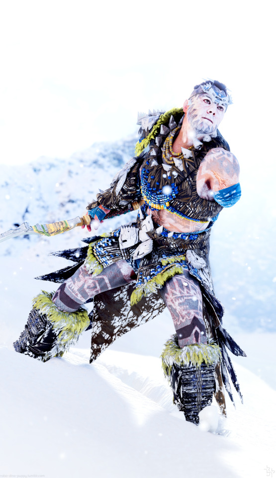
#horizon forbidden west#hfw#kotallo#have i really not posted this one before? i quite like it#sky was overexposed so i went with it lol#i like all the negative space in the tall version but in the end i wanted a closer view of his face... tall version below the cut tho#hfw npcs#chromatichorizon
64 notes
·
View notes
Photo

Eorzea’s Next Top Model Tumblr Cycle Ten
Round 1 Results
Round One is over already! For last week’s challenge, I asked the models to go out and fight something cute. Many cute things were slain, but the model who did some slaying of her own was:
Lily Lycoris
Congratulations! You’re the winner of the first round of ENTM Cycle 10. That cactuar didn’t know what was gonna hit him.
For the models, our judges have some critiques for you below the fold! This week, I asked the judges to do a bit of overlapping to ensure each model got two different perspectives. (Starting with Round 2, we will drop down to one critique per model, but from different judges than this week.)
Judge Kai
Week One, and here we go! Good luck to all of the models, and I can’t wait to see what you do with the challenges to come!
Azalea: This is a nice image, but I’m not sure if it fits the overall theme of fighting. It, more so, looks like they snuck up on you and gave you a shock! That said, the outfit is cute, and I like that you make it match the little Mandragora color theme. The pose is a little awkward, and I wish you’d pulled yourself a bit closer to the camera so we could see you better. The layout and your set up of the image are very nice and my eye went straight to you when I first saw it. But, be careful of brightening an image, it is giving your dress a very white glowy look and could make an image look a bit overexposed. Overall, good job!
Chee: First off, great job choosing to use a dark outfit against such a bright background. It makes you pop with my eye going right to you, and even though the background has taken on an overexposed quality, it doesn't affect your character’s darker theme. I love that you kept your character up front and highly visible, but a little sad you cut off the sword since this is a battle shot. The bright flash in the center is a little distracting, so just keep an eye on that. You don’t want the effects being used to upstage you! Overall, I think you did a great job for the first week so keep it up!
Haila: I will admit, I am not a big fan of backshots unless it actually adds something to the image - which (to me) doesn’t seem to happen often. In this case, awesome job! It gives me this overall sense of you being backed into a corner and this is truly a fight for your life. Very well lit and you were smart to pick the outfit you did because it doesn’t really blend in and makes you stand out in a… very crowded situation lol. Those raptors are out for your blood, and I don’t see you going down without a fight. Though, I’m unsure if I would consider them a -small- friend. But in this case, I don’t really care because this is a very well set up image!
Lantis: Good image and you did a good job lighting it. It looks like you’re taking quite a beating there. These Mandies are not happy with you, and I will admit that this image made me smile. Reminds me of one of those people taking hits to find out how tough they are, lol. I do wish you were a bit closer and dominate in the shot, there are a lot of Mandragora’s to compete with and they are very bright and it did draw my eye to them. That said, the outfit (paired with your skin tone) makes you pop out against all of the green in the background. You got great ideas and I like them, just remember you’re the star!
Rymm: So I am guessing these are the type of cat’s with a very ‘a typical’ personality and don’t appreciate pets lol. This is a nice shot and I love that you made it a tall shot to get the other flying cat in the shot as well. The sunset in the background is lovely, and I like the outfit you picked out. The top matches the colors of the sky without being to blendy. The outfit as a whole makes you stand out against everything going on around you. It does feel like it’s a bit underlit - but, like me, you’re a fair skinned character so we have to be careful on lighting. A trick I use is full on light set at good a distance. It still lights up the surroundings and yourself but doesn’t make us glow. If you need just a little extra light on you, good old sun minion! Good job!
Judge Vederah
Chee: I absolutely adore the coloring of the shot. That bright light in the center along with the beams emanating from that point gives off that feeling that something really powerful is about to happen to that little monster. My only issue is that same pro also ended up as a little bit of a con. I am so drawn to the center of the image that I almost didn't pay attention to the deep eye because he was on the farther edge of the image. James: There's a visually interesting contrast between cool and warm colors happening here. I like that the only warm toned parts of this picture is the graphic of the lance as well as the attack animation around the Korpokkur. I just wish it was a little more well lit around your character. The dark shades of your glamour are starting to blend in with the background. Lily: The DoF in this picture is perfect. The cactuar is slightly blurred- but not so much that you miss those lines and dimples of its skin.All the while the Miqote draws our eye by being crisp, in focus, and may I say quite well dressed. My only half-hearted critique here is that I keep going back and forth on whether or not I'd like this image to be zoomed out a touch more. I'd love to see the rest of the look and a bit more of the "monster". Ni'ko: I'm a sucker for pink, and the heavy concentration of pink towards the left of the photograph and how it's also faded out into the sky as we move farther to the right in the picture really works in your favor here. I love how both characters in this shot look like they're in motion to attack-- but the challenge was to be fighting each other. The fact that your character is facing away from the Moogle makes it appear more so that you're fighting along side him. Ysildor: I love how warm this image is- especially now that Autumn is finally starting to come around. While I love the tone of the image, I just wish it was lit a bit better. The shadows in this picture are really dark and we lose some of those little details of both your character and the Kidragora. That being said, I do like the camera angle this image was taken with. It makes the Kidragora seem a little larger and more intimidating of an opponent
Judge Rongi
Adam, for this week’s battle shot you were smart to use effects to help guide the viewer’s eyes, since the background isn’t visible. The lightning bolts on either side of you guide our eyes up and down the center of the shot showing off both you and the monster. I like how each mandragora is a different color (green, orange, and purple) as it gives a little more variety. Your subtitle made me laugh as well. My idea for this photoshoot, would be to have you over on the left and the mobs more on the right, in the exact same plane they are in now, but instead of how this photo is so centered, you’d have a really nice diagonal going across the image, giving it more depth and filling out the empty spaces on the sides. For next week, don’t be afraid to take a non-centered shot, and really work to fill out the whole image. Good luck!
Haila, for this week’s shot you brought a little pop culture into the competition, and it’s a really great shot. I love the balance you have between you and the 3 mobs, and the background is great. I love how we can see some depth in between the left two raptors. If you keep producing shots like this, I think you will be a force to reckon with over the next 8 weeks. I want to bring up two things though. While this is a beautiful shot, and one of the strongest this week, I feel like it isn’t a battle shot. This may be where the pop culture reference hurts you because in this scene of the movie, they are trying to calm the beasts…not fight them. That scene, plus your pose (again, a great pose and perfectly balanced with the mobs) really makes this seem like a “scene” instead of a “battle.” The second thing is, my idea of a little monster is something at least smaller than you yourself. For me, these mobs are not small at all. So while this shot is absolutely gorgeous and shows that you are definitely a seasoned screenshotter, I feel like it misses the mark on the theme itself. For next week, I hope you can take your skills and really match them to the theme 100%. Good luck! I know you can do it.
Lantis, this weeks shot is a great example of layers! I love all the mandragora piled up in the corner and all the layers we get between them. Looking from one to the other is entertaining and fun. Your subtitle is funny and makes me think they are attacking you saying “one of us! One of us!” haha. I am sure you already know what most of the judges are going to say. There is a lot of open space on the right side! An easy fix would have been to turn your camera to the right, filling the entire left side with mandragoras and the right side with you. Plus, youd be closer to the camera which would block out the background and bring more focus to you. While I definitely love the depth we get from your background, it feels forced instead of natural (like Haila’s depth for example. Your pose feels a little less battleshot than some of the other model”s shots for me. Next week, I want you work on not centering yourself in your shots and filling out the whole screen. The layers we got this week on the Mandys, I want to se stuff like that throughout the whole screenshot! Good luck!
Nadede, this shot is really gorgeous. I love the color scheme. Not only did you match the oer all colors between the mobs crystal and your effect, you also chose an outfit that really matches the adventure theme of the shot. It’s definitely a battle shot, but its also a great model shot as we can see so much of you. Because you aren’t looking anywhere in particular, I do feel a little bit of disconnect between you and the monster though. Had you been looking at the mob, I think we would have got a nice profile shot (I love profile shots!). You are definitely a pro and know what the judges are looking for. The hard part this cycle is going to standing out against so many models. So far, you are doing it. For next week, continue what you are doing matching all the elements and I think you have a good chance at taking the crown. Good luck!
Ona, this shot is a rarity indeed. It is perfectly centered!!! I love how little the background is seen, limiting the empty space that we do see in a few of the other shots this round. I think you know what most judges are going to say. It works as a battle shot, and centering it was definitely a good choice, but we cant see you or the mob very well at all. I think you were going for a silhouette shot, but the lens flare in the center makes you unbalanced and darker at the bottom than the top. Next week, watch you effects and how they limit your visibility as a model. Good luck!
Ysildor, this shot is balanced wonderfully. The sunset with the filter choice give it a really warm color that just looks really nice. Even your outfit color is a nice brown that fits the woods setting and filter color. The location of you and the mob are perfect and fill out the entire center of the image giving us very little empty space. The tilt and the horizon line guide our lines across the image quite nicely. While your screenshot is gorgeous though, I do feel like it is less of a battle shot than others this round. It’s a little bit too stoic. From this shot, I can tell that this isn’t your first time taking screen shots. If you focus on matching the theme 100% you could definitely be Eorzea’s Next Top Model. For next week, keep doing what you are doing and I think you will rank really well this cycle. Good luck!
Judge Kusuh
Azeala: The torn frame on this, alongside the bright filter and your outfit, really make this look like a scene straight out of a storybook! Though, the high camera angle plus the mandragora in the foreground draw my attention away from you and more towards what you're fighting. Having the camera profile between both sides or being closer to the camera with a slightly lower angle (so it's like the mobs are looking up at you about to destroy them!) would take this picture to the next level. Cowbot: The Wall Frame in gpose is one of my favorites, and I think it's used really well here! With the placement of the mandragoras it looks like this is something straight out of a comic book or a dramatic freeze frame in an anime. Unfortunately, though, the brightness of the spell you are casting totally erases your face, which actually makes it look like you're the one losing this fight. Lily: This shot feels like it's straight out of a modern-western movie! The look on your face plus the raised arms of the cactuar really are nice touches that really give off a sense of tension and anticipation. I think what would take this combat shot to the next level would be to have the gun actually firing for the shot, I feel that would give a more "active combat" feel. Ni'ko: Personally, I'm such a sucker for dramatic lighting, and this really delivers the feel of a very charged encounter. The position of the moogle in relation to yourself is something that gives me pause, though. From the way it's set up, it more looks to me you two are both fighting on the same side, as opposed to against each other. Having either yours or the moogle's back to the camera would be a good way to remedy this! Rymm: Oh no the cats! This shot really looks like you don't want to be harming these mobs, which I can tell is your intent from your description, so good on you for that! Having the second cat high above you in the air also adds to the comedy of this shot! My main suggestion for you is to play around with the placement of your lights in gpose. You're pretty dark in this shot, and feel like some cooler (temperature-wise) lighting would brighten you up a bit more! Wren: The ladybugs may not be a fan of your outfit, but I am! I love how you managed to catch multiple ladybugs in the middle of attacking, which really makes this feel like a combat shot. Personally, I would zoom in the shot slightly with the gpose camera zoom so that you are more central to the shot and conflict.
Judge M'Telihgo
First off, to everyone, welcome to ENTM. It takes courage to put yourself out there in front of your peers and other and let them judge away at you. Regardless of anything else, be proud of having that courage,
Adam: I like the lightning in your screenshot, it definitely sells that you are combat. I like the coloring from the lightning, it is a dark shot and their color adds an easy focus. I do feel that the darkness does make it hard to see any background however, I like that area and would have loved to have seen more of it. While many people picked Mandragoras, I think they added to your screenshot as you could get many of them into your screenshot and line them up. I really liked your entry this week.
Cowbot: Welcome back to another round. While most people would not like the split frame effect, and I understand why, I like that you tried anyway. I do see how you put yourself in the middle frame and the monsters in the sides. Your spell effect is hiding your face however, we want to see you too, not just the monsters! I like how I can still your background clearly and I still think the choice of mandragora is appropriate. Well done!
James: This was one of my favorite screenshots of the week. I like the contrast of the white leaves with the darker background, they almost make me think of a spooky ghost in a haunted forest. More on that another time. I like how we see both the effect on the monster that looks like you have sliced it in half as well as your pose would match, well done. A little more light on the trees would have been nice, but not a major point. Also, you did not pick a mandragora, so good job by you!
Nadede: Also, welcome back to ENTM. I like this screenshot from you. I like how your shirt and especially the talisman stick out from the dark background. I would not have thought about doing a Spriggan for my own entry if I was competing, so I like your choice of monster very much. However, I do think that the darker creature on a dark background, especially at an edge, makes it blend in a little too much, an effect may have helped with that. Even with that, I still like it.
Ona: Wow. I am not usually a fan of silhouette shots, but I like this one! While I like the starburst behind you, I do not see a monster in there. Is there one there and I can’t see it or is the Sylph next to you the target? I also would not have done a Sylph myself, so thumbs up from me on your choice of foe. I do think a little more light in the background would help it come out more but I think this screenshot does very well even without that.
Wren: I love the Black Shroud, I hated it in 1.0, but the new version is much, much better, obviously, a plus from me on your choice of location! I like the contrast of both you and your target with the background, makes you and your foe really stand out. If I were to try something different, it would be the angle. I like your battle effect, but I think a little different angle or timing to line it up better could be additive to your screenshot. Even with saying that, I do like your choice of ability and your choice of foe. I look forward to seeing more of your screenshots in the future.
13 notes
·
View notes
Photo
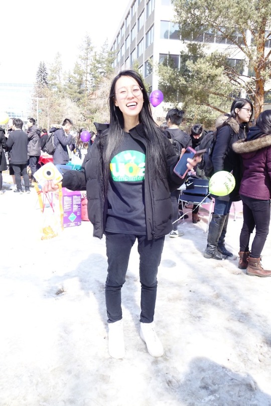
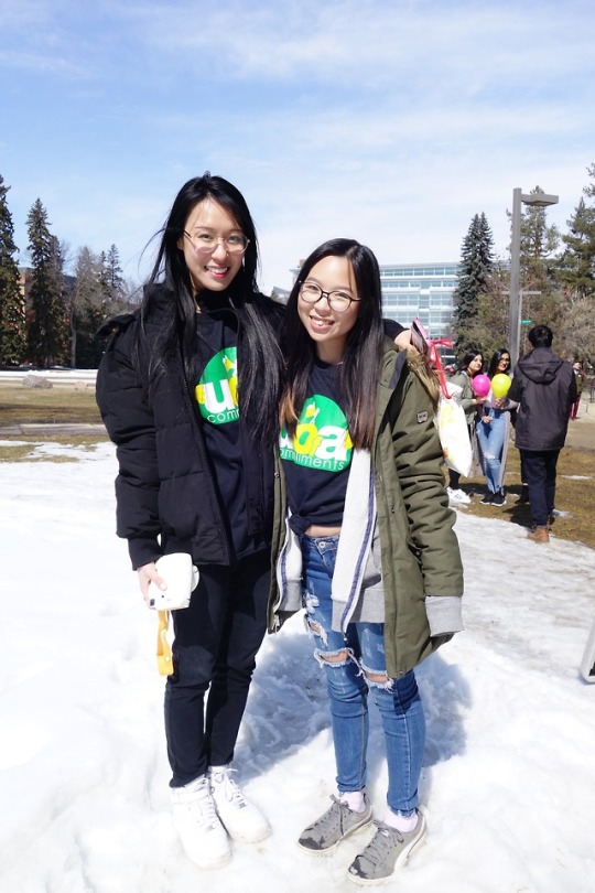

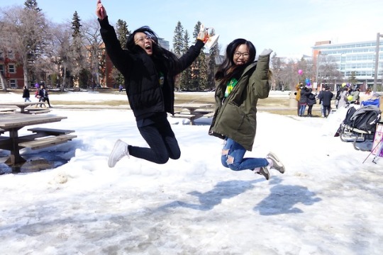
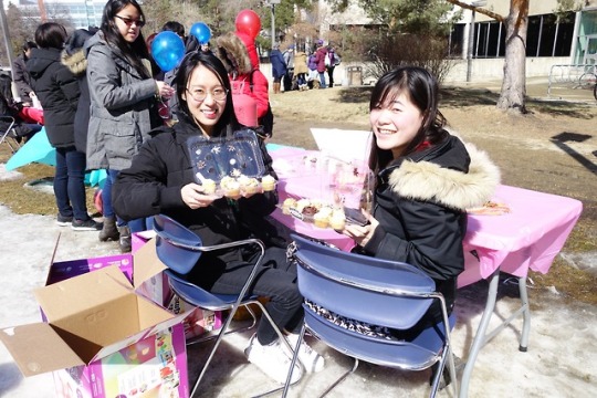


Day 103/365: April 13th 2018 | Last Day of ... Undergrad ???
To be honest, I am always paranoid about announcing stuff like this just in case my academic advisor and I fucked up on calculating my degree requirements lmao...... Even though I got 2 official degree assessments (during 2016 and 2017) as well as an informal degree assessment at the beginning of this term. I double checked, triple checked, quadruple checked. I checked for courses and credits until I went crazy LLOLLLL. In other words, I did ****everything**** that I possibly could. If things go wrong, that really would be the worst luck ever and even Bad Luck Lily does not seem to have the ability to fuck That up. Because I know that my GPA standing will be enough to graduate for sure. I’ll be fine.... so... calm tf down @/me. ;_;
ANYWAY. About today! Today was ridiculously busy and eventful. Felt super long. I woke up at the ungodly hour of 9am and got ready. Before going to class, I went to SUB with Charmy to get free pancakes and sausages (+ orange juice 🍊)! One of the UASU volunteers asked me about compliments because they saw my shirt and I felt so recognized LMFAO. Anyway, a bunch of people were waiting on sausages and each person could take 2. But when it came to my turn, there were THREE left in the bin and there was another person reaching for sausages at the same time as me and the just TOOK the extra piece without negotiating with me!!! OR EVEN TRYING TO LET ME HAVE IT!!!!!! BUT!!! I waited for a bit longer for more sausages and even though I ended up freezing for 5 more minutes outside, I ended up getting 3 sausages in total so who’s the winner now!!!!!!!!!!! >: (
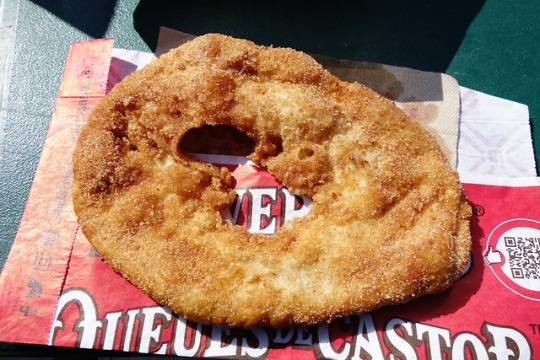
Ate the free breakfast, went to the final earth science lecture (zzz) and went to quad for PositiviDay! I basically just made balloons with Vivian + Kevin for 1.5 hours LMAO. I have never made so many balloons in my life!!! Overwhelming but fun lololol. After making balloons, I ate Pearl’s leftover Donair poutine with Erica HAHAHA. After that, I went to the BeaverTails food truck and used the 5 free tickets that I was given *_* and got the cinnamon/sugar/lemon flavour. Nom nom. Spent the rest of the time sitting at the treats table with Cindy. Wheee.
Went to my brain chem lecture aka my final lecture of undergrad........... WOAH... The lecture deadass ended within 30 minutes LMFAO. Went back to quad for club group pic and then went home and rested (cooked + ate noodles, proofread my research proposal + submitted it) before going to Kung Fu Tea with Erica and Jerry at 9pm lolololol. We went for their Buy 1 Get 1 Free event and tbh it wasn’t super worth it because they seem to be really cheap..... deadass filled mine + Erica’s cups with 50% ice like what the fuck........ this is especially wtf because we both asked for no ice smh fhkjsdgks anyway after being at KF tea for 30 minutes, we went to Coco because Jerry wanted more bubble tea??????? LOOOOO>LLLLFJSKF wild kids right here!!!! But today was a good way to celebrate the end of classes (5ever). I had fun ^_^ ~
#365#ootd#u of a compliments t-shirt#black jeans#bluenotes winter jacket#nike air force 1#yay for alex + chaitali visiting LMAO even tho alex was just distracting me from making balloons with erica LOOOL#omg omg omg i was like vivian we need a pic n she was like 'i brought my polaroid camera' n i was like 'me too!!!!'#so we just each took polaroids and exchanged it... how cute ToT i love vivian ahhh#LOL apparently erica n jerry are my new parents#fan frigging tastic#'but you're leaving'#kjdfjksg#exo-cbx_thursday.mp3#even tho it is fries day#literally have 60 pics from today jdshgjaksgd
2 notes
·
View notes